Click to enlarge
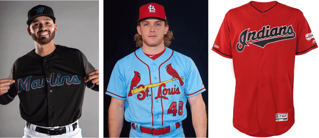
It’s that time of year again: The 21st annual Uni Watch MLB Season Preview will be available this morning, featuring all of the new uni designs that you can expect to see on the diamond this season (including the three shown above). The MLB Preview is appearing on the Sports Illustrated website this year, and I for one couldn’t be happier. Check it out here.
I want to thank everyone at SI, including Mark McClusky, Ryan Hunt, Ben Eagle, and, especially, Connor Grossman, who did a great job of handling all the photos, dealing with all my last-minute additions, and more. Thanks, guys — proud to be working with you, and here’s hoping there’s more where that came from.
Click to enlarge
Collector’s Corner
By Brinke Guthrie
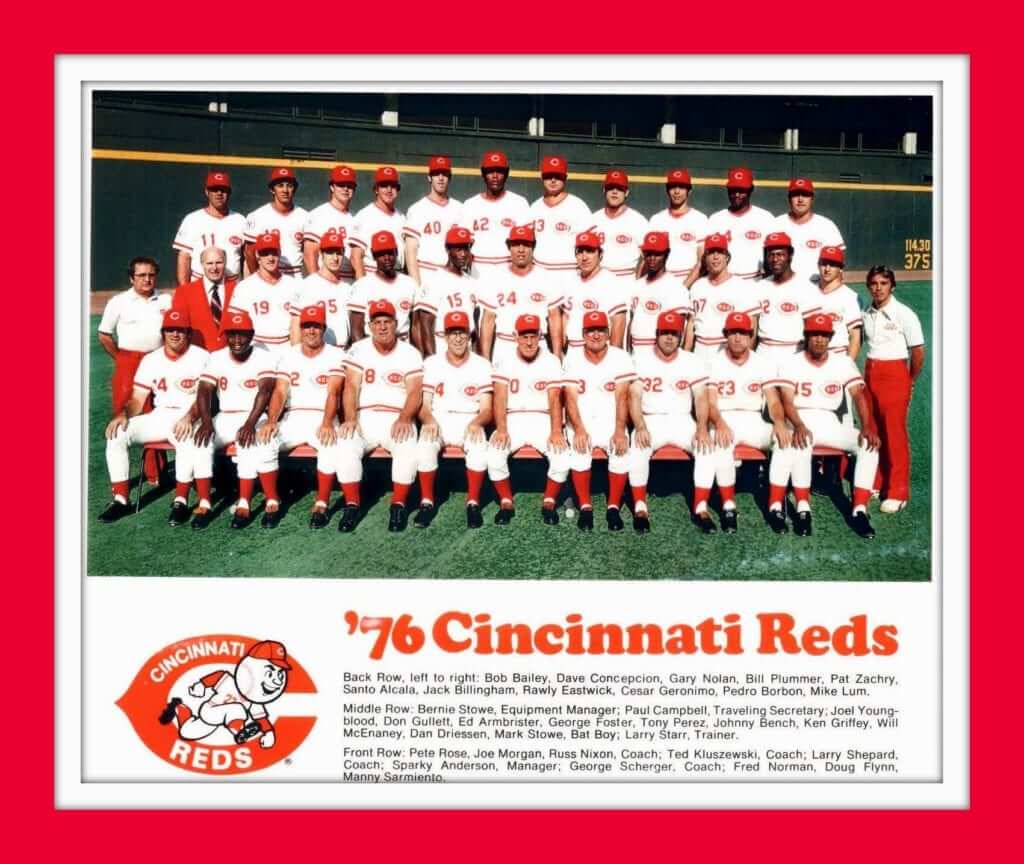
Opening Day is the day after tomorrow, so let’s kick things off with some great Cincinnati Reds items. For many years, the Reds were synonymous with Opening Day — being the first professional team, they had the honor of opening the season on a Monday, while everyone else followed the next day. As I recall, once MLB and ESPN began doing Sunday-night season openers, that was the end of the Reds’ exclusivity. As someone who was in the Findlay Market Opening Day parade for many years, I can attest to the fact that Opening Day is a very big deal in Cincinnati, so it’s shame that they’ve robbed the team of its annual special status.
We’ll start with this 1976 Reds team photo. The ’76 Big Red Machine is rightly considered to be one of the greatest teams of all time. Look at the names on here — Bench, Rose, Morgan, Perez, Concepcion, Foster, Geronimo, Gullett, Griffey. These days, there’s no way a team could afford to have all these guys on the roster at the same time! Next, this 1963 Reds bobblehead. He is in totally excellent shape (and he better be, considering what the seller is asking). Moving along, see these Fleer Reds stickers? I wore the one on the right for the very first game I ever attended at Riverfront, April of 1971. And one more from the Reds: This thermal cup was made to commemorate their back-to-back World Series titles in 1975 and ’76.
I could go on, but there are other teams out there besides the Reds, so here are the rest of this week’s picks:
• Last week’s Collector’s Corner included a game program for the 1969 NBA All-Star Game in Baltimore, a mod-looking game cover if there ever was one. This week, we move up the calendar 13 years for the 1982 game at Byrne Meadowlands Arena in New Jersey. This star-spangled blue program cover was obviously heavily influenced by the hometown New Jersey Nets.
• This 1970s Pirates pennant showcases their spiffy, then-new Three Rivers Stadium.
• Golfers back in 2008 could tee off with these official Opening Day golf balls. (But…you wouldn’t play golf on Opening Day — you’d be at the game, right?)
• Look at the art on this 1975-76 Topps hockey card display box. Kinda looks like a Chicago Blackhawk is sticking his skate right into the goalie’s chest, and that’s gonna leave a mark!
• Here’s a trio of 1960s heavy-duty glass beer mugs bearing the logo of the Washington Senators, later to become the Texas Rangers in 1972.
• This 1960s Major League Baseball from Sears & Roebuck Company was “certified and approved by Ted Williams” for “active Americans.” No word on whether slovenly and/or non-American people could purchase it.
• This 1970s-1980s Buffalo Bills helmet plaque is in fine shape.
• Well into the 1990s, Nike had no presence on NFL fields except for shoes, until Jerry Jones got involved and signed his own deal. (The league would follow shortly.) Meanwhile, multiple companies like Champion, Starter, Russell, Apex, Wilson, and Pro Player all had involvement in NFL gear for players and fans alike. Pro Player came up with this look for sideline jackets, as shown here for the Packers. This would’ve been a 1994 jacket, with the NFL 75 patch on the sleeve. This was when the league knew how to design an anniversary patch, as opposed to now.
• Speaking of Apex, here’s a very nice, clean-looking 1990s Miami Dolphins jacket. Got some BFBS on there, and the seller calls this the “Sharktooth” design. That was in fact the name for a design by Logo Athletic around the same time (as shown on this Chiefs cap) — this Dolphins jacket uses a style known as the “Dart,” if I remember correctly. Also from 1990s Apex: this Cowboys cap with a rather prominent star. This one was paired with their famous “Double Star” jacket.
• Why have a NY Giants mug with a helmet pictured on the side when you can have a mug that is a helmet!
• And from reader Will Scheibler, here are some nice CFL jackets for the Calgary Stampeders and Saskatchewan Roughriders.
Seen an item on eBay that would be good for Collector’s Corner? Send any submissions here.

Click to enlarge
Tequila sunrise reminder: In case you missed it on Monday, we have a new version of the sublimated Uni Watch Tequila Sunrise T-Shirt — a big improvement over the version we originally offered as part of the Uni Watch T-Shirt Club in 2015. Here’s the rear view, along with a look at how the front and back stripes align:

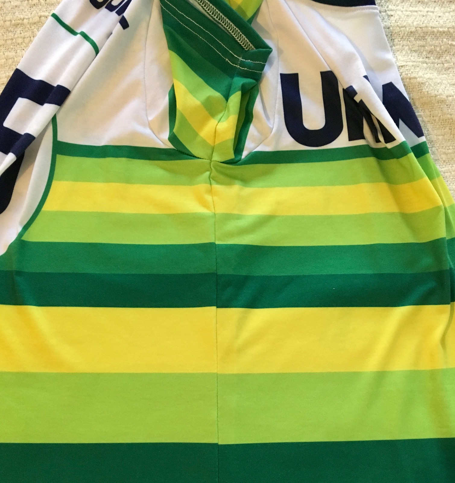
I’m really happy with this one, and I’m excited to have it in the Uni Watch shop. Sublimation is a pricey process, so the shirt ain’t cheap — $35.99 — but I think it’s pretty special. You can order it here.
Click to enlarge
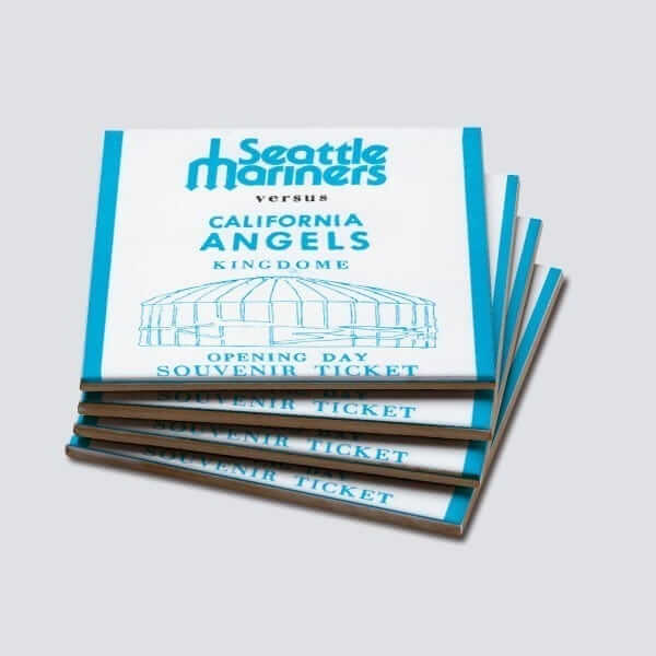
Raffle reminder: We’re once again partnering with Vintage Brand for a raffle. The winner will get to choose any single item from the Vintage Brand website (like the nifty coasters shown above, which are based on a ticket stub from the first game in Mariners history).
To enter, send an email to the raffle address by this Thursday, March 28, 7pm Eastern. One entry per person. I’ll announce the winner on Friday.

Click to enlarge
GOING FAST — sock update: In less than I week, I’ve already sold through more than 85 of the 100 pairs of Uni Watch socks. So if you want a pair for yourself, move fast! Full details on how to order can be found here. Thanks.
The Ticker
By Alex Hider

Baseball News: Nats P Sean Doolittle tweeted yesterday that he will be changing his number to No. 63, saying the number “carries a special significance for me and my family.” He also added he’ll be doing some giveaways this season to help out fans who had purchased his jersey with the old number (from JC Crawford and Ted Bloss). … Speaking of the Nats: The squatchee on the cap of the bullpen cart doubles as a beacon light (from Matt Shevin). … Both the Grapefruit and Cactus League logos were painted on the field during a game between the Cubs (Cactus) and Red Sox (Grapefruit) faced off in Mesa, Ariz., last night (from Steve Sher). … The Indians signed INF Brad Miller Sunday after he was told he wouldn’t make the Dodgers’ big league squad. Yesterday, he wore his Dodger blue cleats in his first game with the Tribe (from Rocky Krsnich). … The White Sox will be giving away a “Sox” soccer jersey this season (from Michael Clair). … Jordan Mayblum was at spring training in Sarasota, Fla., and spotted a fan wearing a fish market’s T-shirt that was pretty clearly inspired by Fenway Park’s 100th Anniversary logo. … Ignacio Salazar got a look at the Astros’ new Hall of Fame at Minute Maid Park. He also spotted a T-shirt with a very cool Astros logo. … The Iowa Cubs will wear Scouting jerseys in April (thanks to all who shared). … The Fort Wayne TinCaps will wear Dwight Schrute’s signature mustard shirt as a tribute to The Office (thanks to all who shared). … The Double-A Mississippi Braves will wear Jackson Generals throwbacks on June 28. The Generals played throughout the 1990s. … The Delmarva Shorebirds announced they’ll wear Maryland flag-inspired uniforms for Thursday home games this season (from Marcus Hall). … The Cardinals wore safari hats for a spring training photo in 1935 (from BSmile). … Get this catcher a new pair of pants! That photo was taken in 1961 at George Washington High School in Manhattan (from Paul Friedmann). … The Seibu Lions of Japan’s Pacific League have introduced an alternate cap with 13 stars to represent their league championships (from Graveyard Baseball). … Southern broke out baby blue uniforms yesterday. Lookin’ sharp (from @CaliGlowin). … Auburn has made a slight alteration to its camo hats, as the logo is now outlined in white (from Clint Richardson). … D-Backs OF Steven Souza Jr. suffered an apparently serious knee injury last night when his cleats skidded on home plate as he was scoring a run. … Odd situation last night in Memphis, as the Cardinals played an exhibition against their Triple-A farm team, the Memphis Redbirds. The Cards wore white, except for P Adam Wainwright, who wore red (from Tyler Oehman). … Speaking of the Cards, the NHL’s St. Louis Blues wore Cards-themed warmup jerseys last night (from Luke Kernell). … New uniforms for UTPB (from Jonathan Shaw).

NFL News: Former Washington LB Jack Pardee wore two different fonts on his jersey at some point between 1978 and 1980 (from Pro Football Journal). … Both the Watertown and Foxborough fire departments in Massachusetts are using Pat Patriot in department logos (from Ilana Hardesty). … In a deviation from recent protocol, the NFL’s season-opening Thursday-night game will not feature defending Super Bowl champs.

Hockey News: White breezers alert! The Cleveland Monsters of the AHL wore them as part of their astronaut uniforms, celebrating the upcoming 50th anniversary of the moon landing (from Dennis W. Alpert). … Cross-listed from the baseball section: The Blues wore St. Louis Cardinals-themed warmup jerseys last night (from Luke Kernell).

Basketball News: Michigan managers make a basketball court out of tape for the Wolverines’ walk-throughs before games (from Ryan Parrill). … An Iowa beat writer for The Des Moines Register did some investigative reporting prior to the Hawkeyes’ game Sunday to find out what color they’d wear (from Josh Sandin). … Alex Gerwitz has updated his NCAA Tournament color bracket through rounds one and two. … Newly acquired Thunder PG Jawun Evans will wear No. 8 after the team claimed him off waivers (from Etienne Catalan).

Soccer News: Adidas is once again debuting new uniforms made from recycled ocean plastic for all MLS teams. Last year, the jerseys were black and white. This year, they’re navy and teal (thanks to all who shared). … Also from Josh, Dutch club PSV Eindhoven has a new jersey advertiser. … Manchester City is selling a limited edition “mashup” jersey featuring multiple design elements from years past. … Disappointing development from FC Cincinnati, where Sunday’s captain Gregory Garza did not wear the city flag-inspired captaincy armband that Kendall Waston wore two weeks ago and instead wore an orange and blue plaid band. Could it be that the flag armband is reserved for home games? (From @labflyer.) … Cross-listed from the baseball section: The Chicago White Sox are giving away a “Sox” soccer jersey this season (from Michael Clair). … Bit of a kerfuffle regarding Venezuela’s kits, as their outfitter, Givova, didn’t have enough uniforms on hand and had to buy another brand’s kits and modify them with their own logo (from Ed Zelaski).

Grab Bag: We’ve got some cricket news (!) from Doug Brei: Last year, Indian club Rajasthan Royals wore pink jerseys for breast cancer awareness. The jerseys were a hit among the fans — Jaipur, the club’s home city, is known as the “The Pink City” because of the city’s architecture. So this season, the Royals have made pink their primary uniform color. … New uniforms for German handball club Magdeburg that feature the Magdeburg Cathedral (from Ed Zelaski). … This shipping container was repurposed into stands for a park athletic field. Could make for a good dugout, IMO (from @jason3thousand and @OlegKvasha). … A car tire inspired by Air Force 1 sneakers for New York Fashion Week? As Darren Rusakiewicz says, “I don’t even know where to begin.” … Mizzou teams across several sports are wearing the slogan “Make It Right” as a protest against what they feel are unjust NCAA sanctions (from Chris Mycoskie).
Typo:
“He also added he’ll be doing some giveaways this season to help put fans who had purchased…”
(help out)
Thanks. Got it.
No photo to show it, but Adam Wainwright pitched for the Memphis team last night. So, unlike the rest of the Cardinals, who wore their spring training red tops with gray pants, Wainwright wore red top with white pants. Memphis wore their standard white home uniforms.
Ah, I see. I’ll adjust the Ticker accordingly.
The Jack Parkee pics are from 1971-his first year with the Redskins. The gold(actually yellow) helmets are the giveaway-Washington switched back to burgundy helmets in 1972.
Washington had yellow helmets in 1970-1971. Pardee played for them in 1971-1972. So the picture must have been from 1971. Pardee was Washington head coach from 1978-1980.
Pardee wore that jersey in 1970 or 1971 – the yellow helmet was worn those years. He was head coach 1978 – 1980.
The Pardee photo was from the early 70’s. Maybe 70 or 71. Look at the Redskins and Rams helmets in the pic.
Fixed.
Although I am not, never have been, and never will be a fan of the Cardinals, I do have to admit they have one of (if not) the best and most iconic unis in MLB, and IMO, are one of the few teams that really look good in the powder blues.
Looking forward to readimg yout annual preview Paul.
So with a digital camo hat, you WANT the logo to be more visible now? I thought the idea was to play soldier and blend in… *facepalm*
Very cool that SI is posting the MLB Annual Preview.
Happy for you Paul, keep up the good work!
Came back to say this. SI would be a nice home for Uni Watch beyond this home base. Congrats!
“Both the Watertown and Foxborough fire departments in Massachusetts are using Pat Patriot in department logos ”
both with disappointing results.
MLB Preview is up:
link
and, as always, it’s a blast. hoping you have many happy returns at SI
FOLKS, CLICK AND SHARE THE PREVIEW!!!!!
The more clicks it gets, the better chance SI will pick up Paul moving forward.
Clicked and shared!
Nice work Paul!
Lee
FC Cincinnati.
The hint for as to why they have two armbands may lie in what FIFA does. For the past two World Cups, FIFA has had two armbands, a default light-colored one and a second dark-colored one for teams who wear a similar color to the light-colored one. Maybe MLS told FCC they can’t wear the flag one with the white shirt because it’s the same base color.
It’s definitely not a home/away difference because the picture illustrating the flag armband is an away game against Atlanta.
small note for the SI preview- says Padres are celebrating 40th anniversary instead of 50th. The preview looks great! Uni Watch and SI did a great job on the design and layout. And the content is incredible as always!
Yeah, I just spotted that typo myself. Asked my editor to fix.
And, they have the Angels down as the Anaheim Angels. I shouldn’t really be complaining because that’s what they SHOULD be, but … yeah …
They SHOULD be the California Angels.
Maybe if they lured away from Anaheim to Long Beach that will happen.
YES
As an Angels fan, I find this “mistake” to come across as either sloppy (unlikely) or petty if not insulting (more likely). Mock the team’s name changes in the commentary (if one must) but afford them the respect of an accurate title/chapter head.
My two cents…respectfully submitted.
I agree, we’ll put. I’m also an Angel fan and I just don’t get why people still care about the Halos calling themselves Los Angeles Angels. I’ve said it a million times, many teams call a city home that don’t play in that city or even state, who cares? I can understand making fun of the “of Anaheim” year’s, but people forget Arte Moreno used that as an F you/loophole to meet a contractual obligation. The contract written when Disney owned the team stated Anaheim must be included in the team name. Anyway been more than 15 years everyone, get over it.
Trust me: It was a mistake by SI. My original copy did not have headers, and I didn’t see the header-inclusive layout until last night. Sorry I didn’t catch it.
Great MLB preview Paul….!
The change to the Phillies jerseys, while subtle, makes a huge difference. I have never liked the current Phillies set but could never really pinpoint why. Seeing the cleaned up lettering I know can appreciate what I didn’t like. So much better.
I’ve never liked the current Phillies set, and I can pinpoint why: The red pinstripes are poorly executed and make the uniforms look pink, like white clothes that have been washed with red. Also the road uniform is such a light gray that it looks like a faded white in sunlight, which ought to be the ideal viewing conditions for a baseball uniform. The chief advantage of the Phillies going back to maroon, even if they keep their current script, would be uniforms that look more distinctly red than pink. Nothing wrong with pink on a sports uniform, assuming that’s a team’s actual intended color. But the Phillies look pink without intending it, in a way that makes them look like a cheap high school theater production rather than a professional, big-league team.
Ever since I was 8 years old and first Uni Watching before I knew it (thank you, baseball cards!), I have thought that the modern Phillies red pinstripes on white made them look like candy canes. So I’ve never been a fan. Nothing wrong with the fonts and numbers, but maroon would eliminate the candy cane look and they could own that shade while looking awesome. I’d endorse that!
Can’t unseen that now, going to mention it to some Phils fans I know.
I think I wrote this comment on the post that shared the Twins new navy jersey when they first unveiled it, but if it matters for the SI article, the gold-trimmed logo on the navy cap isn’t new, they added it when they added their current white jersey a few years ago
link
Great job as usual on the SI article. But the alphabetization is freaking me out. The NL East seems to be by city but some other divisions are by nickname (which I hate) and then I can’t figure out the AL West at all.
Congrats on a great SI debut Paul ~ Cheers!
Fantastic to see the MLB preview on SI.com. Fingers crossed that this is the beginning of a long relationship.
Thanks for the season preview. Glad SI was able to pick it up. Probably my favorite column of the year!
A tour de force of a baseball preview, Paul! Nicely done, and congrats on the SI home. A few editing issues aside, I feel like they presented your work very well. Felt like a much cleaner page than I recall from ESPN. And I appreciate the balance you struck between explaining terms and concepts without either condescending to the less informed reader or sinking below the attention of the more informed reader. The rare case where second-person writing can be effective in journalism (“you know how …?).
Thanks, Scott. Appreciated!
As of when I read the SI piece (congrats Paul, hope it leads to a longer term relationship!), there was a mention of commemorating the Padres’ 40th anniversary. Obviously you meant 50th!
Yes, already fixed!
Great job as usual on the preview.
I’m looking forward to seeing the Tigers during the regular season in re: the size of the hat logo, especially when it comes to the helmets. Watching a spring training game the other day, they still looked like bad souvenir helmets.
Great MLB preview column, Paul! It’s always my favorite of the year.
As a lifelong Phillies fan, I’m really happy with the tweaks they made to the Phillies script. I was never a fan of the thicker script they switched to a few years ago, and am glad to see they’ve thinned it out again and cleaned up the outline. I do wish they would have stuck with the royal blue stars but overall I’m impressed!
Great column — looks fantastic — but just FYI, you have “JUMP TO A DIVISON” near the top, with “division” spelled wrong. Hopefully this is an easy fix.
RE: MLB Preview
Miller Park will actually be the home to the Brewers for this season and next season. The name change will not take place until the 2021 season.
Source was from a Forbes.com article by Andrew Wagner on Jan. 23rd
The SI column looks beautiful! The actual aesthetic of it on their site is fantastic. Of course, the writing is its usual wonderful self too, but I’m digging SI.
As always, the MLB preview is one of my favorites every year. Something about uni-watching baseball over all the other pro-sports for me. Well done Paul! I’m looking forward to seeing if the Sox do wind up doing something for their home opener.
Great SI debut Paul.
Great MLB preview.. I like the SI format better than the old.
For the Indians, you failed to mention that there is an additional new cap design this year. The navy with red brim block C cap did not exist last year. It had the retired logo.
Congrats on the debut, Paul. SI’s format really did justice to your piece and seems like a great home for UniWatch content. Hoping we see more.
Great job as always, Paul.
There’s one part of the Braves’ tweaks I don’t like. Now the middle a in the script Atlaanta does not Respect The Placket.
Speaking of that, not only are the Marrlins’ black jerseys guilty of the same thing…they have stealth numbers, too? Almost makes me miss the previous set. Just. Go. Back. To. The. Original. Unis.
Would’ve been a great opportunity for the now Wahoo-less Inddians to correct their placket issue, but no.
It’s such an easy fix, which makes it so frustrating when they don’t do it. Only thing worse is a team named after a colored article of clothing not wearing said color.
Jim, I don’t always agree with you, but on this point you could not be more right. I do not understand how the decision was ever made to locate these scripts this way in the first place.
Should be Los Angeles Angels not Anaheim Angels
Once again that was a great MLB season preview. Great work, Paul!
Good grief, all 4 iterations of Miami Marlins unis look like absolute crap.
-Jet
Yes, the Marlins got it right the first time, and wrong ever since.
I’m hoping that they actually wear the gray aways this go-’round.
I’d like to see the blue alt featured over that dreadful black jersey.
Someone tell Vintage Brands that their rotating picture ad is annoying and distracting. I have to turn it off with an ad-blocker every time.
To those that will reply with snark, I have eye issues with things that move like that on a screen. Videos are fine but moving .gifs or whatever bother the crap out of me.
Paul,
Great work for SI-hope it leads to more and more opportunities for you!
Since the Phillies are trotting out those all-maroon get-ups against Atlanta, do you know if the Braves will be dressed in a period-appropriate uniform(namely, the feather-sleeved grays)?
Don’t know. But hope so!
Paul, great job on the MLB preview. And I was beyond thrilled to see the Phillies have decided to move away from the ‘fatter’ font on their jerseys. It has bothered me for two years, because it looked blurry on TV. The news completely made my uni-year!
Lovin’:
-Cardinals’ powder blues. Can’t we just make that the regular road unis? Some team needs to take the plunge back into full time powder blue roads.
-All the throwbacks the Reds will be wearing. Will be fun to watch highlights.
-Good changes for the Braves for just the navy and red jerseys.
Hatin’:
-Some of the Marlins’ new look. Hard to see hat logo and script on the black jersey with lack of white.
-Pirates’ military appreciation hats. GI Joke.
-Doing away with team-wide shoe colours. Don’t want to see teams wearing a bunch of random shoe colours like you see in soccer and hockey.
————————-
Looking forward to 2020 as I cannot wait for the Padres to be back in brown! Hang in there and keep your spirits up people as I hope we will someday have the White Sox wearing that pale hose!
Also wouldn’t hurt to see the Angels wearing navy hats with red brims, and the Phillies in maroon all the time.
Not sure how everyone else felt, but scrolling through the preview on SI felt more satisfying than on ESPN. Not sure if it’s because the latter seems to have a lot more on the page to distract you or what, but SI feels a bit better-designed. Here’s hoping they give you more opportunities, Paul!
Clarification on the Cardinals / Memphis game:
The Cardinals wore their red spring training jersrys. Memphis wore their home whites.
Wainwright was the starter for Memphis so the fans could see some more of the fan favorites play. Instead of wearing a Memphis jersey, he wore his Cardinals jersey.