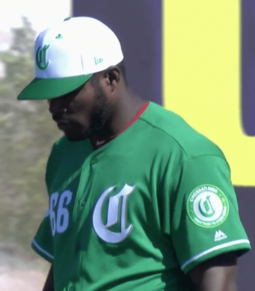
Sports teams throughout the uni-verse wore green for St. Paddy’s Day yesterday. We’ll begin with the Cincinnati Reds, shown above, who not only wore a green jersey and cap but also added a new sleeve patch. And what did that patch say? Let’s take a closer look:
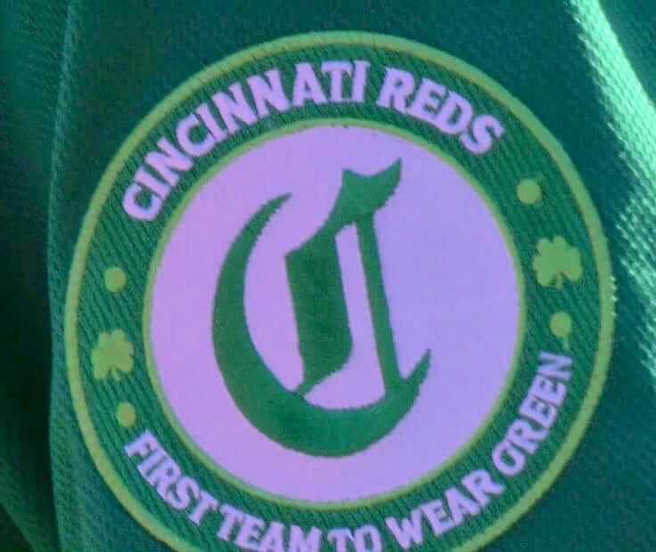
Interesting! This is a variation on the patch that the Reds wore a year earlier to mark the green gimmick’s 40th anniversary. I guess they plan to remind everyone from now on that they came up with the idea.
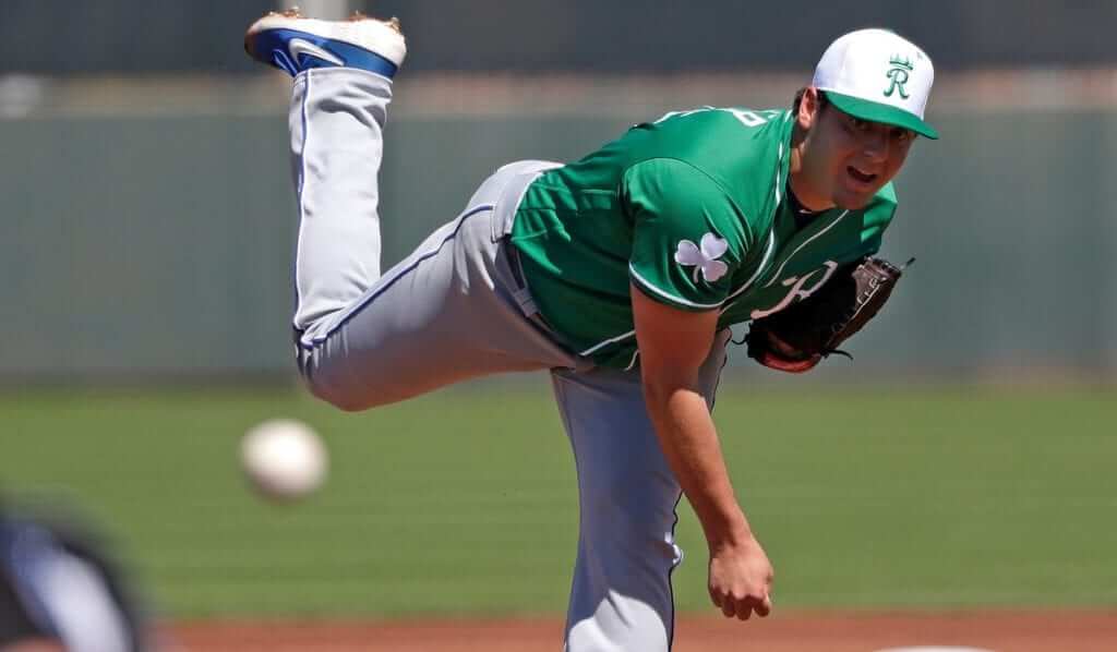
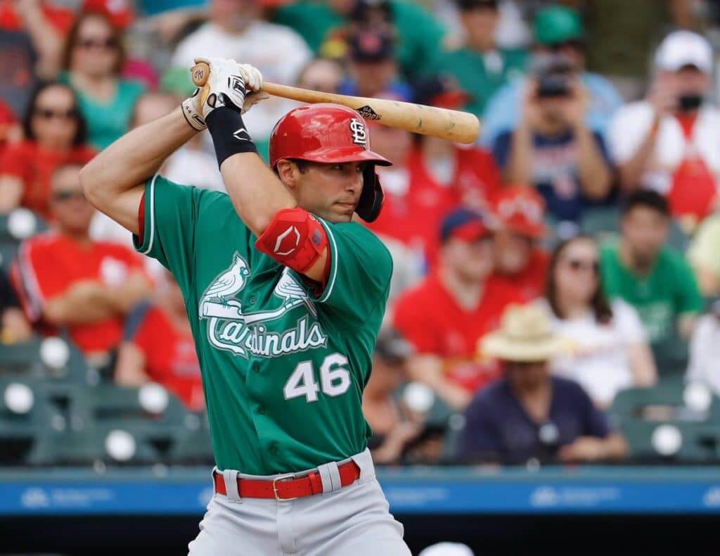
Most MLB teams just wore green caps yesterday, but a few went the extra mile with green jerseys:
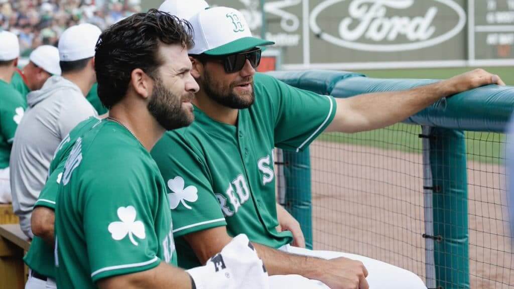
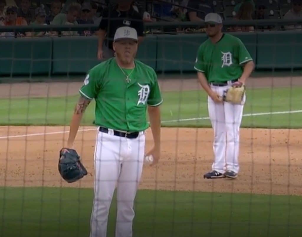
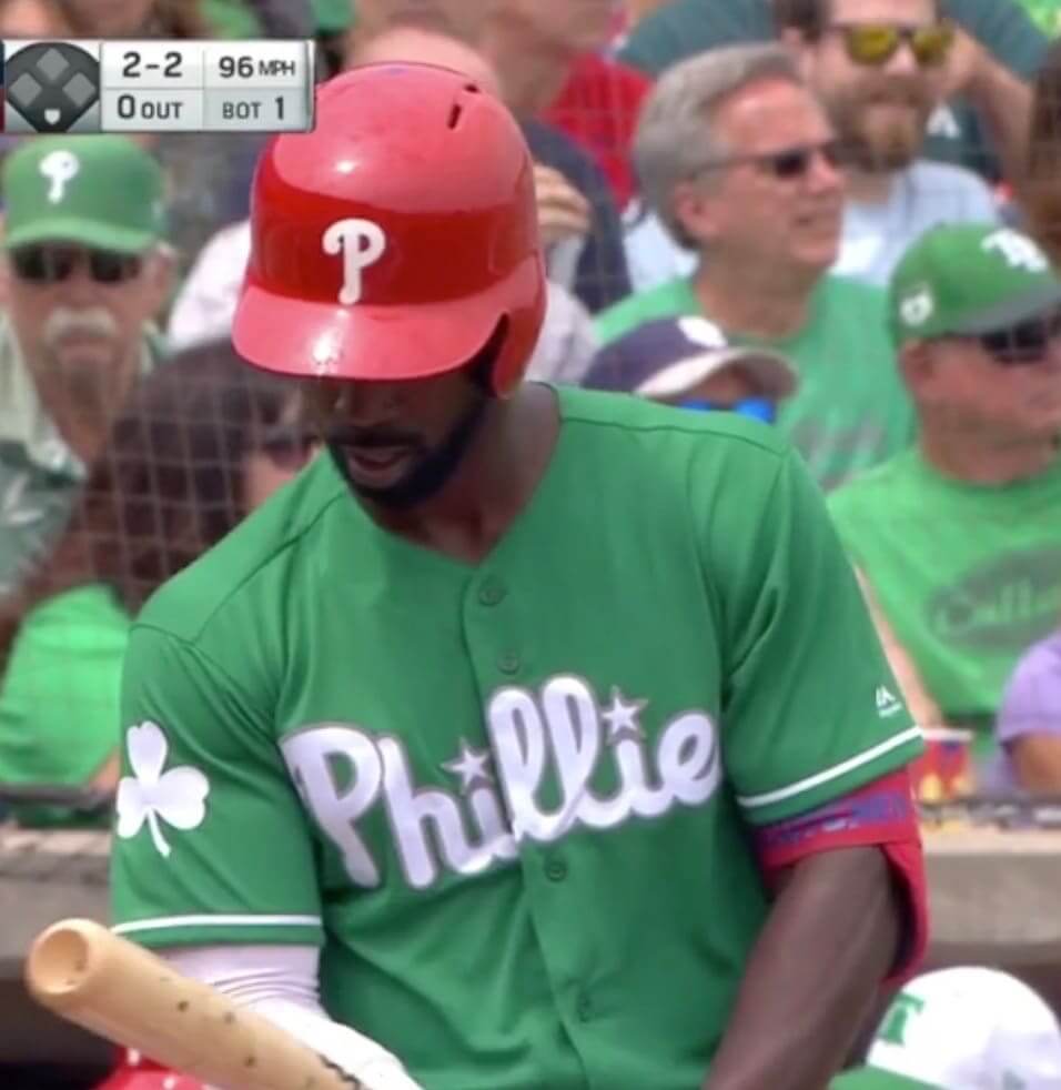
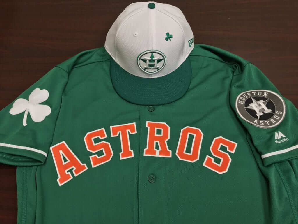
The Brewers didn’t bother with a green jersey, but they did go a bit further than the green-capped teams by also adding a green batting helmet logo:

I’m pretty sure everyone else just went with the green caps.
In addition, high-cuffed players showed off green socks:
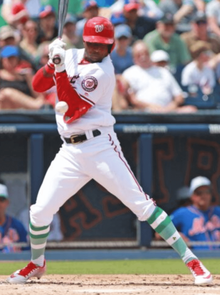
As for other sports and leagues:
NHL
Some teams playing yesterday — but not all of them — wore holiday-themed sweaters for the pregame skate:
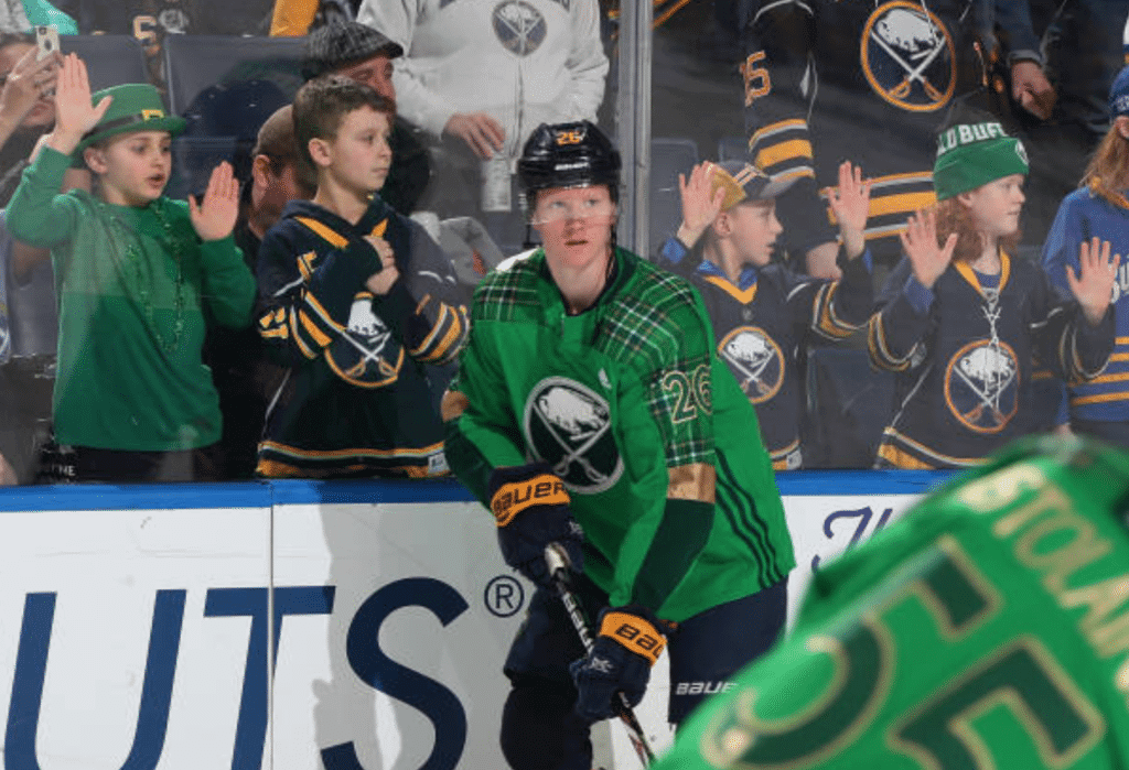


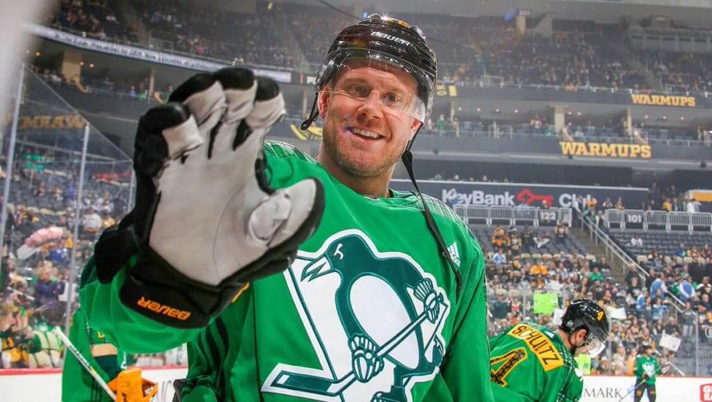
Disappointingly, the Devils didn’t wear their green-trimmed throwbacks, I guess because they were on the road. I realize that they like to save that design for home fans, but it seems silly not to wear it on March 17 when you have it in your wardrobe.
More teams wore green on Saturday, and at least one will do so tomorrow. That’s holiday creep for ya.
College Baseball
Can’t stop the Shamrock☘️
Happy St. Patrick’s Day! Let’s win a series! ☘️#GoIrish #PassTheShillelagh pic.twitter.com/hItEK0QbsH
— Notre Dame Baseball (@NDBaseball) March 17, 2019
Good look at St. Patrick’s Day Alternates @OU_Baseball is rocking today #Sooners @UniWatch pic.twitter.com/tDG6Y06eXl
— Josh Callaway (@JoshCallaway714) March 17, 2019
The Lions wrap up the opening weekend of WCC action tomorrow.
Grab your ticket and limited edition St. Patrick’s Day hat TODAY!
🧢 » https://t.co/K38d6vwYSZ#JoinThePride pic.twitter.com/aGiNQfBjJm
— LMU Athletics (@lmulions) March 17, 2019
The lid for #StPatricksDay
🔴#WreckEm⚫️ pic.twitter.com/8e1XEsClb6
— Texas Tech Baseball (@TTU_Baseball) March 17, 2019
Golf
Here are @JustinThomas34 #StPatricksDay inspired shoes for today via his Instagram story. @UniWatch @PhilHecken pic.twitter.com/N6FEmD22Aq
— Chicago Gump (@GriffinTSmith) March 17, 2019
Lacrosse
Three NLL teams wore holiday uniforms on Saturday night — the Calgary Roughnecks, San Diego Seals, and Toronto Rock:
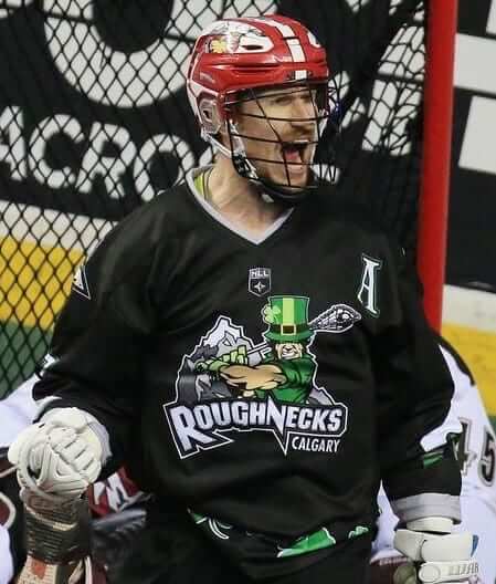
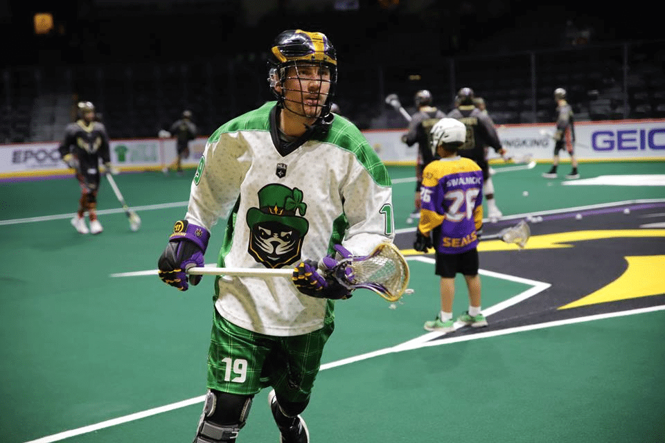
A live look at warm ups. Looking good in green 👍🍀 pic.twitter.com/pJEjEst92I
— Toronto Rock (@TorontoRockLax) March 16, 2019
Uni Watch Readers
The @UniWatch alternate cap is pretty much the perfect color scheme for a St. Patrick’s Day outing. pic.twitter.com/ejDgE1vCJG
— B-Dilly (@Titan4Ever2488) March 17, 2019
@UniWatch On this day, going old school pic.twitter.com/GfLAPeSXNh
— Keith Jones (@scorch99) March 17, 2019
Uni Watch reader Brian Anderson's son wearing Brian's UW St. Paddy's Day T-shirt, which Brian purchased when we first offered it as part of the Uni Watch T-Shirt Club back in 2015. pic.twitter.com/hLQMfGIVXZ
— Paul Lukas (@UniWatch) March 17, 2019
Time to break out this #StPatricksDay treasure from @UniWatch – someone who get's it and knows to use #ShamrocksNotClovers ☘️🇮🇪 pic.twitter.com/eqtoLXQ0Pf
— Shamrock Watch (@ShamrockWatch) March 17, 2019
I’m sure this was just the tip of yesterday’s green iceberg. If you know of other teams that wore green yesterday, feel free to post photo links in today’s comments.
(My thanks to all contributors, including Wade Heidt, Alan Kreit, Matthew Lerman, Chip Powell, @CaliGlowin, and our own Alex Hider and Jamie Rathjen.)
Click to enlarge
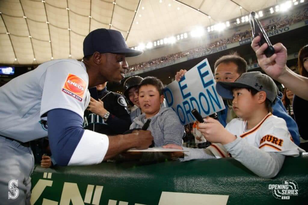
MLB ad patch update: When it was revealed last month that the A’s would be wearing an MGM Resorts advertising patch for their season-opening series against the Mariners in Tokyo, the word through the grapevine was that the M’s would reveal their own uni ad at a later date.
The Mariners are now in Japan, where they’ve been playing a series of exhibitions. And although there’s been no official announcement (which seems odd), we can see that their ad is for the Japanese petroleum company Eneos.
As I explained last month, it’s standard (if depressing) practice for MLB teams to wear uni ads for season-opening games in Japan, dating back to 2000. Full details on that here.
Click to enlarge
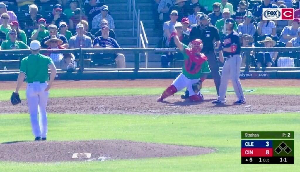
Can’t tell the player even with a scorecard: They always say you can tell a player won’t make the final roster cut if he has a high uni number. But what if he has no number?
That was the situation in the sixth inning of yesterday’s Red/Indians game, as Cincy brought in pitcher Wyatt Strahan, who wore a jersey that was blank on the back. He had the proper graphics on the chest and sleeve, so at least he looked good from the front — but not from the back.
(My thanks to @bs_brewer for letting me know about this one.)
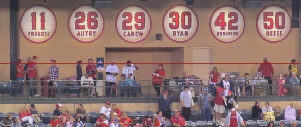
Angelic problem: With MLB roster sizes set to increase from 25 to 26 next season, reader Daren Landers raises a good question: What will the Angels do about No. 26, which they retired for Gene Autry as the “26th man”?
They can’t really change it to 27, since that was Vlad Guerrero’s number and is currently Mike Trout’s number (presenting a thorny number-retirement problem of its own).
This really highlights the absurdity of retiring numbers for owners and executives, which they never should’ve done in the first place. (That noise you just heard is reader Mark in Shiga about to fire off a comment saying that all number retirements are absurd. Love ya, Mark!)
While we’re at it: Kinda disappointing that the Halos’ retired numbers are all rendered in the team’s current typographic style, no? Come on, guys — make them era-appropriate!
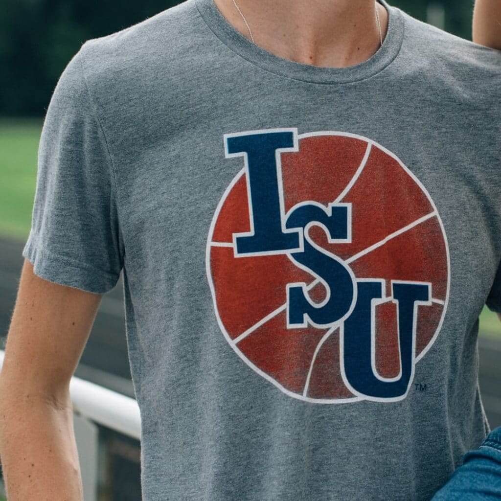

ITEM! New raffle: With March Madness about to get underway, we have a new raffle from Homefield Apparel, which specializes in T-shirts and hoodies from smaller schools– mid-majors, DII, even DIII. Two lucky Uni Watch readers will each get to choose any item from Homefield’s site.
To enter, send an email to the raffle address by this Thursday, March 21, 7pm Eastern. One entry per person. I’ll announce the winners on Friday.
Meanwhile, speaking of raffles, the winner of the free membership that was purchased and donated by a generous reader is Brent Light. Congrats to him, thanks to all who entered, and doubleplusthanks to the reader who donated the membership.
ITEM! Help ring in spring: Last spring I wrote about the excellent double play machine built by artist Mac Premo, who’s become a good friend. He has something special planned for next Tuesday, March 26. Take it away, Mac:
Folks, it almost Opening Day. So let’s celebrate the joy that every baseball season brings. Let’s take that joy to the streets. Let’s have a catch.
It is an exquisite thing to have a catch. Without the exchange of even a single word, a good catch becomes a temporal poem of hope and heritage. It is intimate, it is tremendous, and it is divinely pointless. To have a catch is joyful.
On Tuesday, March 26, at high noon, we’re going to have a catch around an entire Brooklyn block. Then we’re going to share a couple of 8′ party subs from Paisanos Deli, maybe a couple beers.
To make this happen, we need about 40 people. So, here’s the ask: You got a glove? Can you be at The Invisible Dog Art Center on Bergen Street in Brooklyn on Tuesday, March 26, at around 11:30am? Are you cool with us documenting this whole weird thing on film? And most importantly, you wanna have a catch ‘round the block and then eat some party subs?
If the answer is really and truly YES, then let us know ASAP. Let’s have a catch. EVERYONE welcome.
Doesn’t that sound like fun? I’ll definitely be participating. If you want in, let Mac know (he’s trying to get a head count) by posting a comment to this Facebook post. If you don’t do Facebook, just email me and I’ll take it from there. Thanks.

Click to enlarge
Going, going…: Today is the next-to-last day to bid on the one-of-a-kind Uni Watch jersey made by the awesome Wafflebored. Full details, including a rear-view photo, the jersey’s measurements, how to bid on it, and more, can be found here.
The Ticker
By Jamie Rathjen

Baseball News: The Diamondbacks are filling in the path from the mound to home plate this season. … Michigan wore fauxbacks intended to evoke the 1962 national championship team. … Also posted in hockey: Jason Hillyer sent us an article about minor-league promotions focused on Portland, Maine’s ECHL and Double-A baseball teams, who are both changing their names for one game this year. … The baseball team at Pittston (Pa.) Area HS, whose teams are called the Patriots, uses a version of the Mr. Redlegs cap logo modified to wear a colonial-era outfit (from Art Savokinas). … Check out this shot of the 1971 Winnipeg Whips, an Expos farm team. Interesting to see that the player in the foreground has the 1969 MLB centennial sleeve patch — clearly a recycled Expos jersey (from Daren Landers). … Also from Daren: One of the Reds’ spring training batboys has a jersey that’s blank on the back, while another has very un-Reds-like typography.

Football News: The AAF’s San Diego Fleet became the latest team in the league to debut a white jersey (from Richard Bronish).
.

Hockey News: The ECHL’s Cinncinnati Cyclones did a Black Panther promotion this weekend (from Brian Henke). … Speaking of minor-league promotions, Jason Hillyer sent us an article about such promotions focused on Portland, Maine’s ECHL and Double-A baseball teams, who are both changing their names for one game this year.

Basketball News: Reader Robert Brashear spotted Harvard/Yale frankenjerseys at yesterday’s Ivy League championship for the Feinberg brothers: Yale guard Michael and Harvard guard Robbie.

Soccer News: German 2. Bundesliga team FC Ingolstadt wore shirts saying “Right wingers? Only in a 4-3-3!” yesterday. The reference was to Ingolstadt’s last game against Union Berlin, when Ingolstadt captain and Israeli international midfielder Almog Cohen received an anti-Semitic tweet from a Union Berlin fan after being sent off. … A-League teams Wellington Phoenix — the Australian league’s team in New Zealand — and Western Sydney Wanderers wore black armbands for the Christchurch shootings. … New Vancouver Whitecaps midfielder Hwang In-beom had his NOB spelled wrong this weekend (from Steve May). … The NWSL’s Washington Spirit wore last season’s kit without the primary ad for their first preseason game. … Spain’s La Liga is reportedly to switch ball manufacturers to Puma from Nike, with the reasoning that leagues which use Nike balls, including the NWSL, the Premier League, and Serie A, all get the same ball (from Josh Hinton).

Grab Bag: The Crusaders, the Super Rugby team based in Christchurch, New Zealand, are open to changing their name after this week’s shootings. The team yesterday said their name does not reference the Crusades, even though their logo and mascots sure do seem Crusades-inspired. … More Christchurch: the New Zealand and Australia men’s and women’s field hockey teams played each other this weekend and all wore black armbands. Australia’s women did likewise Saturday against Argentina. … The women’s teams at Australian Football League clubs Carlton and Western Bulldogs played a pride game this weekend, featuring rainbow accents for both teams.
The Milwaukee Wave (Major Arena Soccer League) wore green on St. Patrick’s Day.
link
So did Utica City, whose unis are normally as blue as their turf.
link
Both the Notre Dame Baseball and Softball teams wore all-green yesterday, as one would suspect. The Softball team has its numbers in the middle of the tops instead of off-center though – plus they are pullovers and not button-ups.
link
Check that, both are pullovers.
“Kinda disappointing that the Halos’ retired numbers are all rendered in the team’s current typographic style, no?”
What bothers me even more than this is when teams render Jackie Robinson’s uniform number in their own style (like the Angels do). It looks hilariously bad. I enjoy what the Mets (and maybe other teams do, I’m not sure) of putting it up in the Dodgers’ font/color. [INSERT JOKE ABOUT THE WILPONS ACKNOWLEDGING DODGER HISTORY MORE THAN THE METS’].
Fenway has the Red Sox’ retired numbers in red and 42 in blue.
The Phillies went in a different direction altogether – they chose a name/number font which has never appeared on a game uniform or in a team logo for the retired numbers and rendered Jackie Robinson’s #42 in blue.
The Reds weren’t the first team to wear green. The A’s wore green for years before the Reds.
Oh, FFS. First team to do so *for St. Paddy’s Day.*
The Brooklyn Dodgers wore green decades before the A’s, btw (but not for St. Paddy’s Day):
link
FFS. Love it.
fee for service? why is my day job intruding on Uni Watch? ;-)
He’s right. The Reds aren’t special. What’s the A’s gotta do? NOT wear green on St. Patrick’s day?
FFS should be tossed in the direction of that STUPID “first to wear green” patch. Really? We’re celebrating a jersey worn once a year? A celebration of the celebration jersey. What’s next, a patch commemorating the “first to wear green” commemorative patch. GTFO
Surprised Paul hasn’t amended the Reds “First to wear green” even though it’s been 100% proven the Phillies were the 1st to “*for St. Paddy’s Day.* “…unless there’s additional parameters…like “for Spring Training…on a Sunday…in Florida…”.
I always thought Paul was the first to call out the BS…not give a reason to defend it.
Here’s a thought:
1) All MLB teams — and many other teams throughout the uni-verse — now wear green on March 17.
2) Any way you want to slice it, that gimmick (or tradition, or whatever you want to call it) started with the 1978 Reds.
3) Personally, I don’t see a spring training gimmick as something to be especially proud of. But if the Reds want to be proud of it, I don’t see the problem with that.
All this other nonsense (the A’s, the Phillies, etc.) is just pettiness, trying to play gotcha, etc. Back here on planet Earth, the Reds started this trend, for better or worse, the end.
A happy uni coincidence for NHL scheduling during St. Patrick’s Day. The two teams that wear kelly green as part of their usual colour scheme played each other yesterday. Vancouver Canucks at Dallas Stars.
link
Interesting to note that the Red Sox had a split squad game yesterday and only went with green jerseys for their home game. The crew that traveled to play the Pirates had on red jerseys. (The Pirates were in their black tops.)
link
Is “have a catch” a regional thing? I also recall hearing it on “Always Sunny in Philadelphia” years ago, and just sounded odd to me. I grew up and live in Chicago, and we always have called it, or at least everyone I knew, “play catch”. As in “let’s go play catch” instead of “let’s go have a catch.”
A hotly debated topic:
link..69i57j0.3040j0j7&sourceid=chrome&ie=UTF-8
Grew up near St Louis. Always “Let’s play catch.” The first time I heard “Have a catch” was in “Field of Dreams.”
Born and raised in Ohio. I always heard it and said it as “playing catch.”
Also, we referred to “pickle” as “hot box.”
In INDIANA it’s “play catch” not “have a catch” – I find that incredibly ODD. Have a catch?
Same with “on line” and “in line” Here we stand “in line”
Regional it must be.
I also grew up playing a game we called “Hot Box” that I’ve heard others call “Pickle”
When I moved to Indiana as an undergrad from the Mid-Atlantic, the regionalisms I noticed most ..
Soda (or Coke) vs pop
Bag vs Sack
Born and somewhat raised in Iowa, and the first time I ever heard “have a catch” was also “Field of Dreams.” One plays catch in the Midwest, or as far as I can tell most of America.
In PA, 100% “play catch.”
One for the soccer ticker: Internazionale (Inter Milan) broke out their 20 years of Nike mashup jersey for the Milan derby last night
link
A couple of NASCAR St. Patrick’s Day observances?:
Kyle Busch (though it may have been a sponsor-driven coincidence):
link
Joey Logano (race/car sponsor green cap, but car was red/white/blue):
link
Not sure I’ve seen a team place their logo on the socks before – as this University of Alberta Golden Bear player shows (they played yesterday for the national championship)
link
Not sure if you meant to be speaking strictly about hockey, but lots of teams in other sports have worn team logos or wordmarks on their socks.
Did you just mean hockey?
Sorry just hockey, the other point I would make is that logo, appears in seven different spots on that picture (which isn’t from the championship game, although the uni looks to be the same)
It has actually been fairly common with the Canada West university hockey teams in past few years. Of the top of my head, both Mount Royal and Calgary had it over at least the past 2 years.
link
link
Wade you are one impressive book of knowledge. I will say, to me it looks akin to the kid who gets a sticker book and ends up plastering them in a few too many places
I don’t think I’ve asked this before, but Wade do you remember this style of sock – see Bobby Orr I played pee-wee hockey in the early 70’s and there were still remnants of that design. I wonder if it was considered the avant garde for the day?
link:
Hi Oakville Fennel,
I appreciate the compliment! Just being a uni watcher and noticing the details like many of us. It is in my backyard.
Keep an eye on university hockey as I will drop in on a UBC hockey game usually once a year.
About the question with the Bobby Orr socks, I really don’t know if it was avant-garde. Have seen that design before though with the different colour on top of the knees.
Not everyday that I open Uni-Watch and see my face plastered here… lol. (I’m B-Dilly with the alternate cap). Got some nice compliments on it Paul, though most people thought it was Addidas and one person thought it was a Cavs cap (maybe because of the Goodyear ad patch they wear?)
B-Dilly, were you drinking at a Mexican restaurant on St. Patrick’s Day?
there is a good historic link
Yup. It’s our go to restaurant/bar, and honestly all of the “Irish” places in the area get flooded with college kids St. Paddy’s weekend, which I’m a tad too old for these days.
He had the proper graphics on the chest and sleeve, so at least he looked good from the front — but not from the back.
Yep, he looked just as bad as every pre-1930s ballplayer. Someone get him a number quickly!
Angels: keep Autry’s 26 retired. If you switch it to another number, who’s to say that MLB won’t add more players to the roster in the future? Same thing if the NFL ever wises up and adopts CFL rules…the Seahawks should still keep 12 retired in that case.
The Phillies wore green for St. Patrick’s Day – in 1899.
link
Don’t forget to to include the A’s and their St. Paddy’s Day cap
link
The Crusaders have a long history in New Zealand professional rugby. Sad to see the reaction to one complete idiot being the rebranding of a team to make people feel better. Makes no sense.
Yeah, just imagine — doing something to make people feel better!
Madness!!
I’m sorry Paul your sarcasm falls short here, still in favor of keeping the name
So because there’s history of violence between Christians and Muslims that goes back to the crusades, we’re going to make people feel better by changing a team name from Crusaders? All because some idiot who claims to be a christian and shot up a Mosque?
That’s like getting a flat tire on a car and hoping you fix it by changing the oil.
Here’s a crazy thought: Maybe we should leave this for the Kiwis to decide. Since they somehow manage to have these mass killings only once in a generation instead of every other Thursday like us, maybe — just maybe — they’re better equipped to address their own tragedy than we are.
Just maybe.
Let’s please move on. Thanks.