[Editor’s Note: Paul is on his annual August break from site. Deputy editor Phil Hecken is in charge from now through the end of the month, although Paul is still on the clock over at ESPN and may be popping up here occasionally.]
By Phil Hecken, with Chance Michaels
Follow @PhilHecken
I’d been planning hoping to do an article with my buddy (and several time UW contributor) Chance Michaels (with whom I’ve had dinner and “enjoyed” Mets games, as well as a few UW parties); Chance also happens to be the (or “a”) Historian on the previous iteration of the Milwaukee Brewers — the minor league team who played in Borchert Field from the early years of the 20th Century until basically the Braves moved into town. Chance has a fantastic idea to combine Milwaukee baseball history with the 2019 Brewers to create a brand new “throwback” for the team to wear. A “Modest Proposal” if you will. When Chance tweeted that out earlier this month, we knew this would be our August post. I’ll just turn it over to Chance here, as this is one you’ll definitely want to read through!
A Modest Proposal for the Chicks’ 75th
By Chance Michaels
Uni Watch readers with long memories may recall that way back in 2013 I collaborated with the Milwaukee Brewers on a 1913 Turn Back the Clock event, commemorating the centennial of the old American Association Brewers’ first championship. I had lobbied the club for some time to recognize that chapter in the Cream City’s baseball history, and was fortunate enough to see it come to pass.
Today, I’m trying to do it again.
Back in March, I called for the Brewers to recognize the Milwaukee Schnitts in 2019. And just this week, my public campaign kicked into high gear (complete with obligatory Change.org petition).
The who, you say?
Okay, howsabout the Milwaukee Chicks? Does that one ring any bells?

The Milwaukee Chicks, also known as the Milwaukee Schnitts, originally intended to be known as the Milwaukee Brewettes, was the city’s entry in the All-American Girls Professional Baseball League.

We’ve all seen A League of Their Own. You can’t be a baseball fan if you haven’t; it’s in the fine print on the back of your ticket. So we all know the basic story. Major League owner is concerned that the draft will take his best players and hurt the sport, so he recruits young women to play in a small Chicago-based league. They play hard, win over fans, Dottie drops the ball, and the Racine Belles win the 1943 Championship. Right?
As it turns out, the film isn’t that far off. Sure, they fictionalize elements, trading Walter Harvey and his Harvey Bars for Philip K. Wrigley and his family’s eponymous gum. And it was the Kenosha Comets, not the Rockford Peaches, who lost to Racine in the championship series. But many of the elements had a basis in historical fact: the charm schools and chaperones, the former big-leagers managing, the women recruited from all over the country who came to the Midwest to play the game they loved.
There’s a lot for us to love in the design history of the league. Wrigley (and his partner Branch Rickey) introduced a standard AAGPBL uniform template, designed in part by Otis Shepard. Shepard was a master of mid-century design who worked on all Wrigley’s projects. He started with the gum company, and in 1937 moved over to the Cubs, bringing us some truly classic uniforms. Seems natural Wrigley would tap him again for the All-American League. Shepard worked with Phil’s wife Helen Wrigley and utility player Ann Harnett of the local Chicago leagues. Taking inspiration from figure skating costumes and tennis whites, they created a one-piece, short-sleeved, belted “tunic” that ended in a flared skirt. The tunic itself was made in different colors for the various teams. They topped it off with a one-size-fits-all caps with elastic bands inside the crowns.
 The first four players signed by the league show off prototype uniforms. Back, left to right: Clara Schillace, Ann Harnett (who helped design them) and Edie Perlick. Front, seated: Shirley Jameson. The letters reflect the league’s original name “All-American Girls Softball League”, changed midway through the first season. Photo credit: Northern Indiana Center for History Collection
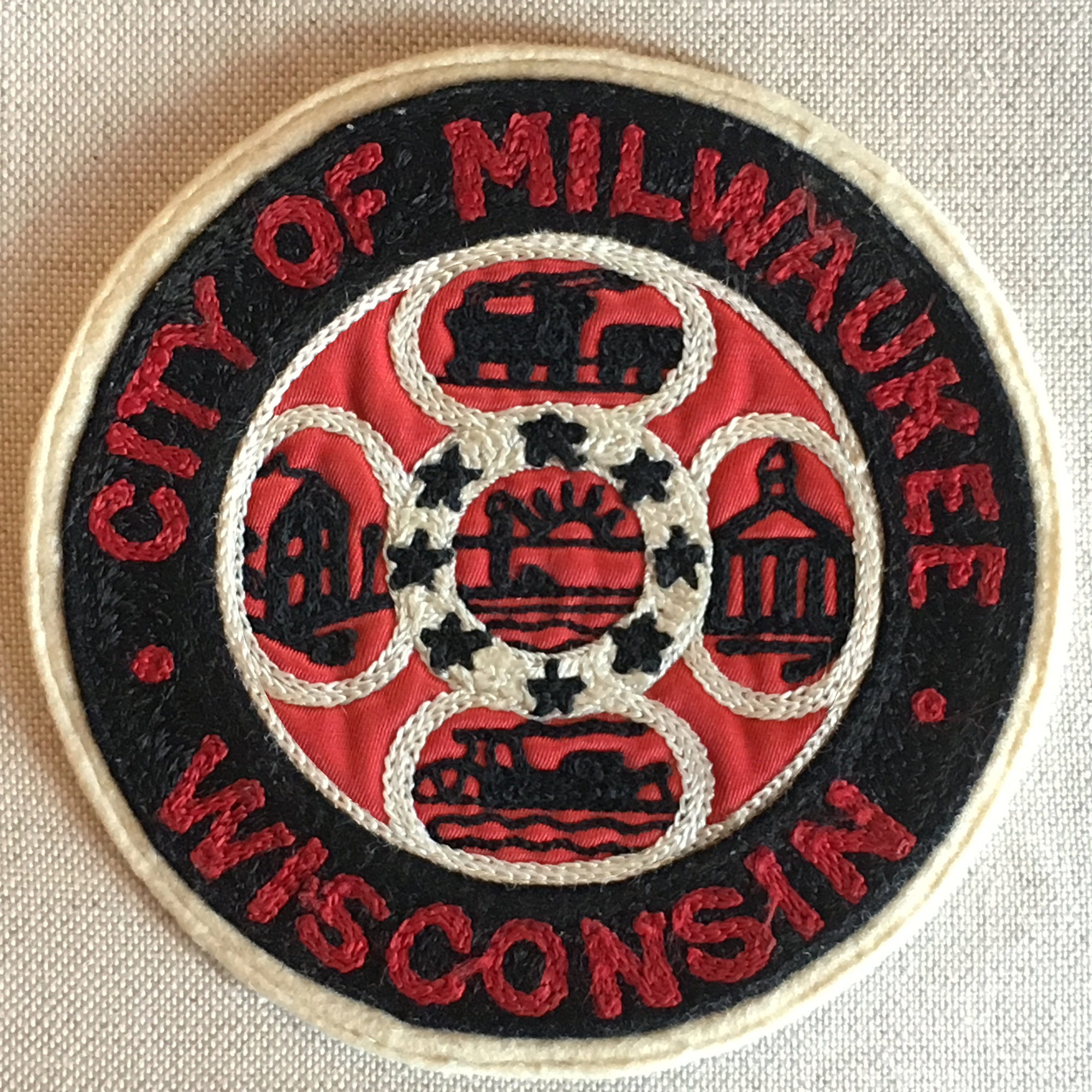
Aside from the colors, the only team identifiers were a city initial on the caps and a patch on the players’ chests. I find those patches fascinating, since they were all adapted from the home cities’ official seals, surrounded by the name of the city and state. That’s a detail that was changed for the movie, as the costume designer removed the state name and replaced it with the club nickname.

Personally, I think the filmmakers were trying to downplay the Midwest roots and universalize the story. Or maybe they just thought we’re too accustomed now to seeing team names on uniforms. In any case, if you’re buying “Rockford Peaches” merchandise that says “Peaches” it’s from the movie, not the league.

Shepard also turned his design talents to the program. The league used one standard design for all teams, featuring his classic artwork on the cover. Simple, and simply gorgeous.
Back on the diamond, the project started well. The inaugural season featured four teams: the Rockford (Illinois) Peaches, Racine (Wisconsin) Belles, South Bend (Indiana) Blue Sox, and Kenosha (Wisconsin) Comets. For the sophomore year Wrigley and Rickey decided to expand their league. Specifically, they expanded into Minneapolis and Milwaukee, two mainstays in the American Association, which was a high-level independent minor league at the time. Two outstanding baseball markets, with good stadiums in place, not too long a bus ride from the existing the AAGPBL markets. Must have seemed like a good idea.
It was a disaster.
The Minneapolis team, originally named the “Millerettes” after the AA club, was forced out of the stadium they shared with the Millers and played the second half of the season on the road, earning the nickname “Minneapolis Orphans”. Understandable, perhaps, that the Orphans finished the 1944 season 45-72, a whopping 26½ games out of first place.
The Milwaukee club, there was something better. They were also given a kid-sister name, the “Brewettes”, but as far as I can tell nobody ever actually called them that. By the time the season started the two great Milwaukee newspapers had each bestowed a different moniker upon the women.
The Milwaukee Journal, the city’s evening paper, dubbed them the “Schnitts”. For those of you not from Milwaukee (or Munich), that is an old Bavarian term for a half-pour of beer. The bartender gives a quick burst out of the keg, and your glass ends up filled more or less equally with beer and foam. It’s usually intended to tide you over at the end of your night of drinking, a sort of “one for the road” when you don’t want a whole one. Trust the wags in Milwaukee to employ an obscure tavern term. Schnitts had also been the name of a short-lived low-level minor league baseball club that shared the Brewers’ Borchert Field in the nineteen-teens, so maybe the Journal‘s sportswriters also had long memories.
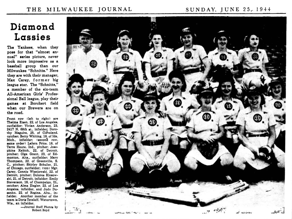
Not to be outdone, the morning paper, the Milwaukee Sentinel, came up with its own nickname: the “Chicks”. Although today this may seem an outdated and somewhat-sexist term (what, was “broads” taken?), there’s actually a bit of cleverness behind it. The Milwaukee manager was a former outfielder named Max Carey, who would eventually be elected to the Hall of Fame by the Veterans’ Committee in 1961. Somebody at the Sentinel remembered an RKO Radio Picture called Mother Carey’s Chickens, or the 1911 novel it was based on, about a close-knit hardscrabble family at the turn of the last century. Max Carey = Mother Carey, Chickens = Chicks, and there you have it.
It’s worth remembering that AAGPBL names were relatively unofficial in those days. Just as they wore city/state on their uniforms, the league used city names to identify them in all league documents. The ads they ran in the Milwaukee papers identified the team variously as “Our Milwaukee Team”, or a combination of “Milwaukee’s Own Team” and simply “Milwaukee”.
Myself, I tend to prefer “Schnitts” as a moniker. Sure, it sounds a bit rude, but drinking slang appeals to me. And even if the half-pour could be read as a joke comparing the women to the “Brews” with whom they shared the ballpark, it still seems a lot more respectful than “Chicks”. The latter is, however, the name in common use today.
It wasn’t until after the 1944 season that the league really fully embraced the “Chicks” name, but by then they were gone. A good deal of the team’s problem was having to take leftover dates at Borchert Field after the Brewers had their pick; both clubs made the postseason, but while Casey Stengel’s Brewers were thrilling the hometown crowds at Borchert Field, the Schnitts were forced to play all seven games of their championship series on the road. That second-hand schedule also meant they played most of their games in the afternoon, while other AAGPBL clubs played the more preferable night games. And all the while, the league was asking for 95¢ for General Admission, $1.40 for Box Seats and Reserved. Exactly the same prices that the Brewers were asking and getting.

The league tried a series of promotional events to get fans out to Borchert Field—including double-headers with a Milwaukee Symphony concert(!)—but in the end the hurdle was too high to leap. The league moved the Schnitts to Grand Rapids, Michigan, where they were forever the Chicks even though Mother Carey didn’t move with them, leaving the club to become the AAGPBL’s president. And that’s another reason to prefer “Schnitts”, being solely used in Milwaukee. The Minneapolis Orphans moved to Fort Wayne, Indiana, where they became the “Daisies”.
The Schnitts, never truly beloved, quickly faded into baseball obscurity. As did the league itself. Then the National Baseball Hall of Fame and Museum launched its “Women in Baseball” exhibit, Penny Marshall made A League of Their Own, and people started to have an interest in these oft-forgotten teams. The University of Wisconsin-Milwaukee interviewed a number of former Chicks players for an oral history project entitled “The Forgotten Champs”. And even with the increased attention, I’d wager most baseball fans in Milwaukee itself know far less about their one-season club than I’ve written here so far.
Now, our current Brewers are better than most. They hosted a reunion of AAGPBL players back in 2000, and have a small tribute to their predecessors in a Miller Park concourse. The effort was there, but the final result is somewhat lacking. The uniform on display is terribly inaccurate; the patch is all the wrong colors, filled with too much detail, and insists on adding the nickname they never wore.
And that’s why I’m doing this. We can do better by this club, we can do better by these players. 2019 is the 75th Anniversary of that single-season wonder, those Milwaukee women who brought home a championship. A perfect time to educate, to commemorate, to have some fun in the process.
So, now we’ve covered the why. Let’s talk about the what.
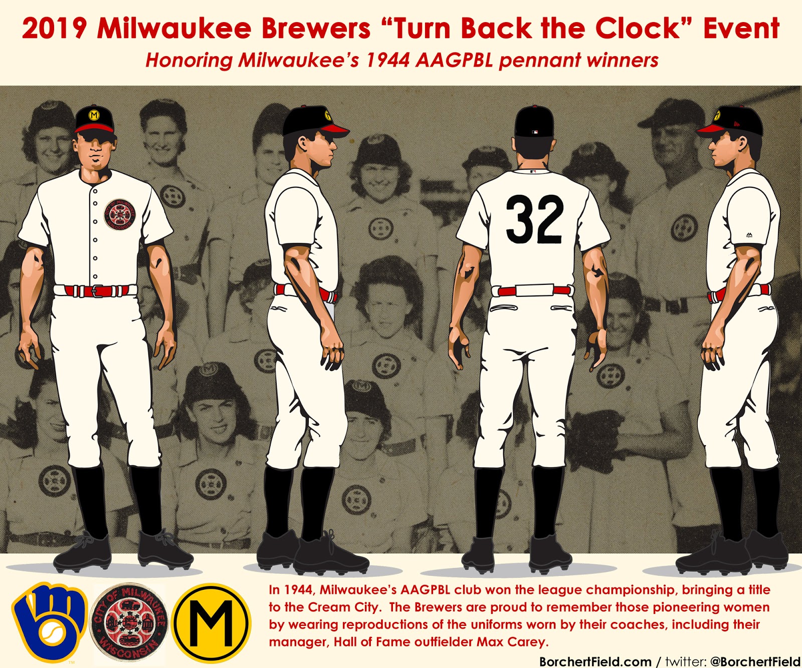
I know what you’re thinking. You’re thinking about the short-skirted tunics. But we have the perfect template for a male version of the Schnitts’ uniform, that worn by Max Carey himself. Going back to A League of Their Own, think about the Tom Hanks character.
Managers wore a version of their clubs’ uniform on a traditional baseball template. In Carey’s case, it was a solid white flannel uniform, with the city seal over his heart. As with the other teams, it was a variation on Milwaukee’s four-lobed city seal, rendered in gorgeous black, red, and white chain stitch.

The uniform numbers were single-color black felt. They used a style originally designed for the Cubs by Shepard back in the 1930s. Can’t blame Otis for playing some of his old hits; it’s a beautiful number font, simple and elegant yet distinctive.
I had this custom jersey created by the good folks at Ebbets Field Flannels, to give us an idea of what the Brew Crew could look like.


I chose “24” for the back because the AAGPBL Players Association credits 24 women as having played for the club.
It’s important that the Brew Crew uses the correct uniform logo. We’ve already seen the inaccurate one currently on display at Miller Park. The AAGPBL Players’ Association recently introduced a new version for their own merchandise. It’s much closer than the other, but still not quite right. The most accurate rendition should be black and red, with thick lines to indicate chain stitching.
The caps were a little more difficult to track down. If I could wring three totally separate full-length articles out of inconsistencies surrounding the merchandise of a Major League team as famous as the Brooklyn Dodgers, it should surprise nobody that the few Schnitts caps commercially available are all various degrees of incorrect.
Until recently, the AAGPBL Players Association (which has assumed control of league trademarks) licensed reproductions of the teams’ uniforms. The cap they offered for Milwaukee was black with a red bill and squatchee, sporting a black M in red circle. The erstwhile Cooperstown Ball Cap Company also made a version for sale, but theirs had a gold circle with narrow black M. Neither of these was correct.
Looking at this picture Vivian (Anderson) Sheriffs at an AAGPBL event shortly before her death in 2012, and a picture of her from 1944, you can see how inaccurate the CBCC cap really is.


From period photographs, we know that the Chicks’/Schnitts’ cap logo was a sans-serif black “M” in concentric circles of gold/black/gold.
Translated into a modern cap template from New Era, it would look something like this:

And yeah, I know. Logo creep. But we can only fight one battle at a time. At least I made it red and not gold.
So there you have it. We could have a unique and fitting Turn Back the Clock tribute to this amazing group of women.
We could have trivia and photos on the Miller Park scoreboard. Perhaps a bobblehead giveaway. Or a t-shirt. Maybe the Brewers could screen A League of Their Own after the game. They could also invite members of the WWII Girls Baseball Living History League, who keep the AAGPBL alive by playing vintage games by 1943 rules in vintage uniforms. Sadly, there are no surviving players from the Schnitts’ 1944 roster, but some of them had daughters and granddaughters, nieces and grandnieces, who could throw out a first pitch (possibly even the families of third-sacker Vivian Anderson or pitcher Sylvia Wronski, the only Milwaukeeans on the team).


I know this seems like a quixotic quest. But I’ve been lucky enough to see it happen before. In 2013 we introduced a whole new generation of Milwaukee baseball fans to the heroics of a club that played decades before most of them were born. Given the contributions of these women to the history of baseball in our country, they deserve no less.
I hope you will help. If you’re in Milwaukee, contact the Brewers and let them know what we want. If you’re a season ticket holder, contact your rep. And everyone please sign the petition at Change.org. Together, we can make this happen.
Thanks, Chance! Man I hope the Brewers take you up on this modest proposal. What an incredible idea/concept. Make sure you guys sign the petition! This is one throwback I really want to see on the field!!!

It’s “Christmas” In Jersey Again

Yesterday afternoon, this story popped up in my “uniforms” google alerts, tipping us off to a potential third sweater for the New Jersey Devils:
New Jersey Devils: A Third Jersey Is Coming https://t.co/OgdFzL2tEc
— Phil Hecken (@PhilHecken) August 21, 2018
Usually, such crypticness keeps us in the dark for a day or so (especially since there was no real advance news of this, nor any leaks). However, not long after, the Devils officially announced they’d be wearing a third jersey for 2018-19, and (not really unexpectedly) it’s a throwback to their 1982 season — their first in New Jersey. The hype video came first…
A Jersey classic returns. https://t.co/Agvli8EdZJ pic.twitter.com/59cm9JsVZR
— New Jersey Devils (@NJDevils) August 21, 2018
It turns out this is NOT their “official” third sweater — this is what’s known as a “heritage” jersey. There is a difference, as our pal Chris Creamer explains:
The main difference between the two classifications deals with how often they can be worn and commitments to future seasons. A “heritage uniform” can only be worn a maximum of six times per season and can be scrapped after one year while a third or “alternate” uniform must be worn a dozen times and for at least three seasons.
It’s possible the Devils could still introduce an actual official “third” jersey before the season starts. So what’s the heritage jersey look like? Well, you’ve seen it before:


Beautiful, right?
I haven’t seen any dates announced of when they’ll wear this, but I did see in a few tweets that it will be worn four times this season.
And here it is.#NJDevils will wear these 4 times next season at Prudential Center. pic.twitter.com/w0FfTsl5sm
— Devils Insiders (@DevilsInsiders) August 21, 2018
Here’s a closeup look at the shoulders:

The Devils are one of the few teams who don’t really (and haven’t ever) have a third jersey. They have brought back the red jersey with green striping (and green breezers) a few times, but never the white/green/red jersey.

This will be the first time in like 3 decades the white sweater with green/red sees the ice.
Because this is not an official “Third” jersey, there is speculation the team will re-introduce the red jersey with green (similar to the one shown above) OR possibly introduce a black alternate jersey, which can be worn with the existing pants. Either way, the white “Christmas” jersey is back!
If you look at the photo above which shows the rear view of the jersey (it has the large “18” #OB), you can see they’ll have green pants with this — which might be a clue to a possible third red/green jersey. Or maybe not. We’ll just have to wait and see.
I’ve never liked the Devils unis (as much) as I did when they had the red/green color scheme. Here’s how that original uniform looked on ice. If these look as good (and they should, based on the photos), we’ll be in for a treat at least four times this year!


It may only be August, but it looks like Christmas came early for Devils fans.

Kreindler’s Korner
I had the distinct pleasure of featuring the wonderful artwork of artist Graig Kriendler on two occasions over the summer and fall of 2017, and more recently, in August of 2018.
For those who don’t wish to click the links, Graig paints baseball heroes (and regular guys) from the past, and is an immense talent.
Occasionally, I will be featuring his work on Uni Watch.
Here’s today’s offering (click to enlarge):

Title: “Hans”
Subject: Honus Wagner, 1902
Medium: Oil on linen
Size: 16″ x 22″Like a multitude of baseball card collectors, I’ve always been fascinated with the T-206s. A card set that was dispersed by means of cigarette and loose tobacco packs, it circulated between 1909 and 1911. Consisting of 524 cards through 16 different brands that were owned by the American Tobacco Company, the set is best known for including a card of Honus Wagner, which to this day is widely considered the Holy Grail of the card collecting industry. The rarity (and story behind that rarity) of the card accounts for its desirability, which was a hot item among early collectors of the set merely a decade or two after its release. The most expensive example to ever sell fetched almost three million dollars, still the most ever paid for a baseball card.
The appealing part of the set to me lays in the images used in the lithography process. The majority of the studio portraiture came from the lens of the Swedish-born Carl Horner, a photographer who was based out of Boston, MA. One of the earlier lensmen of the sport, his depictions of players from the Deadball Era were known for their striking clarity and rich tones. In addition to finding a home in the world of baseball cards, Horner’s work also appeared in numerous newspapers, magazines and board games that were consumed in those first decades of the 20th century.
When I started getting serious about painting portraits of baseball players, I was immediately drawn to those same images that were used to create the T-206 set. I had always envisioned having a gallery show displaying paintings of just those subjects found in that issue – kind of a life-long project. I didn’t want to just paint the faces of these men as they related to the cards, especially considering many of the colorful pastels found in the backgrounds – though those motifs lent themselves nicely to the card designs, I was after a more true realism. It was my goal to try and mimic what it was that Carl probably saw in his viewfinder when he himself took these portraits: polished faces of tough men in their clean uniforms, lit by a northern skylight and backed by a simple muslin curtain, seemingly gazing into the ether.
The Wagner painting was my first attempt, and definitely not my last.
Thanks, Graig! You can (and should!) follow Graig on Twitter.
The Ticker
By Alex Hider

Baseball News: The A’s hosted children from the Make-A-Wish foundation before Monday night’s game, and LF Khris Davis let one of the kids sign his jersey. He played the entire game with the signature on his jersey and even homered (from Michael Miller and Mike Chamernik). … Ed Kalas was walking by the Fenway ticket booth and noticed one sign that had a Sox logo that he’d never seen before. … The Tri-City ValleyCats, the Short-A affiliate of the Astros, wore jerseys modeled after the 1980 Olympic hockey team’s jerseys recently (from Jonathin Zarkin).

NFL News: Former Washington RB Clinton Portis is not happy that Adrian Peterson will be wearing his No. 26 this season (from John Gagosian). … Moe Khan points out that the Raiders painted one of the LA Coliseum end zones in Seahawks colors during the 1983 AFC Championship game. … Patriots OT LaAdrian Waddle’s name was misspelled on his locker yesterday (from Mike D.). … USA Today ran a listicle on the ugliest uniforms in NFL history (from Kevin Shaw). … The NFL has released a series of chrome collectible helmets. Don’t worry, you won’t see these on the field (from Artimus Naugin). … This blog simply lists all current helmet designs from newest to oldest (from Tim Dunn). … Ricky St. Clair photoshopped the Giants roads to make them primarily blue.
College/High School Football News: Coors Light obviously didn’t get the rights to Penn State’s logos for this promotional schedule poster (from Brian Cox). … Brad Eenhuis notes that Florida State put NC State’s nickname in one end zone when they hosted the Wolfpack in 1969. … New helmet and uniforms for Georgetown (from Jim Weber). … A businessman in Columbia, South Carolina is handing out promotional fliers that include South Carolina and Clemson’s schedules — too bad he used the wrong USC (from James Gilbert). … New helmets for Anderson University of NCAA D-III (from Colin Short). … Clint Richardson of the Auburn Uniform Database has published his 2018 NCAA Football preview. … This Sooners fan got himself a Baker Mayfield tattoo, but it looks like the artists misspelled the NOB (from Justin Mitchell). … Los Alamitos High School (California) has new Adidas uniforms (from @_3four3_). … Lake Hamilton High School (Arkansas) has new helmets that poach Arkansas State’s logo (from Larz Roberts).

Hockey News: The Canucks will be bringing back the “Flying Skate” uniforms in 2019-2020, but they almost didn’t happen. Per the Daily Hive, the Canucks nearly wore these teal and black sweaters in 1989 (from Phil). … Canadiens G Carey Price showed off the new NHL-approved chest protectors Monday. The NHL is instituting new size restrictions this year (from Ted Arnold). … The Minnesota Whitecaps, the newest team in the National Women’s Hockey League, have unveiled their new logo (thanks to all who shared). … The Charlotte Checkers of the ECHL will have a few jersey tweaks in store this season (from Mark Noggle). … The band 311 played a show in Hartford last night and sold Whalers-themed T-shirts (from Phil).

Basketball News: Rockets F PJ Tucker is changing his number from No. 4 to No. 17 (from Mike Chamernik). … BC Igokea, a club team in Bosnia and Herzegovina, unveiled Timberwolves look-alike jerseys yesterday (from Christophe Davy). … Looks like Loyola Chicago’s unis are getting an update this season (from @BiersMadness). … Drake has a new court design (from Joe Summers).

Grab Bag: The on-court benches at the US Open this year take inspiration from New York City park benches (from Phil). … Cleveland.com ranked the 25 best uniforms in the city’s history. I disagree with a lot of items on this list, but I’m glad to see the early-’80s Cavs get a shout-out (thanks to all who shared). … Nike is receiving some criticism for selling a balaclava that some claim supports gang culture (from Phil). … Jackson State Community College in Tennessee has changed its nickname to the Green Jays. They used to be the Generals (from Will Shull). … Y’all probably figured most of these out already, but here you go: 12 hidden images in sports logos (from Paul Dalton). … New kits for Italian Pro 14 rugby clubs Benetton and Zebre (from Eric Bangeman and @alexwarneke). … Speaking of rugy, here is a blog post details 8 “cult” rugby league jerseys (from Steven Russo). Even the coin toss in Caribbean Premier League cricket has a sponsor (from Jim Vilk). … Rutgers Field Hockey is holding “MySpace Awareness Day” in October, one of the more out there promotions I’ve seen (from Steven Woj). … The Cincinnati Gardens may be gone, but the iconic lettering from the front of the building has been installed on the American Sign Museum, located a few miles from the arena’s former site.
Great job on the Schnitts’ piece. Very interesting stuff.
As for the “newest to oldest” blog list, I was puzzled by this quote:
New England ditched Pat Patriot, the football-snapping mascot on the helmet, for this more traditional logo. – emphasis mine.
How is Flying Elvis more traditional that Pat Patriot?
Yeah, that comment stuck out to me, too.
“The NFL has released a series of chrome collectible helmets.”
Oh, you mean like the ones they did 18 years ago?
link
“Clinton Portis is not happy that Adrian Peterson will be wearing his No. 26”
Well, Quinton Dunbar already has #23, and AP sure as heck ain’t wearing #28.
link
Shouldn’t bother me but it does…I don’t like when former players complain about someone wearing “their” number.
The Brewers Schnitts throwbacks must happen! Thanks and kudos to Chance for the research and the proposal! I’ve signed and shared the petition, and pledged a couple of bucks to advertise it. Later, I’ll contact the Brewers directly. Aside from the awesome history, I would buy the merchandise if the Brewers did this!
And man do those Devils unis look good. But can we please stop calling every instance of red and green “Christmas colors”? The red and green for Christmas thing is a modern advertising invention, not some long cultural tradition: link It’s one of the three basic complementary color combinations, so green and red should be used more widely in sports. The Devils should dump the black and go back to green full time. And the Red Sox should swap green for navy in their unis; green and red were traditional New England colors centuries before Coca-Cola made them its Christmas advertising colors.
Aside from the awesome history, I would buy the merchandise if the Brewers did this!
Please let them know. ;)
The promise to buy tickets, bring friends to the game, and purchase all the merch is what I’m leading with in my email and tweets!
That Brewers/AAGPBL uniform is an awesome idea and that number font looks beautiful!
(When the Cubs wore 1937 throwbacks, they got some, but not all, of the digits correct. 1, and 5 looked OK, but 3, 6, 7, 8, and 9 looked like Arial Narrow (!) had been substituted in.)
Did Shepard design the number font that they started wearing a few years after that (and still wear today)? They made all the digits squarer to varying degrees; the modern font Eurostile Bold looks almost exactly like it except for the 1.
I don’t have any evidence to back this up, but I believe that he did design the number font. link, and besides the 1937 font just feels like it fits with Shepard’s aesthetic.
I’m usually a traditional block number kind of guy, but this jus might be my favorite number style, period. Well balanced, solid yet elegant. That’s why I wanted to make sure link, so when and if the Brewers take us up on this we have a good photo reference for them to use. :)
Red Sox used the logo pictured in the late 1950s. As I recall (and my recollection is getting worse by the day) that logo was outside the ticket office in the same place it is now.
Cool thanks for the info! Yea that’s above the ticket office. I was just very curious why they would have used a different logo than their classic look. I’m sure that is the original sign from when it was put up, hadn’t seen that logo in any online database of historic logos
This Getty photo says ” Baseball fans… wait in line, outside Fenway Park, to buy tickets to first World Series game, between the Red Sox and Cardinals.”
1946 or 1967?
link
Photo credit says 02 October, 1967
Huge thanks to Phil for the opportunity to share this story. It’s been a personal dream of mine for years, and I really think we might be able to make this happen.
Thanks for all your work, Chance!
This needs to happen.
With everyone’s help, I’m sure it will.
Take that helmet blog for what it’s worth. They claim the Saints haven’t changed their helmet since 1967. Wrong. They tweaked the helmet logo in 2000 (sadly, for the worst). What’s weird is that they actually recognized the Cards’ tweak in 2005, but the Saints’ tweak is much more noticeable, in my opinion.
link
link
It also fails to account for the change the Dolphins made this year to their striping tape.
It’s also wrong in stating that “The Jets helmet changed from a football shape to an oval in 1998.”
Although this is arguably semi-true in that the Jets in 1998 adopted a version of their 1965-77 logo that was oval rather than football-shaped, the change made in 1998 was from a stripeless green helmet with the modern stylized “Jets” wordmark in white and a white facemask, to a white helmet with the modified 1965-77 logo in green, two green stripes, and a green facemask.
In other words, it’s incorrect to say that the helmet or the logo “changed from [X] to [Y] in 1998” when [X] had not been used since 1977.
Duh; the change made in 1998 was from a stripeless green helmet with the modern stylized “Jets” wordmark in white and a black facemask…
Agreed – that was a huge step backwards. Needlessly complicated and fussy.
If they felt the need to add gold to the logo for use on its own, they could just have added a gold outline link like the Packers did. They really didn’t need to add a gold outline and then a black outline.
Also, it only notes the change in red/color for the 49ers.
Not the changes on the oval/graphic itself.
Small, I know, but still….
link
Yep, just a bad article due to the inaccuracies and inconsistencies.
“Washington hasn’t changed their helmets (or controversial logo) since 1972.”
Kind of accurate. Have been changes in the feather placement in the logo:
link
link
According to link, the Jets will be celebrating the 50th Anniversary of Super Bowl III when they play the Colts on October 14:
(emphasis added). I wonder if, along with the gray facemasks, they’ll use 1968 helmet decals and socks as well.
The Charlotte Checker are the AHL affiliate of the Carolina Hurricanes, not ECHL.
Been in the AHL since 2010.
Went to the comments to say this. Even had to check the AHL’s website to make sure I wasn’t missing something
Re: Looks like Loyola Chicago’s unis are getting an update this season (from @BiersMadness)
++++++++++
Sr. Jean celebrated her 99th birthday yesterday and was presented an appropriately-numbered jersey by Coach Moser.
The Charlotte Checkers play in the AHL and not the ECHL
Am I daft or do those 1930’s Cubs numbers look eerily similar to the first rounded numerals for the Bears?
Compare the 1, 2, 7, and 8 in the Cubs image to some of the 1950’s Bear uniforms.
link
link
link
link
Notice how much rounded the early Bears numbers look compared to to today. As the Bears and Cubs shared Wrigley Field, it wouldn’t surprise me in the least if they had opted to copy/emulate the number font when they switched from block numerals in 1949. Also remember the Bears were the only NFL team to wear non-block numerals apart from the 1960 Oilers and 1960/1 Raiders until the 90’s.
Thomas, as a Cubs and Bears fan (and keen observer of numbers), I’ve always thought the same thing. The clincher is the un-serifed “1” — very few teams have ever done that, and the Cubs and Bears both did, at least until the Cubs put serifs on in the ’40s.
The Bears’ sleeve numbers look even more Cub-like with their squatter proportions.
I wouldn’t want to see the Cubs go back to the un-serifed 1 these days now that Majestic kerns the difits so close together (and even overlapping, if you wear “74”). The number 11 would look ridiculous.
Small correction for you, Phil. That collection of 8 rugby jerseys are actually rugby league jerseys. Rugby League is a different sport from Rugby Union. The former is always called “rugby league” or just “league.” The term “rugby” is almost exclusively used for rugby union.
Thanks. Fixed.
I’ve always thought it odd that the Devils’ 1992 redesign is now considered a classic NHL uniform, given that they were one of the earliest teams (predated only by Minnesota) to jump on the ’90s BFBS craze.
That, plus the fact that red-&-black is a boring, cliche color combination anyway makes me happy whenever the Devils bring back green here and there. But would it be too much to ask for this team to occasionally design something new? In the last 26 years, they’ve done nothing with their uniforms except minor tweaks and recycling old stuff. Even the real tradition-heavy teams like Detroit and Montreal have at least pulled out some interesting one-off designs for outdoor games.
I don’t understand why the Devils feel the need to be as boring as possible in the uni department. They’re not even an old team, for heaven’s sake.
By the time I started to pay attention to hockey around ’93 or so, they were in red & black, which made perfect sense. I’m not so sure I would consider them BFBS, because if you’re going to pick 2 colors to represent a devil (and not a blue devil), I think most people would go with (1) red & (2) black. When I would get those cheap packs of trading cards from older sets (basically, from the ’80s), I always thought it was strange that they used green, as that’s pure, unadulterated Christmas right there.
In sum, I’m not going to fault them for being “boring” and wearing black when it fits their nickname and it’s other teams that have used and abused that color. In the very least, they’ve never gone mono-black.
As much as I love green, I like the Devils in red and black because those are also Rutgers colors. What other cities/states match colors like that? New York does it with blue and orange; Pittsburgh, of course, does it with black and gold. New Jersey doesn’t have any connection with those two colors, but seeing two teams in the state wear them is kind of fun.
I feel dumber for just having read that SBNation article about ‘hidden images in sports logos’. At least three of them are just goofy.
Dammit, you made me look!
Making the Giants road jersey blue looks rough and makes it way too close to the Cowboys. I actually really like when teams’ road jerseys aren’t just mirror images of their home jersey with the colors flipped. It’s cool that both the Giants and Cowboys don’t wear the same jersey, pants, or socks on their 3 sets (home, away, color rush).
A team named the Devils SHOULD be black and red. Green and red seems like Christmas. That’s probably the last color combo a team called the devils should be.
But the New Jersey Devils are not named after “Satan” or “Lucifer” from biblical stories… They’re named after the folklore of a legendary creature said to inhabit the Pine Barrens of Southern New Jersey and thus, why would ANY color be off limits?
Are you sure?
link
I’m definitely a fan of bringing the original Devils white jersey design back! The original Devils unis are just so unique in their design, with the striping pattern on the sleeves and waistline, and the white jersey’s yoke in particular having that white space between the red shoulders and the green piping. It’s something no other NHL team has ever done, and though I wish they had the original, thicker piping, at least it’s not the super-thin early Edge piping, and I think it still looks pretty good.
The red-and-blacks from 1992-2017 may be iconic in their own right thanks to the three Stanley Cup wins, but they have a pretty basic sleeve/waistline stripe design, and the squared-off black yoke is pretty much the only unique characteristic to that particular design.
You’ll never see it today, but I thought it was pretty cool that back in 1983 the Raiders put the Seahawks name and colors in one end zone and put the NFL shield at midfield for the AFC Championship game.
I wouldn’t want a home team to do it every week, but for a championship or even playoff game, representing the visitors with one end zone kind of makes the game seem like a bigger deal, recognizing that it’s a contest of the two best teams in the conference. I may be the only one since a lot of fans will say that this somehow gives up part of the “home field advantage” that the home team had earned.
Eh, the Seahawks were a wildcard team that year… They were way over-matched by the Raiders. Wouldn’t call them one of the two best teams in the AFC.
But they earned the right to be in that title game by winning the wild card and then divisional playoff, so I think it’s cool that the Raiders showed them some respect by acknowledging that it wasn’t just another game…