I want to go off-uni today and tell you about a really swell day I had on Saturday with all sorts of interesting design-related pleasures. It began when the Tugboat Captain and I decided to go to the Brooklyn Army Terminal. A few floors of the terminal have been converted into artists’ studios, and they were having an open studio day, so we hopped on the subway to check that out.
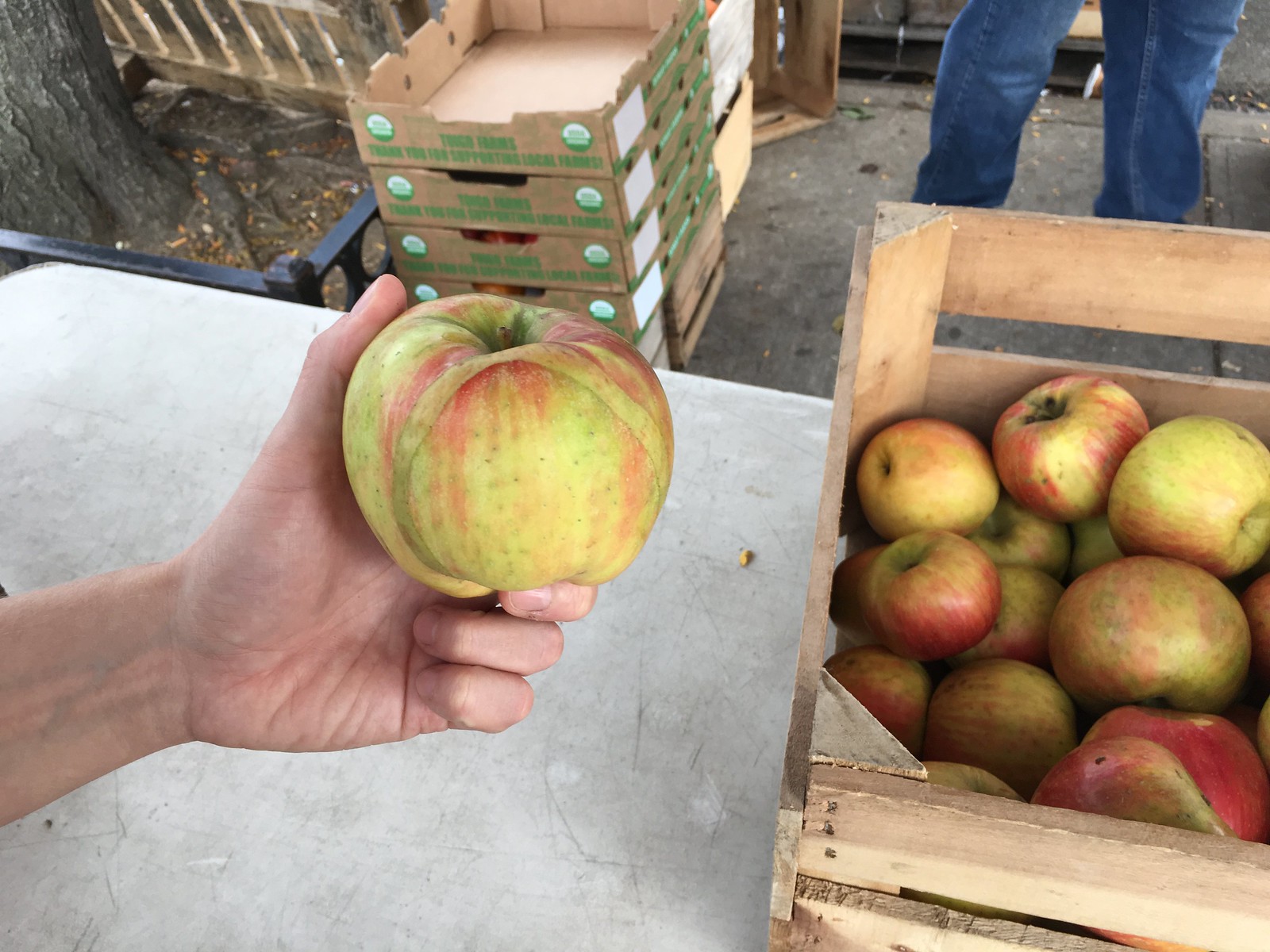
When we got off the subway, we walked past a farmers’ market, where I spotted an apple with an odd strip running across it. It kinda looked like the fruit equivalent of a skin graft. Weird! In hindsight, I wish I had bought it, but instead I just photographed it and then put it back (for all of these photos, you can click to enlarge):
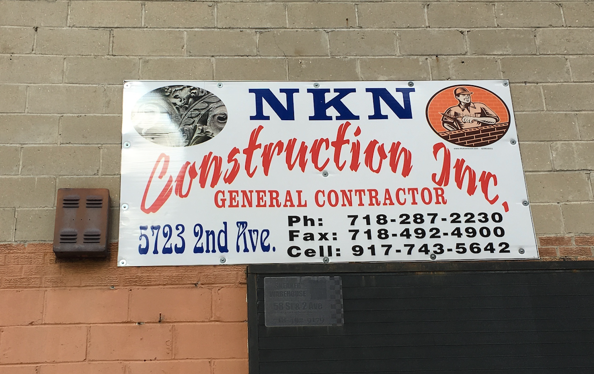
As we walked a bit more, we passed a sign that must set the record for the most (and most wildly disparate) typefaces:
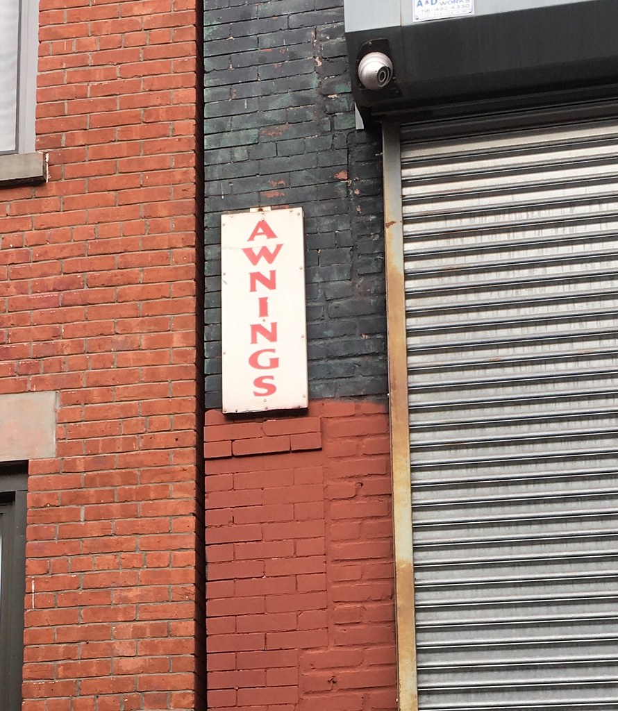
A block later we passed this sign, which made me think of the line (you’ll either get this reference or you won’t) “There was nothing but a circular from the Amalgamated Aluminum Company of America inquiring into his awning needs.”
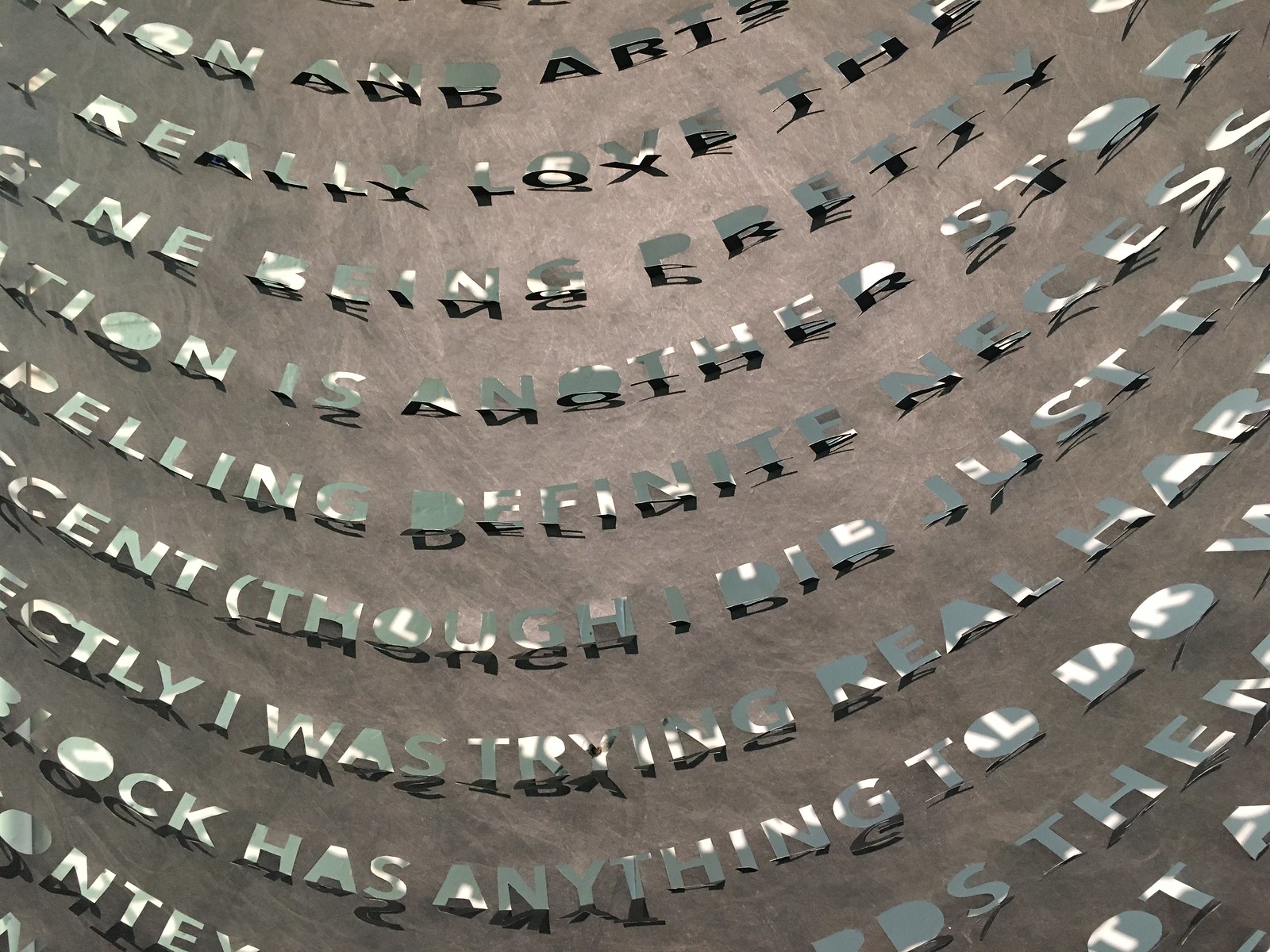
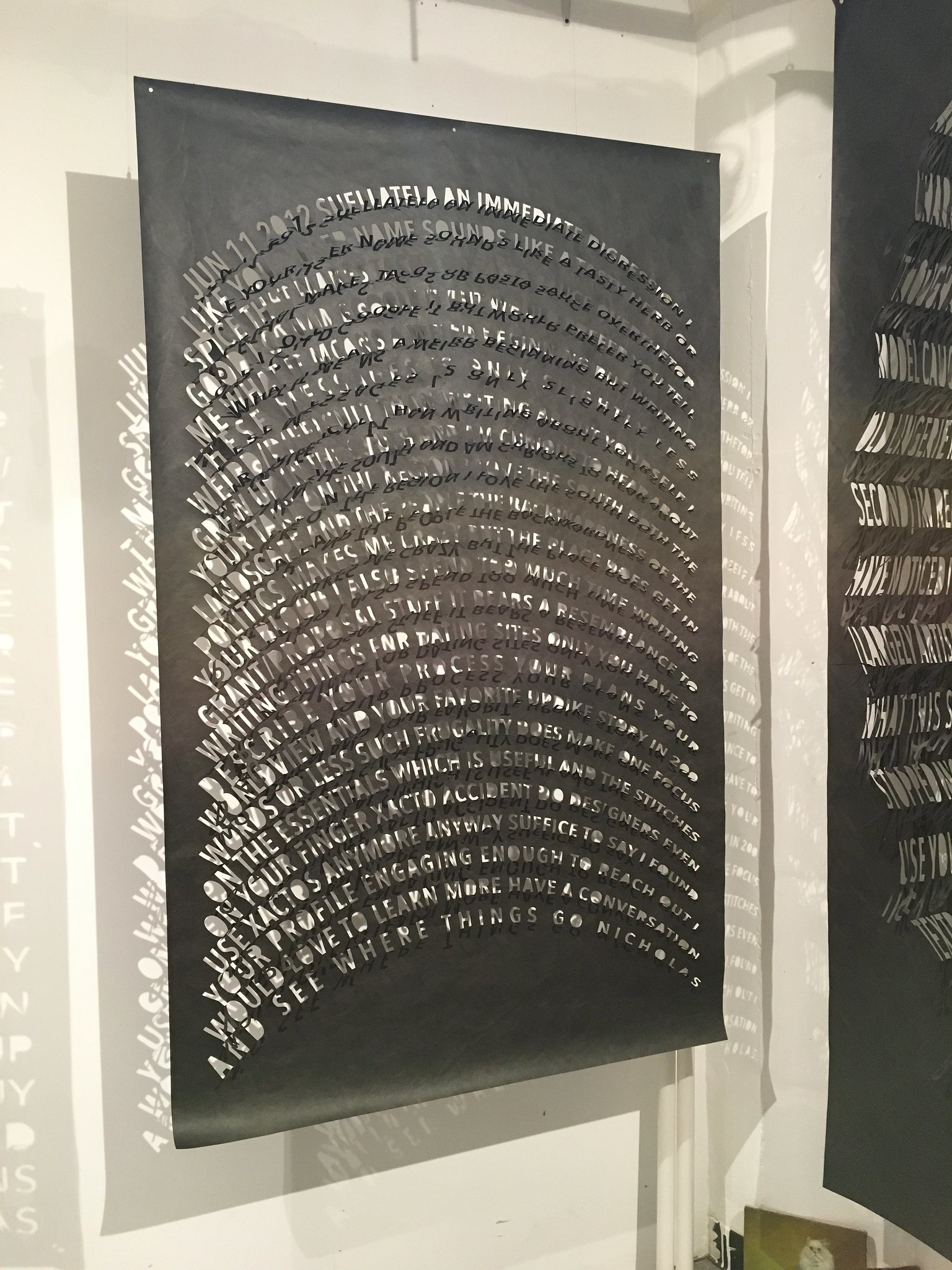
We eventually got to the Army Terminal, took the elevator to the appointed floor, and began checking out art. It was a bit overwhelming — so many artists, so much work to examine. I liked a lot of it, but three projects really stood out. The first was by a guy named Nicholas Fraser, who had these big hanging sheets of black Tyvek with distorted-typography text. Each letter was cut out (by hand with an Xacto, Fraser told me) and hinged forward, creating a really cool 3-D effect and also resulting in fantastic shadow patterns. These first three photos are all of the same piece — a long shot, a close-up, and the shadow pattern:

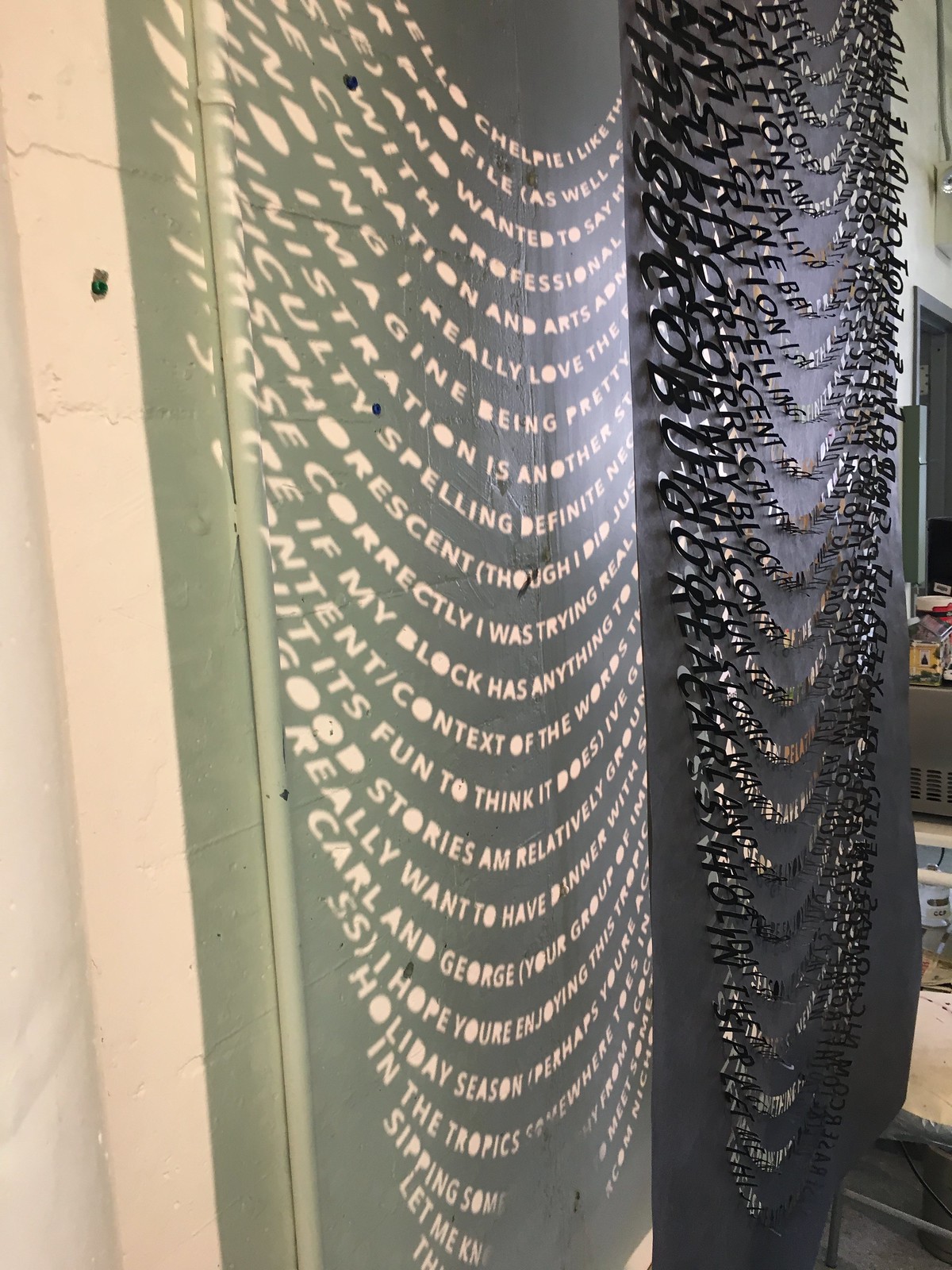
Here’s another piece in the same sequence — long shot, close-up, and shadow:
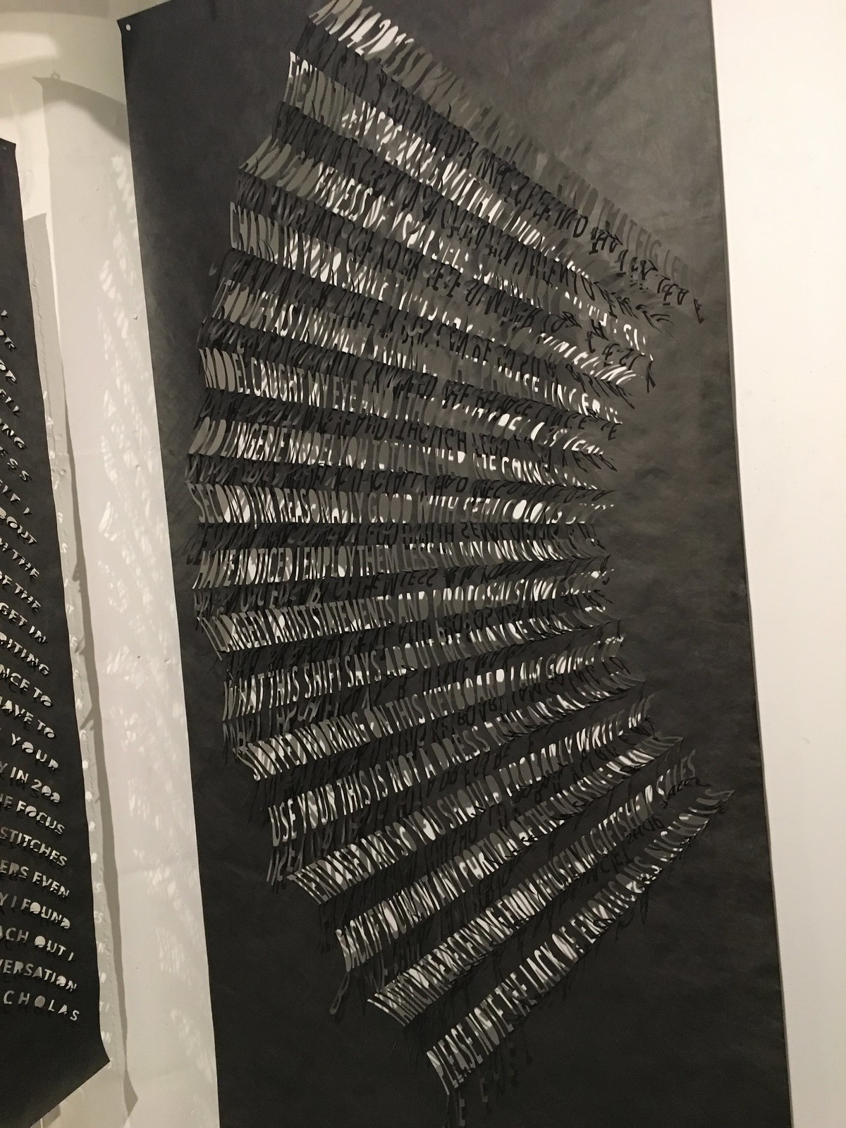
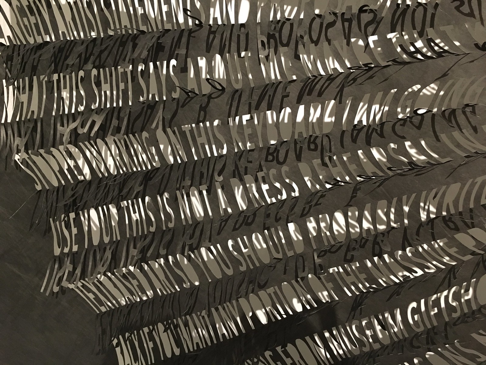
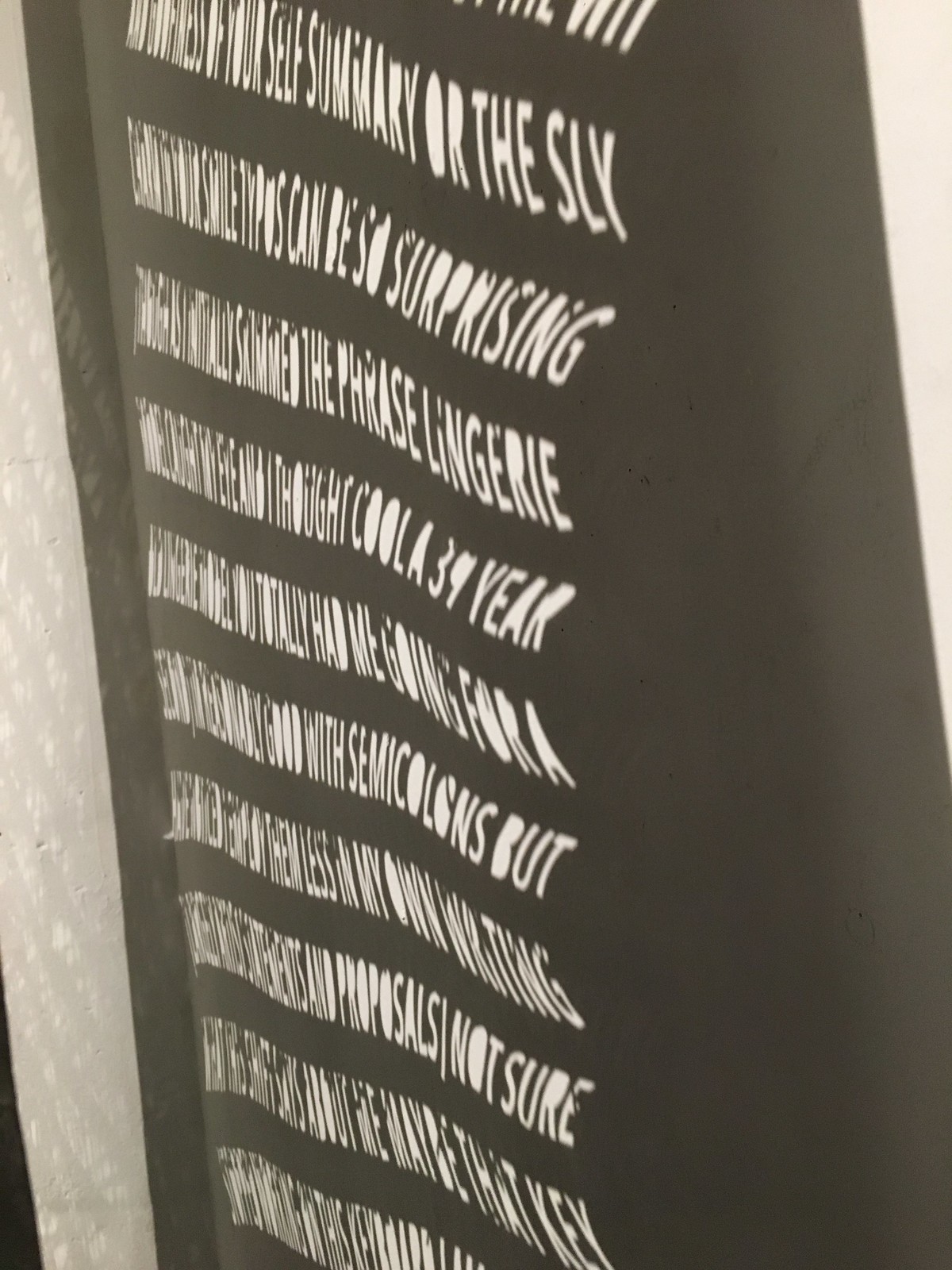
And two more pieces — just long shots this time:

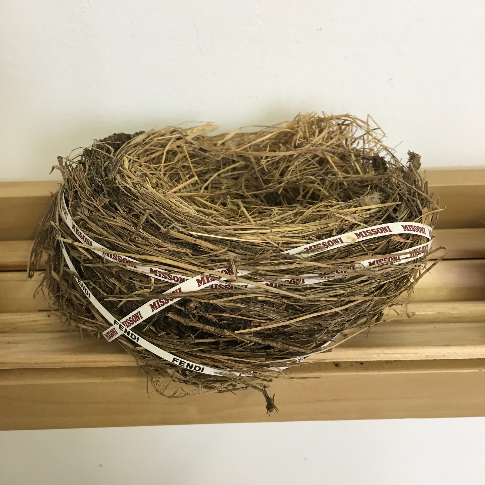
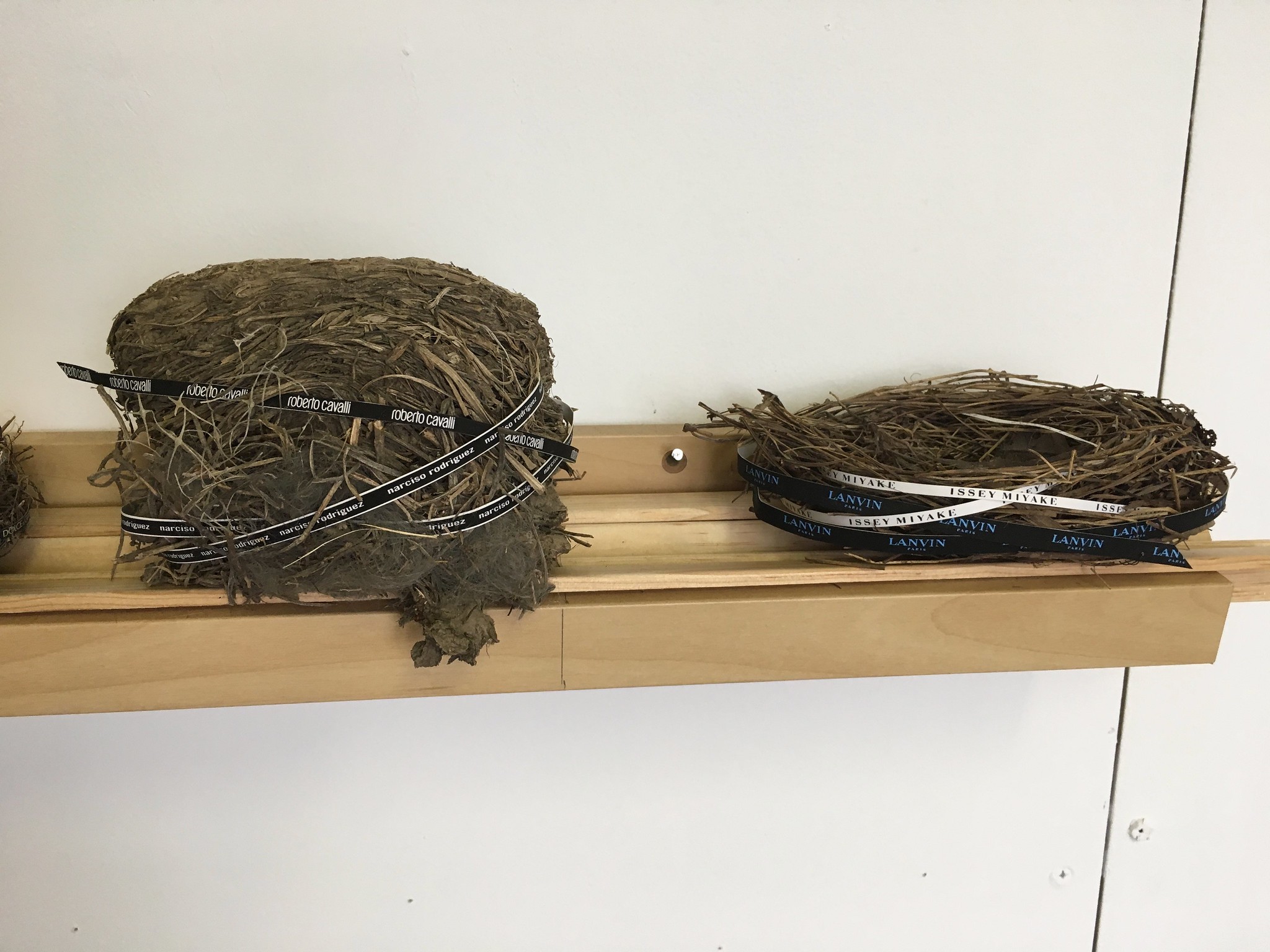
The next artist that really pushed my buttons was Miranda Maher. She had, among other things, a project called “Home Improvement,” which consisted of a set of abandoned birds’ nests augmented with luxury apparel logos. As explained in an accompanying placard, “The series pokes fun at our consumer culture by ‘improving’ the finely crafted nests with the cache of designer labels.” In other words, logo creep!

But my favorite piece of the day was by Jung Eun Park. She does a lot of embroidered work, and in the corner of her studio I found this guide to various types of stitching. It’s like a catalog with swatches (something I’m always a sucker for), only handmade! I love it so much:
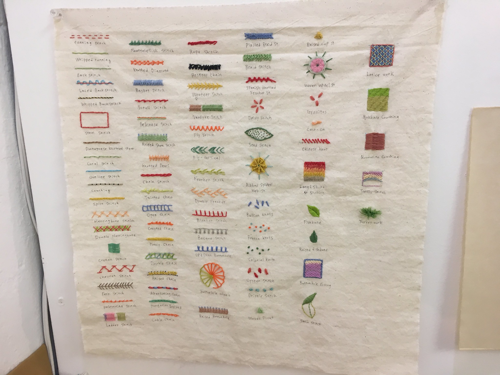
Among other things, note that there are ten different kinds of chain-stitching! Who knew?
I asked Park how much this piece cost. She said it wasn’t actually intended as art and wasn’t for sale — it’s just a reference guide that she made for herself. Leave it to me to fall in love with the one the piece of non-art in a warehouse full of art, right?
(Footnote: Park said that if I was serious about wanting to buy the piece, I should email her later and she’d think about coming up with a price. I wrote to her the next day, and she named a price that I thought was very fair, so I agreed to buy the piece. She’s sending it to me, and I plan to have it framed. Exciting!)
After completing our tour of the studios, we hung out by the waterfront for a bit and then began walking east. Along the way, we passed a junkyard with this old truck trailer (although it looks more like a billboard in this photo):

I like how it looks like someone stole the Cheez-It right off the side of the truck.
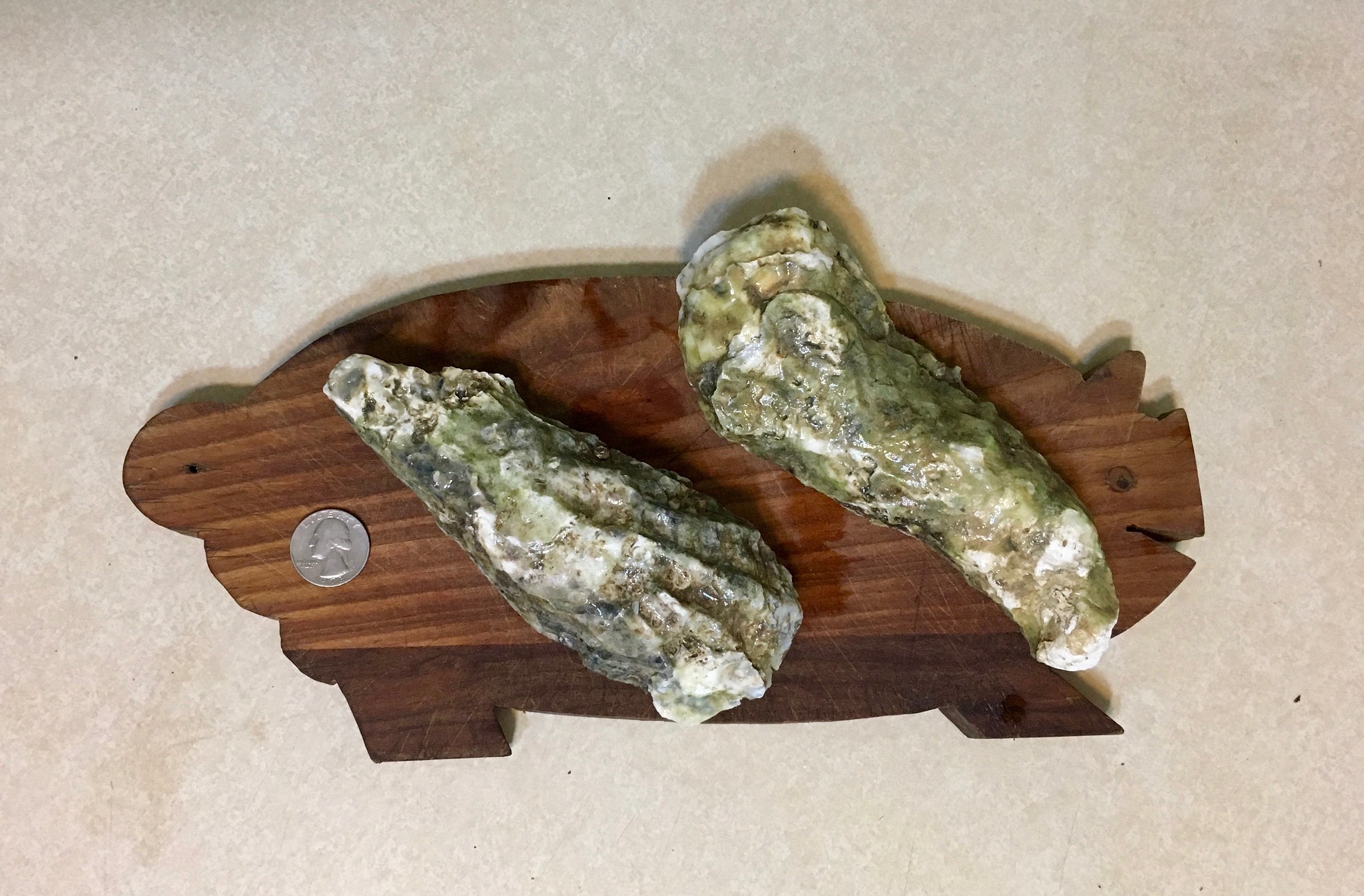
We continued on, stopping for a drink at a great local bar (got to see the Yankees lose Game Two of the ALCS — sweet), and then arriving at Eighth Avenue in Sunset Park — the heart of Brooklyn’s Chinatown. Along the way, we passed a fishmonger that had some truly enormous oysters. For some reason they were all rubber-banded, which I still don’t understand. Like, were they gonna bite someone?

The funny thing is that the Captain and I had just been discussing oyster size the previous day. Stories about old New York always talk about how the oysters used to be “as big as dinner plates,” and here were some that were almost that big! So I bought two of them ($2.50 per) and got some ice to keep them fresh while we went and had dinner at a nearby Taiwanese joint.
A few hours later, when we got home, I prepared to shuck the oysters. Here’s how big they were:
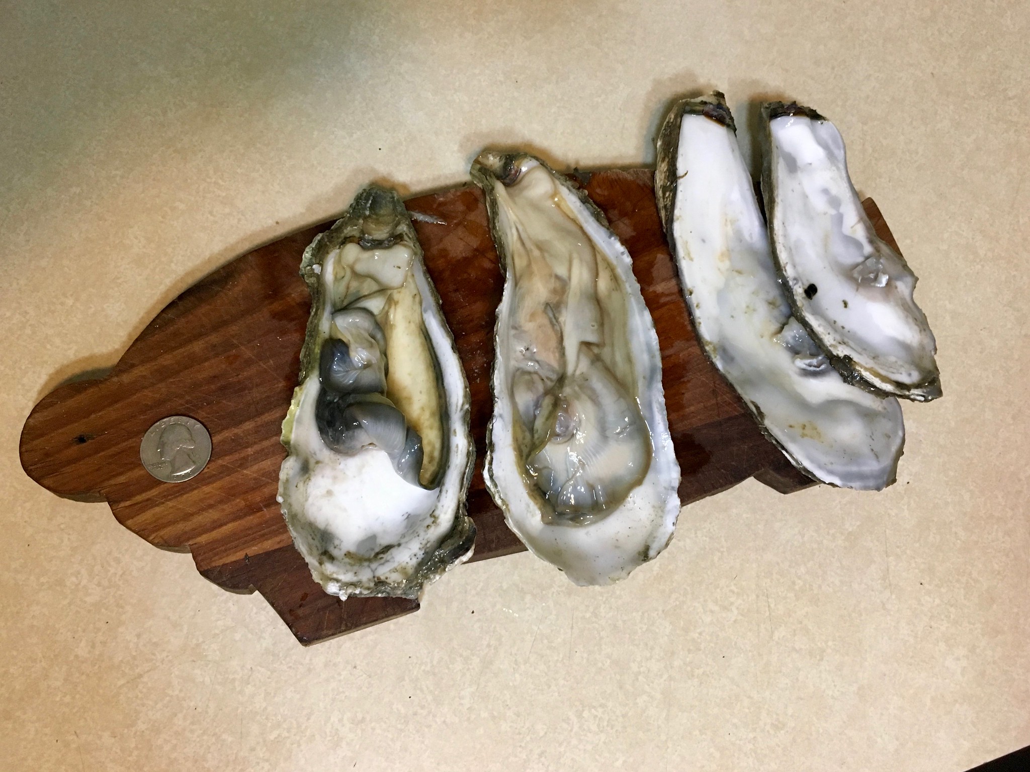
When I shucked them, I was surprised by how easy they were to open. They put up a bit of a fight, but not too much. That got me thinking they might not have been alive by the time we got them home (or maybe even not even at the fishmonger), plus the Captain thought they smelled a bit off (I didn’t agree, but her sense of smell is much better than mine), so I was too spooked to eat them. Still, an interesting experience.
All in all, an excellent day of Brooklyn adventuring. Thanks for listening. We’ll get back to more traditional uniform content tomorrow.
Collector’s Corner
By Brinke Guthrie
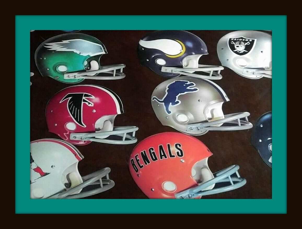
This set of NFL cardboard display helmets makes me flash back to the “This Week In Pro Football” set with Brookshier and Summerall. The seller explains that these were sent to a gas station in Indiana for some sort of display. I thought perhaps it was for the iconic NFL 72 Sunoco book, but the Chargers didn’t go to the blue helmets until 1974.
Now for the rest of this week’s picks:
• Here’s one of Sears & Roebuck’s famous helmet plaques, this one for the Detroit Lions. Notice the lack of white trim around the lion itself, so that would date this to pre-1970. (Speaking of Sears: In scouring the Intertubes looking for Cool Uni Items, I found this Me-TV story about all the NFL stuff you could get at Sears back then, along with this 1969 map of the NFL.)
• Got some vintage mid-1970s NHL pencil cases here and here.
• Great artwork on this 1981 Oakland A’s Billy Ball poster, with everyone dressed in their Sunday whites.
• Pat Patriot is alive, well, and featured on the sides of this 1970s helmet radio.
• More vintage artwork (He Shoots! He Scores!) on this 1970s box of hockey tape. (Hey, Kids! N.H.L. Statistics Back of Every Box!)
• Check out this 1970s San Diego Padres transistor radio. Still works!
• One more for the Pads: this stylish and probably incredibly uncomfortable promo/giveaway jacket sponsored by English Leather.
• This 1970s Packers helmet bank is in terrific shape. This one is plastic as opposed to the usual ceramic ones you see from that era.
• Here’s a 1970s 24″ x 18″ Cincinnati waterfront scene poster depicting Riverfront Stadium and the newer Riverfront Coliseum. The latter opened in the fall of 1975, so the poster is no older than that. Incidentally, I never saw this poster while living in Cincinnati, nor did I ever see the C-Reds logo depicted like that.
• Staying in the Queen City for this one, how about a 1970s Fleer Big Sign featuring the Bengals? If they’re not your team, the same seller has plenty of other choices.
Uni Watch personal shopper: My local vintage shop, right around the corner from Uni Watch HQ, currently has what appears to be an authentic 2009 Darren Sproles Chargers jersey, complete with the 50th-season patch (for all of these photos, you can click to enlarge):


It’s a size 48 and is selling for $10. If you want it, I’ll be happy to buy it and mail it to the first person who asks, as long as you cover the 10 bucks plus shipping charges. Let me know. Update: The jersey has now been claimed by reader Eric Hoey.
The shop also has this really cool T-shirt. Unfortunately, it was too small for me, but I love the design:
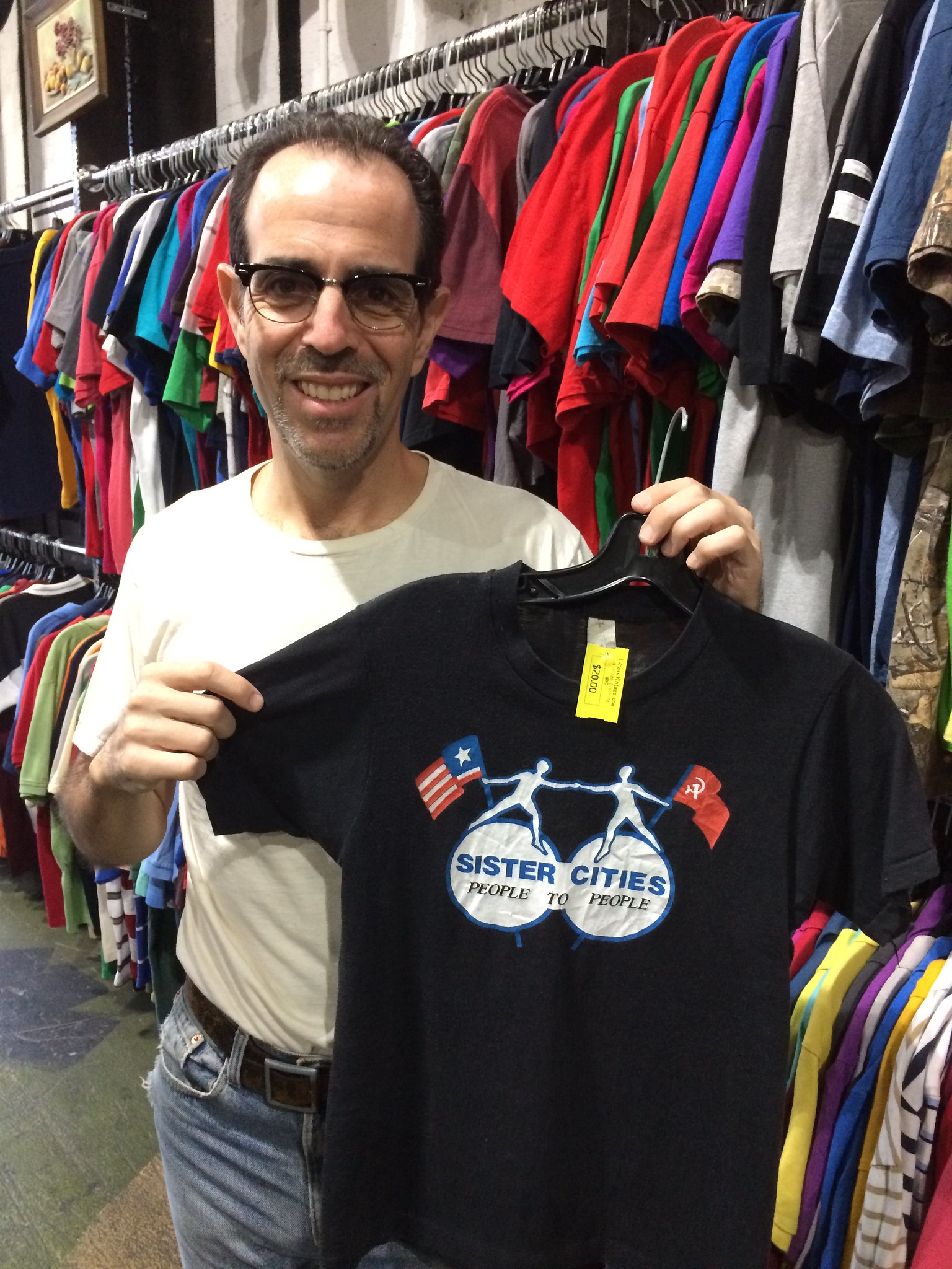
When I posted a photo of the T-shirt on Facebook, my friend Christine Freeman spotted the “People to People” slogan and identified it as part of the People to People Student Ambassador Program, a Cold War initiative to “Promote Peace Through Understanding.” According to that Wiki entry, Walt Disney “became one of the founding directors of People to People and later drew inspiration from the initiative to create the “It’s a Small World” attraction in 1964.
It’s amazing what you can learn from an old T-shirt!
Naming Wrongs update: With college basketball season right around the corner, we have a bunch of new Naming Wrongs designs. One at a time:
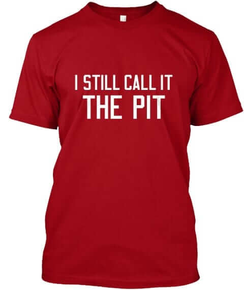
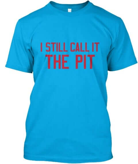
The Pit: The one’s for New Mexico fans. It’s available in red, grey, and turquoise (for all images, you can click to enlarge):

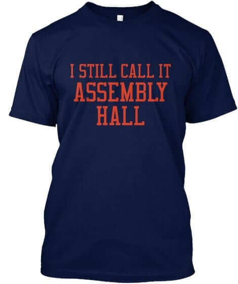
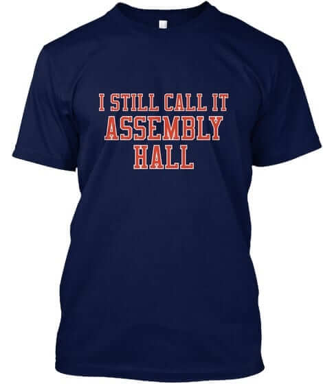
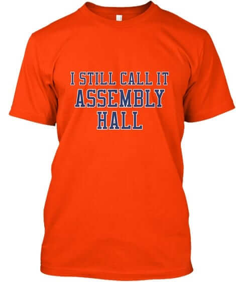
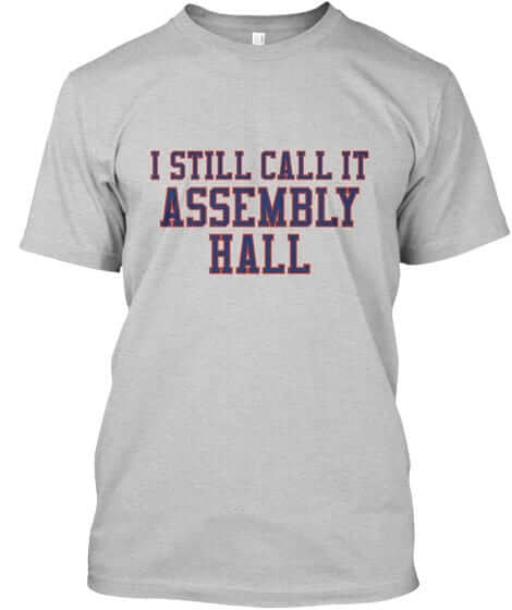
Assembly Hall: Got a lot of requests from Illinois fans for this one. It’s available in navy with no-frills lettering, navy with outlined lettering, orange, and grey.
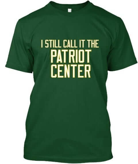
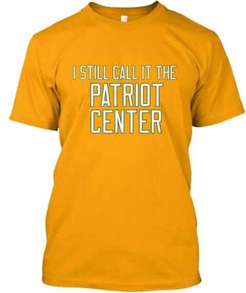
The Patriot Center: I’m not a George Mason fan per se, but I do like that color scheme. This one’s available in green, yellow, and grey.

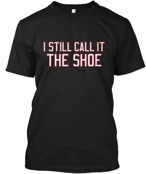
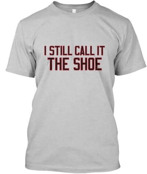
Shoemaker Center. For our friends in Cincinnati. This one’s available in black and grey.
All of these designs are now available in the Naming Wrongs shop. They’re also cross-listed in the Uni Watch shop, where card-carrying members can get 15% off. (If you’re a member and need the discount code, send me a note and I’ll hook you up.)
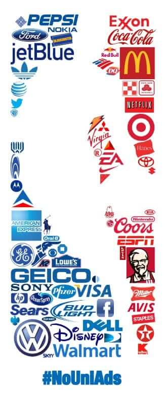
And away we go: The NBA regular season begins tonight with two games and then moves into high gear tomorrow with 11 games. As of this morning, 17 of the league’s 30 teams have sold space on their uniforms to corporate advertisers; the other 13 teams are ad-free. My understanding is that teams can still add a uni advertiser in the middle of the season, so those numbers could change. Still, I think most observers are surprised that so many teams have so far abstained from the uni-ad program. Not exactly a rousing success.
Of the 13 games taking place tonight and tomorrow, four feature matchups between two ad-clad teams, three more games feature two ad-free teams, and the remaining six games have the most interesting pairing — ad-clad vs. ad-free. It’ll be interesting to see how fans react to those games. Here’s hoping they notice that the ad-free teams look a lot better. #NoUniAds
The Ticker
By Alex Hider

Baseball News: Astros C Evan Gattis wears no batting gloves — and his wedding ring! — at the plate (from Josh Hayman). … Looks like The Citadel is adding a new cap, which features an outline of South Carolina (from Will Chitty). … Fox ran a graphic of Astros P Lance McCullers Jr. last night. The photo they used was from Jackie Robinson Day, so they mistakenly listed his number as 42. … Ken Weimer turned Justin Turner’s walk-off home run in Game Two of the NLCS into a T-shirt. It’s available here.

NFL News: Saints WR Ted Ginn had a case of pink eye on Sunday. Not only does pink render eye black useless, but he was playing indoors! (From Mike Chamernik.) … Bears RB Jordan Howard’s thigh pads had the wishbone-C and his uni number on Sunday (from Jeff). … Vote for the best uniform matchup of week six here (from Uni Watch Fans Page). … Here’s a look at what No. 12 means to the Seahawks (from John Chapman).
College Football News: Wyoming will be wearing a memorial decal for former coach Joe Tiller, who died late last month (from Phil). … Texas A&M will go mono-maroon on Oct. 28 against Mississippi State (from Phil). … This video gives a behind-the-scenes look at Clemson’s equipment team (from Brad Darby). … Tom Bookwalter, who designed Kansas State’s “Powercat” logo, is still getting a 7% royalty on his design. It’s rare for designers to have that type of financial arrangement (from James Gilbert). … Penn State’s student paper made a graphic showing a PSU helmet with a white facemask (from M.G.R.). … Austin Gillis says that whenever his wife wears a Notre Dame sweatshirt with the interlocking ND logo, his son will inevitably scream “choo choo!” “Now that I look at it hard, I think that the curved front of the ‘D’ could be said to resemble the front of a steam engine, and the serifed front/top of the ‘N’ could be said to resemble a smoke stack,” he writes. Anyone else see it?

Hockey News: Some Penguins players wore green laces in their skates during practice yesterday in support of the Sports Matter campaign (from Jerry). … Eric Hoey spotted a firehouse in Brooklyn that uses the Blackhawks’ logo. … Just a few games into the season and the Laval Rocket of the AHL have already modified their uni numbers. This is what they used to look like (from Mike Engle). … When it comes to same-surnamed players, the Spokane Chiefs of the WHL usually have the newer player wear FIOB. That went out the window this year when brothers Luke and Jake Toporowski both joined the team. Luke is the younger brother, so he went with FIOB — and he’ll continue to wear the first initial even after Jake left the team (from Larry Brunt). … The Mexican Hockey League starts on Sunday, and it looks like they’ll have pretty bold jersey designs. (from @srperezpolanco).

NBA News: The Target Center, home of the Minnesota Timberwolves, got a facelift in the offseason. This gallery has some photos of the new features (from Josh VanKlompenburg). … Here’s a look at the biggest sneaker storylines of the new NBA season (from Brinke). … Here’s a pretty good video showing how Nike designs for the NBA. Guess how many seconds go by before the first mentions of “brand” and “innovation’ (from Scott Gleeson Blue). … Lots of uni news out of the D League G League: New threads for the Wisconsin Herd (from Brian Kerhin and Phil), the Greensboro Swarm (from Joey Rogers), the Fort Wayne Mad Ants (from Trevor Daugherty), and the South Bay Lakers (from James Brooks). … Also, the league’s new logo appears to be based on a photo of Michael Jordan.

College Hoops News: New uniforms for Radford. … New court design for Xavier (from Matthew Weber). … North Carolina has raised five new banners to the rafters of the Dean Smith Center (from James Gilbert).

Grab Bag: Merchandise marketer Fanatics has formed a new division to focus on college sports (from Tom Turner). … Pinktober is making its way to Formula 1, as some Pirelli tires will be branded with pink letters and the pit lane will go from red to pink for the U.S. Grand Prix (from Dane Drutis and Ben). … Northwest Nazarene University of NCAA DII is changing its nickname from the Crusaders to the Nighthawks. They originally dropped the image of a Crusader as its logo in 2006 due to the “association with violence and destruction,” now they’re rebranding completely (from Tyler Keefe). … Tris Wykes’s landlord picked up this awesome kids’ scooter in Toluca, Mexico, that includes the logos for the Red Devils soccer club. … This map breaks down the naming conventions of lakes and other bodies of water in England (from Jim Vilk). … Sebastian Kurz, who recently won the election as Austria’s chancellor, revamped his center-right party by, in part, changing the party’s color scheme from black to turquoise (from Keith Miller). … Christian Zummer found a dental practice that is poaching Disney’s typography.
I had an amazing time at the Puppy Bowl shoot yesterday morning. I’ll be going back for more this afternoon, and then I’ll staying in Manhattan to catch a movie, so I’ll be off the grid pretty much from 1pm onward. Play nice while I’m away, yes? Yes! — Paul
Proofreading:
“We eventually got the Army Terminal”
“a 7% royaly” By the way, the Under Consideration link is basically a link to this story: link if you want to skip the middleman.
Fixed.
UNC did a nice job incorporating the Final Four logos with their championship banners. And that “NC” monogram was in use in 1924. But why did they use the current NCAA logo for the 1957 banner, instead of the logo that was actually in use at the time?
There should also be a banner for Rameses the mascot and Jason Ray, whose story has been mentioned here previously.
NCAA tournament was created in 1939
Last night on MNF John Gruden kept calling thigh pads “thigh boards” while discussing a blocking technique.
I hadn’t ever heard them referred to in this way. I know they are hard and stiff (at least they were when I played), but were still always called pads.
Never heard that either!
ACK! Jon.
I shouldn’t do that. MY name is Jon!!
That’s just dumb.
Mono-blue a disappointing look for the Titans, especially to display it on a Monday night.
Their best uniform combo with a dark jersey to me is this:
link
I’ve heard it, but it’s not that common. Compared to the other pads that we used to wear in our pants (tailpad, hip pads, thigh, and knee), all but the thigh pads were soft foat. Thigh pads were rigid with a plastic/metal plate encased in foam. Probably where it comes from. Also originally from Ohio, like Gruden.
In the NFL section of the ticket the Bears running back is Jordan Howard not Tarik Cohen
Fixed.
Betcha those rubber bands on the oysters were to prevent them from opening up thus not allowing you to obviously see if they have died and gone bad.
I hope Mississippi State will go with an all white everything theme just for contrast’s sake.
The “vintage 1970s” Padres transistor radio has a web address on it.
Ha! Makes the “works great!” comment by the seller and repeated by Brinke a little less impressive.
It also originally came with earbuds. One might expect the ol’ single-ear mono earpiece if it was truly from the 70’s!
The website, microskills.com, still exists, but doesn’t appear to have been updated in quite some time. It’s not secure (https), and Internet Archive’s Wayback Machine stopped crawling it as frequently in 2006, which coincidentally happens to be the year listed on the course catalog they have available. I’m wondering if this was a giveaway at Petco (or even San Diego/Jack Murphy/Qualcomm Stadium), or maybe even some promotional tool they had made up to distribute throughout the community. Either way, definitely not vintage.
Re: ND logo, if I squint hard enough I see the letter D as the railroad track and the letter N as the train moving along it.
I say this as a proud UNC alum: we have enough banners that we don’t need to be redundant. The team that wins a national championship clearly made the Final Four and also finished with the #1 ranking. The one champions banner covers a lot of bases. The rafters are full enough.
I’m okay with the final four and championship banners, but the #1 ranking banner is silly with the championship banner. Were there years they had a #1 final ranking but not a championship, or vise versa?
Re: Ball players and wedding rings: I remember reading when I was a kid that Whitey Ford used a raised feature (I pictured a small spike) on the underside of his wedding ring to doctor baseballs by scraping.
I’m sure someone has better details than that.
and you already covered it! sheesh.
Quoting from Jim Bouton’s seminal Ball Four:
“Then [Ford] went to his wedding ring. He gouged such sharp edges into it that we used to kid him about having lost the diamond out of it. He’d scuff up the ball with the ring and make it [move erratically]. He got by with the ring for a couple of months until umpire John Stevens, I think it was, or maybe John Rice (for some reason, every time Rice came onto the field, somebody would holler, ‘What comes out of a Chinaman’s ass?’) got wise. The ump could have caused real trouble, but he went out to the mound and said, ‘Whitey, go to the clubhouse. Your jock strap needs fixing. And when you come back, it better be without that ring.'”
That Chargers jersey is an obvious Chinese knockoff… Bubbling numbers and poor stitch work on the patch jump right out. Not a Chargers fan, so I’m sure there are other things wrong… But yeah, that’s a counterfeit jersey.
Absolutely correct it is a China knockoff
Numbers not being twill is dead giveaway
For “the” authority on athletic aesthetics, can’t believe he was fooled…
I don’t spend much time (or really ANY time) looking at retail jerseys. Not my scene. I probably should have picked up on the lack of tackle twill, but it’s a nine-year-old jersey — lots of things have changed.
No good deed goes unpunished. It’s not like Eric Hoey is paying authentic jersey prices. For ten bucks plus shipping he got a jersey and a story to go along with it.
Sad day for the NBA! Will be even more disappointing if MLB allows uniform ads in my lifetime, because while basketball players are almost always in motion when I’m watching them, with baseball players I’m almost always watching them standing around between short bursts of action. But it kills photography no matter what sport.
I may have missed anything about it on here, or on TV in past years, but this last Home Run Derby I noticed the major advertiser was squeezed onto a shoulder patch on the jerseys. Not as big a deal as those overseas games way back, I suppose.
Interesting how teams with storied brands, that are in big markets, and don’t need the extra cash (Lakers, Celtics, Knicks) all cashed in on the ads, while various less popular small market teams who aren’t nearly as profitable are still ad free.
Yeah, but other big market teams *didn’t* get ads: Bulls, Spurs, Rockets. And some small market teams *did* get ads: Bucks, Timberwolves.
In short: There’s no rhyme, reason, or pattern here.
It’s a total coincidence that the G league logo looks likes Michael Jordan, sponsored by Gatorade who employs Jordan.
Not sponsored. Advertised.
link
While I am completely against uniform ads, it is odd that I really miss the youth baseball teams in my town being named after the sponsors.
As a kid local businesses or civic organizations (Kiwanias, Lions Club, American Legion) would sponsor the teams and those were the names on the jerseys. Being that they were all local and active in many aspects of the city, it was a neat little way for a small town to show its identity. And contrary to ads in pro sports, it was a way for all kids to play, have equipment, fields, etc with little to no cost, an actual sponsorship.
Now they just use major and minor league teams’ logos and write companies on the back, which actually makes it seem more like ads than sponsors.
I agree 100%. It was either Lions Club, Knights of Columbus, Kiwanas, VFW, or a local business like well….CHICO’S BAIL BONDS!
Shout out to Rose Hill Cleaners in Alexandria VA for sponsoring LL baseball in my community for many, many years!!
link
BTW, we were the Eagles. Thus the E on the cap.
Yours truly is kneeling, 3rd from the left.
My first little league sponsor was a flower shop. I was kind of disappointed in that. Another team had a local crab shop (this was in MD). I thought that was the coolest.
My first hockey team was Pipe Trades 628.
Later played for IGP (Industrial Grain Products).
I forgot to mention that our sponsors were on the caps, not the jerseys. The jerseys were re-used year to year, but the caps were not. The jerseys all had MLB team names, but didn’t quite match for the colors except the Orioles, which were orange. I played for the Giants (blue) and Rangers (black).
I’m a board member of our local Little League. From time to time, we have kicked around the idea of having local businesses sponsor our teams and naming the team for the sponsor. The main reason we don’t is because it is very difficult for us to find businesses willing to make the sort of sponsorship commitments needed. The cost of having unique artwork with small production runs is a factor also.
In case you’re wondering, virtually all of the funds we need to operate our league come from registrations. The sponsors we have are recognized by signs that are attached to the outfield fences.
We use our league name (East County Little League) on the jersey fronts. We have an interlocking “EC” design for the caps, which are embroidered. The league name is printed in white or black, depending on whether the shirt is a light or dark color. Team jerseys differ by color, and everyone in the league wears the same black cap with white lettering. It isn’t as visually cool as it could be, but it works.
Our set up (when teams were named after the sponsors) was a little different. All teams had the same cap design and logo (a stylized A for Absecon), in different colors. The jersey’s were all the same design (in different colors) using the classic baseball script font with the sponsor names. They were actually good quality jerseys that got turned in every year. 25 years later and I can still remember which teams were which color. In addition to the civic organizations that sponsored we’d have the local hardware store, cleaners, insurance company, etc. Sadly most of those businesses are gone with the local mom and pop stores disappearing. To me it seemed the end of that local baseball naming convention really reflected the end of small family owned businesses throughout small town America.
Nice insight on the K-State logo. I am always looking at logos for some hidden message. Doesn’t seem there was one unlike the Washington State cougar logo.
Last night’s MNF game mirrored TNF so called color night.
It’s prime time apple season here and I’m always looking for an apple with similar markings and normally start my first bite at the marking, delicious!
I get that the new collar template is better than the toilet seat, but man that thing is still huge and looks terrible. Makes you appreciate the teams that keep the collar the same color as the jersey (Cowboys, Giants, Bears, Stillers,etc.)
link
After the neck roll the Saints used to have, I’m not complaining. It’s better than that collar that the Texans used to have.
Interesting that whoever made Jordan Howard’s thigh pads actually matched the number font from the Bears’ TV Numbers. Just compare the shoulders to the thigh pad. That’s pretty impressive not a lot of casual observers notice that the TV numbers are significantly squatter than the front/back numbers.
Great piece! Especially getting consumed by the reference chart, I’ve been there a time or two at flea markets or obmff the beaten path shops. Can’t wait to see it hanging in UW HQ.
” I found this Me-TV story about all the NFL stuff you could get at Sears…”
The Me-TV person makes note of the “sports shoes” indicating they are for “Bowling, specifically, it seems.”
With that sole??? Clearly, this person has never seen a pair of bowling shoes in their life!
“Saints WR Ted Ginn had a case of pink eye on Sunday.”
Talk about being committed to Pinktober.
Interesting Paul said he had a “well spent day in Brooklyn”. Why didn’t he say “well spent day in New York City” A minor contradiction to what Paul said about living in “New York City”. If it’s Brooklyn than you live in Brooklyn but it seems odd to have it both ways even if it’s technically correct.
If you go back and look at the specifics of what I said at the time, compared to the specifics of today’s post, you’ll find that it’s not a contradiction at all.
Didn’t realize that Naming Wrongs had extended to universities.
In that case, my suggestion is ‘I still call it the Coliseum’ for those Wisconsin Badgers hockey fans who attended games off-campus for years before the Kohl Center was built and the old building was renamed for the local power company.
Didn’t realize that Naming Wrongs had extended to universities.
We’ve been doing college stadiums and arenas for months now.
Here’s what the Joe Tiller logo will actually look like (from the Wyoming Athletics website)
link
Looks like the ASU bookstore posted a photo prematurely. Don’t know if that means these jerseys will be worn in a game…
link
link
That Charges Jersey is a clear knockoff. Absolute garbage. Part of the epidemic.