For all photos, click to enlarge
[Editor’s Note: Today we have a guest entry from the goalie-obsessed DIY genius Wafflebored, whose latest project was a commission from a Uni Watch reader. Enjoy. — PL]
By Wafflebored
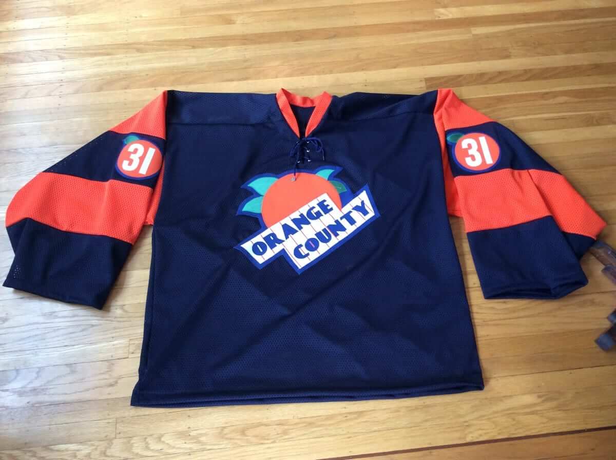
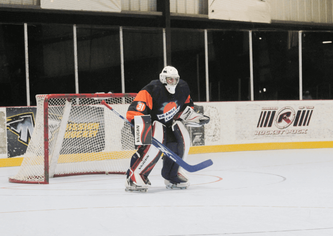
I was recently contacted on Twitter by Uni Watch reader Chuck Eldridge, who wanted to know if I would be interested in making a custom jersey for him to wear in his beer league and pickup games. The project appealed to me immediately, as Chuck is a goalie. In fact, he’s a big goalie at 6’6″, so I knew interesting custom tailoring would be needed. In addition, he had an absolutely great concept for the design: Chuck is a proud resident of Santa Ana, California — the seat of Orange County — and envisioned a jersey design based on the great vintage orange crate labels from the region.
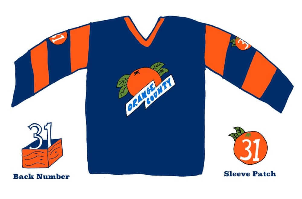
We bounced around some ideas, and I made some quick sketches of possible logos that could serve as the jersey crest. In addition, we had ideas for interesting treatments of the sleeve numbers and back number. I made this mock-up so Chuck could get a feel for what I was thinking for the overall jersey design (I opted for dark navy as a lot of the vintage labels seemed to use that color, probably because it contrasts so well with orange):
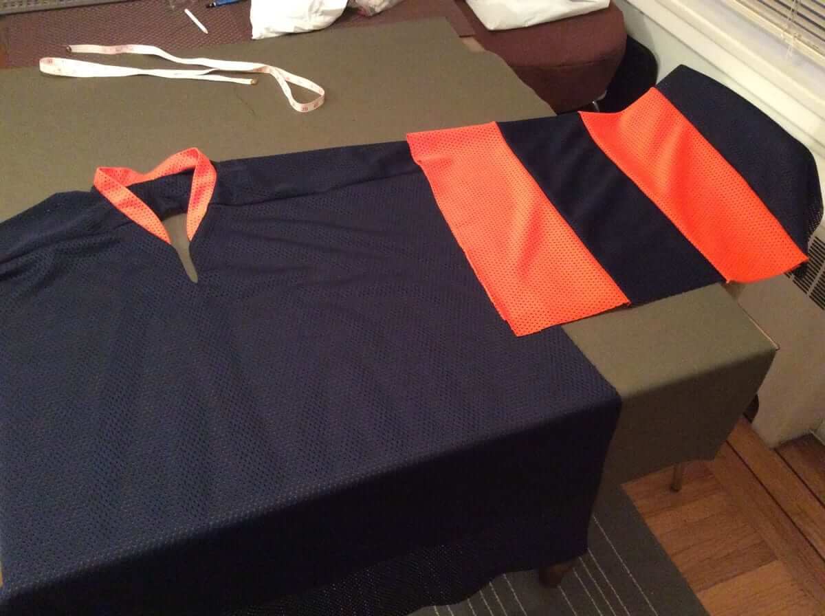
Chuck was happy with the designs, so I started work on the jersey, using a heavy polyester mesh. Chuck sent me some measurements of his existing jersey, which looked a little tight, so we made it a bit larger. Off-the-rack goalie jerseys can still be snug for a guy of Chuck’s size, and I guessed he’d probably never enjoyed the feel of a loose-fitting jersey.
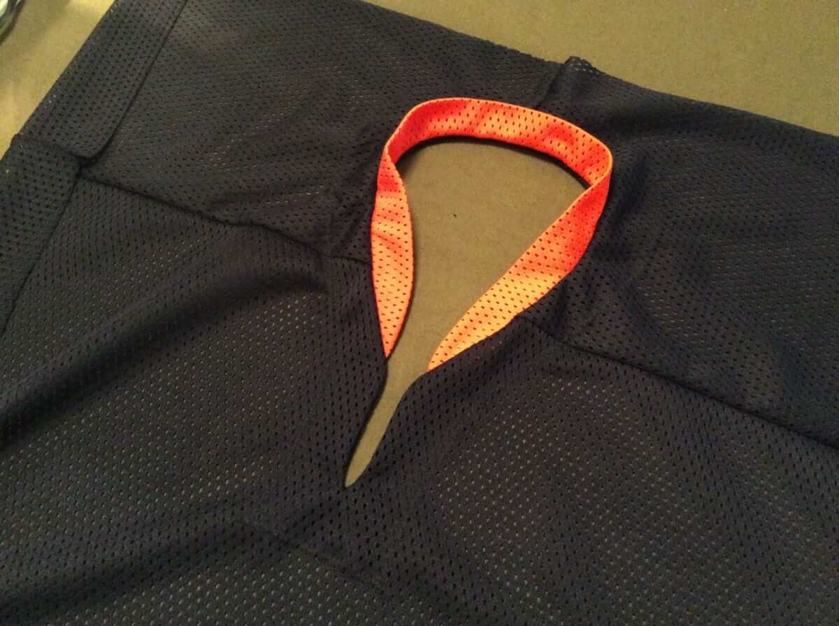
Here are some photos of the jersey as I was working on the collar and sleeves:
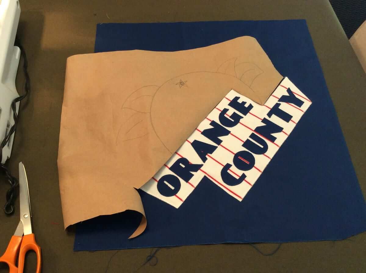
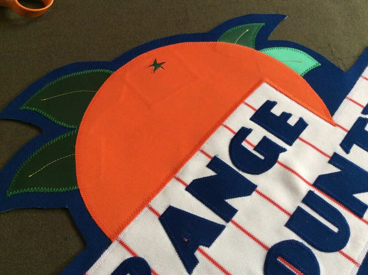
I had a lot of fun with the front crest. Since the vintage produce labels used a lot of color and different elements, I made sure to use a variety of fabrics, including a red-pinstriped baseball jersey material, as well as poly-cotton twill and satin tackle twill. I used hand-drawn paper patterns. Everything was sewn down with a standard zigzag stitch.
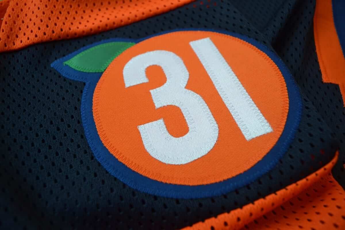
For the sleeve number patch, I envisioned something like the old Cleveland Barons jersey, where they had the sleeve number within an Ohio-shaped patch. We used a single orange with the number inside it. I used a number font inspired the typography of the vintage fruit box label era.
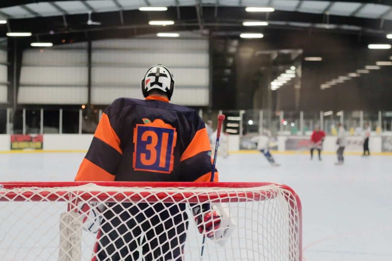
For the back number, Chuck and I agreed we wanted to do something unique, similar to the Warriors’ cable car design. After trying to fit the number 31 inside a crate, I came up with a design that shows a graphic representation of an orange crate as viewed from the end. You can see the slats on the side, and the top is overflowing with picked oranges. I included a green tree leaf, which is a common theme throughout the jersey and also references the green leaves that are commonly found on the vintage crate labels.
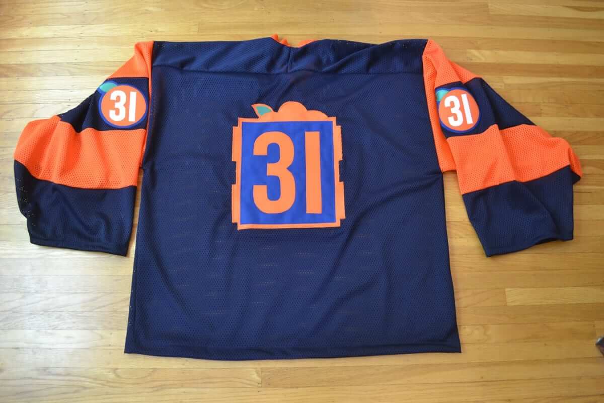
Of course, 31 is a classic goalie number, but it also has multiple meanings for Chuck. He grew up as a Ducks fan and watched Guy Hebert when he wore that number. In addition, California is the 31st state, plus Chuck has multiple family members who are retired from the Santa Ana police department, and 31 is the local station number that appeared on all of their badges. All of this information really added to my enjoyment of the design and end product, since everything on the jersey was totally customized for Chuck.
As luck would have it, Chuck’s parents were visiting Vancouver the week after I finished the jersey, so I dropped it off at their hotel so they could deliver it to him personally.
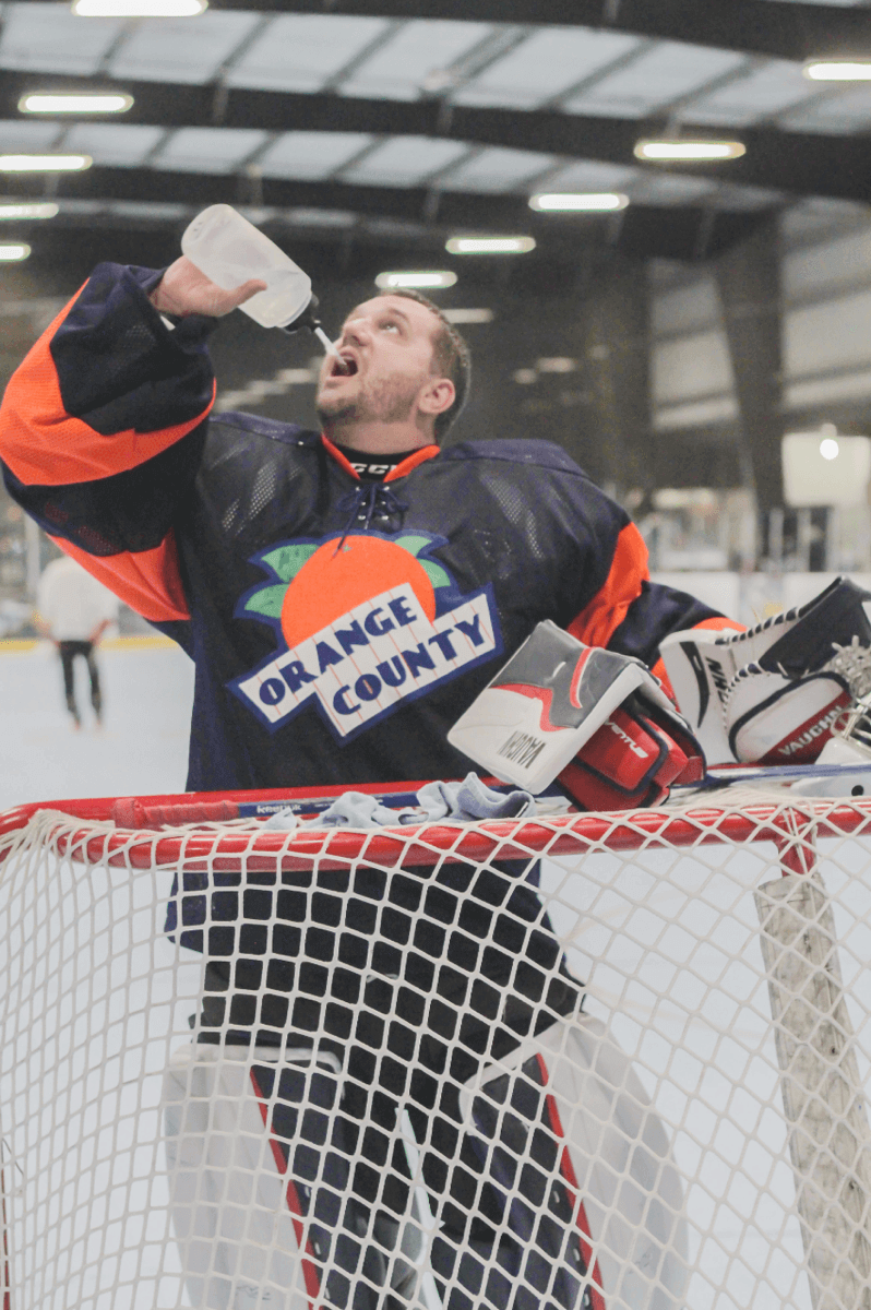
Chuck has now worn the jersey on the ice, and it’s exciting for me to see these pictures of him wearing it (photos by Jason Frerking):
———
Paul here. What a spectacular project! Big thanks to Chuck and Wafflebored for sharing it with us. You can see more Wafflebored projects here.
Meanwhile, here are a few closing words from Chuck, the very happy client:
It was fascinating to see the creative process. In the couple games I’ve played wearing the jersey I’ve had quite a few opponents and refs compliment the look. And believe me, it’s unusual to have those two parties take a moment to skate up between face-offs and start chatting about a jersey. They’re always shocked to learn that it was hand-crafted. It’s also by far the best-fitting jersey I’ve worn
My beer league captain has ordered team jerseys, but they have yet to arrive, so for now it’s a free-for-all regarding jerseys during the games. Once the team jerseys arrive, that’s what I’ll wear. But I’m also a semi-permanent sub with another team — as a sub (and a goalie, at that), I can wear what I want, and the Orange County jersey is a unique and stylish look when I’m in the crease.
Great stuff. Thanks again, guys.
Raffle reminder: I’m currently raffling off some cool Hartford Whalers memorabilia. Full details here.
Click to enlarge
Collector’s Corner
By Brinke Guthrie
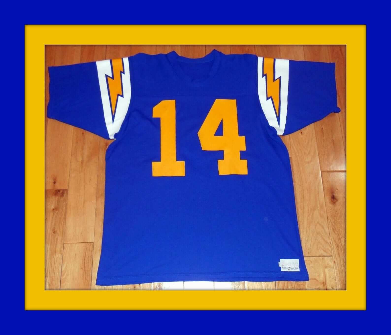
When I first saw this jersey I thought, “Fouts knockoff.” But no, this one’s from Sand-Knit, and they made a lot of jerseys back then. So perhaps this one was just as close as you could get to the real thing. Sure looks nice, right?
Now for the rest of this week’s picks:
• Kinda funky-looking handle on this Oakland A’s beer stein. The listing says 1970s, but they used this logo from 1982-1992.
• Joe DiMaggio, the Yankee Clipper himself, looks a little like Emperor Palpatine from Star Wars on this 1940s pennant, if I may say so.
• Check out this beauty: a 1970s NFL football bank with 14 teams on the base. You lift the laces on the top to drop your coins in. Looks like the red striping is peeling a bit, but a little glue will fix that. Reasonable price, too.
• Another football — this one is a Wilson/NFL Football “Solid State” AM radio, complete with a tee.
• Before the Rockies were an MLB team, there was a team by that same name in the NHL. Here’s a Colorado Rockies Starter jacket from the 1970s. Always loved that logo — such simple execution.
• Though the listing says 1970s, I’m pretty sure these Pittsburgh Steelers Superpro Club helmet stickers are from the early 1980s. One of my favorite helmet looks.
• These 1980s 76ers basketball socks come with the hang tag that says “Japan/NBA.” Here’s another pair of Sixers sox — these look thick and comfy, with embroidered “76” and NBA logos.
• Had one of these! This is an early-1970s Dallas Cowboys display button. You could stand this 6″ button up with the pop-out cardboard stand on the back, or pin it to your shirt, though I always wondered how anyone would wear such a large button.
• This 1960s Baltimore Colts helmet looks kinda DIY, does it not?
• We’ve run one of these before, but it bears repeating: You simply cannot do any better for 1960s NFL artwork than this poster by the Master, Dave Boss.
• This 1972 Stancraft/Kansas City Chiefs poster is a design by George Bartell, another artist who could bring his A game.
The Ticker
By Paul

Baseball News: D-backs P Jake Barrett somehow ended up with two American flag cap patches last night. … A Sherwin-Williams ad behind the home on deck circle in Cleveland misspelled “Serwin.” … The Indians, who have the best record in the American League, have won 19 straight. The Dodgers, who have the best record in the National League, have lost 11 straight. And L.A. still has four more wins than Cleveland. Think about that.

NFL News: Fun fact that I hadn’t been aware of: The Falcons wore white for their first-ever home game. Good-looking uni matchup there, eh? (From Jay Jones.) … Just a few months after installing new turf, the Pats are replacing it with newer turf (from Mike Chamernik and Dan Tarrant). … We’ve seen this before, but it’s always interesting to see the odd FIOB style that the Chargers used back in the mid-1970s. Additional examples here. The Browns did the same thing (first Chargers photo from Andrew Greenstein). … An official in last night’s Broncos/Chargers game mistakenly announced that a time out had been taken by “San Diego.”
College Football News: I’ve seen plenty of thigh pads with an imprint of the team logo, but I’m not sure I’ve seen them with the player’s uni number. That’s Penn State RB Saquon Barkley (from @FightinPhils13). … Hmmm, why does Michigan WR Grant Perry not have TV numbers? (Good spot by John Canterbury.) … GFGS this week for Miami of Ohio. … Mono-orange this week for Idaho State (from Brad Davis).

Hockey News: At the Young Stars tourney, the Jets wore Adidas while the Oilers wore Reebok. … Ray Hundt sent along some scans from early-1970s Topps hockey comic booklets. Very cool stuff. … Good piece on how Madison Square Garden workers create the Rangers’ ice in preparation for the new season.

Basketball News: The Suns will unveil their alternate uniform “from the athlete’s mindset” this Friday. … New uniforms for Rutgers (from Dan Torsiello).

Grab Bag: This is so completely awesome: People dressed exactly like random things. Don’t miss (from my pal Jules Verdone). … Ever see those ads for wristwatches that are almost free? Or actually free, if you pay for the shipping? The great Bay Area artist Jenny Odell, who I first became aware of when we were both part of a Pop-Up Magazine live performance thingie, has written a really brilliant piece in which she investigates the origins of one such watch. Interesting and entertaining — highly recommended. … New black-and-white logo for BMW. … New logo possibly in the works for Apple.
Proofreading:
I’m guessing this is a punctuation error: ‘ Enjoy. ”” PL]’
Maybe a tagging error, but ‘D-backs P Jake Barrett somehow ended up with misspelled “Sherwin.”’ looks like a mashup of two items.
Both coding errors. Now fixed.
Re last item in the ticker, is it a new logo if it’s just the old logo with different colors? I can see good arguments for both sides of the question. Anyway, the only permissible change to Apple’s logo would be returning to the company’s founding logo: link
Also, good gosh yes that inaugural Falcons-Rams game was a beaut. For both teams, the best they’ve ever worn.
I prefer the old rainbow-striped apple, personally.
I found the NY Times article about the NYR ice quite short and uninformative. More of a blurb really.
Wafflebored’s jersey is outstanding, both in concept and execution. I could easily see an organized team wearing that design. I could also easily see a team in Georgia or South Carolina adapting that design to peaches and peach crates (particularly one that plays in link). Again, exceptionally well done!
Well said! Thanks to Waffleboard and Chuck for sharing this project with us. What a treat!
Quite superb! I do really like the crate treatment for the number on the back. Kind of reminds me of the trolley car treatment for numbers on the old Golden State Warriors jersey.
I liked the original idea of the uni number peeking out of the crate. It would still work for an imaginary team, but I imagine there would be problems for an actual team that would have to conform to legibility requirements.
What, no NOB? Just kidding; the jersey is great the way it turned out! When I saw it for the first time, I thought it belonged to a new team that was going to start playing this season, but it is an excellent design to wear for pickup games.
Being a one-off and an original design, an NOB would be just a bit too much, I think.
We actually discussed it but felt since the jersey was vintage-inspired, we would leave the name off.
Good morning Paul,
Just a quick edit, but the Dodgers have lost 11 straight, not 12. Thanks!
Fixed.
A Sherwin-Williams ad behind the home on deck circle in Cleveland misspelled “Sherwin.”
Misspelled in the photo, maybe, but autocorrected in your callout?
Fixed.
The NHL Young Stars tourney in Penticton, BC seems to be a mix of old Reebok and new Adidas. It was not just the Edmonton vs. Winnipeg game. Saw highlights of a game with Vancouver wearing the old Reebok vs. Calgary wearing new Adidas.
I have no idea why they’d go with a negative image on that DiMaggio pennant. link if they’d rendered the light areas of Joltin’ Joe in white. I opted not to simply invert the colors of the entire banner, so I left a thin outline around the cap and part of his face.
Correct. And beautiful. But no longer imperfect, and therein lies the charm.
I don’t know how much charm there is in looking so creepy in negative, though!
Well, yeah. I’d have your version, Rob!
Great stuff today! Wafflebored is an absolute genius…and keeps on proving it. The random things link is priceless.
Great job Wafflebored!!!
Where do you source your fabrics for your custom jerseys? On your blog you mention a local shop near you, but not the name. I have a terrible time trying to find certain athletic fabrics, much like the pinstripe you used on this jersey.
The fabric store in Vancouver is called Dressew. For some reason they have a lot of new old stock polyester sports fabrics from the ’80s and ’90s. It’s an old school shop so I don’t think they have an online presence, though. Sometimes you can find stuff on eBay or etsy.
I second that. The jersey looks very good as a concept. But it looks great in those action pics!
Looks like they do have a social media presence, but no online store.
link
link
One scan from those 1970 hockey cartoon booklets shows color-on-color, the Canadiens in red versus what is probably supposed to be the Oakland Seals in green with blue numbers…
-Jet
I’m honored to have been a part of the Wafflebored project. The Orange County jersey is fantastic and fits so nicely on my giant frame. Glad to see other readers are loving the design and execution of Wafflebored’s genius creativity.
I love the OC hockey sweater! As a Santa Ana, CA native I would be proud to wear that!!
Don’t call it that.
link
The Fouts jersey on eBay does not have the TV numbers. Still looks good.
Or the white blue outline of the yellow numbers.
That Fouts jersey is fantastic.
Chargers didn’t look too bad last night in all white.
Looking at the Falcons/Rams photo, there’s a lot of nice thinks you don’t see anymore:
-Single bar facemask
-Double bar facemask
-Extremely large Numbers on the Rams’ sleeve.
-Rams in Blue/White, not Blue/White and a touch of gold.
Minnesota going full banana this weekend with new goldy helmet.
Just noticed fourth umpire memorial initial patch added, I assume for Ken Kaiser who died a month ago.