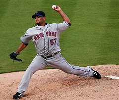
On Sunday night I spent a few minutes going through the comments that had been posted on the site that day. One of them, posted by Benjamin Bonnet, caught my eye: “Santana is throwing so hard today, the blue piping on his right sleeve is falling apart!”
I had listened to Sunday’s Mets/Dbacks game on the radio but hadn’t seen any of it on TV, so I hadn’t been aware of any issues with Johan Santana’s sleeve. So I went online and found this. As you can see, sure enough, it looks like a bit of the blue piping on his left sleeve was coming loose.
And that might have been the end of it. Fortunately, however, reader Dan Cichalski was paying closer attention. He noticed that there was a lot more going on here than just some loose piping, and it involved both of Santana’s sleeves. Check out this screen grab that he sent me, along with these close-ups of Johan’s left and right sleeves.
That’s a new one on me — never seen anything like it. Almost looks like a backwards S, or maybe some spangles, right? Or maybe talons. Very strange.
My first thought was, “Has this been going on since the start of the season?” So I started looking at Sanatana pics from last month. The piping here looks normal enough, but this one looks like it might have some extra stitching — not as much as he had on Sunday, though — or it might just be the spot where the two ends of the piping meet and overlap.
My next thought was that I had to talk to Russ Gompers, the Mets’ stitching and embroidery guy. When a player requires some custom work (like the little stretch panels sewn into Pedro Martinez’s sleeves), he’s the guy who does it. He’s always kinda surprised and amused when I notice these little details, so I called him up and figured we’d have an entertaining and illuminating chat. Here’s how it went:
Paul: Russ, it’s Paul Lukas from Uni Watch.
Russ: Hey, Paul! How ya doing?
Paul [all smug and chummy]: Fine, fine. And I bet you can guess why I’m calling.
Russ [a bit puzzled-sounding]: Uh, actually, Paul, no I can’t.
Paul [still all wink-wink, nudge-nudge]: Well, I was watching the game yesterday, and I noticed something veeeeery interesting on Sanatana’s sleeves. And I figured you might be able to tell me about it.
Russ: Really? I don’t know what you’re talking about.
Paul [spell finally broken]: Seriously?! Well let me show you these photos I’ve got.
So I e-mailed the screen grabs to Russ and then called him back a few minutes later.
“That’s some weird shit there,” he said, as he studied the pics. “Wow. I was watching the game, too, but I didn’t see that. What the fuck? It looks like a backward S. I know nothing about that, Paul, but I will check it out with Charlie [Samuels, the team’s equipment manager] and get back to you.”
The only thing cooler than going over uni details with Russ Gompers is stumping Russ Gompers. Stay tuned for more info on this one.
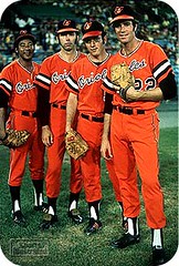
O’s in Orange, Revisisted: As you’ll recall, I recently ran an item about the Orioles’ orange uniforms. I thought they’d been worn twice in 1971 (based on info from Bill Henderson and “Dressed to the Nines”), but Steve Dewing’s photo site suggested they’d also been worn in April of 1972. (If you missed that entry, catch up on it here.) By the end of the day, several people had posted comments quoting archival articles that seemed to confirm that the uniforms had indeed been worn in 1972 as well as ’71.
A couple of things have happened since then:
• First, Bill Henderson — whose awesome CD was my main source for the “only in ’71” claim — checked in with a very thoughtful, articulate post in the comments section. He posted it several days after the fact, so you probably missed it — check it out here. (A lot of researchers would have gotten all defensive or uppity if their work was called into question, so Bill’s graciousness here earns him major bonus points in my book.)
• Mike Kingery (no, not that Mike Kingery) sent along this page. If you scroll down to the bottom, broadcaster/collector Ted Patterson is quoted saying that the orange uniforms may have been worn as many as 10 times.
• Charlie Frank forwarded a bunch of archival articles relating to the orange garb. Here they are, in sequence: 9/17/71 (orange uniforms, “every bit as colorful as the green and gold of the Oakland Athletics,” make their debut); 9/26/71 (the Orioles plan to “bedazzle the Oakland Athletics in the playoffs” with the orange duds [of course, that plan never came to fruition]); 10/3/71 (orange uniforms were hanging in the O’s lockers during the playoffs but were never used in the post-season); 4/18/72 (brief reference to the O’s “wearing their pumpkin orange uniforms” — confirmed for 1972 use!); 5/23/72 (“The Orioles performed in their orange uniforms. ‘We wear them in about one game per series,’ said manager Earl Weaver, ‘and the more we wear them, the less I like them,'” which would seem to lend credence to the fact that the design may have been worn around 10 times).
• My own research turned up a few items from the Sporting News archives, including this item from 5/13/72 (note the first full graf in the right-hand column) and this one from two years later — 5/3/75 — by which time the solid-orange look was already being viewed as a “What were they thinking?” misstep.
Thanks to all who helped sort this one out.
Site News: As you may have noticed, the site is loading much faster now — no more sluggishness. The only down side is that we had to eliminate the little quick-link tags (“Bold,” “Italic,” “Link,” etc.) from the commenting function. For some reason those tags were slowing down the site’s performance — not sure why. John’s working to come up with a replacement plug-in, but for now you’ll have to use standard HTML coding if you want your comment text to be bold, ital, or whatever. If you want to add a link to a photo or web page but don’t know how to do the coding, just put the URL on a separate line, all by itself. OK? OK.
Uni Watch News Ticker: While looking through the Sporting News archives for info on the orange O’s uniforms, I came across a few cool things. First, check out this letter to the editor (from 9/1/73), from a fan who apparently wasn’t too fond of this look. Totally dig that “Voice of the Fan” illo, too. And then, from 3/8/75, imagine the double-take I did when I saw this ad. These and other treasures await anyone who signs up for a free membership at Paper of Record, which has searchable archives of the entire Sporting News database. ”¦ “The IIHF World Hockey Championships are going on right now in Halifax and Quebec City,” writes Kris Fulton. “It’s the 100-year anniversary of the tournament and the first time it’s ever been held in Canada, and Nike has been stepping up with some amazing throwback jerseys.” Lots of photos here. ”¦ Interesting note from Jeff Fishman, who writes: “With the rain out of the Mets/Pirates game on April 28th, the team will face a predicament regarding their scheduled ceremonies for counting down the games remaining at Shea. The original plan had someone associated with the number to be honored (for example, Tom Seaver will presumably take down the 41, and so on). But the April 28th game has been rescheduled for August 11th, so I was wondering if the team will now have everyone switch their appointed ceremony by one game later (a potential travel nightmare, especially for those honored at the last game at the end of a homestand), or just stick to the original schedule.” Good question, especially since there will no doubt be more rainouts to come. Anyone know how other final-season stadiums with similar ceremonies handled this? ”¦ Following up on yesterday’s main entry, Todd Radom checked in with the following explanation of the W used by the Nationals vs. the one that had been used by the Senators: “For the Senators, ignore the retail Cooperstown caps in every respect. See attached for some relevant images, including a couple of game-used examples from a reliable auction house. The Senators had a lighter red and a slightly lighter blue outline, but the Senators and Nats had same angle to the W. Today’s W is of course more puffy and dimensional, and the vintage versions were often inconsistent, but the photos tell the story.” That last bit is the key — we often fall into the trap of thinking logos have always been super-standardized, when in fact they often varied widely. So trying to match a “true” Senators logo is ultimately an exercise in futility. I still think the Rangers shouldn’t have used black-underbilled Nats caps, though. ”¦ Wren Wagner noticed something else about that throwback game: Back in the late ’60s, the Oakland’s pants piping was green-gold-green (at least in that photo), but on the throwback pants it was gold-green-gold. ”¦ Extremely entertaining article here about the “uniforms” — i.e., specially modified suits — worn by New York police detectives. Great accompanying video embedded in the article page, too — highly recommended. ”¦ “I went to the U.S. women’s soccer match vs. Australia last Saturday in Birmingham, and noticed that Natasha Kai was wearing one red Nike Mercurial Vapor IV and one orange one,” writes Craig Justice. “Also to help the orange one match, she has been wearing a bright orange headband during recent matches. I think she’s been doing it for a while.” ”¦ New uniform, of sorts, for Cesc Fabregas. “Hard to tell for sure, but it looks like the actual EPL font on the back, including logo inside the numeral,” notes Matt Brukman. ”¦ “Oscar De La Hoya is a part owner of the Houston Dynamo, and on Saturday he had a Dynamo logo on his trunks, ” writes John Romero. “The funny thing is, the fight took place on the home pitch of the LA Galaxy.” ”¦ “I cover the Manchester Wolves AF2 team in New Hampshire,” writes Ian M. Clark. “On Sunday against Daytona Beach, the Wolves wore jerseys designed by patients in the pediatric unit of Elliot Hospital in Manchester. It’s hard to see in the pic, but the jerseys have some flowers and a sun on the front. In addition to the orange/dark blue shoulders with alternating colored numbers, they also had green stripes down the side. Manchester normally wears blue jerseys at home.” ”¦ The Reds really overdid that NOB lettering back in the day, no? That shot comes courtesy of Kenn Tomasch, who says it dates back to 1988 or ’89. ”¦ Got a note from one Andy Thoele, who has a pretty entertaining site devoted to souvenir batting helmets — worth checking out. ”¦ Awesome discovery by Ed Hahn, who writes: “I was watching a DVD of the 1980 Carl Sagan science series Cosmos (yeah, nerdy). Guess what appears for a few frames in Episode VIII, ‘Travels in Space and Time,’ about Einstein’s Theory of Relativity? Even weirder, this particular scene was filmed in Vinci, Italy, in Tuscany.” ”¦ Remember that guy who tried to force his kid to wear a Packers jersey? Maybe he should adopt this kid. … Speaking of kids, Dave Sterling found some short video clips of Japanese Little Leaguers. Good to see they’re teaching good hosiery protocols over there.
great detective work paul & others on the johan jersey mystery…metswatch is back!
yay
Just curious, but does anyone else think that the “B” on the Red Sox lids looks a little larger this year?
I can’t wait to see the French vintage jersey on the ice at the World Championships. Viva le Rooster!
link
Those advertisments really ruin these international hockey uniforms…. blah.
link
link
link
The souvenir batting helmet site is fantastic. I now have the urge to dig out of my attic the couple of dozen helmets that I bought when I was in 8th grade in the late ’70s.
For a while, it was all the rage to wear the helmets to school. Though I was (and am) a Reds fan, I never liked that the wishbone “C” was too rounded on the souvenir helmet, so my favorite was the Twins helmet that is similar to the one worn by the occasional Twins catcher these days.
Have Another Doughnut…
or is it donut? either way it doesn’t seem like 20 years and 3 Stanley Cups since the Don Koharski, Jim Shoenfeld incident.
What Uniwatchers will find interesting is the yellow practice jerseys and the green sweatpants the officials had to wear.
link
[quote comment=”266119″]Those advertisments really ruin these international hockey uniforms…. blah.
[/quote]
I agree. The US went advertisement-free when they wore their throwbacks in their opening game against Latvia, which was refreshing. I’ve been most impressed by Germany
link
and Latvia
link
…two of the simpler designs. I’ll be at the Canada/USA game this afternoon to see Canada’s throwback. The depressing part? None of these jerseys are on sale at the venue, just the contemporary jerseys.
I think what you’re seeing on Santana’s jersey is just the sleeve trim being stretched to the breaking point.
I have game-worn David Segui and Daniel Cabrera Orioles home jerseys that exhibit similar sleeve trim issues. The jersey material has much more stretch than the trim material does. If you stretch the sleeve enough, the trim pulls away from the sleeve. Once it’s separated, it will curl up and do its own thing.
Neither of my examples are as severe as the Santana jersey, but there you go.
[quote comment=\”266189\”][quote comment=\”266119\”]Those advertisments really ruin these international hockey uniforms…. blah.
[/quote]
I agree. The US went advertisement-free when they wore their throwbacks in their opening game against Latvia, which was refreshing. I\’ve been most impressed by Germany
link
and Latvia
link
…two of the simpler designs. I\’ll be at the Canada/USA game this afternoon to see Canada\’s throwback. The depressing part? None of these jerseys are on sale at the venue, just the contemporary jerseys.[/quote]
One other pleasant surprise – contrary to what the article said, Russia\’s throwback wasn\’t updated to say \”Russia\” but actually had \”CCCP\”. Authenticity wins, don\’t see that often enough.
link
Re: Orioles. In this link, see the middle cap. Did the O’s wear a matching helmet in 1975-76 when they wore this cap? Or did they stick with the white helmet on the left in his link? Thanks all.
link
go to: link
[quote comment=”266100″]great detective work paul & others on the johan jersey mystery…metswatch is back!
yay[/quote]
It looks to me like the backwards S is like seeing a duck in the clouds. It appears the material is simply fraying all around on both sleeves.
Paul, will you be attending the new Sports Museum of America???
link
[quote comment=”266189″][quote comment=”266119″]Those advertisments really ruin these international hockey uniforms…. blah.
[/quote]
I agree. The US went advertisement-free when they wore their throwbacks in their opening game against Latvia, which was refreshing. I’ve been most impressed by Germany
link
and Latvia
link
…two of the simpler designs. I’ll be at the Canada/USA game this afternoon to see Canada’s throwback. The depressing part? None of these jerseys are on sale at the venue, just the contemporary jerseys.[/quote]
LOVE the NNOB for Germany. Wish some NHL teams did that.
Oscar De La Hoya is part owner of the Houston Dynamo, ergo the colors and logo.
The link won’t post fully. Type “Orioles 1975” into Google and it will come up. Sorry.
[quote comment=”266207″][quote comment=”266100″]great detective work paul & others on the johan jersey mystery…metswatch is back!
yay[/quote]
It looks to me like the backwards S is like seeing a duck in the clouds. It appears the material is simply fraying all around on both sleeves.[/quote]
(YAWNS at today’s entry)
This is the “doozy”?????
I noticed the frayed bits of sleeve piping when I watched some of that Santana game on TV, and thought it seemed way too early in the season for it to just be normal stretching/wear and tear on the braid. You get that with repeated washings, especially with cut ends, but how much has he worn that particular jersey?
[quote comment=”266224″][quote comment=”266207″][quote comment=”266100″]great detective work paul & others on the johan jersey mystery…metswatch is back!
yay[/quote]
It looks to me like the backwards S is like seeing a duck in the clouds. It appears the material is simply fraying all around on both sleeves.[/quote]
(YAWNS at today’s entry)
This is the “doozy”?????[/quote]
Don’t mind him, folks. He’s just bored. :)
Agree, great research on the Orioles orange jersey question. The post-1971 articles however, don’t mention the pants, unless I missed it. The 1972 “confirmation article” only mentions orange “uniforms.” I know the O’s had the orange jersey working in the mid-70s, but I still believe the orange pants went the way of the dodo bird after the 1971 season.
Did anyone notice the piping on Prince Fielder’s jersey on the cover of the sporting news a few weeks back. The piping on both arms was all beat up and missing. Must be low quality Majestic jersey.
[quote comment=”266242″][quote comment=”266224″][quote comment=”266207″][quote comment=”266100″]great detective work paul & others on the johan jersey mystery…metswatch is back!
yay[/quote]
It looks to me like the backwards S is like seeing a duck in the clouds. It appears the material is simply fraying all around on both sleeves.[/quote]
(YAWNS at today’s entry)
This is the “doozy”?????[/quote]
Don’t mind him, folks. He’s just bored. :)[/quote]
link
I saw a classic photo of Babe Ruth’s jersey number being retired. I noticed that all of the Yankee players on the top step were wearing what appeared to be road jerseys. Ruth was wearing Pinstripes and it looked like all the players were wearing solid color with block NEW YORK across the chest. Does anyone know about this?
[quote comment=”266137″]The souvenir batting helmet site is fantastic. I now have the urge to dig out of my attic the couple of dozen helmets that I bought when I was in 8th grade in the late ’70s.
For a while, it was all the rage to wear the helmets to school. Though I was (and am) a Reds fan, I never liked that the wishbone “C” was too rounded on the souvenir helmet, so my favorite was the Twins helmet that is similar to the one worn by the occasional Twins catcher these days.[/quote]
Another helmet collector here, Robert. Also happen to be a Reds fan as well.
I had dozen of them too, mostly from the mid to late 70s, most of them purchased at Riverfront Stadium. I had to have a few helmets each time we’d go to Cincinnati, which was about 3 or 4 times a year. We’d go for a few days several times each year instead of going on a big 2 week vacation.
My friends loved ’em and I’d let ’em all wear one as we played during the summer.
Had a few broken when some jerk would smack the top of the helmet and jab those plastic tabs into your scalp.
Dude! those souvenir MLB helmets bring back great memories of the few times I went to see the Astros play when I was a lad. I still have this helmet
link
And this
link
Interestingly enough, Andy has this
link
which I believe is a prototype helmet to have been worn with the red hats like Andy mentions on his site…but, the only time I ever saw it–other than a kids helmet–was when the Astros unvailed their new uniforms back in 1999(?) and not other time since. It’s kind of like the Texans’ white helmet prototype shown when the team name was announced but never used…
dang it! my HTML coding skills are not what they used to be.
link 1 – link
link 2 – link
link 3 – link
[quote comment=”266267″]I saw a classic photo of Babe Ruth’s jersey number being retired. I noticed that all of the Yankee players on the top step were wearing what appeared to be road jerseys. Ruth was wearing Pinstripes and it looked like all the players were wearing solid color with block NEW YORK across the chest. Does anyone know about this?[/quote]
I believe there was a 2-inning exhibition between the ’23 team and other Yankee legends prior to the game. The team in road jerseys would have been one of those 2 teams (not sure which).
I’m not sure if this has been reported here (I was out of town last week and couldn’t catch up on the comments) but the link has been unveiled.
It’s definitely made to resemble the design of the link, in which the game will be played in 2011. And I’m curious why the logo doesn’t say “Arlington, TX”, since that’s where the stadium is and they put up all sorts of taxpayer money to get it in town. Didn’t last year’s Super Bowl have “Glendale, AZ” plastered all over everything?
[quote comment=”266267″]I saw a classic photo of Babe Ruth’s jersey number being retired. I noticed that all of the Yankee players on the top step were wearing what appeared to be road jerseys. Ruth was wearing Pinstripes and it looked like all the players were wearing solid color with block NEW YORK across the chest. Does anyone know about this?[/quote]
are you talking about link?
The Yakult Swallows wore throwback uniforms the other day, including an Astro Boy sleeve patch (they used to be called the Yakult Astros).
link
I believe the Voice of the Fan illo so loved by Paul is by the great sports cartoonist Willard Mullin, who often drew for The Sporting News. To see more of his work, follow the links below.
link
link
[quote comment=”266294″]dang it! my HTML coding skills are not what they used to be.
link 1 – link
link 2 – link
link 3 – link
I used to love them as a kid. One of the big ice cream chains, Carvel, Baskin Robbins, used to give out their sundaes in miniature versions of those helmets.
In the “Dark Time” before cable and the Internet, those helmets, baseball cards, and the occasional non-divisional game for the Yankees and mets were the only times that I would see different helmets!
Did anyone else notice that the A’s are wearing black shoes in this pic?
link
Chalk up another throwback foul.
[quote comment=”266301″]I’m not sure if this has been reported here (I was out of town last week and couldn’t catch up on the comments) but the link has been unveiled.
It’s definitely made to resemble the design of the link, in which the game will be played in 2011. And I’m curious why the logo doesn’t say “Arlington, TX”, since that’s where the stadium is and they put up all sorts of taxpayer money to get it in town. Didn’t last year’s Super Bowl have “Glendale, AZ” plastered all over everything?[/quote]
I’m thinking that’s not the game logo, but the host committee logo.
link
link
And as someone who lives in Glendale, Arizona, I can tell you that “Glendale, AZ” was plastered all over Glendale, but the official NFL stuff said “Arizona” more often than not.
[quote comment=”266333″]In the “Dark Time” before cable and the Internet, those helmets, baseball cards, and the occasional non-divisional game for the Yankees and mets were the only times that I would see different helmets![/quote]
no SI? no sporting news? espn has spoiled us to be sure, but for the enterprising amongst us, we could get our uni fixes via the print medium
and i could be wrong, but i don’t recall BR ever having the mini-sundae helmets…i think it was just carvel…unless BR had soft serve 30 years ago
[quote comment=”266349″][quote comment=”266333″]In the “Dark Time” before cable and the Internet, those helmets, baseball cards, and the occasional non-divisional game for the Yankees and mets were the only times that I would see different helmets![/quote]
no SI? no sporting news? espn has spoiled us to be sure, but for the enterprising amongst us, we could get our uni fixes via the print medium
and i could be wrong, but i don’t recall BR ever having the mini-sundae helmets…i think it was just carvel…unless BR had soft serve 30 years ago[/quote]
It might have been Dairy Queen, I don’t know…I was 4!
As for Sports Illustrated, I neglected to mention my devotion to SI. It would come in the mail on Friday afternoon and I would spend all night Friday and Saturday morning reading that magazine from cover to cover except for Golf articles!
My two favorites were both biographies, one of Lou Gehrig and the other Chuck Bednarik.
I have never gotten a chance to read either “Sidd Finch” or the famous article on Patrick Ewing.
I blame SI solely for my Uni and sneaker obsession!
DC United is latest mls team to ink a shirt sponsor, Volkswagen
pics and news release on mlsnet.com
Re: Orange jerseys of the O’s. They wore them with white pants at home for most seasons from 1975-1988. In 1987 they started to wear them on the road a bit to break a long losing streak. Saw them wear them at Yankee Stadium.
On the road they wore them with gray pants.
This is a pic of an Ole Miss football player with a unique facemask posted by Reed from last night!
link
The only info that I can offer is that is definitely made by Schutt. Schutt is the only company to use the double reinforcing bars below the nose bumper.
In addition, the helmet is made by Schutt, you can tell by the six ppoints for chinstrap hookup.
I can honestly say that I have never seen that mask before on a non-DNA helmet. The side bars on the lower half that connect to the peripheral bars, have always been referred to as “crooked teath”. Players like Najeh Davenport often wore masks like that, as well as Charlie Whitehurst when at Clemson!
As for the center bar on a mask like that, the only player in both college and the pros to wear that mask is Amani Toomer, on a non-DNA model!
[quote comment=”266361″]
I have never gotten a chance to read either “Sidd Finch” or the famous article on Patrick Ewing.
[/quote]
link. I’m not familiar with the Ewing story but link.
link.
This leaves Colorado, Dallas, Kansas City, New England and San Jose as the only MLS teams without shirt sponsors.
[quote comment=”266379″]This leaves Colorado, Dallas, Kansas City, New England and San Jose as the only MLS teams without shirt sponsors.[/quote]
I think New York should be on that list. The only thing I see on the Red Bulls jersey is two red bulls!
[/sarcasm]
[quote comment=”266379″][quote comment=”266361″]
I have never gotten a chance to read either “Sidd Finch” or the famous article on Patrick Ewing.
[/quote]
link. I’m not familiar with the Ewing story but link.
link.
This leaves Colorado, Dallas, Kansas City, New England and San Jose as the only MLS teams without shirt sponsors.[/quote]
Thanks KT!
The ratty sleeve piping on Santana’s jersey just looks like evidence of cat ownership.
link
[quote comment=”266119″]Those advertisments really ruin these international hockey uniforms…. blah.
link
link
link
Maybe so, but I LOVE the socks – the Canada logo on the socks is SWEET!
[quote comment=”266349″][quote comment=”266333″] espn has spoiled us to be sure, but for the enterprising amongst us, we could get our uni fixes via the print medium
and i could be wrong, but i don’t recall BR ever having the mini-sundae helmets…i think it was just carvel…unless BR had soft serve 30 years ago[/quote]
BR had them and I am sure of it. I have the entire collection, somewhere at my parents house. I think my favorite ones growing up were the St Louis, and Oakland helmets. I’ll work on a pic if someone can post it for me.
hey anyone know where I can find more artwork like this?
link
Im looking for this kind of work specifically relating to the new york giants, like a book or something.
Or maybe where I could order old media guides or gameday mags on the web.
thanks!
[quote comment=”266413″]BR had them and I am sure of it. I have the entire collection, somewhere at my parents house. I think my favorite ones growing up were the St Louis, and Oakland helmets. I’ll work on a pic if someone can post it for me.[/quote]
well…it was nigh on 30 years ago…i just don’t ever recall them being at BR…but i can’t remember 30 minutes ago, so…
anyhoo
link … link
Living in Minnesota during Santana’s entire career there, I seem to remember his jersey’s becoming frayed over time as well. I recall it being on the actual Twins logo on the front though.
[quote comment=”266301″]I’m not sure if this has been reported here (I was out of town last week and couldn’t catch up on the comments) but the link has been unveiled.
It’s definitely made to resemble the design of the link, in which the game will be played in 2011. And I’m curious why the logo doesn’t say “Arlington, TX”, since that’s where the stadium is and they put up all sorts of taxpayer money to get it in town. Didn’t last year’s Super Bowl have “Glendale, AZ” plastered all over everything?[/quote]
Yeah like KT said, that is the host committee’s logo…never the same as the actual game…when Jacksonville got SB XXXIX in 2002, for the 2005 game, the host committee put up a weak logo and we in the city thought that would be it…of course the host committee here in Jax was basically made up of Winn-Dickme…er Dixie people hence the logo was similar…
Great issue today! Thanks to all who did the follow-up work on the O’s pumpkin jerseys.
Love those hockey throwbacks. Looks like Latvia and Russia pre-dated the 1980 Vancouver Canucks horrid V-style jerseys!!!
-Jet
[quote comment=”266413″][quote comment=”266349″][quote comment=”266333″] espn has spoiled us to be sure, but for the enterprising amongst us, we could get our uni fixes via the print medium
and i could be wrong, but i don’t recall BR ever having the mini-sundae helmets…i think it was just carvel…unless BR had soft serve 30 years ago[/quote]
BR had them and I am sure of it. I have the entire collection, somewhere at my parents house. I think my favorite ones growing up were the St Louis, and Oakland helmets. I’ll work on a pic if someone can post it for me.[/quote]
You sure? Baskin Robbins, or as the old people called/call it 31 Flavors, was just down the street from me as a kid and they never did it. However 2 different locally owned restaurants in my area did, the Ground Round and the Pink Pony, both are closed for business, and one is in fact a sleasey strip club. But yeah, if I remember right I had all but 2 teams the A’s and the Yankees, and that included but the old and new White Sox helemts and about 25 of the Giants for whatever reason. Between that and teh mini NFL quarter machine helmets, my room was covered in plastic head-gear. And I iknwo for me I only had enough coin for one sports magazine and that was Beckett, copuldn’t get buy without it, my neighbor got SI, so all was well.
As far as the full sixed helmets go, like Scotty said above, I’ve got the scars on top of my head to prove I wore them playing tennisball baseball in my backyard whne I was 7ish.
[quote]You sure? Baskin Robbins, or as the old people called/call it 31 Flavors, was just down the street from me as a kid and they never did it.[/quote]
HEY! i called it 31 flavors
shit…im old
rewatching sunday’s a’s sens game cause i wanted to see the unis once more and, specifically, listen again the campy interview – uh, yes, he s/b in HOF. got me to thinking. when did this turn back the clock unis thing begin? anyone know the date of the first one in either nhl, nba, mlb, nfl?
[quote comment=”266211″][quote comment=”266189″][quote comment=”266119″]Those advertisments really ruin these international hockey uniforms…. blah.
[/quote]
I agree. The US went advertisement-free when they wore their throwbacks in their opening game against Latvia, which was refreshing. I’ve been most impressed by Germany
link
and Latvia
link
…two of the simpler designs. I’ll be at the Canada/USA game this afternoon to see Canada’s throwback. The depressing part? None of these jerseys are on sale at the venue, just the contemporary jerseys.[/quote]
LOVE the NNOB for Germany. Wish some NHL teams did that.[/quote]
its not allowed in the NHL. The league mandated NOB a long time ago and Toronto didn’t want to since it meant less programs being sold, so they did theirs in blue on the blue unis, which the NHL then said you can’t to that.
[quote comment=”266333″][quote comment=”266294″]dang it! my HTML coding skills are not what they used to be.
link 1 – link
link 2 – link
link 3 – link
I used to love them as a kid. One of the big ice cream chains, Carvel, Baskin Robbins, used to give out their sundaes in miniature versions of those helmets.
In the “Dark Time” before cable and the Internet, those helmets, baseball cards, and the occasional non-divisional game for the Yankees and mets were the only times that I would see different helmets![/quote]
It was DQ that offered them. I can still remember going to DQ with my parents and always asking for the Astros helmet sunday. Also would have to get one when we would be at an Astros game, so I eneded up with around 15 of just the blue Astros helmet at one time. Ted Drewe’s here in St Louis actually offers MLB helmet sundays, but I don’t know if they are the current helmets or not. It didn’t seem like they are ordered that often.
Funny story about the souvenir helmets. The night before my first game in the Astrodome, dad and I are watching the news to see how the Astros did. Well, it had been a souvenir helmet promoation to all kids 15 and younger, and the news was showing a clip from the game of a kid trying to catch a home run with one of the helmets. The reporter said “Kids, this is why the helmet is just a toy and will not protect you!” and the clip shows the helmet shattering into many plastic shards as the ball just flies right through it. Everytime I see one of those souvenir helmets, I think of that clip.
[quote comment=”266448″][quote comment=”266301″]I’m not sure if this has been reported here (I was out of town last week and couldn’t catch up on the comments) but the link has been unveiled.
It’s definitely made to resemble the design of the link, in which the game will be played in 2011. And I’m curious why the logo doesn’t say “Arlington, TX”, since that’s where the stadium is and they put up all sorts of taxpayer money to get it in town. Didn’t last year’s Super Bowl have “Glendale, AZ” plastered all over everything?[/quote]
Yeah like KT said, that is the host committee’s logo…never the same as the actual game…when Jacksonville got SB XXXIX in 2002, for the 2005 game, the host committee put up a weak logo and we in the city thought that would be it…of course the host committee here in Jax was basically made up of Winn-Dickme…er Dixie people hence the logo was similar…[/quote]
Didn’t you mean “Dinn-Wixie”?
Also wasn’t SB XLI held in “South Florida” as not to have Broward County feel left out?
[quote comment=”266403″]The ratty sleeve piping on Santana’s jersey just looks like evidence of cat ownership.
link
Knowing what little I do of Shea stadium, it could have been a cat(link), or worse, a rat!
Hey … how you do insert a link in your next now? I finally learned a week or two ago, and I see others doing it even with the new setup!
That thing on Santana’s jersey looks like a seahorse.
[quote comment=”266462″][quote]You sure? Baskin Robbins, or as the old people called/call it 31 Flavors, was just down the street from me as a kid and they never did it.[/quote]
HEY! i called it 31 flavors
shit…im old[/quote]
I’m sorry, but that is the official litmus test for being old.
On a serious note, I’ve been doing some searching and I can’t find anything reliable, but there are mentions on different blogs of people saying they got them at basically every single place in the US that sold ice cream. After reading that I remembered I also got them at DQ, the Tasty Freeze, and the Dairy Ripple(best damn slushies on Earth I tell ya). Too bad MLB isn’t smart enough to do that again, I definitly got dozens of sundaes I didn’t even want to amke sure I got a new team.
[quote comment=”266448″][quote comment=”266301″]I’m not sure if this has been reported here (I was out of town last week and couldn’t catch up on the comments) but the link has been unveiled.
It’s definitely made to resemble the design of the link, in which the game will be played in 2011. And I’m curious why the logo doesn’t say “Arlington, TX”, since that’s where the stadium is and they put up all sorts of taxpayer money to get it in town. Didn’t last year’s Super Bowl have “Glendale, AZ” plastered all over everything?[/quote]
Yeah like KT said, that is the host committee’s logo…never the same as the actual game…when Jacksonville got SB XXXIX in 2002, for the 2005 game, the host committee put up a weak logo and we in the city thought that would be it…of course the host committee here in Jax was basically made up of Winn-Dickme…er Dixie people hence the logo was similar…[/quote]
Thanks for the clarification KT and Jacksonville Yankee. It makes sense that the host committee would play up the stadium and the “North Texas” region in their logo. The blog post I got this info from said the logo looked like something out of Star Trek.
[quote comment=”266467″]rewatching sunday’s a’s sens game cause i wanted to see the unis once more and, specifically, listen again the campy interview – uh, yes, he s/b in HOF. got me to thinking. when did this turn back the clock unis thing begin? anyone know the date of the first one in either nhl, nba, mlb, nfl?[/quote]
First one I remember was the White Sox in 1991 and I think the Jets did it in 1993 for the 25th anniversary of SB III. The whole league in 1994.
[quote comment=”266493″][quote comment=”266403″]The ratty sleeve piping on Santana’s jersey just looks like evidence of cat ownership.
link
Knowing what little I do of Shea stadium, it could have been a cat(link), or worse, a rat!
Hey … how you do insert a link in your next now? I finally learned a week or two ago, and I see others doing it even with the new setup![/quote]
like link?
i never learned the “correct way”, which serves me well now…i just type out the html code
to see the code from a link…just hit “quote”–instead of replying, just note what comes before and after the linky…the left carat, then a then space then href etc.
Hockey fans are the best!
link
linky please!?
[quote comment=”266508″]Hockey fans are the best!
link
linky please!?[/quote]
lets try again!
link
[quote comment=”266481″][quote comment=”266333″][quote comment=”266294″]dang it! my HTML coding skills are not what they used to be.
link 1 – link
link 2 – link
link 3 – link
I used to love them as a kid. One of the big ice cream chains, Carvel, Baskin Robbins, used to give out their sundaes in miniature versions of those helmets.
In the “Dark Time” before cable and the Internet, those helmets, baseball cards, and the occasional non-divisional game for the Yankees and mets were the only times that I would see different helmets![/quote]
It was DQ that offered them. I can still remember going to DQ with my parents and always asking for the Astros helmet sunday. Also would have to get one when we would be at an Astros game, so I eneded up with around 15 of just the blue Astros helmet at one time. Ted Drewe’s here in St Louis actually offers MLB helmet sundays, but I don’t know if they are the current helmets or not. It didn’t seem like they are ordered that often.
Funny story about the souvenir helmets. The night before my first game in the Astrodome, dad and I are watching the news to see how the Astros did. Well, it had been a souvenir helmet promoation to all kids 15 and younger, and the news was showing a clip from the game of a kid trying to catch a home run with one of the helmets. The reporter said “Kids, this is why the helmet is just a toy and will not protect you!” and the clip shows the helmet shattering into many plastic shards as the ball just flies right through it. Everytime I see one of those souvenir helmets, I think of that clip.[/quote]
I’m a huge fan of Cheap Seats on ESPN Classic. Fans of the show might remember one of the episodes that highlighted an old pro wrestling show. There was a manager of one of the wrestlers named George “Crybaby” Cannon. He had to weight over 400 pounds and he wore this sweatshirt that said “Cannon I Am Right” on the back and wore a blue souvenir batting helmet.
As he was stepping into the ring, one of the Sklar brothers quipped that he just ate a dairy queen sundae that was in that batting helmet!
[quote comment=”266499″][quote comment=”266462″][quote]You sure? Baskin Robbins, or as the old people called/call it 31 Flavors, was just down the street from me as a kid and they never did it.[/quote]
HEY! i called it 31 flavors
shit…im old[/quote]
I’m sorry, but that is the official litmus test for being old.
On a serious note, I’ve been doing some searching and I can’t find anything reliable, but there are mentions on different blogs of people saying they got them at basically every single place in the US that sold ice cream. After reading that I remembered I also got them at DQ, the Tasty Freeze, and the Dairy Ripple(best damn slushies on Earth I tell ya). Too bad MLB isn’t smart enough to do that again, I definitly got dozens of sundaes I didn’t even want to amke sure I got a new team.[/quote]
F*ck being old…you are only as old as you feel…Hell I still call Walmart a 5 and Dime…like the old Woolworths and I am only 33. Just to let you know, the Suns, the local Jax AA team here, still gives away sundaes in the helmets…an fyi
Speaking of things that are called differently…tell me something people in NYC…do you call the Building over Grand Central Station the Pam Am Building (still like i will forever) or the new name of the MetLife Building?
[quote comment=”266514″][quote comment=”266508″]Hockey fans are the best!
link
linky please!?[/quote]
lets try again!
link
the most egregious thing in that pic is NOT the nipples on the heads…
it is drinking a brewskie in a plastic cup with a straw
[quote comment=”266530″][quote comment=”266514″][quote comment=”266508″]Hockey fans are the best!
link
linky please!?[/quote]
lets try again!
link
the most egregious thing in that pic is NOT the nipples on the heads…
it is drinking a brewskie in a plastic cup with a straw[/quote]
dude on the left must be the designated
douchebagdriver[quote comment=”266474″][quote comment=”266211″][quote comment=”266189″][quote comment=”266119″]Those advertisments really ruin these international hockey uniforms…. blah.
[/quote]
I agree. The US went advertisement-free when they wore their throwbacks in their opening game against Latvia, which was refreshing. I’ve been most impressed by Germany
link
and Latvia
link
…two of the simpler designs. I’ll be at the Canada/USA game this afternoon to see Canada’s throwback. The depressing part? None of these jerseys are on sale at the venue, just the contemporary jerseys.[/quote]
LOVE the NNOB for Germany. Wish some NHL teams did that.[/quote]
its not allowed in the NHL. The league mandated NOB a long time ago and Toronto didn’t want to since it meant less programs being sold, so they did theirs in blue on the blue unis, which the NHL then said you can’t to that.[/quote]
I know it’s not allowed and I’ve read about the TOR thing, it’s pretty funny. Still think it would look sweet if they wore just numbers though.
[quote comment=”266235″]I noticed the frayed bits of sleeve piping when I watched some of that Santana game on TV, and thought it seemed way too early in the season for it to just be normal stretching/wear and tear on the braid. You get that with repeated washings, especially with cut ends, but how much has he worn that particular jersey?[/quote]
If this is true it is a good example of logo creep backfire. Majestic makes sure everyone knows they make the jerseys by branding them, then the jerseys are crap, so everyone knows Majestic makes crappy jerseys. It is similar to Reebok’s Edge hockey uniforms. They promoted the hell out of them and stuck the vector thing all over them and then the uniforms were terrible.
It seems to me that if a company is going to heavily brand and advertise, they should devote at least as much effort into manufacturing a quality product. Or *gasp* stop slapping logos all over everything.
[quote comment=”266528″][quote comment=”266499″][quote comment=”266462″][quote]You sure? Baskin Robbins, or as the old people called/call it 31 Flavors, was just down the street from me as a kid and they never did it.[/quote]
HEY! i called it 31 flavors
shit…im old[/quote]
I’m sorry, but that is the official litmus test for being old.
On a serious note, I’ve been doing some searching and I can’t find anything reliable, but there are mentions on different blogs of people saying they got them at basically every single place in the US that sold ice cream. After reading that I remembered I also got them at DQ, the Tasty Freeze, and the Dairy Ripple(best damn slushies on Earth I tell ya). Too bad MLB isn’t smart enough to do that again, I definitly got dozens of sundaes I didn’t even want to amke sure I got a new team.[/quote]
F*ck being old…you are only as old as you feel…Hell I still call Walmart a 5 and Dime…like the old Woolworths and I am only 33. Just to let you know, the Suns, the local Jax AA team here, still gives away sundaes in the helmets…an fyi
Speaking of things that are called differently…tell me something people in NYC…do you call the Building over Grand Central Station the Pam Am Building (still like i will forever) or the new name of the MetLife Building?[/quote]
Pan Am, of course. And the trains tht go to GCS are Penn Central.
Glendale, Arlington & South Florida.
Those towns put up a ton of money to build tohse stadiums, and I think their primary concern is that when they host the premium games that the Phoenix, Dallas and Miami don’t get “shorthand credit” for hosting them.
[quote comment=”266502″]
First one I remember was the White Sox in 1991 and I think the Jets did it in 1993 for the 25th anniversary of SB III. The whole league in 1994.[/quote]
White Sox was in 1990, last year of old Comiskey.
[quote comment=”266561″]Pan Am, of course. And the trains tht go to GCS are Penn Central.[/quote]
um
link…where the LIRR and amtrak (heading south) are…and link (MetroNorth trains) are not one in the same
[quote comment=”266514″][quote comment=”266508″]Hockey fans are the best!
link
linky please!?[/quote]
lets try again!
link
Must be the Corey Pecker fan club, Finnish chapter.
link
[quote comment=”266584″][quote comment=”266561″]Pan Am, of course. And the trains tht go to GCS are Penn Central.[/quote]
um
link…where the LIRR and amtrak (heading south) are…and link (MetroNorth trains) are not one in the same[/quote]
This will explain.
link
Anyone riding the Hudson, Harlem or New Haven lines in the early 1970’s knew the operator of those lines as Penn Central. Even after it was renamed Conrail, people generally called it Penn Central.
[quote comment=”266598″][quote comment=”266584″][quote comment=”266561″]Pan Am, of course. And the trains tht go to GCS are Penn Central.[/quote]
um
link…where the LIRR and amtrak (heading south) are…and link (MetroNorth trains) are not one in the same[/quote]
This will explain.
link
Anyone riding the Hudson, Harlem or New Haven lines in the early 1970’s knew the operator of those lines as Penn Central. Even after it was renamed Conrail, people generally called it Penn Central.[/quote]
You’d know that if you were “Westchester Phil” ;-)
[quote comment=”266598″][quote comment=”266584″][quote comment=”266561″]Pan Am, of course. And the trains tht go to GCS are Penn Central.[/quote]
um
link…where the LIRR and amtrak (heading south) are…and link (MetroNorth trains) are not one in the same[/quote]
This will explain.
link
Anyone riding the Hudson, Harlem or New Haven lines in the early 1970’s knew the operator of those lines as Penn Central. Even after it was renamed Conrail, people generally called it Penn Central.[/quote]
mea culpa…
i thought you were combining the names of “penn station” and “grand central” to from “penn central”
i am aware of the penn central, and should have realized in the context of the discussion (the “old” PanAm bldg., etc.) to what you were referring…the old pennsylvania railroad did, of course, go into pennsylvania station, whereas the new york central (among others), which begat penn central did have grand central as a terminus
i don’t call JFK “idlewild” although there are those here who still do, and there are countless older NYers who still refer to things ‘the way they wuz’
uniforms…what uniforms
Here’s another site dedicated to souvenier helmets.
link
[quote comment=”266626″][quote comment=”266598″][quote comment=”266584″][quote comment=”266561″]Pan Am, of course. And the trains tht go to GCS are Penn Central.[/quote]
um
link…where the LIRR and amtrak (heading south) are…and link (MetroNorth trains) are not one in the same[/quote]
This will explain.
link
Anyone riding the Hudson, Harlem or New Haven lines in the early 1970’s knew the operator of those lines as Penn Central. Even after it was renamed Conrail, people generally called it Penn Central.[/quote]
mea culpa…
i thought you were combining the names of “penn station” and “grand central” to from “penn central”
i am aware of the penn central, and should have realized in the context of the discussion (the “old” PanAm bldg., etc.) to what you were referring…the old pennsylvania railroad did, of course, go into pennsylvania station, whereas the new york central (among others), which begat penn central did have grand central as a terminus
i don’t call JFK “idlewild” although there are those here who still do, and there are countless older NYers who still refer to things ‘the way they wuz’
uniforms…what uniforms[/quote]
Which is the train station under the garden?
Don Cherry returns to U.S. TV for the Stanley Cup Playoffs, this time for ESPN. To commemorate the news, here’s a latest of Grapes’ sartorial hits.
link
Back to uniforms…
Last night, I had a basketball game at my local JCC and I saw an autographed version of the jersey in the link below framed and on the wall.
link
Very cool design!
By the way, I caddied for Billy SMith two years ago…what a cool guy!
[quote comment=”266652″]I saw an autographed version of the jersey in the link below framed and on the wall.
link
[/quote]
that was the second place finisher to “fishsticks” in the isles sweater contest a few years back
[quote comment=”266517″][quote comment=”266481″][quote comment=”266333″][quote comment=”266294″]dang it! my HTML coding skills are not what they used to be.
link 1 – link
link 2 – link
link 3 – link
I used to love them as a kid. One of the big ice cream chains, Carvel, Baskin Robbins, used to give out their sundaes in miniature versions of those helmets.
In the “Dark Time” before cable and the Internet, those helmets, baseball cards, and the occasional non-divisional game for the Yankees and mets were the only times that I would see different helmets![/quote]
It was DQ that offered them. I can still remember going to DQ with my parents and always asking for the Astros helmet sunday. Also would have to get one when we would be at an Astros game, so I eneded up with around 15 of just the blue Astros helmet at one time. Ted Drewe’s here in St Louis actually offers MLB helmet sundays, but I don’t know if they are the current helmets or not. It didn’t seem like they are ordered that often.
Funny story about the souvenir helmets. The night before my first game in the Astrodome, dad and I are watching the news to see how the Astros did. Well, it had been a souvenir helmet promoation to all kids 15 and younger, and the news was showing a clip from the game of a kid trying to catch a home run with one of the helmets. The reporter said “Kids, this is why the helmet is just a toy and will not protect you!” and the clip shows the helmet shattering into many plastic shards as the ball just flies right through it. Everytime I see one of those souvenir helmets, I think of that clip.[/quote]
I’m a huge fan of Cheap Seats on ESPN Classic. Fans of the show might remember one of the episodes that highlighted an old pro wrestling show. There was a manager of one of the wrestlers named George “Crybaby” Cannon. He had to weight over 400 pounds and he wore this sweatshirt that said “Cannon I Am Right” on the back and wore a blue souvenir batting helmet.
As he was stepping into the ring, one of the Sklar brothers quipped that he just ate a dairy queen sundae that was in that batting helmet![/quote]
So, i’m not the only one who cought that! Damn, i miss Cheep Seats…
[quote]Which is the train station under the garden?[/quote]
link
[quote comment=”266462″][quote]You sure? Baskin Robbins, or as the old people called/call it 31 Flavors, was just down the street from me as a kid and they never did it.[/quote]
HEY! i called it 31 flavors
shit…im old[/quote]
It may not still be called “31 Flavors,” but there’s still a “31” in the logo: link
And regarding the helmet sundaes, they still serve ’em at most ballparks I’ve visited. I even noticed that at least one Spring Training venue I visited this year (Clearwater?) sells ’em in helmets of teams other than the home team. (Ideal for Spring Training, since caravans of fans travel from camp to camp.)
[quote comment=”266662″][I’m a huge fan of Cheap Seats on ESPN Classic. Fans of the show might remember one of the episodes that highlighted an old pro wrestling show. There was a manager of one of the wrestlers named George “Crybaby” Cannon. He had to weight over 400 pounds and he wore this sweatshirt that said “Cannon I Am Right” on the back and wore a blue souvenir batting helmet.[/quote]
and link
You can get a sundae or cheese fries in a mini helmet at Miller Park and I was shocked when I ordered the fries and the girl asked if I wanted to regular or Retro. Way cool to be able to choose which mini batting helmet to have.
[quote comment=”266663″][quote]Which is the train station under the garden?[/quote]
link[/quote]
Penn Station.
Just to keep this a “uni” post, TSN reports (last item) what this and this cost. I wonder if blue sanis cost extra.
[quote comment=”266680″][quote comment=”266663″][quote]Which is the train station under the garden?[/quote]
link[/quote]
Penn Station.
Just to keep this a “uni” post, TSN reports (last item) what this and this cost. I wonder if blue sanis cost extra.[/quote]
TSN… link
This… link
and This… link
Boy, whatever has been gained by removing the buttons has been lost (by me) in the pain in the ass linking. Someone like to explain? Tried the earlier sugggestion, it did not work.
Not todays post related, but I was looking through Steve Dewings site, and came across this picture of Larry Doby with the Indians:
link
I have never seen that Indians hat before, with white piping going down the seams of the hat. I have seen other styles like it, (the Cubs come to mind) but never the Indians wearing it, with the ‘crazy’ C.
Does anyone have anymore info on this cap? Like how often they wore it? It must have been pretty rare. The uniform it is with is the “Campbell’s Soup” uniform, and usually it is pictured with the Crazy “C” and either a red bill or an all blue cap.
Unfortunately, the photo is not dated.
[quote comment=”266685″]Not todays post related, but I was looking through Steve Dewings site, and came across this picture of Larry Doby with the Indians:
link
I have never seen that Indians hat before, with white piping going down the seams of the hat. I have seen other styles like it, (the Cubs come to mind) but never the Indians wearing it, with the ‘crazy’ C.
Does anyone have anymore info on this cap? Like how often they wore it? It must have been pretty rare. The uniform it is with is the “Campbell’s Soup” uniform, and usually it is pictured with the Crazy “C” and either a red bill or an all blue cap.
Unfortunately, the photo is not dated.[/quote]
wasn’t it determined on this board (i wanna say like 2 weeks or so ago) that that was a coaches cap and the year was circa 1978???
[quote comment=”266670″][quote comment=”266462″][quote]You sure? Baskin Robbins, or as the old people called/call it 31 Flavors, was just down the street from me as a kid and they never did it.[/quote]
HEY! i called it 31 flavors
shit…im old[/quote]
It may not still be called “31 Flavors,” but there’s still a “31” in the logo: link
And regarding the helmet sundaes, they still serve ’em at most ballparks I’ve visited. I even noticed that at least one Spring Training venue I visited this year (Clearwater?) sells ’em in helmets of teams other than the home team. (Ideal for Spring Training, since caravans of fans travel from camp to camp.)[/quote]
Feeling dumb … I never saw the 31 until now (and yes, I, too, know the franchise by it’s numeric name).
Try this for the Natasha Kai image.
link
Chicago White Sox a big fan of Indiana Jones? Look at this schedule and tell me if thats not … odd. haha.
link
Article about the soon to be Women’s Professional Soccer team in Chicago w/ possible name/uni
link
Okay, maybe not just the White sox, but entire MLB.com crew.
from wikipedia “”On July 11, 1990 as part of the celebration of Comiskey Park, the White Sox played a Turn Back the Clock game against the Milwaukee Brewers. The White Sox wore their 1917 home uniforms. This was the first Turn Back the Clock game in the major leagues and started what has become a popular promotion.””
No pics, but Team Canada wore throwbacks during the warm up with NOB and numbers from the 76 Canada Cup team (i.e. Dany Heatley wore #9 “Hull”, Steve Staios wore #4 “Orr”). Classy.
… and the game begins with players with their own NOB and number and HUGE “Zepter” patches on both shoulders. Pathetic.
I don’t know if it has been mentioned but there are some interesting photo galleries on cnnsi.com. Best baseball players by uniform number. A few of them could be debated. And I don’t know how to do a link but it’s on the home page.
[quote comment=”266335″]Did anyone else notice that the A’s are wearing black shoes in this pic?
link
Chalk up another throwback foul.[/quote]
Those are the green Riddells I mentioned (on another thread) that the A’s had for “rainy days” as alternates in the early years of their white shoes.
[quote comment=”266718″][quote comment=”266335″]Did anyone else notice that the A’s are wearing black shoes in this pic?
link
Chalk up another throwback foul.[/quote]
Those are the green Riddells I mentioned (on another thread) that the A’s had for “rainy days” as alternates in the early years of their white shoes.[/quote]
how f’ed up is it to see link in a’s togs???
[quote comment=”266704″]Article about the soon to be Women’s Professional Soccer team in Chicago w/ possible name/uni
link
It’ll be Red Stars. And they’ll have a kit in the colors of the flag of the city of Chicago.
Hey, i’m watching Canada vs USA on tsn.ca, so the resolution isn’t the best but are Team Canada jerseys not only “vintage looking” but also using a vintage cut? They seem to be less sleeker than their regular ones, more old school.
(btw, 3-0 Canada… niiice)
link
Stinkin link issue … somehow I’m sure this is uni-related …
[quote comment=”266727″][quote comment=”266704″]Article about the soon to be Women’s Professional Soccer team in Chicago w/ possible name/uni
link
It’ll be Red Stars. And they’ll have a kit in the colors of the flag of the city of Chicago.[/quote]
That’s a great name, indeed. Too bad it’ll be wasted on a women’s team that will only be around for a couple years. But, maybe we’ll get to see a version of this beauty again.
link
Great. Just what I wanted to see on this humid and rainy day–pictures of Johan as a Met. He does look damn fine in black, though.
Anyway, I know what the problem is–he’s not supposed to be a Met. I have also seen his whole career as a Twin, and I don’t think he had the fraying problem whilst he was our ace.
Then again, I wasn’t exactly looking at his uni when he pitched, but more of his velocity.
[quote]I have also seen his whole career as a Twin, and I don’t think he had the fraying problem whilst he was our ace.[/quote]
indeed not…as soon as PL posted the story, i checked photos of him with his former team…and in NOT ONE did i see any kind of fraying
the problem is not that he’s not supposed to be a met, so much as he’s not supposed to be wearing that gaddawful black uni…he won’t fray in pins…
and…who would have thought that link would be 6-0 at this point in the season
[quote comment=”266743″]Great. Just what I wanted to see on this humid and rainy day–pictures of Johan as a Met. He does look damn fine in black, though.
Anyway, I know what the problem is–he’s not supposed to be a Met. I have also seen his whole career as a Twin, and I don’t think he had the fraying problem whilst he was our ace.
Then again, I wasn’t exactly looking at his uni when he pitched, but more of his velocity.[/quote]
But who can make sense of baseball anymore, the Twins lose Johan and have the ugliest uni’s in the division and thy’re still leading it. Madness I tell you!
Old-Fashioned Guy: Call me old-fashioned, but it seems to me that when the giant holding up the earth dies, we are screwed!
link
More on The Packer Kid
[quote comment=”266749″][quote]I have also seen his whole career as a Twin, and I don’t think he had the fraying problem whilst he was our ace.[/quote]
indeed not…as soon as PL posted the story, i checked photos of him with his former team…and in NOT ONE did i see any kind of fraying
the problem is not that he’s not supposed to be a met, so much as he’s not supposed to be wearing that gaddawful black uni…he won’t fray in pins…
and…who would have thought that link would be 6-0 at this point in the season[/quote]
Ummmm, any decent baseball fan! No offense, but he was already the best pitcher in the game, and he switched to the lesser hitting league. Plus he gets to wear balck alternates, and everyone knows that makes you a powerhouse!
link
One vote for the old buttons, regardless of the speed!
[quote comment=”266752″]http://sports.yahoo.com/nfl/blog/shutdown_corner/post/After-1-561-days-a-young-man-finally-takes-off-?urn=nfl,80972
More on The Packer Kid[/quote]
heh…from the packer kid story:
[quote]What shirt got the call in place of the tattered jersey? A red Nike shirt.[/quote]
there is a god after all
[quote comment=”266754″][quote comment=”266749″]who would have thought that link would be 6-0 at this point in the season[/quote]
Ummmm, any decent baseball fan![/quote]
time for a game of “name that
molinasantana” for you[quote comment=”266762″][quote comment=”266754″][quote comment=”266749″]who would have thought that link would be 6-0 at this point in the season[/quote]
Ummmm, any decent baseball fan![/quote]
time for a game of “name that
molinasantana” for you[/quote]Ugh. I was trying to make that sound sarcastic, guess I should just stick with the straight forward stuff.
[quote comment=”266762″][quote comment=”266754″][quote comment=”266749″]who would have thought that link would be 6-0 at this point in the season[/quote]
Ummmm, any decent baseball fan![/quote]
time for a game of “name that
molinasantana” for you[/quote]James Humphrey: He says, “Welcome to the land of blue light.”
[Humphrey simultaneously signs “Jesus Christ is dead.”]
[quote]Ugh. I was trying to make that sound sarcastic, guess I should just stick with the straight forward stuff.[/quote]
i should have been able to figure that out, but that’s not your style, ducks ;)
i knew you weren’t one of them ‘black is the shit’ types…
[quote comment=”266772″][quote]Ugh. I was trying to make that sound sarcastic, guess I should just stick with the straight forward stuff.[/quote]
i should have been able to figure that out, but that’s not your style, ducks ;)
i knew you weren’t one of them ‘black is the shit’ types…[/quote]
Well actually black is the shit, but as we all know, “Only good guys wear black!”
link
Oops….link
link
[quote comment=”266755″][quote comment=”266752″]http://sports.yahoo.com/nfl/blog/shutdown_corner/post/After-1-561-days-a-young-man-finally-takes-off-?urn=nfl,80972
More on The Packer Kid[/quote]
heh…from the packer kid story:
[quote]What shirt got the call in place of the tattered jersey? A red Nike shirt.[/quote]
there is a god after all[/quote]
Even better from the comments…
Not bad, same shirt for four years, but he won’t be closing in on Charlie Brown’s record any time soon.
[quote comment=”266197″][quote comment=\”266189\”][quote comment=\”266119\”]Those advertisments really ruin these international hockey uniforms…. blah.
[/quote]
I agree. The US went advertisement-free when they wore their throwbacks in their opening game against Latvia, which was refreshing. I\’ve been most impressed by Germany
link
and Latvia
link
…two of the simpler designs. I\’ll be at the Canada/USA game this afternoon to see Canada\’s throwback. The depressing part? None of these jerseys are on sale at the venue, just the contemporary jerseys.[/quote]
One other pleasant surprise – contrary to what the article said, Russia\’s throwback wasn\’t updated to say \”Russia\” but actually had \”CCCP\”. Authenticity wins, don\’t see that often enough.
link
Athenticity? Notice the tsarist/contemporary russian 2 headed eagle in the crest. For authenticity, we would need to see something like this – \http://www.ussr-airspace.com/catalog/images/al/60/29183432.jpg\
[quote comment=”266271″][quote comment=”266137″]The souvenir batting helmet site is fantastic. I now have the urge to dig out of my attic the couple of dozen helmets that I bought when I was in 8th grade in the late ’70s.
For a while, it was all the rage to wear the helmets to school. Though I was (and am) a Reds fan, I never liked that the wishbone “C” was too rounded on the souvenir helmet, so my favorite was the Twins helmet that is similar to the one worn by the occasional Twins catcher these days.[/quote]
Another helmet collector here, Robert. Also happen to be a Reds fan as well.
I had dozen of them too, mostly from the mid to late 70s, most of them purchased at Riverfront Stadium. I had to have a few helmets each time we’d go to Cincinnati, which was about 3 or 4 times a year. We’d go for a few days several times each year instead of going on a big 2 week vacation.
My friends loved ’em and I’d let ’em all wear one as we played during the summer.
Had a few broken when some jerk would smack the top of the helmet and jab those plastic tabs into your scalp.[/quote]
I remember going to the sporting goods store on days they got new shipments. Reds fan also, but also had the twins, mariners, Astros (orange and blue), Padres, brewers, Angels…used to wear one everyday in the summer.
[quote comment=”266361″][quote comment=”266349″][quote comment=”266333″]In the “Dark Time” before cable and the Internet, those helmets, baseball cards, and the occasional non-divisional game for the Yankees and mets were the only times that I would see different helmets![/quote]
no SI? no sporting news? espn has spoiled us to be sure, but for the enterprising amongst us, we could get our uni fixes via the print medium
and i could be wrong, but i don’t recall BR ever having the mini-sundae helmets…i think it was just carvel…unless BR had soft serve 30 years ago[/quote]
It might have been Dairy Queen, I don’t know…I was 4!
As for Sports Illustrated, I neglected to mention my devotion to SI. It would come in the mail on Friday afternoon and I would spend all night Friday and Saturday morning reading that magazine from cover to cover except for Golf articles!
My two favorites were both biographies, one of Lou Gehrig and the other Chuck Bednarik.
I have never gotten a chance to read either “Sidd Finch” or the famous article on Patrick Ewing.
I blame SI solely for my Uni and sneaker obsession![/quote]
I am going to head over to the SI Vault to read the Finch article again…which Ewing article are you referring to?
Thanks for posting that little snippet I sent you about the pant striping on the Oaklnad Throwbacks. I’ve been very interested in this stuff, and to see my nmae in here is quite cool. =D
Check this out. its a list of greatest MLB players by uni number. Been done before but always fun to see.
link
[quote comment=”266822″][quote comment=”266361″][quote comment=”266349″][quote comment=”266333″]In the “Dark Time” before cable and the Internet, those helmets, baseball cards, and the occasional non-divisional game for the Yankees and mets were the only times that I would see different helmets![/quote]
no SI? no sporting news? espn has spoiled us to be sure, but for the enterprising amongst us, we could get our uni fixes via the print medium
and i could be wrong, but i don’t recall BR ever having the mini-sundae helmets…i think it was just carvel…unless BR had soft serve 30 years ago[/quote]
It might have been Dairy Queen, I don’t know…I was 4!
As for Sports Illustrated, I neglected to mention my devotion to SI. It would come in the mail on Friday afternoon and I would spend all night Friday and Saturday morning reading that magazine from cover to cover except for Golf articles!
My two favorites were both biographies, one of Lou Gehrig and the other Chuck Bednarik.
I have never gotten a chance to read either “Sidd Finch” or the famous article on Patrick Ewing.
I blame SI solely for my Uni and sneaker obsession![/quote]
I am going to head over to the SI Vault to read the Finch article again…which Ewing article are you referring to?[/quote]
Way back in the late 80’s I believe, SI had a great article about Ewing that consisted solely of personal anecdotes relating to him on and off the court!
[quote comment=”266137″]The souvenir batting helmet site is fantastic. I now have the urge to dig out of my attic the couple of dozen helmets that I bought when I was in 8th grade in the late ’70s.
For a while, it was all the rage to wear the helmets to school. Though I was (and am) a Reds fan, I never liked that the wishbone “C” was too rounded on the souvenir helmet, so my favorite was the Twins helmet that is similar to the one worn by the occasional Twins catcher these days.[/quote]
I had one of the red Red Sox helmets from the mid 1970s as I kid. Just like the guy on the website, Jim Rice was my favorite player (he had an afro and he was named after food, serious stuff to a first grader.) I made my Dad use black vinyl decals to add a #14 on the back of the helmet to make it look just like Rice’s. Even at age 6 I “Got It”.
hey anyone know where I can find more artwork like this?
link
anyone know where i can find work like this relating to the new york giants, like a book or something.
Or maybe where I could order old media guides or gameday mags on the web.
thanks!
It seems like Yohan needs a new Yersey!
dont know if anyone already mentioned this but jose molina is hat free under his catchers helmet tonight
I am so relieved to see that the logo on Oscars shorts was the Dynamos, I was watching the fight thinking that could be it but wasnt sure and drove myself crazy
you’re right about NOB for the Big Red Machine. Even watching the Reds when I was only 11 or 12, I Got It(tm) and wondered “MAN those are big letters.”
PS, A’s wearing the dreadful black @ home. Why they couldn’t resurrect the Swingin’ A’s as their alt is beyond me. A blemish on an otherwise always-stellar marketing effort by the A’s.
tough luck on gavin floyd there ducks
Yes, they do sell the ice cream in the helmets at Citizens Bank Park, but they also sell them in bowls shaped like the Phillie Phanatic. Any other ballpaks use the mascot bowl? I’ll try to scan a bowl I have and posted soon.
[quote comment=”266554″][quote comment=”266474″]
its not allowed in the NHL. The league mandated NOB a long time ago and Toronto didn’t want to since it meant less programs being sold, so they did theirs in blue on the blue unis, which the NHL then said you can’t to that.[/quote]
I know it’s not allowed and I’ve read about the TOR thing, it’s pretty funny. Still think it would look sweet if they wore just numbers though.[/quote]
Was at that game. It was hilarious once we realized what was going on (I sat in the cheap seats). But Harold Ballard was such an ass.
[quote comment=”267021″] Any other ballpaks use the mascot bowl? I’ll try to scan a bowl I have and posted soon.[/quote]
link…grant roberts demonstrates
link
Please note that it’s not a hole in the bottom of the bowl, the lighting wasn’t strong enough from the scanner.
[quote comment=”266700″]Chicago White Sox a big fan of Indiana Jones? Look at this schedule and tell me if thats not … odd. haha.
link[/quote]
It must be a MLB-wide promotion of some sort because all the team websites I’ve checked are doing the same thing. Remember the flack over the Spider-Man 2 promo a few years ago?
hey look
link
/sorry
I thought Hu’s on second…
(Had to go there, Phil.)
Did anyone else notice the neck protector that Ed Hickock (sp?) wore in Monday night’s baseball game? I saw it on sportscenter — huge Wilson “W” in bright yellow on it. I’ve never seen such blatant “logo creep” in baseball…
Sorry – I don’t have a screengrab.
it’s link
…but those greensleeves are heinous
For the record too, the pitch at the Home Depot is home to the LA Galaxy AND Chivas USA
Those orange Oriole unis reminded me of probably the most garish and eye straining world series ever played, the 1979 WS Orioles vs. Pittsburgh.
The eye strain was made worse due to the fact that both teams met each other only 8 years earlier with radically different unis. I guess its true what they say about the quality of the drugs back in the 70’s. I’d love to see some comparrison photos.