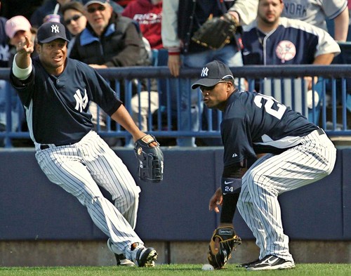
Bobby Abreu: Hey rook, why are you wearing that stupid 3930? They look like ass.
Robinson Cano: I’m not a rookie anymore. Stop calling me that.
BA: You’re still wearing a stupid hat. What are you, stupid?
RC: Girardi is wearing one — is he stupid too? Besides, you’re the only one wearing a 5950. Even Jeter’s wearing a 3930, so what’s your deal?
BA: Mussina’s wearing one.
RC: Yeah, but he’s a cranky old bastard. He probably would wear an old 5950 just to be an a-hole about it.
BA: You should probably throw that ball to second now, rook.
RC: I hate you.
All of those pics were from Saturday’s Yankees-Rays game, by the way. While teammates with different lids is nothing major in spring training workouts (or in BP during the regular season), they generally tend to get things straight for games. One notable exception is Terry Francona, who wears whatever he damn well pleases. The Red Sox wore red jerseys and hats today, while Francona wore the standard navy 5950.
And somewhere, Bob Watson is counting adding up the potential fine. Enjoy your Sunday, folks. — Bryan
Reminds me of link, very nice Bryan.
Hmm, so the Link button doesn’t work like Blogger’s. Try this link
F it. Go here: link
Of course, Kenny Rogers in 2006 kept wearing a different cap during his starts than other Tiger players did. But that was before the 2007-08 version of spring training/ batting practice caps were debuted.
This is a pic from Pauls ESPN uniwatch article. WHat is going on in the top of this pic? It looks like there is a ladder and a guy hanging from the celinig!
link
No mention of the link worn last night in honor of Eve Carson, the student body president who was murdered last week?
Right… I don’t do baseball at all.
I apreciate 3930 and 5950 are different caps. (?).
What makes them so different? I see nothing different!
And why the numbers?
Yours expectantly!
Ell
The Florida Gators came out in black jerseys for the first time all season. No screen cap sorry
It is not just Francona but pitching coach John Farrell as well.
The 5950 is what the players usually wear: link and link.
The 3930 is the stupid hat that they wear for batting practice and spring training: link and link.
Note the color on the brim of the hat and above the ears.
So do you want to dress just like Tennessee Coach Bruce Pearl when you make your NCAA tourney bracket picks this year?
link
I’m just glad the Denver Broncos have inspired another side-panel in sports. And by glad, I mean I’m crying.
Haha, nice entry Bryan.
I cannot believe that MLB continued that horrid design for another season. The only people I have ever seen wearing the 3950 in public are gradeschool kids that don’t know any better.
You can just see it in the store:
Mom: Okay Billy, which hat do you want…the plain hat or the one with the color-trimmed bill and the colored ear flaps?
Billy: O man that one is lame and boring, I want the super cool colored ear flaps!!!
[quote comment=”236577″]Haha, nice entry Bryan.
I cannot believe that MLB continued that horrid design for another season. The only people I have ever seen wearing the 3950 in public are gradeschool kids that don’t know any better.
You can just see it in the store:
Mom: Okay Billy, which hat do you want…the plain hat or the one with the color-trimmed bill and the colored ear flaps?
Billy: O man that one is lame and boring, I want the super cool colored ear flaps!!![/quote]
I work in a sports store (right now actually) and that scenario isn’t too far from what actually happens. Kinda makes you fear the future of uniforms/merchandise.
Looks like Francona is getting in as much wearing of that pullover as possible before he isn’t allowed too anymore…
Great post, as usual, Bryan. Your weekend posts are always entertaining.
I was checking out the link and saw that Phoenix has Toyota logos on their seats. You wouldn’t see the logo if people were actually in the seat, so are they happy when the rink is empty and everyone can see the Toyota ad? Would a place that sells out all the time get less money for this kind of sponsorship since the logo couldn’t be seen? Plus, the Coyotes were in white at home and it might have been because they are so link at home.
[quote comment=”236561″]No mention of the link worn last night in honor of Eve Carson, the student body president who was murdered last week?[/quote]
Very very very tasteful
[quote comment=”236569″]The Florida Gators came out in black jerseys for the first time all season. No screen cap sorry[/quote]
They lost wearing it, which hopefully means we’ll never have to see it again.
Hey UniWatchers, I need your help with a little assignment. I’m a Buffalo Bills fan, and we all know how ugly their monochrome blue uniforms are. The NFL won’t let the team wear the throwbacks for whatever reason and I think it’s too late to do a total uniform overhaul for next season.
However, it is possible to bring back the blue jersey/white pants combination. On the Buffalo Bills’ official message board, I’ve created a poll to hopefully get Bills management to bring back the blue-on-white look for next season.
link
I’ve posted pics in the thread for comparison.
GO BILLS GO!!!
Ryan Petrynka,
Kingston, Ontario, Canada
don’t know if anyone was watching the caps vs. pens on nbc, but the game just ended…it was 2-2 with like a minute to go, when the caps link scored a sweet goal…only problem was–it was an “own goal”…i can’t recall the last time i saw that…but then, i don’t watch much puck anymore either…and this didn’t just like bank off his skate or hit his pads and trickle in…it was like the actually took a wrister on goal…pretty funny
/cristobal huet didn’t see the humor, however
check sportscenter for highlights
los suns today
[quote comment=”236555″]This is a pic from Pauls ESPN uniwatch article. WHat is going on in the top of this pic? It looks like there is a ladder and a guy hanging from the celinig!
link
I noticed that also and for got to mention it.
Cubs vs. Royals…blue on blue today. What a joke!
Man, regarding that poll I started on the Bills message board, it’s close unfortunately. Bills fans actually LIKE the blue-on-blue!
*shakes head*
Bills fans don’t Get It(TM).
[quote comment=”236686″]Man, regarding that poll I started on the Bills message board, it’s close unfortunately. Bills fans actually LIKE the blue-on-blue!
*shakes head*
Bills fans don’t Get It(TM).[/quote]
[quote comment=”236561″]No mention of the link worn last night in honor of Eve Carson, the student body president who was murdered last week?[/quote]
It was discussed in yesterday’s comments.
link
This link shows all the High School hockey jerseys at the Prudential Center
what happened to Obama of Dreams? Did it get overloaded or shut down or something? Sorry if someone’s already mentioned it – I don’t read the comments daily.
What a give up on the NBA’s part. Allegedly a bilingual game, but the only Spanish is the addition of Los before Spurs & Suns.
Los Spurs
Los Suns
They didn’t even translate Spurs/Suns!
But at least Phoenix has visibly different jerseys. I’m convinced the Spurs ironed on “LOS” before the game.
Cano should have been making fun of Abreu’s curve on his hat… or lack of curve
[quote comment=”236609″]Hey UniWatchers, I need your help with a little assignment. I’m a Buffalo Bills fan, and we all know how ugly their monochrome blue uniforms are. The NFL won’t let the team wear the throwbacks for whatever reason and I think it’s too late to do a total uniform overhaul for next season.
However, it is possible to bring back the blue jersey/white pants combination. On the Buffalo Bills’ official message board, I’ve created a poll to hopefully get Bills management to bring back the blue-on-white look for next season.
link
I’ve posted pics in the thread for comparison.
GO BILLS GO!!!
Ryan Petrynka,
Kingston, Ontario, Canada[/quote]
It won’t let the Bills go totally throwback? Why not? What about the Jets?
[quote comment=”236683″][quote comment=”236555″]This is a pic from Pauls ESPN uniwatch article. WHat is going on in the top of this pic? It looks like there is a ladder and a guy hanging from the celinig!
link
I noticed that also and for got to mention it.[/quote]
What the hell is that? There is even a man or mannequin hanging too. Please someone find out what’s going on with that! Also, completely agree with the “Los” thing being completely lame. The idea in general is so stupid.
Obama of Dreams was shut down, probably by MLB. if you got one of the first wave of designs, you lucked out. You’ve now got a minor collectors item.
[quote comment=”236697″]http://devils.nhl.com/community/hshockey.htm
This link shows all the High School hockey jerseys at the Prudential Center[/quote]
Reminds me of Qwest Field in Seattle
They have every helmet from each football team in The State of Washington
More from the Spurs- Suns game:
Photos– note the iron-on chic displayed by the Spurs. At least the Suns had to print a new jersey.
link
link
link
link…los mierdas
Anybody catch tonight’s Simpsons? I believe it was “Dial N for Nerder.” Anyway… when Martin was killed, they held a funeral for him at school. The AV club came out to honor him with a slideshow, and they all had black memorial armbands on. No mention of a Shawn Springs decal, though.
Just thought that was uni-worthy enough to share :)
Re: =bg=
I swear I read somewhere that after the Bills first wore their throwbacks the Bills asked to wear them full-time and the NFL said no. I really wish I could find a link to prove I’m not going crazy.
[quote comment=”236697″]http://devils.nhl.com/community/hshockey.htm
This link shows all the High School hockey jerseys at the Prudential Center[/quote]
Those are quite out of date.
link went dark on dark today
[quote comment=”236700″]What a give up on the NBA’s part. Allegedly a bilingual game, but the only Spanish is the addition of Los before Spurs & Suns.
Los Spurs
Los Suns
They didn’t even translate Spurs/Suns!
But at least Phoenix has visibly different jerseys. I’m convinced the Spurs ironed on “LOS” before the game.[/quote]
i had the same thought. spanglish ain’t much of a tribute, especially when they never had “the” on the jersey or in the name in the first place.
Sols v. Espuelas would’ve been cool.
[quote comment=”236730″]Anybody catch tonight’s Simpsons? I believe it was “Dial N for Nerder.” Anyway… when Martin was killed, they held a funeral for him at school. The AV club came out to honor him with a slideshow, and they all had black memorial armbands on. No mention of a Shawn Springs decal, though.
Just thought that was uni-worthy enough to share :)[/quote]
Boy you blew that joke. Did you mean Sean Taylor??? Shawn Springs is still alive……..
[quote comment=”236697″]http://devils.nhl.com/community/hshockey.htm
This link shows all the High School hockey jerseys at the Prudential Center[/quote]
ha ha my high school!!!!!
WW-P South Pirates!!!
Pirate Pride!!!!
the nba jersey’s are so lame…
baseball does it right
link
link
link
Los Mets.
Los Rangers.
Los Suns.
Los Spurs.
Sports teams, as far as espanol goes JUST DON’T GET IT!(TM)
“NBA Cares”.
the nba cares about its latino players and latino fan base. it will honor its latino fans and players by having the san antonio and phoenix franchises affix the spanish word for “the” on their uniforms.
please…
How about the San Francisco link? At least they translated. Go Giants!
[quote comment=”236750″]Los Mets.
Los Rangers.
Los Suns.
Los Spurs.
Sports teams, as far as espanol goes JUST DON’T GET IT!(TM)[/quote]
Are the link the only team that “gets it” with the Spanish translation?
(aside from the ugly Spring Training cap)
Hawai’i’s new link
I’d like to see what the shoulder trim looks like up close to see if the tribal band pattern is still there.
Has anybody mentioned on here why the Lady Boilermakers have “PUR” in one color, and “DUE” in another color on the front of their uni’s???
link
Yahoo! Sneakers
link
link
This from uhatletics.hawaii.edu:
Some of the highlights of the 2008 uniform designs include:
* Use of the UH green (PMS 3435) in both the home and away uniforms was a priority
* The fabric on the jersey shoulders and sleeves has a tapa design.
* Instead of “Warriors” above the numbers, the “Hawai`i” brand is being used in order to provide greater university recognition. Also, the “Hawai`i” text size is larger for great visibility.
* The “H” brand is featured on the pants and above the player’s name on the back of the jersey.
* The distinctive UH tapa numbers are used on both uniforms.
* Only UH’s green helmet will be worn for both home and away games.
* The silver road uniform, including the jerseys, pants, and helmet, will not be continued.
Here are the link views
[quote comment=”236734″][quote comment=”236697″]http://devils.nhl.com/community/hshockey.htm
This link shows all the High School hockey jerseys at the Prudential Center[/quote]
Those are quite out of date.[/quote]
I’ve got some shots from a recent trip there.
As well as some of all the jerseys at Jobing.com Arena in Glendale, AZ. Gotta get to those at some point.
i noticed on those illustrations that they went the bicycle short version of the pants with no knee pads. as much as that looks sucks, at least they’re being realistic about it.
Damn, those jerseys at The Rock are cool, unfortunately they picked some of the worst designs for the teams, I know my alma mater CBA has their road blues up, which are not nearly as cool as their home whites, and that is the case with many schools
[quote comment=”236754″]
Are the link the only team that “gets it” with the Spanish translation?
(aside from the ugly Spring Training cap)[/quote]
Los Gigantes get it too.
Penn State was added to the Jox in Frox.
[quote comment=”236685″]Cubs vs. Royals…blue on blue today. What a joke![/quote]
It’s spring training, so you can’t take things too seriously. Unfortunately, MLB allows teams to do the same thing during the regular season, which should be a no-no.
link
A Nod to Uni Watch: Top 10 Posters Featuring Rare Sports Uniforms