Last weekend I ran part one of this series featuring graphic artist Casey Vitelli, which you can check out here if you missed it. While Casey sent me his designs and writeup, I came up with the somewhat misleading title of “Negro League Inspired Jerseys” — many of the jerseys are indeed inspired by NLB teams, but not all, so my apologies for any confusion there. As such, Part II of this will be now referred to as “MLB Faux-Back Concept” Series, as that title is more apropos.
Here’s Part II. Enjoy!
MLB Faux-back Concept Series (Part II)
by Casey Vitelli
We at ProLine Mockups just finished a new baseball template and, while I was scrolling through the history of the Negro leagues an idea came to mind.
In this project, I decided to give each team a classic feel, while showing homage to baseball history. Each design is based off a team that played in, or near, where each team plays today. I hope you enjoy, and stay tuned for more!
If you wanted to try the template for yourself, head on over here.
Make sure you are following ProLine Mockups on Twitter/X (@prolinemockups) for more easy to use templates.
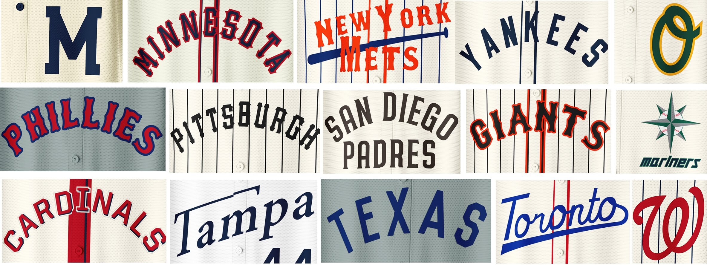
Milwaukee Brewers
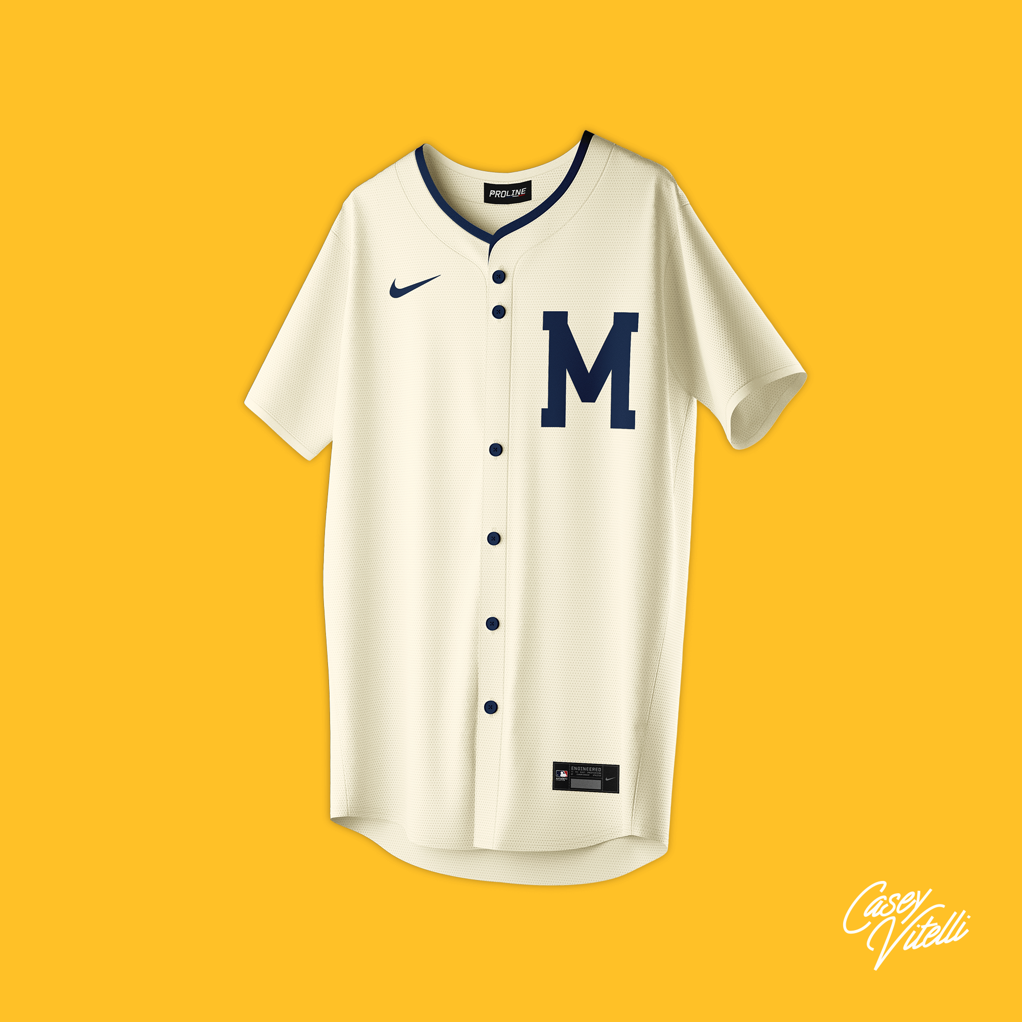
Based on the Milwaukee Grays from the 1870’s
Minnesota Twins
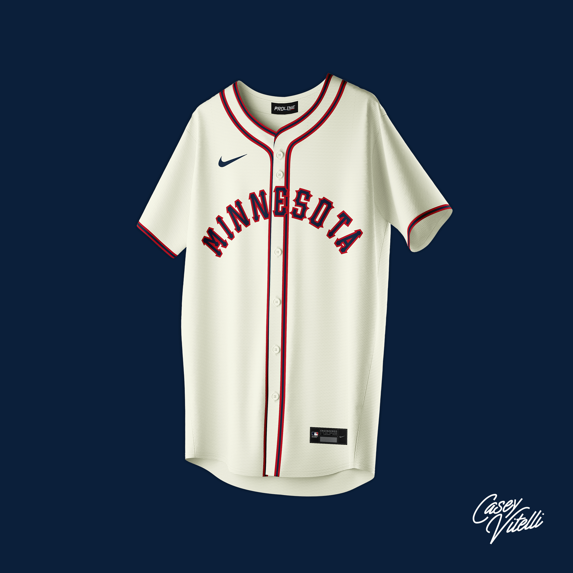
Based on the Minneapolis Millers from the 1950’s
New York Mets
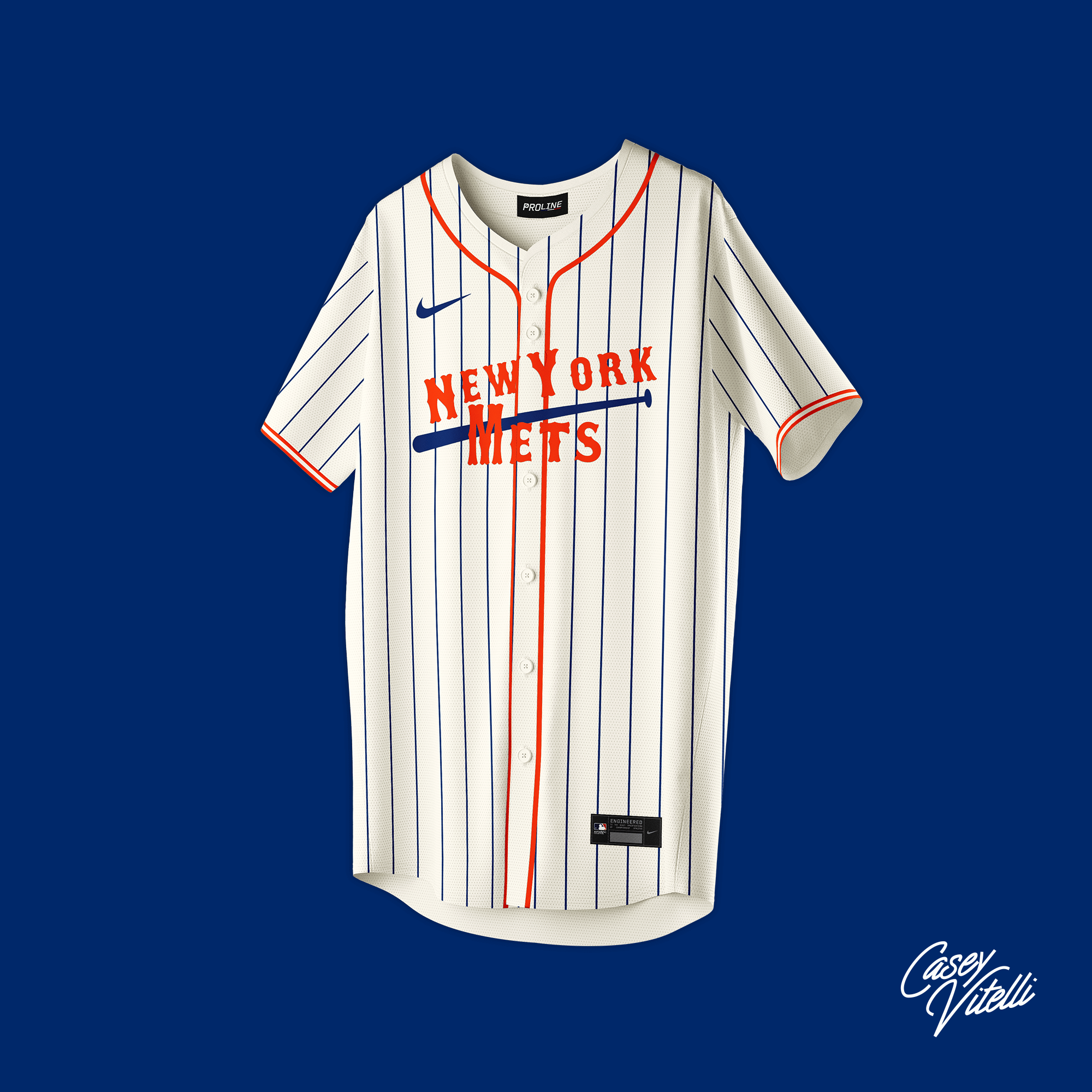
Based on the New York Cubans from the 1940’s
New York Yankees
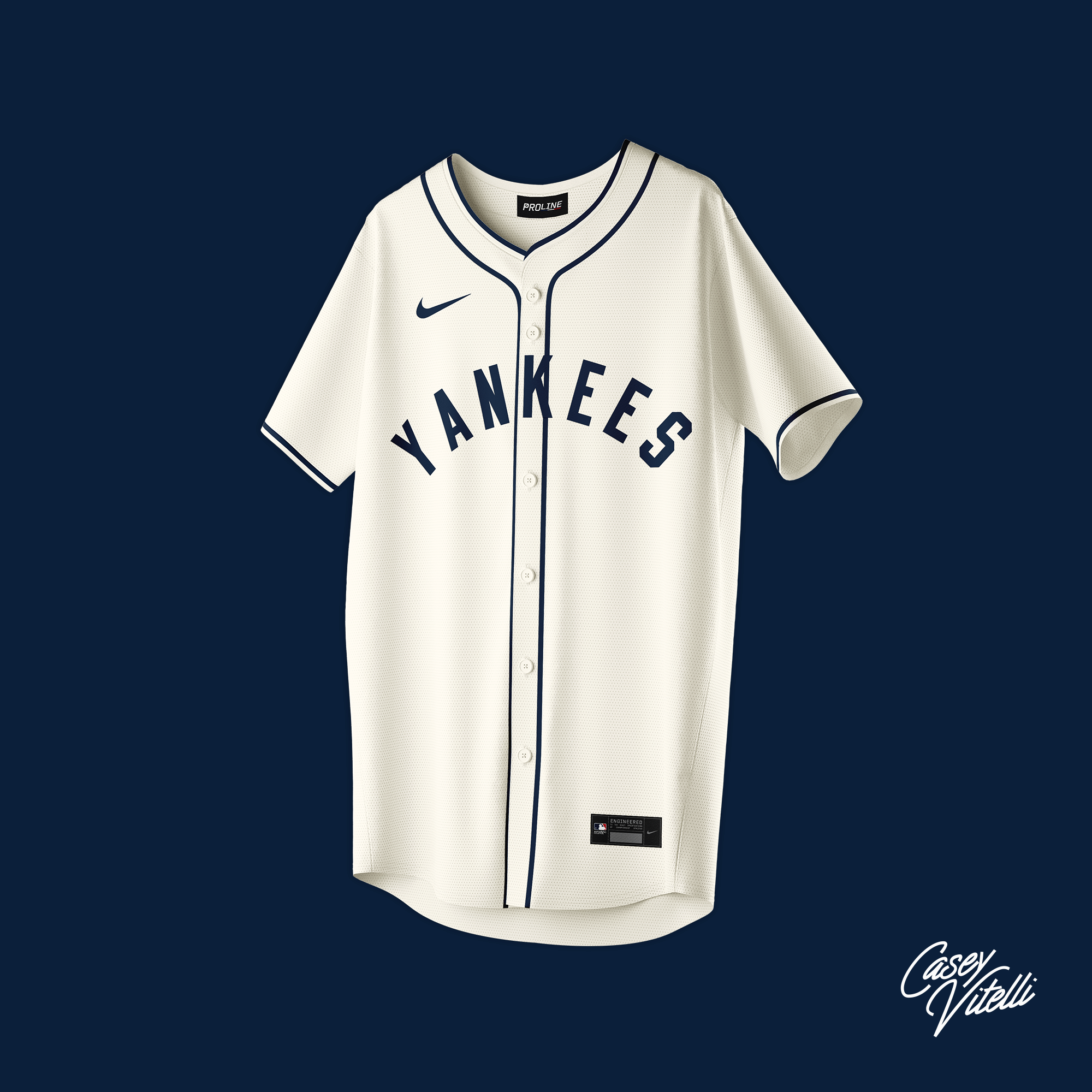
Based on the New York Black Yankees from the 1930’s
Oakland Athletics
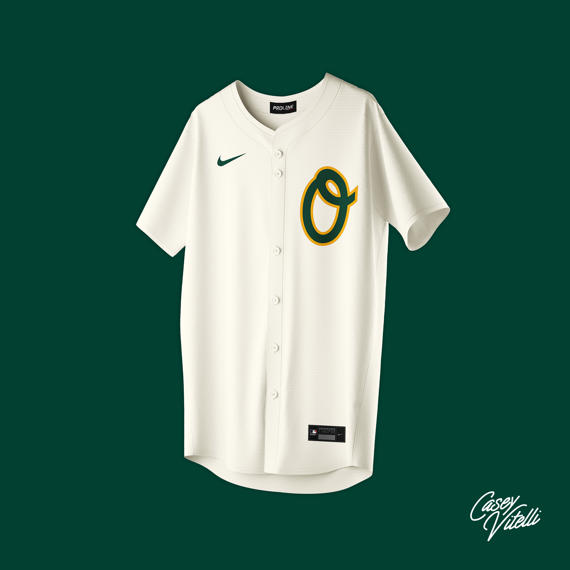
Based on the Oakland Oaks from the 1940’s
Philadelphia Phillies
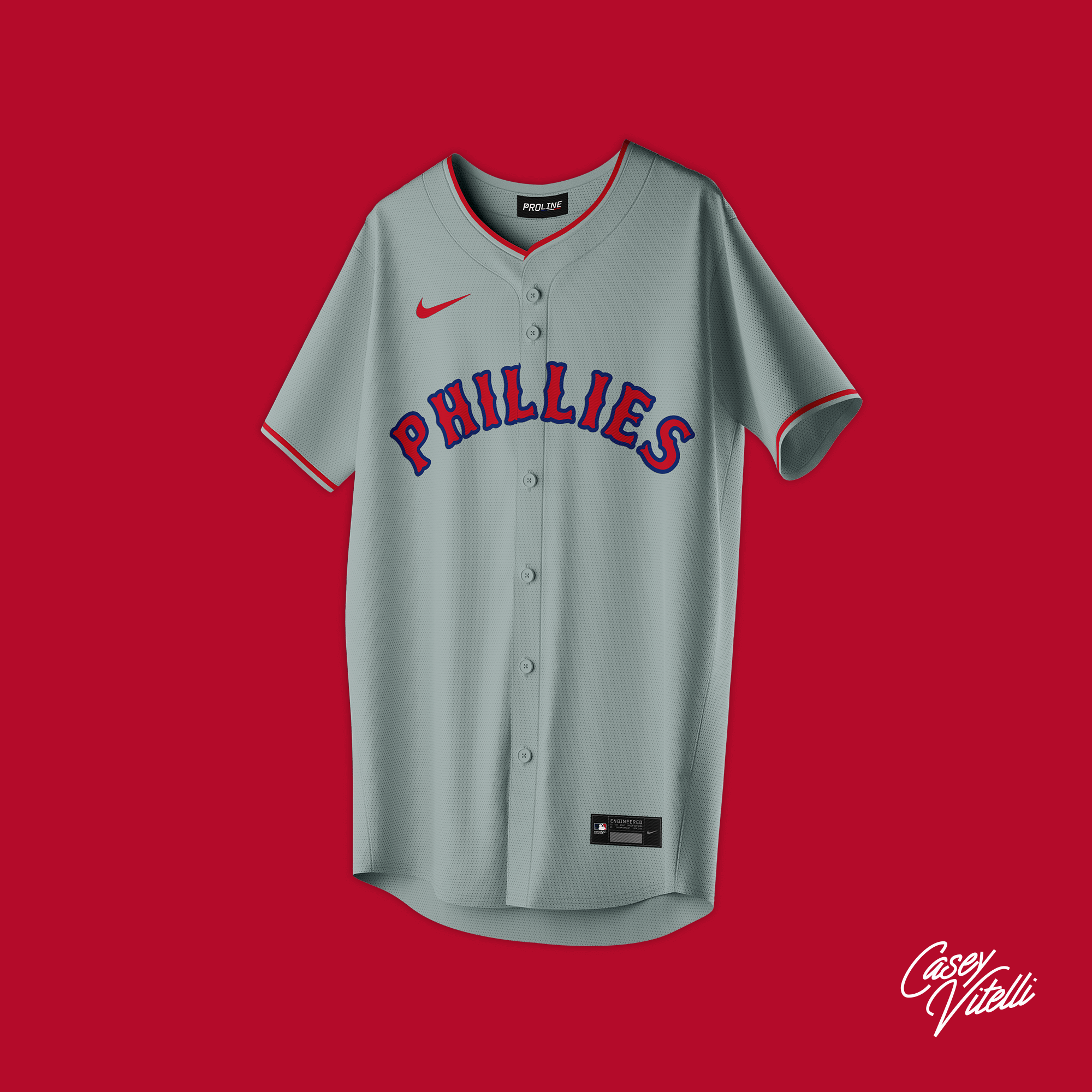
Based on the Philadelphia Stars from the 1930’s
Pittsburgh Pirates
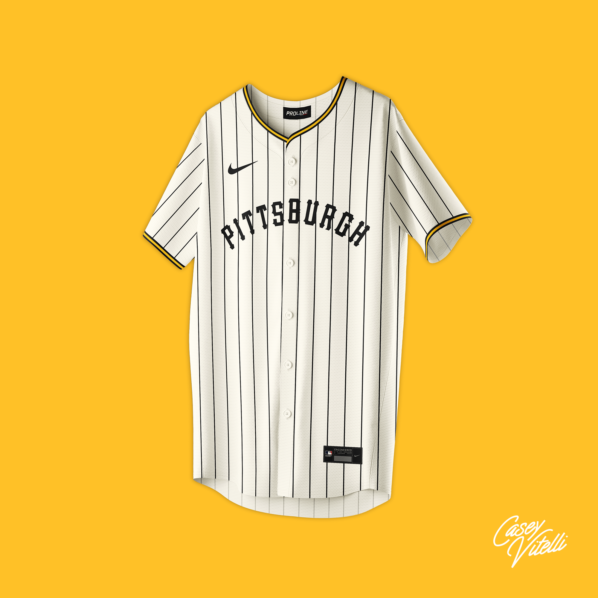
Based on the Pittsburgh Crawfords from the 1930’s
San Diego Padres
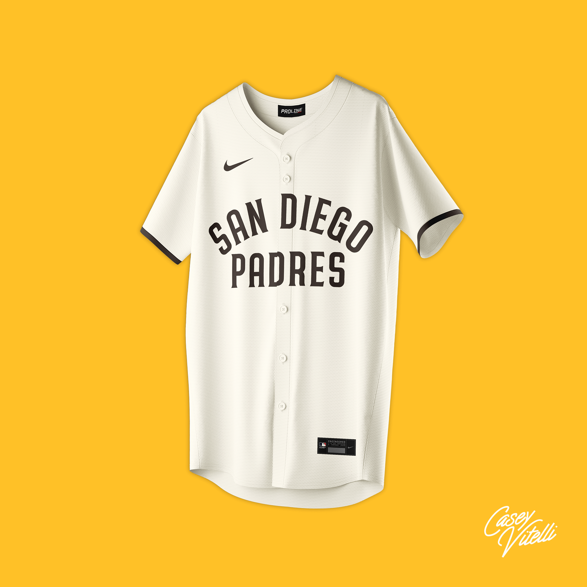
Based on National City High School from the 1910’s
San Francisco Giants
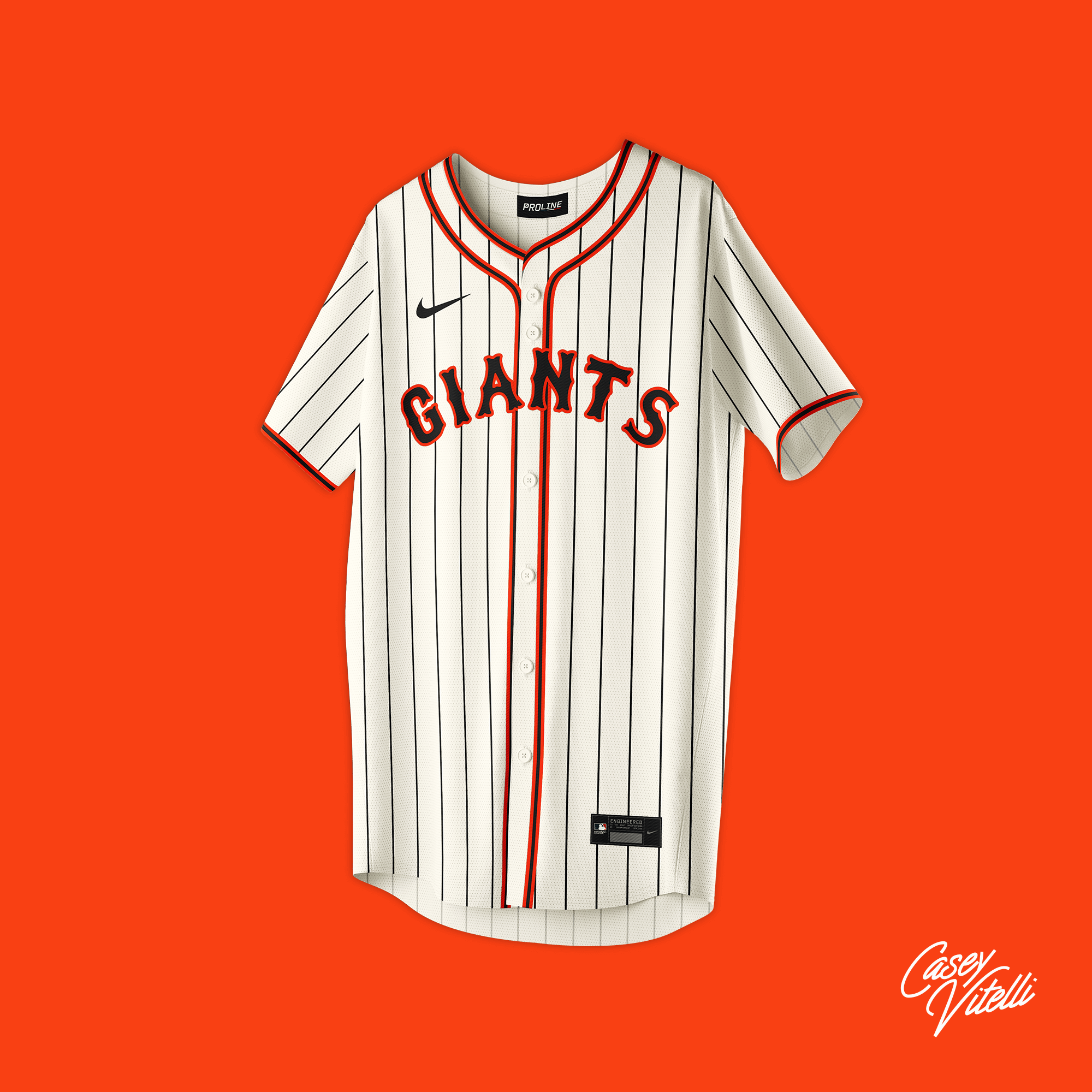
Based on the San Francisco Seals from the 1930’s
Seattle Mariners
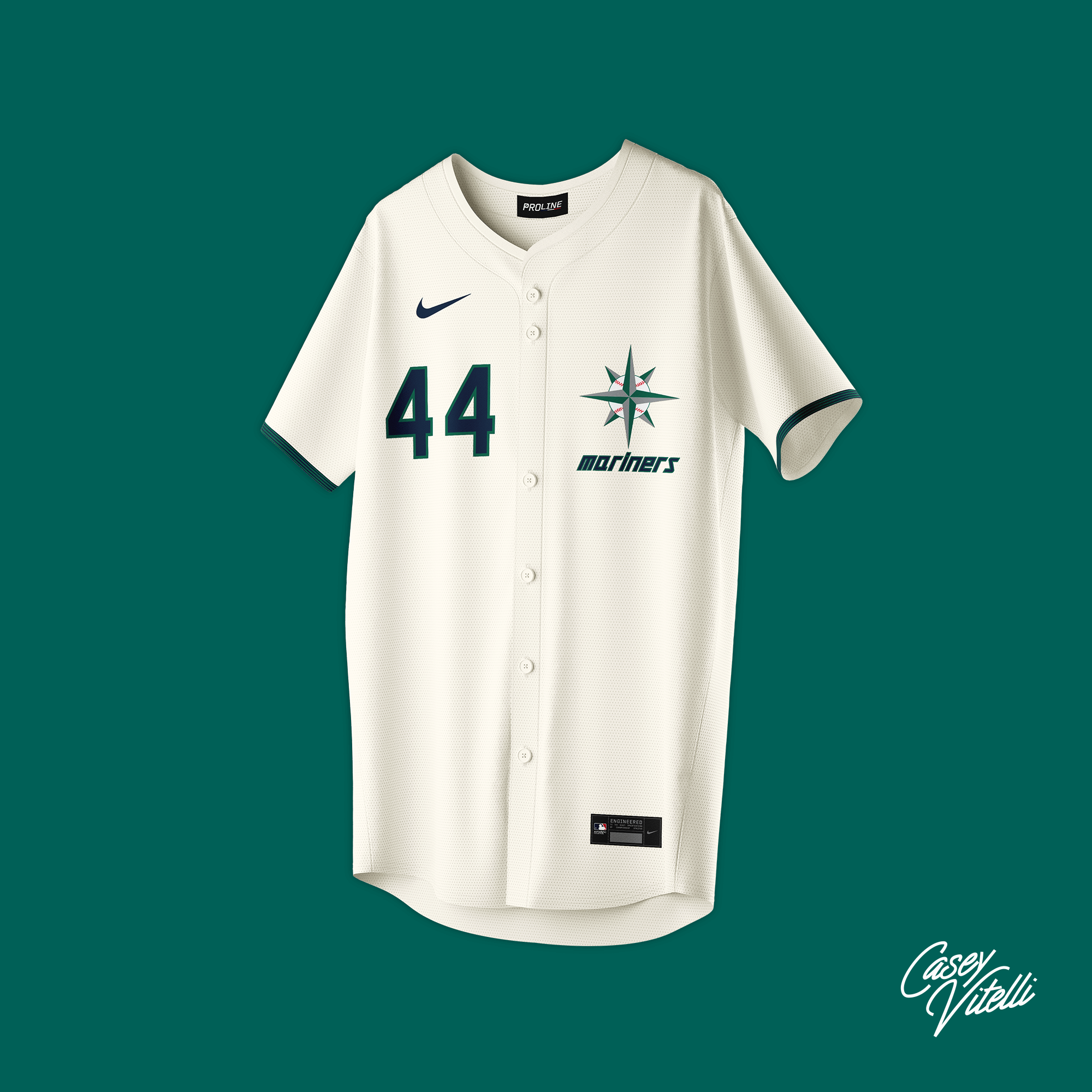
Based on the Seattle Pilots from the 1960’s
St. Louis Cardinals
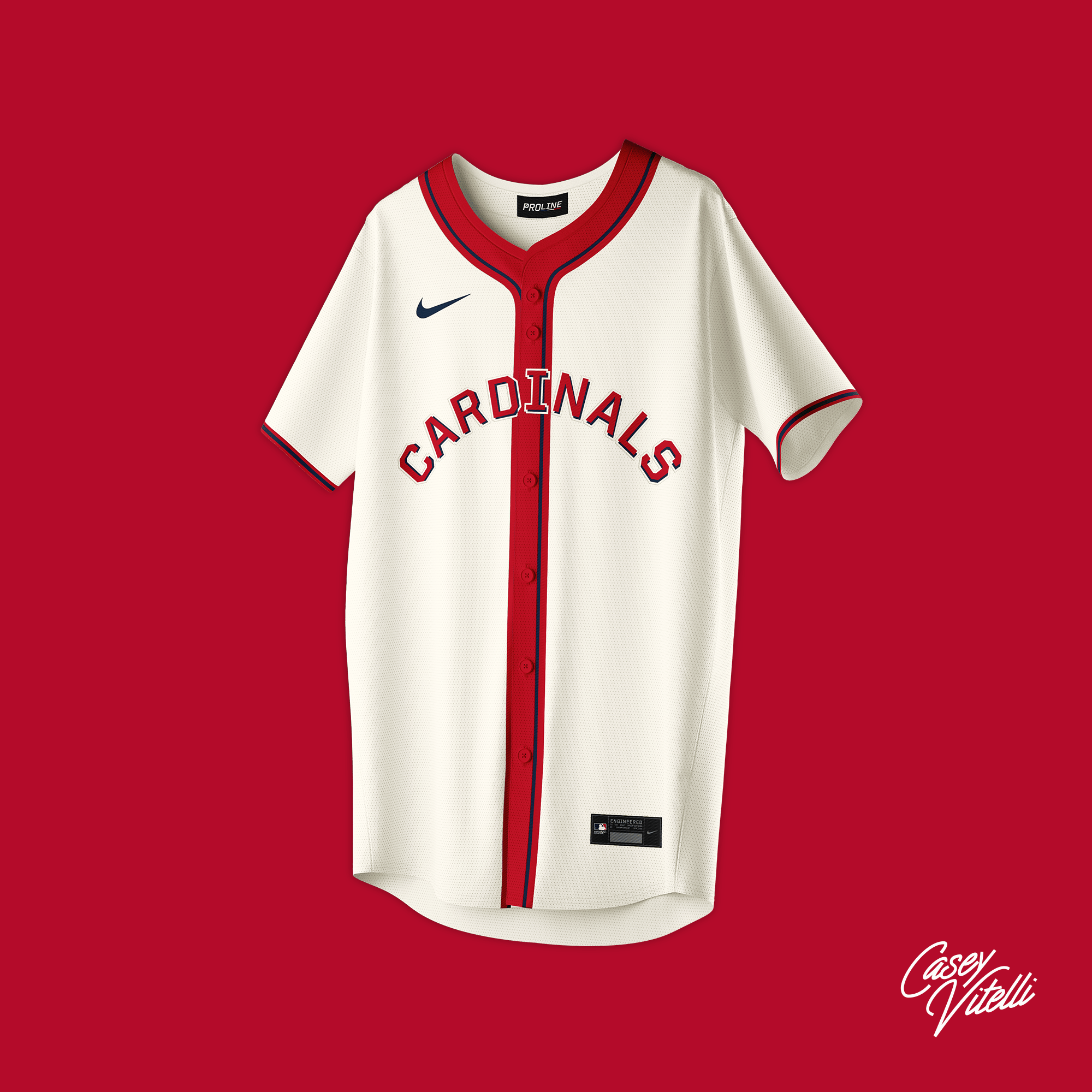
Based on the St. Louis Browns from the 1960’s
Tampa Bay Rays
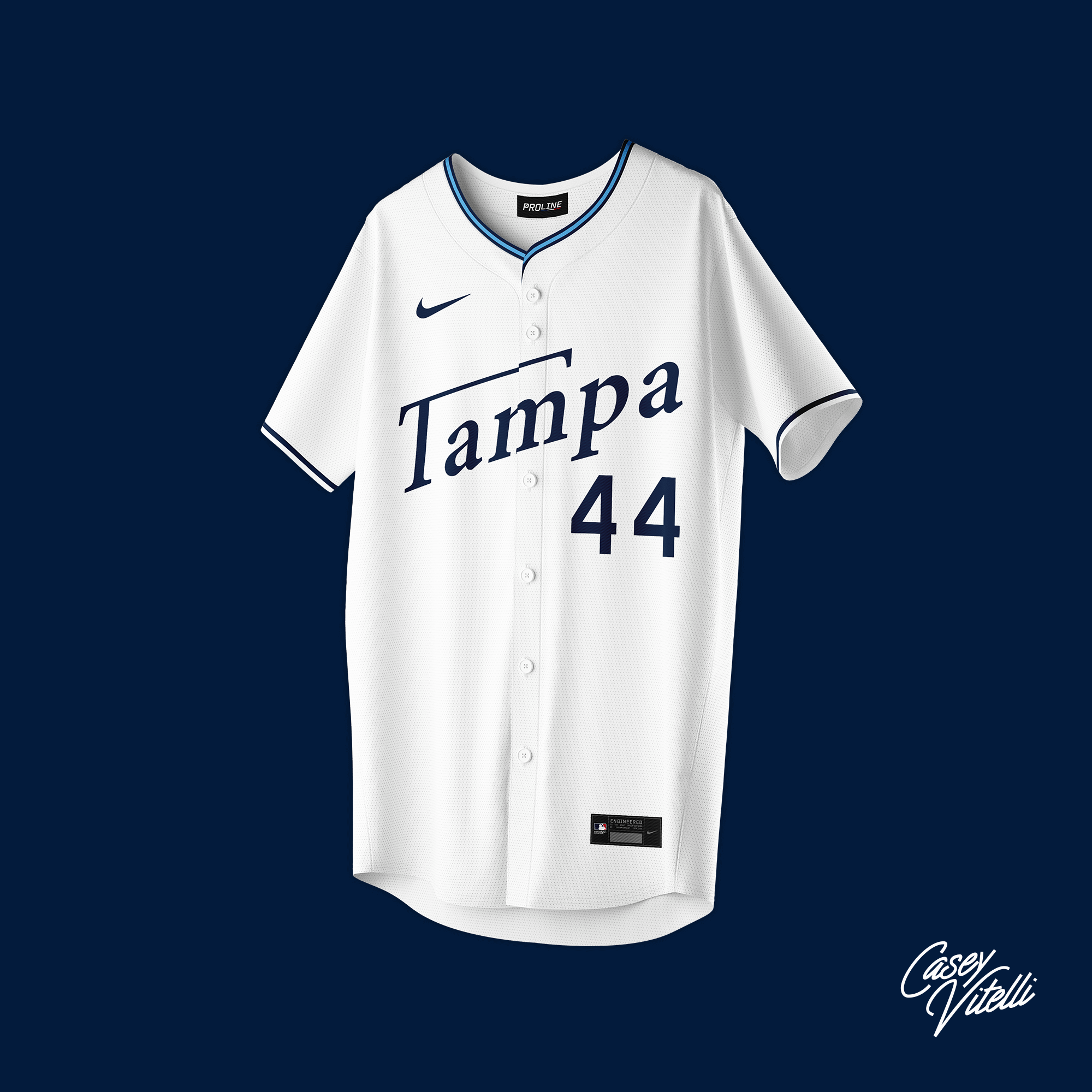
Based on the Tampa Bay Tarpons from the 1970’s
Texas Rangers
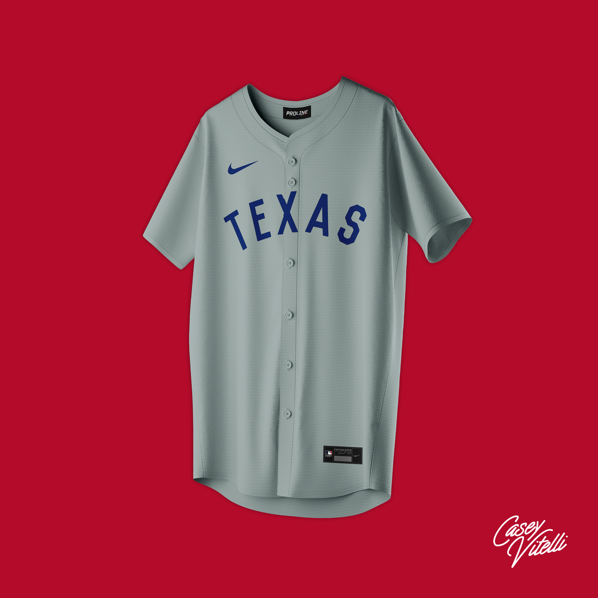
Based on the Corsicana Oilers from the 1900’s
Toronto Blue Jays
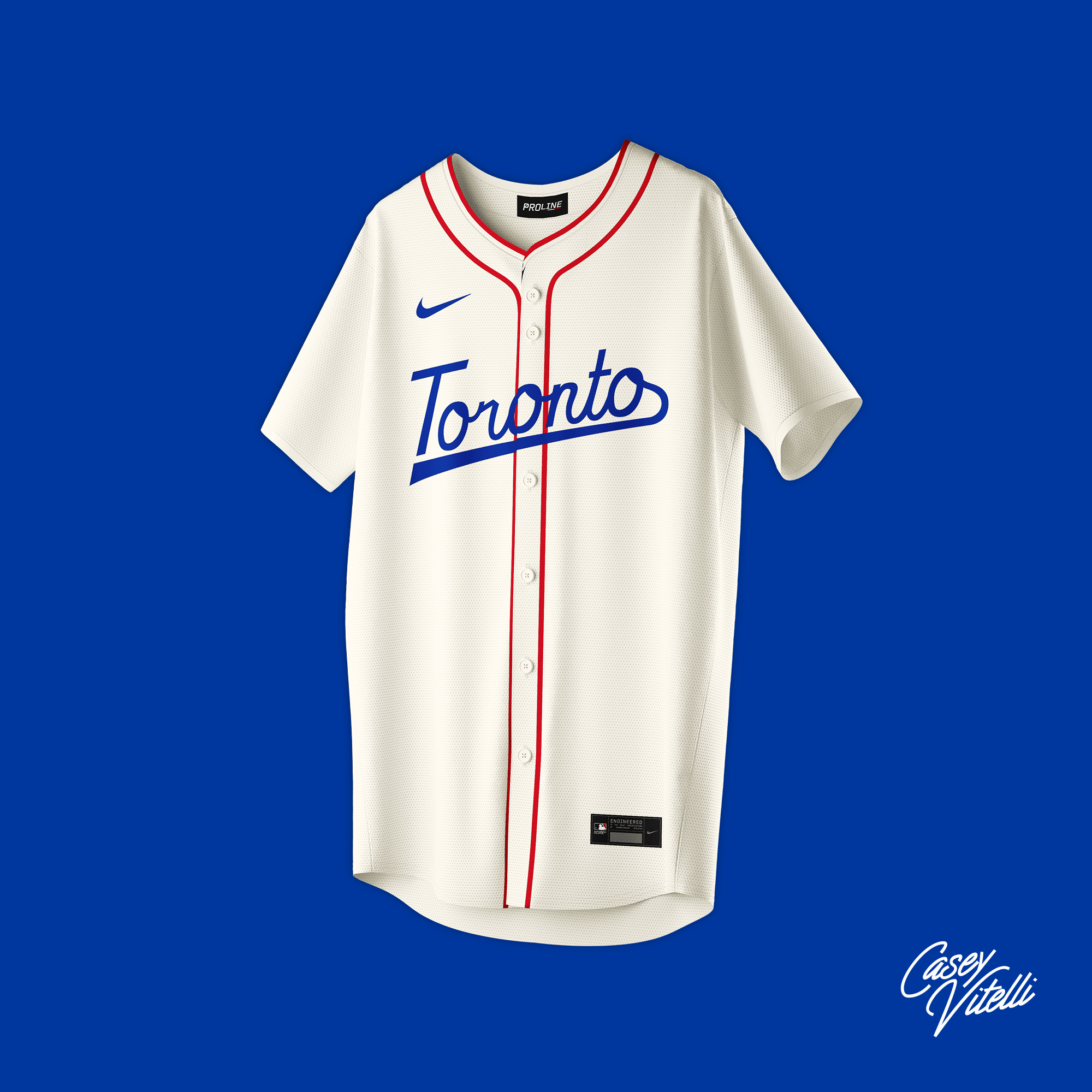
Based on the Vancouver Asahi from the 1940’s
Washington Nationals
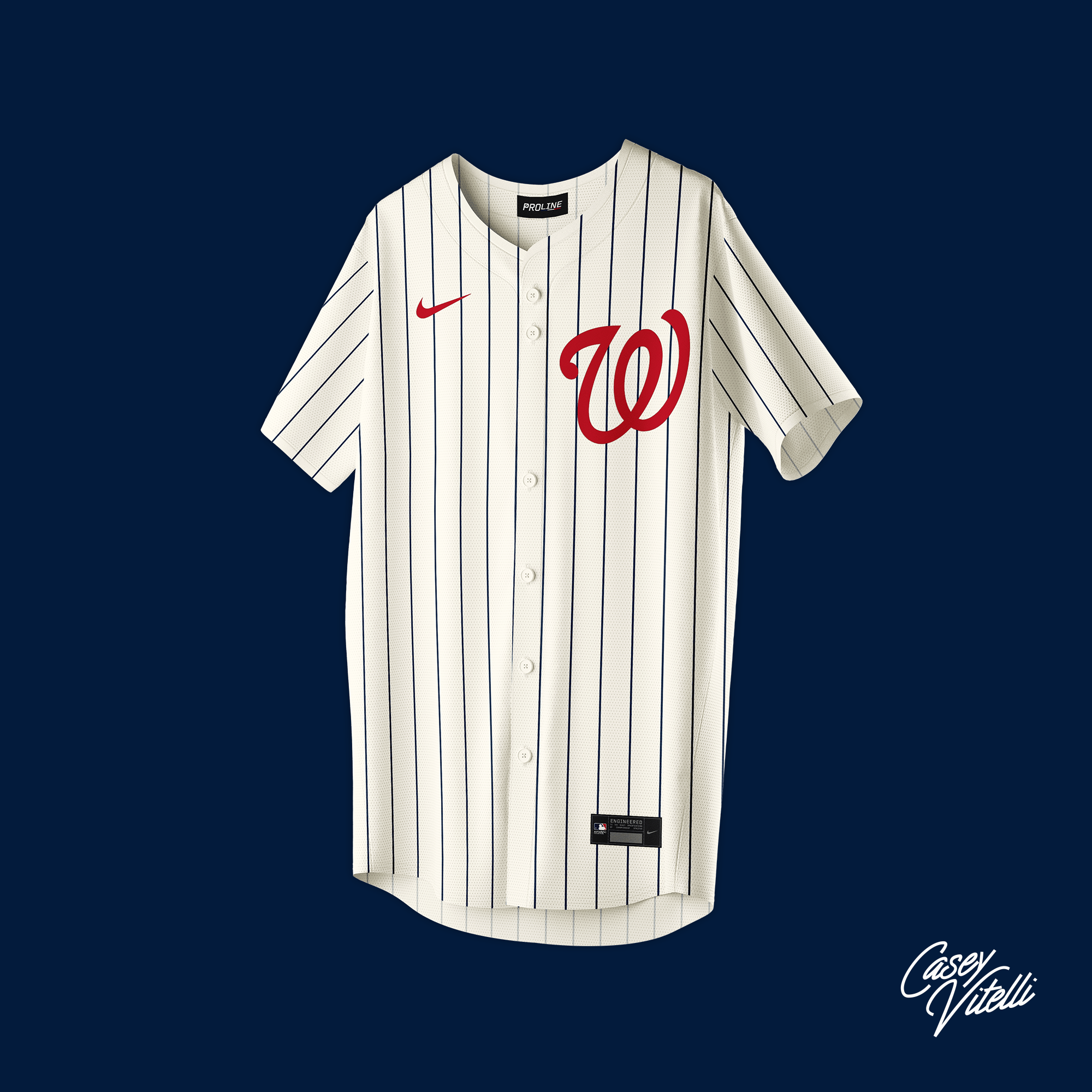
Based on the Los Washington Senators from the 1940’s
Thanks Casey!
Readers? What say you?
Great stuff Casey. Going back to Paul’s ‘controversial’ post the other day, it shows how much variety you can have with traditional’ uni elements. Maybe the ‘round wheel’ is less boring than we thought. And it struck me that the Mariners design is the perfect alternate for them. Love that compass logo on the jersey. Somebody get the M’s on this. Ditch the black pants!
As is most vividly depicted in your Brewers’ proposal, it is better to use evenly-spaced buttons when the design doesn’t cross the Rubicon (Red Sox, White Sox, Yankees, Tigers). Does your template allow you to move the second button down?
Nice job. The Phillies jersey reminds me of the old California Angels. Also, not sure why Vancouver and Toronto? Sure they’re both in the same country, but it would be like a Detroit team having a Seattle theme.
“Based on the St. Louis Browns from the 1960’s” I DON’T THINK that’s the correct decade unless I am forgetting something.
I really like that Toronto jersey
As far as Seattle, the first referenced baseball team is the Seattle Alkis.
link
IMHO would have made for a better “fauxback” treatment than the one year Pilots, whose fauxback status has already been done by the team on a couple of occasions.
Tampa Bay already has the perfect fuax-backs, but this is nice. Also, CARD-I-NALS… Respect the placket with that one and let the “I” sit in that headspoon alone.
Swoosh really stands out on these, but it’s otherwise refreshing to see. If I had ties to Minnesota, that would be quite wearable.
Wallgreens looks really nice on blue pinstripes. I wouldn’t mind seeing the Natties wear those.
I like that Tampa typeface, although I might like it even better if the letters were closer together.
The St. Louis Browns moved to Baltimore after the 1953 season…the Cardinals jersey could not have been inspired by “the St. Louis Browns from the 1960’s”!
I like the Oakland script. For the Oaks, you could easily make an acorn in the negative space of the O.
This really highlights how much the Nike swoosh ruins baseball jerseys.
Man. There are a bunch I wouldn’t mind seeing as alternates — especially the Cardinals and Yankees. Heck, I know that Cardinals look is already better than whatever abomination they’re gonna release as the city connect.
Loose the swoosh!
I like it, but no matter how accurate it is, the Pittsburgh letters are too small. Overall, this project just shows how simple elements need be for a good looking jersey.
It always amazes me how “amateurs” come up with better ideas than the professionals that actually design uniforms for a living. These are great! They’re vastly superior to anything that’s come out of the City Connect program…