New threads 🔜👀🪡 pic.twitter.com/jRS8r17Nhu
— Denver Broncos (@Broncos) March 25, 2024
As we’re all aware, the Denver Broncos will be getting a new uniform set for the 2024 season, and earlier today the team posted on Twitter a short video with the caption “New threads.” That video is embedded above. The ten-second video shows the mane of the Broncos logo being stitched onto an orange background.
The teaser video really doesn’t show much — and about the only thing we can take from it for sure is the orange and blue shades they currently wear will probably not change (or not change much).
The team merely posted “Coming Soon” — which could mean anything. The recent custom for teams who are unveiling new uniforms is to do so shortly before the NFL Draft. This year the draft will be held from April 25-27th, which is about a month away.
Paul has been on top of all the Broncos redesign rumors, so if you want to get caught up, here are three recent articles:
Let’s All Go Bonkers Speculating About the Broncos New Uniforms.
He followed that up with two exclusives:
An Interview with the Broncos Uni Twitter Thread Guy and An Interview with the Guy Behind the Broncos’ Uni Rumors.
The two exclusives give us our best clues as to the direction of the Broncos new threads.
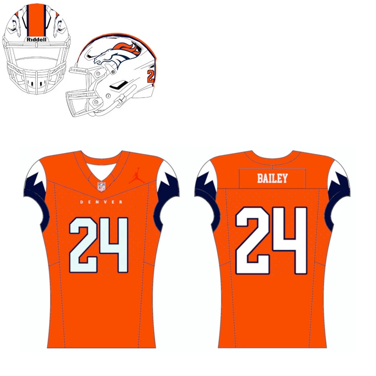
A mockup of the uniforms — which Paul’s interviewees confirm is not perfect, but pretty close to the final product — showed the white helmet introduced previously paired with an orange jersey with navy/white “snowcapped” sleeves. That helmet features the current Broncos logo as seen on their blue lids, whereas the white alternate introduced earlier contained the retro “D” logo.
How close that will be to the new home jersey remains to be seen.
My expectation is that this uniform will not be well received, will hang on for the minimum period, and then the Broncos will go back to the set they wore from 1972-1996, or something very similar to it.
So in other words, they are following the Cleveland Browns and Tampa Bay model.
And Jets
Yup. It’s frustrating how teams keep falling for this trap.
Don’t forget the Jets!
I suspect that was the expectation in 1997 too.
No way it’ll be worse than the Texans new look…I hope.
Yeah it seems like the pattern Nike comes in with shiny stories and promises based on marker research. They totally botch the design adding signatures that no one but a 12 year old would go for and are surprised when people hate it.
The team thinks they hit a home run only to be embarrassed when they see it. Social media torches them, I can think of the Jets posts which I was a part of just roasting the team. Once sufficiently humiliated then go running to a classic and stop listening to Nike.
As for Nike I don’t know how many faceplants it takes but you gotta replace your chief creative officer.
Absolutely right!
Everything that Nike touches is over-designed.
A little less =so much more.
I would posit that this model is exactly what some owners want. The entire purpose of a re-design is to sell merchandise. If you change your jersey every 5 years, many fans will purchase a new jersey every 5 years, whereas a Yankees or Dodgers fan could wear the same jersey for their entire life without it becoming “obsolete”.
I also think appealing to 12 year olds is the smartest way to sell the most merchandise. My friends’ sons ask for jerseys for every birthday and holiday. Kids move merchandise.
And lastly, as much as we all want to think that the collective opinion of Uni-Watch is the definitive public view, it’s really just a microcosm. If you go to any other website or read the comments on Instagram posts, most fans love BFBS, mono uniforms, and softball tops. I had season tickets to the Lions, and inside Ford Field an incredible amount of people consider the grey alternates their favorite uniform.
All of this to say, I hate most new uniforms and I just want block font with nice sleeve stripes. But I also don’t buy jerseys any more, so I can’t fault anyone for not trying to appeal to me.
I think it depends. As a Jets fan I can tell you looking at the stands that this look flopped big time. It was hard to find a jersey in the stands, probably 2/3rds throwbacks and the comments on the jets social media was pretty negative towards the new look in general.
I will say this the NBA has the right idea with 3 jerseys that have to last a number of years but a city one that Nike can get their craziness out with.
If any of my teams pulled this stunt I wouldn’t buy any new merch.
Wow! That new uniform design is butt ugly!!
Well done Wal-Mart, you can’t run the team but you can waste time redesigning something that never needed it.
I fully expect to sell my ticket come next season.
P.S.
Why does George Payton still have a job??
Modern version of the D logo is such a no brainer I can’t believe the Broncos won’t go for the layup. Also I don’t think the Broncos in white helmets will ever look right to me.
White helmets and orange jerseys is the Bucs. Broncos belong in a helmet that is some shade of blue.
I still can’t believe how bad these are. They look like something you announce you’re wearing for the conference home opener against Fresno State.
I really hope the helmet stripe isn’t that thick. That mockup stripe is horrendous.
Yeah, that mock considerably narrows the blue stripes and widens the orange stripe from their current white alternate
link
At least the mock-up shows a “normal” stripe, which means the team likely will be jettisoning the tapered stripe on the helmet they’ve had for almost 30 years…
link
The Broncos president confirmed today that the logo and colors aren’t changing, while the owner said the design will “include elements of Colorado” — definitely supports the mountain motif rumor.
Wait, it’s not really going to have the jumpman(R)(TM)(C)(PP) logo right?
These could end up being really embarrassing.
Sleeves caps will probably change colors when it’s cold. Just like the Coors Light mountain tops LOL
Don’t know about the jersey but that would be some cool Tech on the helmet…
it could be white in normal temps, then turn the old Bronco blue in cold weather…
Sure, it’s gimmicky, but so are most new NFL uniforms
How did they not use this as a chance to go back to the D logo? That logo remains much more popular with Denver fans.They really should’ve done that, the alt helmet from last year would’ve been dandy. At least the uni will better than the nightmare of the last 25 years, but they had a chance to go back to greatness. The 80s and 90s set is one of the best football uniforms of all time.
The D lobgbo is timeless and unique. It’s a shame they keep it shelved.
I meant “logo”, no “loggbbgbsgbggbbgogoogbgbgbbgo”. Sorry.
Don’t let it happen again. : )
Utah teams also fall into the trap of incorporating mountains when the team name has nothing to do with them. If you want a mountain motif, go with Rockies or Mountaineers or something. Jazz or Broncos? Even the lakers and dodgers didn’t incorporate California elements into their imported team names.
Erm, Broncos are not an imported team name, and actually very locally appropriate for Denver. The new uniforms don’t sound very promising, but the Broncos have used mountains elsewhere in their branding for many years. It’s not out of the blue.
The quotes from the ownership group 1) confirm the design leaks (“elements of Colorado”), and 2) illustrate that the team worked directly with Nike instead of outsourcing the design. That’s a double negative. Sigh…
link
I know I’m probably in the minority here but I’m glad the logo isn’t changing. Keep the old “D” as an alternate for a game or two to appease those fans like they’ve done the last few years.
The rest of the uniform is in need of an update. Let’s hope Nike doesn’t screw it up too badly!
Enough uniforms are bad and so many new uniforms have been underwhelming and/or garbage…not sure why people treat it like something that deserves hope or optimism.
It’s simple really. Modern uniforms in all sports are shit to go along with the product on the field or court.
What we are looking for as fans is dead and gone.
Gone.
Ok now you guys are complaining about a uniform BEFORE it’s released. Tough crowd. Sure, we get nostalgic for the “D” but change is good, even if it takes some getting used to. We don’t have to keep going back to old stuff.
No TV numbers. Again. Sigh.
I imagine the league had some input here. The current logo is a strong brand with 3 SB Championships, and representing some of the greatest players in recent memory- including 2 Top 10 HOF QBs (Elway & Manning). You don’t just give that all up to go back to some “retro cool” logo that is basically synonomous (along with BUFs red helmets) with humiliating SB failure. Current logo- with the “D” as a nostalgic/fun throwback makes all the sense in the world IMHO.
It promises to be a mess and if so it will be replaced as soon as possible (so after 5 years). Exactly as other teams have done after their uniform failures. And still nobody at the NFL, Nike or the teams involved seems to be bothered: gloss over it and all will be forgotten in 5 years time. Shameful.
After seeing the Broncos’ Color Rush proposal from Paul’s Substack article with the creator of Color Rush, I’m wondering if this update is going to be closer to that than expected. It contained mountains on the sleeves and topography lines in the numbers.
Judging by the picture, the orange shade may be deeper, darker. That would be at least one win. The blaze orange worn today is too bright/garish – IMO. Admittedly could be just the lighting used in the picture, so we will see.
The white helmet is just so terrible and clashes with the orange.