Back again with another of Chris Diamond’s “Uniform on 11” Project.
Click here for the AFC & NFC East
For each Volume of this series I’ll be including Chris’ introduction so you don’t need to check prior posts.
Click on images to enlarge.
Uniform on 11 – Just How Much More Uniform Could it Be? (Vol. 1)
by Chris Diamond
This site is Uni Watch and we are all UWers obsessed with sports uniforms. Currently the NFL’s uniform standards feel like they are in a fairly lamentable state with the “sock shit show” and untucked shirts for individual players and mono-mania, icy-whites, BFBS for teams (to name but the worst) ruining things for a lot of people. Often we hear “why can’t the NFL be stricter over uniform standards?”. I think people are mostly thinking about making existing uniforms more… well, uniform! But what if the NFL had a much stricter set of rules that it enforced on all teams? And here I don’t just mean enforcing uniform deportment, but mandating style in the same way that some soccer leagues enforce a common number and name font or rules on contrast between team uniform elements. Setting Uniform to 11!
Back in the 50s style was much more uniform between teams, with either plain jerseys or a few different stripe styles and college block numbers almost ubiquitous. So I came up with a “What If?” scenario based on a set of uniform rules being devised at that time and enforced ever since. What might that look like for the NFL teams now? These are the rules I have come up with for this project:
- All jerseys, pants and socks must be the same for all players on a team (apart from number digits)
- Teams must have a colour home and a white road jersey
- Jersey and pants must be different colours
- Pants and socks must be different colours
- Helmet must have central stripe in 1-2-1 pattern
- Helmet must have a team logo or wordmark on both sides
- Face mask must be in team colours
- Jersey sleeves must have stripes in Northwestern pattern in a single contrasting colour to the sleeve
- Jersey stripes may be outlined in a different colour
- Uniform must be unique within the league
- Numbers must be college block, 10” front, 12” back and 4” TV numbers on shoulders
- Number must be edged in contrasting colour unless team uniform is two colour only in which case edging can be the same colour
- Pants must have side stripe in 1-2-1 pattern
- Socks must have stripes in Northwestern pattern in a single contrasting colour to the sock
- Sock stripes may be outlined in a different colour
- Jerseys must be tucked into pants
I have created graphics for each team based on these rules using a simplified version of my usual template for the sake of clarity. For some teams I have done more than one version as the rules means the current colourway doesn’t work that well, or the team has several different looks I want to try. Before we crack on, some of you may remember that the WFL had a uniform ethos known as The Corporate Look that was along these lines. But the Birmingham Americans decided to get their uniforms made locally and messed the whole thing up, but still the idea was sound :)
So just how much uniformity is enough? Is this too much? I must admit it tickles my colours+sets OCD (in a good way) to see the NFL uniforms like this. Rather like the satisfaction you get from a good set of pool balls or the London Underground Map! But I can imagine it’s going to drive some UWers crazy, especially fans of teams with long-standing looks that this violates like the Cowboys or Bears.
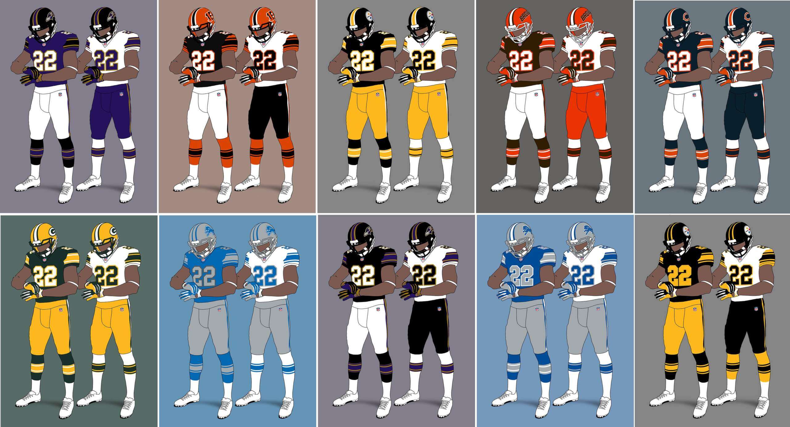
AFC North
Baltimore Ravens V1
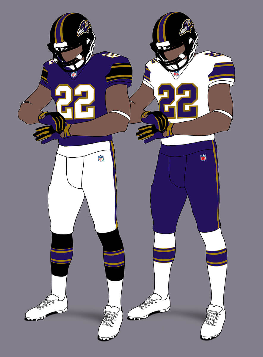
This looks OK, but this shows for with any team with three colours plus white (purple, black and gold here) it can be tricky to fit to this template well.
Baltimore Ravens V2
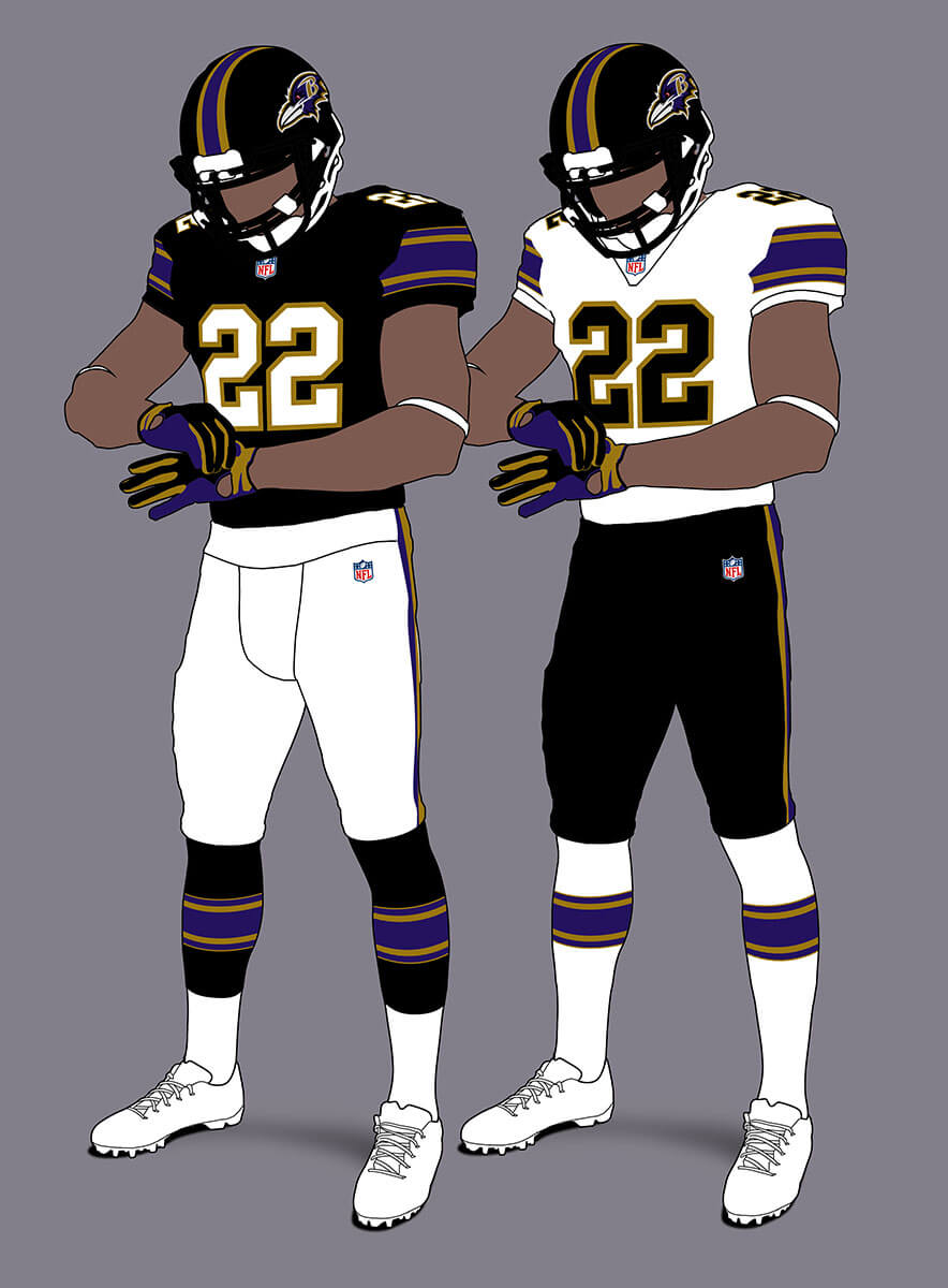
I feel the Ravens look much better with a black jersey in this scheme and TBH any team called the Ravens probably should wear black, even if there are two other teams in the division in black too!
Cincinnati Bengals
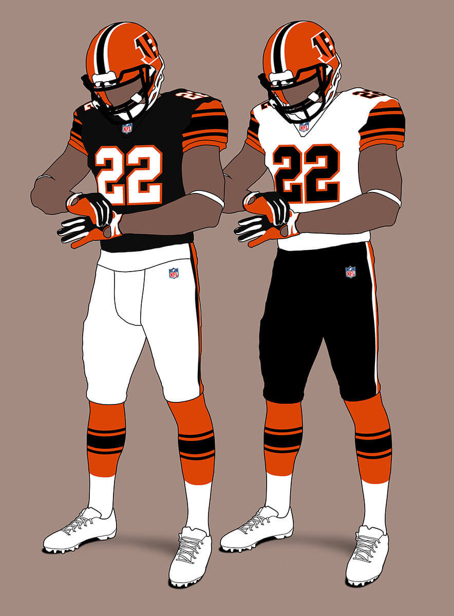
Clearly the Bengals striped helmet isn’t allowed so we need a logo. I went with the striped B as it looks more distinct at a distance than the Tiger head. The orange sleeves and black stripes at least give a tigery feel to the unis.
Cleveland Browns
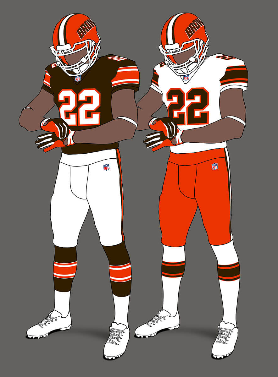
Under this scheme the Browns could have a logo, but I imagine it would be a simple wordmark (in the same way that Paul Brown’s Bengals used one). The uni has the feel of the 1984 re-design that only lasted one season.
Pittsburgh Steelers V1
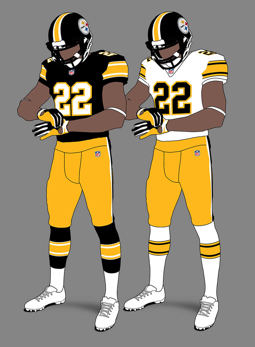
The Steelers already use a form of Northwestern stripes so this doesn’t feel too different although I am getting USFL ’83 Denver Gold vibes.
Pittsburgh Steelers V2
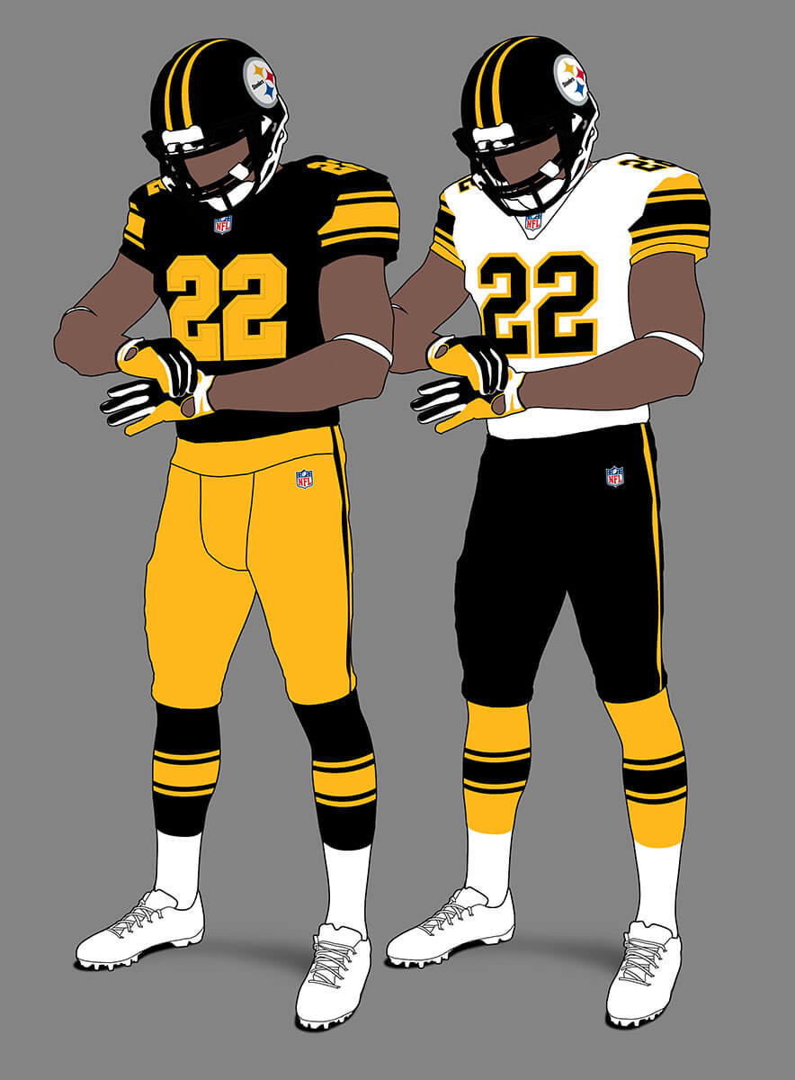
As the Steelers colours are just black and gold, they are entitled to just use those two in a uniform. These are very similar to the 1965 unis and I really like the road jersey sleeves.
NFC North
Chicago Bears
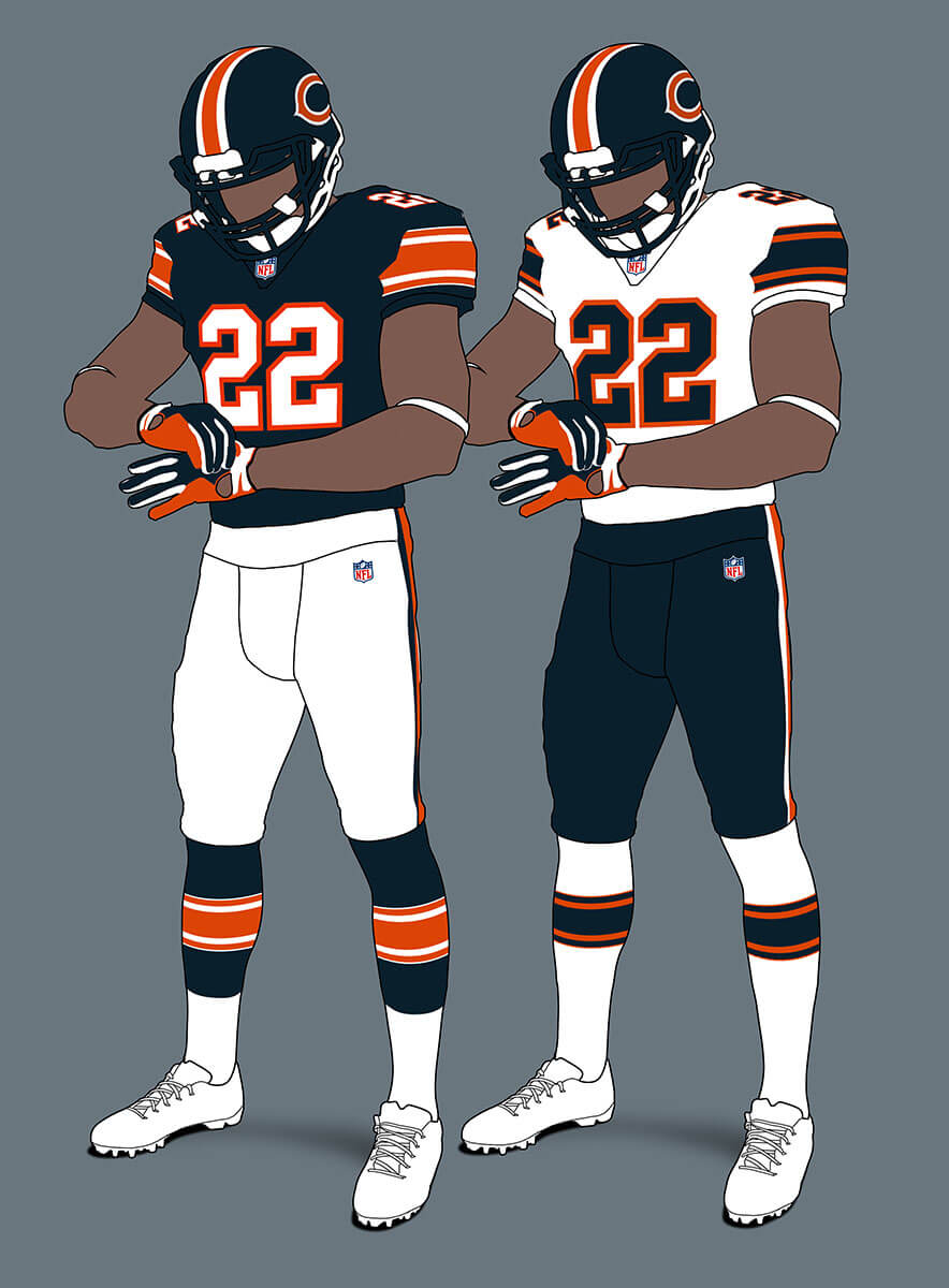
These have the feel of Bears unis and I like the way the helmet stripe echoes the C logo. Under the rules there are no patches or perma-memorials so the GSH is gone.
Detroit Lions V1
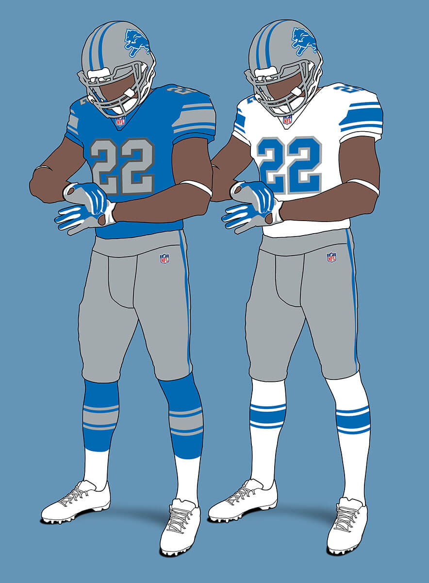
The Lions current unis are very close to this template already so don’t look that different apart from the excision of the LIONS wordmark and WCF perma-memorial.
Detroit Lions V2
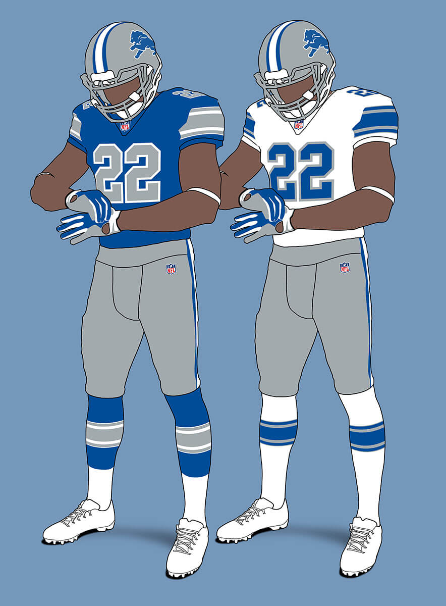
The Lions are currently doing a re-design and this could be something they might consider, based on their 1971-73 unis that use a darker shade of Honolulu blue.
Green Bay Packers
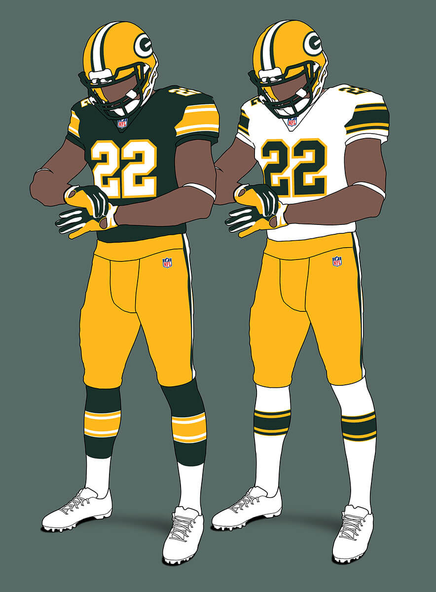
Very similar to their current duds, these still feel like Packers unis to me.
Minnesota Vikings
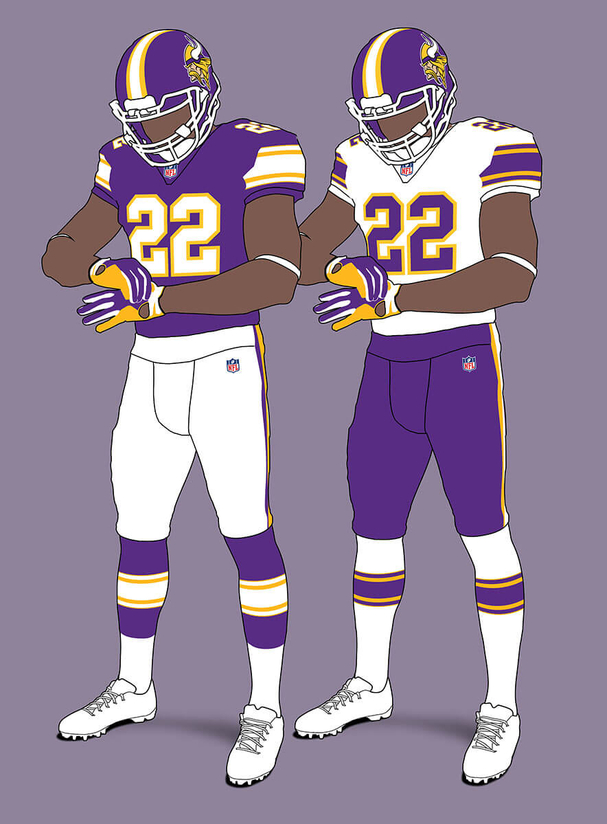
The Viking horns are a no-no so the obvious replacement is the Viking Head logo. Like the Eagles I think this could be a good alt-helmet for the real Vikings. I’ve discarded the black tertiary colour as it adds nothing using this template. The unis are reminiscent of their original 1961 set.
Thanks, Chris! We’ll be back with additional divisional concepts soon.
Readers? What say you…
More great work, Chris!
My only beef is with the number-edge requirement. The GB numbers would look much better without the edging.
The best test of your scheme is whether more teams would look better in your design than they currently do. A couple of examples (GB, etc) aside, your designs pass the test handily.
Thanks jf! But I wonder how much of that is because you’re used to the numbers not having edging? Do you think KC would look better without edging too?
I’m ok with it in principle on classic designs like KC that have always had it. It would be strange to me on GB or CLE. (Obviously teams like IND, NYJ, and LV couldn’t really have edging.)
When I am commissioner, all teams will have one ‘dark’ color and one ‘light’ color, and white will be entirely banished.
I wish I could see the pant stripes better!
Nice work on the write-up and images, as always, Chris! I I think the template works surprisingly well for for Baltimore and Chicago, and it also works quite well for Detroit (though that’s less of a surprise to me).
The template forces helmets on the Bengals, Browns, and Vikings that are all downgrades from what they currently wear. (I have to admit, though, I was hoping to see an infinite regression helmet on the Browns. That would have been fun!)
One reason I appreciate this exercise is the uniformity it brings back to socks! I’ll look at these designs and shed a tear for what once was in the NFL and what I hope might be again. (I hope you’re reading this, Roger!)
Thanks Kary! Yes, it does make you feel sad and nostalgic for striped socks – so many others have said this too. But things do go in waves and players and teams will eventually tire of the plainness. It really just needs stripes to be built in to the tights rather than socks that go over the top. Performance wise surely you couldn’t argue with that?
My concept would have all AFC teams have a single stripe on the helmet (like the Raiders) and all NFC teams have three stripes (like the Cowboys/49ers). Except for the Rams and the Bengals; no stripes for their helmets.
Last week while I was bemoaning the loss of the iconic Bolts and Horns from the LA teams, I completely forgot about the equally iconic Viking horns and Bengal stripes.
Yes those are all iconic and I agree it’s a loss not to have them. But it’s interesting to try and look at the uniforms on merit rather than thinking of what they replace in real life. And it would also be interesting to wonder what uniforms would look like if every team had the unique design style of the Bengals, Chargers etc rather than stripes and side logos? ;)
Great designs I just can’t get over the fact that you lose what makes some teams have iconic head gear ala the eagles Vikings and bengals and rams. And so it really drops them from great to just good designs
Thanks Christian – as I just commented above to BDanner it would also be interesting to wonder what uniforms would look like if *every* team had that sort of iconic helmet design?
“wonder what uniforms would look like if *every* team had that sort of iconic helmet design?”
Well get on it!
;)
Bengals helmet should have the Bengals word mark that they used in the 70s. Browns could use the elf.
I think under this alternate reality that is exactly what they would have had when they were formed. But like the real world Bengals they had a re-design and came up with this look.
I don’t understand why the Vikings horns had to go. It’s a logo in each side of the helmet, so how would that break the rules? It’s not like the Bengals striped pattern.
Yes it’s where you draw the line between “side logo” and “all-over design”? I think it is the size and location of the horns that rule them out, in the same way as the Chargers’ bolts.
That Lions v2 mock-up looks way too much like the Cowboys. I much prefer v1 but add white outlines around the numbers (blue jersey) and a white stripe in the middle of the helmet and voila!
That’s strange because it’s almost identical to the uniform the real Lions wore from 1971-1973! Maybe we’ve got used to the lighter shade of Honolulu blue the Lions wear now so the darker shade looks like the Cowboys to you now?
I can’t get over how– within the vacuum dictated by the project– great these all look! Teams who look good in one-color numbers know the colors and detail of their uniforms allow them to get away with it. Pittsburgh, for instance, is okay with plain white numbers because the player names are in yellow (gold). I would love to see Browns and Packers uniforms with the exact numeral colors you gave them, if only as an alternate.
Thanks Walter! Yes I like the Browns and Packers designs with edged colour numbers too. But you can see from jf’s comment above that adding coloured edging to teams who historically in our reality don’t have them is too much for some. I think for the Browns too, their designs with colour edged numbers have generally been reviled so it sort of leaves a bad taste in the mouth for some to see that.
Good stuff again, Chris!
I don’t like that you messed with the Bengals helmet, but rules are rules. Wonder if a black bucket would work with your simplified uniforms.
Strangely enough, I don’t miss the Vikes horns-Norseman fits the bill nicely.
Chicago sans the Chicago Stripes is a slight disappointment, but they still look enough like the Bears.
Lions V1 or 2 are upgrades that Detroit should strongly consider for ‘24-‘25.
Thanks Chris. I didn’t consider a black helmet for the Bengals, but I think it might look good.
Attention: The sizing of articles today on the site when read on mobile devices is really wonky.
I’ve contacted Paul about this.
I see what you mean about the ticker (it’s wonky on my phone) — but the other three articles that were posted today all look fine on my phone. Is it ALL articles or just the Ticker that’s not showing up properly?
Paul and Ek have figured it out. It was caused by a bad link by a commenter in the ticker. That’s been fixed. Thanks for bringing it to our attention!
I can’t get with the Browns, Bengals, and Bears, but the Ratbirds look a million times better than the schlock they wear now.
The Vikings (except for the helmet) and Lions also look much, much better, pretty much like they used to look before Nike turned sports into a fashion show, and a bad one at that. Just the number font alone makes the Steelers look better.
Not sure how I feel about the Packers.
Nice work, Chris. I usually don’t read any of the other uni-redesign articles that appear here, but this one appeals to me because of the return to traditional, classic designs. Bravo. You ought to be in charge of all sports outfitting.
Thanks Marty! Yes I really like the Ravens looks in this template too, especially the black jersey.
Wow, the white socks with stripes look so much better with dark pants than that leotard look they wear now.
Thanks Jimmy! Yes it’s amazing how much difference a few stripes can make. As I said above one day the trends will swing around and stripes will come back into fashion :)
Be careful what you wish for: By then the players might be wearing their helmets backwards.
I’m sorry, but you completely ruin the Bears, Bengals and Vikings with the helmet rules.
The Ravens have a B on the hip of the pants, I always thought this would be a good helmet logo. Just the B.
Great job, Chris! Of course I’ve got the same quibbles with these strictures that a lot of other people have. But all the same, there’s something exciting & rewarding about seering well-done creativity that’s in tension with limitations of form (arbitrary or otherwise). Bit like a sonnet!
Question…
And idk if this is possible. Can teams who already have Nike templates GO BACK to the Reebok one? Do they have the option or Green Bay’s grandfather in situation their own unique situation. More and more as time goes on, I hate Nikes templates. They’re just big shirts with weird vent holes and sweat squares and non sense collars. Done with it, wish nfl went back to the old Reebok template. More of a statement not a question now…