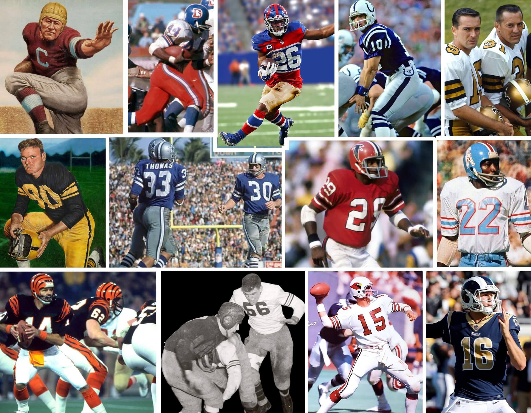
Good Saturday Morning, Uni Watchers. I hope everyone has had a good week.
Those of you who subscribe to Paul’s Substack know that a couple weeks ago, his column was entitled “10 Throwbacks I’d Like To See,” and you might be thinking, “Jeez, did you just copy Paul’s idea and slightly change it?” Well, Mr. Five and One Jimmer Vilk and I had actually planned on doing this column for a couple weeks, and honestly had no idea Paul was going to run with his. Rather than just scrap it, we decided to plow ahead. Our plan was for each of us to select six uniforms that had never been worn as throwbacks, plus one which we both agreed we need to see. Our rules were: two each from the pre-1960 era; two each from 1960-1980; and two each from 1980-present. Early on we both agreed the orange-pantsed Broncos would be our “mutual” choice.
So, we each selected six throwbacks we’d like to see; Jim has his, I have mine. After each selection, each of us was allowed a one sentence rebuttal (In some cases we agreed with the other’s choice, other times we did not). But one thing we always agree upon is that throwbacks are almost always good for the game, both as a history lesson and (usually) aesthetically as well. In some cases, we think the throwback we’ve selected is probably good as a “one and done,” but in others, teams could (and should) seriously consider making them permanent. Obviously, with modern cuts and such, throwbacks sometimes can’t really capture the original. But as long as they are as true to the originals as possible, these are the ones we’d like to see.
And now, let me turn this over to Jimmer for his introduction, and then we’ll get into our 15 selections.
Jim here. At first I didn’t think I could come up with enough throwbacks to make a list of my own. Once I started looking I finished quickly, and I could easily do another list or two! So many good looks have been resigned to history. Unfortunately, some of them will never return because a lot of football owners, coaches, players and fans are too superstitious for their own good. I have no qualms whatsoever with so-called “unlucky” or “unsuccessful” uniforms. In fact, I think throwing back to them is a shot at uni-redemption. Anyway, not all my throwbacks are from losing teams. The one thing they have in common is they all deserve to be seen again. I know you won’t agree with all of them, so let’s see which ones you’d like and which ones you’d rather be forgotten.
For each uniform below, you can click the link embedded in the year/team to see the Gridiron Uniform Database graphic of the uniform.
1920-22 Canton Bulldogs (Jim)
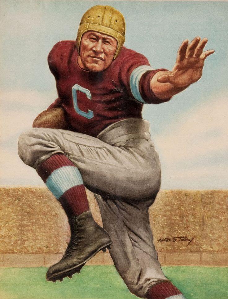
Let’s go way back to where the league began…time-wise and location-wise. Canton no longer has a team, but a short drive up I-77 will take you to Browns Stadium. How about putting Cleveland in this simple but effective beauty for a game or two? They should have done it during the NFL’s 100th anniversary, but the one-shell rule was in effect. It isn’t now, so let the Dawg Pound cheer on the Bulldogs! Just add a front number to the jersey somewhere. And there was a Cleveland Bulldogs team as well, but I like these uniforms better.
Phil’s rebuttal: I didn’t think Jim wanted to throw back this far, but this could be awesome — Love the maroon!
The forerunner of the Detroit Lions made it to the first-ever NFL championship game, an indoor affair at Chicago Stadium. Now that the Lions play indoors, they should invite the Bears to wear their ’32 throwbacks for a revenge game. Love the color, and the properly sized numbers on the back! Same as with the Bulldogs, add a front number and let’s go.
Phil’s rebuttal: Unlike the Bulldogs, I’m not sure I love this uniform, but I do like the idea of a 1932 Spartans/Bears rematch.
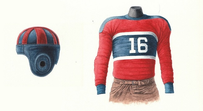
While the Giants, aka “Big Blue” have remained so (at least for their dark jersey) for the better part of 70 years, they wore red or red and blue for much of their early years. The 1933 team had an almost 50/50 red/blue split for their jerseys, and to good effect. I was wondering how this might translate to a modern throwback, and I stumbled on this amazing mockup (I believe on a Reddit thread), and I knew this was something I’d want to see on the gridiron. It’s often difficult for teams to create throwbacks for almost-100 year old looks, but this one could be a modern classic.
Jim’s rebuttal: Go Big Blue/Red/Khaki!
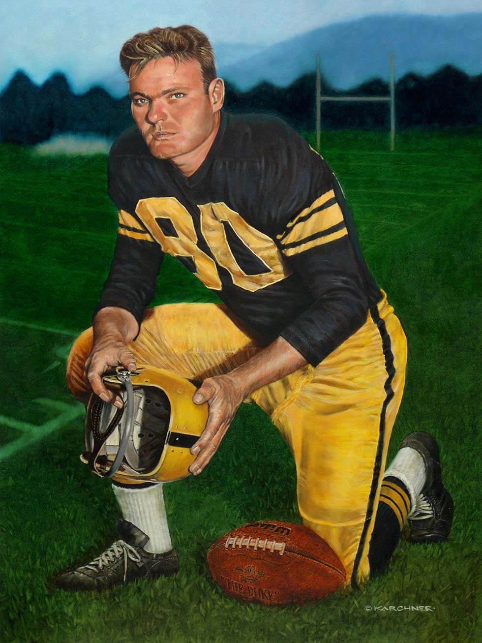
The Steelers have worn a number of throwbacks over the years. But for some reason, they’ve never worn this gold/black/gold beauty. The team has worn black helmets (and had incredible success) for sixty years now, but even as a kid I wondered why they didn’t wear gold helmets, like the Packers. Maybe they’ll never wear gold hats again, but I’d love to see this uniform (with NO white!) as a throwback. The one time they wore a gold-helmeted throwback, they ruined it by wearing white pants. This rectifies that mistake.
Jim’s rebuttal: Very good, although they’re not as fantastic as the 1962 road unis.
1967 New Orleans Saints (Phil)
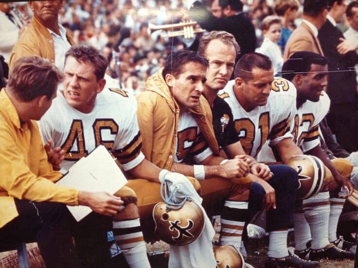
There are a few teams that “got it right from the start,” and the 1967 New Orleans Saints most definitely fit that bill. Somehow they were able to figure out how to make “old gold” the proper shade, and those gold helmets, gold numbers outlined in black, and gold pants were just fantastic. I mean…c’mon…how great is this? They’ve never looked so good. They have a fauxback now that looks good, but the current metallic gold helmet looks awful, and the white pants and socks don’t look nearly as good as the 1967s. It seems like Nike can actually make a decent old gold now. It’s time they do this for the Saints.
Jim’s rebuttal: They got it right the first time, and it’s time to make them right again.
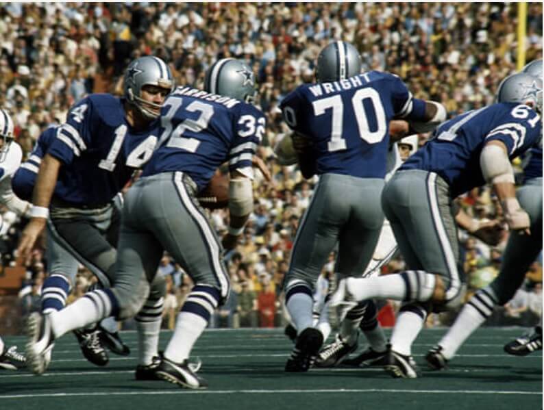
The Cowboys have never looked as good as they did when they played the Colts in Super Bowl V. And it’s time the Cowboys returned to royal blue and gray. As Paul noted many years ago, the Cowboys have the quirkiest uniforms in football. But they needn’t and shouldn’t. They simply need to return to the royal/gray (and yes, they can still wear white at home a lot) — but the navy they added in 1981 was a mistake that has never been rectified. Just return to the Supe V look and make everyone happy again.
Jim’s rebuttal: One of those so-called “unlucky” uniforms, and Dallas fans need to get over that already so we can enjoy this look.
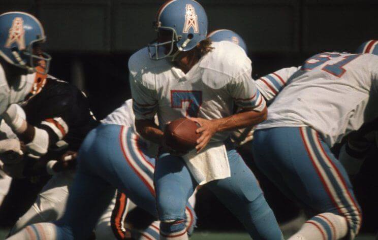
You KNEW I was going there! The. Best. Uniform. Ever. I was aware of the Oilers as a youngster in 1971. When these came out the following year, I had myself a new favorite team. Sure, they had two consecutive 1-13 seasons in them. However, in 1974 they vastly improved to 7-7. The players even carried coach Sid Gillman off the field in the last game for those glorious blue helmets. With an exit like that, why not bring them back and relive the feeling?
Phil’s rebuttal: It’s not my favorite Oilers uniform, but it’s still pretty good, and I’d like to see this one (again).
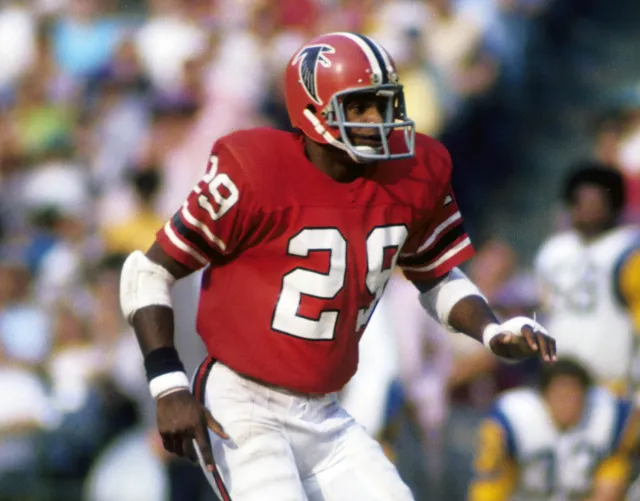
One of the best looking games ever featured these Falcons hosting the ’72 Oilers. How I’d love a rematch! Now don’t get me wrong…I’ll take ANY pre-Jerry Glanville Falcons uniform, so if you told me the current throwbacks would become their new regulars, I’d be ecstatic. If you give me the choice, though, I’ll take the red helmets and jerseys with white numbers and pants.
Phil’s rebuttal: I almost picked this one myself!
1981 Cincinnati Bengals (Phil)
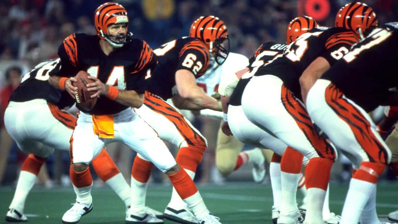
It’s hard to believe that this uniform — really the first modern classic — was considered radical and almost dismissed by many old school scribes at the time. But it looked great back then, and would still look good today. Each and every stripe on the shoulders and pants was unique, but as a whole the uniforms were neither radical nor garish. It’s hard to believe it’s been 20 seasons since they last wore this iteration. It’s time for a throwback (or better yet…just return to these full time — just keep the white tiger as an alternate). Done and done.
Jim’s rebuttal: You had me nodding in agreement until you got to the part about the white tiger zebra alt.
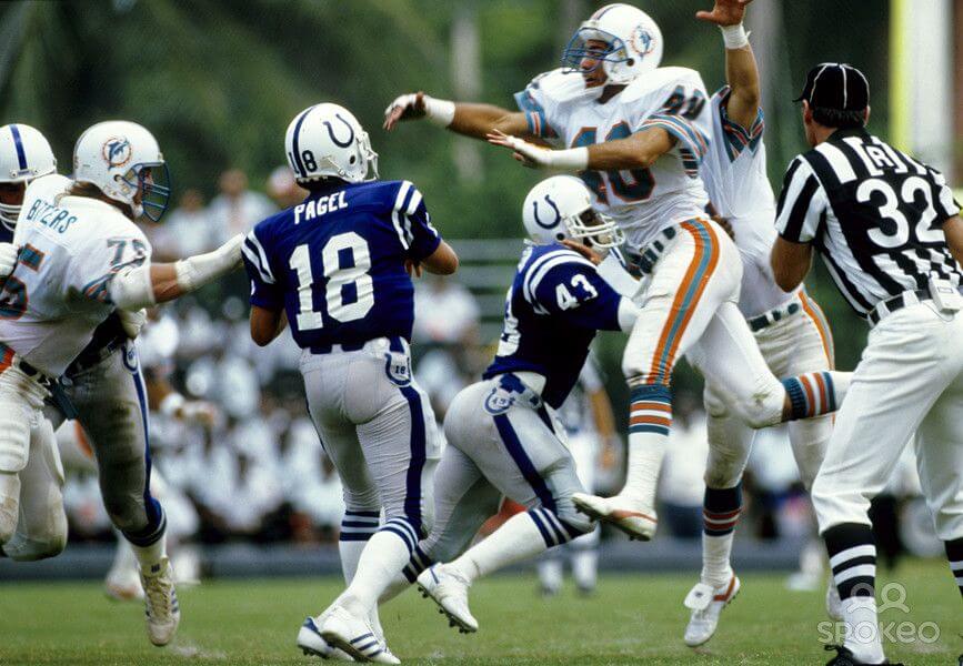
The Colts wore these in their first season in Indianapolis. They wore them for the last couple of seasons in Baltimore, and for a few seasons after ’84. These would have been great to wear this season as Indy is celebrating 40 years of NFL football. I always liked the white facemasks, gray pants, and the hip numbers (even if they’re a little too small inside the horseshoe).
Phil’s rebuttal: If there is a team that should have a royal/gray throwback, it’s the Cowboys, not the Colts.
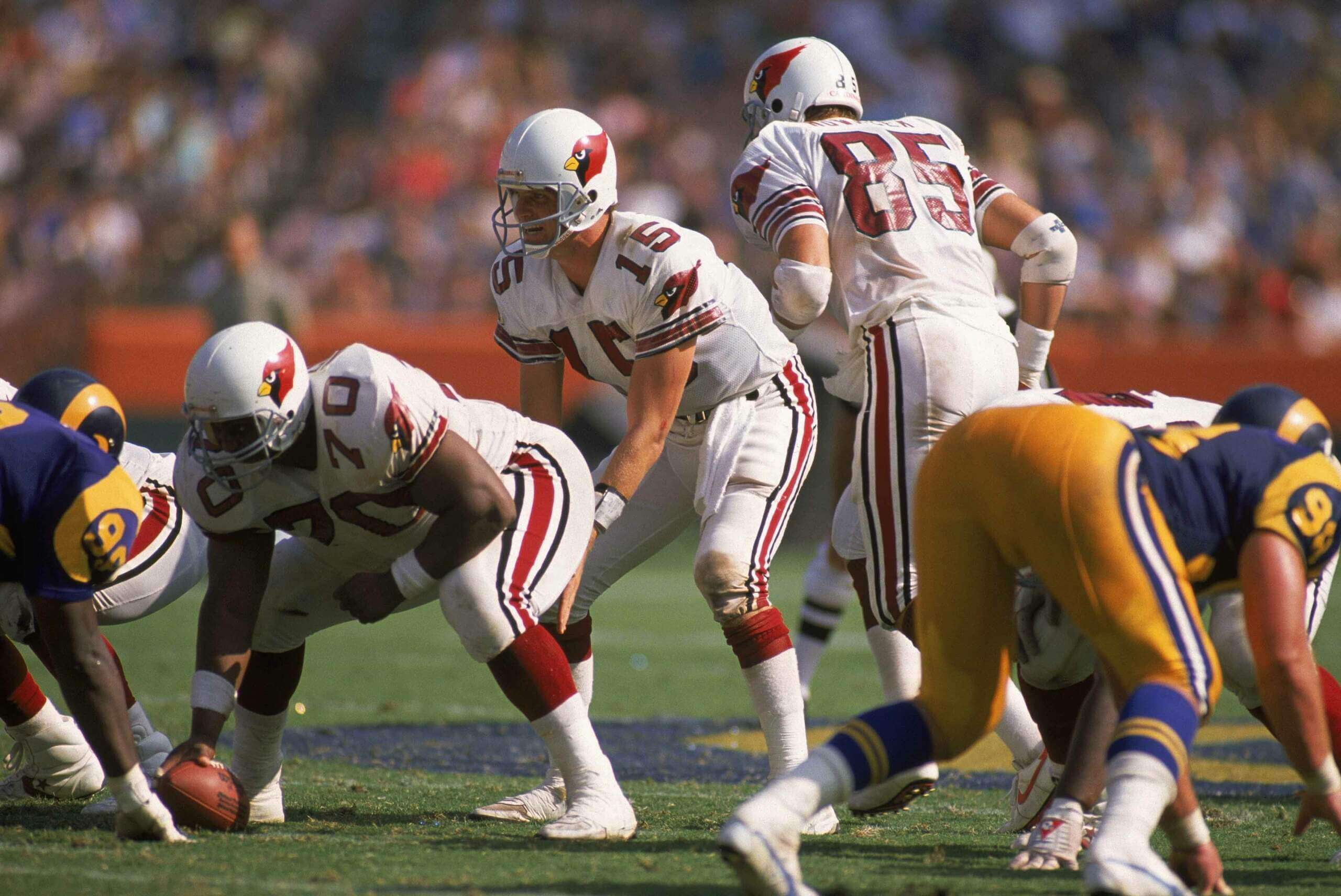
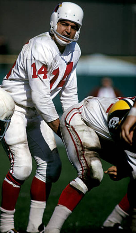
Let’s be honest…the Cardinals had the worst uniforms in football with their last set. They got new uniforms this year, and yet they’re still pretty much the worst uniforms in football. But they used to have really fantastic uniforms, especially in their final St. Louis years. Never has a “mono white” uniform looked so good. Sure, you could never replicate those sleeve stripes today, but you could come close. This is a throwback that needs to happen. Once fans see this on the field, the redesign clock will be ticking.
Jim’s rebuttal: Needs red pants, but this is very nice.
This is Exhibit A when I have to correct people who think I don’t like anything new. Not only do I like this mishmash, I think it’s LA’s best ever look (well, I could have done without the mono-blue option). This gives me a bit of a 1970s Maryland vibe. Not every part of the uniform has to have every team color, as long as the uniform as a whole does. I also get a vibe from one of my guilty pleasures: the anthracite Washington State unis. The white helmet logos and facemasks really pop on both of them.
Phil’s rebuttal: I know Jimmer really likes these, but still, I almost feel he’s trolling us here.
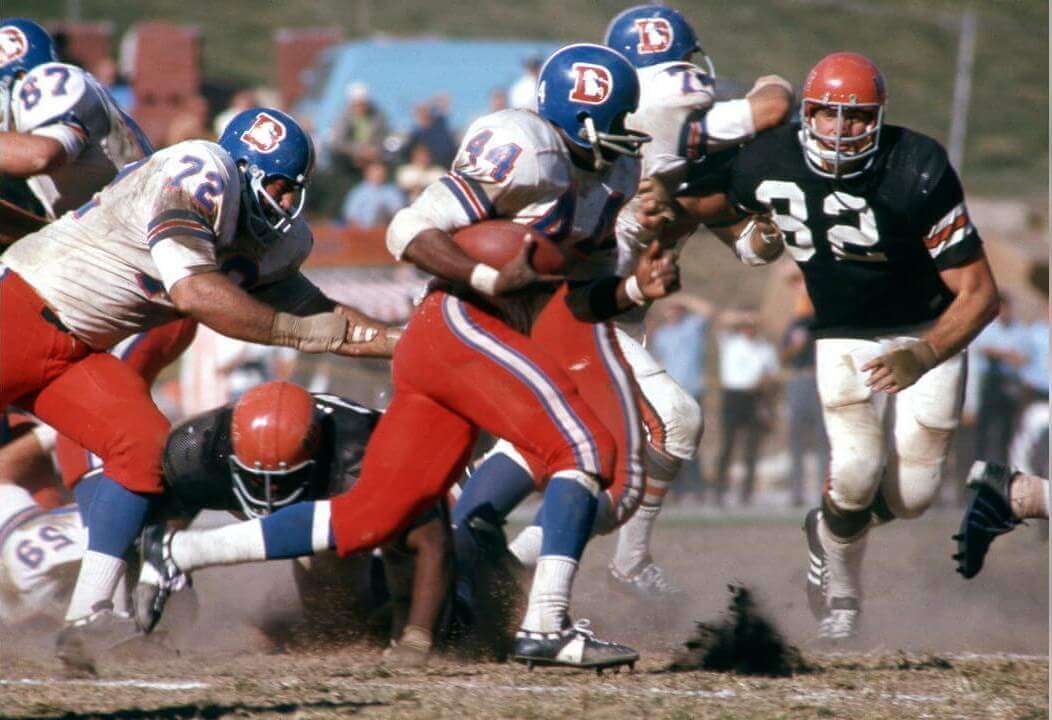
Jim: There was a time when Denver looked good in white road pants. That was when they wore the orange helmets with the bucking bronco logo. Since then, they never looked right to me in blue/white/white. Whether it was the royal blue helmet or the navy blue didn’t matter, and usually I don’t mind navy over all white. I would have forgiven them for being superstitious cowards in Super Bowl 50 for wearing white jerseys if they would have worn orange pants, and I would have cheered for them like mad if they threw back to this colorful royal/white/orange combo. This on-again off-again on-again look should have stayed on and on and on.
Phil: I am generally not a fan of three “mis-matched” uniform elements — in this case royal/white/orange. There are a few exceptions, and Denver is definitely one of them. It’s a shame the only time we’ve seen Denver in orange pants in the past 44 years has been in their CR getup. We know Denver is going to redesign soon — and they’ll likely base their new uniforms on that CR template. All they need to do is keep the orange tops and bottoms separate and lighten up the navy shells they currently wear. But until then, let’s see this royal/white/orange beauty on the field. YMMV.
What say you readers? Any of these you too would like to see? Any you’d rather constrain to the dustbin of history? Did we miss any? Let us know in the comments below!


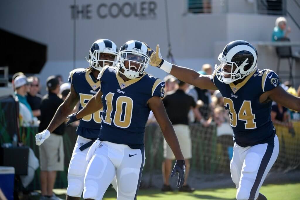
The Rams pick has to be a joke?!
For the reasons he explained, Jim loves those (so, not a joke). He may be the only one who’d ever want to see them on the field again.
I almost picked the ’49 Rams or the 60s/early 70s blue/blue/white unis, but those eras were taken. And Phil didn’t want me sharing the Cardinals or Steelers, even though I had a different uni in mind. So I went with a modern
classicone-of-a-kind look.Give me the 73-99 road unis, the 60s/early 70s blue/blue/whites, and the 2017 look as my throwback, and I’m good to go.
I respect the rams pick. When they eliminated the side panels from that look they created one of the teams best sets. I don’t love any of the rams unis as much as most people in here probably might. I think they range from fine to bad, but they’ve always had great helmets, and I think that gets them a lot of uni mileage. Nevertheless this was a weird set, that came together under unusual circumstances and if you put away the kind of perfectionism that says “the original intended uniformity of uniform design is the only acceptable path” then what you see here is a pretty great look, actually.
if they flipped all the gold parts to white and the white parts to gold on the actual jersey or just dropped the accents all together it wouldn’t have been a terrible jersey
The point is not the orange pants – it is the shade of orange! Blood Orange, Red Orange whatever you want to call it, I love it.
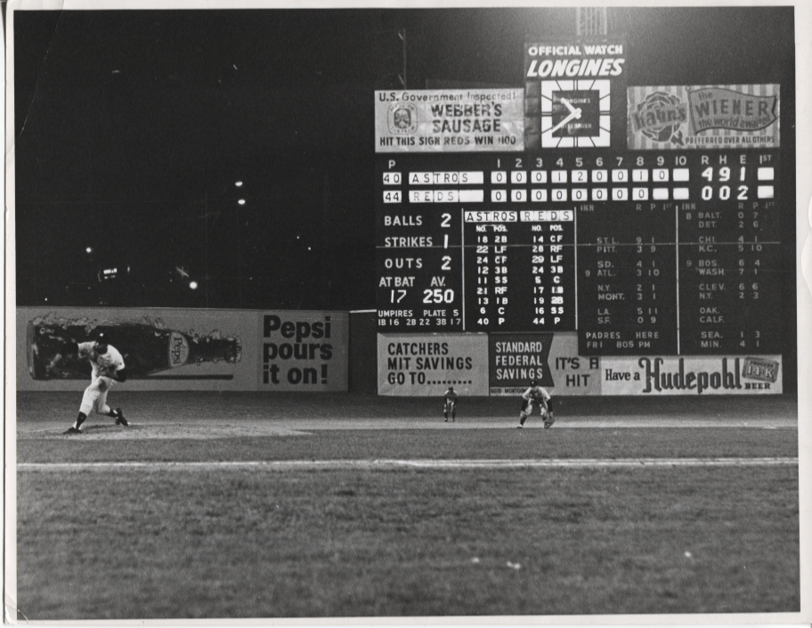
Scoreboard: Don Wilson Hurls 2nd No-Hitter of Career
Scoreboard: Don Wilson no-hitter, 5/1/69. Oddly, the day before the Reds had no-hit the Astros.
Scoreboard: 5/1/69 Don Wilson Hurls 2nd No-Hitter of Career, beating Reds 4-0.
GTGFTU
Anytime I see the 60s Cardinals vs the Packers, I automatically think of St Louis’ Playoff Bowl victory.
That doesn’t look like the Orange Bowl in the background, though.
Not sure.
Guessing today’s GTGFTU:
Week 2 of 1962 season-Sept. 23, 1962
St. Louis Cardinals-Green Bay Packers at Milwaukee
17-0 Green Bay victory
Correct, Brad!
StL”@”GB (game played at Milwaukee County Stadium), 9/23/62.
CFL HOFer/all-time great Sam “The Rifle” Etcheverry about to take the snap.
A hundred times yes to all these. I don’t subscribe to Paul’s additional content, but I’m sure I’d get behind those, too.
1980s Cowboys bad luck blues > 1970s bad luck blues. They looked amazing on the field at RFK.
I’m kinda fond of the old silver-helmeted Oilers, myself.
You should enjoy the Rice game today, then. (If you have ESPN+)
link
link
link
That’s my second favorite look for them.
Colts in silver pants a product of that era. Silver pants became really prevalent during that time. So many USFL teams in silver pants. Even my Saskatchewan Roughriders making the change with 1985 uniform redesign to the silver pants with the sheen.
Was an interesting look for the Colts but I don’t think a white helmet works well in general with dark jersey and metallic colour pants. The only team I could really accept as a fine look with this was the USFL Breakers. Probably because it was their only look.
As a lifelong Falcon fan, I like your Falcons choice but prefer their combo they wore through most of the 1980’s – red helmet with original logo and white and black stripes, silver pants, red jersey with silver numbers, white jersey with red numbers.
Like Jimmer said, anything pre-Glanville is fine. I prefer them in the white pants as well, but their gray-pantsed look was good too.
They went from decades of perfection (or close to it) to decades of bad->worse.
That’s my second favorite, especially with the white facemasks.
If it wasn’t for the controversy with the name in this day and age, and if we’re apparently going way back with choices I would love to see the Duluth Eskimos.
Call them the Northmen?
That was a great uni.
Re: Vanderbilt/Nike old gold
Vandy’s pants don’t look like a Nike template. They probably outsourced them to a third-party manufacturer and slapped the Swoosh on them. So, no, Nike probably still can’t do proper old gold pants.
You got the Oilers right. Those helmets are soooo great. And anything pre Jerry Glanville. That MF ruined my life when he got rid of the red. Wish Coach Noll would have housed him rather than a stern talking to. Ok I’m done
The Cowboys sure didn’t have bad luck wearing the blue jersey in the 1978 NFC championship game, shutting out the Rams 28-0.
Cowboys royal blue is better.
Knew the orange-pants Broncos would factor in. Woof!
Thought for sure the ‘disco’ Giants would make the list, but the selection made is great.
I would have included the ‘70-73 Eagles for sure…possibly work in the ‘59-64 ‘Skins somehow.
I’m pretty sure I *pre-empted* Jimmer there with my Giants choice. We had a couple where we had the same team, but different years (except for the ever awesome Broncos blood orange pants, of course), so we went with one team per. I grabbed a couple teams I’m sure JV wanted, that is why he had the 2019 Rams. (WOOF!)
I’ve thrown in the towel on seeing a resurrection of the “disco NY” helmets, but an overlooked detail I appreciate is the white/red/white helmet stripes of that period.
When I buy the Giants, build the New Polo Grounds and return the team back to the city and state where they belong, they will wear the Disco NY on the road.
At home they’ll go logoless.
I really wish the Browns would have gone with a new identity for the expansion team. I always though Bulldogs with that color scheme would have been great.
Anyone else notice the inconsistent sleeve stripes/length in that photo of the 1987 Cardinals?
Re-‘87 STL Cardinals:
“Never has a “mono white” uniform looked so good.”
See today’s GTGFTU for a better look.
Very close to the current road look the AZ Cards have now-which make their regular season debut tomorrow!
Red pants? You know that’s a no from me, Jimmy V!
YVVMYMMV, of course. ;)Broncos: not orange , that is chinese red.
Indianapolis: 40 years later still not the Colts so bring back the silver monstrosity product of drunken daddy irsay.
That shade of red/orange drove the NFL nuts! The Baltimore Orioles had a pullover jersey of that color in the 1970s. I’ve seen it referred to as Chinese Red, Kalahari Orange, Terra Cotta, Burnt Orange, Go Mango, Hugger Orange, and Orange You Glad.
“Burnt Orange” is the shade Texas wears.
What the Broncos wore isn’t even close to that.
Texas’ orange is another unique animal. It is darker and more neutral than plain orange, and is another color which gives makers of garments ulcers.
Nice to see the original Bengals stripes get some love, but what I’d really like to see is the Bengals in their original uniform (as seen in the 1971 Broncos pic above). Understated and striking.
That was definitely one I would have picked had the Bengals not already thrown back to that in 1994 during the league’s 75th Anniversary season.
link
One of our requirements was no throwback that had already been worn, no matter when.
Cowboys blue is navy, not royal. The intent with royal was for it to look navy, so the intention was always navy. If Cowboys went to royal they’d be far too close to the Giants, Colts, and especially the Lions. No. As a die-hard Cowboys fan I vote navy forever, though I like the quirk of using both. I just wish we’d get a bit more navy.
Chinese Red. AFL said so when Denver was using it. NFL said Bears secondary color was burnt orange. Also Honolulu blue is the Lions and Columbia blue was the Oilers.