While professional athletes surely have opinions on the uniforms they (or other teams) wear, most of the time they simply put on that day’s given uniform and go about their business on the diamond, gridiron, court, ice, field, etc. Other times we’ll see new uniforms introduced and player reactions are recorded — mostly always positive (“dope,” “fly,” “sweet,” etc.).
So it was refreshing when Arizona Diamondbacks hurler Zac Gallen reacted to a photo of himself in the D-backs purple vested throwbacks, and tweeted “We should wear these more (permanently) lol” and included the “eyes” emoji.
Purple> Red. We should wear these more (permanently lol) 👀 https://t.co/0qLAtHU7V0
— Zac Gallen (@zacgallen23) August 13, 2023
He’s right of course — the throwback uniforms the Diamondbacks brought back last weekend, when the D-backs were celebrating the franchise’s 25-year anniversary, are certainly better looking than the team’s current set. (At first it seemed he was specifically speaking of the team’s red alternates as noted in his “Purple> Red” portion of that tweet). Still, he’s a big fan of the look of the “purple” (throwbacks).
But it’s one thing for an athlete to tweet his approval (or preference) of a particular uniform. Gallen took it a step further when he followed up that post with a separate poll, in which his preference for the throwback uniforms versus the current ones was echoed by respondents:
Just curious
— Zac Gallen (@zacgallen23) August 13, 2023
The 14,000-plus who voted in that poll were emphatic: an outstanding 91 percent of those who replied agree with Gallen. That’s an even more emphatic showing than the 81.7% who know that a hot dog is NOT a sandwich.
When asked about his poll, “I just kinda had been throwing it out to the front office, the purple looks good, maybe we should bring it back,” Gallen said. “So I just put up a Twitter poll to see if the fans agree with me. And honestly, I didn’t think it was gonna be that big of a landslide in terms of the votes and the responses. We’ll see what happens.”
It’s interesting to see that Gallen has even approached the return of the purple/teal uniforms with the front office. It’s one thing to publicly like and support a particular uniform on the Twitter, but it’s another to take it two steps further: a poll and a discussion with those who make uniform decisions.
Hopefully they’ll listen!
I’m not in a position to offer Gallen an honorary Uni Watch membership, but if I were, I’d totally give him a UW membership card in D-back throwback colors, and he wouldn’t need to wait until Purple Amnesty Day to get it! (Interestingly, on PAD in 2020, Paul listed the D-backs Purple Vest Uniforms as his favorite [least hated?] purple uniform across all sports.)
Good for Gallen for making his uniforms preferences known and trying to promote their return on a full-time basis.
Yep. Zac Gallen GetsIt™!
The problem is, he affected the outcome of the poll by publicizing his own opinion first. That will make people more likely to agree with him, which severely weakens the validity of the poll.
Anyway, I have no strong opinion one way or the other about the Diamondbacks’ uniforms. Just came here to say that.
Agreed. And we should take Twitter polls with a grain of salt. (Except for the Hot Dog NOT a sandwich one…that’s legit)
But even if he affected the outcome, his preference for the clearly superior uniforms and public advocacy for same is noteworthy!
How long ago was that hot dog poll taken? Maybe those people have come to their senses or died. It might be time to test humanity again to see if they get it right.
#Sandwich
A hot dog is not a sandwich; a hot dog is a sausage–a cylinder of meat.
The question of whether a hot dog sandwich on a bun is a sandwich is one which kind of answers itself.
A hot dog is a taco.
A taco is a sandwich.
A hot dog is a weird pizza
A hot dog is a sausage wrapping itself up with a bun.
No. The Rockies own purple in baseball. Do a turquoise and copper thing. Unique and perfect for the desert.
“The Rockies own purple in baseball”
So who owns blue? Who owns red? Who owns orange or gold?
No one — there’s room in baseball for a second team with purple in its colorscheme.
(Although I’d love to see a turquoise/copper uniform for Arizona)
And no one owns the vest…but somebody should make it a mainstay again, so why not the Diamondbacks?
Nobody owns colors.
Even Pittsburgh doesn’t own black and gold.
Let Arizona wear purple (and teal!).
Agree 100% with this. Purple throwbacks are great but go with copper/turquoise full time. Purple and teal just feels too 90s to me and idk if it has any connection with the state either unlike copper and turquoise (and sand maybe)
A conversation heard in the Diamondbacks front office years ago: ” You know what? Our uniform looks great. That means we have to change them”.
Their first look was their best look. If they could have decided on a single cap logo, they would have been set. Personally, I went A > D, because the monogram should represent the city/state, not the nickname of the team. But the purple works because 1) the Rockies do not have a monopoly; 2) it ties in with Phoenix’s best known team (the Suns); 3) it has historical cache with the D’backs; 4) it could be scaled back for more copper but it is a nice complement to the turqouise and gives me desert sunset vibes.
I like the D-Back’s current set myself, especially the brick red.
Obviously I’m in the minority, sigh.
I fully support a return to purple/teal, but I think those particular uniforms look dated. And yes I know there are tons of older uniforms that are still relevant and used today, but as others have noted that particular iteration looks very 90s to me.
So, an updated version may be the best of both worlds. But that could also lead to them ruining the whole thing…
Also, the shiny dark purple helmets look so bad to me: link:format(webp)/cdn.vox-cdn.com/uploads/chorus_image/image/72542911/usa_today_21195198.0.jpg
Why is it so difficult for MLB teams to get the helmet colour right?
link
I actually love the current Diamondbacks uni and logo set. The Sedona Red is distinctive and the A logo outlined in teal is super sharp.
To each his or her own. The set Arizona has now (if you include the throwback, and their cream CC’s) is vastly improved from the nightmare they foisted upon us in 2016
link
Perhaps a modernization of the late 1990s/early 2000s purple and teal is in order? I don’t mind the Sedona Red (I’m not a fan of red, but that’s a good shade) but sooooo many teams wear red and/or blue, the D-backs could really set themselves apart with a purple/teal (or even turquoise/copper) theme.
Oh man, those 2016 unis were such a bad idea. The whole team looked like they had been stomping around in blood!
link
While I do love this look, I gotta say the modern skin-tight undershirts under the vest is a bit odd to me.
A lot of ways Arizona can go with this, but I give the nod to the purple and teal because A. It does NOT say D-backs on it, B. It is the uniform of the World Series champion, C. Purple is a desert color, and D. By my calculations, Colorado is going to be an American League team within the next few years. Stay with me: rearranging the current batch of teams (and two expansion teams) into eight divisions of four franchises each– with the requirement of all teams being in neighboring time zones– only works transferring the Royals to the National League and the Rockies to the junior circuit.
I don’t watch much NL West baseball these days (past my bedtime) but if you asked me to draw the Diamondbacks uniforms from memory today I couldn’t do it. Are they still a red team? Are they a teal team? Do they still have those bloodstains?
All of which is to say they had a distinctive look, won a world series, the uniform they were wearing at that time is the look that everyone associates with the team, and there’s no reason not ot say “you know what we were wrong, we’re going back to our iconic look”. Like the Jays, Astros, and countless hockey teams.
Being a Diamondbacks fan for 25 years, of course this is better uniform. The reason given for the change are weak. “Another team in same division has purple.” So what! The Angels gave a reason for more red than blue, because of not many red teams in the AL. That can’t be said in the NL, with the Phillies, Cardinals, and Nationals. Another reason given is that Purple & Teal is so dated to the 1990s. So what, that is when they were formed. Another good reason for these uniforms is because too many teams have red, black, or blue, as their primary hats. This is also a good reason why the Marlins should go back to their aqua hat and uniform from that era.
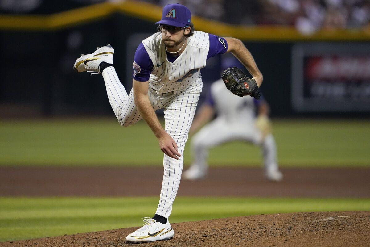
The simple fact that, despite wearing long pants, he has them well tailored and the hem sits above his cleats, rather than over his shoe or under his shoe, not only tells me that this guy gets it, but it also makes the uni look that much nicer. Tailoring and fit really can make a world of difference.
He wears his uni like that all the time (must be a comfort thing), but the funny thing is that particular style, with the long pants-but-barely-showing-sock was *the* style when that uniform was en vogue, so it looks particularly period-appropriate on him in the throwback
link
As much as the purple and teal are special and peculiar to the Diamondbacks I will go for the copper-turqouise pinstripe and hat option with a hint of purple or sonora red as logo or wordmark outlines. That would be my second to favorite uniform (after the Mets at home).
Purple and teal >>>>
I love these unis. (1) I love purple (2) I love vests and (3) I absolutely adore the purple pinstripes.
Two teams that need to go back to the 90s/early 00s are AZ & Miami.
I don’t even care if they don’t go with vests anymore. Recall in 2001 they had a vest and non-vest version of the purple pinstripe with the A logo. Just use the non-vest version for the home uniform. The grey Arizona away, Black A alt and purple Arizona alt. That’s your set. Use the serpent D hat with the Alts, the purple A hat with the home and grey.
As for Miami, you’ll need to change the F to an M, but for the jerseys, the current throwback as the home, solid grey with Marlins on (version they wore final season as Florida Marlins) then a teal alt with Marlins in black, and the black & white with teal accents alt they used around 2003. That’s your Marlins set.
I will say this, if only 1 of these teams could change I’d change AZ. Although 90s/00s Marlins are the best Marlins, their current set is okay and far superior to the orange era.
Additional hot baseball uniform take no one has mentioned, the Texas Rangers should go back to the simpler Nolan Ryan era uniforms. Nike sells a vintage Nolan Ryan Rangers jersey, old design but modern materials, it looks really good. Basically just a simpler version of today’s set, Google it. White/Grey/Royal/Powder just like now but with simpler unshaded fonts.
Now if only someone would teach him how to blouse his pants and wear stirrups, that would be even better.
I’m torn; I don’t have a dog in the hunt, but the purple and teal were very much a product of the era they were born in, the 1990s. So many teams – too many teams – jumped on the teal, purple, and other odd color bandwagon during that time. My two cents – drop the sand color from the current set, use brick red and black, with turquoise – sparingly – as an accent color.
The first pro sports team I ever decided, on my own, to root for was the Charlotte Hornets in 1992 when I was 6 years old. It was because of the uniforms. I loved the teal & purple. You’re right, looking back, it’s so 90s.
Funny enough, the first team that my son, also now 6, chose to root for himself, independent of me, is the Seattle Kraken. Like me, he like their uniforms which of course include their own shade of teal.
As a 25 year Diamondbacks fan, I have never been a fan of the red, and I don’t really know anyone (with an opinion about it) who does. Bring back the Purple!
I actually like the current colors more than the teal and purple. I do wish however they would get away from putting “D-BACKS” on the jerseys. I know you can’t really fit Diamondbacks on a jersey (See their first season unis) so the best look in my opinion is just the throwback template but in the current colors. I always loved the A logo anyway. I’m just glad they got away from the D snake logo, never cared for that one.
Anything that doesn’t say “D-Backs” is an improvement.