Welcome to the latest installment of Uni Watch readers telling us how they first got bitten by the uniform bug (or, as I like to say, how they first Got It™). If you’re new to this series, the previous four installments are available here. Ready for the fifth one? Here we go:
Joe Alvernaz
As a kid in school, I would do a little sketching here and there with some of the “alphabet-based” sports logos — the Angels’ “A,” a wishbone-C, nothing too serious. It clearly went to another level in 1991, when I slowly muralized the desktops of my 10th grade English classroom with NBA team logos. Every day I would sit in a new seat and sketch out another team’s logo in pencil on the desks. Kids would erase or “distort” my work (which was not by any stretch high-quality art). I think at most I had about 10 teams represented at one time. I had opinions on every team’s logo — though I loathed the Trail Blazers, for example, their pinwheel logo was always pleasing to draw. As an adult, I have graduated to making logos for several teams that I’ve have coached, or that my kids have played for.
———
Robert Brashear
My first memory of “getting it” goes back to tee-ball. I remember that stirrups defined the difference between being a real player and a pretend player, at least for me. Maybe because anyone could get a glove or bat or hat, but only real players had stirrups. When they gave me my first tee-ball stirrups, I knew I had become a real player. [I can totally relate to this. — PL] I have to confess that even in high school, I enjoyed wearing the uniform more than actually playing the game. And what separated the varsity from the junior varsity was, of course, stirrups.
———
Justin Black
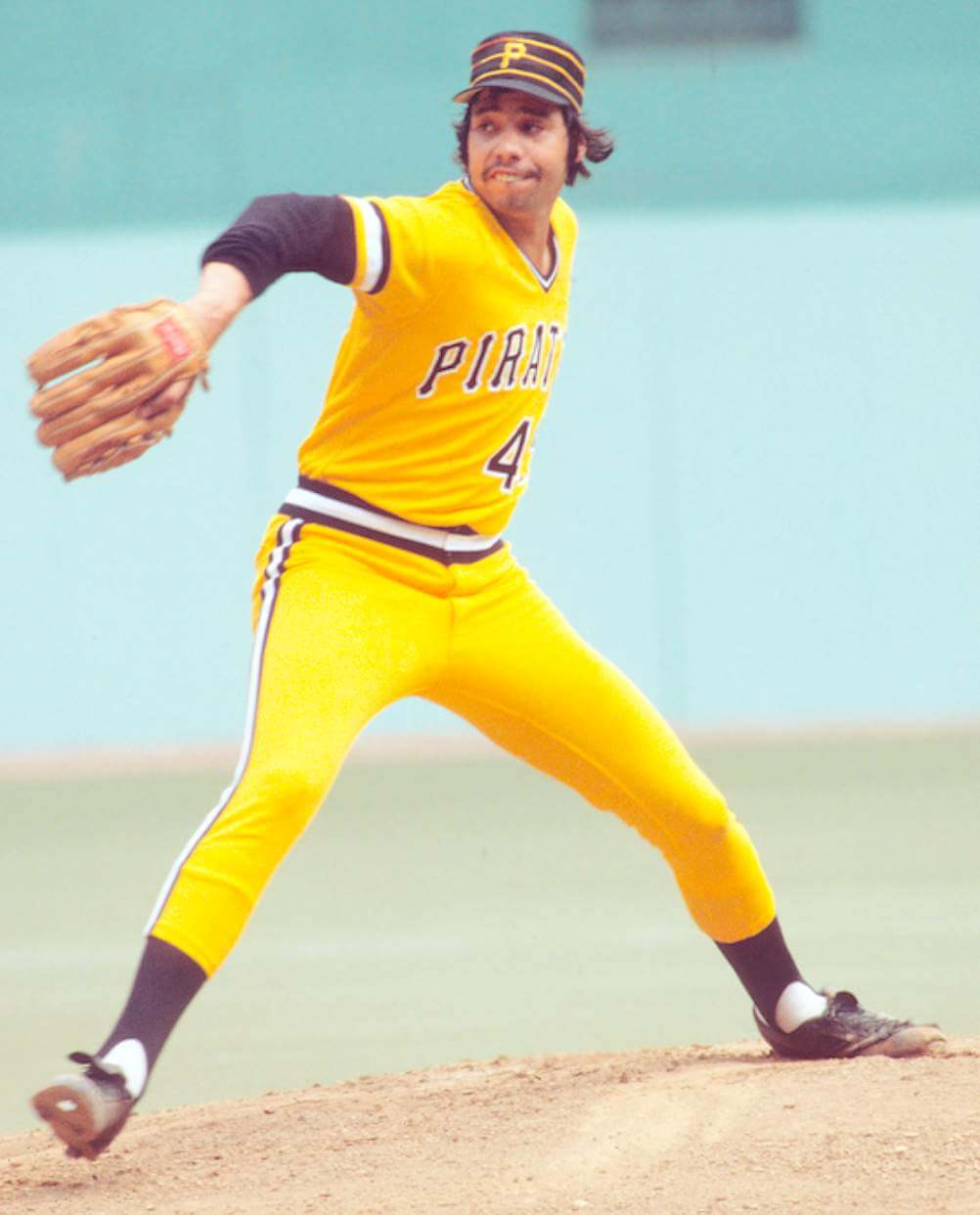
Growing up in New York as a Pirates fan (dad was a Pittsburgh native), I was lucky to see lots of Pirates/Mets games on WOR each season, plus a few in person at Shea and at Three Rivers. Visiting in April ’77, I saw a news photo of Al Oliver in the Pirates’ new unis and was appalled. Why? The white jersey was pinstriped, but the gold pants were not. Awful look, I thought.
The doubleheader at Three Rivers the next day is when I Got It™ — the Buccos sported solid-gold unis, which I loved, as Candelaria dominated and Pops hit one out. For the nightcap, it was their sleek and badass all-black combo. Dave Parker hit a three-run laser for a walk-off sweep and I was hooked.
———
Jason Tierney
It was the early ’90s at the Boston Garden. My godfather had taken me to my first Bruins game. He surprised me and said he would buy me a jersey. We went to the merch booth and there was a wall of jerseys of all different colors. A sense of fascination came over me — in those days, they wouldn’t sell just the home team’s gear but stuff from every team in the league. From the Flames’ fire of reds and yellows and the wonder of the seemingly indecipherable Nordiques logo to that iconic North Stars get-up — I was overwhelmed. After much deliberation I ended up supporting the home team with a black Bruins replica Cam Neely jersey, which I still have today.
———
Marc Mayntz
Some people may remember the early-’80s magnetic standings boards that had logos (or, in the case of the NFL, helmets) for every team. I had MLB, NFL, and NBA versions and loved updating them every morning after reading the paper. Then in 1984, disaster struck: The Clippers moved to Los Angeles, which meant my “San Diego Clippers” logo was horribly inaccurate! I wrote to the Clippers’ front office (I was eight, so this was huge), begging them to please get me an updated magnet and even sending them the now-useless San Diego magnet so they knew what I was talking about.
The Clippers were very nice, apologetically explained that they had no magnets to give, and instead gave me a pack of similar-sized stickers, which they suggested I put over the original magnet (which they returned). I did exactly that, only to find that it made the problem worse because now that magnet was different from all the others! I was so upset, but my mother said, “It’s pretty much the same thing. It shouldn’t bother you like this.” She didn’t Get It™, but I did from that point forward.
———
Scott Unes
I started following baseball as a kid in the late 1970s, and it was Johnny Bench and The Baseball Bunch that got me started. Although my father and relatives were all staunch Cardinals fans, I decided my team was going to be the Cincinnati Reds. I asked my father if he would buy me a replica Reds jersey. He sat me down and informed me that the St. Louis Cardinals’ uniforms were much better than Cincinnati’s, and then he got a piece of paper and a pencil and proceeded to draw that Cardinals logo (he was an artist) and explain to me how the “C” in the word “Cardinals” hooks over the bat. By the time he drew those two birds on the bat, I was in love. The following weekend we went to the local sporting goods store and he bought me a powder blue Sand-Knit Cardinals youth replica jersey, which I then wore every day for the next two years.
———
James Knight
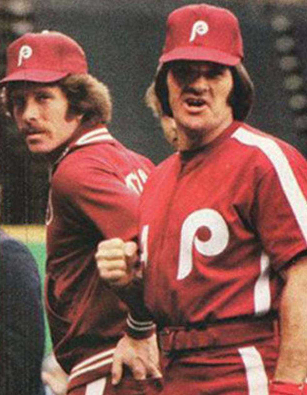
Late May, 1979. My Dad had (out of necessity) moved our family from the bustling Philly ’burbs to the middle of nowhere, N.C. Apart from my friends, what I missed most were my Phillies. This being the pre-ESPN days, the only way to follow them was through box scores, and the odd article in Sports Illustrated. At one point SI did an article on how well Pete Rose was fitting in, and they included a photo of him and Mike Schmidt in the reviled “Saturday Night Special” all-burgundy uniforms. I can still remember the caption nearly 40 years later: “New Saturday-only duds no flashier than Schmidt, Rose.” At 10 years old, I loved them — it hadn’t dawned on me that teams could do that, even when they shouldn’t. From then on, I was constantly on the lookout for new or updated kits, regardless of the team or sport. So yeah, the unis that made my favorite player, Greg Luzinski, look like “The Giant Grape” instead of “The Bull” were the ones that made me an obsessive uni-watcher.
———
Bob Cooke
I was playing Little League baseball and I moved up to a new age bracket, where for the first time we would wear spikes and have full uniforms (not just shirts and caps). It was the early ’70s and most of the teams had baggy grey flannel uniforms. But I was on the team that was sponsored by the local sports store, and we were the first to get polyester stretch-knit uniforms. Not only were our uniforms form-fitting, but we had the best colors, including green stirrups and yellow sanitary socks, à la the Oakland A’s. Man did we look sharp. From then on, I knew that not all uniforms were created equal.
———
Zachary Hoover
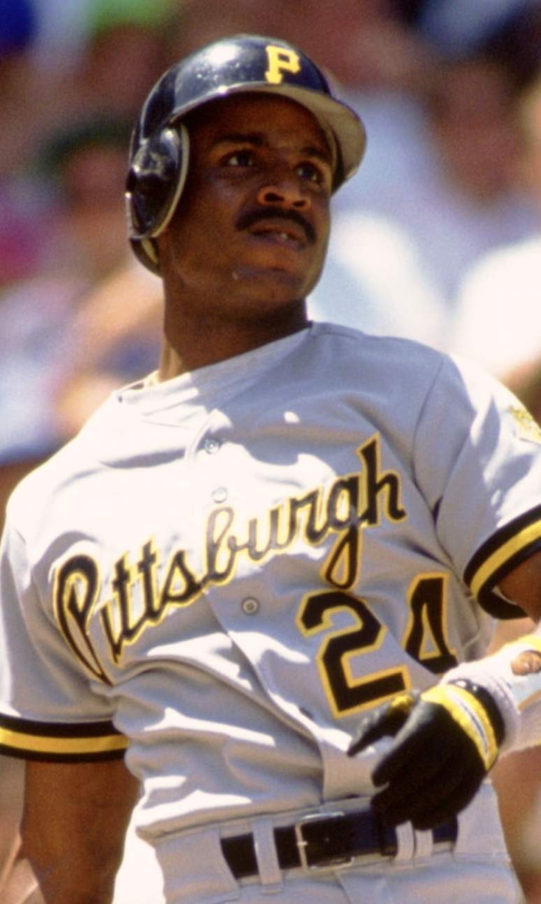
Growing up in Pittsburgh, I first Got It™ when the Pirates upgraded their road jerseys from a “Pirates” that matched their home whites to an elegantly scripted “Pittsburgh” prior to the 1990 season. Like many other readers, the change sent me off on countless classroom doodles showing how other teams should improve their uniforms. I was delighted to see the Pirates return to the same road script this season, despite the prominent swoosh and the awkward mid-“s” break across the placket.
———
Steve Tilders
I Got It™ in the 1960s, when my Dad took me to Mets games every few weeks. I noticed that the concession stands for hats and merchandise always had a replica cap for the visiting team. I bought every one of them. They were terrible by today’s standards — they had a patch for the team logo, there were no contrasting brims, and the Expos were pure blue instead of tri-color. That got me going and I’m still in love with hats and uniforms to this day.
The second inspiration came when I started writing letters to every team in every sport, asking for their media guide. It was fascinating to see the custom envelopes and letterheads, the media guides, and which teams sent me extra stuff. By far, the most generous were the New Orleans Saints, who sent me lots of logos and stickers. Every sticker I got from every team ended up on the back windows of my Dad’s brand-new ’68 Beetle. I should have named it the “Uni Bug.”
———
Jeff Spry
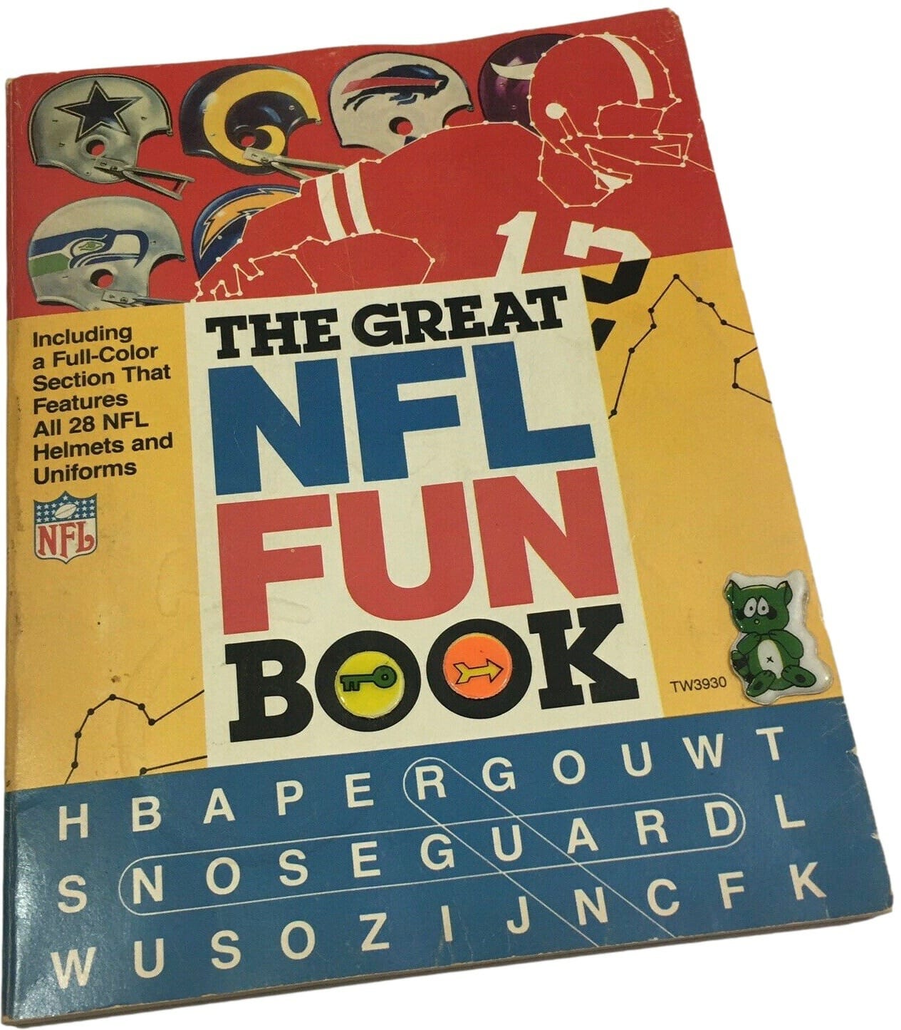
I’ve been into uniform aesthetics so long, I don’t know if I can pinpoint a beginning. I loved superheroes before sports, so maybe that’s where it started. I received a full Steelers uniform for Christmas — still have the helmet and customized-NOB jersey with No. 7 (for Mickey Mantle — weird crossover, I know). I had the NFL helmet lunchbox. I saved my own money to purchase an authentic satiny Yankees Starter jacket in the ninth grade (still have that, too). But I think the obsession really took off when I bought The Great NFL Fun Book at the school book fair. It had page after page of uni-related goodness, including cut-out “cards” of each team with the uniforms prominently displayed. And yes, I still have the book!
———
Andy Chalifour
Like many kids, I collected baseball cards. I don’t know why I loved sorting through and looking at the many players I’d never seen play before, but think it might have been the uniforms and accessories. I always was drawn to the louder or more unique uniforms, like the Astros, Brewers, or Pirates. I was a sucker for the sansabelt pants or anything else that stood out, like a familiar player in an odd uniform (Pete Rose as an Expo) or odd equipment (a brimless catcher’s helmet). As a loyal Uni Watch follower over the years, I have submitted many of these things I’ve found. I even keep track of the times my name appears on the site — more than 90 so far!
———
Scot Ryan
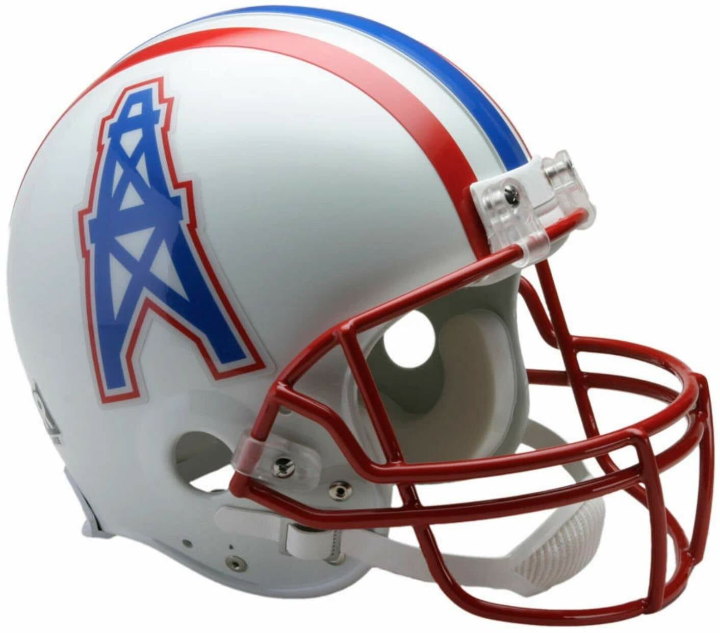
My older brother and I got to order replica NFL football helmets as gifts out of a Sears catalog one year, most likely around 1979 or 1980. Our home state had no NFL team, so our choices were based on aesthetics, not hometown allegiance. My brother chose the Dallas Cowboys, but for me the choice was clear: the Houston Oilers. That blue oil derrick outlined in red on a stark white helmet was simply electric. Did I have any idea what an oil derrick was? Not in the slightest, but through my six-year-old eyes, I saw a rocket ship ready for lift-off.
———
Chase Stevens
When I was younger (late elementary school, probably), I would buy the giant College Football Preview magazine every fall. I would flip through every team and earmark my favorite jerseys. Then I would ask my parents for a couple of those jerseys every Christmas, never understanding why they couldn’t get their hands on a South Carolina Gamecocks away jersey in the suburbs of Texas.
———
Rob Vigneault
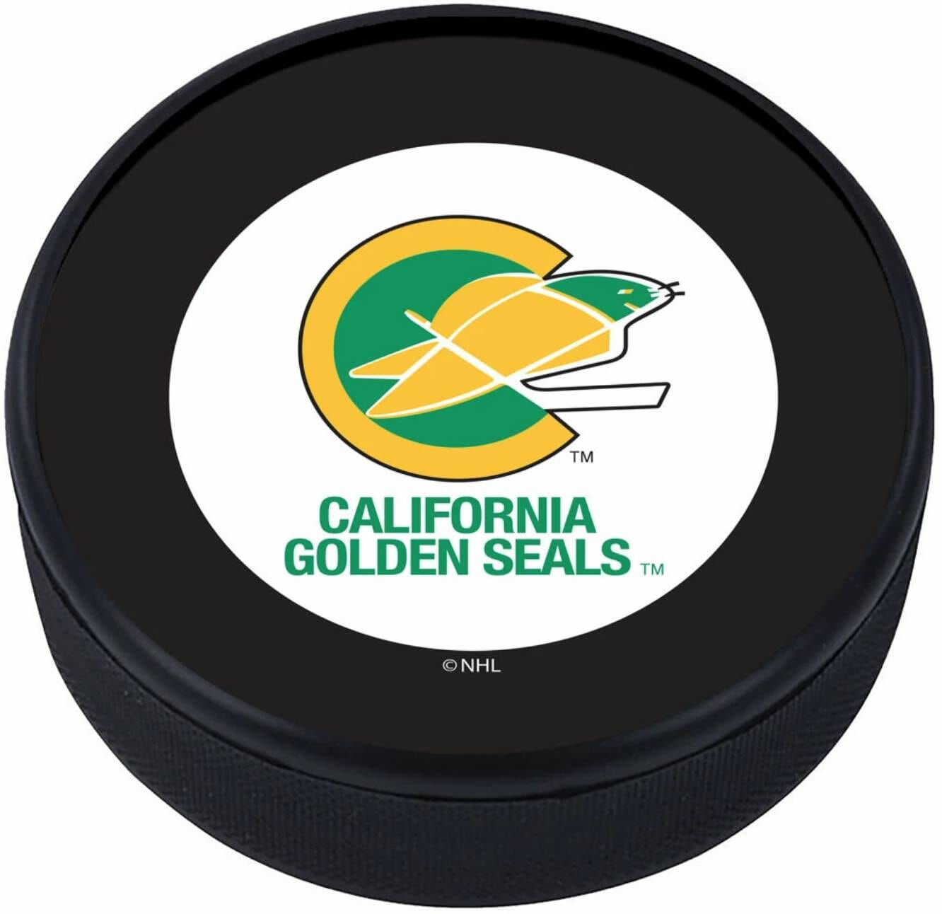
Remember it vividly. It was a California Golden Seals puck. I stared at it for hours!! I was hooked. Still hooked!!
———
Jim Griggs
When I was a junior in high school, the baseball coach got funding for new uniforms. He asked players to come up with design concepts and said he’d choose what he liked best. He also said he might mix and match elements from different designs. So I got some colored pencils and paper together and got started. This was the mid-’70s so color was the thing. I designed a raglan-sleeved pullover jersey in scarlet with white sleeves that had gold trim, and white letters and numerals The pants were white with red pinstripes. Red stirrups and gold sanitaries. Inspired by the A’s, I went with white shoes, Cap had a white crown with red pinstripes, a red bill, and a red squatchee. Coach loved it. It was a garish uniform of its era, but it got me to paying attention to uniform details and design elements. Been locked into unis since.
———
Dennis Turk
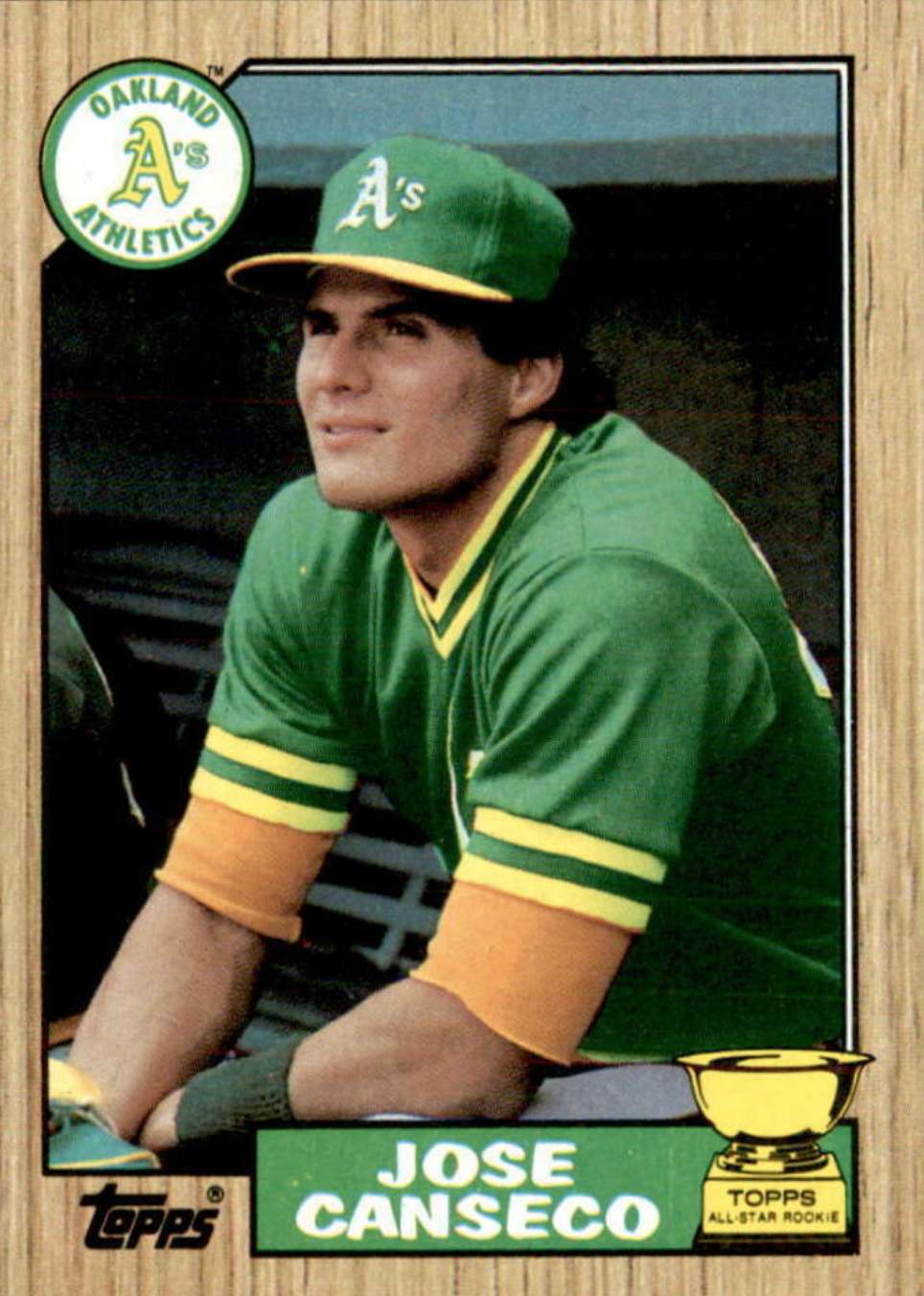
Gotta be 1987 Topps baseball cards. I was 12 and they just looked and felt right. They used the team logos on the front and had a great-looking wood-grain background, not to mention collecting hot rookies like Canseco and Joyner. Cards from Puckett, Will Clark, Bonds, and Clemens round out the set. From that point on, I’ve been obsessed with symmetry and classic/traditional looks in uniform and print.
———
Dan Skantar
The uniform bug bit me on a chilly, rainy afternoon at Pitt Stadium. Dec. 1, 1968 — Cardinals at Steelers. My first pro game of any kind. Up until then, I only knew sports from in front of a black-and-white TV. The stadium itself was brownish and the field more mud than grass. But suddenly the Cardinals players trickled onto the field in those elegant red jerseys. I fixated on the bird-head helmet logo, the jackets, the rain capes. Then the Steelers emerged — black helmets, white jerseys, gold pants with the black stripe. It was so vivid, so alive, so real. From that moment on, I studied the front of my sports cards more than the stats on the back. I’d notice things like Phillies’ chain-stitched embroidery, football’s position-based uni-numbering system, the different cuts and styles of the various uniform manufacturers, and more. I learned to “date” a photo based off the uniform. To this day, I will very often choose to watch (or not watch) a game based on the uniform aesthetics.
———
Paul Kosman
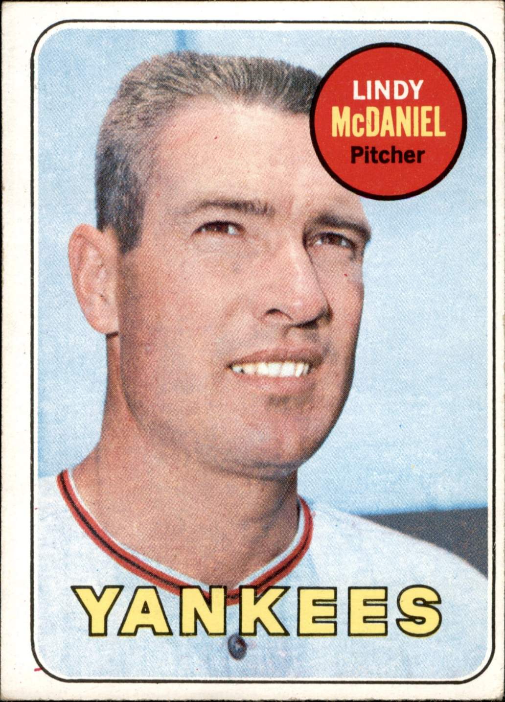
I got it as a seven-year-old during the summer of 1969. I was just getting into baseball and baseball cards. The 1969 Topps set is notorious for its overuse of hatless pictures, which were used when players switched teams and Topps had only pictures of the player with his old team. My eyes were immediately drawn to the player’s uniform. I could tell that the player who was listed as a Yankee was wearing a Giants uniform. It was very unsettling for me!
———
Matthew Gunderson
I grew up watching college football and was an avid BYU fan because of my father. He had the team’s media guide mailed to him every year (you can see past editions here), and right when I was really getting into watching football in the early 2000s, BYU changed their look to the dark blue and also added tan to their color scheme. They had some pretty dismal uni years in there. I would draw the old block-Y they had on their helmets and use the old royal blue color for it, wishing they would go back. I would also spend hours every summer playing EA Sports’s NCAA football video game, creating new schools so I could play around with color schemes and mascots — and certainly created a better-looking BYU team a time or two.
———
Steve Ammidown
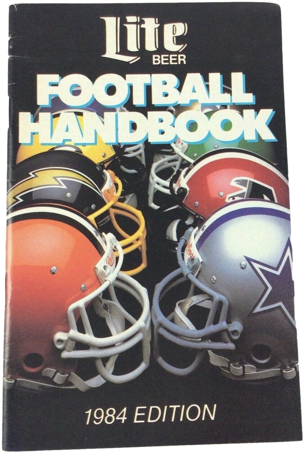
It started with helmet logos. I remember going with my dad to the liquor store when I was a kid and getting one of those early-’80s Miller Lite NFL Preview books. When we got home, I took it to my room and tried to copy each of the helmet logos into my little notebook. I was no artist, but there was fun in trying to match the details. In high school, I had a baseball coach who dictated every uniform detail, from the undershirts we wore to how we wore our stirrups. In the mid-’90s I became obsessed with Newcastle United because of the details — stripes! Seahorses on the crest! The Newcastle Brown Ale logo! Nobody around me seemed to care as much as I did, but somewhere along the line I found Paul’s Uni Watch posts on ESPN and realized I was far from alone.
———
Chris LaGrow
When I was eight, I joined tee-ball. I was already collecting baseball cards and learning all the teams’ uniforms by that point. I could name all the teams by division (even those two new ones, the Blue Jays and Mariners), and I knew the lineups for the Yankees, Royals, Red Sox, and Dodgers by heart. Imagine my disappointment when I got my uniform: a blue T-shirt with the league name on the front and the team name on the back, and a blue cap with the league’s logo on it. Not only was my name not on the back, but I didn’t even get a number! AND, I had to wear jeans, because you didn’t get a full uniform with stirrups and pants until you graduated out of tee-ball. But even then, the numbers only went to 15, and I wanted Willie Randolph’s No. 30 (since I played second base). I think I’ve been critical of uniforms ever since.
———
What a great collection of stories! I especially like Marc Mayntz’s tale of mailing the Clippers magnet to the team and them mailing it back to him with the stickers. I totally relate to his notion of how the sticker-corrected version just wasn’t as satisfying, and how having the wrong logo also wasn’t satisfying. (But magnetic standings boards — those are satisfying!)
If you want to share your own story of how you first Got It™ — no more than one paragraph, please — go ahead and send it here (note that this is not the usual Uni Watch email address). Thanks!
If you’ve already sent in your story and it hasn’t appeared yet on the site, it’ll be in the next installment.
And again, if you want to see all of the entries in this series, they’re available here.
Podcast reminder/update: How do you like our latest placeholder logo for Unified, the new podcast I’m doing with SportsLogos.net’s Chris Creamer? Longtime reader/pal Joe Hilseberg sent that to me yesterday, unsolicited (thanks, Joe!). Nice, right? We’ve put it on the podcast’s Twitter page for now, but we’ll have a new fancy-shmancy logo (several of them, in fact) later this month.
If you haven’t already listened to the first episode, you can find it — and subscribe to future episodes — on Apple, Google, Stitcher, TuneIn, and Spotify, or just use the player below:
You can also check out the video version, which is on Chris’s YouTube channel:
We should have the second episode next week, probably on Thursday. Thanks for all the enthusiastic feedback we’ve been getting — much appreciated!
The Ticker
By Anthony Emerson

Baseball News: MLB The Show’s newest version will also include an edition with Jackie Robinson on the cover. Purchases of the Robinson edition will include a $1 donation to the Jackie Robinson Foundation. … MLB.com has a wonderful story on the origins of the Yankees’ “NY” logo. Highly recommended (from Jimmy Hoss). … MLB.com also has a good piece on why there are no left-handed catchers (from Pete Simmonds).

Hockey News: The digital rendering for the Leafs’ George Armstrong memorial patch featured the Armstrong figure with dark hair, but the physical patch on the Leafs’ jerseys depicts him with white hair (from Adam Gignac). … Rangers G Igor Shesterkin wears a headband under his mask, for hair control. … For tonight’s Lightning ЯR game, the team’s 2020 Stanley Cup patch is rendered in the style of 2004’s Stanley Cup patch, which I find totally cool (from @joeinthehat). … The Habs debuted their ЯR unis last night, and Michael Engle notes that the team changed its helmet numbers to match the ЯR jersey numbers. … The Seattle Kraken have begun searching (paywalled) for a costumed mascot ahead of their fall debut (from Kary Klismet). … Due to pandemic restrictions, the WHL’s Calgary Hitmen will be playing at Seven Chiefs Sportsplex on Tsuut’ina Nation, rather than the Saddledome, the arena they usually share with the Flames. The Saddledome is also temporarily housing the Flames’ AHL affiliates, the Stockton Heat, and AHL and NHL COVID restrictions don’t allow further teams to play at shared arenas (from Wade Heidt). … Also from Wade: The OHL’s Peterborough Petes have completed their “Who Wore it Best” poll on uni numbers. … Several readers have noticed that the backwards “R” we’re using for “ЯR” doesn’t precisely mirror a regular R. We use the Cyrillic letter ya. Many fonts do mirror a Latin R and a Cyrillic ya, but in my brief research I found most sans-serifs have slightly different renderings for a Latin R and a Cyrillic ya.

NBA News: Many of you may know this already, but it’s worth bringing up periodically: During the 1980-81 NBA season, teams wore the league’s 35th-anniversary logo on their shorts. As this was the era of short-shorts, sometimes the patch ended up in odd places, like on Mike Newlin’s hip (from @DrJStuff). … The NBA had a red-vs.-blue game last night. Was that Bulls vs. Grizzlies? Rockets vs. Sixers? Heat vs. Knicks? Nope — it was that pair of well-known red and blue teams, the Nuggets and Lakers.

College and High School Hoops News: Colorado State men and women swapped out their NOBs for the names of local cancer patients during their recent games against Boise State (from Kary Klismet). … Arizona PG Kerr Kriisa is going FiNOB. He also received permission from Arizona alum Steve Kerr to wear No. 25, which was retired in 2013 (from Max Rodriguez). … Illinois high school sports returned this week, and regulations require players to wear a mask during play (from Mike Chamernik).

Soccer News: FootyHeadlines has all the kits for teams competing in the FIFA Club World Cup (from Kary Klismet). … Also from Kary: FootyHeadlines also has all the kits for teams competing in this summer’s European Championships, which were postponed from last summer. … One more from Kary: Universidad de Chile have had their away kit leaked. … Tottenham Hotspur wore Chinese New Year warm-up shirts before yesterday’s match with Chelsea (thanks, Jamie). … From the same match, Chelsea manager Thomas Tuchel was forced to switch from a royal blue coat to a sky blue coat as the former blended with his players on the sidelines (from Moe Khan).

Grab Bag: New athletics logo for Hagerstown Community College (from Kary Klismet). … Also from Kary: Ohio’s Capital University is seeking public input on a new mascot after retiring “Crusaders” last year. … Rugby union note from Eric Bangeman, who writes: “Scotland is playing England this weekend for the Calcutta Cup in the opening weekend of the Six Nations. In March 1871, Scotland and England played the first-ever test match in rugby. To commemorate the occasion, each Scotland player will have the name of the player who started in his position in the 1871 match embroidered on his jersey.”

That’ll do it for this week. Have fun with Phil’s weekend content, enjoy the Supe, stay safe and well, and I’ll see you back here on Monday. Peace. — Paul
Tampa updating their Stanley Cup patch for the reverse retro is an amazing move! It looks fantastic to boot! Big cheers to the Lightning!
I really like the Lightning Reverse Retro. So much so this is on my list of the RR unis that I think a team should consider as its regular third or would even be an upgrade as the primary uniform.
The Lightning should wear a blue helmet with this uniform and not black. A general aesthetic rule for hockey uniforms for me. If you are wearing a dark jersey that has white shoulder yokes, then the helmet should be the same colour as the jersey torso. The look gets too busy with a different colour helmet compared to the torso of the jersey if the shoulder yokes are white.
Agreed! SO COOL!
Surprised you didn’t go with the Uni-Watch stirrup hanging off of the SportsLogos star/leaf for your logo!
As noted in today’s text, the real logo is still being designed. Maybe that’s what it’ll be!
Great first episode by the way. I liked Chris’s anecdote about maple leaves added to American companies in Canada. Looking forward to seeing the new logos and I’ll be surprised if the leaf is absent.
That happens a lot. There’s a reason why Tony Kornheiser waves a Canadian flag at the end of PTI.
Great radio voice Paul. Looking forward to more episodes.
[Insert “And a face made for radio, too!” comment here.]
;)
Those ’87 Topps cards were also interesting because many of the photos were obviously taken during Spring Training, so it introduced practice jerseys that the general public mostly never saw during that time period.
link
link
link
The placeholder logo for the podcast is nice. You guys should consider keeping it in the rotation somehow after the other logos are ready. It could be the “throwback” logo.
A question not of critique, but genuine curiosity, when it comes to Uni Watch style.
Why does Adidas get capitalized (even when the brand prefers all lowercase) but the Reverse Retro program gets the stylized RR that I don’t think I can do on iPad?
We capitalize Adidas because that is their official company name — it’s listed that way in their official business documents, their articles of incorporation, etc.
Saying “Reverse Retro” over and over is tiresome, and people tend to associate “RR” with “railroad.” Hence our use of the mirrored abbreviation instead.
Cool. I get it and I appreciate it! On first instinct, I thought it was weird to seemingly sign off on one silly Adidas thing but not the other, but it’s always nice to know that the aesthetics here have a reason. (I mean, of course they would! But it’s good to hear so.)
I really enjoyed the podcast. Keep up the great work.
Why would you continue to use faux Cyrillic knowingly for your convenience when you would never adopt another character for stylized purposes?
I would expect you to call out places that do that, especially when they have the resources to do it correctly.
It really does come off beneath you and insulting to those who speak and read in those respective languages.
As I’ve already explained previously, I simply googled “backwards R,” copy/pasted what came up, and kept using it without even realizing I was using a Cyrillic character.
Even if I were doing it intentionally, I’m not sure why you’d find that “insulting,” but that’s up to you.
I guess we will have to agree to disagree.
“Let’s move on” :^)
As a life long Western PA resident, I’m proud of so many “getting it” stories having to do with the Pirates!!
KUBBY!
Unified logo is awesome! Love it. Contrast for days …
My last name is misspelled in the Grab Bag section :(
Fixed.
Haven’t watched the first Unified yet, perhaps it is addressed in there, but curious if Chris is a traditionalist (best I can describe it) when it comes to uniforms like Paul is. That is to say, anti-BFBS or all of the other nonsense gimmick excess that Nike does these days. Obviously there is a segment of the population that likes that, even if Paul and many of us in uni-watch community don’t. I haven’t been able to pick up on Chris’ exact uni philosophy reading his website all these years.
It surprised my looking at the Gridion Database simulation league, the amount of what I would call, Nike-oid style uniforms from participants there. Showing there is a significant segment of uniform enthusiasts that actually like that nonsense.
Remember, I’m not a traditionalist — I’m a *classicist*! (A traditionalist says, “Don’t change anything ever, because change is bad.” A classicist says, “If it ain’t broke, don’t fix it. But if it *is* broke, definitely change it!”)
I would say Chris is, for the most part, a classicist as well.
Ah right, classicalist, I knew you came up with a better term for it.
Great stories today!
For some reason I’m having a hard time finding examples online, but I seem to recall that all the Nets wore the NBA 35th anniversary patch on the hip.
The longer I watched the Jets game last night, the more I liked the RR uni. The jersey by itself is nothing special but the complete package looks pretty, pretty, pretty good. The program certainly is a mixed bag of hits and misses.
LOVE the Unified logo!!
One of the best sporting events of the year begins this weekend. The Six Nations Rugby competition. Can’t wait to watch the Calcutta Cup.
RE: Jason Tierney and Steve Tilders-
Yes! My Dad took me to many Yankees games in the 1980s, and the sports stores across the street had shirts and hats and helmets for every team in both leagues. It was awesome. Same for souvenir stands in the stadiums (we went to Shea a lot too), maybe to a lesser degree. We built up quite a hat and helmet collection over the years by getting one after each game! Now, you walk by those stores and it is all Yankee merch – so boring! How many Yankee hats and shirseys can a fan accumulate??
Similarly I remember going to Flyers games with my dad as a kid. He had shared a season ticket plan, and I would get to go to a few games a year with him. Every game he’d get me a puck with a different team’s logo on it. I can remember the early 90s as they added like 5 new teams, and there was relocation, being overwhelmed at how many new pucks I was going to need.
New Appy League Team – Greeneville Flyboys… uniform show here with local coverage
I can’t get over how great that ЯR Canadiens’ uniform looks, and I wonder if they contemplated wearing red breezers before deciding it would look too much like the Rangers.
Since so many of us were logo-doodlers in our youth, I think a poll of what we considered the easiest/hardest symbols to draw would be a worthwhile undertaking. Paul, you said you were particularly bedeviled by the Flyers’ “feathered P”. The one I found hardest was the St. Louis Cardinals; I could never get the birds to come out right. The easiest, though, was a weird one: The Boston Bruins’ spoked wheel. Maybe it was because I knew it stood for “The Hub”.
I played little league first on the Athletics, then on the Red Sox. Lived in LA. So I was always doodling the A, B and LA. I couldn’t ever seem to get it right.
Also spent time doodling the LA Rams Helmet (1970s version of the Rams).
Embarrassing moment #37: When I was first “getting it” in the early 80s (age 11-12), I would make the LA Rams shoulder horns in the shower with soap suds.
Jim Griggs, we need to see the sketches and uniforms…I love these UniWatch installments.
I know it’s just a placeholder, and I know you guys have more coming because… duh… logos and aesthetics are what you do, but damn if that “placeholder” doesn’t look great.
Maybe consider keeping it? I’d buy merch with that on it.
Podcast was great. Love the discussion about leaving the corporate world and striking out on your own. Someday….
Thanks for sharing those moments with us!
Damn that’s an astute observation Eric S.
The colorful jerseys add to the cards’ appeal.