
Time for another round of Question Time, where you can ask me anything and I’ll do my best to answer. Here’s the latest installment, based on questions that were submitted a few weeks ago.
You’ve revealed that a few teams have people within their organization who know you, or know of you or the site. Has there ever been a time that someone from a pro team approached you to ask your opinion of something, uniform-related or not? Kind of a “Hey Paul, is this good or stupid, whaddya think?”
No, that has never happened with a pro team. One FBS-level college football team has run some ideas past me and asked for my feedback, however (I gave some very quick responses). And amateur/recreational teams ask my advice all the time.
Do you have a good braciole recipe?
Never made it myself — sorry.
If you were a music critic (instead of a uniform critic) and were able to vote in the Village Voice Pazz and Jop poll, what would have been your top five albums for 2012?
Actually, I used to be a music critic, and I used to vote in the Pazz & Jop poll. (In fact, they still send me a ballot every year, but I no longer fill it out because I’m not an active critic.)
I don’t keep track of release dates anymore, but here are some recent-ish albums I’ve liked: Waxahatchee’s American Weekend and Cerulean Salt; Northern Soul by Cardinal; Monomania by Deerhunter; Light Up Gold by Parquet Courts; and MCII by Mikal Cronin.
When discussing sports-related beverages, Arnold Palmer comes to mind. Do you prefer lemonade topped with iced tea, iced tea topped with lemonade, equally poured in at the same time, just lemonade, or just iced tea?
Just lemonade. Preferably yellow, but I can deal with pink.
How long have you been playing bass, and have you ever played live with a band?
I purchased my bass — a Fender Precision — in 1986. I have a good ear but very, very poor technique. I’ve occasionally played with another person in my apartment, but never with a band.
In an earlier post, you had mentioned that NBA teams were required to include a basketball in their logos. Is this actually an official requirement, or were these comments made in jest? I noticed that the TrailBlazers, Timerwolves, Bulls, Bucks, Nuggets, Warriors, Rockets, and Grizzlies don’t have a ball in their logo. So why is this a “league-wide requirement”?
It’s not a codified rule that’s spelled out on paper. But league officials have told me that they strongly prefer team logos to include a basketball, and that any team wanting not to have one would have to give a pretty good justification.
In your opinion is this whole uniform revolution just a fad, or has it become the new standard?
I don’t understand this question.
Assuming you’ve had cats before Tucker and Caitlin (which I think is the case), are you a cat person out of practicality or necessity (maybe your apartment doesn’t allow dogs?), or do you genuinely prefer cats over dogs?
I’ve had cats pretty much continuously since 1986, and I don’t see that ever changing. Basically, I can’t imagine a life without cats.
But I also love dogs — always stop to pet them, love to be around them, etc. I don’t feel a strong urge to own one, however.
As an aside, I think the whole notion of pet ownership — and the cross-species bond at the heart of it — is kind of amazing. Like, if I didn’t already know that people could have pets, and if someone then told me that we’d share our living spaces with animals and we’d love them and they’d love us back, I’d probably say, “Nah, that’s never gonna work.” That it does work feels like a miracle and a gift.
When an umpire/referee wears a special patch or another special aspect to the uniform, who is responsible for it? Does the home team’s equipment manager take care of it or does the league send special uniforms to the refs/umps?
Excellent question. I don’t know the answer to it, however. Anyone..?
When it comes to breakfast at a diner, do you go for sweet or savory? If sweet: Pancakes, French toast, or waffle? If savory: How do you like your eggs?
Always sweet. In a perfect world, I’d always order waffles, but most diners either (a) don’t offer waffles at all or (b) offer Belgian waffles, which I don’t really care for (I prefer small-tread waffles, like the ones served at Waffle House). So I often end up going for the French toast. Once a year or so I’ll opt for pancakes, and I almost always regret it, because they end up sitting like a lead weight in my stomach. And now and then I’ll go for silver dollar pancakes, which are fun.
If you had an evil twin, basically someone who is the exact opposite of you, (and for the hell of it, we’ll call him Saku Lluap), how would you describe him from a Uni Watch perspective? Does he like purple as a sports team color? Is he in favor of the use of Native American imagery?
This is like that Seinfeld bit about the Bizarro World. Like, what’s the opposite of “good-bye” — is it “hello” or “bad-bye”?
The cop-out answer would be to say that my opposite wouldn’t care about uniforms to begin with. But for fun, let’s say that my evil twin would be pro-pajama pants, pro-purple, pro-Nike, anti-football sleeves, pro-Native American imagery, pro-logo creep, anti-stirrups, and so on.
Or we could just call him The Jeff.
Hunt-and-peck or touch typist?
I’m a very good typist. In fact, I’d say typing is the second-most important thing I learned in high school. (The most important thing came from an art teacher who told me, “If you are bored, you are boring.” Single most important sentence any teacher ever said to me.)
We are well aware of your objection to Native American derogatory team names, but why not any objection to team names that impose natural disasters on people, (i.e. hurricanes, cyclones) These names seem to support devastation and death on mankind. Shouldn’t they be reconsidered?
I’m going to assume that this question was submitted in jest. (I do think, however, that Yankees radio announcer John Sterling’s home run call for Alex Rodriguez — “An A-bomb, from A-Rod!” — is in poor taste.)
Have you ever been to the Ebbets Field Flannels shop in Seattle?
Yes. I also did an ESPN story on EFF back in 2008.
The other day I was watching The Bad News Bears in Breaking Training and thought that the Houston Toros had some really cool stirrups. So I’m wondering, do you have any favorite uniforms from (fictional) sports movies?
I don’t actually watch many sports-related movies, because I tend to think the sports sequences don’t look realistic enough. I do like the uniforms in Rollerball, however, and the futuristic football uniforms in Starship Troopers, and of course the baseball unis in The Natural.
Do you do any uniform concepts?
Nope. I’m not a designer.
You are free to put together your ultimate all-star band. Who would you pick?
Eh, all-star bands are almost always a bad idea. I’ve always been curious about how Johnny Thunders would have fit in (musically, not interpersonally) as a member of the Rolling Stones, however.
When I was in Brooklyn recently, I saw that there are several barbecue restaurants there. Which Brooklyn barbecue joint is the best?
I think the best ’cue in Brooklyn is Fette Sau, although there are at least two Manhattan ’cueries that are better (Hill Country and Mighty Quinn).
The vast majority of football chinstraps have an excessive amount of strap that covers up the team logo or provides an unintentional white stripe across a plain or painted helmet. Do you find this to be incidental, necessary, a sign of laziness by the equipment manager, or no big deal?
It bugs me a little (just as it appears to bug you). Wish they’d trim the excess, but I understand that they have bigger things to worry about.
Have you ever read The Mezzanine by Nicholson Baker? It’s a novel about an ordinary office worker spending his lunch hour contemplating, in fascinating detail, everyday items like staplers, shoestrings, drinking straws, and the switch from glass to paper milk cartons. There are numerous footnotes that dig even deeper into these mundane objects, but in a very entertaining way.
It’s not a stretch to say that my writing career might not have happened if not for The Mezzanine (which you can score for just a few bucks). It was published in 1988, but I didn’t read it until 1992, and it was a complete revelation. “Wow,” I thought, “I’m not the only one who looks at the world this way!” It helped spur me to start doing my own writing, and the following year I published the first issue of my zine, Beer Frame: The Journal of Inconspicuous Consumption, which definitely owed a certain stylistic debt to The Mezzanine. I sent a copy to Nicholson Baker, in care of his publisher. To my very pleasant surprise, he responded with a nice note (which, unfortunately, I no longer have).
If you were Commissioner for a day for each of the Big Four leagues, what rule change would you make for each of them?
MLB: Mandatory high-cuffery. NFL: Mandatory sleeves going down to at least an inch above the elbow. NBA: Mandatory high (or at least high-ish) white socks with team-colored stripes. NHL: No more Bettman stripes or scoop-hemmed jerseys.
With New York FC being started in New York, if approached would you design a uniform and logo for them?
As mentioned above, I’m not a designer. Also, I’m not a soccer guy, so I wouldn’t even feel good about consulting or advising on this project.
As vocal critic of poorly done advertising, how do you justify having a site with pop-up ads (perhaps the most annoying form of advertising) and other ugly, randomly generated ads on your page?
Uni Watch doesn’t have pop-ups; it has pop-unders (i.e., the ads don’t obscure your browser, or at least they shouldn’t). Personally, I don’t find pop-unders so annoying. If you do, I’m sorry. Have you considered a pop-up blocker?
Hypothetically, if all Native American tribes were to come out and announce that they have no issue with Chief Wahoo, would you still have issues with it?
This is like asking me if I’d be okay with two plus two equaling five, as long as every mathematician gave it the thumbs-up.
Have you ever designed your own sports uniform? Any photos/illustrations as proof?
Again, I’m not a designer. Sorry.
Uni watch is my first stop every morning after email. Which sites do you find yourself checking in on daily?
I have relatively few daily stops. In no particular order: ESPN; the New York Times; my friend Ken Davidoff’s baseball blog; Romenesko; Poynter’s MediaWire; Gawker; Adam Rubin’s Mets blog; Mets Police; Can’t Stop the Bleeding; Chris Creamer’s site; Gothamist; probably a few more I’m forgetting.
There are also tons of sites that I probably should read daily but only check out a few times a week. That list is pretty huge.
Everyone seems to be into indie-rock and whatever was popular when they were 18, but do you harbor a not-so-secret fascination with, I don’t know, 1920s country music, medieval choral singing, French pop of the 1960s, Tibetan throat singing, or anything out of the so-called mainstream?
I am particularly fond of 1920s-’40s Delta blues; 1940s-’60s Chicago blues; 1920s-’50s country, western swing, and bluegrass; 1950s-’60s R&B; and most forms of jazz from Dixieland through bebop.
Your feelings on the flag-desecration uniforms worn by college and pro clubs are well known (and I’m in agreement), but how do you feel about national teams (like the USA Eagles) incorporating elements of the national flag into their uniforms?
I have less of a problem with that, although it still feels like a lazy attempt at rah-rah patriotism. And for those who say they don’t like politics mixed in with their sports, consider this: Wrapping oneself in the flag is an inherently political act. Wouldn’t it be better if teams avoided this approach altogether?
I think you’ve covered this before, but what kind of bike do you ride?
I ride a Trek 7.5 FX.
I am a true blue Detroit Tigers fan. Am I really going to have to wait until the end of time to see the Tigers wear a blue alternate jersey?
Probably, yeah.
How did you first stumble across Ebbets Field Flannels?
Hmmm. I’m not sure! I think maybe one of their catalogs showed up in the mail in the early 1990s..? Not positive.
What’s your feeling on the ’70s/’80s trend of powder blue road uniforms?
It’s one of those things that seemed sacrilegious at the time but now seems sort of quaint, and nicely representative of a particular era. It’s hard to imagine the ’70s without powder blues, right?
You like to bash on Native American mascots, In particular the Cleveland Indians, who you gave a 15 seed in your uniform bracketology. Have you ever been to a Cleveland Indians game, or even Cleveland (aside from a flight layover)?
First of all, I don’t “bash on” Native American mascots. “Bashing” is what the strong do to the weak, what the powerful do to the vulnerable, what the haves do to the have-nots. I couldn’t “bash” an MLB team, or any aspect thereof, if I wanted to.
Secondly, I didn’t seed the Indians 15th in ESPN’s recent “Battle of the Uniforms.” If you go back and check the bylines, you’ll see that my colleague Jim Caple did that. (He did the American League seedings; I did the N.L. seedings.)
I have never attended an Indians game. But when I eventually do, I’ll wear one of these T-shirts (maybe with this one underneath).
I have spent a decent amount of time in Cleveland over the years — not as much as I’ve spent in, say, Milwaukee, but more than I’ve spent in Boston, L.A., and lots of other cities.
If you’re suggesting that only someone intimately familiar with Cleveland should be allowed to have an opinion on Chief Wahoo, I respectfully disagree.
Something that always bothers me in sports merchandising is team caps that are far removed from a team’s colors, like red Yankees caps. I always associate those colors with their rivals, the Red Sox. I’m a Dolphins fan and if I ever saw a blue and red Phins hat (that would cover Bills and Pats), I’d wonder who the hell came up with it. Colors are important. Why is it acceptable for this using-the-whole-spectrum idea to exist?
New Era started making red Yankees caps after Spike Lee personally requested on in 1996. It turned out to be a hit, and New Era was off to colored-cap races. Basically, this is what happens when sports merchandising becomes more about lifestyle marketing and less about sports. Which is just one of many reasons I look upon sports merchandising with a generally jaundiced eye.
Mars One. Interested? Why or why not?
In theory, definitely. In practical terms, I’m probably too old.
What do you think is the best looking baseball uniform ever worn in professional baseball?
“Professional baseball” includes all levels of the minors, the Negro Leagues, etc., and there are probably some great-looking uniforms out there that I’ve never seen. If we restrict it to MLB, I’m sticking with my go-to choice: mid- to late-1960s St. Louis Cardinals.
Understandably, you spend most of your time looking at the professional and collegiate leagues of the “big four” sports, with occasional nods to soccer and tennis. But what is your take on the aesthetics of modern kits from my favorite sport, rugby?
I have nothing against rugby, but I don’t follow it. When I see photos of it, however, my usual reaction is, “Pretty good-looking sport.”
I don’t know how many basketball arenas you have been to, but what are some of your favorite features of various venues you have attended? What would you like to see in any new basketball arena being built?
The vast, vast majority of the basketball games I’ve attended over the years have been at one arena (Madison Square Garden), so I don’t have enough experience to comment on this — sorry.
Have you ever listened to Eric B and Rakim and said, “This Rakim guy… He is quite the poet”?
For better or worse (probably a bit of both), rap doesn’t speak to me at all.
What’s new with the former weekend bench coaches/interns? Do they still contribute/comment/keep in touch, do they retain a different color in the comment section after their departure, did they depart on good terms, etc.? I guess this could be summarized as, “Former Bench Coaches: Where Are They Now?”
My first intern, Vince Grzegorek, is now the editor-in-chief of Cleveland Scene, the alt-weekly in Cleveland. He and I keep in touch pretty regularly, and we tend to see each other roughly once a year (mostly recently a few months ago here in Brooklyn). I don’t know if he still reads Uni Watch frequently, or at all. That doesn’t really affect our friendship one way or the other.
Bench coach Bryan Redemske lives in Omaha, where he contributes items to the Omaha World Herald. He usually writes something for Uni Watch about the College World Series and will be doing so again this year. He and I have never met, but we still keep in touch, although not as often as Vince and I do. Again, I have no idea how often he reads Uni Watch these days, and it doesn’t really matter to me either way.
Intern Nina Dubin never really made much of a mark here (although she did design this T-shirt). That’s mostly my fault, as I never found a good set of things for her to do. She kind of drifted out of touch, and I have no idea what she’s up to now.
Suppose you had the opportunity to travel back in time and live through any single year of the 20th century, with no obligations, as a sort of time tourist. Which year would you choose? And during your stay what would you be most curious to observe?
I have always wished I could have seen the New York Dolls. Put me down for that, please.
Looking back on your career, anything you’d do differently, knowing what you know now?
I would have read The Mezzanine sooner.
Seriously: On the micro level, there’s an endless list of things I wish I could go back and change: sentences I’d write differently, opinions I’d express more clearly, some stuff that was probably better off left unsaid. But on the macro level, I wouldn’t change much, except that there have been too many times when I’ve bitten off more than I could chew, work-wise. Saying “No” to a prospective assignment or project has never been my strong suit, so I often end up overburdened and stressed out. This is something I continue to work on.
Have you ever been to Germany? Do you plan to come over here in the future?
Never been, but would love to. Save some beer and sausages for me!
My wife and I will be in NYC for a few days in July. While she’s been there a time or two for business, it’ll be my first trip. Do you have any food recommendation for us while we’re in the city?
Dude, do you know how many food options there are in NYC? Gimme a little help in terms of your preferences regarding type of cuisine, price range, fancy vs. casual, etc.
Ever consider owning/riding a Vespa in NYC?
Scooters look cool, but I’ve never felt a strong urge to own one.
The leading English muffin has two distinct sides. Do they have names?
I don’t mean to sound glib, but I suspect the names are just “the top” and “the bottom.”
That’s it for this round. We’ll do Question Time again in a coupla months.
Collector’s Corner
By Brinke Guthrie
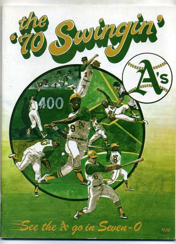
See the A’s go in Seven-0! That’s a mighty fine slogan, so this Oakland A’s program leads off Collectors Corner this week. [Note the gold batting helmets. Also note the apostrophe catastrophe, which wasn’t something you normally saw back in 1970. ”” PL]
Other items of note this week include the following:
• Ever seen one of these? A 1960s Packers football-shaped beer stein.
• Musta been a lot of Cub Power back in the 1960s — this pennant says so! We are #1!
• These Dolphins socks are of recent vintage, but I like the clean retro feel. Maybe these Mets socks from the same seller will find a home at Uni Watch HQ. [Uh, no. ”” PL]
• Bruins fans will love this — a signed record album of the 1969-1970 season, Goal: Bruins! Autograped by then-GM Milt Schmidt.
• RIP to Deacon Jones. Here’s his 1970 Topps bubblegum poster. And speaking of the Rams, there’s a cool 1973 team poster here, and a Rams beer stein here.
• From Paul, here’s an old hockey jersey with “Air Traffic Control MSP” on the front, which stands for Minneapolis/St. Paul.
This jersey must have been for the airport’s hockey team.
• This is a new one. A New York football Giants flower planter. Put a geranium in the cranium!
• A grab-bag of items from reader Mike Clary today, beginning with a Miami Heat jersey with “Wade 3” on the back, but a “6” on the front — oops. Also: a star-spangled Washington Bullets warm-up from 1982; a truly wretched Portland SeaDogs jersey from 2006; and a New York Titans sideline parka from Stall & Dean.
• And we conclude with a really weird one: a set of 1993 NHL/Muppets pins, submitted by reader Cory Gibson-Bath.
Seen something on eBay or Etsy that you think would make good Collector’s Corner fodder? Send your submissions here.
Uni Watch News Ticker: The NBA will allow advertising on the court apron for the 2013-14 season. Interestingly, the article states that this “is in lieu of putting corporate logos on jerseys, a proposal that has somewhat stalled,” but I’m not sure what to make of that, since the last thing we heard about jersey ads was that they’re slated for 2014-15, not 2013-14. ”¦ Apparently playing military dress-up on Memorial Day wasn’t enough for the Orioles, because they’ll be wearing G.I. Joe caps and jerseys this Friday, for “Military Appreciation Day.” They’re also giving away T-shirts with a G.I. Joe version of the Oriole bird. Why not get it over with and wear camo every day? (From Avi Miller.) ”¦ We’ve known for a few weeks now that that there would be slight changes to the Penn State football uni this season. Here’s more info on that (from Larry Bodnovich). ”¦ A chrome Pats helmet and a white 49ers helmet — both clearly for display, not for on-field use — are floating around in this thread (from Pinch Santos). ”¦ Coupla MLB games were engulfed in fog last night, which led to something unusual: an “F” on the Wrigley Field scoreboard. “Never seen that in my 53 years,” says Bob Gassell. ”¦ Oh baby, look at this completely awesome Wheaties ad featuring Stan the Man (welcome back, Ricko). ”¦ Fascinating article on Nike’s deal with the U. of Minnesota (from Brett Stone). … Arturo Vega, who designed the Ramones’ logo, has passed away. ”¦ Here’s one of the more amusing repurposings of the MLB logo. That’s a barber shop in Springfield, Illinois (from Kevin Eckhoff). ”¦ Speaking of poached logos, here’s one way to avoid a copyright suit. That Canon ad, with an obviously Photoshopped Cubs cap, ran the other day in the Houston Chronicle (from Daniel Woolston). ”¦ And while we’re at it, here’s a creative use of the Marlins’ logo (from Michael Miller). ”¦ Really good piece on horse racing jockey silks (thanks, Phil). ”¦ Kurt Stachnik has tracked the Brewers’ record by uniform — no mean feat, given that the team has already won 11 different uni combos this season. ”¦ New logo for the Mall of America (thanks, Brinke). ”¦ One of my 2010 ESPN columns is referenced in this short piece about the sad state of baseball pants (thanks, Phil). ”¦ We’ve seen lots of uni-themed weddings over the years, but this Seahawks-themed ceremony definitely ranks among the best. ”¦ Baseball writer Rob Neyer thinks someone should do a real throwback game — no batting helmets, players leave their gloves on the field, only two or three umpires, etc. “I think he didn’t go far enough,” says Robert Silverman. “The sportswriters should be forced to crank out their copy on vintage Underwoods.” Yeah, but how can they tweet on one of those things? ”¦ New uniforms for the Japanese national track team (from Jeremy Brahm). ”¦ The Canadian Soccer Association has suspended a Quebec soccer organization that wouldn’t let turban-clad Sikh children play. ”¦ This is pretty funny: a flowchart showing how to buy a Bears jersey in a post-Urlacher world. ”¦ Inaugural uni set for the Victoria HarbourCats (that’s a summer collegiate team).
The Bizarro version of Good-bye is officially Bad-Hello
WE AM DOOMED! YAY!
Hey now, I am not anti-football sleeves or pro-logo creep. :(
So you’re saying you’re pro-pink hats?
Or we could just call him The Jeff.
Ha! Just laughed out loud in the office. I love that I’ve been reading this blog so long I get the inside jokes. Huzzah to the UW community!
Whole-heartedly agree. That was the best response to a question yet!
You’re welcome. That was my question.
To be fair to The Jeff, I’d think Paul’s evil twin would be a vegan. This would disqualify The Jeff, who throws his cat a slice of pepperoni off his pizza every once in a while.
But well played! That elicited a chuckle.
I knew Paul realized Bob Wills is still the king!
“Air Traffic Control MSP” jersey looks like a re-purposed link jersey.
Pretty good Q&A. I’m planning a trip to the Philly outpost of Fette Sau this weekend, hope it comes together.
Wow — I didn’t even realize there was a Philly outpost of Fette Sau.
link from the same folks that started the Brooklyn mothership. Decent review, worthy for its photos, is link
Although I have very definite barbecue preferences (Eastern North Carolina vinegar-and-pepper pulled pork) all the meats look promising; not so sure about the sides.
That’s walking distance from me. I had no idea.
The Fette Sau in Philadelphia is outstanding. Haven’t been to the NYC one but I can imagine they’re comparable. Loved it. And the sides (and bourbon bar) were very good. Almost put myself into a meat coma. I do share teenchy’s love of Eastern NC barbecue (King’s of Kinston will ship anywhere in the US, overnight… just sayin’)
The Fighting Saints’ design was also worn by the Johnstown Jets, as well as their fictional counterparts, the Charlestown Chiefs.
I didn’t make the [forehead slap]obvious[/forehead slap] connection to the Chiefs, but based my observation on the Minnesota location of the team. So it could very well have been a stock pattern?
I would imagine its simplicity would make it a popular pattern.
Of course, the airport team could’ve used it specifically because of the Saints.
Regarding tweeting in that real throwback game:
link
ed
That’s awesome.
To answer the referee patch question, the equipment managers have nothing to do with referee uniforms, they always end up just showing up in the referee locker room, so I’d assume the league/conference takes care of anything uni-related for the refs.
Not true in hockey. Home team always takes care of the officials. I.e. sharpening skates, mending tears, supplying tape and laces, etc. and also stitching on any memorial patches.
Dang it, forgot to mention I only knew about football.
Regarding the uniforms for umps, from my experience in the Mets Clubhouse (2006-09) they are their own entity. Their equipment gets to delivered to the stadium, and the Umpire Room ‘guy’ takes care of it. He unpacks them, does there was, etc, etc.
I know we sent down Father’s/Mother’s Day stick on patches (before it went pink crazy) and American flag stick on patches (again before it went crazy).
That being said, if they were in a tough spot, I know we would have helped them if say the washing machine was broken, etc. But, as I mentioned above, they have their own attendant, so he took care of that.
Cubs and White Sox both home at the same time. Earlier this year Yanks and Mets were home together. Didn’t they used to try to avoid that? When did it change?
It’s been happening more frequently in the last five years or so. Here in Chicago, about twice a season (with one occurrence last week where both teams were on the road).
Wow, that is strange. Especially in Chicago, where the Cubs still play mostly day games.
Also, it used to bring out a lot of people to do a double-header. Wrigley during the day, The Cel at night.
However, I think this lead to a lot more drunks- drinking all day and the like.
Seahawks wedding: Two guy wearing #13? Lame.
WHEN CAN I GET MY TEBOW PATRIOTS JERSEY??
;^)
There’s a very cynical part of me that suspects Tebow will get passed around the NFL like a hat, pumping up merch sales as he goes.
Will he be able to persuade Ryan Mallett to give up #15? or is it time for a change?
FWIW, current available numbers for QB are 1, 2, 4, 7, 8 and 9.
The Pats have rookie kicker and punter (5 and 6), and Mark Harrison (13) is an undrafted rookie, so that could open up.
You can pre-order one (no # assignment)at the Pats website.
While I was there seeing what TE/FB #’s were available for Tebow, I noticed that the star on Flying Elvis’ hat appears to be beveled:
link
Is that new?
I went back two years on Web Archive, and it appears as though the logo on that same page has been the same. (link)
Probably just an alternate that’s not used on jerseys or apparel.
Yeah, they’re just trying to give it some 3D dimension.
The cover of the Bruins record drives me buggy, because the artist screwed up the Red Wings’ jerseys. Red shoulders? That’s Montreal, not Detroit!
In regards to teams with natural disaster names, I believe that there would be an opportunity for the organizations to reach out and connect with the community. If I owned the Oklahoma City basketball team and named them the Tornadoes instead of the Thunder, then I would want to set my organization up in a position to help victims and to rebuild the community. I don’t think natural disaster names should be off-limits. Clearly, we already have quite a few (Hurricanes, Avalanche, Earthquakes, Cyclones, etc).
Also, I might have named the basketball team the Oklahoma Tornadoes. “Oklahoma City” is just too long. Black and yellow would have been good colors, too, instead of the myriad colors currently in use.
I don’t disagree that the name is too long, but ultimately, I think they made the right choice, for a couple of reasons.
State names on pro teams feel provincial, and can come off like a team’s trying too hard to expand its reach because the city isn’t big enough to sustain support on its own. This was a chance for the city, and not the region, to announce itself as major league.
Plus, when you say “Oklahoma” in Oklahoma, we’re talking about the Sooners. They needed to go with OKC to avoid being second bananas.
Points taken. Thanks!
I do think, however, that Yankees radio announcer John Sterling’s home run call for Alex Rodriguez – “An A-bomb, from A-Rod!” – is in poor taste.
Not to pile on, but I’m curious if anyone ever asked Hideki Matsui his thoughts on that particular call.
And I’m asking as someone who grew up being able to tune in Phil Rizzuto calling games on channel 11 when the reception was good.
(Just if there’s confusion: I have no idea how my comment got as a reply; I will chalk it up to operator error for my hitting “reply” at some point.
It was supposed to be standalone and nothing to do with “natural disaster”.)
I disagree. A-Rod has EVERYTHING to do with “natural disaster.”
And you can lump John Sterling in there as well. Growing up on LI in the 70’s as an Islanders fan, Sterling was THE WORST thing about the team.
Don’t forget the Chicago Fire.
I live in a very hurricane-prone city. I’ve never even considered the concept of “Hurricanes” as a team name being offensive.
Exactly. The Minneapolis Hurricanes just don’t make no sense.
In the thread showing the Niners white and Pats chrome helmets, there’s also a Raiders helmet (mostly cut off) that appears to have an Oregon Ducks-style “carbon fiber” pattern on it.
The Detroit Tigers have worn a blue alternate jersey before back in 1995. I am pretty sure it was worn on May 7, 1995 and may have been worn once more that season but am not positive.
Pictures of Tigers pitcher Buddy Groom’s gameworn jersey from that year:
link
And like the Phillies Saturday night specials and the Dodgers blue jerseys, hopefully never to be seen again.
Friday is an actual holiday, Flag Day. Why are the Orioles calling it “Military Appreciation Day?”
Because they hate America and our flag, obviously.
It’s just stupid because the holidays don’t even get celebrated in the correct manner. Memorial Day turns into a celebration of all the military. Wrong! It’s for those killed in combat. Fourth of July turns into a military celebration. Wrong! It’s for our independence. Labor turns into a military celebration. Wrong, again! It’s for all the workers in America and labor unions. Veterans Day, there it is. That’s the day. MLB I’m sorry it doesn’t fall during the season so you can sell your caps.
It’s only a real holiday if “Door-Buster” sales are advertised on TV.
June 14 is also the US Army’s ‘birthday’, so it seems a Camo-Bird giveaway makes a bit of sense in that regard?
While it’s may be best to have separate recognitions at the ballpark, there’s nothing preventing the Orioles from appreciating the military and celebrating Flag Day on the same occasion even though doing so may be bad form.
Also, there would surely be outrage over a t-shirt emblazoned with a ‘flag desecration’ cartoon bird (on the same level as the proposed recolored Chief Wahoo July 4th cap, right?), so the O’s are smart enough to steer clear of that sort of controversy.
But the Army has no presence in Baltimore, nor really even near Baltimore. Baltimore’s most famous brush with the U.S. Army was when residents rioted and murdered four soldiers and injured 36 others. Whereas Baltimore does have a major Coast Guard facility and a long history with the Navy. Baltimore is also the home of the single most-famous American flag in our history, and the state is in the midst of celebrating the 200th anniversary of the war in which that flag earned fame and inspired our national anthem.
So, yeah, celebrating the Army’s birthday instead of Flag Day makes all kinds of sense for the Orioles.
It is worth mentioning that ‘military appreciation’ is a common occurrence at Camden Yards:
link
Of particular note:
“Every Sunday home game, the Orioles,…donate a catered private suite to wounded soldiers and other active duty and veteran military groups and their families. Guests will also be treated to a special player meet and greet before the game, recognition after the playing of “God Bless America”….Participating groups in 2013 include United Services Organizations, Fort Belvoir Community Hospital, Department of Veteran Affairs, Fort Meade (about 25 min away BTW), Luke’s Wings, and the Wounded Warrior Project.”
Re: the pop-up ads, I get exactly one at Uni Watch every day, and it’s always precisely the first time I click on a link that day. It’s not a pop-under, either. Always a pop-up. Am I the only one?
I don’t get any pop ups or pop unders. I’m using Chrome and it’s the best browser I’ve used with settings that really, really work and obliterate those types of ads.
Follow-up to my comment above about the Tigers blue jerseys.
Here is a reference from the Argus-Press that mentions them being worn on May 7, 1995. The article calls them blue batting practice jerseys, but I think the batting practice jerseys the Tigers wore at the time were slightly different.
link
I know, I know. Yes, they did it once.
But I think it’s gonna be a long time before they do it again.
You know, rugby’s a good looking sport, but it was an even better looking sport back when everyone wore plain, collared cotton jerseys (what department stores call “rugby shirts”).
I realize sponsor logos and lighter materials were going to happen, but we’ve lost a little on the way.
whoa i totally thought about nba logo’s with a basketball in them.
the grizzlies 2ndary logo used to be the grizzly paw grabbing a ball. maybe all the teams have atleast one logo that has a basketball in it.
here’s another nba logo thing that will blow your mind: the lakers and clippers essentially have the same logo. wow
There are four teams that currently do not have any active official logos featuring a basketball: the Chicago Bulls, Houston Rockets, Portland Trailblazers, and San Antonio Spurs.
The Rockets used to feature a basketball in all of their previous primary logos; their current logo does feature a hoop element, though.
The Blazers’s primary logo is an abstraction representing two basketball teams moving against each other on the court (five stripes of each color for five players on each team). They also had an alternate logo that had a basketball in it for a couple of years, but that seems to have been retired.
The Spurs haven’t used a basketball in their iconography since they were in the ABA as the Dallas Chapparals.
Finally, the Bulls have never used a basketball in any of their logos, although they’ve had a basketball behind the Bulls logo at center court of the United Center since its opening in 1994.
Bobcats? Bucks? Grizzlies? No basketball in their primary logos either? Almost 30% of NBA team don’t have basketballs in their marks… which inserts pokes another hole in the basketballs are mandated by the NBA to be included in their logos.
just did some quick research. it seems like the spurs are the only nba team never ti have a secondary logo with a basketball in it.
Unless you count their past incarnation as the Dallas Chaparrals:
link
I don’t think the Bulls have ever used a secondary logo.
Not sure if it counts but the bulls have had a basketball behind their logo at center court for ages.
I think that the basketball logo behind the Bulls logo at center court didn’t appear until the move to the United Center
The fucking New York Knicks don’t have a basketball in their secondary logo you miserable research maggots.
I figure most people wouldn’t care about a lower-division English club, but the new Derby County kit is an ugly mess created out of something that should have been great: link
The 70s-style collar, fine. But the arm stripes just aren’t working and makes it look like everyone’s wearing captain’s armbands. But the biggest problem is the sponsor logo, which comes up past the upper chest, and pushes the crest basically up to the clavicle. Besides being ugly and making the sponsor logo even more prominent, it makes kissing the badge a little awkward.
Puma’s done the same thing with the crest to the new Watford kit: link
I don’t think either of those are too bad, actually like the Derby stripes. But, aren’t the crests for both placed way too high? Shouldn’t they be over the heart instead of just below the shoulder?
I should read everything before clicking links… but still isn’t the point to have the crest over the heart?
Exactly. Now when you touch your heart or kiss your shirt, you’re expressing your love for the sponsor.
The badge placement looks horrible. The sleeve stripes on the Derby kit look like mourning armbands. The stripes remind me of Arsenal’s current shirt, where a really nice design is ruined by large, unnecessary sleeve stripes.
Puma’s designs are almost always awful.
“A chrome Pats helmet and a white 49ers helmet – both clearly for display, not for on-field use – are floating around in this thread”
We know that they aren’t going to be used on field this year, but is there any speculation or info on if these may be used over the next few seasons as these teams could possibly be redesigned their jersey sets with Nike? All three of these teams, including the Raiders helmet you see there, have been suggested teams that might make a change. That’s just total speculation and hear-say from people online, but I wouldn’t be surprised.
BTW: The helmet in the right of that picture is a carbon fiber Raiders helmet.
Speculation is just that — speculation.
Love that a photo from the AEMA convention, with helmets that were mocked up to show the brand’s technology are being speculated about on fan websites. Obviously, it’s time for the NFL to come back already. haha
Re: Mall of America logo
I know soliticiting entries from the public for free is frowned upon by some folks here, but that design firm missed the mark with that logo, should have opened it to the public for ideas.
Nah, any project of that scope, the client gets what the client deserves. You can’t blame the designers for MOA’s bad choice. Nothing says “energy” and “excitement” like putting your name on a somber black band across a star. Say, where have we seen that basic design before?
link
Shoulda just tweaked the old logo, reworked the type in a new font, and called it a day.
“MLB: Mandatory high-cuffery. NFL: Mandatory sleeves going down to at least an inch above the elbow. NBA: Mandatory high (or at least high-ish) white socks with team-colored stripes. NHL: No more Bettman stripes or scoop-hemmed jerseys.”
You have my vote.
Mmm…Deerhunter.
re: Cubs style “O” hat in Canon ad
I’m being a Pedanticky McNitpickerson here, but that would be avoiding a trademark infringement, not copyright infringement suit.
Designs based solely on type or simple shapes are considered too simple to be eligible for copyright. They can, however, be registered as trademarks, and the Cubs would have had grounds to sue based on an unlicensed use of its trademark.
Missed ya, Ricko!
Ricko!!!
Have to say, that white Niners helmet, as blasphemous as it is, looks really slick. I’d…wear it…
Hot damn! That A’s program looks good!
They just don’t do illos like they used to.
Right on.
-Jet
Mmmmm, yellow sanis.
From an ancient A’s fan: they kept it going —
“Swing and run in ’71”
“Watch what we do in ’72”
I think they gave it up in ’73. Finley couldn’t come up with a decent rhyme. (And I have few doubts he came up with the others. Oakland in those days literally didn’t have anyone else.)
Not sure that’s technically an apostrophe catastrophe either: could just be the phrase (70 Swingin) in single quotes. Bad punctuation, to be sure — but still. And yeah, I’m biased but that yellow-gold combo is definitely in my top 5 in MLB history.
Paul – I really enjoyed your point of view on pet ownership. And for that reason, I believe you will enjoy this. link
BRACIOLE (STUFFED FLANK STEAK)
Serves: 6
Ingredients:
2 1/2 pounds flank steak
3/4 cup bread crumbs
2 cloves garlic, minced
2/3 cup grated parmesan
1/3 cup grated fontina cheese
1/2 cup extra virgin olive oil + 2 Tablespoons
1 teaspoon salt
1 teaspoon ground black pepper
2 Tablespoons chopped Italian parsley
5 ounces thinly sliced prosciutto
1 cup dry red wine
1/2 cup diced yellow onion
1 large jar prepared spaghetti sauce
1/4 cup fresh basil or 1 tablespoon dried
2 pounds pre-made gnocchi (prepared per package directions)
Directions:
Preheat oven to 325°F. Place the flank steak between two pieces of lightly oiled plastic wrap. Using a meat mallet pound out the flank steak to 1/4 ” thickness. Remove the plastic wrap and place the steak on a cutting board. Some stores sell pre-sliced Braciole rolls which much easier than 1 large roll. In a small bowl mix together bread crumbs, garlic, parmesan, fontina, 1/2 cup olive oil, salt, pepper and parsley. Spread this mixture evenly over the surface of the pounded steak. Cover with a layer of prosciutto. Roll the steak as tightly as you can into a log shape so that the grain runs lengthwise. If the braciole is too long, cut it in half. You want the pieces to fit in an 8 X 8 baking dish. Using butcher’s string, tie the log(s) at each end and in the middle. In a large sauté pan over high heat, add remaining 2 Tablespoons olive oil. Once the oil is hot, sear tied beef on all sides. Remove the browned braciole and place into an 8 X 8 glass or non-reactive baking dish. In the same sauté pan over high heat, add the onions and cook until translucent. Pour in the red wine and deglaze the pan. Cook for 1 minute to cook off the raw wine taste. Lower the heat and add the jar of sauce and chopped basil. Simmer for 3 minutes. Pour this sauce over the top of the browned braciole in the 8 X 8 pan. Cover with aluminum foil and place in preheated oven. Bake for 1 ¾ hours or until meat is tender. Baste the meat with the sauce halfway through the cooking. Slice the braciole. Serve with cooked gnocchi and the sauce the braciole was cooked in.
Trust me, I’ve used homemade sauce and it wasn’t as good. I use Trader Joe’s basic Tomato Basil Marinara.
If you’re in the Chicago area, Valli produce in Arlington Heights has the meat pre-packaged into approx 9X3 strips. It’s called Braciole meat. This is the perfect size for individual rolls of Braciole. I’m not sure where the original recipe came from, I’ve tweaked it so many times over the years and this is what I’ve been making for years now. Always comes out great.
Amusing use of the Marlins logo on her house cleaning business, but as a sign business owner I gotta say that that car magnet is an example of hideous design. Packing that much copy onto a small car magnet sign guarantees that none of it will be read. Just awful clutter, all jammed together. Name, address and phone is really all you need.
-Jet
Tebow to wear No. 5, according to @MikeReiss.
He got a rookie kicker to change numbers. I wonder if any enticements had to be made:
link
They are both listed as 5 on the roster.
It’s not a codified rule that’s spelled out on paper. But league officials have told me that they strongly prefer team logos to include a basketball, and that any team wanting not to have one would have to give a pretty good justification. —–
This is absolutely 100% false. NBA never suggested teams use a basketball in their primary logos. Worked closely on multiple NBA projects and the subject was never discussed. Bad info.
What was FACT until JayZ showed up was that teams were NOT allowed to have a primary or secondary black uniform (after the Utah Jazz alternate) which was the last black uni allowed and you can check that tidbit with facts.
The fact that league officials have told me this is not 100% (or even 1%) false. It is an absolute fact that league officials have told me this.
Now, if league officials gave me bad info, that’s a different issue. But the fact that they told me this is 100% true.
Are we forgetting about the Miami Heat all-black alternates that came out in 2011?
link
Or the Chicago Bulls black alternates that were redesigned a couple of times since the Utah Jazz released their, the Sacramento Kings alternates that came out in 2011, or the Blazers primary road unis that were redesigned in the last few years?
Maybe the distinguishing factor was that the Jazz never had black as a team color, just as a base color for the uniform? #speculation
I guess what Pete meant was that NBA didn’t allow *new* branding elements with black? That sort of kind of makes sense, since all the other teams have black grandfathered into their brand, and the Suns are going retro with their “new” black and orange unis for 2013-14.
And there’s this from a New York Times article: link
…the N.B.A., according to a person with knowledge of the discussion, thought that African-American athletes did not look good on TV in black, an assertion that a league spokesman adamantly denied.
You are correct. The Jazz black alternate was the perfect example of a black uniform for the profiteers at 645 5th Ave. (The NBA League Office) and the realization that soon the black jersey’d teams would be playing the white jersey’d teams ONLY was enough to convince Stern to put a moratorium on black unis. And this was FACT…
Miami Heat have had a black alternate as part of their identity since early 1990’s. So that’s not a new addition by any means: link
Bulls black alternates the same thing:
link
Same goes for the Kings and the Blazers…
The Nets went from navy blue to black and that IS the first NEW black jersey since the Jazz added an alternate in the late 1990’s…
link
And the Nets’ black gear is a part of a wholesale identity change with a geographic relocation. So I think credit must be given where it is due, and I have never thought of this until now: the NBA and its member teams had every opportunity to go BFBS and ride the cash register through the late 90’s and beyond, but when objectively compared to MLB, the NBA showed some restraint. By this count, only the Jazz had such a BFBS uniform, while the Mets, Royals, and Athletics have all had black tops and caps.
(But somebody has to mention that the NBA is still guilty of BFBS. The Knicks had touches of black that were neither awesome nor necessary, and the Celtics have a black-inclusive uniform that is simply terrible. Gotta call out those shenanigans.)
Yeah, I didn’t see your response before I posted mine. And the NY Times link I found does support your assertion.
To be fair, the teams you mention all already had black as a team color. In theory, his alleged rule could apply only to teams which didn’t. The Bulls or Heat could continue to use black, but a team like the Lakers wouldn’t have been allowed to. It’d be a really odd rule, considering how well black sells and how blatant the league is in its quest for more money… but it’d fit with what we’ve seen.
Sure, the league wants money, but it’s also cognizant of how it appears to the non-urban youth audience.
Look at the dress code, for example – the obvious subtext was “Young black men in casual attire make some people uncomfortable”.
It’s FACT. The decision was in fact more Deputy Commissioner Russ Granik’s decision as it was Stern’s as Russ was more a traditionalist than David is. Russ also held up the Lakers from going to the white Lakers home jersey and did not endorse the idea of any team (besides the Lakers) having a “color” home jersey besides white. After Russ left in 2006 you can see the Lakers finally get their home white alternate. FACT.
@RozeyPete
Do you expect any shift in attitudes towards uniforms in the Stern-Silver transition?
And I’m assuming Granik wouldn’t have been happy with the Big Color jerseys for Christmas games or the Nets wearing black at home in the playoffs.
Much of what John Sterling says is in poor taste. Or reflects poor taste. Poor taste is involved somehow.
“The most important thing came from an art teacher who told me, “If you are bored, you are boring.” Single most important sentence any teacher ever said to me.”
I work with kids and whenever they say they are bored, I always reply “Only boring people get bored.” Glad to see other people impart this advice. I’m sure someone said something similar to me one time. I wish I knew who it was so I could thank them.
HUGE difference, IMO, between the statements:
“If you are bored, you are boring”
and
“Only boring people get bored”
example:
me personally, i’m VERY rarely “bored” in life, but can come off as a really “boring” person. just ask my GF… family… friends… coworkers… etc…
Right. The former is a call to action and the latter is a judgement on a person, denying that person’s right to feel one way. They’re essentially saying the same thing, but the former is more empowering.
Actually, both of those statements are logically equivalent, thought neither may apply to you. If, however, one said “ALL boring people get bored,” then you would have an argument.
“though” not “thought”
The difference is in the subtext. In “If you are bored, you are boring”, the implication is that I can stop being bored by being less boring. But with “Only boring people get bored”, a child is either (a) being denied the feeling of boredom, or (b) being labeled a boring person. Both are unhelpful from a child psychology POV.
As a child, I was often bored. The glacial pacing of time gradually seems to speed up as we age. When we’re old, time is a runaway freight train. But the upshot is: Now I’m never bored.
I was never bored as a child or a teen, never. I can never understand when I hear children claim they are bored. There were never enough hours in the day to do all the things I wanted to do.
-Jet
terrible human-
Do you expect any shift in attitudes towards uniforms in the Stern-Silver transition?
And I’m assuming Granik wouldn’t have been happy with the Big Color jerseys for Christmas games or the Nets wearing black at home in the playoffs.
Adam Silver has been behind many of the more evolutionary ideas at the NBA, including NBA TV (first league w/its own Network, etc.) and he will be the one that gets advertising on the jerseys and on the court aprons.
Russ would first ask? Why the hell can’t I read the players uniform numbers??? Which of course would be a good question.
Paul,
I have read that the Mothership is hoovering more jobs to meet their quota of production costs…
link
hang in there…
light up your torches and grab your pitchforks boys!!!….
Cleveland’s Allstar Game hats have Cheif Wahoo on them(at least the ones listed on lids.com anyways)
link
What logo is reflecting off the bill sticker?
Too funny DG!
The caps the Orioles and Tigers use at home are shown to have ASG patch too:
link
The A’s alternate between their green/yellow and all green when they are on the road, correct?
Last time I checked, gold brim at home, all green on the road, no crossover there (except for batting helmets, gold brim always).
Yesterday, the Ticker talked of custom football facemasks with artistic designs. Today, the quash.
link
And then, after looking through links related to that story, I found something that appears to be two years old, but it was new for me.
link
What, if anything, happened there?
I’ve got a question – how’d you score on the narcissistic personality inventory?
This has probably been mentioned before, but I’d like to see a throwback game where the managers wear suits instead of unis
Art Howe did that, sort of. WHen he was skippering the A’s in 2000, he brought out the lineup card for a throwback game dressed up as Connie Mack (and accompanied by Mack’s daughter:
link
I believe he changed back into his regular uniform for the game.
Great link on the Minn. deal with Nike. I’ve always been fascinated by how much schools get for their deal with Nike. Does Nike just send the school a ton of gear or do they get an allotment and ??? decides what to get? What about a mid-major school? What would the smallest school get? I know there are 300+ mens D1 teams and on one end of the spectrum is Alabama and UNC, but what about the other end like Kennesaw State and Elon? What do those schools get?
Look here:
link
Max Scherzer is wearing an old jersey tonight – has the Sparky Anderson sleeve patch. Seems to be only one on Tigers with the patch.
What I find puzzling about New Era caps is why doesn’t a 7 1/4 ever fit the same.
..very puzzling and annoying. I would never order a New Era cap online.
From my collection alone I have 3 different sizes, it’s almost unbelievable!
i know a lot of them are hand-stitched so no two people will stitch them the same
There is a New Era commercial that shows the caps being made by hand link I guess “quality” does not include quality control for size. Most frustrating to me is when the 7 1/8 runs small while the 7 1/4 runs large. I end up having to try on every cap in the hope of finding a fit.
Just was watching the Twins game on TV tonight and when there was a play to centerfield I saw a radio station logo on the batters eye; you know the type of ad only the tv viewers can see. Is this becoming common around the league? If so a pox on any team for desecrating the most simple, and basic thing in any ballpark.
When did the patriots get this little strip panel under the armpits? un-noticed?
link
Why not make the MLB All-Star Game an annual Turn Back the Clock game? Honor the tradition of the game while honoring today’s best players. Make it a meaningless game (World Series home field decided simply by better record) so that players won’t complain about: having to wear a glove they aren’t familiar with, no batting gloves, crappy equipment, etc.
(I read Uni Watch almost every day.)