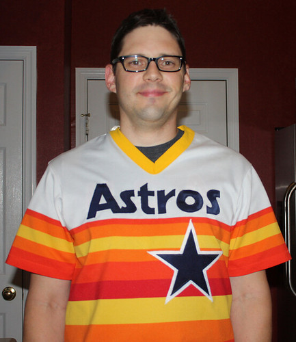
Back in June, I spotted a blank tequila sunrise jersey on eBay, linked to it from the Ticker, and suggested that it would make a good project for a DIYer. Happily, reader Thomas Qualls (that’s him at right; no relation to Jimmy, I hope) rose to the occasion. He scored the jersey for only $12.50 and then — well, I’ll let him explain it.
You Can’t Spell ‘Tequila Sunrise’ without ‘DIY’
By Thomas Qualls
I was in the market for a 1985 Nolan Ryan jersey (I prefer the white outline on the star that they started using in 1983, as opposed to the orange outline they used before that), and I wasn’t all that concerned with the authenticity, so this jersey was perfect for me.
When the jersey arrived, it looked exactly as advertised and fit wonderfully. I got to work right away, downloading the Astros’ chest insignia and turning it into a template that I could cut out and use as a stencil.
I did the same thing for the NOB lettering, the numerals for the “34” on the back, and the star (I used two of each for the stars and numbers, because I used the inside of the thick line for the blue and the outside for the white border). Then I printed everything out on cardstock and cut it out to create the stencils I would use to trace onto the twill material that I’d be using for these elements.
I didn’t have any white twill for the white outlines on the numbers and star, so I just used felt. My process for that was slightly different: I bought this stuff from the fabric store that you can draw on and then iron onto the felt. After that, you can cut out your numbers, peel off the paper backing, and voila — you have a set of iron-on numbers! This is what it looks like with the numbers drawn on and ironed on to the felt.
Here’s how the numbers look on the jersey (with close-up view available here, here, and here). As for the NOB, no nameplates for me — I sewed the lettering directly onto the jersey. I need to clean up the frays a little bit.
Here’s how the back came out (with a little help from my son’s arm), and here’s the front, along with a close-up of the star.
You may have noticed that I positioned the uniform number a bit higher than on the original. I had to do that because if I started them down below the stripes, they would have ended up way too low and looked goofy. And like I said before, I wasn’t terribly concerned with making it super-authentic (note that my jersey has a gold collar, which doesn’t jibe with the original either, but I don’t mind).
A big thanks to fellow Uni Watch DIYer RyCo for being a nice guy and responding to an e-mail from some random guy asking about sewing. I contacted him after seeing how beautiful his Ryberto’s jerseys have turned out, and he responded with all kinds of helpful information. I’ve been going crazy with the sewing projects ever since.
———
Very nice job by Thomas. Keep those DIY projects coming — always happy to feature them here on the site.
More multi-tasking: It’s been a while since I’ve mentioned this, but I still host Open Mic Show-and-Tell each month at the City Reliquary, with the next edition coming up this Thursday. Whether you want to bring an item to show and tell or just be shown and told, it’s a good time — please come.
Uni Watch News Ticker: New package design for the sweet elixir of the gods (thanks, Kirsten). ”¦ The Seahawks’ stadium has a new corporate name. ”¦ Most of you have probably seen this shot of Lou Brock wearing the N.L. centennial cap-style helmet. Now Jeffrey Moulden has found a shot of Keith Hernandez wearing the same style. ”¦ Due to a happy accident, Evan Longoria found some relief from a foot injury in a pair of new spikes. ”¦ When Jason Marquis went down with that broken leg on Sunday, it was revealed that he was wearing very short socks under his pajama pants (good spot by Chris Errington). ”¦ Lloyd Davis notes that the WinniJets’ new logo looks an awful lot like the logo used by a Toronto restaurant. ”¦ Amazing skeleton-like stripe pattern worn by this 1926 high school football team (nice find by Keith Winney). ”¦ Yesterday I asked if anyone knew the story behind Killer in an Oakland uni. Several readers pointed me toward this explanation. ”¦ Whew, that is some mighty huge NOB lettering! (Big thanks to Russell Goutierez.) ”¦ There’s a good thread on the Chris Creamer board about what appears to be a change in the Rams’ helmet horns. Read the full thread here. ”¦ The Penguins have released a logo marking the 20th anniversary of their 1991 Stanley Cup. Destined to be a patch, perhaps..? (Thanks, RyCo.) ”¦ New court design for Arkansas (from Justin Bates). ”¦ Updated football uni news for Auburn here and here. Here’s a better look at the new pants striping (big thanks to Jeff McClendon). ”¦ The Astros will wear “Los Astros” jerseys on Aug. 20. The jerseys will look like this T-shirt, which will be given away to the first 10,000 fans. ”¦ Some good auction finds by Bruce Menard: a seriously rare 1938 Phillies jersey (look at that sleeve patch!) and a 1970 Phillies ball girl uniform. ”¦ New logo for the Great Lakes Conference (from Tod Hess). ”¦ Steve Dodell was watching a a documentary about Jerry Koosman (haven’t watched it yet myself, but my hunch is that it doesn’t include the part where Kooz goes to prison for being one of those crazy tax deniers) and noticed something odd: Tom Seaver, appearing at an instructional clinic, wearing something other than No. 41. Not clear if it’s Kooz’s No. 36 or something else. Ran this one by Mets by the Numbers guru Jon Springer, who’d never seen it before. ”¦ Several readers have recommended this new web site with all kinds of great old Oregon sports imagery — good stuff. ”¦ You’ve Gotta Be Kidding Me Dept.: Notre Dame coaches now have official sideline belts, which will make their debut at today’s Media Day activities (blame Warren Junium). ”¦ New soccer kit for the Japanese women’s national team (with thanks to Jeremy Brahm). ”¦ Matt Shepardson spotted something odd while watching a show on the Style Network: “I noticed Bill Rancic, the first ‘Apprentice,’ wearing a Nike cap with this weird blur-out. It seems to be blurring out the ‘one’ logo, which I thought was also Nike. I decided to see if Nike had some sort of in-show promotion later in the show, but I didn’t find any. I did, however find Rancic wearing a Reebok-branded Chicago Bears hat, with the NFL logo obscured with a piece of electrical tape. Why is one Nike trademark okay if another isn’t, and why would only the shield be off limits on an NFL cap?” ”¦ Lots of interesting info on Jags equipment manager Drew Hampton’s Twitter feed. Scroll down to his Aug. 12 posts to see what he has to say about next year’s uniforms (from Dustin Kline). ”¦ Here’s a very incomplete rundown of sports figures who’ve worn glasses (from Kurt Esposito). ”¦ Interesting note from Greg Trandel, who writes: “The main logo for the University of Georgia (the school, not the athletic administration) used to be nicely symmetrical. Just recently, it started sporting — like a big pimple — a trademark symbol. Have other colleges done the same thing? Will they?” Hmmmm. Maybe UGA will be like the Cubs — a lone ®-inclusive institution among a sea of ®-free peers. ”¦ The Mariners gave away an Ichiro T-shirt last Friday, and my old zine buddy Steve Mandich will give his to the person who composes the best Ichiro haiku. ”¦ Michael Orr’s weekly roundup of Premier League kits is back.
Brilliant Diet Coke cans. Really. Cut off letters so it looks kinda like “iki”. Because when I think Diet Coke, I think icky. Good job, Coca Cola.
When I read “for the sweet elixir of the gods”, I was expecting to see something about barbecue sauce.
Yeah, Paul really threw me off with that.
I was never a fan of Diet Coke, and the new logo design is just lame. Why can’t you just put the logo on the can and be done with it. However, the stacking box is a pretty cool idea.
Whoever’s in charge of Coke design these days is earning their money, I recently saw a delivery truck that had been decaled to look like it was hauling 6 packs of 10 ft tall Coke bottles. Very clever. Couldn’t find an image of it online, but I did find link
I wish they could make Diet New Coke.
Thomas did a wonderful job with his DIY jersey…almost makes me want to run out to the fabric store!
+1 – Fantastic DIY job. I wore the rainbow guts for more years than I care to remember in youth ball – dressing preteen boys in rainbow shirts to play baseball is a form of child abuse – and so I basically hate the tequila sunrise. But man oh man, Thomas’ DIY has me rethinking my stance. Just bee-yoo-tee-ful. His numbers placement is even better than the original, if you ask me.
I played softball for a team who wore blue tequila sunrise unis. LOVED them. MLB needs a couple of v-neck pullover teams now.
Loved this DIY project, too. Great job, Thomas!
I would lose myself with giddiness if a few teams would come out with some v-neck jerseys as their everyday jerseys. Or at least an alternate that they wear with more regularity than a throwback game here and there.
Great job on the jersey Thomas! Can you elaborate on the stitching process though? Are there two layers of felt for the number, the white in the back and the blue on front?
I actually had navy twill material that I got online, but did not have any white, so I used felt. So I used 2 different materials for the numbers and star, but yes, a full layer of white with a smaller blue layer laid on top of it. Then I sewed the blue onto the white using a zigzag stitch which is pretty standard on any sewing machine. After that, I ironed the whole thing onto the jersey (as I stated, I had made the felt numbers with an iron-on backing) and then used the same stitch, different thread to sew it onto the jersey. BAM!
Houston native here who prefers the description “Rainbow” over “Tequila Sunrise.” When in Rome… Now if jersey creator Thomas can just whip us up a time machine to bring back the Astros’ 1986 lineup in place of the team’s current roster…
But if the Pirates aren’t going to be in last place, then the NL Central needs to have the Astros there!
The Pirates may end up there yet…if not last, fifth. The Cubs are coming, and the Pirates are fading.
Wikipedia says “Rainbow Guts.”
Wouldn’t Ed Wade just find a way to trade off Jose Cruz and Davey Lopes for almost nothing if they brought back the 1986 Astros?
Nice job Thomas!!
Thomas, that is one amazing jersey! The sewing for the numbers and NOB is perfect!
That picture of Hall of Fame guard Tom Mack from 1970 with the huge NOB, always had me fascinated about teams like the Rams, Bears and Browns, off the top of my head, who seemed to have trouble with the sizing and positioning of the NOB on the jerseys in 1970 when the two leagues merged and NOB became mandatory. If you look at old NFL Films game footage it’s sort of unusual how a name like “JONES” came out “J O N E S” on a nameplate on a team like the Browns.
And, as pictured with the Rams, they’re lettering for many players was over sized that first year with NOB.
Another niche within the niche that has always caught my attention.
Recall that the Steelers when adding NOB’s in 1970, had yellow NOB’s on the white jerseys. Almost impossible to see, whether at the game, watching on b/w TV or color TV. Once they got the hang of NOB’s, they added a thin black outline to the letters in 1972. Except for 1997, they haven’t changed since.
Indeed.
(link)
Quick question.
Watching the MNF regular season game from 1983 between Redskins & Packers. Lambeau Field. Quite a famous game evidently.
Seemed quite odd that the field had two green bay helmets painted in one endzone, and then two blank burgundy helmets exactly the same style in the other.
Was this a crude attempt at doing a Redskins design in the other endzone? Why?
Also, when Riggins scored, they played the Redskins fight song.
Was this common place back then? It seems odd that the home team would welcome the away team so much!
Back in the early days of the Saints, when they played on a grass (dirt) field in Tulane Stadium one end zone was always decorated for the visiting team. I played there once in college late in the season and found that the end zones were almost bare of grass and that the team logos were not just paint but made mostly with some sort of tiny colored gravel. As I recall, though, it was pretty standard practice in the NFL to decorate one end zone for the visiting team.
Yeah. Was common, standard. Teams also would even wrap the goal posts differently, in barber-pole stripes, one in each team’s colors, to match the endzone where it stood.
“It seems odd that the home team would welcome the away team so much!”
It ain’t war. It’s just a football game.
Exactly, Ricko.
Plus, it gave you the look and feel of a bowl game every Sunday.
The Chiefs used to have two helmets at midfield: their own, and the opponents’. Every Sunday they changed it.
I posted videos for these a while back. If I can find out what day I did that, I’ll link to it.
“It ain’t war. It’s just a football game”
~~~
o rly?
Picturing the Chiefs changing their midfield design every week. I’m picturing this:
link
Here’s a shot of the Chiefs and Dolphins helmets at midfield for a regular season game:
link
According to this morning’s Washington Post:
“On Tuesday night against the Cincinnati Reds, the Nationals will wear cap emblazoned with the Navy SEALs logo to honor the 22 SEALs killed alongside eight other U.S. servicemen and eight Afghans in the Aug. 6 helicopter attack in Afghanistan. Tuesday night will be the Nationals’ first game in Washington since the attack took place. The Nationals have used caps to honor the victims of other tragedies, including when they wore a hodgepodge of caps with the Virginia Tech logo following the April 16, 2007 massacre on campus.”
I’ll be at Nats Park to see it first hand. The SEALs insignia — special forces trident — is pretty cool:
link
That would look pretty nice on a plain navy blue cap. Hopefully New Era made the standard MLB cap with that trident (and it’s not too big/puffy).
What’s needed is for all 30 teams to draft an apology to the fans for choosing to play games while people are suffering and dying in the world, and for not pursuing careers in grief counseling instead. They care, they care so much.
Ho-lee Christ am I sick of the caps & patches.
Waiting for the Colts to unveil a little collapsing stage patch in 3…2…1…
Does anybody know where to purchase lettering for an MLB jersey?
You can get pre-cut stuff at many places like this:
link
I just bought a roll of material and made them myself, though. You can find the fonts out there on the internets, create your own templates and then trace them onto the fabric.
I’m looking to rename some casualty jerseys from the trade deadline. There’s no beating a $25 MLB authentic
Regarding the Rams’ helmet horns, my guess is that the new horns decals have been designed to accomodate the newer, large shell helmets such as the Riddell Revolution and Revolution Speed. You’ll notice the ill-fitting example of the new horns shown is on a smaller shell, rounded helmet.
BTW, have you noticed how many pro players have now switched to the Riddell Revolution Speed? Maybe this has something to do woth it:
link
I know the league doesn’t mandate a helmet type or minimum safety standard other than the NFHS standards, but can a team mandate a helmet type or require minimum standards above the league’s?
I think the Jets should have perhaps borrowed a bit more from the Avro logo if anything. The Avro Canada CF-105 Arrow depicted in the Avro’s logo has a legitimate Canadian legacy. The abstracted jet on the Jet’s logo assumedly depicts an FA-18 (or I guess CF-18 in Canada, but I don’t know what else it could be with the wing-tip rails). While that jet is indeed in Canadian service, it’s an aircraft designed and produced in the US.
The Avro Arrow was the focal point in probably 90% of the logo development. It was changed to a CF-18 at the end of the process. I don’t know what else to tell you other than, ‘That’s what the ownership chose.’ Much of the development actually looked a lot like the restaurant logo, so I suppose it’s a good thing that it wasn’t adopted. Could have left the team and league open to litigation. Who knows? Maybe that’s the whole reason the Arrow was eliminated from the logo.
The story of the Arrow is a pretty important one to Canada, but I don’t think there’s any real connection to Winnipeg.
Other than the fact that the movie which told the story of the Arrow was filmed primarily in Winnipeg.
link
(I’m an extra in that movie, in one of the crowd scenes filmed at Winnipeg Airport)
True that. But the Hornet isn’t any more connected to Winnipeg.
Is Wikipedia correct? Is the air force base in the ‘Peg primarily equipped with Dash-8s and Hercules transport craft? Both of those are propeller-driven.
For the record:
1. Hate “War Eagle” on the rear waistline. It’s already on the neck bumper of the helmet, so why does it need to be repeated?
link
2. Not a fan the truncated pants striping. Under Armour has all their schools wearing these new pants, and the weird seams just don’t allow for traditional stripes. That said, I don’t see Alabama or USC or Ohio State or Oklahoma having to give up their traditional stripes because the cut of the pants change. You can see the strange seams on this illustration of South Carolina’s new unis. Hawaii’s will be very visible, because their pants are 2-tone.
link
3. Love the stars on the jock tag. Won’t be visible for most players, but I think it’s a great idea from the soccer world that’s strangely never caught on in American sports.
4. I also feel like the sleeve stripes are much more abbreviated than in the past. Probably has to do with a new jersey cut, too. Pity.
5. At least they didn’t do anything rash like the orange drop shadow from the 90s.
link
Agree 100% re: pants striping. Auburn had traditional, basic uniforms like the ones we who are over 30 all grew up with. UA couldn’t stand that! They had to go and mess with a good thing.
Sigh.
My beef is, considering the way the pants are put together, the institution might have not even wanted to change the stripes but Under Armour’s ‘innovative design’ didn’t give them the option. And another thing, if the stripes came to a point at the knee it would be one thing, but it’s obvious in some of those pictures that while the back blue stripe and the orange stripe end at a point, the front blue stripes just keeps on going another inch or so into the hem at the knee like always. Shoddy.
i’m not the biggest fan of the nhl/soccer jerseys. i feel they are a bit rushed, and just kind of blend in with eachother. i think it’s a great idea though. but have you all noticed the coolest thing about them? championship stars! pretty awesome, and something i overlooked the first time around:
link
Wooooowww. That’s cool. I didn’t notice them at first, either. I went straight for the Hurricane’s jersey and almost went off for leaving off their championship, but it’s neatly tucked in the logo. Great placement.
yeah, that was clever! i did a double take on the capitals jersey stars though.
i just wish they were either more classic/less corprate, and that they incorporated more of the actual ice-jersey rather than what we see everyday on a regular soccer jersey anyway. my opinion of course. love the idea and effort though, don’t want to take anything away from that
Those serve as an excellent reminder of why a lot of people don’t care about soccer. Hypothetically I’d wear a soccer-style jersey with an NHL (or NFL) team logo on it. But I will *not* wear an American Airlines jersey.
I wear an America Airlines shirsey all the time!
You mean Alaska Airlines?
It appears they’re going with gold stars representing 10 titles and silver stars for one. Keeps the clutter down for those teams where it’s an issue (Canadiens, Leafs, Wings).
Why does the Red Wings shirsey have Chrysler on it? And the Islanders have Modell’s? Last time I looked, the Islanders played in the Nassau Mausoleum, not the Modell’s Sportsateria. As an aside, up until Sep 1999, Detroit was the only city to have all 4 major sports teams playing in 4 separate non-sponsored venues.
Yea if anything, the Red Wings should have been sponsered by Little Caesars and not Chrysler. Not a fan of sponsered jerseys in the least, but I gotta admit some of these do look very nice, great job.
i want that purple Kings futbol jersey NOW!
again, great job on the DIY TQ! thanks for the shout-out too, glad i could be of some help!
Always, man! You taught me well!
You two should do a collabo and make a tequila sunrise Rybertos alt!
I’d wear that!
RyCo, the people demand it!
Georgia alum here and this is the first I’ve seen of el sÃmbolo de marca registrada as applied to the Arch. The university has the link available on site as to how its marks should be used but I’m afraid I don’t have the time at the moment to do a deeper dive.
I do know the Arch at the entrance to North Campus (as opposed to as it appears on the state seal) has long been used as a symbol of the university as a whole and I imagine there are many locally and regionally who’ve tried to appropriate its image to imply some sort of association with the university.
About the Seahawks having a new corporate sponsor on their stadium? It isn’t so much that CenturyLink purchased naming rights as it is them buying out Qwest. In future news, AT&T buys CenturyLink…
BTW, nice job on the jersey.
Is it me or does anyone else find something wrong with the Penguins (and any team in general) doing a 20 year (or 10 year or 25 years or whatever) anniversary of our stanley cup win? And especially a patch?
First off the Penguins have won the SC since then, but I do understand it was a classic SC team that won in ’92. I just think it’s a total money grab or tacky to celebrate your stanley cup win years ago.
Even worse is when someone celebrates their 20th anniversary SC win and they haven’t won since then. It’s like, forget the damn patch and the anniversary, go out and win the stanley cup. Honestly it’s like celebrating the fact that it’s been 5 years since you dated a hot girl who ran off with your best friend.
i think in the penguins case, they are remembering their first ever SC. slight difference, but i know what you’re talking about
Don’t have a problem with the Penguins or any other team celebrating their first league championship with a uniform patch. And in the Pens case, it was a repeat, and since 1990, only the Red Wings have been able to back to back Cups.
In that case, the Leafs should be ramping up for the centennial of Toronto’s first Stanley Cup win in 1914. (Granted, that was, like, three franchises ago, in a whole nother league.)
What does the Pens and Red Wings winning back to back have to do with anything, or was that just your daily Pro-Pittsburgh rant?
BTW since 1980, only two teams have won the cup 4 times in a row.
Back to back? Childs play!
Two?
Yeah, only one team from 1980 on has done 4 in a row (Edmonton did 5 in 7, but those pesky Flames kept the Oilers from three-peating twice). Unless you’re thinking of that team from 1976-1979 as that second team… then 1980’s not the right cutoff point, is it?
Although, the Islanders have done SO much since the era of the “Core of the Four”… their last, best chance to date was back in 1993, and they haven’t won a series since – in the few seasons they’ve even been able to make the playoffs.
Slap me sideways, I thought Ed won four in a row from 84 to 87, but it was Montreal that did it on the other side of the Islanders in the late 70’s.
And actually, being an Islander fan that was the team I had in mind, I know they bring out the core of four every year and maybe a one game patch is ok, but anything longer than that and you’re tacky. Especially the Islanders, we haven’t won a playoff series in nearly 20 years, but lets celebrate the stanley cup from 30 years ago!
Tom V., I’m the same guy who called the Islanders four straight Cups one of the most under publicized feats around! If I want to make a statement about the Pens, Wings, or anyone else, I’m going to go ahead and make it. You must have also missed my comment last night, promoting Jim Thome for the HOF.
I’m just glad the Maple Leafs didn’t get the idea first!
This season will mark 45 years and counting.
I think that logoblock were just super-precautionary; the studio probably didn’t ask permission to have the logos be that visible and didn’t want to get caught.
On the other hand, maybe the NFL shield was blocked because it was the old logo. In that case, the people who had that logo blocked are more aware of the NFL than most news stations.
“… Amazing skeleton-like stripe pattern worn by this 1926 high school football team (nice find by Keith Winney). … ”
Such a fine picture. Besides the stripes on the kids’ jerseys, check out the coach’s incredible overcoat and the endearing way the left upright leans toward certain collapse. I deduce that the jerseys say “GRANDVIEW.” Anyone know which Grand View or Grandview? MO, IA, MN?
Hi Connie,
Its none of the above. The photo is from my alma mater, Grandview Heights High School in Columbus, Ohio.
I was wondering where the team was from. Very cool unis.
Bingo! Thanks, Nathan.
I also like that high tech goal post.
FYI, the man on the right with the overcoat is the team physician (Dr. Stout). The man on the left is Mr. Walter the school chemistry and physics teacher. The coach of this team was C.V. “Red” Money. He is the man in the back row, center middle with the mustache. He left Grandview in 1927 and embarked on a 35+ year college coaching career. You can read about him on Wikipedia. link
Not a lot of uni color diversity on the cover of the SI college football preview issue
link
No phony ass tough guy faces, either (eyeroll).
“Ready? Say ‘posturing’.”
Looks like an audition for an Under Armour TV spot.
-Wow you can really tell when they don’t put the thigh pads into those white pants.
FYI, link
Man, I love headline writers … It seems to me like John Lannon is going to get extra rest as a tribute to the fallen Navy SEALS.
I don’t know how many of y’all watch the EPL, but did anyone else notice that the referees had new cards for bookings? Look almost like circles instead of rectangles?
I think its just the corners of the cards are more rounded than they have been before.
Love the DIY Astros jersey – I’m a sucker for anything with the Rainbow Guts design. I’m currently making a DIY 1985 Milwaukee Bucks jersey, but was struggling to find a way to make the RG-esque side panels until I tried using fabric paint through an airbrush and just stencilled the design on – worked like a charm!
I’ve even started using the design in my art…
Changes a-brewin’ for the Mets:
link
One of the best things I’ve read about the Mets in a long time. I’m praying they don’t screw this up.
But what I find most perplexing in that article is this part of the Dave Howard quote regarding the black jersey:
“We did wear it extensively in ’99 and 2000. We won the National League championship, I believe, in 2000 in that jersey.”
Really, Dave? Maybe you should dig into the archives and confirm that the Mets were the National League Champions in 2000. Please get back to us and let us know what your research finds.
I believe his comment was referring to the final game of the 2000 NCLS, Oct. 16 2000, when they won the 2000 National League Championship. They were wearing the black jerseys that game.
link
“… A source subsequently told ESPNNewYork.com that significant elements of the original 1962 uniform (see the Gil Hodges photo on the right) will be incorporated in 2012…”
“Significant elements,” eh? Let’s hope for the best, but that’s one wide loophole.
It was good seeing the 1976 Cardinals and those batting helmet shots, so I wonder if the Cards wore those pillbox hats the second most times in the NL that season. Once a week would have been roughly 24 times, but even that figure may have been high. I’ve never seen a game action photo from the field of a NL team outside of the Bucs wearing a pillbox hat.
I had the impression, at the time, that the Cardinals wore the pillboxes that entire season. That’s why the helmets were striped, too.
Here’s at least ONE game action photo…
link
and another…
link
Thanks, I would think any of those old surviving Cardinals, Phillies, Mets, etc. pillbox hats are very collectible.
Calling the Premier League “the EPL” is like calling the NFL “the ANFL” for “American National Football League.” Not trying to bash any UWers, because this is a mistake made by a lot of people: link
But others get it right (and this is a company that thinks little league is more important than international soccer): link
I’m sure if you search hard enough you can find a few EPLs on ESPN.com.
Apologies. Will fix.
I’m not so sure I agree here. We call it the EPL because its the English Premier League. I feel the need to distinguish that it’s English because it isn’t American. Also the same way I call it the German Bundesliga. I see where you’re coming from, sure. But EPL sounds right to me, and to a lot of other people.
I agree especially as there is a Scottish Premier League as well. I say you can either call it the EPL or the Premier League but you can’t just call it the PL.
Paul Lukas is the PL around here.
Unless you’re in England, it’s the EPL. Actually, I’m sure Barclays would prefer you call it the BPL.
link
what do they call the british open in britain? “the open”
what does everyone else call it? “the british open”
it’s the EPL if you’re writing from the states…
They call it the Open Championship. I think the two terms are interchangeable, too. I’d say EPL and Premier League are also interchangeable here, since there’s more than one Premier League in international soccer, just like there’s more than one Open Championship in international golf.
Tons of people call it the EPL. Tons of people also call it the BPL (British Premier League – which is actually more accurate now with Swansea in).
German Bundesliga is a great example, because there is also an Austrian Bundesliga.
Deal with it.
British Premier League — which is actually more accurate now with Swansea in
Wait, wha? Is there like a Welsh Premier League too? Apparently there is:
link
Wow. EPL it is, then.
“BPL” stands for “Barclays Premier League”.
I had a feeling the Killer pic was related to a broadcasting gig..thanks to you and my fellow Uniwatchers for sorting the mystery out. I love seeing photos of iconic players in uniforms other than the ones they made famous. The Hank Greenberg debacle with the Yankee uniform was fascinating to say the least.
New post over at Permanent Record:
link
How can the writer compile a list of glasses wearing athletes and not include 1975 Virginia Squires teammates Mel Bennett and Gerald “Go-Go” Govan?….
link
Yesterday, while researching something else, I came across some pics of Jeff Burroughs from his bespectacled Texas Rangers days:
link
Dorkiest-looking MVP ever? Probably.
“Dorkiest-looking MVP ever? Probably.”
~~~
yeah, but he probably got crazy laid
Burroughs looks like a a frumpy dad dressed up for Halloween.
That there is an award winning facial expression.
In that Squires pic, it looks like Bennett (#25) is wearing some sort of a necklace/chain as well. I’m always a bit surprised to see that given how much physical contact there is in basketball, and since it’s been illegal at nearly every level as long as I’ve been around.
Do we have any idea when that practice was stopped? I know I’ve seen a photo of Kent Benson wearing one at IU (may have been link, but it’s not high enough resolution to tell), which means that it was still going sometime between ’73 and ’77.
The NBA outlawed it around the late 70’s – I wanna say 1979. I know Darryl Dawkins used to wear a huge chain when he was with the Sixers…
According to link, it was 1981.
Incidentally, the author of that book shares a name with an Iowa Hawkeye of about a decade back — but the author was born in 1969, so I doubt they’re the same guy.
Hmmm, I wouldn’t trust that book – a few of the other dates in that section are incorrect. Going through my Sixers photos from that era, I don’t see Dawkins wearing any jewelery after the 1979-80 season…
Related to the subject of sports players wearing glasses, this is my all-time favorite baseball card:
link
Oh, man…I need that in poster size, please!
Giants in the mid-70s had a reliever named Gary Lavelle….he probably wore photo-grays, but at the time, I started playing ball in shades just to look as cool as him.
Wow.
my favorite guy with glasses was former a’s reliever Eric Plunk, who had a great name for a pitcher.
Bonus points for the picture being taken at good ol’ Shea.
What’s weird about the Penguins’ 20th ann’y StanCup celebration is that it should have happened LAST YEAR. Their first Cup – the one they’re celebrating (1991 SC Champs) was won in the 1990-91 season, in May ’91. THIS year they should be celebrating the second Cup for the 1991-92 season. Just sayin’.
The whole season-erasing lockout seems to have messed with the heads of team execs across the league, as there’s no league-wide consistency with post-lockout anniversaries.
The core issue seems to be that teams can’t decide if they’re celebrating the anniversaries in years, or seasons.
Last night I listened to David Stern on the latest link and around the 25-minute mark, he pretty much shot down Bill Simmons’ proposal of putting sponsors on jerseys. “It’s not the panacea that you think it is,” Stern said.
Amen!
Nice job Thomas. I was going to ask here one day about DIY projects. How there seemed to be less people doing them or maybe not sending them in.
Always interesting to see how guys do the numbers and lettering.
“New logo for the Great Lakes Conference”
That’s snazzy. See? It’s possible to make a new logo that looks good.
Lookin’ at you, B1G.
They only have that logo so they don’t have to change it once they go to 16 teams.
Glad to see the return of Michael Orr’s EPL roundup. Even more glad to see QPR sponsorless…at least for the first match:
link
Looking forward to seeing West Brom v. Norwich. Not that they’ll televise it in the States, but at least I can see the photos.
I think QPR went sponsorless for only the first match because it’s the 125th anniversary of the club (the back of the kits had 125 embroidered in red up near the neck).
I still call it The Gigantic Clam Next to Safeco.
Call No Mas. Tell them to put that on a T-shirt.
I guess no one on here wants to give credit to Nike for potentially fixing the piping issues on the Jacksonville unis according to their equipment manager. Except for Paul of course by putting it in the ticker. I say that before people go all chicken little on the NFL and Nike, how about we create a points system to determine if the transition from Nike to Reebok is really all that bad. Let’s say if they fix a problem on a current uni design that has to do with the manufacturing or cut of a uni then they get +1 point. If they mess something up they get -1 point. If they improve upon the design of team’s uni they get a +3 for a good improvement or a +5 for a great improvement. If the design goes slightly downhill it gets a -3 or if it’s downright horrible -5. Obviously if it’s neutral it gets a 0. How about if they lessen the amount of logo creep on a uni. That would be a sign of improvement right. So perhaps a +1 or +2. Just a thought so that way we don’t scream the sky is falling if they fix 4 teams and ruin just 1.
For those who didn’t scroll down on Drew Hampton’s Twitter feed to see the posts in question, I’ve gathered the most uni-relevant ones here:
link
Probably no point in changing the Jaguars’ miserable uniforms if they’re going to be in LA in the near future.
Longtime veteran NFL reporter hereabouts—very well-connected—thinks the longtime result (next few years) is this…
Vikings get new stadium in Minnesota.
LA Area builds new stadium and BOTH the Chargers and Jaguars eventually move there to play in it, ala Jets and Giants (Jags seemingly would move to NFC).
His point, and it is well-taken, is that in this economy there simply are not people around able to, or willing to, come up with HUGE money for an NFL expansion franchise…and the NFL has realized it. Hence the notion that letting two teams move to LA (if it turns out that way) is now viable. No sense waiting around for an expansion payoff that just isn’t there in the foreseeable future.
And the monstrous LA market has been sans NFL long enough, thank you very much.
agreed on all counts — plus, the nfl is now at 32 teams — in four perfectly set (if not aligned) 4-team divisions per conference…although the stupid wild card structure should be eliminated or fixed somehow…but i can’t see a need (or real want) to expand further
~~~
“Vikings get new stadium in Minnesota.”
+++
indoors or out? im guessing you could build an outdoor stadium with some “fan friendly” enhancements, or would it need to be either completely indoor (a la ford field) or with a retractable roof? and how would those potential costs play into it?
not saying you (ricko) or anyone has those answers, just a few questions to ponder
ricko, I’m increasingly disconnected from Minnesota political news (even though he’s been governor for like 2 terms now, and a leading legislator before that, I still think of Tim Pawlenty as a Jon Grunseth campaign flack, I’m so out of date). Is there any new interest in the Legislature for contributing public money to a Vikings stadium?
Most sense (therefore least likely) in that scenario might be Los Angeles Jaguars and St. Louis Rams switching places.
Yeah, they’d lose Rams-Niners, but that simply isn’t as big as it once was, but it would put the Rams with Houston, Tennessee and Indianapolis. Eventually there’d be some pretty decent rivalries based on reasonable proximity in that setup, I’d imagine.
Ramsey County. Former site of the arsenal in Arden Hills. Country pushing quite hard, actually. Involves entertainment taxes, tax on souvenir items, etc. (I believe; don’t hold me that, though). Significant NFL and Viking/Wilf contributions, too.
Governor Dayton has stated that, if they come forward with a definite plan, he’ll call a special session to address the issue. He’s said he considers the team a community/state asset, but he doesn’t want a debate. He wants a concrete plan for legistors to say yeah or nay and end the special session quickly.
(That’s a really, really simplifed nutshell on it).
My thoughts are this. There are two pretty good stadium proposals right now, which is what the NFL wants so they can move two teams. Minnesota will be fine, they’ll get a new stadium. San Diego will stay in SD as well. The movers will be the Jaguars and the Rams. The Los Angeles Jaguars doesn’t sound too bad either. Especially when you shorten it up to LA Jags. The Rams stadium situation right now is pretty bad and the Jags can’t get people to come to the games in Jacksonville. Florida doesn’t need three teams. On a uni note, isn’t the rule that you can only redesign your uniform every 5 years? So Jacksonville wouldn’t be eligible anyway.
If there is a 5 year rule then the Lions, Jaguars, 49ers and Bills would be the only teams not eligible for a Nike redesign.
If one new person signs up for a membership — just one! — we’ll have enough to fill out the current batch and send it off to get printed.
If you’ve been meaning to do it, now’s the time!
If anyone’s looking for a design, might I suggest the ABA’s Carolina Cougars?
link
Love that font.
The beautifully rusty post-industrial cinematography in this video:
link
Made me think of Paul. Plus, corporate-branded sports equipment!
What a beautiful film! Remarkable. Thank you for the link.
So i know some of you remember my cardinals jersey made out of metal if not here it is as a reminder :
link
Today i made the florida gators logo out of the same guage metal. took about 2 and a half hour to cut out and etch the metal. hes going to paint it up. That was free hand etching also.
link
i really would like some input on these.. i have enough metal to make probably 7 or 8 more logos of a decent size so i accept challenges!
Those are awesome. If I was gonna give you a difficult challenge I would say maybe the Bucs, Skins or Jags in the NFL, the Celtics or Mavs in the NBA, the Mariners or Marlins in MLB and the Blackhawks or Wild in the NHL. They just look more difficult to recreate than others, not saying those would be the best aesthetically.
Great stuff!
For what it’s worth, Invesco Field @ Mile High is no longer……it’s now Sports Authority Field @ Mile High….
Blah blah blah. I can sort of (not much but sort of) accept the whole corporate sponsorship thing if they keep the name for a long time. The Cell in Chicago, The Jake in Cleveland.
But if its changing all the time, it just becomes forgetable.
the jake wasn’t a corporate name
As far as bespectacled athletes go, is it true that Bob Griese was the first one in the NFL?
Also, I don’t think that was a football player with the M A C K NOB, looks more like a Mack truck!
That’s what the Hall of Fame says, and I’ve never seen anything else to suggest that they are wrong.
The violinist at the Nationals game preformed the Star-Spangled Banner at the game a few minutes ago. He was playing some electric violin that looked like a Louisville Slugger and sounded like an electric guitar. Any details?
link
Glenn Donnellan is kind of a local institution:
link
Plays with the National Symphony Orchestra. He’s brought his electric batolin to several other MLB parks as well, including Atlanta that I know of. Here’s his account of how he got started in the whole electric-violin-bat thing:
link
Here’s his NSO bio, with more batolin videos:
link
Wasn’t there talk of the Nats wearing Navy SEALs caps tonight? Doesn’t seem to be the case:
link
Looks like they’re wearing their stars-and-stripes alt (which, blessedly, is one of the least-worn alt jerseys in MLB – good gosh, what a crappy jersey) and their road caps. Not quite Toronto or Mets-in-black level uni badness, but close. A SEALs cap would have been an improvement in my book. Especially if it was link.
holy shit
chien-ming wang is back in the bigs?
and they’re wearing their lovely S&S unis? ugh…may as well wear a seals cap with that piece of shit
chien-ming wang is back in the bigs?
Get yer head out of yer textbooks, college boy — his first game back was against the Mets!
link
has it really come to this? baserunning glove on Weeks.
I could swear that Seaver was up for a little while at the end of the 1966 season and wore 36. Maybe he had it in Spring Training as well before he switched to 41.