Earlier today, the New York Mets announced they will wear a memorial patch for the late Buddy Harrelson, their former player, coach and manager. Harrelson passed away on January 10, 2024 at age 79 following a lengthy battle with Alzheimer’s.
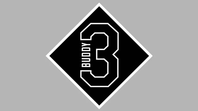
The patch will feature Harrelson’s No. 3 with his nickname “BUDDY” in a diamond and will be worn on the sleeve of the Mets home and road jerseys.
Six of Harrelson’s grandchildren will be involved in the ceremonial first pitches when the Mets open their season this Thursday, March 28 when they play the Milwaukee Brewers.
Harrelson was a member of the Mets from 1965–1977. Shortly thereafter, Buddy would become a coach with the Mets in 1982 and again from 1985–1990. Harrelson took over the managerial duties early in the 1990 season and led the Mets through the 1991 campaign.
Here’s how the memorial patch will look on the home pinstripes:
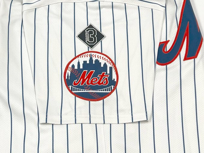
The team announced it will also appear on the road uniforms, and, one would assume, the alternate blue and black jerseys as well. Like the Mets sleeve logo, it will be on either the player’s left or right side (depending upon their handedness), opposite the side with the team’s ad patch.
Like other memorial patches the team has worn over the years, this one will have a unique shape and look. Whether it changes for the blue and black jerseys remains to be seen. When Tom Seaver passed away and was honored with a sleeve patch, it took two different forms (and because Seaver passed away late in the 2020 season, the team wore a memorial patch in 2021 as well).
Comparison of Mets’ memorial patches for Tom Seaver. 2020 version (worn last season from Sept. 4 thru Sept. 27) on left, 2021 version on right. pic.twitter.com/kpr84Kl6rC
— Paul Lukas (@UniWatch) March 1, 2021
Other memorial patches the team has sported have had different looks.
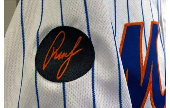
The Rusty Staub memorial was a black circle, with Rusty’s signature rendered in orange (his nickname was Le Grande Orange due to his hair color):
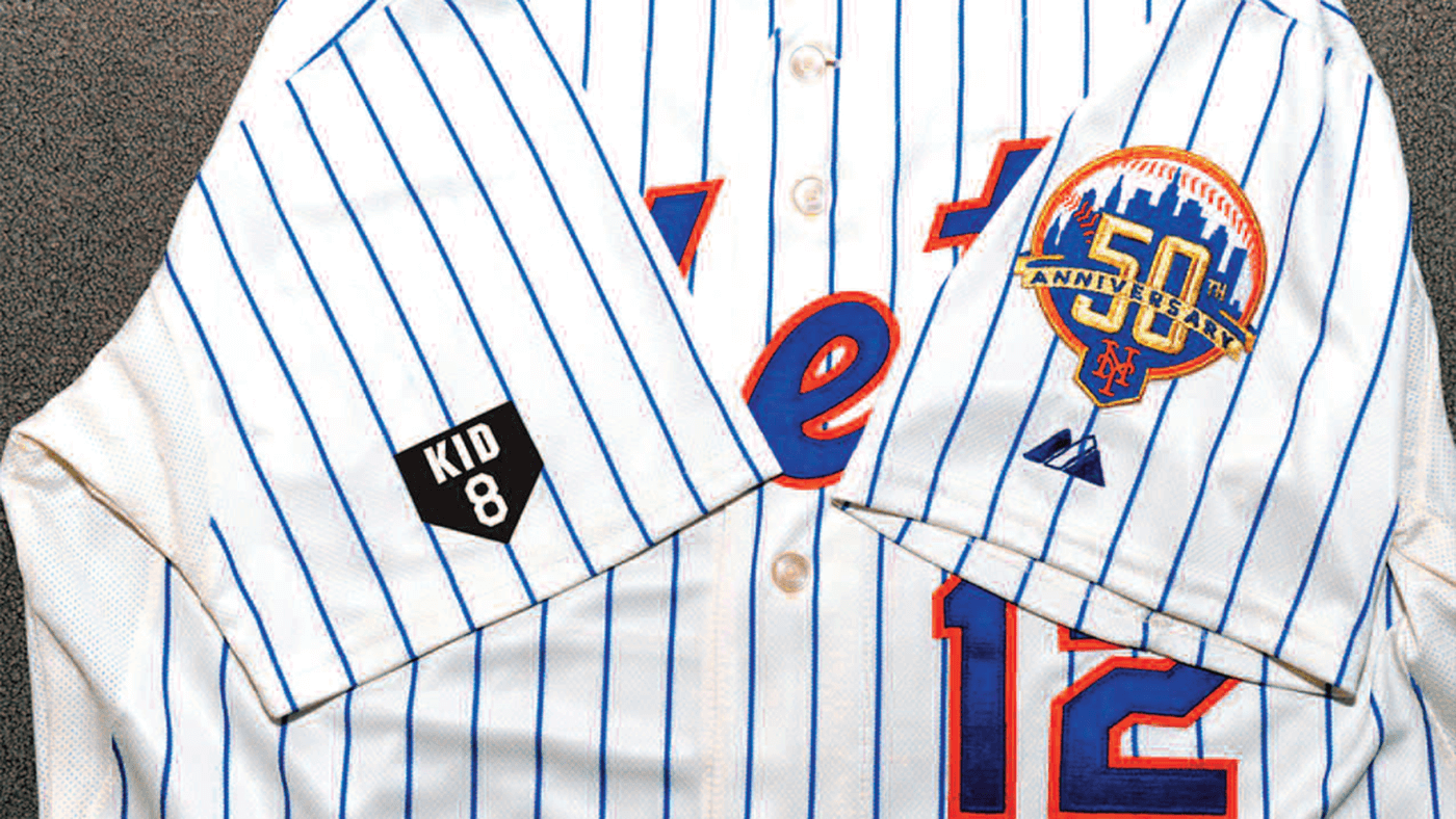
Catcher Gary Carter’s memorial patch was rendered in the shape of home plate, and included his nickname and number:
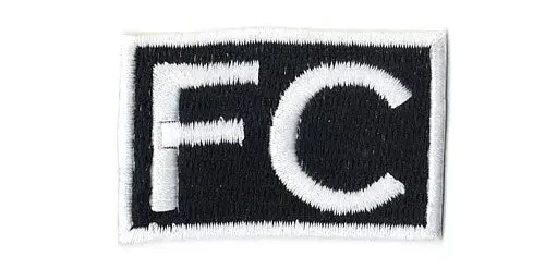
The Mets have also honored non-players with uniform patches. In 2014, the team wore an “FC” patch for late general manager Frank Cashen. That was a simple square patch in black with white letters.
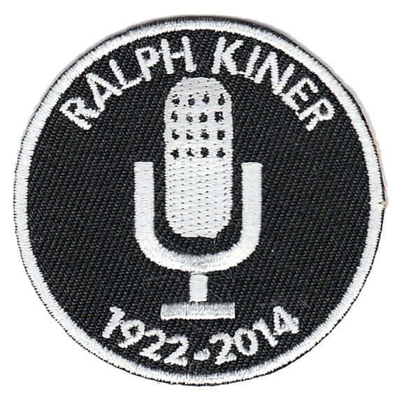
The team also honored longtime broadcaster Ralph Kiner’s passing in 2014 with a circular patch featuring an old-school microphone.
The new Harrelson patch follows Mets protocol by having a unique design.
Of course it has to be above the Mets logo. The other sleeve is reserved for an advertisement! I guess it’s better than having it above the ad, since it would look tacky and maybe distasteful. Ideally though, the Mets wouldn’t have an ad and they’d put the patch there instead.
It’s a nice memorial logo with all that being said.
Is it me or should the diamond points land on a pinstripe? Maybe the pinstripes aren’t centered on the sleeve anymore? Compare the buddy patch to the home plate for Gary Carter. If this is how it will look on field it will drive me nuts all year.
I hadn’t noticed that at first glance, but you are so right.
It’s so tiny. Not that I think it should be huge. I don’t know. There was a time when a Bud Harrelson wouldn’t be memorialized at all. This is just a step up from that.
>There was a time when a Bud Harrelson wouldn’t be memorialized at all. This is just a step up from that.
Precisely. Having just said more, nothing more need be said.
Nice gesture, too bad that there is an ad on the other sleeve. The design of the mini-patch is nice.
I dunno, since the ad patch is fairly small compared to a lot of other teams, I feel like it would look better on that side. BUT, I also can see a hospital not wanting a memorial patch right above their ad, doesn’t quite send a message of confidence.
No Mets bobo here, but this seems like something they get more “right” than just about any other team. Going to just that little bit of extra effort to memorialize the person with a unique symbol. And classy, pleasing design work.