Good Saturday morning, Uni Watchers. I hope everyone has had a good week — yet another busy one in the uniform department.
Reader Camryn Brown had recently been working to improve the identities of both his baseball club in Auckland, New Zealand and the regional baseball association itself. As the former involves uniforms, Cam thought this would be a fun project to share with the Uni-verse, and I wholeheartedly agree. I’ll let Cam take it from here. Enjoy!
by Camryn Brown
I’ve been a regular reader of Uni Watch since I came across it shortly after moving to San Francisco in late 2006 and found myself immersed in the rich, new-to-me world of US athletics aesthetics. Several years later I returned to my native Auckland, New Zealand and joined my local baseball club (North Shore) as a player and a parent of players. Over time, my passion for my club and my longstanding uni-obsessiveness combined into a series of projects to improve Shore’s uniforms and overall visual identity.
The first thing I noticed was that I could find at least nine versions of our club monogram and seven ways those nine versions varied. Given that the club was founded in 2010, I didn’t think we could justify a Detroit Tigers situation and so I created a standard design in Illustrator. At the time I didn’t have any particular role in the club and so I left things there.
However, I was able to turn to our jerseys themselves after the end of the 2022/23 season. Two seasons prior, the club had adopted a new jersey design that had proven problematic.
I considered it BFBS compared to our previous designs.
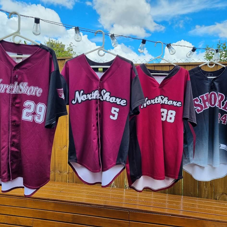
Other club members disliked the wordmark and that it was a pullover. The main problem was that the manufacturer had let us down and sewn the entire order several sizes smaller than the agreed specifications.
By the end of the 2022/23 season, many of our teams were wearing old sets from storage and our on-field look was very inconsistent. By this time I’d become Vice President of the club and took on the project to source new jerseys.
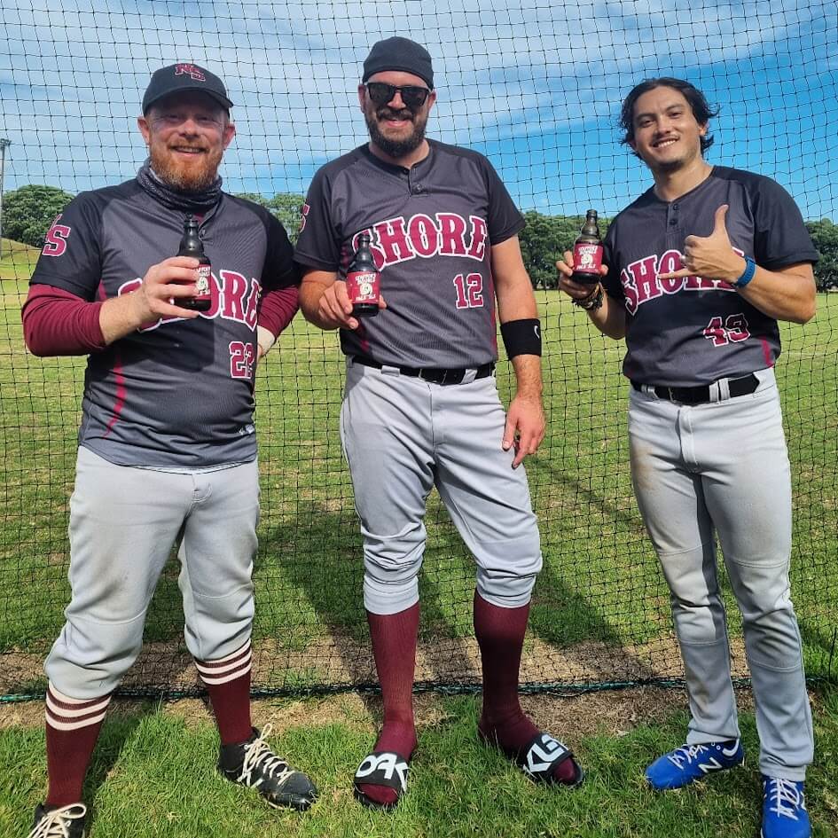
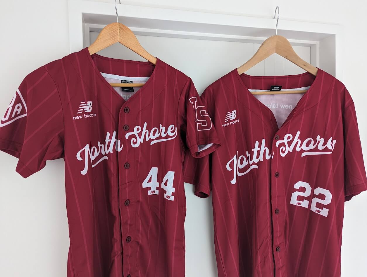
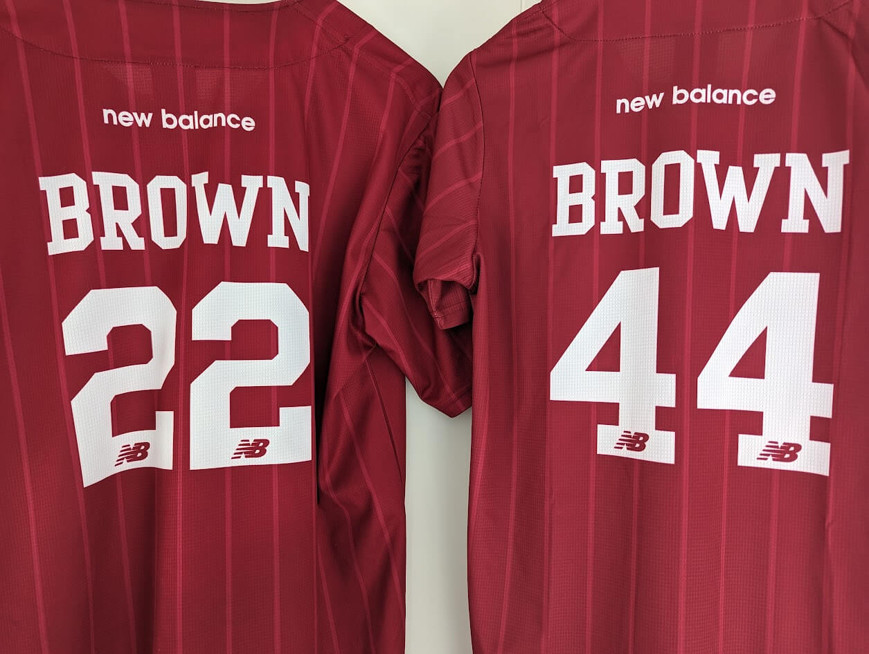
OK, I should now address the elephant in the room. We are not a purple club. Our primary colour is maroon. Specifically, the same maroon as worn by the local professional rugby union team as per the relatively common concept in New Zealand that geographic areas have standard sporting colours that every team purporting to represent that area should adopt if possible. (We’re a collection of Pittsburghs).
We are a maroon club but, I admit, we had found ourselves wearing purple from time to time. And red at other times. We had no documentation of what we meant by “maroon” and various manufacturers had interpreted it quite widely. So, I set about to create a standard for our maroon based on the idea that the colour should be a Pantone standard one (for uniform sublimation and printed material) as well as an ISACORD one (so we could get caps embroidered in the exactly correct shade as well). This seems simple but took quite a while to figure out. The Pantone name is “Cardinal” which is, I think, odd.
The uniform design process itself was not very complicated. What I wanted to do and what proved to be popular with the wider club were mostly the same things – use a “very baseball” North Shore wordmark, have a full button front, and include pinstripes. Pinstripes were not currently used by any club in Auckland and so were available to give us a distinct, traditional look. That was my main reasoning, but I also dislike headspoons. I don’t like how “busy” it feels to have piping and wordmarks interacting in the prime upper chest real estate. On that note, I’m sticking with my 2010 SF Giants away jersey until they see the light and remove the headspoon that was added in 2012.
Prior to generating concepts I designed the necessary graphical elements, again, in Illustrator. The new wordmark was a very mildly tweaked version of a purchased font that had a great traditional baseball look and struck me as fated when I saw it was called “Auckland.”
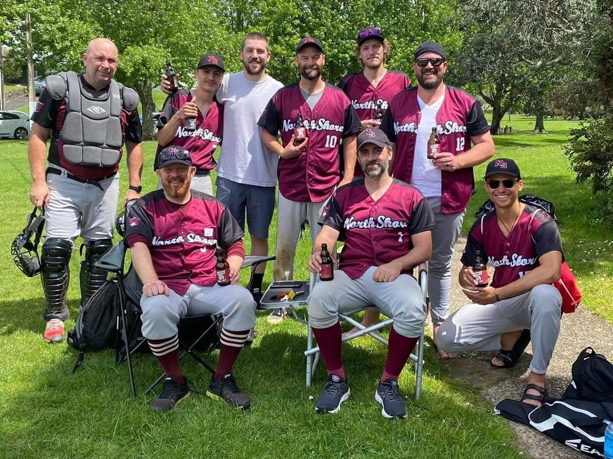
To generate concepts, I used the New Balance tool since our national parent body had signed a deal with them and was encouraging clubs to do the same. Having been burned by an independent manufacturer, we wanted to use a supplier with a reputation to protect. I did create a BFBS concept in case the club wanted to stay on that path. Luckily, the vast majority did not! Once the maroon pinstripe concept was approved I worked with New Balance to mock-up what their online tool could not, i.e. the correct shade of maroon, the desired angle and position of the wordmark, the correct width and shade of pinstripes, and so on. We did three or four rounds of tweaking before we settled on the final design.
We then had to wait a little before ordering the jerseys – first, we needed to secure the funds to make such a large purchase and, second, we had to wait to see what was happening with the Auckland Baseball Association (ABA) logo. We play in the ABA’s competition and wanted to feature the ABA logo on our shoulder. However, the ABA was considering a change in logo at the same time. The designer? Also me. As of mid-2023, the existing ABA logo was a derivation of the old Baseball New Zealand logo from before Brandon Moore’s 2018 redesign, was illegible at distance, and had no monotone version to better fit against diverse club colour schemes. In the end, I did a full visual standards document for the ABA and my new logo was accepted.
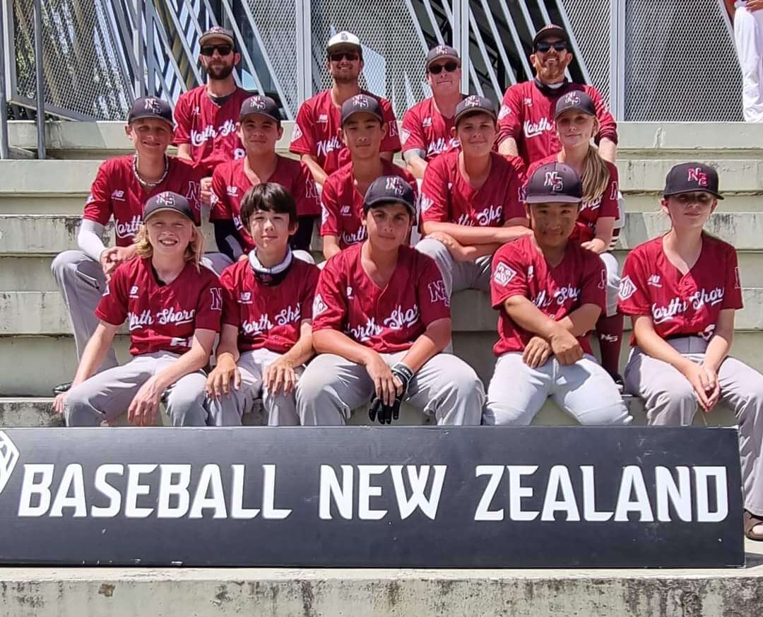
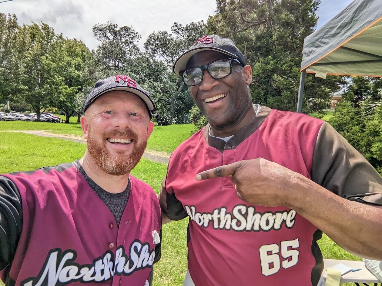
So, we received our new unis at the start of the 2023/24 season in October and they look really good.
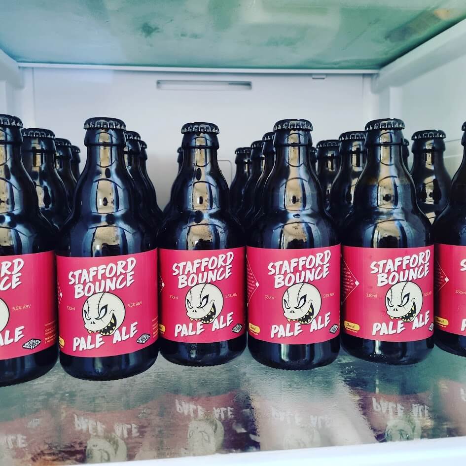
I rounded out the project by working with New Balance to generate a set of other uniform elements, training gear, and supporter merch and by creating a very pedantic page on uniform standards for our club website. I’ve also tinkered with a club mascot (I used an initial result from the Midjourney AI and cleaned it up and vectorised it in Illustrator) and a club beer (named for the unpredictable bounce off the playing surface at our Stafford Park home).


And some views of the Auckland Baseball Association logo and script:


EXCELLENT effort and presentation by Cam. Thanks for sharing!
Thanks!
Shout out to fellow UniWatch reader Jack! Sometimes you find yourself sitting at one of your favorite bars in Orlando (Redlight Redlight) and you get a tap on your shoulder, asking about the hat you’re wearing (it was a Clink Room hat) – Any other Central Florida UniWatchers in the house?!
Justin – I live in Orlando.
Brevard Co. here.
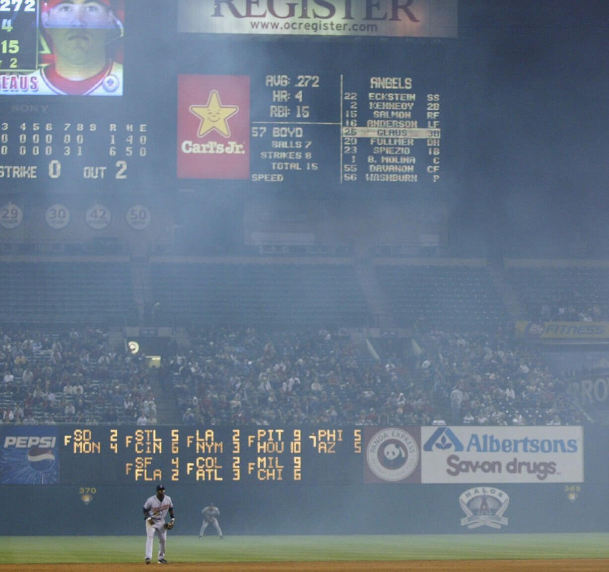
GTGFTU: 6 May 2003, Anaheim Angels beat Cleveland, 6-1
Jarrod Washburn pitched a complete game, allowing only a first-inning homer from Ellis Burks. Garret Anderson hit a 2-run home run in the bottom of the first and the Angels never relinquished the lead.
correction: GTGFTS
I have a correction of my own to confess…when I submitted this to Phil I got the date totally wrong!
“CLE(1)@ANA(6), Opening Day (actually, night) – April 13, 2003…out-of-town scoreboard confirms the date.
The smoke was still clearing from the fireworks set off to celebrate the HR hit by the Halos’ Adam Kennedy off #57 Jason Boyd a few batters before.”
Great job fact-checking and showing me the error of my ways…mea culpa.
A W for Gregory W…the halo shines today!
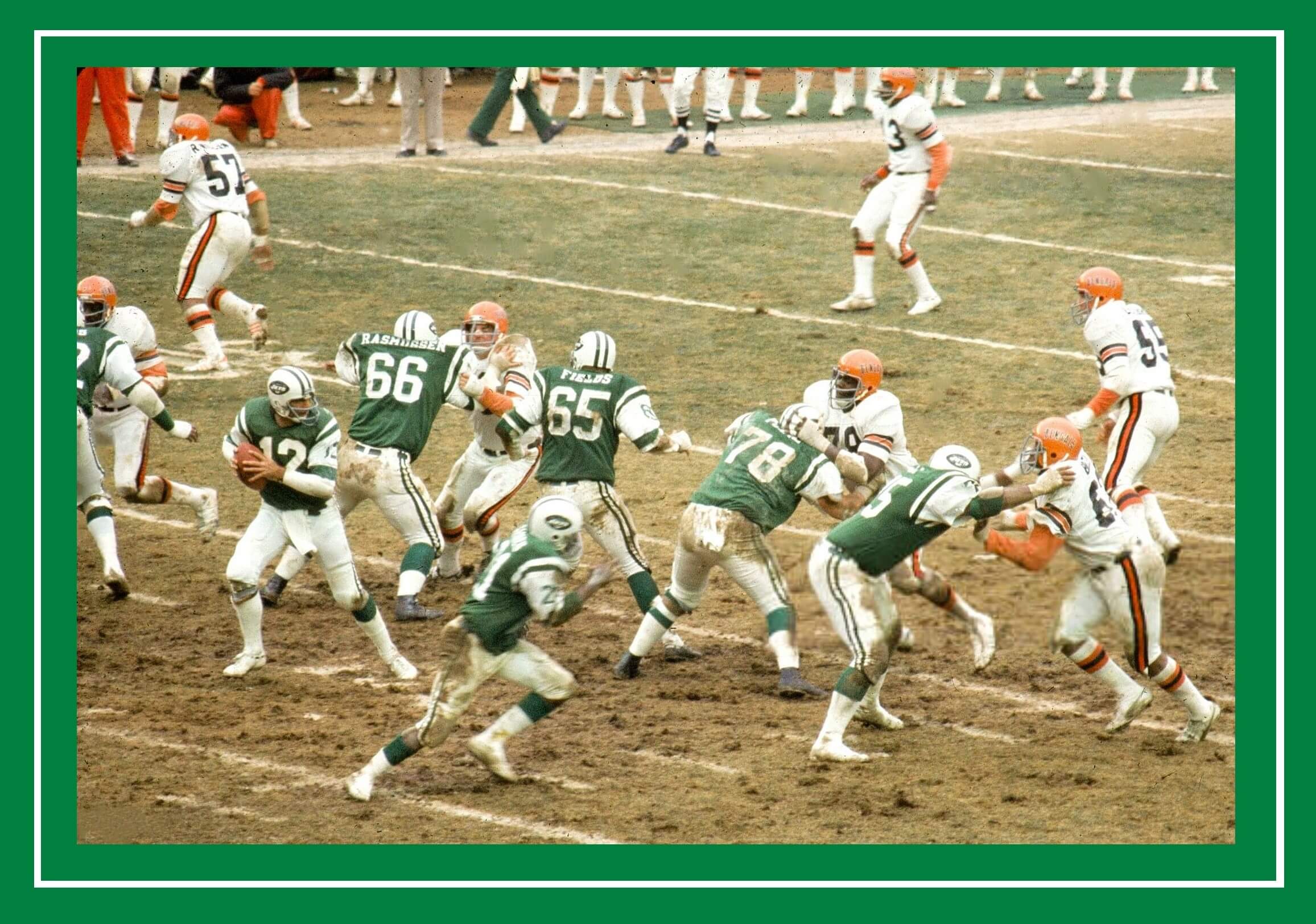
GTGFTU – December 12, 1976 Bengals at Jets. Joe Namath’s last game as a Jet; the Bengals won 42-3.
Such a great photo.
The Jets never looked better, and the Bengals are in their second best uniform, after the early 80s look. Love the dirt and grass at Shea, and the cloudy weather.
Namath had four completions and four interceptions!
Phil – yesterday somebody mentioned timing of posts and I wanted to encourage you keep a 7 a.m. post when you take over. It’s nice to have some UW to read on the bus and train going into the office.
Agreed.
Even though I don’t get up until 10 or 11 during the middle of the week (part-time night shift is *so* fun…), it’s nice to know the Morning Edition is waiting for me.
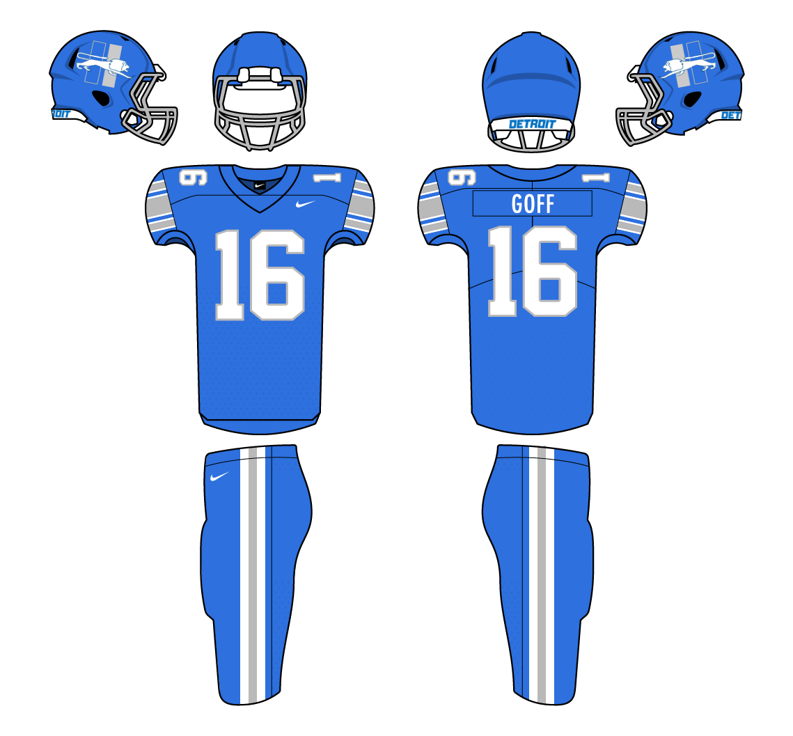
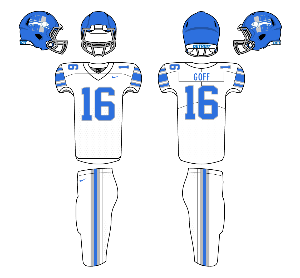
Nice jerseys, but the manufacturer graffiti is way too much. Don’t let Nike see the logo in every single number. We don’t want to give them any ideas.
I was thinking the same thing. The elements that Camryn created — the maroon base color, the far-apart pinstripes in a muted color, the ABA league logo — look great, but the manufacturer cruft is horrible. They’ve got their logo on the front, inside the digits, plus on the back above the player’s name and number, and it’s so far down the collar that it shoves everything else downward, just like we’re seeing with Nike and what they’re doing to major league uniforms in North America.
These jerseys would look perfect with just big block numbers on the back with no manufacturer logo inside them or above them, and as I type this I see that link. Was it all the manufacturer who chose smaller digits, their logo inside the digits, and their logo above the NOB? Because Camryn’s proposed design (and I like the black jersey with red TNOB too) is much better than what the maker gave them.
Oops, it looks like the HTML ate the description of my link and changed it to just the word “link”. It should say “the design in Camryn’s Google Doc has nice clean block numbers” or something similar.
Correct, the manufacturer kinda sprung the logo-in-numbers on me at the last minute.
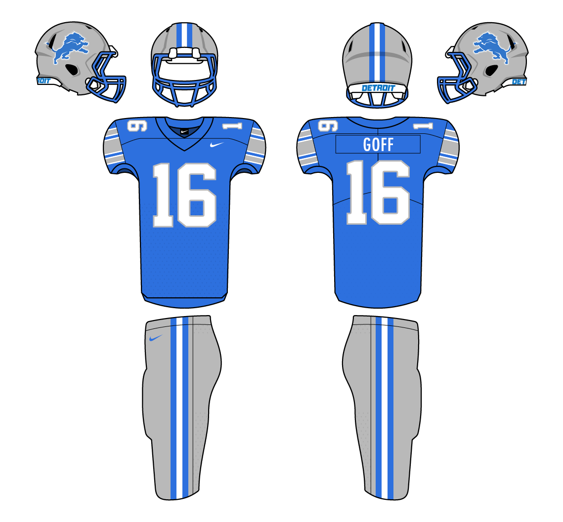
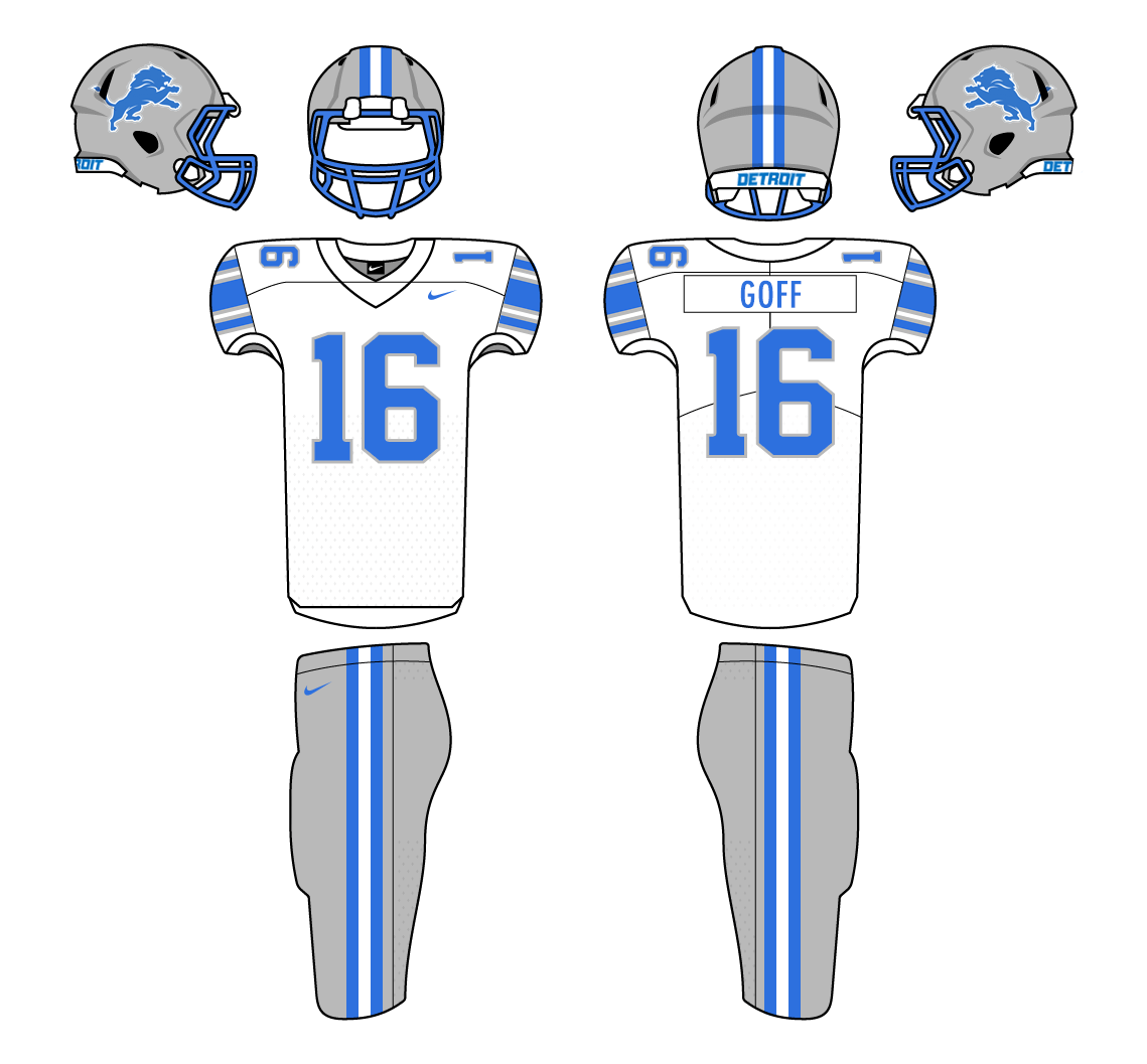
Benjamin Dib – as a fellow Lions fan, I love what you’ve created here. Well done!
Love the Lions or not, their classic uniforms are pretty easy to put in a box. The pants’ striping pattern is used by about half the teams in the NFL. Sleeve stripes use the pattern from the Steelers’ white jersey. That being said, their efforts to think outside the box have been met with derision. Ben’s uniforms probably can’t be improved on, except for using sparkle fabric on the silver elements.
“We’re a collection of Pittsburghs.” What a great line and a great article! Everything was done so well and with such great detail. Just a few questions for Cam: Are stirrups an option for the teams? I didn’t see any in the few photos posted here. If/when I order a cap, how long is the shipping to the US? I thought $50 was steep until I checked the conversion rate which comes out to ~$31 US.
As for the Lions concepts, yes please! Well, with the exception of the blue helmet. Most of the reactions I’ve seen are “Meh.”
As a Pittsburgher, I loved this remark!!! Great job Cam! I love all the little details, especially the name of the beer.
Thanks!
Unfortunately, our hosiery situation isn’t the greatest. More players are wearing socks but (a) we have a large old order of incorrectly coloured pairs to get through and (b) stirrups are practically unheard of here with the sport not taking off until after stirrups were rare.
Shipping to the US: I’m not sure, but I expect 2-3 weeks.
Thanks for sharing Cam’s story. A major upgrade to your uniforms Cam, well done.
Thanks for sharing all those details! It’s cool to see what actually goes into getting uniform design right.
Looks very professional!
The Lions uniform is a classic, and they definitely should wear the classic helmet, jerseys and pants together only, and use the blue helmet only for their various alternates.
Brilliant work, Cam! Loved reading all the details…
Everybody got Joe Willie’s last game as a Jet, there are two Hall of Famer’s in the photo, Namath and Ken Riley. Seven months later I met Joe again at Rams camp, I took a Polaroid of him throwing. Jack Faulkner of the Rams introduced me to him. When I got back to Maryland my father was furious I didn’t mention him to Joe, my only excuse was I froze. He was so cool I wish I could have hung out with him after practice instead of those old coaches at happy hour.