Good morning, everyone. Paul had quite the scoops on a bunch of new MLB uniforms for the 2024 season this past week, but teams haven’t finished unveiling new looks. Yesterday, Paul noted the Marlins will have two new jerseys (I’ll have a separate post on those later, as they were unveiled late yesterday at the Marlins Annual Fan Fest). But that’s not all.
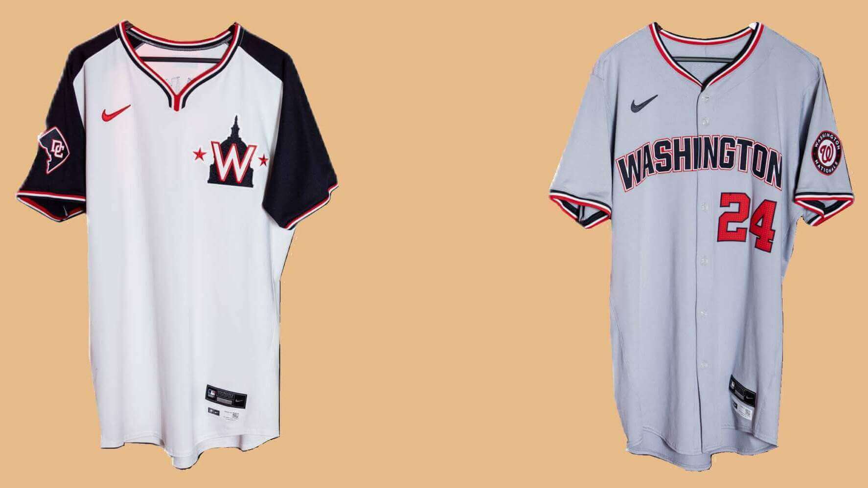
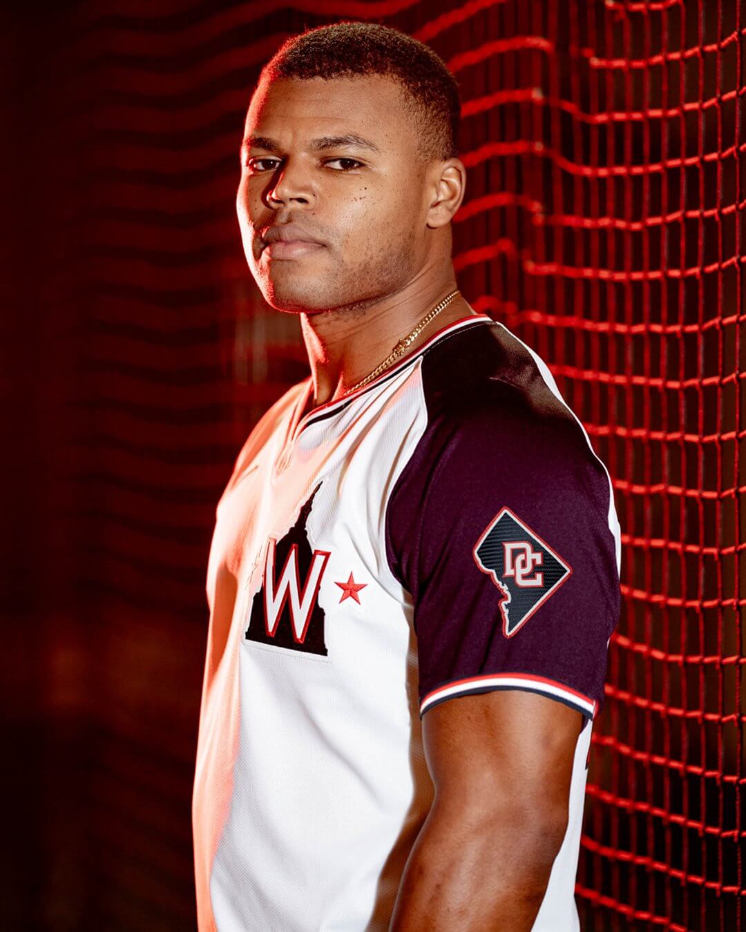
Yesterday afternoon, with no advance notice, the Washington Nationals unveiled two new jerseys which will be worn for the 2024 season: a white pullover (!) and a new road gray jersey. The white jersey will serve as an “alternate” while the new gray jersey replaces the script Washington they have worn for the past several seasons.
New Alternate Pullover
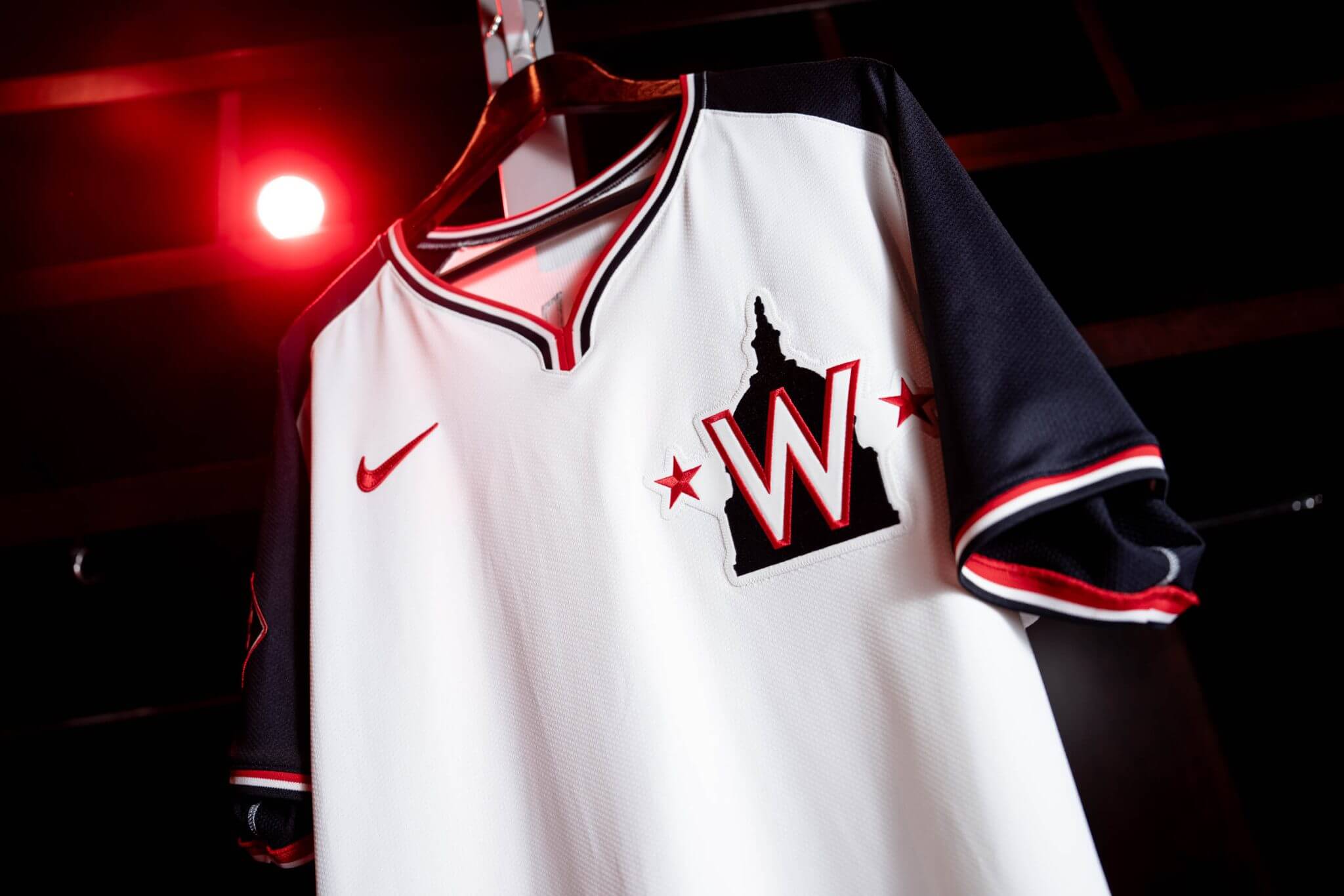
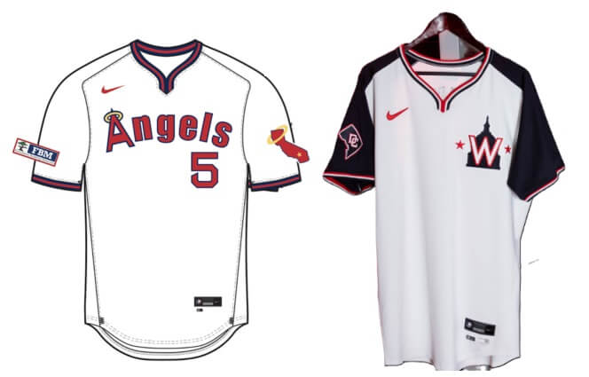
We recently saw the Angels were planning on wearing a throwback pullover uniform, and this new alternate for the Nats is in the same template — giving us our first non-MLB Style Guide look at the new pullover. You’ll note the collar is in the “wishbone” style on both.
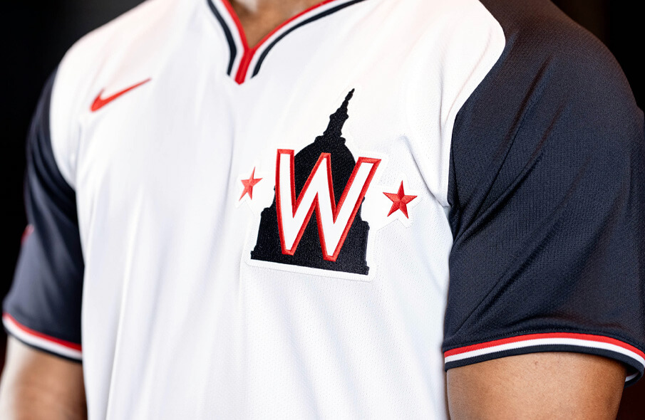
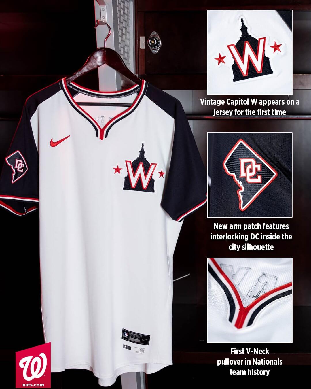
The Nationals’ new alternate jersey is the club’s first pullover and includes the vintage Capitol W logo on the jersey for the first time.
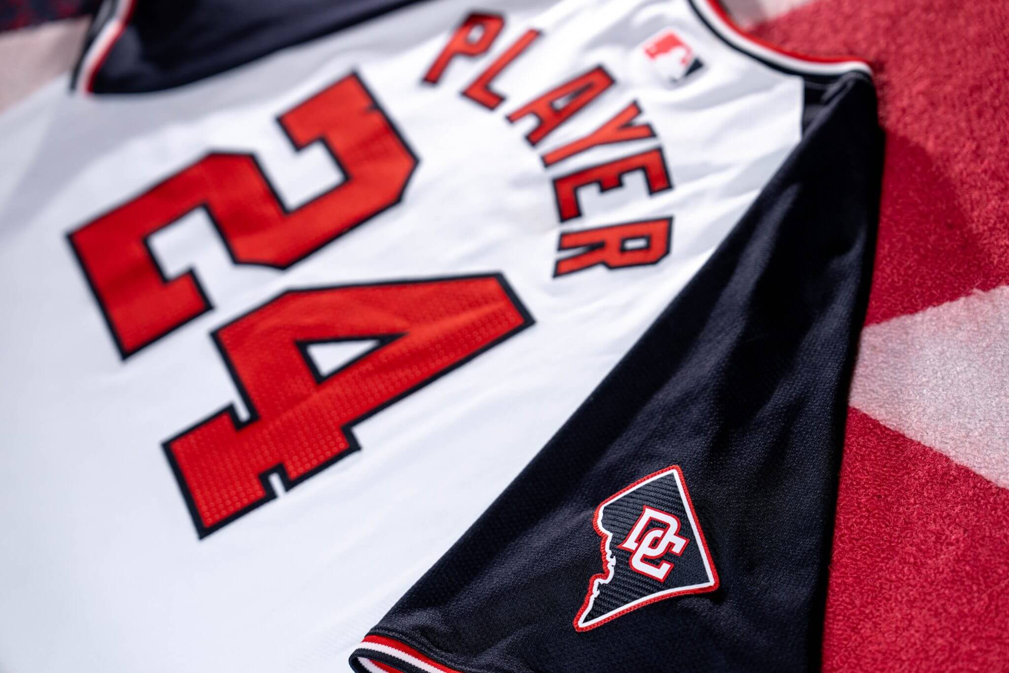
Here are some additional views:
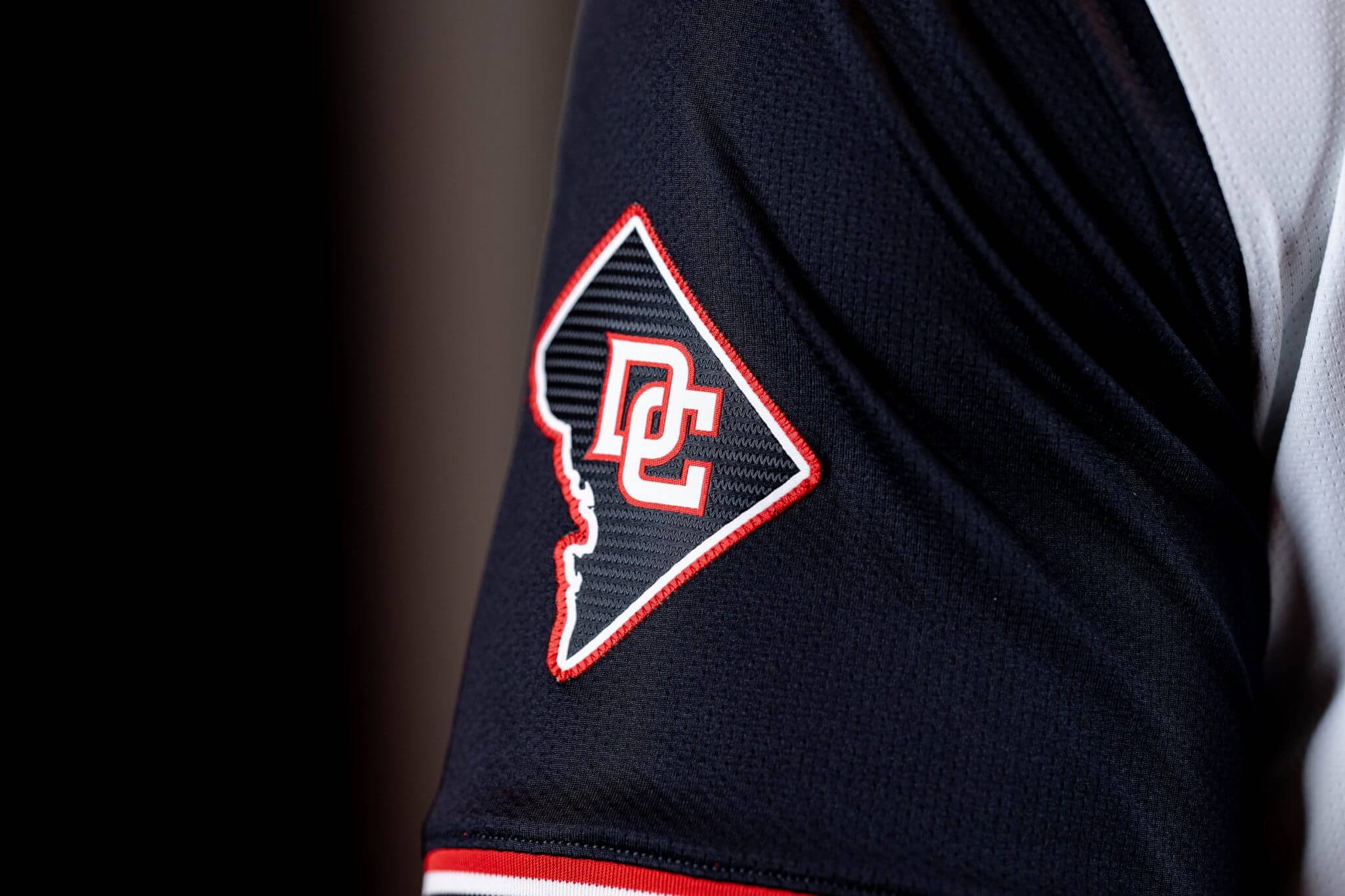
Here’s a closeup of the sleeve patch:
As you can see, the new wishbone collar features red, white and blue piping. The jersey also has navy blue raglan sleeves, and a thinner red/white/blue piping on the sleeve ends. The back of the jersey features a red NOB, outlined in navy, in a radial arch. Numbers are similarly red outlined in navy.
The team was kind enough to provide a handy-dandy graphic depicting the new elements:
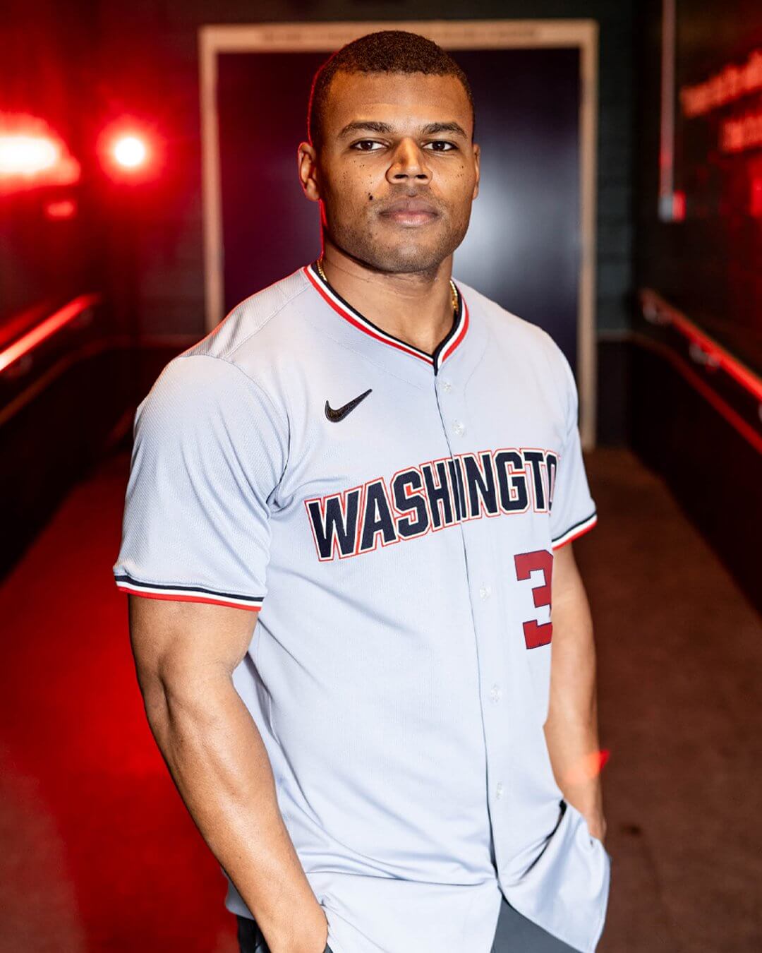
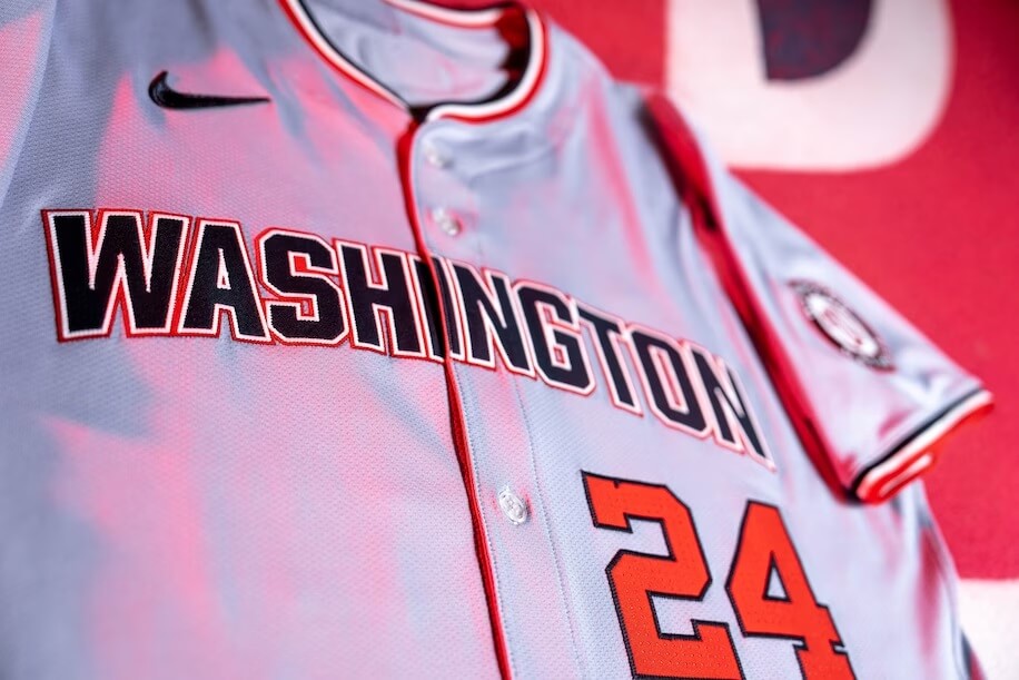
New Road Jersey
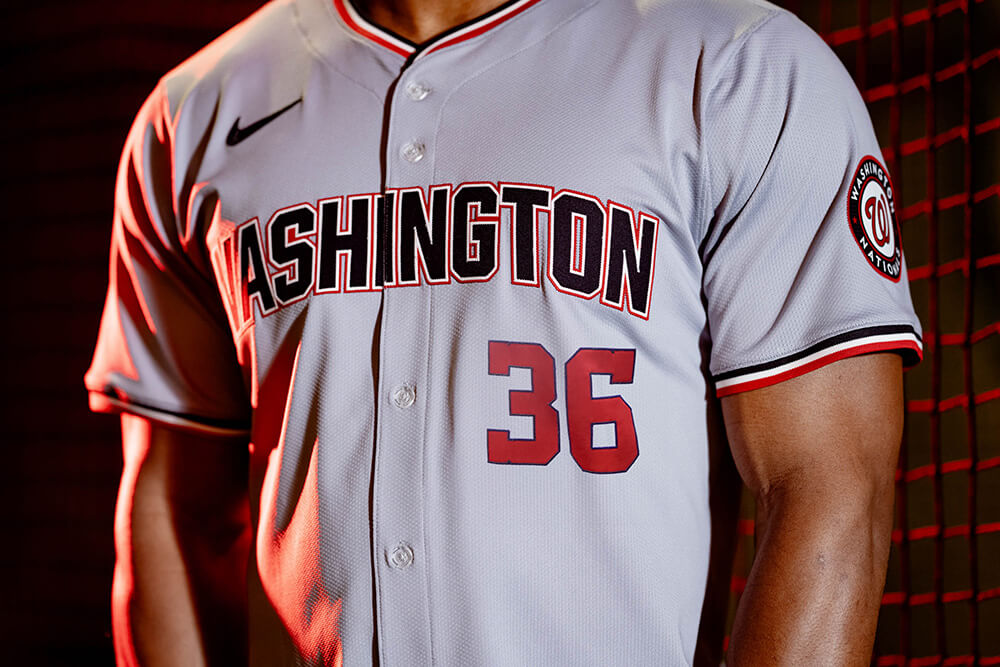
As noted above, the new gray jersey will replace the previous jersey which featured “Washington” in red script. This jersey is rendered in the traditional button-front style (and Nike’s new template). Like the new alternate, this jersey will feature red/white/blue piping around the collar, as well as the sleeve hems. Previously, the road jersey had red/blue/red piping around the collar and sleeve ends.
The team has introduced a new font, and “WASHINGTON” is now rendered in capital block letters, which are navy blue, surrounded by a white and red outline. Front numbers remain red with a navy outline. The sleeve patch remains the same Washington Nationals roundel.
Here are some additional views:
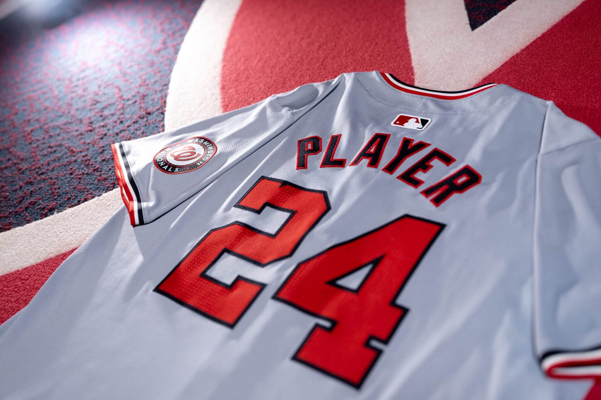
The back of the new roadie has NOB in blue with a red outline (with the new radial arch), and numbers are rendered in red with a blue outline.
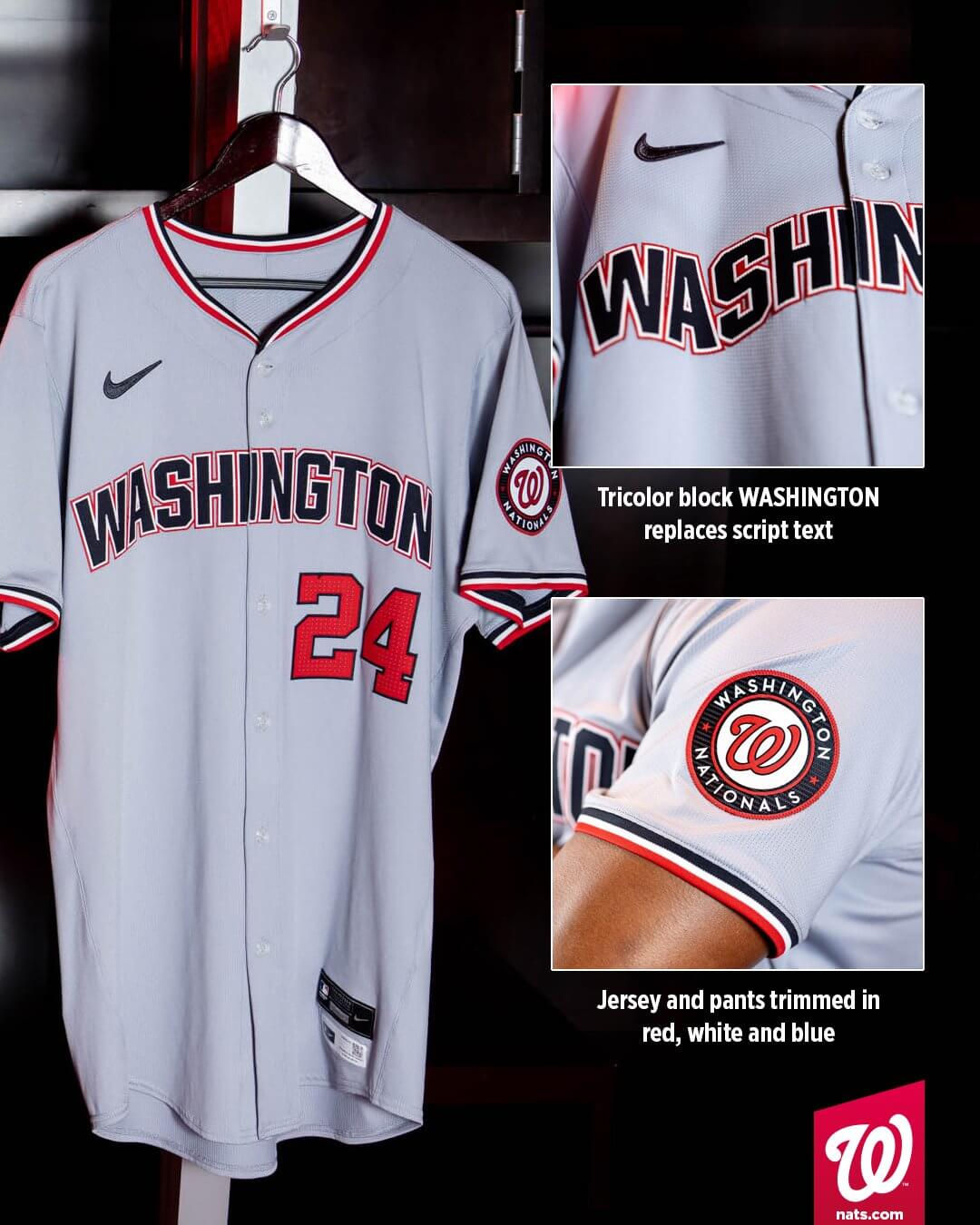
This will be the third iteration of a road jersey for the Nats: the 2005-2008 beveled, Todd Radom design, and the more recent red script (also designed by Todd).
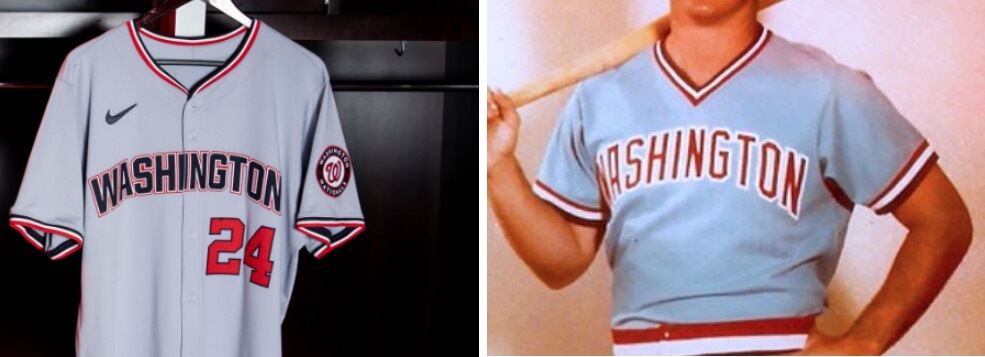
The new road jersey is somewhat reminiscent of the “Washington Stars” powder-blue road uniform that had been proposed for a possible Padres-to-DC move that never happened.
I had asked Paul if he could acquire the MLB Style Guide sheets for these new uniforms, but after the extensive week of MLB uni-exclusives, he thought it best to give the source a rest. I was hoping to see what pants the team would be pairing with the new alternate and road jerseys, since the piping has changed. The team did not provide a view of the pants with this unveiling, but they’ve indicated the road pants piping will be changed to match that on the jersey. It’s quite possible the team will also create a new set of white pants to match the r/w/b piping on the new alternate jersey as well.
One more thing of note: last season the Nationals had two alternate jerseys: a red jersey and a blue jersey. They also have their City Connect uniforms. If the team is to fall under the “4 + 1” (four jerseys plus CC) restriction, either the red or blue alternate jersey will likely need to be retired. The team has given no indication as to which one will be scrapped Per the WaPo, the red jersey is being retired and the blue alt will remain. Additionally, the team has given no indication how any of the other jerseys will change — if at all — under the new Nike template.
Fortunately, the Nationals are one of several teams that do not have uniform ads on the sleeve, so it was good to see an unveiling that doesn’t feature gratuitously staged photos prominently displaying an ad. How long the team will remain ad-free is unknown.
As always, I will need to see the jerseys on the diamond and in action in order to have a fully informed opinion, but I’ll be very interested to see the new pullover. Aside from throwbacks, MLB hasn’t seen pullovers as standard uniforms in decades. The new road gray isn’t all that different from the previous iteration, with the exception of the new block “WASHINGTON.” I wasn’t overly fond of the previous red script, but this new look feels like a bit of a wash. I’m also interested to see how they pair with the pants, which will have new piping in the r/w/b style of the jersey.


Nats new uniforms are garbage except for the return of the interlocking DC.
I like the trim better but that word mark is bland.
Couldn’t agree more. The DC is a pleasant surprise but the silhouette of the district is weak. Many states can claim a recognizable shape, but I don’t think any city (or district) can, but maybe I should say that very few cities (or districts) have shapes that are pleasing as design elements AND are recognizable by the general public.
I’m also infuriated by the wishbone collar. I thought the NBA was keeping that for themselves until it mercifully died, but apparently it’s proliferating.
Per the Post, the red jersey is being retired and the blue alt will remain.
link
Thanks, post now updated!
Great analysis Phil. I think we are misusing the term piping though. Piping is what you would see on the armrest of a sofa
link.
The flat trim that is used in baseball that is sewn over the fabric is called soutache. Nike seems to have eliminated it for the ends of sleeves. They are using a sleeve trim or striping attached to the end of the jersey sleeve.
I hated when Cleveland ditched the red script on the road uniforms in favor for block navy. This seems like like another downgrade.
Also just as the last vest dies, Pullovers are reborn.
I know this is shouting at the clouds but could they not break it to have WASHI NGTON? The break is right in the middle of the I so that it stretches it out so it looks dreadful. I dread to think what other placket abusing monstrosities might be ahead this season! #RespectThePlacket!
I completely agree. The “I” is the thinnest letter in WASHINGTON and they couldn’t just move it a little bit?!
Came here for the same reason.
Seriously, Nike, if you can’t/won’t move one small letter one tiny degree to either side, just make every jersey a pullover.
Better yet, stop making jerseys.
I hate the split lettering across the placket too, but I think the fault lies equally with the team. Surely they could have had swooshie’s engineers create a script/wordmark that respects the placket. The fact that no one on the Washington/Nike design squad feels this just looks “off” speaks volumes.
First thing I saw about the jerseys was WASHIINGTON. Sticks out like a sore thumb.
Came here to say this.
The Nats went from having a great look just a few short years ago to a complete visual mess.
Yup, it’s so disappointing. The script Washington jersey was the best road uniform in DC baseball history, especially when they wore the solid navy cap. I’m hoping the solid navy cap is coming back, it started being sold in the ballpark last year. That’s the best cap in DC history too.
One of the worst examples in history of superstition compromising design. The Nats happened to win the 2019 WS in a set of uninspired alternate jerseys & caps, so they decided that the best look in the club’s D.C. existence was somehow unlucky and its elements were something to get away from.
The interlocking DC is one of my favorite logos of all time and I’m glad to see it back. However, having the Pretzel W, the Block W and the DC is terrible for the overall. The Nats need to embrace one style from Washington baseball history and go all in on it.
The new block Washington jersey looks like a knock off you would see at a gas station
These look so amateurish, especially the pullover. It’s like a cheap knockoff of the Nats brand.
Looks like ad patches may be on the way. Photos of the new home alt jersey show the city outline patch on either arm. The jersey on the hanger, the generic Player jersey, and the graphic all show the patch on the right sleeve, whereas the jersey being modeled shows the patch on the left sleeve.
The Nats are really devoted to following a few years behind the Twins in terms of tweaking their way gradually from a basically good uniform set to an ugly, incoherent mess. Hopefully this means the Nats are just a few seasons away from a total overhaul that results in a reset to uniform excellence. What I don’t understand is how the unifying theme of every recent tweak is moving away from the curly W, but yet the new road jersey includes the curly W roundel instead of either the Capitol block W or the DC mark. Also, almost from the beginning the Nats have had the opportunity to pair a Washington jersey script with a DC sleeve patch or alternate cap to thus wear the popular (though not official) full name of the city, and the team keeps not doing so.
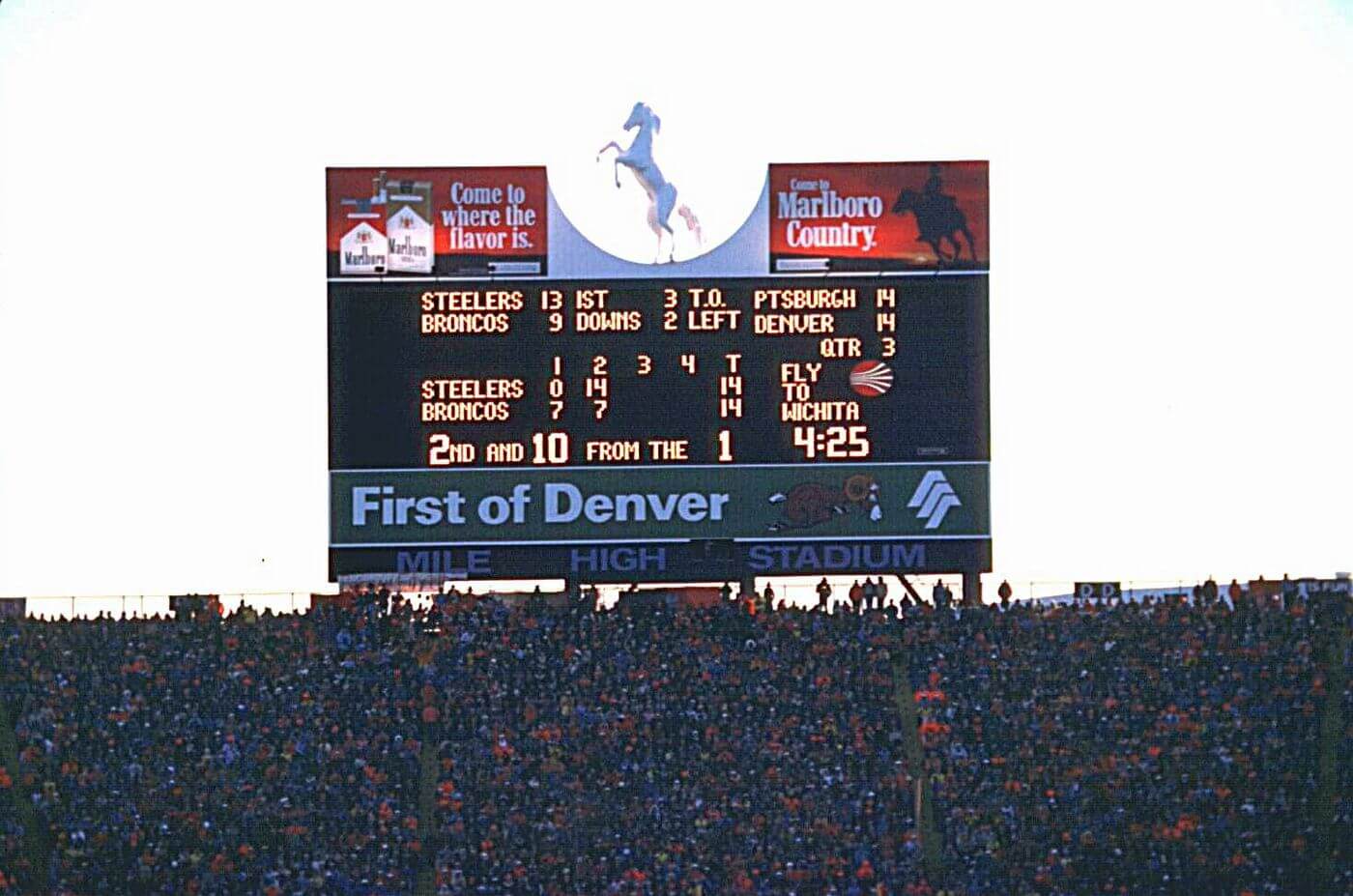
I’m guessing that the scoreboard is from the December 24th, 1977 playoff game which Denver won 34-21 at Mile High.
One advantage of the pullover is that it alleviates the problem of where the name break is from the buttons, but Washington uses only a “W”. Not a fan of this weird wishbone collar. It would look so much better to just have a normal V-Neck.
I very much dislike the wishbone collar too. The nBA does this too and it looks terrible, it can ruin an otherwise good looking uni for me.
I don’t have to wait to see the Nats jerseys on the field; from experience, the only thing that looks worse on a baseball diamond than a pullover jersey is sansabelt pants.
Breaking the I over the placket is terrible. Just scoot the I to the left and let the break happen between letters.
I do like that pullover though.
big time downgrade. road jersey script looks like an online shop that had 4 fonts to choose from.
GTGFTU
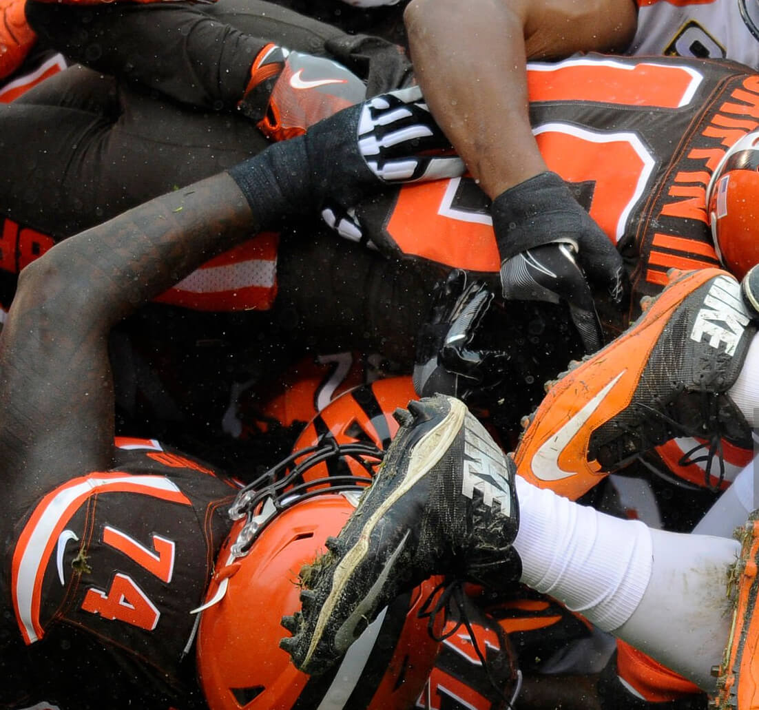
11 December 2016
Bengals 23 @ Browns 10
Only time the Browns wore the brown wordmarked pants vs Bengals’ whites
Yep…nice going, Marc!
12/11/16, CIN@CLE…RG3’s return and only game with him wearing that version of the mono-turd. It’s sad seeing the best helmet in the NFL buried like that!
I’m two days late, but I figured it out with the somewhat more pedestrian, “how many home games could RGIII possibly have played for the Browns?” approach. The answer is two, one against the Bengals and one against the Chargers. And the one white jersey we see is clearly not the Chargers.
Love that photo!
The kerning on the new road uni is super tight. Looks amateurish. Not a fan. Loved the Washington script. This whole Nike thing has been disappointing.
Well, I like ’em both.
This is the first *non-throwback* pullover introduced, right? Don’t you have to go back to the 1992 Reds for a regularly worn pullover?
I’m guessing they’ll pair it with belted pants. I hate when they do that with throwbacks, but this one could look cool.
It depends on how you feel about the Tampa faux back
The road Uni, while a downgrade, is not awful.
The softball top is awful and is now possibly the worst jersey in MLB at the moment in my opinion.
Those wishbone collars are awful.
I actually like the new “road jersey”. But, the “WASHIINGTON” thing could get a little crazy on the field LOL. I could possibly even like the pullover, if it weren’t for the Angels “throwback” that has the NBA collar. Not sure why Nike would do that for a throwback? I am cool with the Nat’s pullover, since it has never been done before. But, the Angels??????? Come on. Make it somewhat accurate.
Scoreboard is from the 1977 AFC Divisional Playoff, which Denver won 34-21.
Holy Crap….. These suck
I’m surprised that horrible Nats road jersey has the curly W logo on the sleeve, since their actions over the past few years suggest that they hate it.
I don’t mind the new road jersey font. I guess it’s a wash either way. With the new Nike chassis (eyeroll) how would the old script break across the placket? Now we have WASHIINGTON. Oh well! As for the new pullover, it looks to me like a NBA referee shirt or even a soccer jersey. Not meaning this as a compliment.
That GTGFTU photo would make an awesome jigsaw puzzle.
When I sent that pic to Phil I called it a ‘Where’s Waldo?’ – like your suggestion!
2 more years of the CC Cherry Blossoms and then a new Nike story….can’t wait…(sarcasm with heavy sigh)
I agree. There always has to be a “story” behind every new uniform these days. What ever happened to, “hey, this is a really cool uniform. enjoy”? LOL
Wish we could see the style guide outline on the Nats new road uniforms. I can’t tell if this is a vertical or radial arch or a slight combination of both. And it looks as if the middle letters are horizontal. Angle of the photographs, I guess.
While I don’t like the wishbone collar, I really like the pullover jersey. I also love the interlocking DC logo, It’d be nice to grab a hat with that logo on it.
I bought a throwback curly-W cap several years before the Expos moved, and their adoption of that mark when they came to DC made me a fan right away. Instant favorite logo of the 4 major teams in town which was crazy considering the multiple-decade head start the Slurs, Caps, and Wiz had. I dig the interlocking DC and the Capitol-W, and either would be fine primaries if they hadn’t already hit it out the park when they followed their initial impulse to just pick up where the ’71 Senators left off. Maybe the organization is taking the “looks like Walgreens” teasing too personally with these pivots, but they should brush off the haters and stay the course.
I don’t like either one of those jerseys for the Nationals. The logo on the pullover is incredibly unimaginative. The collar just looks funky. The new road gray is an absolute drab downgrade in my book.
Ehh. These’ll do.
“If the team is to fall under the “4 + 1” … restriction, either the red or blue alternate jersey will likely need to be retired”
Dump ‘em both – bring back the Expos throwback (you know you want to see them!)!
God pullovers…. Does every awful 70s/80s trend need to be unearthed by Nike? Seesh
The Nationals new road jersey also bears some resemblance to the Senators early 60’s block letter road uni’s: link
I’m not so sure Washington should return to a word mark assembled from separate letters: link
MLB is also saying that this coming season will be the last time they wear the City Connect cherry blossom uniforms.
link
I grew up in the 70’s with MLB pullovers, so I’m cool with them. But what’s up with those horrible wishbone collars?? Hate them in the NBA. Hate them more in MLB.
Agree 100%. Is this just Nike trying to put their own unique “spin” on a design element?
Woof.
Not into pullovers for baseball, I used to play in them. Ugly. Missed opportunity with the road grey, they should have stuck with the red blue red striping instead of this generic one. The wordmark is dull.
Speaking of red-blue-red striping (piping), wait until you see what they did to the Braves jerseys.