
[Editor’s Note: Paul is on his annual August break from site (although he’s still writing his weekly Substack column). Deputy editor Phil Hecken is in charge from now through the end of the month.]
Good morning Uni Watchers!
It was a relatively quiet day on the uni-front, yesterday. Really, about the only semi-big news was the Philadelphia 76ers changing the block shadow on their blue jersey (and of course there is plenty of other uni-news you’ll read about in the ticker).
I am once again joined by our own Anthony Emerson, who in addition to compiling our tickers twice weekly, has also contributed a few articles to the site, including a really great piece last week grading the GOP candidates logos.
Today’s article is actually going to be a two-parter previewing the kits of the 2023 Rugby World Cup (both parts will run this morning), since there are 10 teams and reviews in each article, so there’s a lot to cover.
Here’s Anthony:
by Anthony Emerson
Next Friday at the Parc des Princes just outside of Paris, France and New Zealand will kick off the 10th Rugby World Cup. South Africa will seek to win their record fourth World Cup and retain the title from four years ago in Japan. The Springboks also won the World Cup the last time it was held in France, in 2007. England will seek to win their second World Cup twenty years after their first one, with two silver medals in the interim. And for the USA or Canada, who both qualified four years ago…both nations failed to qualify, with all three Americas qualifiers coming from South America.
Get ready to read the word “sublimated” a lot. Basically every team has added something to the fabric to make their kit look better. Does it always work? Well, of course not. I’m here to tell you where it does and where it doesn’t. From traditional Polynesian art to “performance chest grippers,” here is the good, the bad and the ugly of the 2023 Rugby World Cup.
Pool A
New Zealand

For some reason, Adidas and the All Blacks chose to launch their kits without color photography, so the above photo doesn’t show how prominent the sublimated silver fern motif is. This has garnered controversy among All Blacks fans, due to the abstract design of the fern itself, and the notion of an All Blacks jersey not being all black. I, for one, think NZ would’ve looked better without it.
Here’s the change shirt by the way, which they *may* wear for their opening match against France, or maybe not – tbd pic.twitter.com/1EdDTVc9uk
— Rucked – The Rugby Magazine (@rucked_mag) June 28, 2023
On the contrary, I quite like the away jersey. Instead of going for a traditional bright white, they’ve instead gone with a more cream color. Not to mention, they’ve avoided the silly sublimated design.
France

Le Coq Sportif have done the hosts no favors here, with ugly blue splotches under the armpits of both the home navy and away white on otherwise unspectacular T-shirts. I quite like how prominent the Gallic rooster is, but that’s about it.
Italy

The Azzurri’s kits feature a sublimated laurel wreath design “inspired by the one in the FIR’s crest.” I like that, but I have no idea what’s going on with the collar and the design abruptly stopping on the yoke and sleeves makes the whole thing look slightly amateurish.
Uruguay

Depending on the lighting, the home jersey looks either sky blue or teal. I certainly hope it’s the former. It’s sort of hard to tell on the orange away jersey, but they both include a sublimated Sol de Mayo design, a reference to the national flag of Uruguay. I could do without the white cut-out on the collar, and the primary kit could use more color, but overall this is a solid set for Los Teros.
Namibia
https://twitter.com/namibia_rugby/status/1682392366802698240
For the record, 895 Namibian dollars is about $60 US. The Welwitschias have played at every World Cup since 1999, and 2019 actually saw their best finish ever (17th out of 20). This year, we have a traditional Namibian blue primary shirt with a white away, although they’ve added some flair with striping under the arms of the white and a similar red design on the upper back of the home. I’m not sure if there’s any greater meaning to those designs, or if they’re just supposed to look cool, but it’s unfortunate we won’t see more of these kits at the World Cup, as the southern African minnows are destined to be eliminated in the group stage.
Pool B
South Africa

This is Nike’s first kit for the Springboks since inheriting the contract from Asics, and it’s a beauty. But really, it’s nigh impossible to screw up with those colors, right? Bokke have a very traditional kit, with sublimated hoops and a traditional polo collar, which contains a design inspired by the flag of South Africa. It’s stunning, perhaps the single best of any team at the World Cup.

Nike have gone a totally different direction with the away kit, but it’s still a triumph. While the home is an homage to the look of Bokke’s past, the away kit is decidedly modern. Despite the use of a color palate unfamiliar to the Springboks, Nike have once again hit a home run (or, perhaps, scored a try) with a bold design taking cues from indigenous art.
Ireland

Irish fans are not happy with the shade of green used by Canterbury, and I can’t blame them. In the past, Ireland used a darker green, closer to a forest shade, but Canterbury has inexplicably lightened it to a more minty hue. It looks dreadful, coupled with a rather staid overall design for the kits. Not sure what the black cuff stripe is doing on the white one, either — completely superfluous, and makes the jersey look worse than it already does.
Scotland

If it weren’t for the tartan pattern under the arms, I wouldn’t really like the home kit. The tartan is also the Scottish Rugby Union’s official tartan, which is a cool touch. I didn’t even know the SRU had a tartan. I think the jersey would look better with more of a polo collar, and I find the thick neck stripe to be distracting. Why isn’t it the same size as the sleeve cuff stripes? And why didn’t they include the green stripe?
I do dig the away kit, with its V-neck and sublimated tartan pattern (you can see it much better in that photo than the above one). If they had taken the design elements from the away and matched them on the home, we’d have a much better set overall.
Tonga

The ‘Ikale Tahi‘s home kit features a prominent kupesi tokelaufeletoa sublimated design, although FXV doesn’t extend it onto the shoulder yokes for some reason. The rear neckline features the national moto of Tonga, “Ko eʻOtua mo Tonga ko hoku Tofiʻa” or, “God and Tonga are my inheritance.” In terms of national identity, there are few kits at the RWC stronger than Tonga’s.

The away jersey is very much an inversion of the home, though the kupesi tokelaufeletoa design is not quite as prominent, making it seem like a plain white jersey at first glance. This could’ve been the time to make the design really prominent, like what South Africa did with their away jersey.
Romania

The first thing everyone will notice about the Romanian kits are the sleeve designs. “Inspired by typical geometric designs found on traditional Romanian fabrics and clothing,” according to the press release, I do like the idea of having a different design on each kit, and having one of those designs be a different color on each sleeve. The collar design, however, makes the players look like priests, especially on the white jersey. And how could they leave the socks completely blank? They look like someone had to run to a sporting goods store and buy them right before the photoshoot.
nbsp;

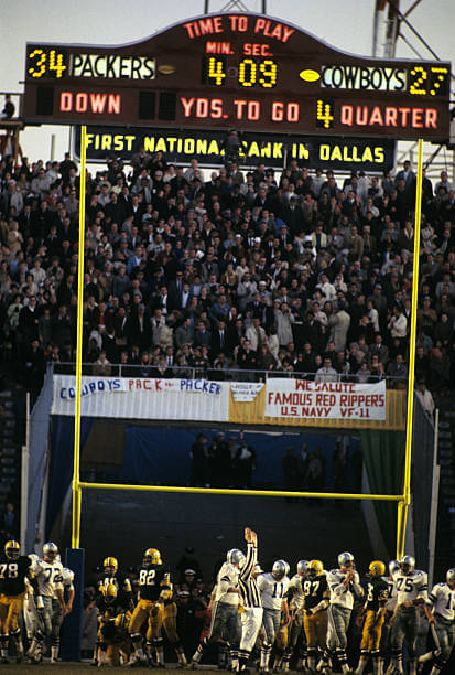


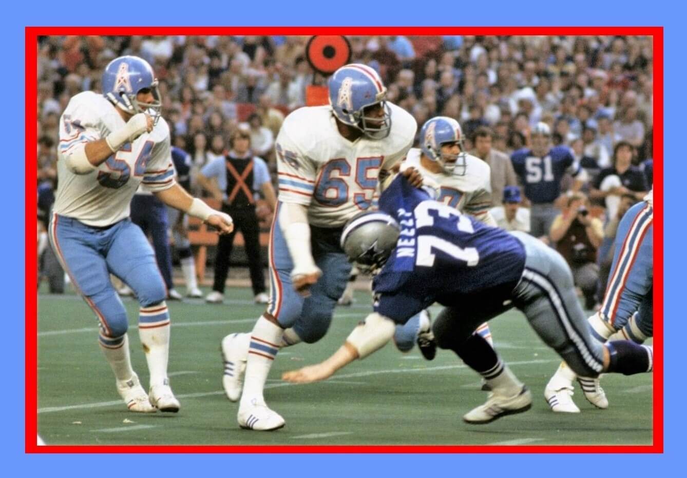
GTGFTU: 11/24/1974: Dallas Cowboys (10) at Houston Oilers (0); Houston Astrodome.
An all time classic uni combo!
When I sent this in to Phil I said this one is for Jimmer! This was one of the best uni matchups of the 70’s. My favorite uniform was the Dallas Cowboys blue uniforms from 1970-78. What was odd about this was Dallas moved the numbers on the white jerseys back to the shoulders in 1974 and they were now heat pressed, yet on the blue jerseys they were still sewn on and the numbers were on the sleeves right above the stripes until 1978. Both jerseys were made by Southland.
Bad Luck > Luv Ya on that occasion.
“…on the blue jerseys they (the numbers) were still sewn on…”
As were the name plates so it seems…looks like a slight color mismatch on #73.
Kinda surprised that Lanrdy looked the other way when it came to players hacking their sleeve stripes.
OK, I will go on record with an unpopular opinion.
The Oilers are not coming through that door. Luv Ya Blue is not coming through that door. Warren Moon is not coming through that door. Columbia blue is in Nashville now, and has been that way, for right or wrong, for over 2 decades.
The mocks, while done well, are the equivalent of Houston fans saying to the Texans “Why can’t you be pretty like my last girlfriend?”
Not an unpopular viewpoint (yours has my full-throated support!) – a rather obvious/less vocal one.
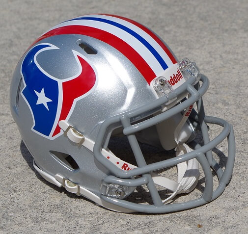
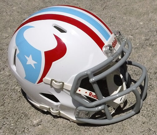
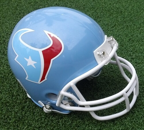
But onto the helmets – truly nice work, Andy! :
The silver is quite good in a Patriot-y/Cowboy-esque sorta way. I’m no fan of the Oilers look from that period in their (aka: Titans) history, so I’m biased against this one. Sorry.
The white with Columbia/Scarlet accents warrants high praise. It is superb, but of course suffers a bit by the use of the gray facemask…YMMV – I got that right this time : )…goes to show how awesome the Oilers branding was, is, and hopefully will be again if the Titans return in something like them to the gridiron.
The blue bucket is rather plain and the re-colored logo is sorta lost there; it would make for a decent poach job for a design-lazy high school team.
I actually like the silver one the best of the three.
The logo is indeed lost on the blue helmet, and you need stripes.
If the Texans ever introduce Columbia blue I hope they keep the navy blue as well. My only quibble with the Texans’ unis is that the logo blends in with the helmet too much. Keep the logo in the current colors on a Columbia blue helmet? Now you’re talking. And throw in some Columbia blue trim on the uni striping.
Then again I also like their red alt helmet a lot.
GTGFTS looks like the 1966 NFL Championship Game from The Cotton Bowl on New Years Day 1967, Green Bay at Dallas. The Cowboys have just cut the Packers lead to 34-27 with the extra point following a TD pass from Don Meredith to Frank Clarke, but that ended up being the final score, after Dallas failed to score again despite being inside the Green Bay 5 at the end of the game, ending with an interception by Tom Brown.
You guessed it, William!
Sometimes they have to be easy, but it’s a nice looking board at any rate.
All the details you included are spot-on. Thanks for including those.
The Pack advanced to “SB I” with this win…the 2 were re-matched the following year in the ‘Ice Bowl’.
For starters, as much as I hate to admit it, France’s primary shirt and the classic All Blacks shirt are the best of the tournament. I’m an England supporter, love the white home, don’t care for the navy away.
Second, strong encourage everyone to give rugby a shot. I know a lot of Americans do have a stand offish view of soccer, even as it becomes more popular here. But if you’re one of those Americans, trust me, rugby is nothing like soccer. Imagine an NFL game condensed down to a bit under 2 hours in which you removed 85% of the standing around and the endless commercial breaks.
It’s seriously so much fun, no sport gets my heart rate up like rugby. Rugby World Cup will be primarily on Peacock, I think NBCU will put a few matches on linear channels too (USA, CNBC, NBC etc).
If the World Cup hooks you, Premiership Rugby, the English domestic league, is also on Peacock, 18 matches per season. starts Oct 14. Then you get a minimum of 4 matches in the Champions Cup or Challenge Cup, the European/African cup competition but that’s on FloRugby which admittedly is annoying. Top 14 (France), and United Rugby Championship (Ireland, Scotland, Wales, Italy, South Africa) are also both on Flo.
There are so many solid designs in this rugby world cup preview! I don’t think I’ll ever tire of Scotland’s use of tartan though maybe less under the arms would be better.
The Irish green is a big miss for me, just doesn’t look right.
I absolutely love that third Texans helmet concept but it needs the striping from helmet #2, inverted of course.
Where’s the US kit? Oh yeah, we choked in the qualifier and aren’t in it.