[Editor’s Note: Paul is on his annual August break from site. Deputy editor Phil Hecken is in charge from now through the end of the month, although Paul is still on the clock over at ESPN and may be popping up here occasionally.]
By Phil Hecken, with Brinke Guthrie
Follow @PhilHecken
If you are here for the GRIFFINS ALTERNATE DESIGN Contest for GROUP 2, scroll down or CLICK HERE — it follow’s today’s lede!
I’m back today with my doubles partner, the one and only Brinke Guthrie, he of Collector’s Corner and tennis infamy, who will be giving you a rundown of the latest fashion trends at the US Open, which begins this coming Monday. Enjoy and be sure to continue reading after this article for the Griffins voting and more! Here’s the Brinke-man:
US Open Fashion Preview
By Brinke Guthrie
August is coming to a close, and that means tennis fans are geared up for the U.S. Open, which kicks off in three days at the USTA Billie Jean King National Tennis Center in New York. Tennis players are geared up as well — this is the last chance in 2018 for manufacturers to show off their stuff.
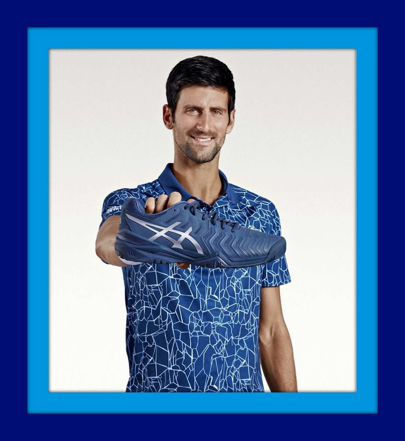
Novak Djokovic (above), the rejuvenated winner this summer at Wimbledon and last week in Cincinnati, will sport the Lacoste Men’s Sport Print Technical Jersey Polo X Novak Djokovic (whew, wait, I’m not done) On Court Premium Edition. He’ll pair it with this jacket for a coordinated look. He’ll have a coordinated look on his feet, too- he signed earlier this year with Asics for shoes, moving over from Adidas, and this is the GEL-Resolution Novak colorway he’ll wear at the Open.
Serena Williams has a rather distinctive look planned for this year’s Open. Virgil Abloh is the men’s designer for Louis Vuitton, and he’s come up with what can only be described as a non-traditional Nike dress. (Non-traditional and Nike do seem to run into each other now and again.)

Since this is New York and not, say, Wimbledon, players have a lot of latitude in what they can wear on court. It’s a “one shoulder” design that has the words LOGO and SERENA boldly displayed, with different versions for daytime or evening play. Oops, can’t forget the shoes, either. More looks here, here, and here. (What’s up with the green tag thing? Is she gonna have that on her shoe when she plays a match?) Here’s a graphic showing some of her past USO looks.
Elsewhere in Nike land, defending women’s champion Sloane Stephens wore Under Armour for her Flushing Meadow win in 2017, but she signed a shoes/clothing deal with Swoosh earlier this year, and you will see her in this orange dress. She can light up the court with her dazzling smile as well as her ground strokes, so this color is a good choice for her. Her Air Zoom Zero shoes match, natch- the first Nike tennis shoe to have full-length curved Zoom Air bag for cushioning. That will come in handy for the punishing USO courts.
Sloane is also the tennis face of a new casual sportswear line from Nike called the Sport Pack. Nike has also recently released a new La Cortez sneaker, the second such design via Maria Sharapova. Tying in her “Sugarpova” brand, this shoe has a lollipop on the heel.

On the men’s side, orange/blue is the color scheme of choice, as seen on Denis Shapalov. Women’s #1 Simona Halep just received a nice special edition gift from Nike for winning the French earlier this year; the Zoom Vapor X Simo with her name on the heel. You Never Forget Your First, after all.
Speaking of the embattled Under Armour — they won’t have much presence in New York. It’s rumored that UA is phasing out their tennis involvement, but they never embraced it, anyway. As we said, Sloane skipped town for Nike. And Andy Murray’s deal is almost up — they never even made his shoe available to the public (maybe since it’s a reverse-engineered Adidas Barricade, so the rumor goes. Murray will soon be looking for a new shoe/clothing home, if his hip holds out.
Fila has quite a few top name players under head-to-toe (shoes and clothing) deals. Former USO winner (2014) Marin Cilic is always one to watch with his gigantic serve; he’ll be wearing the men’s Legends Collection in saturated green contrasted with gray and white; same for fellow Fila guys John Isner and Sam Querrey. On the women’s side, leading player Karolina Pliskova will sport the Heritage Collection with stars and stripes appropriate for the USO.
Adidas has a ton of players under contract and you can see their USO lineup in this Instagram video. Caroline Wozniacki will, as per usual, hit the courts in her “Adidas by Stella McCartney” line.
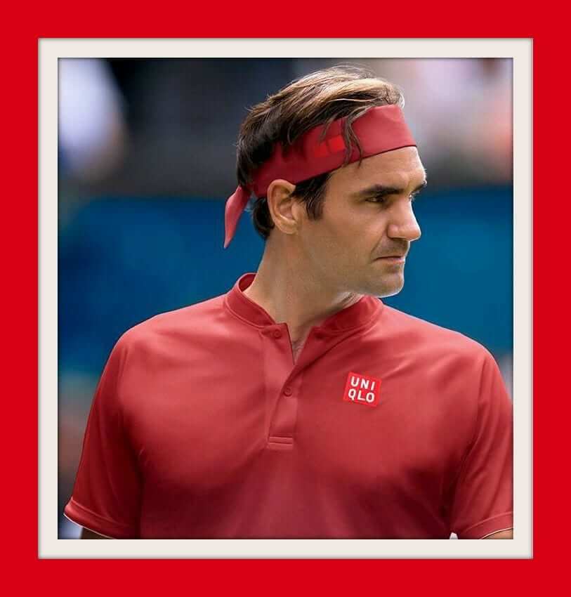
As far as the men’s GOAT Roger Federer, he started a new 10-year deal with Uniqlo at Wimbledon — it will run long after his career ends. You can pre-order his debut Wimbledon stuff here, and here’s what his USO look will be. I always looked forward to the fun stuff he did with Nike surrounding the USO- whether it was emoji T-shirts or one-off Brand Jordan collabs. There’s no doubt Fed and his management are savvy business operators — he’s pulling down some serious coin from the Japanese mega-retailer.
However, Uniqlo badly botched (IMO) their deal with Djokovic, who escaped to Lacoste. Never once did I see his signature clothing in one of their stores. You’d walk into their huge SF Union Square store, ask for it, and … get a blank stare. Novak who? OK. Well, They’re a lifestyle brand, not an athletic line. They even admit this on their website. “Uniqlo is not a sports company. Uniqlo describes itself as a life company that creates LifeWear™, thoughtful everyday apparel with a practical sense of beauty, and constantly improved through craftsmanship and technology.”
Mwah mwah mwah.
Tennis fans will soon see that Uniqlo can’t come close (again, IMO) to marketing Federer globally the way Nike did — no one matches Nike as far as marketing — but hey, they showed him the yen, er, money and he said “deal.” UniFed stuff is supposed to roll out to their stores starting in early 2019 — I’ll believe that when I see it, and hope it comes in sizes other than XS, S and M, as most of their stuff in the USA seems to do. As of this writing, possession of his RF logo still resides with Nike, and he’s still wearing his RF Nike sneakers, though to my knowledge he is not being paid to do so. Yet.
In tennis these days, pretty much every pro wears clothing and shoes from the same company. Not like the old days with Bjorn Borg, who took it to the extreme. He wore Fila everywhere but Scandinavia (Jockey), Diadora shoes everywhere but North America (Tretorn) and Donnay racquets everywhere but North America (Bancroft.) Since Uniqlo doesn’t make tennis shoes, Federer is still a sought-after free agent on the sneaker market. Djokovic was already with Lacoste, so Asics made sense for him, since Lacoste doesn’t make competitive sneakers either. My bet is Federer signs with Asics or Adidas for sneakers, getting a signature shoe in the process.
Curiously, Nike is still releasing new RF logo gear — even for women, which I have never seen before. (The “Fall RF Advantage NY Polo is the design Roger was going to wear in New York had he stayed with Nike, as these designs are done far in advance- I’ve read up to 18 months out. Maybe a new ad campaign here; Just Buy It Anyway- Roger Doesn’t Wear It, But YOU Still Can!)
As always, money makes the tenni$ world go ’round.
* Thanks go to Malherbe Pelser (ASICS), Luis Hernandez (Fila), and Melissa Pastore (Lacoste) for supplying images. *
Thanks, Brinke! Give him a follow on the Twitter @brinkeguthrie!

Griffins Alternate Design Contest – Second Group of Submissions
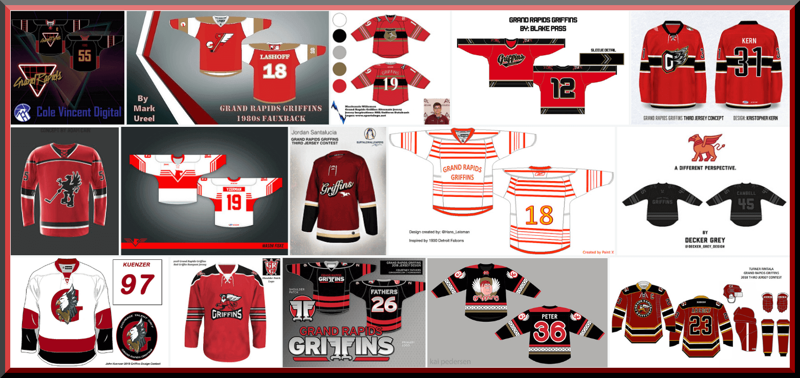
Today we begin voting on the second group of contestants for the third annual Grand Rapids Griffins design contest. In case you missed it, the contest parameters and rules were laid out here.
We’re using a new polling system, which we hope will eliminate (or at least drastically reduce) any fraud or shenanigans. You will be permitted to vote for as many designs as you would like, but you may only vote ONCE. The poll(s) will close approximately twenty-four (24) hours after being posted — the TOP THREE vote recipients will move into the final group (the winner of which will be chosen by the Griffins).
Today the lede will focus on the second 15 submissions. Subsequent days the designs and voting may be a sub-lede, so please be sure to check back and check the full post each day.
You will also notice the polling system looks different — I want to give my great thanks to Larry Torrez, who worked with me to come up with the poll you’ll see below in an aesthetically pleasing format as well! Great work ElTee (of DC)!
REMINDER: The Griffins set out the following parameters for designing an alternate jersey. Please use them to guide you as you make your decision(s) below:
• Create a brand new design for a Griffins alternate jersey (remember: you are ONLY designing a jersey, not a full uniform).
• While your design work must be original, you MAY use current or previous Grand Rapids Griffins logos.
Therefore, while some of the submissions you see below may include gloves, helmet, pants, etc., you are ONLY voting on the jersey design. Please keep that in mind when casting your vote(s).
OK? That’s about it. First I’ll display all the submissions for today, which will be followed by the new (sharp-looking and hopefully cheat-proof) poll. Click to enlarge any image below.
A: Cole Vincent

B: Mark Ureel

C: Mackenzie Willemen

D: Blake Pass

E: Kristopher Kern

F: Adam Cain

G: Mason Fiske

H: Jordan Santalucia

I: Hans Leisman

J: Decker Grey Herfuerth

K: John Kuenzer

L: Dennis Healy

M: Courtney Fathers

N: Kai Pedersen

O: Turner Rintala

And there you have it. Your second 15 submissions. And now, to vote, here’s the poll — to start, click “ENTER” or hit “SUBMIT”; once you start the poll, the reader design will appear next to the name and you may select as many designs as you like. Once you have finished voting, be sure to scroll to the bottom and hit “ENTER” or click “SUBMIT” to make sure your vote(s) are counted! That’s it!):
The Ticker
By Kris Gross

Baseball News: Matt Holiday didn’t have black cleats, so the Rockies gave him an old pair from his previous stint with the team (from Brian Murphy). … Not sure why, but the Tigers wore their Players’ Weekend jerseys yesterday. … Khris Davis also got an early jump on Players’ Weekend with his belt last night (from Samuel Lam). … Imagining classic MLB nicknames on Players’ Weekend jerseys. … Cubs 3B Kris Bryant will wear three different cleats for Players’ Weekend, all expressing his hope that MLB players will be allowed to play in the 2020 Olympics. … Here are more Players’ Weekend cleats, for Yankees 2B Gleyber Torres and Reds 2B Scooter Gennett (from Matt Shevin, Steve Hemsath). … It sure was a colorful matchup between the Hiroshima Carp and Tokyo Yakult Swallows yesterday (from Graveyard Baseball). … We are down to the seven finalists for the new name of the Green Bay area collegiate team.

NFL News: The Panthers are going with a new uni combo, blue on black, against the Patriots tonight. … In his new book, Aaron Hernandez’s lawyer said the former Patriot once sold his jersey number to Chad Ochocinco to finance a drug deal (from Al Kreit).
College Football News: New wordmarked paint has been laid down for Oklahoma (from Sam McKinley). … Conference USA teams will honor former commissioner Mike Silve and promote prostate cancer awareness by wearing Mike Silve Foundation helmet stickers (from Griffin Smith). … Here is a great history of Nebraska’s Blackshirts logo (from Bryan). … New jerseys for University of Mary (from Dustin). … Not sure if this will transfer to game day, but we have some bumper inconsistencies from Georgia practice (from Chance). … There are new rules involving knee pads this season (from Jerry Kulig). … An Arkansas high school has pulled a logo that is similar to Arkansas State’s. … Good spot by Wade Heidt, who noticed that the University of Calgary Dinos have made a change to their helmets. Last season their helmet logo was outlined in white, where there’s no white outline this year.

Hockey News: The Canucks will wear four different jerseys this upcoming season.
.

Soccer News: Arsenal and Adidas have agreed to a five-year, $385 million contract beginning next season (from Aashish Shah). … Scottish team Rangers’ midfielder Ryan Jack’s shirt was missing the team crest and maker’s mark, but of course, not the ads (from our own Jamie Rathjen). … Here is the logo explanation for Austin FC, a potential new MLS team (from Mike Barnes). … Southampton FC will wear Scope, a charity, on their shirts this weekend (from Josh Hinton). … New crest for Virginia (from Nate Rathjen).

Grab Bag: University of Mary athletics has a new logo (from Greg Enkers). … The Geelong Cats of the Australian Football League will unveil new guernseys this week (from @j_foreigner). … This announcement photo for the Tiger Woods/Phil Mickelson one-on-one has Tiger hitting a left-handed driver (from Chris Flinn). … We have another apostrophe catastrophe (from Greg Prince).
The Canucks will wear four different jerseys this upcoming season. – Wording is incorrect. They will wear them in the 2019 – 2020 season, not this upcoming season (which is 18-19).
Can we know who won yesterday’s round of voting?
I’ll have the results of yesterday and today’s voting on Monday.
The Canucks won’t have have four jerseys until the 2019-20 season. It looks like they’ll only have two this season.
-The linked story today with quotes from the Canucks’ COO did provide some limited info. It will be a brand new jersey that is launched in conjunction with 50th anniversary. I would think the main crest will be either Stick-in-Rink or Johnny Canuck, but no hints.
-If Canucks Sports & Entertainment will be making the effort to change the colours of seats in the arena, then please just do something to at least improve the primary uniform.
If the team is keeping the orca, the current jersey can be improved with minor changes. Remove the Vancouver text from above the logo. Add a bit of green in the logo, like this:
link
As a Canucks fan, this minor improvement would be an upgrade to me. Would allow the complete team colours of blue and green to be part of the primary logo when it stands alone.
What’s interesting is that they’re celebrating their 50th anniversary next year (2019-20 season), after celebrating their 40th during the 2010-11 season. (You could say they celebrated their 40th season that year.)
The 04-05 lockout really screwed everything up.
The White Sox also wore their Players’ Weekend jerseys in that game.
I hope that Austin soccer team never wins a game for that stupid logo explanation
“FC Tradition?” Seriously? Same cookie cutter trash that the league has put out with every new team in the last several years, only in this case FC stands for “F*ck Columbus.”
Question. Does the Panthers’ black pants qualify as BFBS since it is a team color?
No. Black is their primary color. Changing a uniform element to black is in line with their identity.
What Greg said. The team has always been link, so this is not a BFBS case.
This uniform combination has a unique characteristic. It is a throwback nod to the early prototype uniform that never made it to the field. Throwback to a time before the team existed on the field.
link
This current uniform combo would look better with a black helmet though.
Agree, the black pants make sense, but not with a silver helmet. is just looks off balance. For football uniforms they work well when the helmet and pants are the same color, if they aren’t going to be the same color than they look good going dark with the helmet lighter down to the pants.
Carolina would look good with blue/black/blue, or black/blue/black. The silver helmet really limits them to silver or white pants for now.
Yes they need black hats to wear with the black britches
It just sounds so weird to me when people call football helmets, “hats” and pants, “britches.”
The White Sox and Tigers opened their four game weekend set with a day game yesterday, hence the Players Weekend attire. Not sure I’ve ever seen a non makeup Thursday day game opener before.
Never? It just happened two weeks ago between the Yankees and Rangers.
DAY game. The Rangers-Yankees game was an evening game, and evening games to open a 4-game weekend series happen all the time. The Sox-Tigers game was an afternoon start, and that is not common for a Thursday four-game opener. Even the Cubs haven’t done that this year.
So far the only other Thursday day game at the start of a 4-game weekend series I’ve found for this year is Houston at Texas back on March 29th to open the season (that was a 2:35 CT start).
Clarification: I meant the Cubs haven’t hosted such a game, but they were involved in one.
Here, as far as I can tell, is the complete list of Thursday day games that opened a 4-game weekend series this year:
(times listed are local for the home team)
Chicago Cubs at Miami Marlins – 3/29, 12:40
Los Angeles Angels at Oakland Athletics – 3/29, 1:05
Houston Astros at Texas Rangers – 3/29, 2:35
Boston Red Sox at Tampa Bay Rays – 3/9, 4:00
San Francisco Giants at Los Angeles Dodgers – 3/29, 4:08
Atlanta Braves at Cincinnati Reds – 4/26, 12:35
Detroit Tigers at Kansas City Royals – 5/3, 1:15
Cleveland Indians at Chicago White Sox – 6/14, 1:10
Chicago White Sox at Detroit Tigers – 8/23, 1/10
Also, note that the Mets and Phillies were scheduled for a 4-game series on August 16-19, with the first game scheduled for Thursday at 7:05. However, because of a postponement on 5/12, they ended up playing a doubleheader on 8/16, with the first game started at 4:05.
Tigers wore their costumes yesterday as they play a four game series against the White Sox.
Those Green Bay wood-bat team names are … not terrible. But most of them are way under-thought. Like, supper club is a terrific place to start developing a team identity, but with even a teensy bit of thought, you drop the “supper” from the name. You can communicate that with the team’s graphics – there’s definitely a supper club aesthetic, including for type treatments like you’d use for jersey scripts – and the name “Clubbers” expands the meanings while shortening the name. Both huge virtues in team branding. The same basic point could be made about most of the candidates. They’re mostly OK ideas that need to be taken beyond the first words shouted at the brainstorming session.
The only exception is Under Dogs, which doesn’t belong because A) Underdog is one word, not two; and B) A baseball team should not be named after a football team, which is what the name refers to.
I’m less than a fan of all of them.
Like you say, underthought. With team names, you have to think out the worst-case scenarios. I don’t think that was done here.
1. Green Bay Booyah. A team name to remind everyone, on a regular basis, that Stuart Scott is dead.
2. Green Bay Cheese Curds. Probably my favorite of the bunch, but then they’ll just be the Curds, and at some point, we’ll get someone making a joke about the Curds being driven out of someplace.
3. Green Bay Old Fashioneds. Really? You’re disconnecting the name from anyone under 21 (or more like anyone under 40), and once you separate it from the drink, it’s just … old-fashioned. The team has said they’re going to play in a ballpark with an entirely digital outfield wall. That sounds like a team that’s really … old-fashioned.
4. Green Bay Supper Clubbers. I like your thinking, but again, Supper Clubs are kind of an old-fashioned concept, so see #3.
5. Green Bay Tailgaters. Also not awful, but to me, this almost implies the pre-game is more important than the game. You’re obliged to have some sort of tailgate activities going on if you name the team this, I think.
6. Green Bay Under Dogs. First off, yes, it’s one word. Secondly, you’re basically saying, “Yeah, don’t expect anyone to think we’re good from the beginning. I mean yeah, we’ll score an upset sometimes, but no, we’re Under Dogs.”
7. Green Bay Wurst. Only here would we name a team the worst, er, Wurst. I can see the headline now: “Wurst live up to name, finish last.”
I’m not a fan of most of them, but compared to the dreck we usually see these days, these seem like mostly adequate options to me. “Not terrible” is high praise in modern minor-league baseball nicknamery. I mean to praise the list only to the extent of damning faintly.
But one thing I disagree about: Every team name can be nicknamed and punned to ridicule the team in headlines. So it’s never a valid argument against any particular nickname that it can be shortened or used in derogatory puns. Even Wurst, with its obvious homonym, is no more liable to negative headlining than any other nickname. Plus, the day the team wins a pennant, the headline writes itself: Wurst to First.
And, they don’t NEED a new name. Bullfogs works just fine. It has some brand equity around here, with no negatives I know of. And, yes, the mascot is Jeremiah.
They will be moving to a new stadium – which is much needed. The new place is actually in a suburb named Ashwuabenon. But like the USHL team and the indoor football team that play in the arena in Ashwaubenon, they will use the GB moniker.
The announcement did leave wiggle room to keep Bullfrogs or pick something else.
Oh, and I don’t like any of the choices, but Booyah is the least objectionable to me. And the most “local culture” of any.
The Serena Williams Nike stuff is all part of a phenomenon Nike series called “off white.”
Link for more explanation; link
I’m a self proclaimed “sneaker head” and day one Uni-Watch reader, I was the 12th posted member card. These shoes sell on the secondary market for thousands of dollars, and yes, they do keep the green or red tags on the shoe when worn.
I was just at a the Sole Exchange sneaker convention in Brooklyn last weekend, saw several pairs of Nike “Off-White” Jordan I’s, $1,700 and up, and damn are they beautiful.
Serena is gonna have the most clout for the open thats for certain. That being said, those shoes are ugly and seeing some of the other Off-white x nike shoes, he could have done better
“Off White”
LOL (but not necessarily in a good way)
Off-White isn’t part of Nike. It’s a standalone fashion label started by Virgil Abloh that frequently collaborates with Nike. They’ve done numerous collabs with labels like Kith, VLONE, Moncler, Vans, Umbro, just to name a few.
Demitre, “off-white” is def part of Nike, they are sold through Nike channels, these designers and other brands collaborate with Nike. Nike would never allow some other brand to use their silhouettes and logos without owning the rights.
This is very, very wrong. Just look up Off-White. Nike owns none of it. You do realize how collaborations work, right? Since you’re a “sneakerhead”, does Nike also own ACRNYM? Or how about Pendelton? Nike just works with Off-White. Please stop spreading misinformation.
I really dislike Oklahoma’s new wordmark font. The “O” doesn’t even match the “O” on their helmets. Stupid.
That’s not an “O” on their helmet… it’s a ZERO!
Great write up Brinke but I think you may be misinformed in terms of Borg using Donnay rackets and Diadora shoes everywhere but in in North America.
While it is true that he did use Bancroft and wear Tretorn early in his career (circa mid 70’s) at the US Open/North America he switched to Donnay and Fila by the late 79’s /early 80’s for the US Open/North America as well.
yeah I should’ve added that. By 1980 or so Donnay and Diadora were worldwide. Bancroft/Tretorn had some type of corporate relationship so that might’ve explained the deal with him. Given that Tretorn Nylite sneakers are little more than slippers, I still can’t fathom how he could wear those. Only male player I ever saw wear them.
The Bancroft rackets were just his Donnay rackets painted with Bancroft colors/logos.
See, I knew there was a rumor of a PJ, but didn’t know who was copied. Do you have a URL that states that for sure?
Well done Brinke. Not normally a tennis fan – but I will be now for next 2+ weeks!
The green tag on Serena’s shoe is part of the Off-White aesthetic. They’re basically just zip ties with a tag for branding. They’re usually done in red but I’m assuming they went with the green to match the tennis ball this time.
re:canucks, they will be wearing four different jerseys in the 2019-20 season and NOT THIS SEASON. that is to coincide with their 50th anniversary season
Those Canucks jerseys are for the 2019-2020 season…. their 50th anniversary.
I’m sure this will piss some people off but for me, the jersey contest is lacking something this time around. I voted both days because I respect everyone’s participation, but honestly my votes had little to no conviction – More like eh, this one and I guess that one. No design has stood out (yet) like in years past. Is it a lull in enthusiasm? There were half as many entries as last year. Last year I remember several designs that would be easy finalists this year not make the cut. Unless something changes Monday or Tuesday I think this will be a year that the “best” design doesn’t win… simply because there isn’t a “best” design, just many on the same level.
the Griffins jersey contest feels MEH because of the “never as good as the first time” principle. I am so tired of looking at those jerseys since it happens every year how can you not feel “MEH”.
the winning jersey should be one with a Griffin Jumping a Shark
but i still love the website and hit it EVERY day FOR FREE
#Uniwatch4Life
The lack of a theme really made it tough to come up with anything for this contest. I feel like they’re all just randomly thrown together (mine included).
The lack of a theme made it a little bit tougher for me. I feel like I submitted a randomly thrown together design.
As far as wearing the Players’ Weekend unis on Thursday, I wonder if the Tigers and White Sox got an early start on them because the Tigers are planning on retiring Alan Trammell’s number on Sunday, and maybe possibly want to wear their regular uniforms that day? So by wearing their PW unis on Thursday, they can get the 3 days in.
It would seem to be confirmed, after I asked the Tigers’ Twitter feed. They do plan on wearing their regular unis for Tram’s uni retirement ceremony on Sunday.
link
Man, would have been nice if this round of Griffins jersey voting wasn’t under a “US Open Fashion Preview” post. I totally missed it.