As we approach Super Bowl LVIII (aka Supe 58), it’s time for a ranking of every SB uniform pairing ever played, going from worst to first. Of course, these rankings are largely subjective, and I’m sure you won’t agree with the order of my selections. After literally hours of finding and grading all 57 games played to date, I’ve come to the conclusion that ranking games ain’t easy — sure, there are some stinkers and some absolute all time glorious-looking games, but the middle-of-the-pack uni matchups can be a bit tricky.
For my rankings, the most important criterion is how both uniforms look together; we can have games where one of the two uniforms is fantastic, but the other is not. By and large, two good uniforms opposing one another will rank higher than just a single great uni. But there are times when both uniforms may look tremendous individually, but when paired together, the matchup as a whole isn’t as good as the individual parts. Where a game was played (as well as time of day) also factors into it: dimly lit dome games are likely to rank lower than games begun in sunshine, with all other factors being equal. Colors also play a part: if two teams have essentially the same colors, that may either work for or against the overall matchup, depending on where they appear (helmet, jersey, pants). Finally uniform styles — be they classic or modern — will affect the rankings. Two things that are not considered in the uni matchups will be the quality (or final score) of the game (close games and blowouts are factored equally), nor will a team’s success in a uniform be considered. For example, the Patriots’ “Flying Elvis” uniforms of the Brady years may have been successful in terms of Super Bowl appearances, but that factor alone does not for a good uniform make. Conversely, many Broncos fans may consider the orange jersey “cursed” but that will not affect their rankings in terms of being a good or bad uniform.
The Rankings will be divided into four parts, in ascending order — yesterday we looked at the 14 “worst” matchups, and what follows are the third-best 14. Next Saturday it’s the second best 14, and on Super Bowl Sunday, I’ll finish up with the Top 15 best uni matchups in SB history.
Remember, it’s all subjective, so feel free to disagree in the comments below.
St. Louis vs. Tennessee
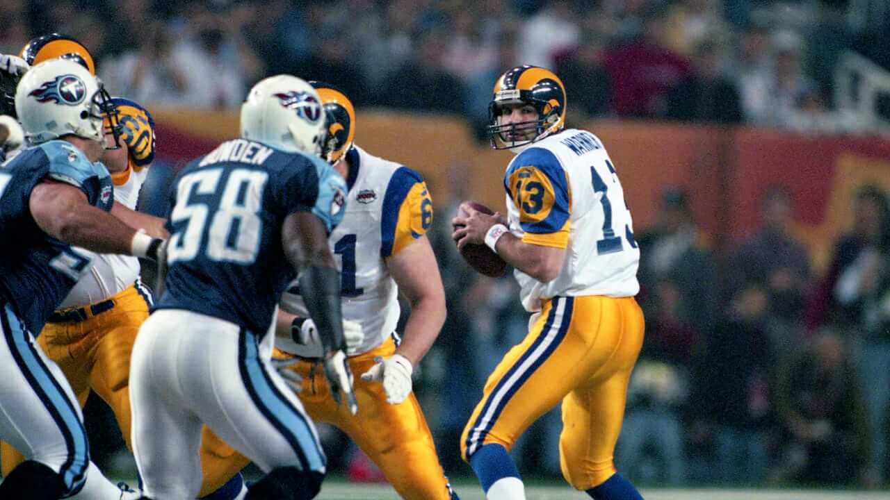
Oh what could have been. If only the Titans could have made a Super Bowl as the Oilers, especially against the (LA) Rams, this might have been Top 15. Instead, we got the Titans with their funky fonts, shoulder yokes and weirdly striped helmets. And it was the last time the St. Louis Rams would ever wear these uniforms.
Green Bay vs. Denver
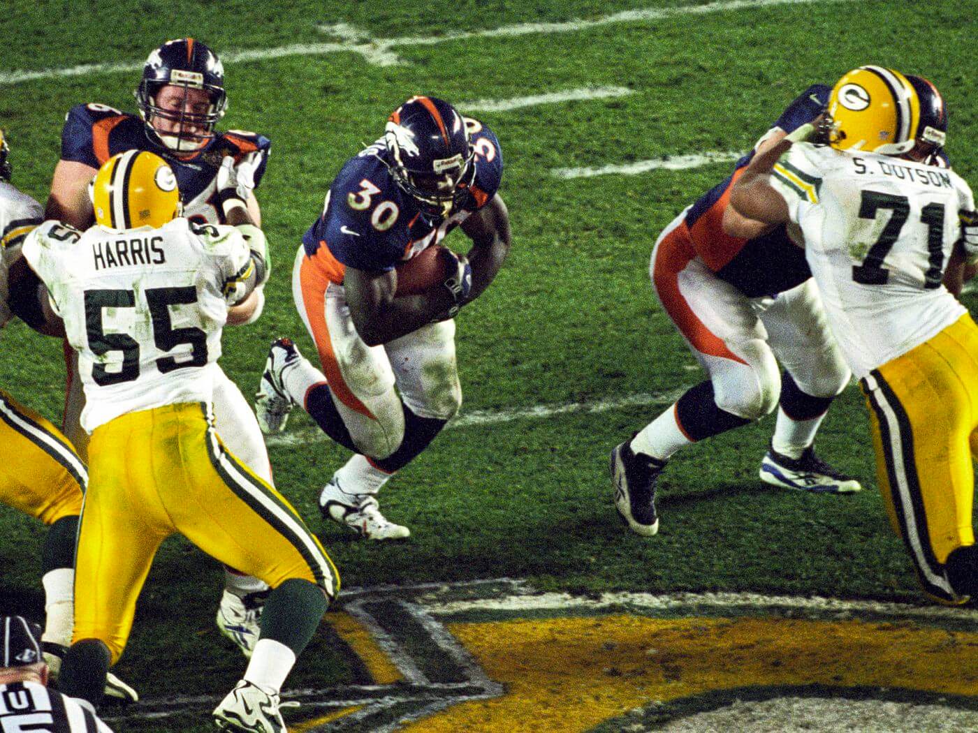
I firmly believe that if Denver hadn’t immediately won the first of their two straight Supes wearing their then-new Nike parentheses uniforms, they’d have been retired long before now. It actually was a pretty good matchup, contrast and colorwise, but the modern vs. classic uni battle — begun the year before with the Pats and Pack — would usher in a new and decidedly less-pleasing era of uniform design for the next two decades.
Los Angeles vs. Pittsburgh
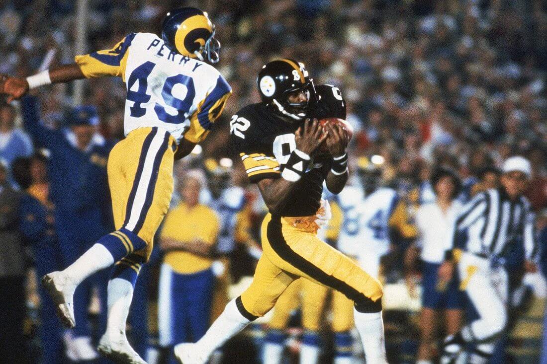
Here’s one of those examples (like the one to follow) where the sum of the parts is much better than the total. Both the Steelers and Rams have outstanding unis in this Supe, but with both teams in gold pants, it was almost too much gold.
Pittsburgh vs. Green Bay
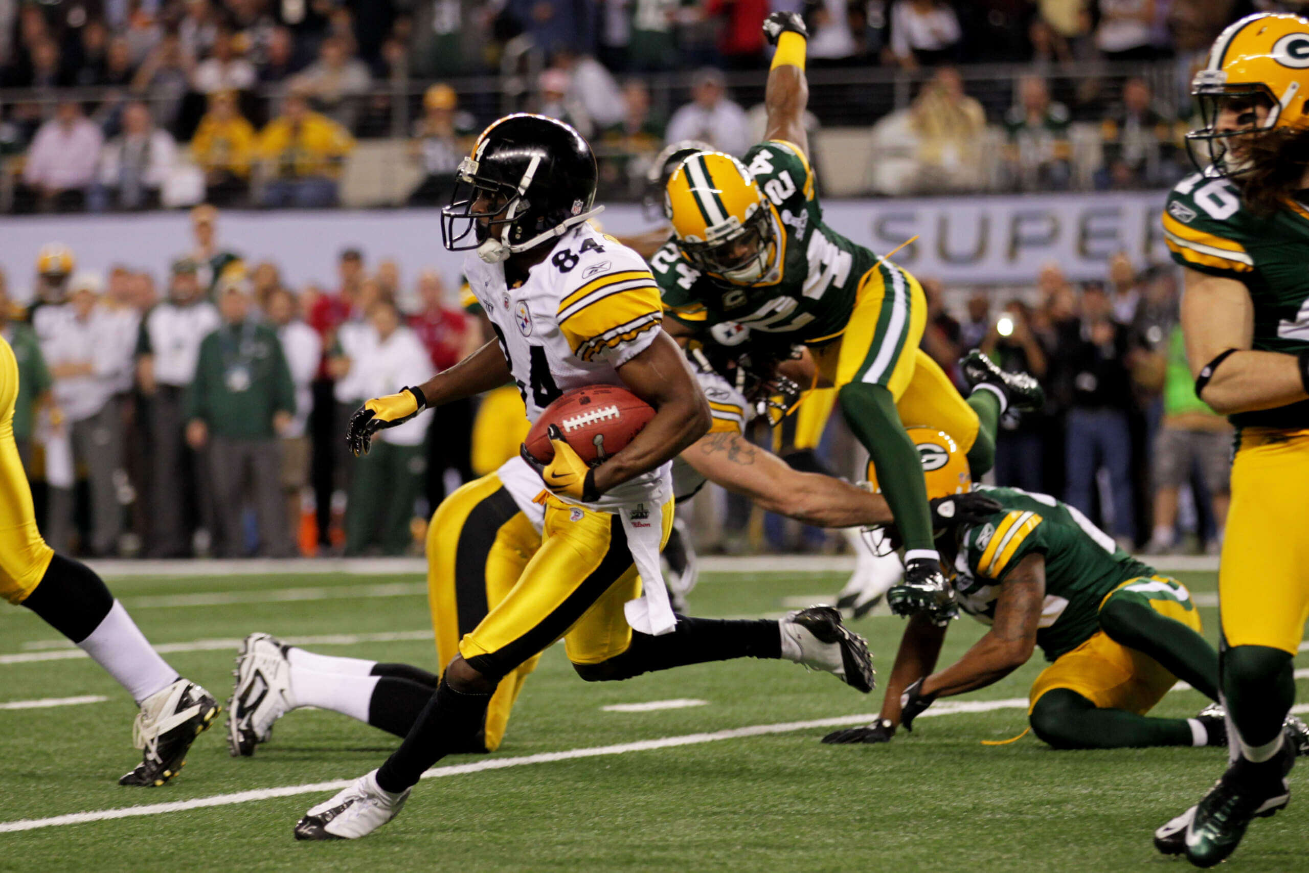
Much like SB 14 above, this one also suffered from a gold overload. I think GB has the best home uni in football (and Pittsburgh’s roads are really nice too), but they just didn’t play well with each other.
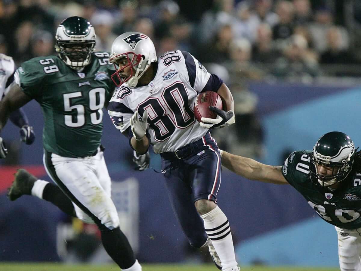
Philadelphia vs. New England
Following the “too much gold,” we have the second set of uni-rematches, this time featuring the Eagles and Patriots. I don’t hate the Eagles midnight green unis as much as others, but when matched up against the Pats Flying Elvis side panels, it’s not a super look.
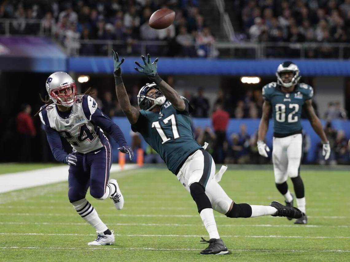
New England vs. Philadelphia
Despite the thirteen year gap between these uni-rematches, both uniforms are essentially unchanged. The biggest difference was the Pats won SB 39, while the Eagles had their revenge in SB 52.
Kansas City vs. Tampa Bay
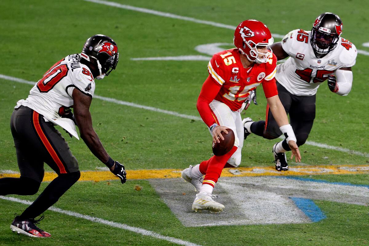
This one could have been the worst looking Supe of all time, but fortunately, the Bucs jettisoned their gadawful “alarm clock” unis just before this season. And while their new/current look seeks to replicate their 1997-2013 duds, unfortunately Nike can’t quite get the shade of pewter correct. The pants are more an anthracite than pewter, giving the appearance of almost solid black pants and socks. KC’s unis are fine, but it takes two to tango.
Carolina vs. New England
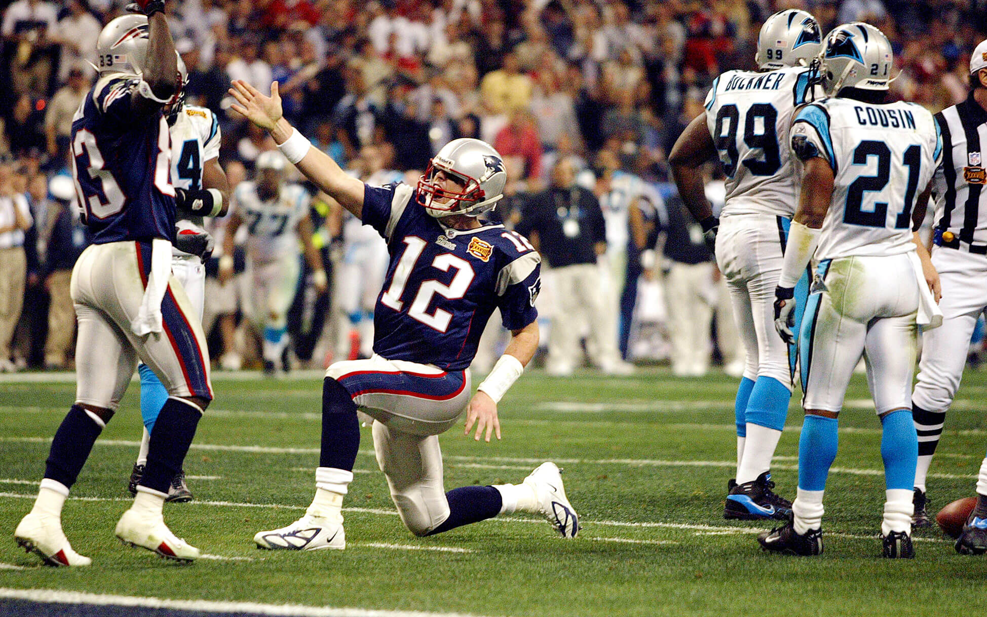
It’s perhaps a testament to the staying power of their original look, but the Panthers uniforms haven’t changed much since the team was born in 1995, and their silver/white/white look is perhaps their best. This one would have been much lower if Carolina had worn silver/black/silver, as both teams would have been in same-color hats and britches. Fortunately, they did not.
#35: SB 56
Los Angeles vs. Cincinnati
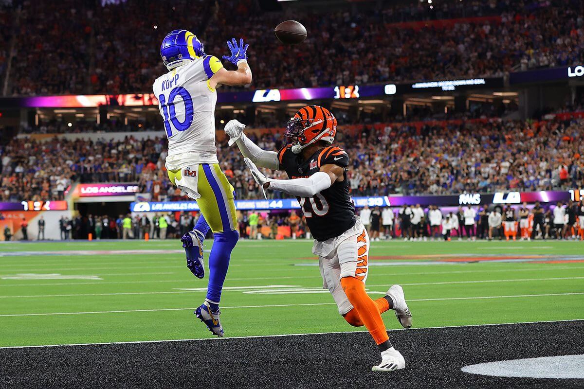
Here’s another Supe that could have looked much worse — fortunately for us, the Rams and Bengals (both fresh off recent redesigns) each wore their Sunday best for this game. For a pair of teams with “modern” uniforms, this one was surprisingly attractive.
New England vs. Los Angeles
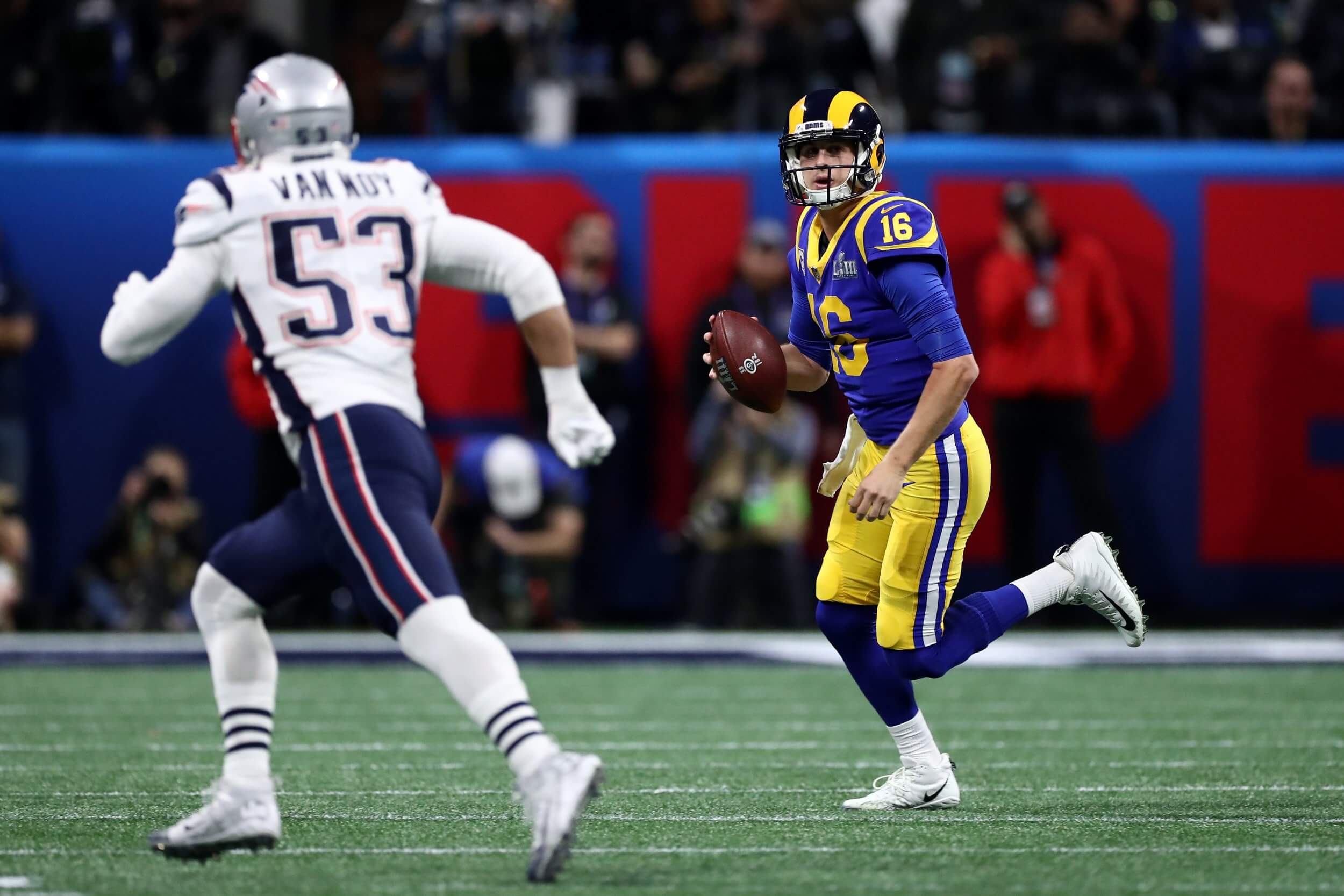
If you’re sensing a theme with LA here, you’re right: this is another Supe where it could have been sooooo much worse. If you’ll recall, the Rams were in the midst of transitioning from their terrible St. Looey uniforms, and fortunately they received special papal dispensation to wear their throwbacks for the season. (The Uni Gods permitted them to wear their throwbacks as their primary that season.) The result was a pretty decent looking game.
Minnesota vs. Miami
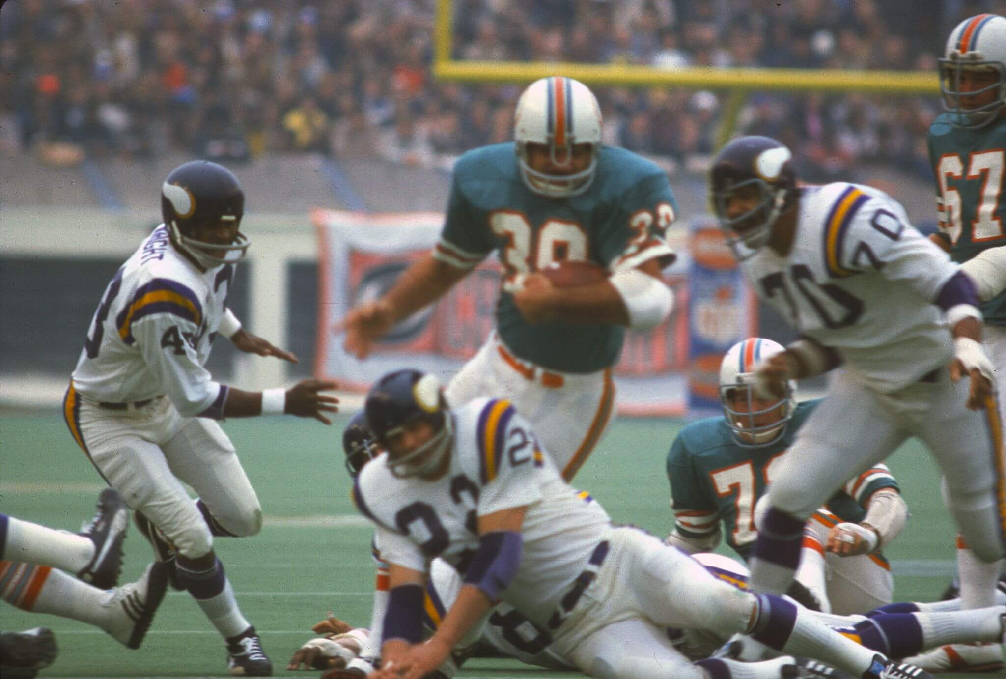
I bet you’re surprised to see one of the first 10 SB’s this low on the list, and this time it’s not 100% the fault of the unis — although it would have looked better if the Vikes were in purple tops. It was a cool (50°) overcast day in Houston’s Rice Stadium, and the early-gen Astroturf just added to the anticeptic look. Normally vibrant, Miami’s aqua jerseys looked as blah as the day and the stadium.
Miami vs. San Francisco
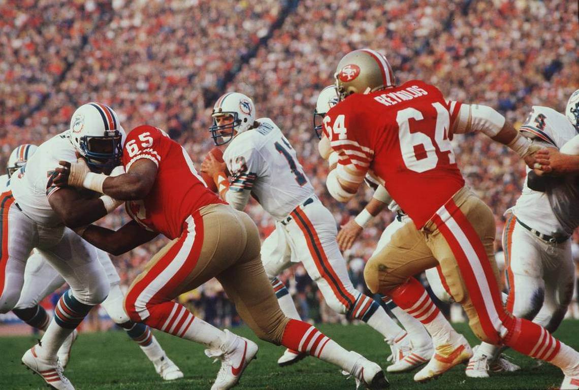
As we approach the end of Part II, we’re starting to get into some relatively good looking games, and the 49ers and Dolphins certainly wasn’t a bad lookng game by any means. My only problem with this is the really fat pants stripes on SF, and Miami’s aqua face masks.
Washington vs. Denver
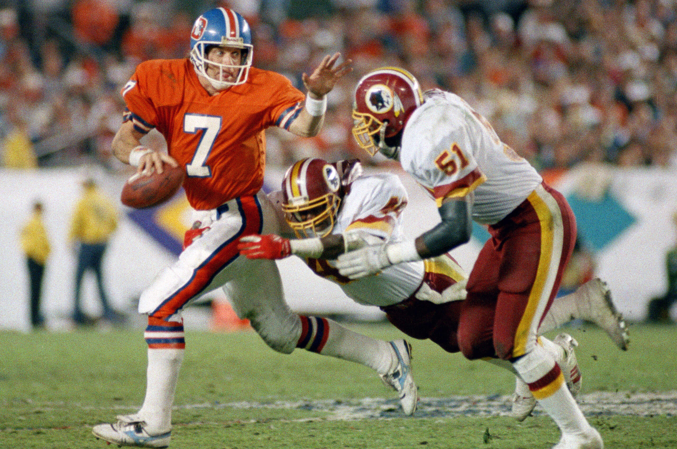
It’s hard to find fault with either team’s unis (and Denver in royal over orange is glorious), so this one comes down to the burgundy/orange combination, with Washington’s gold and Denver’s royal blue adding just a couple too many colors into the mix. Not a bad looking game, but there are still 30 better.
Pittsburgh vs. Minnesota
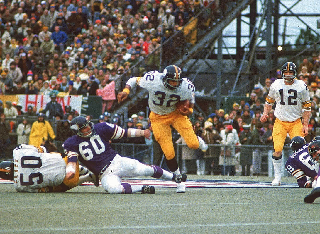
Here’s another Supe where we’ve got a pretty good uni matchup, but it’s taken down a notch by the weather and location. It was another mostly cloudy and cold (46° at kickoff) day, played on the poured concrete and astroturf of Tulane’s stadium. The result was a less-than-vibrant combination of purple, white and gold.
As I mentioned at the outset, feel free to disagree in the comments below.
Miami had 4 different stripe patterns on that uni good lord
Personally I love the Panthers silver, black, silver. Regardless in reading your comments, you mention how the early astroturf detracts from the game! I agree wholeheartedly! I still believe it takes away from I’m the game today, especially when throwback uniforms are used! Have you or Paul ever considered writing on the aesthetics of games played on turf? I keep wondering if I am one of the few who seldom watches football or baseball when played on non-grass fields!
I think Phil is too hung up on the shade of the Bucs’ pewter pants. He’s referenced it before as a problem, but the Bucs’ modern day pewter pants look really good with both the white and red jerseys. It’s a top 10 NFL uniform as long as they don’t wear white pants. Bucs-Chiefs was very pleasing to the eye imo.
I prefer the lighter shade of pewter the Bucs wore before the digital clock redo. When they switched back to the 1997-2013 uniforms (or a pretty close approximation), they kept the darker pants that they’d been creeping toward over the course of that set. Look at pictures of their 2002 team to the current one and the difference is pretty obvious, it’s now more of a dull charcoal/brown.
Is Denver’s most recent past uniform color really royal blue? When I think of royal blue, I think Colts or Bills, and the Broncos wore a noticeably lighter shade – although that may have just been the helmets in the same way that the Giants and Rams wore helmets that were darker than their royal blue jerseys.
It’s definitely more a royal blue than anything else. “Royal blue” isn’t a precise shade, it basically represents a fairly wide spectrum that’s lighter than navy blue and darker than baby blue.
The link saying Nike can’t get the shade of pewter right is broken.
In #36 I think you might’ve meant to write Panthers in silver/white/silver, bc otherwise it wouldve been a navy vs black jersey matchup.
No, I meant silver/black/silver, as they wore that in their other Supe appearance, but I can see how they wouldn’t have been able to wear black jerseys if the Pats were in blue. My comment wasn’t about the specific game so much as their other (at the time) option. Sorry for any confusion.
#37 (SB LV) – the “shade of pewter correct” link goes to a 403 Forbidden page.
Swapped in a new link. Should work now.
Whoa whoa whoa. What’s wrong with Miami’s teal facemasks?? It’s CLEARLY their best option of the 3 they’ve had!
They’re aqua, not teal. I personally prefer gray facemasks.
I know I’m in the minority, but San Francisco’s fat pants stripe was a uni-quirk that I loved.
Steelers-Rams was a top ten SB uni-wise for me. Totally disagree about the yellow pants, there was plenty of contrast and two classic looks (and the best look for both franchises possibly ever.)
VIII & IX were great matchups *because* of the cloudy weather.
Rams/Bengals was a great Color Palette Special.
Both Phil./NE games should be ranked 57th and 56th. Only game worse was Broncos/Falcons in 33.
I might be inclined to agree that the burgundy vs orange contrast from the Skins/Broncos Supe was kind of rough, but it’s offset by the fact that Denver has never looked better than they do in that old blue/orange/white uni.