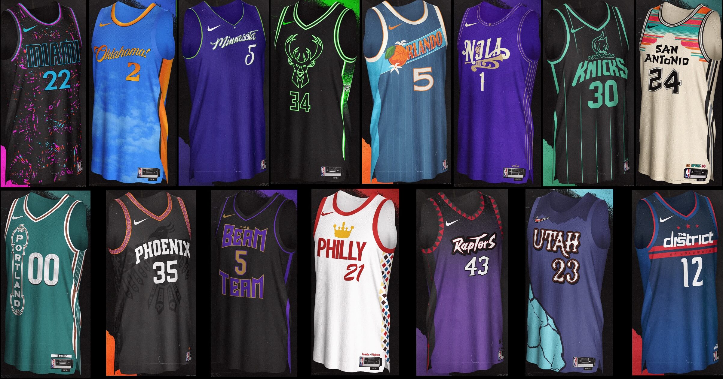
Greetings and a very good Saturday morning to you all.
Last Saturday, ICYMI, I shared 15 NBA “City Edition” concepts, created by multiple designers (and spearheaded by Casey Vitelli), and today I have the remaining 15. It should be noted that Casey and the 29 other concepters created this project before any of the (mostly leaked, some official) 2023-24 City Editions were known. I think in many (most?) cases, the graphic designers have created better — or at least certainly more well considered — unis than those that have been unveiled so far. Of course, opinions are like certain body parts in that everyone has one, but I think you guys will particularly like this new set. Interestingly, the last set included a large number of white/light jerseys, whereas this set is more populated with darker concepts. That’s just the way the alphabetical cookie crumbles.
I’m including Casey’s introduction again from last week, so you don’t need to click the above link if you missed that.
Here’s Casey…
NBA City Edition Concept Series, Part II
by Casey Vitelli
We had so much fun with the “Earned Edition Concept Series” that we wanted to bring it back, bigger than ever.
I went and grabbed 29 designers (yes… 29…) and we each designed a “City Edition” jersey and battled it out in a follower vote to crown the champion, bracket style.
One small bit of info, though: We didn’t announce who designed which jersey to make things interesting.
Miami Heat — @DemenzGr
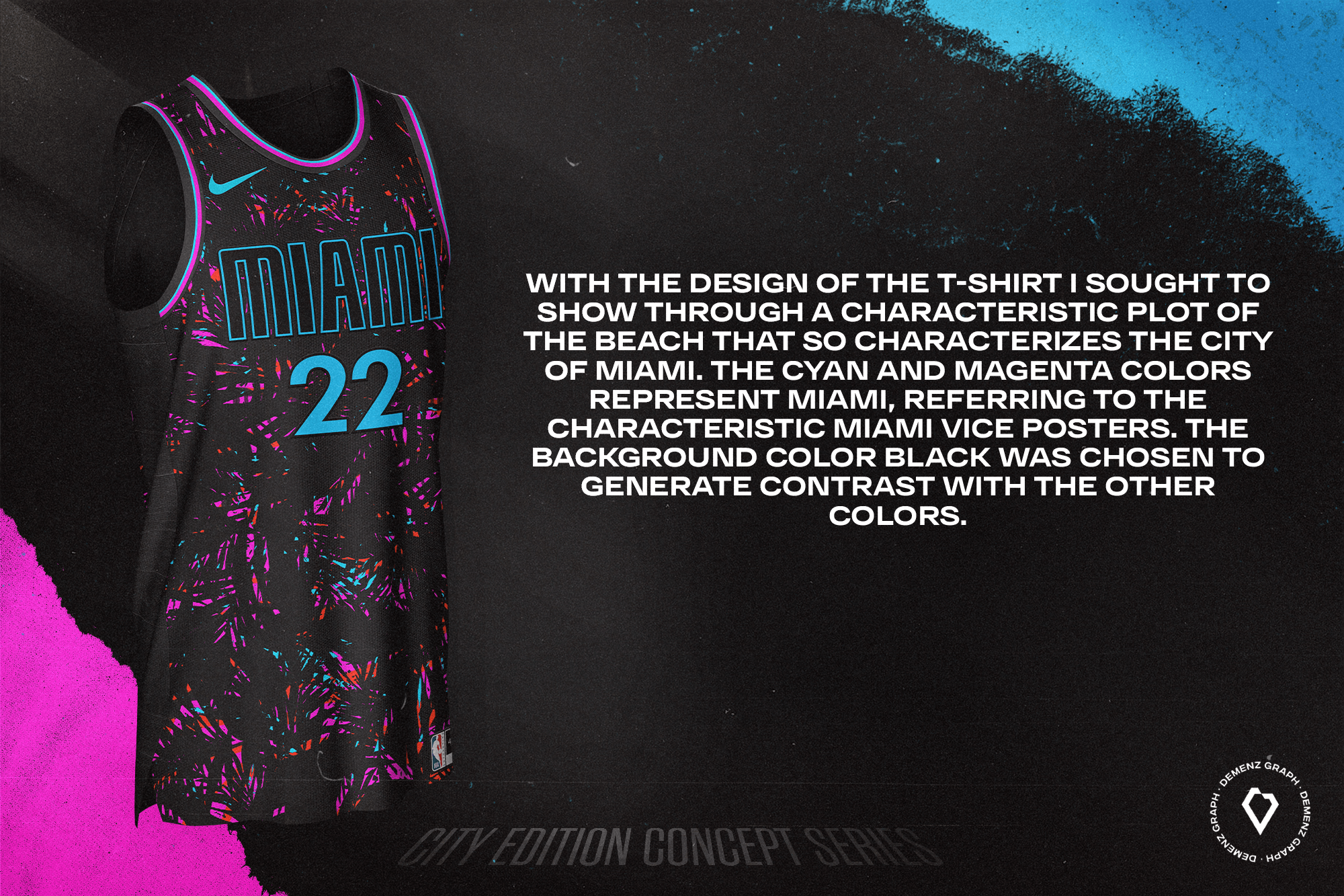
With the design of the t-shirt I sought to show through a characteristic plot of the beach that so characterizes the city of Miami. The cyan and magenta colors represent Miami, referring to the characteristic Miami Vice posters. The background color black was chosen to generate contrast with the other colors.
Milwaukee Bucks — @MJD7Design
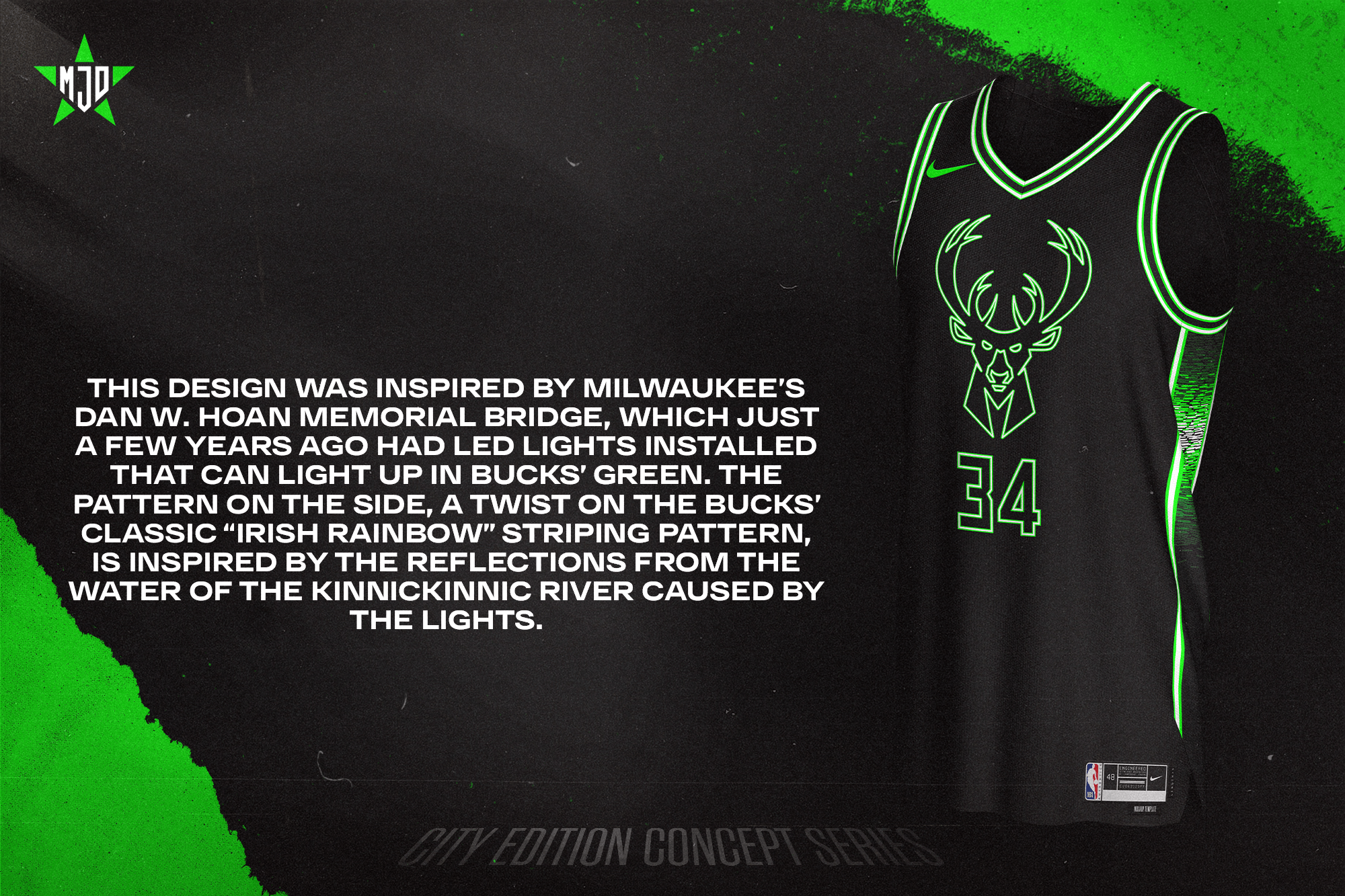
This design was inspired by Milwaukee’s Dan W. Hoan Memorial Bridge, which just a few years ago had LED lights installed that can light up in Bucks’ green. The pattern on the side, a twist on the Bucks’ classic “Irish rainbow” striping pattern, is inspired by the reflections from the water of the Kinnickinnic River caused by the lights.
Minnesota Timberwolves — @Lance_Hinesman
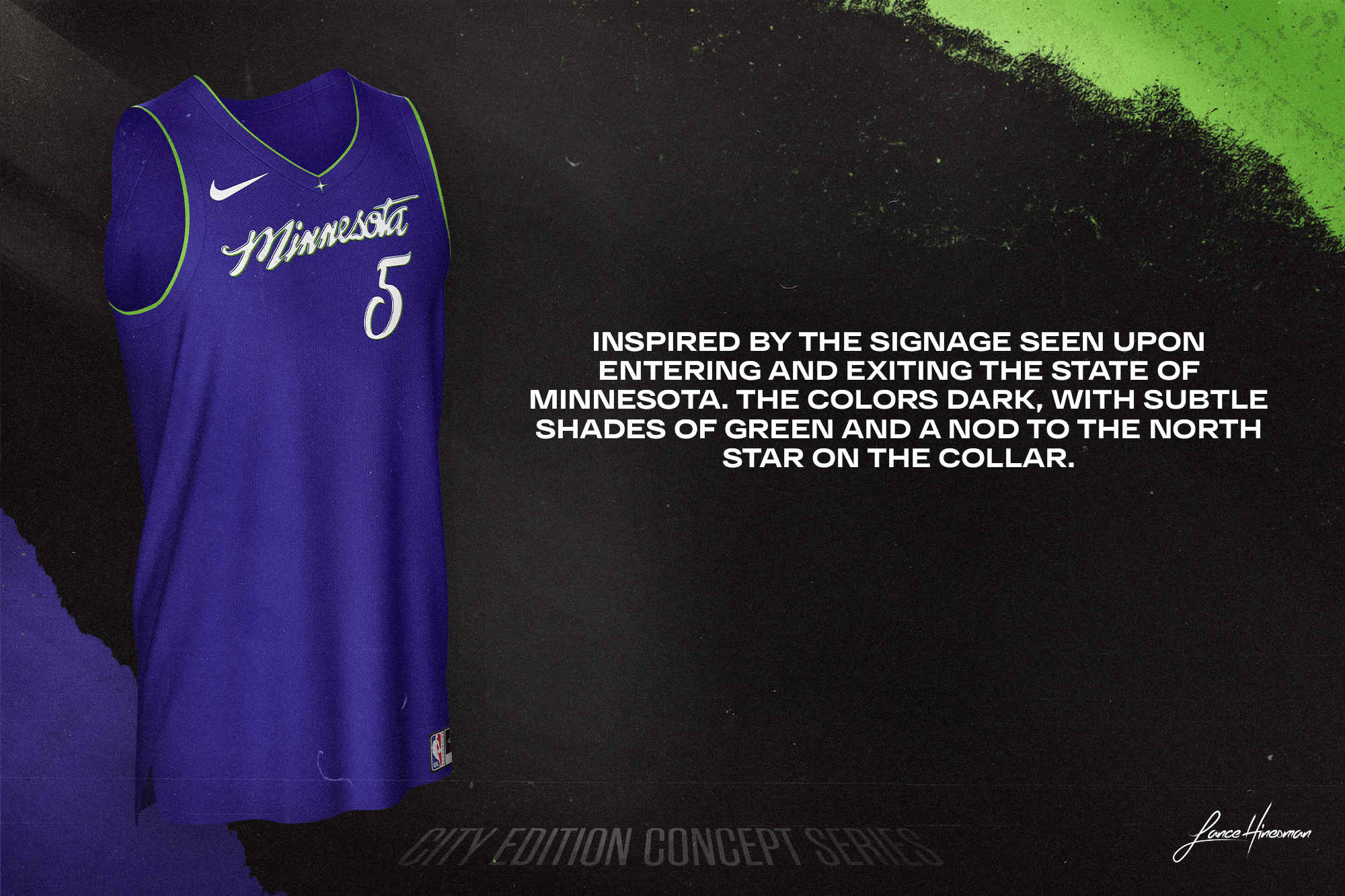
Inspired by the signage seen upon entering and exiting the state of Minnesota. The colors dark, with subtle shades of green and a nod to the North Star on the collar.
New Orleans Pelicans — @niranjan.psd (instagram)
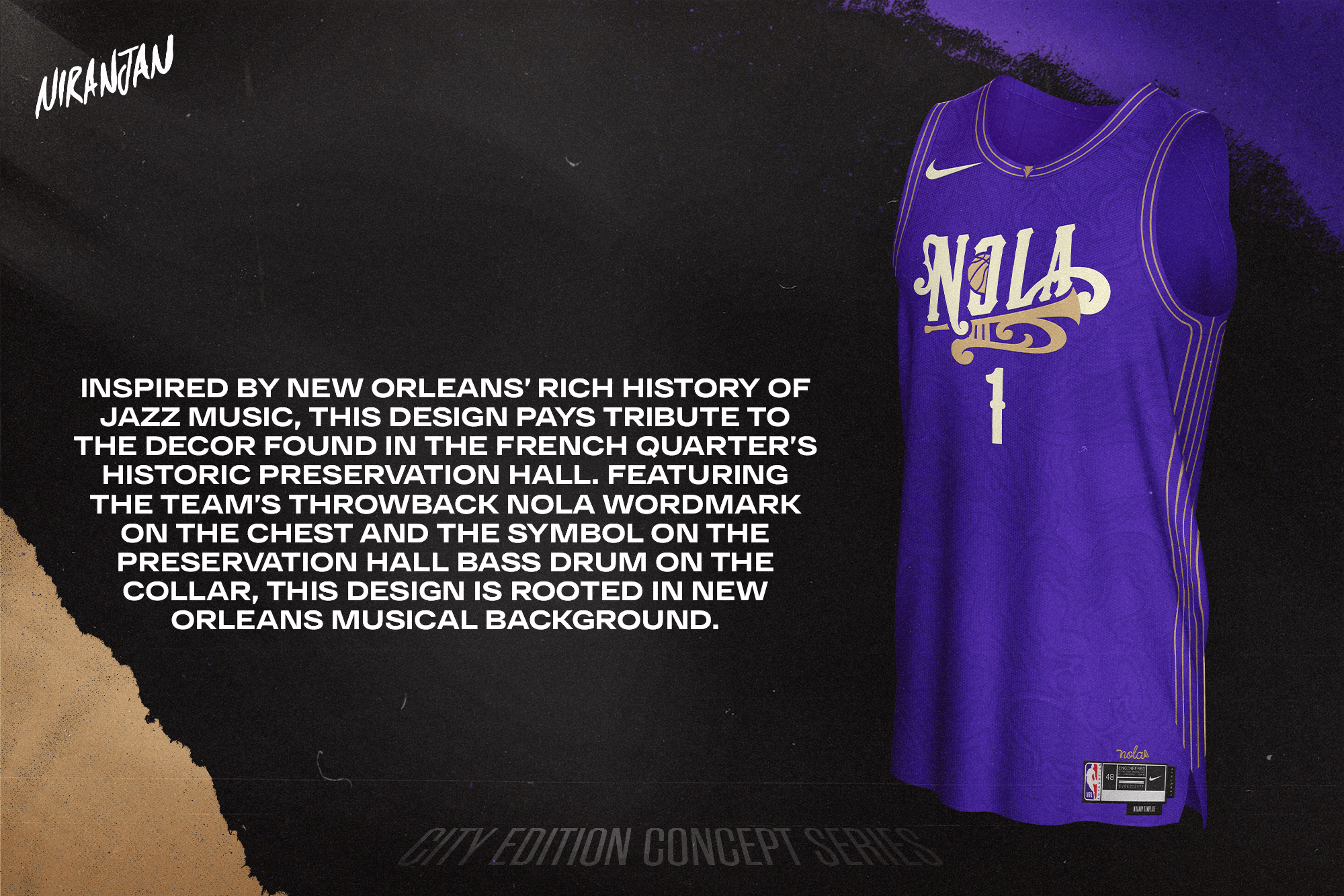
Inspired by New Orleans’ rich history of jazz music, this design pays tribute to the decor found in the French Quarter’s historic Preservation Hall. Featuring the team’s throwback NOLA wordmark on the chest and the symbol on the Preservation Hall bass drum on the collar, this design is rooted in New Orleans musical background.
New York Knicks — @mrjojostephens
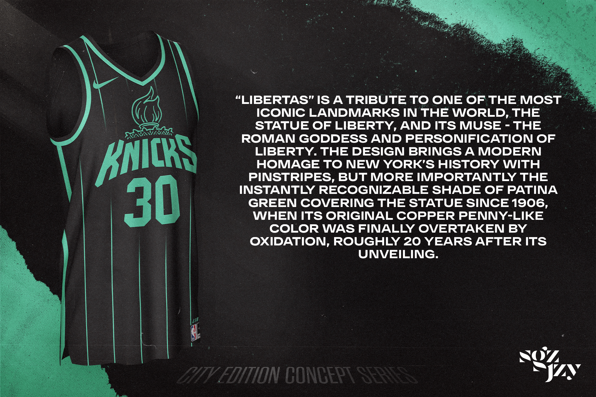
“Libertas” is a tribute to one of the most iconic landmarks in the world, The Statue of Liberty, and its muse — the Roman Goddess and personification of liberty. The design brings a modern homage to New York’s history with pinstripes, but more importantly the instantly recognizable shade of patina green covering the statue since 1906, when its original copper penny-like color was finally overtaken by oxidation, roughly 20 years after its unveiling.
Oklahoma City Thunder — @superduperduperclub (instagram)
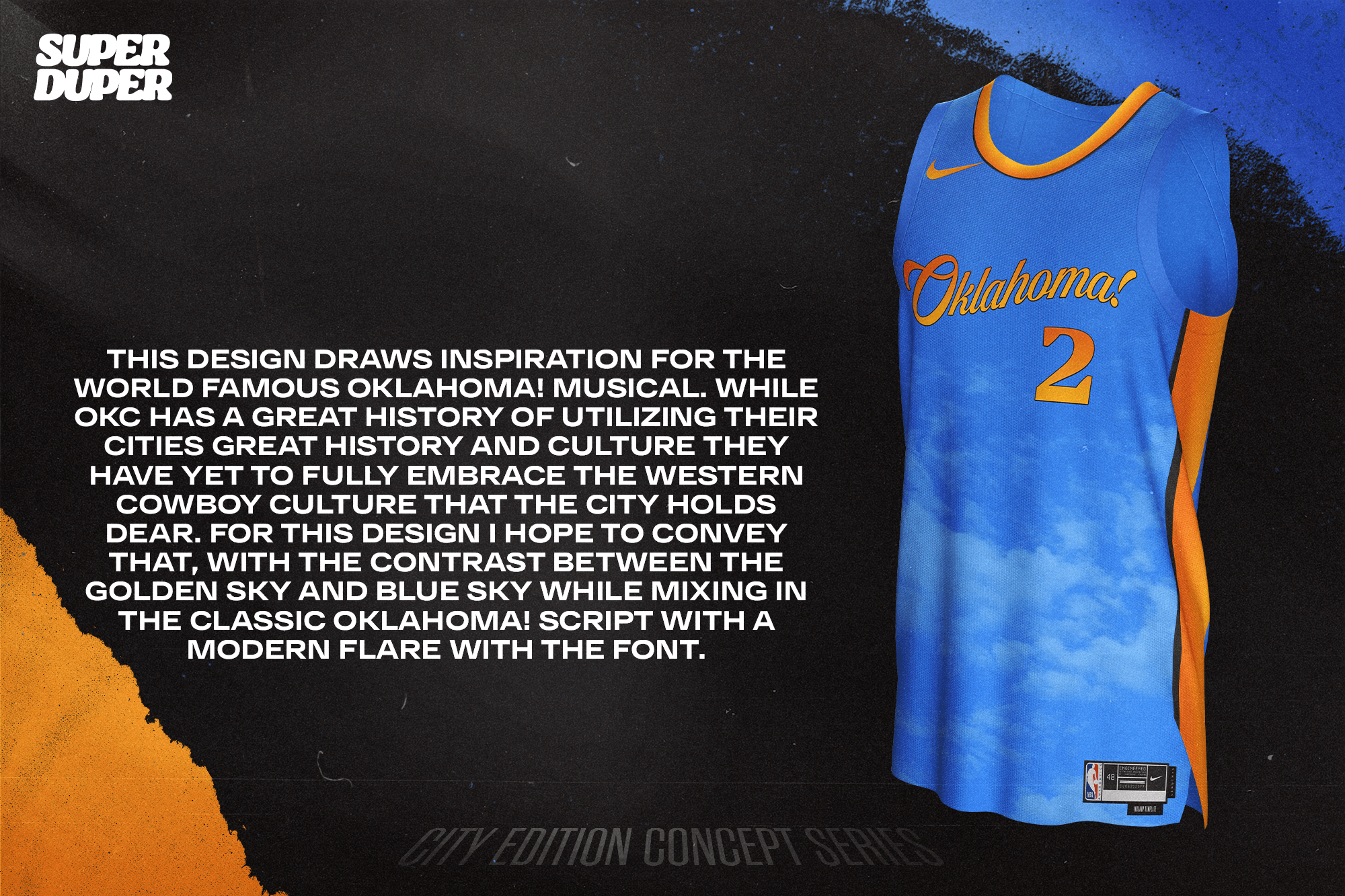
This design draws inspiration for the world famous Oklahoma! Musical. While OKC has a great history of utilizing their cities great history and culture they have yet to fully embrace the western cowboy culture that the city holds dear. For this design I hope to convey that, with the contrast between the golden sky and blue sky while mixing in the classic Oklahoma! Script with a modern flare with the font.
Orlando Magic — @DenverGravitt
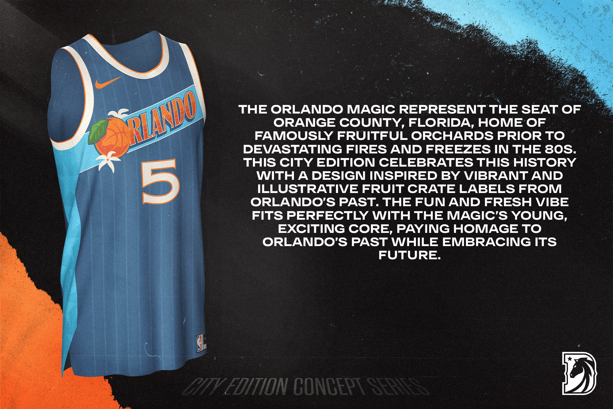
The Orlando Magic represent the seat of Orange County, Florida, home of famously fruitful orchards prior to devastating fires and freezes in the 80s. This city edition celebrates this history with a design inspired by vibrant and illustrative fruit crate labels from Orlando’s past. The fun and fresh vibe fits perfectly with the Magic’s young, exciting core, paying homage to Orlando’s past while embracing its future.
Philadelphia 76ers — @petemrogers
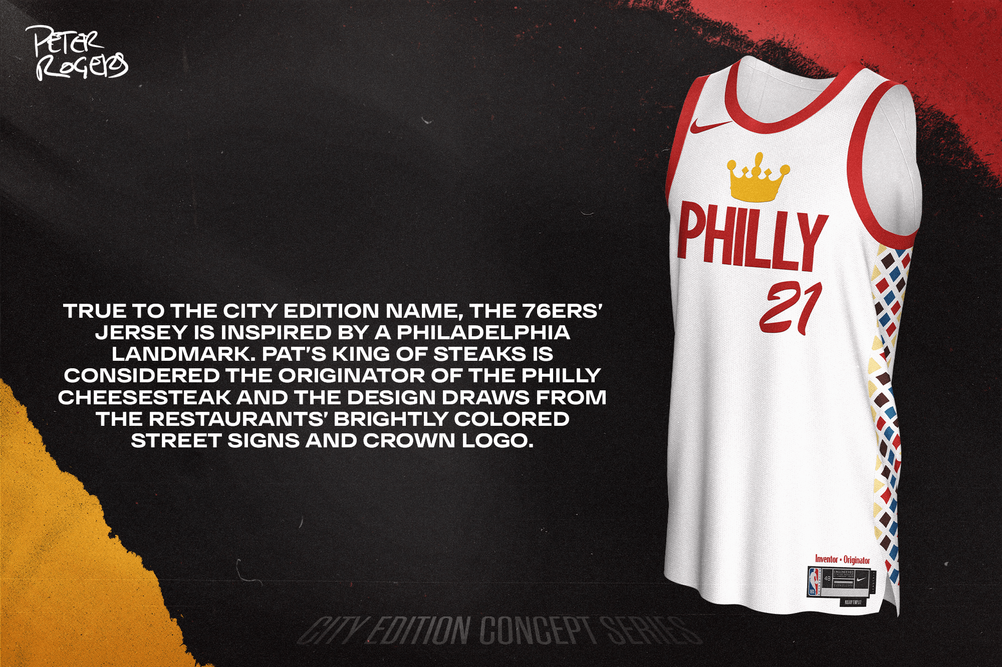
True to the city edition name, the 76ers’ jersey is inspired by a Philadelphia landmark. Pat’s King of Steaks is considered the originator of the Philly cheesesteak and the design draws from the restaurants’ brightly colored street signs and crown logo.
Phoenix Suns — @uniform_design_co
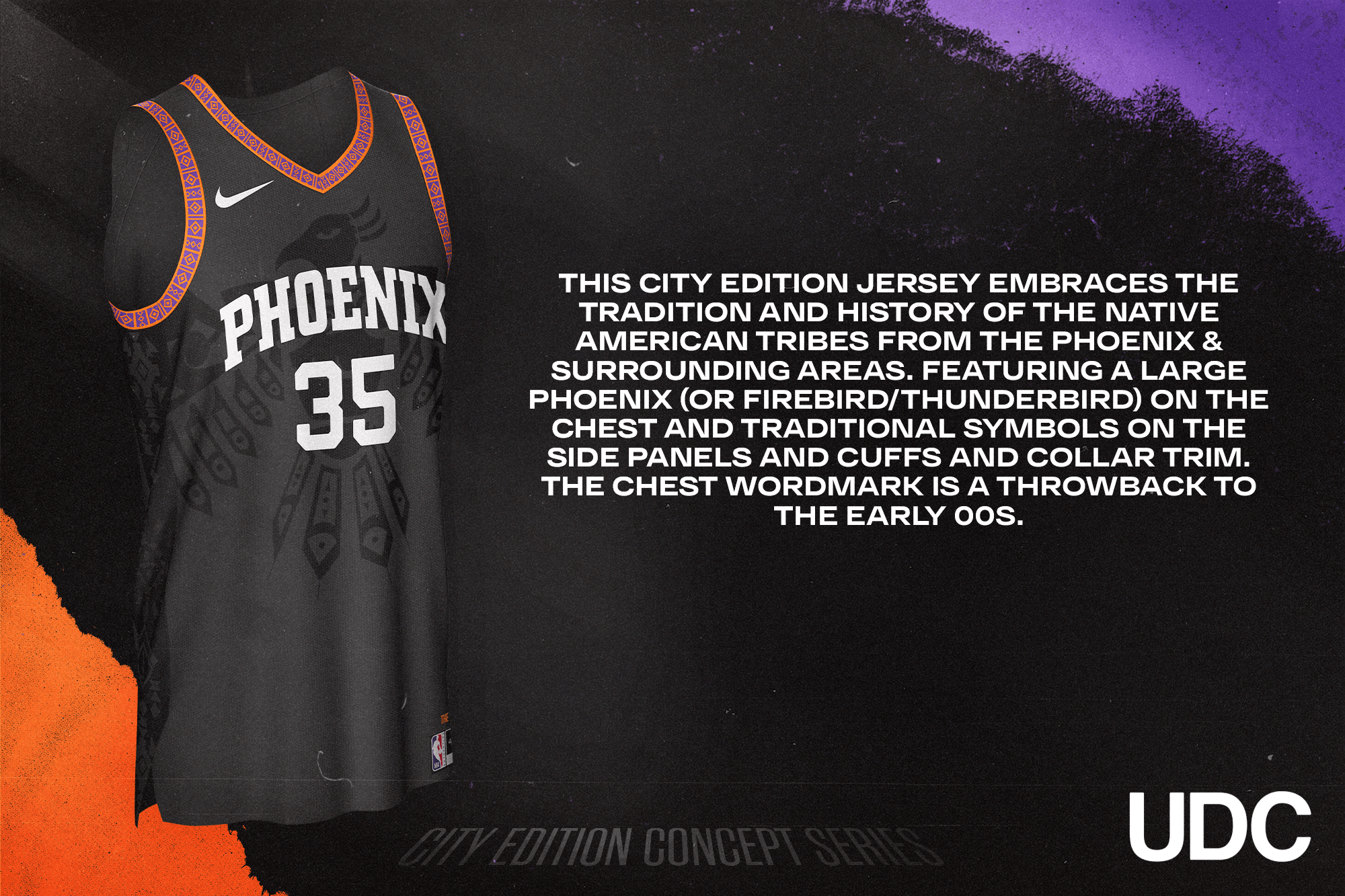
This City Edition Jersey embraces the Tradition and history of the Native American Tribes from the Phoenix & surrounding areas. Featuring a large Phoenix (or firebird/thunderbird) on the chest and traditional symbols on the side panels and cuffs and collar trim. The chest wordmark is a throwback to the early 00s.
Portland TrailBlazers — @PacersUniTrackr
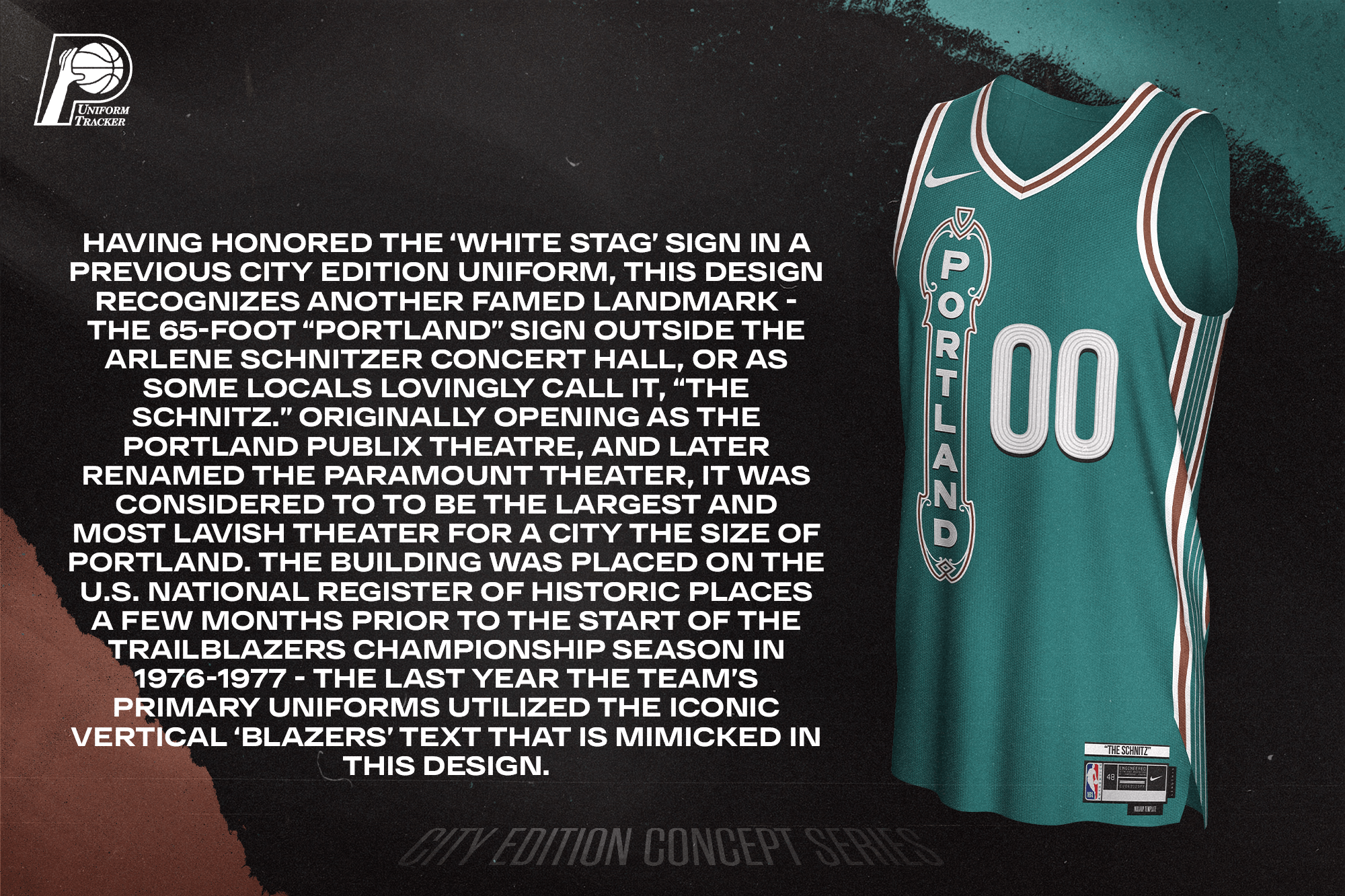
Having honored the ‘White Stag’ sign in a previous City Edition uniform, this design recognizes another famed landmark – the 65-foot “Portland” sign outside the Arlene Schnitzer Concert Hall, or as some locals lovingly call it, “The Schnitz.” Originally opening as the Portland Publix Theatre, and later renamed the Paramount Theater, it was considered to to be the largest and most lavish theater for a city the size of Portland. The building was placed on the U.S. National Register of Historic Places a few months prior to the start of the Trailblazers championship season in 1976-1977 — the last year the team’s primary uniforms utilized the iconic vertical ‘blazers’ text that is mimicked in this design.
Sacramento Kings — @SethR94
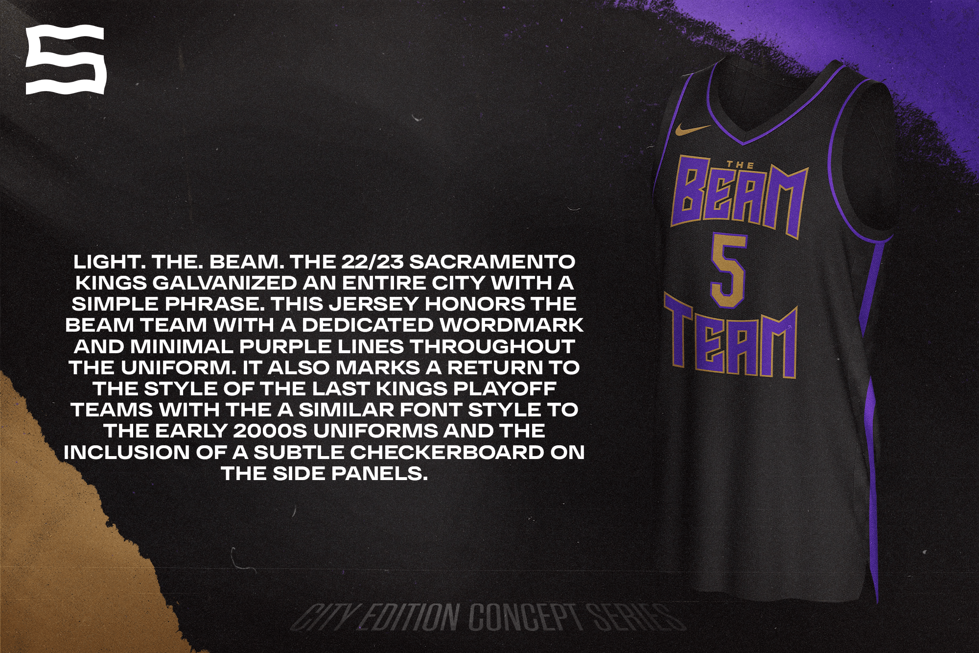
Light. The. Beam. The 22/23 Sacramento Kings galvanized an entire city with a simple phrase. This jersey honors the Beam Team with a dedicated wordmark and minimal purple lines throughout the uniform. It also marks a return to the style of the last Kings playoff teams with the a similar font style to the early 2000s uniforms and the inclusion of a subtle checkerboard on the side panels.
San Antonio Spurs — @conradburry
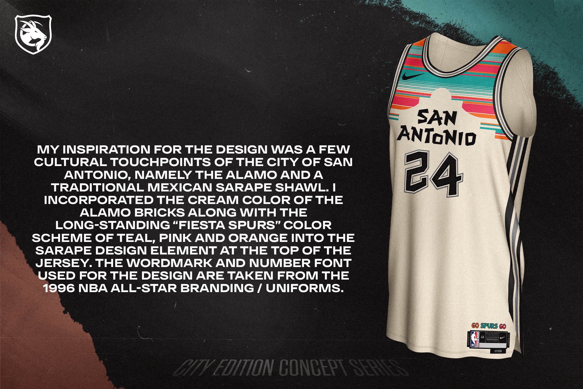
My inspiration for the design was a few cultural touchpoints of the city of San Antonio, namely the Alamo and a traditional Mexican sarape shawl. I incorporated the cream color of the Alamo bricks along with the long-standing “fiesta Spurs” color scheme of teal, pink and orange into the sarape design element at the top of the jersey. The wordmark and number font used for the design are taken from the 1996 NBA All-Star branding / uniforms.
Toronto Raptors — @trpaxton
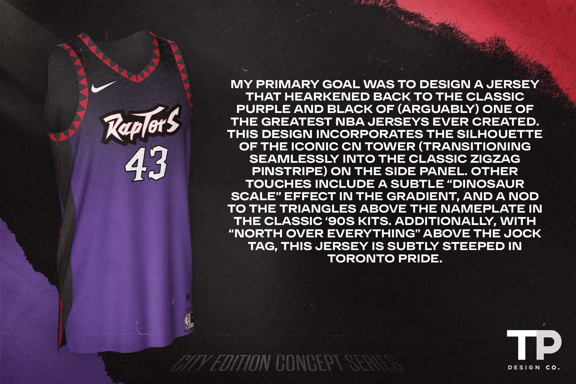
My primary goal was to design a jersey that hearkened back to the classic purple and black of (arguably) one of the greatest NBA jerseys ever created. This design incorporates the silhouette of the iconic CN Tower (transitioning seamlessly into the classic zigzag pinstripe) on the side panel. Other touches include a subtle “dinosaur scale” effect in the gradient, and a nod to the triangles above the nameplate in the classic ‘90s kits. Additionally, with “North Over Everything” above the jock tag, this jersey is subtly steeped in Toronto pride.
Utah Jazz — @jakepablomedia
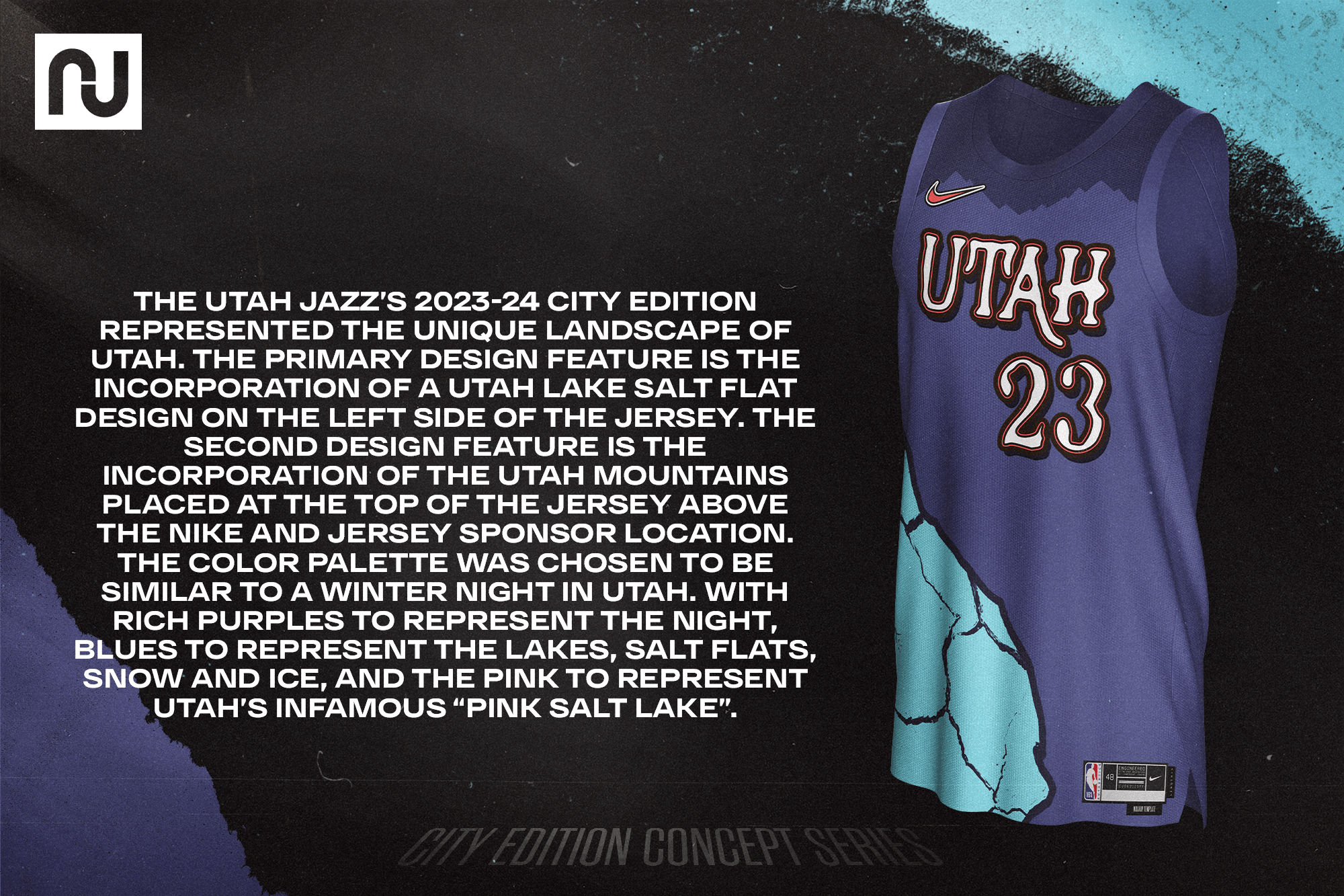
The Utah Jazz’s 2023-24 City Edition represented the unique landscape of Utah. The primary design feature is the incorporation of a Utah Lake Salt Flat design on the left side of the jersey. The second design feature is the incorporation of the Utah mountains placed at the top of the jersey above the NIKE and jersey sponsor location. The color palette was chosen to be similar to a winter night in Utah. With rich purples to represent the night, blues to represent the lakes, salt flats, snow and ice, and the pink to represent Utah’s infamous “Pink Salt Lake”.
Washington Wizards — @emmegraphic_
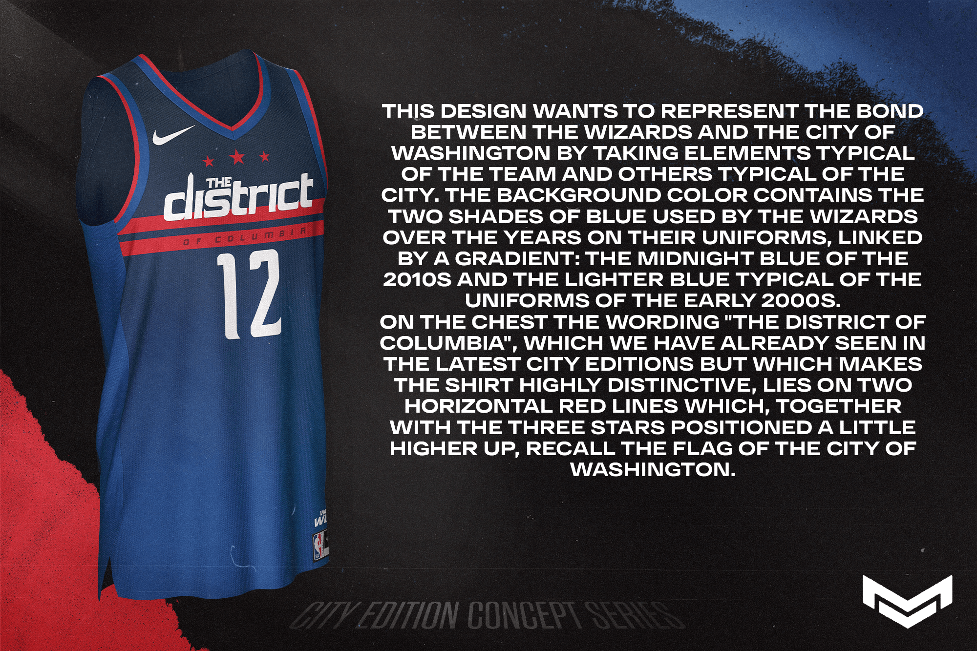
This design wants to represent the bond between the Wizards and the city of Washington by taking elements typical of the team and others typical of the city. The background color contains the two shades of blue used by the Wizards over the years on their uniforms, linked by a gradient: the midnight blue of the 2010s and the lighter blue typical of the uniforms of the early 2000s. On the chest the wording “the district of Columbia”, which we have already seen in the latest City Editions but which makes the shirt highly distinctive, lies on two horizontal red lines which, together with the three stars positioned a little higher up, recall the flag of the city of Washington.
Thanks, Casey! That was a really fun (and in many cases, very creative) set of “City” concepts. I think our readers will agree many (most?) of those are a lot better than what the NikeBA have turned out!
Readers? What say you?

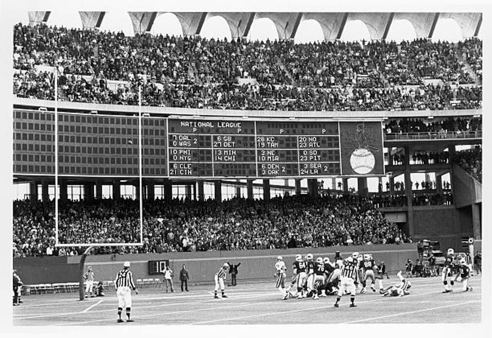
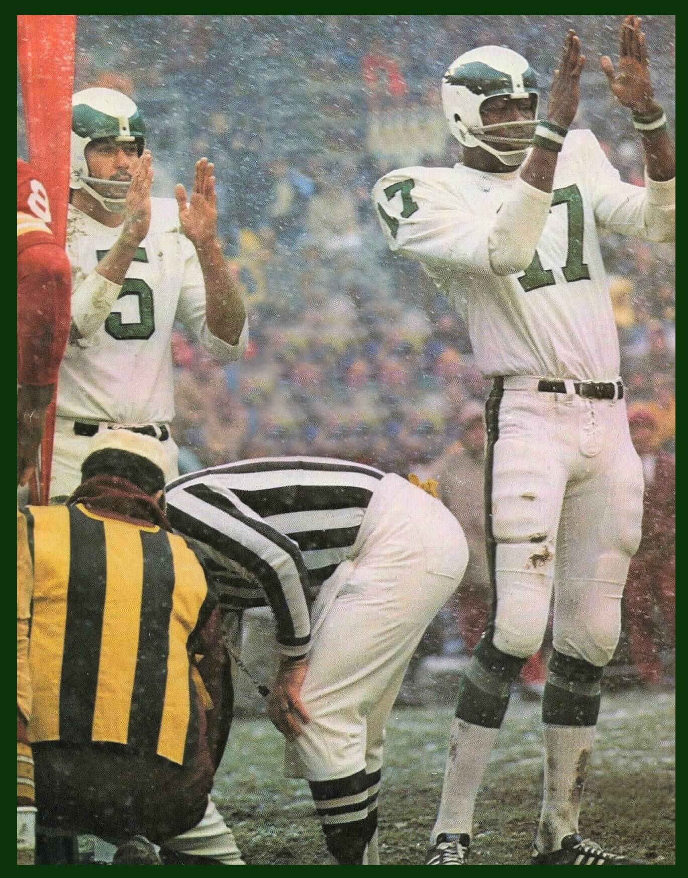
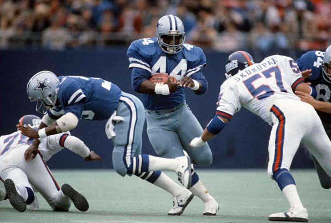
GTGFTU – there is a narrow window between the Giants introducing the GIANTS helmet logo and the Cowboys switching from white to gray sleeve stripes – and with the Giants usually wearing blue at home, I reckon is has to be Nov 9th 1980 – Cowboys 35 at Giants 38.
Most notable thing about the game sounds like a Giants flea flicker to set up the game winning field goal.
Fun stuff on the latest round of City Edition concepts, Casey and team! Thanks for sharing them. I absolutely love some of these (the San Antonio Spurs one in particular), like almost all of them, and think they’re all better than what Nike is churning out right now
GTGFTS is the October 31, 1976 game between the visiting San Francisco 49ers and the home St. Louis Cardinals, which the Cardinals won in overtime 23 – 20 on the field goal shown in the photograph. The Cardinals baseball logo is shown on the scoreboard. The scoreboard shows games between the intra-division AFC West game between the KC Chiefs and Tampa Bay Bucs which was in 1976. After that year the Bucs were moved to the NFC Central.
GTGFTS – October 31, 1976, St. Louis Cardinals 23, San Francisco 49ers 20, in Busch Memorial Stadium (aka Busch Stadium II). link
Besides being a Halloween game, the game is notable for Niners RB Delvin Williams setting a franchise record by rushing for 194 yards in the game. link
Also notable (at least to me) is that the game featured a matchup of two Hall of Very Good QBs between Jim Hart for the Cards and Jim Plunkett for the Niners.
A mixed bag of results with these NBA jerseys. I like Phoenix and Portland, and San Antonio would look good with more formal lettering and numbers. I dislike Sacramento, Washington, and Oklahoma City for its use of blue skies when the Thunder name warrants stormy weather.
So New York Liberty imagery and (almost) colors for the Knicks? If anyone is wearing seafoam green in that town I’d put it on the Nets who also own the Liberty.
I think that Sixers jersey would cause a riot tbh. People would lose their mind at the idea of the NBA declaring that Pat’s is the best cheesesteak in the city (it’s not)
Absolutely right about the reaction to the jersey and the review of the cheesesteak!
Heck, there a better option not far from the Sixers Training Annex in Camden.
Donkey’s! If you know, you know. Down the street from them now.
And nobody from here would buy a Pat’s “King of” Steaks jersey. Basic market research would have scuttled this from the start.
GTGFTS:
Ooh…a rare time-stamp tie! Had that ever happened before?
Both Mike Duet and BvK are correct and provided great additional info, too.
I’ll lay odds at 5 and, err…5 to 1 that there’s a certain some one out in the uni-verse that admires and can ID the kicker in this photo, even if they are late to the game!
Jim Bakken for the win!!!
Absolutely love that photo. The arches, Roger Wherli holding for one of my favorite kickers, the old scoreboard… just fantastic.
A reminder that all cookie cutters weren’t the same. Busch was better than my sentimental favorite Three Rivers, and WAY better than the Vet. If only they had grass or better turf…
And the criss cross pattern in the end zone!
Does that Sixers jersey come wit or witout?
No such thing as “a Utah Lake Salt Flat.” There is Utah Lake, then there are the Bonneville Salt Flats – two very different things. I really like most of these designs, but based on some of the oddly-worded grammatical and factual errors combined with the anonymity of the 29 designers, I’m wondering if this wasn’t an AI-developed project?
You got me Mr. Newport!, Dallas is wearing a two year style jersey, worn in 1979-80, you can tell because they have white trim around the neck. The Cowboys wore their blue jerseys against the Giants in 1979 and 1980. Every player in this photo played both of those seasons and since Roger Staubach and Danny White are not in the photo you can’t use that to determine the year. Well played sir.
According to the GUD, the Giants wore blue jerseys both times against the Cowboys in 1979. They wore white at home every game in 1980.
You are correct, I should learn to do a better job reading that data base myself, I always screw it up by a year. Actually, if I read it properly 1980 can be the only year that game was played.
White trim around the collar? I can’t see any.
Yes, GTGFTU is definitely the Nov. 1980 game at Giants Stadium. It was the first Giants win over Dallas since 1974, breaking a streak of 12 straight losses. It was also the first time the Giants ever wore white at home vs. the Cowboys.
I mentioned that the white trim because that is one of the ways you can tell a 1979-80 blue cowboys jersey. I was just mentioning that as a tip to readers, I know quite a lot about the Cowboys jerseys from 1970-80.
Since I’m not from all of these markets, I can’t speak to the connectivity of them, but I will say from a uni standpoint, these are mostly good, some pretty great. I’d take just about any of them over just about anything we’ve seen from the CE unis this season. I’m still an advocate of simply refreshing a teams entire look every 5-10 years, rather than mandating 1-3 new novelty unis every year. There are very few exceptions that live in the sacred uni space (Yankees, Celtics, Red Sox, lakers, and a handful of NFL and NHL teams), but I think even teams on the fringe of that sacred space can tinker without ruining their classic look. But it’s about being cohesive, consistent, and thoughtful, not over-saturating the novelty market just for merch money.
Thanks again for sharing these, Casey!
The Heat jersey suffers from the same legibility issue as their MLB counterpart.
The Magic one is so much fun…the orange as a basketball? Inspired!
I like New Orleans, Orlando, and Portland. Philly and Washington are OK. I think I would like the Knicks with a different color scheme. Maybe a cream uniform instead of black.
I only like the San Antonio one and with a different font. Most look a bit garish with all these gradients. Also, the storytelling is very contrived and forced. For a moment I thought: do all these designers already work for Nike? But to be fair: my jufgement would probably be more lenient if the shorts would have been part of the design. A basketball uniform in particular can only be judged when both the jersey and the shorts are shown.