I received an interesting note the other day from reader Andrew Beckman, as follows:
I just finished reading Packers historian Cliff Christl’s fine book Packers Heritage Trail. At one point he covers the origins of the team’s ‘G’ logo (it debuted in an intra-squad game on Aug. 5, 1961, at the old City Stadium) and notes the logo was revised to a more oval shape prior to the 1970 season. I was not aware of the revision.
Neither was I. Before we go down that rabbit hole, let’s start with how the Packers’ original logo was created. It’s spelled out nicely in this short video:
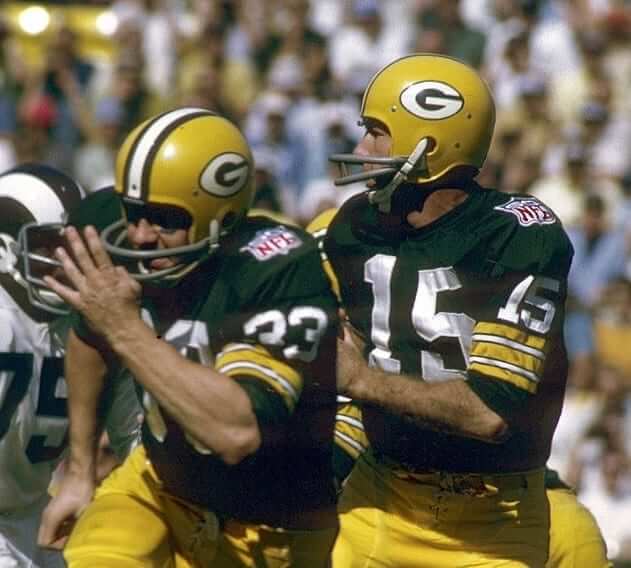
Did the logo actually change from 1969 to 1970? Photos appear to bear this out. First let’s look at this photo from 1969 (we can be sure of the year because of the NFL 50th-anniversary patch):
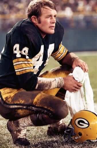
Now let’s look at this Associated Press photo from 1970 (there’s no way to know for certain that the date is accurate, but the AP tends to be good about dates):
Now let’s compare the two helmets side by side — 1969 on the left, 1970 on the right (click to enlarge):
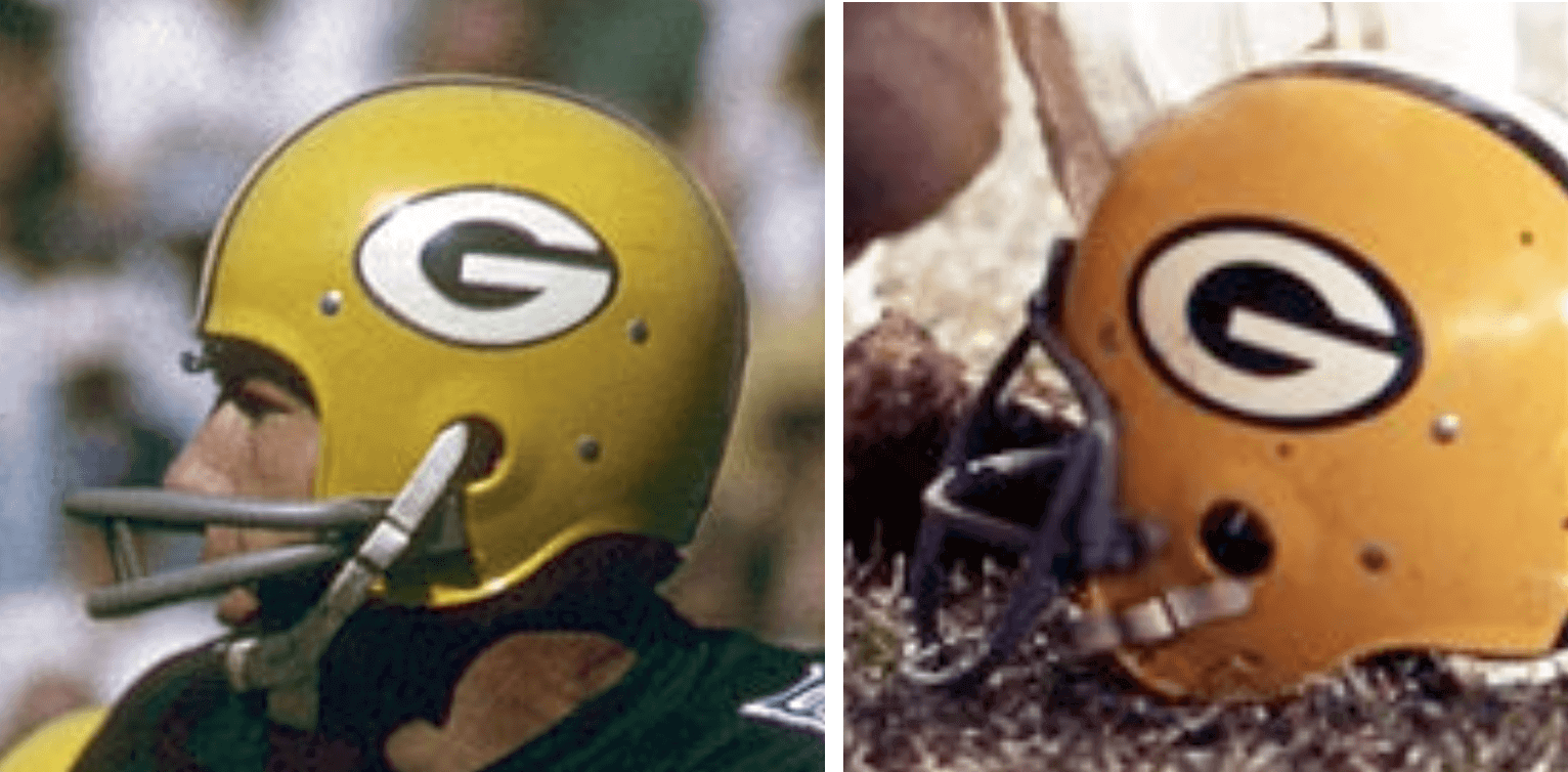
At first glance it might seem like they just expanded the green border around the logo. But if you look closely you can see that the overall logo shape did indeed become more oval, with the shape of the “G” clearly changing as a result. One way to see this is to look at the negative space inside the two “G” letterforms — they’re clearly different.
This is, obviously, a very subtle distinction. Was it intentional, or did it just happen accidentally because the team switched to a new decal supplier or something like that? (That would never happen today, of course, because things are much more standardized now, and digital to boot, but graphic standards were a lot more mutable back in the day.)
If you look again at the passage from the book, it just says that “the Packers reshaped their ‘G’ logo into more of an oval shape” — it doesn’t give any sense of how or why that happened. So I contacted the author, Cliff Christl, and asked him. He said he couldn’t tell me because a source had sworn him to secrecy, so it’s still not clear how or why this logo revision took place.
In any case, it’s all very interesting. I’ll be alerting SportsLogos.net honcho Chris Creamer, so he can update his Packers logo page accordingly.
Going, going…: Today is the next-to-last day to enter our Jaguars-redesign contest. Full details here.
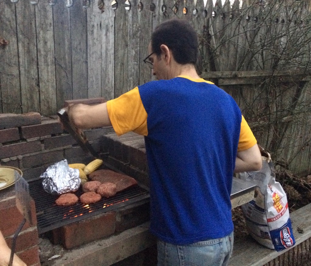

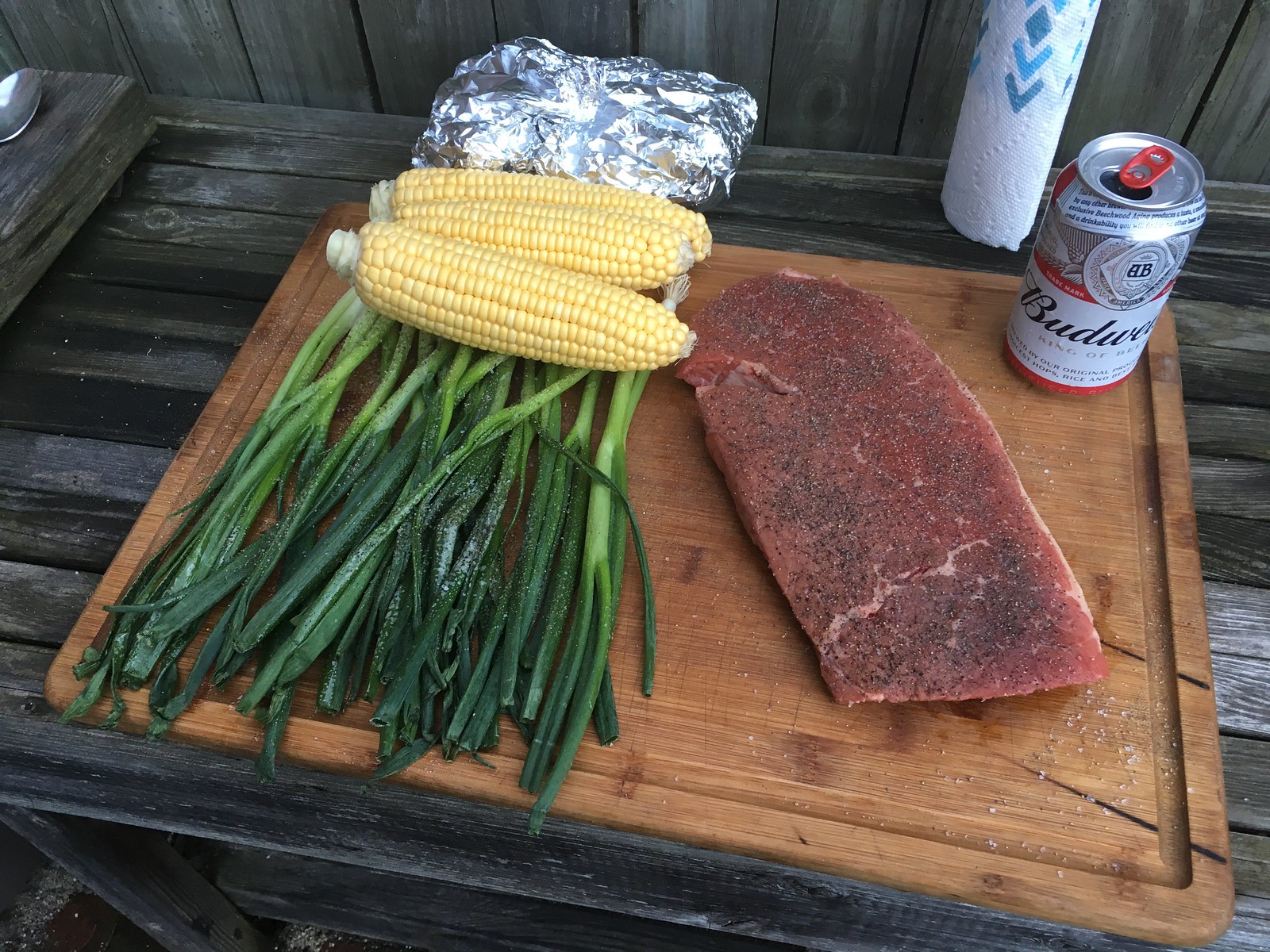
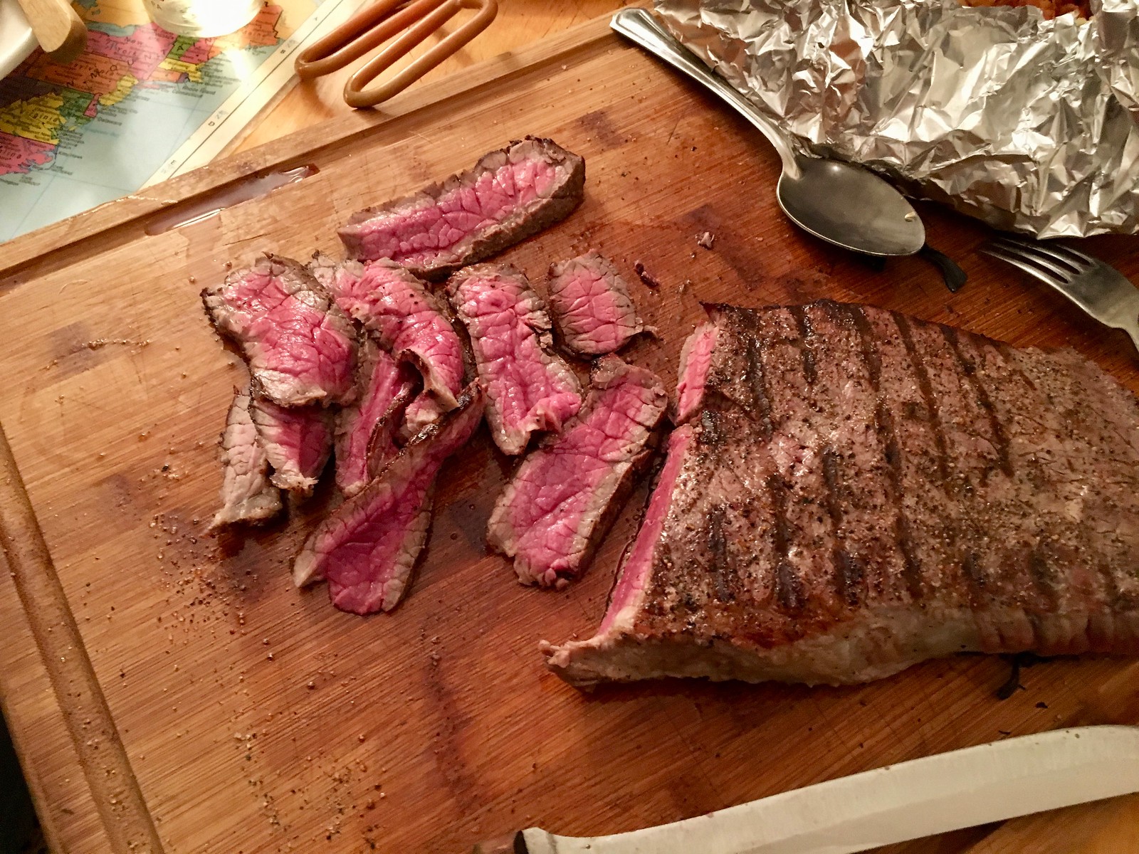
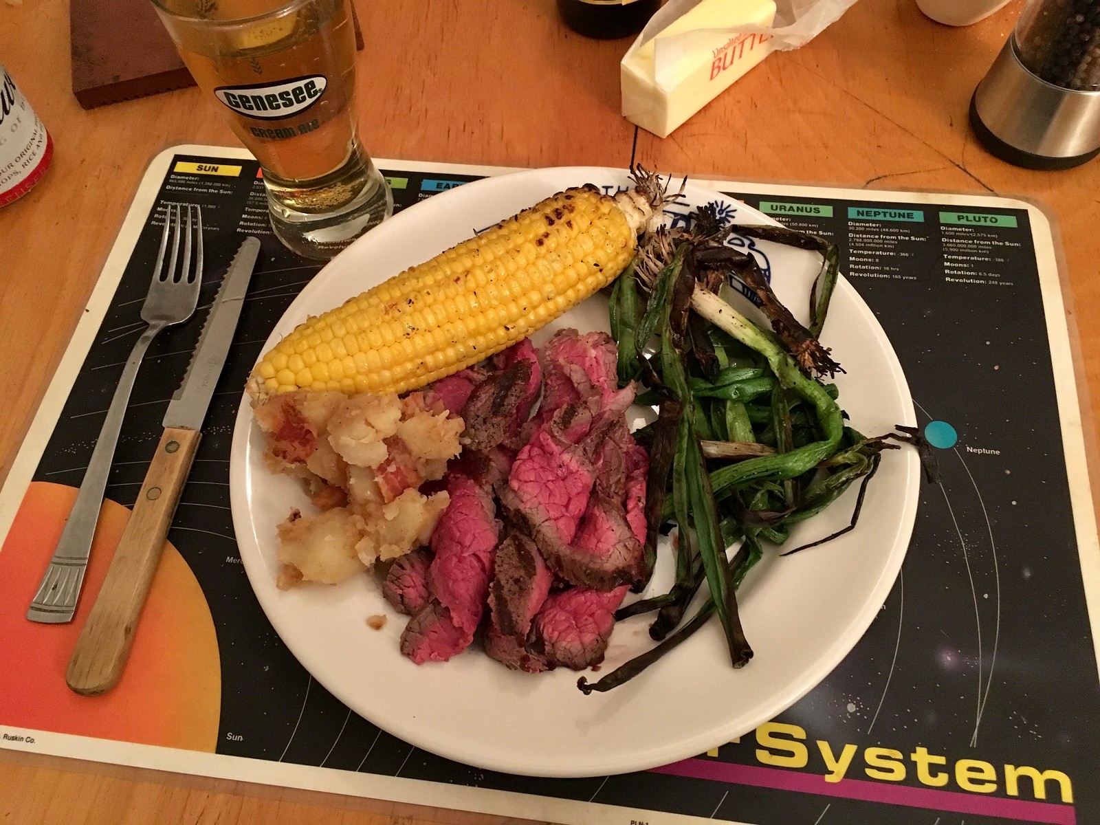
Culinary Corner: It was 70something degrees yesterday in NYC — a record high for Feb. 21 — so I got out the charcoal and fired up the grill. Pretty sure it’s the earliest date I’ve ever done that.
Nothing fancy — just a London broil, some corn, and some scallions (plus my landlord tossed on some burgers) — but damn did it taste good.
Granted, it’s a little messed up for it to be this warm, so it’s a bit ironic (or symbolic, or something like that) that I marked the occasion by putting more carbon into the atmosphere. But still: February grilling!
For all of these, you can click to enlarge:
The Ticker
By Paul

Baseball News: White Sox P Hector Santiago created a very makeshift DIY jersey for Photo Day (from Todd Usher). … What’s better than a player named Scooter Gennett? A bobblehead showing Scooter riding a scooter (thanks, Alex). … Jarrod Saltalamacchia, currently without an MLB gig, has been playing in Mexico, where his 14-letter surname doesn’t look so huge amidst all the advertising nonsense (from @fittedsflannels). … There’s high-cuffed, and then there’s really high-cuffed. Yikes (from Robert Hayes). … New blue Sunday alternates for the Montgomery Biscuits (from Kristopher Sharpe). … Lots of uni number switcheroos in Red Sox camp, all summarized here (from our own Anthony Emerson). … New 25th-anniversary baseballs for the Northwoods League (from Zachary Loesl). … Clarification on yesterday’s Ticker item regarding MLB teams wearing Stoneman Douglas High School caps during their spring training openers: All teams will wear the caps for pregame workouts, plus teams have the option of wearing the caps during the games (from Anthony Emerson again).

NFL News: Some old Cowboys cheerleading costumes are headed to the Smithsonian. … 49ers WR Marquise Goodwin tweeted a photo of himself in a Photoshopped mono-white uniform and asked fans for their feedback. … Rudy Gutierrez was watching a Raiders game from 1979 and noticed inconsistent “2”s on the jerseys. … We’ve all seen old photos of NFL coaches wearing suits and fedoras on the sidelines, but how about a coach in a suit and a straw hat? That’s Paul Brown of the Browns. Also, I note that he’s wearing his wristwatch on his right hand. Was he a lefty? (From @tjcttr.)

Hockey News: Seattle’s potential NHL team will kick off its inaugural season ticket drive starting next week, so the Great Wheel was lit to resemble the old Seattle Metropolitans logo (from Markus Kamp). … A Chicago Tribune reporter suggests that Blackhawks fans who are upset about their fellow fans who recently taunted Capitals F Devante Smith-Pelly with racist chants should wear Smith-Pelly jerseys the next time the Caps are in town. Unfortunately, the Caps won’t be in Chicago again this season. … Reprinted from yesterday’s comments: According to this old New York Times article, the Kings, Seals, Penguins, Blues, and Red Wings were all planning to switch to colored skates in 1970. As it turned out, only the Seals, Blues, and Pens went ahead with it, at least based on the known photographic record (from longtime commenter Jet). … G.I. Joke jerseys tomorrow night for the Tulsa Oilers (from Mike Iles).

Basketball News: The Heat are adding a memorial patch for the Stoneman Douglas massacre victims (from Mike Chamernik). … New pink uniforms for the Auburn women’s team. … We may not have mentioned that Stanford has worn new GFGS alternates a few times this season (from Kary Klismet). … Mike Selock was watching the documentary Jacksonville Who?, about Jacksonville University’s improbable run to the national title game against UCLA in 1970, and saw Jacksonville playing a team with “Buccaneers CVI” on the back of the jersey and just a number on the front. I had no idea what that was about, but lots of people on Twitter told me that it’s the College of the Virgin Islands. Fascinating! … Northwestern will new uniforms for Senior Night tonight (from Dan Sagerman). … Kansas State wore shooting shirts in support of Texas’s Andrew Jones, who’s battling leukemia (from Riley Gates). … Illinois State and Drake went red-vs.-blue last night (from Josh Hayes).

Soccer News: Toronto FC played the Colorado Rapids in CONCACAF Champions League two nights ago, and they went burgundy vs. red, with the Rapids wearing last year’s burgundy kits instead of their newer design (from Ian Gerig). … New primary shirt for Argentina Racing Club (from Ed Zelaski).

Olympics News: Here’s a faaaascinating piece about Korean food at the Olympics (NYT link). … American skier Mikaela Shiffrin brought 35 pairs of skis (NYT link) to the Games. … Short track speedskaters are literally lopsided (NYT link). … As I’ve said all along, figure skating is really musical theater, not a sport. But if the Olympics have to have musical theater, it’s definitely better to see them to skating to AC/DC instead of what they usually play. … The US speedskating uniforms are generating chatter because of their contrasting crotch design. … Faaaascinating piece on how physicists don’t fully understand why curling stones curl. Highly recommended. … American skier Lindsey Vonn has the initials “D.K.” and a heart written on her ski helmet and the Greek word for “believe” on her right glove, all in tribute to her late grandfather, Don Kildow, who built his hometown’s first ski hill and was a competitive ski jumper himself (from Kary Klismet). … American hockey player Hilary Knight was spotted wearing a USA Soccer cap.

Grab Bag: Interesting piece on The Players’ Tribune (NYT link) and its implications for sports journalism. … The Yukon government is facing a storm of criticism after spending nearly half a million dollars on a rebranding logo and website redesign. … Apple’s old rainbow-striped logo is making a comeback. … New helmets/decals for UNC lacrosse (from James Gilbert). … New logo for Doctor Who. … New logo for the ABC-TV affiliate in Norfolk, Va. … Spectacular photos of vintage Michigan roadside attractions here (big thanks to John Korinek).
Small edit: Northwestern’s Senior Night is this evening. The Cats unveiled the uniforms on Wednesday, but will wear them in tonight’s game.
Thanks. Fixed.
I’ve been aware of the Packers logo tweak for a long time, but now I’m trying to come up with a scenario why someone would insist the reason be kept secret…and I’m stumped
Yeah, I would have sworn that the original, more football-shaped logo had been covered here. I can’t imagine how else I would have known about it.
The change definitely improved a lot about the logo – the proportions and negative space are much better balanced – but the original pigskin shape makes such a stronger statement. It’s a shame the team didn’t keep the shape while tweaking the inside of the G.
I’ve noticed it before too. I think the oval version looks better than the football-shaped version, although in the case of the Jets I think the opposite is true. As much as I appreciate the Jets’ 1998 redesign, I wish Parcells had made the new version football-shaped instead of oval, which if nothing else would have distinguished it from the Packers and 49ers.
Edit: Link in figure skating is not a link, it’s text
Fixed.
In re: the Packers, until I looked at that 1969 image, I had never thought about the Packers logo perhaps being meant to evoke the shape of a football — unlike the NY Jets, where that always seemed obvious to me.
The ‘oval-ing’ of the logo goes away from that somewhat. In any case, I’m glad the logo is still the logo. Packers are the last team to need a redesign in my opinion.
I edited Cliff Christl’s book, which is referenced in today’s lead item. I also helped him with some research into the debut of the G logo while I was still at the Green Bay Press-Gazette a few years back. Couldn’t begin to say who Cliff’s source on the reshaping of the G logo might be, but I don’t doubt that it’s accurate.
Is it possible to know why it changed without knowing who changed it?
I’m sure I knew about this change in the Green Bay Packers logo from reading this website. That’s how I knew it was originally a football shape.
My understanding was that Georgia, then Grambling modified it into a more oval shape. Perhaps Green Bay was reacting to that.
Why wasn’t that Green Bay ‘G’ ever copywrited or protected as you’re absolutely correct with both Grambling and Georgia both using that basic design (as well as numerous high schools), or did Green Bay give permission, or were the Packers not the first to use it. Please enlighten me.
If I remember rightly, Green Bay own the trademark and have done since 1961 and license the oval G out to Georgia (starting 1964) and Grambling shortly thereafter
Budweiser in a Genesee glass?
Welcome to Paul’s Restaurant, where he’ll serve whatever he wants to serve in whatever glass he wants to use! ;)
I can relate to that.
At first, I thought, well, it’s not as if Genesee is still around, but I googled and sure enough they’re still brewing. I haven’t seen their commercials in such a long time.
” 49ers ….Photoshopped mono-white uniform ”
Hella-better than mono black!!
.
.
.
.
.
(is “Hella” still cool?)
It is better than the black uniform, but that’s a pretty low bar to clear.
It looks too much like the Giants
Which is the fault of the Giants, who shouldn’t have so much red on the white uniform. :P
The phrase “hella” was used in the film Lady Bird. It was set in Sacramento in 2002, so the use of the term made sense. I rarely hear “hella” used these days unless someone from Northern California is intentionally harkening back to the 1990s (or early 2000s).
Sworn to secrecy about a logo that’s been around since 1970? Egads it’s not Cold War documents or the recipe for McDonald’s secret sauce.
Secret Sauce is just Thousand Island with extra mayo and relish. The secret behind the redesign of the G is probably just as trivial. Maybe it really does stand for “Greatness”?
The only actual hypothesis I can think of that would lead someone to think secrecy is justified is that the change to the G was somehow related to or done in coordination with Chicago adding the similarly shaped wishbone C to its helmets at the same time. A lot of Packers fans would more readily forgive collaboration with the Soviets than with da Bears.
The Bears wishbone “C” was originally used with permission of the University of Chicago.
I always thought that the Bears tweaking of the C to add orange and change the shape (as has been discussed here) was because of the creation of NFL Properties. As part of the start-up, they asked all the teams to sign over their property rights to their logos, and they learned that the Bears did not own the C. So they created a new version.
The website for UGA Athletics mentions the change to Green Bay’s “G,” and how Green Bay’s “G” seems to have evolved to something closer to Georgia’s “G.” The key paragraph:
“Since the Georgia “G”- though different in design and color- was similar to Green Bay’s “G”, Coach Dooley thought it best to clear the use of Georgia’s new emblem with the NFL team. Athletic Director Joel Eaves called for permission which was granted. However, since its inception in 1961, the Green Bay “G” has been redesigned several times and now looks like Georgia’s original 1964 “G.” Georgia is proud that the Packers apparently liked the special nuances of the Bulldogs’ forward-looking “G.””
link
“Doctor Who” is always spelled out, unless you’re talking specifically about the 1960s film with Peter Cushing (which is not part of the series canon).
I noticed that Sportslogos shows the current G logo on the yellow background as starting from 1970, and Chris doesn’t have an earlier version up yet (though in the primary logos, the current G, on a white background, is dated from 1961). So there’s some awareness, at least.
(Though it would be nice if Chris would finally fix the font errors for the 1967 Maple Leafs logos!)
Fixed.
Thanks for the fix. It’s a minor detail, to be sure, but we Whovians tend to be stickers for that sort of thing. I, for one, am glad they’re moving away from the 2010 logo, though personally my favorite is the link.
Paul, your London broil is cooked to perfection. Do you use a meat thermometer, or do you just know how long to cook it on each side depending on the thickness?
No thermometer, no looking at the clock, no “thumb test” — just instinct!
Looks great. Have never tried grilled scallions – will need to give that a try.
How about garlic scapes? Ever try those?
Never did scapes, but that would work.
Love grilling scallions. Spray them with olive oil Pam and then add a bit of salt/pepper. So good!
I’m not sure where I saw it (I would think on Uni Watch, but maybe not), but I remember reading that the Packers helmet logo was originally applied in two parts – the green oval and the white “G” were separate. I don’t know if the oval was painted on or a decal, but the “G” was a decal and there were pictures of it separating from the oval or getting torn. I’m wondering if there is any connection between the transition to a one-piece decal and the 1970 alteration.
Interesting that the email from the reader refers to “the old City Stadium” – City Stadium is the original name of still-standing (duh) Lambeau Field, which opened in 1957.
The term “old” City Stadium was used to refer to their previous home stadium, which was also called City Stadium.
I realize you were quoting an email as opposed to generating original content – just sayin!
To clarify, the Aug. 5, 1961, intrasquad game cited above was indeed played at old City Stadium behind Green Bay East High School, That venue preceded new City Stadium, which in 1965 was renamed Lambeau Field.
Then it all makes sense! Thanks for clarifying.
RE: Packers original “football shaped ‘G'”
I was certain this had been covered on Uni Watch before. I had always known the Packers “G” was shaped like a football for a few years prior to what it is now. I guess I thought this was common knowledge as this was their look for their first few World Championships/Super Bowls.
Plus, when the whole “What does the “G” in Green Bay stand for” thing was happening around SUper Bowl XLV, I thought Uni Watch dissected the logo/history as well.
I always thought it was strange to “conform” with the University of Georgia instead of keeping the original.
For everyone who says this has been covered on Uni Watch before: Maybe you’re right! I sometimes forget things. If anyone can turn up the entry where it has previously been covered, please share it with us. Thanks!
If you have the articles archived, it was probably late January or early February 2011 when the Packers were in Super Bowl XLV.
Chance wrote a great article on his blog (Wearing of Green and Gold) about this subject on March 21, 2013. I think that paired with the article on the Milwaukee Journal Sentinel about this topic.
link
I suppose no mention was made about the logo changing to what it looks like now, and that is the mystery. I guess I always knew it changed, just never knew why.
On the right side of the page, below the rather lengthy list of categories, is a drop-down for the archives, sorted by month.
Personally, I’d move that up above the categories. Maybe something to discuss with the webmaster?
I went back through the January-February 2011 archives, and saw no mention of the evolution of the G in any of the ledes. If it was brought up in the comments (which I did not go through), it didn’t carry over.
I’d go through more of the archives, but I actually have to get back to work now, so….
Love the Genny glass Paul! Drink whatever you want out of it!
I like the Packers logo lower on the helmet like they used to have it, now it’s up a lot higher.
RE: Oakland raiders “2” inconsistencies – Looks like the “3”s are also different. Look at the number above Tatum.
I’m surprised this wasn’t more well known. Being from Wisconsin, it was obvious to me that this change happened, but I figured everyone knew it to be fact. Since it is so insignificant I can see why it got passed by, though.
Also, there is a myth perpetuated in many circles that I would like to address and debunk. There are many people that say the Packers G logo stands for “great” or “greatness” instead of the more logical abbreviation for “Green Bay.” know where the source of this confusion originated.
In 2003, as the Packers completed a massive renovation of Lambeau Field, they released a DVD about the team and stadium history. In it, the voice over talent says something like “In 1961, the Packers add a G to their helmet, and it stood for ‘great.’” Then he went on to decribe how great the team was in 1961, winning the first title under Lombardi.
I remember it sounded confusing based on the delivery, but it was just supposed to be a creative line saying “hey maybe it must have stood for great because the Packers began a period of domination that year.” It was not intended to be a literal statwment.
The Packers had a massive crowd at Lambeau Field watch that video on the Jumbotron and the DVD could be found (seemingly) at every grocery store in the state. It received widespread distribution and I bought one. I think the confusion from the line in this documentary was probably perpetuated by those who watched the DVD, shared it with others in the Internet, and it became accepted as a quasi-fact.
Could Lombardi have thought “oh, G also is the first letter in greatness, as well as Green Bay, so that is even better.” Yes. But it most likely simply stands for Green Bay. And the myth of it being greatness started with a confusing statement from a documentary voiceover.
You are right dave. When the Tiki Barber “Greatness” thing happened, this video was mentioned, and I could see how someone might confuse what was said in the DVD to be literal, but as you stated, I think the narrator meant for it to mean they went on to have a great year, or were having a great year.
Do you know what the name of that DVD was?
Hi Johnny. I’m glad you are aware of this too. The DVD is titled:
The Legend of Lambeau Field
The Heroes, the Highlights, the History.
Vince Lombardi and Brett Favre are on the black cover.
Also, sorry for all of the typos. I tried to produce a quick response over mobile.
Paul Brown wrote with his right hand. See 0:22 – 0:25 of this video: link. The video also contains many views of him wearing a watch on his right wrist.
Paul, kudos for using charcoal instead of gas. I use hardwood charcoal, which leaves less residue and can be composted.
Grilling with gas isn’t really grilling; it’s cooking. If you’re turning a knob, you’re not grilling.
If you’re grilling with charcoal, you don’t have kids.
I liked that the Polish couple did their ice routine to Postmodern Jukebox. That was a pleasant surprise.
I know that the Georgia Bulldogs sues the Packers on the grounds that their logo was similar however I don’t know if that lawsuit happened around the time of the logo change. I do know that the pack lost and were forced to tweak their logo. This tweak in 1970 might be in response to that lawsuit.
*sued, not sues
Was watching the Ryan/Ventura fight for the umpteenth time (because it NEVER gets old), and it turns out one of the brawlers was wearing a pin that was heretofore unmentioned in Paul’s list of baseball players wearing pins.
The pinner in question is Gary Redus (2:27 mark in the video).
link
Thank you! I’ll add it to the list.
Not sure if more jealous of grill or of placemats…
I have really nice roof access, all to ourselves, but I’d trade it in a heartbeat for your outdoor space! UW potluck? Haha
That shot of the wheel lit up like the the Metropolians logo is great.
Also never would have pegged Paul as a Bud heavy drinker, though I am sure he’s discussed it before and I wasn’t paying attention.
That London Broil looks fantastic!
For the record, I would never care about a “wrong” logo on a beer glass, as long as it’s the right kind of glass. I still get PTSD over one time when I was served a stout (not Guinness, but don’t recall which) from the tap in a pilsner flute. I should have sent it back!
Cheers!
Ha. Are you concerned about the style glass simply from an aesthetic perspective or do you think it actually tastes better in the “right” glass? If that latter you have super powered senses.
I live in Hazleton, Pa.
I don’t have any pics, but the warm weather allowed our grill to go on Tuesday.
I agree that the Packer logo shape was discussed on Uni Watch, or at least a link on Uni Watch pointed to a discussion of it. I am thinking this wa the discussion, though it does not give a definitive reason for the change:
link
If you look at the negative space in the football-G logo, there’s a hint of football in motion there. Kind of a football within a football.