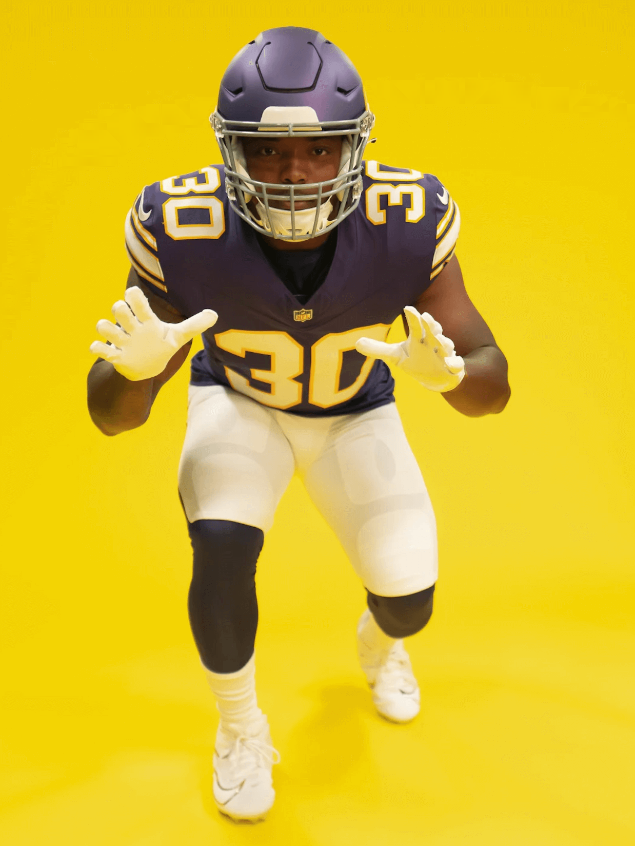
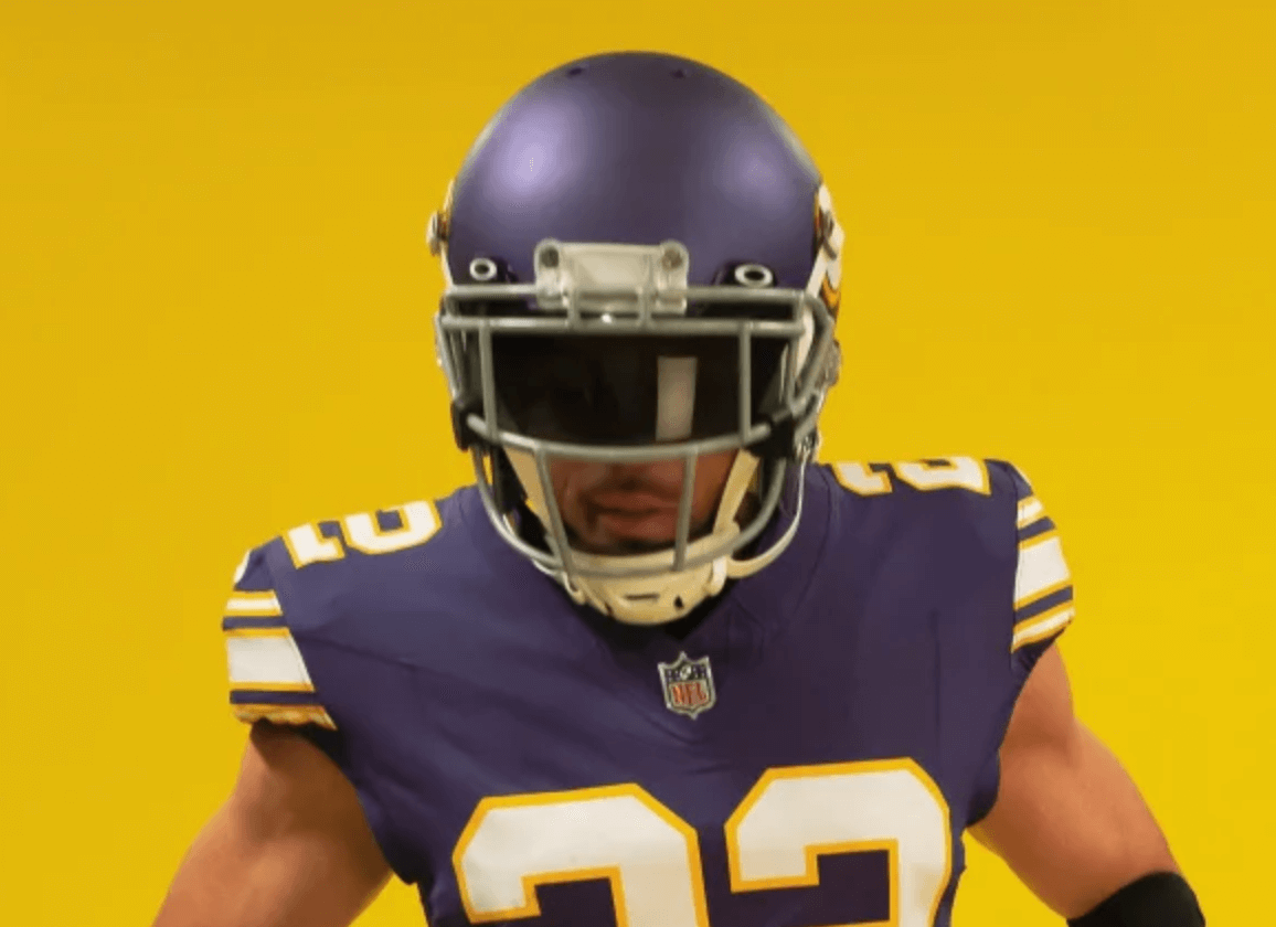
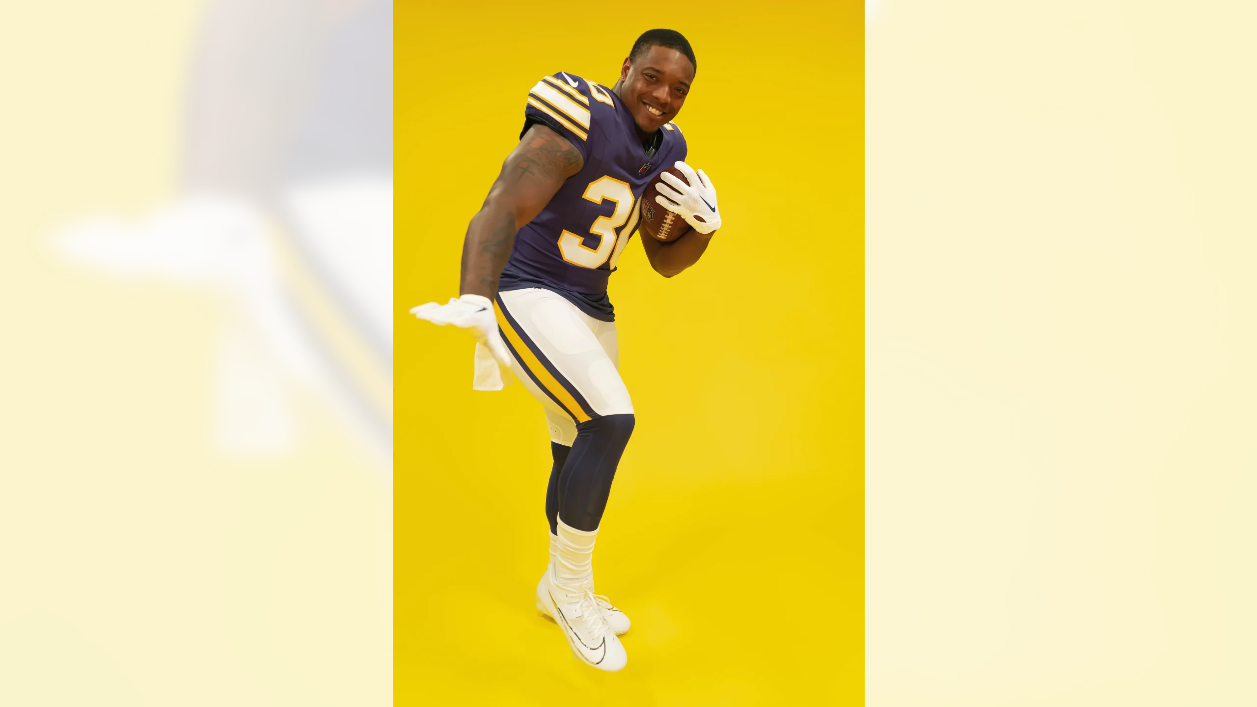
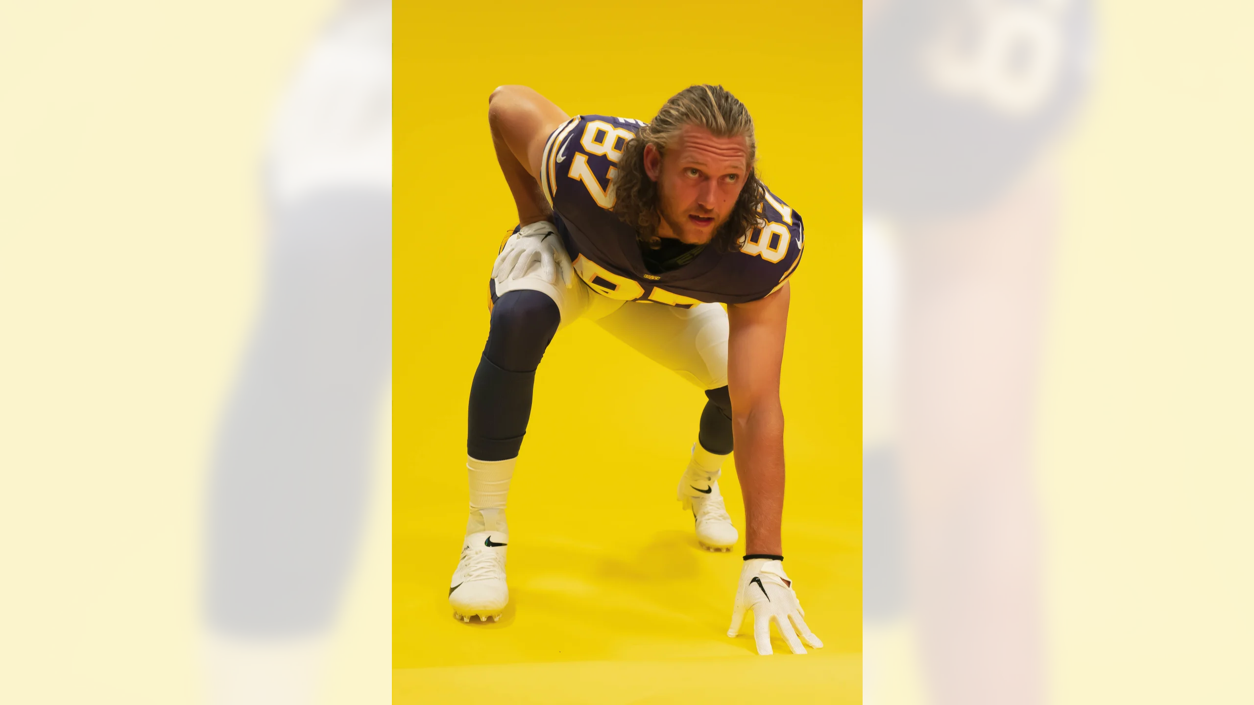
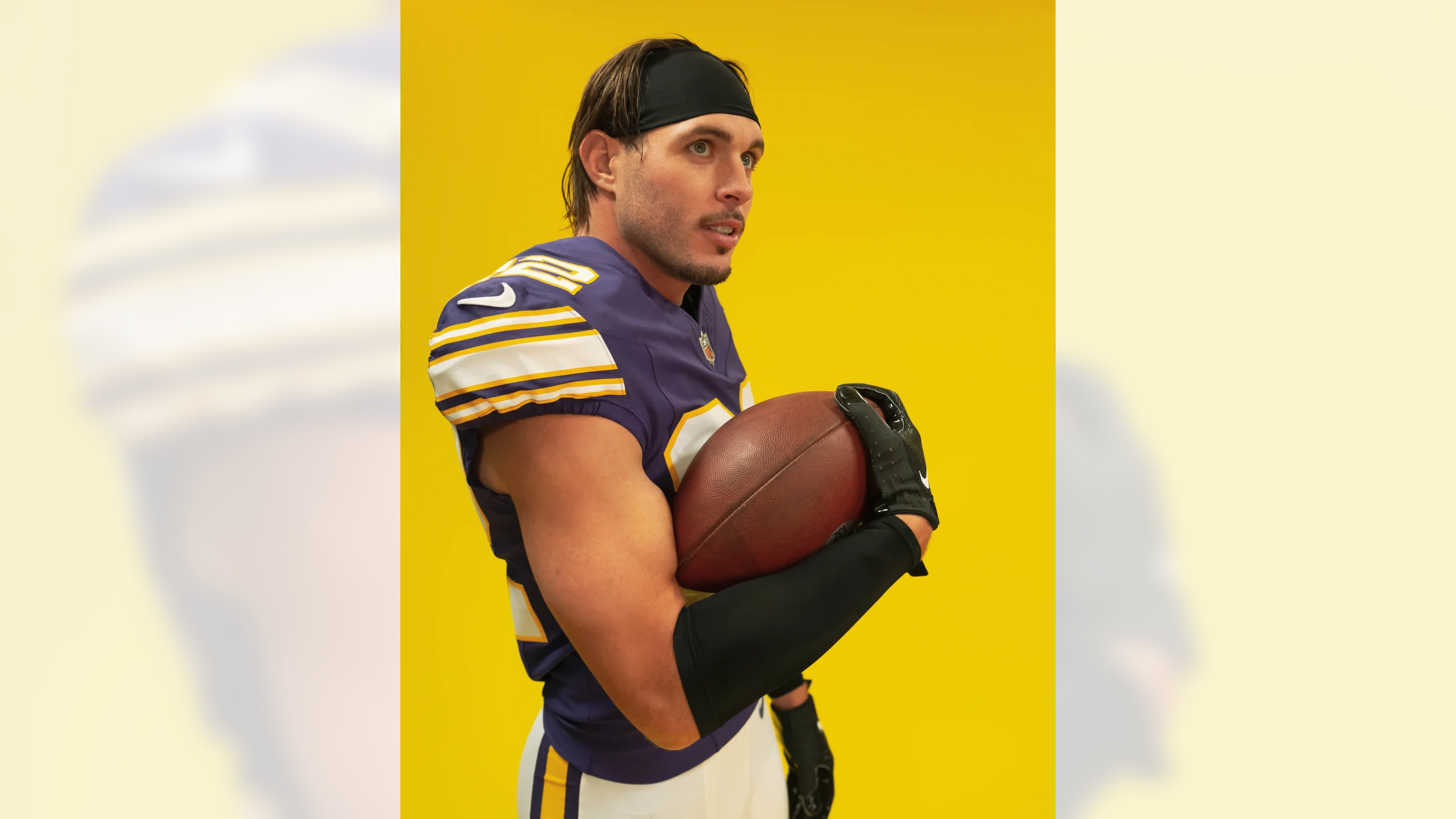
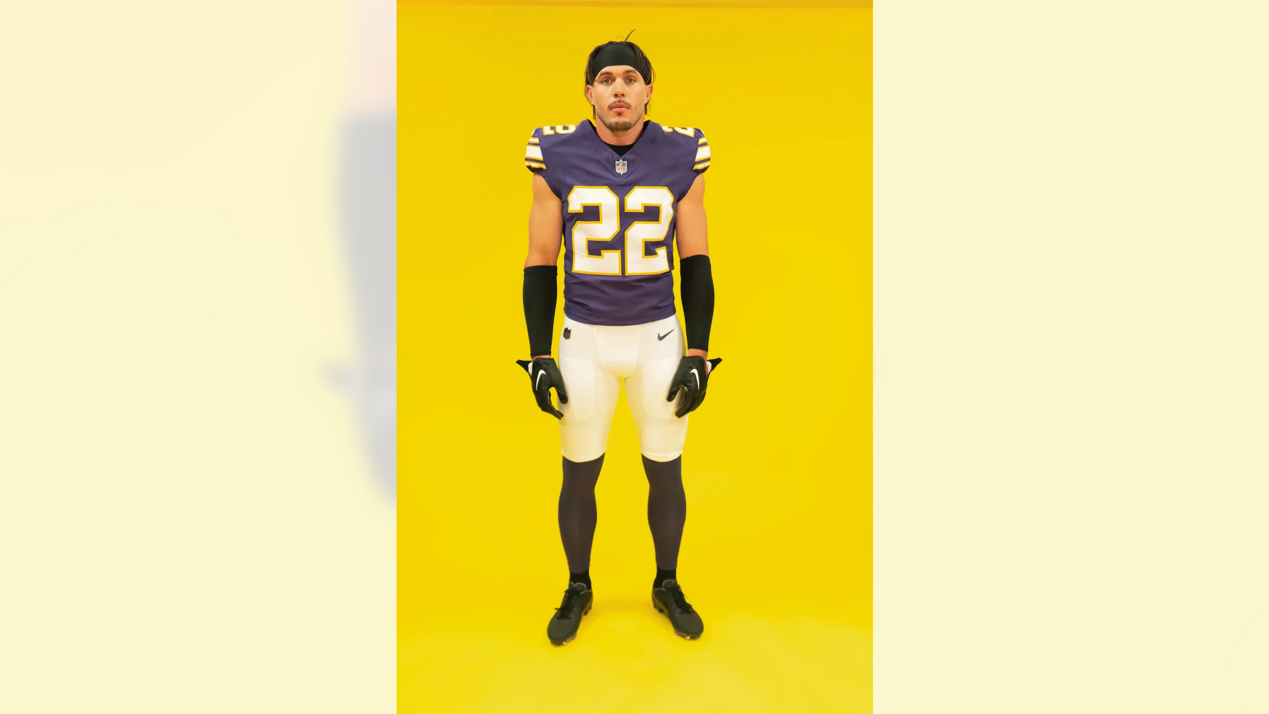
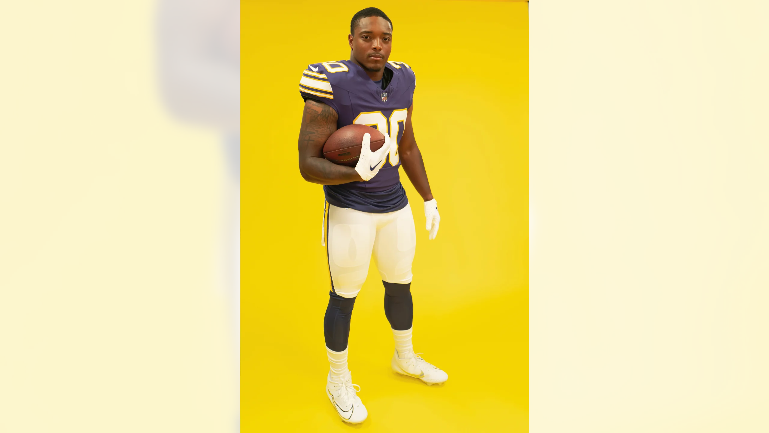
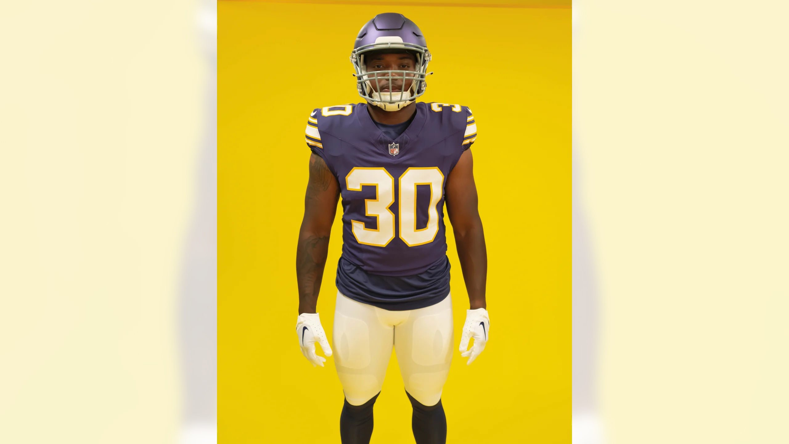
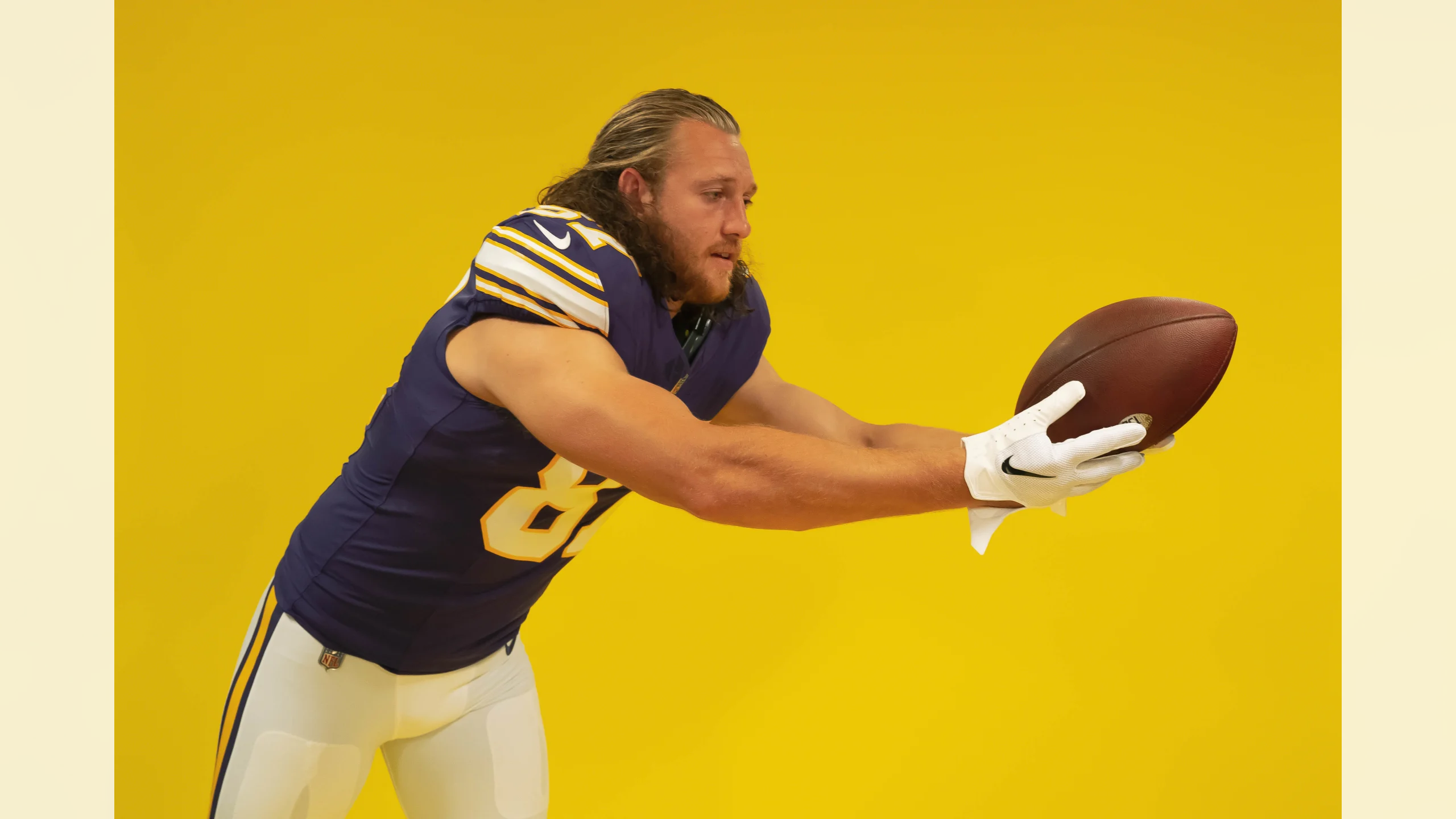
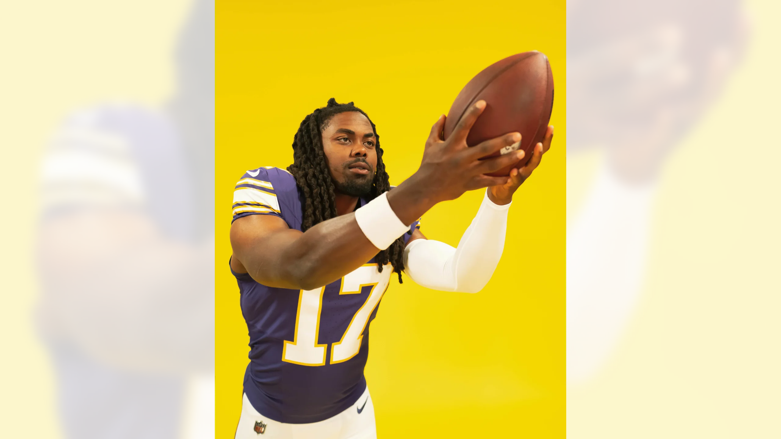
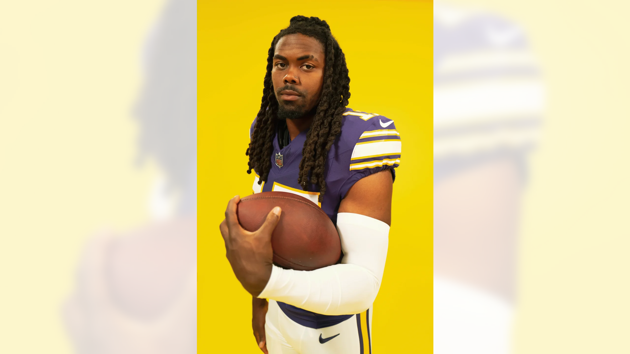
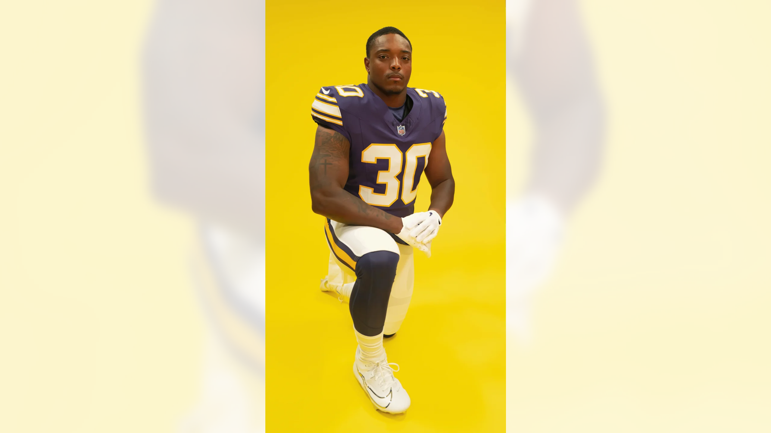
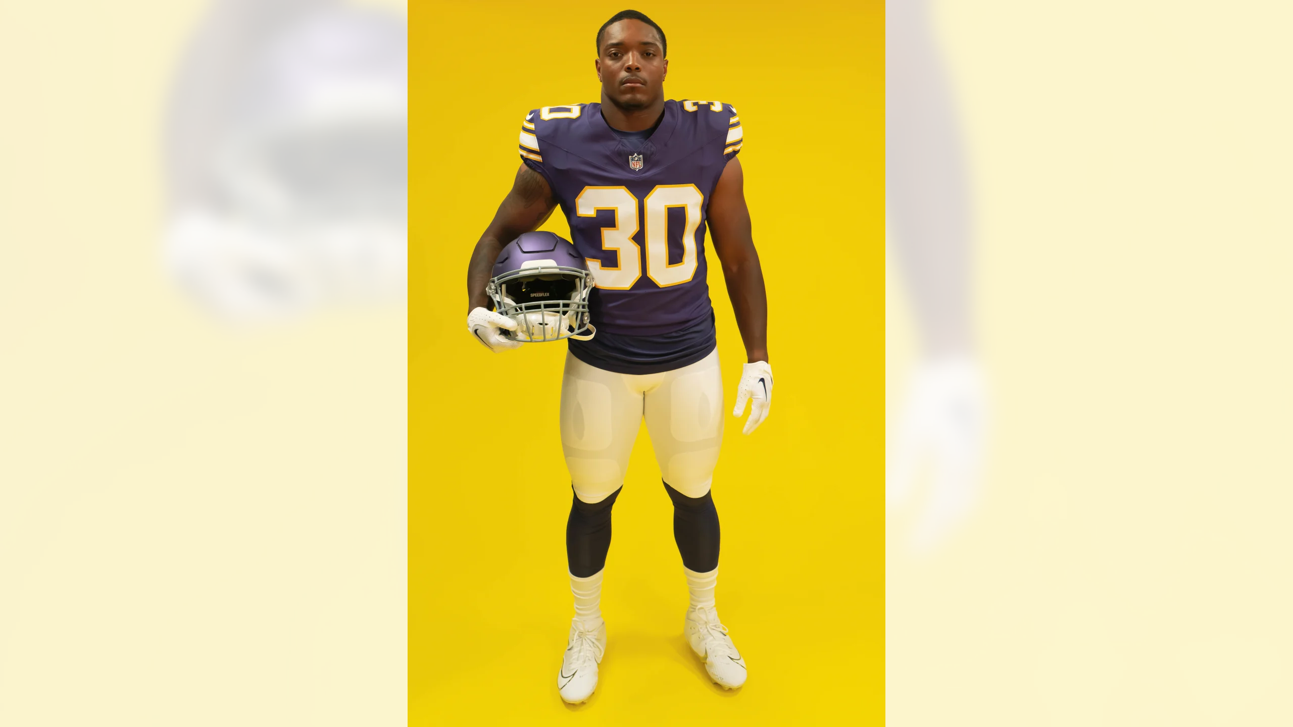
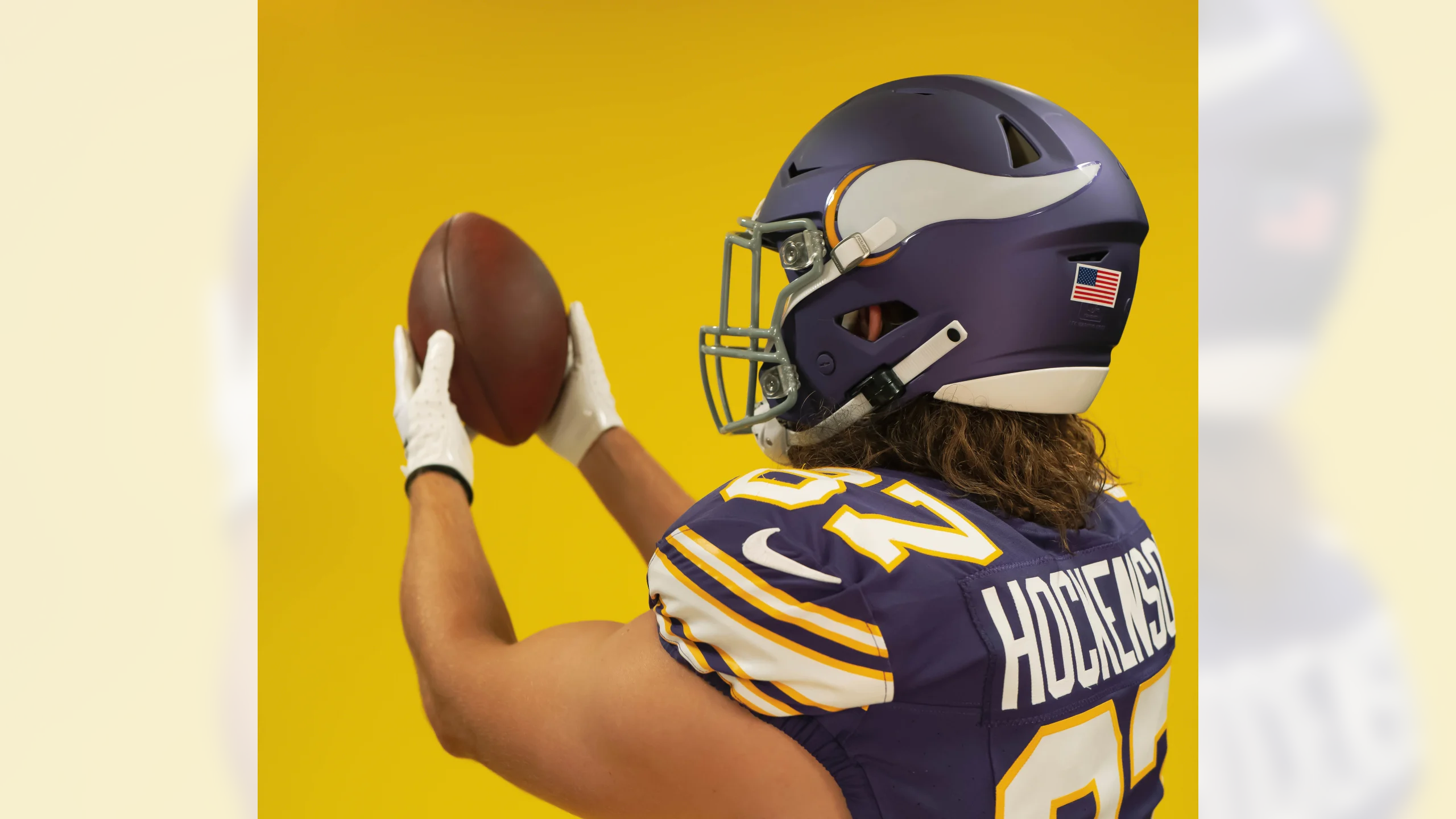
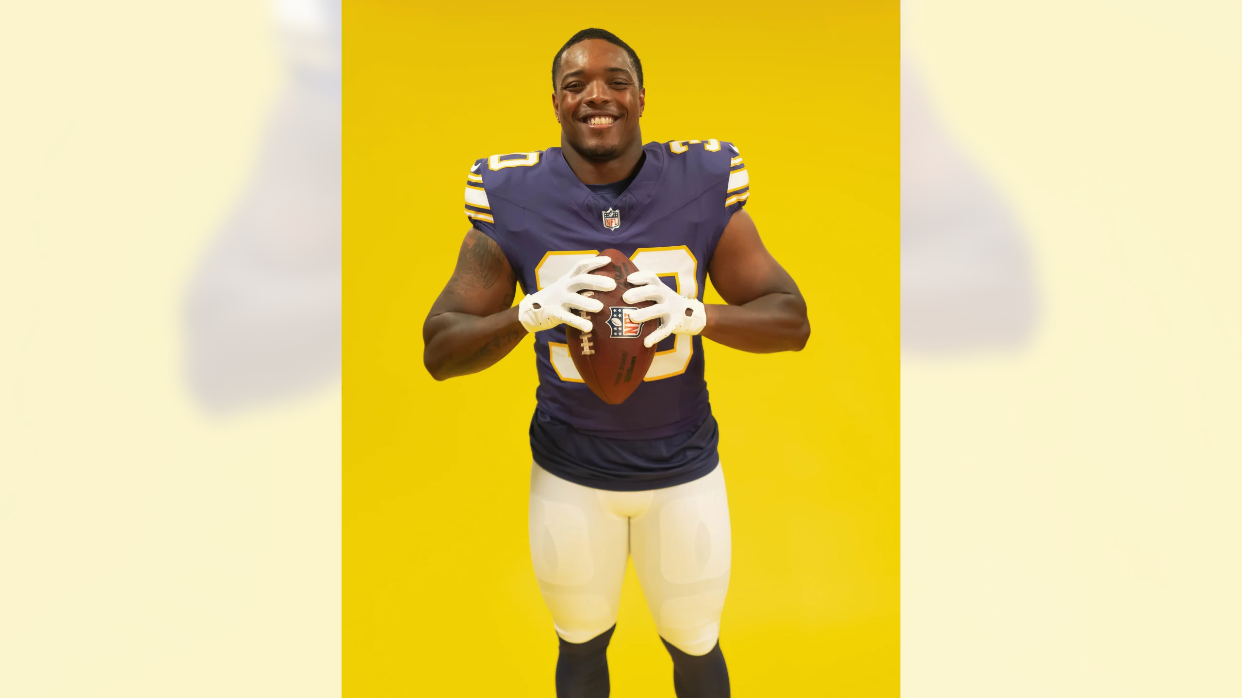
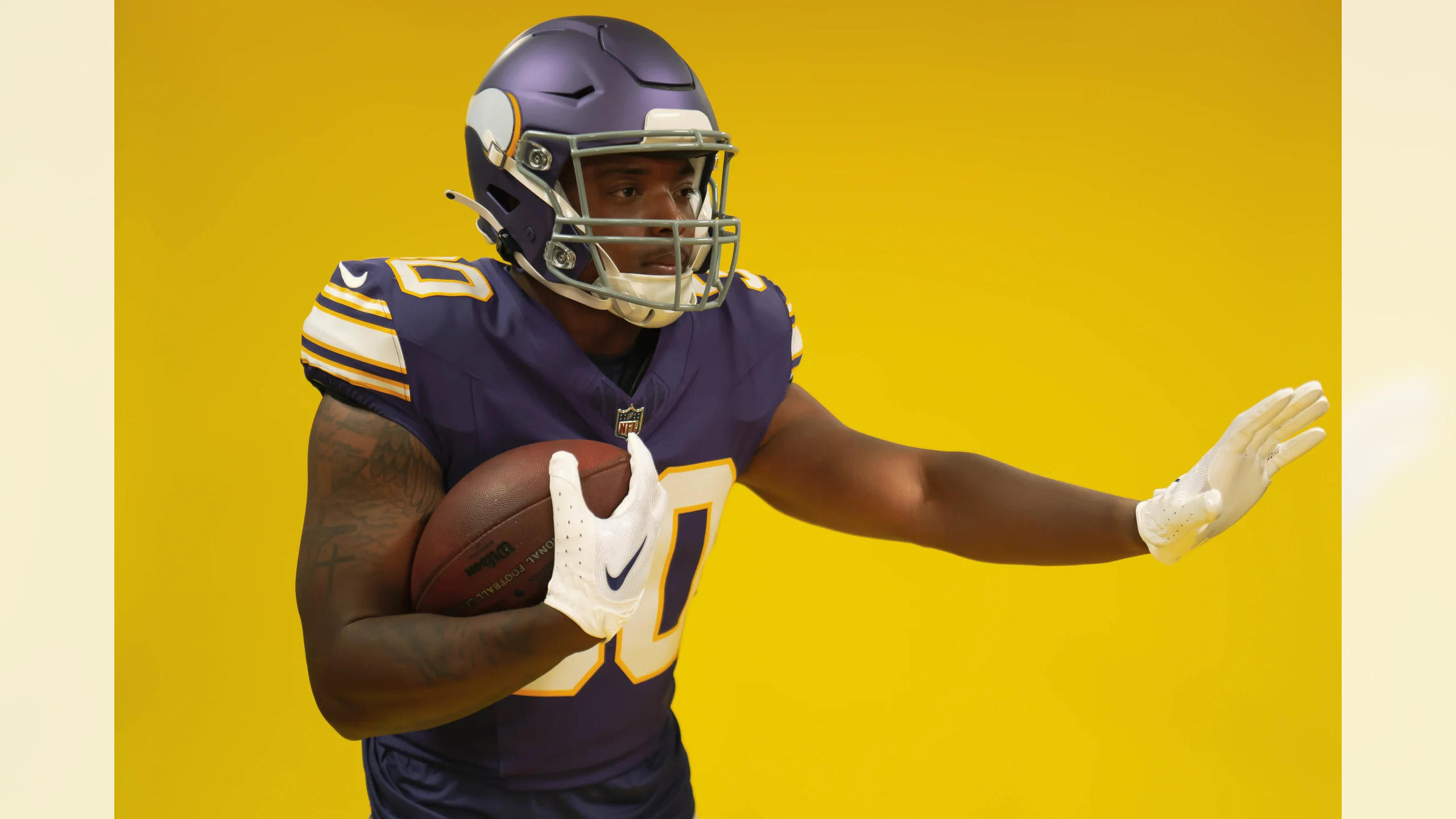
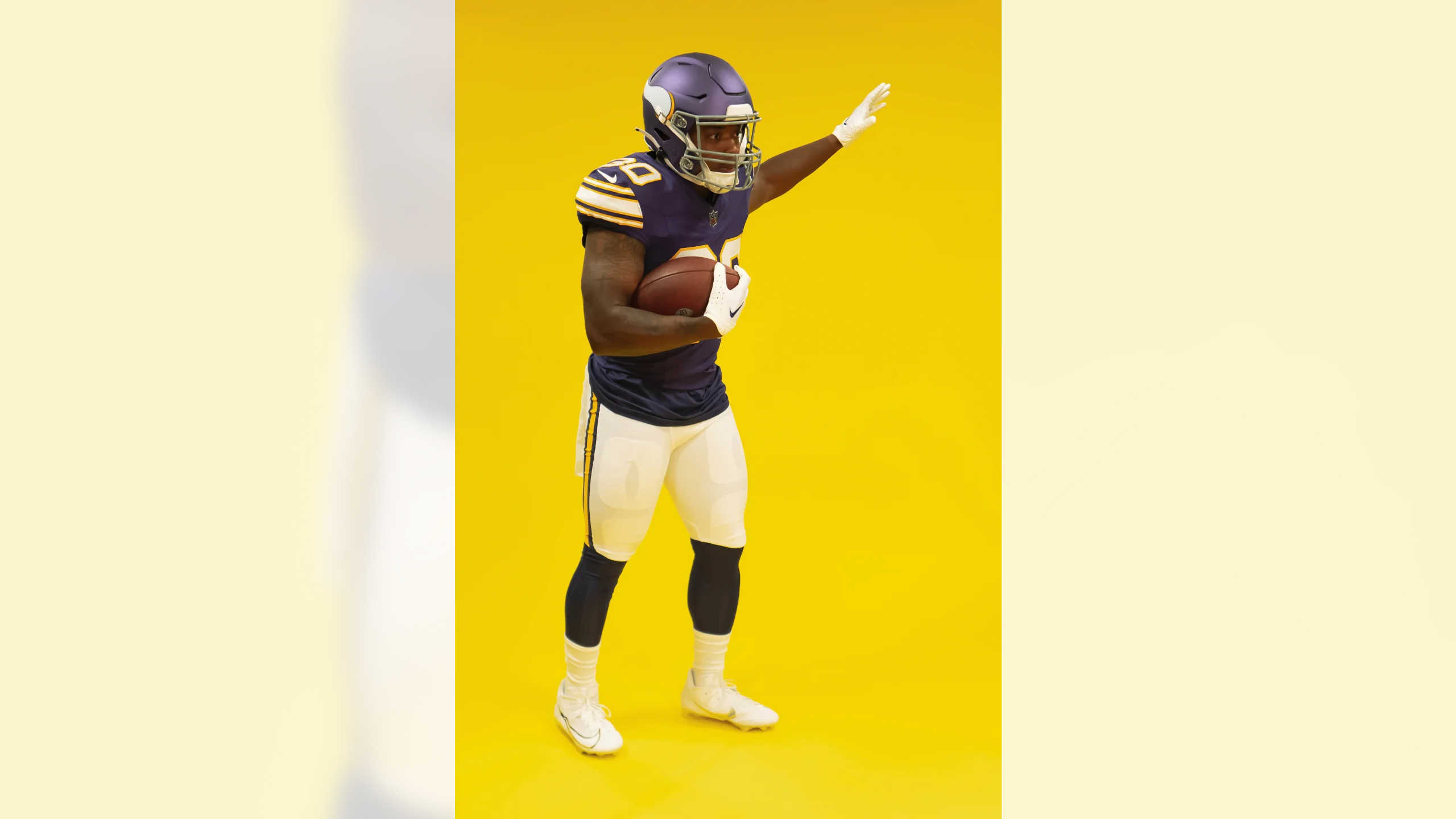
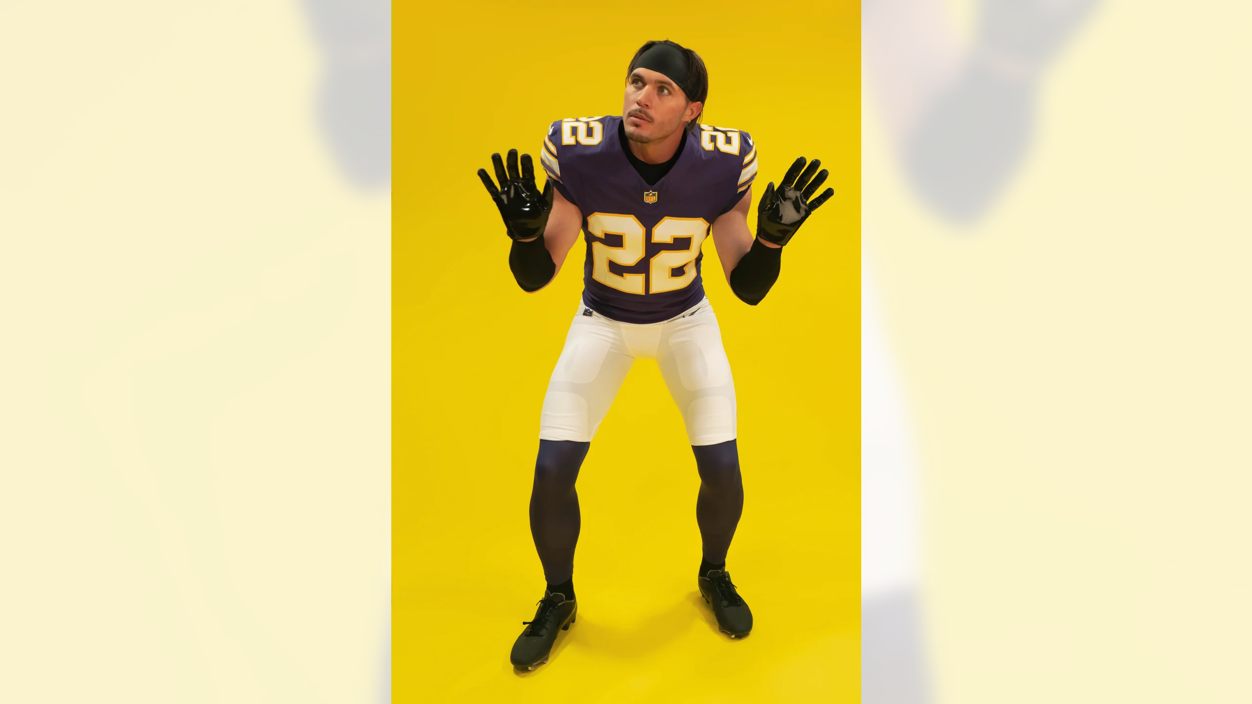
The Vikings, as expected, have unveiled a throwback uniform that will be worn for their season opener against the Buccaneers on Sept. 10. Except for one detail, which I’ll get to in a minute, I think they look great!
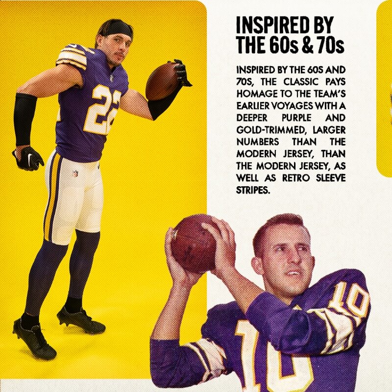
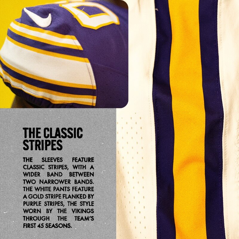
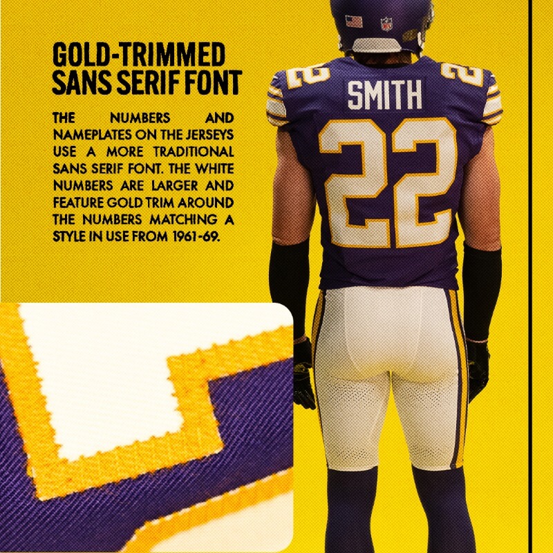
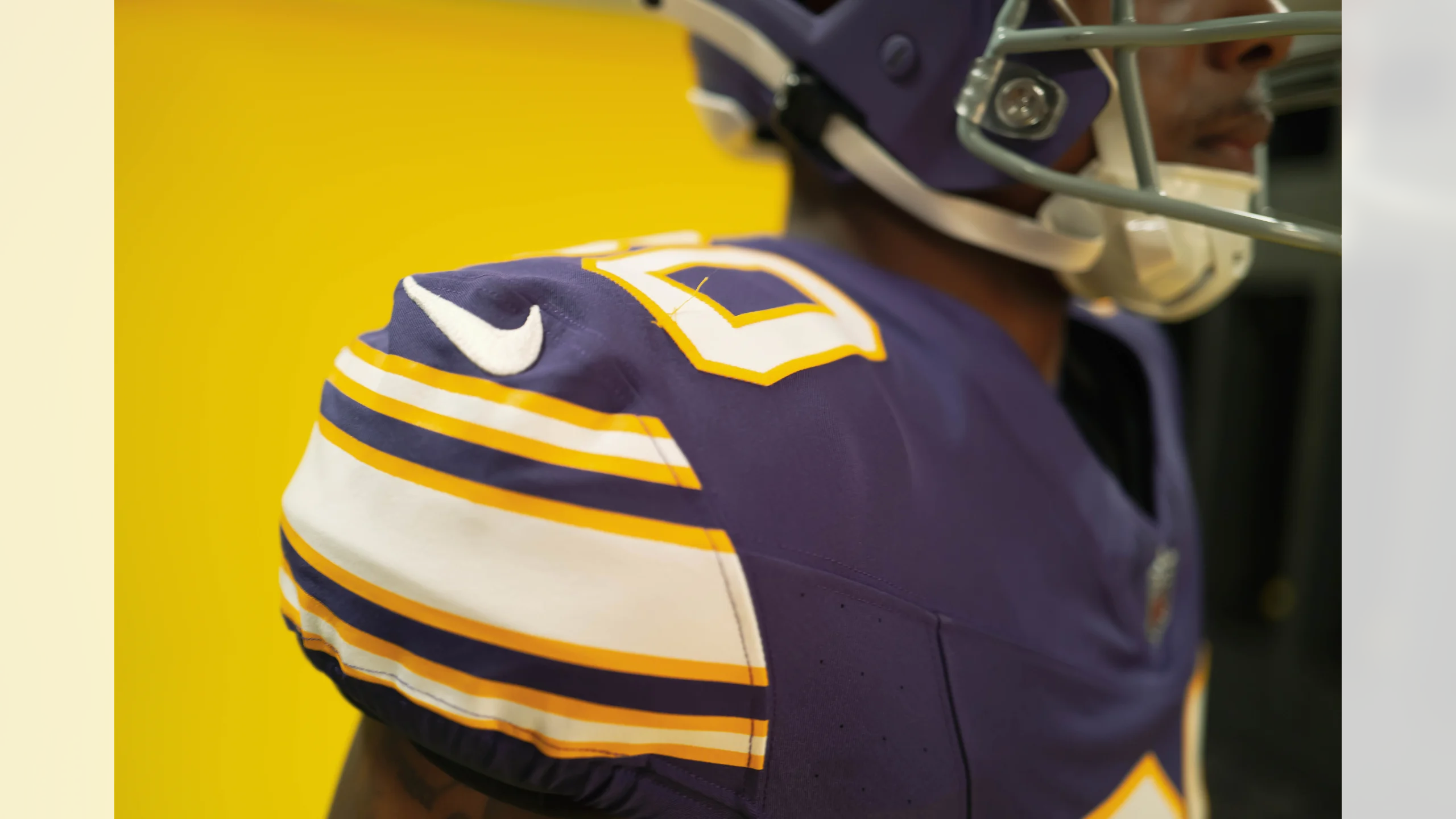
The throwback draws on designs that the team wore in the 1960s and ’70s. Here are some of the details (including an inaccurate claim that the block numbers are “sans serif”):
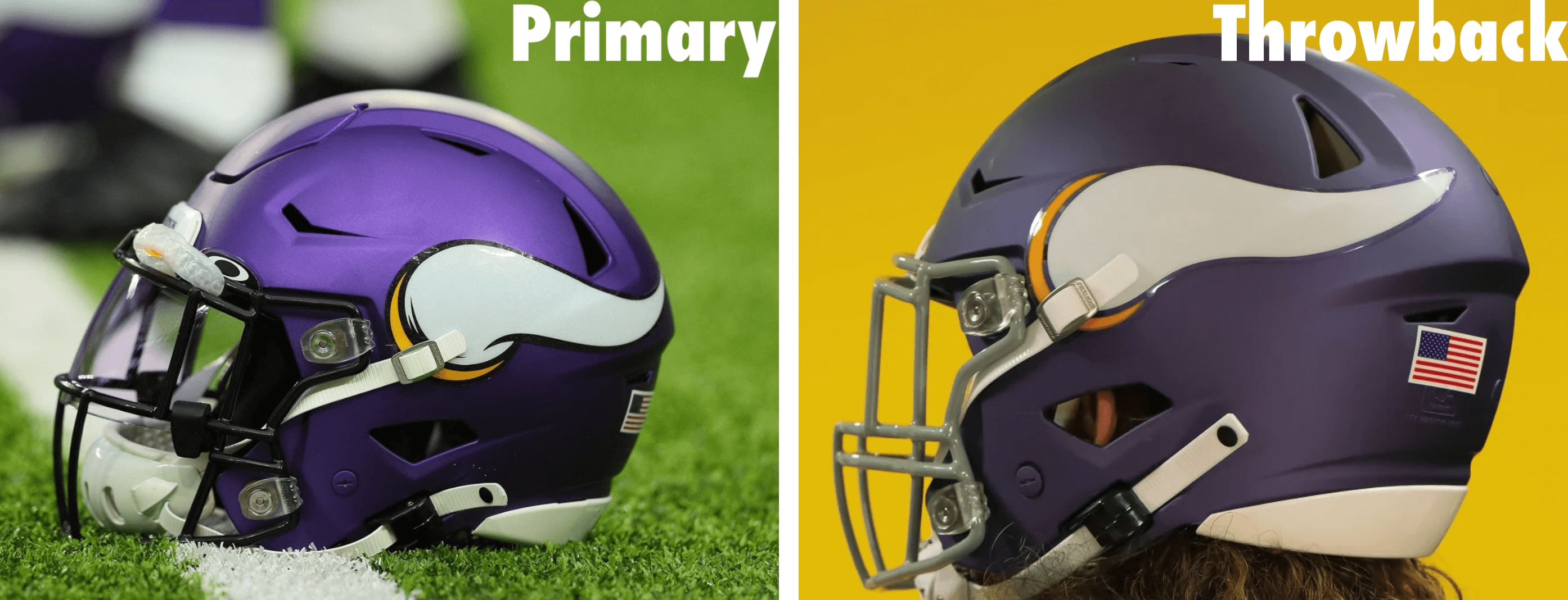
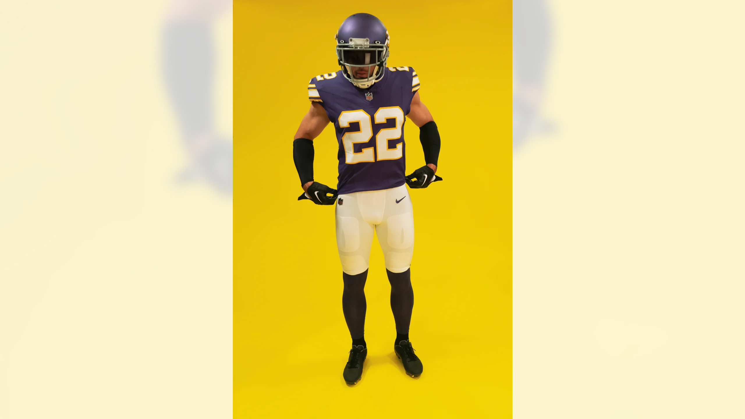
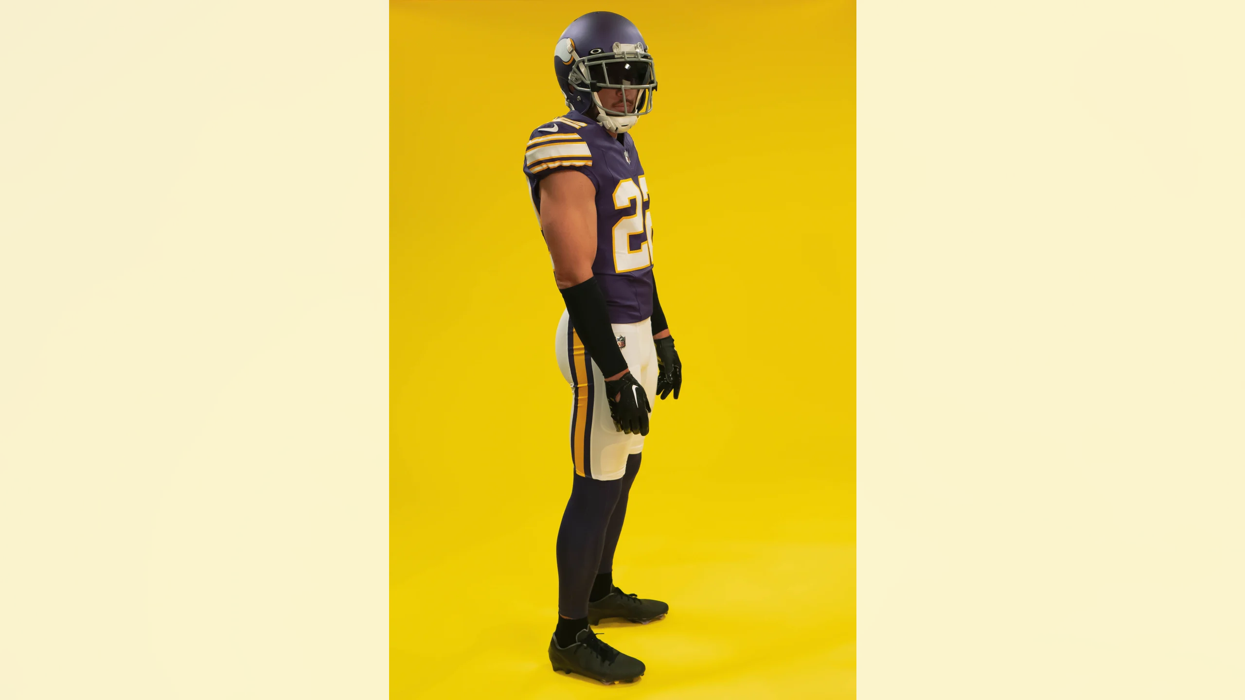
The biggest surprise, and a slight disappointment, is that they’re sticking with their primary matte-finish helmet with the lighter shade of purple, instead of creating a more historically accurate glossy helmet with a darker shade:
So the release of this throwback has nothing to do with the lifting of the one-shell rule — they could have worn it anytime over the past decade.
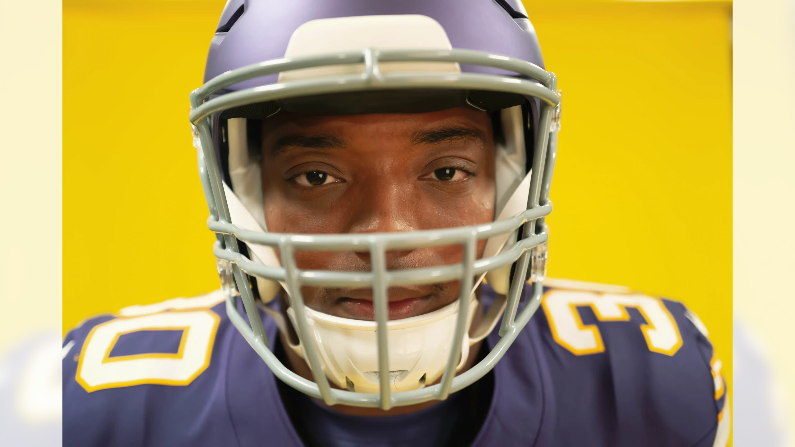
Speaking of the throwback helmet: It will have a grey facemask, a blank nose bumper, and the team’s original horn design, which is ever-so-slightly different than the current horns. Here’s a comparison (the current primary was adopted in 2013):
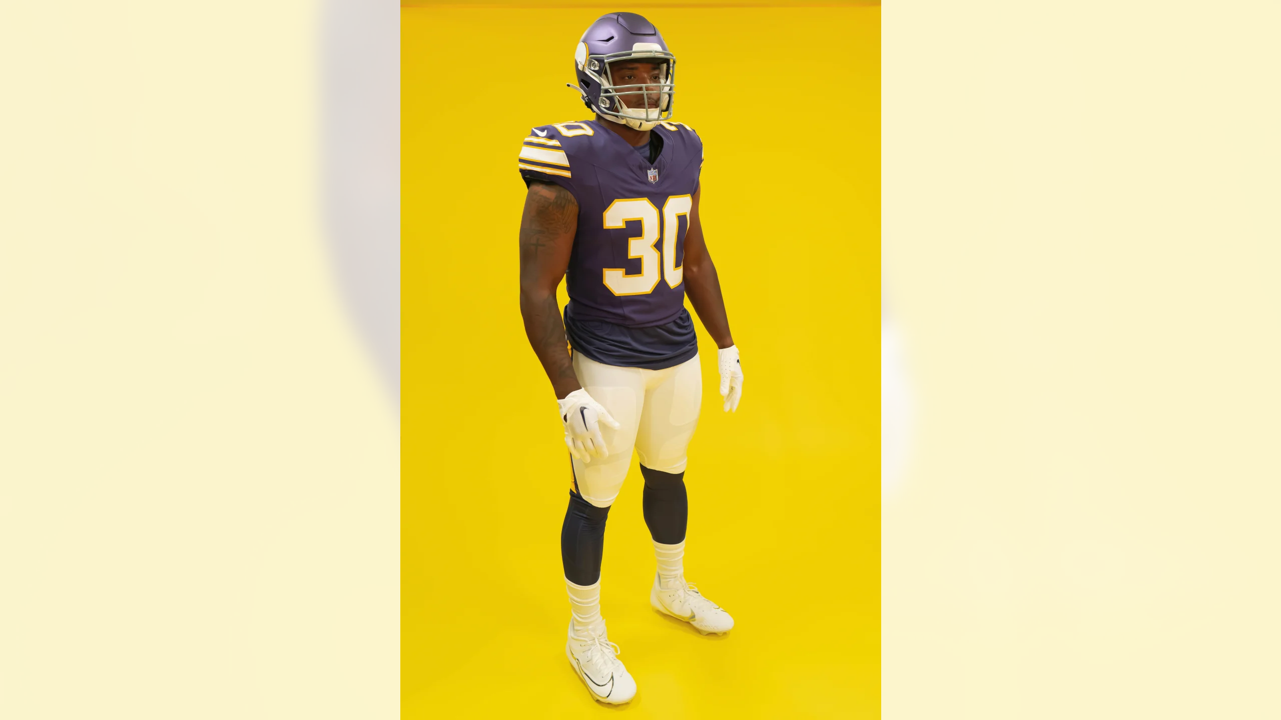
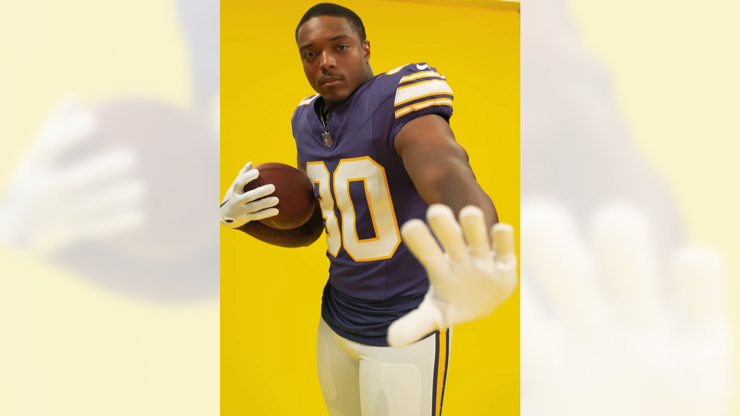
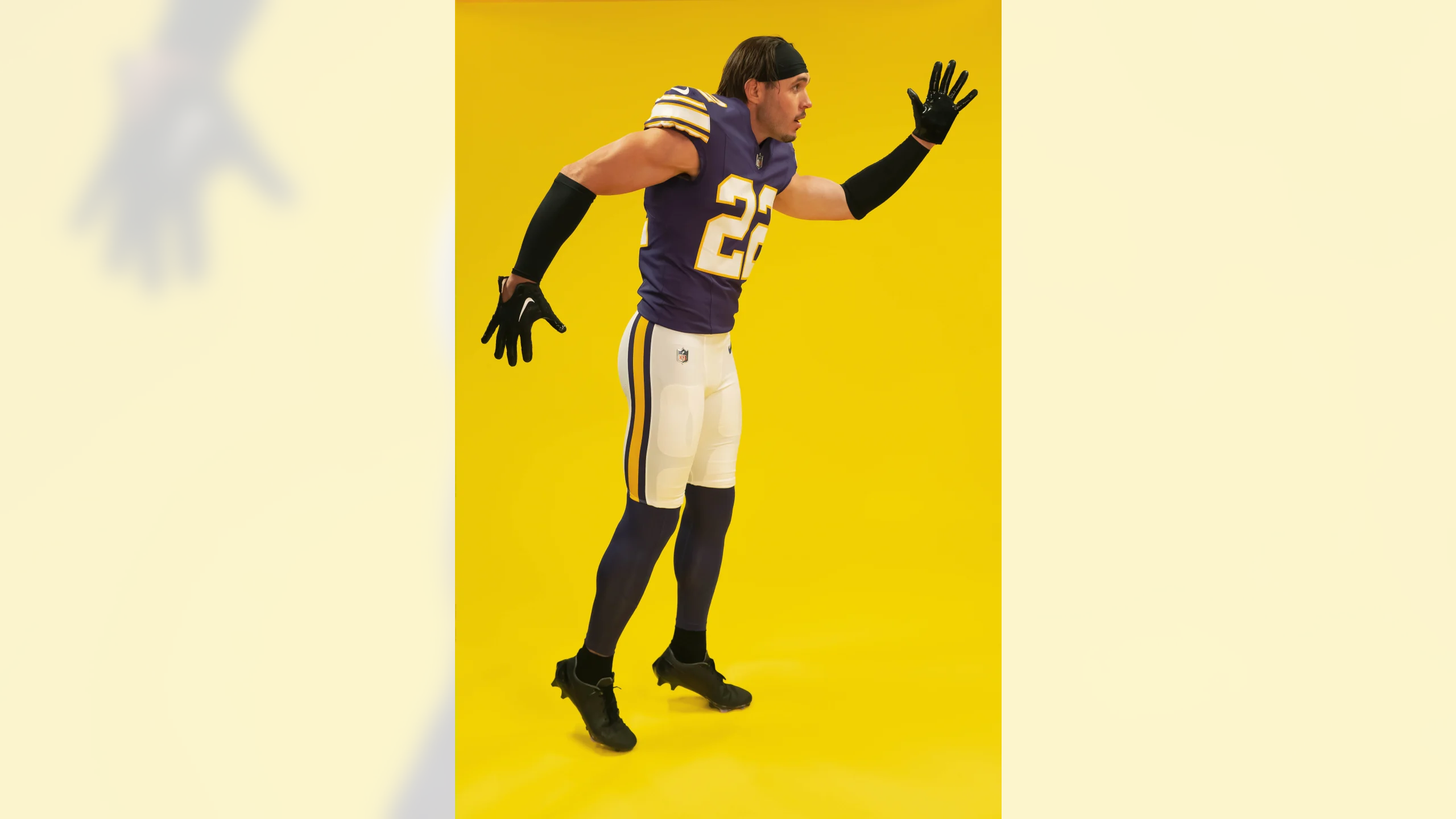
You can see dozens of photos of the new throwback uniform here:

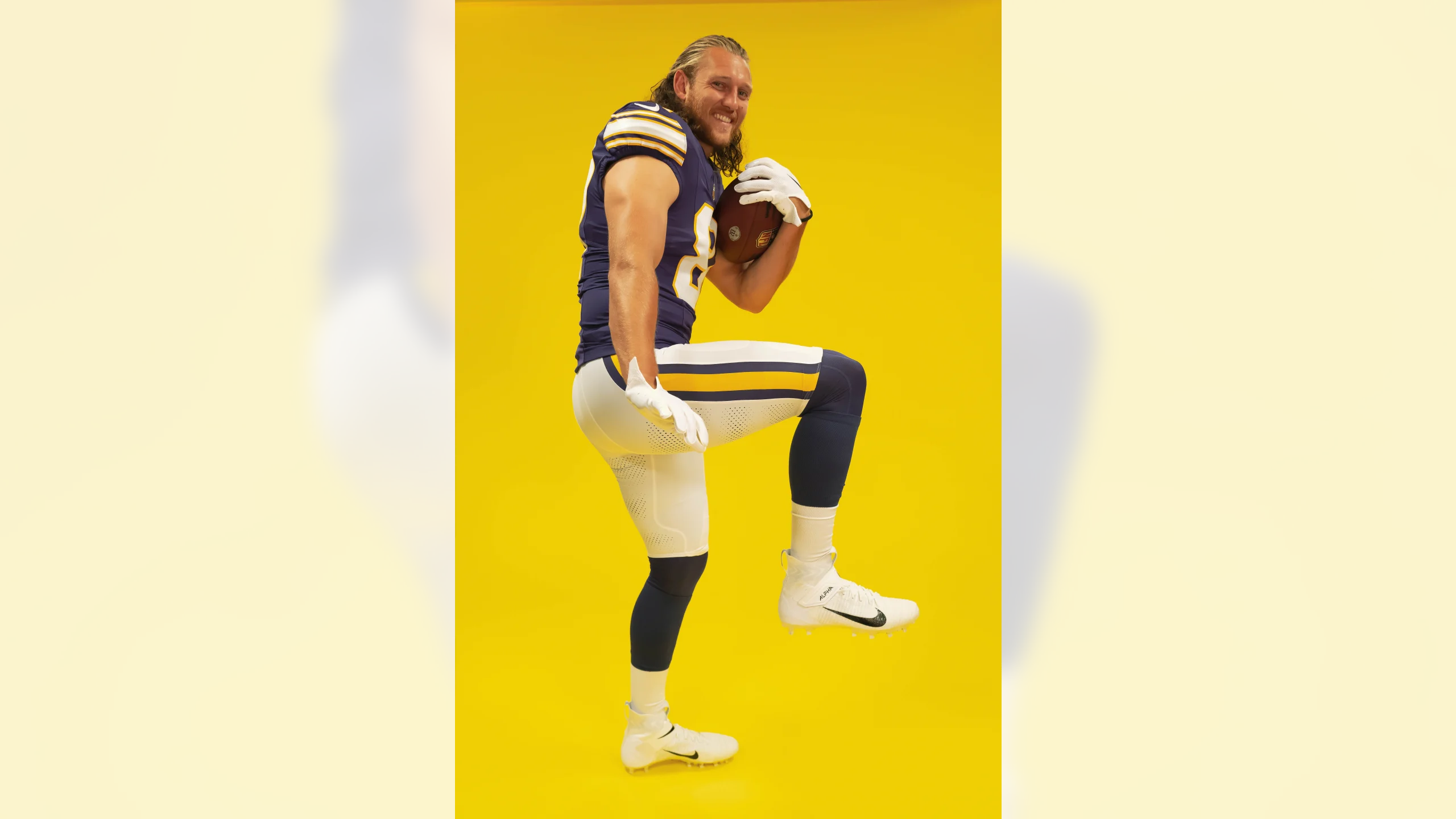
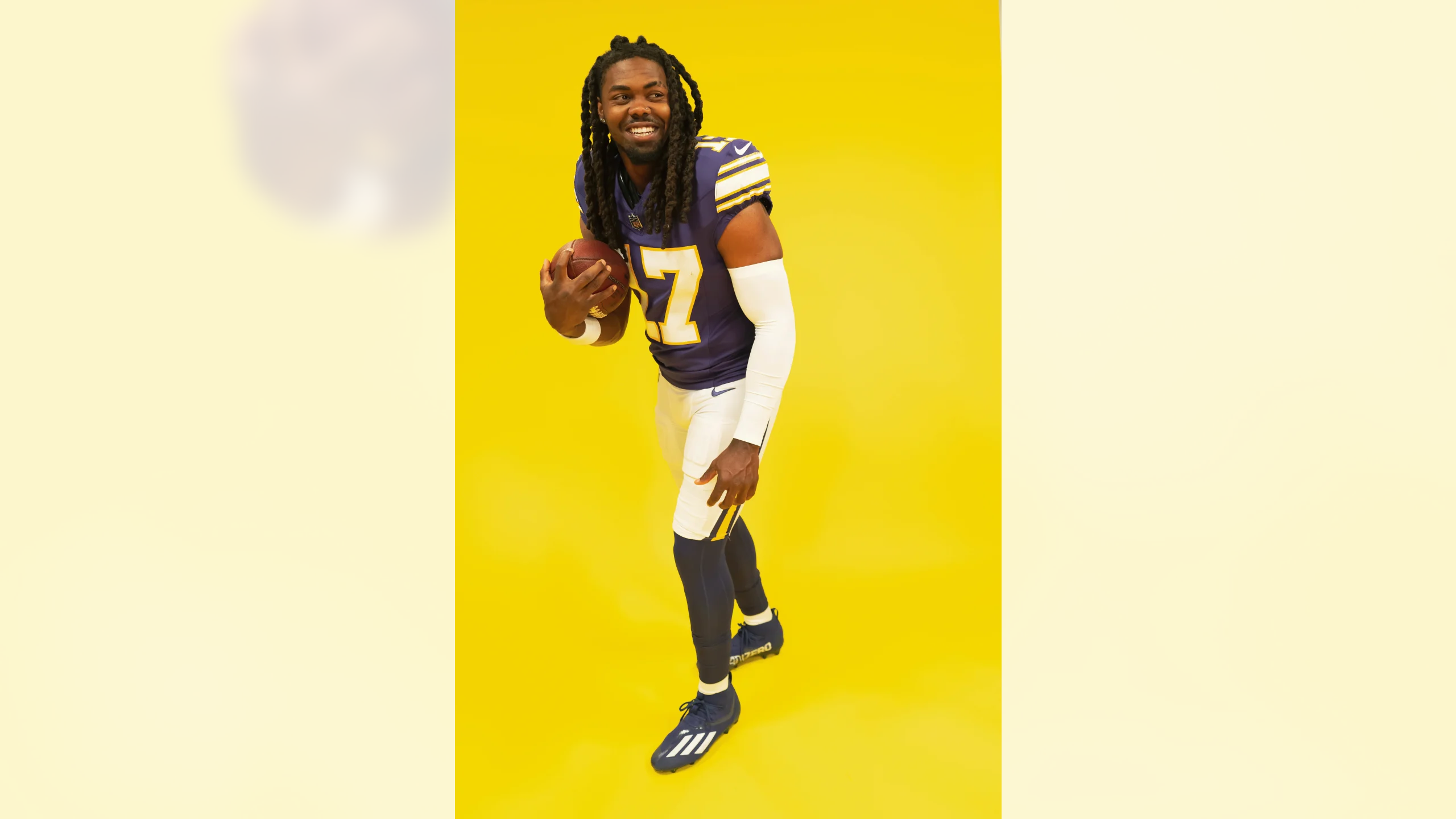
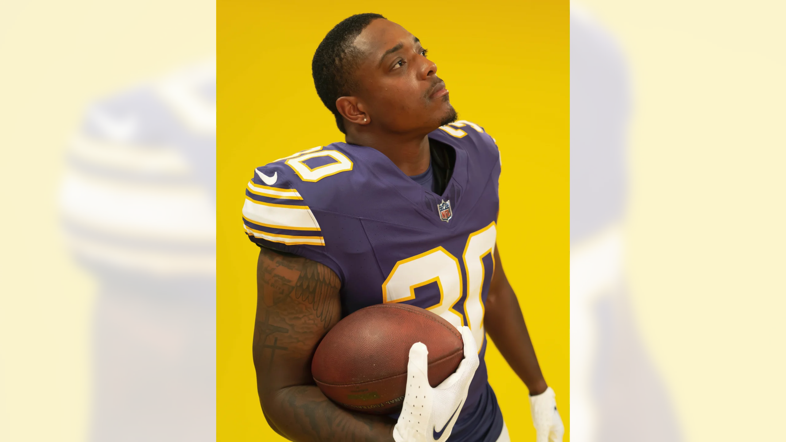
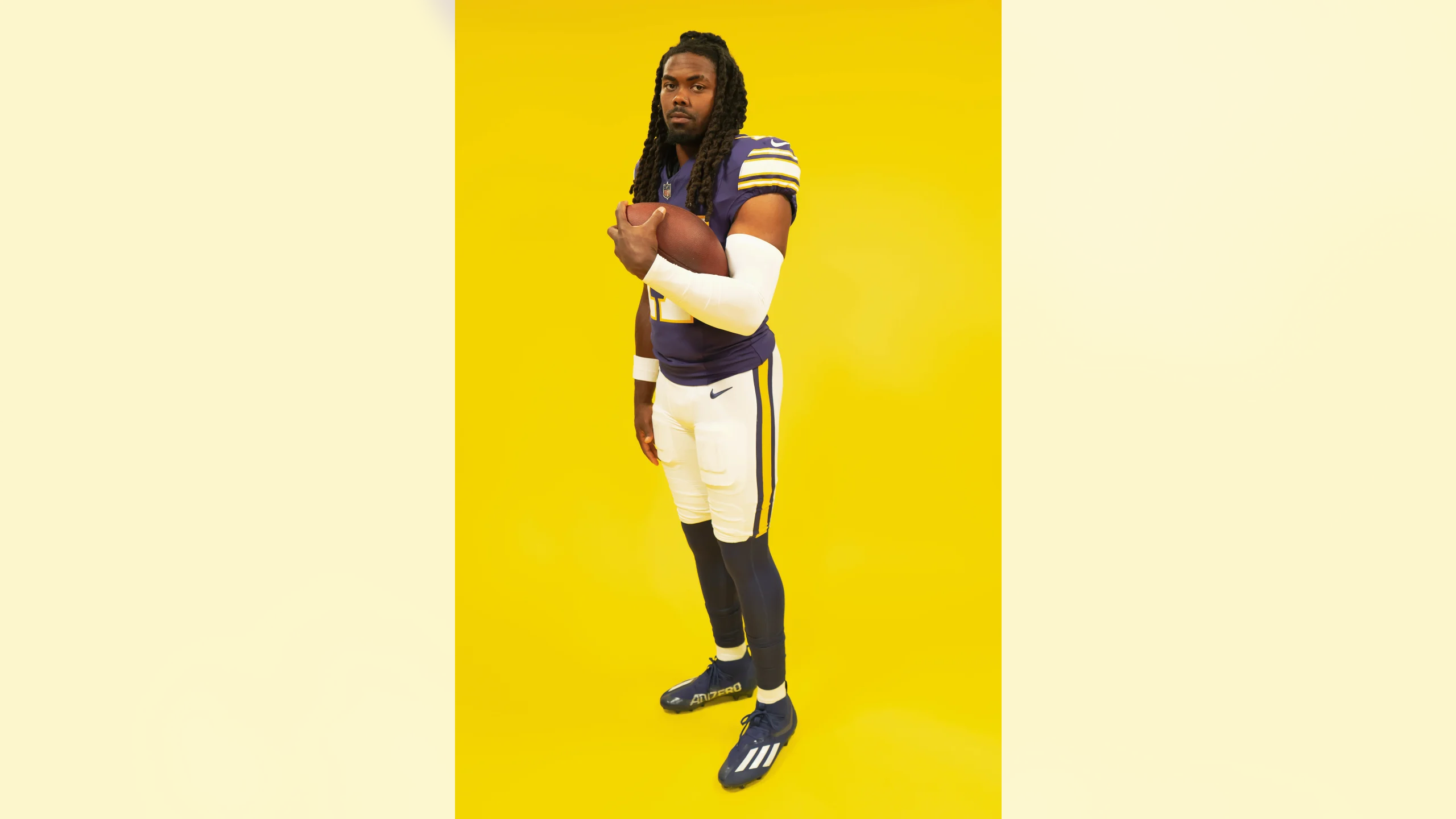


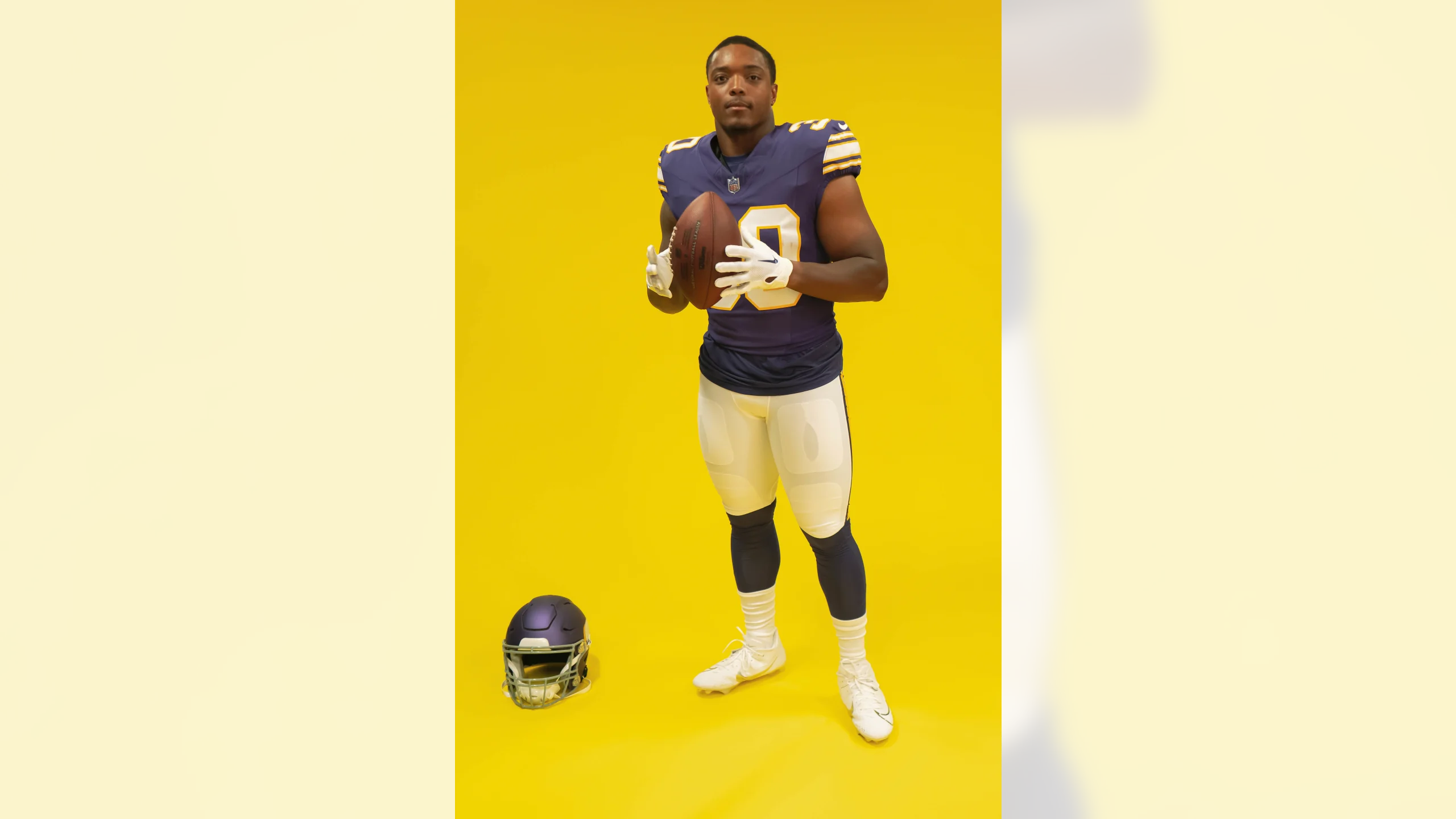
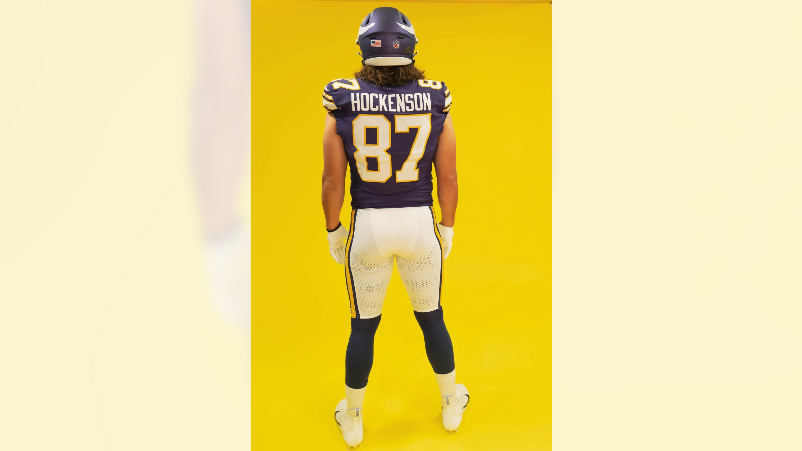
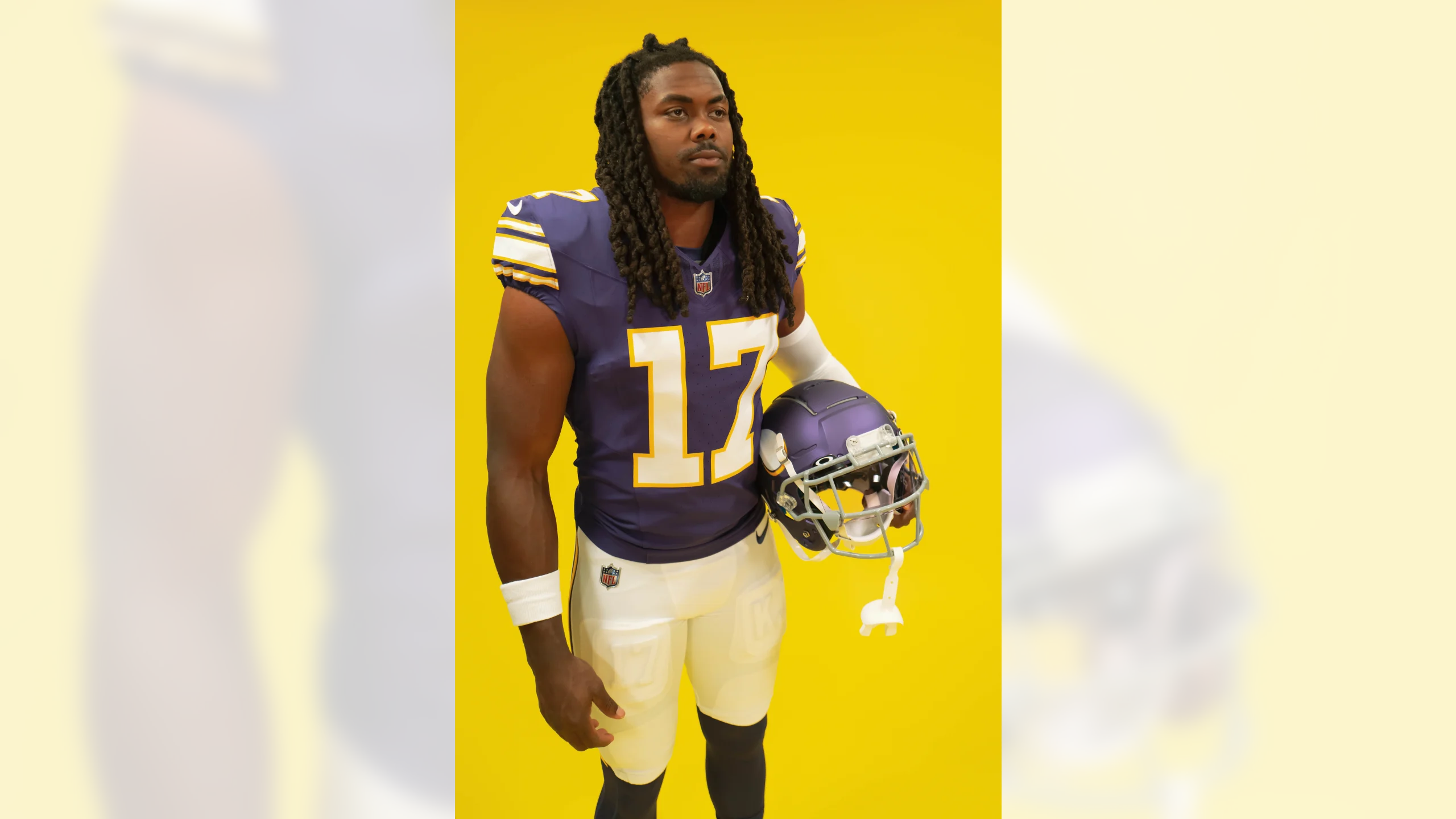
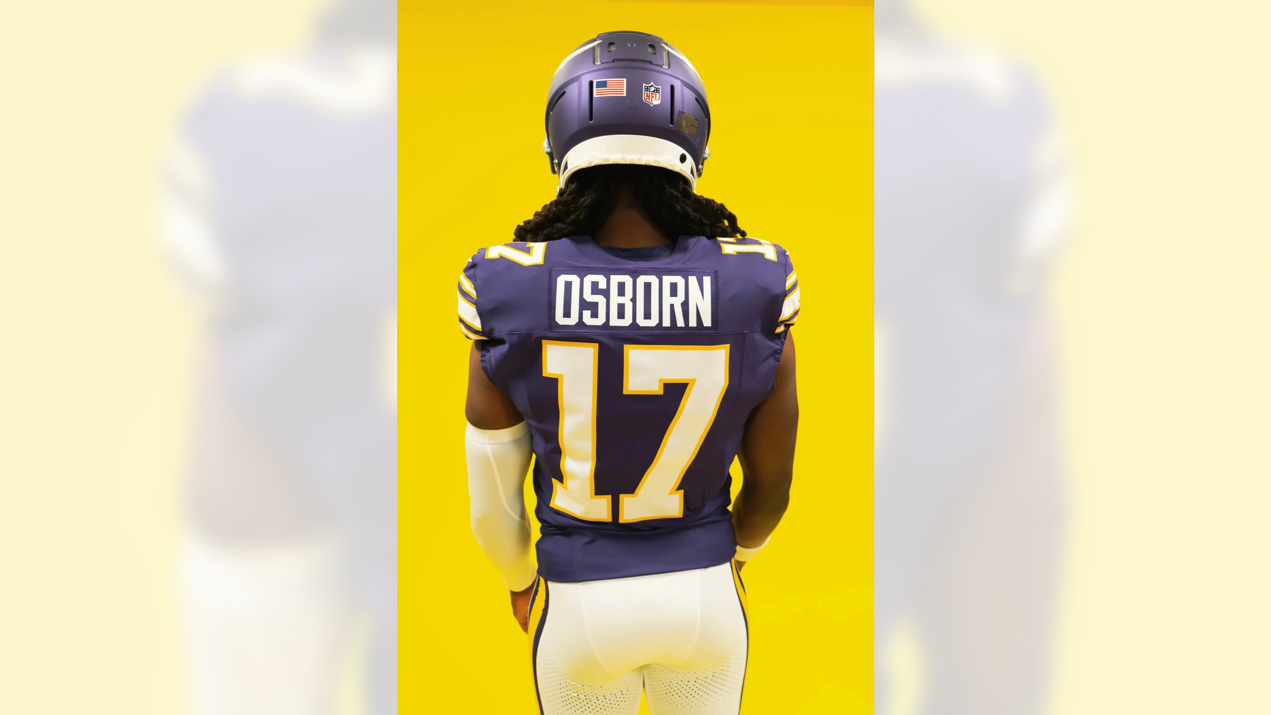
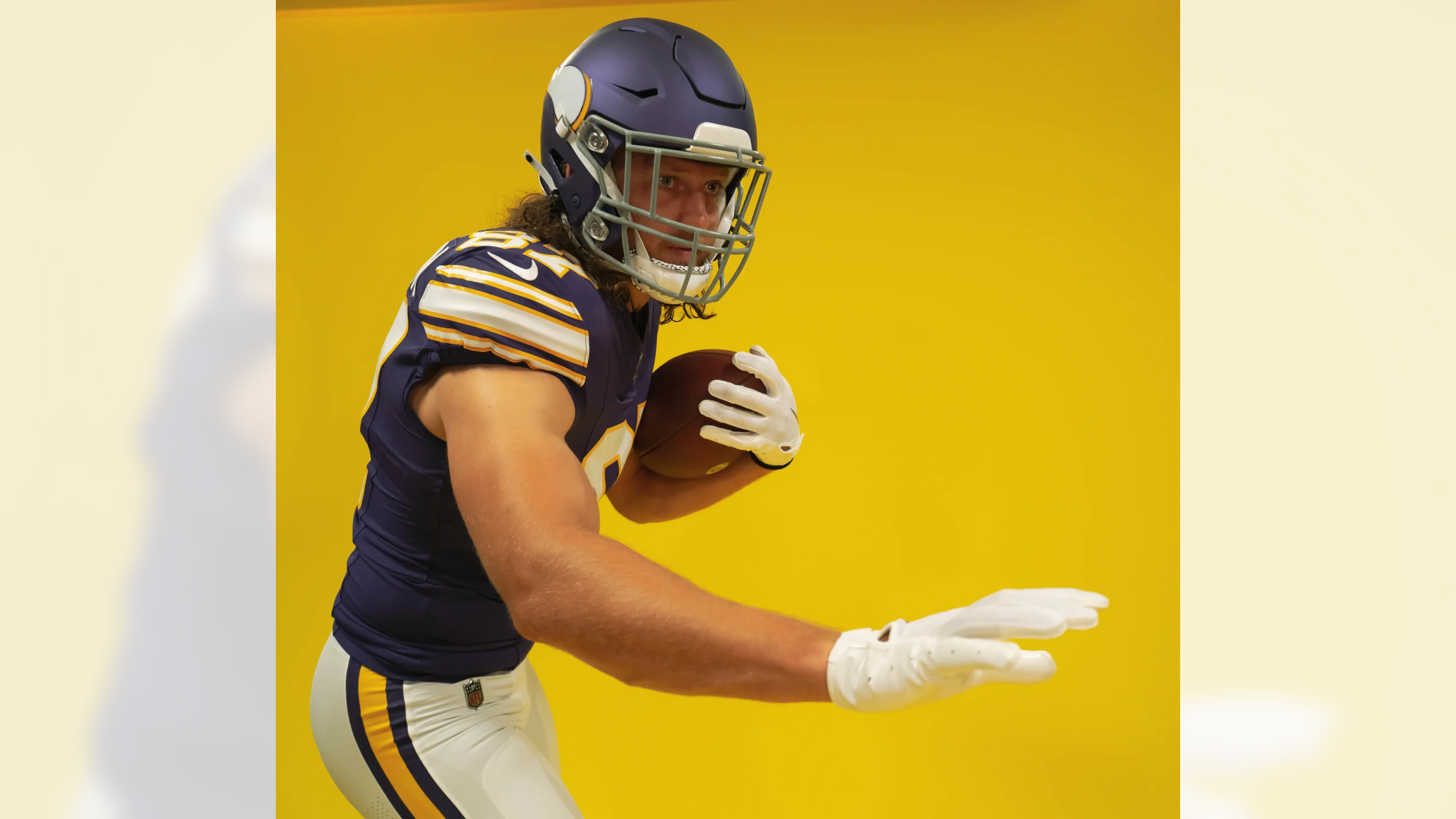
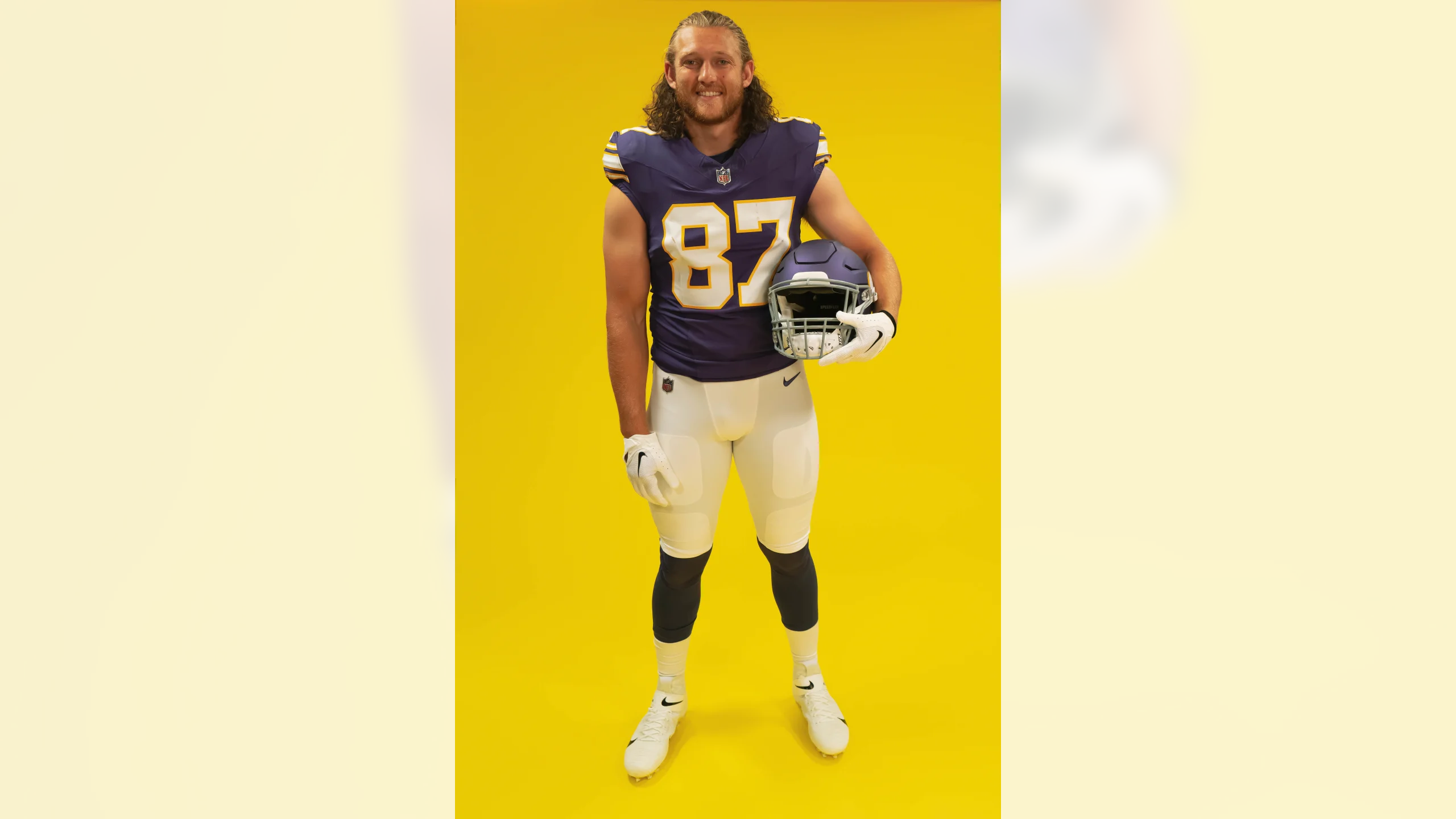
This is, obviously, a huge improvement over the Vikes’ current uniforms, if only because it doesn’t have the idiotic mismatched number font. Too bad they’re wearing it only once. (Also too bad that Tampa Bay doesn’t have a white-jersey version of the creamsicles to wear for that game!)
Meanwhile: My Uni Watch Premium article on Substack this week will be a deep dive on the original uniforms that inspired this throwback. Like the other deep dives I’ve recently done for the Bucs’ creamsicles, the Eagles’ Kelly greens, the Seahawks’ blue/silver set, and the Oilers’ uniforms, this one will be filled with obscure fun facts and great visuals. It will be published either Wednesday or Thursday. You can receive it in your email in-box (and gain access to my full Substack/Bulletin archives) by becoming a paid subscriber to my Substack. Thanks!
Next up: the Seahawks, who will unveil their new throwback at 11:32am Eastern tomorrow.
Update: There are apparently some rumors about the Vikes adding a white alternate helmet later this season, because the white-over-white combo that they wore for a home game late last season was a hit with fans. If so, that would explain why they kept the matte helmet for the throwback, thereby retaining the option for a different helmet shell.
But there’s a catch: Alternate helmets can supposedly be worn only with alternate uniforms, and white/white isn’t an alternate combo for the Vikings — they wear it on the road all the time, and it’s just their standard white jersey and white pants. But the NFL often seems to bend these sorts of rules, so we’ll see.
That is so nice! Can we keep it as the primary?
This has the potential to be an excellent year for throwback uniforms!
My thoughts as well!
Didn’t think I’d ever see “sans serif” used to describe that block numbering style
And isn’t that literally a serif on the bottom of the 2’s on the uniform in that graphic?
This is objectively their best uniform and there is no reason they should deviate from it. It removes all of the stupid quirks of their current set and is better for it in every way.
100% agree. Geeeeez just keep these.
I can’t quite tell, but are the socks black or purple? One would certainly be better than the other.
Purple.
Better than black, but then again, not sure which color you would prefer there :)
Were they this dark in the past? I’m wondering how much of this is lighting and photography, and how much is just having it too dark?
I think it’s just the lighting.
These are nice, but not terribly noteworthy when compared to the return of Bucco Bruce, the Seahawks blue/greys, Kelly Green for the Eagles and the Titans throwing back to the Oilers.
Is that a typo on the “Inspired by the 60s & 70s” graphic when it says “than the modern jersey” twice?
I was thinking the same thing.
I was thinking the same thing. I was thinking the same thing.
No reason they can’t have a purple vs creamsicle match-up.
True. The NFL now allows color vs color for special games, Color Rush, and throw backs, ad long as there’s enough contrast. Those creamsicle uniforms would have plenty of contrast with practically every opponent, except maybe the orange Bengals jersey. Also maybe the lighter shades of uniforms, like the light blue Chargers and aqua Miami.
“— they could have worn it anytime over the past decade.”
GRRRRRRR!
This is definitely a keeper…get to work on the white roadie, Nike!
Would be nice if they did a throwback week or month in the nfl
YEP
It would be nicer if they told Nike to go pound sand and stop ruining the uniforms. anyone with a pulse can see the level of support the throwbacks are getting, especially relative to recent modern uniforms (Falcons, Rams, Jags and Browns before they both reeled it in a little). The cynical part of me wonders if the NFL goads Nike into making shite concepts, knowing people are lemmings and will buy whatever the team is wearing – and at the same time driving up the nostalgia factor when decent-looking throwbacks from our childhoods get the wallets open again.
Confused why they are still using the satin helmet finish when they could easily use a gloss shell with the 2 helmet rule.
Which is exactly what I wrote in the article.
I know you wrote that, just stating my confusion behind the decision.
Could it possibly be for some other helmet reveal this season?
A true throwback finish and color-appropriate helmet would have made this an absolute home-run. Alas, it’s still a huge win.
Too bad about the stupid matte helmet but this uniform is one of my all time NFL favorites. And they managed to get the stripes on those modern sleeves, bravo!
Ugh I love these uniforms so much but the matte helmet absolutely ruins it for me. I’m a fan of tweaking a throwback look to improve it (like the Browns putting the stripe on the white helmet), however I don’t think this made an improvement. When they had the correct darker shaded helmets in the late 2000s it was a lot better looking.
Oh well
I love @Paul Lukas showing this much love for purple uniforms! I’m a Ravens (and Buccaneers) fan so I’m partial to them in that way, but I agree that this set invokes many of the same feels as my Bucs’ creamsicles and the other throwbacks revealed and announced so far!
I like the sleeve stripes better than Brown’s. I’m wondering what the Seahawks will get. Maybe more of a “patch” of the Seahawk logo?
What’s wild is that on their website, it describes the numbers accurately as a slab-serif font.
link
Very nice uniform. Gloss paint would make more sense and look SOOOOO much better. I’m totally over the satin/matte helmets.
Never get me to understand why they would wear anything else. A classic football uniform.
I wish they had gone with the darker color for the helmet like the brett farve era throwbacks, and without the matte finish. I feel like that’s the coolest part of the throwback, the mismatch of the jersey and the darker helmet color. I understand feeling compelled to modernize it, but its a throwback. The Giants had basically this look against the bears this last season of a blue jersey and navy blue helmet, and it looked incredible.
Sucka for a gray face mask
For a one-off it’s fine…but if they wore these full time a white grill guard would be the way to go.
Negative.
All teams should have gray masks all the time
As someone who spent their childhood watching Iowa State football when they had grey facemasks, no. I HATE grey facemasks 90% of the time. To me it just makes the helmet look unfinished. Like I forgot to add a color in create a team. Especially when grey is no where to be found in the teams colors. The rest of the uniform is team colors, why shouldn’t the facemask also be?
Couldn’t disagree more. Give me the Chargers with yellow, the Dolphins with aqua, and the Packers in green.
For the week 1 game, no real reason Vikings vs Bucs could not be this throwback vs the creamsicles. It would be beautiful.
A crapton better than what they have.
I agree. Looks like the classic Vikings uniforms of my youth. Too bad about Matt helmet but not a killer. I do like the striping but wish they had more sleeve to work with. Aside from that, why no stripes on the socks?! The should have continued that. What I’d really love to see is this white jersey with the purple pants! Back in the day, I think only the Chiefs and Vikings wore dark pants. I can see Tommy Mason running in the backfield now.
I was born in 80 and missed everything from the People Eaters and Fran and even the Met. Back when i was a kid and seen color photos of these uni’s from the 60’s, i felt they never should’ve changed a thing. They instantly became my favorite. Plus the white matching jersey looked better than the UCLA shoulder stripes. I never liked the mismatched sleeves from the “classic” jerseys from the 70’s & 80’s. Plus i felt the gold outline on the numbers had a more intimidating look kinda like the Steelers when they had block numbers.
If I were a team marketing director, I would put out a simple post about the team wearing throwback jerseys from the year xxxx, maybe post a picture of the team playing in year xxxx, and that’s it. Once you post a picture of the “new” throwback, or a picture of your current quarterback in the “new” throwback, it loses most of its excitement. Leave the actual reveal for when the players run on to the field wearing it.
Very interesting take….
Sorta like Paul holding final judgement for a new uni till its on the field with another team
Is there a chance that this throwback, especially with the gold trimmed numbers a tribute to not just Bud Grant, but also Joe Kapp as well? Kapp wore this and not the white only numbers that came in ‘70. But yes this Vikings fan is very disappointed in the satin helmet and not a darker shade gloss finish like they did with previous throwback.
I wonder if a classic or throwback jersey such as these would do VERY well sales wise – would it effect the owner’s/team’s potential choice of uniforms moving forward? In other words, would ownership say “Boy, the fans really love these classic jerseys – maybe we should consider moving to these full-time?” or would they be more apt to say “Boy, the fans really love alternate jerseys – we should get to work on a few more sets of alternate jerseys!”
So the Vikings have 3 different purple jerseys? Home, Rash and throwback?
Yep! Gotta love it. The team has been pretty conservative with uniforms (even considering the atrocious 2006-12 set), never a black or yellow jersey. Only worn Purple/White, Purple/Purple, White/Purple, and White/White.
Great point.
I get that the darker purple helmet would have been more historically accurate, but I think the lighter shade looks 1000x better with the uniform. Helmets that are a different shade than the uniform look terrible IMO (Think 1980’s Giants). I have to image that wasn’t intentional back in the day, they just didn’t have as many paint/fabric options in order to make them match.
It’s almost as if there’s some marketing aspect of only wearing these on occasion vs all the time – because they look 1000 times better than the mess they currently sport.
I generally don’t like monochromatic unis, but the white/white looks good and it would kinda cool if they could pair it with a white alt helmet. That said, I HATE the personalized thigh pads. It feels like just another way to make the player more important than the team.
I don’t think the rules are the alternate helmet has to be worn with an alternate uniform. But if they use a alternate helmet it takes the spot of an alternate uniform since the Panthers wear their alternate helmets with their primary jersey