Good Sunday morning, Uni Watchers! I hope everyone had a pleasant Saturday.
Are you ready for some (Canadian) football? You better be, because the 2023 CFL season begins this Thursday! Most weeks feature one game every night (Thursday through Sunday), so if you’re able to watch the games, unlike in the NFL, there is never a scheduling conflict.
I’m pleased to be joined today by Wade Heidt, a reader and — probably much better known to you who follow “Sunday Morning Uni Watch” here during college football season — our Canadian University uniform correspondent. Wade will be back with the rest of the SMUW crew this fall, but today, he’s here to bring your his take on the uniforms of the the gridiron pros from the Great White North.
It’s a comprehensive review, so I’m just going to turn it over to Wade new with his…
by Wade Heidt
Yes, it’s almost that time! We have been patiently waiting. Time for some football. Canadian rules football that is!
The Canadian Football League regular season kicks off on June 8 when the BC Lions visit the Calgary Stampeders. It is a journey. The CFL teams will battle through the heat of summer and into the cold crispness of autumn with hopes of winning the 110th Grey Cup game in Hamilton on November 19.
We are going to look at what is new with the uniforms for the CFL teams in 2023. New Era became the CFL uniform supplier in 2019 and continues to outfit the league. Some teams have done big uniform overhauls this year while other teams have not changed anything. However, before we delve into the individual teams there are some league-wide matters to attend to.
• The CFL has made it mandatory for the Guardian Cap to be worn by offensive and defensive linemen, running backs, and linebackers during training camps and in all contact practices during the season. The Guardian Cap is a padded shell affixed to the outside of the helmet.
• Starting this year, CFL teams are not allowed to have players wearing both number 0 and number 00. Only one player is allowed to wear either 0 or 00. According to the league this causes some sort of difficulty that someone should be able to figure out.
Now that the league matters are out of the way, let’s have a team-by-team look at what’s new on the Canadian gridiron in 2023.
East Division
Hamilton Tiger-Cats
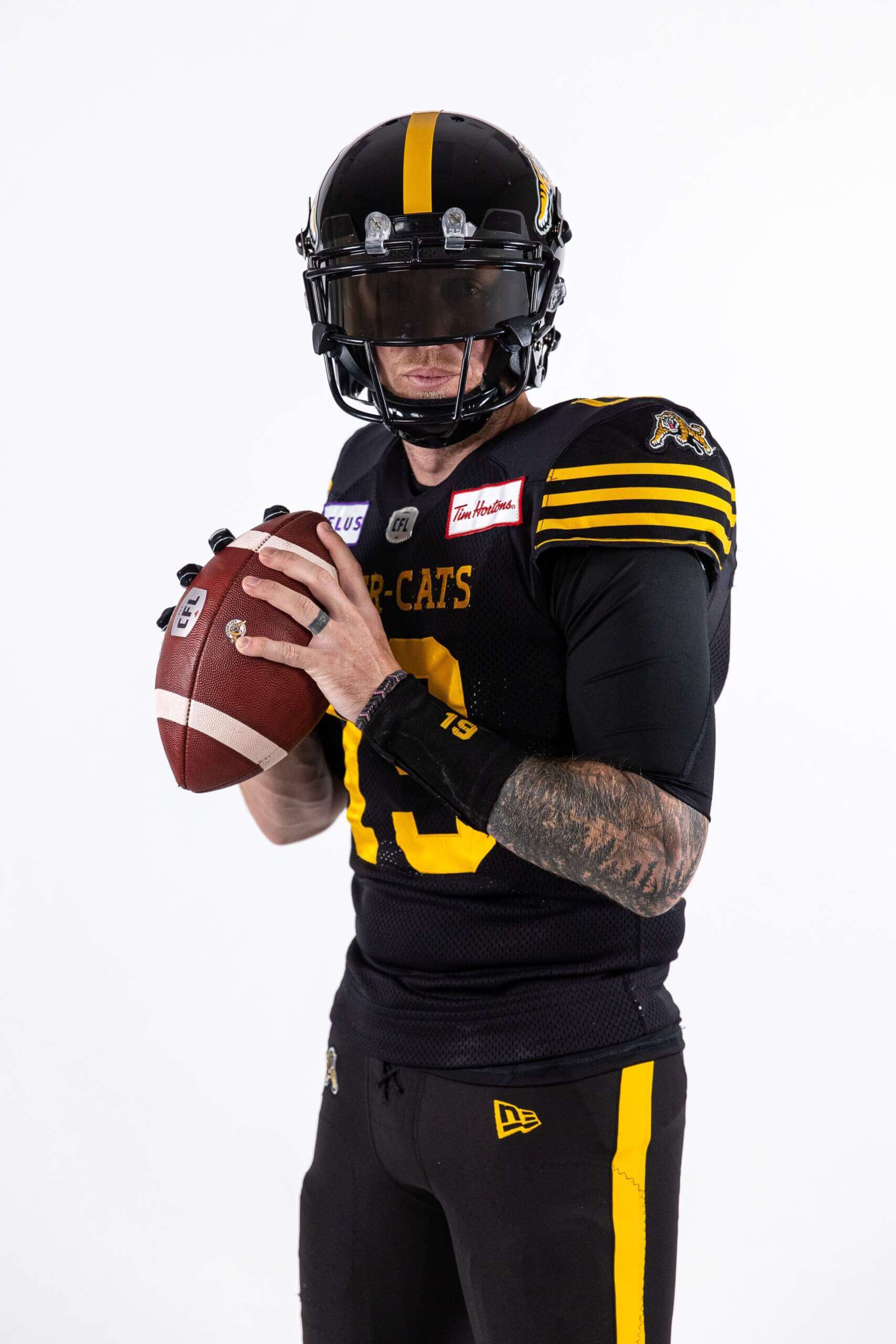
Black and yellow Bo? Yes please.
@Ticats | #CFL
pic.twitter.com/n7khAVOWvu— CFL (@CFL) May 17, 2023
No announcement of uniform changes from the Ticats but there is a small change noticed by us fans. Preseason photo shoots show a yellow stripe added to the black pants. The black pants were solid black with no stripe last season.
The Tiger-Cats also wore sets of yellow pants and white pants last year that did not have stripes. Makes me wonder if there will be stripes on these pant sets as well if worn this year.
I do like the addition of the yellow stripe. Helps to minimize the black yoga pants look when they wear the black socks with the black pants.
Notably, the Tiger-Cats wore solid black pants in their first preseason game this year. They are likely wearing last year’s pants before breaking out the new pants when the regular season starts.
Montreal Alouettes
No changes to the home and road uniforms in 2023. We have been advised the Alouettes will unveil a new alternate uniform. These will debut at the July 1 home game against Winnipeg. It is mentioned by the Als in their description of the theme nights this season. The statement is in French. Translated to English the July 1 notes state “big surprise with the unveiling of the team’s third uniform”.
Enfilez votre chandail #Alouettes et attachez vos ceintures, car les thèmes des matchs sont enfin arrivés !@Cirque du soleil , spectacle de BMX , match de la famille, et une GROSSE annonce à venir…ce n’est qu’un avant-goût !
LES DÉTAILS →https://t.co/nSzm19aFwJ #AlsIN pic.twitter.com/kVxtottaI7
— Alouettes de Montréal (@MTLAlouettes) May 16, 2023
No leaks of the uniform yet and no idea what it will look like at the time of reporting. I would guess the jersey may be red considering the July 1 Canada Day debut. The Alouettes have a history of red uniforms and it is their trim colour. Then again, I could be completely wrong.
Ottawa Redblacks
JERSEY SCHEDULE IS HERE#ALLIN | @CFL
— Ottawa REDBLACKS (@REDBLACKS) May 9, 2023
No new uniform changes announced for the Redblacks for 2023. They have released a home uniform schedule confirming they will wear their red alternates twice and will also wear white at home one time.
Nice to see Ottawa showed players wearing both the black and white pants with the black jerseys in the uniform schedule. Looks like they will be mixing in the black over white look at home. The white pants worn with the black jerseys are different than the white road pants. In fact, they are the pants left over from the old road uniforms.
According to sources, the Redblacks will have a new uniform in 2024. Only one of the three uniform sets is expected to be changed. This makes perfect sense that it will be the home uniform. The current road uniform and alternate third were unveiled in 2021 while the home uniform had remained unchanged.
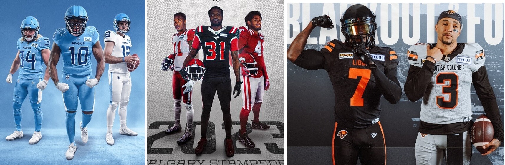
Toronto Argonauts
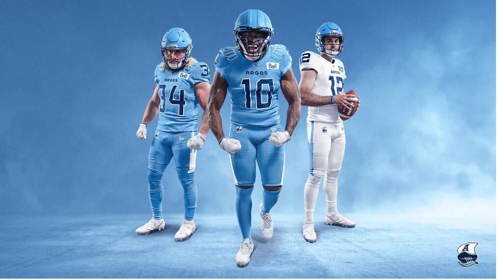
Sometimes you can feel and see a uniform change coming. Sometimes it will be a surprise. I didn’t expect to see this type of uniform redesign for the defending Grey Cup champions as the team marks its 150th anniversary.
The Double Blue has switched to the lighter Cambridge blue as the primary colour with the darker Oxford blue now becoming the trim colour. The new helmet was released before training camp, followed by the uniform unveiling before the preseason games started. The team is wearing Cambridge blue from head to toe with the home uniforms and white over white with the road uniforms. Though it is not the signature look for the Argonauts, wearing mono-Cambridge blue including the helmets is not unprecedented. The team last did this in 1951.
The helmet
— Toronto Argonauts (@TorontoArgos) May 24, 2023
The Argos are wearing a Cambridge blue helmet for the first time since 1962. There is silver flake to represent “shimmer and reflection of water.” The front helmet bumper now features the long-time team slogan “Pull Together” which ties in with the team’s origin as part of the Argonaut Rowing Club. The recently reintroduced and updated “Boat” logo remains the same. It does pop better on the Cambridge blue helmet. The Oxford blue football seemed to be hidden on the Oxford blue helmet when viewed from a distance.
The uniforms
The details pic.twitter.com/tMcQuKedQN
— Toronto Argonauts (@TorontoArgos) May 24, 2023
The Argos last wore Cambridge over Cambridge as a primary dark uniform in the mid-1970s. The shoulders feature oars. Each pants stripe has an oar as well. The bottom front of the jersey features a perforated pattern with a design meant to represent waves. The number font is influenced by Royal Canadian Navy ship numbers.
We will wait to see if there is some mix and match between the jerseys and pants. It appears we will see some mix and match with the socks. The uniform release featured Cambridge socks with the Cambridge uniforms. However, at the time of reporting Toronto had worn Oxford blue socks with the Cambridge uniforms in their first preseason game.
When the new Cambridge helmet was released and we awaited the uniform unveiling, I envisioned this helmet would look good with an Oxford blue jersey over white pants. Would have preferred that. It will take some time getting used to seeing the Argonauts in this look.
West Division
BC Lions
THE WAIT IS OVER!
INTRODUCING BLACKOUT & FOG GREY: BC Lions’ NEW look for 2023 ⬛️️
Get Yours | https://t.co/zdK7cDixJC#RoarLikeNeverBefore pic.twitter.com/FjeQolofje
— BC LIONS (@BCLions) April 13, 2023
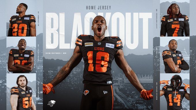
Owner Amar Doman purchased the Lions in August 2021 and began planning the uniform change that is ready for this season.
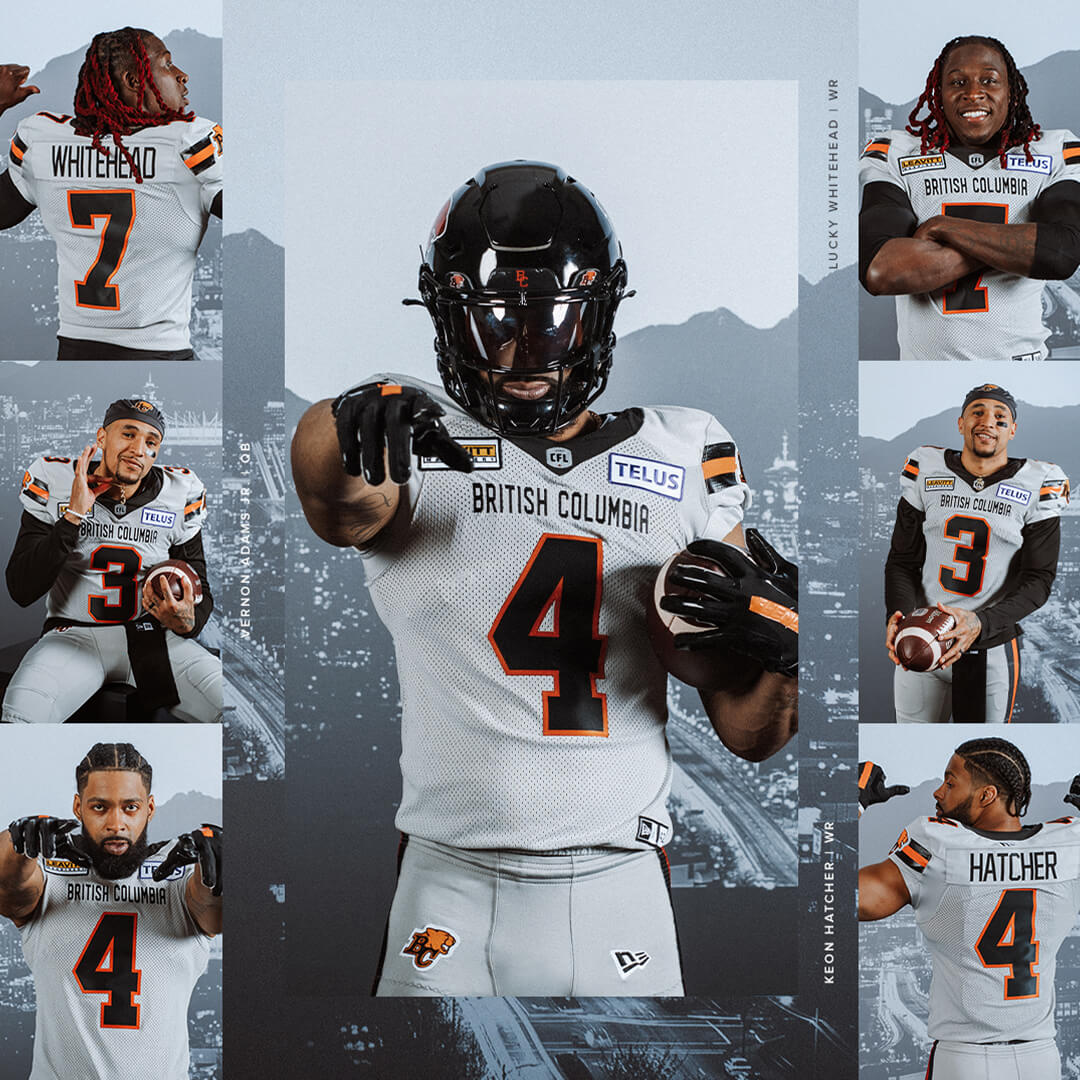
The Lions introduced the new “Blackout” home uniforms and “Fog Grey” away uniforms in April.
The Lions are back in black as the primary colour — a monoblack look with orange striping and numbers at home. Interesting to note the Lions have switched back and forth between black jerseys and orange jerseys as the primary look since the team started in 1954. This season marks the third time BC has switched from an orange jersey to a black one; they did the same with uniform changes in 1959 and 1990.
The away uniforms feature grey jerseys and pants. The “Fog Grey” apparently celebrates how rainy and cloudy it can be on Canada’s West Coast in the fall and winter. The use of a grey road jersey by a CFL team has been done before by the Ottawa Rough Riders from 1992 to 1993.
The helmets remain unchanged except it does appear the orange numbers on the back have been removed.
According to comments from owner Doman to the media, the reborn and reinvented gun metal thirds from last year will remain around and be sprinkled in during the season.
I do have mixed feeling about the new uniforms for the Leos. They look good and have traditional football uniform striping. The shoulder yokes that have plagued the Lions’ primary look since 2016 are gone. However, orange is the colour the Lions own in this league. Though they also have a history as a black team, I would have preferred they stick with a primary orange jersey rather than becoming a third team wearing black as a primary in the league.
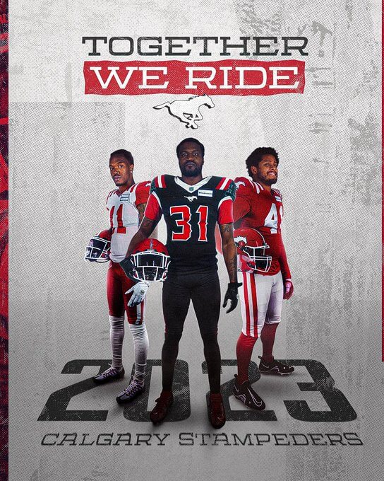
Calgary Stampeders
UNVEILING THE COMPLETE UNIFORM SET FOR 2023 ⚪️
Get yours https://t.co/cLcuc800as#TogetherWeRide | #CFL pic.twitter.com/TjFmYPYLeM
— Calgary Stampeders (@calstampeders) April 19, 2023
Well, it is happening. The Red and White are red and white again! For the most part.
In 2021, the Stampeders wore a throwback-inspired uniform for the team’s 75th season. Last season, the Stampeders decided to keep wearing their special throwback as the primary home uniform while still wearing their regular road uniforms. This made for an inconsistent look.
The Stampeders have made tweaks to the dark home uniforms and now have a matching set of road uniforms. The red and white uniforms are a throwback nod to the old-timey look when the Stamps started wearing red and white in 1948.
The helmet remains the same except for the switch from a black mask to a white one. On the red jersey, the throwback “Bucking Bronco” logo on the sleeve has been replaced by the team’s current primary logo.
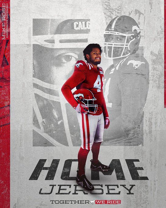
The new road uniform features the shoulder striping to match the home look. The Stamps will wear red pants with the white jerseys. The vintage “Bucking Bronco” logo still appears on the front right side of the white pants and red pants.
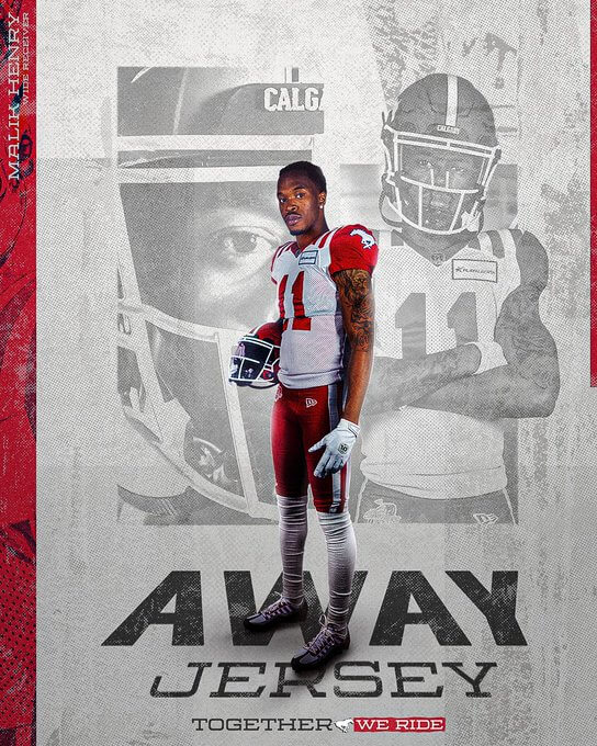
A new version of the black “Outlaw” third uniform was unveiled just last year and will remain as the team’s alternate. The only change to that uniform, of course, is that they’ll wear the white facemask now.
Some other interesting uniform details from the Stampeders this year:
• They have new, more detailed practice jerseys than other teams in the league. Each set (white for quarterbacks, black for defence, red for offence) features a different logo from team history. Not sure why the numbers seem too small compared to other teams.
• The club acknowledged alumni this preseason with something creative. Current players fighting for jobs in training camp were temporarily assigned numbers that have been retired by the club. The players wearing the retired numbers in training camp and preseason play wore a patch honouring the player who used to sport that number. Here is QB prospect Silas Fagnan in camp wearing Harry Hood’s number 5. The patch is on the upper left of the chest.
Many fans have been calling for the Stampeders to drop the black. Never thought we would see a strictly red and white Stampeders uniform again but we are basically there. Interesting move going with a modern version of a uniform introduced in the 1940s.
We knew the Stampeders will keep around the black alternate. They have been regularly wearing black alternate jerseys since 1994. Basically, they’re the first pro football team in this era to start wearing regular alternate uniforms.
I am disappointed that the helmets still have black bumpers, minimal black trim on the helmet stripes, and it appears from preseason still have the old number font for the helmet digits.
Edmonton Elks
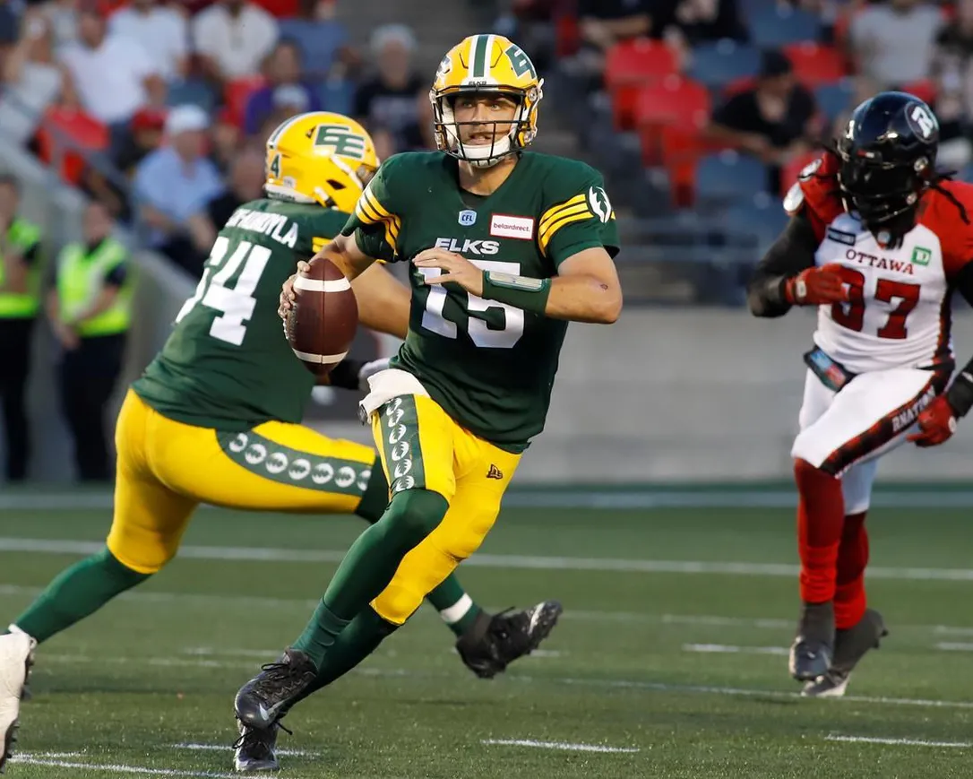
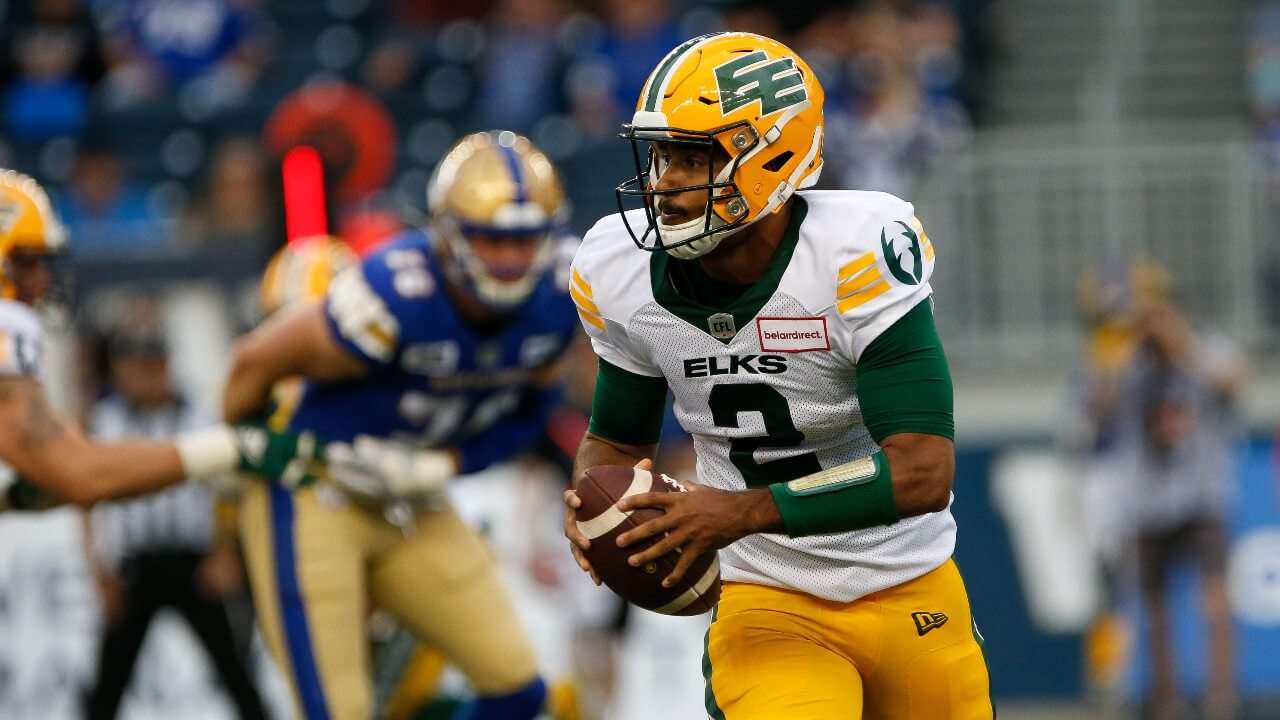
The Elks redesigned their uniforms last year, so no changes to report out of Edmonton.
They are doing something special with the helmet logo during the team’s home opener on June 11 versus Saskatchewan. For $250 CAD, 90 fans have been given the opportunity to put their name on the helmet’s “Double E” logo and then take home the framed game-worn decal as a collectible.
Ever wanted to see your name on a CFL field? Put your name on the Double E for our home opener June 11.
Get…
LIMITED QUANTITIES | https://t.co/5l0OSADFTK#OurTeamOurCity #GoElks #CFL pic.twitter.com/WaVY4WqG5e
— Edmonton Elks (@GoElks) April 20, 2023
There are 45 names on each side, and they’re barely noticeable from a distance. Rumour has it a Saskatchewan fan bought a spot on the logo with the name “Go Riders Go” and was given a refund.
Saskatchewan Roughriders
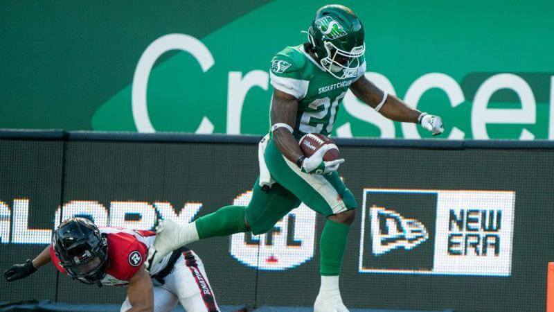
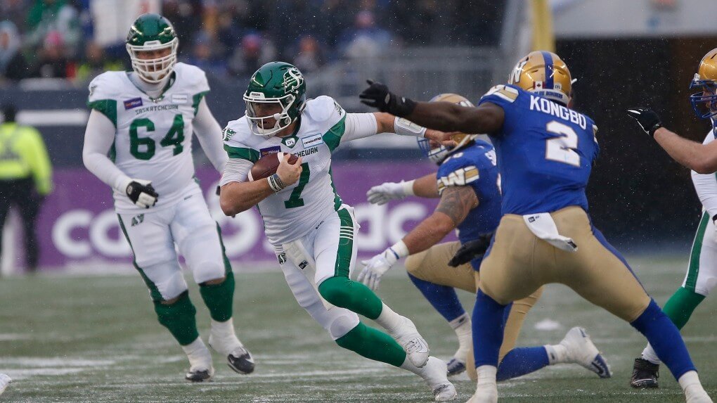
Since we are speaking about the Roughriders, we will continue to do so. Unfortunately, there’s not a lot to discuss. No new uniform news from Regina for the Green and White.
We do know for certain they will be wearing their throwback-inspired alternates on July 6 for their Throwback Thursday night. Of course, the vintage alternates will likely be the home uniform for the Labour Day Classic as usual against Winnipeg.
The Riders occasionally mixed it up last year and wore white jerseys over green pants. They love wearing the green over green at home, though, as the primary look. Since the Riders started wearing this design in 2016, they have not worn the green jerseys over the white pants for the primary uniform since doing it once that season. Would really love to see the Riders wear the white pants with the green jerseys some of the time!
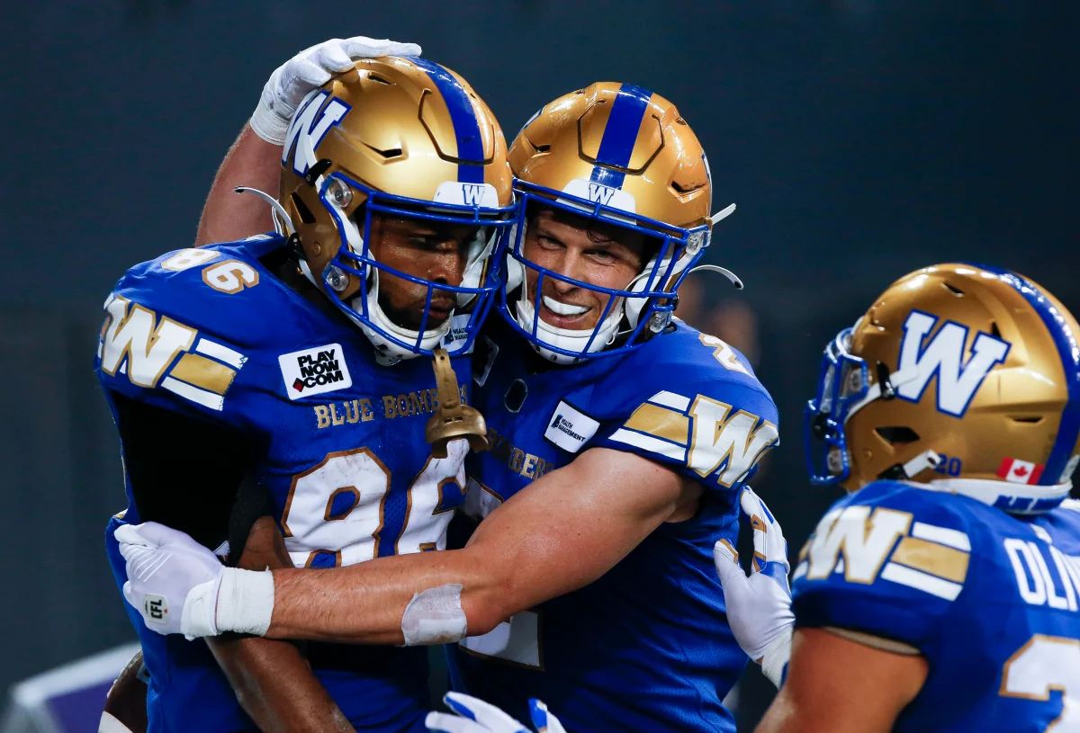
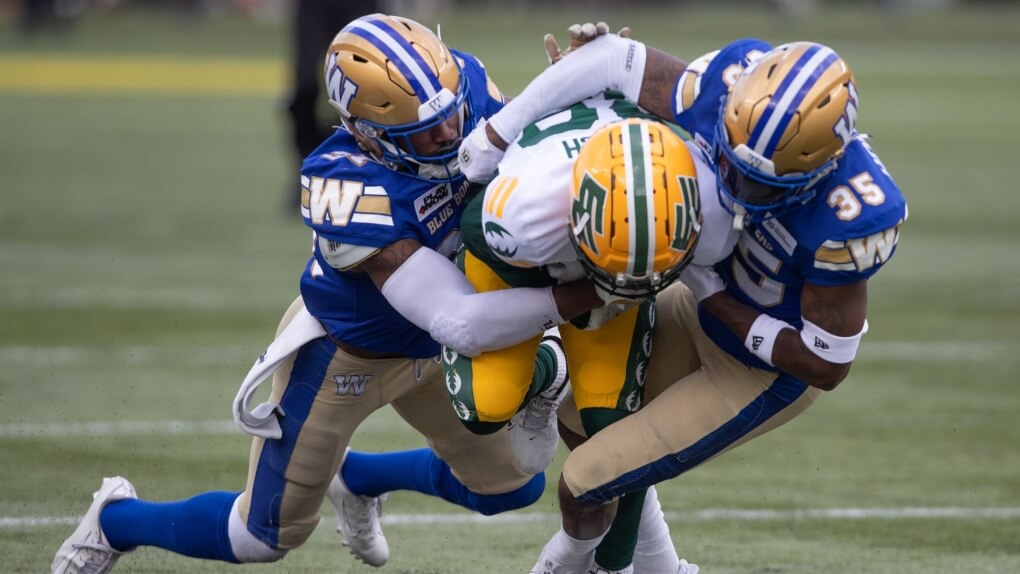
Winnipeg Blue Bombers
The only change to the uniforms in Winnipeg has to do with the helmet stripes. The Bombers adopted different helmet stripes for their third uniforms introduced last year. It is a white stripe flanked with blue stripes, which is different than the single blue stripe on the primary uniform helmets. In addition, the alternate helmet stripes did make an appearance last year with the primary uniform.
OLD:
NEW:
The decision has been made to have the alternate helmet stripes be part of the primary look. They’ve been worn on the helmets throughout training camp and in the preseason. I am upset with this. The helmet stripes no longer match with the solid blue pant stripe. The look is a modern take of a traditional Blue Bombers uniform and they have now messed it up by changing the helmet striping. I will do my best to move on and try to get over this.


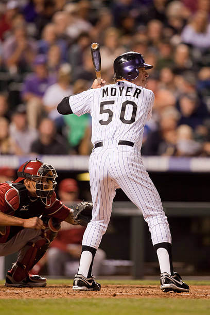

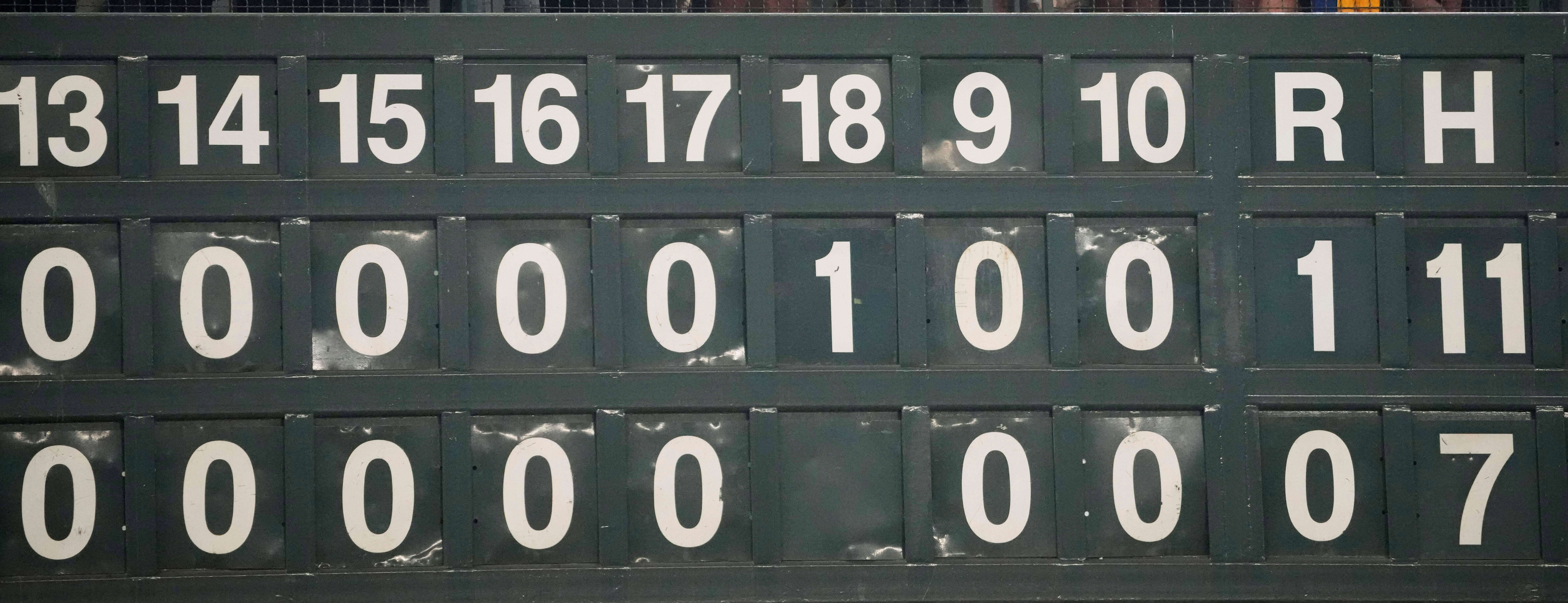
GTGFTU: May 16, 2012 – Diamondbacks (1) at Rockies (6); Coors Field.
Indeed!
One of Moyer’s last at-bats, possibly the one where he became the oldest MLBer to drive in a run.
The Rockies’ 2 tone helmet kinda worked for me…the Texas Rangers one, well:
link
Oct 15, 2022, ALDS, Hou @ Sea, Final Hou 1-0, sweeping SEA in the series. Luis Garcia gets the W, with 5 innings of relief and being the 8th pitcher in the game for HOU.
My favorite thing about the CFL: Tram color helmets. Canada knows better than to let teams play with a white helmet.
* ahem, _team_ colored helmets.
No white helmets currently. During the long history for these teams we have seen many of them wear white helmets. Whether it was their primary helmet or a secondary helmet when in the last decade many CFL teams had specific home and road helmets prior to the current one-shell era.
A couple teams had really good uniforms when wearing white as regular helmets. Thinking of BC Lions from 2005 to 2015:
link
BC Lions in their orange and brown era 1978 to 1989:
link
Montreal Concordes/Alouettes from 1983 to 1986:
link
link
I like your subtle inclusion of the old Ottawa branding in those photos…the Redblacks should rethink their decision to only change 1 of their uniform sets and do all 3!
Excellent write-up, BTW!
The photo in the article about the upcoming Ottawa uniform change showed them wearing the alternate helmets in 2022. Featuring the larger Redblacks’ R without the sawblade and had the helmet striping. Essentially it is a Redblacks version of the old Rough Riders helmet and popular with fans. I am all for the Redblacks making that there primary helmet and a redesign that is a modern version of the old Rough Riders uniform.
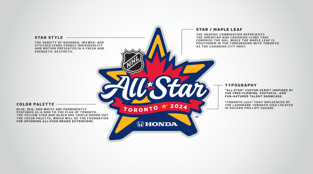
There are actually two versions of the NHL all-star logo. The one shown with the Honda logo is for the U.S., but there’s a version for Canada with the red Rogers logo on a white background.
Having “0” and “00” on a roster is confusing for broadcasters, namely graphics operators. Many graphic databases are organized by player number, so computers have trouble differentiating the two.
The horse on the Stamps’ uniforms is referred to as the “Bucking Bronco”, but it looks more like a galloping mustang.
When referring to the “Bucking Bronco” logo, it is the vintage Stampeders logo and not the current, primary logo. It also have a cowboy hanging in there for the ride.
link
How the 75th season red throwback-inspired jersey looked before the changes with the “Bucking Bronco” logo on sleeve before being replaced by team’s current primary logo. Also, the black masks then didn’t fit well with the red and white uniform. “Bucking Bronco” logo is still on the pants with this new uni.
link
The Blue Bombers really do have some of the greatest Unis in all of professional football. That royal blue and gold looking like Washington without Paul’s dreaded purple. Almost makes you forget how wide the field is.
The current uniforms are a modern version of the old Blue Bombers uniforms. A return to the classic look for the most part (except the new helmet striping.)
After wearing the signature gold/royal blue/gold uniforms for so long, they made the big 1995 uniform change. Looking back the 1995 uniform change gets the big thumbs down. Going with the navy/navy/white look at home. Well, it was the mid-1990s. Many questionable uniform changes then that became infamous back then.
link
I just wish they would get rid of the royal yokes on the away uniform – if they did that, it’s a perfect set.
Sunday is always a busy day for me. After getting caught up from the week I treat myself to Uni Watch…The CFL update make my day! Wade….awesome work…thank you!
Thank you Rick! I appreciate the opportunity Uni Watch gives me to write about Canadian football.
Thanks, Wade, for the CFL preview!
Way too much Cambridge blue, Toronto, and not enough yellow/gold, Hamilton! I want the gold helmets to return!!
White facemasks are always a good thing, so I’m happy for Calgary. It’d be even better if they ditched the alternate uni.
Thanks Jim! One CFL team changed helmet colours this year and it was Toronto. Quite surprising dropping the darker Oxford blue helmet for the Cambridge blue. If I was told that only one team will change helmets and I have the opportunity to choose, you know I am putting the Tiger-Cats back in the yellow helmets. Their classic look. The way it should be.
Are the 1932 Pittsburgh Pirates throwback uniforms the worst in Steelers franchise history?
No, because,
1) the team wasn’t founded until 1933.
2) the ’33s are far superior to the ’34 bumblebee prison-stripe numbers-in-boxes jerseys.
And both are better than the current italic-number jerseys.
Great CFL article, nice uniforms (Toronto is the winner for me) but they are all spoilt by the ads. NFL fans: this is how your team may look like after the current commissioner retires.
Why are the BC Lions’ shoulder yokes being called a plague? I think shoulder yokes look great, separating the NOB and number and giving each one its own area. You see this look with hockey teams but not too much in football. One of the Steelers’ throwbacks had it, as did one of the Packers’ throwbacks. Assuming NOBs aren’t being removed, I’d like to see more of it.