A very good Saturday morning, Uni Watch readers. I hope everyone has had a pleasant week.
I’m back once again with Chris Diamond, who has shared with us another set of his wonderful “What if…” think pieces — What if the AFL Never Existed (Part 1) and What if the AFL Never Existed (Part 2). Chris is back today with the third part, and like his previous installments, this one is fantastic. Enjoy!
What if the AFL Never Existed, Part III
by Chris Diamond
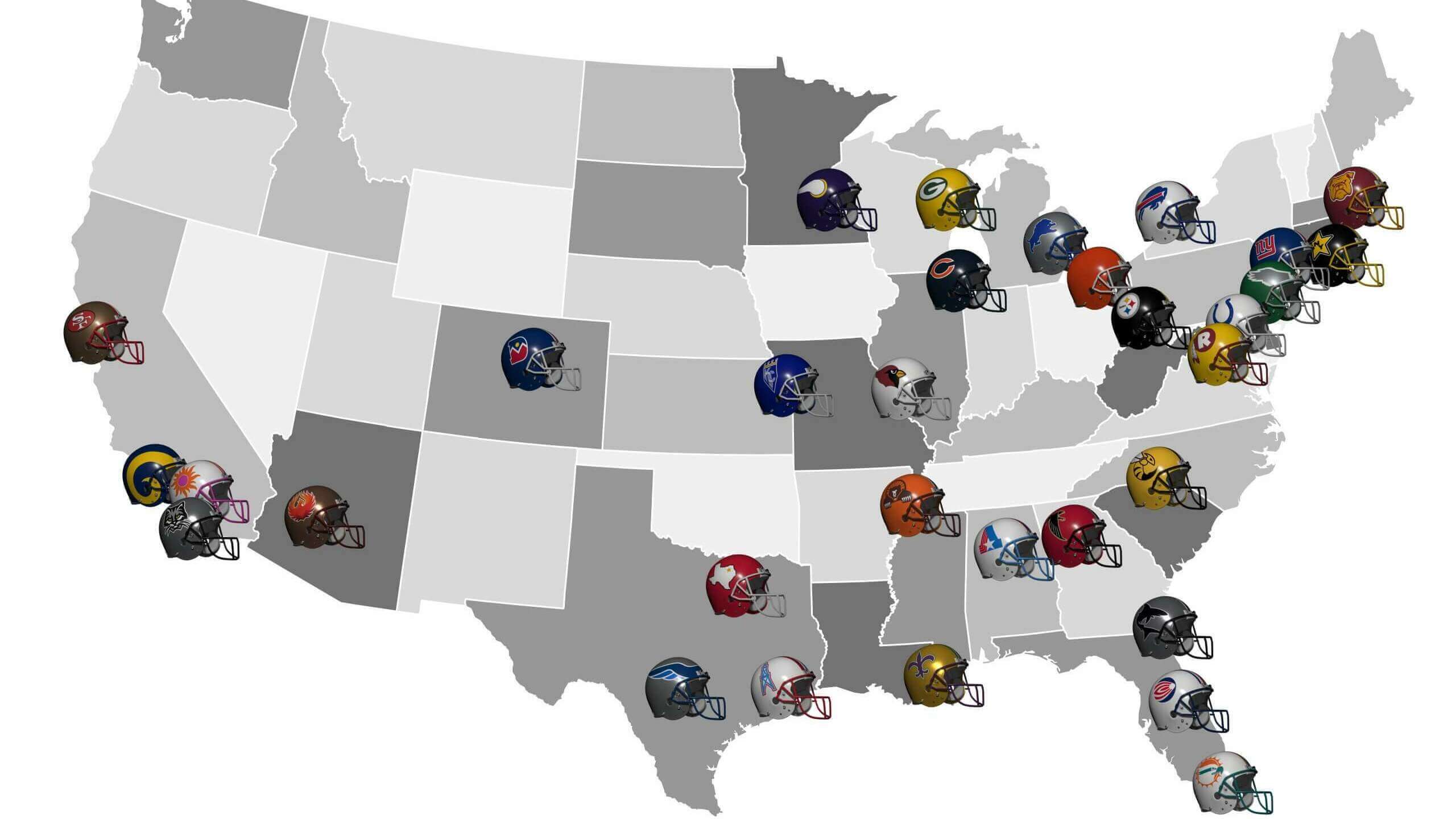
In Part 1 of this piece, I posed the question “What if the AFL Never Existed?”. Starting in 1959 I followed the evolution of the NFL to 1970 when it expanded by four teams. In Part 2 in the 1970s a rival WFL challenged the NFL and eventually the two merged in 1980 to form a 32 team NFL. So here in Part 3 I consider what might have happened up until the turn of the century.

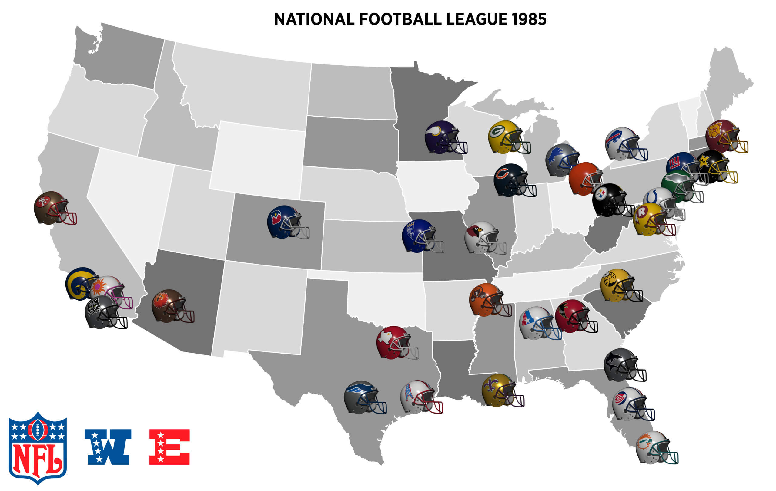
In real life, in the 80s and 90s the 28 team NFL saw multiple franchise moves (and threatened moves) as team owners looked to get shiny new stadiums from their current city or new cities hungry for a team. A lot of this was possible because there were still large markets without teams. But in this alt-reality NFL with 32 teams there are far fewer options on offer. So what might have happened? Well the Colts may still have moved to Indy, the Oilers to Nashville and the Cards to…. probably Cincy or Seattle. But something happens to make those moves less likely!
In reality, the USFL was created in 1983 as a Spring-Summer league. The original “Dixon” Business Plan was sound, calling for restrained spending in the early years and not competing directly with the NFL. Of course we know that went out the window and the league folded in 1986 after Donald Trump persuaded them to sue the NFL and try and move to the Fall. But, what if there was an alternate USFL, starting in 1980 that stuck to Spring-Summer like planned? How might that have played out and how might it have affected the NFL?
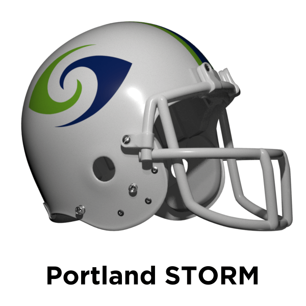
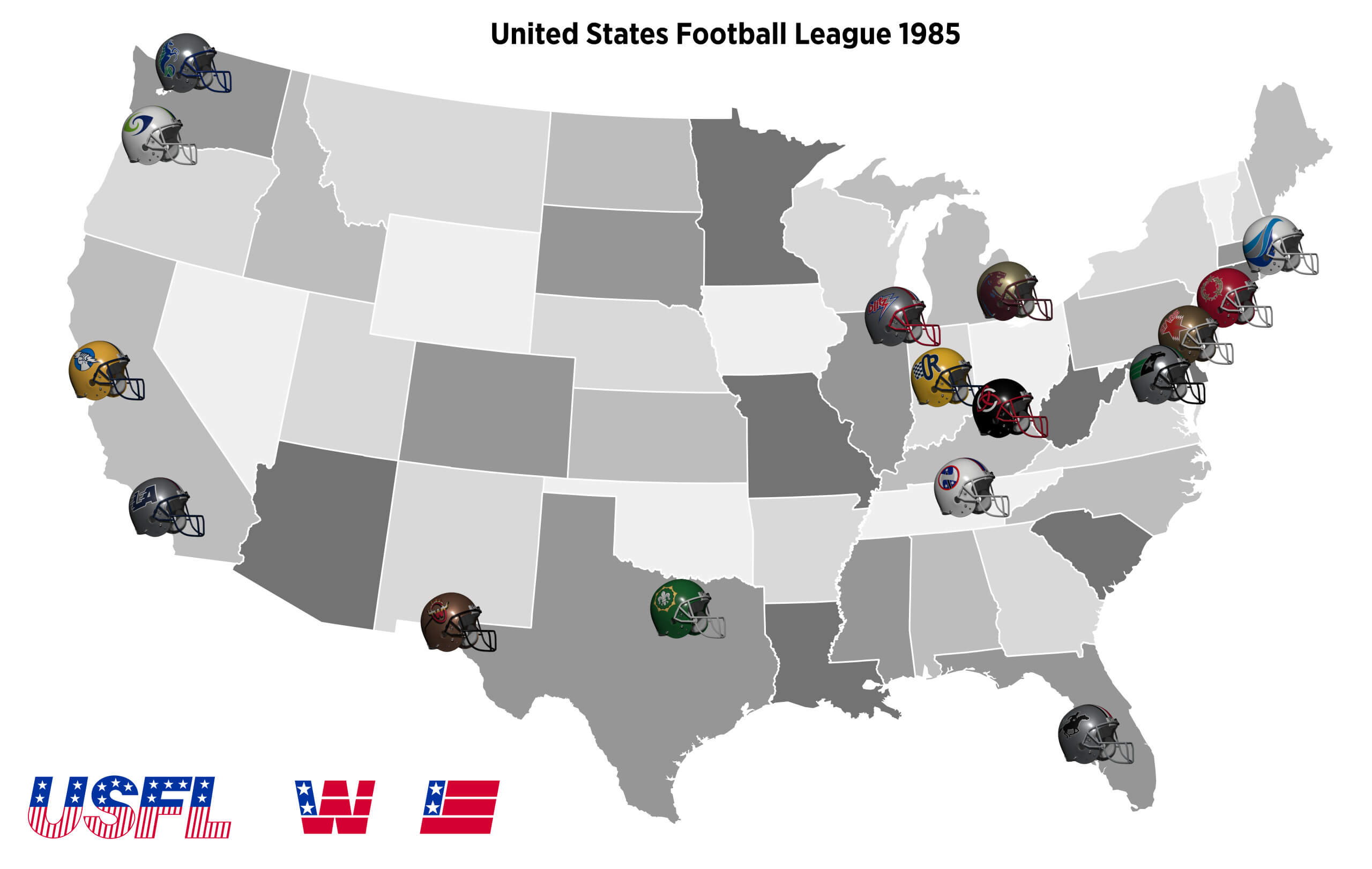
The real life USFL started with 12 teams in major US cities like NY, Chicago and LA. But also cities without an NFL team at the time like Birmingham and Phoenix. Here the NFL has teams in these cities so the alt-reality USFL has teams in the cities without NFL teams instead — so Cincinnati, Indianapolis and Seattle. As well as cities without teams in both realities like Oakland and Portland.

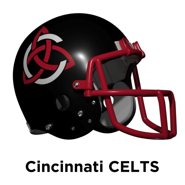
Cincinnati’s real life Bengals are named after an obscure AFL Team from 1941. It’s possible that was chosen so Paul Brown could keep as close to Browns colours as possible! Here Brown isn’t involved so instead the USFL team takes the name of an equally obscure team — the Celts. The Celts original colours are black and yellow, but as this feels too much like Pittsburgh they go for a more Cincinnati friendly black and red.
In another of my pieces I created an Indianapolis team called the Racers in 1987. This is a similar era so as I like the design, I borrowed them for this alt-reality USFL!

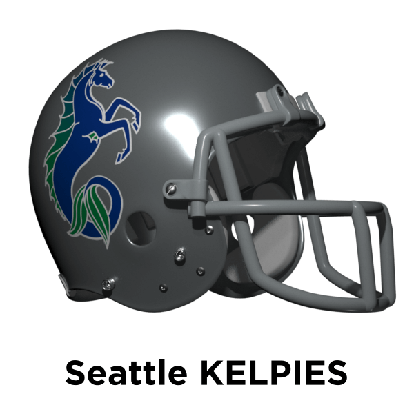
This alt-reality NFL already has a Seahawks team in Miami, so it’s unlikely the USFL team would be called that too. The NHL’s Kraken are named after a mythical aquatic creature so here I go a similar route with the Kelpies.
Finally, the real-life USFL Breakers ended up in Portland in 1985. But here they are in Boston so instead I’ve used the real-life WFL Storm as team name as the logo is so excellent!
So we have a 12 team USFL – how might this have affected the NFL? Well as a lot of prospective cities for owners with itchy feet now have pro teams I think it might have poured cold water on the relocations we saw in reality. Or at least made it harder to move. Plus the real-life NFL team moves only happened after Al Davis sued the NFL and won when it tried to stop the Raiders moving to LA. The Raiders don’t exist here, so that precedent wasn’t set and so the instability it caused wouldn’t be here either.
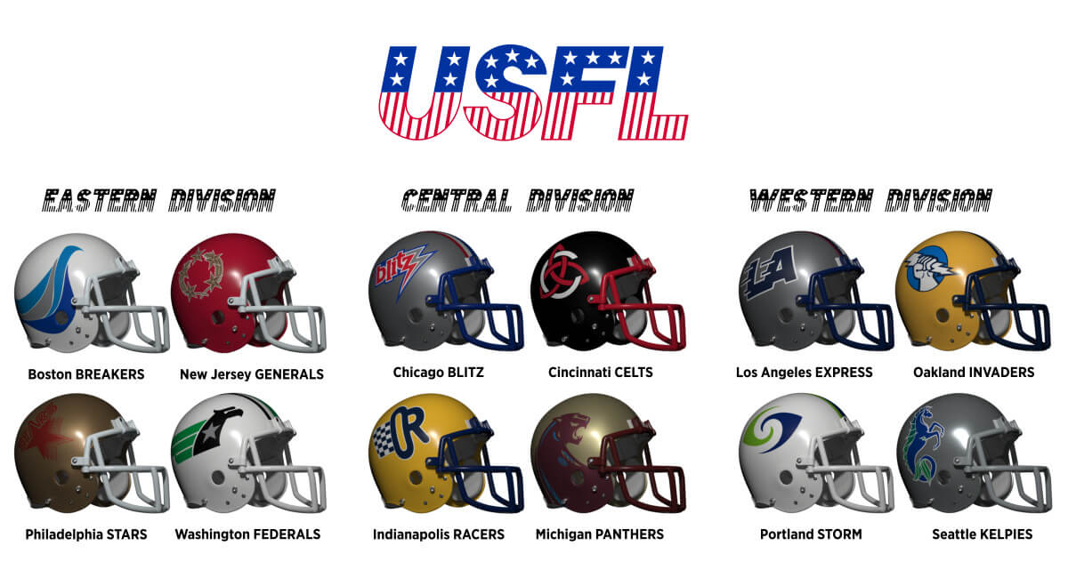
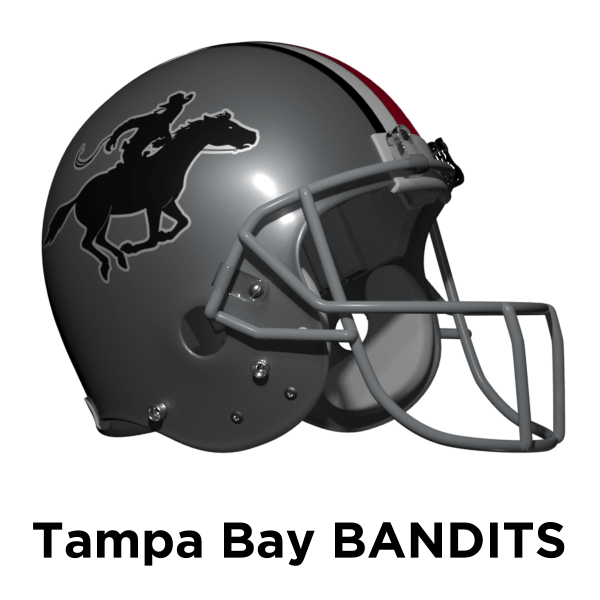
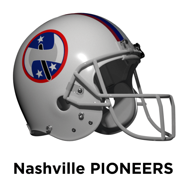
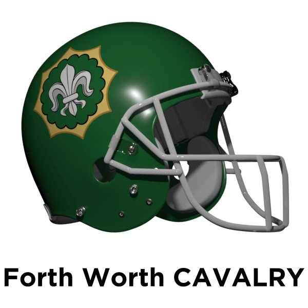
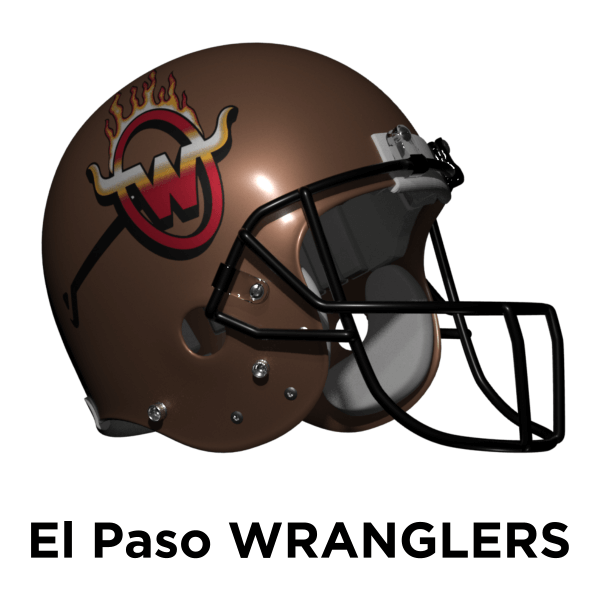
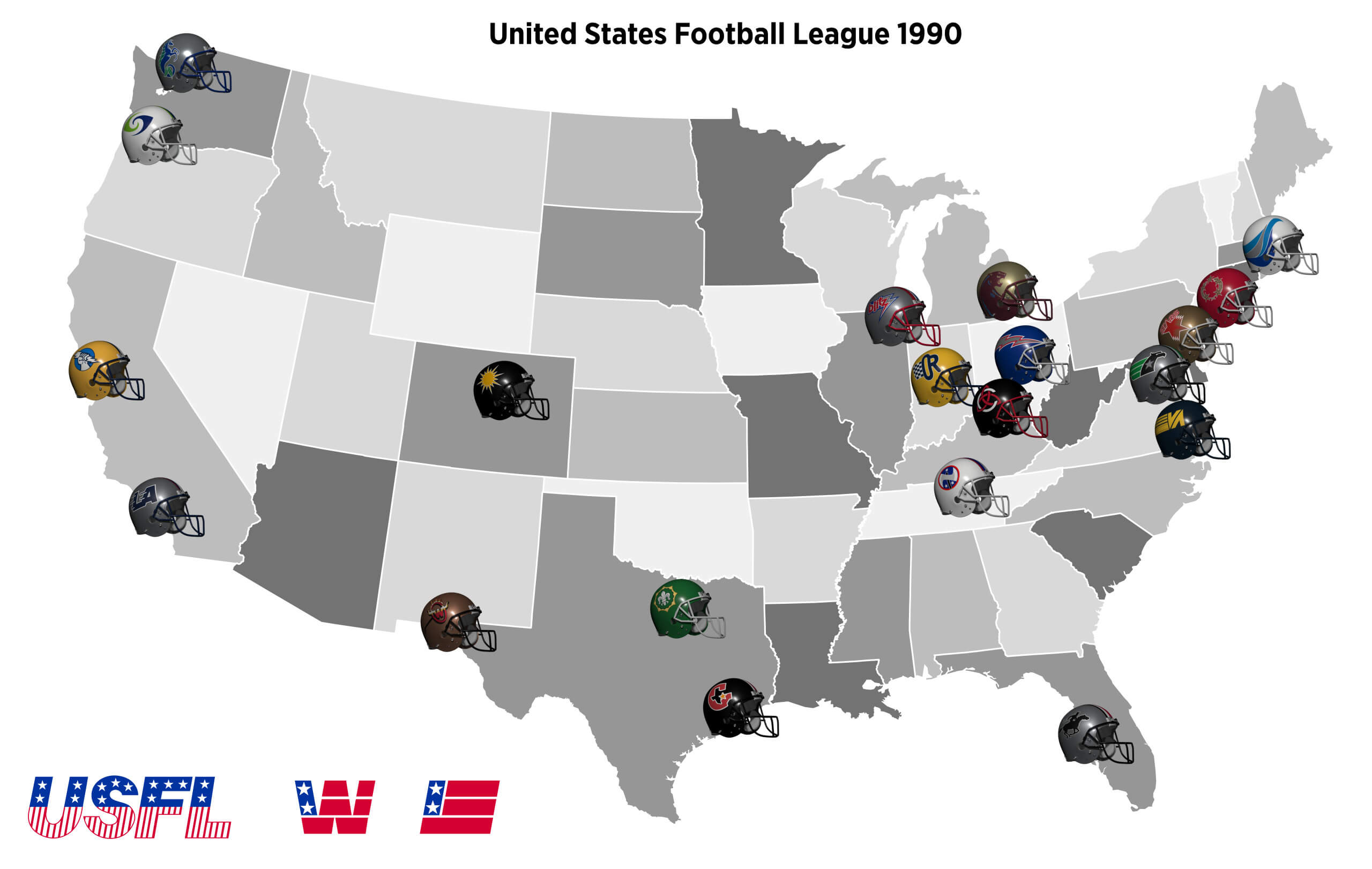
Five years later and the USFL’s business plan is working. They decide to expand by four teams, based on large cities without teams, selecting Tampa Bay, Nashville, Fort Worth and El Paso. The league is split into two conferences Eastern and Western each with two divisions. Tampa Bay and Fort Worth are in the territories of existing NFL teams (Florida Blazers and Dallas Texans) but they identify with the city that doesn’t have a team (like Oakland with San Francisco).
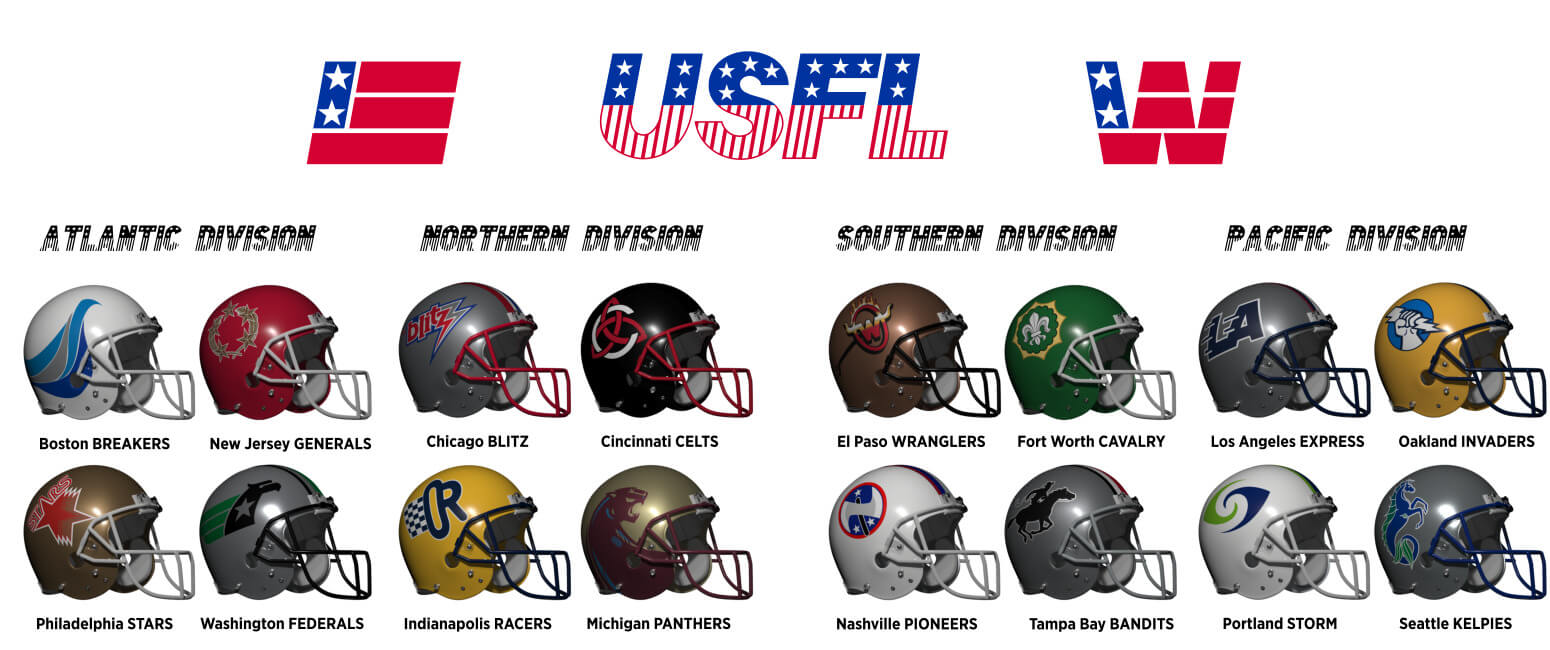
The real USFL had the Tampa Bay Bandits from the start of course, so it’s natural here that the team is also called the Bandits. I stick with their helmet design here.
I have borrowed from my previous piece again for the Nashville Pioneers as I love the logo and the team name!
Fort Worth was founded in 1849 By soldiers from the 2nd Cavalry Regiment so the team is called the Cavalry and takes the colours and badge of the regiment.
The real USFL had the Arizona Wranglers, so here I have borrowed that identity for El Paso.
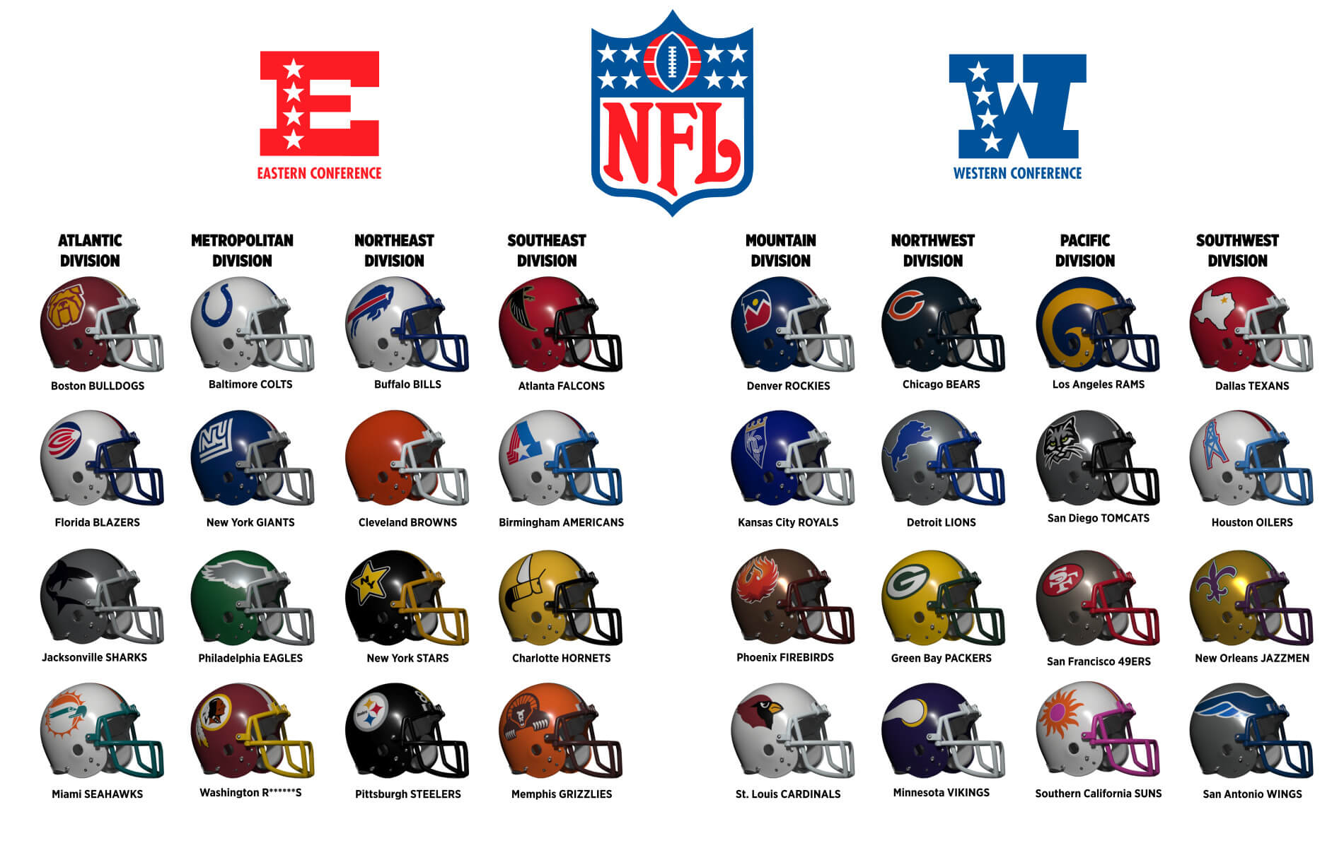
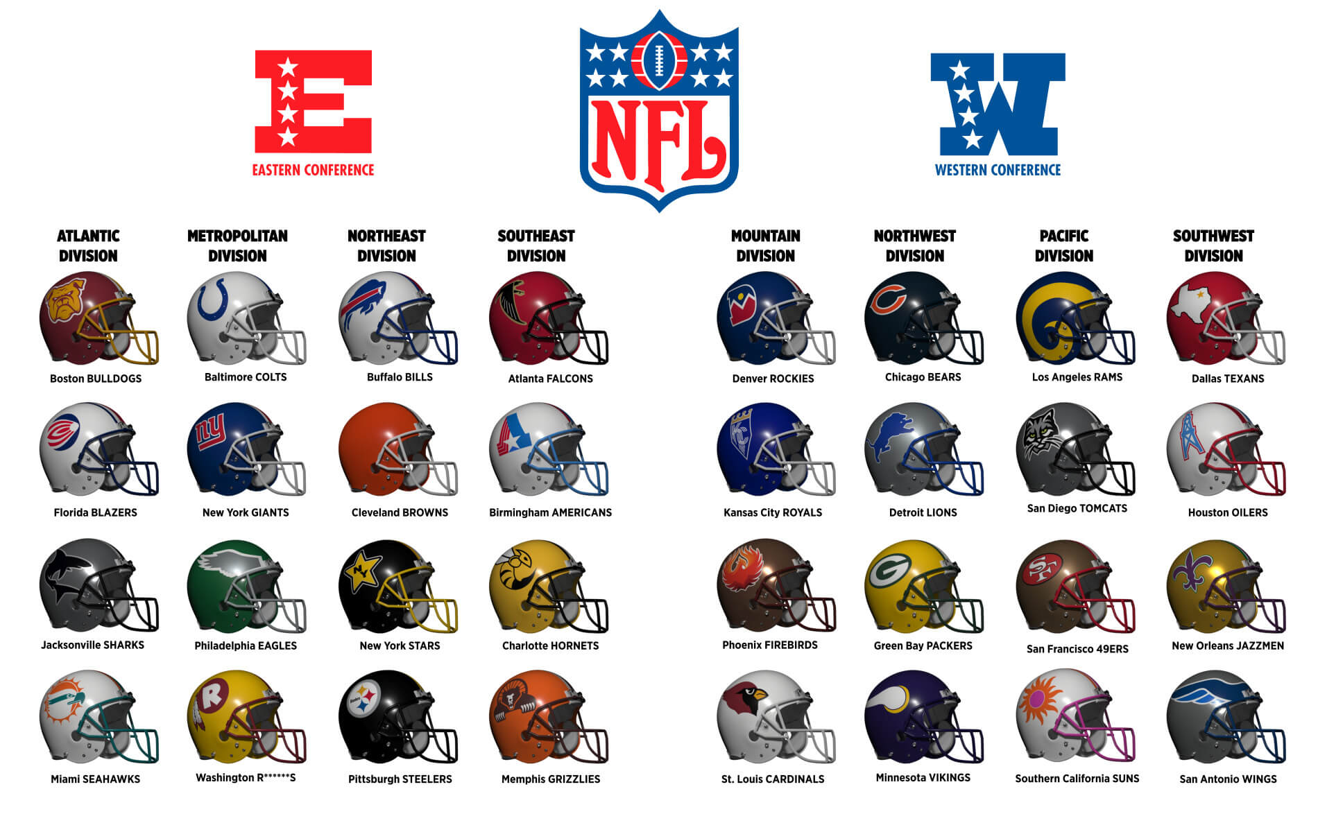
For the NFL in 1985 there have been a few helmet design changes. The Giants have ditched their 70s disco “NY” and gone back to a version of their old style. But this time in red outlined in white to match the helmet stripe. Two other ex-WFL teams have ditched their 70s logos. The Charlotte Hornets go to less abstract-like hornet shaped in a letter C. The Boston Bulldogs go for a fiercer looking logo in a more up-to-date (80s) style. Unlike the real NFL, the Bills don’t change to a red helmet as here they aren’t in a division of white helmets! Finally the Washington team go away from the old logo and pick something like their 1970-71 logo.
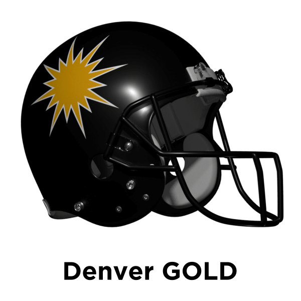
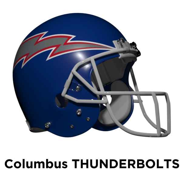
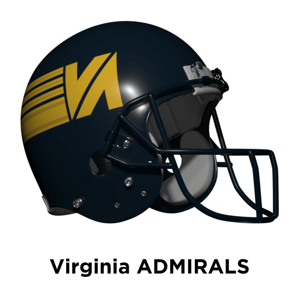
The USFL’s popularity and success continues and in 1990 they decide to add another four teams – Denver, Houston, Columbus and Virginia (Beach). Houston are seen as local rivals to Forth Worth and El Paso. Denver at this time doesn’t have an MLB franchise so is a good choice for a spring/summer league. Columbus have Cincinnati as a local rival and Virginia Beach puts a major league team in Virginia for the first time. (Note the real world WFL tried this in 1974 but the team ended up as the Florida Blazers). The Federals continue to tinker with their helmet logo, adding a white outline and the Bandits switch to a black facemask.
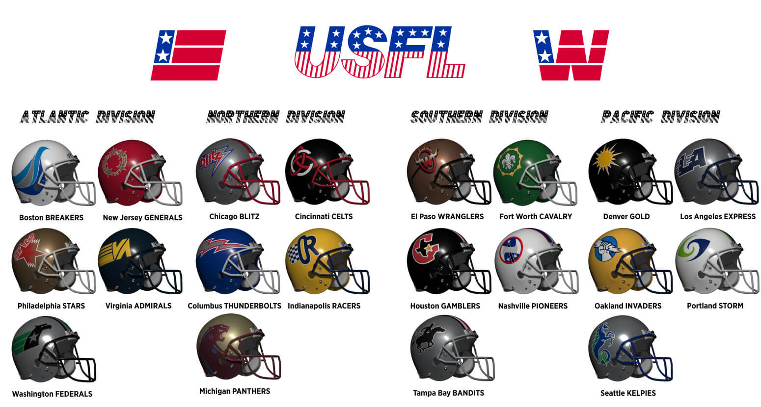
The real life USFL had the Denver Gold and Houston Gamblers so I’ve just gone with both those here too.

In real life, Columbus had the Ohio Glory of the WLAF and the Thunderbolts of the Arena League. I’ve combined the colours of the former and the identity of the latter (plus the NHL Blue Jackets use red/white/blue so it felt like a good fit).
The area around Virginia Beach has a strong Navy presence so I went with the Admirals. The logo is based on an admiral’s Rank Insginia.
No changes to the NFL in 1990, either in helmets or franchise locations. So by the turn of the millennium the 32 team NFL and 20 team USFL are still existing side-by-side, what will happen in the 21st Century? Find out in the final part!
Thanks for reading!
Thanks, Chris! Another outstanding think piece and looking forward to the conclusion in Part 4! Readers? What do you think?

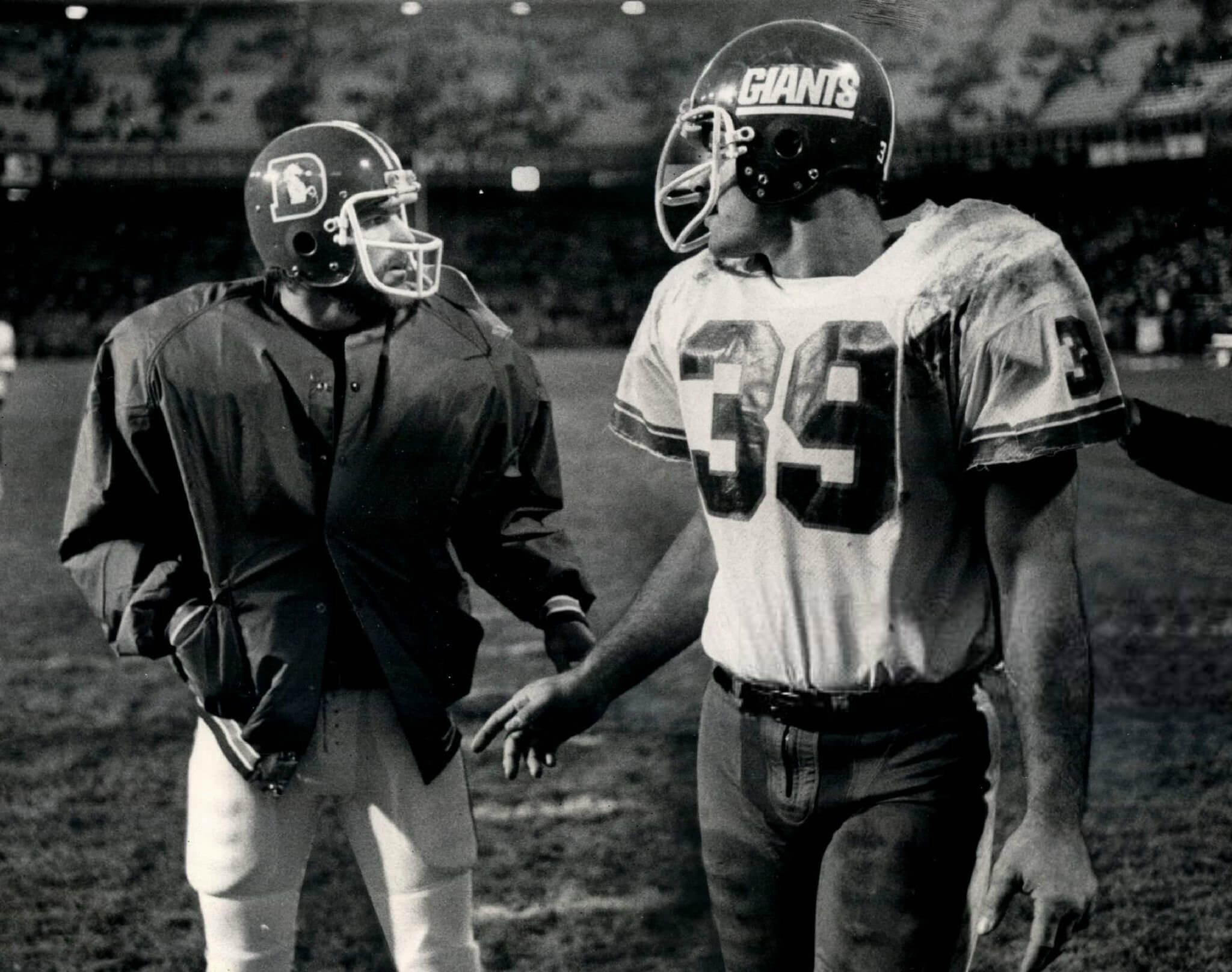


GTGFTU: Has to be 11/21/1976, Giants at Broncos. That’s Larry Csonka on the right; not sure who the Denver player is, maybe Norris Weese. Broncos won the game 14-13.
You got the game right Graf, but that is not Norris Weese, it is another former WFL player Jim Kiick. I watched Norris Weese play against my father when he was with the Hawaiians, he was a good young QB and gone way too soon RIP.
The GTGFTU is the November 21, 1976 game between the NY Giants and the Denver Broncos which the Broncos won 14 – 13. The photo shows Denver’s Jim Kiick (Butch Cassidy), who did not get into the game, meeting his former teammate Larry Csonka (The Sundance Kid) on the field. Csonka scored the game winning touchdown for the Giants.
You got it Mike, Butch and Sundance! Before the game against Memphis in 1975 we saw Csonka and Kiick sitting on a couch in the hotel lobby. I said to my father isn’t that Larry Csonka and Jim Kiick? we walked over and my father shook both of their hands and introduced himself and wished them good luck. They shook his hand and gave him a look like they had no idea who the hell he was?
As we walked away, I said Dad I don’t think they knew you played for the Bell? He said they know who I am, they big timed me, they let me know they are NFL stars, and I am a minor league QB.
Seeing Csonka in anything but his signature Dungard is shocking. He switched to a ‘QB’ model facemask in the final years as a Giant… but was this his only game in a ‘Riggins’-style mask?
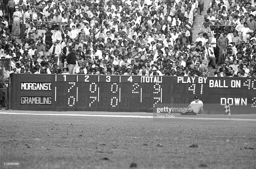
The GTGFTS is Grambling versus Morgan State on September 28, 1968 at Yankee Stadium in New York, which was the first time two HCBUs played in New York City. Morgan State won 9 – 7. The game is the subject of the documentary entitled 1st & Goal in the Bronx: Grambling vs. Morgan State.
GTGFTS: Morgan St. leads Grambling 9-7 going into the bottom of the 4th inning.
Re: Alt-reality thread: I am loving this, so well done. I guess the USFL didn’t prohibit gray facemasks? My only quibble is the Nashville Pioneers logo has a passing and unintentional resemblance to the Aryan Nations insignia – theirs is an N over a cross, this is an N over an axehandle, but in an era where people tend to overread into everything, and a version of a Padres’ cap logo can be interpreted as a swastika, I don’t know how this will play.
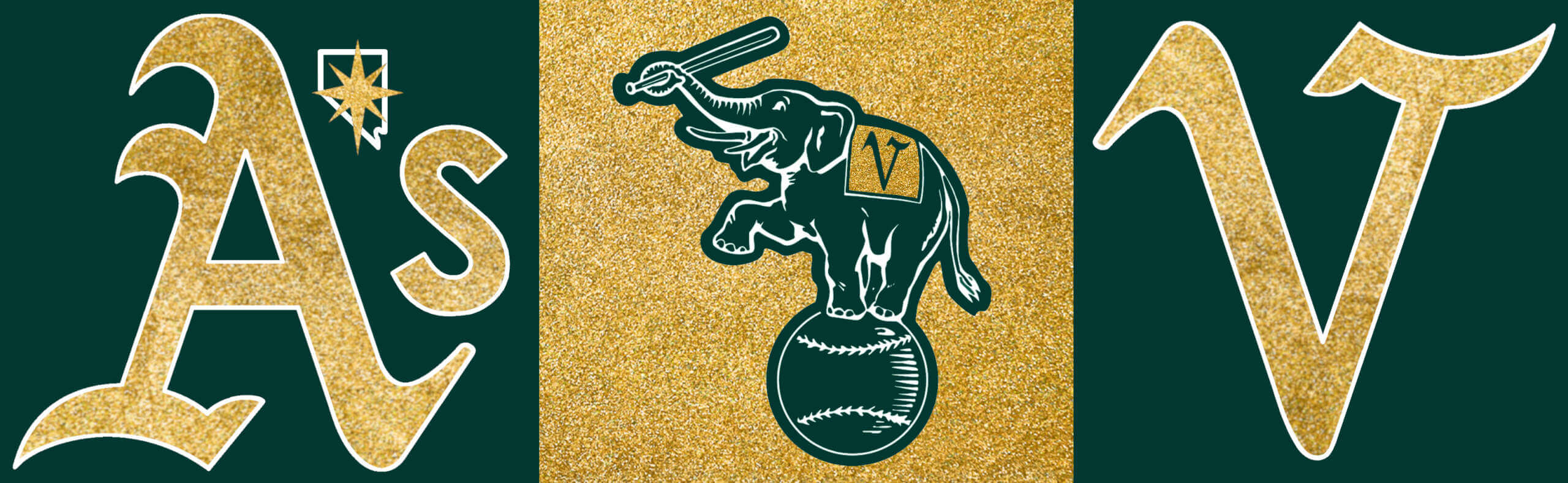
Re: A’s redesign: I hate that we’re talking about this at all. BUT… I LOVE this idea. The Vegas gold, the inverted A as a V all work. I would assume that the A’s would still wear the A’s on their caps, as they have forever, but the V would be a clever addition to a Las Vegas script wordmark (I would hope they will be the Las Vegas A’s, not merely “Vegas A’s”, like the hockey team).
Thanks MJ! The USFL don’t prohibit grey facemasks, but only teams with grey/silver as a colour would have them. I had no idea about the Pioneers logo – no-one commented the first time around so I guess it can’t be that close?
It is not obvious but you never can underestimate the ability of someone with a social media connection to register their righteous indignation over things most people would gloss over.
Really enjoying Chris’ epic journey through alternative history.
Glad to see both Denver and Tampa Bay are in this USFL, as they were the two teams who voted to stay in the Spring in real life. Plus I’m a big BanditBall fan. And it’s great having a pro team playing at the Sun Bowl…go Wranglers!
Love the Arena League reference with the Columbus Thunderbolts. Any chance we can convince your Boston Bulldogs to move to Foxboro and rebrand as the New England Steamrollers?
Thanks Jim! Yes I think epic is the right word! When I started this I don’t think I realised quite how it was going to play out. But I guess when you re-write 60+ years of football history it’s going to be a big job!
The Bulldogs won’t be re-locating, but we may see another presence in New England in Part 4 :)
Here’s hoping that presence is clad in orange and black!
By sheer coincidence, I happen to be wearing my Steamrollers Tshirt this morning.
Whew! That’s a lot of football teams …crowded enough to keep the CFL from expanding south of the border and the WLAF from having a US presence.
Not feeling the Cincy market team…the USFL ‘should’ have considered expanding to Milwaukee or Pittsburgh (full disclosure – loved the Maulers!).
Texas is a tad over-served over time …maybe the Wranglers move to OK (ironic?)?
Some bold design choices! I really like the Saint, err… Jazzmen in gold and purple, but I prefer the Federals in the white helmets. They played horribly but looked really good.
Can’t wait for the final installment!
Thanks Chris, yes it’s a lot of teams! Your comments may prove prescient for the next part ;) I think the Federals had one of the best looks in the USFL (in a league of excellent designs). I’d like to see the USFL2 resurrect them, but they were so awful they may be too tainted for that!
The Feds played horribly both years (the only team that lost two games to the inaugural Maulers??), but I vastly preferred the ’84 silver/green/silver look.
The next time Hollywood decides to make another football movie they should hire Chris Diamond to design the fictional helmets, they sure could have used his talent for Any Given Sunday. Look how effortlessly his fictional helmets blend in with NFL, WFL and USFL helmets, it looks like this league really did merge with the other leagues and play games. Also, the subtle changes that would have taken place as the WFL teams headed into the early 1980’s, like the Portland Storm going to a white facemask but keeping their original 1974 style helmet fits perfectly into this league that never happened. Any ACFL teams going to get in, how about the 1971 Norfolk Neptunes? they won the ACFL championship but had a silver helmet with no logo, Chris would have to design something for them LOL!
Wow, thanks Jimmy that is high praise indeed :) I did make a conscious effort for new teams to do designs that were era appropriate to make them blend in exactly like you noticed. No Norfolk team as the Admirals would be too close, but there will be more new teams in Part 4.
I would have loved to see the uniforms, as the WFL teams moved into the 1980’s, they would have abandoned their standard mesh Sand Knit style jerseys that were all the rage in 1974 and adopted the large port hole mesh jerseys that were popular in the USFL, Tampa Bay had them, they were made by Champion and plenty of NFL teams wore the large holes in their mesh jerseys in the mid 1980’s too.
The Southern California Sun are being listed as plural. They were always a ‘singular’ team, like the Philadelphia Bell, Chicago Fire, and Portland Storm. Takes just a tiny bit away from the history of the WFL being the league that introduced singular names, since you now have the Storm and the Cavalry entering the scene via the USFL.
That was a choice as no NFL team has ever had a singular team name. I can’t see that changing even in alt-reality! That obviously doesn’t apply to the USFL.
Cincy’s black letters on a black background are terribly unreadable. Have they never seen a Marlin’s game?
The Reds’ CC uniforms are unsurprisingly terrible. The cap is okay, but the whole thing would look better reversed with all red and black trim.
Not sure who this “connects” with…
(Sigh) Those Res uniforms are nonsense. I am not anti-black unis. But, how could the Reds not see that these uniforms are a disaster. The design is too dang dark. And, why create a modern typeface for the jersey, but then revert to a classic insignia on the hat? I mean…make it make sense.
Umm … Kelpies?!? In 1980 it would have been far more likely that Seattle would go with Pacific Northwest Native American imagery rather than foresee 40 years into the future and take the less insensitive mythology route. So they go with Totems, a name already associated with the city through hockey until 1975.
link
If/When Chris does the uniform concepts, he should include the hex codes of the team colors for those of us who like that kind of thing.
The A’s should leave their colors behind. I know they pre-date their move to Oakland, but KC has their own team and isn’t missing those colors, and those are literally the city colors of Oakland and the best looking uniforms in the major leagues. Fischer ran the team and the stadium into the ground, ran the Raiders out, and is now running the A’s out too. The least he could do is leave the colors. They don’t need to run with him.
A’s adjustments are interesting but I think they should start all over with a new color scheme: red and black (the colors of playing card symbols), a splash of dark green (the felt roulette tables indeed) and a bit of silver.
The football history series is outstanding, I love the Admirals logo.