Good morning Uni Watchers! I hope everyone had a good week — this past one was one of the busier ones in the Uni-verse! We had the unveiling of the Texas Rangers City Connects (CC), which they debuted last night, Maryland football returned to their early 2000s unis, the Dodgers tweaked their CCs, the Padres honored Johnny Ritchey with 1948 throwbacks, the horrible Mother’s Day caps were released, Seattle’s CC leaked, and oh yeah, the Arizona Cardinals redesign was unveiled. They instantly went from having the worst uniforms in football to still having the worst uniforms in football. Quite a week!
As you can see from today’s hed and splash, last evening the Texas Rangers debuted their CCs, and you’ll note the Rangers caps feature a prominent mark on the right side, with “4*21” — here’s a closer look:
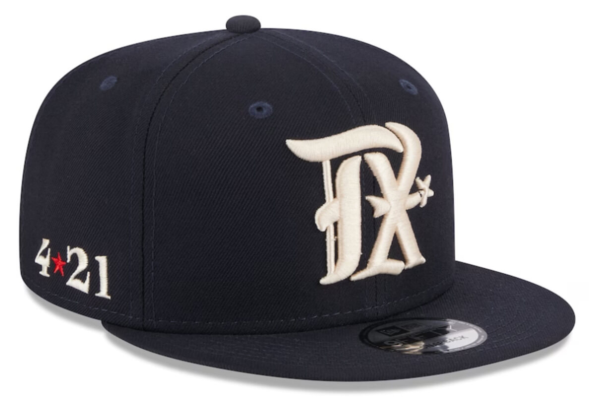
This is just one of several story-telling features on the team’s CC kits. The mark is an anniversary date: April 21, 1836, which is the day of the Battle of San Jacinto, a very important date in Texas’ history. The victory at San Jacinto gave Texas its independence from Mexico. If you so desire, you can read more about that battle here.
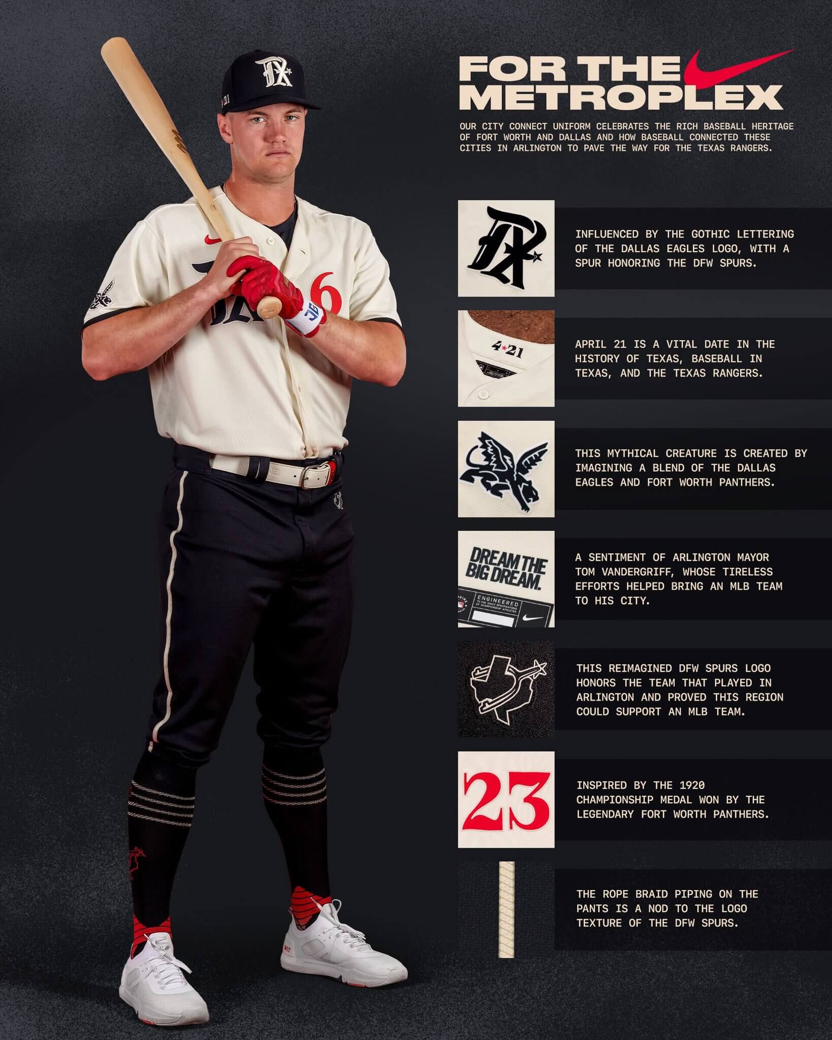
Paul covered the release on Monday. As I’ve mentioned many times on here, it’s fairly impossible to judge a CC uniform on solely on its merits, because the storytelling drives the uniform creation process. While Paul covered it well, our pal Chris Creamer came up with a handy-dandy graphic outlining all the uni-details, and the team did as well. If you didn’t click on Paul’s piece, here are those two graphics:

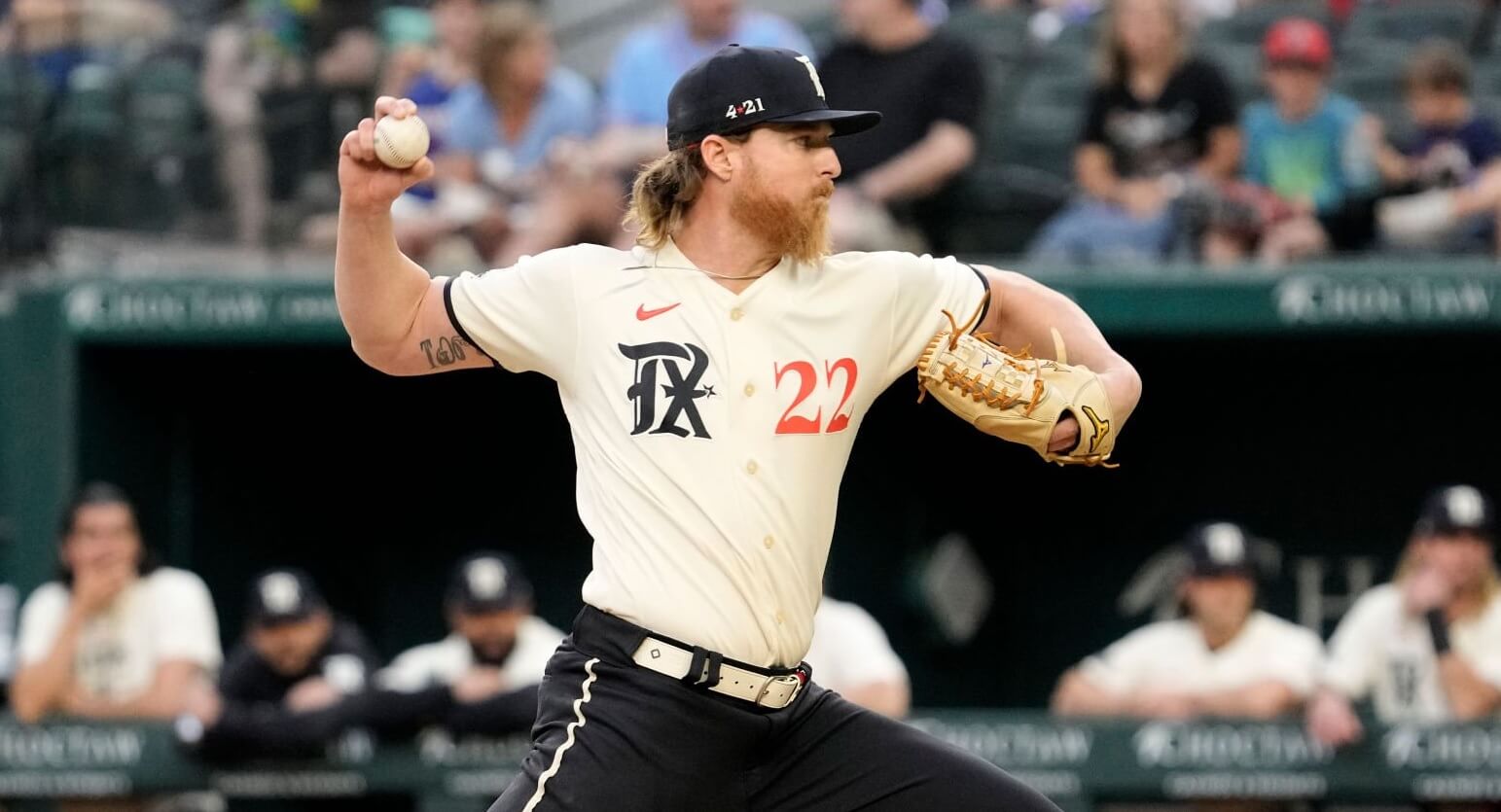
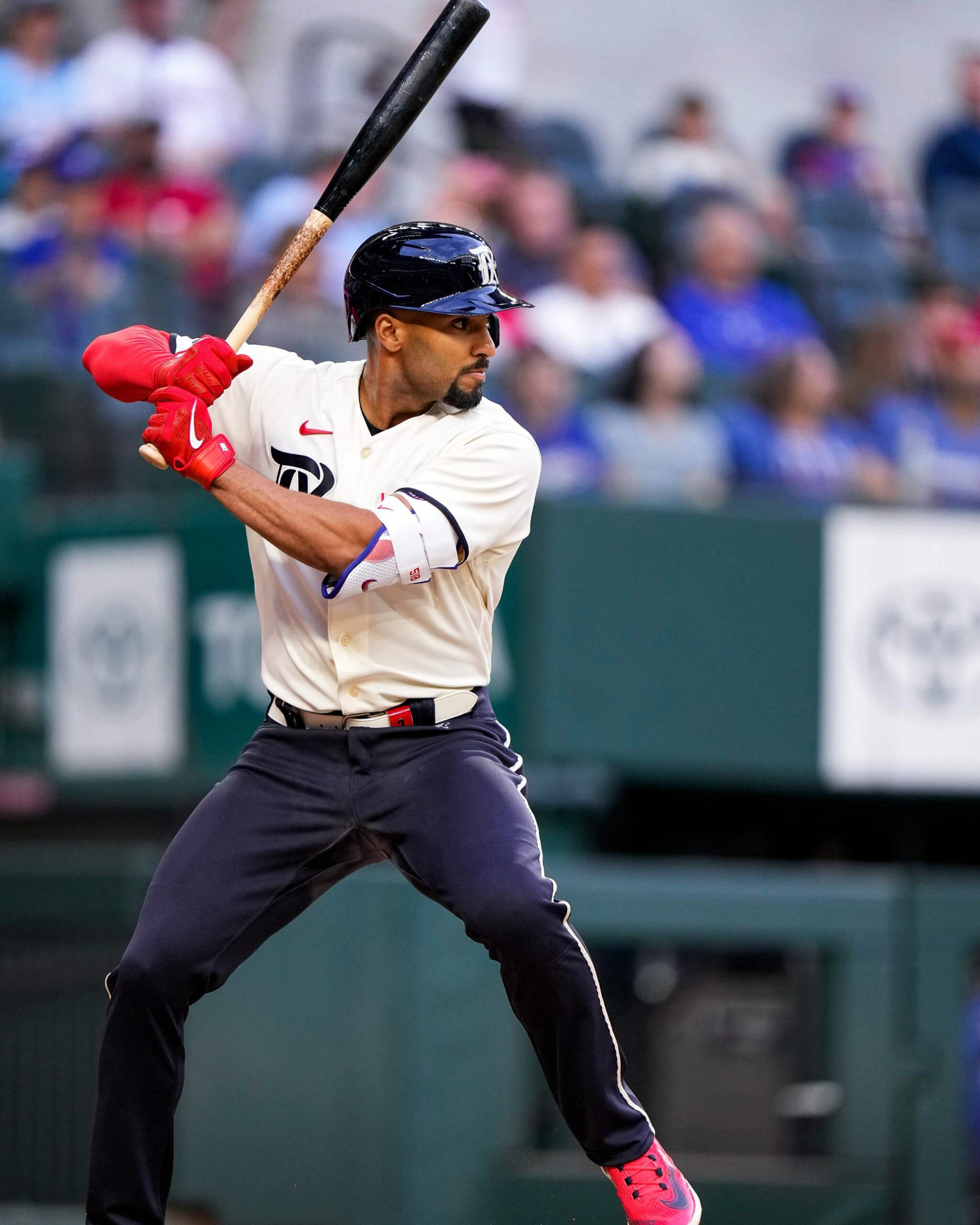
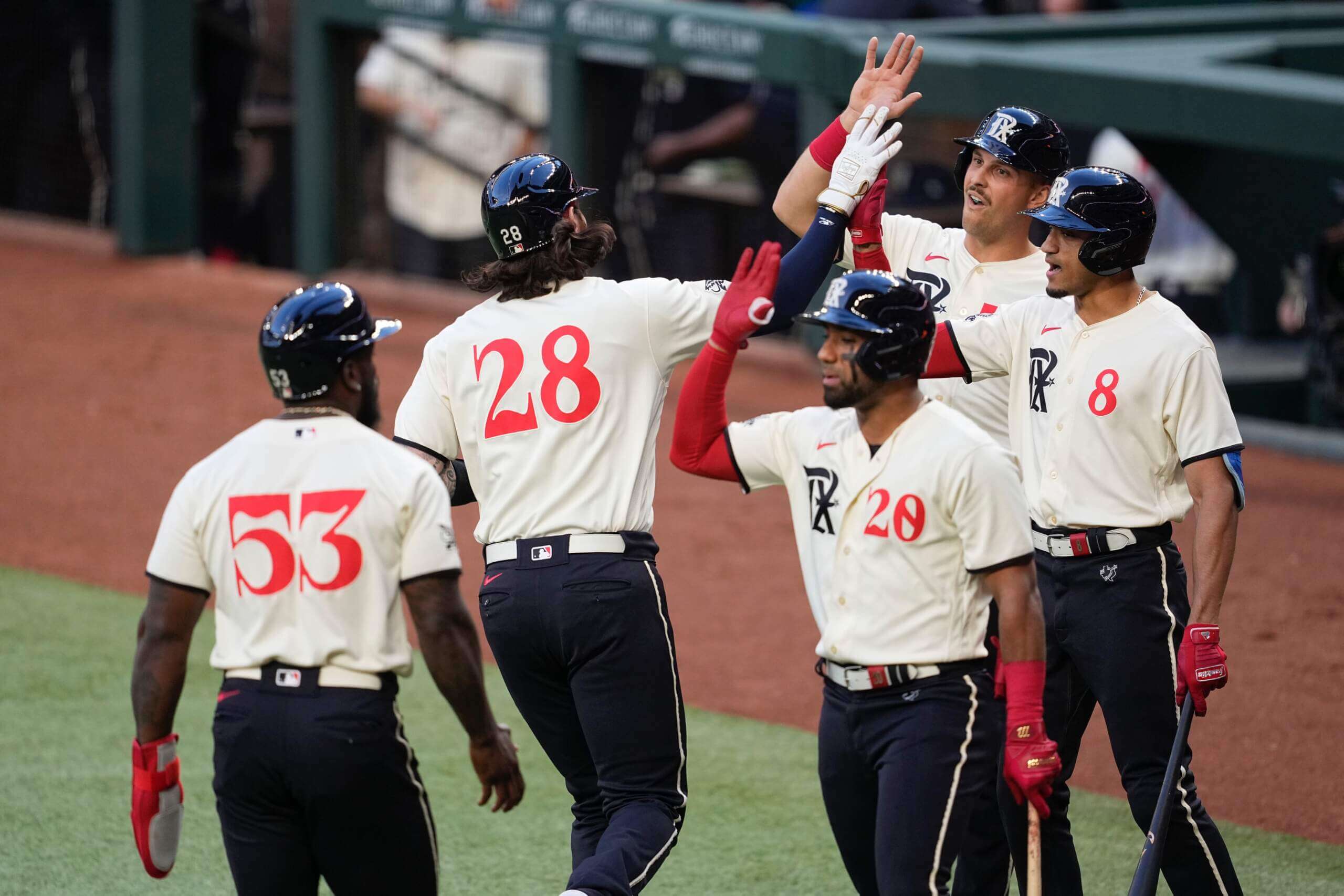
My only comment on the uniform when it was released was that I wanted to see how they looked on the field, and last night, we were given that opportunity. The question at hand is whether it holds up as a uniform, regardless of the backstory attached to it. My biggest fear was how the pants (very dark — midnight blue — almost black) would look, since dark, uncuffed pants tend to look more like slacks and less like baseball pants. And since the team’s CC socks are largely dark blue, for any players who went high-cuffed, would it even make a difference?
Let’s see how they looked on the field!
Like many of you, I’m not in love with the gothic “TX” logo on the right breast, but I do love the red number font which was “inspired by the 1920 championship medal won by the Fort Worth Panthers.” It’s not the prettiest font, but it was surprisingly easy to read. The cream jersey is attractive, and the NNOB is a good look.
You’ll recall that when some of the CCs were first introduced some teams had custom helmets, while others wore their “regular” helmets (at least until a special CC helmet could be created). The Rangers had no worries, as the CCs already had custom helmets ready for this set.
Another feature of the uniform of which I’m not overly fond is the use of the contrasting white-ish belt with the dark pants. It’s not a deal-breaker, of course, but back just a few years ago in the business world at least, white belts were never worn with dark pants, so it looked a bit odd to my non-sports uni eye. Of course, the belt does match the jersey, so there’s that.
While my photo research during the game wasn’t exhaustive (I didn’t see the game itself), it appeared most of the Rangers went uncuffed. I’ve never been a fan of this look (for any baseball uniform), but the dark pants didn’t look as terrible as I thought they might.
Fortunately the fairly thick braided stripe provided a nice bit of visual contrast.
That stripe makes a big difference on dark pants — one of the reasons the Dodgers’ (original) CC pants were so bad. The constrasing color belt and stripe provide a modicum of visual acuity.
Despite the storytelling behind the unis, they looked surprisingly clean on the field. The only extraneous doo-dads on the uniform were the “peagle” on the right sleeve (and of course, the Rangers don’t have a uni advertiser at present, so that helps), and the “DFW Spurs” (reimagined) logo on the left hip, as well as on the CC socks. I’ve never been a fan of hip logos, but this one was fairly innocuous.
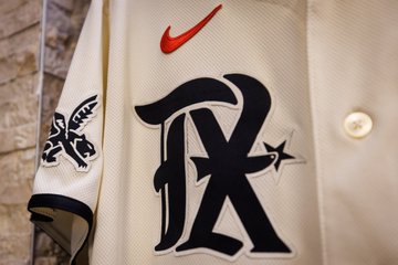
Another feature of this uniform I like is the balance between the “TX” logo on the right chest and the red number font on the right.
We had some discussion in the comments this past week about whether front numbers look good (or are even needed). Some of you feel uniforms look good without them, others like them always. I’m of the mind that a front uni number needs to pass the eye test (how does it look) rather than having a blanket “do they look good or bad.” Examples (IMO) of an unneeded front number would be on teams who don’t balance those numbers. However, even unbalanced numbers fill out an otherwise empty front. That doesn’t work always and for all teams, but the eye-test shows it works (at least for the Mets).

Don’t think so? Check out the Rangers announcers who were wearing replica jerseys which are sans-front number. This — to me anyway — looks incredibly unbalanced.

So, while we can’t quite divorce the storytelling from the uniform, we can still judge them solely as uniforms: do they look good on the field? Uni-traditionalists (or classicists) will undoubtedly argue they don’t. While I am most definitely in the uni-classicist category, I actually liked how these looked on the field. Stills may not do the uniforms appropriate justice, so here’s some video:
The @Rangers are showing out in their new threads. pic.twitter.com/jqUtL8wVRe
— MLB (@MLB) April 22, 2023
HEIM WILL FIND YOU 👊
@Rangers | #StraightUpTX | 📺: BSSW Extra pic.twitter.com/tdAAWHzAQj— Bally Sports Southwest (@BallySportsSW) April 22, 2023
I rather like these, at least from first viewing. Of course, I am not an overall fan of the whole CC program, but that horse left the barn years ago. The Rangers CCs are the second of six uniforms (Atlanta already debuted theirs), and four still have yet to be unveiled. Of course, we’re pretty certain Seattle’s CC’s have already leaked (they’re next up to release theirs). The on-field debuts of the remaining four are below:
Seattle Mariners: May 5
Cincinnati Reds: May 19
Baltimore Orioles: May 26
Pittsburgh Pirates: June 27
I ranked the CC uniforms in 2021 and 2022, and once all six of this year’s have been worn I’ll rank them for 2023. Based on Atlanta and now Texas (and Seattle looks quite promising!), we may be looking at the best year for CCs yet. It’s way too early to say that, but so far so good.
You can see more game photos here.
Now that you’ve seen them in action, what’s your verdict?


Come on, Phil, the Cardinals don’t still have the worst unis in the NFL. I think that honor has to now go to the Broncos, Falcons, Titans, Commanders, Rams, Seahawks, or Jets.
Pretty sure none of them have a black jersey with red numbers.
So for once I agree with Phil. Cards are the worst.
For the love of Jake Plummer, just go back to the Phoenix Cardinals look!
Not buying the party line of this Cardinals’ set being a disaster. Not even close. The prevailing mindset of black uniforms/red numbers being the Great Satan is a canard I’m unwilling to accept. Are there things I would have done differently? Of course, starting with stripes on the red uniforms. But they are definitely advanced from square one.
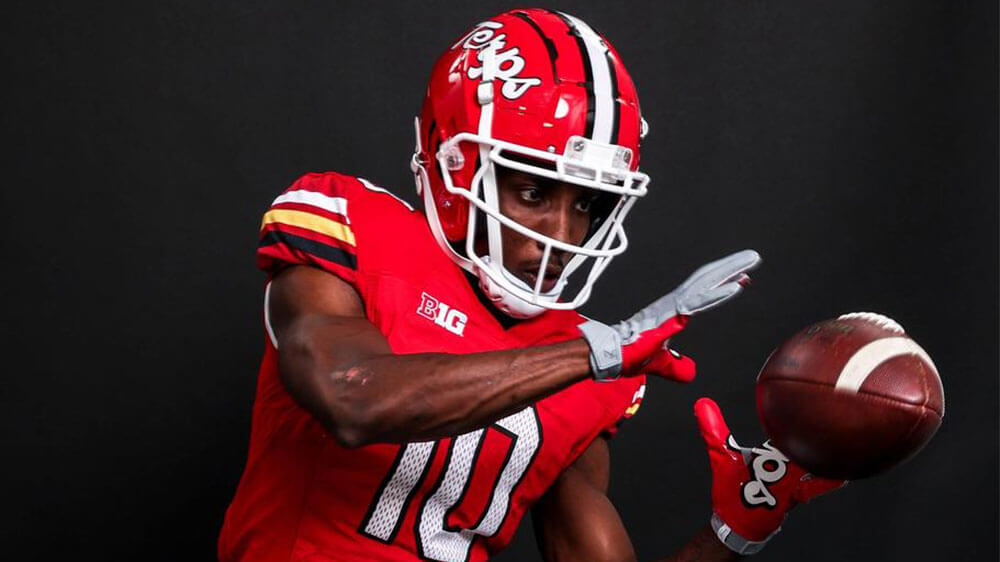
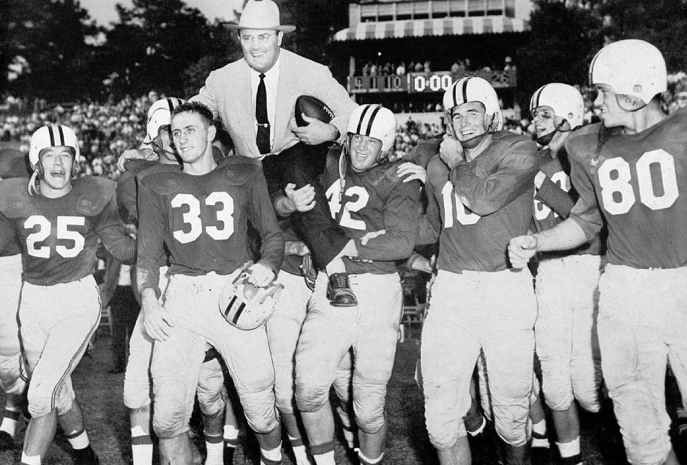
As a Maryland native and University of Maryland alum, I am soooo happy with these changes. Not only does it remind me of the beautiful uniforms of the Boomer Esiason era, but it gets rid of the airbrushed flea market style flag helmets. I love the state flag and some of the iterations of the flag helmets were great
link
link
but, I am grateful to see the most recent set go!
I remember and love those 70s Maryland unis.
But the script Terps… that is their best and signature look!
The flag helmets were nice. Unfortunately the rest of the uni wasn’t.
I’m an UMD alum from the 80s. I recall the fireworks the night of the Frank Reich comeback game. I taught/tutored a number of athletes. Not sure why uni-watch harkens back to the 2000’s. Perhaps because sportslogo.net only goes back that far. My memory is the 80’s helmets were red with white script, 2000’s flipped to white with red script. So at least in my memory the new uniforms harken back more so to the 80’s.
I’m glad to see the flag take a back seat on uniforms. While growing up in MD, the flag itself was not so ubiquitous in daily life or on the sports teams. Sure, the colors were, but slapping a flag on everything was a later marketing ploy.
The state flag can always be put on the back of the helmet as a sticker.
On or off the field, bad design is bad design. The Rangers unveiled a bad softball uniform, and they looked like a poorly clad softball team on the field.
The white belts gave me an early Oughts indie rock vibe. And Herb Tarlek.
Looks like all the pictures shown here don’t show any of the players on the field going high cuffed. Awful pajama/sweat pants look.
Yeah, that bothered me (it does ANY time players go uncuffed). But with their CC socks being a dark midnight like the pants, I’m not so sure it would have made that much difference. Methinks if the tops of the socks were red (or even cream) instead of dark blue, a) it would look much better; and, b) players might have been more willing to go high-cuffed. Maybe not, but in this case I think sock design was poor in relation to the pants. Perhaps the team will ditch the blue pants (or add an alternate set of cream pants) so the dark socks will show up better/make more sense.
At least one player DID go high cuffed:
link
link
link
As I suspected, the dark socks with the dark pants didn’t make much of a difference in the overall look. That could easily be corrected by issuing a second set of CC socks, with either cream or red as the dominant color.
Well, I didn’t mean to follow the above comment, but so it is.
I think this is a great uni for the rangers. I don’t know how locals/fans feel about the rangers normal uni sets. Personally I feel like they’ve only ever had one interesting uni identity (the Tex Avery wacky cartoon font), and that is a bit of a novelty design at this point. Otherwise they just kind of flounder around not knowing exactly what to settle on for very long buys it’s always just something sort of uninspired. Particularly in contrast to their fellow Texan baseballers who are always at least trying something interesting and new even though they change every ten years or so.
This could be the base for their every day look, and I would be very happy. If it were to become an every day thing, yeah some of it could get toned down (maybe take the logo off the hip, make the socks something more simple) but for me this is a great example of Nike designing a uniform rather than a costume (with spray paint sleeves, or gradient fog motifs everywhere)
Agreed. Whatever the merits of the uniform – and I have a lot quibbles with these – these are far and away the best uniform in the Rangers locker right now. The Rangers CC uniform feels less like a civic tribute and more like a decent first draft of a new team visual program.
Agreed, cream pants on these, or whole uni to white, and they’re pretty much good to go…
I don’t even hate the dark pants. It’s the kind of thing I’d love to see one or two teams do. After all, plenty of teams wear solid-color shirts at home on the regular; why not solid-color pants?
I like City Connects in general, and think some of them have been great, like the Marlins and Rockies. I do enjoy the storytelling, unless they go too far.
I don’t like the gothic TX on these. Something just seems off. But the rest seems neat.
The Rangers CC looked better on field than what I thought. If I’m not mistaken, did the first baseman have a red belt on??
I love the Rangers uniforms. Might not look like the Texas Rangers but it’s a darn good looking uniform.
I always liked this Maryland helmet.
link
Very nice combo of flag and M
Those were good looking helmets. That’s what they wore when I went there, but those teams were not good. I’d rather have a visual identity closer to Bobby Ross and Ralph Friedgen than to Ron Vanderlinden and Mark Duffner.
More MLB teams should break out non-white/non-grey pants. Never understood why it has traditionally been rarely used in the bigs.
Agreed. I can only think of the late 70s White Sox and (occasionally) Pirates in modern times to go light-over-dark.
It has roots in the very beginnings of the game; it’s not something to sneer at as non-traditional. And I think it looks great.
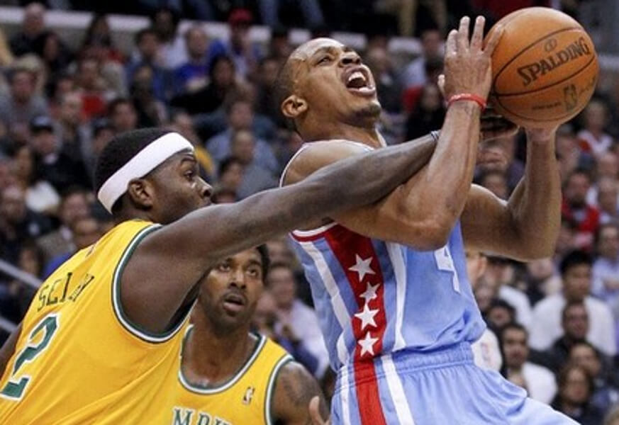
GTGFTU: January 26 2012: Memphis (91) at LA Clippers (98).
You guessed it, Morris!
Grizzlies dressing and the Tams, LAC in LA Stars throwbacks…noting really noteworthy, just one beauty of a matchup.
Too bad an ABA ball wasn’t used – chef’s kiss!
“As I’ve mentioned many times on here, it’s fairly impossible to judge a CC uniform on solely on its merits, because the storytelling drives the uniform creation process.”
You are being too kind Phil. I think you can judge them on their merits. MLB teams are capable of producing nice uniforms. Some of the CC are nice uniforms. The rest of them are just overdone costumes. Maybe that is the standard. Is it a uniform or is it a costume? The Rangers offering is more costume-like.
So…when do the Oakland A’s get their City Connect? That’s gonna be awkward…more like City Disconnect
Indeed.
At the conclusion of 2023, 20 teams will have CCs, so that leave 10 who won’t. MLB released them in batches of 7 the first two years and 6 this year. Originally, all 30 teams were supposed to have CCs by the end of 2023, but the timeline keeps getting pushed back. So, will they release the remaining 10 next year? Maybe they’ll drag it out even further (5 in 2024 & 5 in 2025)? Either way, I don’t think the A’s will have moved to Vegas by then. Nor do I think the league will have expanded to 32 teams by then.
But with the writing (move to Vegas) on the wall, it’s fair to question what swooshie will do with the As. You have to think they’ll get a CC…but it’ll be more like a City Swansong than a City Connect (I do like your use of “City Disconnect” for their CC kits).
maybe the prevailing visual theme will be inspired by a luggage tag from oakland international to harry reid. that or it will mimic the logo of a local moving company.
That cap logo to me looks like 2 golfers. The X is pointing somewhere and the T is holding the cup flag!
Am I the first to point out this is the first jersey (ever?) to put the insignia on the right and the number on the left? It completely changes the balance we’re accustomed to. A basic rule is for the numeral and the monogram to rest on the same baseline, which explains the satisfying appearance of the graphics.
This all seems very familiar…
link
Also,
link
link
Gotta admit, those Ranger uniforms look better than I expected. Of course, stirrups would have made a huge difference.
Yes, the new Cardinal uniforms are a disaster. The NFL is the worst dressed league by far. So many horrible looks. No sleeves…mono…BFBS…gradients…stripe-free socks or no socks at all. What a mess.
I dig the Ranger’s CC.
GTGFTS: Rays@Red Sox 8/13/20.
Out of town scoreboard is Hurricanes 3 Bruins 2. Game 2 of the first round of the Stanley Cup playoff bubble.
As far as the Rangers CC uniforms…
Eww…
They look like something as if the secretary, who knows nothing about the sport, designed the company’s softball uniforms.
But, to each his own.
Gotta love how the Rangers couldn’t even bother to proofread their own press release nonsense . . . “gotchic”?
Maybe whoever wrote up the press release was thinking of their girlfriend? Goth chick. Haha.
Phil, you gotta warn a Terp before you link to a Randy Edsel picture. The worst…
I was at last nights Rangers game. While the jersey and hat looked ok (many fans also were wearing the jersey and hat), the dark pants were disturbing. At first blush, it looked like a softball team.
I think the logo itself is pretty cool.
I wouldn’t be surprised if Maryland football comes out with a gold version of these uni’s in the near future. They did wear a gold throwback a few seasons ago, forgot which era they threw back to. And as we know UMD basketball has a history of wearing gold.
UMD’s move to a new uniform is a good one, Rangers CC is a fairly poorly executed occasional one (except for the Peagle and the rope striping which are brilliant), Cardinals move to a new look is a pathetic, insulting and infuriating one. Nothing makes sense or looks even remotely atteractive.