It’s been obvious from the start that the Dodgers aren’t into the whole City Connect thing. While other teams came up with newfangled (and often awful) designs, the Dodgers mailed it in with a “Los Dodgers” design that felt half-assed at best — maybe even quarter-assed.
That was in 2021. Then they changed the design in 2022. And now, as we discovered during yesterday’s Dodgers/Cubs game, they’ve changed it again for 2023! Here’s a quick recap:
2021: Dodgers CC 1.0
This was the team’s original mono-blue CC design. It was worn only four times in 2021 (which I’m pretty sure is the lowest count for any CC uniform that year), which tells you what the Dodgers thought of it.
2022: Dodgers CC 1.1 

The “Los Dodgers” cap apparently wasn’t selling (shocker), so they scrapped it and came up with a new cap — black brim, regular “LA” logo on the crown, “Los Dodgers” moved to the side. This combo, like its predecessor, was worn sparingly — only five times.
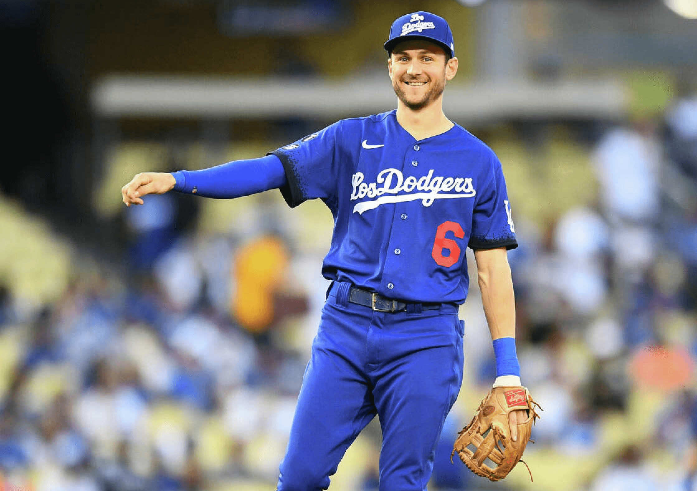
2023: Dodgers CC 1.2

The new cap must be selling at least half-decently, because they’ve kept it for this year. But the players reportedly disliked the mono-blue combo (shocker), so now they’re going with white pants. But wait — they’re not the team’s usual home pants, which are all-white. These are extra-special City Connect pants with blue piping down the sides! Yes, they actually ordered an entire new set of white pants just to be worn with this lame-o jersey.
Fortunately, if recent history is any guide, we won’t have to see this combo very often in 2023.
I hate to give the Fodgers any credit for literally anything, but at least they can recognize when something needs to be changed.
I hate the black brim.
Agreed. Black does not belong anywhere near the Dodgers set.
Personally, I’m still upset they didn’t go with a “Doyers” wordmark for the CC.
If they feel the need to come up with something different on the hat to justify its existence as a separate uniform, how about a white brim? Or a red brim?
Or……hear me out….no brim.
Doyers!
It looks better now than it did in the beginning. Next year, maybe they can get rid of the ridiculous black sleeve ends. The whole CC series is an abomination.
Why don’t their usual jerseys say The Dodgers?
I always loved the way Omar Vizquel pronounced Dodgers. He pronounced it DOE-Yairce.
You mean speaking Spanish?
Don’t really care for the slow roll out of these uniforms across the league. The fact that the Dodgers (twice) and the Rockies have changed their CC uniforms before other teams have even had their own release makes it even worse.
White uniforms; red graphics that say, “La La Land”, with the exception of a blue number on the front.
So they’ve essentially got themselves a blue alternate top, like every other blue team in the league.
And hopefully as the years go on they’ll not wear any of the city connect any longer. One can only hope.
Not a fan of the gimmicky idea. I find it funny that my team just mails it in. It’s not something they want to do and so do just do little enough possible to satisfy the gimmicky wants and needs of MLB via Nike.
Pathetic that the Dodgers are demeaning themselves with this uniform set – and that some fans are saying this is an improvement. A zero set that is still a zero set, The whole City Disconnect program is an abomination, especially for a team that got through the ’70s unscathed.
Los Dodgers? How about Los Angeles instead?
Those guys play in Anaheim.
Please don’t aim your pitchforks at me, but…I kind of like the Dodger blue pants.
Me too. As a fan of the Chicago Cubs, a team that has worn mono-navy (including pants) in several eras — the 1880s-90s, the 1900s-10s, and now again with City Connect — I’d love to see more colored pants. People laugh at colored jerseys and call them “softball tops” because they don’t match the pants, but then when a team does match their pants with the jerseys, people laugh again. It’s like they only ever want to see white and gray.
The Mets had blue pants too when they wore Negro League throwbacks regularly a decade or so ago. I say let’s have more full-color pants uniforms. They look great.
Matching Jerseys and Pants in a bunch of colours would look so much better than a bunch of mismatched tops.
I actually think it would be fun to see Red vs Blue Angels vs Dodgers. Or an all teal Marlins look.
One game w the home hat and white jersey and blue pants. I’m okay w that just to see what it looks like.
I’d love to see a cross over w other teams uniform colors in other sports to well connect w the city. A yellow and purple Lakers colors uniform or silver and black Kings would be fun, keeping the Dodgers uniforms in tact just swapping the out colors.
Nike must be scratching its head by now when the Dodgers and Rockies change their CC uniforms. Maybe the swoosh staff does not get it at all when it comes to designing attractive uniforms.
hollywood (in the font of the famous sign) would have been cool…..something similar to what the cubs did with wrigleyville.
The City Connect concept is good, it’s the Dodgers mono-blue pajama unis that were bad. The White Sox Southside version nailed it. Heck, this year’s (shudder) SF Giants CC jersey made me a little envious. LA fans deserve better… but just don’t go the way of the SD Padres CC design. Those are straight up awful.
Glad someone phoned in this lame brained city connect nonsense. Bin them all.
So now they’re pretty much just doing the “Los Mets” thing from a few years back. Meh.