Good Saturday morning, Uni Watchers! I hope everyone had a good week. A belated Chag Sameach! to those observing Passover and an early Happy Easter as well.
I’m pleased today to introduce a new series, created by none other than UW friend and contributor (and Ticker-submitter extraordinaire!) Kary Klismet, which we’ll be calling “Dressed for the Season.”
Earlier this week, Kary approached me with his pitch: “I recently had the idea to do a series on uniforms appropriate for particular holidays, called something liked ‘Dressed for the Season.’ The pieces would likely be in the format of a top ten list (perhaps with a few honorable mentions), similar in some ways to Paul’s piece about orange uniforms from last October…I’m thinking of additional pieces in the series for the 4th of July, Halloween (focusing on scary uniforms more than orange and black), Thanksgiving, Christmas, and possibly into next year with Valentine’s Day.”
I absolutely love this, and today, Kary is here with the first set of “Dressed for the Season” unis and kits. Enjoy!
by Kary Klismet
Much like sports teams have color schemes that define their identities, we often associate holidays in American culture with their own sets of colors. While fans may don apparel in team colors to make their team loyalties known, so too will you see holiday enthusiasts dressing and decorating in the colors that fit the season. That confluence of customs helped sparked an idea for me to explore a series about sports uniforms that would fit well into the established visual programs of the holidays so many of us celebrate.
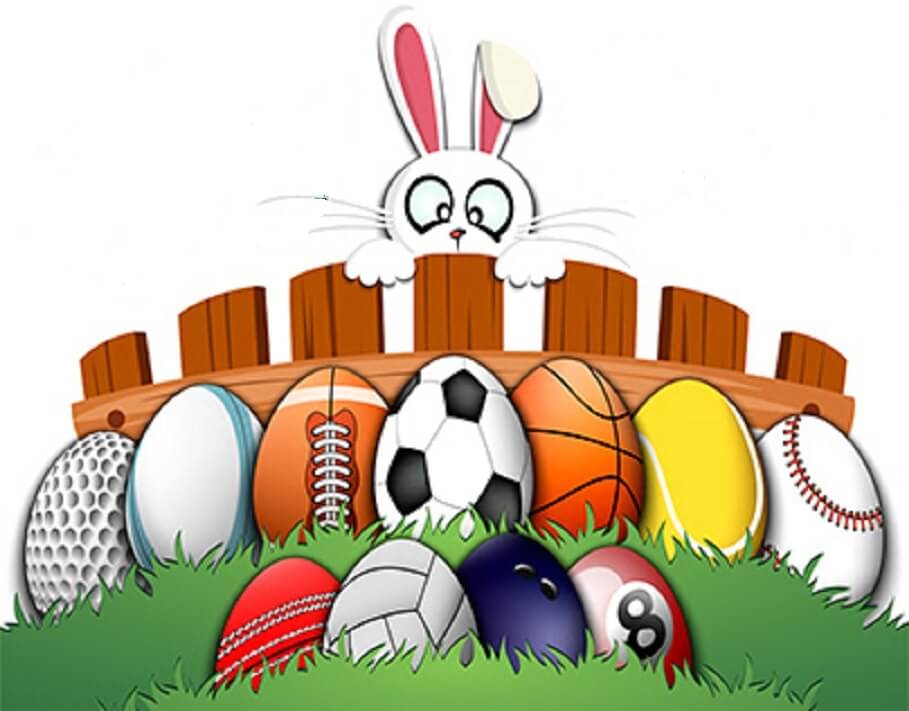
First up for this series is an exploration into the top twelve uniforms that fit within the pastel color scheme our society associates with Easter. If the uniform could be placed neatly in the midst of a display like this without looking out of place, then it stands a great chance of making this list.
My rules for compiling this list were fairly simple. As a threshold matter, colors take precedence over religious imagery. While many people (myself included) have deeply held beliefs about the spiritual significance of Easter, this list focuses on those aspects of the season that everyone in our culture can commemorate. A little dash of Springtime pastels is something that’s available to us all!
To that point, colors really do matter (at least for this list)! The purpose is to highlight the sprightly shades of pastel most commonly associated with Easter. That means teams with Spring-themed uniforms where non-pastel colors dominate (like the Washington Nationals’ grey cherry blossom City Connect alternates) don’t make the cut.
Also of particular importance: no one-offs meant to pander to holiday consumers or promote certain causes. The uniforms have to be part of a team’s legitimate visual identity, with some emphasis placed on teams’ sustained use of the colors in question. That immediately disqualifies those cringe-worthy MLB pastel jerseys from a few years ago. (Oh, wait! That was an April Fool’s joke, thank goodness!)
And finally, only one entry per team or program. We don’t want certain clubs with seasonally appropriate color schemes to dominate these rankings.
With those guidelines in place, let’s see what eye-catching combinations made the list.
12. North Carolina Men’s Basketball – Blue Away Uniforms
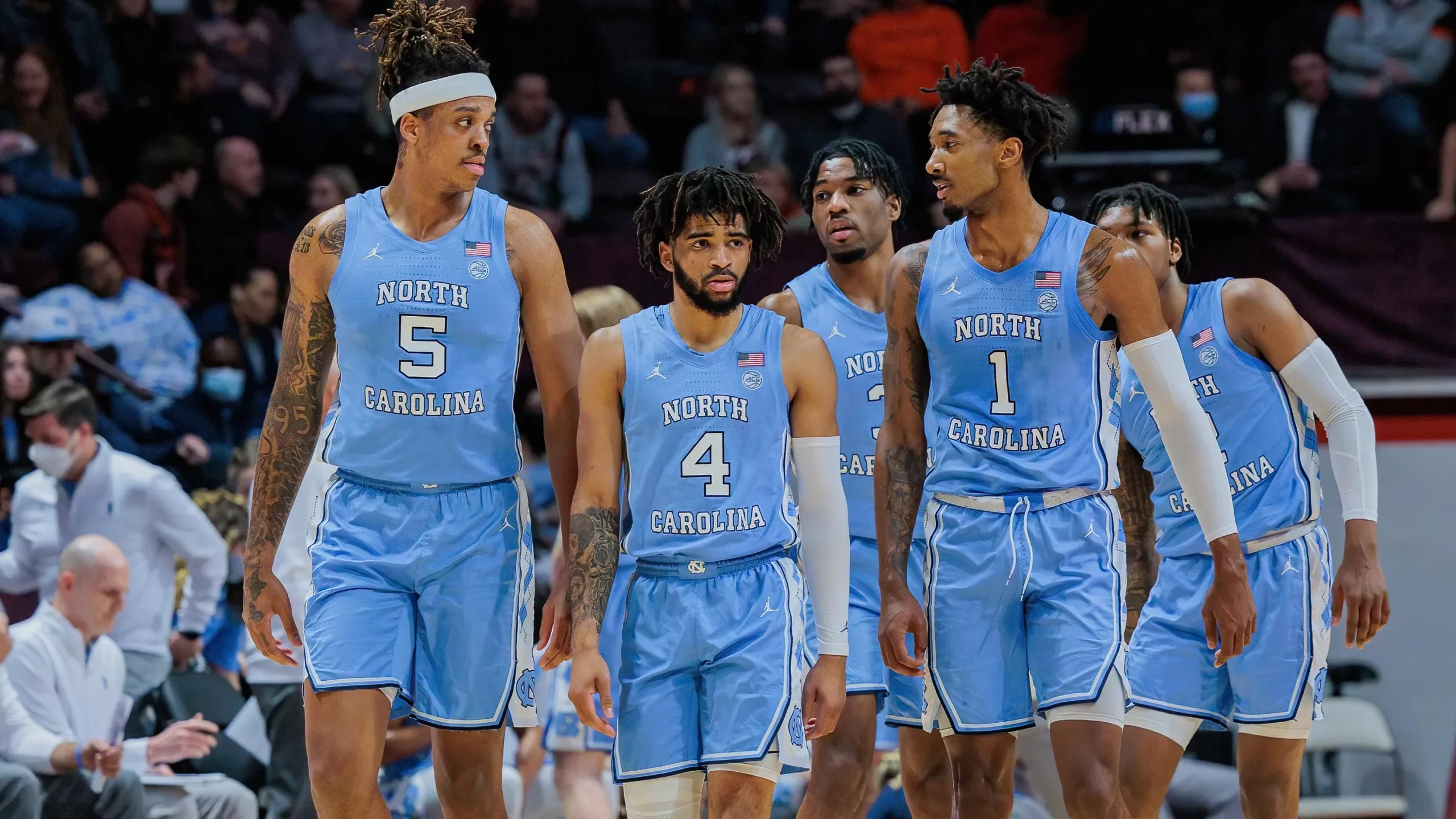
The first six uniforms in our ratings represent an attempt to recreate the full complement of Peeps colors in monochromatic sports uniforms. And, of course, you can’t complete that spectrum of Spring colors without a cheery pastel blue. Thankfully, whether you call it powder blue, sky blue, or baby blue, there’s no shortage of teams so adorned in the sports world. And no one wears it better than the University of North Carolina men’s basketball team in their iconic Carolina blue road unis. A fitting classic to kick off the list.
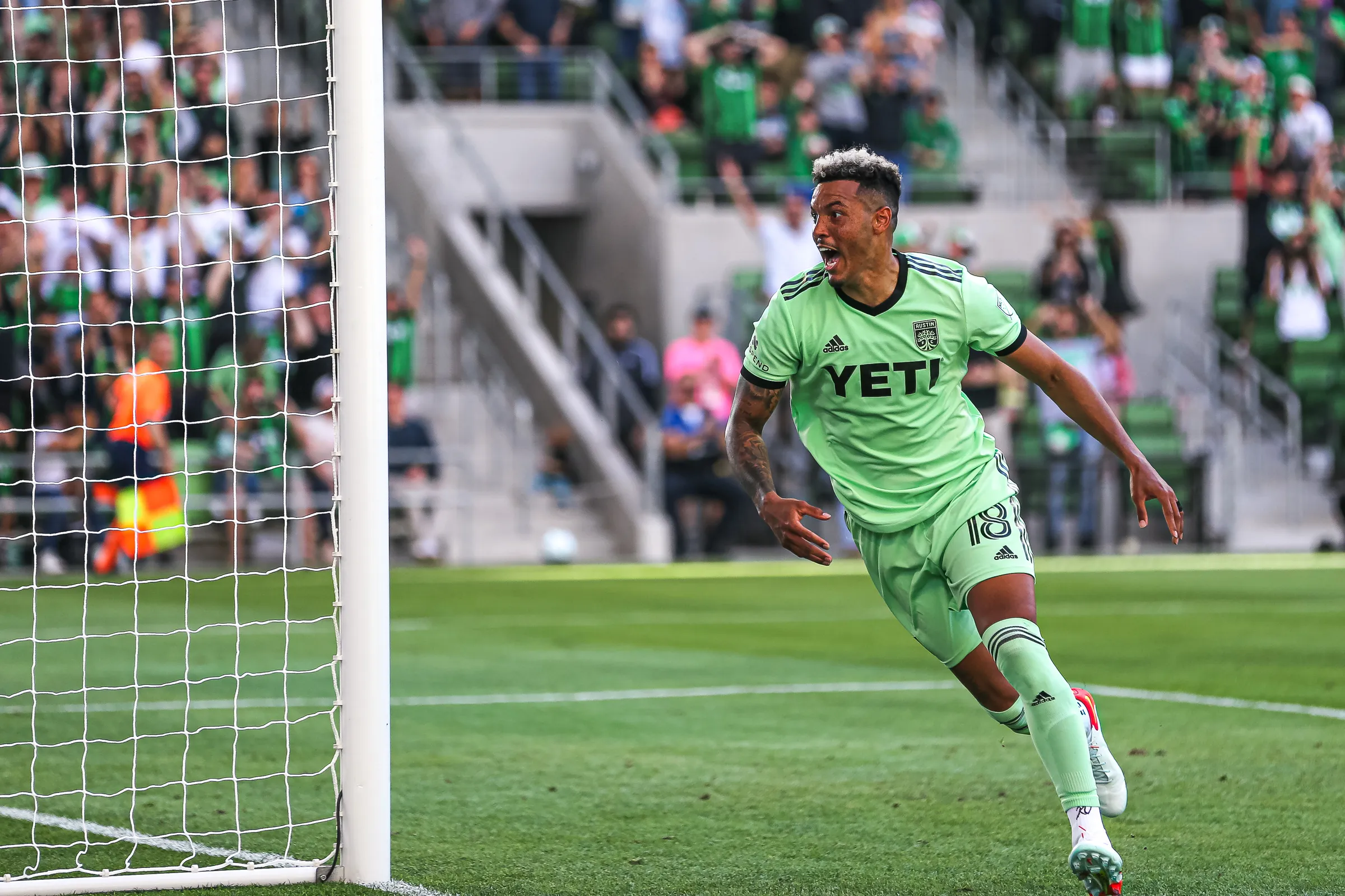
As we all already know from Paul’s tireless advocacy, green is a woefully underutilized color for sports uniforms. Pastel green, in particular, is practically unheard of. Nonetheless, one team pulls off the look with impeccable style, as Austin FC has worn light green shirts and shorts as their standard road kits since last season. It’s the ideal shade of green to blend in with the fake filler grass in our Easter basket!
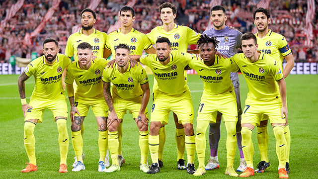
Nothing signals the renewal of Spring like the yellow found on a fluffy baby chick, and we have just the team to fill that spot on our color palette. Villarreal, a fixture in Spain’s La Liga for nearly 25 years, has worn all-yellow kits since 1947. It’s such an established look for the team that they’re known by fans as “the Yellow Submarine.” And their lively shade of yellow is just light enough that no one is going to mistake it for “athletic gold.” A delightful ray of Springtime sunshine!

It seems like orange is often overlooked as a Spring color, but no Easter bouquet is complete without some blooms of orange – perhaps some tulips or marigolds – in the arrangement. Finding a team to fill the pastel orange slot on the Easter color wheel was challenging since so many orange-clad teams wear darker or richer shades. But this list owes a debt of gratitude to European soccer’s custom of rotating through a full prism of colors for teams’ second and third kits. Another La Liga mainstay, Atletico Madrid has worn third kits this season that make them look like a giant orange cream candy, or perhaps a tasty confection for the Easter Bunny.
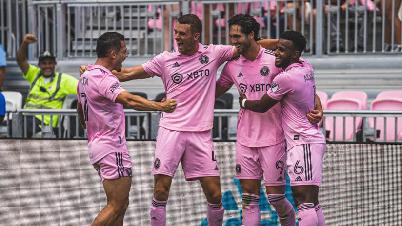
Is there a color that screams “Easter” louder than pastel pink? Multiple generations’ worth of new Sunday-best outfits testify to its importance to the holiday. And MLS’s Inter Miami is precisely perched to play the pink-clad role on our list. Likely taking inspiration from Europe, where pink is not an uncommon color for second and third kits and is part of the well-established identities of clubs like Palermo in Italy and Evian in France, Inter Miami has doubled (or perhaps tripled) down on the shade by pairing it with pink shorts and socks. For some reason, I’m suddenly craving Cotton Tails…
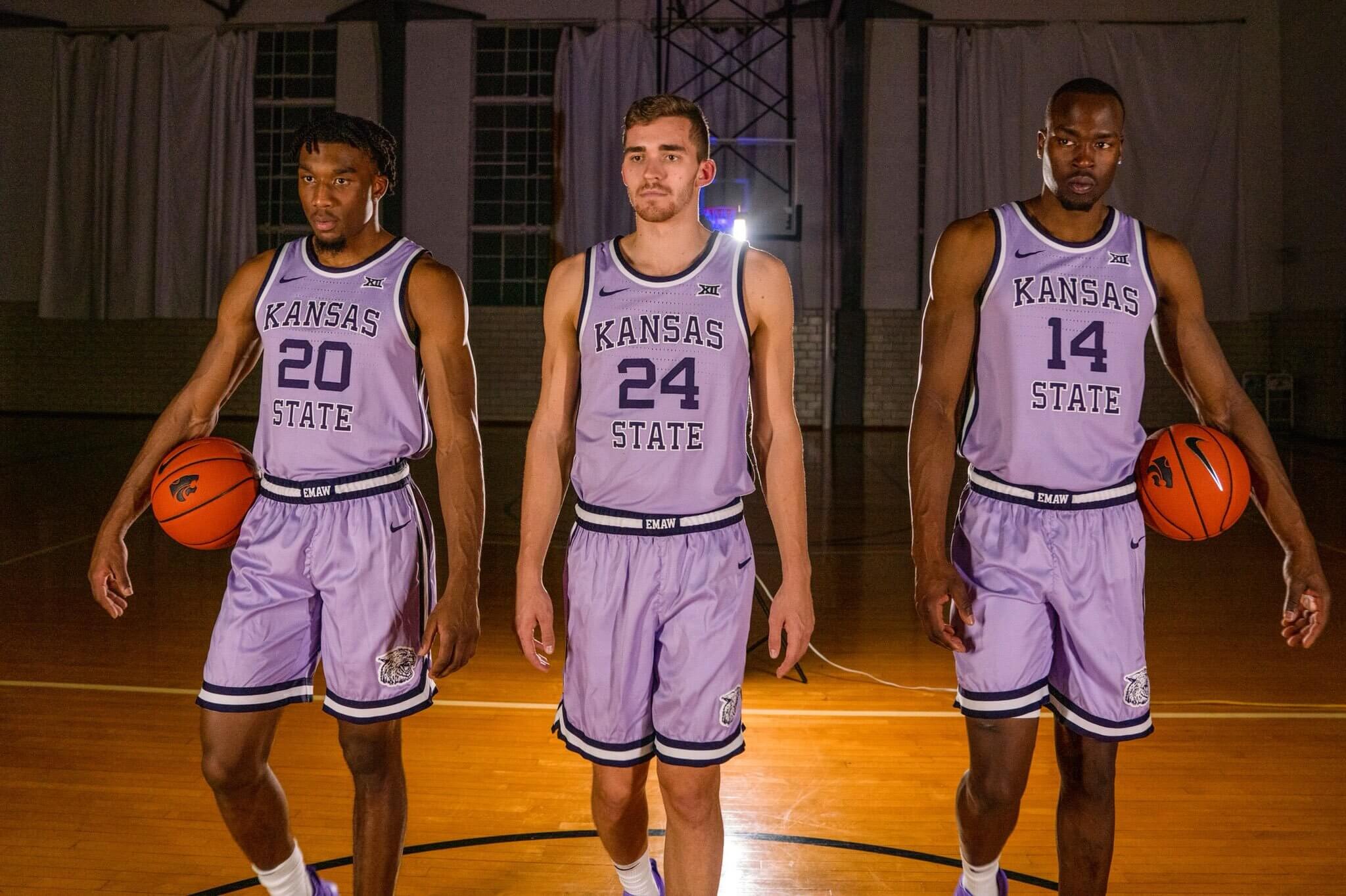
Unveiled as an homage to the Wildcats’ infamous two-tone purple road uniforms from the early ‘80s, Kansas State originally paired those ready-for-the-Spring-Cotillion pastel purple jerseys with darker shorts when they debuted in 2018. But they soon switched to matching shorts to create these all-lavender lovelies, which remain a part of their wardrobe to this day.

If uniforms consisting predominantly of one pastel color can be excellent signifiers of the Easter season, how much more so are uniforms that incorporate multiple shades of pastels? The next six uniforms on this list all fit that bill, and there’s no color combination more perfect for Easter than the pink and purple featured on the Japan Women’s National Soccer Team’s away second kits for the 2023 World Cup campaign. These uniforms might have ranked higher had I seen them in action on the pitch.
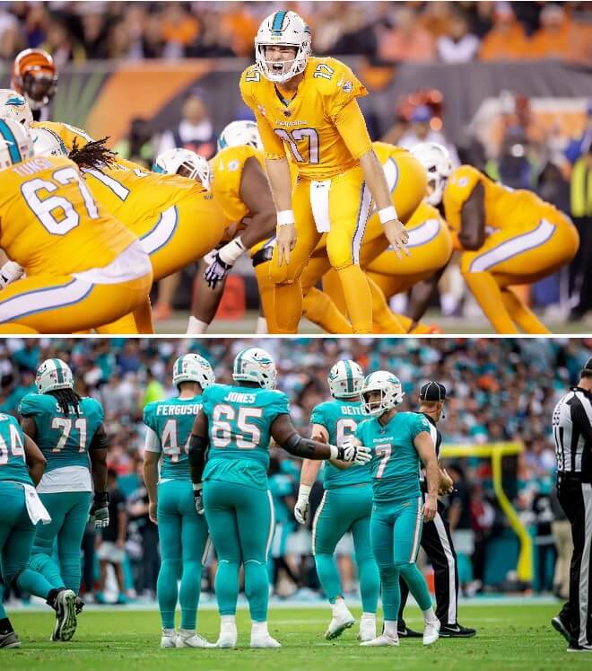
This one’s a bit of a cheat since my own parameters dictate I choose only one uniform per team or program. But how do you choose between mono-pastel with pastel trim and mono-pastel with pastel trim? Some of Miami’s past uniforms evoked the ocean better, with a darker shade of aqua, but their Nike-fied current set leans much closer to teal. Indeed, I’d say the Dolphins would blend in quite nicely with this well-matched family on their way to Easter brunch.
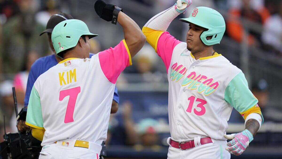
There’s a fine line (no pun intended) between highlighters and pastels. To my eyes, San Diego’s City Connect uniforms, introduced last year, fall just on the pastel side of that ledger. More to the point, I daresay they look like a box of pastels exploded all over their uniforms! The Padres pretty much have the entire Easter palette covered here.
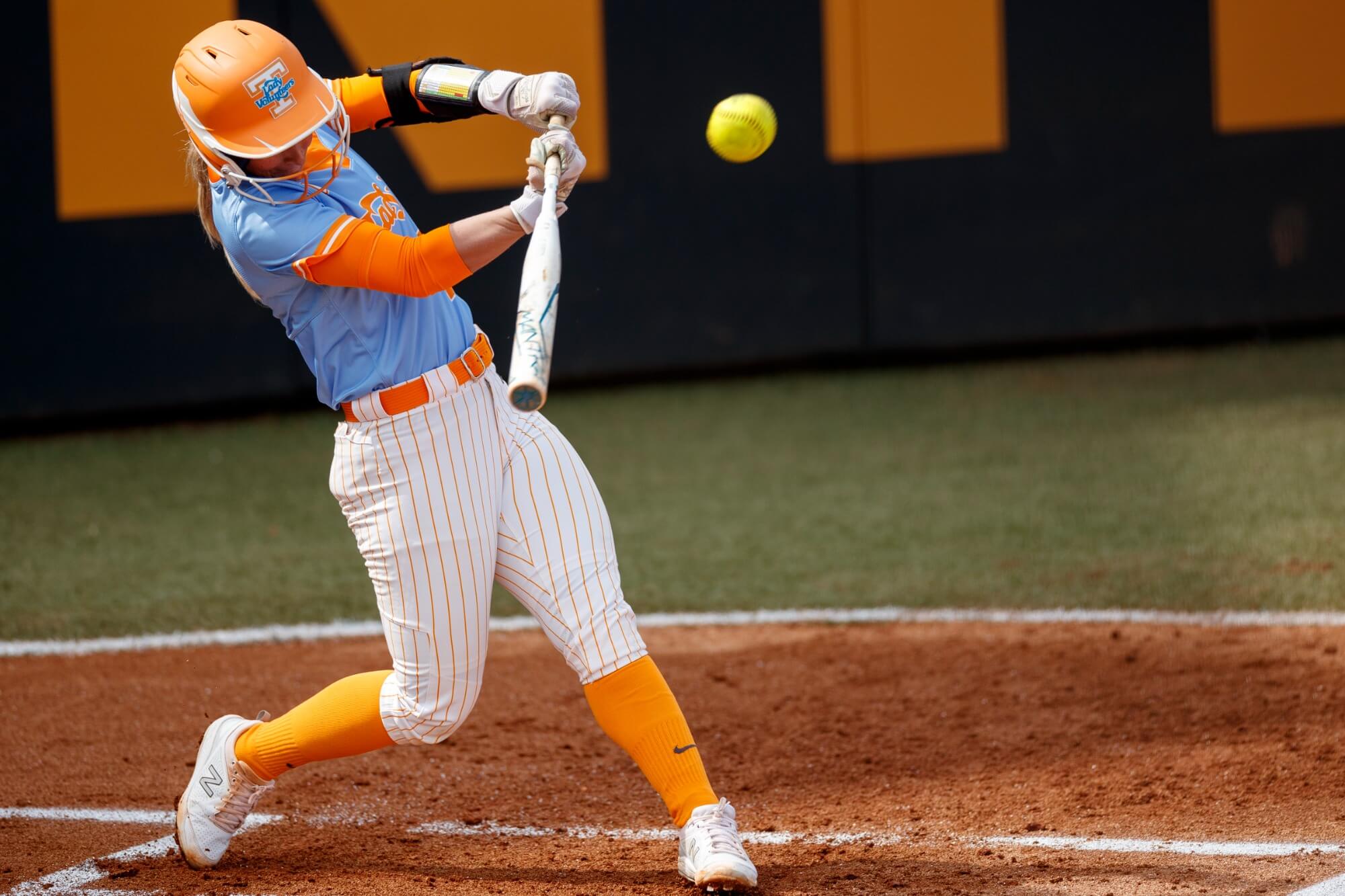
There was no way that the University of Tennessee, with its vibrant shade of orange, wasn’t going to find a spot on this list. The hardest part was figuring out which team – and which uniforms – would best represent them.
It was tough to feature anyone other than the football team and their highly visible brand. However, the school’s women’s sports programs, which have incorporated light blue into their visual identity ever since the days of Pat Summitt’s dominant basketball teams, effectively up the Easter ante with two shades of pastels. And the interplay between both colors is perhaps best displayed in these beauties worn by the softball team.
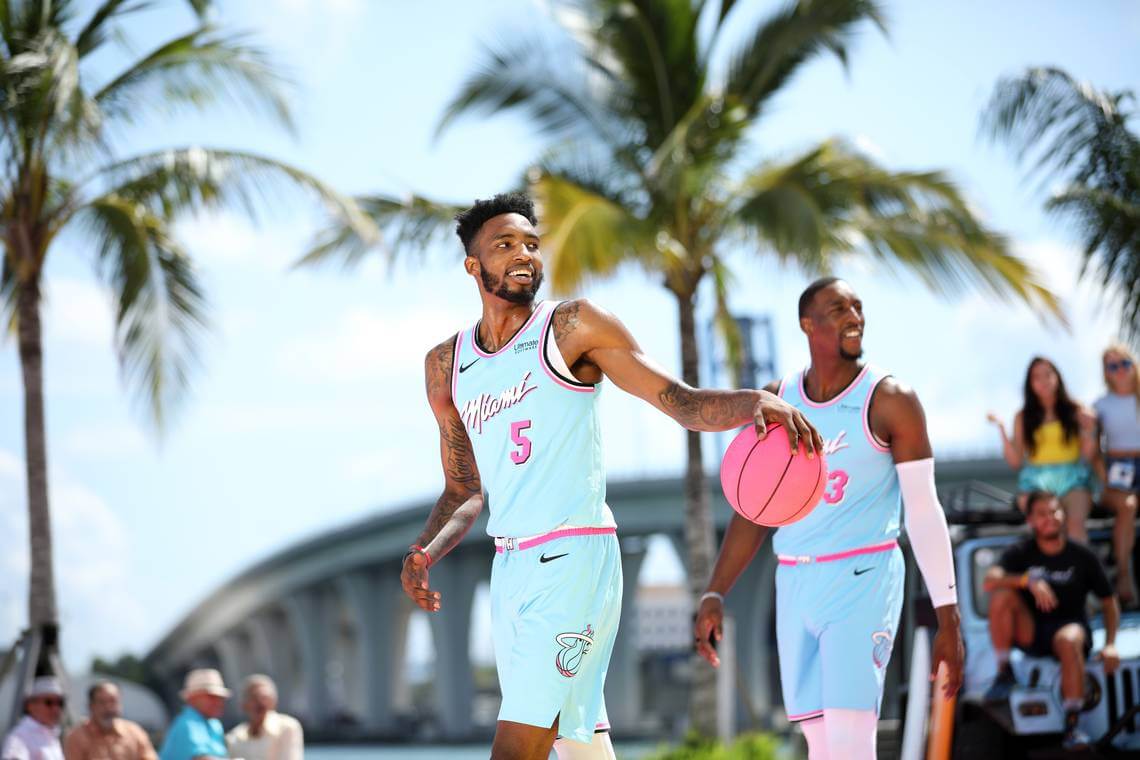
The pink and blue color scheme of the Heat’s “Miami Vice” alternates may have reflected the era-defining television show’s signature look (inspired in turn by Miami’s famous Art Deco scene), but the combination would be equally at home as part of any household’s Easter decorations. Although the editions with the half-and-half gradient are hard to resist, it’s the blue uniforms with pink trim (minimizing the use of black) that give off the most distinctive Easter vibes.
Unsurprisingly, Miami teams are well-represented on this list with no less than a quarter of the entries. It takes a special uniform to keep the city best known for pastels out of the top spot, and that’s exactly what we have with our top choice…
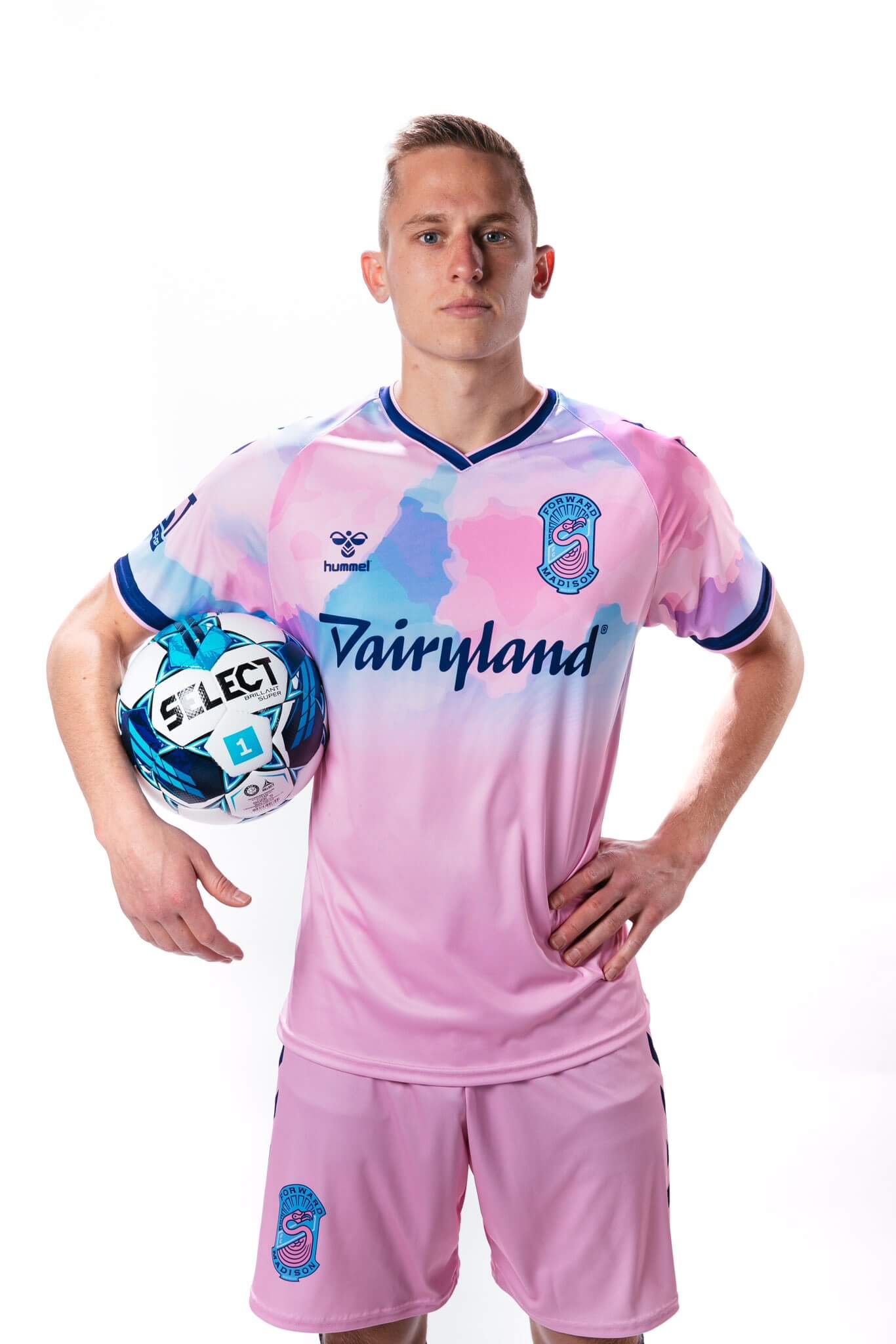
Have there ever been uniforms that look more like hand-dyed Easter eggs than these stunners just unveiled earlier this year by the always-cheeky USL League One side from Wisconsin’s capital? The Flamingos have always been creative with their pink and blue color scheme, but by toning down the neon and concentrating on a mottled pastel design, Forward Madison has created the most Easter-appropriate uniforms that any team has worn.
So there you have it! What teams did I miss? I’d love to hear your thoughts in the comments. And to everyone celebrating, Happy Easter!


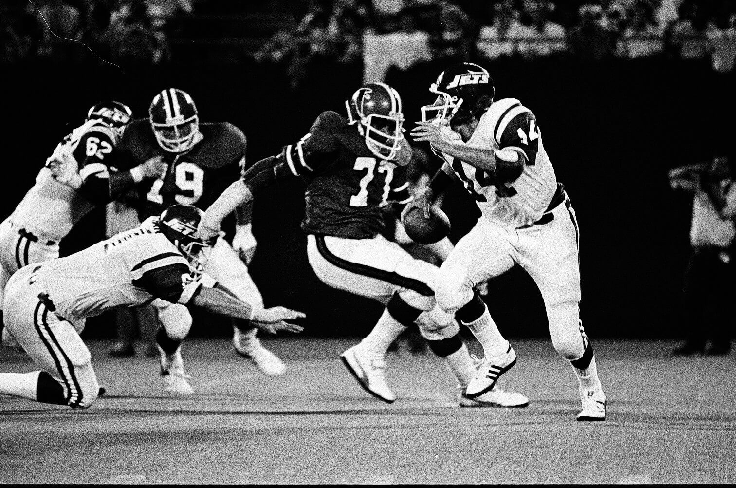
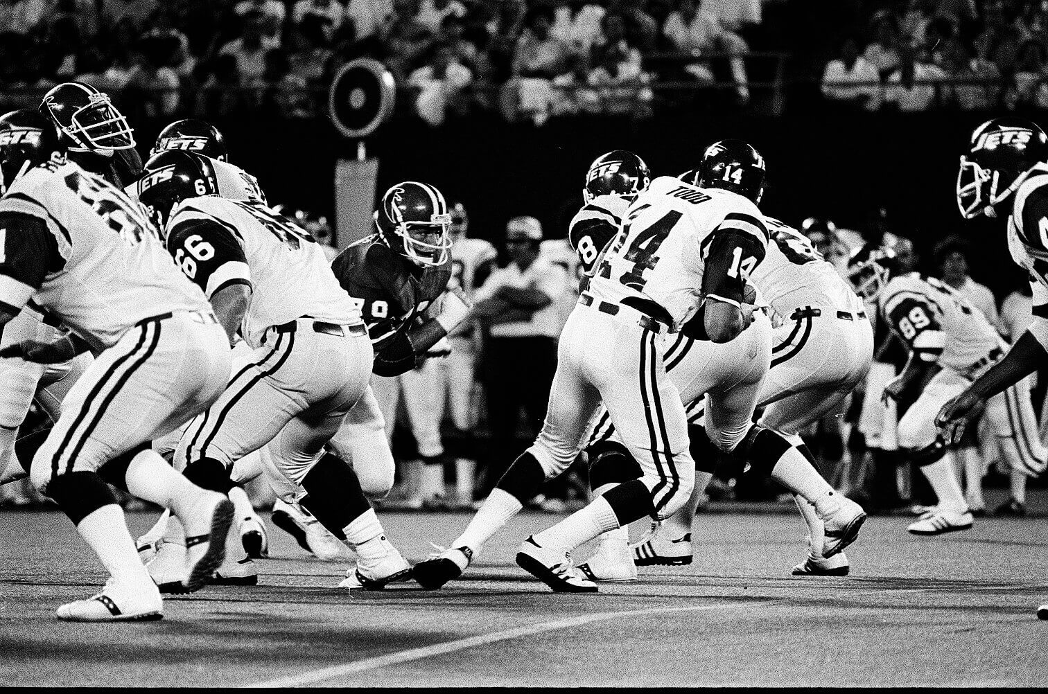

Guess the Game from the Uniform: Jets at Falcons October 12, 1980 Score: Jets 14 Falcons 7
Actually, Guess the Game from the Uniform is from the 1978 Preseason: August 7, 1978 Falcons at Jets.
Giants Stadium, Falcons 20 Jets 17.
Yep; unique uniform game because both teams were transitioning to new uniforms for the 1978 regular season.
This was the very last game where the Falcons wore that red jersey/white pants set until they used it in 1994 as their NFL 75th Anniversary throwback; they also wore the old white jersey set for the next game also on the road then debuted their silver pants starting with preseason game #3 (their only home preseason game that year).
The Jets transition lasted all preseason- they wore their new green helmets with the old Namath-style white uniforms for the entire preseason; the debuted the rest of that uniform set in the regular season.
Great looking matchup!
This is a good idea, Kary. The Scotland shirt I got in today’s Ticker would be a good shout (so would primrose and pink link if it ever comes back).
Japan wore that shirt for the first time yesterday. link
Thanks, Jamie! I appreciate the kind words. And those unis are both excellent suggestions! I might have to include them in an updated list next year.
As for the Japan unis, what unfortunate timing that they debuted them right around the time I was putting the finishing touches on this piece. They probably would have ranked a slot or two higher.
Scottish Rugby has an alternate home kit using lavender when the opposing team also wears blue. From this year’s Six Nations…
link
Those are something! Definitely an unusual shade of purple.]
I would nominate the ABA Denver Rockets road uniform worn from 1971-73 for inclusion on this list. link
Nice one, Paul! I knew the old Denver Rockets had worn purple and yellow back in the day, but I guess I’d forgotten the shade of purple was so light.
Love this idea – off the top of my head, how about the Eagles’ yellow and blue 1934 throwbacks?
I imagine choosing a cohesive list for the 4th of July will be a lot harder than Easter, given the proliferation of red/blue teams across all sports.
I support its’ inclusion (and for the Eagles to throw it back out there from time to time)…but your comment could use a photo:
link
Thanks for the input, Chris and Chris! I did indeed give careful consideration to those Eagles throwbacks. They just barely missed the cut, but they were definitely in the mix!
Ultimately, what moved other uniforms ahead of these ones was the white pants, whereas most of the unis on the list had colored shorts/pants. (The exceptions being the Tennessee softball pants, which have orange pinstripes to break up the white, and the Padres’ City Connect uniforms, which overcame the heavy dose of white with that explosion of multiple pastel colors through the rest of the design.)
I also gave serious consideration to the Chargers’ home uni set with the yellow pants: link. However, I thought that their yellow is a bit closer to athletic gold than pastel. If choosing between the two, I’d probably select the Eagles’ throwbacks.
Picking a Tennessee Volunteers uniform obviated the need to have a Tampa Bay Buccaneers jersey, since their shade of orange is the same.
Exactly! I did, in fact, conduct a bit of a mental head-to-head between Tennessee and Tampa Bay. The Vols won out because the light blue works better as an Easter-themed accent color than does Tampa’s red: link. Another close call in my considerations!
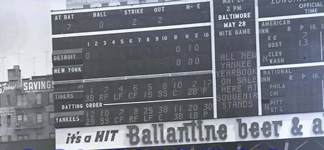
Guess the Game from the Scoreboard – May 20, 1959, Tigers beat the Yankees 13-6
Batting eighth for the Yankees, playing first base, number twenty, Marv Throneberry
Love the pastel uniforms article. Couldn’t have gone wrong if you included East Carolina baseball’s ‘Powder Purple’ uniforms. link
When Kary pitched this to me (and I hadn’t seen his writeup), I thought *for sure* these unis would be on the list, especially with Paul throwing out the first pitch at the ECU Purp Walk game.
I said it before, and I’ll say it again, Paul BETTER do his level best to ensure the players have, at a minimum, dark purple socks, or even better still, purple stirrups. With proper cuffing and hosiery, those can be beautiful unis. Worn as seen — at full length/sans visible hosiery — they are neigh on awful. Such a small aesthetic improvement will go a LOOOOONNGG way towards making or breaking those.
Thanks, James! I did consider those East Carolina duds,, but I went with Kansas State in the purple slot because I felt like the shade of purple the Wildcats use is a bit more pastel than what ECU wears. Also, let’s just say you may still hear from me yet about the Pirates’ all-purple unis…
As a hockey fan, I thought of the Kraken’s reverse retro.
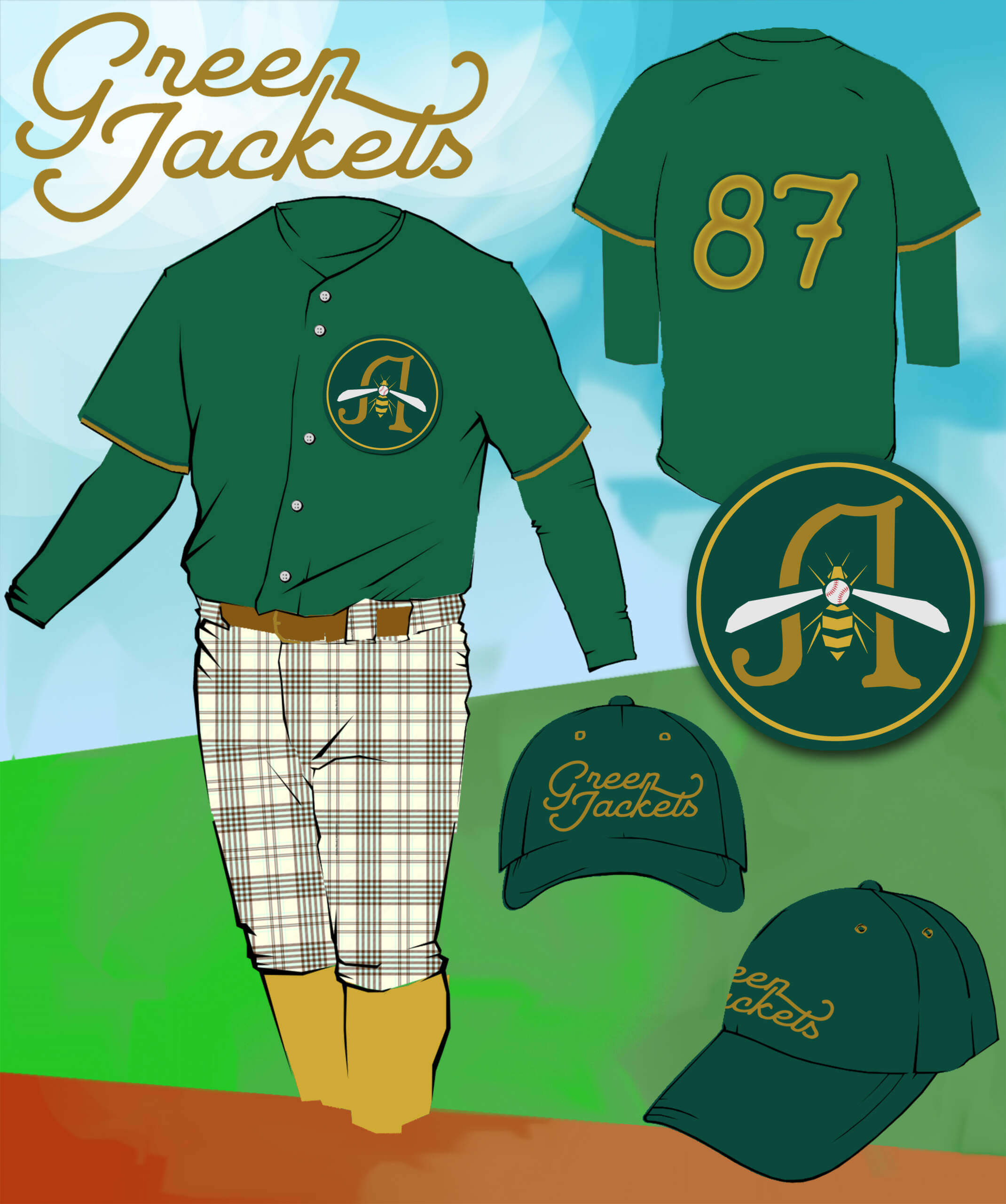
That Green Jackets uniform is positively resplendent! Well done sir!
Thank you, sir!
I’ll second that! Sharp-looking concept, Dave! Thanks for sharing it.
Thanks a lot! I appreciate it!
I love this dress for the season concept. Well done!
Thanks, Steve! I appreciate your kind words and enthusiasm. I’m looking forward to sharing the next entries in the series!
How about Honorable Mention for Al McGuire and Marquette basketball? link
I think Jim Vilk would wear that
Oooh! I love that! Now if only the rest of his team were similarly outfitted…
I would like to put forth the kit the Philadelphia Union wore during the 2022 MLS Cup Finals.
link
I like it! Philadelphia is definitely in the running for a pastel blue-and-yellow slot if I do another edition of this story in the future.
First one I think of is the Finnish hockey team Jokerit. Not the one they use now but this one they use for a while in their past:
link
Wow! Those are really… something.
Fun topic Kary! Thought of LA Clippers wearing the throwback San Diego Clippers colours when reading this. I think the Clippers would be served well going back to these colours as their primary.
link
Of course if you had a Halloween edition, we know a uniform that would be tough to beat.
link
Great pull on those Clippers alts, Wade! And I’ll definitely keep those Canucks classics in the mix for future pieces.
How about World Bowl II… Sacramento Surge vs Orlando Thunder?
link
link
Kary, I know I’m late to the party, but this is great!
As a die-hard soccer fan, I very much appreciate the inclusion of so many soccer clubs on the list.