Good Sunday morning, Uni Watchers! Welcome to the shortest day of the year (unless you live in Arizona or Hawai’i) — because most of the rest of the US of A observed Daylight Saving Time at 2:00 am last night. I hope everyone’s circadian rhythms get back on track ASAP.
Last weekend, I introduced you to artist Anthony “Ant” Giaccone — if you missed that, click here. In that post I mentioned Anthony has shared with me dozens of pieces of his art, which focus on classic athletes in uniform. We looked at some of the greats of baseball’s golden era in that article, and today Anthony returns with a focus on football stars from the mid-twentieth century. I’m sure you’ll be familiar with all the names. Classicists like myself will hark back to the time when many teams wore their best-ever uniforms. I particularly like Anthony’s renderings, especially — as you’ll soon see — how he tailors the unis to show mud and dirt and grime and the effects of play on gridiron fields that weren’t as well manicured as those of today. I’m especially enamored of his sketch of Paul Hornung with his pants completely covered in mud! Looks like he just spent an hour on the frozen tundra muck of Lambeau!
So, without further ado, please welcome back Anthony as today we cover…
Football’s Gridiron Greats
by Anthony “Ant” Giaccone
Each of these drawings have a few common things in common: each is a full body shot. Each was chosen for the classic uniform they wore. Each has a time period appropriate pennant representing the team.
Fran Tarkenton:
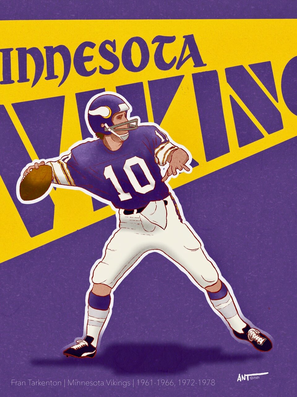
I choose Fran because I really loved the old Vikings uniform and simple round helmet. The stripes on the shoulders are just very striking — especially considering the way uniforms are designed today, you don’t really get to see that anymore. This is Tarkenton from his rookie year in 1961. He was the first player in NFL history to pass for 4 touchdowns in his first game.
Johnny Unitas:
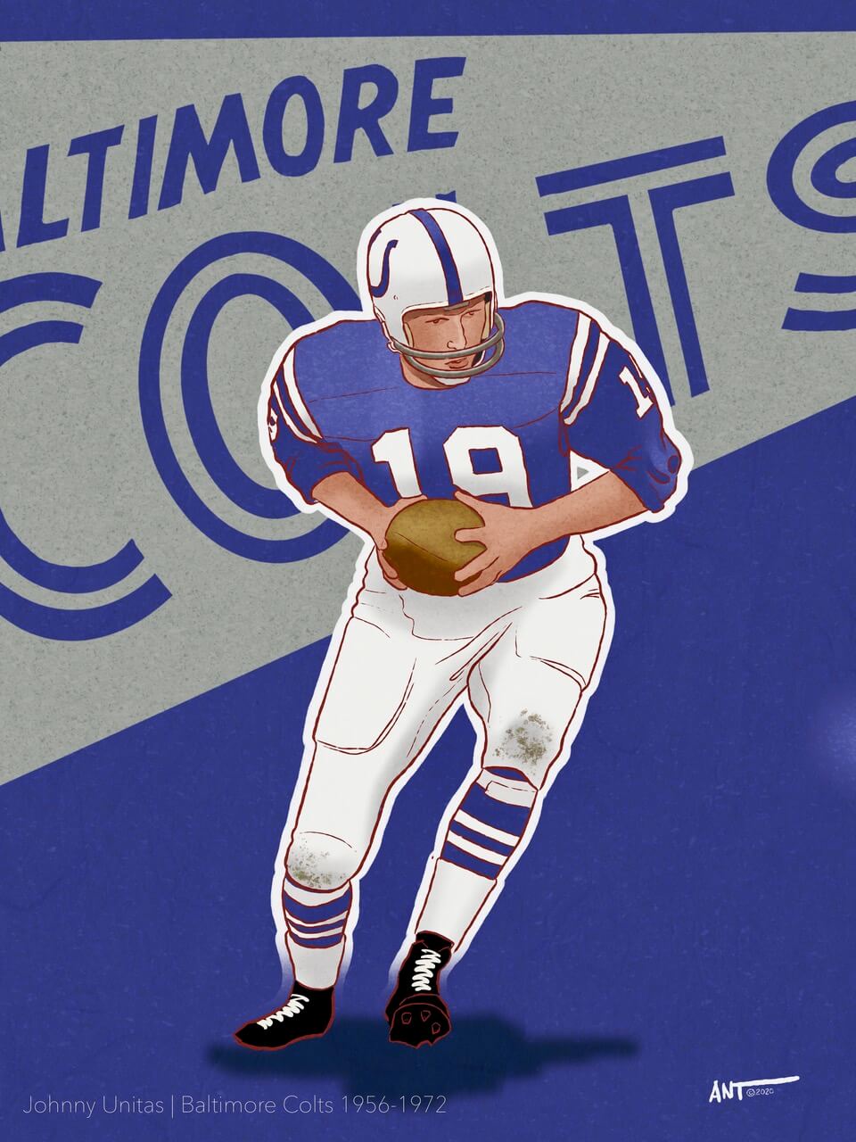
Johnny U was picked again because of the jersey. The 3/4 length sleeve is almost forgotten today. Not to mention the socks With two pairs being worn one over the other…and his high top black leather cleats.
Archie Manning:
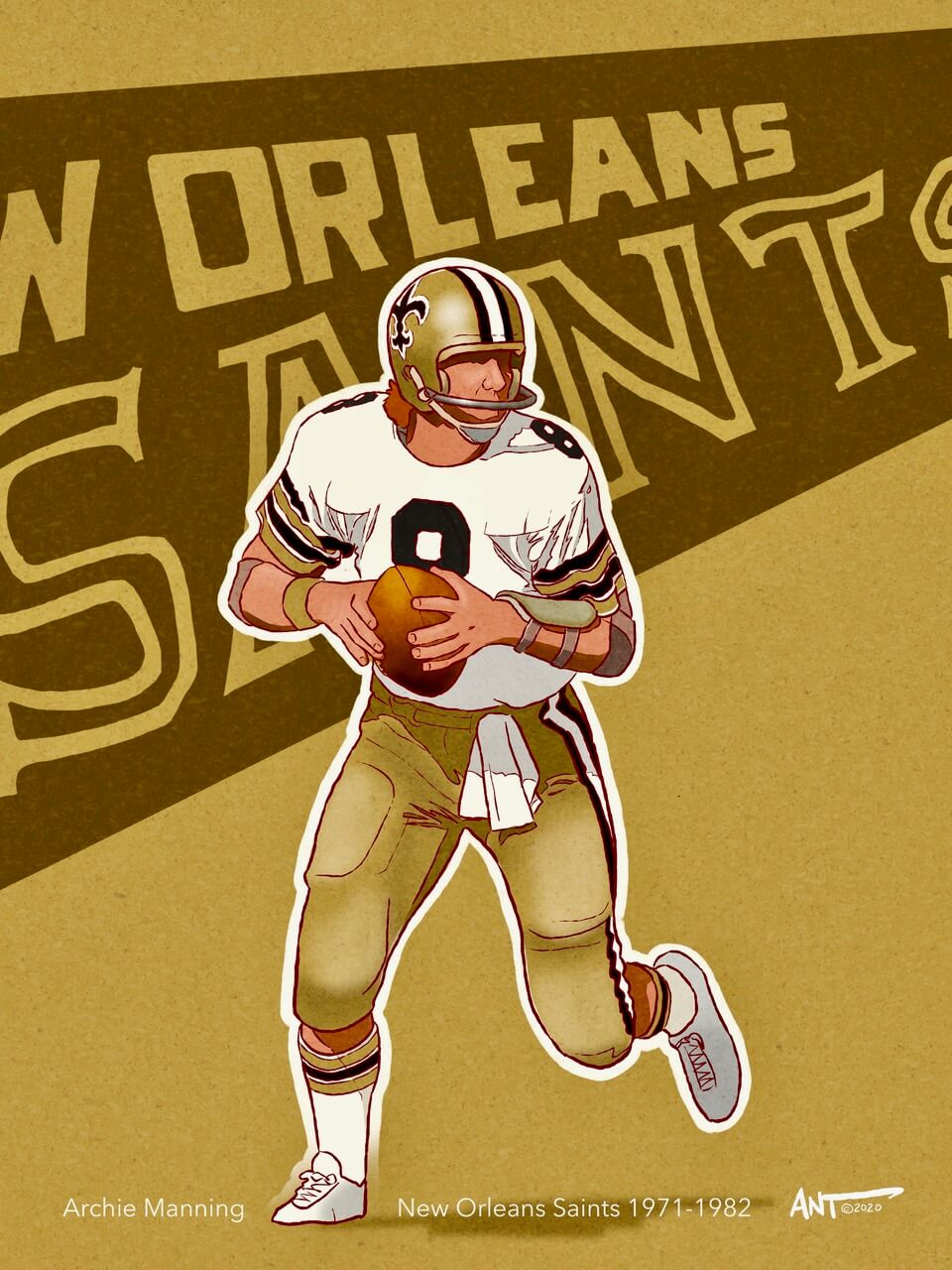
One of my best friends was born, raised, and resides in New Orleans. Needless to say, Archie is a patron Saint (pun totally intended) of The Big Easy. I choose to draw this uniform design based on that awesome jersey and bold stripes on the sleeve.
Ken Anderson:
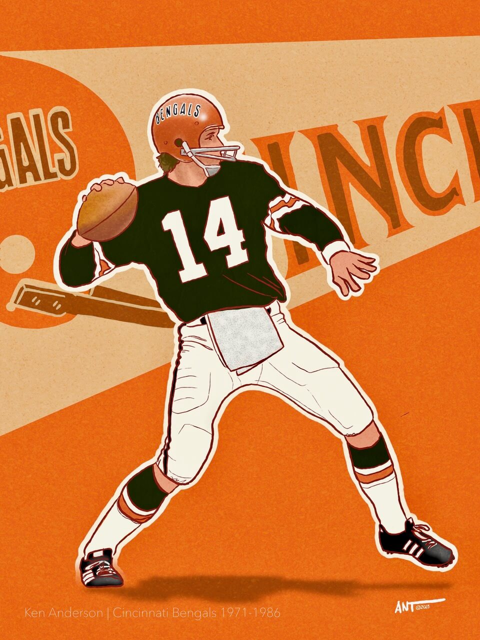
So if Johnny U was wearing 3/4 length sleeves, we have a shot of Ken Anderson in 1973 wearing the original Bengals home uniform, used from 1968-1980: black jerseys with orange and white stripes, white pants with orange and black stripes, striped socks, all orange helmet with the name Bengals on the side. I might be in the minority when I say, “sometimes less is more”.
Joe Greene:
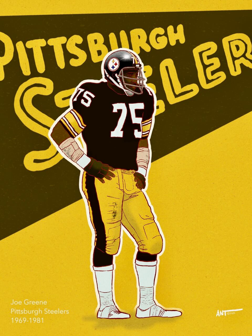
Two words: “Block Numbers”. To me this is the all-time classic Steelers uniform. The Sans-serif Italic number font should be banned. But that’s just me. This drawing of “Mean Joe” is most likely from 1975. No matter how you draw him, he always looks imposing — even standing still. Fun Fact: in 1936 the Steelers went to a jersey that featured Northwestern Striping on each sleeve, the same design that graces the uniforms today.
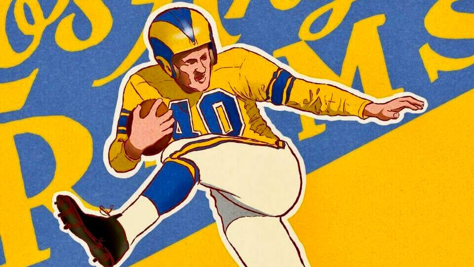
Elroy Hirsh:
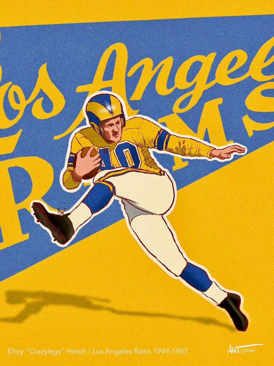
By now you can see that I have a fondness for old-school retro nostalgic images. This classic image of “Crazy Legs” is from 1953. The Rams uniform is now iconic, but the yellow jersey and hand painted rams horns have a very post-war Southern California “look”. From what I found on the gridiron database (when searching the colors to draw from a black and white photo), the 1953 Rams only wore this jersey — both home and away.
Dick Butkus:
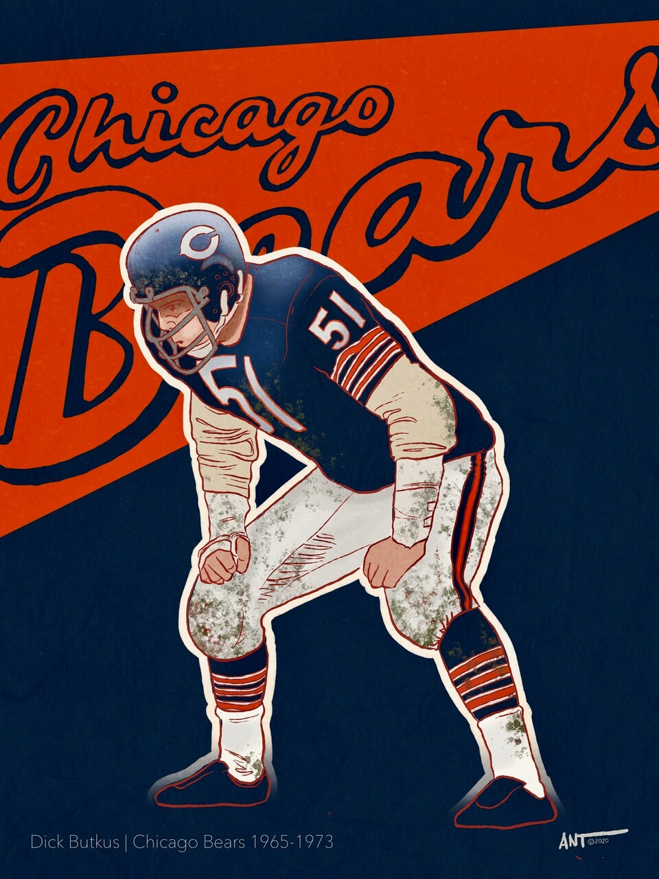
This was a fun drawing to do. It’s an image of a ready-to-destroy Dick Butkus in a timeless Bears home jersey from circa 1968/1969. (Before they ruined it with the perpetual GSH on the sleeve). Add a little bit of mud, grass, and blood on this iconic uniform, and you get an image of what is considered classic Butkus in his prime.
Joe Namath:
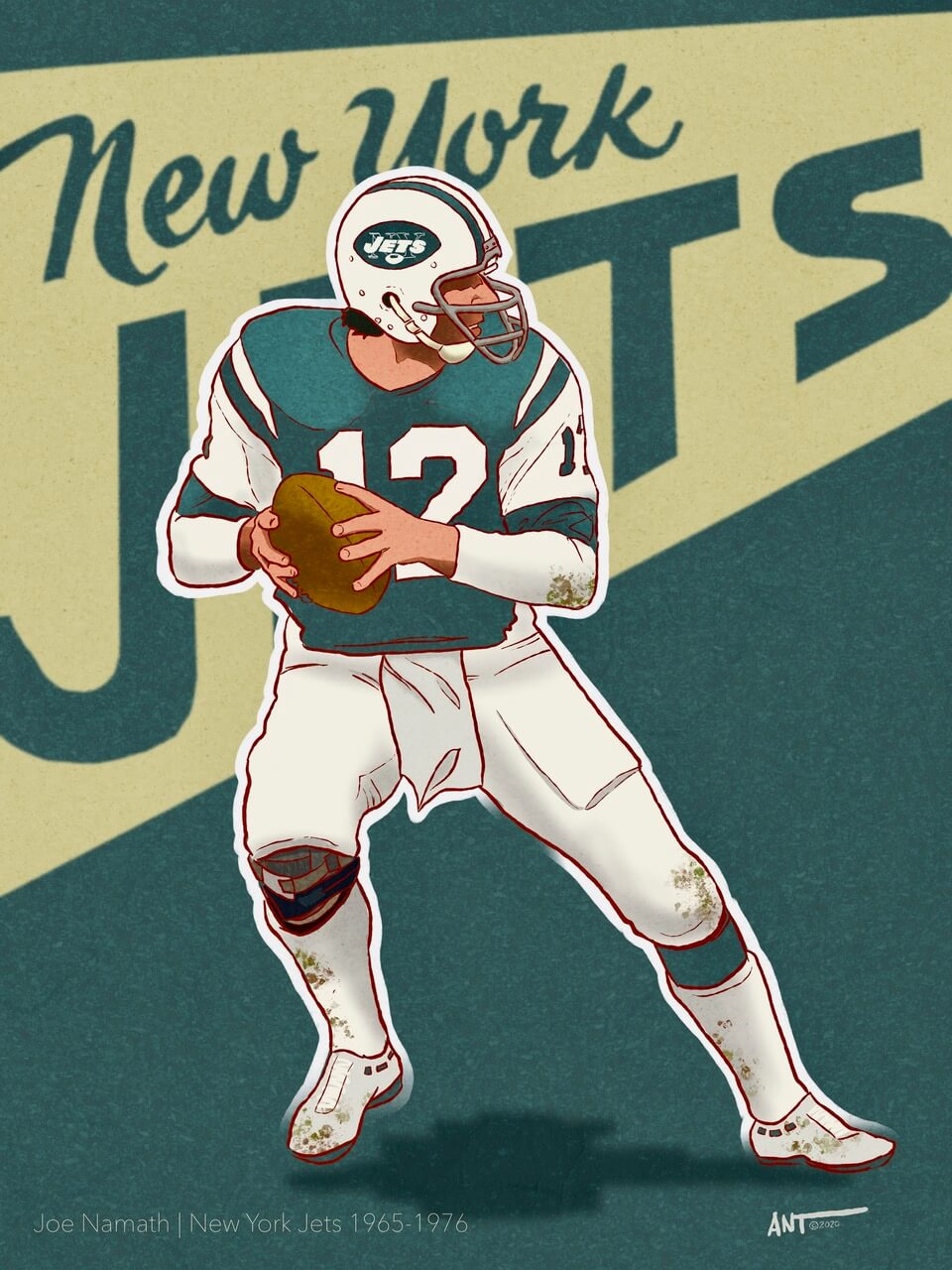
Broadway Joe was a request from a friend who is a long suffering Jets fan. To me, seeing Joe Namath drop back to pass is a signature pose. The old-school 1969 jerseys that had actual sleeves showcased what I feel is a cool looking set of stripes with the number being contained within the larger white stripe. It’s the “’67 Ford Mustang” of Jets uniforms.
Paul Hornung:
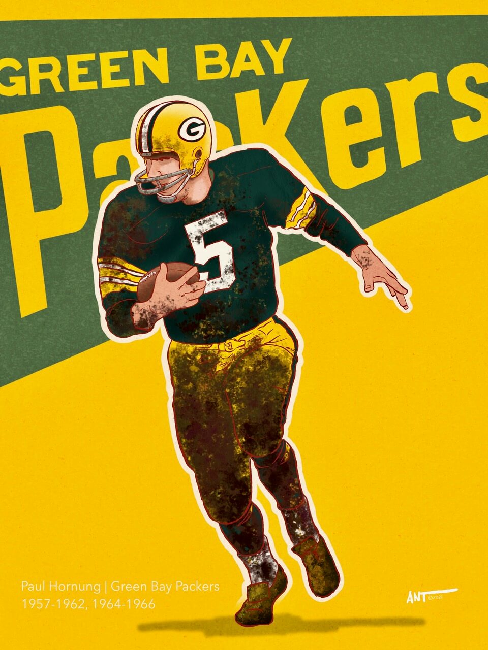
Classic Player? Check. Green Bay Packers Uniform? Check. …just because you learned how to illustrate mud and dirt to a degree you can’t even see the uniform. Check. This was cool to illustrate as you totally know who this is based on just how iconic and recognizable the logo and color scheme is. Paul Hornung was “the most interesting man” of his era. How a movie or documentary of his life has never been created is beyond me. Fascinating guy.
Charlie Conerly:
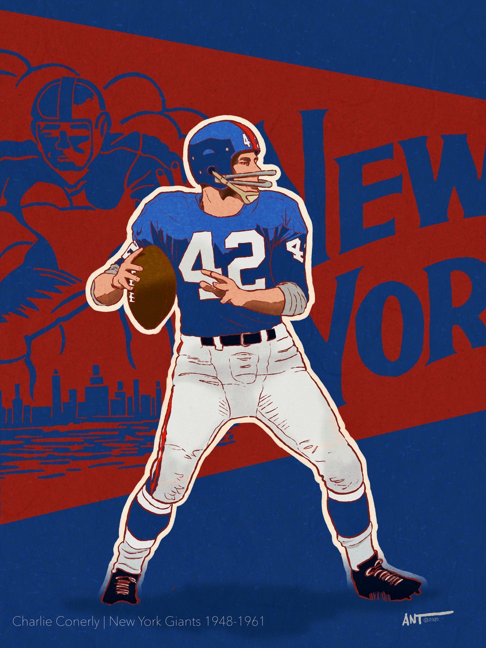
I am a Giants fan by birth. Granted, the classic Giants uniforms aren’t really much to draw as they are just a lot of blue with a hint of red — but Mr. Conerly is a pretty interesting throw back player of his era. He holds (or held) over 10 Giants franchise records and was the original “Marlboro Man” after he retired. My dad said he was one of the toughest underrated players of his era. He was also a Marine during WWII, and has yet to be inducted into the NFL Hall of Fame.
Otto Graham:
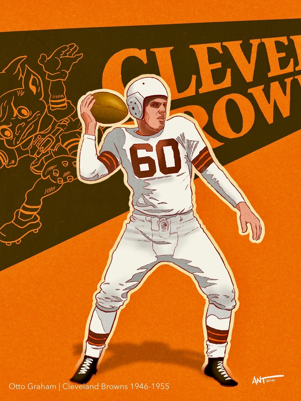
Otto Graham is a forgotten beast of a player, having taken the Browns to league championship games every year between 1946 and 1955, making ten championship appearances, and winning seven of them. With Graham at quarterback, the Browns posted a record of 105 wins, 17 losses, and 4 ties. In one of my earliest digital drawings, I drew him for a number of reasons one being those really awkwardly staged poses they would do back then for sports publications. I can’t say it’s one of many better drawings (as Graham deserves better) but that pose, combined with Brownie on the pennant was too good to pass up.
Harold Carmichael:
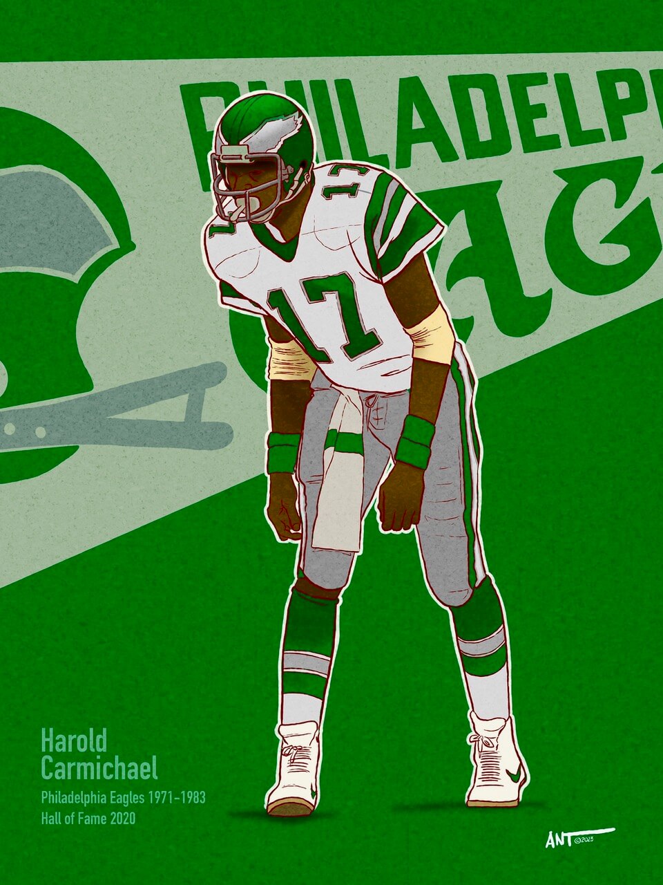
Okay, as a Giants fan, I loathe the Philadelphia Eagles. It is what it is. BUT you have to admire the classic uniforms of the Eagles before they went to midnight green and black. Plus those shoulder stripes are freakin’ awesome. I drew Harold for this years Super Bowl. For a wide receiver who was an all-decade player of the 1970s, this pose represents the hall of fame pretty well.
Len Dawson:
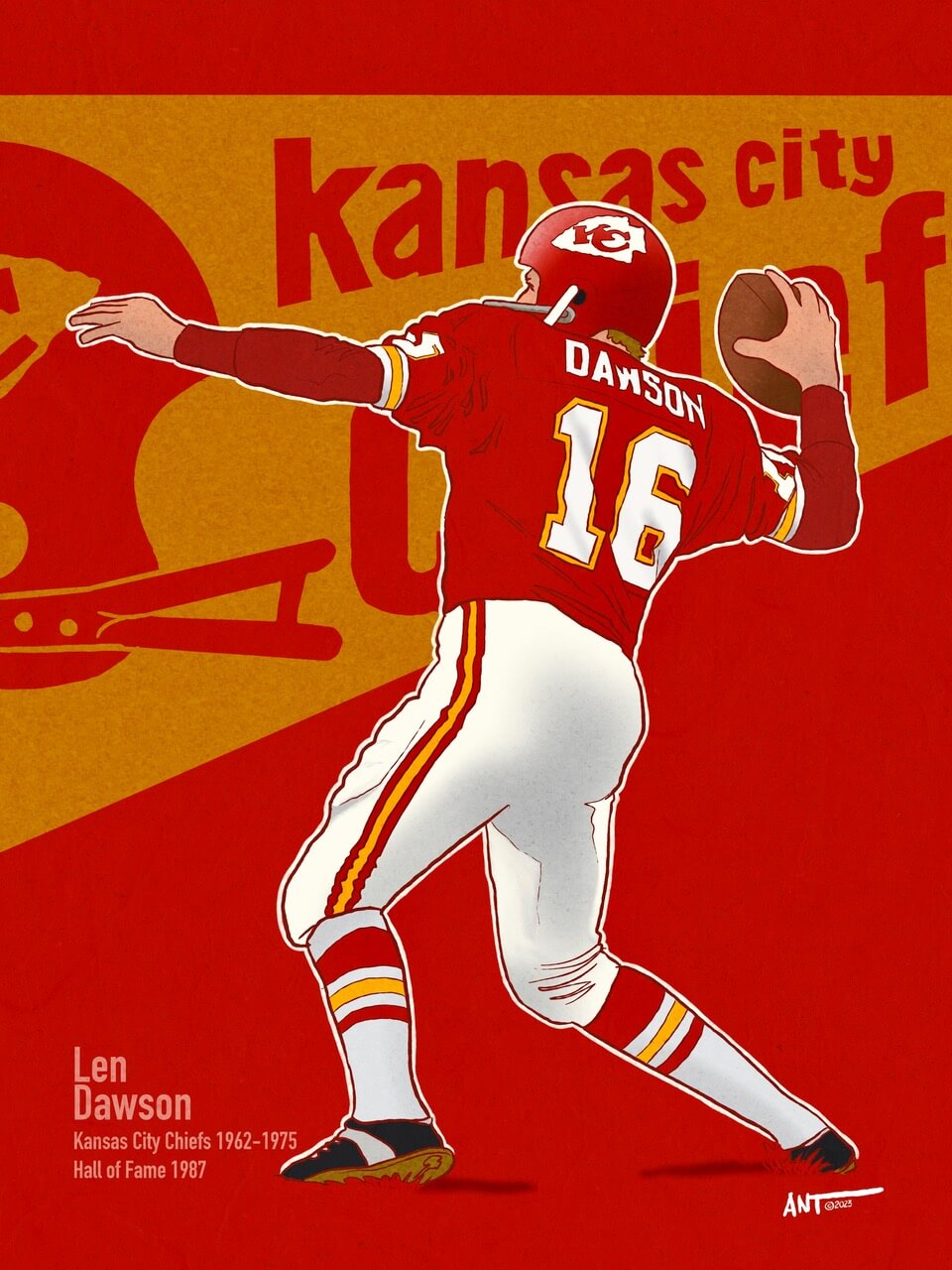
This is the matching image to Harold Carmichael for this year’s Super Bowl. Before Patrick Mahomes, there was Len Dawson. This is a great pose that highlights the Chiefs uniform with Dawson’s name and number prominently displayed. If I could change one thing on the Chiefs uniform, I would add gold to the helmet so that it has a connection to the uniform (in the way the Bears added orange to the “C” on their helmet). That being said, the uniform has been virtually unchanged since 1963. Len Dawson wore it well.
Thanks Ant! Readers? What do you think?


I’m Calling It Daylight Shifting Time.
There’s no “Saving”…. it’s a scam.
That being said, at least I was pleasantly awakened after a short night with Ant’s wonderful art work! I love these. Any chance you want to do the silver or blue helmeted Oilers next? Or the 70s Pro Bowl unis?
Ban the shift!
I look upon it as borrowing the Atlantic Time Zone for a few months while the Central Time Zone borrows ours.
Thank you Jim! YEs, I see a blue or silver helmet Oilers player in the future! Great suggestion.
If I could change one thing on the Chiefs uniform, I would add gold to the helmet so that it has a connection to the uniform (in the way the Bears added orange to the “C” on their helmet)
That, I wouldn’t mind for KC.
But I wish the Bears never added the orange to their C. It really popped with just the white on the helmet.
Yellow has been lacking on the helmets for so long, to add it now wouldn’t look ‘right’ even if doing so would be ‘correct’.
As for the Bears, I wish they never added blue pants to their program. That was perhaps their only poor decision uni-wise…prior to rolling out the orange jerseys and then the pumpkin alt helmet.
Agreed. The midnight blue pants, even if worn with “proper” white socks, just never looked right.
Wow, those football portraits are great! Thanks!
Thank you Marty! Cheers!
No Ant, it’s not just you, it’s me too – the Steelers sans-serif Italic number font should be put to rest and bring back the block numerals. Love your dirt, grass stain and blood touches – Hornung and Butkus are most deserving!
GTGFTU: September 9, 2007, Buccaneers at Seahawks
The Seahawks wore this set from 2002-2011. The Bucs set doesn’t help narrow it down as they used that set both before and after that timeframe.
During 2002-2011, these teams played 6 times. However, only once was it this uniform matchup. Notice the pants the Seahawks are wearing. They’re darker than the jersey base. During the rest of these appearances, the Seahawks either wore white jerseys, or lighter blue pants when wearing the blue ones
AGH! I used the wrong date on accident, December 20, 2009! I closed the wrong tab lol
Kee-reck! Good detective work.
That was a good looking game!
Probably a very unpopular opinion, but I liked that iteration of the Seahawks ‘scuba’ uni…and while Bucco Bruce is all the rage these days, the Bucs look better in pewter.
Ant’s Elroy Hirsch piece is great. I’ve collected a couple of Elroy Hirsch cards because he and my uncle were high school friends and teammates in Wausau, Wisconsin.
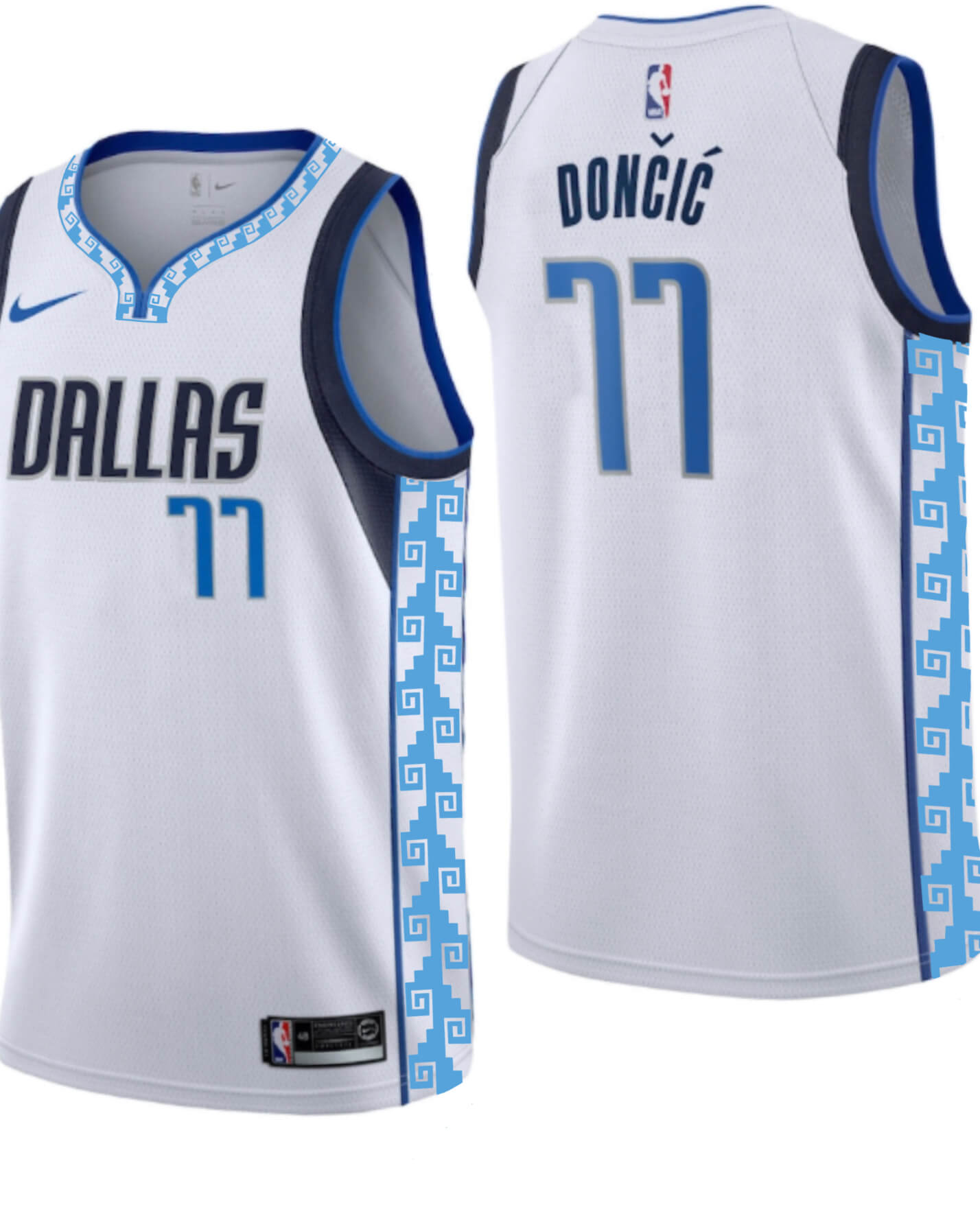
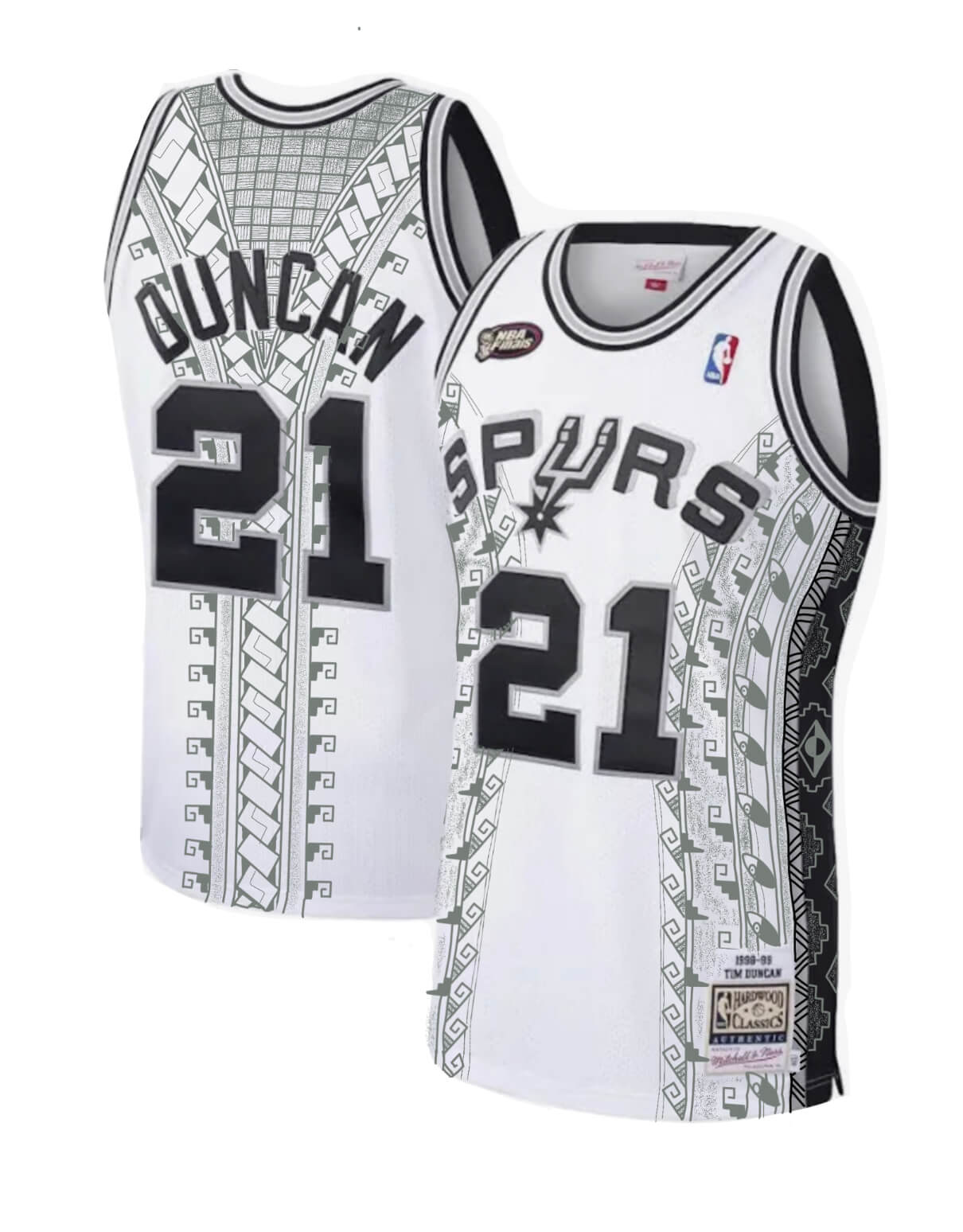
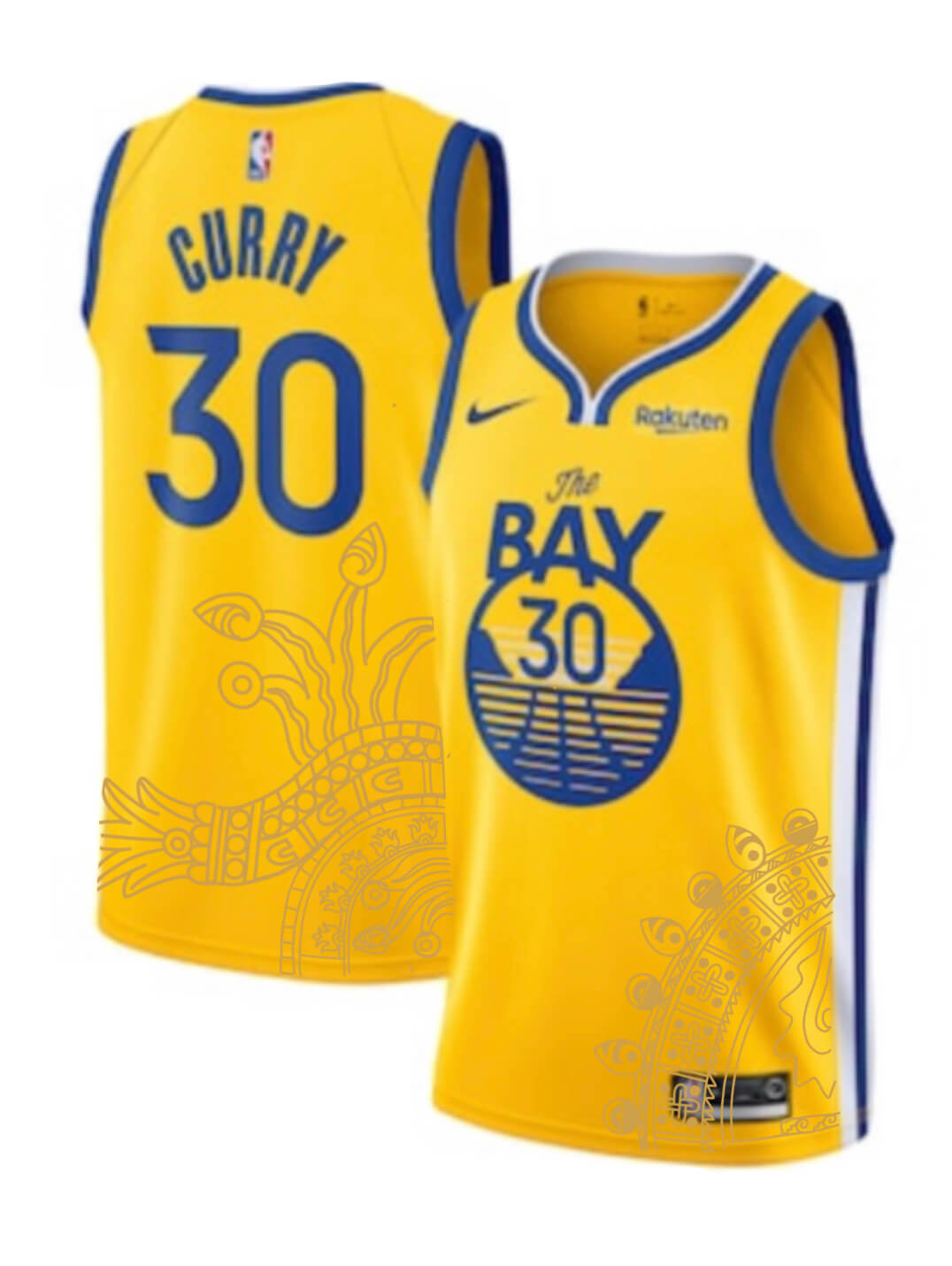
All kinds of good stuff today. Those uniform designs by Kiki Platas are tremendous.
Thanks Jeff! Cheers!
Kiki’s NBA designs are the direction I’d like to see all North American teams follow. Sublimated patterns show the homework and low-key storytelling I’d try to encourage in sports, both professional and varsity. Example No. 1: The Kente pattern on Georgetown’s uniforms.
Love the artwork but would have also loved to see the Ant treatment on a classic Raiders player in Silver & Black
Suggestion on a favorite Raider? Stabler? Long? Alzado? Let me know!
The image of Tarkenton sure looks like his second tour of duty with the Vikings. A manufacturer’s logo stripe on the shoes and scruffy tuft of hair creeping out the back of his helmet don’t say 1961 to me.
Waa. Time Change. Waa. Please.
Why did only two of the pictures say Hall of Fame?
My fave is the picture of Joe Willy. Maybe because his image is bigger than some of the others, he seems to fit the space better than, say, Archie Manning. Plus I always have loved those Jets unis. Crazylegs is a close second for me.
Thanks Joe! Cheers!
Glad to see Otto Graham getting respect. “Forgotten beast” is a great description, but possibly not strong enough. Every time I read about Brady being the GOAT, I remember Graham’s ten championship appearances in ten seasons. It makes Brady’s nine appearances in 23 years look positively anemic. Oh, and Graham won an NBA/NBL Championship for the Rochester Royals in 1946, so make that ELEVEN championships in ten years. “Forgotten beast”, indeed.
Maybe it’s nit-picking, but are the Steelers’ uniform stripes truly ‘Northwestern stripes’? These days with the truncated sleeves, they rarely show complete of course. The stripes on the white jerseys are a modified Northwestern stripe, with a small black outline of the yellow stripes. But on the black jerseys, there’s a second set of two white stripes in between. It’s almost as if instead of adding each stripe individually, they created a single wide piece for the white jerseys and used it for the black jerseys as well – only realizing that the white stripes came along with it after they were attached.
That thought planted another question in my head – if this was the case, and they do use the same wide band of stripes for both, doesn’t that mean that the stripes on the white jersey – because the black doesn’t show up on the black jersey – are technically wider than those on the black jersey? I realize this is strictly minor aesthetics, but isn’t that what this site is all about?
Great artwork that shows how much I miss proper sleeves and the stripes that come with it. Current NFL jerseys are turning more and more into basketball jerseys or baseball vests. Give us sleeves! The one painting with a small flaw is Otto Graham: it looks like het is listening to the ball like listening to a shell to hear the sea.
The NBA jerseys are really nice. I especially like the versions for the Suns and the Lakers.
Thank you Ingmar! I truly appreciate the kind words. I totally agree about Graham — not my best work. If Phil will allow me a “do-over” I’ll do my best to make him the GOAT he really is.