Welcome back to your 2023 MLS kit preview. Earlier this morning we looked at the jerseys for the MLS’ Eastern Conference, and we now conclude with the Western. The Western Conference features MLS’ new (expansion) squad, St. Louis City SC. If you missed the Eastern Conference preview, click here.
Let’s go!
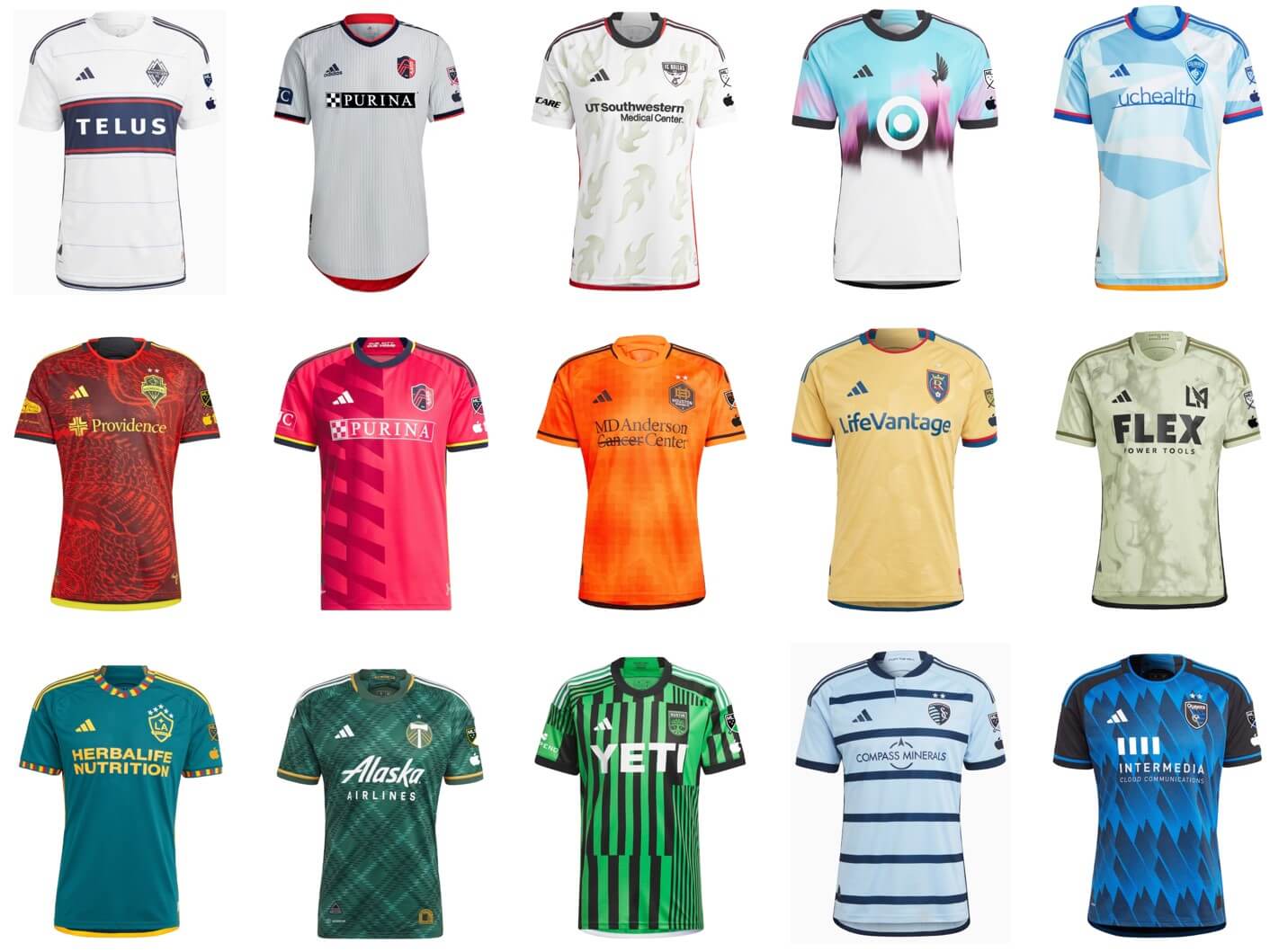
2023 MLS Uni Preview — Western Conference
by Kyle Evans & CJ Fleck
Thanks Phil! We’re glad to be back for our 8th(!) MLS season jersey p/review. The league kicks off today, now with 29 teams with the addition of St. Louis City SC (moving Nashville to the Eastern Conference) and LAFC are the defending MLS Cup champions. The competition format changes as well, with a month long Leagues Cup tournament between all MLS and Liga MX teams as well as an expanded MLS playoffs (9 teams in each conference).
All of the uniforms continue to be made by Adidas, but you will now see an AppleTV patch on the left sleeve of every jersey due to the league’s new broadcast platform. As always, each team’s primary and secondary jerseys are on a 2-year rotating cycle, meaning that every team reveals a new jersey each year and wears them for 2 seasons. Each of the new kits have a “name” primarily for marketing and storytelling purposes which we will avoid. On to the jerseys!
St. Louis City SC
Primary: Red with navy/yellow accents (city flag colors) with geometric pattern on left side
Secondary: Light gray with pinstripes
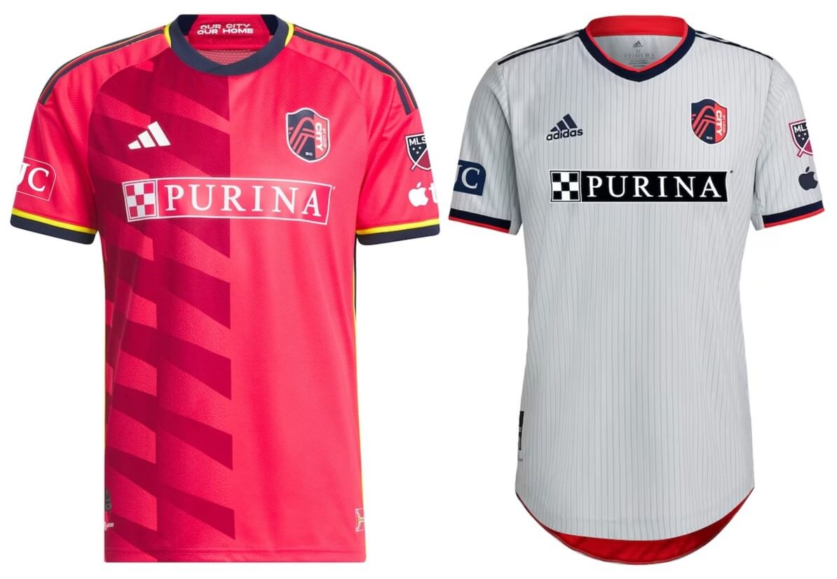
Kyle: Beautiful debut kits for St. Louis, we’ll see how they perform.
CJ: Can’t go wrong with either choice here, so good start for St. Louis.
Austin FC (primary)
Green and black vertical stripes of various widths
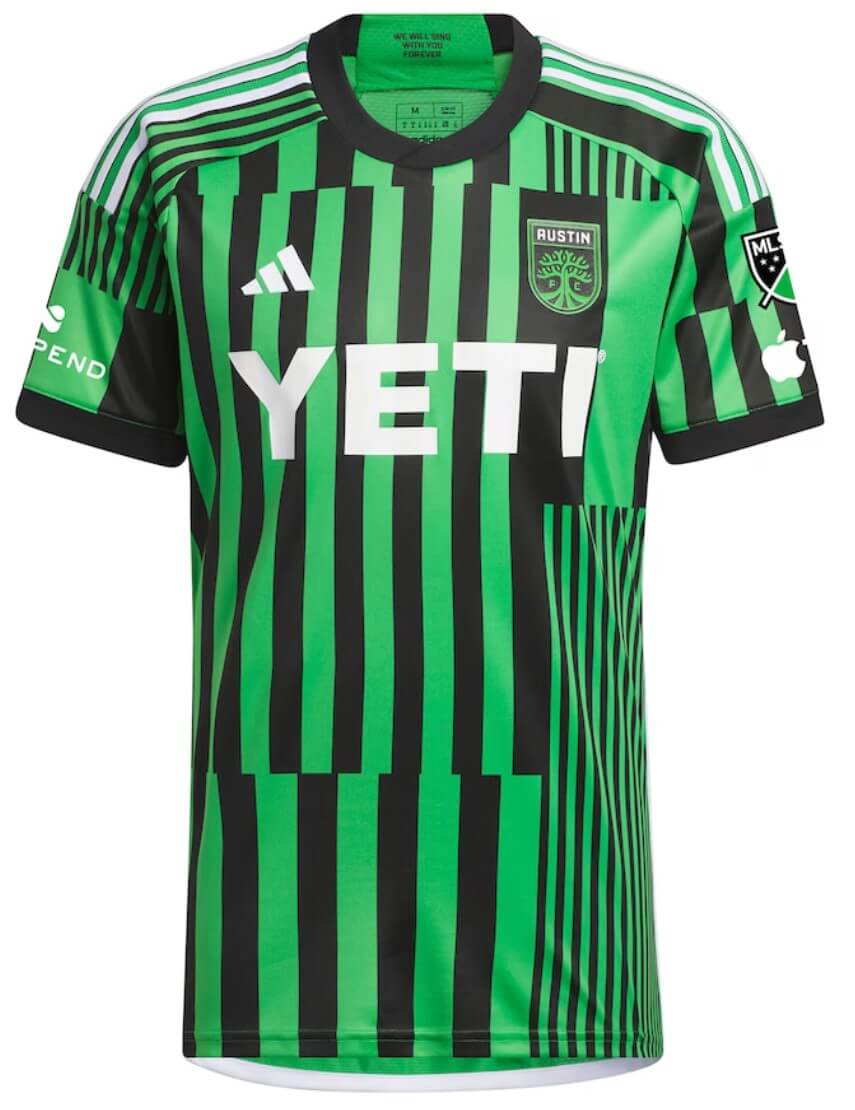
Kyle: Busier than it needs to be, consistent widths please.
CJ: Kyle, you’re being too polite, this is a mess.
Colorado Rapids (secondary)
Light blue geometric blocks inspired by sunrise/sunsets
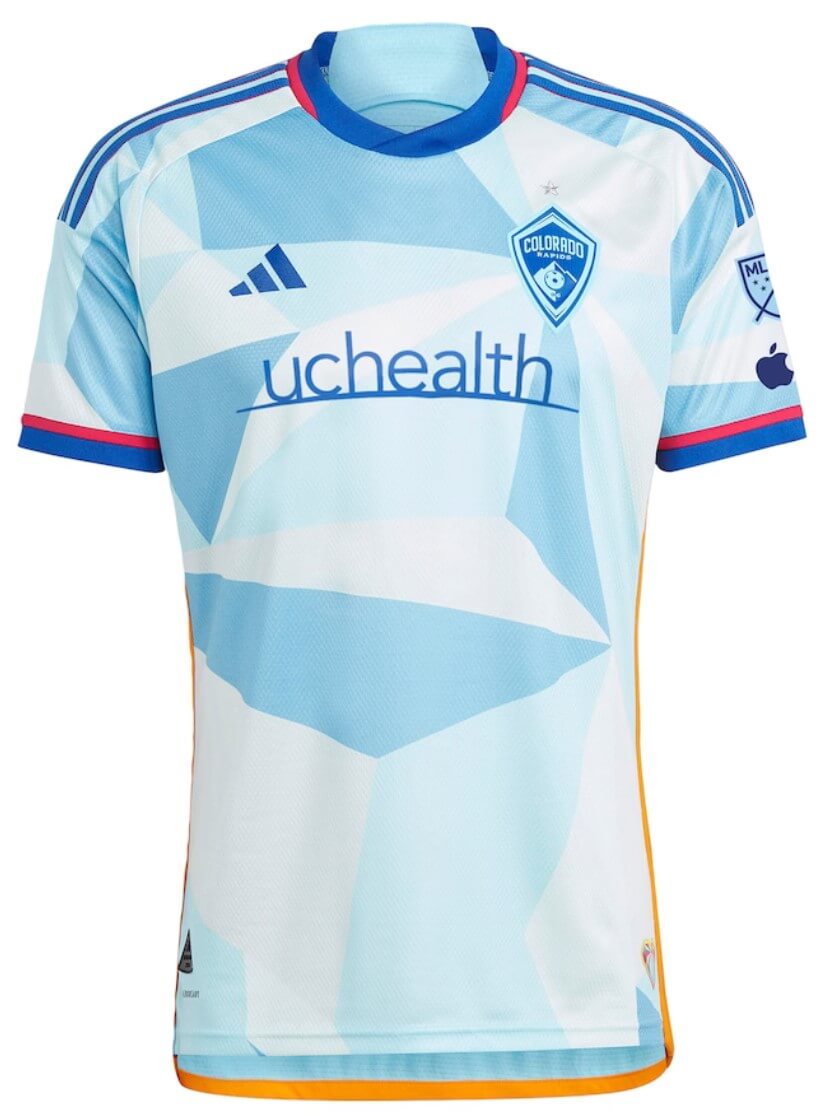
Kyle: I do like how the shapes radiate from the crest, but otherwise I weirdly find this jersey boring.
CJ: Good use of flag colors, just wish there was more to that part of the design.
FC Dallas (secondary)
White with flame pattern as a callback to their original name Dallas Burn
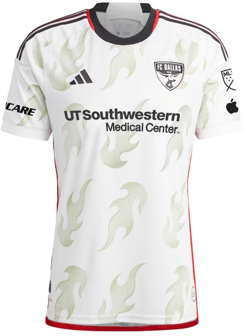
Kyle: The flames look like emojis and that’s not a good thing.
CJ: I thought we left MLS 1.0 in the dustbin of history for a reason.
Houston Dynamo (primary)
Orange with subtle sun-shaped pattern
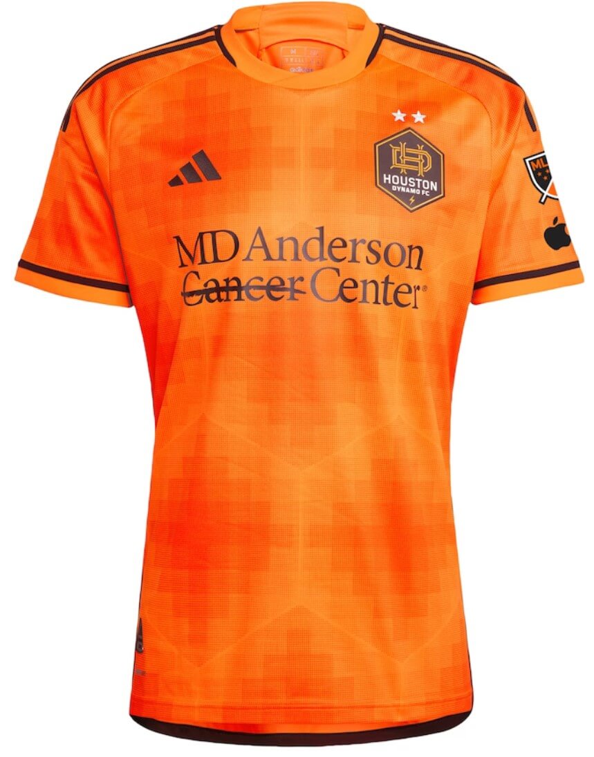
Kyle: An orange team wearing orange, no complaints here.
CJ: Subtle, but I strangely like this one. Can’t figure out why.
Sporting Kansas City (primary)
Light blue with navy horizontal stripes (hoops)
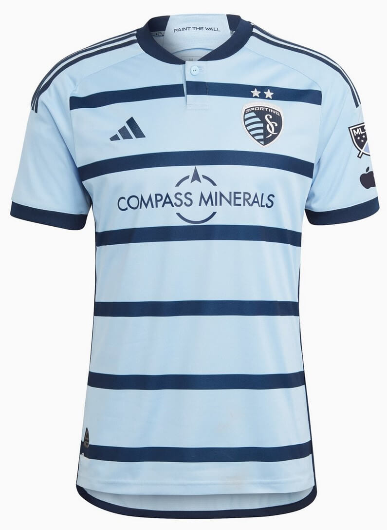
Kyle: Love SKC’s tradition of hoops, another beautiful version.
CJ: Completely agree with Kyle, add it to the list of good SKC kits.
LAFC (secondary)
Light olive green with smoke-style pattern
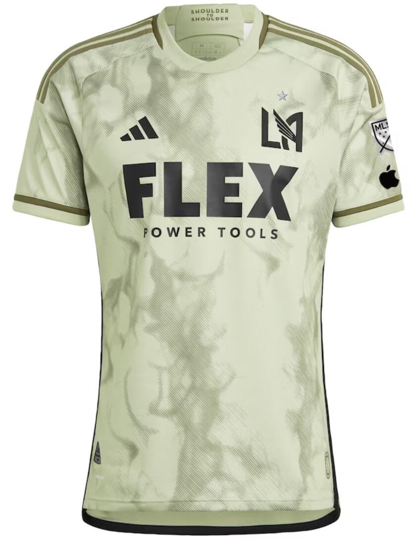
Kyle: This looks like a camo training top, and again that’s not a good thing.
CJ: I’d have to see this on the field, but the faded look just isn’t for me.
LA Galaxy (secondary)
Teal with yellow/red/teal pattern on sleeves/collar based on city flag
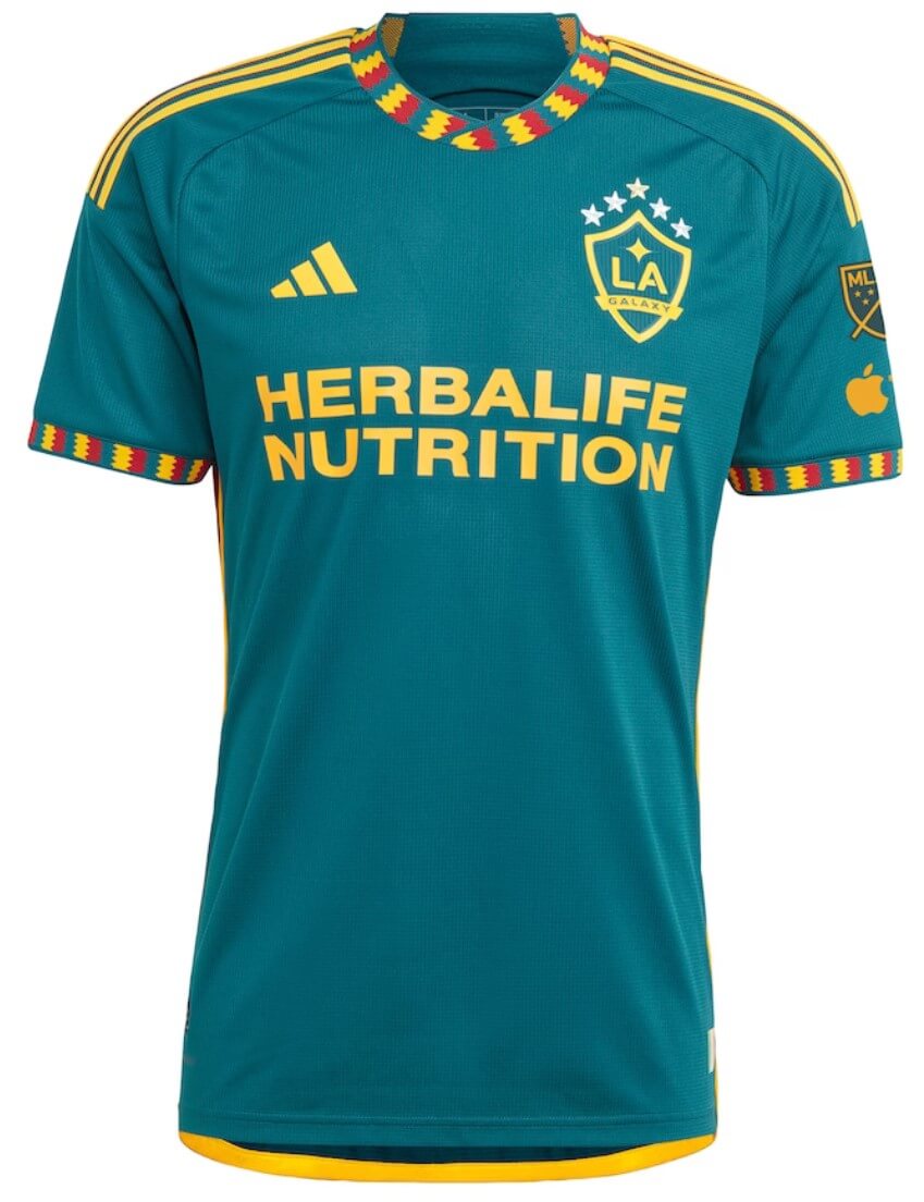
Kyle: These colors are also a throwback to the original Galaxy colors and it works well for a secondary jersey.
CJ: This feels like a throwback beyond the start of MLS and into the 1980s. I love it.
Minnesota United (secondary)
White and sky blue with pink/black graphic inspired by Northern Lights
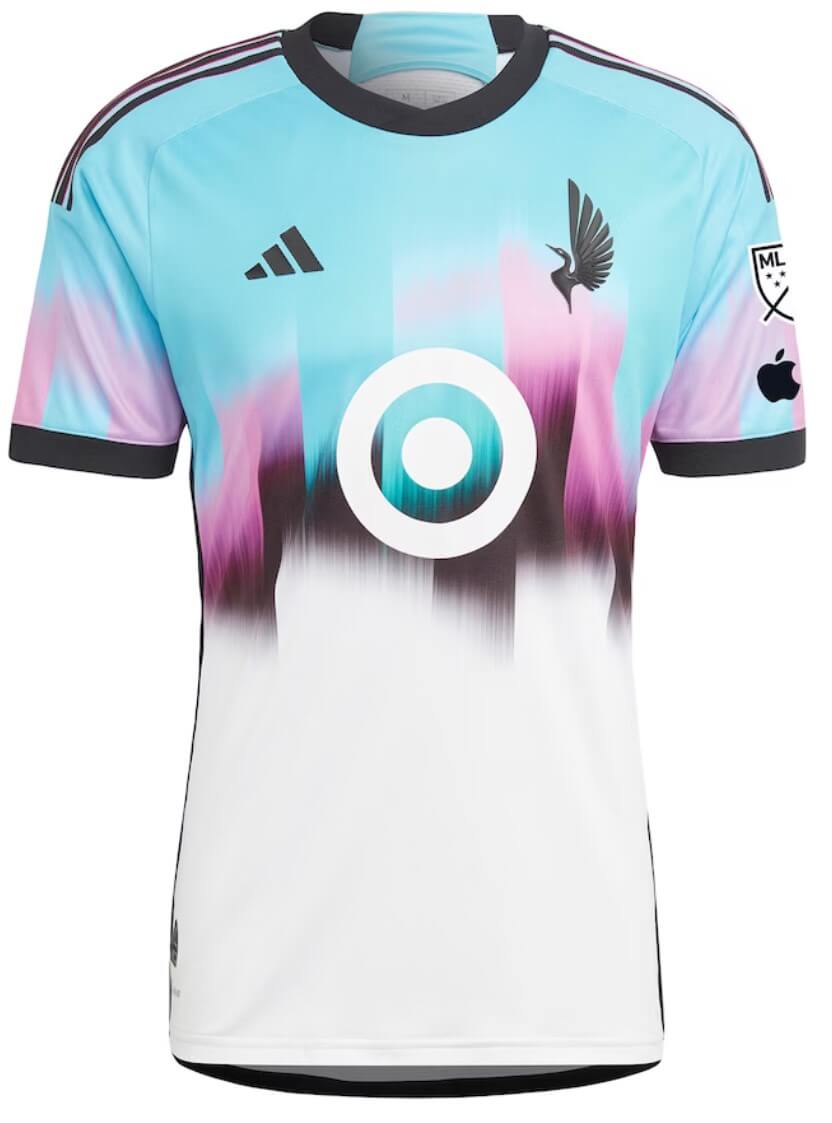
Kyle: I rarely comment on jersey ads but this one really disrupts a lovely design.
CJ: Here’s one I think looks like a training top! Just not for me.
Portland Timbers (primary)
Green with plaid pattern
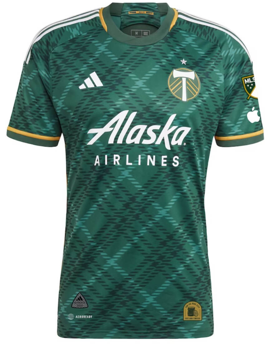
Kyle: Absolute perfection. I might need to become a Timbers fan.
CJ: Not sure I agree with Kyle. I can’t compute this one.
Real Salt Lake (secondary)
Yellow with red and blue accents
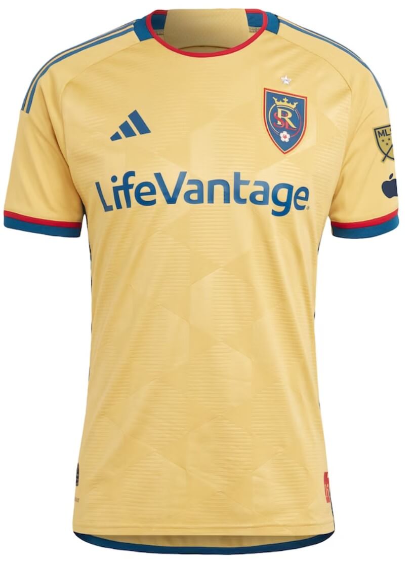
Kyle: Yellow isn’t seen much in MLS, so I like how RSL is finally featuring one of their secondary colors. (And yes, I know they briefly had awful all-yellow third kits over a decade ago.)
CJ: It’s not a simple white or black secondary, so we’re making progress in the league.
San Jose Earthquakes (primary)
Blue with black sleeves and black/blue diagonal fault-line inspired geometric pattern
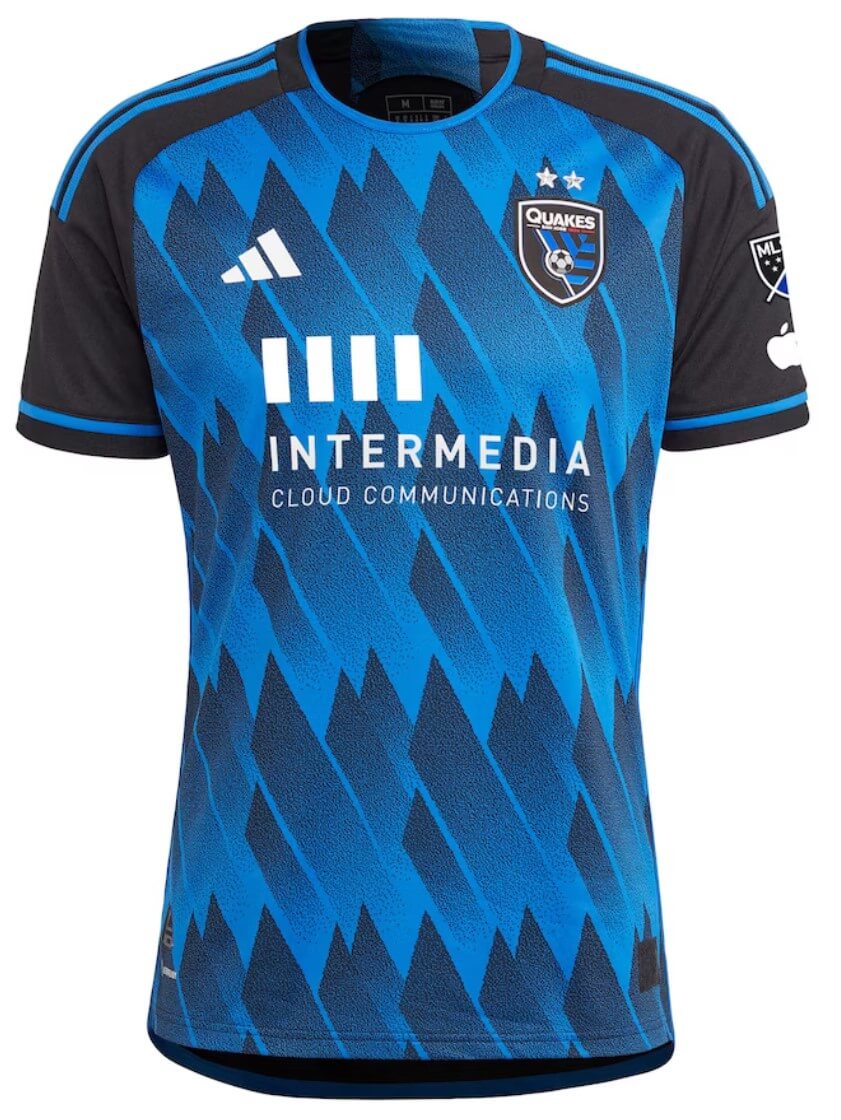
Kyle: This design has grown on me quickly, it’s a great look and I think the gradient within the shapes is done just right.
CJ: On first glance I like it, which feels contradictory to my other comments, but this whole thing is subjective so let’s just run with “it’s good” and call it a day.
Seattle Sounders (secondary)
Red with yellow accents and sublimated dragon as a tribute to Bruce Lee
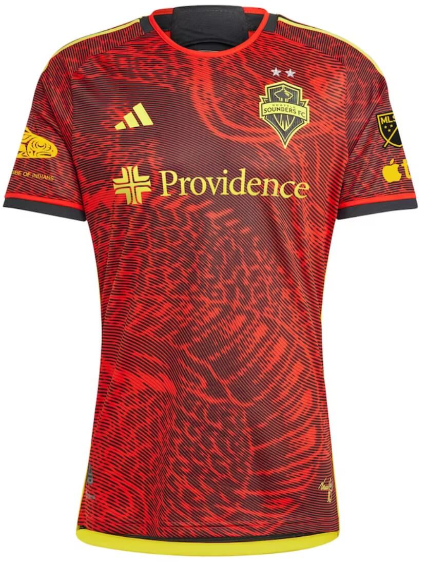
Kyle: From Jimi Hendrix to Bruce Lee, you gotta give Seattle credit for storytelling and unique designs. This one is just okay for me, but I’m sure it will sell well.
CJ: Storytelling is one thing and design is another. Colors are interesting but I can’t like the overall look here. Points for trying something different, for sure.
Vancouver Whitecaps (primary)
White with center navy and red horizontal stripe and thin light blue horizontal stripes
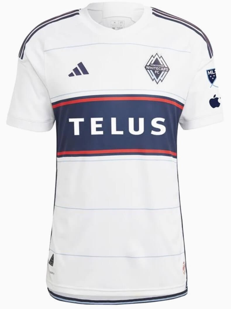
Kyle: The Whitecaps continue to deliver gorgeous primary white jerseys.
CJ: I know that’s (hopefully?) not the goal, but it feels like a frame for the ad. Vancouver wears white, though, so they’re staying true.
Thanks guys! Great wrap up of the new for 2023 jerseys for MLS.
LA and Portland bucking the grayscale minimalism trend in the best possible way.
LAFC continuing it in the worst possible way.
Champions shouldn’t look like their kits were dyed in a dysenteric cesspit.
To me, the Seattle Sounders in red is NOT the Seattle Sounders. They will always be blue/green, something to do with water or the Pacific Northwest.
Houston Dynamo and Dash putting out very similar orange jerseys this year. Slight change in the pixelation pattern but from a distance they look the same. Not sure if this is something they always do? Same owners?
Yes, they have the same ownership group. The teams also stay very connected through Brian Ching, who played many years for Dynamo. He has a leadership role with the Dash, part general manager.
This was at the top of the Western Conference review:
“2023 MLS Uni Preview — Eastern Conference”
Probably needs to be changed to — Western Conference :-)
GAH! Yes. Good catch and thank you. Now fixed.
As with the East, a mixed bag. A lot of the intricate details won’t show up from the stands or on TV.
LIKE: Portland, Galaxy, Houston, Vancouver, RLS. I would like Seattle if it weren’t a team whose colors are so iconic – but that’s the idea behind a good clash kit, I guess.
Is St Louis’s red more of a magenta? Every pic I have seen makes it look different than what the Cardinals wear.
A mixed bag, sure, but so is any league. None of the 2023 kit I’ve seen from MLS is worse than above-average compared to prior seasons. None of these would be the worst kit in the EPL or Bundeliga. All in all, 2023 looks to be the best-dressed season in MLS history. And not by a little bit. It’s as if MLS has finally noticed the visual innovation that’s been going on in every lower-level league in North America for the last decade-plus and decided to try to play along.
Minnesota’s is the only advertisement that draws criticism, but to me it’s the least offensive because it consists of geometric shapes and no distracting words.