Tired of seeing annoying ads (like this one!) on Uni Watch? There’s a simple solution: Join Uni Watch Plus. You’ll get an ad-free site experience, plus exclusive access to our UW+ discussion forums, push notifications whenever a new blog post has been published, a special UW+ badge accompanying all your comments on the blog, and a 20% discount on our Teespring merchandise.
Good Saturday Morning, Uni Watchers! I hope everyone has had a pleasant week.
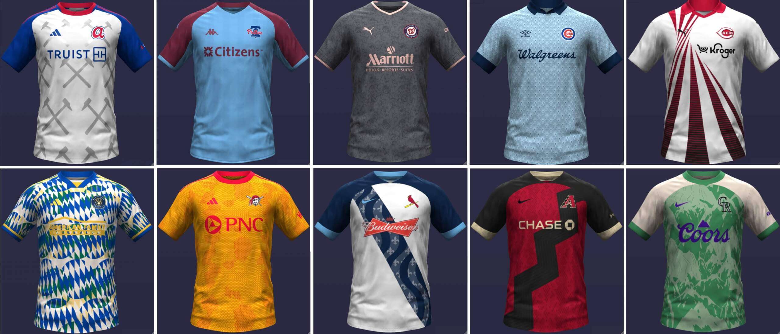
A couple weekends ago, I ran a pretty neat set of crossover concepts from graphic artist Danny Kaufmann, in which he has concepted an entire league of Major League Baseball clubs reimagined as soccer teams (and in soccer kits), with both home and road versions of those kits. That first set was for the American League. Today we’ll finish it off with the senior circuit.
Before we go any further (and as I said a couple weeks ago), I want to note that each and every jersey contains an advertiser. I struggled with actually running these, but obviously there was a lot of time and effort put into each concept kit, and the advertisers selected seem to make sense for the teams. That’s not an endorsement of the advertiser (and I wish Danny hadn’t included them); however, in light of the fact that soccer kits have contained giant advertiser logos for decades (and might even look “funny” without the ad occupying the prime real estate), I’m going to share them as they were sent. If we can look past the ads, I really like a lot of these designs and it’s a fun “What If” set of concepts. Once again I’d please keep any comments to the kit designs themselves. Thanks!
And with that, here’s Danny:
• • • • •
NL East
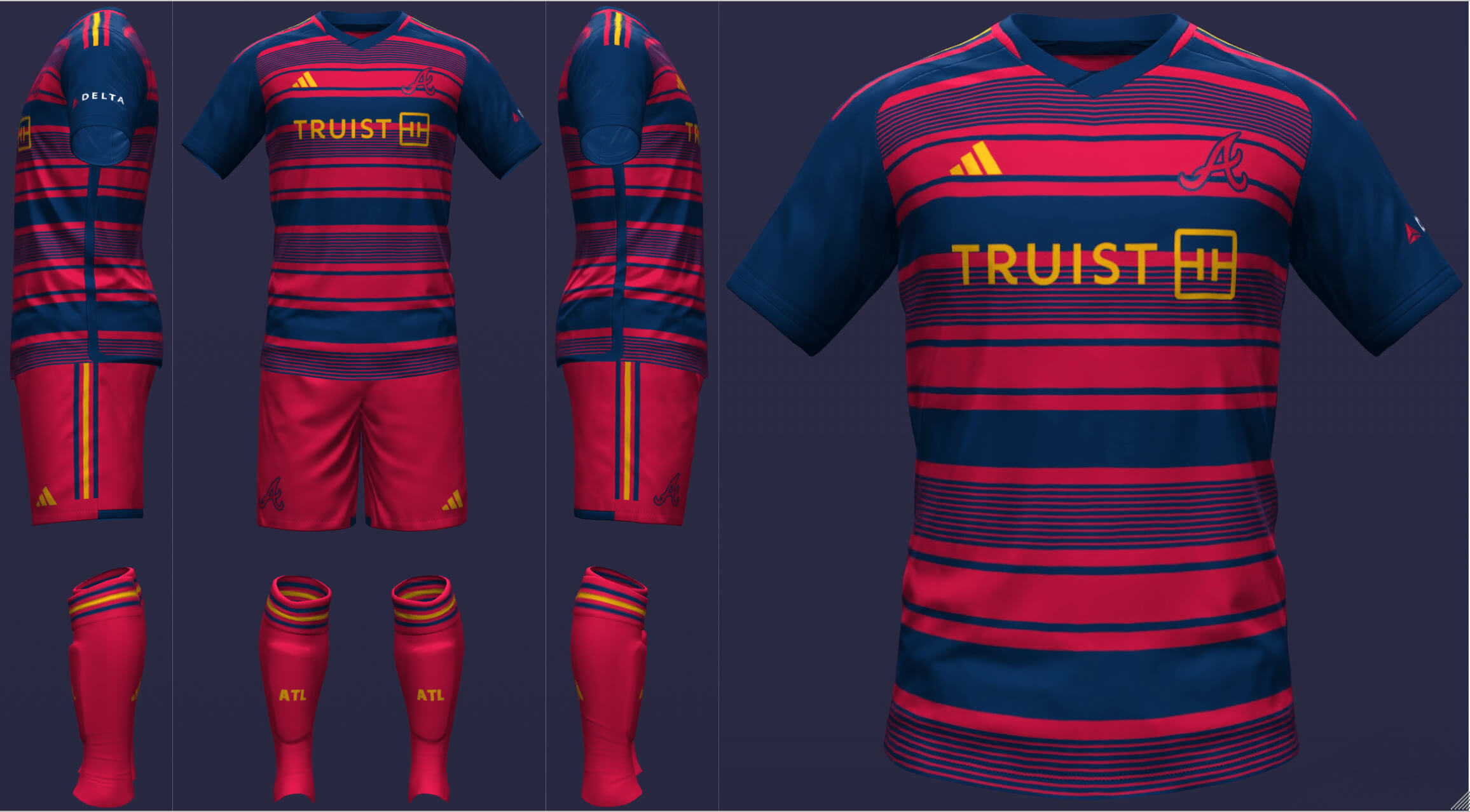
Atlanta
I decided to put Atlanta in a more red-heavy look since they are sort of a red-at-home, blue-on-the-road team. The secondary is intended as a Hank Aaron tribute, mimicking the 1972-75 style with silver hammers.
__________
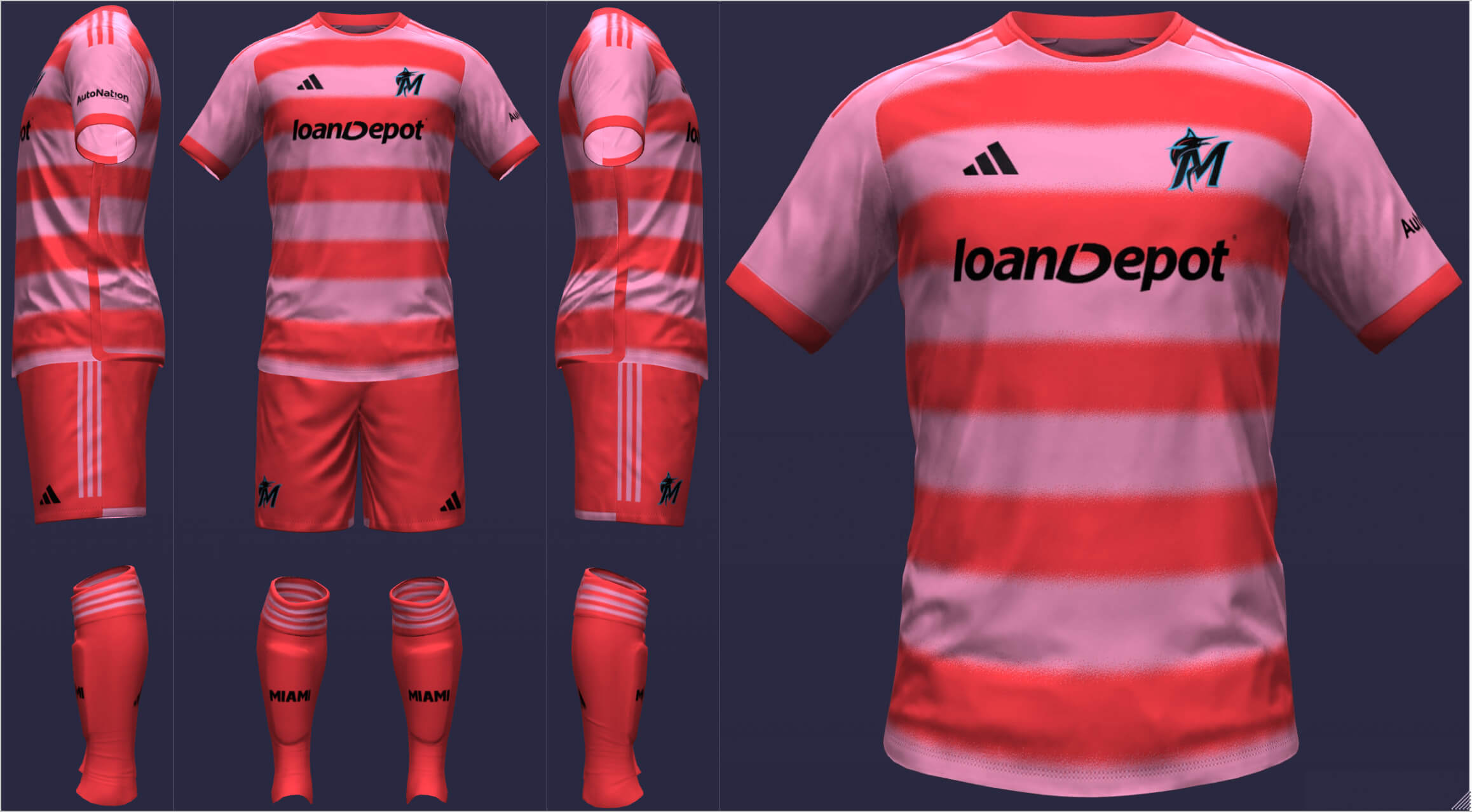
Miami Marlins
The Marlins are trapped in a crisis of what to do about secondary colors. However, I think we can all agree that they need something other than black against black so I upgraded light blue to the base of the shirt. The away marries the salmon shade the team uses with a more Miami Vice-like one.
__________
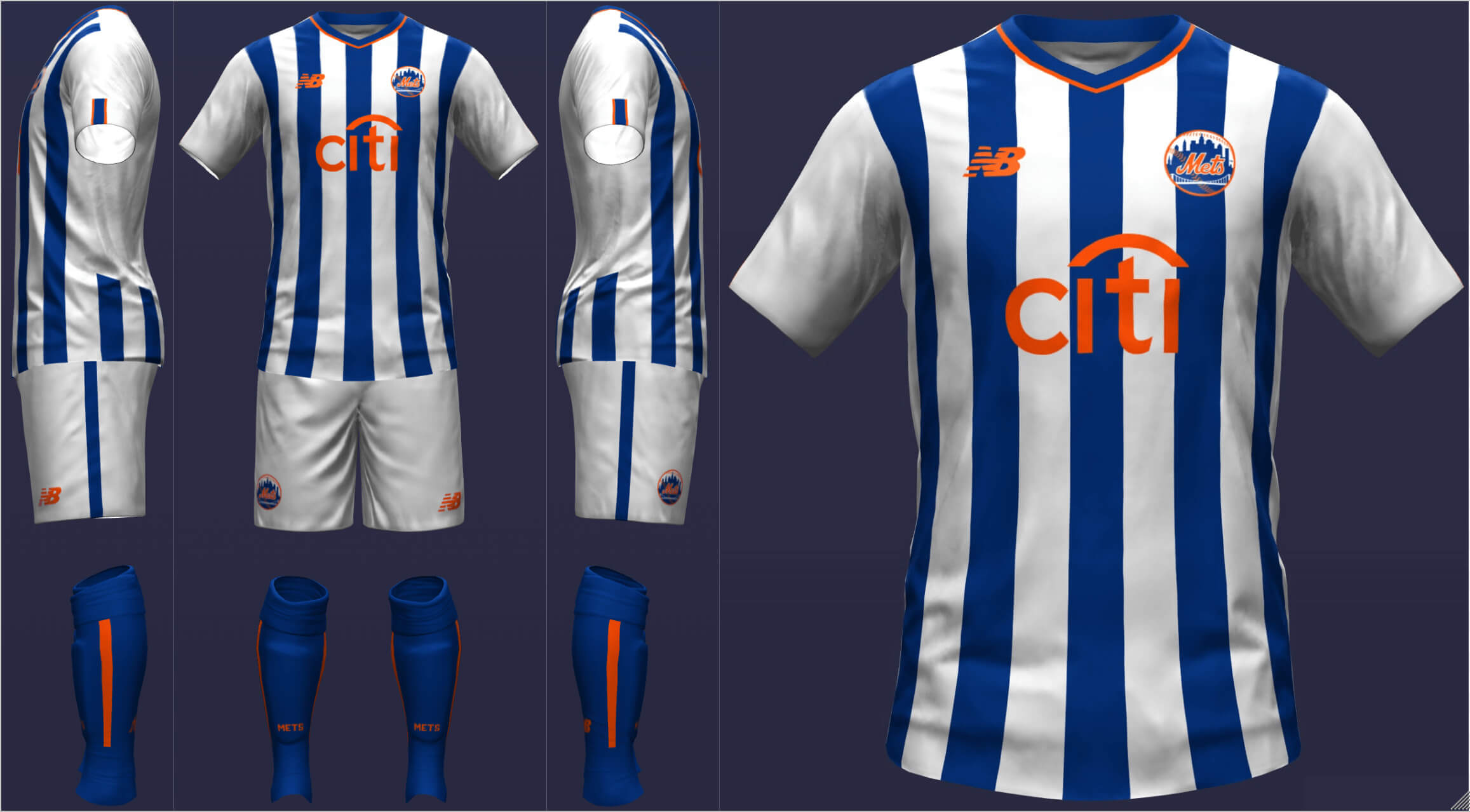
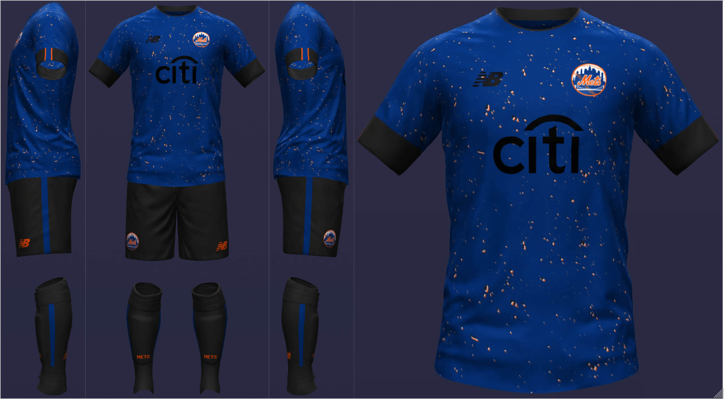
New York Mets
The Mets widen their pinstripes into stripes for a like that’s as classic as the baseball one. I took two risks with the road by picking a look that doesn’t contrast the home as much as other sets and uses black. However, I figured that was the decision the franchise would’ve made and I didn’t want to stray from blue and orange, which are so tied to New York.
__________
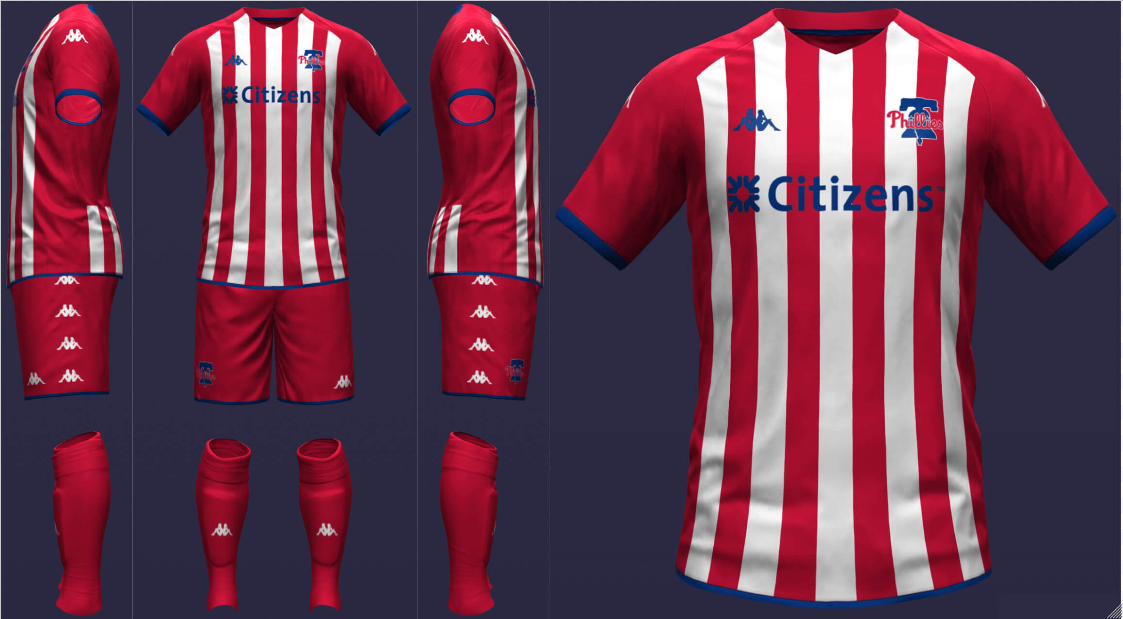
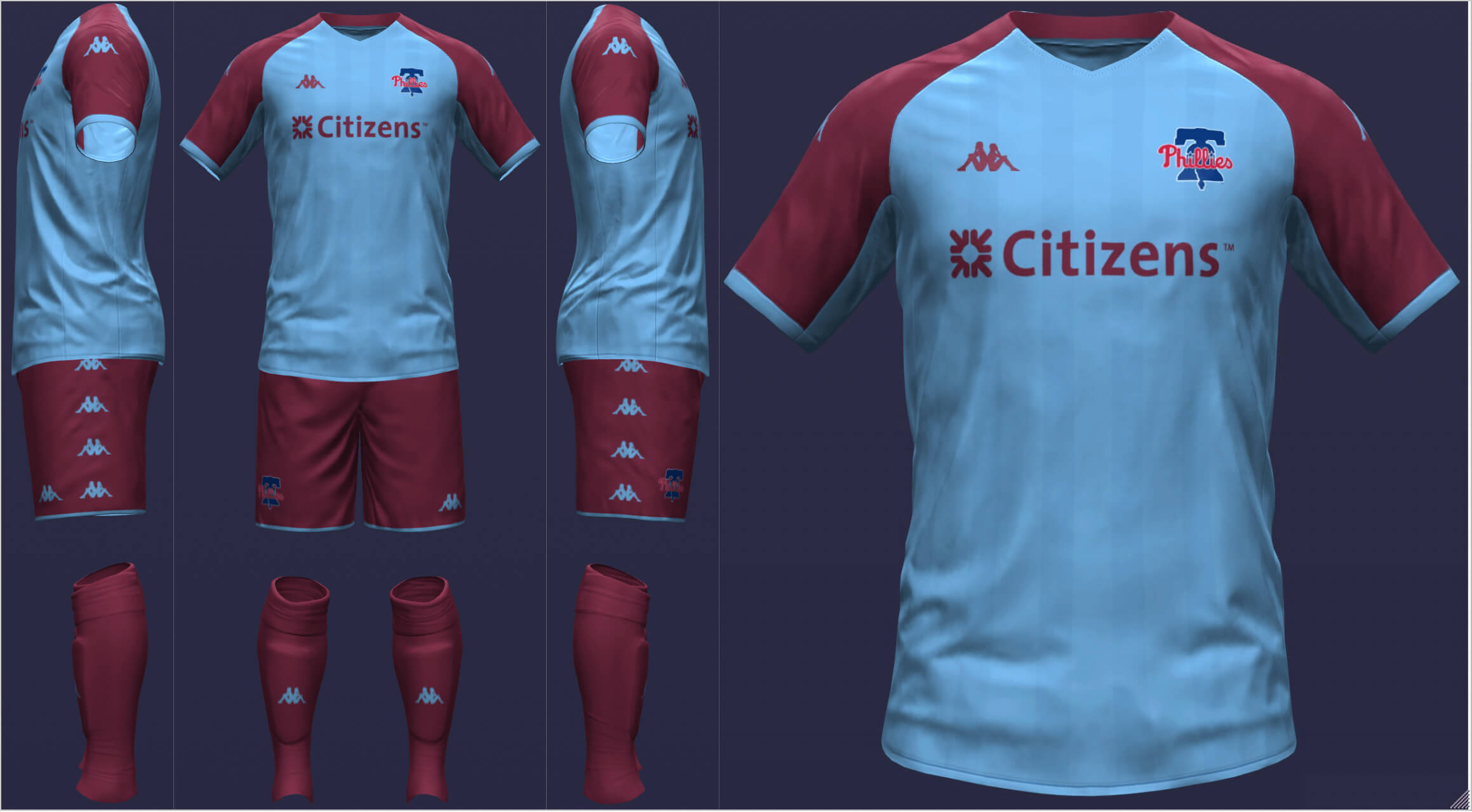
Philadelphia Phillies
Philadelphia goes for kits that, just like the baseball equivalent, are straightforward but hard to argue against. Naturally, I used the retro colorway on the road.
__________
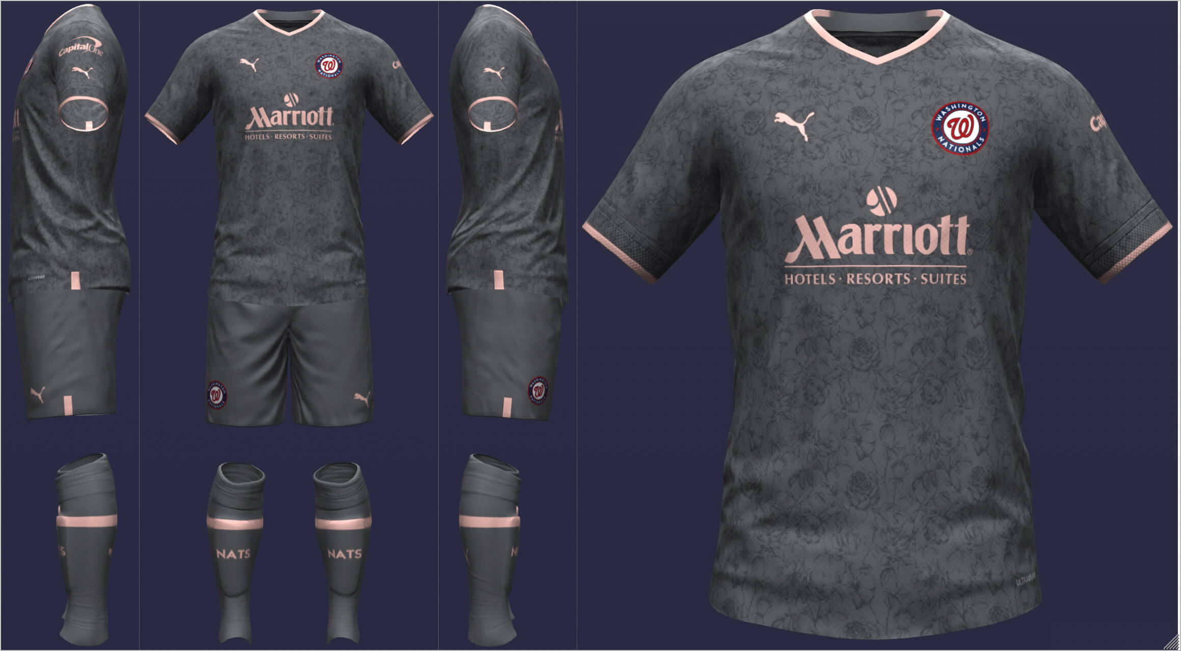
Washington Nationals
The Nationals opt for civic pride for both uniforms. The home borrows the two red stripes from the city flag. The away is essentially a replica of the Nationals’ City Connect look.
====================
NL Central
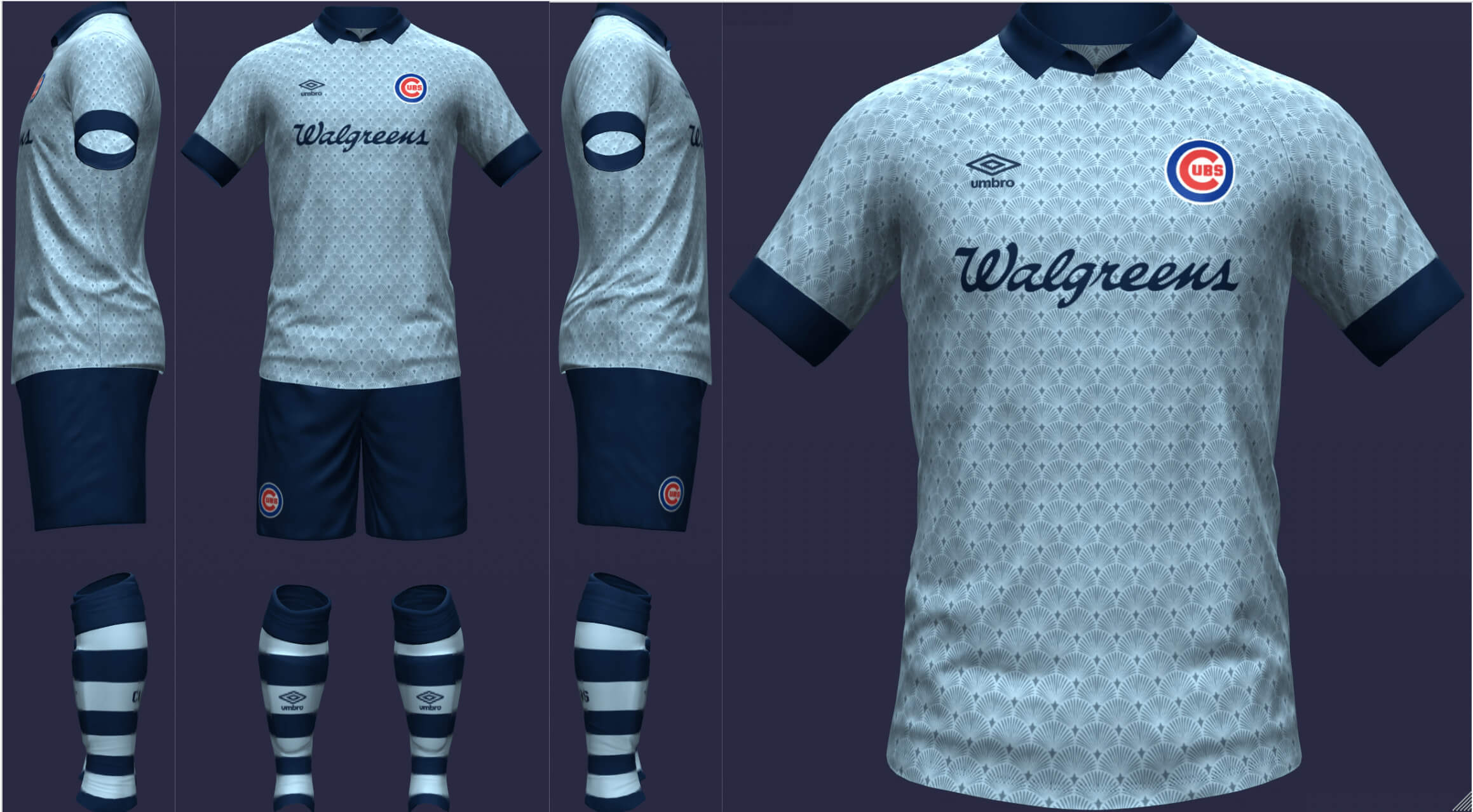
Chicago Cubs
Instead of stripes like the other pinstriped teams, the Cubs get a blue base with one large white stripe. The shirt is trimmed in a red art deco fan pattern and the socks are based on those of the late 20s to mid 50s. The pattern takes center stage on the road, with a collar and hooped socks making for a very classy look.
__________
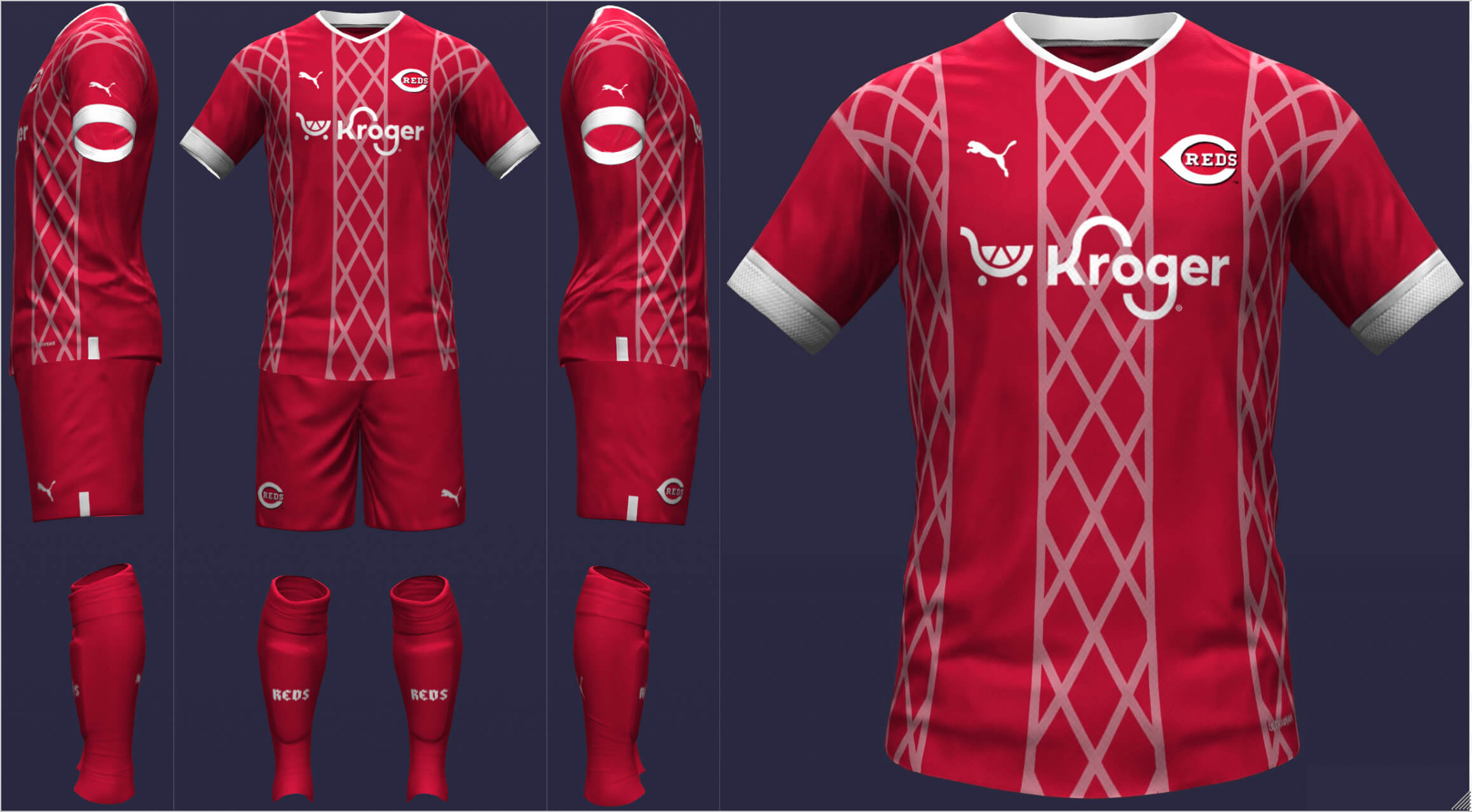
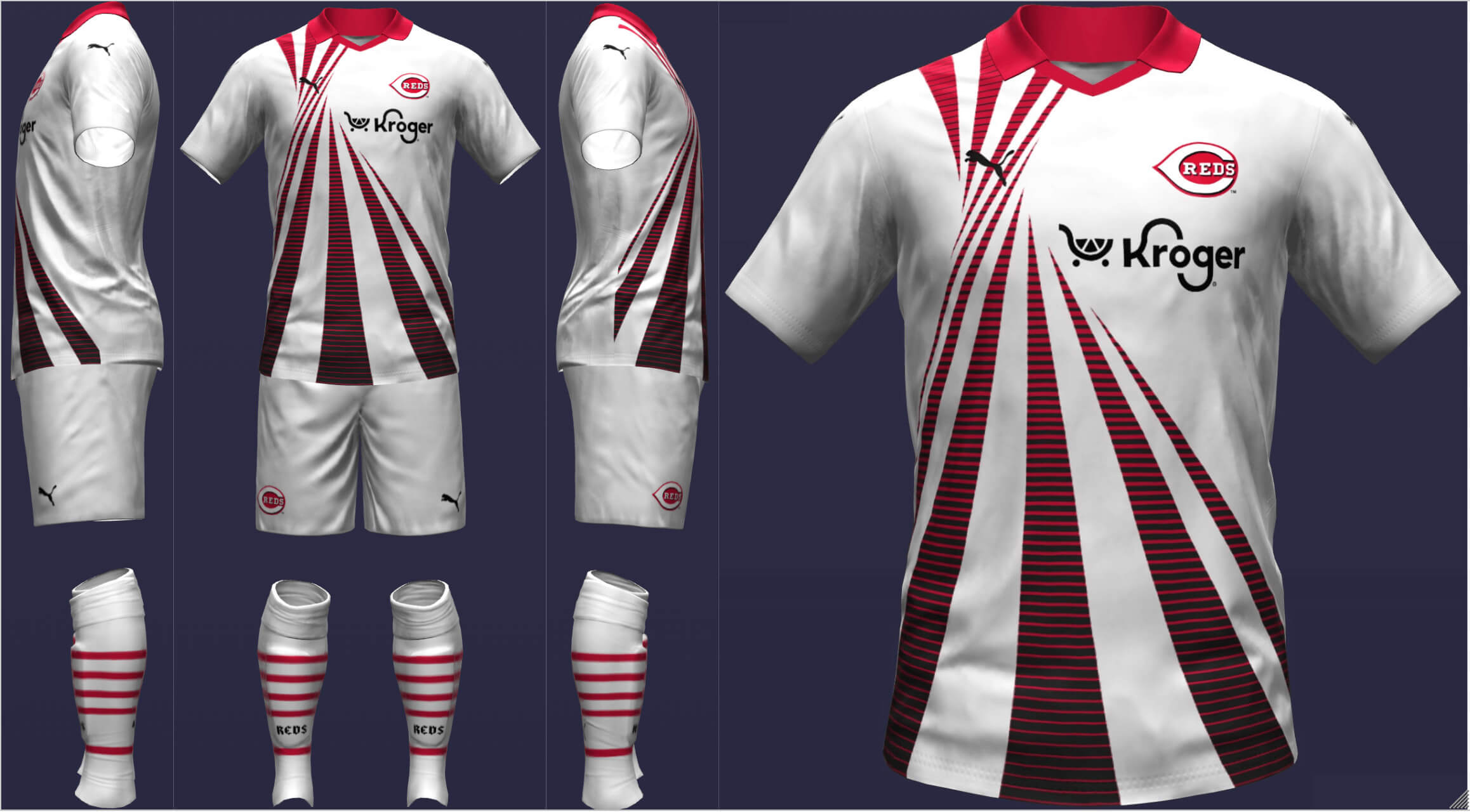
Cincinnati Reds
The Reds were a bit tricky since the name, logo, and uniforms really just point to the color red. I chose to replicate the exterior of their ballpark but made the lines a little transparent so red would still be the focus. For the away, I took a Puma template from the 90s and made it even more 90s with a black lined gradient.
___________
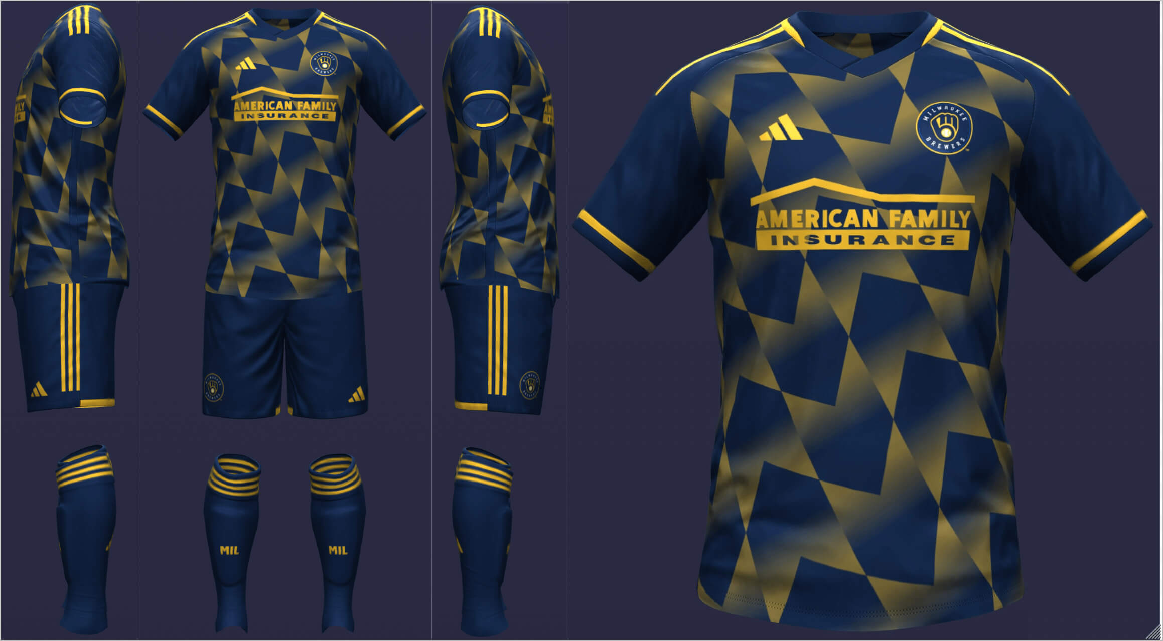
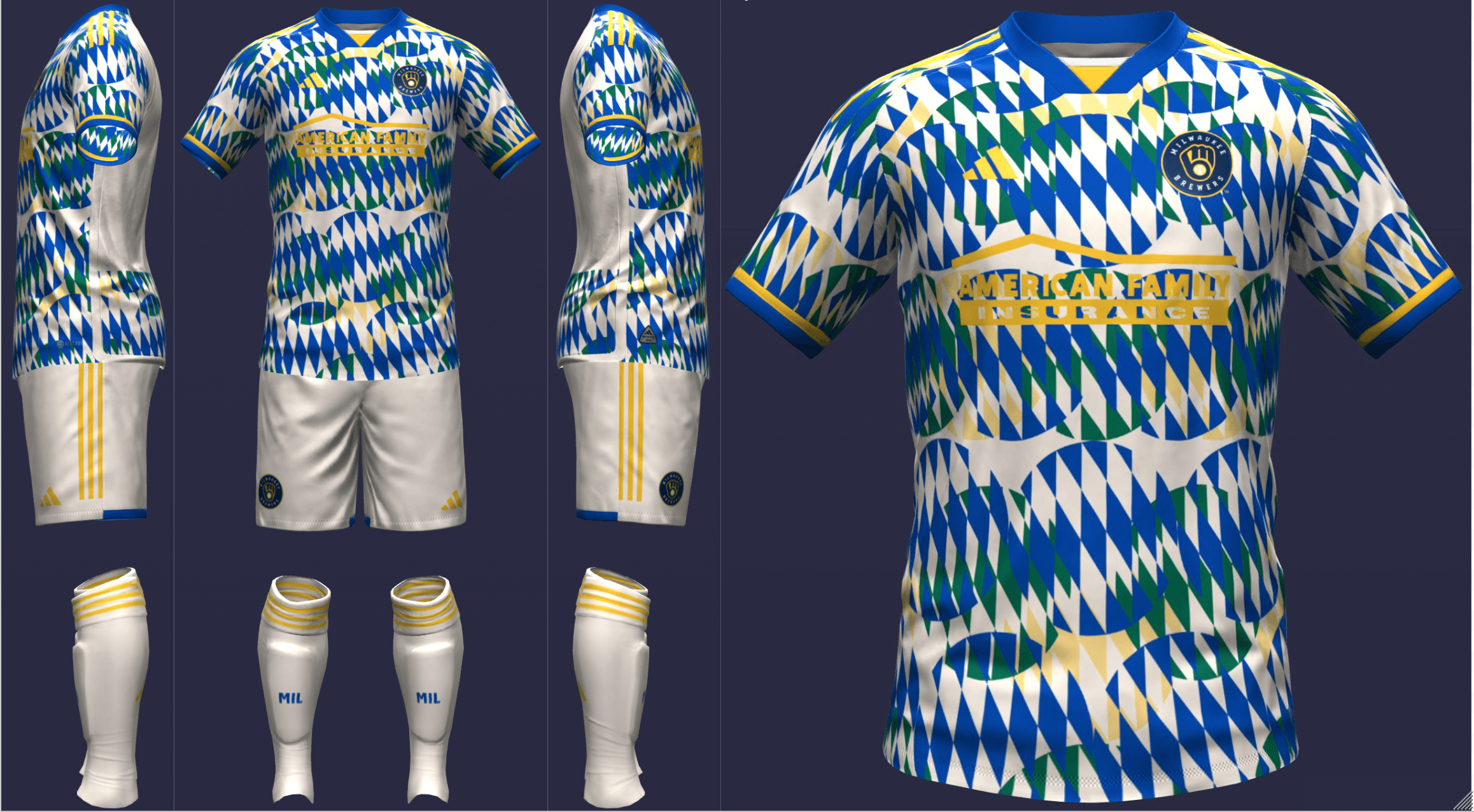
Milwaukee Brewers
I intended to base the design around the wheat in several Brewers’ logos. I was lucky enough to find an existing Adidas pattern that I resembled wheat without being too overt. For the away, I took the Bavarian diamonds (as a nod to the German-American culture of Milwaukee) and “stamped” them all over the jersey in various colors from the team’s history.
__________
Pittsburgh Pirates
I once again used a roundel logo but kept everything pretty standard otherwise. The bones work on the pirate level and as a reference to the city’s USL team, the Riverhounds. I wasn’t sure at first about using red but I didn’t want the away to just look like a color swap. The graphic reminded me of a pirate’s map.
__________
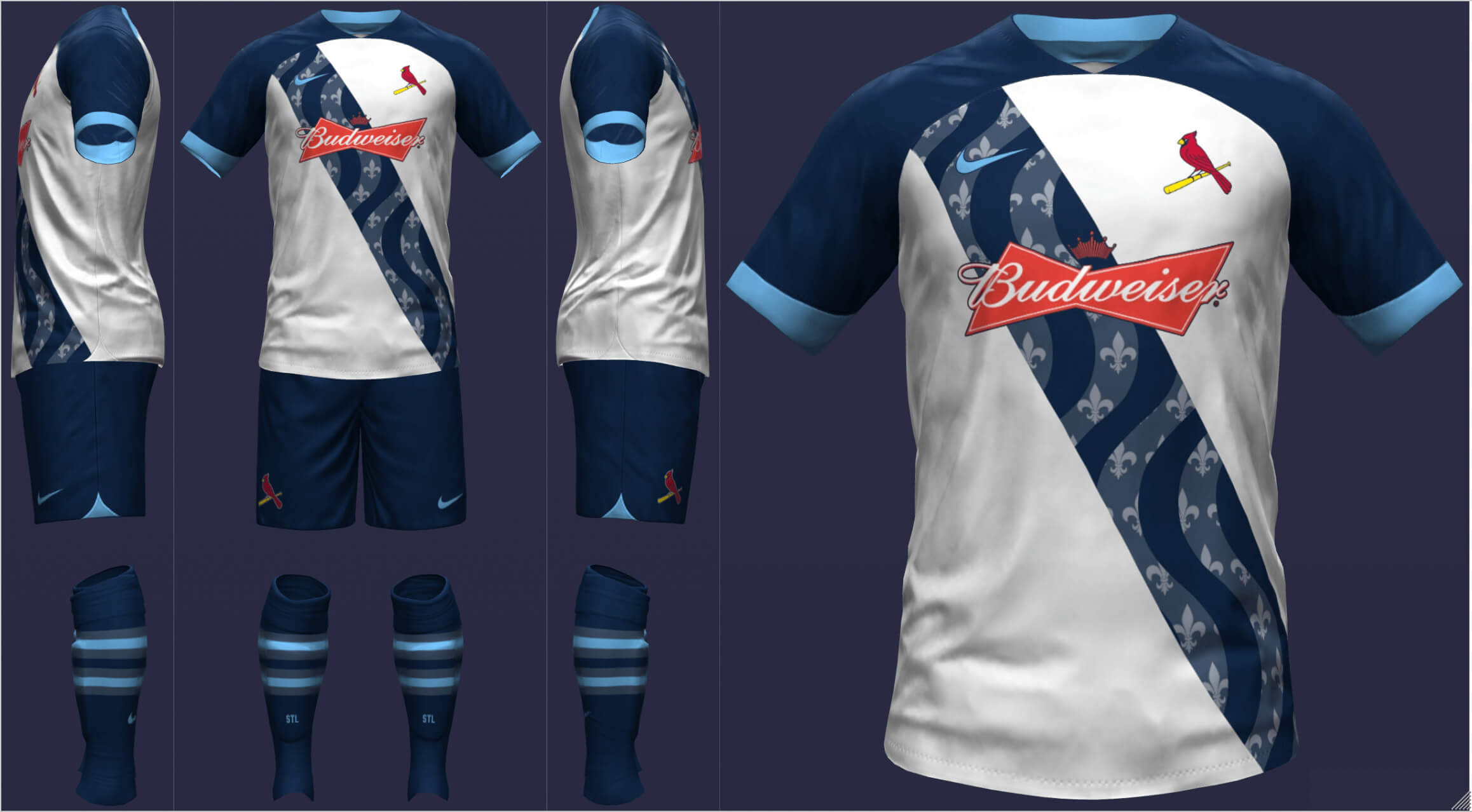
St. Louis Cardinals
Since St. Louis is the Gateway to the West, I picked a pattern that evoked the idea of paths crossing. The away depicts the Mississippi River with fleurs-de-lis from the city flag.
================
NL West
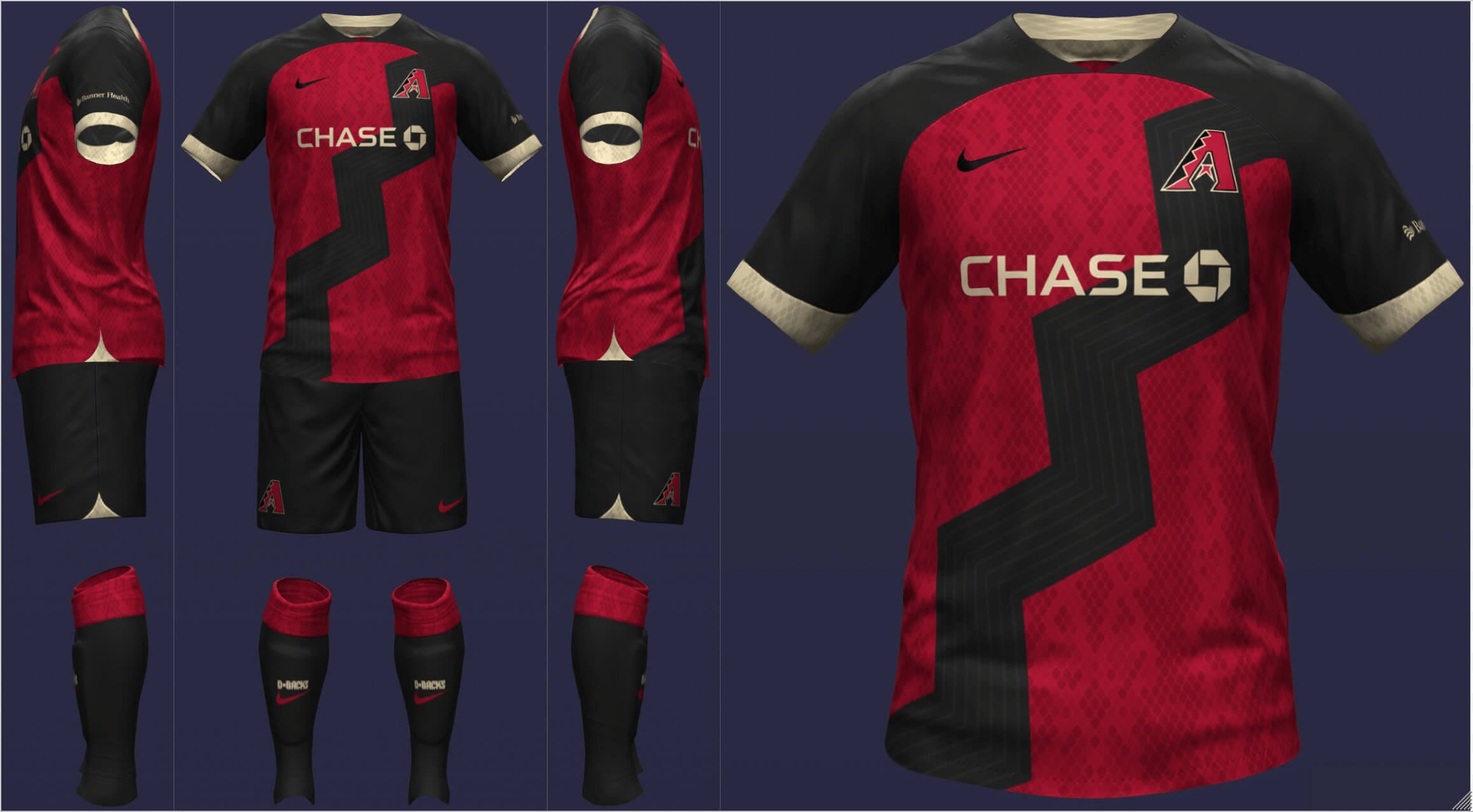
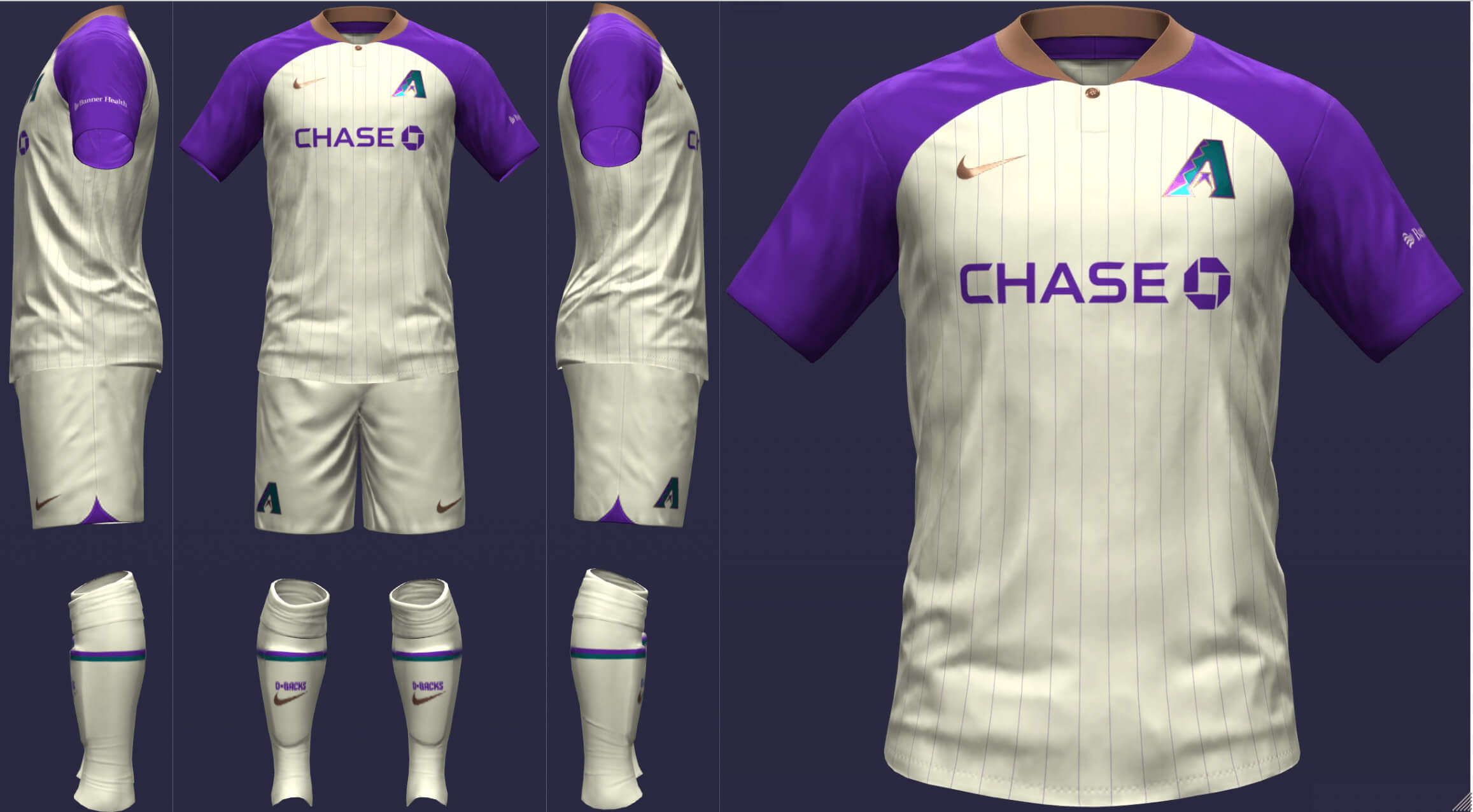
Arizona Diamondbacks
Naturally, I started with a snakeskin pattern, which works a lot better than it would on a baseball uniform. Then, I took the zig-zag from the A logo and expanded it into a sash. The away kit recreates the uniform the DBacks wore when they won the World Series in ’01.
__________
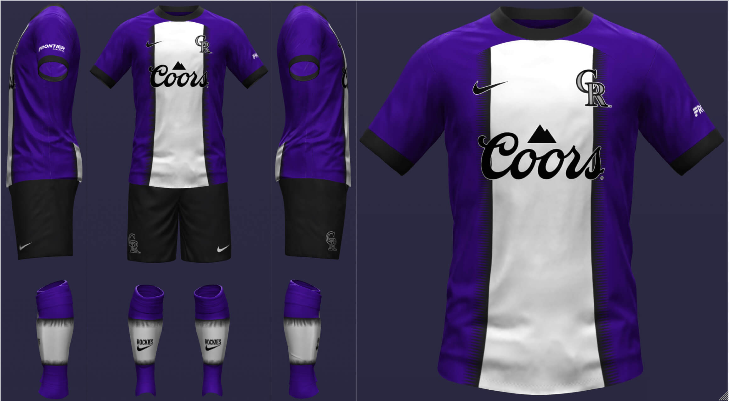
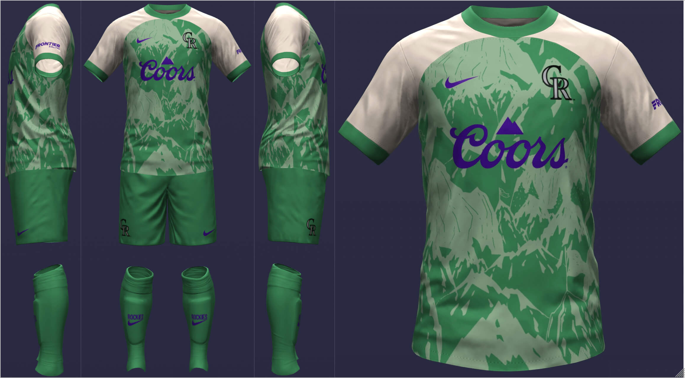
Colorado Rockies
With a certain color serving as the base, Colorado sports a Hechter stripe with a horizontal version on the socks. I really like the Rockies’ City Connect (provided that it is paired with white pants) and wanted to incorporate green. I did switch to a lighter shade of green for the sake of contrast and used a more detailed mountain pattern.
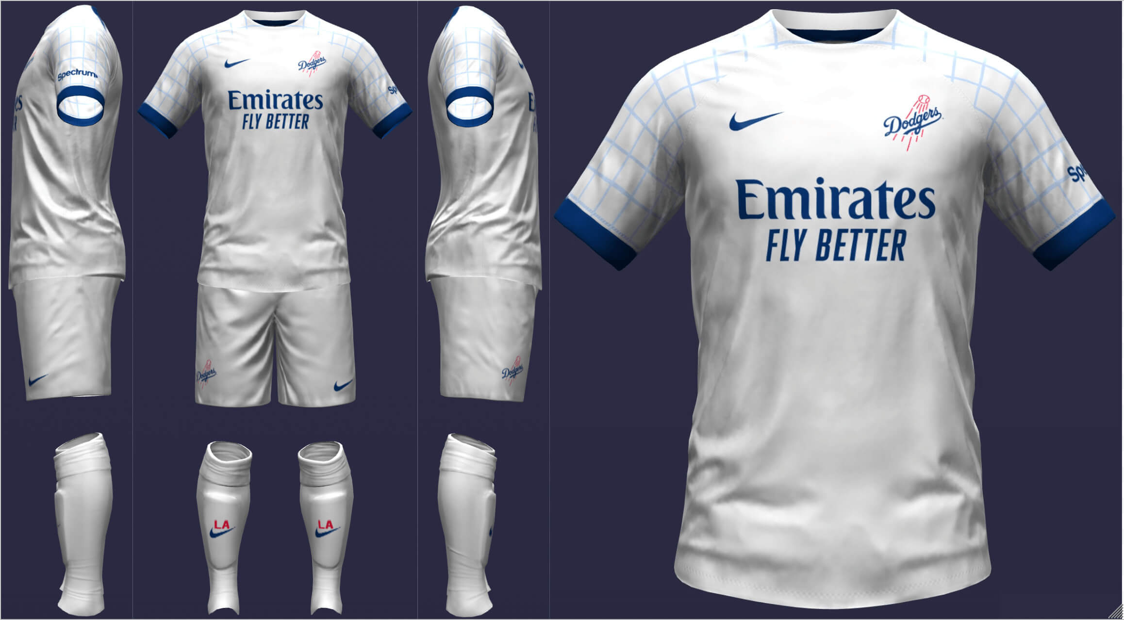
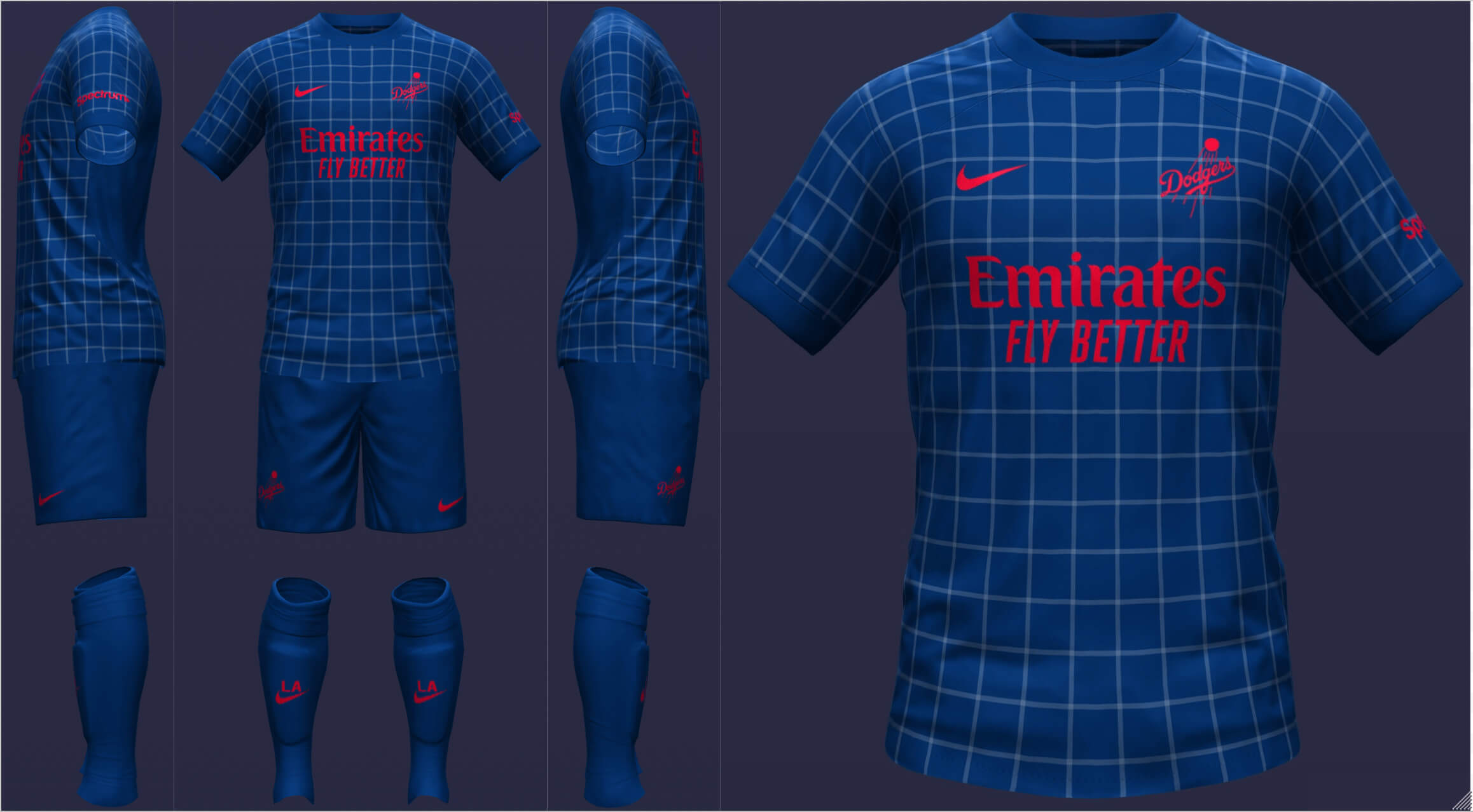
Los Angeles Dodgers
Originally, I kept the Dodgers as plain white with blue sleeve cuffs. However, I knew I wanted to do a checkered jersey for the change kit and decided to bring a bit of it to the home.
__________
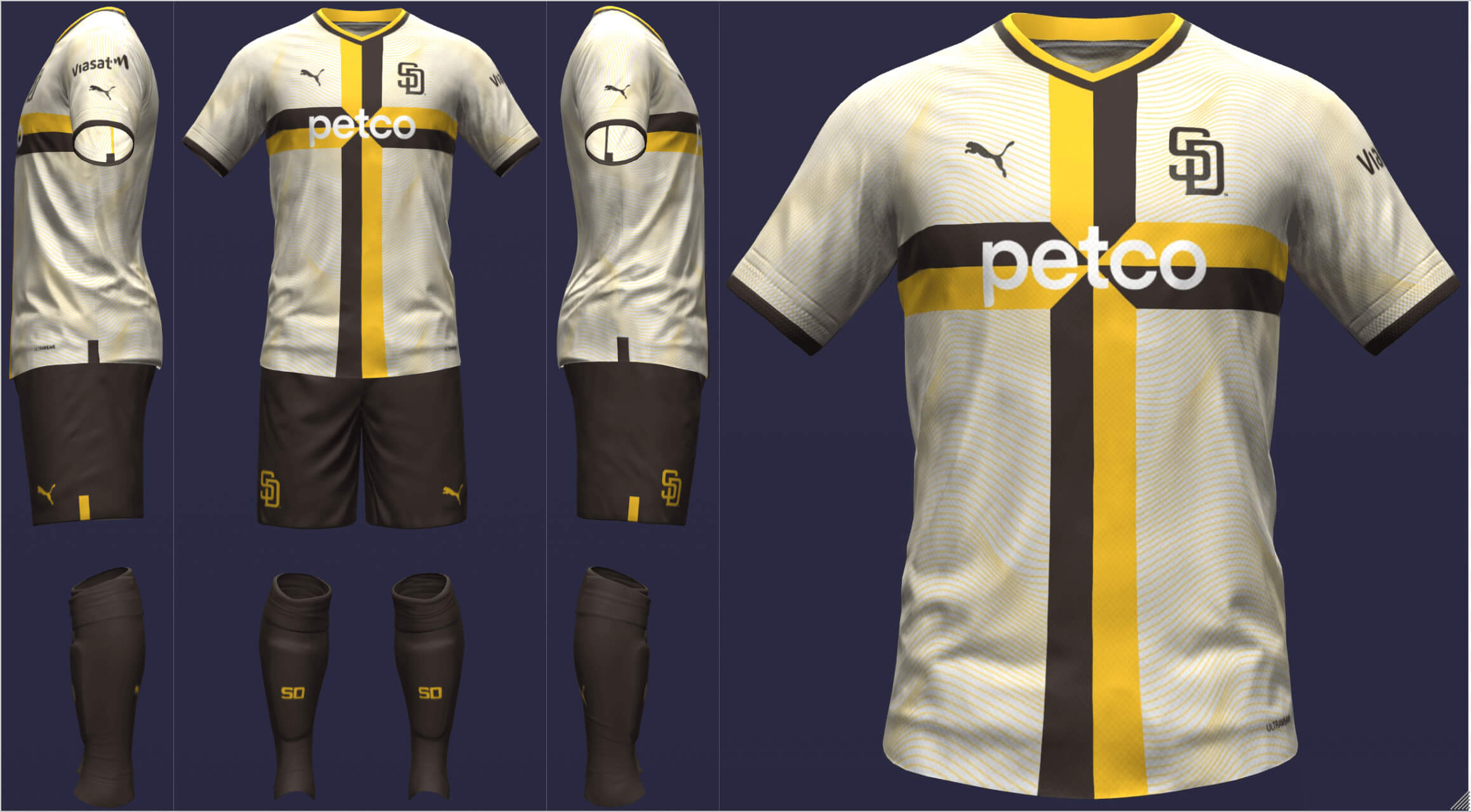
San Diego Padres
I inadvertently used a cross for the Padres’ home shirt but I thought it worked well enough to keep it. I wanted to work with one of the colors from the City Connect uniform and chose mint because I liked the way the palm fronds looked on it.
__________
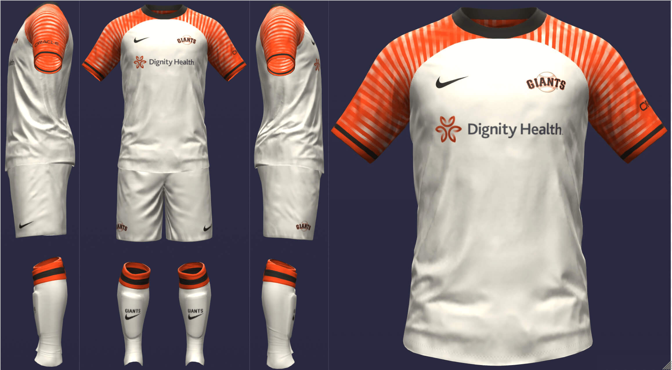
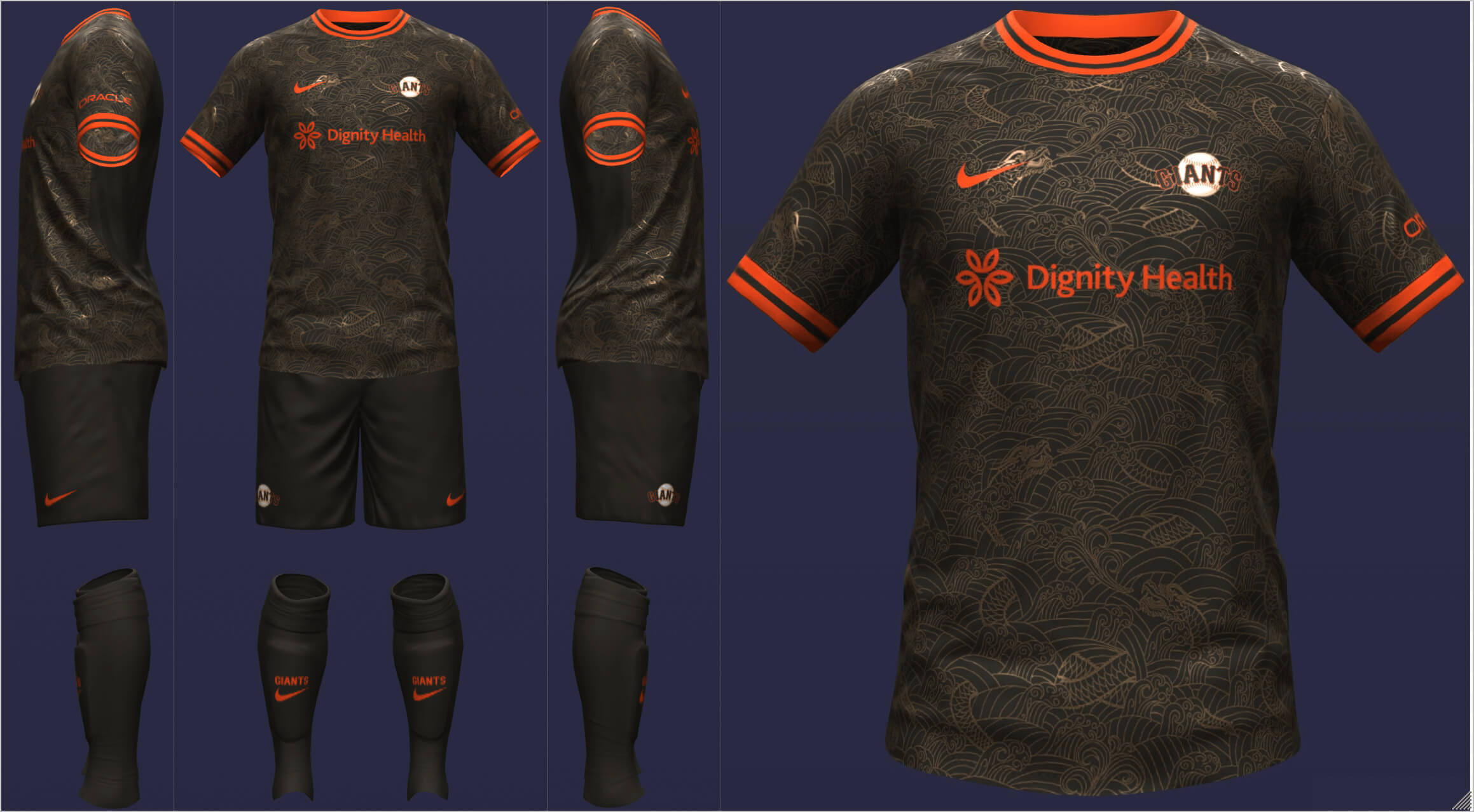
San Francisco Giants
As a diehard Giants fan, I was skeptical of the City Connect execution but I did like the idea. So, I put the beams of the Golden Gate bridge on the sleeves, with fog underneath. Chinatown is such a big part of San Francisco so when I happened upon this dragon pattern, it was hard to resist.
• • • • •
Thanks Danny! Really fun set of concepts for both leagues. Readers? What say you?
Are You Ready For Some (More) Football?
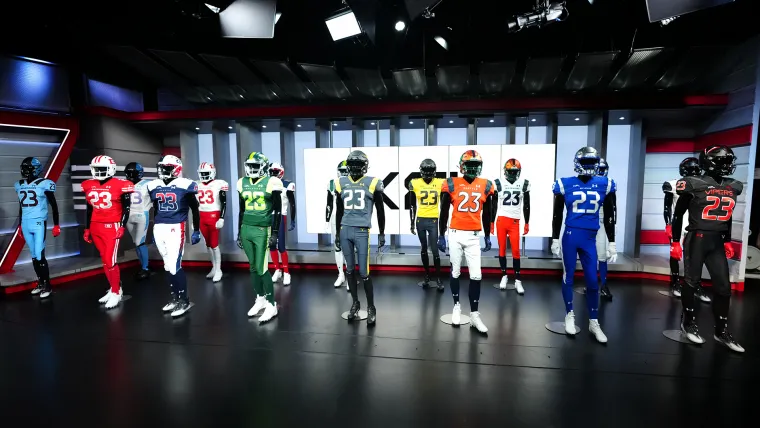
In case you weren’t paying attention (or simply don’t care), the XFL, Mach 3.0, returns this weekend, with eight teams playing four games — two today, and two more tomorrow. The schedule for those games is here.
The teams unveiled uniforms way back in December, and Paul had his own inimitable take back then. I’m not quite as down on the league as Paul (although I don’t expect to be watching any many games). Still, the league has uniforms and it’s worth a couple minutes to at least look at the on-field product (the unis, not the play). A couple quick notes: each uniform tries to be unique, style-wise (so that’s a plus) to varying degrees of success (that’s a minus). For example, each jersey, for the most part, has some type of differeing “striping” (you’ll see in a sec). All jerseys have the words “BLOOD SWEAT RESPECT” on the inside of the collar. So much for uniqueness. Here we go…
__________
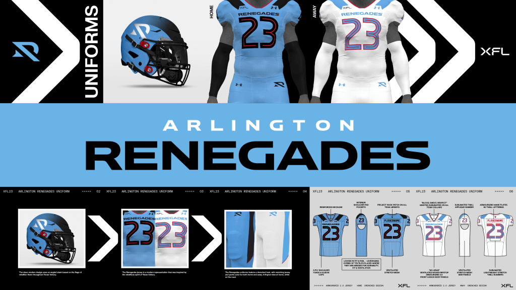
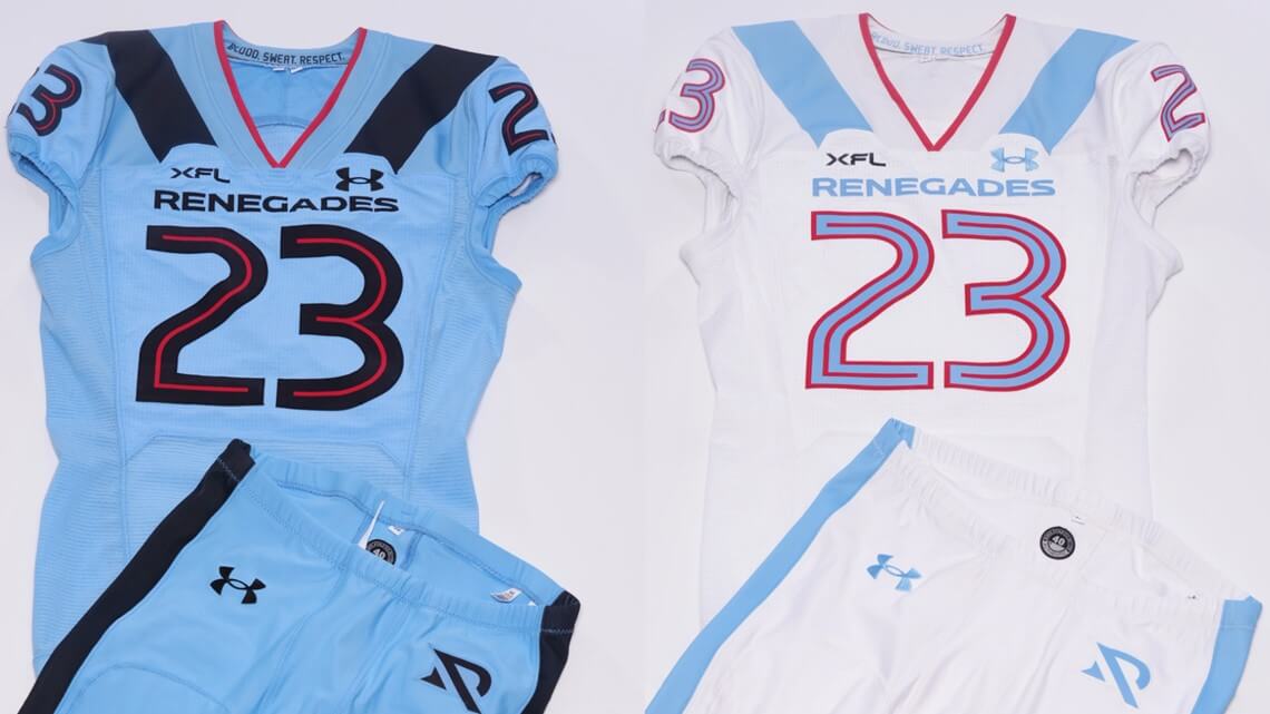
Arlington Renegades
I get a bit of an “if the Oilers and Blue Jays had a baby…” kind of vibe with this one. I like the colors, and the fonts aren’t bad at all. While it seems most teams who have two pairs of pants can wear them interchangeably with either color jersey, this feels more like they need to be worn mono-style. Not a fan of the shoulder “stripes” (more like a solid color block). I also wish the team hadn’t used black as an accent on the blue uni; using the red might have been a better option, especially since the white uni has no black at all.
__________
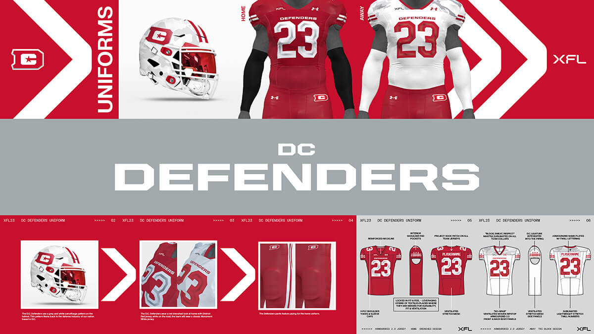
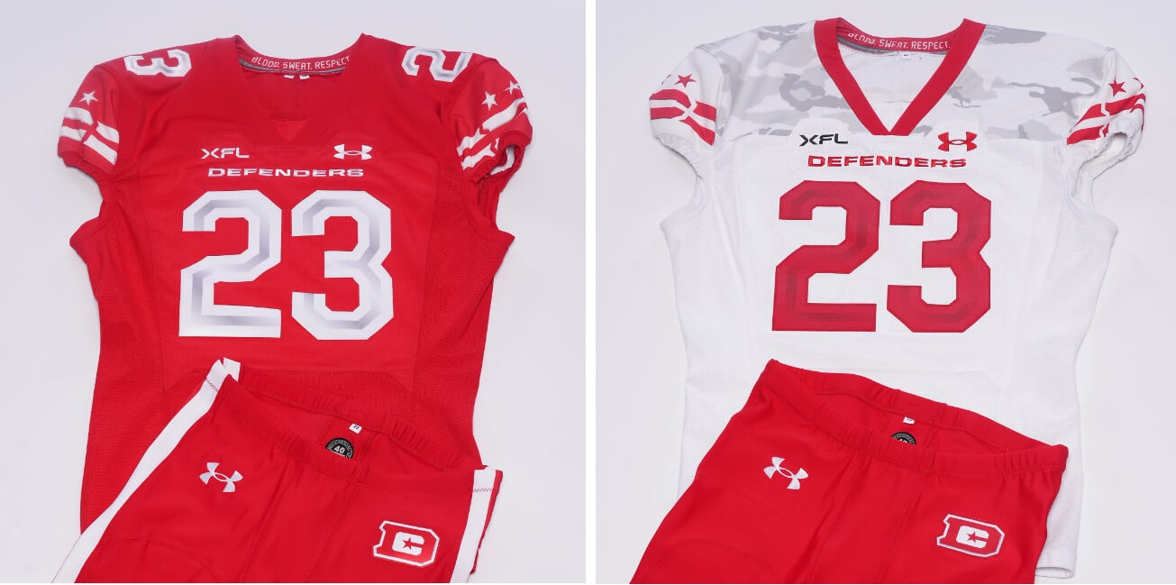
DC Defenders
By far the best stripe treatment of any team (although they basically repurposed their own treatment of the Wisco Badgers). Of course, there is the obligatory “3 star” treatment (a nod to the DC Flag). I’m definitely not a fan of the sublimated camo on the white jersey (also present on the helmet), and I really wish they had a pair of white pants. And only the red jersey has TV numbers.
__________
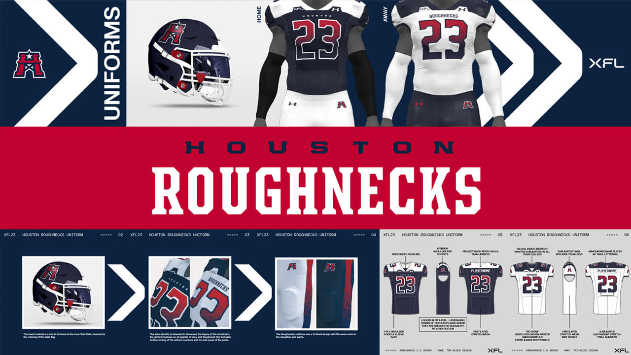
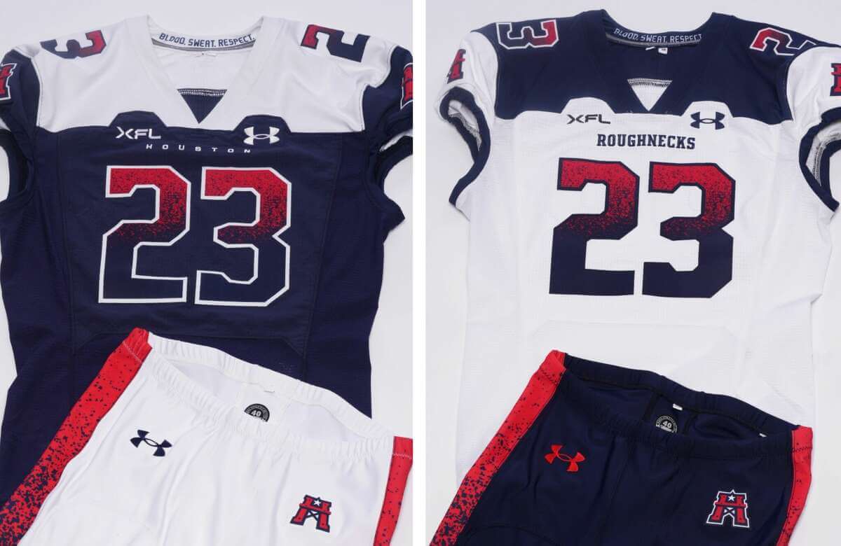
Houston Roughnecks
This uniform had so much promise. Too bad they ruined it with the college/minor league gradient numbers and screwing up an otherwise decent looking contrasting-color yoke by having cutouts for the league logo and makers mark. The eyebrow yoke just ruins a pretty decent look. Also, look at the sublimated paintsplatter on the pants stripes. C’mon man. The helmet is pretty good, and I love the white over blue or blue over white combos, but the other gimmicks put a damper on that enthusiasm.
__________
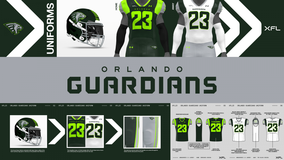
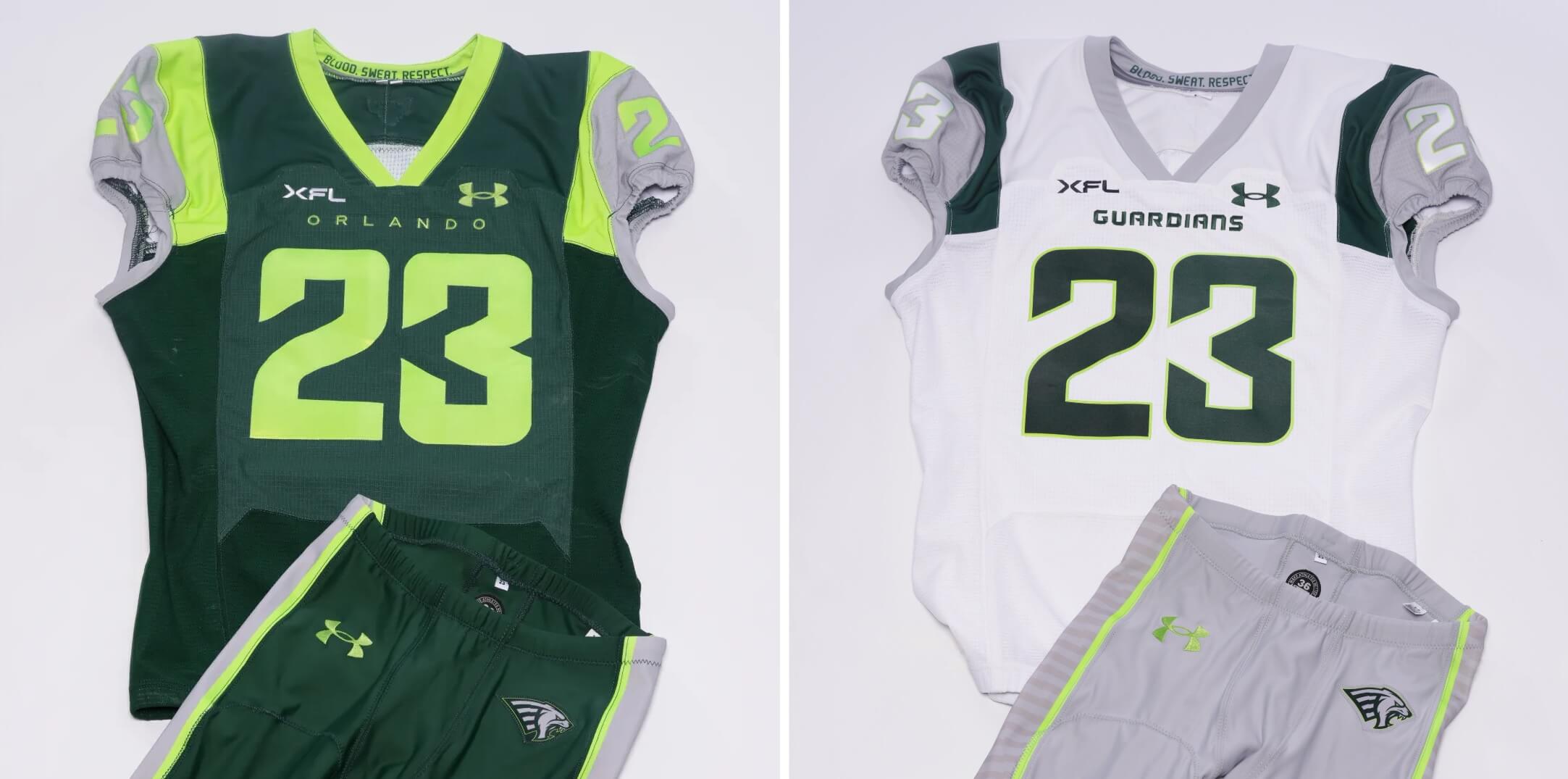
Orlando Guardians
I might be one of the few people who thinks chartreuse looks good on a uniform, so I have a bit of an affinity for these. But what’s with the two-tone jersey? Reminds me of the sweatbox look, but only these jerseys are dry. I like the gray accents (and think the dark jersey should have gray pants, like the light jersey does), but I get kind of a USF and Oregon (circa 2010) feel with these. The dark green almost looks black…a slightly lighter shade would work better.
__________
San Antonio Brahmas
Here I like the gold and anthracite color scheme, but that font is kinda brutal. Also, I think there is some sublimatation within the white numbers on the dark jersey. It probably won’t be visible on TV at least. I’m not a fan of the helmets, either. That wraparound logo just looks unfinished from any angle.
__________
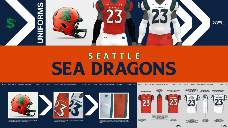
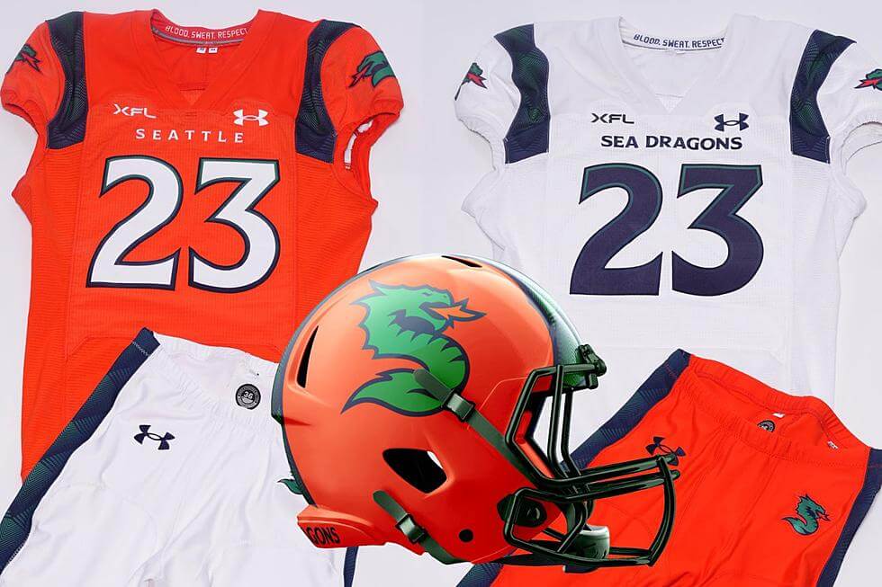
Seattle Sea Dragons
Of all the new 2023 XFL uniforms, this one is my favorite. Great helmet, beautiful colors, decent fonts. And (at least judging from the promotional photos) it looks like they won’t be going mono! I’m not big on the big blocky shoulder stripes. The orange helmet is phenomenal and keeps the team from looking too Hurricane-ish. The Broncos could learn a thing or two from these. Interestingly these unis have no TV numbers.
__________
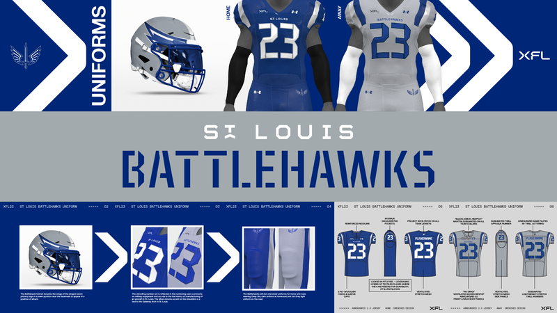
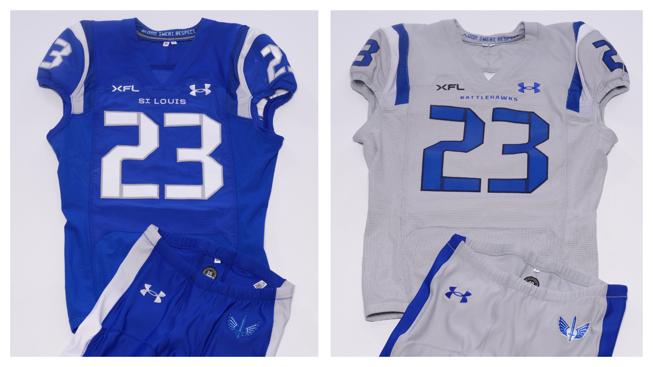
St. Louis Battlehawks
These may not be the worst unis of the bunch, but they’re definitely the most boring. Royal and gray mono? And what’s with the pseudo-stencil font? Is that an allusion to the name “BATTLEhawks”? The helmet isn’t awful, but it’s not great either.
__________
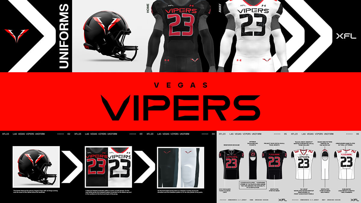
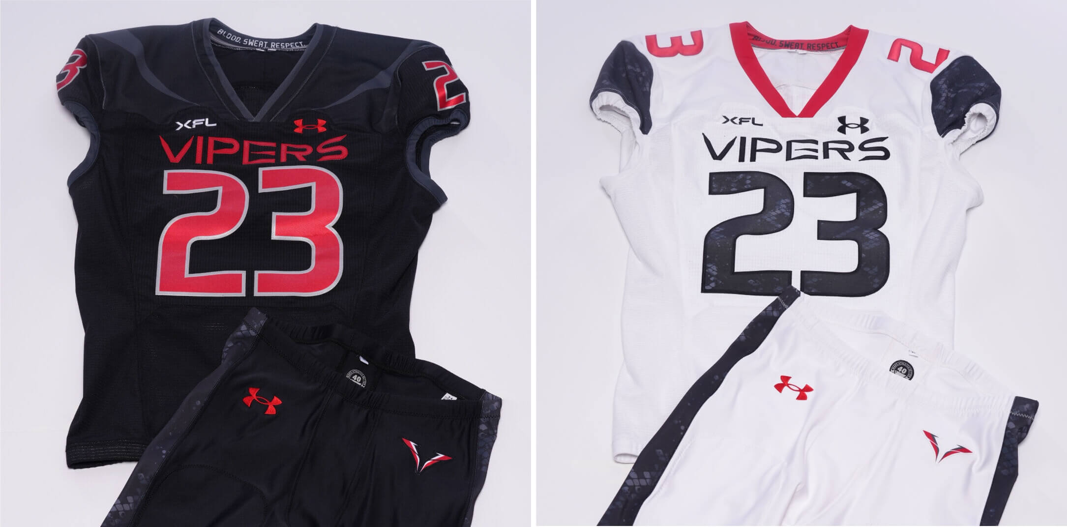
Vegas Vipers
I hate to keep comparing the XFL uniforms to other unis, but that’s the first thing I see when I look at about half of these. And these most definitely remind me of the Atlanta Falcons mono-black and mono-white. I’m not sure that’s such a good thing. Like the San Antonio team, these jerseys feature TV numbers on the shoulder caps (black) and shoulder tops (white).
_________
And there you have it. All things considered, the uniforms could have been a lot worse (but also a lot better). But if you’re a fan of football and want to keep that jones going…first the XFL and then the USFL (mach 2.0) will have you covered for the next several months.
Your thoughts?
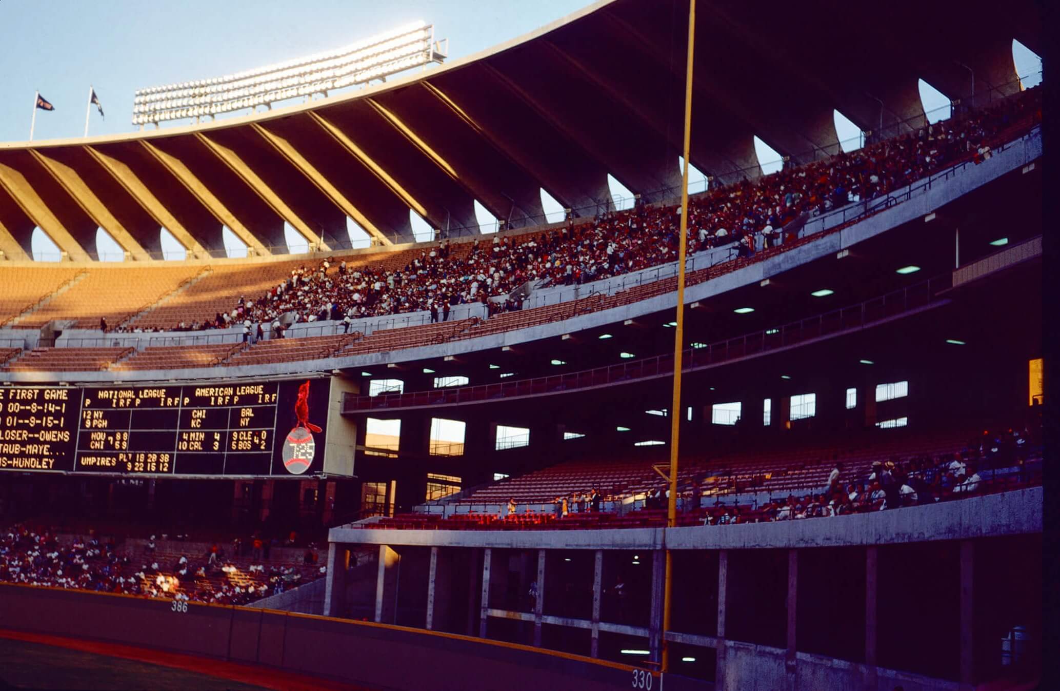
Guess the Game from the Scoreboard
Guess The Game…
…From The Scoreboard
Today’s scoreboard comes from Mike Chamernik.
The premise of the game (GTGFTS) is simple: I’ll post a scoreboard and you guys simply identify the game depicted. In the past, I don’t know if I’ve ever completely stumped you (some are easier than others).
Here’s the Scoreboard. In the comments below, try to identify the game (date & location, as well as final score). If anything noteworthy occurred during the game, please add that in (and if you were AT the game, well bonus points for you!):
Please continue sending these in! You’re welcome to send me any scoreboard photos (with answers please), and I’ll keep running them.
And Now a Few Words from Paul
Hi there. In case you missed this on Thursday, let me catch you up: Last month I did that blog post about the Orioles’ 1978 uni order from Wilson Sporting Goods. One of the players on that team was pitcher Nelson Briles (he’s the one who, as you may recall, had special instructions for his sleeve openings and pant cuffs). One of the people who commented on that post was Briles’s son, David Briles, who, as it turns out, has been an occasional Uni Watch reader for many years.
I asked David for an interview, and he turned out to be a gold mine of fascinating information. Among other things, he told me how his dad sometimes disguised which brand of glove he wore on the mound due to an endorsement conflict; that a key bit of info on his dad’s 1973 baseball card is inaccurate; what his dad thought of the Astros’ rainbow design; how his dad ended up making a cameo appearance on Saturday Night Live; and a lot more.
David also provided me with lots of great photos from various Family Day promotions. The one at the top of this section is from 1970 (that’s David at far right, and his sister Kelley wearing the Cardinals’ uni with the skirt!), and check out this priceless shot of David with Willie Stargell in 1972:
There’s more where that came from — a lot more. I know I seem to say this almost every week, but this is one of my favorite Uni Watch articles ever — really! Definitely peak Uni Watch. You can read the first part of it here. To read the entire thing, you’ll need to become a paying subscriber to my Substack, which I hope you’ll consider doing. Thanks!
And finally...
…that’s all for today. Big thanks (again) to Danny Kaufmann for those soccer kits for baseball team concepts! Fun stuff. And I cannot recommend enough Paul’s latest Substack (detailed above) — if there’s ever been a reason to sign up for that (and there are many), this is why! One of my favorite pieces ever.
Today’s Ticker should publish at 8:30 am (Eastern).
Everyone have a good Saturday and I’ll catch you back here tomorrow. Till then…
As for the Pirates, I would’ve used hoops like their old pillbox caps. The yellow on the black uniform makes them look more like Borussia Dortmund. The artist should’ve used the yellow that the Pirates actually use.
GTG
8/11/66. Cards 5, Phillies 1.
The hint was the Cubs/Astros double header in the out of town board.
In the Cardinals game, Dal Maxvill went 4 for 4, Dick Allen hit a home run, and the two catchers were Tim McCarver and Bob Uecker
I would have liked to see for the home Diamondbacks the teal/aqua trim that they use on their best current uniforms.
These soccer kits are beautiful and well thought-out. The chest ads don’t bother me, to pretend that they are not an omnipresent feature of soccer jerseys is delusional.
+1 to this. The only big miss for me is not using the maroon Phillies P with the alternate colorway.
Agreed and the ads are more prevalent in soccer than any other professional sport, but these sponsors tied in well with the teams they sponsor.
My ONLY beef with the entire set is the Mets. Blue/white primaries are gorgeous (and I hate the Mets), a very Brighton vibe. But the clash kit needs to give some distinction from the primary kit. Solid royal blue doesn’t do that, so if Mets FC played another blue team, what would they wear? (Same problem with the Orioles in the AL version.) Black would work historically and provide some contrast. OR… orange tops. Plenty of contrast there.
Awesome job on the soccer concepts!
I wish that the Washington logo on their change kit matched the grey and pink hues like it does on the sleeve of the City Connect you based it on, but that’s a really small nitpicky thing.
I love the idea of this type of “crossover”. I really do. Unlike D.R.I., I’m not just “Dealing With It”.
I must, however, be a bit of a jerk here. I’m on my knees begging please… DO NOT include any imagery of the team’s actual sport. For example, either remove the bat beneath the cardinal, or plop him on a soccer ball. These uniforms in their current state look too ornate for what equates to a charity soccer match played by MLBers.
My apologies for being so negative, but the idea of a baseball logo on a soccer kit makes the Jump Man logo on a football uniform seemingly more acceptable. And I don’t want to think like that.
Seriously good job though. Lots to be proud of here.
Several of these (especially my beloved but poorly attired Nats) are more thoughtful and better-looking uniforms than what the teams actually wear. Kudos!
Nice job, Danny. Really like the Giants and Dodgers concepts. And the Philly away is fantastic. Would have preferred to see the Mets in an orange away strip since the home has so much blue in it.
You should have used Walgreens on the Nationals kit ;-)
Great work on the concepts! Not a futbol fan on the professional level, but the kits look like they could be on the pitch. Dang……way too much soccer lingo.
I think these are are all awesome and well conceived! Great job! I came across several and was thinking, ‘yeah, I’d buy that if I saw it in a store.’
I liked about half of the soccer concepts. I think a lot of the change kits are garbage, frankly, but maybe that’s just the nature of change kits. I especially think he leaned way too heavily into sublimated and background graphics that didn’t really have anything to do with the club. There’s probably a good reason why nobody’s used a grid pattern on a sports uniform before.
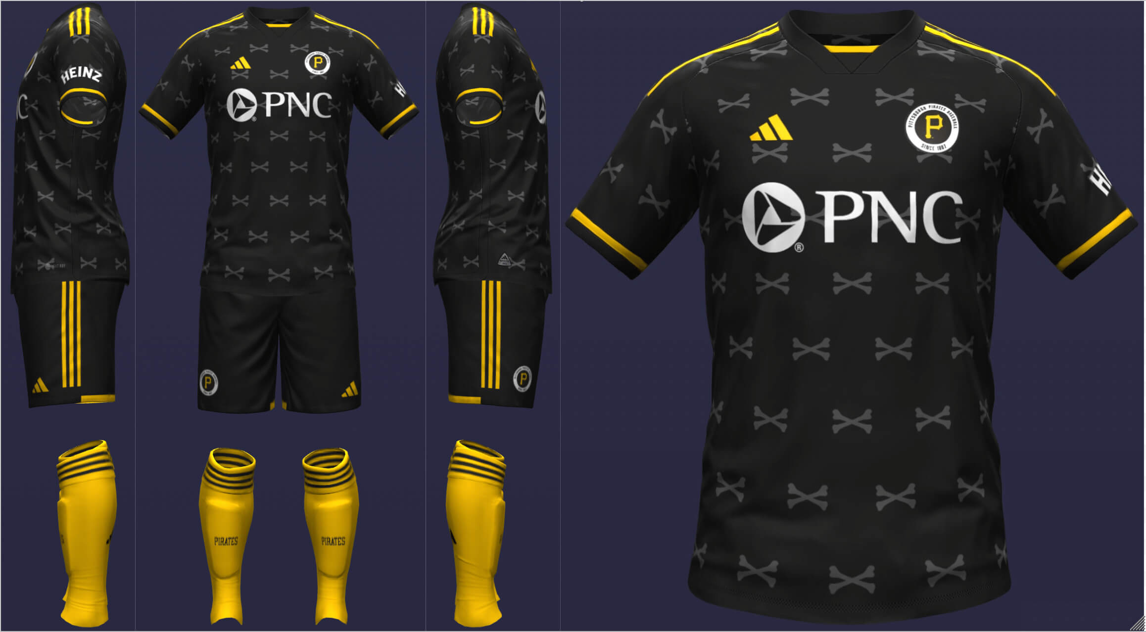
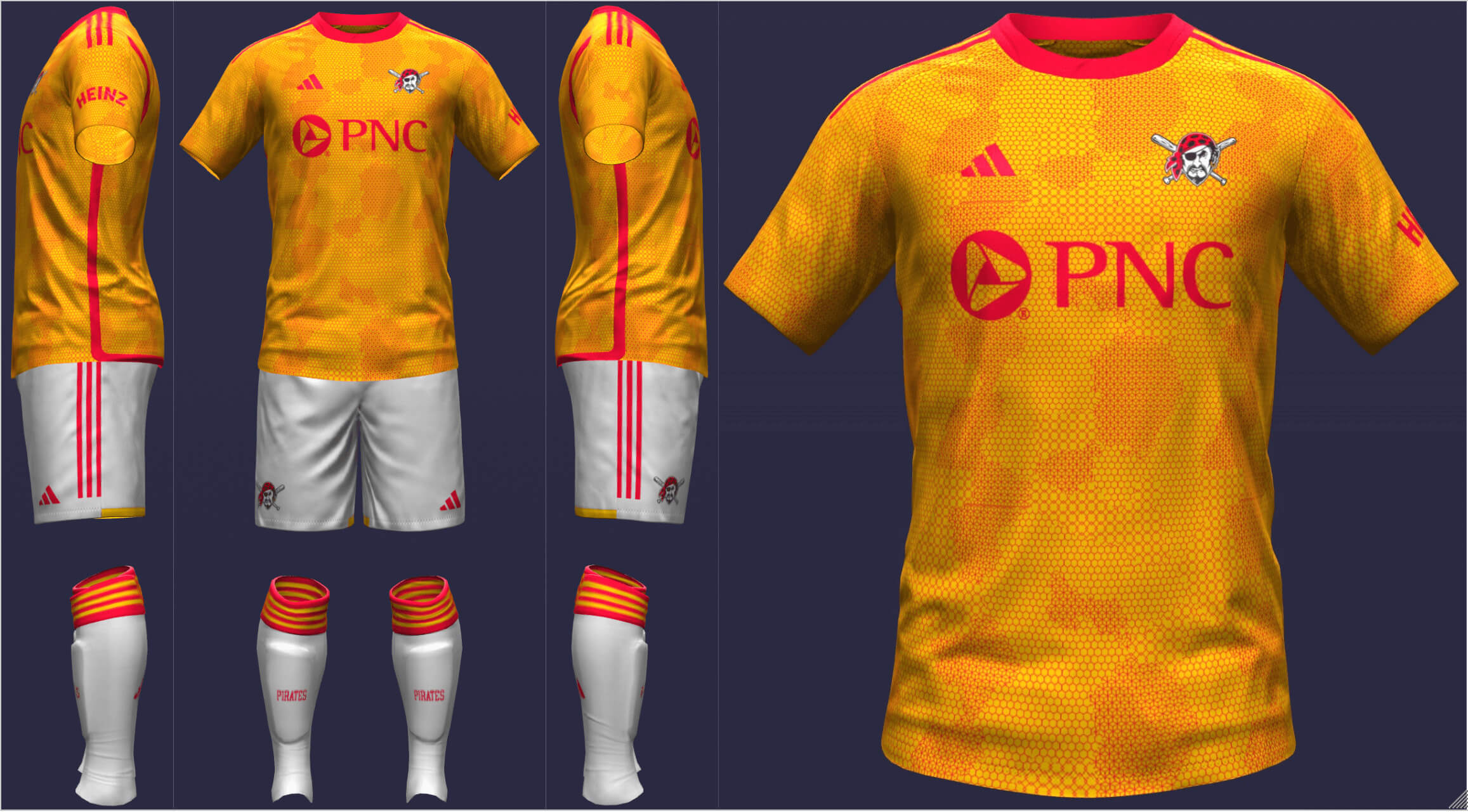
Nobody? What do you call this?
link
Most of these MLB soccer kits actually look better than all the new MLS kits put together. I like the Cubs, Phillies and most of all the Padres.