Earlier this morning, Kyle Evans and CJ Fleck previewed the World Cup kits for Groups A through D. Here’s their preview and hot takes on Groups E, F, G and H. Enjoy!
2022 World Cup Kits, Part II
by Kyle Evans and CJ Fleck
Thanks Phil! Happy to be back to preview the World Cup, which is generally held in the summer but will take place from November 20th – December 18th due to Qatar’s climate. This is the last tournament that will be held with only 32 countries, as the 2026 USA/Mexico/Canada edition will expand to 48 countries. There are plenty of kits to get to, so let’s jump right in and let us know your favorite and least favorite designs!
Group E
Costa Rica
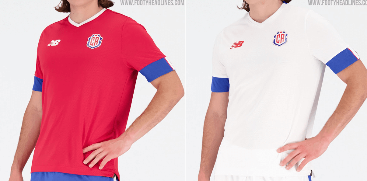
Primary: red with blue sleeve cuffs and blue shorts
Secondary: white with blue sleeve cuffs and white shorts
Kyle: These arguably look more American than the USA kits.
CJ: I mean, it could be worse, but it could be much better.
Germany
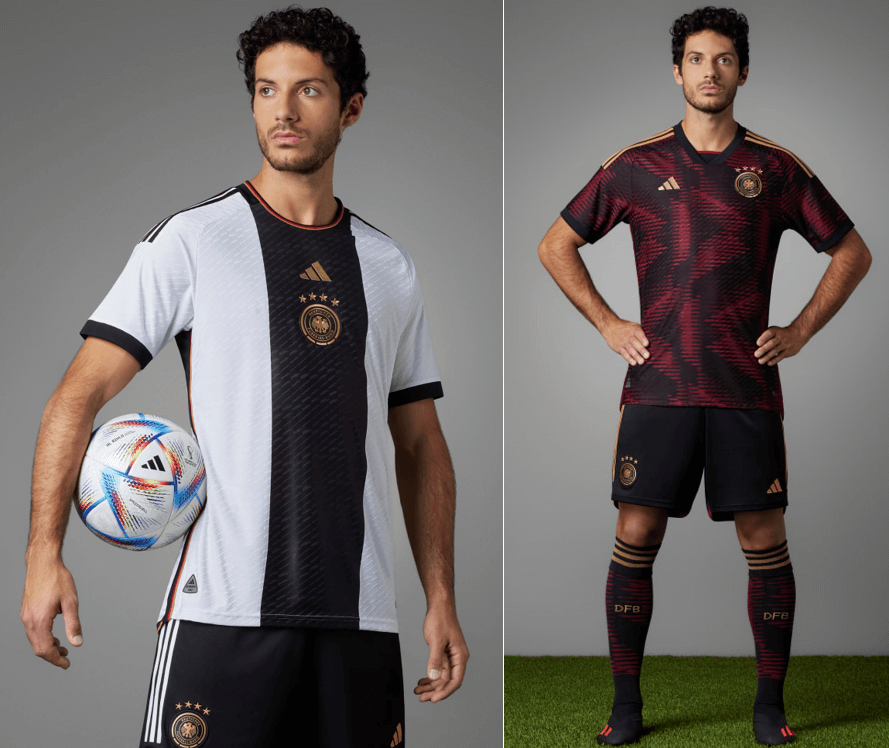
Primary: white with black center vertical stripe and gold accents
Secondary: blurred maroon and black graphic design and gold accents
Kyle: Even though it’s logical inside the center stripe, I’m still not sold on the centered and stacked maker mark and crest. Overall, I’d say these are a step down from what we have come to expect as one of the best dressed teams.
CJ: Adidas has a lot of creativity this year, but I’m not sold on the German designs. I wouldn’t call them bad, but they’re just not for me personally.
Japan
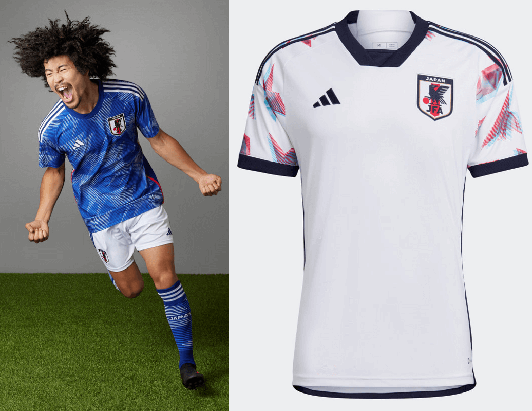
Primary: blue with origami-style light blue graphic print pattern
Secondary: white with red/blue origami-style print on the sleeves
Kyle: One of the best complete sets in the tournament. Great execution of a unique origami pattern.
CJ: Here is where the Adidas creativity shines, I think. Some good looking kits!
Spain
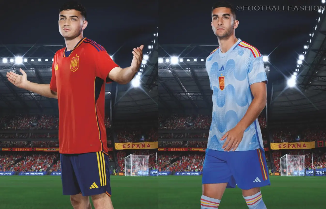
Primary: red with navy armpit panels and navy/yellow accents
Secondary: light blue with wave-like pattern and flag color accents
Kyle: That light blue jersey is real rough for me and the centered crest only makes it worse.
CJ: Not quite sure how those waves will look on the field but you know what, it’s an effort.
Group F
Belgium
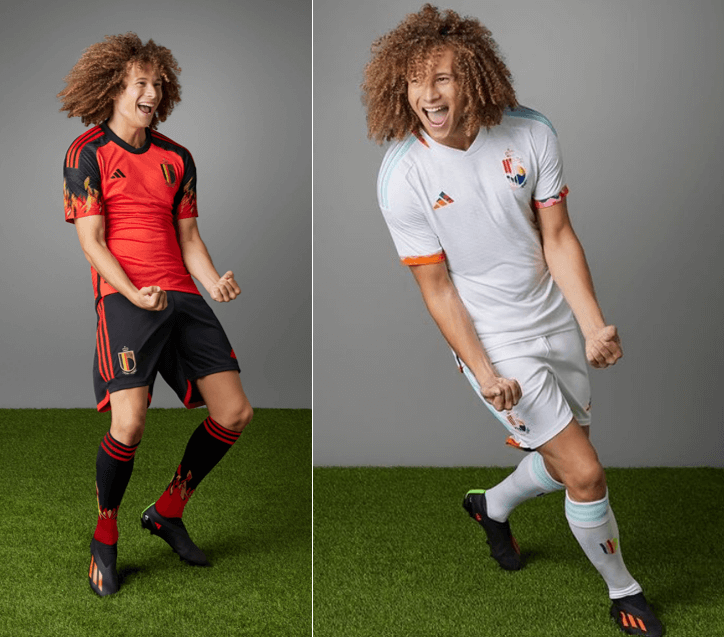
Primary: red with black sleeves and a flame graphic
Secondary: white with a multicolor trim done in collaboration with a music festival
Kyle: Love the flame design on the sleeves for the Red Devils and how the colors are perfectly coordinated.
CJ: Count me in on those red and black Belgian socks!
Canada
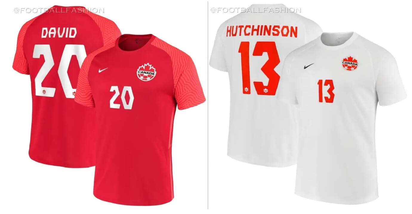
Primary: red
Secondary: white
Note that Canada is the only team without new kits for this tournament.
Kyle: Really unfortunate to not see new designs for a team that has certainly earned it.
CJ: Nike’s biggest crime and it isn’t even a design-specific one, it’s the fact that they didn’t design for Canada at all. A true shame for a country that hasn’t been to the World Cup in decades.
Croatia
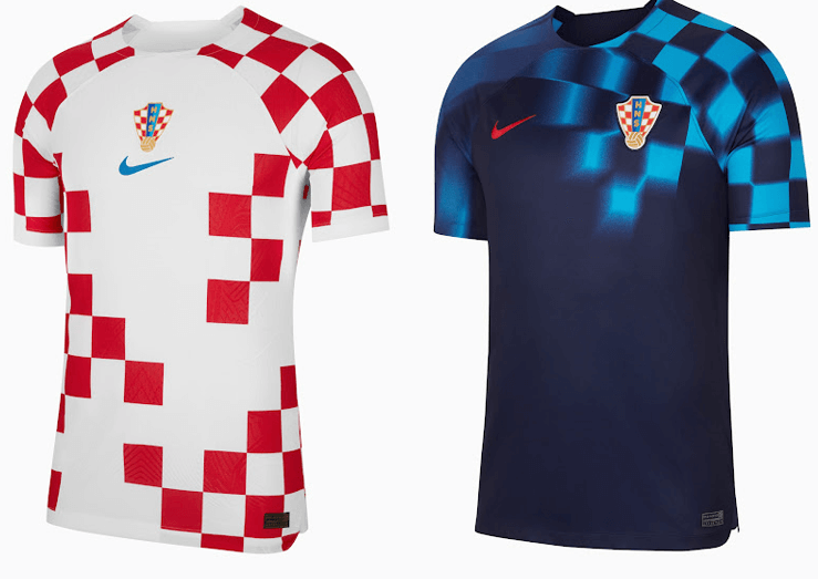
Primary: red and white checkers with some red checkers “missing”
Secondary: dark blue with blurred light blue checkers on left sleeve and chest
Kyle: Give me the full classic checkers, but the blue one is a unique take on it.
CJ: Croatia’s checkerboard is an instantly recognizable classic, but I’m not sure on the incomplete one. I strangely like the fading blue change shirt, though.
Morocco
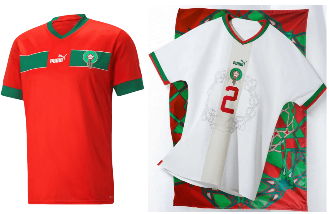
Primary: red with green sleeve cuffs and top horizontal stripe
Secondary: white with gray center vertical stripe, green/red accents, and “Puma shield”
Kyle: The subtlest of the Puma shields make the white bearable.
CJ: Puma shield aside, I like these!
Group G
Brazil
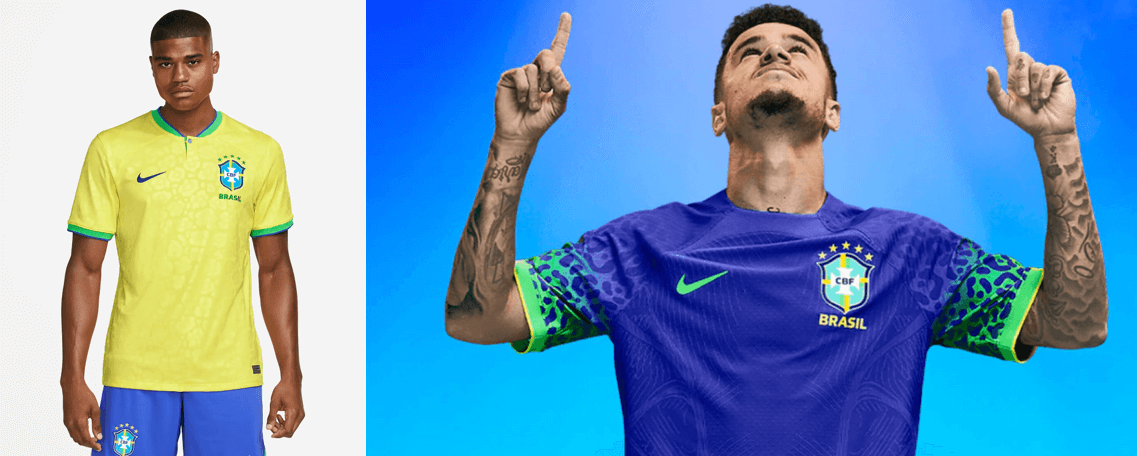
Primary: yellow with sublimated jaguar print pattern and green accents with blue shorts
Secondary: blue with not gradient jaguar print on the sleeves
Kyle: Amazing classic look and I’m genuinely torn on the jaguar sleeves, but lean towards being too busy.
CJ: Hard to go wrong when you’re Brazil, but as Argentina showed it is certainly possible, so let’s appreciate solid kits where we can.
Cameroon
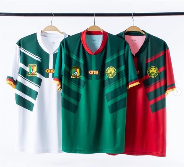
Primary: green with dark green armor-like pattern
Secondary: white with green armor-like pattern
Third: red with green armor-like pattern
Kyle: Very much not a fan of this particular design which makes the consistency unfortunate.
CJ: Coherent, lovely, everything you’d like to see in a World Cup kit in my opinion.
Serbia
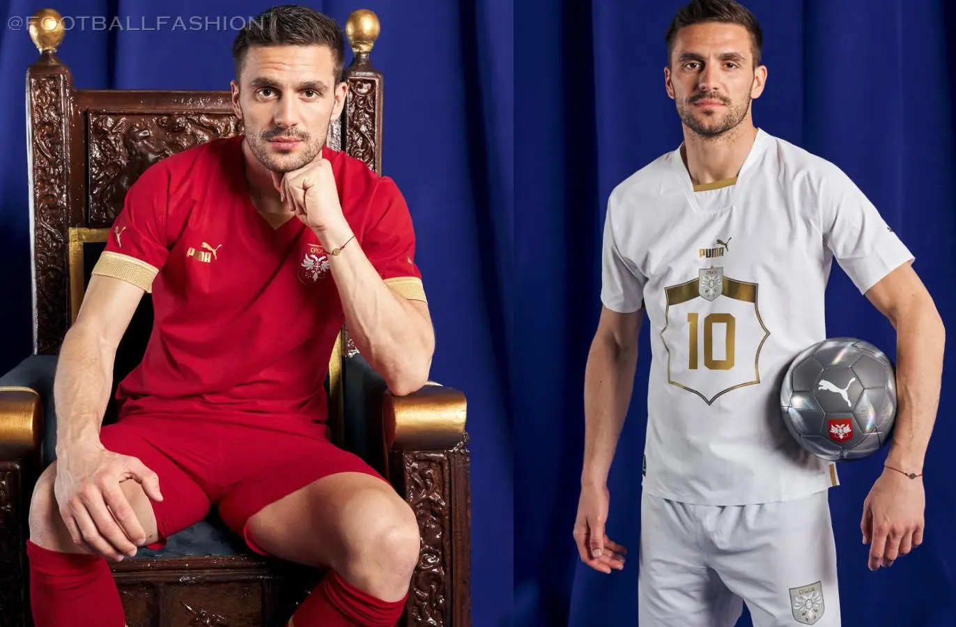
Primary: red with gold sleeve cuffs and accents
Secondary: white with centered gold shield to place jersey numbers
Kyle: Incredibly boring and the Puma shield doesn’t work here.
CJ: Puma shield is hit or miss, and this is a miss for me.
Switzerland
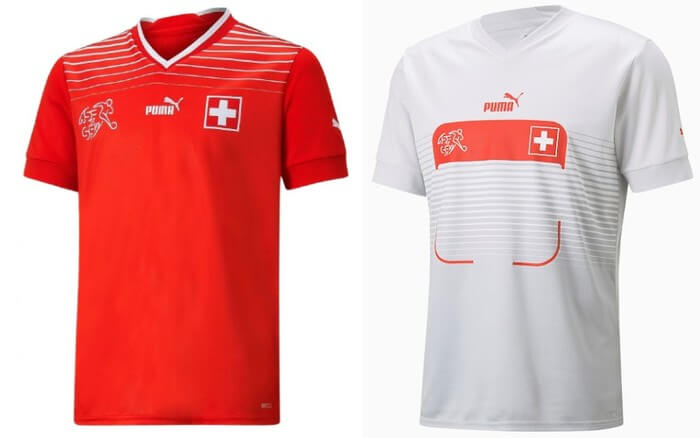
Primary: red with thin white horizontal stripes on the shoulders
Secondary: white with thin gray horizontal stripes and a number box
Kyle: Hello, my name is Dr. Kyle.
CJ: A big “yuck” to this number shield. Unsure what they were going for.
Group H
Ghana
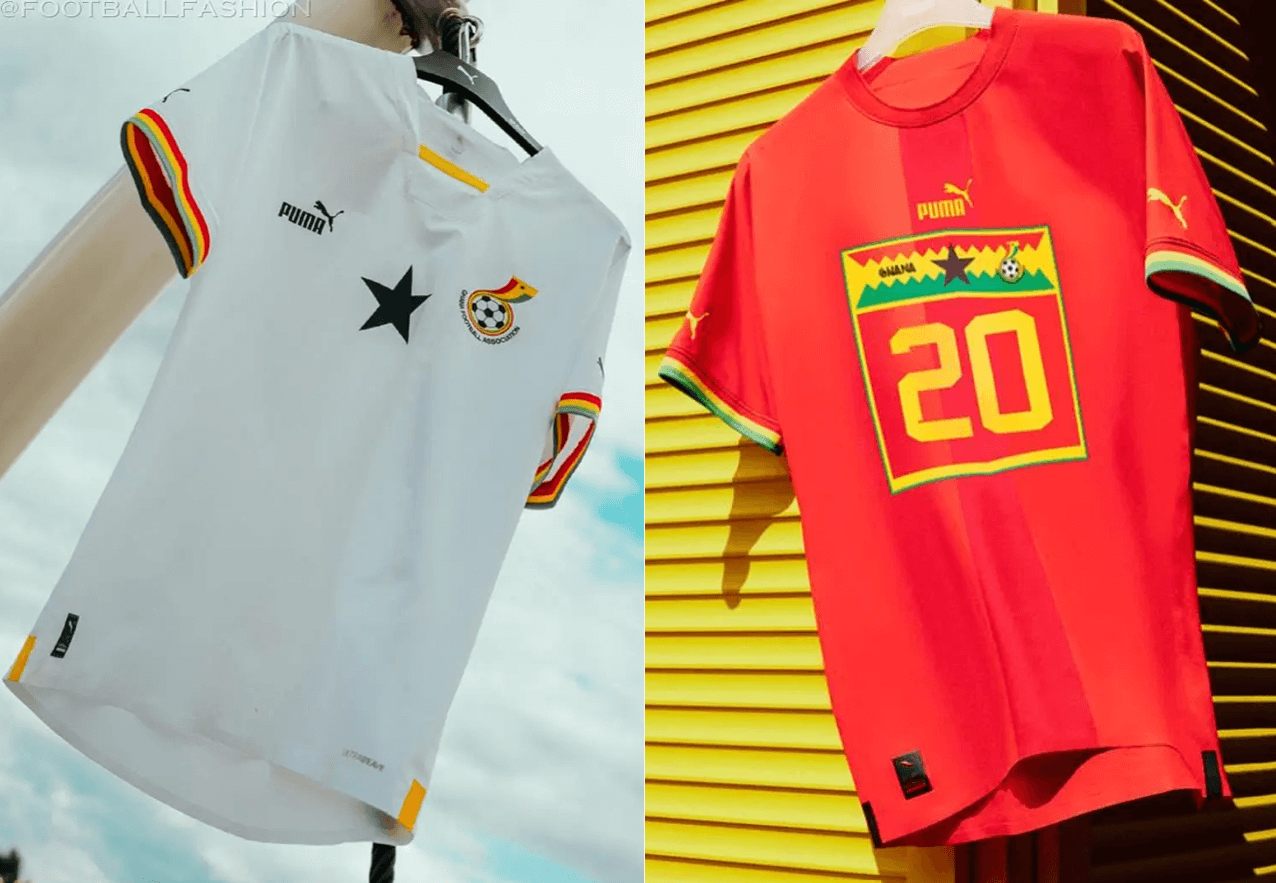
Primary: white with black star and red/yellow/green sleeve striping
Secondary: red with subtle red vertical stripe, red/yellow/green sleeve striping, and number box with flag colors, black star, and crest
Kyle: Beautiful white kit and there’s too many design elements in the top of the number box.
CJ: A crisp white kit accompanied by a startlingly awful Puma shield red kit. It’s a coin flip for me if this overall presentation is any good.
Portugal

Primary: red and green diagonal halves
Secondary: off-white with red/green horizontal chest stripe
Kyle: Beautiful designs and I love how the color ratio of the horizontal stripe mimics the flag.
CJ: Design elements you love to see. Big, big fan of these.
South Korea
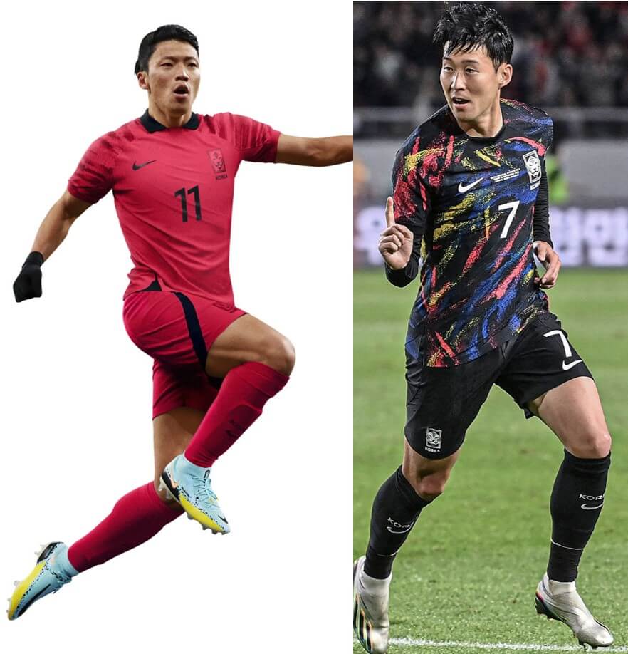
Primary: red with tiger-stripe sleeve pattern and black accents
Secondary: black with red/blue/yellow paint-like pattern
Kyle: A beautiful combination of simple and vibrant kits.
CJ: How can there be so many kits of interesting design paired with boring templates? Sometimes I don’t understand.
Uruguay
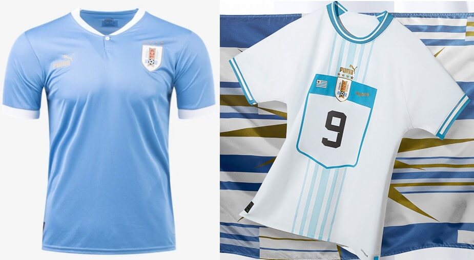
Primary: light blue with white accents
Secondary: white with thin light blue vertical stripes and number shield
Kyle: Stick to the simple primary look please.
CJ: Puma has gotten out of control, at this point.
Thanks, guys! OK readers. That’s the full set of World Cup kits for 2022. What do you think?
My favourite part of the Japan jersey is the yellow names and numbers on the back. It creates great contrast, so for someone that struggles with colours like me, it is very easy to see.
Canada has a third all black kit that isn’t included here, and it’s arguably their best one.
Absolutely not! That kit is BFBS, and I hope they left it home .
For me, Portugal has won the Kit Cup, by far
Portugal makes the Kit finals but loses to France in my bracket by a close 2-1.
Really like Japan both are good but not too busy. Swiss red jersey is excellent but the white is just terrible. Definitely “hi my name is” vibes.
Korea Secondary *chef’s kiss*
“Hello, you’ve reached the Canadian Soccer Association. Your call is important to us, please continue to hold and we will answer your call as soon as possible…”
We can see Nike’s treatment of Canada as a slight, or we can appreciate that by not getting new uniforms from Nike, Canada will be by far the best-dressed Nike team in Qatar.
As a Canadian I am okay with not getting a re-design for he world cup. It’s a nice simple design. I mean I am not even sure you can buy the shirt anywhere in Canada anyways. Just paly the games and see what happens.
Japan hoists the Kit Cup in a narrow win over Portugal. France and Mexico surely disappointed to just miss out on the final.