
Time for more Uni Tweaks from the UW readership.
I hope you guys like this feature and will want to continue to submit your concepts and tweaks to me. If you do, Shoot me an E-mail (Phil (dot) Hecken (at) gmail (dot) com).
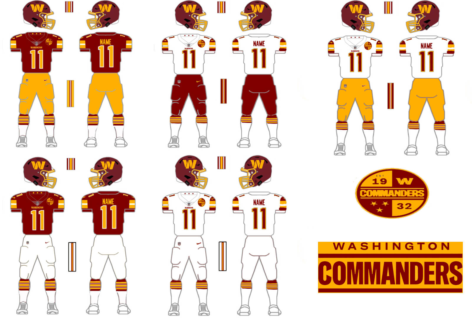
We a couple concepts and tweaks for the Washington Commanders today. The first comes from Neal Dorfman:
Good morning, Phil!
My shpiel: I’d obviously like to do something more drastic with the Commanders’ uniforms, but wanted to throw something together as a quick/temporary fix for some of the most glaring issues. Piping on the pants, more consistency with helmet and jersey, no more “broken” numbers or huge “Commanders” wordmark, less gradients and more solid colors. Hope some folks will enjoy.
Thanks!
– Neal D
Our next Commanders tweaks come from Morris Belleville:
Good morning Phil,
No matter how folks feel about the new Washington nickname, I think it is universally agreed upon that they dropped the ball on the new uniform set. Since the team seems to like them so much, I decided to clean them up and at least make them more presentable. Basically I took the home and road unis, made the team name much smaller on the home jersey, added shoulder numbers, way more yellow, removed the accursed black (And therefore no third is needed), and used a simplified universal patch vs. having different patches for home and road.
While I still think they would have been better off taking the new logo and using the previous uniform set, I think these would be way better than what they currently have.
Thanks,
Morris Belleville
OK readers (and concepters). If you have some tweaks or concepts, shoot ’em my way with a brief description of your creation and I’ll run ’em here.
Both are huge improvements!
The proof that less is usually more. Hard to believe a team this old would so dramatically change what they look like, regardless of the name change. I support the change of the name but the unis shouldn’t have made the franchise unrecognizable on Sunday.
These are both huge improvements over what they wear now. I still don’t know why they didn’t just slap the W or the crest on the old helmet and call it a day. The old uniforms were classic & didn’t need changing, just the name.
Ultimately the Cmdrs will adopt a uniform much closer to the Skins’ 1979 design, which was close to perfection. The uniform didn’t need fixing, the name did. I DO admit to liking the folded “W”.
Burgundy jersey, yellow pants. Perfect!
I am not fully convinced on the uniform concepts, but those red pants with the thin yellow stripe down the side (matching the helmet) MUST BE CREATED NOW!!!! They are fantastic. Washington…are you reading this???
Both are improvements but there is nowhere to go but up. I agree with those who said that the ‘Skins/WFT look was fine but the nickname was not. The new uniforms are a compilation of modern uni design failures.
I especially like the return of gold/yellow pants on concept #2. They obviate the need for white or burgundy pants and match well with home or road jerseys. I also prefer having the shoulder TV numbers to not.