
Time for more Uni Tweaks from the UW readership.
I hope you guys like this feature and will want to continue to submit your concepts and tweaks to me. If you do, Shoot me an E-mail (Phil (dot) Hecken (at) gmail (dot) com).
Hi Phil,
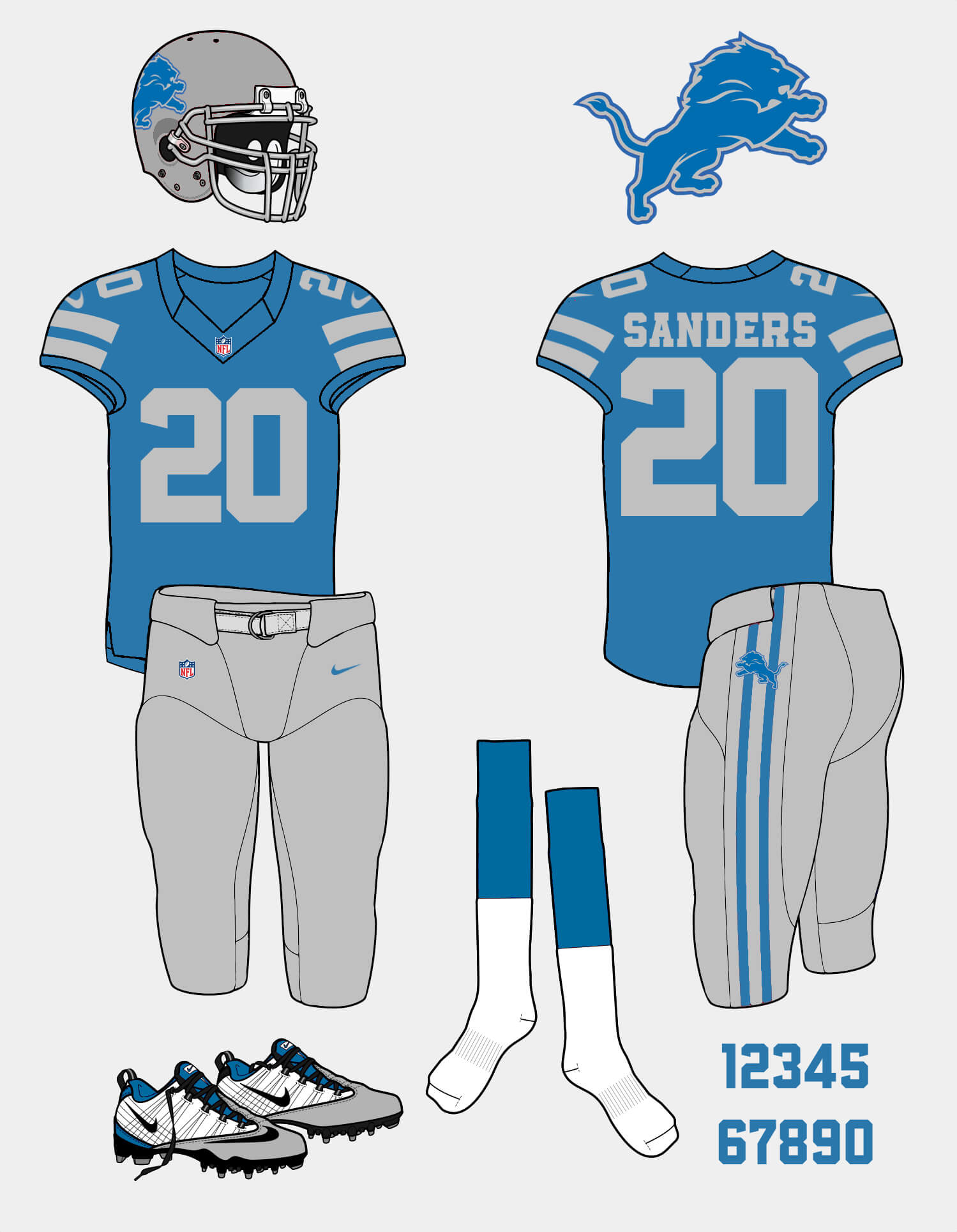
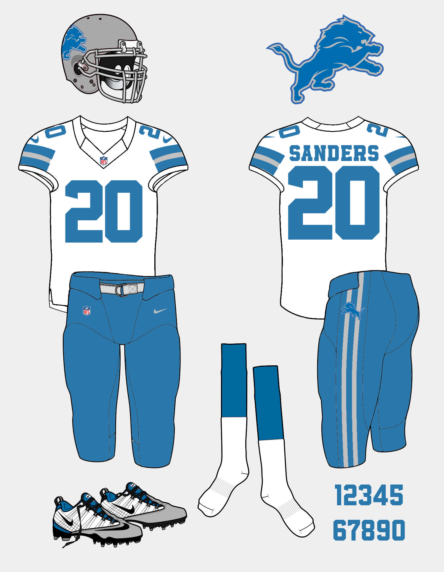
I have a concept that I would love to see the lions go for or at least something a little different. I think they were close to a slam dunk with the recent redesign although I can’t stand the number font (too slim and I can’t stand italic numbers on a uniform) and how busy the jersey sleeve stripes are. This design is a blend of the Barry Sanders era uniforms and the current throwback with a couple modern touches like the number font and the current logo. (Obviously I would want them to keep the throwbacks as a 4th set)
Cheers!
RJ Nordlund
OK readers (and concepters). If you have some tweaks or concepts, shoot ’em my way with a brief description of your creation and I’ll run ’em here.
No helmet stripes? Ugh.
love the lack of helmet stripes
NOB font looks huge, I’d say no block letters there. Also, the Lions colors are Honolulu Blue and Silver, not grey. If you’re gonna go without helmet stripes (which is a mistake as every classic era team should have them), go for a silver helmet and a white outline of the lion.
Add new team owners and you’re all set!
The color you’re referring to as grey is obviously intended to be silver.
Yeah it’s supposed to be the same shade as the Thanksgiving throwback silver. I love that design the most and went off of that as the base by adding the logo to the helmet and modernizing with sleeve and pant stripes and a modern block font. And I personally think that the way helmets are made now, stripes just never look right on anything other that those players that are still wearing the simple schutt helmet model.
I’d like to agree with you about the helmet stripe, but with the new helmet models they almost all look awful with all the holes and cut aways. I think helmet stripes will become a thing of the past, unless helmet designs significantly change.
NOB font probably is a little too big. Thankfully I’m just a fan playing around with illustrator and not a professional designer.
As a recent detroiter and lions watcher, my issue with their uniforms are that the silver and blue don’t contrast enough, and so the numbers and nobs are hard to read on the home uniforms. If they would get away from the modern number font and ad white outlines to the numbers I think it would look a lot better. the white makes the blue pop.
Felt this way as well, the silver and blue need a pop of white.
I never understood the obsession with helmets stripes. I’m fine with a stripe-less Lions helmet. But in would prefer more white on the home uniform. Maybe white numbers with gray outlines (okay, silver outlines for the nitpickers).
That said, it’s a nice looking concept. Definite improvement over the current set.
Your 2 almost looks as if was an upside down 5. Other than that, the concept looks good.
no WCF initials on the sleeves?
Thankfully no.
Thought about it…. NOT! Haha.
the uniforms they wore during Barry Sanders career were the best. Just go back to those and forget about all the rest.
Hard to argue this.
Yes plz! Also, the blue facemask of that era still looks better than the silver one. I was so glad they got rid of the black one, but silver only looks good on the plain classic helmet.
PRO: kept the colors; kept the logo; traditional design for a historic team; silver numbers on the home set.
CON: the helmet looks bare without stripes; while I like the emphasis on Honolulu blue and silver, the home and alternates are a little too dull without any white in the trim (pants stripes, NOB, etc.); the number and name font are close enough to Block Varsity, you might as well just use Block Varsity (the Browns make this mistake currently and the Dolphins more or less do the same thing; one weird angle or needless curve isn’t a “new bespoke font”, it’s change for the sake of change).
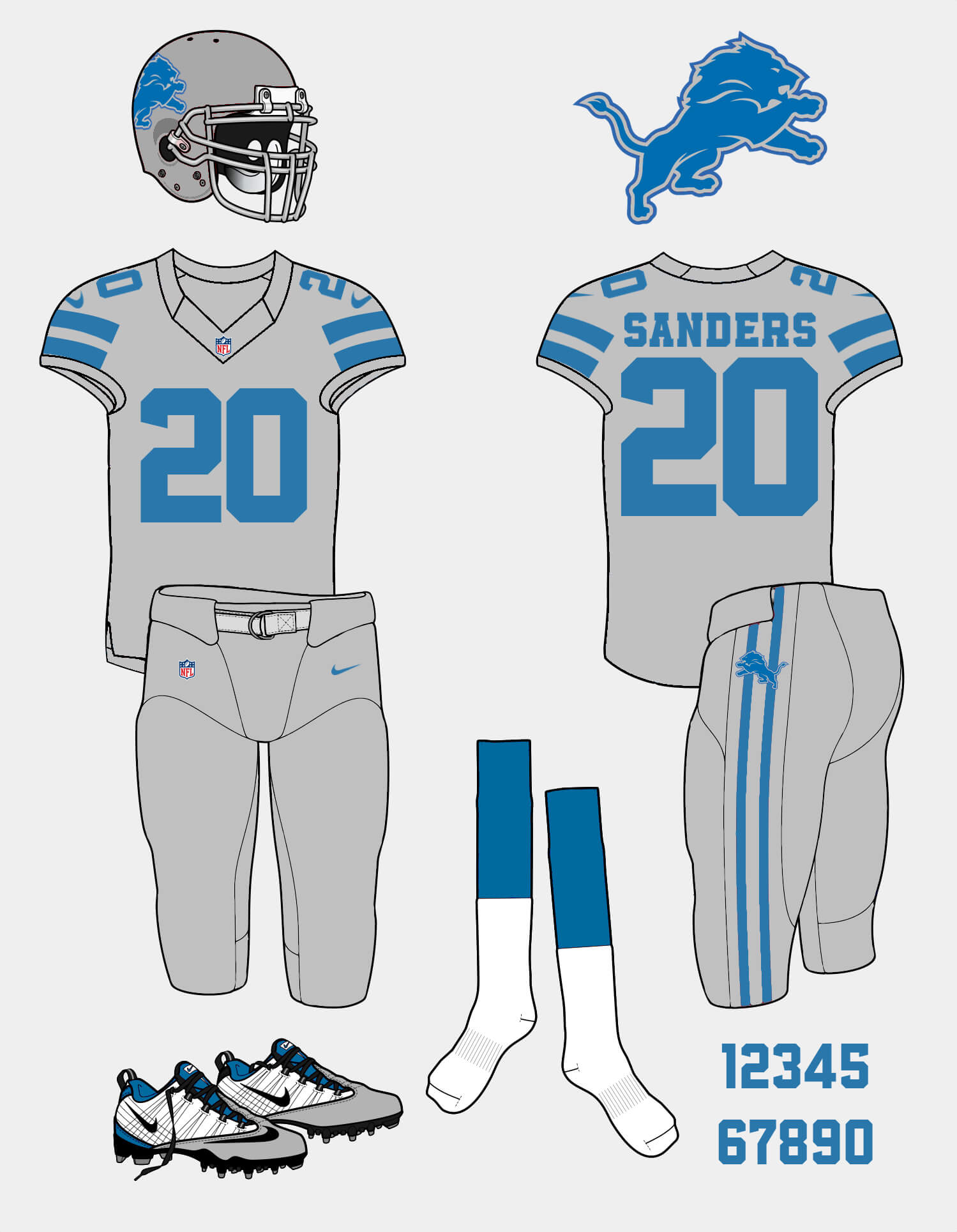
QUESTION: on the alt set, the jersey, pants and helmet are all metallic silver? Yikes, like giant disco balls…
In total, I like it but it could be more.
add a Honolulu blue face-mask, and these are great.
You’re right, don’t know why I didn’t think of that.
I actually really prefer the stripeless helmet. Didn’t know I felt that way until I saw this concept.
RJ,
Great tweaks! I’m OK with the stripe-less heImet. Although I would prefer stripes on the helmet with the silver on silver. It would add some needed color.
I even like the silver on silver look which surprises me. I’m not into the mono look. The best look IMO would be the silver jersey with the blue pants.
Scrap the grey… errr… silver uni and this is a winner.
I prefer helmet stripes but I’m not married to them.
I’ll take this concept (including the all-silver/gray uni) over what they have now. Great job!
Overall these are really nice. Well done.
I would like some white in the home & the alternate, those socks are going to really stand out if they are the only white in the whole uniform. Maybe white between the 2 silver sleeve stripes (like you did w/ silver between the blue on the road jersey) & white middle on the pant stripe (this may also help the lion logo on the hip stand out more).
Good work, but I have to echo Mic’s comment above – the white socks on the home and alternate look a little out of place when there’s no other white on the uniforms.
The numbers should be bordered in a white Stripe like the 90’s.
The Home Jersey would get the White Out line on the shoulders stripes.
Bring back the Honolulu Blue Facemask.
The Silver Jersey should be a blended Jersey between all elements of the lions eras. (Black some where to commemorate the Mega Tron Era, number font from the 60’s, pants stripes from the “Harrington Era” ; a true “Motor City Mashup”.