
[Editor’s Note: Paul is on his annual August break from site (although he’s still writing his weekly Bulletin column and may pop up here on the blog occasionally). Deputy editor Phil Hecken is in charge from now through the end of the month.]
A pleasant good morning to you, Uni Watch readers. It’s Monday. I hope everyone had a good weekend.
I’m joined today by designer Jonah Ward who’s got something that’s both fun and is a bit of a history lesson all in one: Jonah has examined a huge number of defunct NFL teams (and there were a LOT of them) and has designed uniforms for teams which no longer exist (some for almost 100 years), extrapolating a modern take on the old school gear worn by teams of yore. On top of that, he gives us a nice bit of a history lesson on those former teams in the process. This is just a taste of what Jonah has done, and I’m pleased to bring this particular set of “what if they still played” concepts to you today. I’ll have more with Jonah in the future too, but, for now, please enjoy …
NFL Defunct Franchises Resurrected: A Mini-series
by Jonah Ward
Did you know there are more defunct NFL franchises in its century-long history than there are in the league today? There are 49 teams that are no longer with us that existed between the 1920’s and the 1950’s. Before the advent of television, the NFL was in its wild west phase of teams coming and going, leagues merging together, and overall instability.
You might have heard of some of the teams that used to play in the NFL such as the Dayton Triangles or Canton Bulldogs. Some teams you may have never heard of. I took an interest in 14 of them particularly for their names and colors. I wanted to revive them and share my vision of how they would look had they have not folded.
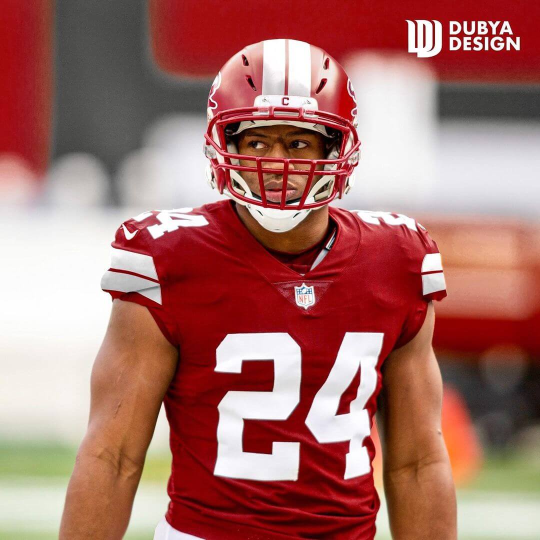
1. Washington Senators
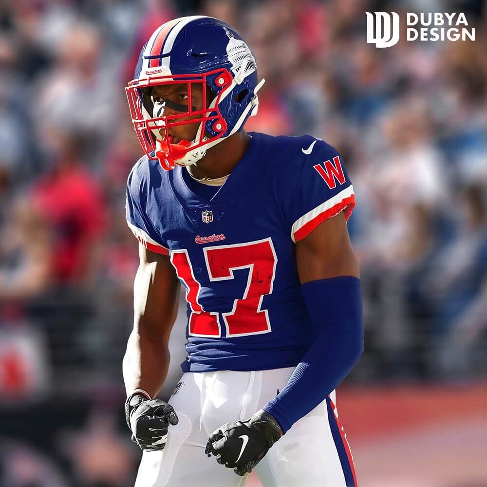
Up first we have the Washington Senators, who had just lasted the 1921 season in the NFL (APFA at the time.) They were named after the Senators baseball club from D.C. They donned a simple navy and white get-up, but I added in red. I borrowed the “W” and Senators wordmark from the multiple iterations of that team. For the logo/helmet decal, I simply used a basic illustration of the capitol building.
2. Pottsville Maroons
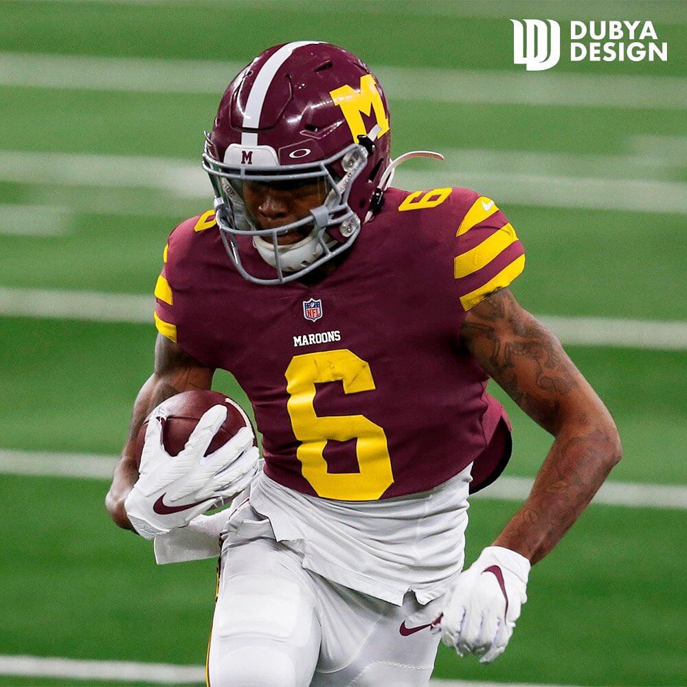
The Pottsville Maroons are the true 1925 NFL Champions, but the NFL stripped their title and gave it to the Chicago (now Arizona) Cardinals, who have been cursed for almost 100 years now because of it. They lasted from 1921-1929. For this uniform. I stuck to the basics. I stuck to the look of the 1927 uniform, I maintained the stripe pattern from their original socks and transferred it to the sleeves, solid yellow block numbers, and a Maroon helmet to match. I wanted this uniform to have a classic feel to it. It would’ve been cool to see another small-market team like Green Bay stick around.
3. Boston Yanks
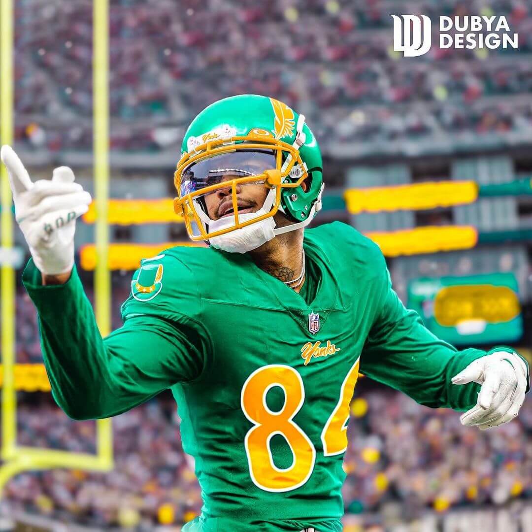
This team existed from 1944-1948 and played most of their home games at Fenway Park. Their color scheme was a homage to the Irish heritage that Boston is famous for. The team was pretty bad, but I liked their name and colors. For the uniforms I ran with the kelly green and gold, and kept striping and accents minimal for this one. The helmet is my favorite part, a glossy green look with a singular feather decal that is positioned to be sticking out from the yellow facemask. I did this as a reference to Yankee Doodle sticking a feather in his cap. The logo is an Uncle Sam cap in the team colors with the feather in it also.
4. Chicago Rockets
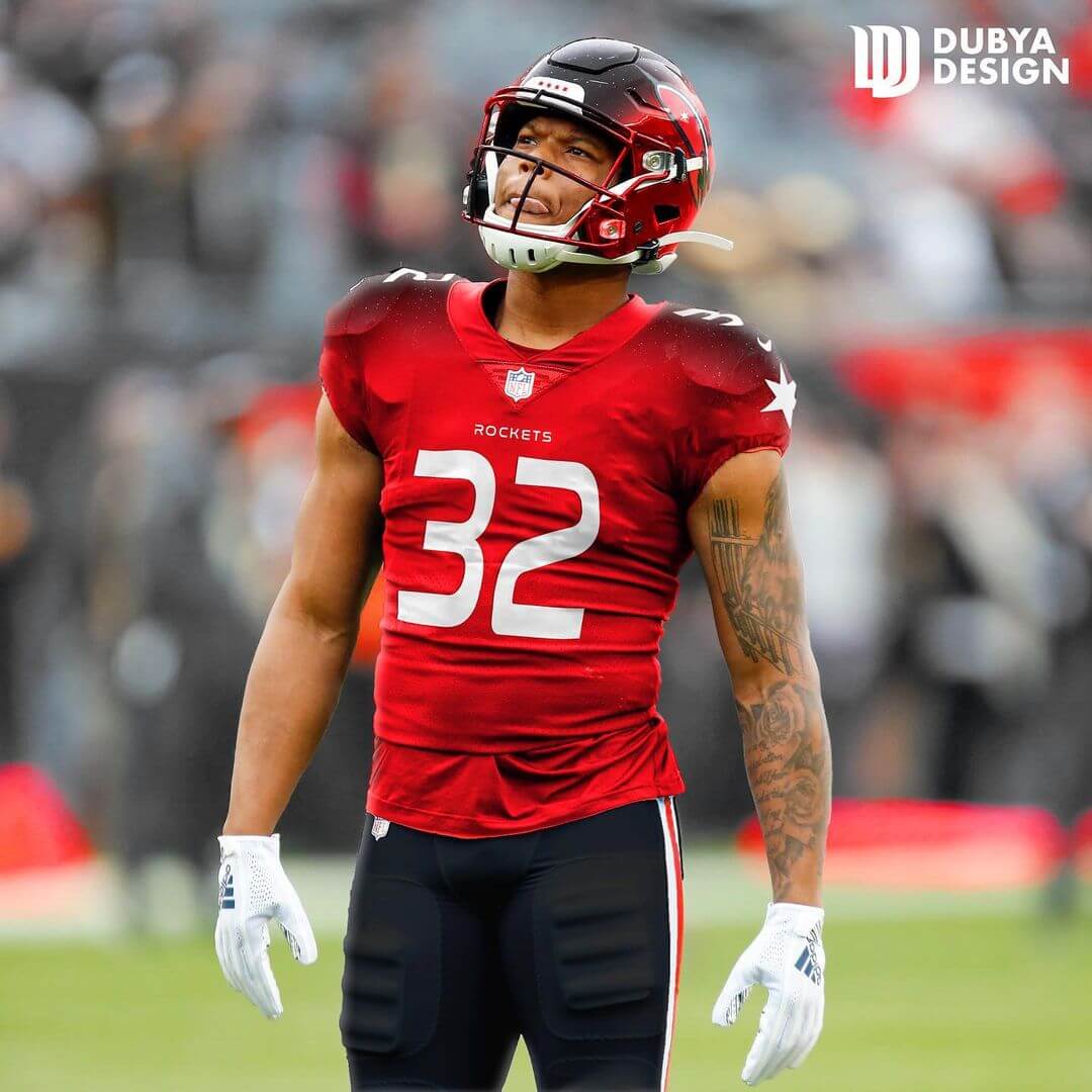
This Chicago Rockets were an AAFC team that existed from 1946-1949 and they played their home games at Soldier Field. The AAFC was eventually merged into the NFL, with the Browns and 49ers making the cut. For this team, I wanted to break the pattern of traditional uniform design, which I tend to prefer. For the fonts, I went with the famous NASA worm font. I created a sleek black, white, and red rocket logo for the helmet. I ran with a gradient seen on the shoulders and helmet that fades to a space background with stars, I wanted to fully capture the feel of space. I used the stars from the Chicago flag and put them on the sleeves and on the helmet bumper. Again, this one was meant to be more modern and wild than anything else.
5. Dayton Triangles

Perhaps one of the stranger team names, the Triangles were a team that originated in 1913 in Dayton, Ohio. They played in the first ever NFL game against the Columbus Panhandles. Their uniforms featured a distinct triangle on the chest, I wanted to keep it as a mainstay, so I opted for small chest numbers and sleeve numbers to do the work. We live in an age where HD tv exists, so this can work in my eyes. I put triangular patterning around the sleeves and down the helmet. I even modernized a logo of the Triangles mascot running in a Heisman-like position and made him blue with a Triangle head. You can see him on the helmet decal.
6. Muncie Flyers

Based out of Muncie, Indiana, the Flyers originated in 1905. I really liked the airplane theme of the team, so I picked them to be a part of this project. I kept it simple with block numbers, wings, and a matching stripe on the helmet. I put a vintage flyer plane as the helmet decal. I originally wanted to include aviator goggles on the helmet, but ended up scrapping it.
7. St. Louis Gunners
The St. Louis Gunners were a team that lasted only three games, taking the spot of the suspended Cincinnati Reds franchise in 1934. The St. Louis Gunners had a uniform and logo that were far-ahead of their time in my opinion. Their logo was a cannon over a shield and they had a beautiful palette of red, white, and blue. Their uniforms are almost like a mash-up of the Oilers and Patriots classic sets, but the Gunners predate them by almost three decades. I chose not to touch much on this uniform and simply opted to modernize it by moving the logo from the chest to the sleeve, adding numbers to the chest, and bringing the sleeve stripes to the helmet.
8. Duluth Eskimos
The Duluth Eskimos was a team that existed from 1926-27, they also played as the Kelleys from 1923-25. While they were the Eskimos, they became the first team to ever use a logo, which was a simple igloo. I know in real life, they would probably get renamed to the Duluth Football Team or the Duluth Demanders eventually, but I wanted to use the winter theme and igloo motif for this exercise. I added ice-blue to the team’s navy and white color scheme. The helmet features an igloo-block pattern and a D covered in snow. The igloo patch is featured on the chest and I featured a traditional Inuit pattern on the sleeve bands. I tried to really focus on the winter/igloo theme the most and that’s why I decided to run with this team.
9. Providence Steamroller
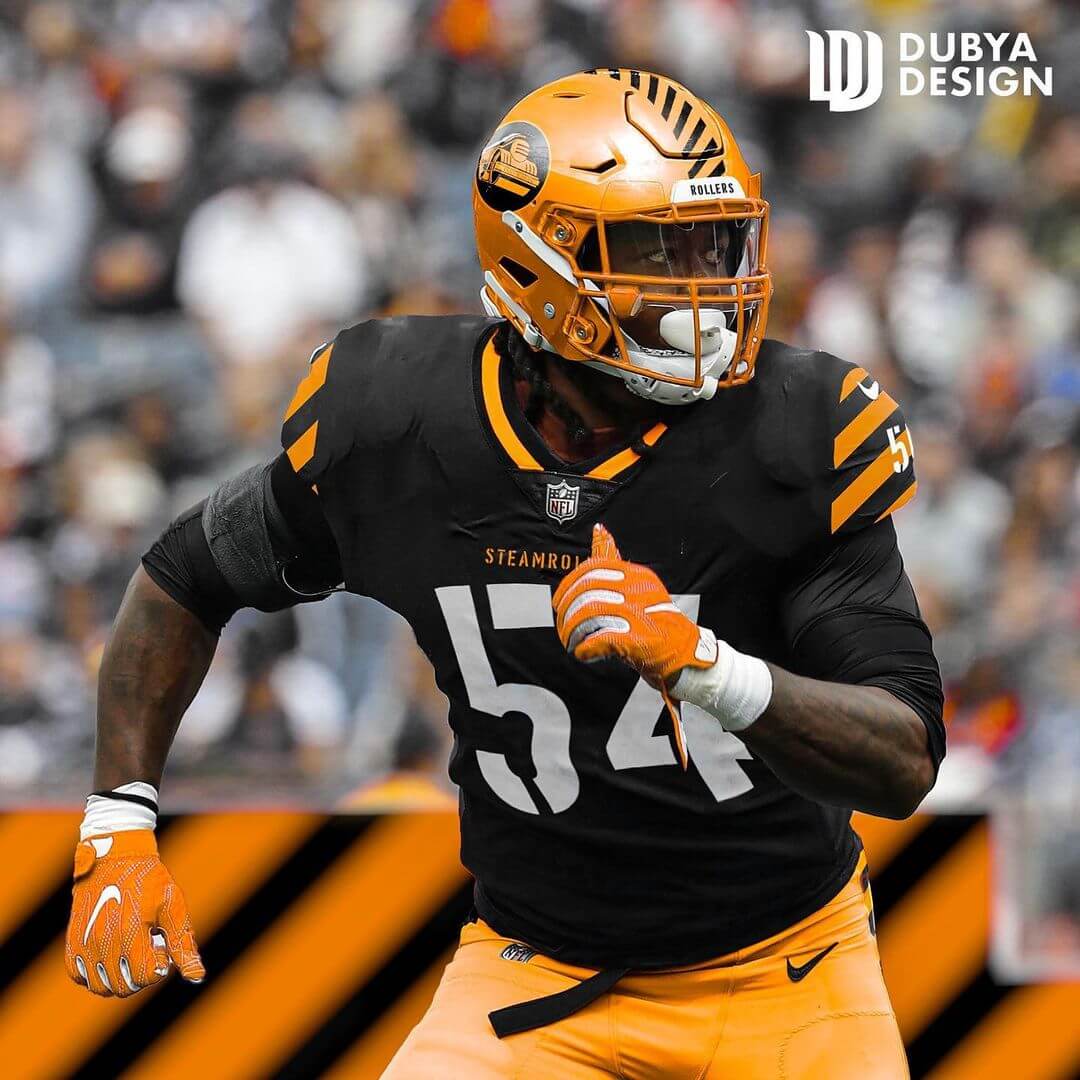
Before the New England Patriots, there was another team winning championships in the NFL. Having won the 1928 title, that makes them the last defunct team to ever do so. They lasted from 1916 to 1933. I kept their original color scheme of orange, black, and white, but made an effort to theme it around an actual steam roller. So I added the construction stripes to the sleeves and helmet and used a stencil font. I slightly modernized and recolored an old logo for the team.
10. Frankford Yellowjackets
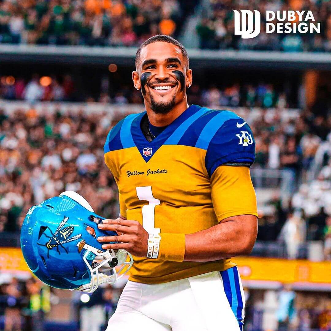
A lot of people are aware of this team because the Philadelphia Eagles took the field wearing the infamous 1933 throwbacks. That team is not the Eagles, they were the Yellowjackets. They pretty much folded and their equipment was given to the Eagles ownership group for taking on Frankford’s debt. I used all four of the team’s color combinations from its existence between 1899 to 1931. Navy, powder, yellow, and white. This uniform does not look much like a modern NFL uniform, but more of a homage to the early days of the league. I gave them shoulder stripes meant to vaguely resemble that of a yellow jacket.
11. Kansas City Blues

This team lasted one year as the Blues and later were renamed the Cowboys. I decided to run with the Blues since there already is a Cowboys in the NFL. The Blues were likely named after the literal color Blue, but Kansas City eventually became a major hub for Blues music during the Great Migration and the years following. So I made it music themed. One thing you may notice immediately is the music bars and notes on the helmet and sleeves. That music is actually the notes of Wilbert Harrison’s version of the classic song, “Kansas City.” It was originally recorded in 1952, but made popular later by the likes of Harrison, Fats Domino, and even the Beatles. To match the music bars, I used a font with thin lines as a drop-shadow accent. I changed the colors from a washed-out navy to royal blue to match the KC Royals. The blues font you see on the helmet bumper actually is the same font from the Fender logo. I wanted this to have quite a few easter eggs.
12. Orange/Newark Tornadoes
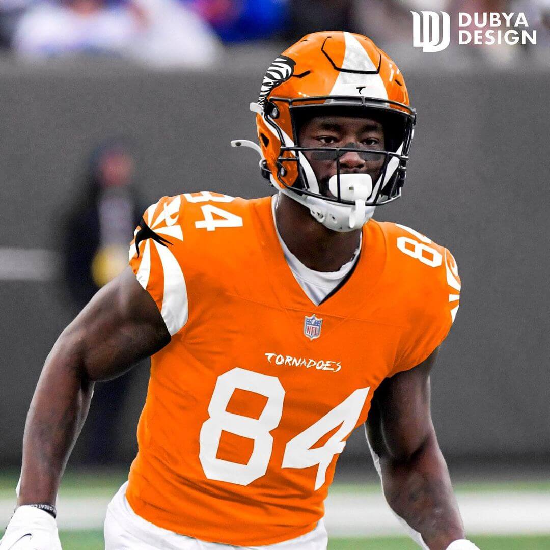
This team originated in 1887 as the Orange A.C. but didn’t make it to the NFL until 1929, they folded in 1930. I went with their Tornado name and stuck with their orange, white, and black color scheme. This uniform is more experimental than anything, I went with a twisty pattern on the sleeves because Tornadoes are called twisters. I made a “T” logo that is in the shape of a Tornado for the sleeves and helmet bumper. I stuck a funnel shape stripe down the middle of the helmet for obvious reasons. The logo is, well, a Tornado. Fun fact: this team did not use numbers on their uniforms, instead they used letters, like “H” to identify players.
13. Canton Bulldogs
Arguably the most famous defunct team, we have the Canton Bulldogs. I really wanted a classical feel on these unis. I used the dual stripe pattern from their uniforms and adapted it to fit the helmet and modern sleeves. I used simple block numbers and stuck their classic bulldog logo on the helmet. I hope Jim Thorpe would be proud.
14. Kentucky Colonels

Last but not least, we have the Kentucky Colonels. A team named for Kentucky’s famous colonels, they were Kentucky’s sole NFL team. I had a lot of fun with this one and even leveraged a real Kentucky Colonel to help me design this. The logo on the helmet is designed by myself and it features a laughing colonel wearing a hat. The patterns and knot you see on the sleeves, shoulders, and pants are seen on some actual colonel outfitting. I also included a bolo tie, some apparently do wear them, not just Colonel Sanders. The bolo tie is just a fun addition, doesn’t have to be there, but I think it would be hilarious to see those on 53 NFL players.
Thank you for reading about the NFL Resurrected project. If you would like to see the full logos, home and away jerseys, and helmets, please check them out on @DubyaGFX on Instagram and Twitter. It was a fun project for me and it involved a lot of research. NFL history is very fascinating and can become quite the rabbit hole.
Thanks, Jonah! That was quite the project, and I’m sure our readers will enjoy it as much as I have!
Readers? What say you?
These defunct team uniforms are very good, I actually like all of them. My favorite: the Bluesn the Eskimos and the Colonels. Those bolo ties will look even better on the white away jersey!
Maybe this is just something going on with my computer, but on the main page this story is out of chronological order. Friday’s story about sideline gear shows up above this one on the list, then after this story comes Friday’s story about the new Air Force uniforms.
Same
Should be fixed now. Friday’s post was “Sticky” (meaning it was designated to remain at the top of all posts); however, the “sticky” feature wasn’t working. I believe Ek fixed that, which is why it moved to the top, but I wasn’t informed the feature was fixed. I removed the “sticky” tag, so now everything should be working correctly. Thanks for pointing this out! We’re still working out all the kinks!!!
Jonah excellent article! Your concepts are better than some playing in NFL today.
Why would “Eskimo” be allowed?
CFL eliminated it and the NFL elimated Washington’s name.
If you read the blurb, he says that it would be something else like the defenders
Missed opportunity for Jonah to include Duluth Elks!
Duluth Lips…
…sink ships
Great stuff!
The Providence uniform is fantastic, in particular.
And having family in Pottsville for a long time, it’s great to see a nod to the Maroons.
I’d love to see the Maroons, Steamroller, Flyers and Gunners in the league today!
The 1988 New England Steamrollers were one of my favorite Arena League teams as well. Same great color scheme.
If the USFL expands and plays in the home cities, I’d like to see the Canton Bulldogs there.
Great work on all of these!
When I saw the tie on the uni I did literally LOL.
To be pedantic, though, I think that’s more properly called a string tie, and not a bolo tie. Any tie gurus are free to correct m, though.
As a fan of the Washington football team, I can get behind that mock-up, the new uniforms are so bad I wish they had stuck with the WFT ones.
Jonah,
Great project! Some of the uniforms (probably 1-8 or 9 are better them a lot of uniforms from the NFL. I’m from Indianapolis and I had no idea Muncie had any kind of high-level professional football team. I would rate the uniforms as:
1. Canton 2. Dayton 3. Duluth 4.Providence 5. KC
6. Pottsville 7. Muncie 8. Kentucky 9. Orange/Newark 10. Boston
11. Washington 12. St. Louis 13. Chicago 14. Frankford
Canton McKinley High School are the Bulldogs and they have a pretty solid logo and uni history as well.
link
Love that Canton concept, makes me wish they were still around
This is a really fun idea! Looking forward to more, and maybe from other sports too! #BringBackTheWhale
Strong concepts, well rendered. I really like the Bulldogs and Triangles.
This might be one of my favorite articles that you guys have put out in a long time…and you put out a lot of great stuff. The only thing I felt was missing were either more pics from different angles or preferably a style sheet (or whatever you call it) with the helmet and uniform designs to see them more clearly. Other than that, I found this extremely well done!
No Tonawanda Kardex? Lame…
(j/k it was awesome)
I can’t imagine that the NFL or the teams would ever go thru the trouble or the expense to do this, but how cool (but also confusing for the casual viewer, most likely) would it be if they did a weekend where every single team took the identity of a defunct franchise, complete with “what if they still existed?” uniforms to go with it?
Outstanding work by Jonah, great research, design, and graphics. Thanks to April for another great (superior) August.
April? Should read Phil!
LOL. With apologies to Paul Simon, I can call you Betty, and Betty when you call me, you can call me April…
You forgot about the Rochester Jeffersons. I’ve made several electric football teams dedicated to them.
As a Rochesterian, I was having that same thought!!! Twice a week I drive past Jefferson St. in downtown Rochester (The team took their name from the fact that they played their games at a park on Jefferson Street), and think about the fact that Rochester once had an NFL team!
Bring back the Staten Island Stapes!
How could you not do the Racine Legion? Lots of great options with that nickname.
Technically, the Chicago Rockets existed from 1946-48 and the Hornets were a new organization.