[Editor’s Note: Paul is on his annual August break from site (although he’s still writing his weekly Bulletin column and may pop up here on the blog occasionally). Deputy editor Phil Hecken is in charge from now through the end of the month.]
Good morning Uni Watchers!
I’m once again joined by UW stalwart Walter Helfer, who returns this time to take an intricate look at the Major League Baseball teams who sported pullover jerseys, which became de rigueur once baseball began to change from wool flannel uniforms to polyester. If you’re of a certain vintage, you may look back fondly upon this time. For the rest of you, it may have amounted to a “what were they thinking” period. It’s funny that Walter has undertaken this lookback, as I’ve been working on a piece (which should run later this month), where I argue that one of the seminal moments in baseball fashion occurred just at this time. But that’s for later. Now…let’s take a look at Walter’s…
Greatest Hits of the MLB Pullover Era (Part I)
by Walter Helfer
I began following baseball in the ’70s, a singular age in professional sports where experimentation and color triumphed briefly over tradition. Of baseball’s 30 teams, 23 wore pullovers and I rank my favorites from worst to first.
#23. 1977 New York Mets

Why they’re great: The first time we get to see blue-orange-blue trim. It looks nice!
Why they’re not: Everything else: Henley shirts look like underwear, drab belts rather than colorful Sansabelts (or cummerbunds, if you prefer), no “NEW YORK” on the grey road uniforms, and the team played like crap.
#22. 1978 Minnesota Twins

Why it’s great: Vertically-arched player names in red; snazzy! Fun sleeve patch.
Why it’s not: Pretty much a contemporary St. Louis Cardinals’ uniform, only with poorer detailing. Road blues would have been better in grey. They made the navy blue details look plain black.
#21. 1977 Texas Rangers

Why it’s great: Fat stripes emphasize the “Things Are Bigger In Texas” trope. THOSE HATS. Spiffy “Playbill” chest script. Player names in crisp Full Block which matches the unique Rangers’ number font.
Why it’s not: Henleys still look like undershirts.
#20. 1976 Detroit Tigers

Why it’s great: Fantastic detail on two-color “D” on the cap. Vertical arching. Those amazing stirrups.
Why it’s not: It is literally the ONLY Tigers’ pullover, winning by default. Itty bitty player numbers. Doesn’t match the home uniform.
#19. 1975 Atlanta Braves

Why it’s great: White raglan sleeves pair well with white-paneled hat. The feathers. Three-color graphics.
Why it’s not: Where’s the Sansabelt? (On the 1980 uniform, of course.
#18. 1979 Baltimore Orioles

Why it’s great: White-paneled hat commands attention, even with loud jersey. Same colors as an actual oriole. Orange stirrups.
Why it’s not: Participation trophy- It is also the ONLY pullover jersey for Baltimore. My color blindness sometimes made the shirts look red.
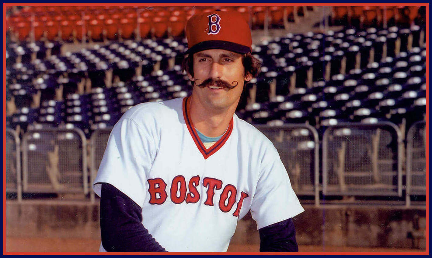
#17. 1975 Boston Red Sox

Why it’s great: The McAuliffe number face. White and navy stripes on the red stirrups. Navy undershirts.
Why it’s not: Unfinished-looking sleeves. Dark “B” on the red hat is underwhelming.
#16. 1981 St. Louis Cardinals

Why it’s great: Jazzy hat, fun stirrups, red birds on an unbroken bat. Crew neck dropped in favor of widow’s peak.
Why it’s not: All that stuff makes it a tad busy, especially when you consider how balanced the uniform is in 2022.
#15. 2012 Tampa Bay Rays

Why it’s great: A giddy uniform by a team who doesn’t care that it didn’t exist during the pullover era. Excellent working of the team’s color scheme into a retro design.
Why it’s not: “Hey, that’s just the Padres in blue!” Where’s the Sansabelt?
#14. 1983 Chicago White Sox

Why it’s great: Crisp and imaginative; splashy graphics. Unique sleeve stripes.
Why it’s not: Yet another red shoe team? Road cap is better than the home cap.
#13. 1977 Kansas City Royals

Why it’s great: Look at how high the chest script is; it looks really cool. When player names were added, they were rendered in a beautiful vertical arch.
Why it’s not: The pastel blue is confined to the road uniform.
#12. 1977 Chicago Cubs

Why it’s great: Beautiful numerals; cute teddy-bear patch. American-flag color scheme looks great in the Chicago sunlight.
Why it’s not: Solid blue stripes on sleeves and Sansabelt look klutzy.
#11. 1989 Cincinnati Reds

Why it’s great: Careful detailing improves on Plain-Jane “Big Red Machine” duds. Black shoes banished. “CINCINNATI” written in vertical arch.
Why it’s not: Front of home uniforms always seem incomplete.
Thanks, Walter! Great stuff as always. Walter will be back with his Top 10 Greatest Hits of the Pullover Era soon.
Just one small quibble…the Mets started wearing the henleys in 1978…not 1977.
Oops.
The Orioles had other pullovers besides the orange. Also, I think you meant the 1982 Cardinals based on the photo (with black memorial armband)
First thing I thought of was the 1993 black pullover the O’s wore
Really? Don’t remember that one. I still like the 1979 ones better.
I wanted to be sure NOT to show the heinous 1979 jerseys, with their sleeve numbers.
Would love to see some of the NOB fonts that were referenced but not shown, but I realize it might not be possible. No quibbles with the list either thus far. Strong work!
I didn’t want to lean too hard on my Bill Henderson guide. I was hoping to find examples in the wild.
This is the best era of MLB uniforms. The pullovers look fantastic, and beyond aesthetics, are functional. Disagree all you want, but can we really explain button up shirts/jerseys? I mean, are we playing sports or going to dinner? Can you imagine NFL players buttoning up their jerseys around a set of shoulder pads? The pullovers are perfect. This is what baseball uniforms should look like.
Why show the Reds second iteration from the 80’s instead of the better Big Red Machine version? For the Mets why show the original pullovers and not the racing stripe version? If you want New York there are the ‘87 roads. It seems like this was a rigged attempt to choose the uniforms you liked least for teams that you don’t care for. Or something is missing from the setup to the piece.
I kind of agree with this, especially with regard to the Mets. Those racing stripe unis were probably my favorite non-Pirates uniform of the era when I was a kid.
Imagine caring this much about someone else’s list.
Not everyone likes the racing-stripe Mets’ uniform. And I have gone on record with my pathological hatred of the Big Red Machines’ uniforms.
And I am a Mets’ fan. The 1987 script would have looked nice on the 1978 jerseys, as would a V-neck. But it would have to have been rendered in the blue/orange/blue color scheme.
Would have enjoyed this more if there were more and better pictures. There are many descriptions of things that have no pictures associated with it.
Any predictions for #1? I’m guessing the Clemente-era Pirates’ pullovers…
As a VT alum I’m more embarrassed by that uniform than I am the score! Well, it’s close at least
A few random thoughts:
I really hate that Rangers font. I guess it’s supposed to look playful? To me it just looks chaotic and haphazard.
It’s not your color-blindness. Those Orioles unis were pretty far on the red side of orange – incidentally, well away from the shade of orange worn by an actual Baltimore Oriole: link
This has probably been said a million times by a million different people, but I’m definitely one of those folks who sees the Cubs’ logo as “UBS”. Of course I know the “C” is there intellectually, but it just doesn’t jump out at me. Kinda ruins the logo for me.
It’s not helpful that the Reds’ home jerseys say “CREDS”, playing by the Cubs’ rules.
What about the SF Giants?
Don’t ask why, but I literally watched a 1979 game of theirs on YouTube, they were wearing orange pullovers against the Expos.
Lee
Link to the game: link
Oh, I missed the “Part 1” mention. Oops.
Lee
Does the fact that the Astro’s tequila sunrise and the White Sox beach blanket styles have inspired so many other uniforms weigh anywhere in the rankings? These styles (whether you think they are good or bad) broke new ground. The rest of them are just kinda copies of prior uniforms.
I learned that I liked each and every uniform to some degree. Some favorites didn’t make the final list, because the team had a uniform I liked slightly more. The Mets, Royals, Braves, and Cubs were examples.
Cannot wait for the top 10, although I prefer the button up. To me a Henley is a hybrid between pullover and button up and does not really count as a pullover, but a very nice article! My favorite: gold A’s en tequila Houston home.
To don a henley, do you need to pull it over, or button it up.
Its a pullover.
Lee
When Don Henley dons a Henley, does he get confused? :-P
Walt thanks! Enjoyed it!
I enjoyed writing it!
The Rangers pullover had “RangerS” on the front. Apparently the owner, Robert Short, was such an egomaniac that he wanted his initials in capital letters.
It certainly had an effect on the “RockieS”.
Why did Puma stop making baseball shoes? They always looked great on the stars of the 70s and 80s. They should get back into baseball.