
Time for more Uni Tweaks from the UW readership.
I hope you guys like this feature and will want to continue to submit your concepts and tweaks to me. If you do, Shoot me an E-mail (Phil (dot) Hecken (at) gmail (dot) com).
Hi Phil!
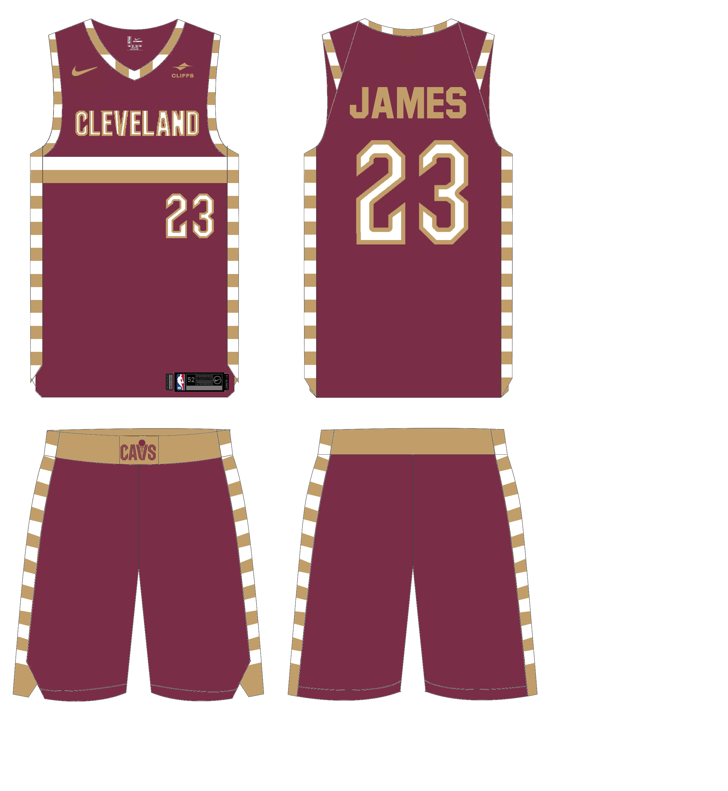
Like most, I was underwhelmed by the recent redesign of the Cleveland Cavaliers, so I wanted to take matters into my own hands and redesign them in a way I thought worked well with the direction Daniel Arsham and the Cavs’ creative team were going.
Icon (wine)

I added striping to the chest and sides of the jersey inspired by 1974-1981 uniforms (sides) and 1981-1983 uniforms (chest). I also made the detailing inside the numbers and chest letters white to pop a little more, fitting better with the white uniform which already did this. For the pants, I continued the striping, made the waistband gold for contrast, and made the waistband logo wine for the same reason (why even have a waistband logo if you aren’t able to see it?)
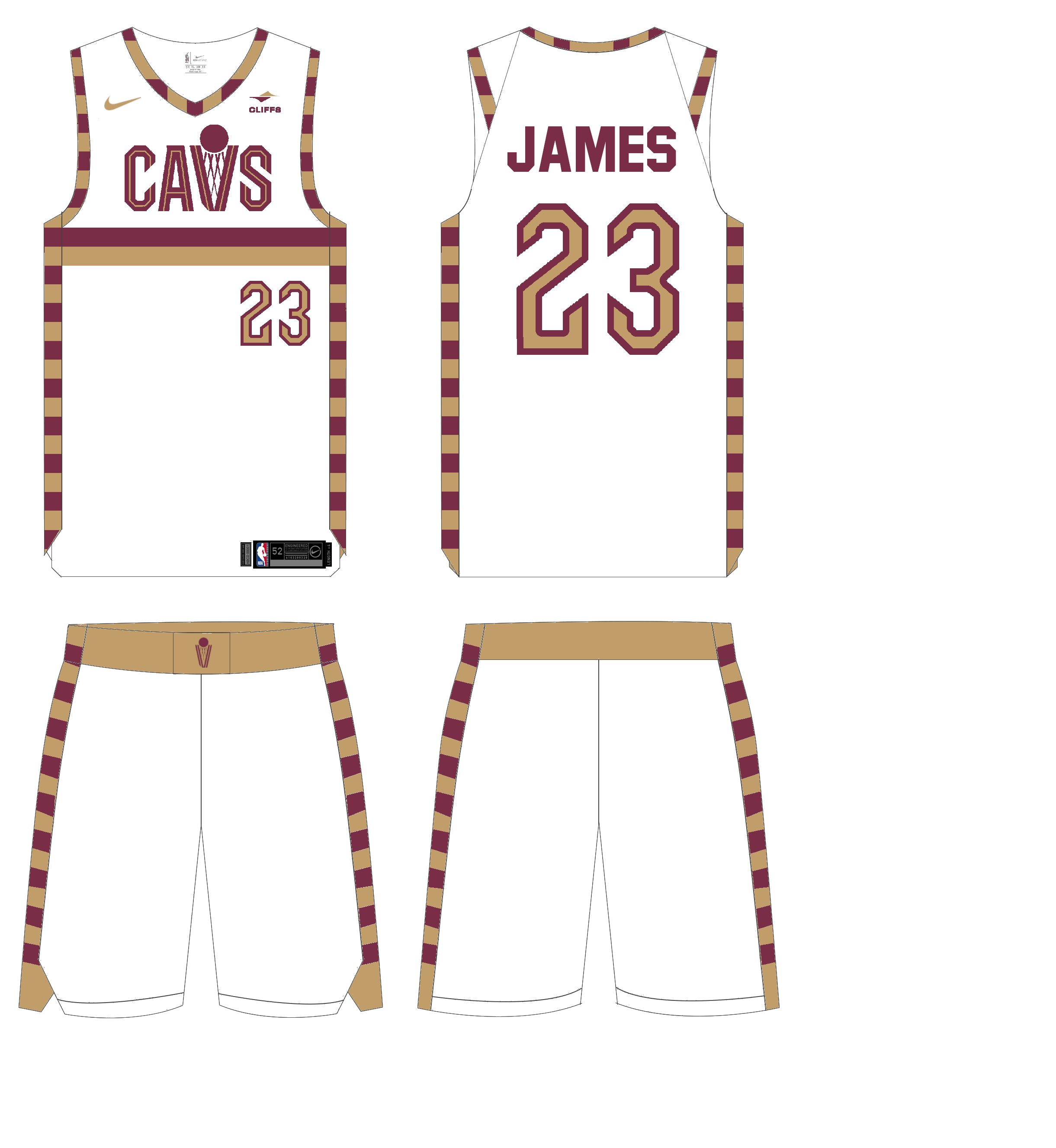
Association (white)
This one went fairly unchanged once I added the striping. The only real change on the jersey is that I made the sponsor’s logo wine and gold on this one as well to match with the wine and black (and because I at least feel like the sponsorship is slightly less egregious if you put it in team colors. I still hate it, but if we must sacrifice, at least make it a little less noticeable.) For the pants, I continued the striping, made the waistband gold for contrast, and made the waistband logo wine for the same reason.
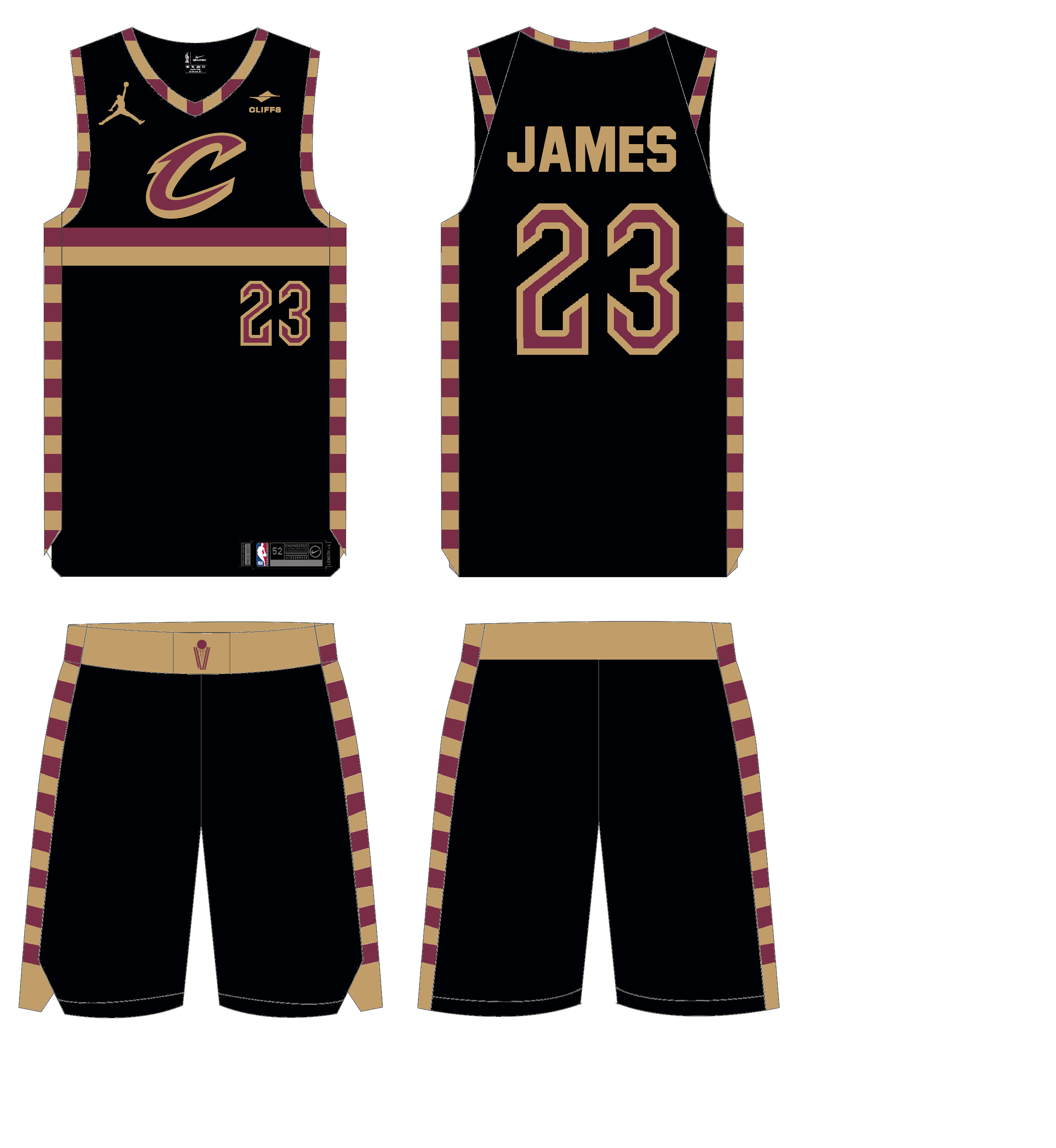
Statement (black)
I didn’t change much with this one either after adding the striping. The only change on the jersey is that I made the detailing inside the numbers wine to stand out. This was similar to what I did with my wine jersey. For the pants, I continued the striping, made the waistband gold for contrast, and made the waistband logo wine for the same reason.
I am not an NBA guy normally and I’m also not from Ohio (although I do try to claim it since I was raised there for nine months and I like Ohio better than Michigan—my actual home state), so I am very interested in hearing the thoughts of the comm-Uni-ty as a hole, but Cavs fans in particular.
Thanks for all that you and Paul do!
Ian Lee
The suggested Cavs’ tweaks are a thousand percent better than their actual new uniforms.
Agreed
Thanks Patrick and superfly! Glad you like them.
I am inclined to dislike basketball uniforms with proprietary fonts and numerals; too fussy, too aggressive. All of Cleveland’s discarded uniforms would have been improved with block letters and octagonal numbers.
Do many ppl hate the black Cavs jerseys (any black Cavs black jerseys) with the giant C on them or is it a case of being hip to hate on them?
Disclosure: I don’t like them.
I actually don’t like them much either, but for the sake of not making things too insanely different, I kept them.
Good question, but I think that C logo is just so uninspired that the hatred is warranted.
I’ve never met a BFBS Cavs uni that I liked. And as Phil can testify, I’ve never been accused of being trendy. Don’t get me started on how angry I was during game 7 of the 2016 Finals.
These wine and white concepts, on the other hand, are spectacular. Without the swoosh and ad, and with a standard number font, they’d be even more spectacular.
Not a Cavs fan but I don’t like BFBS in general. However, they won a title in them so it will be hard to fully move on from them.
These concepts are an improvement in every way. Wine and gold worked for the Cavs and was unique to them.
Those horizontal stripes make it look like a sports bra. Other than that, good job!
A site that has railed against ads on uniforms now routinely features concepts that have uniform ads.
Putting ads in concepts is an insidious form of free advertising for those companies and helps to normalize such ads. They add nothing to the concept
The current unis are such a low bar.
These aren’t that good either. Mashups are so hit or miss, and these miss.