For all photos, click to enlarge
Good morning, happy July, and happy Canada Day to our neighbors to the north!
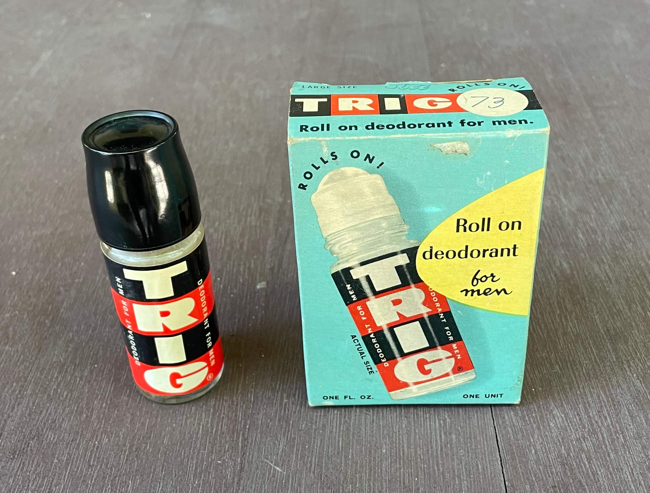
As we ease into the holiday weekend, I want to show you this fun vintage item I recently scored. It’s now displayed in the Uni Watch HQ bathroom. Such a cool design! Here are some additional views:
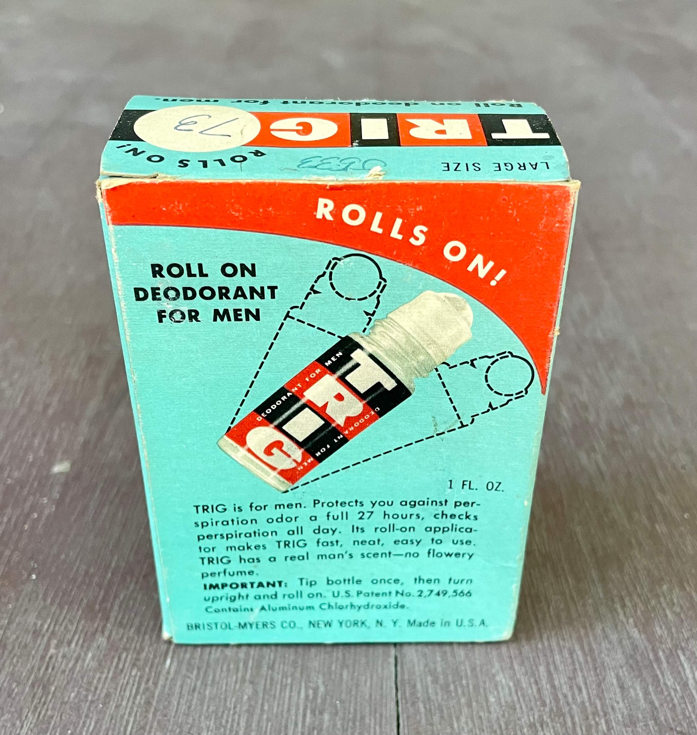
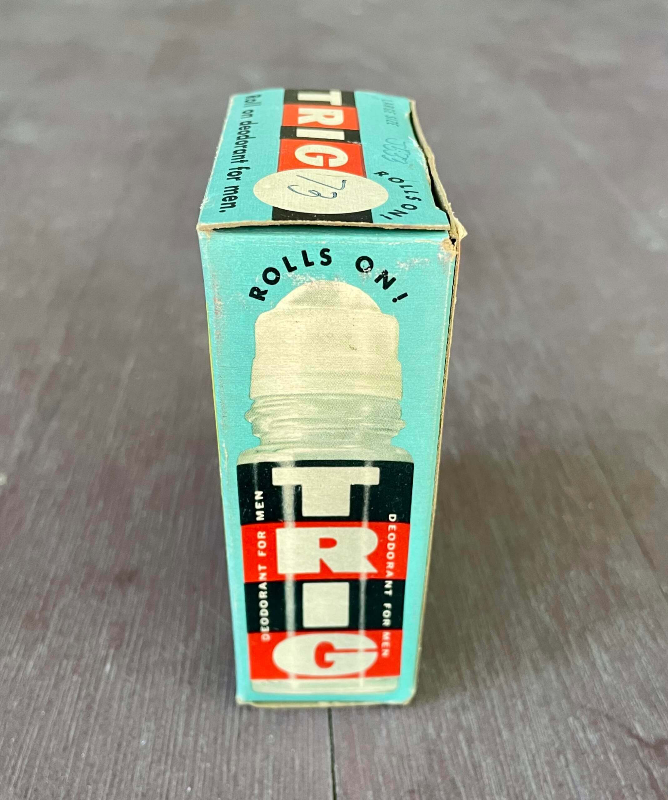
I’d never heard of Trig before, but Bristol-Meyers apparently made a big push for it in the late 1950s and early ’60s. (Here are some print ads they ran at the time.) At some point they apparently changed the cap color from black to white.
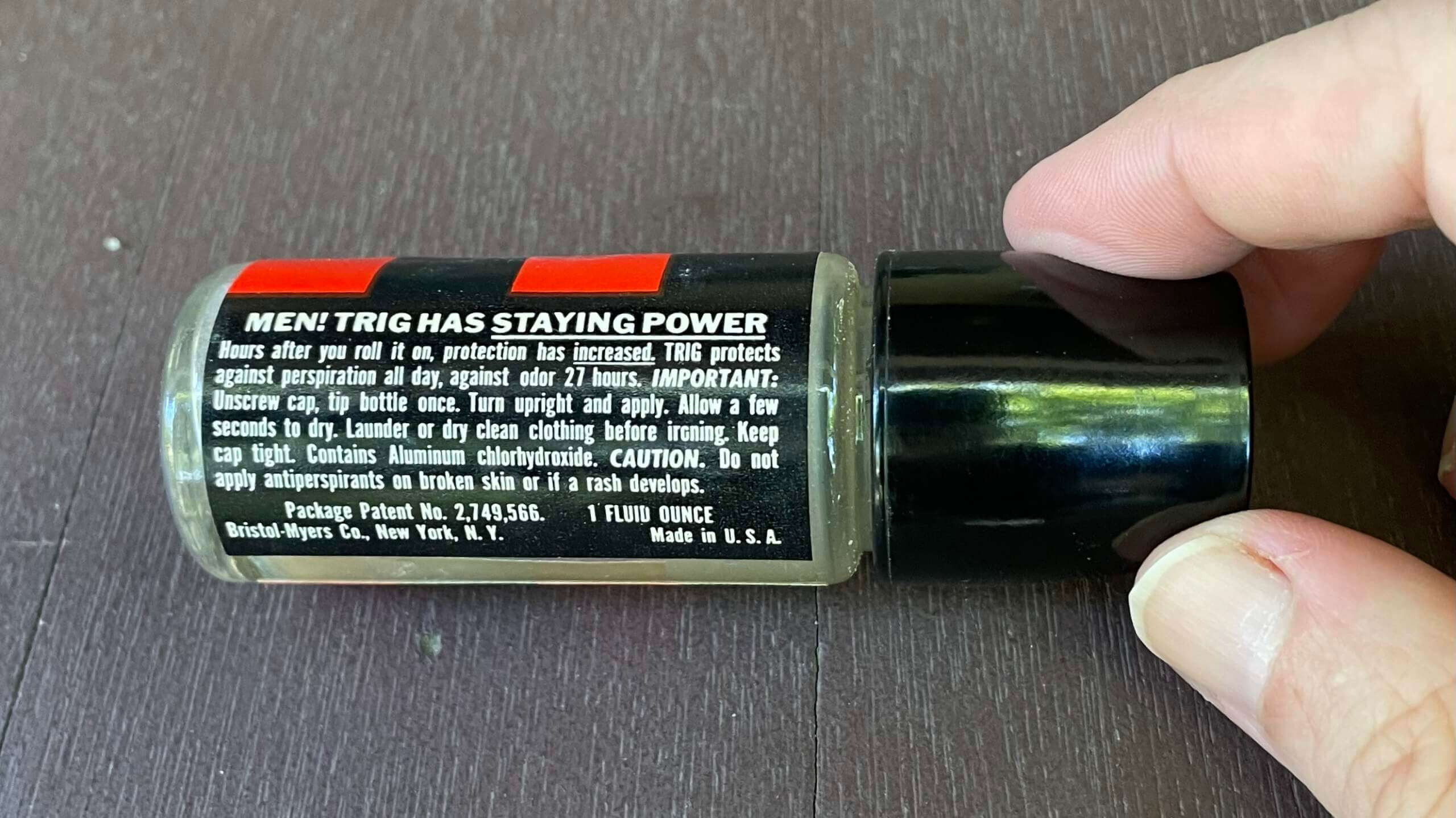
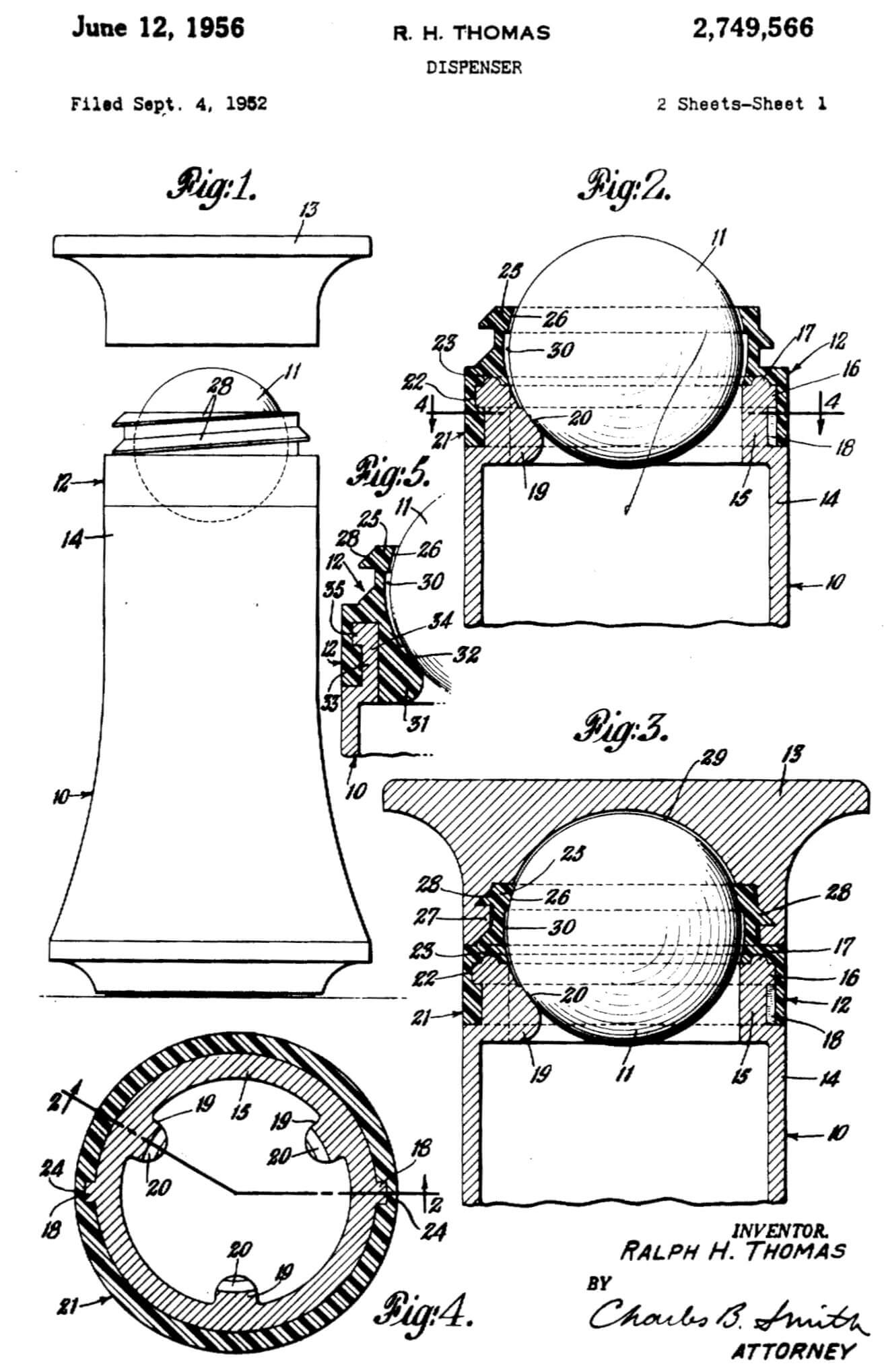
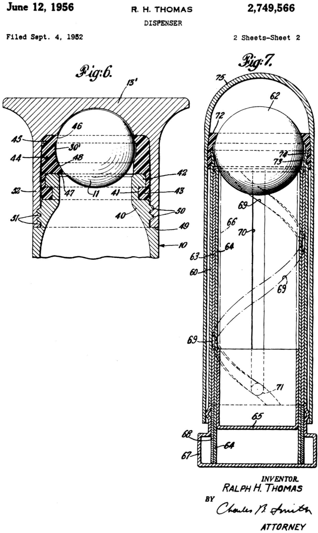
If you look at my photo of the fine print of the product label, you can see that it says, “Package Patent No. 2,749,566.” I looked up that patent, which is from 1956 and turns out to be for the invention of the roll-on dispenser format. It includes these gorgeous drawings:
———
This was a fun rabbit hole. Thanks for going down it with me!
Bulletin reminder: My Bulletin column this week looks at the best throwback options for each NFC team, now that the one-shell rule has been lifted. (My picks for the AFC will follow next week.) My premium subscribers can read the NFC piece here. If you haven’t yet subscribed, you can do that here (you’ll need a Facebook account in order to pay). Don’t have or want a Facebook account? Email me for workaround info. Thanks!
Design contest reminder: Last year’s MLB All-Star Game uniforms were a bad joke, and the early hints are that this year’s won’t be much better. Obviously, the best solution would be to go back to having the All-Stars wear their regular team uniforms. But if MLB and Nike have permanently turned their backs on that option, as appears to be the case, then it shouldn’t be that hard to come up with decent All-Star uniforms, should it?
That’s where you come in. Our latest Uni Watch design contest challenge is to come up with some MLB All-Star unis that, you know, don’t suck. Full details here.
“What’s It Worth?” reminder: In case you missed it on Monday, we’re once again partnering with Grey Flannel Auctions to offer free, no-obligations appraisals of your sports memorabilia items. Full details here.
Uni Watch News Ticker
By Anthony Emerson

Baseball News: MLB The Show, which originally showed the Brewers’ CC unis with an inaccurate number font and other inaccurate details, has been updated to fix those issues. … The Memphis Redbirds, Triple-A affiliates of the Cardinals, will wear stars-and-stripes unis this weekend for Independence Day (thanks, Phil). … Single-digit pitcher alert! That’s Red Sox ace Chris Sale on a rehab assignment with the Double-A Portland Sea Dogs. Sale’s Bosox number is 41, which is currently available in Portland, so it’s odd to see him with a different number, let alone a single-digit one. … The Athletics’ new stadium plans are one step closer after getting approved by the San Francisco Bay Conservation and Development Commission (thanks, Brinke — autoplay video alert on that link).
College Football News: Notre Dame will wear their green alternates on Sept. 17 against Cal (from Nicklaus Wallmeyer).

Soccer News: A Newcastle United supporter lucked out when he purchased the club’s new home kit, as it arrived without the advertisement (from Blake Jackson). … New second shirt for Scottish club Hibernian (from Ed Zelaski and our own Jamie Rathjen). … Also from Ed, new home kits for Polish club Pogoń Szczecin. … One more from Ed: Israeli club Maccabi Haifa has revealed its new kit. … New home jersey for Portuguese side Benfica (from @mikedfromct). … Israeli club Maccabi Tel Aviv has released its new home kit (from Uri Finzi). … Forge FC honored captain Kyle Bekker with a jersey with “100” on the back when he became the first Canadian Premier League player to reach 100 games for a club (from Wade Heidt).

Grab Bag: The W Series is adding rainbow firesuit accents and changing the series logo on the cars to rainbow this weekend at Silverstone because London’s pride events are on Saturday. Also, driver Sarah Moore is getting a pride-themed helmet (thanks, Jamie). … New logo for PBS Kids (from Jason Hillyer). … A $70,000 Toyota Tundra was delivered to a customer with a backwards letter on the badge (from @cylinen).
Click to enlarge

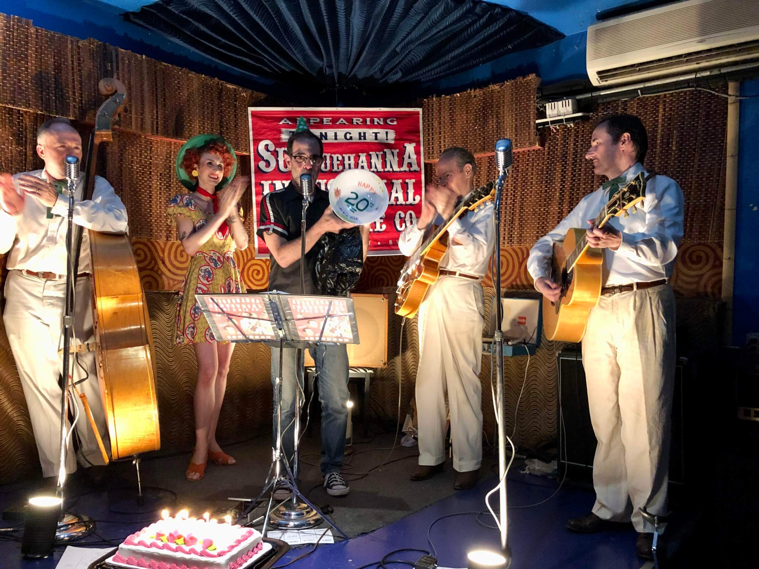
What Paul did last night: My friends Susquehanna Industrial Tool & Die Co. marked their 20th anniversary as a band last night. The 20th is traditionally the “China anniversary,” so I got a China bowl from the dollar store and used permanent markers to inscribe it with “Happy 20th SIT + Die.” I presented it to them during their set last night and then ceremoniously filled it with pretzels and potato chips (because the band’s shows always feature “salty snacks”). A fun way to salute a fun band. Whatever you did last night, hope you had fun too!
And that’ll do it for this week. Everyone have a safe and healthy holiday weekend, enjoy Phil’s Saturday and Sunday content, and I’ll see you on Monday with my annual Independence Day post. Peace. — Paul
Shouldn’t it be that Sale’s #41 is UNavailable?
No it *is* available, which is why it’s odd that they gave him a different number.
The headline should have been:
“Sale—93% off!”
(3 being, with some rounding, 93% less than 41.)
Dear SeaDogs: maybe a more legible number font? I guess that Chris Sale was given a #3 but the idea of NOB and uniform numbers is to make identifying individual players easy. When your font is so overdesigned that it compromises legibility, it is time to start over.
Typically items in the ticker open to a new window, but today they do not. Might be something on my end with my Chrome browser, but just wanted to bring it up in case it’s something on your end.
Thanks for the heads-up, Jake. Not sure why that happened, but should be fixed now.
A naive, young, newlywed went to the drug store to buy her husband some deodorant. She told the man at the counter that she wanted a bottle of Trig. He asked, “the ball kind?”, and she responded, “no, silly, for under his arms!”.
Football teams across the world with gambling company advertisers offer blank jerseys for those whose religions proscribe gambling. With the Newcastle jersey that arrived without the front advert, it’s likely more a case of the team mailing the wrong style of jersey rather than it being a printing mistake.
Honestly, the most embarrassing ad your team can have is from a gambling firm…or now maybe crypto service. But if you love ad-free kits, you might root for that turn of events. Their team store will offer those ad-free versions.
Happy Bobby Bonilla Day!
The link in the ticker item “Israeli club Maccabi Tel Aviv has released its new home kit” goes to an image that says “Away Kit”. This appears to be the new home kit:
link
Both appear to be new for 2022/23.
Surprised there was no mention of USC and UCLA joining the Big Ten.
I fail to see how that news is relevant to Uni Watch. Am I missing something?
Agreed. The only uni-notable thing would be that starting in the 2024-25 season, the Trojans and Bruins will be wearing a B1G patch on their unis instead of a Pac-12.
Though, we could start speculating – would the Big Ten update its logo? B16, anybody? Also, will the Pac-12 try to fill those spots, or revert to the Pac-10?
You think they’re done at 16? Lol. There’s a reason they’ve decided “Nah, Big Ten is fine. Let’s just keep using that.”
I don’t expect USC and UCLA will be the only West Coast schools to jump.
Maybe they can update from B1G to BS…
They didn’t change their name when they added Penn State in 1990, increasing their number to 11 members. Then they added Nebraska in 2011, and added Maryland and Rutgers in 2014. They have had more than ten members for 32 years now.
What makes you think this would be any different and they would change their name now?
I’m with the crowd that says the B1G could do business as The Big 10 Hexadecimal.
I think they should start calling themselves the Big 16, and have students in the art department start designing the logo. Immediately. If they add another team in a week or two, start the process over again. Immediately.
If you think this is absurd… why shouldn’t it be? If the foo shits.
I wonder if the Brewers CC unis were supposed to go on Nike’s template, before it was delayed. (This is pure speculation)
The dots on the original striping pattern would echo the perforated numbers we’ve seen on Nike’s template (whereas the striping on the Majestic template is more traditional).
Nice rabbit hole, Paul. As a holder of patents, I appreciate the art that goes behind them. The legacy patents and their hand drawn art are much more elegant than the Microsoft Visio drawings of today…
What patents do you hold, Tim?
Design patent fans may enjoy this recently-published book:
link
Patented: 1,000 Design Patents
By Thomas Rinaldi
Ooooh, very cool! Thanks for that tip, Rob.
You’re very welcome, Paul!
I just watched Trevor Lawrence provide the storytelling for his Gatorade GX bottle model. Jeepers.
Good day to our neighbours to the North!
Happy Canada Day to you and the best aesthetically look flag!!
I used to teach a patent law course for beginning lawyers. This one, my favourite patent of all time, was part of the curriculum
link
It was in the course to demonstrate that the three “elements” of a patent are utility, novel concept, and non-obviousness. There is no need for the product to actually work or to be safe. This thing met the three elements and was appallingly unsafe.
(and is a helmet, so I guess its uni-adjacent)