For all photos, click to enlarge
The MLB All-Star Game will take place in Los Angeles on July 19 — three weeks from today. As you may recall, last year they deviated from the longstanding practice of having the players wear their regular team uniforms and instead dressed them up in laughably bad All-Star costumes, but the reaction to that was so overwhelmingly negative that I was wondering if they might go back to the old way this year. Judging from the caps that were released via retail channels yesterday, it appears that they’ll likely be staying with last year’s approach.
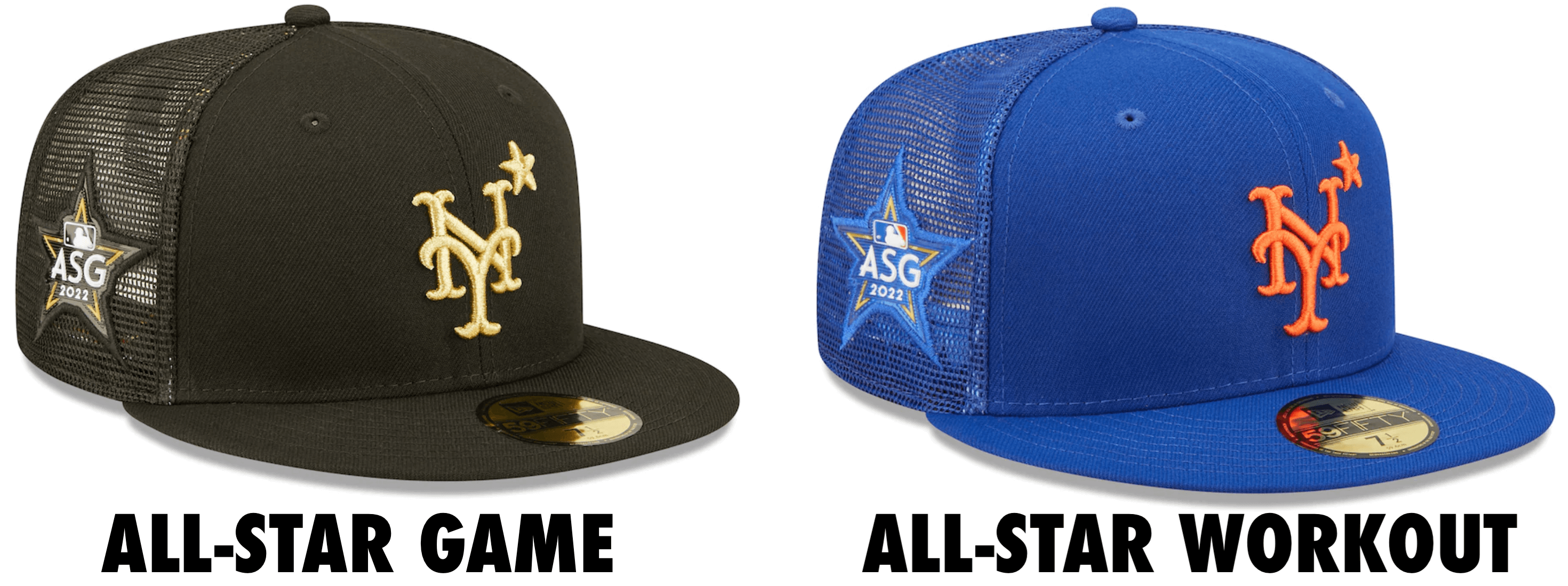
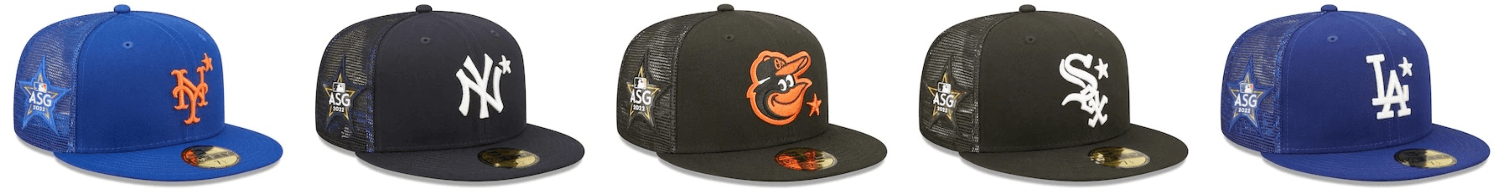
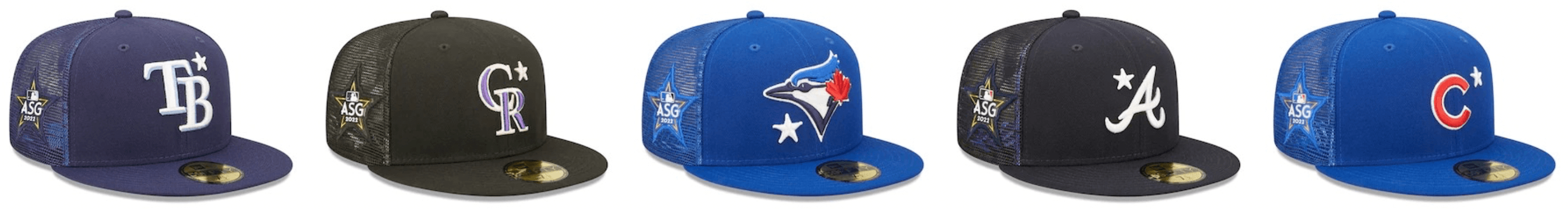
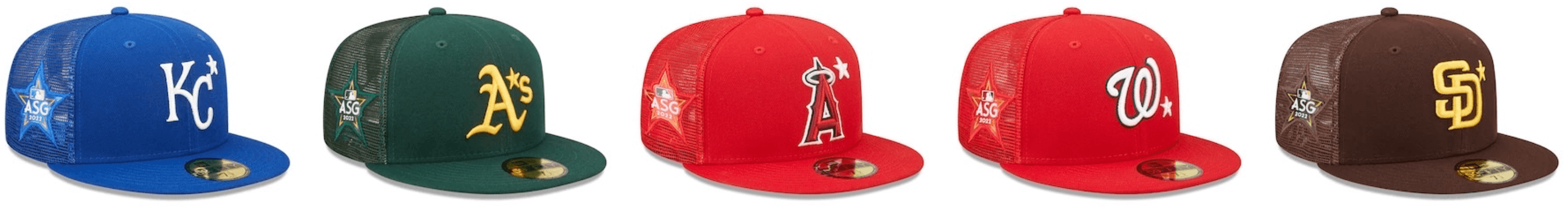
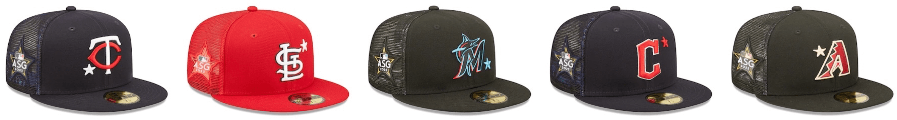
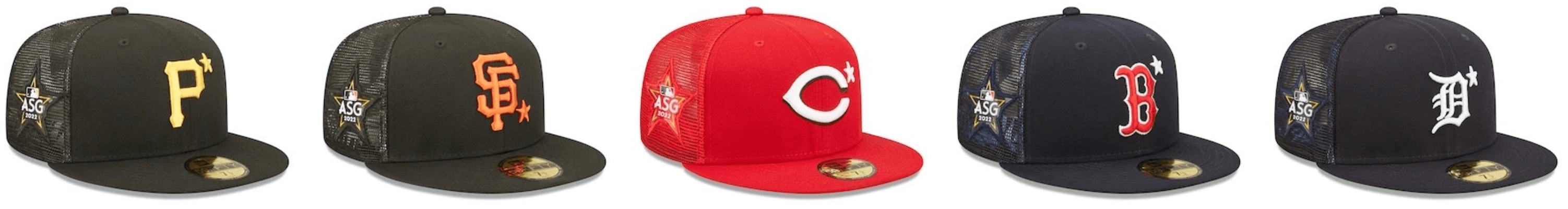
Let’s start with the game caps. All of them are black — fabric in the front, trucker-style mesh in the back — with the primary team logo rendered in light-gold embroidery, along with a little star. Here’s the full set:
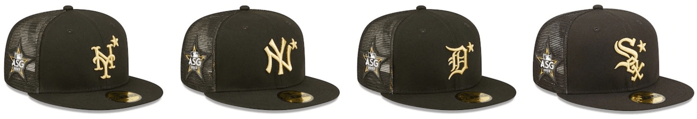
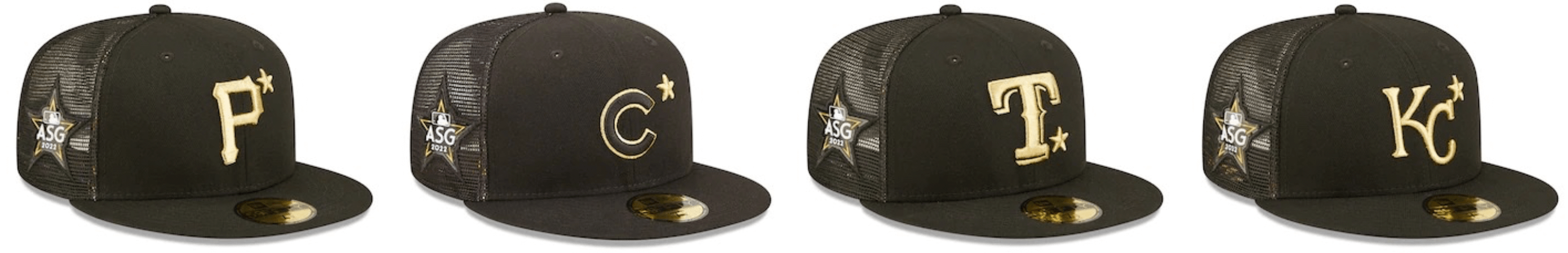
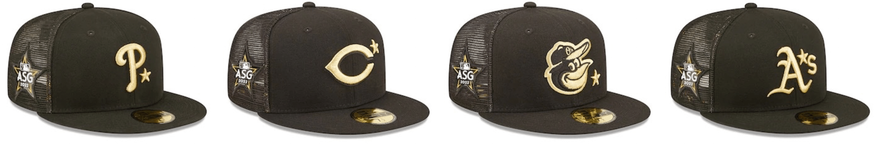
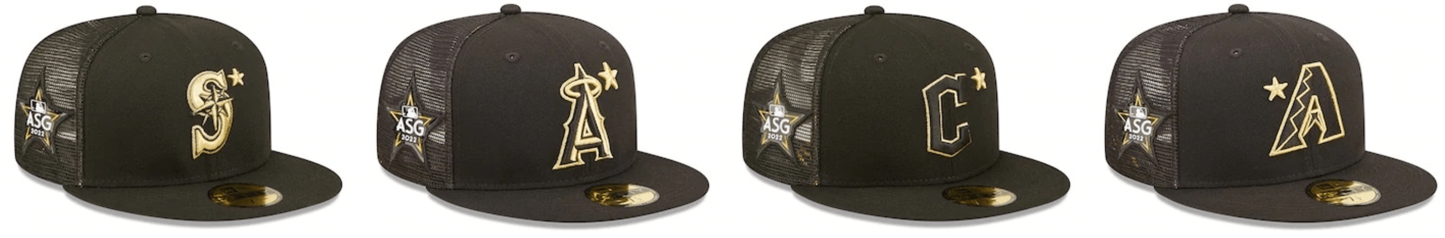
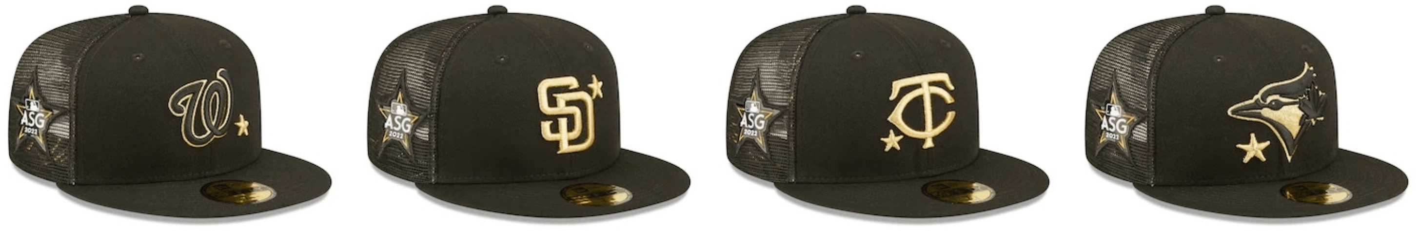
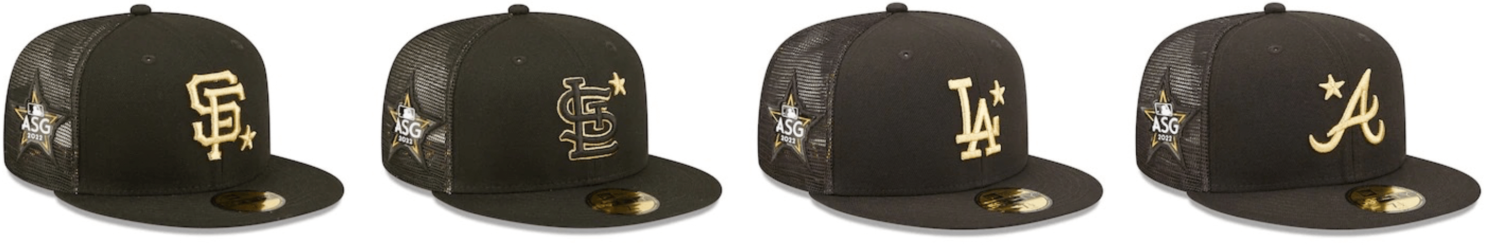
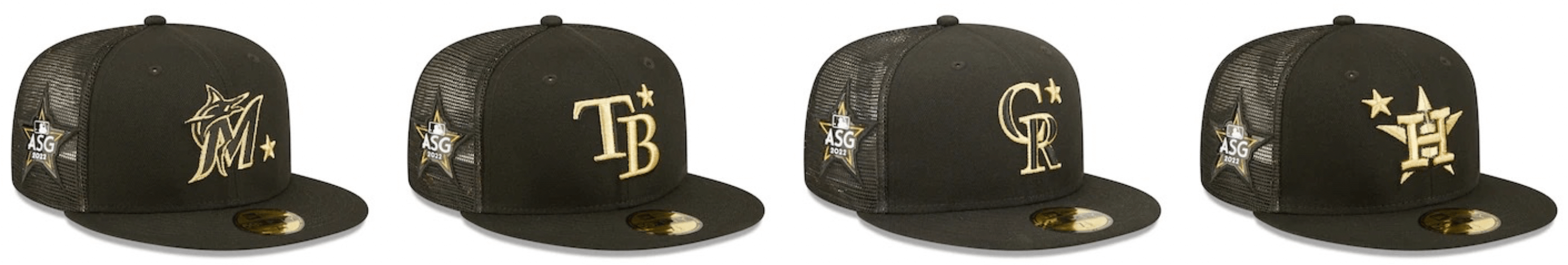
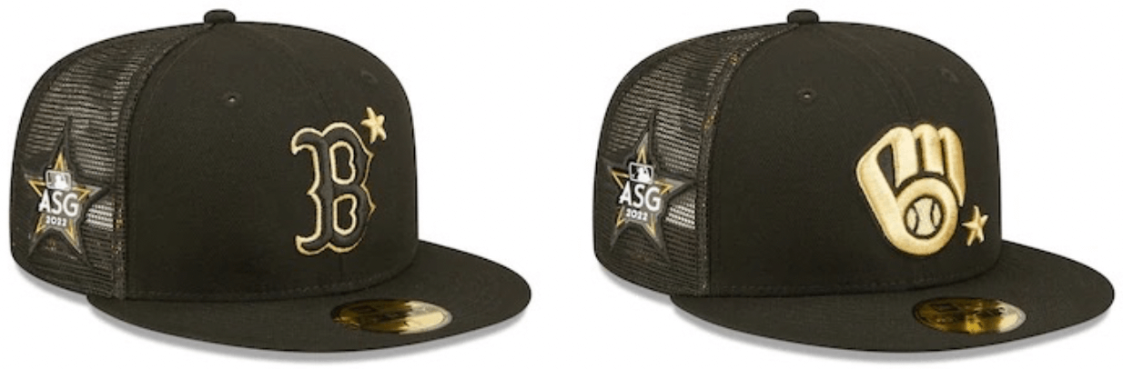
Obviously, these are pretty awful. A few notes:
• It’s weird that the location of the star varies from team to team. The worst location is when the star appears at upper-right, because then it looks more like an asterisk.
• It’s also interesting that they chose to incorporate the star into the A’s logo, using the star to replace the apostrophe. (I’m surprised they didn’t do something similar with the Phillies, since the Phils used to wear this cap.)
• Astros: Star with a star!
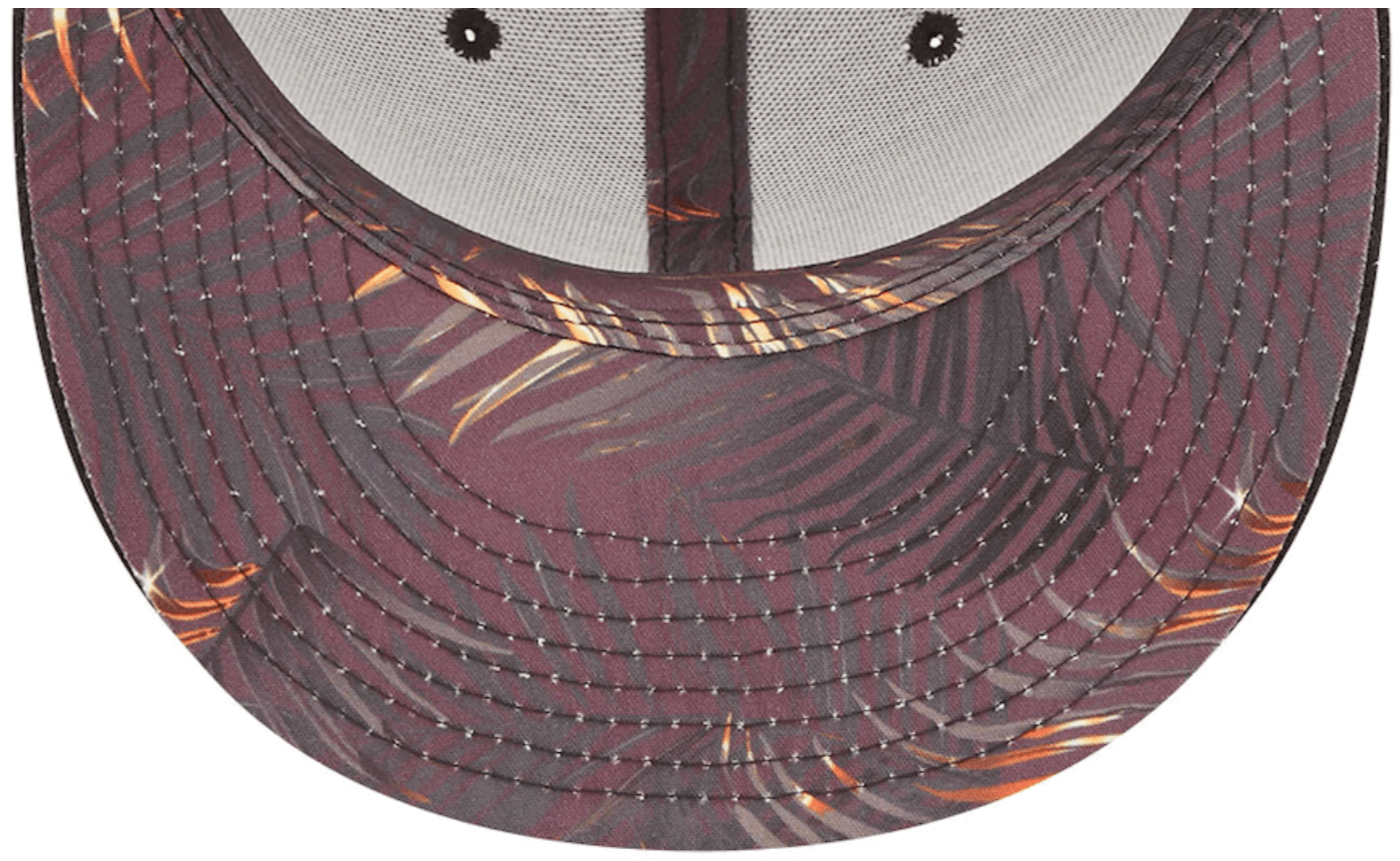
One additional detail: The undervisors have a palm theme, presumably because the game in taking place in L.A.:
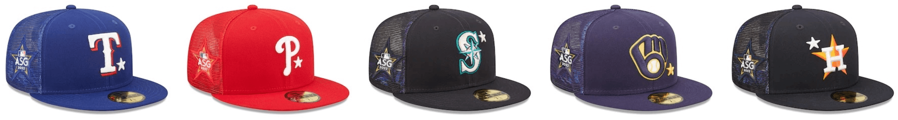
Next up are the “All-Star Workout” caps, which are also worn for the annual Home Run Derby. These are essentially the same as the game caps, but rendered in the teams’ usual colors:
———
So what does this all mean? To me, it means this: Since the workout/Derby caps are done in team colors, that means players will once again be wearing their standard team uniforms for the workouts and the Home Run Derby — just like last year. And that in turn suggests that they won’t be wearing their team unis for the game itself, so we’ll once again be seeing some sort of All-Star costume. Here’s hoping it’s better than last year’s.
Click to enlarge
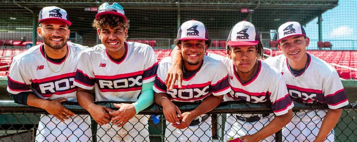
Sox appeal: ESPN ran a story yesterday about how the sons of various former Red Sox players now play for the summer collegiate Brockton Rox. That’s nice, but I was more interested in this photo showing how the Rox’s uniforms are based on the White Sox’s old beach blanket design. (No number on the pants, though.)
After I tweeted that photo, Twitter-er @roblmo let me know that the Cheyenne Post 6 Sixers — an American Legion team in Wyoming — have their own excellent take on the beach blanket design:
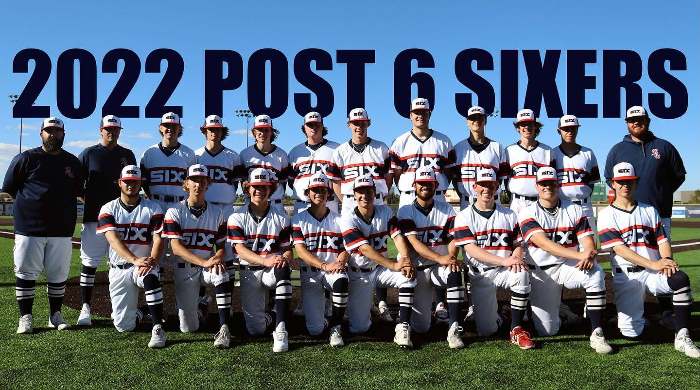
Plus the Legion team also puts its own spin on another Chisox logo:
Click to enlarge
Collector’s Corner
By Brinke Guthrie
Follow @brinkeguthrie
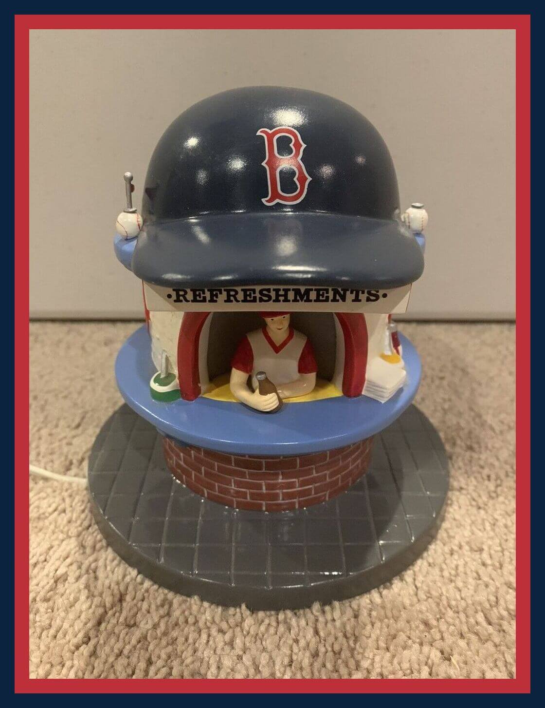
Take a look at this! You can almost hear the echoes of “Sweet Caroline” over this early-2000s Boston Red Sox Fenway Park concession stand tchotchke from Dept. 56. It also lights up for night games, so getcha dahgs he-ya! Pop-cahn, peanuts, Cracker Jack! (Looks like a White Sox version is also available.)
Now for the rest of this week’s picks:
• Here we have a telephone used for the 1993 Super Bowl. Provided by GTE, “Official Telecommunications Consultants to the NFL.” Just plug it in, get a dial tone, done. Not terribly fancy, is it? Does it even have speed-dial to the league office?
• Bland & Co. Insurance was the sponsor of this 1958 St.Louis Cardinals ruler. Nifty little player illustrations!
• Here’s a record album called The Greatest Moments In Sports, from El Marko marking pens. The record features notable sports moments from the 1930s and ’40s.
• Here we have a huge lot of 28 1970s Avon/NFL cologne decanters, each one topped with a miniature football! There are 25 with those enameled team logo badges, and three blanks. All are unopened and filled with Avon’s “Wild Country” cologne.
• Look at the cover of this 1968 San Francisco 49ers media guide. Look that old-style cape, and you can practically feel the Kezar Stadium chill in the air.
• Light up the night with this 1979 Oakland A’s nightlight.
• This seller is offering a set of three very generously sized 1970s Baltimore Orioles promo thermal mugs.
• “Part of a Proud City’s Tradition,” says this 1980s Budweiser display card featuring Roger Maris and Mickey Mantle.
• Here’s a 1980s NFL sleeping bag with graphics I’ve never seen before (didn’t think that was possible at this point!). I do recognize one player — that’s definitely John Hadl of the Rams toward the lower left.
• Baseball’s Joe Torre has no doubt received many accolades over his distinguished career as a player and manager. He’s also immortalized here on this “Big Torre head fan,” for lack of a better name.
“What’s It Worth?” reminder: In case you missed it on Monday, we’re once again partnering with Grey Flannel Auctions to offer free, no-obligations appraisals of your sports memorabilia items. Full details here.
The Ticker
By Paul

Baseball News: The Blue Jays’ Independence Day cap has been revised to remove the stars/stripes motif, but it’s still pretty awful (thanks to all who shared). … The Triple-A Las Vegas Aviators wore Black Panther alternates this past weekend (from Kary Klismet). … The Triple-A Worcester Red Sox are having a Pawsox heritage night on July 9. “Love the idea because a lot of people in Pawtucket never had the chance to say good bye to the team because of Covid,” says Kevin Rice. … The Atlantic League’s Staten Island FerryHawks will play as the Staten Island Wild Turkeys on July 5. And I can personally attest that the name is appropriate!

Hockey News: Avalanche RW Nicolas Aube-Kubel managed to damage the Stanley Cup mere moments after the team won it on Sunday night (from Kary Klismet).

Basketball News: Bulls rookie Dalen Terry will wear No. 25 as a tribute to former Chicago high school star Benji Wilson. … Here’s a ranking of 76ers jerseys.

Soccer News: New away kit for FC Barcelona (thanks, Anthony). … New first kit for Scottish club St. Mirren. “It supposedly has a paisley pattern, which would be awesome because they’re from Paisley,” says our own Jamie Rathjen, “but I can’t see it in the photos.” … New home kit for third-tier English side Bolton Wanderers (from Ed Zelaski and Kary Klismet). … Also from Ed: New kits for Welsh side Newport County and English sides Oldham Athletic and Forest Green Rovers. … One more from Ed: New away kit for second-tier Spanish side Leganés. … Newcastle United, which was recently bought by the Public Investment Fund of Saudi Arabia, has a new third kit, and David Bell says it’s “an exact copy of the Saudi national team’s design!” … New kit for fifth-tier English club Yeovil Town (from Alex Evans and Kary Klismet). … English side Bournemouth, which has recently been promoted back to the Premier League, will offer a retail version of its new shirt without the advertisement. “The club signed a sponsorship deal with Dafabet, an online gambling company,” says Chris Edwards. “From what I can tell, that prompted a tactful grass-root campaign to ask the club to reconsider and find a non-gambling sponsor. I guess the sponsorless retail option is the compromise.” … New kits for Mexican club Santos Laguna (Ed Zelaski again). … The rest of these are from Kary Klismet: New kits for Tigres UANL of Liga MX. … Also from Liga MX, new away kits for Monterrey. … New home kits for RKC Waalwijk of the Dutch Eredivisie. … New third kits for League Two side Leyton Orient FC. … New kits for Erzgebirge Aue of Germany’s 3. Liga.

Grab Bag: New uniforms for certain Hong Kong police units. … Aussie rules football team Carlton FC has added orange trim for for this Friday’s game against St. Kilda as part of the team’s annual “Carlton Respects” program to promote gender equality and prevent violence against women. Additional info here (from @BluesBrother95). … Whoa, check out this amazing tape measure curtain! (From the Tugboat Captain.) … Interesting piece about Elvis Presley as a fashion innovator. … U.S. Air Force crew members are getting new high-tech helmets (from Kary Klismet). … Also from Kary: Here’s the history behind the Chevrolet logo. … You can be replaced by a machine (maybe): Reader Duncan MacKenzie prompted an AI interface to design a “sports team logo” and came up with these results. “Seeing a lot of animal-influenced designs, and way too much blue,” he says. … Pro golfer Sergio Garcia’s LIV team will have a new name and logo for this weekend’s event in Portland. … Pro tennis player Emma Raducanu wore a polo shirt with Rafael Nadal’s “Raging Bull” logo for her post-match interview session following her first-round Wimbledon victory. She explained that she did it because Nadal “embodies fight.”
“…the reaction to that was so overwhelmingly negative…”
I don’t doubt this is the case, I’m just curious the metrics used to determine this. I say this because I think there are various segments of uniform fandom. I think the word you usually use to describe your tastes is “classicalist” and I’d venture to say I am in pretty much the same boat, as are a lot of uni watch readers. But given how certain uniforms and uniforms styles that are loathed by the classicalist set somehow hang on, I assume they are popular somewhere, presumably with the group of people who buy the merchandise?
So while we may have hated the MLB uniforms, and perhaps classicalists took to twitter to disapprove, twitter is never a good metric. Do we know they didn’t sell many jerseys from last year? I think that is the only metric MLB really cares about.
Two Brewers caps, no Red Sox cap (black).
Thanks, Jim. Now fixed!
Why are the stars on the Blue Jays hats so much bigger than all the others?
I cannot, for the life of me, figure out why MLB/New Era thinks people want trucker mesh caps. I usually love these kinds of hats, but these new designs, like the spring training and batting practice caps,are terrible with the mesh.
I know they’re not wool anymore but the standard fitted caps are hot in the summer in LA.
I agree. It always just looks cheap to me, like the hats we got in my city rec league days. If temperature is really an issue, there are a lot of other directions they could go.
Seems like the star on the Astros hat is carefully placed not to look like an asterisk (related to their cheating scandal).
Should that line read *they are pretty awful?
these. Now fixed!
The new away kit design for FC Barcelona is vastly superior to the home kit.
Was a west coast game so I’m late to the party for a ticker submission, but if you wanted to add it after the fact, the Orioles wore their ‘O’s’ hat with something other than their black jersey for the first time ever last night. Also the first time they’ve worn it on not a Friday in…awhile. Maybe the first time ever on a weeknight.
link
Hey Paul. Had this idea based on the ASG Caps that the lettering for team cities/names would mimic the Hollywood sign font set against a hillside with searchlights. That might make them a bit more appealing to the eye than last year’s fiasco….
I find it interesting that two similar caps (BoSox, Cleveland; red logo, white outline, blue cap) have two differently colored stars (Guardians, red; Sox, white).
Don’t know WHAT the Worcester RedSox management is thinking. “Yes, we know we stole your team with the promise of a brand new free stadium, but come celebrate with us!!” That’s like a demolition company offering to sell your possessions back to you after knocking your house down by mistake.
The ASG caps are the latest shot in New Era’s war on bald people. Trucker caps provide little protection from the sun. They are letting down those who need their product the most.
I’d like to see interleague play in minor-league baseball.
That way we could have Carolina Disco Turkeys against the Staten Island Wild Turkeys.
Interesting they used the A’s old away (‘94-‘13) hat for the ASG Work-Out cap.
and the ASG Game hat should have the logo outlined like other teams.
Boy, the caps are bad. All black for everyone. Sheesh.
Back before any of this nonsense, I used to wish the leagues would wear special ASG uniforms. Now that they do, I feel like MLB has tried every combination except for the one obviously correct one: League jerseys, with each player wearing his normal team cap/helmet. The cap is the most fundamental quantum of a baseball uniform, so that’s the bit that should be least changed.
And for Home Run Derby, each player should wear his normal full uniform. HRD players are standing alone as themselves, not representing their league, so standard uniform is the way to go. A patch on the jersey or the cap, at the maximum.
From a marketing perspective, I do kind of understand it: New Era makes hats that last (under normal wear and tear) for three or four years (or more), but that’s not a good way to make money. But from a design perspective, these don’t make any sense. They aren’t different enough to be exciting, are silly looking, and the jokes write themselves. The same is true with the July 4th hats. Ugh.
And there are much, much better design opportunities to do something special for each team. Even the youngest franchises in the league have interesting uniform histories (and in the case of Tampa Bay, have an invented uniform history that’s visually appealing). All this to say: these design choices a just frustrating and confusing to me.
I’m 100% convinced that design choice is specifically driven by people who DON’T like or watch MLB. People who don’t care about design, sports, team histories or anything else about baseball, its teams or their history.
As someone who cared about a team’s uniforms since the early/mid 1970’s, I barely even pay attention anymore to special occasion outfits, most alternates, City connect, etc… Heck I no longer even look at NBA or soccer or college uniforms anymore. And hardly hockey.
It’s simply not designed for people like me anymore.
Lee
Lee, I know it sounds crazy but people can like/watch MLB and have an opinion that differs to yours.
Your last sentence is much more appropriate than your first.
MLB (and most other sports league) are more interested in the lifestyle market than pleasing the everyday fan. That’s what I mean.
And while YES, some people who like/watch MLB will think the special occasion outfits, most alternates, City connect, etc are cool and neat, that isn’t the primary focus in terms of design for New Era (or Nike, adiadas, et al).
Lee
they always get the Brewers hat wrong. The M & B should not be gold, it should be black outlined in gold.
My issue with the ASG hats / uniforms isn’t that they’re all black or that I think they look awful. My issue is that I really, really, really liked the tradition of having each player wear their own team uniform. It was weird and charming. It was a thrill to see your own team uniform represented (particularly if you were a fan of a bad team and they had one token middle reliever there).
You had crazy mismatch team photos. It looked like the first day of little league practice.
link
I guess it was too disorderly to continue. The marketing geniuses look at this and say “that can’t be allowed to continue, they need to be UNIFORM”.
This. Exactly this. Having everyone out there in their own unis was what made the ASG fun for me. I loved the players lined up along the baselines for introductions in the mishmash of colors and (sometimes) styles that represent their teams.
Zackly. Was so much fun. And now they’ve ruined it, just to sell some lifestyle merch. Idiots.
On top of that, it’s lifestyle merch that’s really tacky looking. I’m less conservative on my uni design opinions than others, but these are just bland and syleless.
What’s more, every time there’s a league wide promotion like this, it cheapens the team identities that much more. Let each team have their own colors! Seems like it’s six or eight times a year that every team wears the same color hat and has their jersey re-colored.
When I was a kid growing up in the 70s, I loved to watch the MLB All Star game because it gave me a chance to see all the teams’ home and road uniforms (especially the West Coast teams that I didn’t get to see that often on TV), and to see the teams who traditionally wore black shoes (my Mets and the Reds) wearing blue, red, or even white shoes. It was really cool to see some Oakland players wearing their gold jerseys, and some others would wear their green jerseys. I have a feeling that the All Star uniforms this year will be worse than the ones last year. Old man rant over.
Yes, living in Cincinnati, I always liked how the Reds would wear red shoes (imagine that!) or Concepcion, who wore I believe white Converse with the red design. Sticking it to The Man who kept them from getting shoe deals.
as someone who grew up in the 90s (born in the 80s) & a brewer fan… i remember watching & waiting all game just to see that brewer uniform in a late pinch hit or relief appearance.
The star on the ASG caps seems like a ripoff of the star the Naval Academy awards for bearing Army.
Interesting that the Braves hat is solid navy which is most similar to their road cap. With the AS game hosted by an NL team seems it would make more sense for them to wear a cap with a red brim.
All 30 ‘workout’ caps are single-color, regardless of what team normally wears what where. The O’s don’t even have a single-color hat, normally.
This feels like another effort by Nike and its ever-complicit partner in crime, the MLB owners, to test how far they can go to sell more and more dumps of “lifestyle merch” to non-fans in Asia and Europe before they lose their acctual fans. If my only recourse is to vote with my wallet – and my eyeballs – I will do just that.
Not that abastaining from buying this junk was going to be that hard, but making a conscious decision to not watch the All-Star Game will be a more carefully considered decision. It’sbeen my favorite all-star exhibition among the major American sports since I was a kid, in large part because of the chance to see all the different teams’ uniforms on the field and in the dugouts all at once. I watched last year’s game because it was in Denver, where I live. But without that local connection, there’s not much to draw me to a game that I expect, based on the cap unveiling, will look every bit as bad as last year’s uni-debacle. Here’s hoping, in the aggregate, I’m joined by enough other fans in tuning out that Nike and MLB will take notice.
I’m not going to crap on trucker hats, though. The most comfortable cap and stylish cap I’ve ever owned is the 2018 Purp Walk hat.
link
(I say that as a guy with hair, I understand the bald guy complaints)
Sorry BvK that wasn’t meant to be a reply to you.
No apology necessary! For what it’s worth, I like (low crown) trucker hats myself in the right context. Seeing them on the field in a Major League game is not one of them, however.
Astros should be forced to change the star from the ASG to an asterisk and keep it.
Creamer on Twitter: ‘A #MLB source has told me that the star placement for each team’s All-Star cap is based on the shape of each logo, done so in a way that the star felt like it was part of each logo and not off floating around on its own. No other reason.’
New Era missed a golden opportunity to put the star inside the C for Chicago, Cincinnati, and Cleveland. Particularly the Cubs; it would have been a throwback to when they link on the batting helmets. (Did the player hand-write it himself, or the equipment manager?)
Pretty sure it was the equipment guy.
Hi, Jamie! Great piece today! I have noticed your efforts bring more content about women’s sports to Uni Watch, and I appreciate it. Thanks for those efforts!