[Today we have a guest entry from Jared Buccola — that’s him at right — who’s going to get us set for the 2022 Premier Lacrosse League Season, which begins this Saturday. Enjoy! — PL]
By Jared Buccola
I started playing lacrosse my junior year in high school and continued to play on a club team while at Fresno State University. After graduating, I spent three years as the team manager for Cal State San Marcos in southern California. These days I live in Phoenix, where I play with a local pick-up group, Coed Lacrosse AZ.
The Premier Lacrosse League (PLL) was founded in 2018 by brothers Paul and Mike Rabil. It started with six teams and is now up to eight. The most unique attribute of the PLL is that the teams are not geographically located. Instead, the league operates like a music concert tour. This year, Week 1 is in Albany, with all teams playing their season openers, and then the action moves to a different city for each subsequent week of the season. (You can see the full schedule here.)
In terms of uniform design, the PLL tends to be more stylized and less traditional than say, MLB or the NFL. Before we get to the team-by-team rundown, here are some things to keep in mind:
• The PLL has eight teams, each of which has at least two jerseys. That usually, but not always, means one colored and one white.
• The photos in this article (all of which you can click to enlarge) are from last season, but no major design changes are planned for the team uniforms this year. Except for…
• The league is changing outfitters this season, from Adidas to Champion, so the jerseys will now carry the Champion maker’s mark.
With the season set to begin this Saturday, June 4, here’s a breakdown of each team’s uniforms.
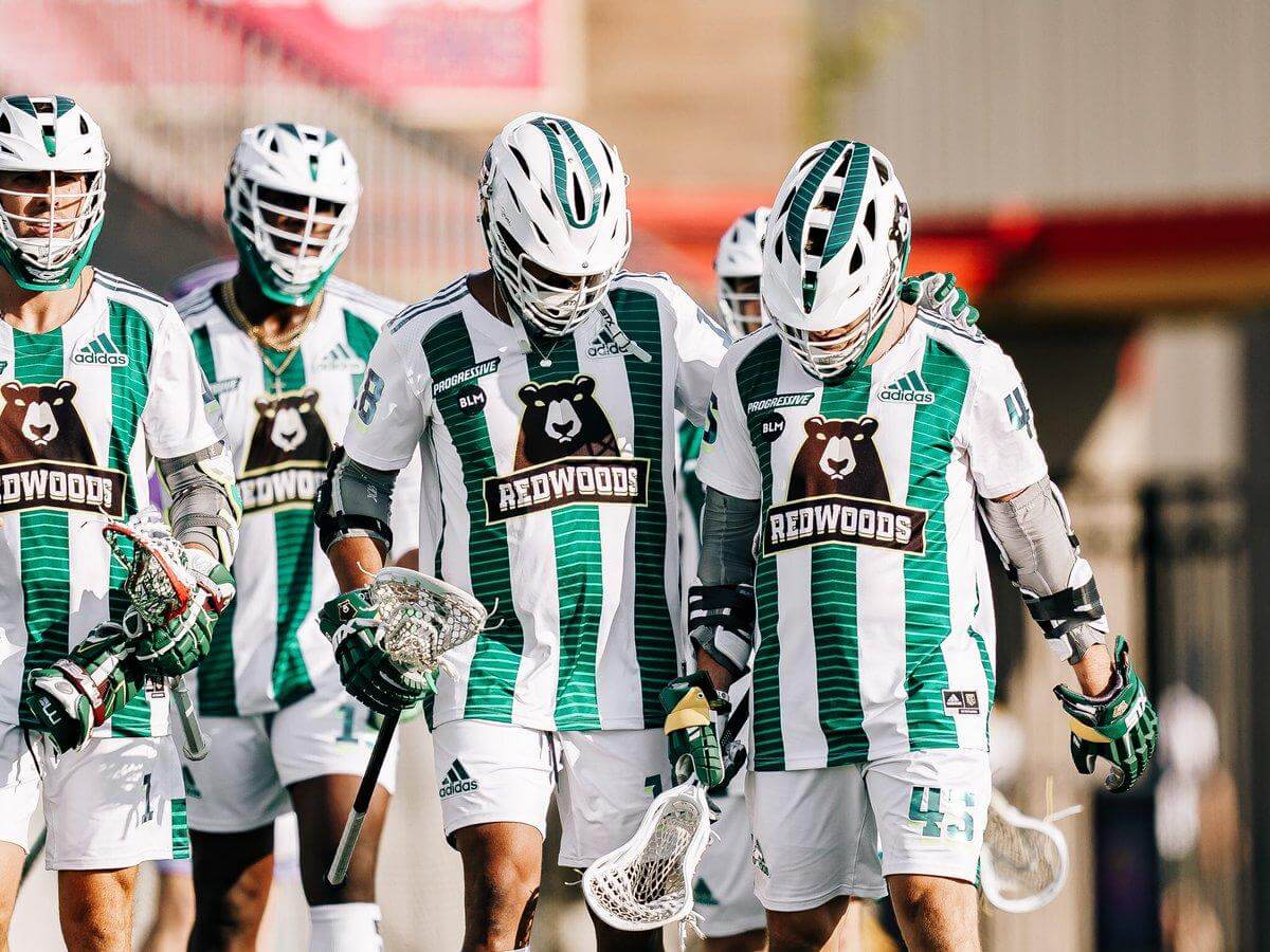
Redwoods Lacrosse Club
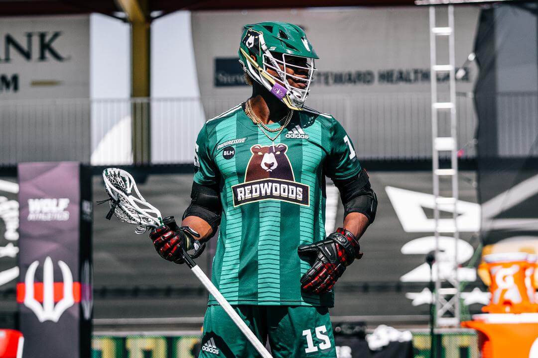
The Redwoods consistently sport a monochrome uni set, either all green or all white. Both sets feature their primary bear logo on the chest with their wordmark below. Three green vertical stripes run up the front of both the green and white jerseys, with chevrons within the stripes. The chevron pattern continues in the stripes on the shorts and the helmets. The bear logo is also on each side of both helmets, with the chevron wordmark centered on the back.
Also: As you can see in the photos above, Redwoods is one of three PLL teams to have an ad patch. This season, however, it’s moving from the chest to the sleeve, as you can just barely see here.
———
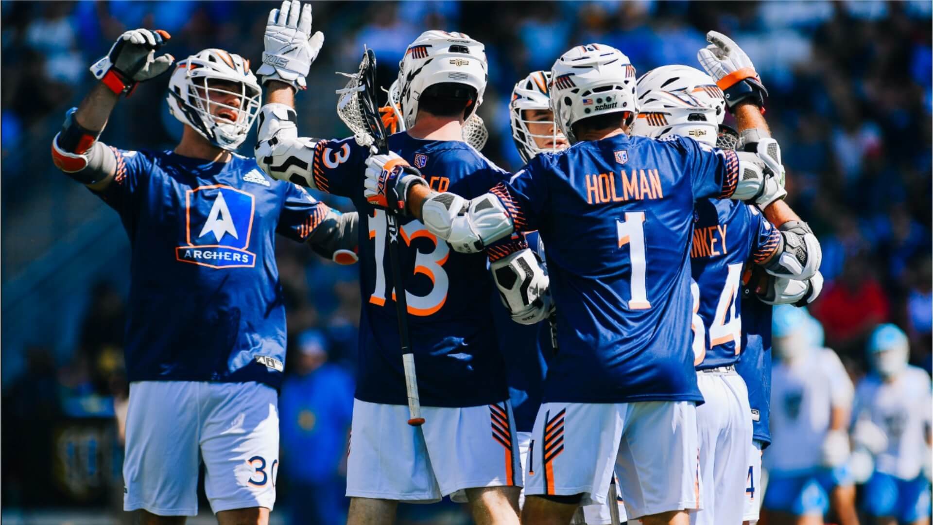
Archers Lacrosse Club
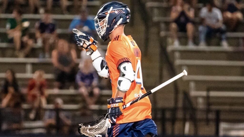
A navy, orange, and white color scheme gives the Archers multiple uni-combo options: navy or white helmets; navy, white, or orange shorts; and navy or orange jerseys. (They had white jerseys in previous seasons but removed them from the repertoire last year.) With all those options, the Archers probably mix and match their uniforms more than any other PLL team. One constant, however, will be the ad patch on the right sleeve.
———
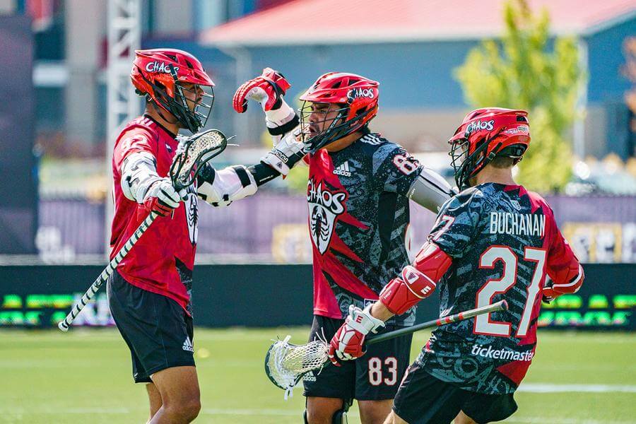
Chaos Lacrosse Club
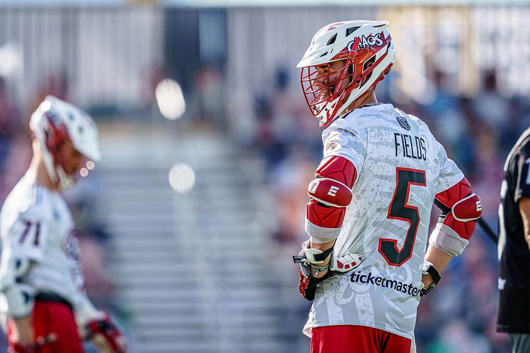
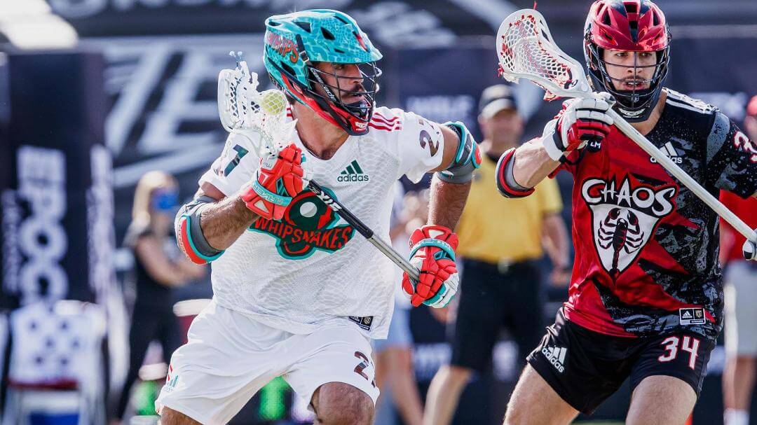
Here’s a situation where the uniforms live up to the team name. The options include white or red chrome helmets, black or red shorts, and white or black/red jerseys. Both the white and black/red uniforms have sublimated overlapping designs that are difficult to follow, especially with the black/red border zigzagging its way down the middle of the black jersey.
As defending PLL champions, Chaos will likely add a crowned version of the PLL logo to the back of their jerseys, similar to what Whipsnakes did in previous years.
———
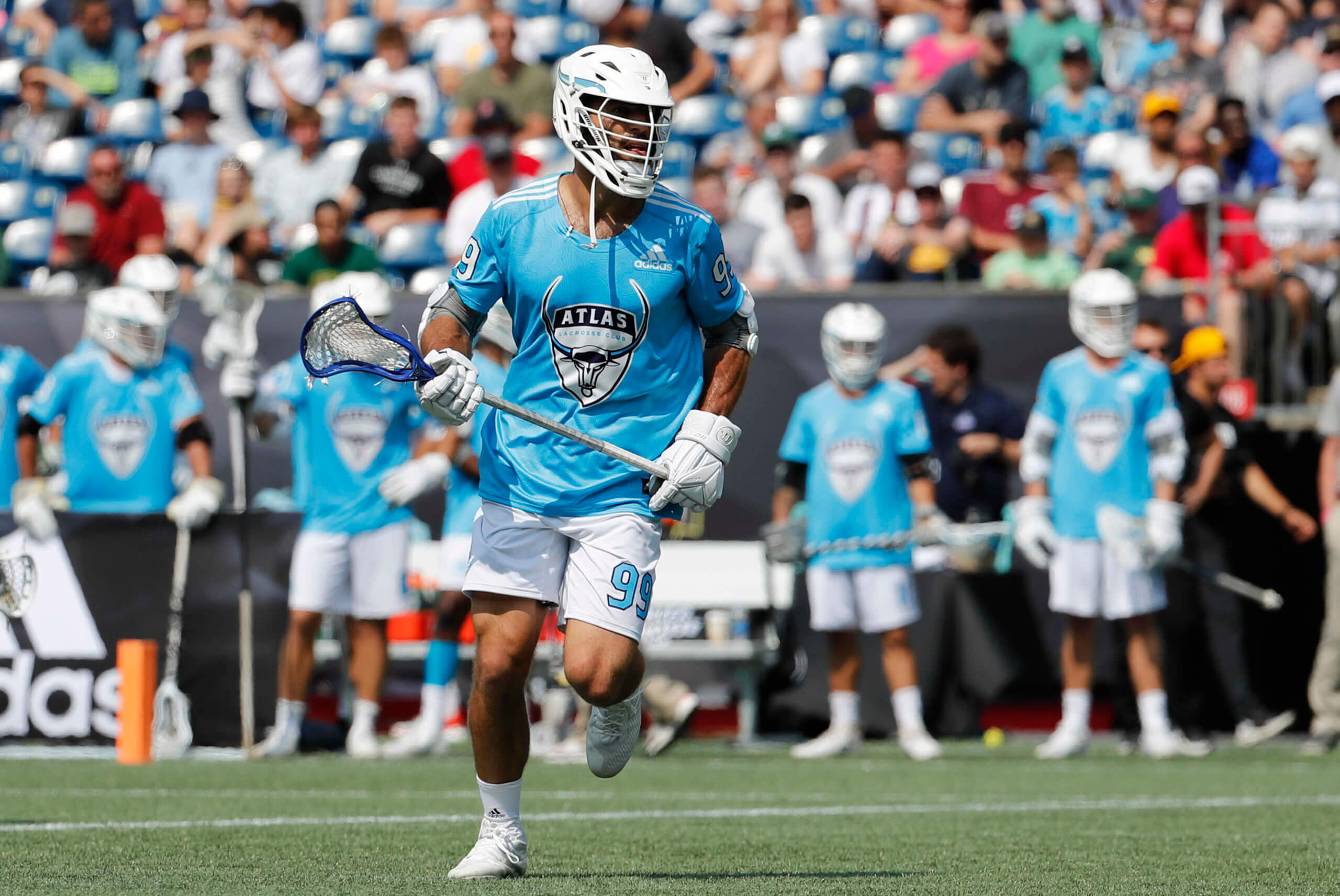
Atlas Lacrosse Club
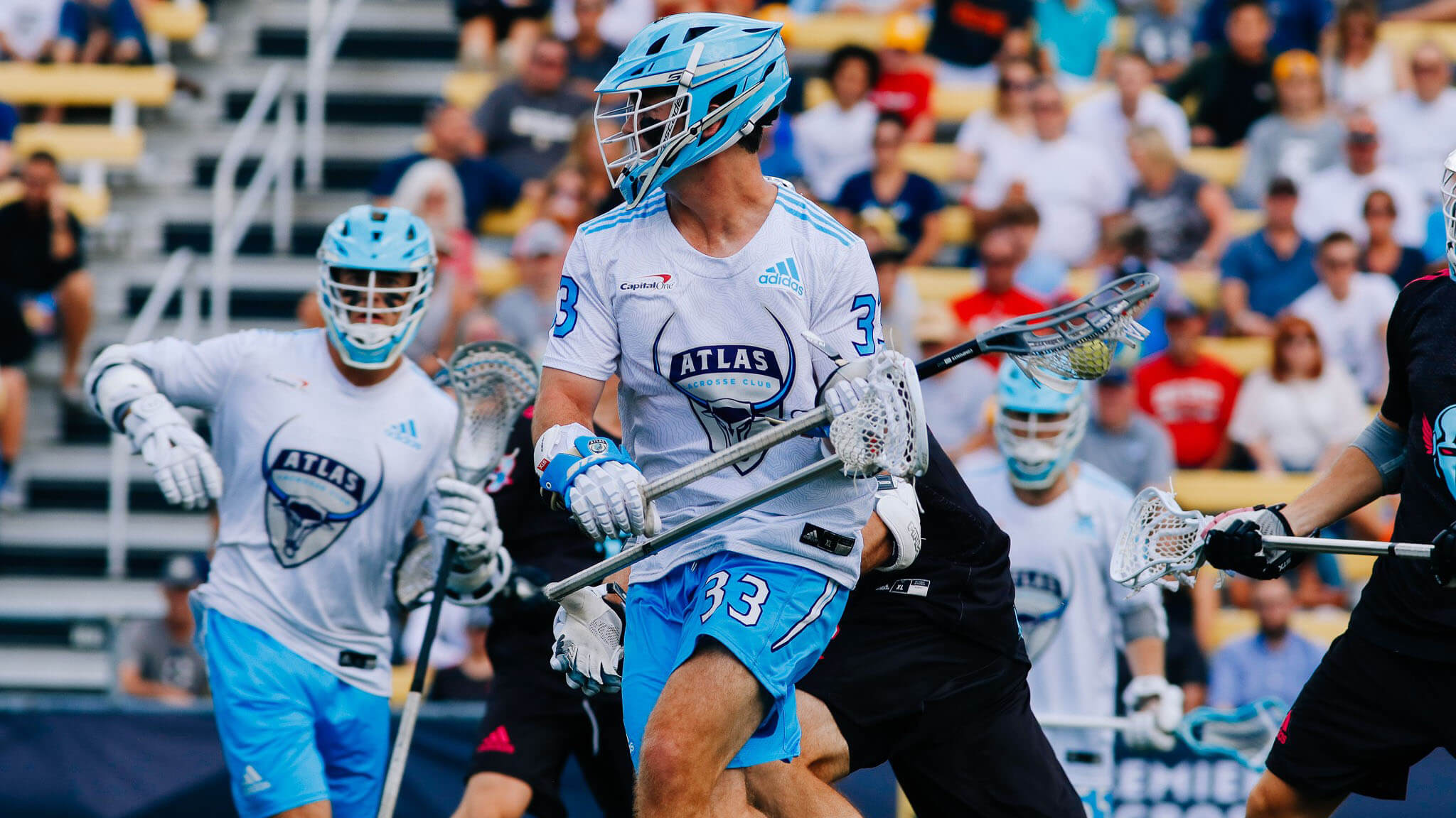
Atlas brings a straightforward uniform set to the league. They have two options from top to bottom, white or electric blue. The helmets have a single sweeping horn along each side, like the Minnesota Vikings’ helmets. That same horn graphic can be seen running down the side of the shorts. A hidden detail is a faint, topographical map pattern that runs across the entire jersey. Also, Atlas is one of the few PLL teams with a paid advertising patch, located on the upper-right chest.
———
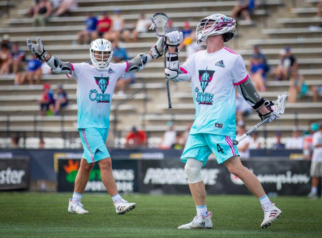
Chrome Lacrosse Club
Here we have what is probably the league’s most unique uniform set, featuring a loud color scheme of black, teal, pink, and (of course) chrome. (It’s probably the most inconsistent set as well, as the team has gone through multiple uni tweaks over the past three seasons.) Both of the current uniforms feature gradients, something I’m not generally a fan of, although it’s better than some of the team’s previous designs, which had a chainmail armor sublimation and a burst of diagonal lines. The helmets, black or chrome, sport the primary logo on both sides, which is a futuristic, winged aviator’s helmet.
———
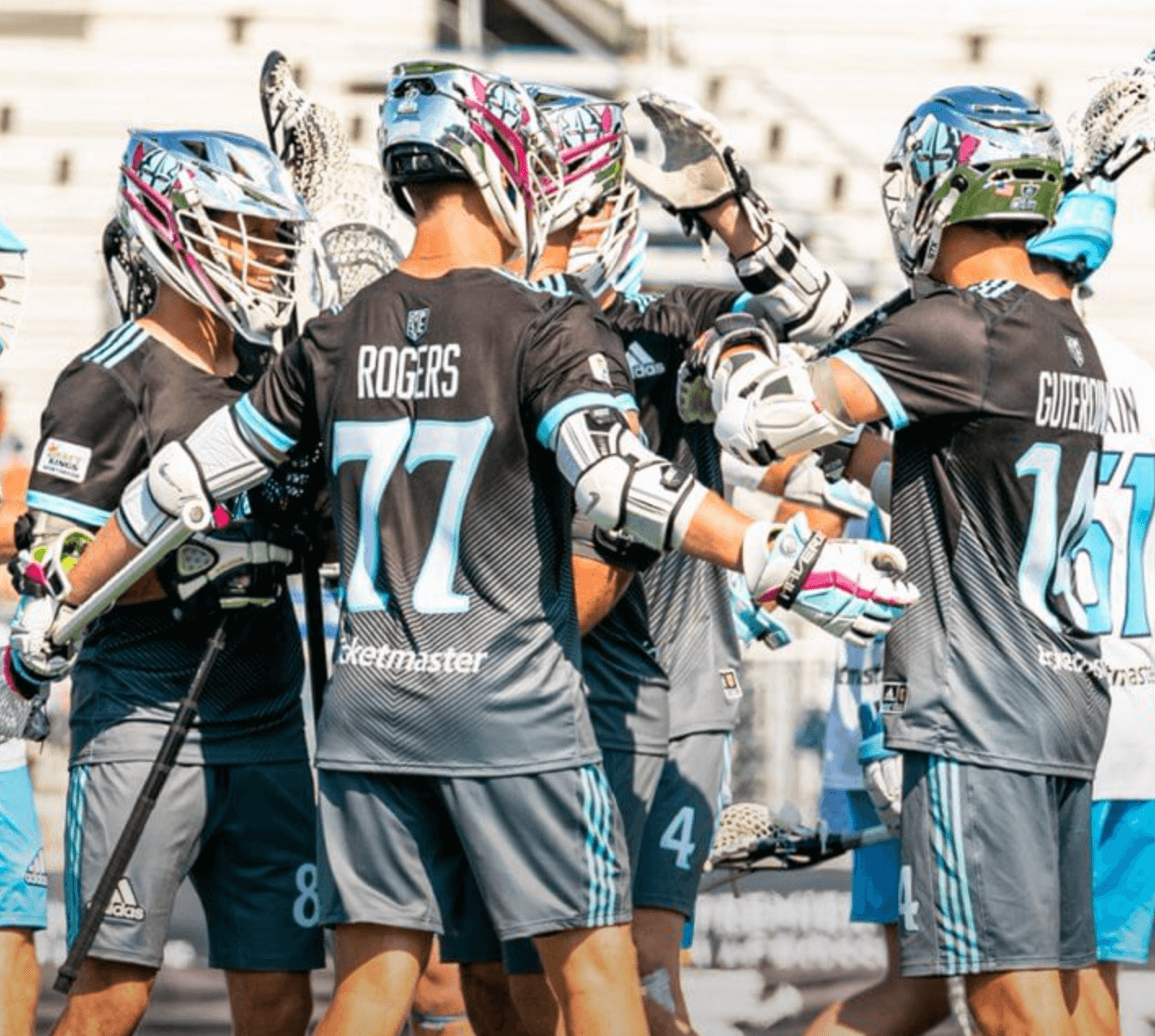
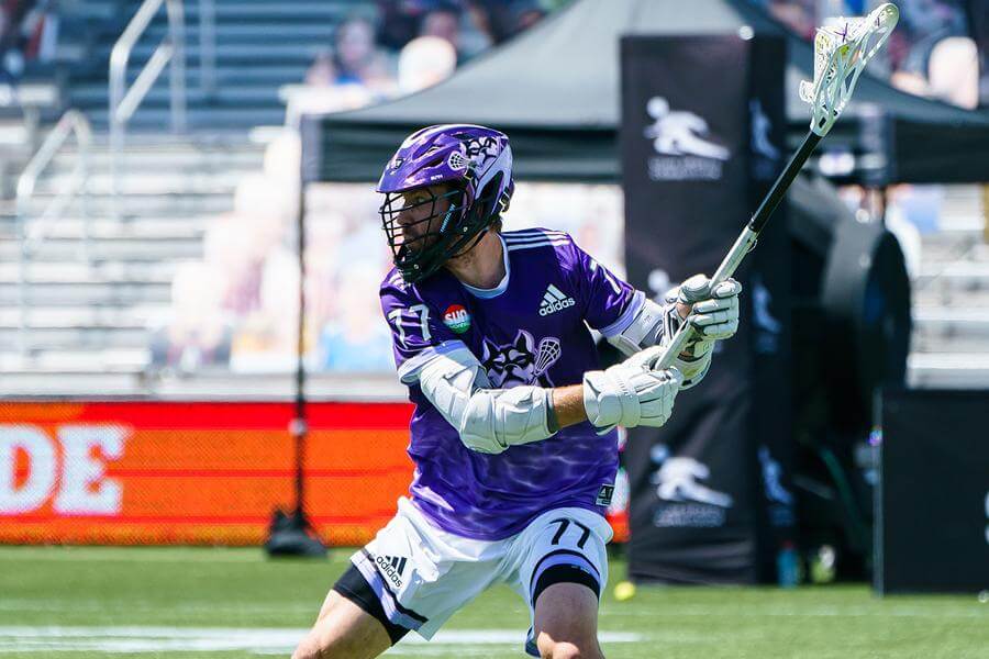
Whipsnakes Lacrosse Club


Champions of the first two PLL seasons, the Whipsnakes stand out with their red/green color scheme. Their options include a white or green helmet; white, green, or red shorts; and white, green or red jerseys. Despite all the potential mix-and-match options, they go mono most of the time. Their primary logo is in the shape of a lacrosse head surrounded by a coiled snake, which also happens to take the shape of an “S.” Probably one of the league’s best logos, wasted on the worst team name.
———
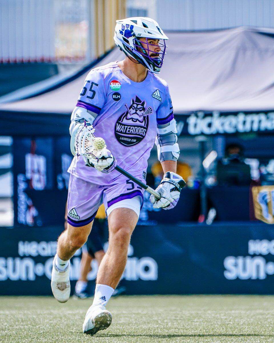
Waterdogs Lacrosse Club
Paul’s favorite team, no doubt. They wear dark purple as their primary color, with lavender and white serving as their secondary colors. Their dark uniforms are purple with a sublimated water effect near the bottom, usually paired with a purple chrome helmet and white shorts. Their light uniforms are basically the same design but in lavender. The mono-lavender look feels like a gimmick — a white jersey with purple shorts would be a big improvement. On the plus side, their primary logo features a stylized bulldog chomping on a lacrosse stick, with the wordmark framed by a water drop — clever! On the down side, the ‘Dogs are another team that has an ad patch.
———
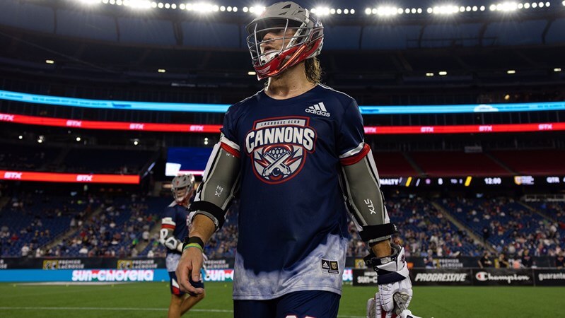
Cannons Lacrosse Club
Cannons are the newest team to join the PLL, but they’ve actually been around professional lacrosse longer than any other team. That’s because they were originally part of Major League Lacrosse (MLL). When the PLL and MLL merged in December of 2020, the PLL acquired the rights to all of the MLL team names and logos. So when it was time for the PLL’s next expansion, instead of creating a whole new team from scratch, the PLL revived the old Boston Cannons identity. The team’s familiar color scheme of navy, red, and grey carried over from the old league. Both their navy and white uniform designs are awkwardly separated by what’s supposed to be cannon smoke along the bottom of the jersey, but it looks more like grey/white tie-dyeing. Also of note: Based on recent Instagram photos from training camp, it looks like the Cannons have new white helmets this year.
———
Paul here. I know absolutely nothing about lacrosse, so I’m grateful to Jared for stepping up and filling us in on this corner of the uni-verse. Please join me in thanking him!
Seriously, Mariners? Fr a nce?
@uniwatch @philhecken pic.twitter.com/YHeHSOEgLm
— SteveinLC (@SteveinLC) April 29, 2021
MLB’s most problematic font: For this week’s Bulletin article, I’m doing a deep dive on the NOB font on the Mariners’ navy alternate jerseys, which over the past 20 years has provided a steady stream of kerning issues and other typographic glitches. In an effort to get to the root of the problem, I interviewed the team’s equipment co-managers, their local stitcher, a team exec, and more. Proofreader Jerry Wolper, who usually maintains a very even keel, calls it “more peak Uni Watch,” and I can’t say I disagree!
My Premium Subscribers will receive this article in their in-boxes tomorrow morning. If you haven’t yet subscribed, you can do that here (you’ll need a Facebook account in order to pay). Don’t have or want a Facebook account? Email me for workaround info. Thanks!
Click to enlarge
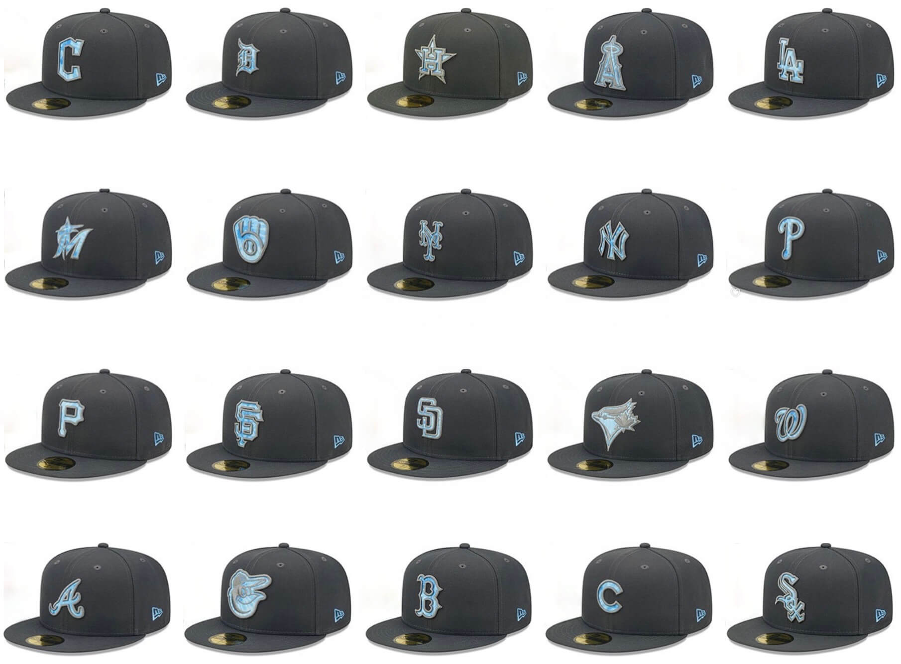
The usual slop: MLB hasn’t yet officially released its Father’s Day caps, but 20 of them appeared yesterday on a retail site, and you can certainly extrapolate what the remaining 10 will look like.
Father’s Day is on June 19, three Sundays from now.
(My thanks to Zac Porta for letting me know that these designs had shown up on a retail site.)
Click to enlarge
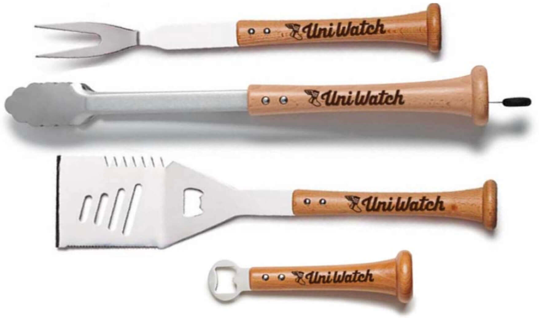
Speaking of Pa’s Day: The folks at Baseball BBQ tell me that if you want any of our cool Uni Watch grilling tools in time for Father’s Day delivery, you must get your order in by next Monday, June 6. The products, with handles made from real baseball bats, are available here.
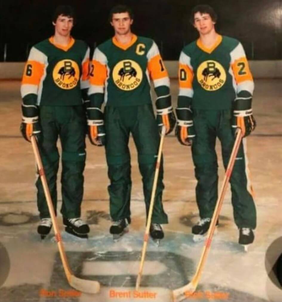
Too good for the Ticker: Gotta love this photo of the Sutter brothers during their stint with the WHL’s Lethbridge Broncos, circa 1980. Tasty!
Longtime reader Mike Styczen tells me that the 1980s were a wild time for WHL uniforms, so I’ve invited him to guest-write an entry about that. Stay tuned.
The Ticker
By Lloyd Alaban

Baseball News: People who vote at Dodger Stadium for local elections today will receive a Dodgers-themed “I voted” sticker (from Patrick Maher). … As if on cue for Paul’s Bulletin article tomorrow, Mariners 2B Adam Frazier’s NOB has some serious spacing issues (from Harry F. Higgins). … The Greenville Drive, affiliate of the Red Sox, will wear throwbacks to honor former Greenville team Black Spinners (from our own Phil Hecken). … Kudos to the St. Paul Saints, who are using vertically arched NOBs (from Brenden Matthias). … You can never read too many stories about the great Savannah Bananas (thanks to all who shared).

Football News: The Falcons teased something uniform-related for today. It’s widely expected to be a red throwback helmet, which we already knew was coming several weeks ago (from multiple readers). … Rusty Lee’s neighbor in Kalamazoo, Mich., found this cool Lions/Packers ticket stub from 1938 in his attic. “They presumably belonged to the house’s previous owner,” says Rusty. … The CFL’s Montreal Alouettes have added a fleur-de-lis to the side stripes on their pants (from Wade Heidt). … UTEP launched a campaign to promote El Paso with the region’s area code, 915, on the team’s helmets (from our own Phil Hecken). … New corporate name for UCF’s stadium (from Timmy Donahue).

Hockey News: A TV station’s sports anchor wore a Sweden hockey jersey while interviewing Indianapolis 500 winner Marcus Ericsson, who is Swedish (from @mrmichael21).. … Tempe’s city council will vote tomorrow on whether to open negotiations on building a new arena for the Coyotes.

Soccer News: The next few items are from our own Phil Hecken: New shirts for Arsenal and Chelsea. … One sportswriter is begging American leagues to stop using “illegible” jersey numbers. … The NWSL’s Washington Spirit is holding two Pride games this year— one at each home venue — that will include rainbow captain’s armbands and corner flags (from our own Jamie Rathjen). … Also from Jamie: The blog Museum of Jerseys has a new post on the goalie kits worn by England at the 1970 men’s World Cup, where they managed to use five different combos in four games. … New crest for Mexican side Cruz Azul (from Sinuhé Guevara). … Reader Peter Clark checked out a soccer-centric exhibit at a design museum in Kensington, England, and took a bunch of photos. … Tennis star Roger Federer received a custom shirt from the Switzerland men’s national team (from our own Brinke Guthrie). … Ladue High School in Missouri has named their soccer field after World Cup and Olympic Champion alum Becky Sauerbrunn (from Timmy Donahue). … New home kit for Stoke City (from Ed Zelaski). … Also from Ed: New shirts and new advertiser for German side Hansa Rostock. … Portuguese side Benfica’s new home shirt has leaked.

Grab Bag: Cross-listed from the hockey section: A TV station’s sports anchor wore a Sweden hockey jersey while interviewing Indianapolis 500 winner Marcus Ericsson, who is Swedish (from @mrmichael21). … New kits for the U.S. national rugby union teams (from multiple readers). … Cross-listed from the soccer section: Tennis star Roger Federer received a custom shirt from the Switzerland men’s national team (from our own Brinke Guthrie). … Here’s some of the history behind the clothing brand Champion (from Tom Turner). … NASA will announce the companies that will design the spacesuits for the upcoming Artemis moon missions later today (from James Gilbert). … Virgin Atlantic has relaxed its tattoo policy for employees (from Timmy Donahue). … Here’s a fun thread on the best helmets in F1 history (from Jeremy Brahm).
A minor correction — the person wearing the Swedish hockey sweater is not Indy 500 winner Marcus Ericsson but the journalist interviewing him. Marcus is the sharp-looking guy in the tux. The photo was probably taken at Monday evening’s Victory Banquet. The tweet about the photo is not worded very clearly so I can certainly see how it was mis-read.
Incidentally, I attended this year’s Indy 500 (my 39th) and was lucky enough to get Ericsson’s autograph the day before the race. I knew he had a great car this year and was consciously thinking as I got the autograph “this guy could win the race.”
Yup, already fixed. Thanks!
Gotta ask. If the PLL teams have no geographic base, how do three of the eight have advertisements? Does the advertiser get a random team?
That’s a great question, and i’m not sure. The only hint I can think of is maybe some of those teams have individual ownership who sell just their team’s jerseys for ad space. I know that the PardonMyTake guys from Barstool Sports are part owners of the Waterdogs. So maybe teams that have individual owners can make that decision. Not sure though.
Thanks, Jared for the breakdown of PLL uniforms. Love the creativity in the helmets.
Looking forward to Mike Styczen’s WHL article. True, lots of interesting stuff for WHL uniforms in 1980s. When the teams quit wearing Cooperall long pants in 1987-88 and went back to short pants, have to say all 14 teams at the time had pretty solid uniforms. It was a good-looking group.
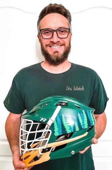
Thanks Wade! I agree about the helmets, wish the Redwoods brought back their original “tree lined” helmet, which is what i’m holding in the photo. I like it better than just the bear
Just wanted to say I enjoyed the PLL breakdown. It’s really great to see more pro sports leagues get ‘their day’ on UniWatch.
I agree with this sentiment. Great job Jared!
Thanks Memal! I appreciate it!
Thanks Julie! I hope to be back next year!
Well Done Jared! I’ve been trying to get Paul hooked on to few lacrosse Uni’s across the year through Twitter but hands-down appreciate everyone giving the PLL some love for this season. Be well everyone and shouts out Coed Lacrosse.
Hey Sal P!
I’ve sent in a lot of lacrosse stuff for the ticker over the years too. With the growth of the PLL, I think it just lined up perfectly for this year! Thanks for the positive words!
Without geographical locations for the PLL teams, are they all headquartered in El Segundo, CA, where the league is headquartered? I mean where do the teams live and practice? What are the logistics? Or do they all just meet up before the season for a training camp, and then travel from one city to the next every week, like a traveling circus? Or do they fly back to their practice facility location every week to practice, and then fly into the next city location?
Presumably it could be somewhat like individual sports, who have tournaments at various locations. The teams always travel to play on tour like the PGA. The obvious difference being the need to practice as a team, so all members of a team need to live in close proximity to practice during their season and whatever their offseason practice schedule looks like. Could be EVERYONE lives where ever the the league’s corporate office is located? That would probably make the most sense to make free agency and trades easier.
Hey RICKAZ,
Your traveling circus analogy is the most accurate. They all go off to their respective lives and homes during the off season. Then all 8 teams meet up at a decided location for training camp (Albany for this year) and then they play week 1 in Albany. Week 2 they go to Charlotte so all 8 teams will travel to Charlotte. They’ll be playing at American Legion Memorial Stadium so they’ll use those facilities for practices until the games that weekend and then off to the next! HQ in Segundo is corporate, like ticket sales, marketing and so on
Thanks. This makes sense. I just wonder how attached fans can be without a city to represent?
Understandable, in my opinion it provides a new opportunity for anyone to follow any team. I don’t feel obligated to follow a team just because I live/lived in their city. I picked the Redwoods as my favorite because of the color scheme, logos, uniforms and the individual players on the roster. Also, “Redwoods” has a slight nod to California, which is where i’m originally from. They may not be based in California, but the scheme sort of implies a geographical connection. On the other side, my father-in-law is from Dallas, so my wife picked Atlas (because of the longhorn), so now we have the in-house rivalry kind of thing going. Makes it fun!
Hey RickAZ-
Its really more to do with the structure of lacrosse, you’d attach a rooting interest at the college level and then have nowhere to see the players play (sorry, box doesn’t count).
The live atmosphere makes teh format work too. Some of the MLL games (they had actual geographic teams & home games) were lifeless. PLL games are extremely well attended, and are multi-game tickets which echoes the format of the NCAA weekend Championship.
I think its a common example, so eg: I tend to enjoy watching any high-level team play, so its easy to find a couple players-ones I coached/played against, or went to schools I root for/attended.
It will never approach the same passion I have for other specific teams, but a general rooting interest in the sport and its evolution.
Would think it would be a lot like National Lacrosse League. The box lacrosse league does have teams based in different cities. However, the players have other jobs considering NLL pay is not a lot and there are only 18 games for a team in a season. Many players probably do not regularly even live in their home cities where their teams are located. Fly in and out for games.
I find the evolution of lacrosse jerseys so interesting with this, and would LOVE a follow up about how players went from basically wearing hockey shoulder pads (sometimes even liners AND shoulder pads) to not wearing any at all, and how that now has led to them being able to wear what are essentially soccer jerseys.
To be clear, I’m into it. Growing up (I played high school in the mid aughts), basically ever kid tried to wear as small shoulder pads as possible (I just wore liners). I have a feeling a big part of it was aesthetics, as I thought I looked cooler without the padding, and was willing to have bruises that went from my triceps up through my shoulders to maintain that cool. The refs would even pat our shoulders before games to make sure we were wearing any pads at all.
Anyways, being away from the sport for about 15 years it’s wild to see the pads gone. Can anyone who has been following closer add any insights to this? From a quick search it seems college players are still wearing some sort of shoulder pads, so is this an NHL half visor vs. college full cage situation?
Hey Gabriel,
I do not know for sure, but I agree, the shoulder pads/liners seem to be (extremely) optional in the PLL. Your NHL to NCAA Hockey analogy seems spot on. NCAA players absolutely wear shoulder/chest pads and I think the PLL has just an understanding that it’s “at your own risk”
New US Lacrosse mandated safety protocols for shoulder pads/chest protectors put in place for the season that is currently winding down. All shoulder pads/chest protectors have to be Lacrosse specific (no hockey pads) and have increased padding in the chest; meeting NOCSAE safety standards.
link
Bicep pads are still optional, but there has to be something in the chest/sternum, collarbone area.
As an aside, my son’s team wears sleeveless jerseys, with short sleeves underneath.
As Brent said the pad rules have changed recently. Youth & HS players have to wear certified shoulder & chest pad the past few years. The new pads basically added a hard chest shell to protect against internal injuries from a blocked shot (sternum, ribs impacting heart or lungs, etc). My son plays D3 college level & this past season they also have the new regulated shoulder/chest pads.
In general the protective equipment is required & regulated heavily at the youth level for protection. You see young kids almost completely covered in bigger pads, shoulder w/ arm protector then large elbow pads basically cover the entire space from there to their gloves.
Like you described, as the players get older they tend to wear the minimum required by the letter of the law. Always looking for an edge in speed, mobility, shooting accuracy.
In the PLL they are part-time professionals & adults. I agree with Jared’s reply, they do not appear to be required to wear them & they are playing with assumed risk (I’m guessing waiving liability is somehow in their contract).
IMO the tour model has also lent itself to a large group of players mentality, not cut throat bitter rivals. It gives me the feel of weekend tournaments or an all star weekend vibe of other pro sports. Unlike all star games, these games are still physical but the players all know & respect each other. Lacrosse is expanding but still regionalized so many grew up close or played in college together. Far fewer dangerous hits or “cheap shots”
Thanks everyone for the replies! That all makes sense. I actually modified my old lacrosse shoulder pads for men’s league hockey to serve as a chest/heart protector.
PLL seems fun but I’m old enough to remember when the cannons were selling out Nickerson Field at BU (I was a soda hawker at the games), so a bit sad to see the MLL’s demise.
I was going to send more images of the kerning issues with the blue jersey of the Mariners last night. The biggest current problem is with Julio Rodriguez’s jersey.
Road Grey
link
Blue
link
(Interesting side note on Rodriguez, he seems to like wearing a NW Green belt rather than a blue/black one).
Shouldn’t the solution be to spread the letters out until they match the distance of the two widest-spaced letters?
Wow! Great stuff today, Jared! Thanks for putting this together and sharing it with us!
Appreciate for the positive words, BvK!