
Good morning! Hope everyone had a healthy and happy holiday weekend.
Yesterday was Memorial Day, so MLB players wore poppy patches, inscribed with “Lest We Forget,” on their jerseys. This year, however, there were no patches on the sides of the caps.
The same change was made for the umpires:
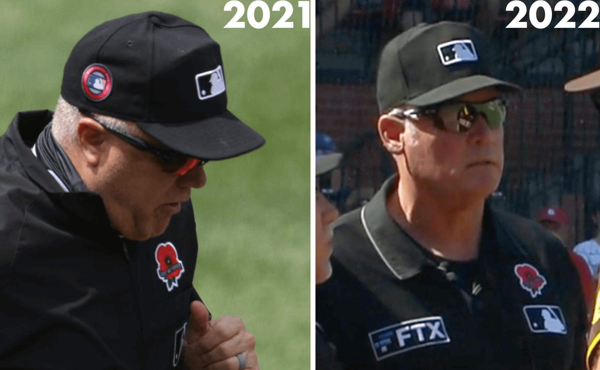
A quick recap: For many years, MLB dressed players in G.I. Joke outfits for Memorial Day (even though the holiday is a solemn day of mourning the fallen, not a rah-rah day to support the troops). That changed in 2019, when players began wearing the poppy and the cap patch. There were no MLB games on Memorial Day in 2020 due to the pandemic, and then the jersey and cap patches both reappeared in 2021. Now they’ve apparently scrapped the cap patch.
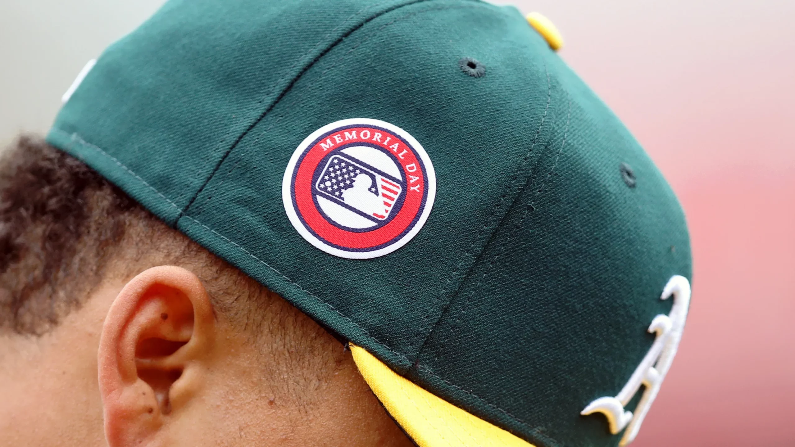
To me, this is addition by subtraction. For starters, I’ve never liked cap patches, because they tend to throw the cap’s symmetry and balance out of whack. Moreover, the Memorial Day patches always felt rote and unfinished, like they forgot to put some type along the bottom of the mark:
MLB’s next holiday: Father’s Day, on June 19.
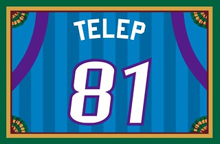
Membership update: All of the Purple Amnesty Day orders have now been processed (including Nicolas Telep’s card, shown at right, which is based on the uniforms of the WNBA’s Utah Starzz). I should be able to get the printed/laminated versions of this latest batch in the mail by the end of this week.
Working on the purple cards is always fun, despite the repeated exposure to my least-favorite color. Thanks to everyone who helped make Purp Walk 2022 such a great success!
As always, ordering a membership card is a good way to support Uni Watch, and fun to boot. And remember, a Uni Watch membership card entitles you to a 15% discount on any of the merchandise in the Uni Watch, Uni Rock, and Naming Wrongs shops. (If you’re an existing member and would like to have the discount code, email me and I’ll hook you up.)
You can sign up for your own custom-designed card here, you can see all the cards we’ve designed so far here (now more than 3,300 of them!), and you can see how we produce the cards here.
Meanwhile, speaking of purple, Bryan Molloy, who designs our purple merch each year, recently spotted this purple grape shandy, called the Purp, made by a New Jersey microbrewery:
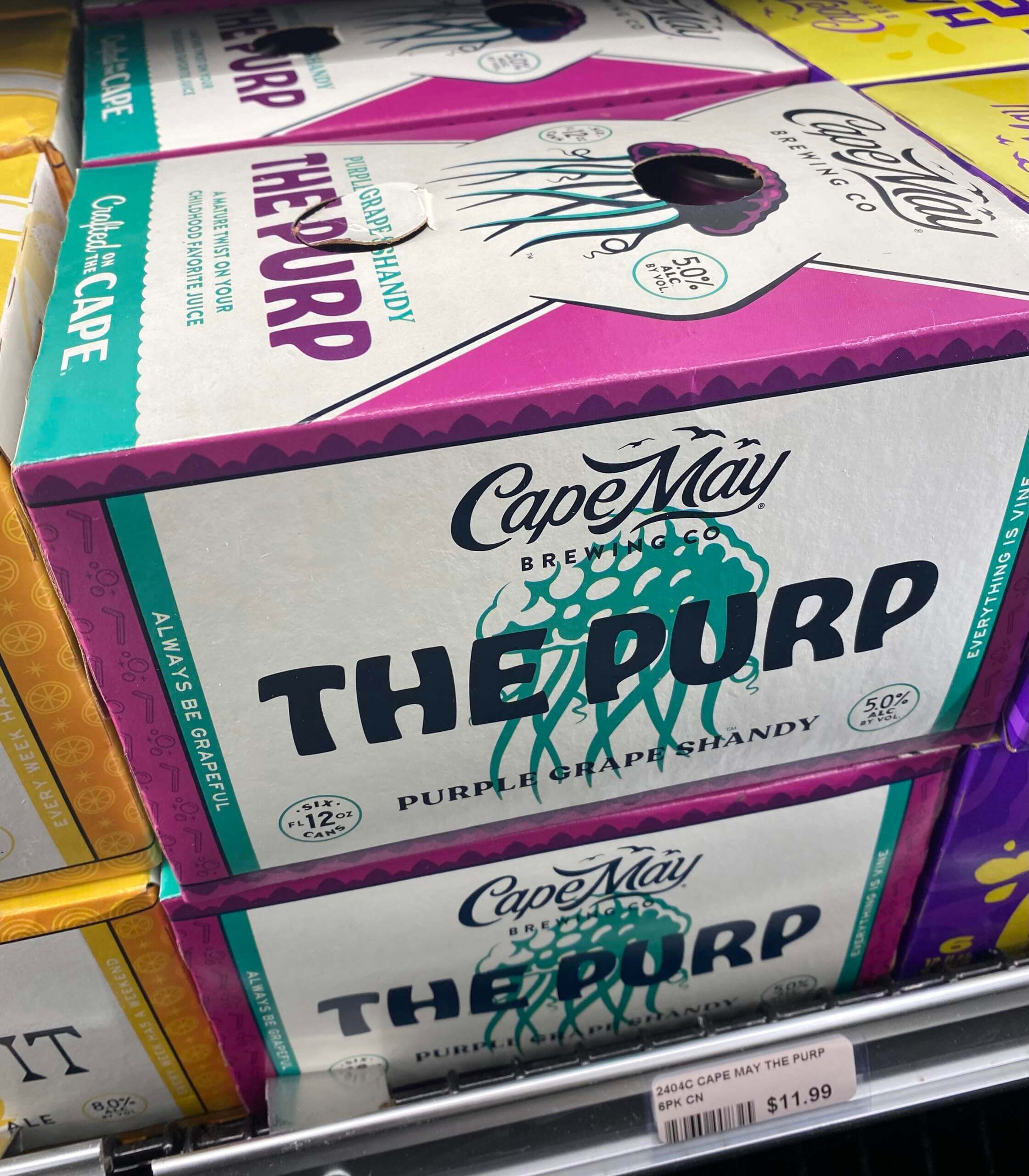
Whatever we end up doing for Purp Walk next year, it will definitely have to include a few cases of this stuff!
Click to enlarge
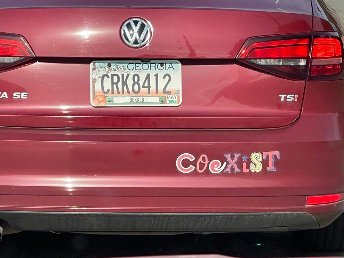
Ransom note: Reader Jason Mohr spotted this clever composite bumper sticker message in Iowa. Nicely done!

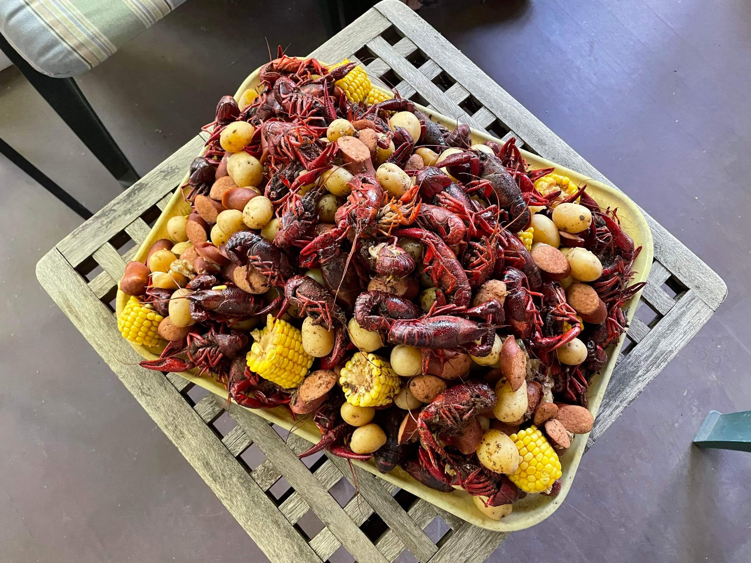
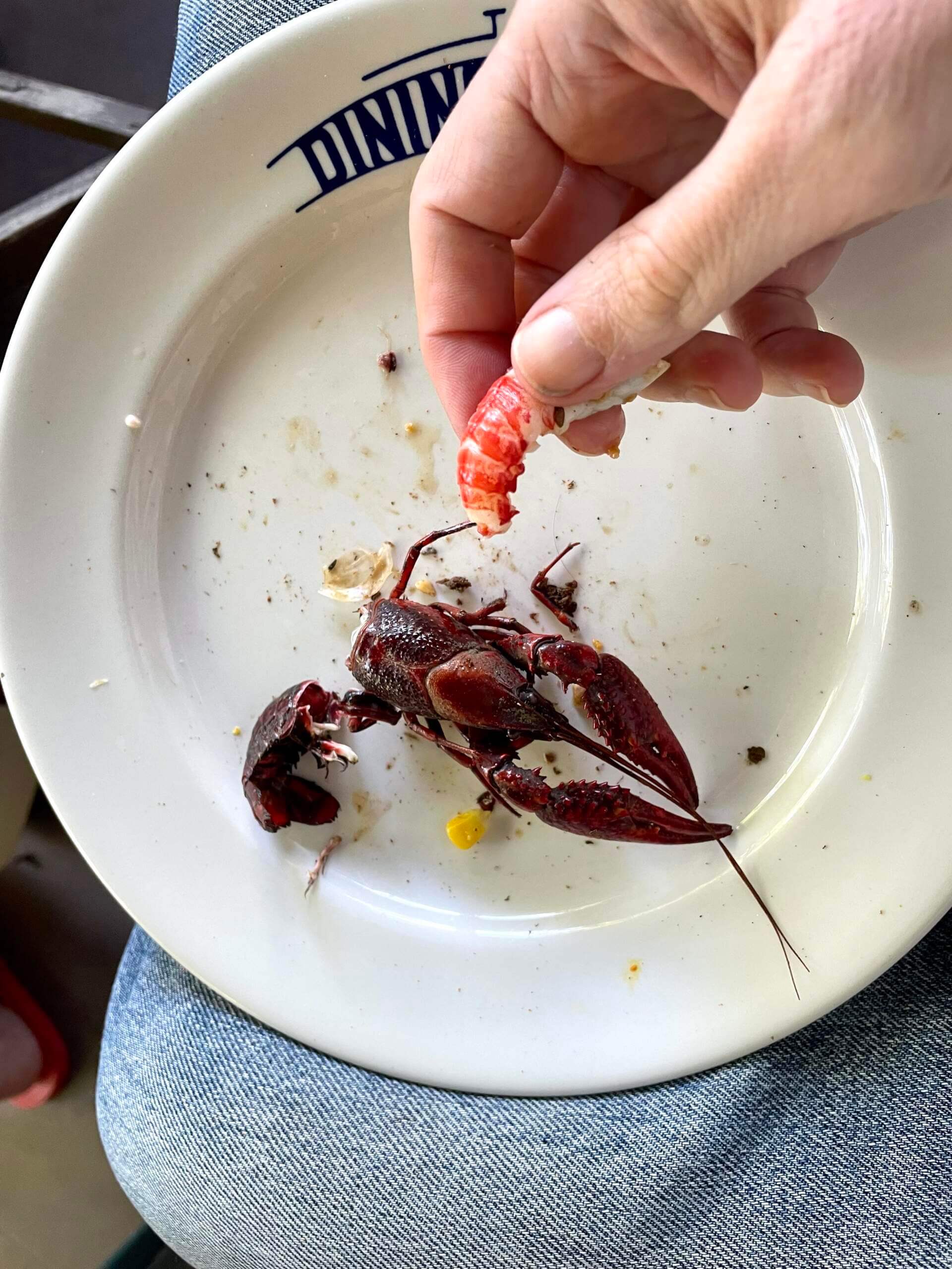
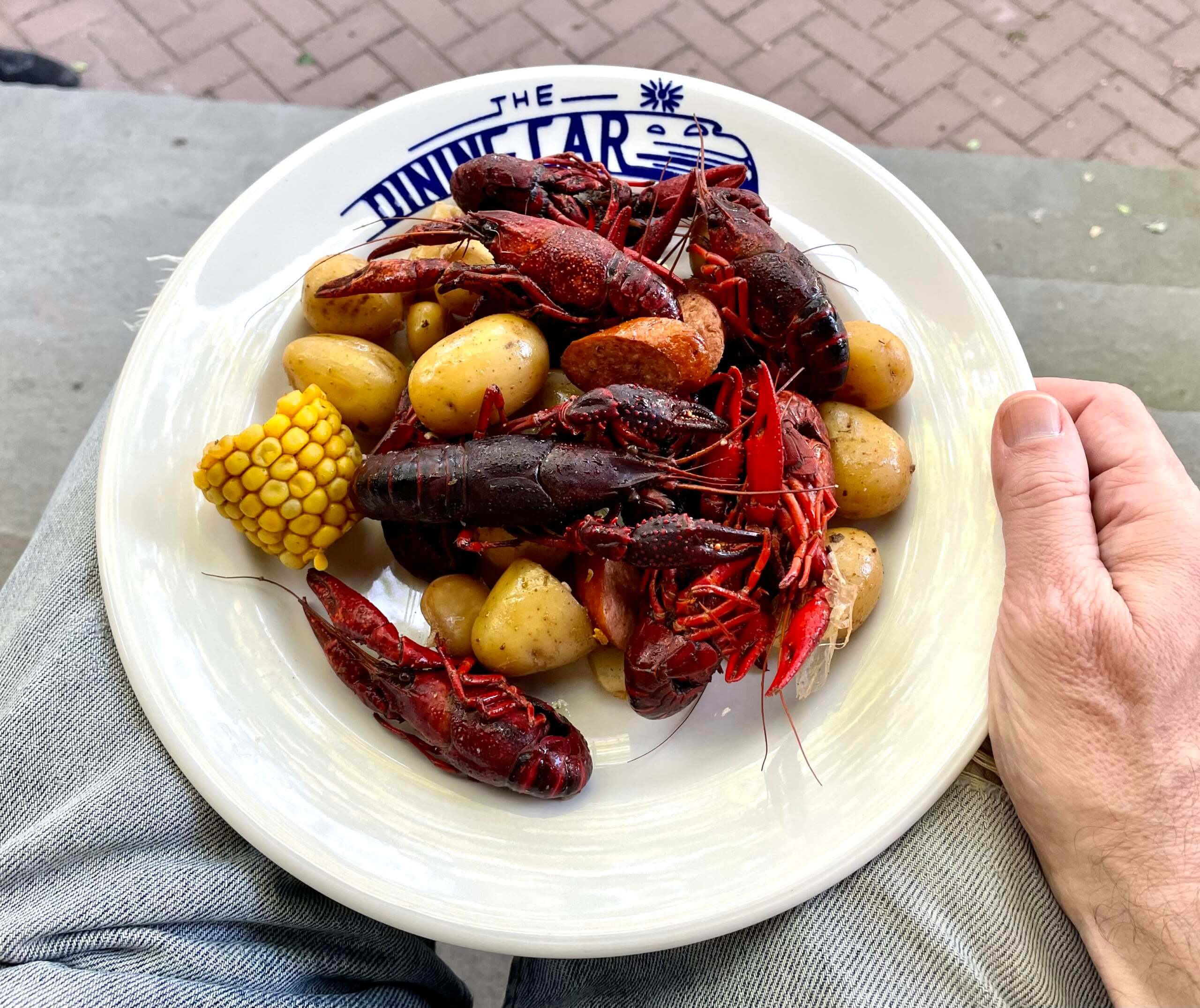
Culinary Corner: We had some friends over on Sunday for a crawfish boil on the porch. Got a bunch of bugs from my favorite Chinatown fishmonger, added a bunch of corn, potatoes, andouille sausage, and spices (from this recipe), and voila — an instant party.
Turned out great:
Hope your long weekend included some similarly fun cooking projects and/or feasts!

Uni Watch Screening Room: Over the weekend we streamed the new-ish Norwegian paranormal thriller The Innocents (which we really, really liked — highly recommended). But then something really strange happened at the end: The closing credits scrolled down, instead of up. I couldn’t recall ever having seen that before. Such a simple thing, but it looks so weird!
When you think about it, it makes sense that upward-scrolling credits are the default, because the visual effect mimics our cultural habit of reading from top to bottom on a printed page or screen. I’d never really thought about that before.
I mentioned this on Facebook and my friend Nate pointed out that the closing credits in the 1995 movie Se7en also scroll downward. I love that movie but had no memory of the credits, so I looked it up. Sure enough:
Is anyone aware of any other movie(s) with downward-scrolling credits?
Update: Reader/commenter Anthony Verna reports that IMDB has a whole subcategory listing for movies with downward-scrolling credits!
Click to enlarge
Collector’s Corner
By Brinke Guthrie
Follow @brinkeguthrie
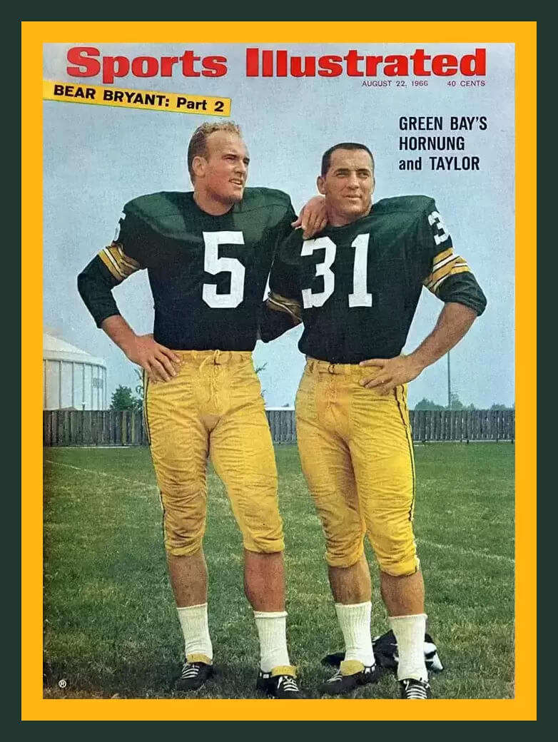
Back in December, I found this shot of Packers stars Paul Hornung and Jim Taylor on the cover of this August 1966 issue of Sports Illustrated. (Here’s a current auction for a framed copy.) And I was struck by the fact that those blocky numbers, the 5 and the 31, were so white and bold against that dark green background. It reminded me of an old retro clock radio with the time showing “05:31.” I looked at the calendar, saw that May 31st, 2022 was indeed a Tuesday (the day that CC runs), and thought, “File in the ‘UW Save’ folder.” And here we are, on 05:31, the last day of May — the perfect day to run this!
Now for the rest of this week’s picks:
• This is a Double Header Softball from J.DeBeer & Son. Great ad copy here: “You Have Bought A GOOD SOFTBALL. Play It Hard!” Also: “It Has The Pep And Stands Punishment.” Why don’t marketing departments use “pep” anymore?
• I think this Minnesota Vikings helmet tailgater grill would be ideal for the next Purp Walk party.
• The Baltimore Orioles produced this “Year of the Bird” bumper sticker back in 1970, featuring a rather psychotic-looking version of their cartoon bird logo, who is wearing the regular logo on his cap!
• Here’s a 1968 Minnesota Vikings AM. Radio made by Admiral; the seller helpfully notes it will get “static plus a couple of local AM stations.”
• This 1967 book is titled Ice Hockey Rules in Pictures. The cover shows both teams are wearing colored jerseys, and they closely resemble the Red Wings and the Rangers.
• Never seen this before! The Super Men of the Super Bowl is a 1978 magazine covering the first dozen Supes. Looks like the Cowboys and Broncos on the cover, as they played in SB XII. Great artwork inside, too. It was done by the “Creative Services Division of NFL Properties.” Would that have been a fantastic place to work at or what?
• Love the box art on this 1943 board game simply called, All Star Football. This one was made by Corey Games, a division of the Quality Paper Box Co, Boston.
• Ed-U-Cards made this 1964 Detroit Tigers Baseball Card Game. You get “All the Thrills of a Real Baseball Game.”
• The name “Birmingham” was shortened to just “B’Ham” on this 1970s WHA Birmingham Bulls puck.
• Here’s a set of three 1994 New York Mets drinking straws, “For the All-Star in Your Family.”
Sorry, no Ticker today, because the entire Uni Watch team had the weekend off. The Ticker will return tomorrow. See you then! — Paul
“Repo Man” was the first movie I remember with credits scrolling the wrong way. It fit the off-kilter tone of the film perfectly.
There’s an IMDB list for credits scrolling down:
link
Excellent! Will add to text.
The next MLB holiday I believe is actually Fathers Day.
Oops — right you are! Will fix.
MLB’s next holiday is Father’s Day weekend, which is June 19th (and also Juneteenth).
MLB’s Memorial Day restraint was impressive. If only they, and the rest of pro sports could follow suit on other special days.
Nice to see Cape May BC get a shout out on Uni Watch, a great regional brewery down here in South Jersey. Though can’t say Purp is my style of beer. They do a have a pretty great design aesthetic for their beer labels that Uni Watch fans would probably enjoy. I’m happy to supply / mail some Purp to whatever event the next Purple Amnesty Day brings, whether I am in attendance or not.
A fellow South Jerseyan and I agree with Greg – CMB makes a lot of great beer. Not big on the shandies (and they do a lot) but they’re quality.
Your crawfish boil has me excited for my friend’s boil this weekend.
Looking at the card gallery, and I’m wondering what’s up with the identical yellow 44s? Obviously by the different names on the files, two people requested the same thing, but I have no idea where it’s from.
One person requested a design for himself and an identical design for someone close to him.
Kind of figured something like that, but it doesn’t explain where the design comes from, and that’s what I’m really curious about.
A sweatshirt being worn by a kid in an old snapshot.
Interesting. So I’m guessing it’s a pretty personal meaning for them, then. Curiosity satisfied, moving on now. Thanks! ;)
Two comments about the great Paul Hornung-Jim Taylor SI cover. First, football players always look better with long jersey sleeves, no matter how muscular their arms may be. Second, the “5” and “31” are from two different number fonts. The serif font of Taylor’s No. 31 was largely abandoned after the 1964 season by the Packers.
Good spot…I wrote about this in my piece last summer about the Sand Knit font.
link
Just came here to express my appreciation for the fact that the “coexist” bumper sticker was spotted in Iowa but evidently belongs to someone from Georgia. I suspect there isn’t a lot of Georgia-Iowa traffic as a general rule.
That was my first thought also!
I can’t place the S in the coexist sticker. What team is that?
link
I think the S is a Seattle Mariners S.
link
I’m drawing a blank on the E. Anyone know what team it is from?
It’s isolated from the Montreal Expos’ logo.
It’s the “e” from the link eMb (genius) logo
here a better link (I *think* done by the great Todd Radom)
It’s fun to see all the cards in the gallery, especially the ones you have to figure out the meaning behind. Also, good job on my 2022 Purp card. It turned out exactly as I had envisioned. Hoping to see it in my mailbox soon!
Unrelated MLB question – when did the Phillies start wearing a red alternate jersey? I saw it for the first time this week and was thrown for a loop..
They have such nice (classic) alts as it is, shame
Good recap here:
link
Hornung/Taylor Picture. Love the old school look. Under the calf socks without another colored sock showing