For all photos, click to enlarge
[Editor’s Note: Today we have an NWSL Season Preview from our own Jamie Rathjen. Enjoy. — PL]
By Jamie Rathjen
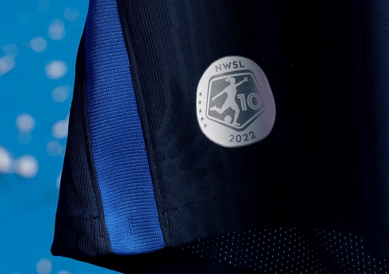
The NWSL is celebrating its 10th anniversary this season with a patch at the hip of each team’s shirt (shown above) and a small logo added to its ball. (Both marks conveniently avoid the words “season” and “anniversary.”) A number of the new team designs this season also feature patches at the hip, usually on the opposite side from the league anniversary patch.
The league added two new expansion teams in Los Angeles and San Diego — Angel City and the San Diego Wave — while the previously nameless Kansas City team is now known as the Current.
The season structure is similar to last year, with the Challenge Cup (a cup competition/preseason tournament) held mostly before the regular season starts. However, some teams have once again waited until closer to the start of the regular season to release new shirts, opting to play for about a month before doing so.
For the first time in several years, no teams are playing in baseball stadiums (the two that did, the Kansas City Current and Seattle’s OL Reign, both moved in with their MLS equivalents). From the “Sure, why not?” department, the Orlando Pride are also hosting a game in the infield of Daytona International Speedway on July 3.
You may notice that every team has a second shirt that is either white or close to it. That’s apparently a league rule, and I probably don’t have to tell even the non-soccer readers that that’s not something any other soccer league does. [Actually, I didn’t know that! — Paul] But last week new commissioner Jessica Berman said she would look into the rule, which I find a needless restriction on designs.
With all of that in mind, here’s the team-by-team rundown of this season’s new kits.
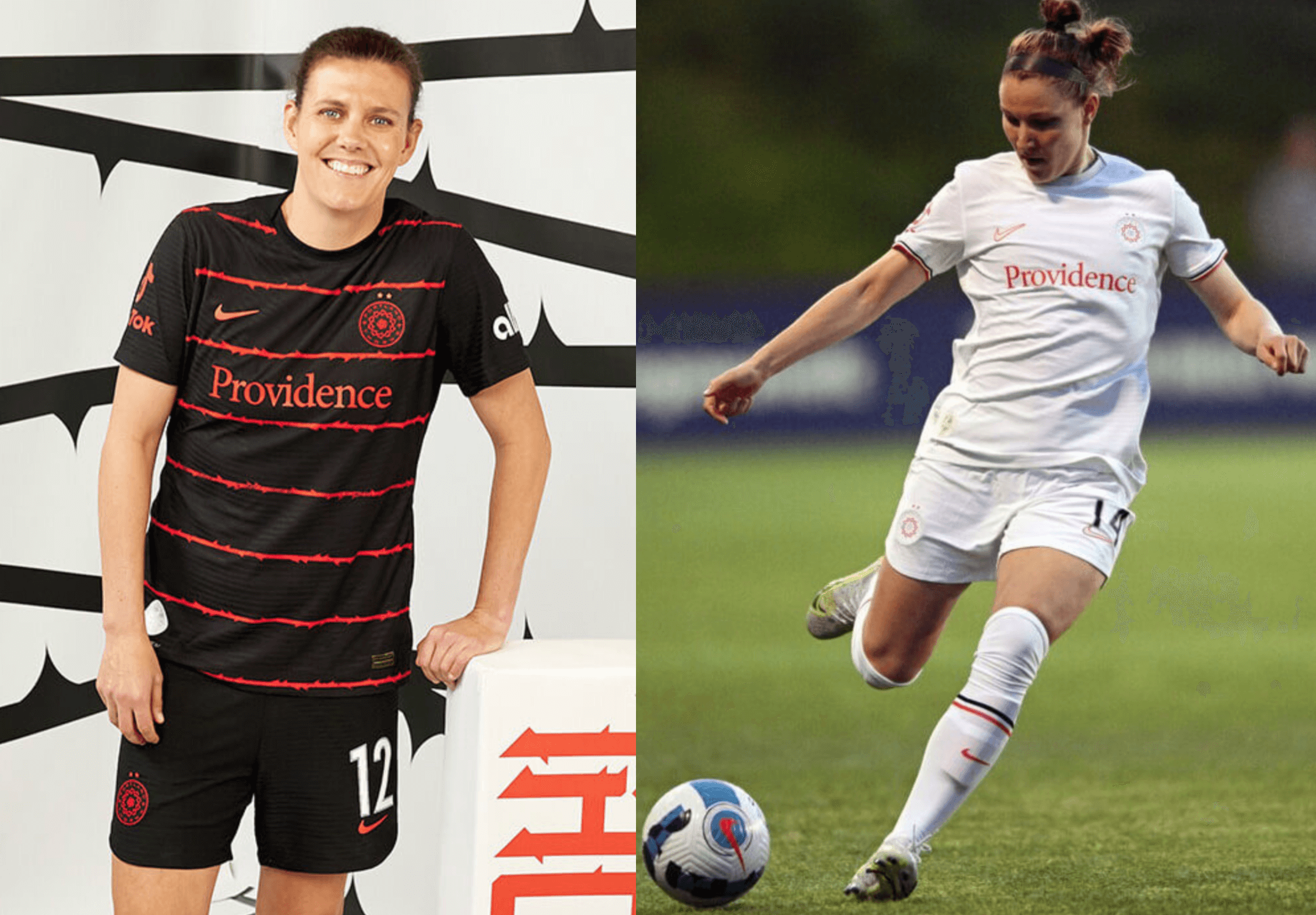
Angel City
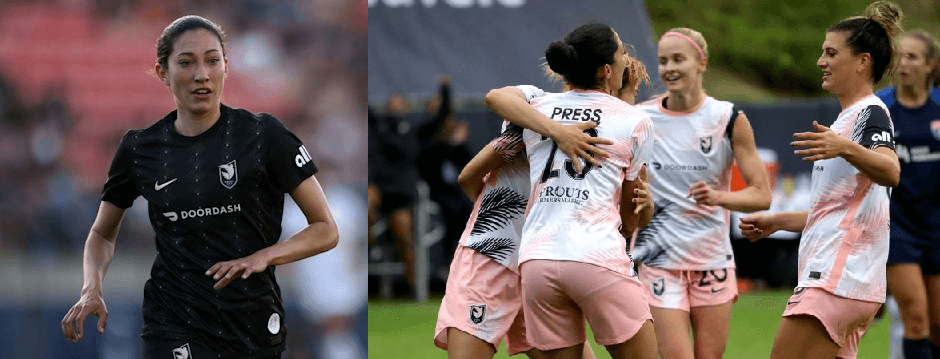
The Los Angeles team’s black first shirt has actually been out since last year, well before the team’s first games in March. The team doesn’t have the same ownership as MLS’s Los Angeles FC, only playing at the same stadium, but I really felt like they’d remind me of LAFC’s mono-black look with a different accent color.
The second shirt goes some way toward countering that idea, because it leans heavily on the pale pink secondary color. It throws in some palm tree fronds, which continues a trend of NWSL teams referencing nature in their designs.
Chicago Red Stars
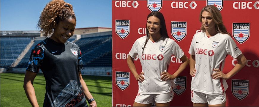
The Red Stars once again want to hit the city theme, with the new white shirt supposedly inspired by skyscrapers. I don’t think this is going to be as memorable as the city-flag-on-chest design that it replaced, because the skyscraper pattern design is so subtle you can’t see it from any distance. There’s also a Roman numeral XV, because this is actually the Red Stars’ 15th anniversary, even though their first season was in the NWSL’s predecessor, Women’s Professional Soccer.
Houston Dash

The Dash’s new white second shirt uses a star pattern borrowed from Houston’s flag. A version of the flag without the city seal inside the star appears as a patch on the lower-left front. When combined with the NWSL 10th-anniversary/season patch, that means this shirt has patches on both sides of the bottom front.
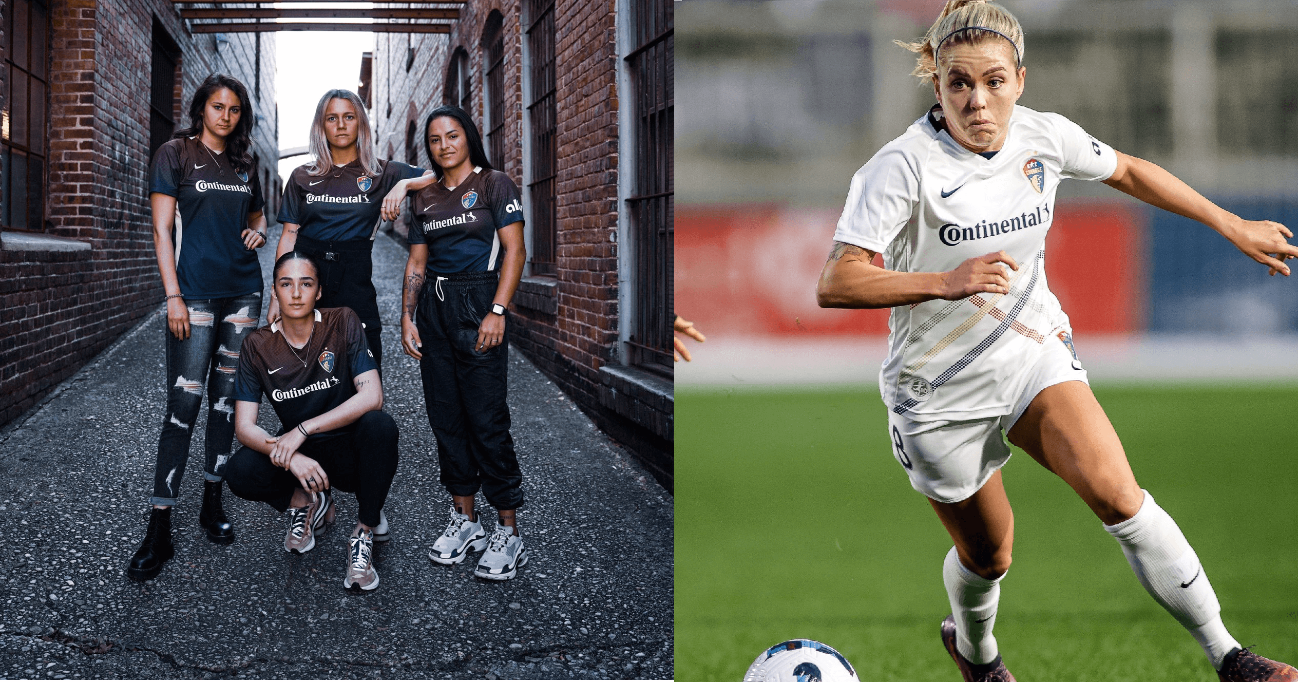
Kansas City Current
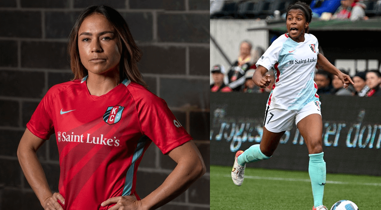
The Current kept their red/teal color scheme after their renaming, which I think works surprisingly well with their primary red/red/teal combo. The new red first shirt is similar to the one it replaced, adding the wavy pattern from the team crest through the center.
The new white second shirt is a step up from the solid-white design used last season, which was bereft of color because it was the team’s very first design before we even knew what their color scheme would be. The shirt now has some teal splotches and red accents.
For some reason, neither shirt’s side stripes match those on the corresponding shorts. The red shorts’ white accents match neither the old nor new red shirts that have red and teal side stripes, respectively. The white shorts also have black accents when the white shirt uses red.
North Carolina Courage
The Courage have usually gone with minimalist designs and avoided any serious attempts at “storytelling,” and that’s true again with their new blue first shirt. This is another design that has a second hip patch, in this case of the North Carolina state flag.
NJ/NY Gotham FC
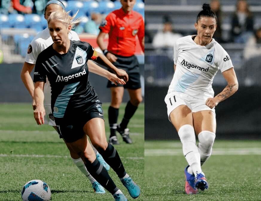
Aside from a new advertiser, Gotham didn’t make any design changes for this season.
OL Reign
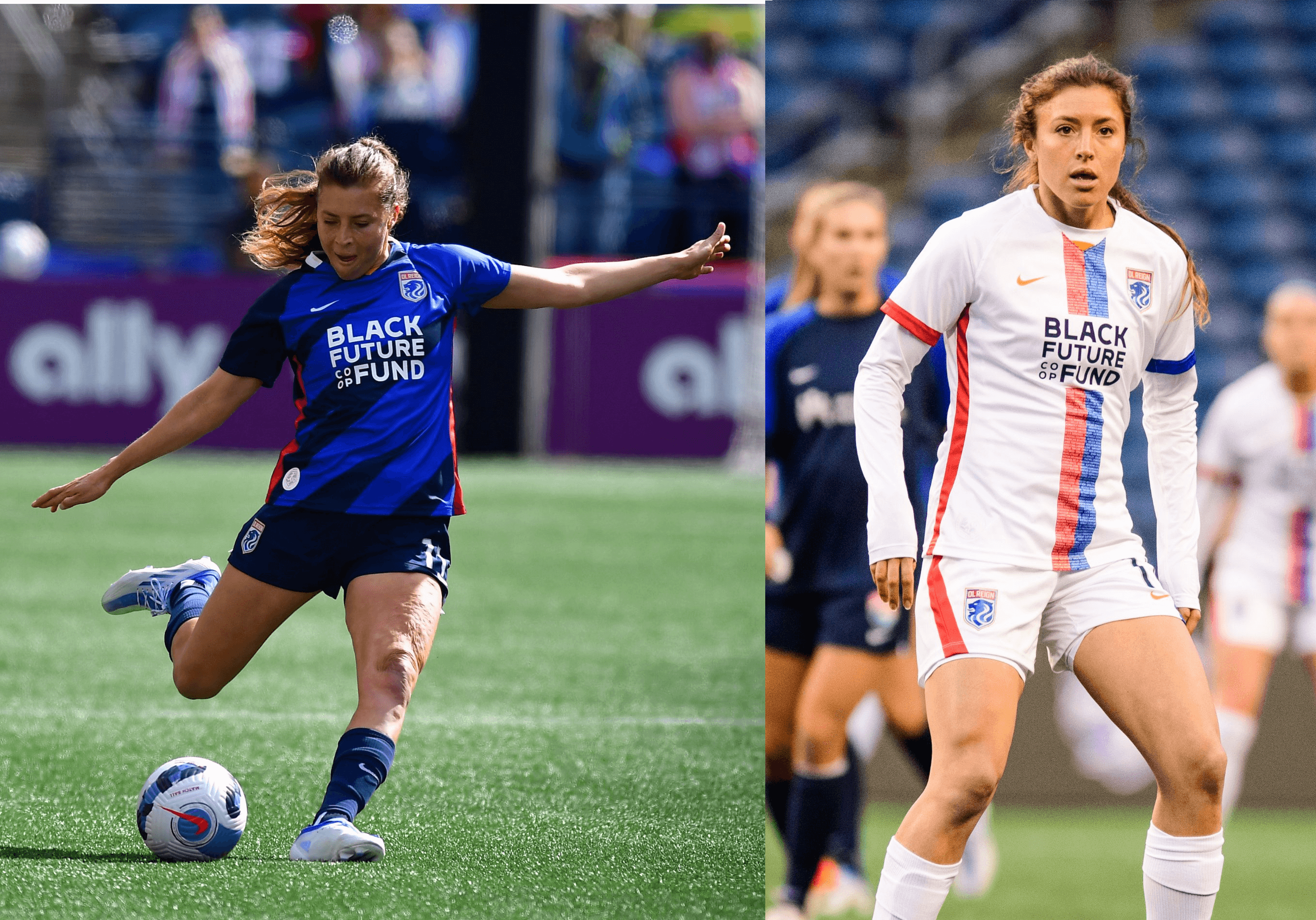
The new white shirt for Seattle’s OL Reign is again heavily influenced by the French parent club, Olympique Lyonnais. The half-red/half-blue vertical stripe on white is an extremely common design for Lyon, both this season and when their men’s team won France’s Division 1/Ligue 1 seven times in a row in the 2000s (although the centered stripe is less common than off-center). The non-matching red/blue trim is also a Lyon element, having appeared on the team’s 2020-21 first kit.
The center stripe also appears to contain the names of all Reign players, as a 10th-anniversary commemoration.
Orlando Pride
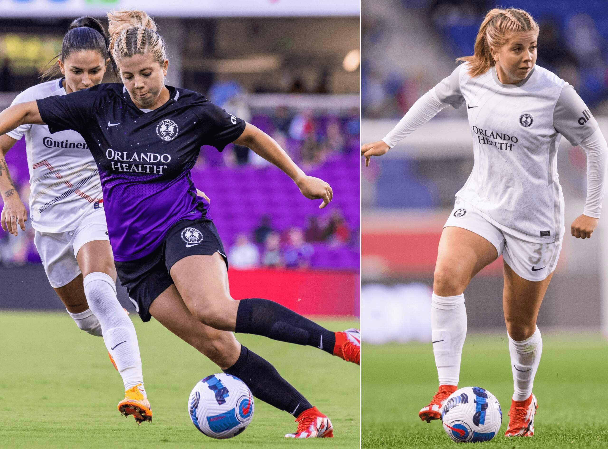
The Pride released a moon-based shirt last season that was purely merch, but they’re now actually going to wear one. They’ve leaned heavily into the cosmos theme for their designs two times in a row, sticking with their black space-themed shirt from last year. But like that merch offering last year, this new design is basically a white T-shirt with grey sleeves dressed up in marketing. It has grey numbers and NOBs, which are not the easiest to see.
This shirt has another patch where the 10th-anniversary patch should go of the Greek goddess Artemis, who is associated with the moon. I am all for uniform elements from classical antiquity, but by including one the Pride appear to have skipped the 10th-anniversary patch on the white shirt, at least for now.
Portland Thorns
The Thorns’ previous two designs, which had rose and thorn patterns, were really popular. That’s not the case with these new ones. The black first shirt is basically a colored version of the previous white thorn design, while the white shirt is, well, white. It looks like something MLS’s Timbers would wear, and I don’t mean that as a compliment — the NWSL has shown by now that its designs usually have a bit more to them. Instead, it was the men’s team that got the rose pattern this season.
That’s one consequence of soccer teams changing designs so frequently: When they hit on a great idea, it’s gone after one to two seasons, and designers can’t come up with great ideas constantly.
Racing Louisville
The new white second shirt is not that different from the one it replaced. But while that previous one had a purple fleur de lis pattern, this one features mint green. If I was comparing them directly, I’d rather have last year’s design, with purple shorts, than this year’s, which leaves in enough purple accents with the mint green that the result feels like a mishmash.
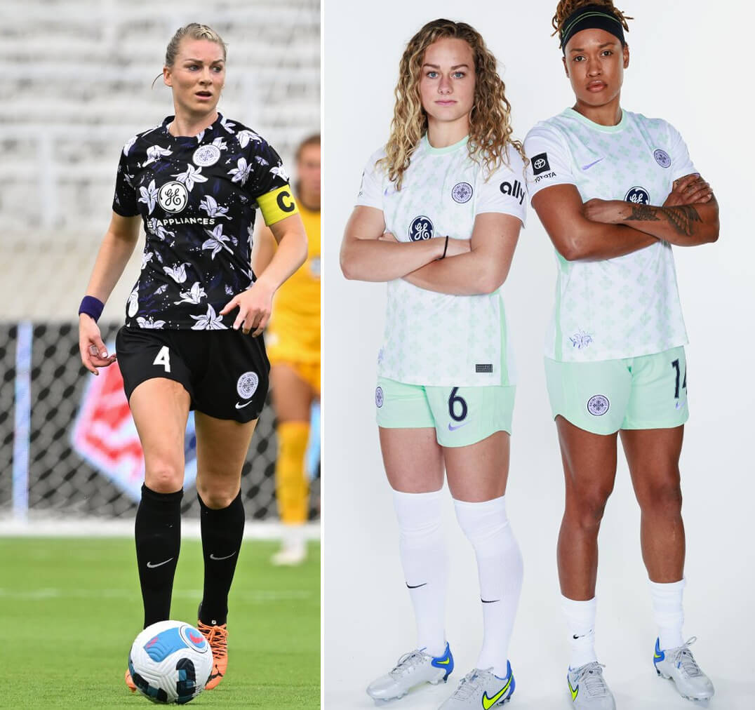
San Diego Wave
The Wave’s crest introduced a very promising color scheme of dark blue with pink, teal, and orange. Despite that, their wardrobe initially seemed plain until the regular season started. While the Wave’s numbers and NOBs on their blue shirt were white in the Challenge Cup, they changed to pink and teal, respectively, before the first regular season home game, which is a colorful addition. They’ve also added a small “SD” patch.
The blue shirt has so far been paired with a solid white one. Still a very plain start, boosted somewhat by the bright NOBs and numbers, but I see potential for San Diego.
Washington Spirit
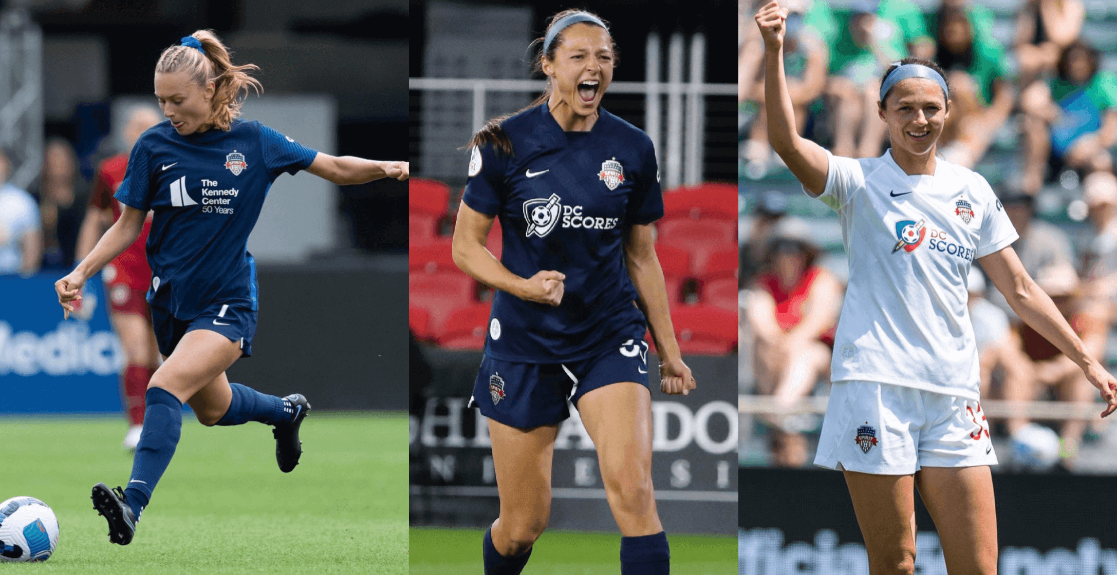
I root for this team, so I’m biased, but I really liked the Spirit’s blue/red/blue combo, even more so because they won a championship in it. But they’ve done that with understated shirts and now have blue shorts, which takes away what was for me the best part of the combo. The Challenge Cup-only shirt (in the center of the pics shown above) and the regular season design (on the left) are similar to each other, and more of the same, after the first Spirit blue shirt was kept for two years.
The white second shirt is back for the fourth consecutive year in a row, which is the rarest of milestones in the era of soccer teams changing designs so frequently.
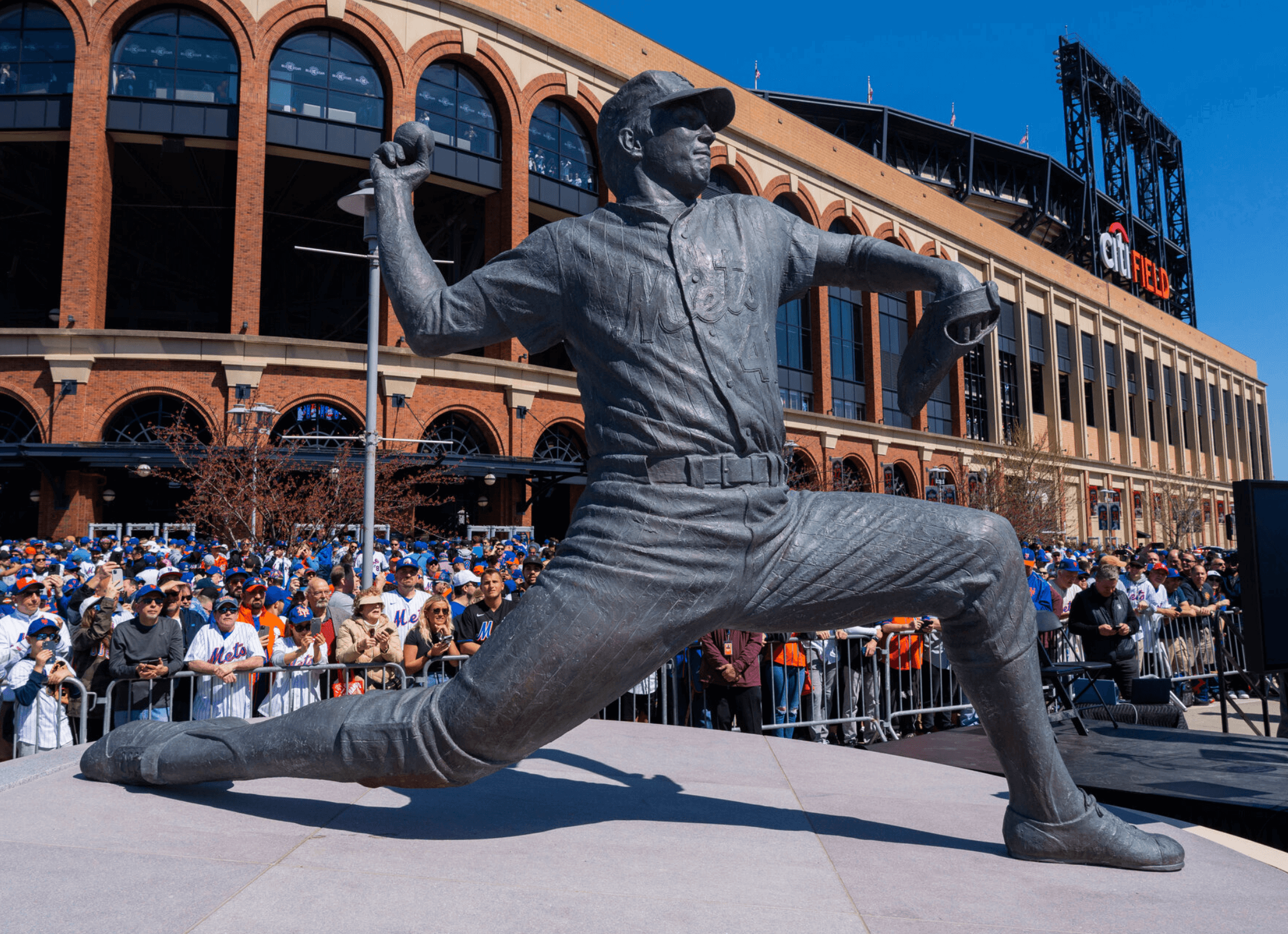
Seaver statue fallout, continued: My story about the design error on the Mets’ Tom Seaver statue got a lot of airtime yesterday on WFAN’s Carton & Roberts show. You can hear some of that discussion here.
But here’s the beauty part: Uni Watch reader Steve Dodell — the one who spotted the error in the first place — called in to the show and got on the air! You can hear that call at the beginning of this segment.
Although I didn’t keep listening to the segment after Steve’s call ended, I’m told that former New Jersey Gov. Chris Christie — a longtime Mets fan who’s also on the team’s board of directors — later called in and told either me or Steve (it’s not clear) to “get a life.” I mentioned this to the Tugboat Captain, who cracked up and said that’s basically an honor.
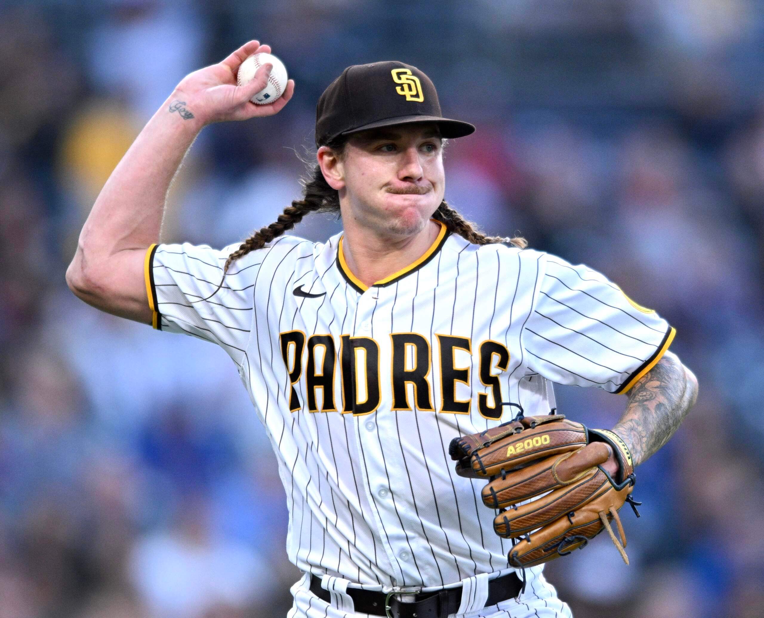
Photo by Orlando Ramirez, USA Today Sports; click to enlarge
Hairy situation, continued: Last Thursday I wrote about Padres pitcher Mike Clevinger’s unusually long hair. He was back on the mound last night — with braids! Have we ever seen anyone do that before?
(Thanks to Shane Bua for letting me know about this.)
Click to enlarge
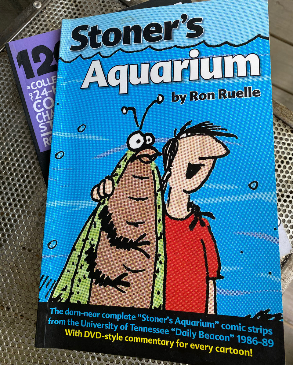
Purp Walk update: Got the following note yesterday from reader and Brooklyn Branches designer Ron Ruelle, who’ll be attending next Tuesday’s festivities in Denver:
I have an idea for a little gift for all attendees. In college at UT-Knoxville, I drew a daily comic strip called “Stoner’s Aquarium” and later published an anthology of all four years’ worth of strips. At one point I got bored drawing the main character in his usual black or white sweatshirt, so I started showing him wearing a different hockey sweater each day. Later on, I switched him to baseball jerseys.
The book has commentary on every single strip, including a lot of discussion of the jerseys. I have plenty of extra copies, so I’d love to give a signed copy of the book to everyone at the party. I’ll even use a purple marker to sign them!
How great is that? What a nice comm-uni-ty gesture — thanks, Ron!
The Ticker
By Lloyd Alaban

Baseball News: The Tigers and A’s played a doubleheader yesterday to make up for a previously canceled game. Oakland was listed as the home team for one of the games despite both games taking place in Detroit. The A’s kept their road grey pants and the Tigers kept their home whites on for both games (from Ken Schroeder). … Here’s a ranking from Audacy of the best alternates in MLB. … A person on the latest episode of History’s Pawn Stars was pawning off a Yale baseball jersey from 1912 (from @The_Big_GB). … MLB is looking for ways to make baseballs perform more consistently across all major league ballparks. … Reader William Selby’s neighbor’s daughter designed one-off jerseys for the Bowie Baysox, affiliate of the Orioles. Looks like kids do still know how to write cursive! … The Giants are the latest MLB team to announce that they’ve hired a company to find a 2023 uni advertiser for them. … The Mariners keep having problems with their alternate NOB font (thanks top all who shared). … Paul’s favorite “hosiery hero” pitcher, Chris Paddack of the Twins, may need Tommy John surgery. At the very least, he and his stirrups will be sidelined for a while. … Reader Erwin Pérez-Del Real has noticed a difference in the fabrics on Nike MLB replica jerseys depending on where they were made.

Football News: IHOP had a promotion circa 1972 where you could buy NFL-licensed “Thermo-Serv” mugs. Reader R.J. LaPorta recently completed a collection of the mugs. … The next few items are from our own Phil Hecken: Here are the rookie numbers for the Vikings and Browns. … New number for recently-drafted Jets CB Sauce Gardner. … Here’s one sportswriter’s ranking of the best unis in college football. … Here’s a history of Wisconsin’s helmets.

Basketball News: Here’s a breakdown of the Sixers’ record by uniform (from Ross Gelman). … Here’s a video report on how track and field star Florence Griffith Joyner had a hand in designing the Pacers’ 1990s-era uniforms (from Johnny Garfield). … HBO’s Winning Time, which documents the 1980s Showtime Lakers, used a poorly-made knockoff of the Larry O’Brien trophy in its season finale (from our own Alex Hider).

Soccer News: Scottish side Rangers’ new home shirt will be sold with a Sportemon Go ad, even though the company has gone out of business (from our own Anthony Emerson). … The rest of these are from Ed Zelaski: New home shirt for Bundesliga club Mainz (from Ed Zelaski). … Speaking of the Bundesliga, Stuttgart will wear 1992 throwbacks for the season finale against Köln. … New home kits for for Spanish side Sevilla. … One more from Ed: A new shirt for Celtic has leaked. …
Ukraine News: NASCAR Cup driver Josh Bilicki will have a Ukraine-themed livery for this Sunday’s race in Kansas (from multiple readers).

Grab Bag: Here are some details about the livery on IndyCar driver Rinus VeeKay’s car (from Matthew Houk). … New shirts for the Houston SaberCats of Major League Rugby (from Sy Hart). … New rugby union kits for the Australian national team (from Adam Ingle).

What Paul did last night: There’s a place in my old neighborhood, right around the corner from the old Uni Watch HQ, that’s been running a monthly program of short movies. Last night’s program, which we took in after a nice taco dinner, was mostly shorts about NYC, including a very funny/sad 11-minute film set in Coney Island (see above).
One thing I really like about short films is that they often don’t have a tidy resolution (either by design or because the filmmaker ran out of money and just had to stop at a certain point), and that’s definitely the case with this one. Recommended.
I thought Kickin’Wing from Joe Dirt was pitching for the Padres last night LOL. Also, not sure if it has been covered? But, I just noticed Jurickson Profar’s metallic belt.
Proofreading in the grab bag.
Rinus Veekay is an Indycar driver, not F1.
Fixed.
The Rinus entry is for IndyCar, not F1.
Yup, already fixed.
Wow, Jamie! Phenomenal job on today’s feature! Lots of great detail on every team to chew on. Thanks for all the time and effort putting this together for our enjoyment!
And I do not know about the NWSL’s white road kit rule. For a smaller league with less resources, I think it makes sense as a way to ensure kit clashes are avoided. White road uniforms may not always be as visually interesting as a broader color spectrum, but they do have a decidedly practical design function.
Thanks, Kary! And yeah, that’s probably a fair point for a league where some of the players get paid, well, more than it used to be, I’ll just say that. The players’ association did sign the first CBA just recently.
Sorry Governor. If you’re gonna do it, do it right.
-C.
If Chris Christie is telling you to get a life, you’re doing the right things. Keep it up, Paul!
Jersey native, and you are definitely on the right side of this. Almost any time Chris Christie disagrees with you, you can feel comfortable knowing you’re right.
One proofread from the NWSL preview: “blast year” should be “last year” in the Louisville write-up.
Typo fixed.
I guess “getting a life” means calling in to a radio show to talk about something that doesn’t need to be talked about?
I only want to hear, “Get a Life.” from Chris Elliot.
Now I have to go listen to Handsome Boy Modeling School’s first album.
It’s really great to see some women’s sports coverage on here and get an NWSL season preview! WNBA next??
As a Red Stars fan, this newest kit is a bit of a disappointment compared to seasons past. As much as I dig architecture and the cities skyline, I think this white kit is a slight miss IMO. Still better than a plain white shirt though.
Portland also had a massive downgrade this season. The two teams (Red Stars & Thorns) who were known for some of the strongest kits in all of football are left as sort of afterthoughts this year.
I enjoy Louisville’s mint over purple, their primary is still too busy for me though.
Here’s hoping the new comish relaxes the white rule soon.
I know it’s all about selling merch but the changing of kits every year or every other year in soccer/football is a bit silly to me and it’s definitely making it hard for designers to come up with something unique on a consistent basis.
Thanks, Julie! I’m hoping the mint for Louisville grows on me.
Julie — How do you like the Red Stars’ EL Train kit? The odd spacing of the train graphic (to accommodate an advertiser) throws me off. I loved the city stars jersey. It was the best rendering of the Chicago flag on a jersey I have seen.
I’m not in love with the El kit either. Not a fan of the camo or whatever the sleeve pattern is supposed to be called. I don’t think they have a front ad on this kit unless I’m mistaken so the spacing looks even more off balance.
They had a great blue kit prior to the El with the outline of the city and then they followed it up with the white city flag kit, so two solid kit releases in a row IMO.
Re: Sixers record by uniform:
What was the Sixers’ record in 2019-20 when they wore the parchment-colored uniform with the spelled-out Philadelphia on the front? I remember the first game they wore it, the Center’s crowd was amped up like I hadn’t seen it in years.
The former governor/Mets board member calls into WFAN to tell someone else to get a life. Yeah, got it dude.
He needs to STFU and eat a salad once in a while.
Please: We can dislike Chris Christie without fat-shaming him. He has plenty of distasteful qualities without making fun of his body.
I have cycled through the ten comments I have for Governor Christie and the “get a life crew.” I’m opting for one of the standards from my adopted home state of Texas. “Bless their hearts.”
Watched that short film Paul posted. Honestly, I’m not sure what to make of it (perhaps that’s the point?).
I was listening to C&R when Christie came on yesterday (in fact, I e-mailed PL about it from the road); if you want to hear the “Get A Life” section — it’s really quick, but fast forward to about 29:08 of the segment that link. Christie says:
It’s not exactly certain if he’s talking about Steve (for noticing the error) or Paul (for writing about it). And Christie clearly read PL’s article because he specifically mentions “notch.”
Mike Clevinger might be the first white guy in the MLB to put his hair in braids, but Raimel Tapia of the Blue Jays wears dreadlocks and Andrew McCutchen had dreads in Pittsburgh too. I’m sure somebody’s had cornrows too but I don’t know off hand. What are those, if not braids?
Good point — lots of players have had cornrows. But none as long as Clevinger’s, I’m pretty sure!
Absolutely ridiculous looking IMO. And this is not a ‘get off my lawn’ era comment. That just looks totally silly. Look, I can tolerate certain “modern” looks- pants down over the shoes, shoes with custom paint jobs for this and that.
But braids on a big league player? On the field? No.
If you heard all the segments, the point the hosts kept making was “who would ever notice this?”
I wonder if their attitude would be different if they knew I was a high school math teacher. Maybe one of my students will be their surgeon…their airline pilot…a cop…an architect some day. Do you still like to believe small details don’t matter? Should I be lax like that with our youth?
I have watched the Mets for over 50 years and the 4 on the home jersey has never changed. What fan for that long WOULDN’T notice it?
Steve,
Christie probably wouldn’t know the difference between music and muzak, either. -C.
I heard a good chunk of it, and I totally agree with your assessment. Roberts even notes he follows Paul on Twitter and loves the account.
I think the larger point we can draw from this is that even the staunchest of Mets fans (which Evan certainly is) either doesn’t care about or doesn’t notice the uni deets we on here obsess over. I love Roberts, but he most clearly doesn’t GetIt™
And I think that’s true for a large part of the Mets (or any team’s) fan base. That’s why people don’t get worked up over BFBS and all the alternate shit being worn on the field. I’d say we’re a small (very small?) minority on here that notice these things. It’s just not that big a deal (Christie and others’ attitudes) to them.
He loves it because Paul and the comm-uni-ty point out the oddities on certain uniforms for him, so he can go back to paying no attention to detail. I actually met Evan is the Shea parking lot last year and walked into the game with him and he is really a nice guy though.
OMG, I was interested to hear the complete podcast discussion of the 4 but how does anyone listen to those two blowhards for more than a couple of minutes? Yikes!
They are an acquired taste
So is Castor Oil.
Yesterday someone called me pathetic and an idiot for mentioning that I visit this site and that I have been especially eager for news on the Rockies’ city connect unis. I was told that it’s a weird thing to do and a waste of my time. I’m not sure why people feel the need to shame others for perfectly innocent hobbies. Regardless, my first thought after being insulted was about the Seaver fallout. I’m not sure how you guys put up with people dumping on you for having the audacity to care about uniforms, but please know that your readers find it interesting and we appreciate your work.
Thanks, R.G.
As I mentioned yesterday, when people encounter a mindset that they don’t understand, they often find that threatening and thus feel the need to either ridicule it or become angry about it. That way they can feel superior or at least aggrieved.
I’ve done this myself at various junctures in my life (although not about uniforms, obviously). I suspect most of us have. It’s an unfortunate reaction, but I think it’s very human. I’m sorry you were on the receiving end of it yesterday.
Bronson Arroyo pitched with cornrows, but I don’t recall if they were ever long enough to show much below his cap.
Congrats on getting being told to get a life by Chris Christie.The Tugboat Captain is absolutely right you should be honored and flattered even. Also watched the short film and I absolutely loved it. It was just what I needed this morning.
I attended the match in Los Angeles between the Orlando Pride and LAFC. My friend has season tickets so we had good seats pretty close to the field (or pitch). I can attest that the NOBs on the Pride’s white/gray uniforms cannot are not legible to anyone in the stands. The numbers, being much larger, can barely be read only if the players are very close. 95% of the time they are invisible as well. I can’t imagine why the league allows this kind of design defect.
Rinus VeeKay is an IndyCar driver, not an F1 driver.
Which is exactly what it says. (Fixed it a few hours ago.)
I’m struggling to understand why MLB thinks the baseballs need to be consistent in each park. Each park has different geometry, each stadium has different structural and architectural designs which can affect wind impact, each city has different weather characteristics. It seems silly to try to standardize the ball, when all of these other factors are varied. In fact, baseball is unique because of all these things.
Loved the column today. NWSL has some real jewels of design. San Diego’s set is such a bummer, I wonder if supply chain had anything to do with a more custom look.
Angel City also made their debut this year but as the article said had logos and designs introduced much earlier in the process than San Diego.
Uni Watch “Get a Life” — Christ Christie t-shirt seems a natural at this point.
+1
+1. And a natural tie-in with the For Those Who Get It™ slogan.
Thanks, Jamie, so much for the NWSL review. I really miss the light blue shirt that depicted the city’s Lake Michigan shoreline. It’s too bad that teams don’t keep a design that works. As plain as the “skyscraper” shirt is, there are a few nice elements, like keeping the red stars on the shoulders rather than the chest.
Related to KC’s NWSL team: I remember back when Sporting KC originally took on their new name, as I was living out there at the time and I think part of the talking points was developing an umbrella organization for other athletics, a la european sport clubs. So it’s kind of odd in that respect that the NWSL club in KC isn’t under sporting KC. I’m sure it’s different ownership and all that, but sporting KC is hardly a sporting club
I loved the “NYC Tips and Tricks” short film! Thanks for posting it.
Dillon Tate of the Orioles was sporting some pretty spiffy stirrups last Sunday.
Late in the day but Sergio Mitre had his hair in braids when it got to this length. In the MLB I’m not sure, but when he played for the Tijuana Toros. Not sure I know how to add a link here, though, sorry!
Thanks for the NSWL rundown. Just chiming in to point out that the NCC’s primary kit duplicates the spectacular sunsets we get at the stadium. I just really really love that fact.