By Phil Hecken
Follow @PhilHecken
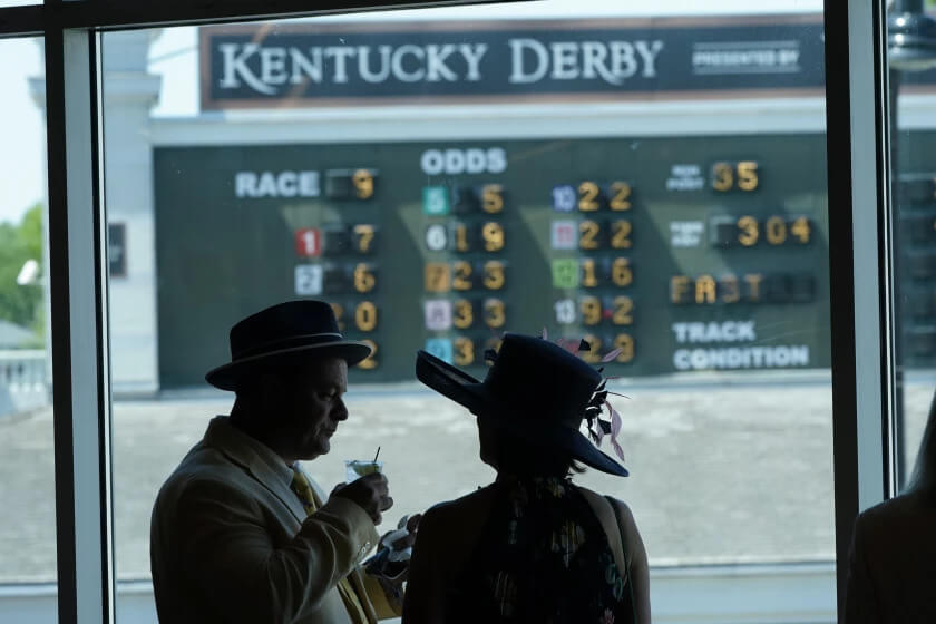
Good Saturday Morning, Uni Watch. I hope everyone has had a good week. For those of you so inclined, today kicks off the Triple Crown with the Kentucky Derby, a/k/a the “Greatest Two Minutes in Sports,” later this afternoon. Grab yourself a Mint Julep and a slice of Paul’s Derby Pie (the recipe for which was in yesterday’s post).
Now then: last evening Atlanta celebrated the life and legacy of Henry Aaron, with their “2022 Hank Aaron Week” (which I believe is now an annual event). Last night the team took the celebration to the unis, as the team wore 1974 throwbacks. While Aaron wore many a different style uni (both in Milwaukee and Atlanta), the 1974’s were selected because that’s the uni Aaron wore when he broke Babe Ruth’s home run record. Here’s a touching tribute the club put together:
This week we celebrate 44. 💙#HankAaronWeek pic.twitter.com/seUotAR9UP
— Atlanta Braves (@Braves) May 6, 2022
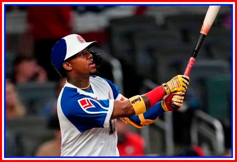
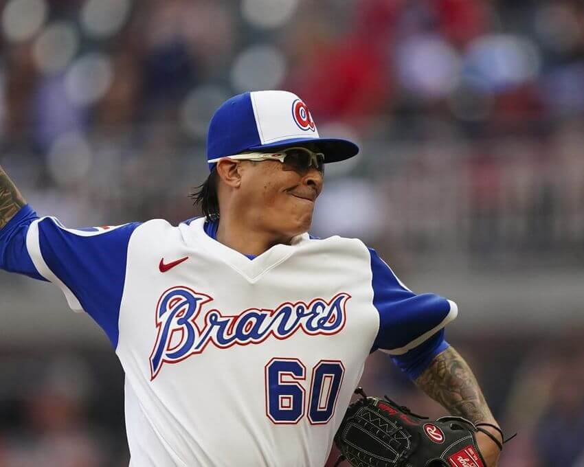
While Atlanta wore this style in 1972 and 1973, the 1974 and 1975 unis were different in a few subtle ways, most specifically they were made by a different manufacturer (Sand Knit in 72-73, Wilson in 74-75). In addition, the script is more flowing and the numbers were slightly more blocky. The 72-73 jerseys also were henley style, while the 74-75 had a solid, v-neck collar.
Here’s how last night’s unis looked on the field.
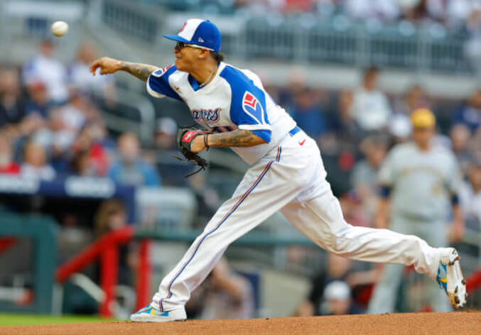
OK, they weren’t all worn baggy pajama style. But aside from the very prominent makers mark on jersey and pant, these were pretty faithful reproductions of the 1974 originals.
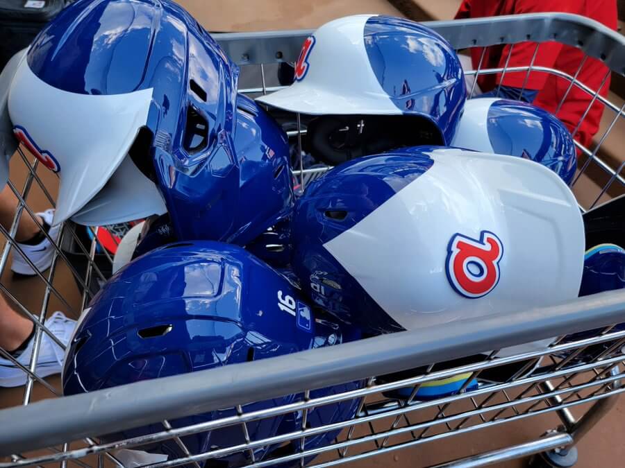
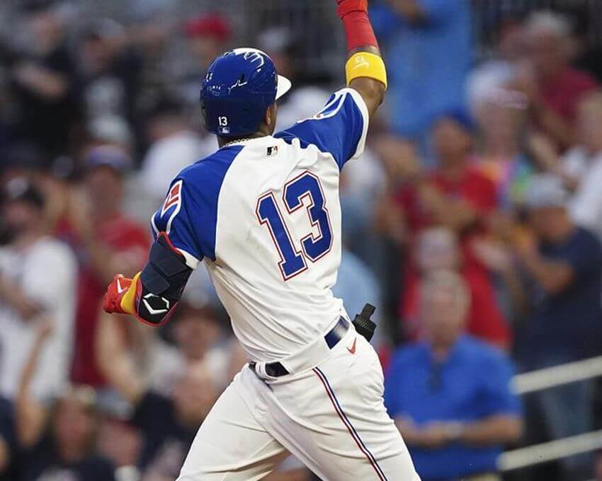
Like the 1974 beauties, these were raglan sleeve, with the team name displayed in blue script with a white/red outline around both script and front numbers. Players wore white front panel royal blue caps with a stylized “a”. Both sleeves were rendered in royal, with a stylized “feather” logo on the both sleeves:
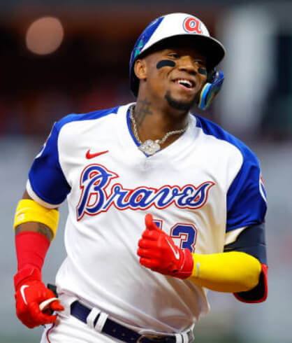
If you look closely at the helmet, you’ll notice the raised “a.”. I’m honestly not sure if they had this feature last year when they also did Aaron throwbacks. Here’s a better look:
Like their 1974 counterparts, last nights jerseys were NNOB. Numbers were also in royal blue with a white/red outline (the same style as in front):
Also like their 1974 originals, the team’s pants were solid white with a thin red/white/blue stripe down the leg. Most players wore their pants pajama style, but those who went high-cuffed wore solid blue socks (as opposed to stirrups which were worn with the original).
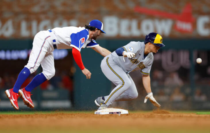
In that photo, you’ll notice Atlanta’s opponent, Milwaukee, were wearing a “44” tribute patch on their sleeves. While they wore it last season to honor Aaron, they had dropped it this year. For this series, the Brewers returned the patch — a nice tribute to the real home run king.
Here’s a good look at the unis in action:
Spencer Strider is making a habit of strikeouts in the bigs.
The #Braves righty racked up 8 K's vs. Milwaukee, including whiffing the side in the 2nd: pic.twitter.com/Th1YYaV7gT
— MLB Pipeline (@MLBPipeline) May 7, 2022
You can see more photos here.
There was one humorous moment last evening (even though it wasn’t uni-related): Ronald Acuña Jr. absolutely launched his first home run of the season, but gets no style points:
Homer No. Oñe. Now the return feels real. #Braves pic.twitter.com/bJzVXMIPHt
— Cory McCartney (@coryjmccartney) May 7, 2022
The two teams are scheduled to play again today, with Atlanta again wearing their 1974 throwbacks. They’ll wear their regular uniforms when they play on Mother’s Day (when they’ll be wearing this gray cap).
I personally think the 1974-75 uniforms are the best the team has ever had, and I can see why so many are calling for their full-time return. Unfortunately, this team still has a history with the use of Native American iconography, and really should change or modify their name and remove any and all references to this part of their past. Sadly, it seems the fans won’t be embracing any change soon…
Let’s Go @Braves 🎈 pic.twitter.com/EVmqvmBDGw
— Brandon Silvers (@BSilvers_1) May 7, 2022
On a night honoring Henry Aaron no less.
But if/as/when the team rebrands, they would do well to use the 1974-75 uni as a basis for a new identity (or at least modified identity) going forward. I love seeing these. And what a better way to honor Aaron than to design a new uniform in the spirit of the one he wore when he broke Babe Ruth’s home run record.


Guess The Game…
from the scoreboard
Today’s scoreboard comes from Robert Baffled.
The premise of the game (GTGFTS) is simple: I’ll post a scoreboard and you guys simply identify the game depicted. In the past, I don’t know if I’ve ever completely stumped you (some are easier than others).
Here’s the Scoreboard. In the comments below, try to identify the game (date & location, as well as final score). If anything noteworthy occurred during the game, please add that in (and if you were AT the game, well bonus points for you!):
Please continue sending these in! You’re welcome to send me any scoreboard photos (with answers please), and I’ll keep running them.

Uni Concepts & Tweaks
Time for more Uni Tweaks from the UW readership.
I hope you guys like this feature and will want to continue to submit your concepts and tweaks to me. If you do, Shoot me an E-mail (Phil (dot) Hecken (at) gmail (dot) com).
Today’s concepts come from Marcus Hall:
Hey Phil!
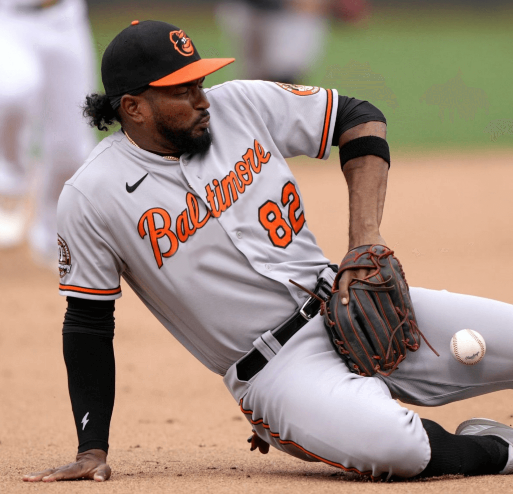
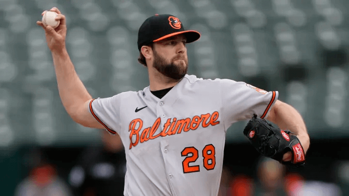
I think the Orioles Road Jersey could use a simple tweak, addition by subtraction, by getting rid of the tail on the script. It would make “Baltimore” less bulky and clean up the jersey. I made it slightly bigger on the picture of the pitcher.
Thanks!!
Marcus Hall
(Marcus from Baltimore)
OK readers (and concepters). If you have some tweaks or concepts, shoot ’em my way with a brief description of your creation and I’ll run ’em here.
Click to enlarge
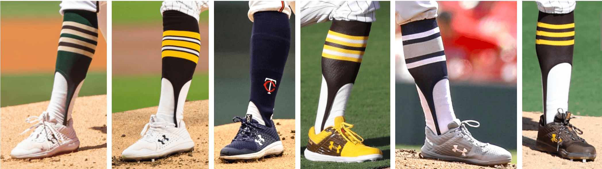
Bulletin reminder: Paul here. In case you missed it on Friday, my latest Bulletin column features really fun interview with MLB pitcher Chris Paddack about his stirrups (some of which are shown above), including info on the high-cuffed role model from his childhood, how he obtains his stirrups, his plans for this year’s designs, and even a stirrups-based charity initiative. He definitely Gets It™!
My premium subscribers can read the article here. If you haven’t yet subscribed, you can do that here (you’ll need a Facebook account in order to pay). Don’t have or want a Facebook account? Email me for workaround info.
Now back to Phil with the rest of today’s content.
Too Good for the Ticker…
Here’s a great shot of a 1969 United Air Lines ad, with a Seattle Pilots hat, that appeared in Sports Illustrated. Submitter Steve Mathonnet-VanderWell writes, “Maybe it’s the lighting but surprised how much lighter blue the Pilot cap looks compared to Royals or Cubs.”
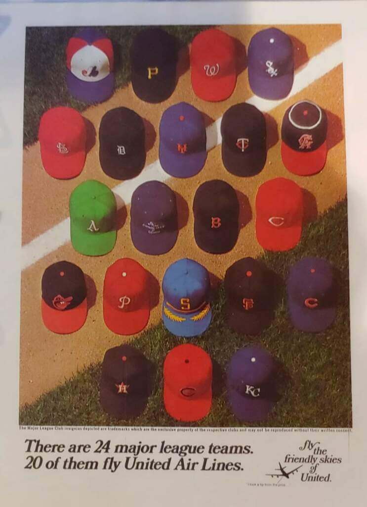
I’ve always felt 1969 was the best “uni” year in baseball — and part of the reason was the awesomeness of the caps!
Uni Watch News Ticker
By Anthony Emerson

NFL News: The Falcons have announced their 2022 draft class’ uni numbers and the Jets have announced general uni number updates (thanks, Phil). … The Eagles have unveiled their rookie uni numbers (from Sam McKinley).
College Football News: Here’s a look at Oregon’s helmets from the 1980s onward (thanks, Phil). … Also from Phil, what are the best unis in the Big 12? This blog thinks they’ve figured it out.

Soccer News: English sixth-tier side York City FC have introduced a centenary crest (from Ed Zelaski). … Werder Bremen will wear a special kit this weekend, with a design inspired by players’ and fans’ tattoos (from @ooner_g). … The NWSL’s Kansas City Current have a new primary kit (thanks, Jamie). … The SB Nation USMNT blog says something we can all get behind: bring back the Waldos (thanks, Phil).
Ukraine News: On May 4, Ukrainian President Volodomyr Zelenskyy wore a T-shirt depicting an X-Wing fighter from Star Wars within the Ukrainian national symbol.

Grab Bag: McLaren F1 driver Daniel Ricciardo will wear an Ace Ventura: Pet Detective-themed helmet for this weekend’s Miami Grand Prix (from multiple readers). … While other drivers have gone with Miami cultural references for the Miami Grand Prix, Aston Martin driver Sebastian Vettel has gone with a climate change awareness helmet, the top of it reading: Miami 2060, First Grand Prix Underwater” (from Russ Flynn). … Trackhouse Racing’s owner Justin Marks purchased one of Harry Gant’s 1991 Skoal Bandit ‘sponsored’ cars and planned on making some parade laps in it before Sunday’s NASCAR Cup fauxback race at Darlington. But due to federal laws against tobacco advertising, that’s not going to happen (from Christopher Hickey). … The Colorado Summit of the American Ultimate Disc League have become the first professional American sports team to have a cannabis advertisement on their uniform (thanks, Phil).
Uni Tweet of the Day
AND…a great follow up from Marcus Hall…
@UniWatch @PhilHecken The story of the chain! https://t.co/Ar7U3V8Dv8
— Marcus Hall, SHRM-CP (MHRM in progress…) (@b_fianchetto) May 6, 2022
And finally… that’s all for today. Enjoy the Derby (and any other sports you may watch), and I’ll catch you back here tomrorow. Till then,
Peace,
PH
Don’t wish for a full rebrand, but wish the Braves would wear these for Sunday home games instead of the cream uniforms.
Absolutely the Orioles should wear Baltimore on their road uniform. Though that would require the ownership to admit to themselves that the Orioles are a Baltimore team, not a DC-inclusive Mid-Atlantic team that owns every fan’s loyalty between Philly and Atlanta.
Also the Orioles should fix the ugly black stitching on their white cap panel. Cap makers have been able to match thread to contrasting panels for generations now, so there’s no excuse for black stitching lines on the Orioles white-fronted caps.
They do wear a Baltimore script on the road
link.
Marcus’ tweak is to remove the long tail on the word, not to add “Baltimore” to the gray road jersey.
I’m aware of the tweak, my reply was to the comment above
I was agreeing with you. Should have nested that comment below Scotty’s. Sorry for any confusion.
The swash below the script serves a purpose: To make an oblong word more square. Long words like “Nationals” and “Baltimore” should have it. Short ones like “Miami” and “Mets” don’t. Mind you, this rule has more exceptions than followers (Twins, Detroit, Chicago AL, Reds, Phillies) and other teams have a graphic device which serves the same purpose (Atlanta’s tomahawk, the Cardinals’ bat).
Baltimore’s problem resides in the huge space between the “l” and the “t”, which would be resolved by 1.) Tilting the word more steeply 2.) Making the letters less italicized, or 3.) breaking the word in a different place.
“ There are 24 major league teams.
20 of them fly United Air Lines.”
But it looks like 21 caps in the photo?
What team hat is between the A’s and Red Sox? Can’t make it out.
There’s a united airlines hat tucked in between the As & Red Sox
It’s weird that they wouldn’t put that cap in a more prominent position in the layout.
For a second I thought that the one cap between Oakland’s and Boston’s was an expansion team. However, that cap says “Fly the Friendly skies of United” on it. Oh, those fly-boys!
What’s with the yellow arms on Ronald Acuña Jr.? It looks gawd awful. Players should be required to wear team colored accessories.
Yellow is a team color.
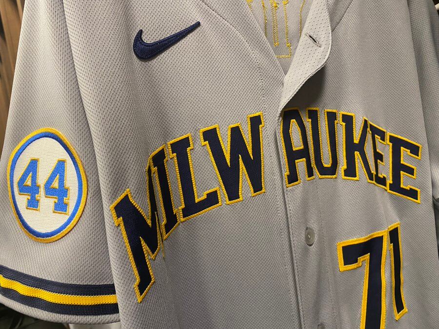
Man, that’s a good looking matchup between Atlanta and Milwaukee… but like I said earlier in the week when the Braves throwbacks were announced, it would’ve been great if they could’ve gotten the Brewers in 1975 powder blue throwbacks with the block M in the yellow panel on the cap, as Aaron wore in his return to Milwaukee at the end of his career.
Supply chain issues?
That United Airlines 1969 cap advertisement is awesome, partly because I too firmly believe that the 1960s was the Golden Age of Baseball, including in the aesthetic sense.
By the way, the ad said 20 of the at the time 24 MLB teams used United Airlines. The other 4 were the Atlanta Braves (They likely used Delta), Los Angeles Dodgers, New York Yankees, and San Diego Padres (I wonder what they used since the other 3 expansion franchises used United).
If memory serves, the Dodgers had their own plane. I suspect the Yankees might have as well.
I don’t know about the pre-Kroc era, but under his ownership the Padres had their own plane with plans on expanding into a charter airline that never materialized.
On the tweet clip that Marcus Hall posted of the Orioles’ HR chain, manager Brandon Hyde’s cap has an extra black outline around the cartoon bird logo, just like the 1978 caps made by Roman Pro that the team wore. Their current on-field caps have an orange outline and always have since the cartoon bird debuted in 1966, whether black or white front panels – only exception was 1978. Anybody have any info on this aberration?
“they were made by a different manufacturer (Sand Knit in 72-73, Wilson in 74-75). In addition, the script is more flowing and the numbers were slightly more blocky.”
Slightly more blocky is an understatement. You can’t get much less blocky than the Sand Knit circus font of 72-73.
link
link
I love those Braves throwbacks — the block number font looks just as good as the curvy one they had before that — and also like the contrasting-color sleeves. Those sleeves add a lot to the gray road uniforms that they wore in that era. Would love to see these become the full-time home uniform again.
Road uniforms of that era were just the home jerseys with the colors reversed. White pants were worn on the road. But a blue jersey with grey raglan sleeves and grey knickers has a lot to recommend it.
While I too love the link with white pants, I was actually thinking of the link. I find gray dull and boring, but when you’ve got colored sleeves to spice things up, along with big, bold numbers, gray can look OK.
On that United Airlines ad, there are 21 caps. Am I missing something? Shouldn’t there be either 20, or 24?
One of the caps is a United Airlines cap. Then there are 4 teams that didn’t use United Airlines that aren’t shown (ATL Braves, LA Dodgers, NY Yankees, SD Padres).
As someone pointed out above, there is a United Airlines cap between the A’s and Red Sox.
Even more odd is that the Mets are shown with an orange squatchee, which they never wore until the 1990s.
Seahawks Rookie Uni Numbers
link
To do the tomahawk chop, one can only be one of two things… mean or stupid.
Hate it for you.
I hope Atlanta hosts the Dodgers in 2024 and wears those uniforms. A perfect fit for the 50th anniversary of home run 715.
Like the Chiefs changing the arrowhead to the fireman Maltese cross, The Braves could simply change the tomahawk to a fireman’s axe, changing nothing else, and move away from the Native American imagery/history.
A fireman’s cross is a Florian Cross, not a Maltese Cross.
link
The Braves breaking out the ‘74s once in a while to celebrate Aaron’s historic milestone is just fine…a full-time switch from their current look (one of the best in the bigs) to that would be a downgrade.
I like accurate throwbacks (who doesn’t?), so as far as questionable branding goes…be it Native American iconography currently used in stick and ball sports or former tobacco product placement in NASCAR… it should be given a pass if it’s for the occasional/one-off turn back the clock event/game.
1974…twenty years before baseball died…the best looking year in MLB history.
As long as the Braves are going to be the Braves, they need to just wear this uni. Period. Full stop.
When they decide to rebrand, I hope they go with the Bees. Part of team history, and a nice complement to the GT Yellow Jackets.
As long as it isn’t “Beaneaters”. No need to emphasize how their jet-propelled baserunners get their edge.
Re the 1969 hats – I cannot for the life of me understand why the Angels have passed on having the halo on their hats for over 50 years now. Swing and a miss!
MLB came to the conclusion the halo on the pitcher’s cap was potentially distracting to the batter.
Wait is that actually true?
Today I learned that the White Sox had a blue cap in 1969.