For all photos, click to enlarge
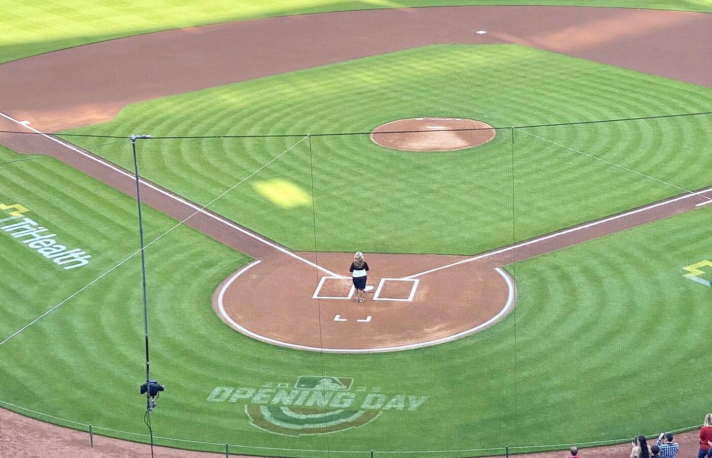
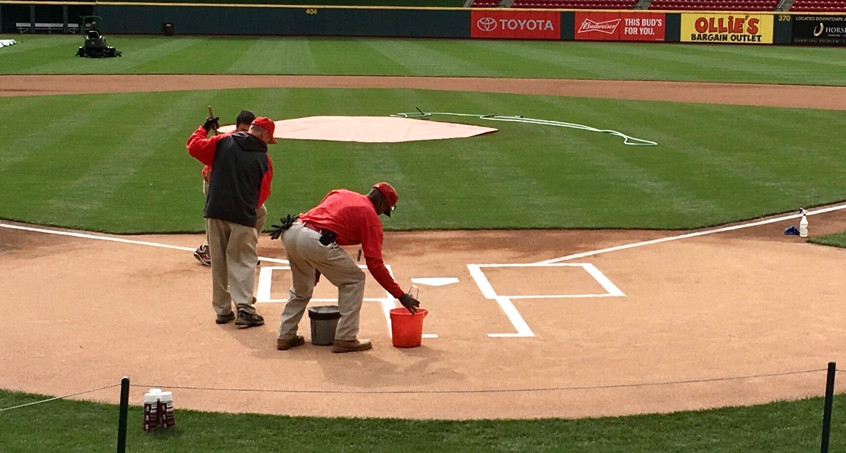
It all started last Tuesday evening, when Padres radio broadcaster (and card-carrying Uni Watch member) Jesse Agler sent me a note from Cincinnati, where he was getting ready for that night’s Padres/Reds game. He attached the photo shown above, featuring a minimalist catcher’s box. I’d never seen anything like it, and Jesse said he hadn’t either. Like, were they trying to save chalk or what?
Here’s a closer look:
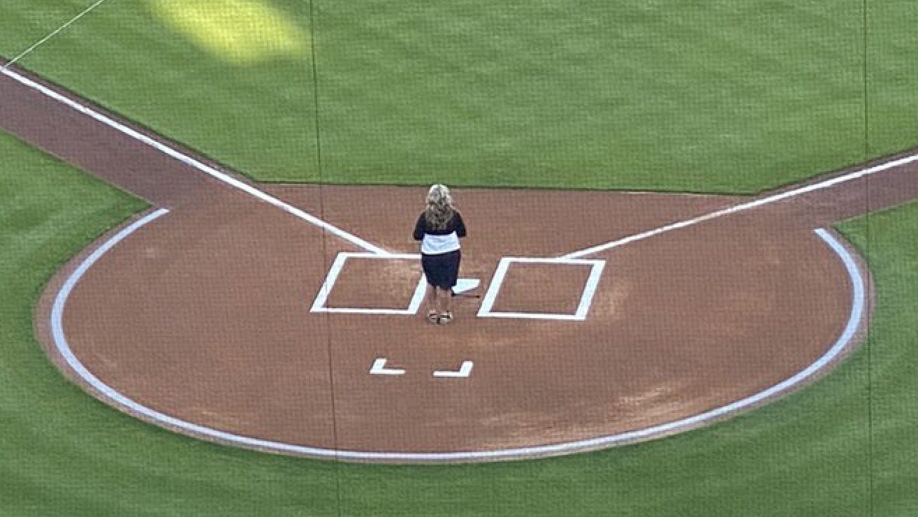
I promptly tweeted Jesse’s photo, and the ensuing discussion led me to a guy who explained the whole thing to me. But before I get to that, let’s take a second to talk about the catcher’s box.
The rulebook requires the catcher’s box to be part of the field, just like the two batter’s boxes, and has two diagrams showing how it should look (here and here). Although the diagrams indicate that the box should include a backline, many MLB ballparks skip that line and just have the two vertical lines on the left and right. Other ballparks do include the backline.
In theory, Rule 5.02 (a) stipulates that a catcher will be called for a balk if he leaves the box before the ball leaves the pitcher’s hand during an intentional walk; in practice, catchers routinely left the box early for years (and sometimes still do so for pitchouts), but it never got called, and the rule is essentially moot now that the four intentional balls no longer have to be thrown. More to the point, the catcher’s box always gets erased by the end of the first inning anyway — and sometimes before the game has even started! It’s among the game’s least useful details, but it’s nonetheless part of baseball’s longstanding visual signature, which it why the version they were using last week in Cincinnati looked so weird to me when Jesse sent me that photo.
I was curious to know if this was a new thing in Cincinnati, or if it had been going on for a while and I just hadn’t noticed, so I started looking for photos. Because the catcher’s box is hard to see once the game has started, I looked for photos of someone singing the national anthem (or other pregame ceremonies). Opening Day turned out to be the most fertile photographic territory. Here’s what I found:
• On Opening Day in 2015, the Reds’ catcher’s box looked just like the rulebook says it should, complete with the backline:
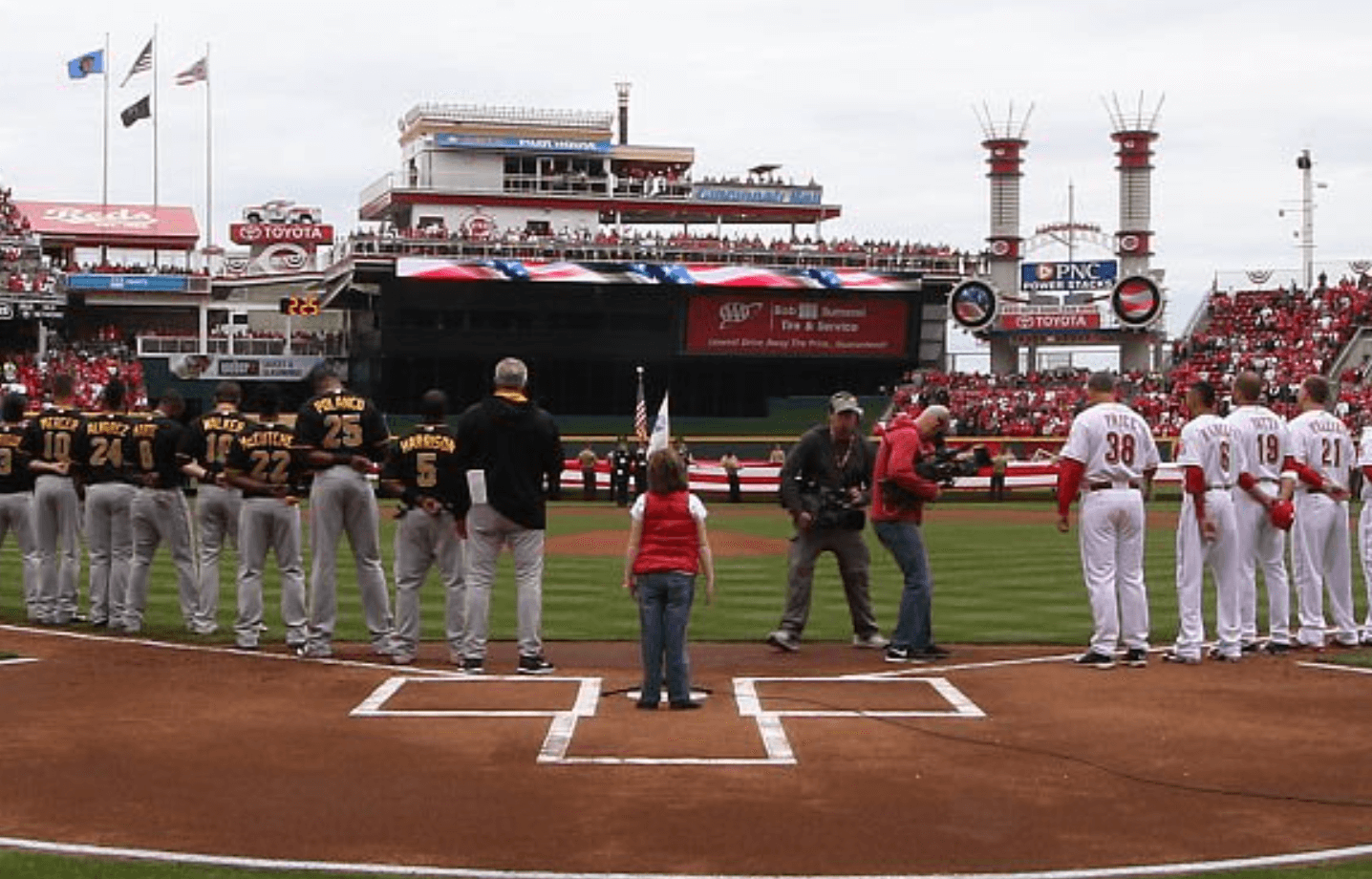
• A year later, on Opening Day 2016, the backline was gone but the two vertical lines had two prongs extending off of them, sort of implying the backline without actually showing the full line:
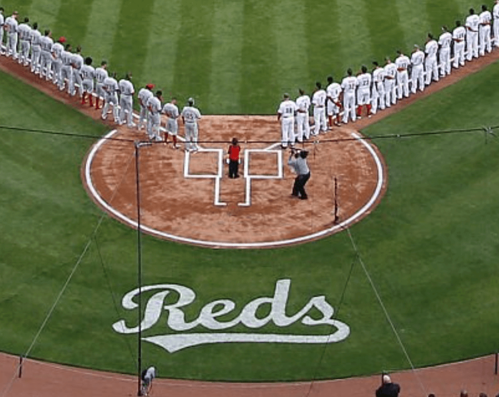
• On Opening Day 2017, the two back prongs were shorter:
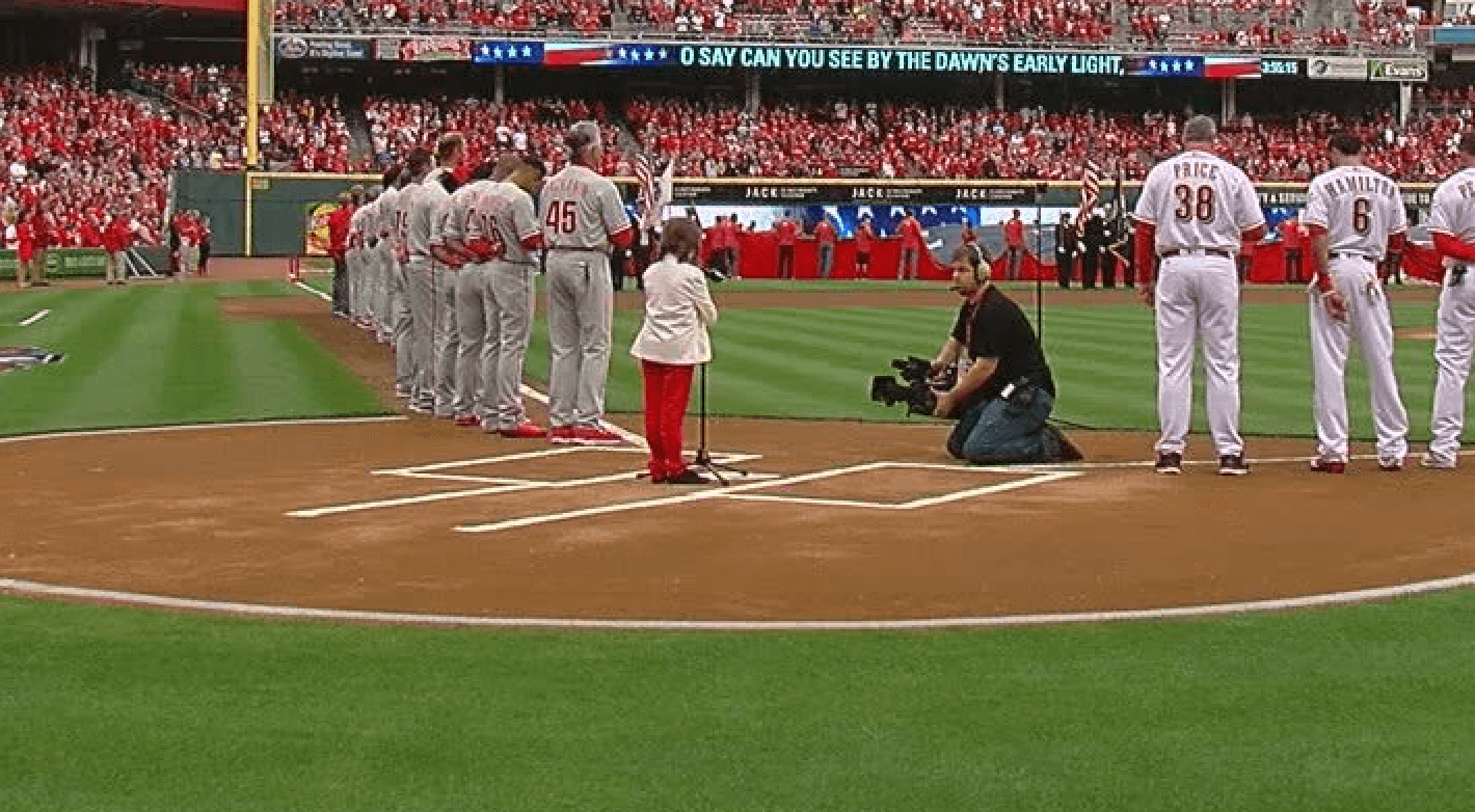
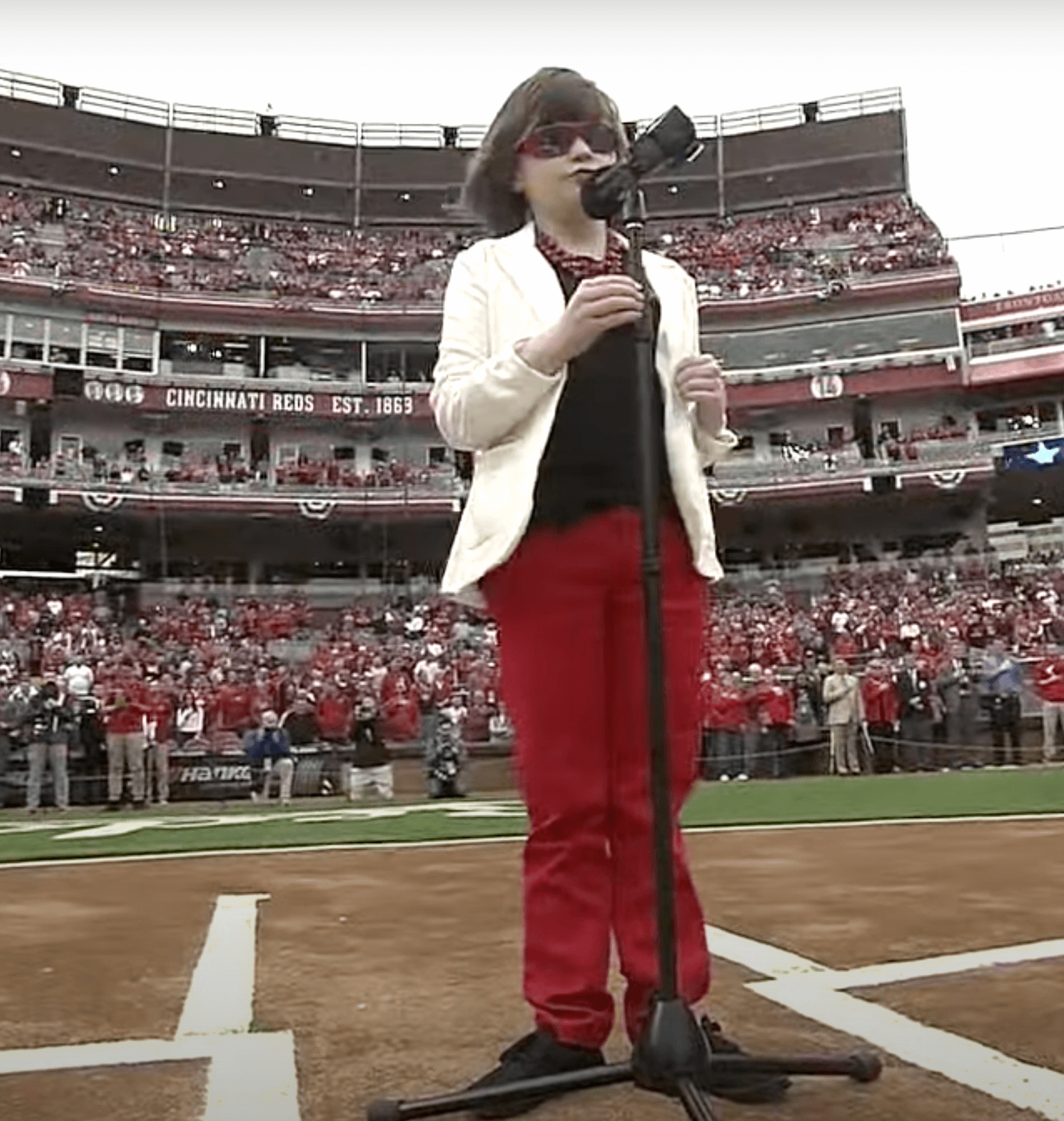
• On Opening Day 2018, the backline had returned:
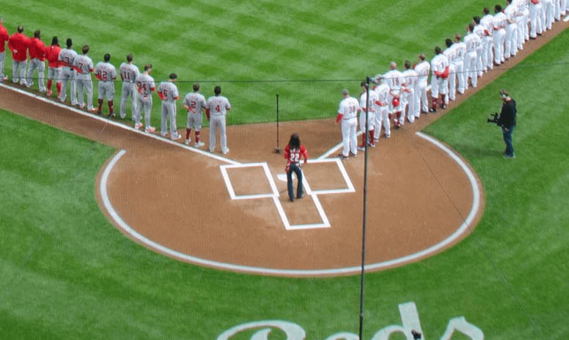
• It’s hard to be sure, but it looks like Opening Day 2019 had the minimalist corners, like what Jesse Agler saw last week:
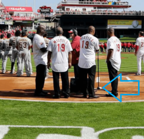
• On Opening Day 2020, they definitely had just the corners. So this is not a new style — they’ve been doing it at least since 2020, and probably since 2019:
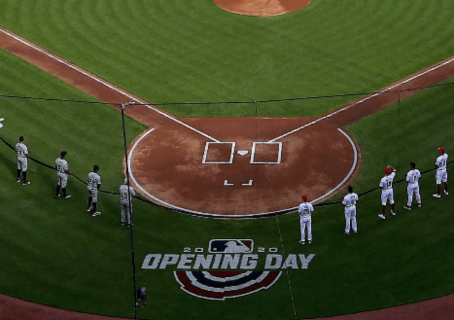
• On Opening Day 2021, they went with what we might call a “back bracket” style:
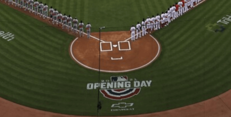
• They maintained that style for Opening Day 2022:
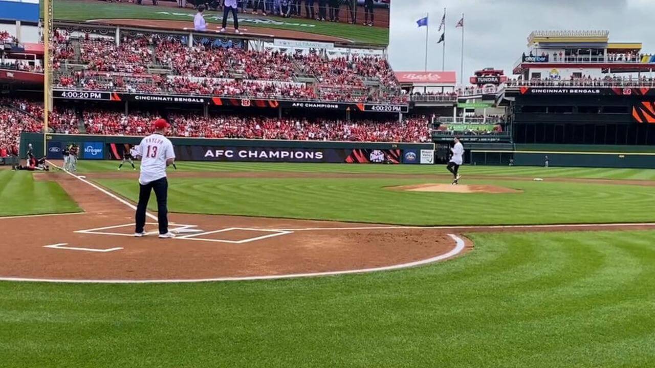
Clearly, the Reds’ catcher’s box situation has been a free-for-all!
As I was going down this rabbit hole, the responses to my tweet of Jesse’s photo led me to a guy named Stephen Lord. Lord is currently a sales consultant for Advanced Turf Solutions, but from 2015 through last year he was the Reds’ head groundskeeper, and before that he spent eight years as the head assistant groundskeeper for the Rangers. (He left the Reds to achieve a healthier work/life balance and be more present for his wife and kids — good for him!) I wanted to pick his brain about the Cincy catcher’s boxes, but it took a few days for our schedules to match up. We finally spoke by Zoom yesterday. Here’s a transcript of our conversation, edited for length and clarity:
Uni Watch: When you were with the Reds, would you personally apply the chalk for the batter’s boxes and foul lines, or would your staff do that?
Stephen Lord: Most of the time it was my staff, but I’d do it probably once a homestand.
UW: I said, “chalk,” but I guess I should have asked first, do the Reds use chalk or paint?
SL: Chalk. The only places we’d use paint would have been painted foul lines on the grass, as well as the half-circle that they do around home plate.
UW: How did the Reds end up with their own style for the catcher’s box, and how has that style evolved?
SL: First, you should know that MLB groundskeepers for years have been — I wouldn’t call it bickering, but they’ve at least brought it to the league’s attention through the years that most catcher’s boxes are scrubbed out by the first pitch. Either by the catcher or sometimes the umpires will kick it out. People are more careful with the batter’s boxes, but the catcher’s box has always been one of those things that looks great when everyone’s standing for the anthem, and then 30 seconds later, out comes either an umpire or the catcher basically scrubbing it out, so that it’s not even a part of the field of play anymore as far as having any distinguishable use.
UW: But it’s there in the rulebook, right? And theoretically, the ump can call a balk if the catcher leaves the box before the ball leaves the pitcher’s hand.
SL: Yeah, but you don’t ever see anyone get called for it, even on pitchouts, whether they leave the box early or not. And with catchers setting up inside or outside, they’re basically all over the place, but you’re still never gonna get called. So the box has become mostly a worthless marking. To the point where some groundskeepers, like Bob Christofferson in Seattle and Tom Burns of the Rangers, brought it up at our annual meetings with the league that, you know, we’re wasting product, wasting labor time, for an aesthetic that’s basically knocked out five seconds later.
So some of the guys said to MLB, “Hey, can we get rid of this? Can we just not do it anymore?” And the response was basically, “We’d love to accommodate you, but the rulebook is the rulebook, so it’s got to be out there.”
UW: So how did the Reds develop their own version of it?
SL: There’s this guy Bill Littlejohn, who’s been part of the Reds’ grounds crew since the late 1980s, going back to Riverfront Stadium. He usually handles all the chalk around home plate. Once BP is over, he’s the guy who brings out our chalk boxes and chalks the actual outlines, I’d say for 75 out of the 81 home games.
UW: So he’s the one who started changing the look of the box?
SL: Yeah. He was always saying stuff like, “Hey, I put it out there and it gets beaten up right away. So what are we doing here?” So sometime around 2016 or ’17 — I think that’s when it was — he started using two little corners on the back of the box, little dog ears.
UW: Looking at old photos, I noticed that the length of the corners could vary.
SL: Yeah. And eventually it kind of morphed and just put the two corners on there without the vertical lines. There have been several different iterations of it, for sure.
UW: So the two corners, without any other lines, we might call that the minimalist style.
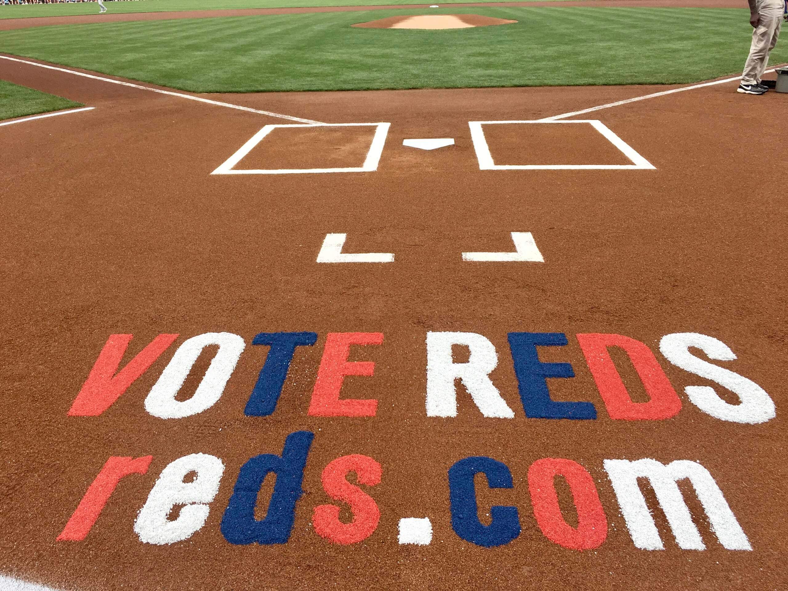
SL: Yeah. And I’d say that’s probably been the standard since 2020. You use less chalk, and you end up with less chalk migrating to your dirt surfaces. But it’s also kind of a unique look that we’ve kind of branded as our own. I’ve put pictures of it on Twitter a couple of times, and the response has always been overwhelmingly positive.
UW: Response from who — other groundskeepers?
SL: The big Reds fans who follow me would always comment about how they liked the look. But yeah, also other groundskeepers would see it and say, “Hey, that’s unique.” I’ve had a number of people tell me that they’ve started doing it at their rec fields or their high school fields, just because it’s something fun, something different. It gives people a different aesthetic.
UW: I’ve seen another style, with the backline and the corners. Here, let me share my screen with you — this was Opening Day of this year, so just a few weeks ago.
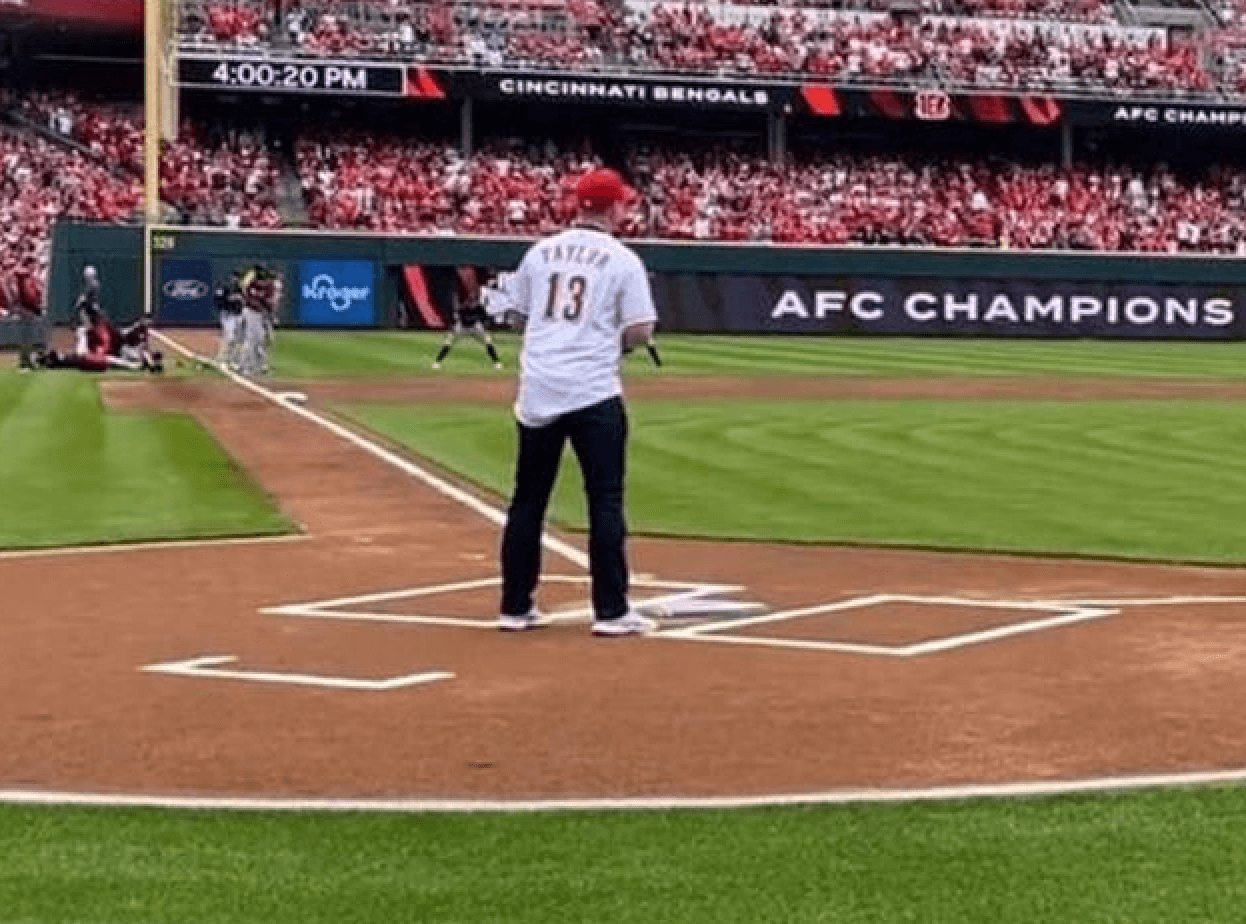
SL: That’s a new one! I don’t think I’ve seen that before.
UW: See what happens when you leave the Reds? Bill Littlejohn starts freestyling!
SL [laughing] I’d say we give him a pretty decent creative range for things like that, especially when there’s no impact to the game.
UW: Has any catcher or umpire ever noticed or said anything about this?
SL: I’ve never been approached about it, whether from players, managers, or umpires — no one said anything. We’ve never been called out to fix it or anything like that. So I think they kind of look at it the same way that we do — it’s kind of a useless line. I don’t think anyone would miss it if it completely went away.
UW: Are you almost disappointed that nobody said anything? Like, nobody noticed that you did this thing a little different?
SL: Not really. With groundskeeping, usually you only hear about it if somebody had a negative experience. So something like this, that’s not going to make any difference, you don’t expect to hear anything about it.
UW: Were you concerned that you might hear from somebody higher up, like from the league, because it’s not exactly the way it’s spelled out in the rulebook?
SL: It crossed my mind. But I think that the league office is pretty good about picking their battles with things. A couple of times a year we might get interesting feedback about the yellow home run line, or if a ball got caught under a wall pad, stuff like that. But never about the catcher’s box.
UW: Is it annoying or sort of depressing that you chalk something out really perfect — not just the catcher’s box, but the batter’s boxes, everything — and then most of it is scrubbed out so early in the game?
SL: Not really. I worked in golf course management before I came over to sports turf, and one of the tough things about it was that you rarely have a moment of perfection, a moment where you can stand back and look at things and appreciate what you’ve done. But with baseball, you get that every night at 7:05. You can see the fruits of your labor. So I always looked at it as being lucky that you have your moment of perfection. I mean, the field’s there to be played on, and things aren’t going to remain 100% perfect all the time. So that’s just part of the game.
The biggest thing that would bother me was rain. You’ve got everything ready to go, it looks perfect, and then you get a pop-up thunder shower and you’ve got to put tarps on everything. And anytime you put the tarp on, you catch chalk on the tarp, whether it’s your baselines or around home plate. That would drive me nuts. If something’s gonna mess it up, I want it to be the players, not Mother Nature.
———
Faaaascinating! Much like my piece last year about the unusual batter’s boxes at Dodger Stadium, today blog entry casts a light on a really interesting and overlooked corner of athletics aesthetics. Peak Uni Watch! Or at least that’s how it feels to me. Hope you enjoyed this as much as I did.
My next step, clearly, should be to secure an interview with Bill Littlejohn. Stay tuned.
(Thanks to Stephen Lord for sharing his story with me; to Twitter-er @jerrylawless3 for bringing Stephen into the discussion; to Steve Kriske for catching the hint of the back corner in the 2019 photo; and, most of all, to Jesse Agler, who really deserves all the credit for today’s post.)

Inside the beltway: Interesting move last night by the Astros, who changed the belts on their “Space City” alternates from navy to orange — a big upgrade (additional photos here). It’s still not a good uniform, but it’s interesting to see how much it can be improved by tweaking the baseball uni-verse’s most overlooked and underrated element. At a time when belts have become a free-for-all, with no uniformity and players wearing pretty much whatever the hell they want, this is a good reminder that getting a small detail right can go a long way.
(Big thanks to Twitter-er @spadilly for spotting this one.)
MLB released the Camo-pandering hats and woof. This program just needs to end…@sportslogosnet @UniWatch @PhilHecken @DbacksUni @SDPUniTracker pic.twitter.com/fjmksS79QP
— Kendrick ♥️💙💛 (@kendrick_67) May 2, 2022
The usual slop: Here’s a quick history lesson: For many years, MLB teams wore camouflage to “support the military” for Memorial Day. During that same time, certain observers, including this website, kept pointing out that Memorial Day is not a rah-rah day to celebrate the military but is rather a solemn day of mourning. So in 2019, MLB dialed down the rah-rah for Memorial Day (players now wear a cap patch and a poppy jersey patch). But the MLB folks didn’t want to miss out on their annual camouflage merch dump, so they moved that to a “holiday” that most Americans had never even heard of, Armed Forces Day, which takes place on the third Saturday of May. And then they had the players wear the merch-dump hats for the entire three-day “holiday weekend.”
And that, my friends, is why your favorite team will look like shit on May 20, 21, and 22.
Click to enlarge
Collector’s Corner
By Brinke Guthrie
Follow @brinkeguthrie
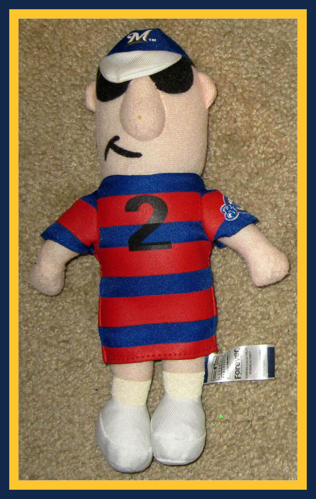
Mascot races are very popular in Major League Baseball, and that includes the sausage races in Milwaukee! Here we have a plush toy of the No. 2 stuffed Polish racing sausage, one of the guys you saw in that video clip!
Now for the rest of this week’s picks:
• Here’s a pair of NFL Action Footwear boots — looks like a canvas upper with a toe piece that resembles the classic LL Bean boot.
• Toronto Blue Jays fans could plan their days, weeks, and months with this 1985 Blue Jays planner.
• Speaking of the Jays, here’s a plush turtle puppet of the SkyDome mascot, Domer.
• NBA star Wilt Chamberlain recorded this 45rpm record, “By the River.” (You can listen to it here.)
• Paging Dr. James Anderson to the white courtesy phone: If you’re looking for your 1989 Minnesota Twins Parking Pass, Dr. Anderson, well, I found it!
• Sammy Sosa put his signature and “2One” logo (which I’d never seen until now) on this 1998 set of colored markers and pencils.
• Good cover artwork on this generically titled booklet, Football Guide 1977.
• I decided to include this kids’ size 7 Baltimore Colts jersey (Bert Jones, no doubt) for one reason: It’s made of Paul’s favorite uniform fabric, Durene.
• How about this 1970s New York Jets varsity jacket with chenille Jets logo? Proudly manufactured by the Aladen Athletic Wear Co of Pompton Lakes, NJ. And look at the chain they put on there for hanging it up!
• I bet your local Dade-Broward (county) Chrysler-Plymouth dealers happily tossed in one of these “I’M A DOL-FAN” license plates with every new car purchase!
Click to enlarge
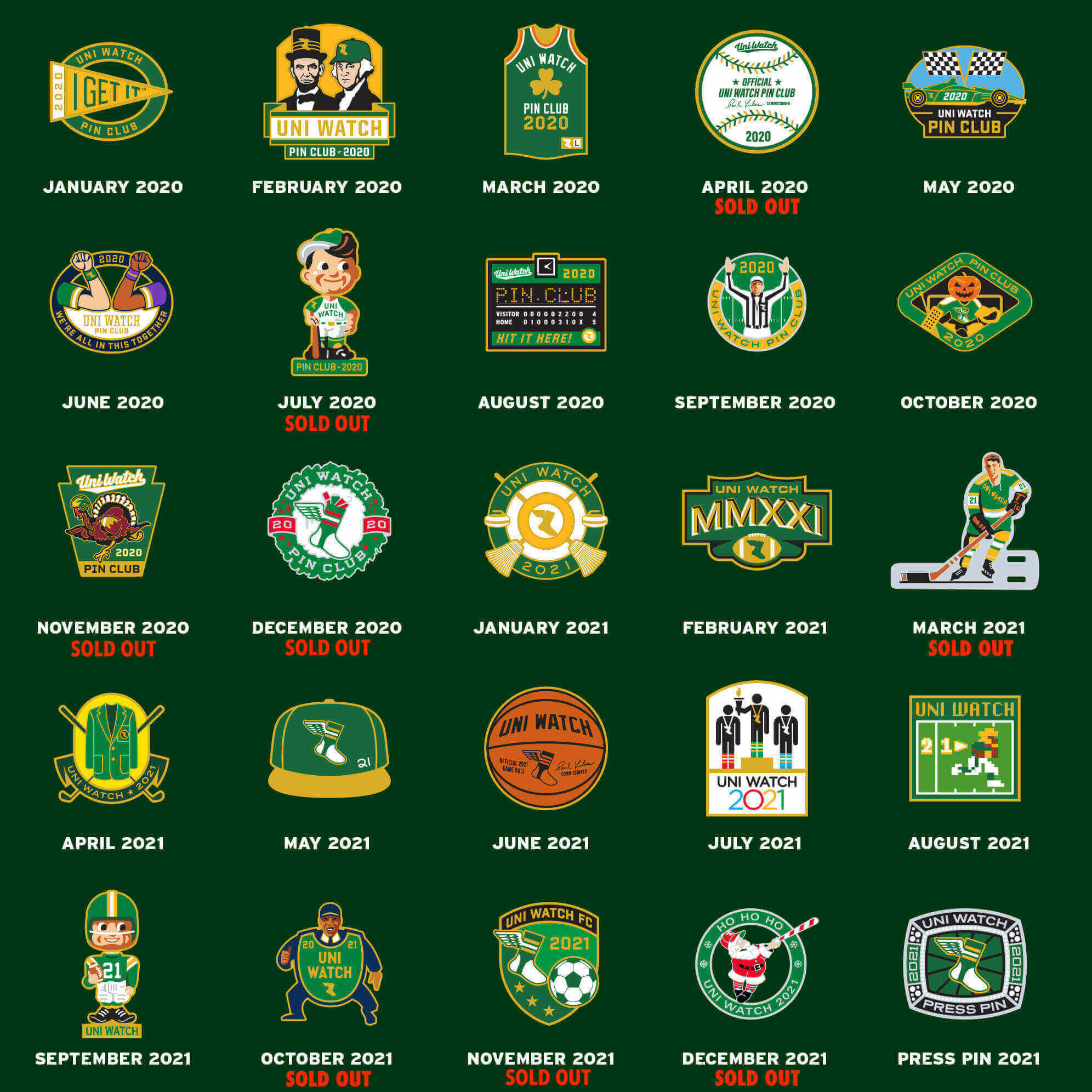
Pin clearance update: We sold out of November 2021 yesterday, and I’m down to the last two of June 2020. In case you missed it yesterday, prices are even lower this week, as I’ve moved into final clearance mode:
• For up to eight pins, the price is $3 per pin plus $5 for shipping.
• For more than eight pins, the price is $24 for the first eight and $2 for each pin after that, plus $7 shipping. So for 11 pins, for example, the price would be $37 ($24 + $6 + $7).
• If you’re outside the USA, contact me for a shipping quote.
To order, send me the proper amount via Venmo (use @Paul-Lukas-2 as the payee), PayPal (newcollegeuni@gmail.com), or Zelle (plukas64@gmail.com). If you’d rather use Apple Pay or a paper check, contact me and I’ll give you the info you need.
After sending payment, email me with your mailing address and a list of the pins you want. Please list them by date — “January 2020,” “May 2021,” and so on.
If you want to combine your purchase with an order for a Uni Watch koozie, a trading card, a seam ripper, or a magnet, email me and I’ll give you a price that includes a combined shipping fee for the whole shebang. (Sorry, these are the only Uni Watch items I can combine into one shipment, because our other items ship from separate locations.)
Also: I’m down to the last two of the June 2020 design, so move fast if you want one of those. Thanks!
The Ticker
By Alex Hider

Baseball News: I don’t believe I’ve ever seen the Twins logo listed in the middle of this graphic. Anyone else know more? (From Trevor Williams.) … The White Sox wore their City Connect uniforms for the first time this season yesterday, and it appears they’ll continue to wear them for Monday home games moving forward (from Ryan Andrew). … Speaking of City Connect, here’s a design concept for the Mariners (from Jonah Henderson). … Cubs OF Rafael Ortega uses the song “Thank You Hashem” as his walk-up music. The song is by a Haredi Orthodox artist and has become a staple at some Jewish celebrations. It turns out Ortega uses the song because he is a follower of Messianic Judaism (from @walbergLines). … The Staten Island FerryHawks of the independent Atlantic League are asking fans to design the uniforms they’ll wear when they play as the “Greenbelters” on June 16. The one-off nickname pays homage to the borough’s public parks project known as the “Staten Island Greenbelt.” Click here to submit info and enter the contest (from Rex Doane). … Seventy-First High School in North Carolina is poaching both the Giants’ and the Atlanta Falcons’ logos (from Gerry Dincher). … Japanese club Rakuten Golden Eagles has released an in-depth video showing how they launder team uniforms (from Jeremy Brahm). … Also from Jeremy: Hanshin Tigers players will be using pink bats and batting gloves for Mother’s Day.

NFL News: The Packers have announced the new number assignments for their rookie class (from Phil). … WR A.J. Brown will continue to wear No. 11 with Philadelphia, becoming the first Eagle to wear that number since QB Carson Wentz. Another new WR arrival, Zach Pascal, was slated to wear No. 11, but it appears that he will now wear No. 3 (from Sam McKinley). … The state of California has announced it will sell 49ers-themed license plates, with proceeds from the specialty plates going to support state parks programs (from our own Lloyd Alaban). … Here’s another fascinating progressive timeline animation, this time showing the number of NFL draft picks by school since 2000. … Cross-listed from the Baseball section: The Seventy-First High School baseball team in North Carolina is poaching both the Falcons’ and the San Francisco Giants’ logos (from Gerry Dincher).
College Football News: Here’s a unique animated look at UTEP’s uniform combos (from Shawn Hairston). … The University of Western Ontario has presented its players with championship rings following their win in the 2021 Vanier Cup, which is the championship for university football in Canada (from Wade Heidt).

Hockey News: Teams in the playoffs have added a decal of the new Stanley Cup logo to the back of their helmets (from Wade Heidt). … Reader Gabriel Luis Manga brings to our attention this “profoundly weird” sausage ad featuring former Canadiens RW Guy Lafleur playing on a children’s indoor soccer team. Gabriel notes that while Lafleur is wearing what appears to be a Habs-inspired uniform, Lafleur’s socks don’t match his teammates’. … Also from Gabriel: A Russian opposition newspaper editor, Dmitry Muratov, was attacked last week with acetone poison. At the time of the incident, he was wearing what appears to be a New York Rangers shirsey. Gabriel notes that the shirt was more than likely a Artemi Panarin shirsey — a Russian player who has been public in his criticism of President Vladimir Putin.

Basketball News: Gross: The Bucks looking to sell the naming rights to the fan district outside their arena (from Brinke). … Arizona men’s is changing its uniforms and dropping the gradient patterning (from Phil and Benjamin Nisbet). … Here’s the floor design for Texas’s new arena (from @sprotsbot). … This blog ranks the four best uniforms in the recent history of Notre Dame men’s basketball (from Phil).

Soccer News: Nashville SC played the first game in their new stadium over the weekend and wore an inscription on their jerseys to mark the occasion (from Kary Klismet and Justin Buznedo). … Also from Kary: RB Bragantino of Brazil’s Série A1 have released their 2022-23 home jerseys.

Grab Bag: In news that will undoubtedly thrill Paul, Delta Airlines is allowing employees to swap out their purple uniforms for grey replacements. The airline has faced lawsuits after some workers said the purple material prompted allergic reactions (from Douglas Ford). … A Swiss company claims that Meta, Facebook’s parent company, stole its logo (from Trevor Williams). … Here’s how the Microsoft logo has evolved since the 1970s.
Not sure if you meant to, but the entire ticker is italicized.
Loved the interview. That stuff is so fascinating!
Fixed.
“You’ve got everything ready to go, it looks perfec…”
Fixed.
Nice subtle geography reference for Houston. One of the major highways is Beltway 8.
Belts are overlooked as team trademarks. A diamond snakeskin motif on Arizona’s leather belts would pep up their dreary uniforms and reference Diamondbacks in a clever way.
Dfinity and Meta both have crappy logos. But, I don’t think that Meta stole Dfinity’s idea.
Anyone trying to claim exclusive use of a Möbius strip/infinity symbol motif is gonna have a hard time. It doesn’t help that there are significant differences: Dfinity uses a straight-up infinity sign that’s rainbow-colored, while Meta uses a heavily modified infinity symbol that’s all blue (something that the article should have shown, but didn’t, much to my annoyance).
Not including the images that are discussed always vexes me. I am aware of Meta’s infinity M, but I had to look up Dfinity’s logo. It also aggravates me when I news article about an offensive tweet or quote fails to include the offensive tweet or quote.
I like the Reds’ catcher’s box; it looks like a smiley face.
Some rather disappointing news in the NHL. As seen last night. The Edmonton Oilers are wearing their navy blue alternate uniforms at home during the playoffs. Where do I begin on the issues with this uniform? Hoping this is the final ride for those unis and we never have to see them again after this year.
link
Urgh.
They should be in blue, but the classic blue design with the orange shoulders and white trim, not this crap.
The only good thing about these navy alternates is that they’re still better than the mutilations the Edge system inflicted on the old navy and copper unis… but not by much.
Years ago, I was a youth baseball coach and my team won a playoff game on a catcher’s balk. The umpire had screwed up a sacrifice fly call earlier in the game*. Then, in the bottom of the 6th (final) inning, if to say “I know the rules better than you” he called a catcher’s balk that advanced my runner from home for the hollowest walk off victory in the history of sports. I really felt badly for the opposing 11-year old catcher. I would have preferred the umpire just tell the kid “No, you have to stand here until the pitch is thrown” and had let the the game play out.
I should say the umpire was probably 16 years old, so it’ not like he wasn’t a kid too. I’m also pretty sure the lines of the catcher’s box were never chalked in the first place!
*My player left third early on a tag up situation. Instead of waiting for an appeal, the umpire yelled out “you left early, you have to go back!” (That was the rule on stealing bases. Base stealers couldn’t leave until the catcher caught the pitch. They were sent back if they left early. No appeal.) The opposing team appealed and after insisting that play couldn’t be appealed, I had to tell the umpire that the other coach was correct, he shouldn’t have said anything and to go ahead and call my runner out.
I remember way back when I played Little League, we often had to get a volunteer from the stands to be the base umpire. They didn’t always know the rules that well. I once had a guy try to call me out for running out of the baseline when I rounded first on a double. Also, the rule of the ball passing the batter before the runner could steal, you can’t get take a lead in Little League. So my Dad would always tell me to leave a little early because they would just send me back to the base. I did it all the time and never got caught. We also had a play where if we had a guy on third and the batter got walked, if he got the sign when going to first, he would keep going to second. It worked every time, the other team never knew what to do.
Reminds me of a time coaching six-year-olds in 1999 when an opposing coach badgered a teenager umpire into drawing batters boxes aligning with the front of home plate. None were painted or chalked on the field. The ump clearly didn’t know the rule, and neither I nor my assistants had a copy of the rule book on hand, so for the rest of the game every kid had to stand well behind the plate. Rendered the game utterly useless from a practice/training perspective for batters. I never again coached a game without a physical copy of the rule book in a pocket on my person.
That catcher’s balk has to be one of the least enforced rules in all levels of baseball. I had a summer league coach that would get livid with me if any of his pitchers threw a pitch on 0-2 that the opposing batter would even get his bat on. I set up so comically and sarcastically outside (although probably still had at least one foot in the box!
I did a bit of digging and it looks like the last time a catcher’s balk was called in the majors was in 2000. And even then it wasn’t about a balk, it was more about shenanigans with the chalk on the part of the grounds crew.
link
Sorry. What i should have said was that the last time a catchers balk for leaving the box early was called was in 2000.
There was a catchers balk called last year for using equipment to corral the ball.
link
An interview like this is Uni-Watch at its best. Loved the interview Paul, will definitely keep my eye out for catcher’s boxes from now on!
If they don’t want to waste product, I’m surprised they don’t put down skinny lines for the catcher’s box, like the Dodgers batter’s/catcher’s boxes. Just a couple of really thin corner markers back there to satisfy the bare minimum.
I think that Twins logo in the ticker ended up being used as a sleeve patch on their cream alternate jerseys a few years back.
link
You’re referring to the logo at the top. But the Ticker item is about the logo in the middle.
Both of the “1965” logos are recent creations. I think I recall first seeing the middle logo circa 2010. The bottom one draws some inspiration from real 1965 World Series pins, but the Minnesota text is rendered in the distinctive font of the team’s 1986 logo. And the real 1965 pin logo had the text World Series vertically on the left, not Vegas-sign-style numbers. Both logos are merchandising fauxbacks. While I like both, aesthetically, I’m irrationally outraged that they’re being presented as actual historic logos. I mean, Cal Griffith was a famous skinflint of a cheapskate and would never have paid to have such nicely rendered new logos drawn. Certainly not in the mid-1960s, when the team didn’t even bother to standardize the reproduction of its actual logos on on-field uniforms.
I don’t like those logo banners at all because they so often end up being slop jobs, with inaccuracies often taken off the web and not double-checked, and of course with the use of Comic Sans, always a sign of quality… urgh!
That Rangers shirsey that Dmitry Muratov is wearing almost looks homemade! The lettering (and sleeve patch) appear to actually be patches, not just screen printing like every other shirsey I’ve ever seen.
Great stuff here! Creative liberties don’t stop at the catcher’s box, either.
When I was lining the field at Austin Peay, I would always line the runner’s lane and coach’s boxes in different styles – rounded corners, short arms, no arms, etc. Gotta keep it interesting.
The Mets are wearing their alternate (non pinstripe) pants with their home alternate jersey. First time in years!
Saturday, Phil wrote:
“One thing I’d like to see changed about the Mets uniforms: as you see, the team wears solid white pants (with blue piping) with the black jerseys. However, when the team wears their alternate blue jerseys, they wear their blue pinstripe pants at home. This combination, to me anyway, looks like they forgot their regular pinstripe tops and had to wear their BP jerseys for the game. Since they now obviously have the set of plain white pants, I wish they’d pair those with the alternate blue jerseys, as to me this would look more like a uniform. I personally detest when pinstriped teams wear a solid jersey with them.”
Today, for game 1 of their doubleheader, the Mets are wearing the blue jerseys with the plain white pants, just as Phil suggested. Coincidence? Maybe not. And, of course, he’s right–it looks WAY better than when they wear the pinstripe pants with those jerseys.
I don’t want to say they look great (since I hate alternate tops), but this actually looks like a UNIFORM, not like someone forgot to pack the pinstriped tops and they took the BP jerseys out of the bin.
Looks SO MUCH BETTER than the blue tops/blue pin mismatch.
Re: Cubs’ Ortega . . . “messianic Judaism” is a self-contradictory misnomer and is (very) arguably an insult to Jews. He may self-identify that way but that doesn’t make it right.
Anyone know if that Cincinnati catcher’s box is rendered properly in The Show 2021?
I really enjoyed this entry today. I agree with Paul, that this is peak Uni-Watch. Great stuff!
Paul, loved uni watch for waaaaaay to many years now. Many times I’ve almost dropped a comment, but typically someone has beaten me to it or frankly it’s to say I like a cubic concept that will never happen Today though, how can no one see the Harry Carrey in that catcher’s box. Now I’m asking myself why haven’t or wouldn’t the Cubs do it. Absolutely love every ticket rabbit hole you’ve led me on, please never stop the site!
Awww — thanks, Chris!
I decided to include this kids’ size 7 Baltimore Colts jersey (Bert Jones, no doubt) for one reason: It’s made of Paul’s favorite uniform fabric, Durene.
I had one of those very jerseys, only it was a Giants’ John Mendenhall #64 white uniform. And, like the Colts’ shirt, the silkscreened number cracked, only mine had completely flaked off. Screen printing doesn’t seem to adhere well to Durene.
Speaking of City Connect, here’s a design concept for the Mariners (from Jonah Henderson)
The “Seattle” lettering in Serif Gothic typeface is one of my favorite underused trademarks. It resembles the script used by the Seahawks from 1976 through 2001. The mixing of upper and lower case letters is reserved and cool, like the city itself.
Louisville baseball wearing red jerseys with red numbers tonight. Wretched.