[Editor’s Note: First Marc Mayntz brought us a “national flag” for each NFL team. Then he did the same thing for the NHL. Today he’s back with the NBA installment of this ongoing project. Enjoy. — PL]
By Marc Mayntz
I initially thought it would be too difficult to distill NBA teams down to simple flag designs because the uniforms and colors change so much with every game, but I was able to put together some pretty good designs that blend some old and new looks.
As with the NFL and NHL installments, I limited myself to one instance of copy/pasting a team logo (Toronto) and one square flag (Utah). I had to make lots of judgment calls to blend together all of the trends and fads that NBA uniforms and logos have gone through, so this batch of designs may cause a little more controversy than others. I admit I may be more biased towards the ’80s designs, as that’s what I grew up with.
Okay, let’s get started!
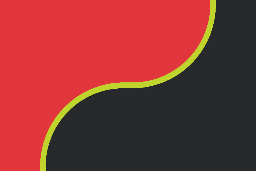
Atlanta Hawks
The Pistol Pete curve rendered in modern colors.
———
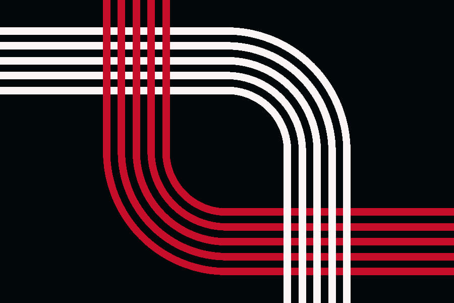
Boston Celtics
Eight stripes to represent the eight consecutive titles from 1959-66, laid out to emulate the parquet floor.
———
Brooklyn Nets
Linking the Dr. J-era ABA team to the Brooklyn Bridge cables which, in a nice coincidence, form a net.
———

Charlotte Hornets
The Alexander Julian pinstripes representing the team (white and purple), the city (green), and Julian’s alma mater (UNC blue).
———

Chicago Bulls
Yes, I know — bulls don’t actually get mad when they see the color red. But 22,000 of these waving in Chicago Stadium? That would be scary for any opponent!
———
Cleveland Cavaliers
I went with the Craig Ehlo Cavs instead of the LeBron swords, but it was close.
———
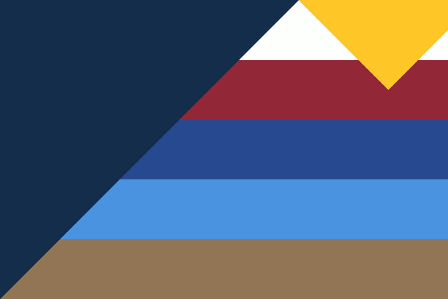
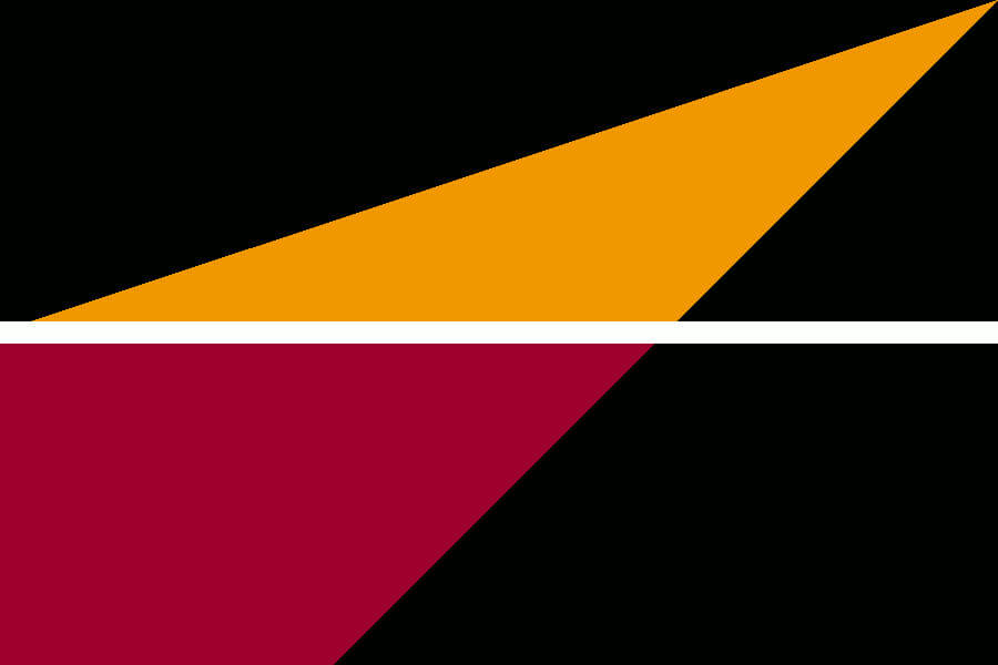
Dallas Mavericks
I modified the Dallas city flag to include a thin crescent moon.
———
Denver Nuggets
The Alex English rainbow with various shades of previous Nugget team colors form the strata of the Rocky Mountains.
———
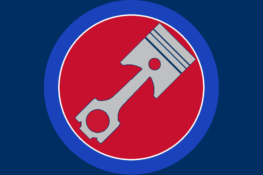
Detroit Pistons
I wanted this to look like a vintage gas station sign and it took forever to get that piston just right.
———
Golden State Warriors
Close-up of a great logo, with the hidden subtext that the real fan base is across the Bay at the old arena.
———
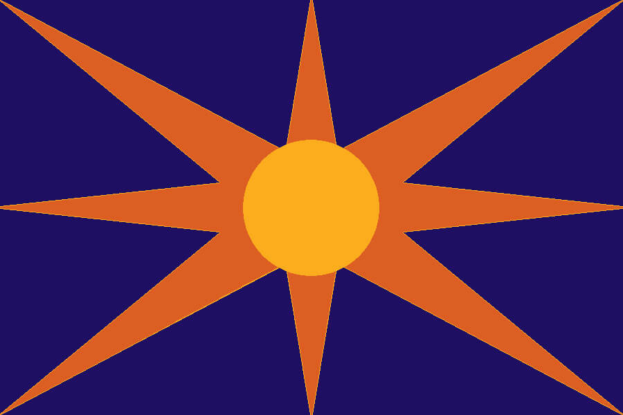
Houston Rockets
A Saturn V rocket as viewed from the ground after liftoff.
———

Indiana Pacers
Based on the The Reggie Miller “Eight points in nine seconds” jersey.
———
L.A. Clippers
The 3 masts of the franchise’s San Diego-era logo in front of a sunset-lit Pacific Ocean.
———
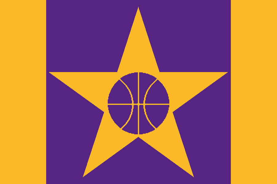
Los Angeles Lakers
This flag gives the Lakers their own star on the Hollywood Walk of Fame.
———
Memphis Grizzlies
Bear claws tearing a musical staff across a field of Beale Street Memphis Blue.
———
Miami Heat
A simpler, two-dimensional, geometric view of one of the best logos anywhere.
———
Milwaukee Bucks
Milwaukee – The MECCA was decades ahead of its time, before everyone realized that hardwood floors could be art canvases.
———
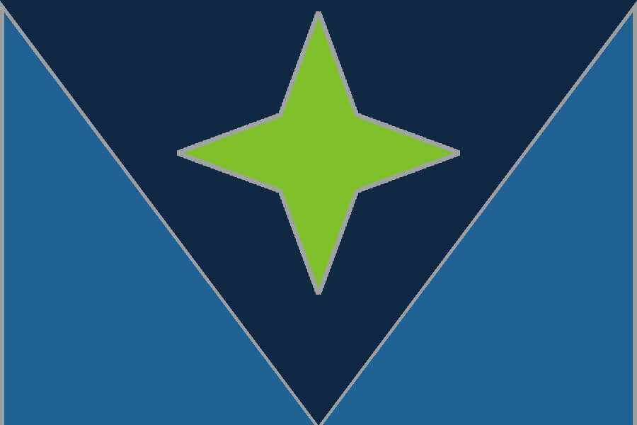
Minnesota Timberwolves
A subtle “M” in the interlocking shapes, with a neon green North Star dominating the dark blue.
———
New Orleans Pelicans
The outstretched pelican wings support a fleur de lis and modified beak.
———
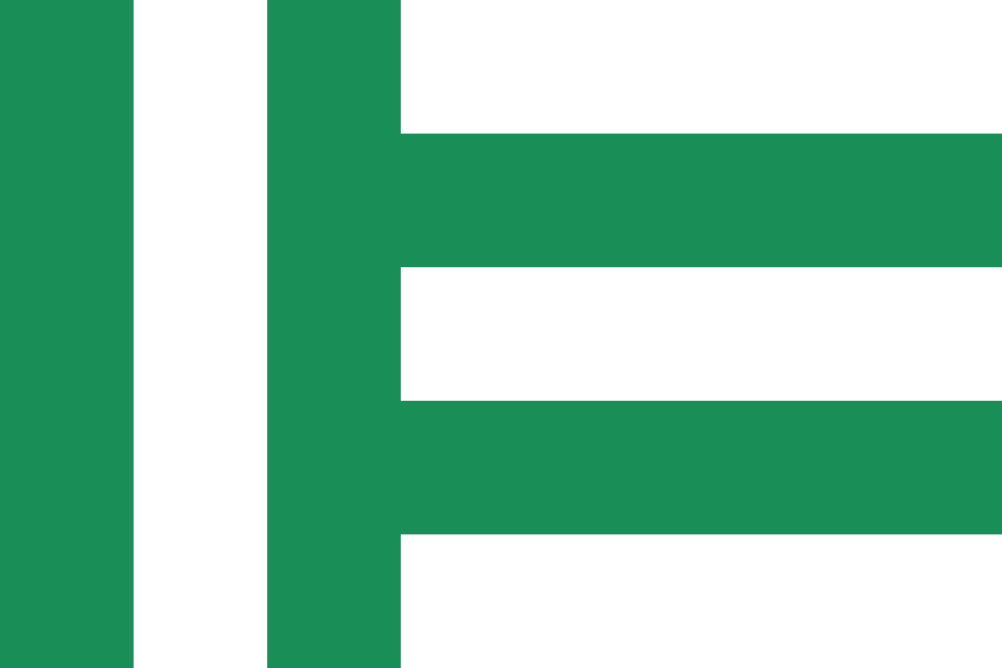
New York Knicks
New York – The five colors represent New York City’s five boroughs: black for Brooklyn, silver for Staten Island, blue for Queens, white for Manhattan, orange for the Bronx.
———
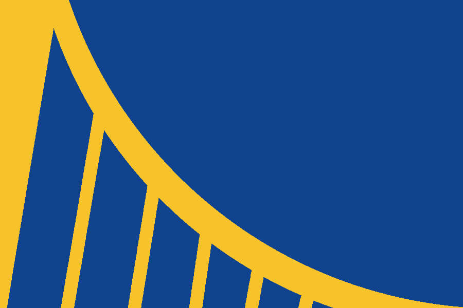
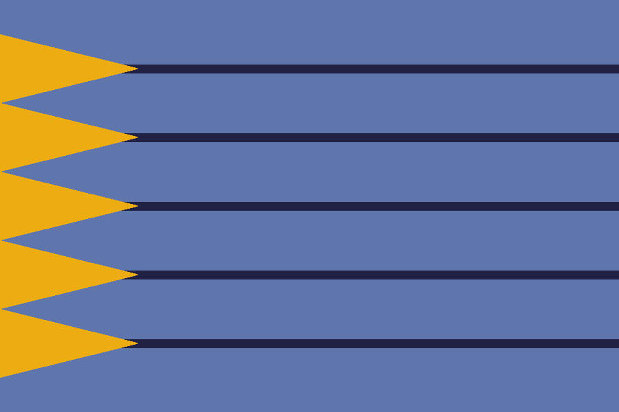
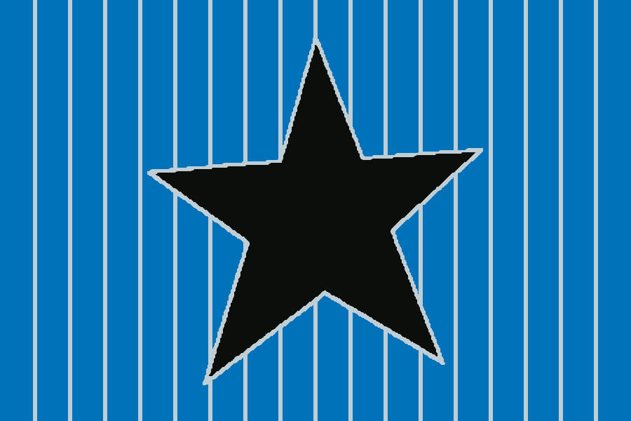
Oklahoma City Thunder
Inspired by the “O” from the team’s 2018 City Edition uniform.
———
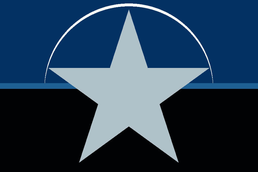
Orlando Magic
Remember when the Magic won the lottery two times in a row to get Shaq and Penny? Good times.
———
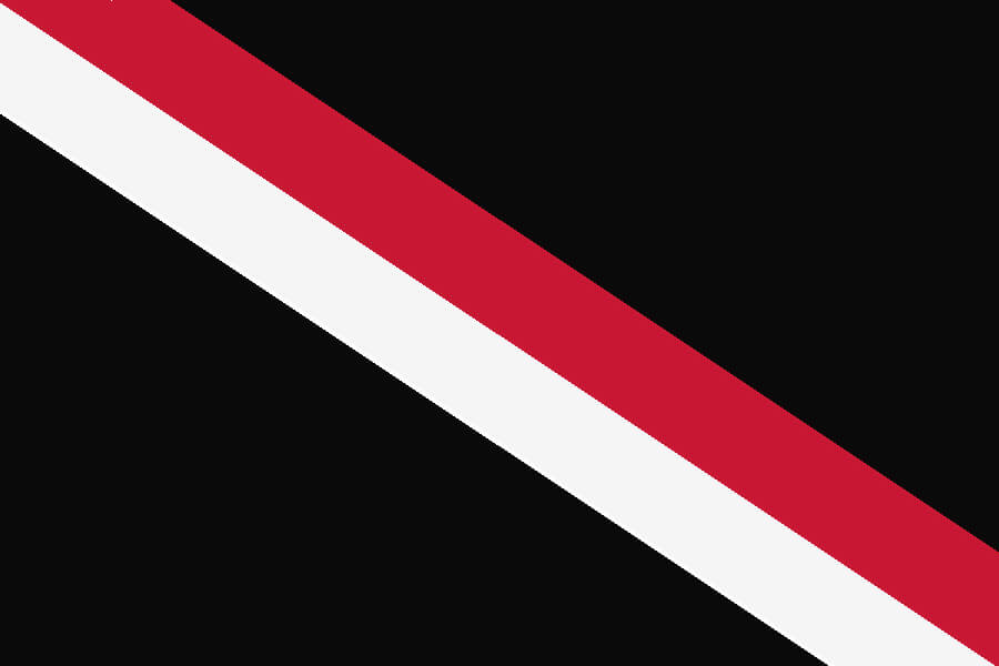
Philadelphia 76ers
With all due respect to Allen Iverson, this is the Sixers’ best look.
———
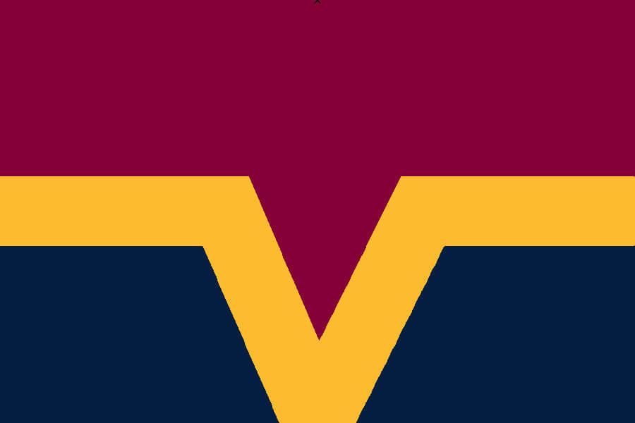
Phoenix Suns
And with all due respect to Paul, this is purple done right.
———
Portland Trail Blazers
In true Oregonian fashion, this is a double sided flag, with the “pinwheel” extended to emulate the Portland city flag on one side and the “blaze” strip on the other.
———
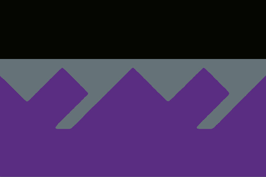
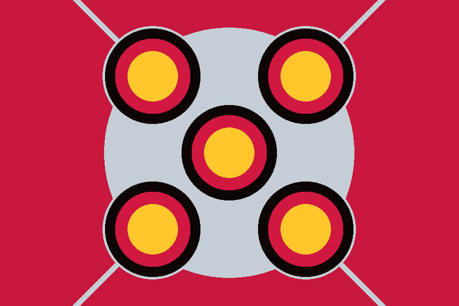
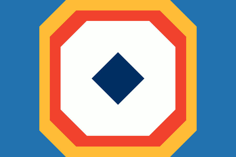
Sacramento Kings
The top of the Kings’ crown.
———
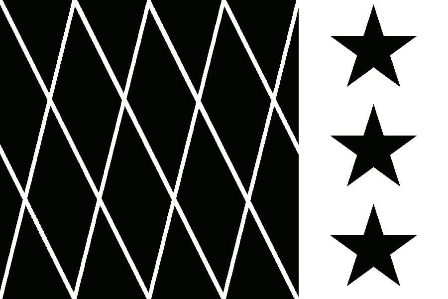
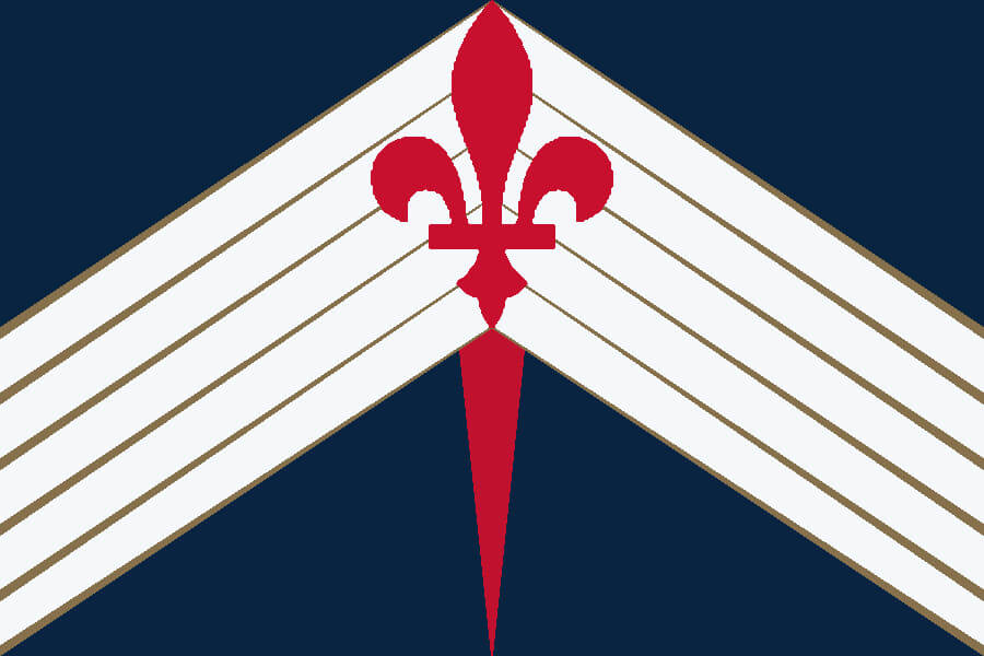
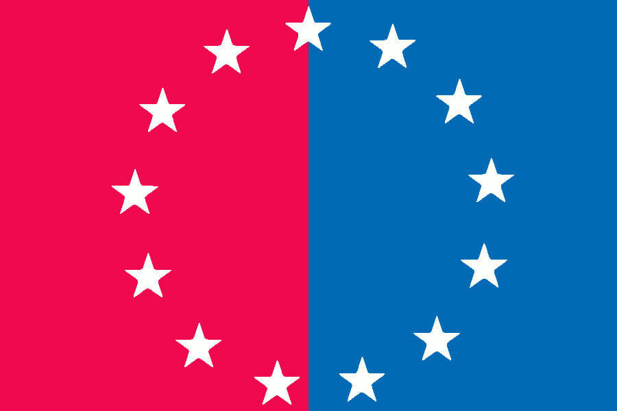
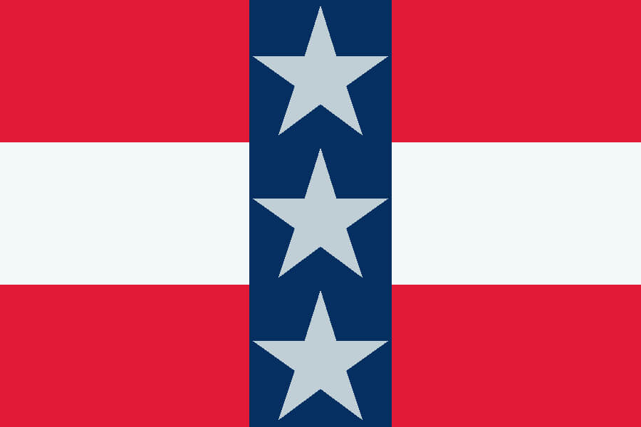
San Antonio Spurs
The Fiesta stripes with a six pointed spur in the middle.
———
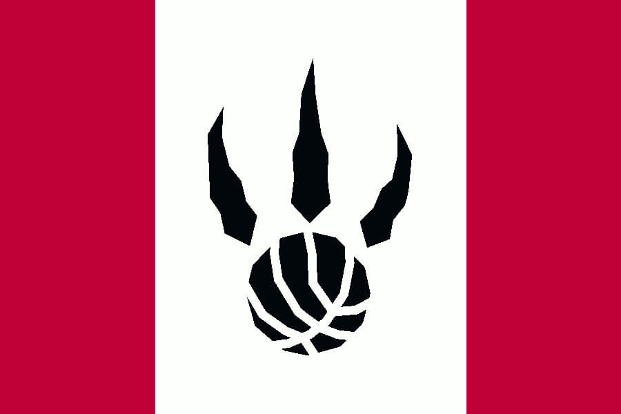
Toronto Raptors
A modified Canadian flag with the Raptors’ claw logo in the center.
———
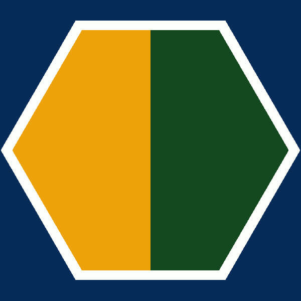
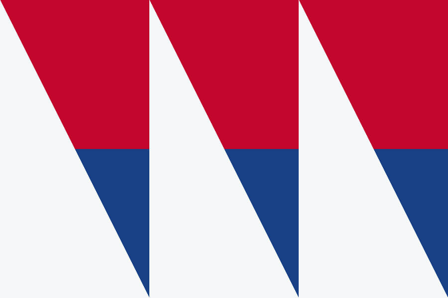
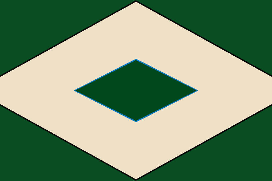
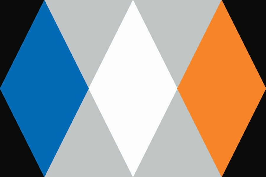
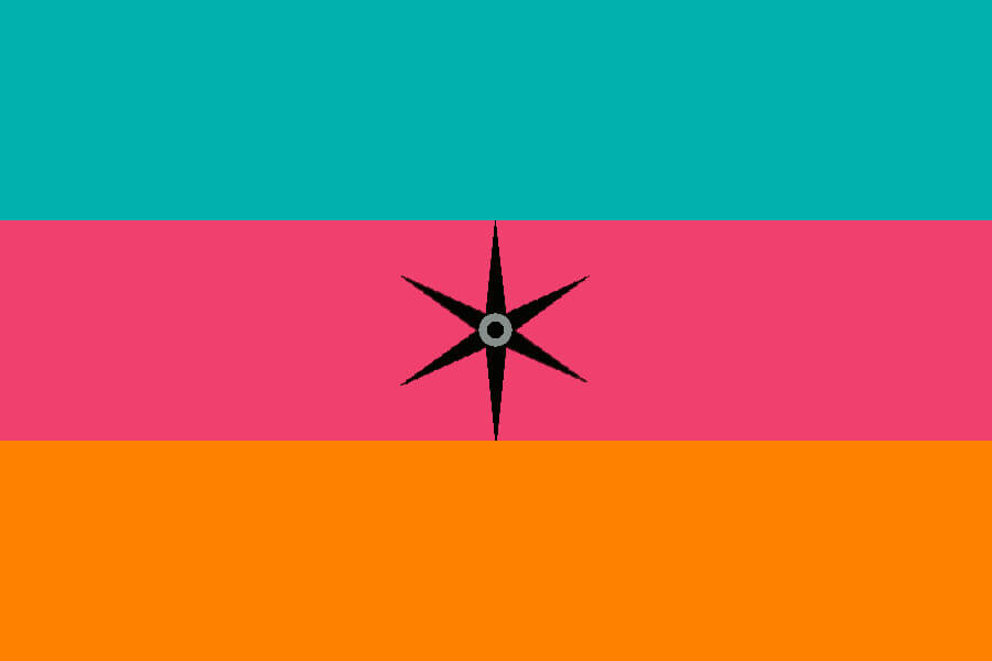
Utah Jazz
The one square flag in this set. As much as everyone loves the “Red Rock” alternates, these are Jazz colors.
———
Washington Wizards
The Unseld uniform is timeless, no matter what you name your team.
Click to enlarge
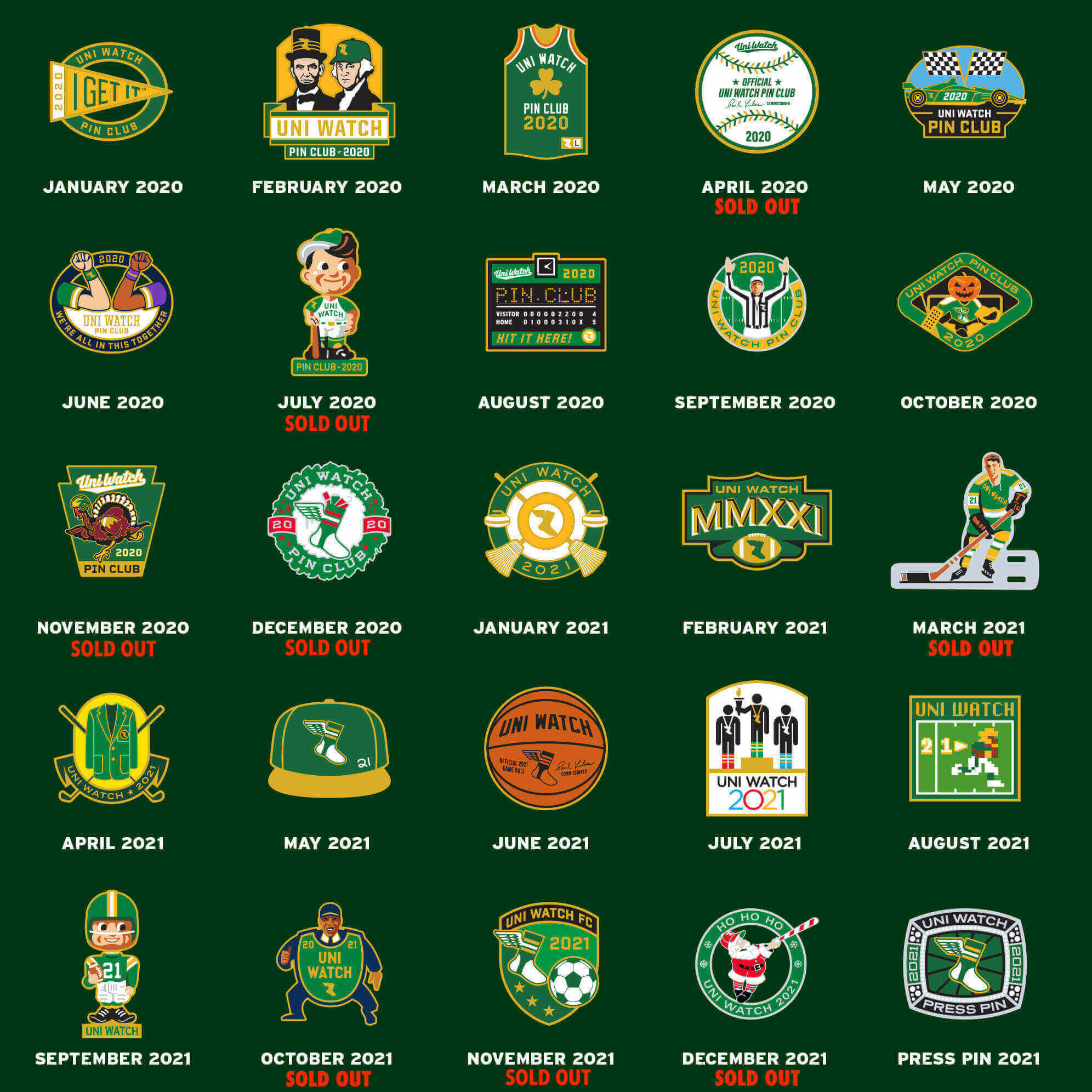
ITEM! Final pin clearance prices: The response to last week’s pin sale was good (thank you!), but I’d still like to move the rest of the pinventory out the door, so I’m now reducing the prices one last time. Here are our final clearance prices:
• For up to eight pins, the price is $3 per pin plus $5 for shipping.
• For more than eight pins, the price is $24 for the first eight and $2 for each pin after that, plus $7 shipping. (So for 11 pins, for example, the price would be $37 ($24 + $6 + $7).
(If you’re outside the USA, contact me for a shipping quote.)
To order, send me the proper amount via Venmo (use @Paul-Lukas-2 as the payee), PayPal (newcollegeuni@gmail.com), or Zelle (plukas64@gmail.com). If you’d rather use Apple Pay or a paper check, contact me and I’ll give you the info you need.
After sending payment, email me with your mailing address and a list of the pins you want. Please list them by date — “January 2020,” “May 2021,” and so on.
If you want to combine your purchase with an order for a Uni Watch koozie, a trading card, a seam ripper, or a magnet, email me and I’ll give you a price that includes a combined shipping fee for the whole shebang. (Sorry, these are the only Uni Watch items I can combine into one shipment, because our other items ship from separate locations.)
Also: I’m down to the last few of the June 2020 and November 2021 pins, so move fast if you want one of those. Thanks! (Update: November 2021 now sold out.)
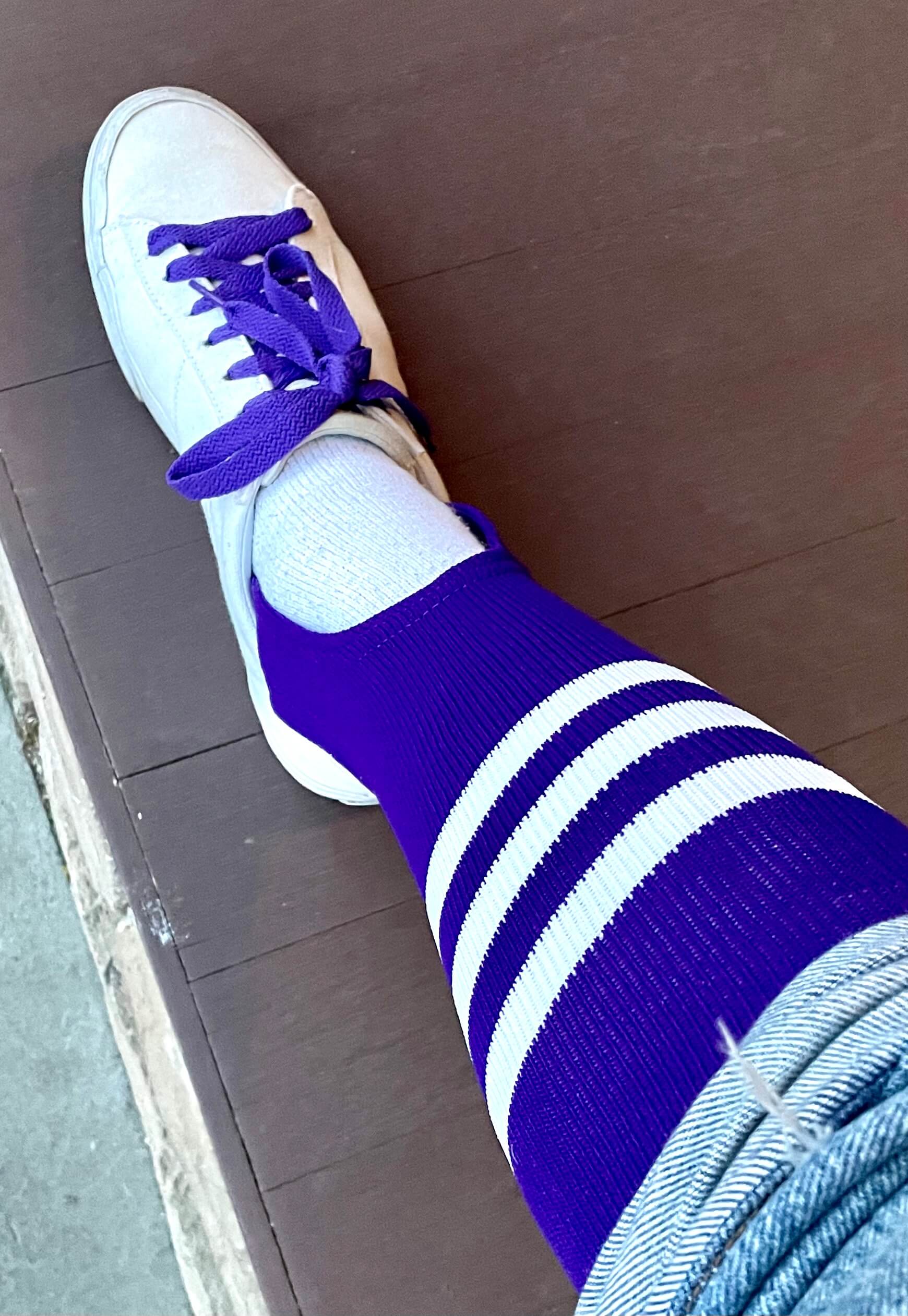
Purp Walk update: Plans for the 2022 edition of Purple Amnesty Day continue to shape up nicely. We had 28 pre-orders for the T-shirts with the bonus logo on the back, which presumably means we’ll have at least that many people coming to the party at Black Street Tavern on May 17 — a very nice turnout.
It also looks like we’ll have a nice crowd of Uni Watch readers watching that night’s Rockies/Giants game from the purple row of seats at Coors Field. Looking forward to that!
Meanwhile, as you can see in the photo at right, I’m continuing to gear up for Purp Walk myself. Stay tuned for more.
If you have no idea what any of this is about, look here to get the full scoop.
The Ticker
By Jamie Rathjen

Baseball and Softball News: The Royals are wearing their City Connect uniforms a few times this week, and then for Friday home games for the rest of the season (from Jon Saddler). … Lots of college and high school softball teams wore purple ribbons this weekend in memory of James Madison C Lauren Bernett, who died by suicide last week. Many posted pictures under the #LB22 hashtag on Twitter. Some teams wore multiple colored ribbons, including JMU’s purple and gold as well as purple and teal, which is associated with suicide prevention. … We previously mentioned in the Ticker that this would be coming: Virginia baseball retired No. 11 for Ryan Zimmerman on Saturday. The promotion included a shirsey giveaway, commemorative bases, and No. 11 mowed into the outfield (thanks, Phil). … Reader William F. Yurasko tells us that the No. 11-in-a-circle treatment for Zimmerman reminds him of the logo of New York TV station WPIX. … Lamar baseball is planning to hold a ceremony next weekend for some players whose numbers were retired but didn’t get a ceremony at the time (from @JTS65). … Longtime reader Dan Cichalski has written an interesting article about how Yankees stars Yogi Berra and Phil Rizzuto opened a bowling alley in New Jersey in the 1950s.

Football News: The Commanders’ new field design was painted last week. It keeps the burgundy end zones from the Washington Football Team design and uses the W logo at midfield after stints with the NFL logo and a circular WFT logo. … Meanwhile, since NFL teams have been posting their draft picks’ numbers, the Commanders posted all theirs at once (from Adam Apatoff). … Some classic blue collar cosplay from the Seahawks, whose team execs wore team-branded work shirts on the third day of the draft (from Clint Cavey). … The commenter who goes by tosaman sent us this article about linebackers in this year’s NFL draft. The article refers to the defensive player who communicates with the sideline as a “green dot,” because of the extra helmet decal they get, and also mentions that an extra green-dot helmet is kept on the sideline in case the wearer is injured.

Hockey News: Cross-posted from the soccer section: In MLS, CF Montréal did a Guy Lafleur tribute during warm-ups on Saturday by wearing the Canadiens winger’s NOB and No. 10 (from Wade Heidt).

Basketball News: We haven’t yet mentioned that the Celtics have been wearing a No. 24 memorial patch for Sam Jones, who passed away at the end of 2021 (from Kary Klismet).

Soccer News: Tottenham Hotspur’s men’s team wore shirts supporting a charity, in this case one run by their advertiser, which the Premier League allows once a season. … In MLS, CF Montréal did a Guy Lafleur tribute during warm-ups on Saturday by wearing the Canadiens winger’s NOB and No. 10 (from Wade Heidt). … Also from Wade: Since Real Madrid’s men’s team clinched the La Liga title on Saturday, which had looked inevitable for a while, they held an open-top bus tour with the trophy on the same day. Players wore shirts with “Campeones” as the NOB and No. 35, since it was their 35th title. … The NWSL’s Washington Spirit revealed their 2021 championship banner yesterday. The Portland Thorns also revealed one on Saturday for last year’s win of the NWSL Shield, the regular season title. … After publicly confirming their new shirt ad on Friday but not posting a picture at the time of what it would look like, the Spirit also did that yesterday. … Meanwhile, in this story Thorns center-back Becky Sauerbrunn has some interesting uni-related memories of the first NWSL game in 2013. While playing for FC Kansas City, not only was she at first given a shirt with her NOB spelled “Saverbrunn,” but the game was played at a Kansas high school where the field also had markings for football and men’s lacrosse. … New second shirts for Ireland’s Cork City and Sweden’s IFK Norrköping (from Kary Klismet). … Signs on D.C.’s Anacostia Freeway pointing towards D.C. United games when the team played at RFK Stadium have fallen off, revealing one for the 1996 Olympic soccer tournaments (from @DanielMLane). … Here’s a breakdown of this season’s special-edition shirts from Italian teams (from @CalcioEngland).

Grab Bag: The Australian Football League’s men’s Indigenous round is later this month. Melbourne is rebranding as Narrm Football Club, based on the name for Melbourne in Woi Wurrung, one of the local Indigenous languages, for both the men’s round and the women’s one that is probably later this year. They’re also using the the same Indigenous guernsey design for both teams for the first time (from multiple readers). … NASCAR Cup driver William Byron was forced to use a backup car for this weekend’s race in Dover, Del. While the car was supposed to be all dark grey, the backup was grey on the sides and otherwise white (from @Parzival401). … Italy’s women’s volleyball league, Serie A1, placed “2022 Finale Scudetto” on the court for its championship series, referencing the shield patch that the defending champions of many Italian sports leagues wear. It’s visible on the shirts of Imoco Volley next to the roundel that is also worn by the winners of Italian cup competitions (from Jeremy Brahm). … In a match at tennis’s Madrid Open yesterday, Daria Kasatkina and Maria Sakkari wore the exact same outfit (thanks, Brinke).
Marc I like a lot of these team flags–very cool! I understand the solid red Bulls flag was a choice, but I was thinking it’d be cool to incorporate the diamond design element on the teams’ shorts:
link
Thank you AJ. I thought about the diamonds, but every time I added them, they looked (to me) like they were added on ex post facto, almost like “we have to put something there,” and the Bulls’ logo is too good to effectively disrespect like that.
Dan Snider is a billionaire with a B, yet he still cannot make grass grow in FedEx Field. English soccer stadiums have 20-40 games a season, plus practises……putting green. Danny has 8 games a year….crap. Even grass cannot succeed under his leadership.
While I’m no defender of Snyder, we have the same issue in Pittsburgh. Are American groundskeepers still doing the sand-based fields? I think that’s the problem.
I know it is probably a design choice, but why is Orlando’s star slightly to the side?
I know in the stripes + star uniforms of the team, the star is either, perfectly centered or slightly to the side, but to the other side than this flag.
Originally, I had the star leaping like the current “comet tail” logo, but it looked terrible. The tail got deleted, but the slightly canted star stayed.
Love the idea of using a two-sided flag for the Blazers, just like the state flag. And both designs are perfect.
Thank you Mike. It helps that the Blazers have such a distinctive logo and uni element that helped facilitate the choice to do a 2 sided flag.
One of my favorite Uni-Watch projects. My favorites were Charlotte, Memphis, and Portland.
Thank you Walter.
Extra green dot helmet: I am assuming the extra green dot helmet kept on the sideline is sized for a specific defensive player. Otherwise, giving a randomly-sized helmet to the next defender would be much more dangerous than allowing teams to have two different color helmets (which was forbidden for years)
Given how overprepared NFL coaches try to be, they probably know exactly which defensive player is the ‘backup green dot’ before kickoff. Maybe it’s the next guy on the depth chart for that position, maybe it’s another starter.
I try to avoid commenting on these types of posts, as my personal opinions can come off as overly negative.
However, I will point out an issue of accuracy: the neon yellow used on the Atlanta flag is not used by the Hawks anymore. They’ve gone back to traditional yellow (which would look better on the flag).
The thunder should be done in green and gold in a pattern similar to the Space Needle.
Really excellent work Marc! I especially like that you have created design elements that connect with each team and make sense. And I mean in a genuine pre-design way. Not the silly post-design stories that league marketing guys come up with after-the-fact to give meaning to (often) bad design choices.
Great work Marc! I loved the NFL version you did a few months back and I patiently waited and hoped for an NBA edition. 29/30 are excellent, but just one question: Why is Utah a hexagon?
I’m not an NBA fan much at all anymore so no real skin in the game. But if I was a Spurs fan, I’d be printing out that flag this instant. I love it! Nice work on all of these, it looks like a fun project!
Love all the flags! But as a Spurs fan, I’d rather the star be five-pointed as a nod to the franchise’s five championships.