Click to enlarge
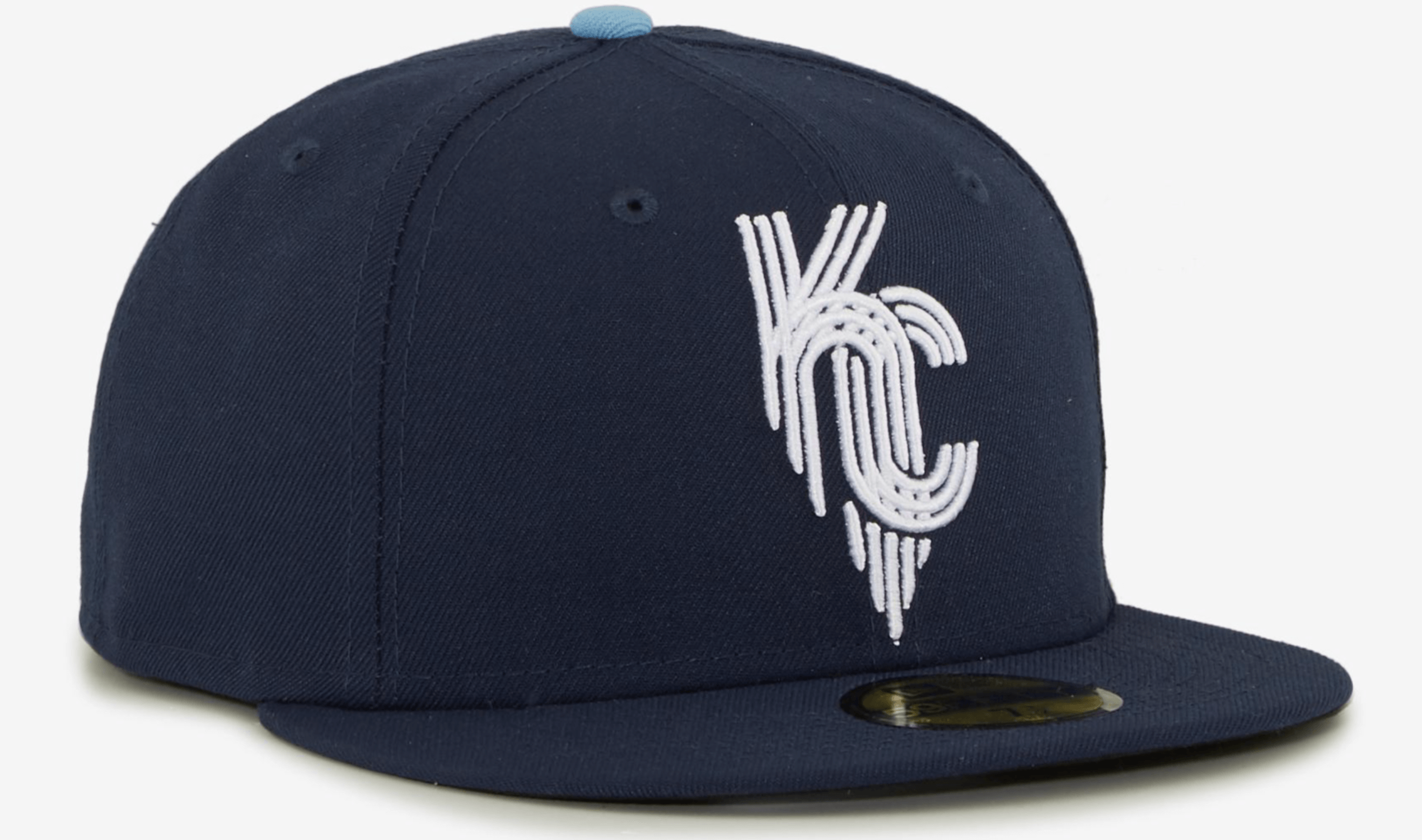
The next MLB team to unveil a CC uni will be the Royals (their CC design is set to make its on-field debut on April 30). Although we don’t know when the official unveiling will be, their CC cap was briefly available for sale on the EbLens.com retail site yesterday afternoon. The listing was quickly taken down, but not before I got the screen shot shown above.
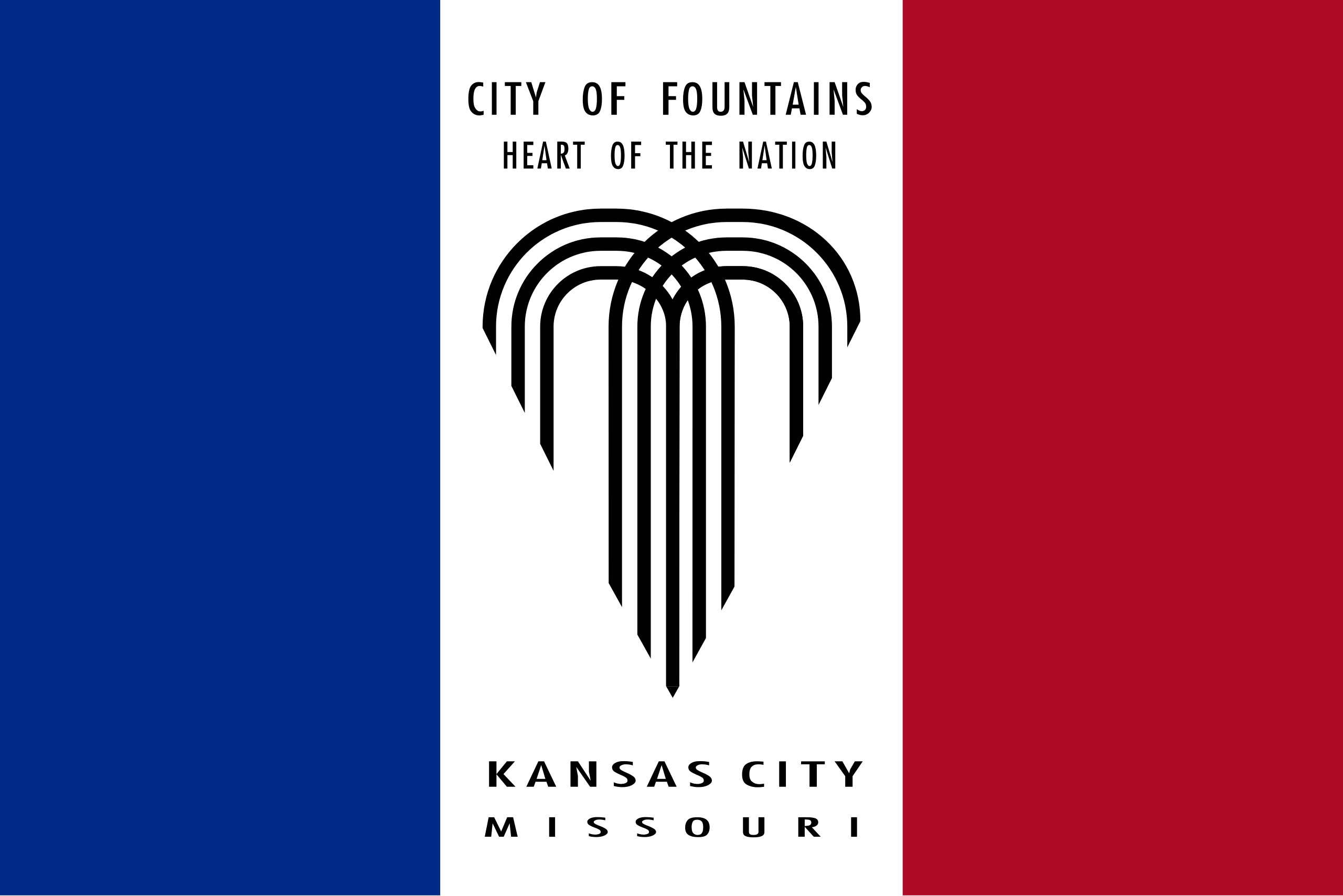
The cap logo is apparently based on the Kansas City flag, which celebrates KC being the “City of Fountains” (although the heart-shaped fountain icon is sometimes jokingly referred to as a “grappling hook”):
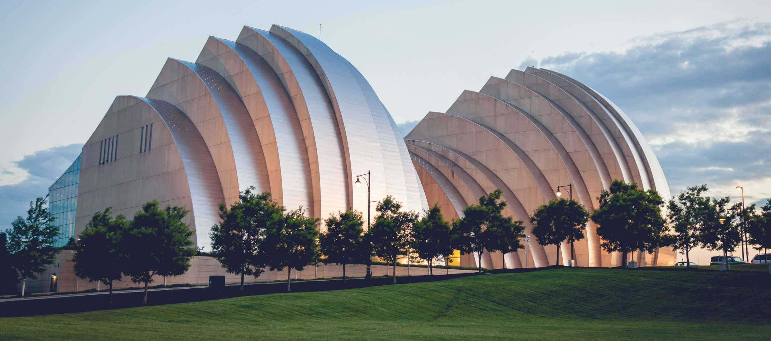
Not sure if it’s just a coincidence, but the cap logo is also vaguely evocative of the architecture for KC’s Kauffman Center for the Performing Arts:
It’s a bit surprising that the cap is navy instead of royal blue. But the light-blue squatchee suggests that other shades of blue may be in play here. We’ll find out soon enough, since the full unveiling will presumably take place in the next week or so.
(My thanks to Joseph Foro and Lou Griffel for bringing the leak to my attention.)
ITEM! Big Purp Walk 2022 news: Today I have some big news about the 2022 edition of Purple Amnesty Day, which, as always, will be on May 17 — exactly four weeks from today.
Let’s start with a quick history refresher: The idea for Purple Amnesty Day came from longtime reader Tim Cox, who lives in Denver and has season tickets for the Rockies (who, of course, wear purple). On the blog’s fourth birthday — May 17, 2010 — Tim posted the following comment:
Congrats on 4 entertaining years, Paul & company. I’m a daily reader but not a member because I can’t do a Rockies membership card without purple. The 4th anniversary seems like the perfect occasion to grant amnesty to all the Rockies, Vikings, LSU, Northwestern, etc. fans out there.
I then responded:
[Y]our idea for a one-day purple amnesty program is a good one. If anyone wants to sign up for a purple-inclusive membership card, today — and only today — I will honor all such requests!
And just like that — very informally — Purple Amnesty Day was born. It has continued to evolve in various ways since then, but it all comes back to Tim’s suggestion back in 2010.
Over the years, Tim has really leaned into Purp Walk. He wore his 2019 Purp Walk shirt to the Rockies’ Photo Day that year, and he later had me autograph that shirt with a purple marker when we met at the Uni Watch 20th-anniversary party in Brooklyn. (He actually flew in from Denver earlier in that day, got a cab to the party — where he wore a purple shirt, naturally — and then flew back out that same evening. Now that’s devotion!)
Around the same time that we met at that party, Tim suggested that I do some sort of Purple Amnesty Day event in Denver, ideally in conjunction with the Rockies. I told him we could pitch the idea to the Rox the following year — 2020. But it turned out that the Rockies were scheduled to be on the road on May 17 that year (and then the pandemic wiped out that part of the schedule anyway), so we tabled the idea until 2021. The next year, the same thing happened — the Rockies were on the road for Purple Amnesty Day. So Tim and I continued to bide our time.
This year, however, the Rockies will be home on May 17, against the Giants. Tim and I have had some back-and-forths with the team’s marketing department in recent months, and at one point it looked like they’d be on board for some sort of cross-promotion with Uni Watch. (I had dreams of throwing out the first pitch with a purple baseball, among other things.) Unfortunately, it now looks like they’ve changed their minds about partnering with us — not so surprising when you consider that I hate purple on the other 364 days of the year — but I’ve decided to go ahead with a Denver plan anyway. Here’s what’s on tap for this year’s Purp Walk:
1. I will be flying out to Denver on May 17 and hosting a Purp Walk party at the Blake Street Tavern, which is just a few blocks from the Rockies’ ballpark. (They’ve even agreed to put up a “Welcome Uni Watch” banner for us!) I’ve hosted lots of Uni Watch parties over the years, but this is the first time I’ve done one in connection with Purple Amnesty Day. It makes sense that it should happen in Denver, with Tim Cox in attendance.
The party will start at 5pm, and then we may go over to the ballpark to catch the game — or we might just watch it at the bar. Not sure about that part yet, but we’ll get a plan worked out in advance so people can buy tickets if they want.
2. I will go all-out to embrace purple for this event. I will wear a purple shirt (more on that in a second), purple pants, purple shoes/socks, the works. I may even paint my face purple! I will hate every minute of it, but hopefully in a fun way.
3. As usual, I’ve worked with designer Bryan Molloy to create a Purp Walk T-shirt. Since I’ll be in Denver, we went with a Rocky Mountains theme:
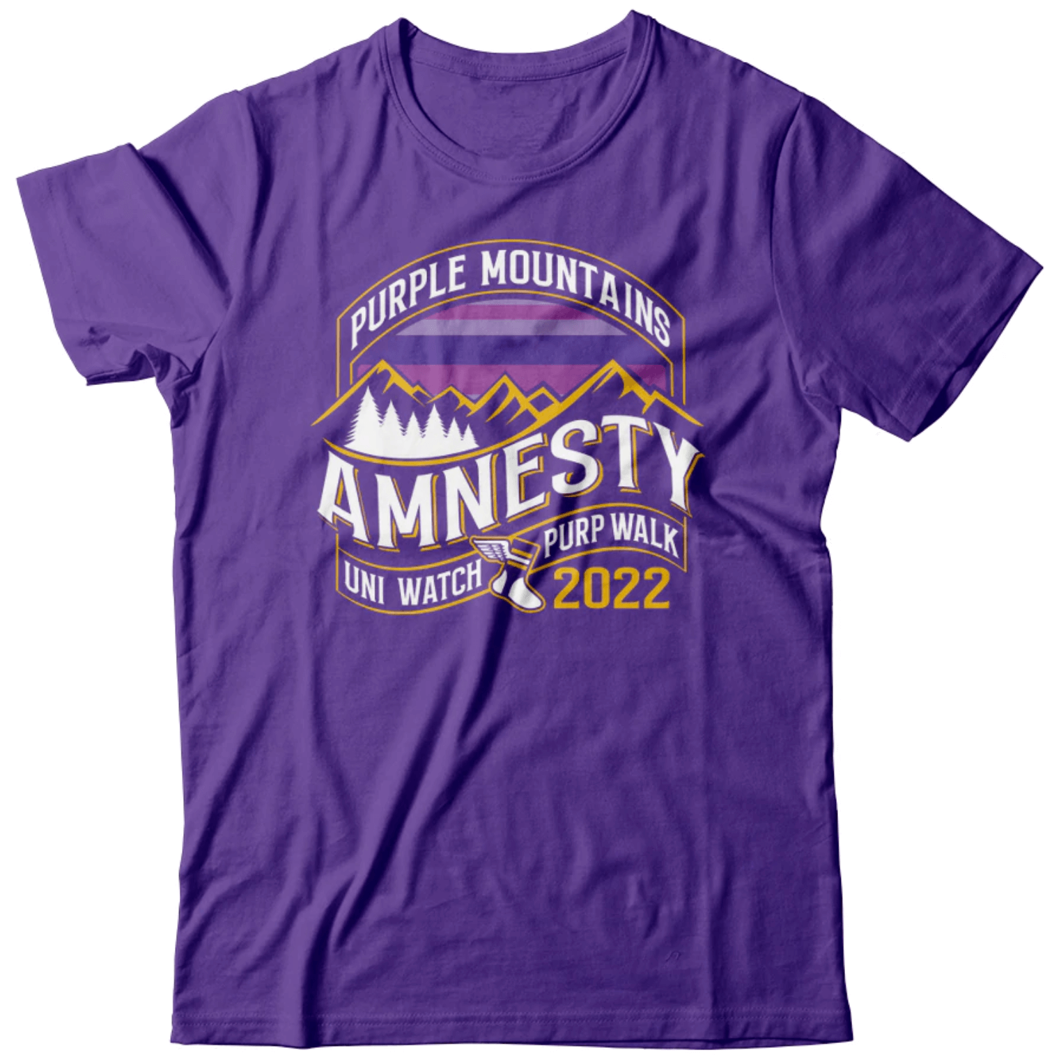
Is that great or what? Bryan really outdid himself with this one.
4. As usual, the shirt will be available for ordering for only 24 hours — midnight to midnight on May 17. But! We’re also going to take pre-orders for a special edition of the shirt that will include a bonus logo on the back:
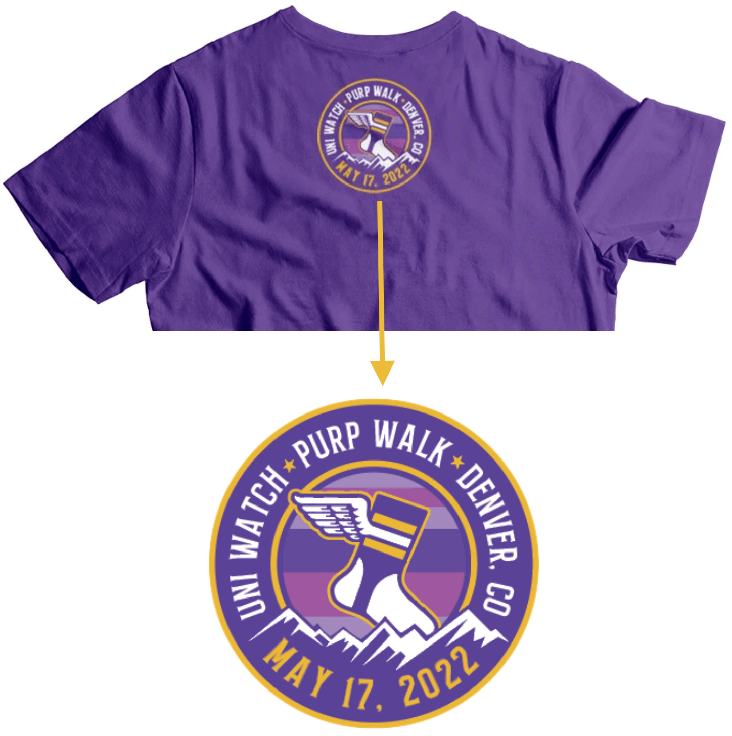
If you’re going to attend the party at Blake Street Tavern, you can pre-order the shirt and then we’ll give you your shirt at the party. That is the only way to get the shirt with the bonus logo on the back. We will not be shipping this version of the shirt to anyone or setting any of them aside to be picked up later. If you want this version of the shirt, you must attend the party, period. We are taking pre-orders here (go ahead and enter your shipping address when prompted, even though the shirt will not be shipped to you) and will continue taking them through next Thursday, April 28, so get your order in by then if you want to pick up your shirt at the party. If you can’t attend the party, you’ll still be able to order the regular shirt, without the bonus logo on the back, on May 17.
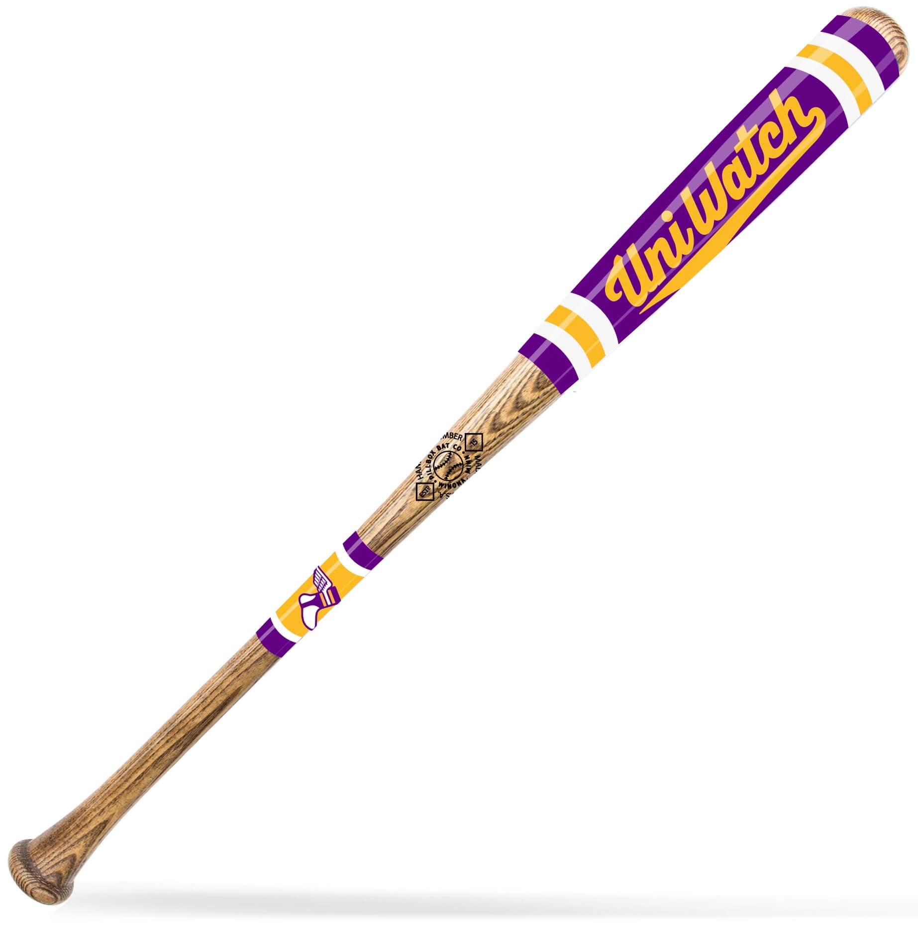
5. Also: Remember how I recently mentioned that I was partnering with the great Pillbox Bat Co. on a new line of Uni Watch baseball bats? That will include a purple bat for Purp Walk! The bat, like the basic version of the shirt, will be a 24-hour offering on May 17 (click to enlarge):
I’m very excited about all of these developments! I’ve never done a Uni Watch party in Colorado before, so this will be my first chance to meet readers like Ron Ruelle (creator of the Brooklyn Branches) and the indefatigable Kary Klismet. Looking forward to it!
The credit for all of this — from the original Purple Amnesty Day concept to the idea of turning it into an event in Denver — goes to reader Tim Cox. He’s also letting me stay with him while I’m in Colorado and being super-generous in other ways. Thanks so much, Tim — you’re the best.
Click to enlarge
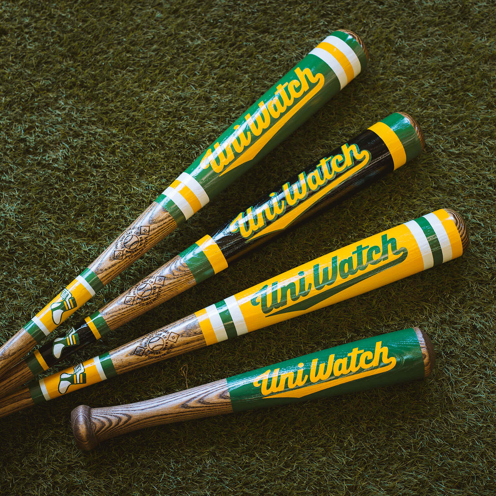
And speaking of bats: Although the purple bat will be available only on May 17, I’m happy to announce that the rest of the Uni Watch Baseball Bat line is now available from the Pillbox Bat Co. They’re available in green, yellow, BFBS, and miniature. Check them out here.
Also, speaking of the intersection of Uni Watch and baseball bats, don’t forget that Uni Watch grilling tools, with handles made from real wood bats, are also available:
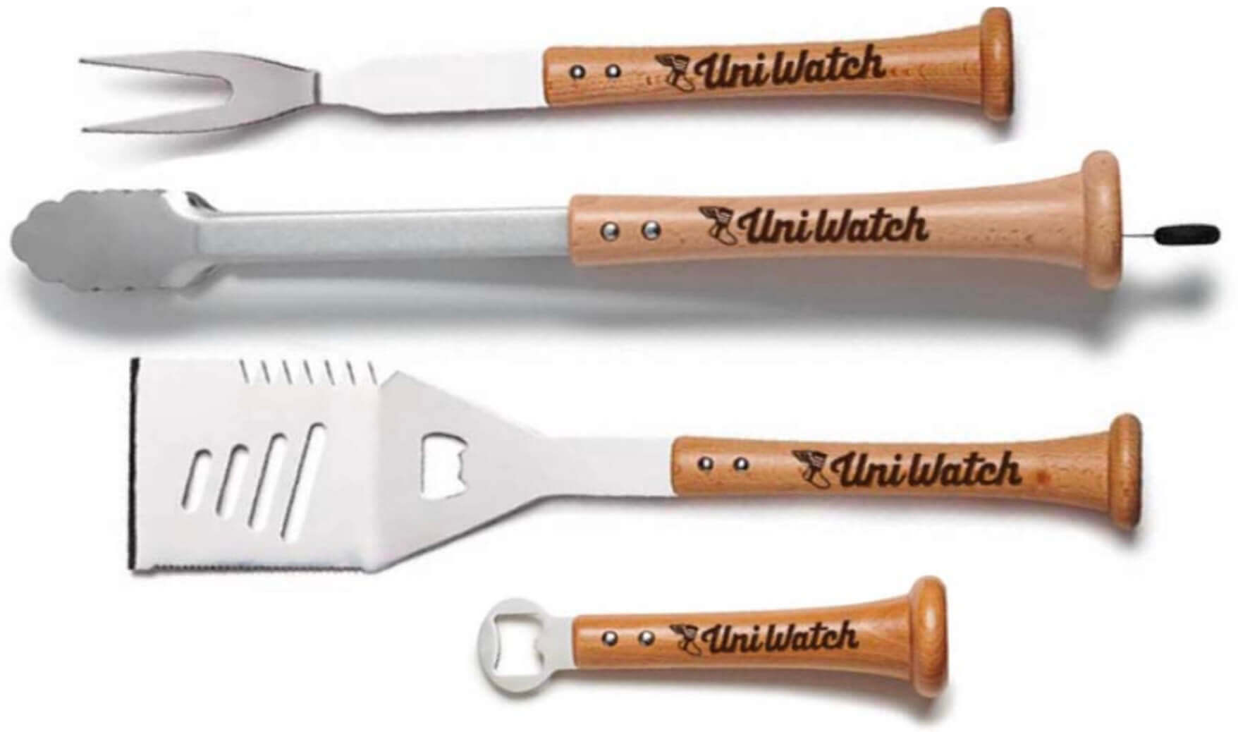
These launched in February, but of course they’re more seasonally appropriate now, with baseball and grilling seasons both heating up. The full collection is available here.
Click to enlarge
Collector’s Corner
By Brinke Guthrie
Follow @brinkeguthrie
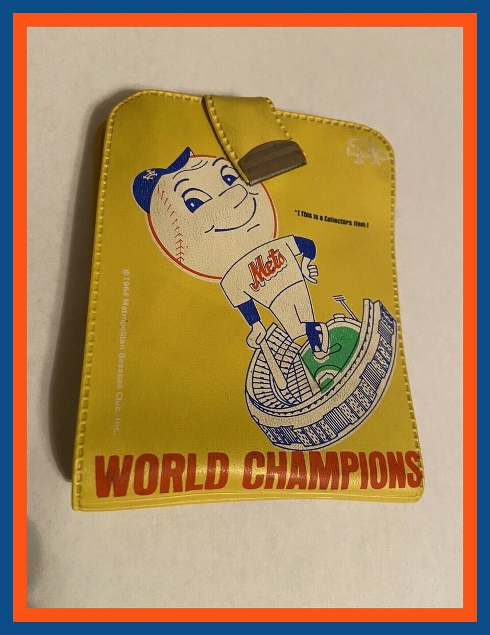
Kicking things off this week with this great New York Mets 1969 World Champions wallet! It includes a scorecard and pencil, and an official card that certifies you as a “Faithful Fan of the Fabulous Mets Club,” along with “Great Moments in Mets History.” [I’m a lifelong Mets fan and have never seen this item before. Really great stuff! — PL]
Now for the rest of this week’s picks:
• Here’s a 1950s matchbook for the NBA’s Baltimore Bullets. For tickets, phone “SAratoga 2638-39.”
• Here’s a complete 1970s Tudor Electric Football set for the NFC East teams.
• I loved this game, which was simply called Sports Illustrated Pro Football Game. They called it “the most realistic football game ever devised.”
• From the year 2000, here’s a 12-piece set of NFL logo napkins.
• Nice-looking portraits of Paul Molitor and Dennis Eckersley shown on the cover art for this 2004 Baseball Hall of Fame induction program.
• Ted Williams narrated this 1967 45rpm record from Sears, entitled “How to Become a Better Hitter.” I like how they made the record label look like a baseball.
• If you’d rather read about batting tips than listen to them, these two fellows had some game, too: Paul Waner and Lou Gehrig led their respective leagues in hitting in 1934, and their comments are provided in this 1934 booklet from Hillerich & Bradsby (Louisville Slugger) called, How to Raise Your Batting Average and Famous Sluggers of the 1934 Season.
• Never seen one of these before! A 1962 Houston Colt .45s bobblehead in perfect condition.
• Here’s another bobble for you, this time from 1961, featuring the original silver gold and black look of the Oakland Ray-duhz.
Click to enlarge
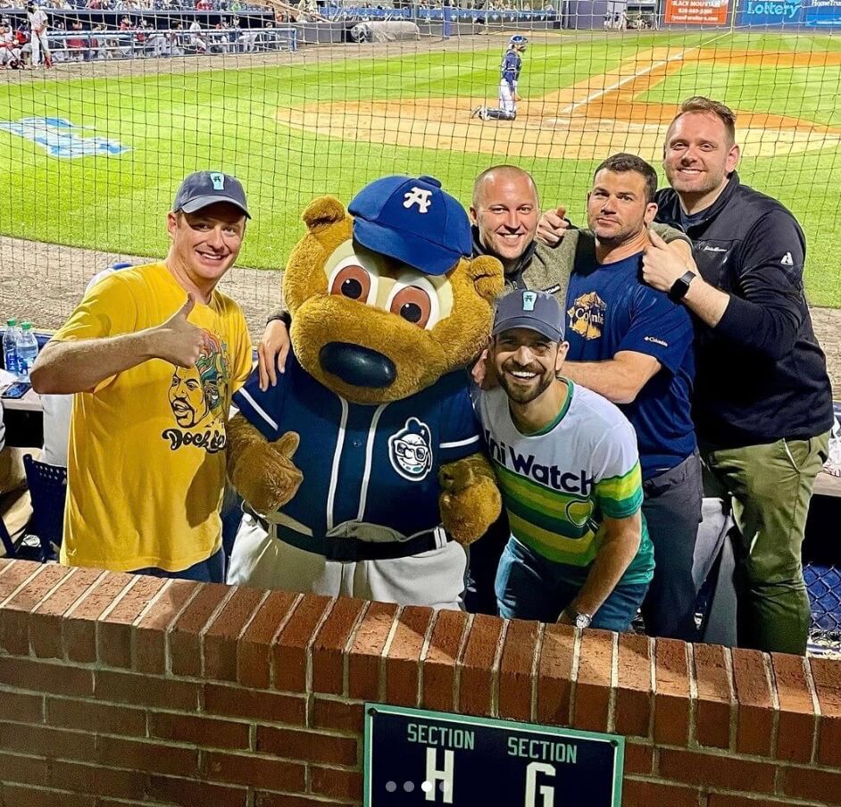
A tourist checks out the Tourists: Who was that wearing a Uni Watch Tequila Sunrise Deluxe shirt the other night while posing with the Asheville Tourists’ costumed mascot, Ted E. Tourist? None other than longtime reader and Ticker contributor Andrew Cosentino. Andrew specializes in Baltimore- and VaTech-related Ticker items, so it’s almost startling to see that he was in North Carolina — a tourist indeed!
Thanks for repping Uni Watch, Andrew. Looking good!
The Ticker
By Alex Hider

Baseball News: The A’s finally unveiled their Ray Fosse memorial patch. They announced that they’d have a patch for him two weeks ago, but they’re only wearing it on the home whites and didn’t have their home opener until yesterday, so that was our first look at the design (from Terry Mark and Richard Paloma). … Shawn Hairston has some questions about the Astros’ lineup card — which strangely uses the term “extras” instead of “reserves” or “bench.” … The Double-A Somerset Patriots wore Autism awareness jerseys on Saturday (from John Cerone). … Ferdinand Cesarano was watching a 1992 game between a team of Japanese stars and team of MLB stars. “MLB was the designated the home team, so all players sore their home uniforms,” he says. “I was startled to see Wade Boggs wearing a home Red Sox uniform with his name on the back.” You might think they did this to help promote the MLB players to the Japanese audience, but Mark Grace of the Cubs, whose uniforms were NNOB in those days, did not have his name on his jersey — Boggs was the only one with the aberrant NOB. No Yankees on the team, unfortunately, so we can’t see how they would have handled that. … Were you aware that that Mr. Met is able to remove his cap? (Thanks to all who shared.) … Speaking of the Mets, their ballpark offers not just ice cream helmets but ice cream caps — note the squatchee and seams. Not only that, but it’s an all-white cap with a strange patterned logo (from Dan Cichalski). … Union Station, Houston’s old train station that now serves as the façade for the Astros’ ballpark, has a new “Space City” mural out front, based on the team’s new CC uniforms (from Ignacio Salazar). … The Kansas Jayhawks will wear Kansas City Monarchs-inspired uniforms today when they take part in the inaugural Buck O’Neil Classic in KC. Opponents Texas Southern will also have commemorative uniforms (from @TJFsports and Jonathan Coffey). … A St. Louis brewery is releasing a limited series of beer cans that feature paintings of pitching great Satchel Paige. Some proceeds from sales will go to Paige’s family and the Negro Leagues Baseball Museum (from Trevor Williams). … Did Reds OF Aristides Aquino have a gummy stuck to his batting helmet last night? Sure looks like it (from Brandon Sparks). … The Double-A Wichita Wind Surge have been teasing an alternate identity that will be unveiled today (from Trent Guyer). … Several fans have noticed that Mets OF Starling Marte wears a Mickey Mouse necklace. You can find the story behind that by going here and searching on Marte’s name (thanks, Phil). … Reprinted from last night’s comments: Mariners OF Jesse Winker and SS J.P. Crawford both wore very nice striped stirrups on Sunday (from Tim Dunn). … As usual, the Red Sox wore their “Boston Strong” alternates for yesterday morning’s Patriots’ Day game at Fenway.

Football News: Kirby Wilson, the coach for the USFL’s “Pittsburgh” Maulers, taped over the maker’s mark on his sweatshirt during last night’s game (from L.J. Sparvero). … Back in 1944, the Lions had proposed a rule change that would have allowed NFL coaches to stand on the field wearing special uniforms (from Trevor Williams).

Hockey News: Word through the grapevine is that the Caps will revive their “screaming eagle” logo as part of next season’s Reverse Retro program (from Phil). … Adidas is facing a lawsuit from a plaintiff who feels that “authentic” NHL retail sweaters aren’t the same thing as what’s worn on the ice (from @diablos20cn). … Talk about a strange hockey card! G Jeff Hackett was traded from the Canadiens to the Bruins during the 2002-03 season. Victory chose a photo of Hackett wearing his Habs equipment and the Bruins’ alternate jerseys for the next year’s card — even though he signed with the Flyers in the offseason (from Moe Khan). … Roosevelt Raceway was a horse track that operated 1940 to 1988 on Long Island. At one point, harness racers, groomers, and other track officials formed a hockey team that wore a really great mid-century-style logo (from @uniformnerd).

Basketball News: This shot from the set of the HBO series Winning Time — the series that follows the rise of the “Showtime” Lakers dynasty — shows an era-inappropriate Sixers jersey. The jersey in question was last worn by Philly in 1976-77, while Magic Johnson and Larry Bird arrived in the NBA in 1979-80 (from Michael Paolucci). … Here’s a virtual tour of Texas’s new basketball arena (from Kary Klismet).

Soccer News: Liverpool’s home uniform for next season has reportedly leaked (from @sheds88). … The next three items are from Kary Klismet: League of Ireland Premier Division club Dundalk FC will wear kits on April 22 to raise awareness for motor neuron diseases. … New jerseys for Vitória, a club in Brazil’s Série C (also from Ed Żelaski). … U.S. Città di Pontedera of Italy’s Serie C have new uniforms to celebrate their 110th anniversary.

Grab Bag: Adidas has released a limited-edition M&M’s sneaker (from John Cerone). … I’m sure plenty of you are ticket stub collectors. For those who weren’t already aware, there is a whole website devoted to that hobby. Yesterday, the site’s operator, Russ Havens, announced that the site is up for sale. … Spotted in Miami: a plumbing truck with a Boston sports frankenlogo (from @DaveGH2P). … The Albany FireWolves of the National Lacrosse League will wear new “blackout” jerseys on April 30 (from Wade Heidt).
Today is Fountain Day in KC. Feels like a good time to unveil the full uniform.
Props to everyone involved in the KC City Connect design process for taking such a terrible city flag and turning it into such an effective cap logo. I’d rather see royal than navy, no matter what storytelling nonsense the team puts out to justify wearing less of the color that shares the team’s name, but that KC logo is a real beauty.
Not sure I’d call that a terrible city flag, it certainly meets the flag criteria of being simple enough to easily recognize and to draw. Given the amount of city flags that feature seals, this one should be considered decent simply for being simple and recognizable.
It would be better without all the words.
It does feature a seal. That’s exactly why it’s so bad. Not the official city seal, but a symbolic device with words is a seal in this context. Remove the words and it goes from terrible to pretty good. Redesign it entirely around the fountain symbol and it could be DC or Chicago-level great.
KC-lifer here. I didn’t know what they would do that wouldn’t be either fountain themed or barbecue themed. They made the right call. The fountain-heart is no longer in heavy use by the city and I always thought it had more potential. Plus, personally I love a navy-white-baby blue combo, so I am excited for this color scheme.
Keep the fountain, leave the heart.
Re the Mets ice cream cap, here’s one from the Nats featuring a cap the team actually wears on the field: link
Great Purp Walk shirt design.
Paul, given how your trading card also got the boot, is it safe to assume you might still be on MLB’s naughty list and that is why the Rockies’ reversed course on doing something with you?
It’s possible, but they didn’t tell us that, so I don’t know.
Based on the powder blue squatchee, I’d be willing to bet money the jersey and pants will both be powder (unlike the link, which feature a gorgeous powder blue alt jersey, but for some inexplicable reason, did not add powder pants to match).
KC deserves a full powder uni. Just not sure it should be in the form of a CC uni…
“for some inexplicable reason, did not add powder pants to match”
For everyday use, I prefer the Royals approach. The blue jersey with the white pants looks like an alternate that can be worn anywhere.
For me, the full powder blue uniform is the “road” uniform and will never look right at home. Its like wearing your grey set at home.
The Jays have the powder blue pants and it looks like they’re wearing road uniforms at home. It looks like two road teams are playing.
link
Agreed 100%.
All full powder uniforms should be roadies (like the Cardinals). I’m not sure why this is so difficult a concept for teams to comprehend.
I agree with the everyday use theory and I love the new powder blue jersey, but it just looks out of place in live action. The piping on the pants are thicker this year so it looks weird having no royal blue anywhere on the tops and no powder blue on the pants. Looks like they just threw something together. At least the old powder blue tops had the royal blue outline and numbers that tied the pants together.
That shirt slogan is very clever! Hoping to attend one of these events if it’s ever close!
Paul, that is truly great stuff for Purple Amnesty Day, love to see it embraced wholeheartedly despite your animosity to the color purple!
And May 17 is of course a special day in the Uni-verse: it’s the birthday of Carlos May, the only MLB player to wear BOB (that’s “Birthday on Back”) – “May” and “17.”
I never knew that about Carlos May! Great piece of trivia.
This year’s Purple Amnesty Day shirt (and the greater plan) is nothing short of inspired.
Perhaps you could try to get a group ticket package for the famed Purple Row up in the nosebleeds and watch the Rockies game from exactly 5,280 feet above sea level.
Oh, wow — that’s a really fun idea! Let me think about that.
Great idea!
I’ll be packing a moving truck on April 29 to leave Boulder and head to the beaches of North Carolina. Dang, I would have totally been all over Denver Purp Day otherwise!
Oh no! Dammit, I was really looking forward to meeting you, Ron. Dang.
Well, you’ll just have to do another event in Raleigh or some such. Maybe I can fly in for it. I’m going to the game on 4/20, which is “Free Gummie” Day at the ballpark. Actually, it’s “Dollar Hot Dog” day, which if one has munchies, is just as valuable.
“Royals’ City Connect Cap Leaks”
Considering the logo, was headline pun intended?
No. Good point, though!
“It’s a bit surprising that the cap is navy instead of royal blue.“
I think it’s more surprising when a CC cap is the same color as the primary
That purple T is amazing! I can’t wait to order that badboy…
Purple Mountains Amnesty is nothing short of brilliant! As a Giants’ fan, I cannot celebrate in good faith, but it sounds like one hell of an event. Cheers, and all the best!
I really love that they are using the “Mis-matched Purples” Lakers jerseys for the Winning Time show! I keep hoping a for the Lakers to reproduce those for their City jerseys. That’s something to celebrate even if it is purple!
Nice catch, Luke! I haven’t watched Winning Time yet (I don’t have HBO), so I hadn’t noticed their era-appropriate mismatched purple Lakers uniforms until I saw this photo. But I might have to get HBO and watch it just for that!
Thanks, BvK! I haven’t watched either, but I hadn’t noticed the mis-matching purples in the promos either. It’d worth signing up for HBO just for them!
Wow!! Wow!!
The Purple Amnesty t-shirt with a Colorado theme AND the man himself is coming out to Colorado to celebrate it!
Can’t wait for May 17th. I’ll be there!
So glad to hear about the Purple Amnesty Day plans. My wife and I will definitely be in attendance! Heck, my wife actually called me on my home from work this morning to tell me about it and and party haha
I am way digging those Jayhawk uniforms. The Monarachs’ color scheme fits them perfectly.
The Screaming Eagle is my favorite Capitals’ logo (my second favorite is the Expansion Year “capitals” word in left-slanting italics). It utilizes the five stars in the shape of a “W” which suits the city of Washington elegantly.
So does anyone know who is the maker of the official game ball of the United States Football League (2020 edition)? Thanks in advance!
Color-wise, it looks like the Royals may just be getting the Cubs’ City Connect treatment. Kind of disappointing. The logo is great though.
As a long time hockey jersey collector, I attest to the fact that the Adidas “authentic” jerseys are garbage in comparison to the on ice jerseys. Once they took over the on ice jerseys, they started deceptively marketing these replicas, in part, by using a numbered sizing system (as opposed to S,M,L,XL), and by throwing a fight strap on the back. The material is nowhere close to the on ice jerseys. Also, they are made in Indonesia, whereas any jersey worn on ice must be made in Canada (much like the MLB policy that on field uniforms must be made in the USA).
I really miss the CCM 6100 pro-weight jerseys. And the CCM 550 “semi-pro” replicas introduced in the mid-90s that supplanted the older, lighter and cheaper replicas.
In fact, I haven’t gotten a single Reebok or Adidas jersey. I still rock vintage CCM.
Agree! Everything about the current hockey jerseys, pro or retail, does not interest me – the material (loved the ultrafil and mesh jerseys of the 1980s/90s), the cut (so many pieces, side panels, etc), the styling (Scooped hems! Thin or no waist stripes!). For the most part, one can find a 1990s pro weight jersey (the term used then, not “authentic”) on ebay for, usually, much less than what a current authentic might retail for. Which is kind of backwards to me.
The beginning of the end…shit… link
Should be Purple Mountain Amnesty…
This is a very good point.
Wow, can’t wait for the Denver event! Keep us posted on any further plans to get tickets, we’ll be just down the street from the ballpark.
Lots to like in today’s post. This year’s version of the Purple Amnesty tee is a home run! I’ve purchased the last three shirts and this one tops them all. I hope the purple party in Denver is a blast.
The Royals leaked cap looks pretty good. I’m glad they went with a City of Fountains theme. I was thinking barbecue but whatever.
Also, those Kansas Jayhawks unis are chef’s kiss perfect. I hope they do wear the stirrups in-game and not just for the photo opp.