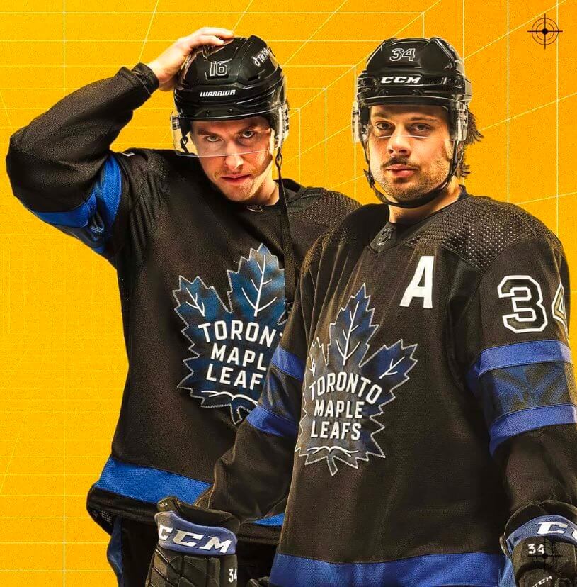
For all photos, click to enlarge
As had been expected, the Maple Leafs yesterday hopped aboard the BFBS bandwagon by unveiling a new black alternate uniform, which they’ll wear for tonight’s home game against the Devils. My understanding is that this uniform will be also worn for additional games (and seasons), although no specifics are yet available on that.
The photo above provides a good front view of the jersey. Here are some shots of the full uniform, including the pants, socks, and rear view:
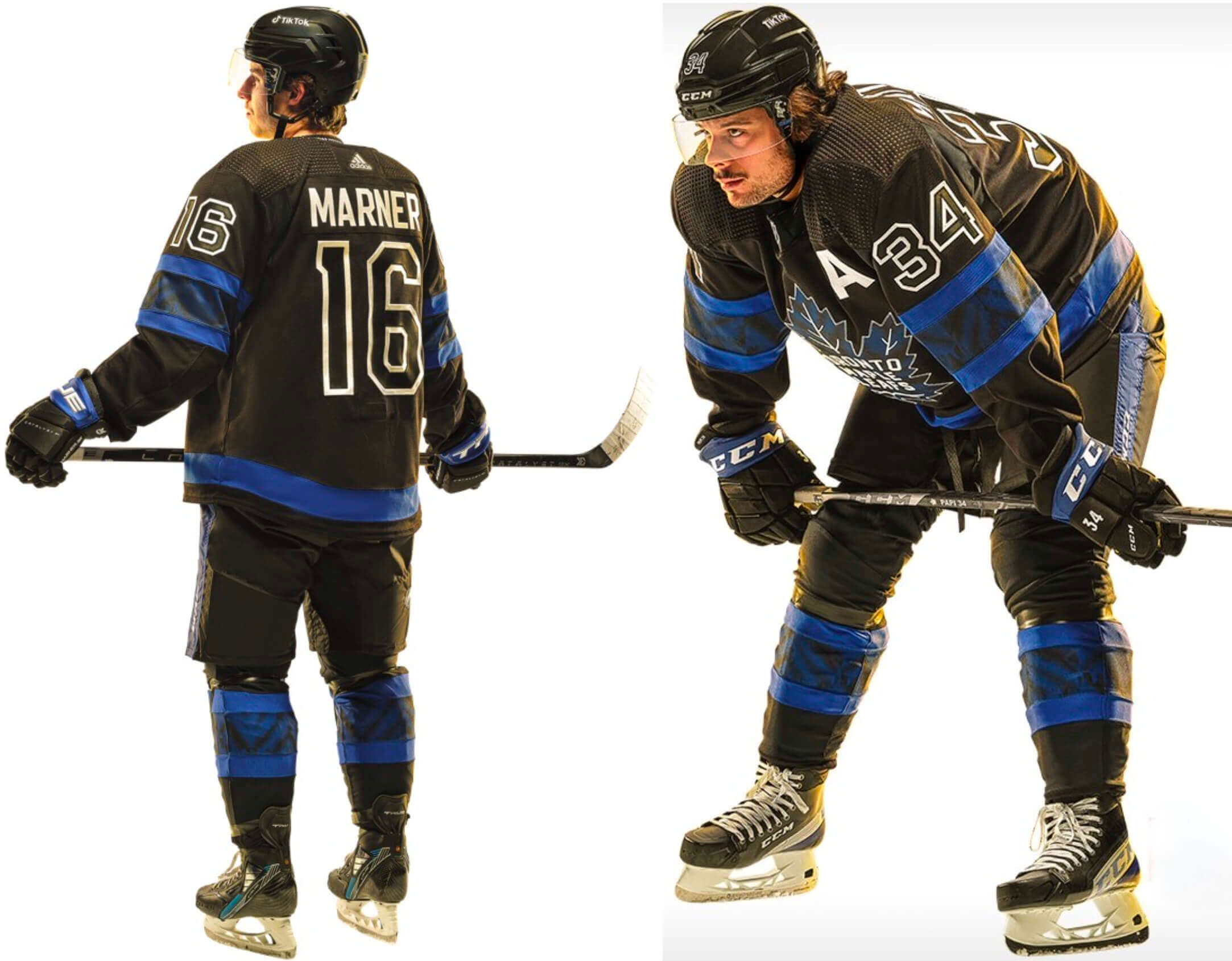
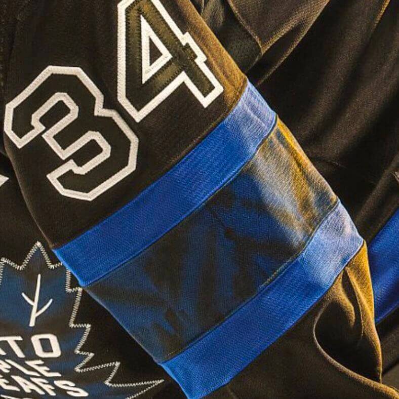
The jersey crest, sleeve stripes, and sock stripes feature soft-fading patterns inspired by shibori, which is a Japanese tie-dye technique. In addition, the pattern on the sleeve and sock stripes includes a subtle outline that’s purportedly inspired by the Toronto skyline:
Some thoughts:
• The black numbers on the black jersey are brutal. We know from past experience in several different sports that tone-on-tone typography doesn’t work and just looks like shite. Compare the white NOB lettering and the white alternate captain designation — much better.
• If they had gone with white numbers instead of black, this wouldn’t be a bad uniform — it would just be a bad Maple Leafs uniform, because BFBS doesn’t make sense for a legacy team like this one (sort of like how the Red Sox’s CC uni isn’t a completely terrible design per se — it’s just terrible for the Sox). But with the black numbers, it’s a lose-lose.
• As you may have heard, this uniform was supposedly designed in part by Justin Bieber. That doesn’t matter to me one way or the other (if Bieber is capable of designing a good uniform, that’s fine by me), although I do think it’s interesting that two of Toronto’s pro sports teams have rolled out uni designs connected with Canadian pop stars — Drake for the Raptors and now the Bieb for the Leafs. Can the Blue Jays’ collaboration with K.D. Lang be far behind?
I’m also wondering if pop stars may soon become (or already be..?) passé to today’s youth. If a team is really looking to attract young fans, would they be better off partnering with a TikTok influencer? Just to be clear, I’m not saying that would be either a good thing or a bad thing — I’m just wondering if that’s where lifestyle-driven uniform releases like this one might be heading.
• As you may also have heard, the jersey is reversible, with the inner design featuring a Leafs-themed version of the logo of Bieber’s fashion brand, Drew House:
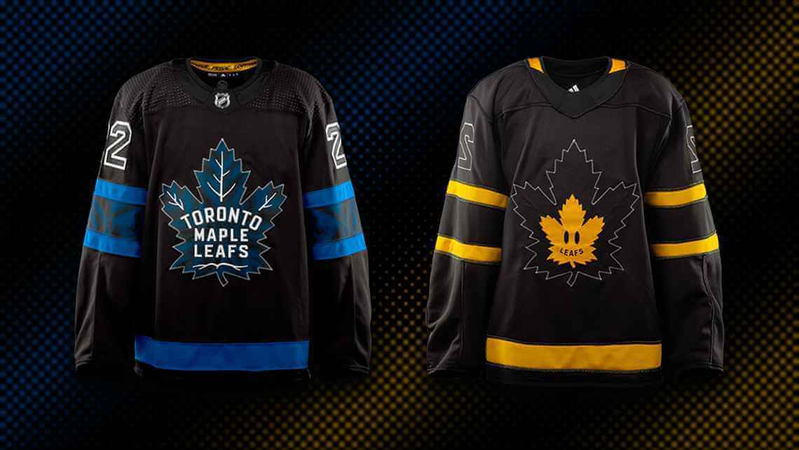
SportsLogos.net’s Chris Creamer has confirmed that the inside-out version will not be worn in a game, so it’s irrelevant from a Uni Watch perspective. Just another retail gimmick that has nothing to do with what we’ll see on the ice.
• As far as I can tell — and it’s possible that I’m just missing it — there is no mention of this new uniform on the Leafs’ home page. They appear to be promoting it exclusively on social media. Again, that says a lot about where the uni-verse is heading.
One final note on all this: Tonight’s game will mark the fifth different uniform in the Leafs’ last five games. They wore their Toronto Arenas throwbacks in the Heritage Classic against Buffalo on March 13; their home blues against Dallas on March 15; their St. Pats throwbacks against Carolina on March 17; their road whites against Nashville on March 19; and they’ll debut the BFBS alts tonight. That’s a lot of uni churn by any league’s standards, and all the more so for the NHL. Anyone know if the “five unis in five games” thing has ever been done before by an NHL team?
Click to enlarge
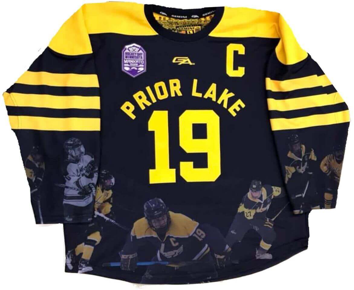
Prior Lake update: Regarding yesterday’s post about the Prior Lake hockey jerseys with the sublimated/ghosted players on the abdomen and sleeves, reader John Ogren pointed me toward this Facebook post from Gemini Athletic Wear, the company that makes Prior Lake’s uniforms. It explains that Prior Lake coach Joe Pankratz wanted to feature some of his favorite past players on the jerseys. That’s pretty much what I figured, and I’m glad to have it confirmed, although it’s too bad that Pankratz never responded to any of my emails or phone messages, since it would’ve been nice to hear more about his thought process on this unique design. In any case, though, mystery solved!
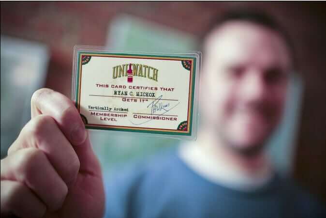

ITEM! New membership raffle: Ticker stalwart Kary Klismet marked my birthday by generously donating funds for me to raffle off a Uni Watch membership card, so that’s what we’re going to do to today.
This will be a one-day raffle. No entry restrictions. To enter, send an email to the raffle in-box by 8pm Eastern tonight. One entry per person. I’ll announce the winner tomorrow. Big thanks to Kary for sponsoring this one!
The Ticker
By Lloyd Alaban

Baseball News: The Red Sox will honor former player/broadcaster Jerry Remy with a memorial patch this season (from multiple readers). … Here are the complexities behind number changes for the Twins (from Mike Menner). … Marlins SS Jazz Chisholm Jr. has an ice cream-themed glove (from Mike Sgori). … Audacy Sports has issued a ranking of MLB uniforms. … Tulsa, Okla., is building a monument to mark the location of the stadium that served as the home to the city’s minor league teams from 1934 to 1980 (from Kary Klismet). … Also from Kary: SUNY-Binghamton (Paul’s alma mater!) opened its new ballpark over the weekend. … The Phillies are not wearing the mesh-backed spring training caps that other MLB teams are wearing. … Atlanta retired No. 29 for John Smoltz years ago. But non-roster INF Jordan Cowan is wearing that number in spring camp.

Football News: Michigan is adding new video boards to its home stadium (from Kary Klismet). … New Colorado State coach Jay Norvell did the working class wannabe/cosplay thing at his introductory press conference. … “Yesterday saw the start of the BUCS (British Universities and Colleges Sport) Big Wednesday finals (Big Wednesday on a Tuesday!),” says Perry Wayman. “In what I believe to be a UK first, both teams wore a commemorative patch to mark the occasion.”

Hockey News: New uni number assignments for the Rangers. The announcement on the team’s Twitter account, however, rendered the NOBs in radially arched lettering instead of the team’s traditional vertical arching. No block-shadowing on the numbers, either (from multiple readers). … D Ben Chiarot, recently traded from the Canadiens to the Panthers, was spotted wearing a Panthers practice jersey with Habs socks and his Habs helmet (from Moe Khan).

Basketball News: New court design coming for McDaniel College in Maryland (from Robert Turning). … The Bucks are giving away replica championship rings tomorrow to commemorate last season’s NBA title (from Kary Klismet). … The checkerboard pattern on Kentucky’s men’s uniforms is reportedly going away (from Derek, who didn’t give his last name). …Here are this year’s March Madness pins to identify coaches and bench staff (from Patrick Garie).

Soccer News: New fourth kit for AC Milan (from our own Anthony Emerson). … The NWSL’s Orlando Pride have apologized to a supporters’ group after telling the group that it could not display a banner that included the word “Gay.” … The USL League One Lexington club revealed its name and crest. … In the 2001-02 Premier League season, there were two players named Mark Hudson who both wore No. 36 — a center-back at Fulham and a midfielder at Middlesbrough. They never played with or against each other. However, they did later both play for Huddersfield Town wearing No. 4 at different times, the midfielder from 2005-07 and the center-back from 2014-17 (from our own Jamie Rathjen). … Also from Jamie: New shirts for USL League Two/W League’s AFC Ann Arbor. … The next several items are from Kary Klismet: Real Madrid has unveiled a custom font for its 120th-anniversary shirt. … New lettering and numbering font for Canadian Premier League uniforms. … Brazilian futsal team Cascavel has 36 advertisements on their uniforms. … New uniforms for Portuguesa Rio of Brazil’s Série D. … New kits for Santos FC of Brazil’s Série A. … New away kits for Malmö FF. … New kits for Djurgårdens IF.

Grab Bag: New logos for Vanderbilt, which is combining its sports and academic identities into one visual system. More details here. (from multiple readers). … Italy beat Wales in a massive come-from-behind upset at last week’s Six Nations rugby union tournament. Josh Adams of Wales was awarded the Player of the Match award, which in rugby gets decided a few minutes before the match ends. After the match, Adams, in a nice display of sportsmanship, gave his award to Edoardo Padovani of Italy, who led the last-minute comeback (from Tim Dunn). … Reader Miles Cliatt found this George Mason-Georgia Tech mashup shirt. … Adidas has made small tweaks to its logo. … A new Buick logo might be coming. … New uniforms coming for Taco Bell (from Kary Klismet).
Tomorrow: A new Bulletin article. Subscribe here to receive it in your in-box tomorrow morning (Facebook account required), or email me for info on a non-Facebook workaround. — Paul
k.d. lang should be all lower case.
Blue Jays relief pitchers running out of the bullpen to ‘Constant Craving’
1) I won’t disagree too hard on the black-on-black numbers, but will disagree that it’d be better if the numbers were white, because too many teams go with white numbers and sacrifice their actual colors on the rest of the uniform. Exhibit A is the AZ Cardinals; while both of their black uniforms are bad, their ‘standard’ black uniform, to me anyway, is leaps and bounds WORSE than their color rush black because the standard one has like NO red. The Leafs would’ve been better off going with blue numbers outlined in white on the black. I think they’d pop just fine so long as they didn’t have the black tie-dye sublimation the crest has.
2) If the Blue Jays collab with any Toronto-based musician in the future, it better be Geddy Lee.
A blue outline around white numbers would work, but white around blue still leaves us with the hard-to-read dark-on-dark numbers. Readability is more important than the aesthetic statement.
Ha! You beat me to it with the Geddy Lee idea. :)
While I’m not a fan of having the same color for the core of the numbers and the base of the jerseys, I actually think these are not too bad, because the white outline is bold enough for the numbers to stand out. I would still prefer the core of the numbers to be in blue in this case, as even in the Leafs’ shade of blue I think they would pop pretty well.
Of course, I reserve the right to downgrade my assessment of those numbers once we see them in actual game action… ;)
As for the rest of the thing… meh for the rest of the game uniform, bleh for the reverse side of the jersey.
I’ve heard Geddy Lee (Rush) is a season ticket holder of the Blue Jays, so maybe “Closer to the Heart”
He should be a season ticket holder for Ohio State football after this awesome Rush tribute by the OSU marching band.
Great stuff here.
link
For most games he sits right behind the plate. He is usually visible on centerfield camera for each pitch. I get disappointed when my team is playing in Toronto and he isn’t there.
And, while I can sing along to “Tom Sawyer”, I am not even the biggest Rush fan.
There’s no way that a team has ever gone 5 in 5 with uniforms before. At least in the NHL. it’s so rare for a team to have 5 jerseys in rotation anymore. Unless next season a team with a heritage alt also gets an outdoor game, along with a reverse retro. Which could be up to 6 jerseys. But who knows
Before the Stadium Series inflated the number of outdoor games, the only time any NHL teams had five jerseys in rotation was in the 2003-04 season, when the NHL rolled out its first Vintage program. The Bruins, Kings (c.1985), Rangers, and Canucks all ended up with five uniforms – their regular home and away, their regular alts, and a home and away vintage pair.
The Oilers also had three regular uniforms, but apparently only included the white vintage uniform in their rotation. The blue vintage uniform was worn by the alumni team in the MegaStars game that preceded the first Heritage Classic, though.
Good call! The Vintage uniforms for the Canucks in 2003-04 were the spark that gathered momentum and led the way to the Canucks making the full-time return to blue and green by 2007-08.
The Nationals also appear to be wearing their 2021 non-mesh Spring Training caps this year.
The Leafs sweater is the rare case for this inveterate BFBS-hater where the black works for me as a neutral color like the team’s normal white. So if the jersey didn’t have ghosted black-on-black numbers, I think I would approve. But ghosted color-on-color numbers are objectively bad design. Not a matter of taste or style, but empirically bad. Also, the “reversible” thing would be a fun gimmick if it supported a charity or a fan organization rather than a commercial brand.
So does this mean no fight strap on the Leafs jerseys? Are those Going the Way of the Buffalo?
Also, as a 41 year old, I’m proud to say that I just learned today that Justin Beiber has a fashion brand. haha
Oh, wow — that is an *awesome* point that I didn’t even think of! I’ll see if I can find out.
It does have a fight strap. And they also look like the Bruins’ 16-17 third jersey when inside-out
Re: Prior Lake. Is that jersey just the mock-up the designer made? Or is that an actual jersey used this year. If the latter is the case, then is #19 wearing a jersey that includes a picture of himself??
Just confirmed via Google that it is indeed a current player wearing a picture of himself. That’s weird!
Small correction: Josh Adams gave his Player of the Match award to Ange Capuozzo, the Italian full-back.
So now BFBS = Bieber for Bieber’s sake?
GENIUS!
No love for The Tragically Hip?
Match the Canadian singer with the relevant Canadian sports team!
Bryan Adams
Nellie Furtado
Nickelback
Rufus Wainwright
Barenaked Ladies
Jully Black
Arcade Fire
William Shatner
Lol at William Shatner! I also just remembered Jann Arden and Alannah Myles.
Need to put Loverboy on the list. Responsible for essential 1980s anthems.
Plenty of love for the Hip.
link
I can’t believe that was 12 years ago
RE Wales/Italy-
POM award was given by Adams to Ange Capuozzo who’s awesome “where did my jock go” run setup the try by Padovani.
link
I had to google what the line “cold water” in the title of the post meant. Which, I think, means that these uniforms are not meant for me.
link
That’s fine. Marketing to the next generation of fans seems … smart. Not everything needs to be made just for middle aged white guys (me) who think everything peaked in the 1970s.
Should the numbers be blue, or white? I don’t know. I assume that they tested them on the ice and on TV and I’m sure they’ll be fine.
Honestly, I wouldn’t know Justin Bieber if he sat on my face, but I figured it would be fun to include one of his song titles in today’s headline, so I googled his hit songs and chose the one that seemed most appropriate.
I thought it was a more deliberate choice to pick that song because the official video (the one I linked to, with over a billion views) seems to be based entirely on black, with blue stripes and a bit of white. The video looks exactly like these jerseys.
UGH! I’m trying very hard not to visualize that.
It’s been proven over and over that dark numerals on dark jerseys don’t work. Black, blue, it wouldn’t matter. They won’t be visible to 90% of the crowd and 100% of the TV viewing audience.
Hope the Blue Jays get Neil Young to help on their next Unis. Long may you run.
Those Rangers NOBs are vertically arched, just not as drastic as the actual jerseys. No drop shadows on the numbers is odd.
I enjoyed the article on the ranking of Major League uniform sets. I suppose it helped that my two favorite teams (Athletics and Cardinals) are on the medal podium. I have bought MLB replica jerseys before, but haven’t in over 30 years. If I were to buy one now it would be the Athletics kelly green alternate.