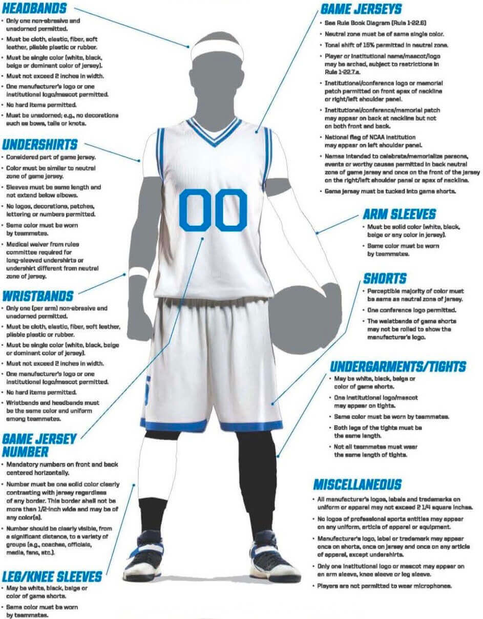
Click to enlarge
March Madness begins this evening with the men’s First Four Games; the women’s First Four will tip off tomorrow. With that in mind, here’s a graphic (shown above) listing the uniform guidelines that the schools have to follow. Note that rolling the waistband to expose more logo creep, which was once a popular thing (I wrote about it for ESPN several years back), is no longer allowed.
Meanwhile, check out this excellent illustration by cartoonist Greg Kletsel (click to enlarge):
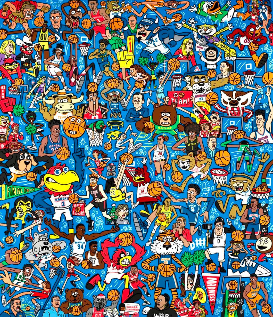
As you can see, it features tons of college hoops uniforms and mascots. It also includes 68 basketballs! If you go to this interactive version, the page will count the balls as you click on them. It’s not that hard to find all of them, but it’s a fun little exercise that helps you appreciate all the details in the illo. Good stuff!
Also, note that the name “March Madness” officially applies to the women’s tournament this year, as well as to the men’s tourney. As it should be!
ITEM! Making the Jade Grade: With St. Paddy’s Day coming up on Thursday (and with green being my favorite color), I’ve ranked the 35 best green uniforms of all time for this week’s Bulletin column. This was so much fun, I can’t believe I didn’t think of doing it years ago, and I don’t mind saying it’s one of the best things I’ve worked on in some time. In addition to the usual suspects you’d expect to see from the Big Four pro leagues, the rankings also include entries from college football and basketball, soccer, lacrosse, cricket, boxing, golf, tennis, auto racing, horse racing, rugby, the Olympics, and more. Even if you don’t like green as much as I do, I think you’ll really like this one! I hope you’ll check it out.
My premium subscribers can read the article here. If you haven’t yet subscribed, you can do that here, but you’ll need a Facebook account in order to pay. If the Facebook requirement is a dealbreaker, email me and I’ll let you know about non-Facebook payment options and possible workarounds. Thanks!
Click to enlarge
Collector’s Corner
By Brinke Guthrie
Follow @brinkeguthrie
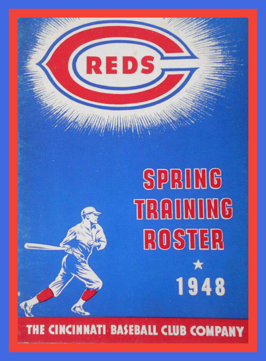
Play Ball! As those two words finally echo throughout MLB training camps in Florida and Arizona, let’s head back 74 spring trainings ago and begin this week’s edition of Collector’s Corner with this 1948 spring training roster from the “Cincinnati Baseball Club Company” (so formal!). The ’48 camp opened on March 1, and the regular season opened rather late by today’s standards — April 19! Of course, the schedule was only 154 games in those days, and there were no playoffs leading up to the World Series, so that gave them more calendar flexibility.
Now for the rest of this week’s picks:
• Keeping with the spring camp theme, this 1960s matchbook is from the then-spring training home of the San Francisco Giants, the fabulous Francisco Grande Motor Lodge in Casa Grande, Ariz.
• Here’s a 1960s Chicago Cubs DIY jacket.
• This 1952 Coca-Cola carton insert featured New York Yankees star Phil Rizzuto.
• Staying with The Real Thing™, here we have a set of 34 “NFL All-Star” bottle caps from 1966.
• 7-11 was the spot to pick up one of these 1984-85 Wayne Gretzky “hologram” discs.
• Those little plastic things you see on TV and radio microphones with the station logo are called mic flags (probably created when someone thought their station needed to stand out when the mics are clustered together at a press conference). Here’s one for TNT, for the NBA’s 75th Anniversary.
• Tampa Bay Buccaneers fans will want this vintage Bucco Bruce stadium cushion seat for the 2023 season, when Bruce makes his on-field return.
• The Green Bay Packers held a “Full Dress Intra-Squad Game” on July 25, 1973. Check out the roster on this game program.
• Get Tips From The Tigers in this 1964 “Fundamentals of baseball for young players” booket, sponsored by Elias Bros./Big Boy restaurants.
• Interesting treatment of the “R” on the cover of the Kansas City Royals yearbook from the team’s 1969 inaugural season.
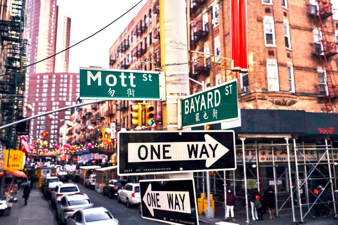
Uni Watch’s highest rating: If you care about municipal ephemera like street signs, then you absolutely must check out this amazing New York Times piece on the evolution of bilingual street signs in NYC’s Chinatown. The piece looks back at over a century’s worth of signage history via interactive maps, audio translation files, and a lot of historical research. It’s a completely fascinating deep dive that shows how something as simple as street signage can both reflect and shape a neighborhood’s character and influence.
This piece will almost certainly be winning some year-end journalism awards. Don’t miss. (Plus there’s also a good behind-the-scenes piece on how the authors researched the story.)
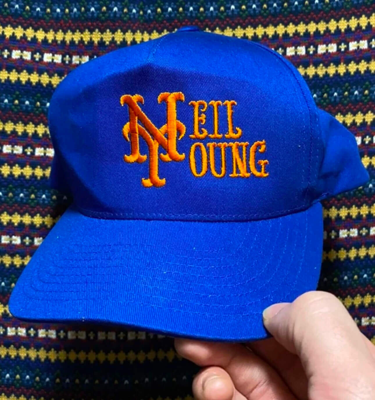
Click to enlarge
Too good for the Ticker: This sensational Neil Young/Mets cap showed up on Twitter yesterday. It apparently sold on the vintagewear website Grailed, although it’s not clear who manufactured or DIYed it. Reminds me a lot of the amazing DIY cap embroidery by comedian Joe Mande, which I wrote about last year.
Fun fact: As near as I can tell, Neil Young never played Shea Stadium and has never played Citi Field.
(My thanks to Twitter-er @tsklear for this one.)
The Ticker
By Alex Hider

Baseball News: Despite renderings that suggested otherwise, the Guardians will have a right-sleeve “Winged G” patch on their jerseys this season (from John Sabol). … This should make Paul happy: Mets manager Buck Showalter was rocking stirrups during yesterday’s spring workout (from Gregory Zitelli). … Here’s how the Nationals came to be called the Nationals (from John Muir). … At 15 letters plus a space, Twins P Simeon Woods Richardson is in the running for one of the longest NOBs ever, although he’s unlikely to make Minnesota’s final roster cut (thanks to all who shared). … After signing P Carlos Rodón, the Giants Photoshopped him into a 2020 jersey — note the “20 at 24” patch on the right sleeve (good spot by Ryan Walters and Shane Bua). … Speaking of Rodón, he’s worn No. 55 for his entire career but will wear No. 16 in San Francisco, out of respect for former Giants P Tim Lincecum (from Carlos Montalvan and Brinke). … The Rangers’ ballpark promoted an upcoming Lady Gaga concert by posting a photo of the team’s equipment staff making a Rangers jersey with a “Lady Gaga” NOB (from Chris Mycoskie). … Can’t say I’ve ever seen jerseys like the ones worn by the Emmeram, Kan., baseball team in 1911. Look at the size of that “E”! (From Kyle Eilts).

Hockey News: The Islanders have unveiled the 50th-anniversary logo for next season. John Muir notes that the Isles have been inconsistent regarding their patch positioning in the past, so it’s not year clear where this one will be worn. … The next three items are from Wade Heidt: The OHL’s Oshawa Generals wore St. Paddy’s Day unis on Sunday. … Staying in the OHL, the Saginaw Spirit wore fauxback jerseys Saturday inspired by the Saginaw Gears, an old minor league team that used to play in town. … Over in the WHL, the Moose Jaw Warriors wore sweaters honoring the Snowbirds, a military aerobatics flight demonstration arm of the Royal Canadian Air Force based in Moose Jaw. … Trent Guyer ’s 10-year-old son created a short YouTube video about what he thinks are the worst uniforms in NHL history. … SportsLogos.net’s Chris Creamer wrote an emotional account of his trip to Sunday’s Heritage Classic game.

Basketball News: NBA referee John Goble, who usually wears No. 30, wore No. 10 during Friday’s Sixers/Nets matchup (from Josh Edney). … YouTube TV’s interface is using an older U of San Francisco logo (from @ItsCurran).

Soccer News: Maharlika Manila FC of the Philippines Football League have new uniforms, designed by reader Austin Chen! He says the team chose his design during a fan contest on social media. Congrats, Austin! … New jerseys for the OL Reign of the NWSL. Per our own Jamie Rathjen, it appears the center stripe features the name of every woman who has played for the team. … The Suzuka Point Getters, a fourth-tier Japanese club, have some kits with a really out-there pattern (from John Flory).

Grab Bag: Reader David Firestone spotted this design guide for Air Force planes in a Strategic Air Command Facebook group. … The office of Australia’s Prime Minister and Cabinet has removed images of the logo for its “Women’s Network” initiative after the design was criticized as being too phallic (from Dell Michaels). … This listicle recounts the best movie studio logos. … In the 2006 Abu Dhabi Championship, golfer Ian Poulter wore an Arsenal home shirt. According to @footballkitpod, “While European Tour officials were unhappy with the size of the O2 logo, Poulter argued that they weren’t a personal sponsor. He avoided a fine but was instructed not to do it again” (from Rex Henry).
Love the Neil Young cap. Needs to be paired with a Canadiens jersey modified to read “Crazy Horse.”
Ha — yes!!
Typo?: “Too good for the Ticker: This sensational New Young/Mets cap…” I think you mean “Neil” Young/Mets cap.
Yes. Fixed.
Having a foot in the rock realm and the other in the sports world, I’m getting some mileage using the Atlanta Flames Logo for the Arcade Fire. Wearing a Padres’ hat to a Swervedriver show should get you some love, too. If I think of any others, I’ll let you know.
Watching the Davidson-Richmond men’s basketball game this Sunday, I was distracted the whole time by Davidson’s jerseys: link.
It was so strange to see the front panel overlapping the collar. It looked like they bought jersey templates, sewed on their Davidson nameplate before realizing the nameplates were too big, and said “Whatever, it’s fine.”
I found this picture of their red jerseys, which we’ll probably see Friday night against Michigan State: link
I agree with you the uniform template is unusual and I am not a fan of the neckline either.
This is a Steph Curry brand uniform. I believe Davidson (his alma mater) is the only program wearing SC branded uniforms. I would suggest they adjust the template before they roll it out further and convert more UA schools
Thanks for pointing out that these are Steph Curry brand uniforms. I was wondering whose logo that was!
It’s a good thing Davidson is the only school wearing them because they are horrible!
It cannot be. The Saskatchewan Roughriders are not on the green uniform list :)
Whether it is the 1985-89 set with the excellent wraparound helmet logo. Similar to Eagles but still differences in jersey striping in those years:
link
Or it is the current throwback-inspired thirds:
link
After all, for the Riders everyone knows as the song goes “Green is the colour, Football is the game”.
Ah, indeed — I should have considered them. And the Elks, too!
I look forward to a list of the 35 best purple uniforms of all time in about two months.
So am I!
I love that short video Trent Guyer’s son made re the worst NHL unis. Agree with all but the last one: that ultra-striped Canadiens set was really great IMO.
Re: 1973 Green Bay Packers full-dress game.
Is it brain fog, or are there only a couple of recognizable names on that roster? The only people I recognize are Willie Buchanon and Dave Kopay.
It’s a miracle the Packers won five games with this group.
I’m struck by how there are many duplicate numbers on the roster, but no players in the single digits or 90s.
I thought that even then it was possible for WRs to have 10s numbers if the 80s were full. There are plenty of doubled-up 80s numbers and several unused numbers in the 10s.
Had no clue March Madness never officially applied to the women’s tourney until now. That is pretty absurd. That term has been around as long as I can remember, and it took until 2022 to actually allow the ladies to use it?
C.R.E.A.M.M.
The Nationals announced their name on November 22, 2004. Today is the anniversary of the day when the Nats and MLB settled an IP-squatter’s lawsuit over ownership of the name in 2006.
Thanks for clarifying. I’ll adjust the text wording.
Chris Creamer’s account is literary magic.
Worthwhile reading; I loved it!
Best green uniforms: Current Packers’ uniform, 1974 Oakland A’s, 1977 Minnesota North Stars, 1978 Seattle Supersonics.
It’s a real shame that Youtube is using that older USF logo. In my opinion, USF has objectively the best logo in all of sports. Audacious? Maybe. But I’d probably be willing to armwrestle anybody who disagrees.
Major ups for Austin Chen! It’s been a dream of mine to have a team wear my designs.
Agreed, great kit.
Thanks man! It still feels a bit surreal if I’m being honest.
A neat thing about Suzuka Point Getters is that their emblem hybridizes their Roman-alphabet initials, P and G, with their Japanese initials, ポ (po) and ゲ (ge). See link
Love that Tigers/Elias Brothers’ booklet about playing baseball. Look at the first lines of Al Kaline’s hitting tips: “The most important advice I can give to a young ballplayer is this: Don’t try to hit home runs! I can’t emphasize this enough. We all want to be home run hitters… …but it’s also foolish. You play into the pitcher’s hand when you try to hit the ball out of sight.”
Seriously, can we get about a thousand copies of this and deliver them to MLB spring training? Paint it on the clubhouse walls? Tattoo it on their foreheads? THIS is exactly why MLB is so unwatchable these days.
About those NFL bottle caps. I seem to remember as a kid you could collect them onto a sheet. If you filled the sheet, you could get a free football from your local Coke bottler. I collected all of them and my mom took me down into Baltimore city and we got a football.
I am in the minority as I like the Guardians logo and I must say, it looks even better in that picture today of the logo on the sleeve with the splash of silver! Yeah it is a bit campy, but WaHoo was campy also IMO.
I love the illustration by Greg Kletsel and I’m pleased that it portrays women’s players and coaches and not only men’s.
The NYT article on the street signs is paywalled (I’ve used up my one free NYT article for the month already).
Same. I’d love to read it, and I’m already a little miffed by the fact that it opens by talking about signs in Chinese ‘dialects’ when the correct word (for Cantonese, Mandarin, Hakka, etc.) is ‘languages’.