
Thanks to baseball’s current labor impasse, the MLB Players Association logo has been enjoying some renewed visibility (as seen above behind MLBPA executive director Tony Clark, and also on his jacket lapel). That made me realize the other day that I had no idea what most of the other pro sports union logos even look like, so I thought we’d run through them today, one at a time.
Instead of sticking to the Big Four, I decided to cast a wider net — 10 union logos in all. I’ve grouped and sequenced them by sport. For most of the logos, you can click to enlarge.
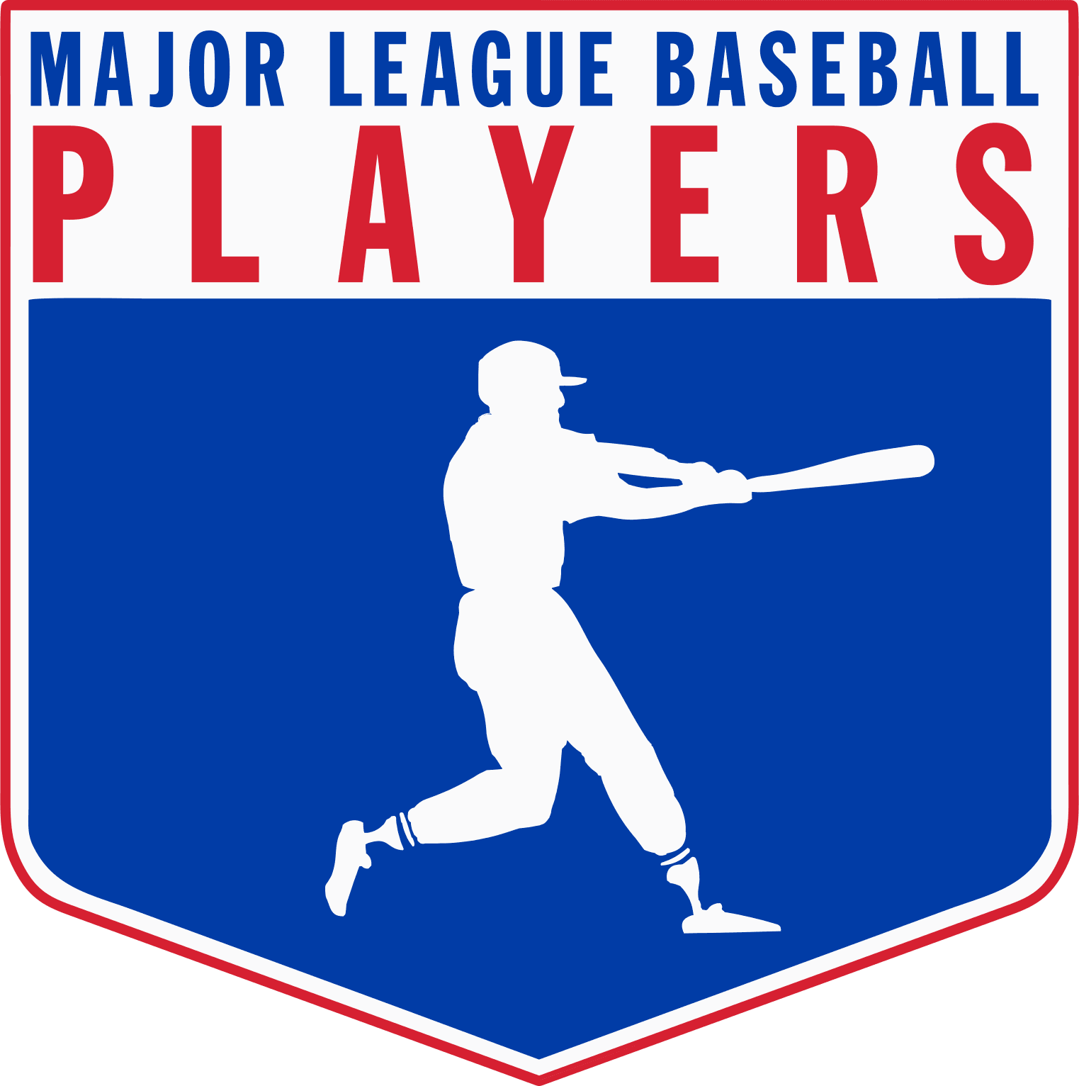
MLB Players Association: This logo, which has been around at least since the early 1970s and maybe the 1960s, is endearingly out of date. The silhouetted player is shown wearing calf-cuffed pants and striped stirrups (and, I’m thinking, a flapless batting helmet) — a style I approve of, obviously, but it seems out of step with today’s players (much like the NBA logo with Jerry West wearing short shorts).
The rest of the logo similarly feels dated — that’s not to say I dislike it (on the contrary, I like it quite a bit!), but I’m surprised they haven’t updated it. Then again, the MLBPA is arguably the most powerful and successful trade union in American labor history, so maybe they don’t want to mess with a good thing. Or maybe they like the old-school design because it implicitly acknowledges the earlier players who made today’s salary structure possible.
———
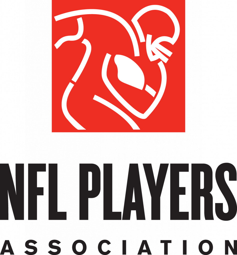
NFL Players Association: Is it possible that I’d never seen this logo prior to writing this article? Maybe — or maybe it just never made an impression on me because it’s such an uninspired design. I mean, doesn’t this look like something a kid would design in junior high? And what’s going on in the upper-left part of the red square, where the player’s arm should be extending? Like, does he have a hook instead of a hand, or what?
This has long been a weak union (NFL players don’t even get guaranteed contracts like players in the other major sports!), and they have a weak logo to match.
———
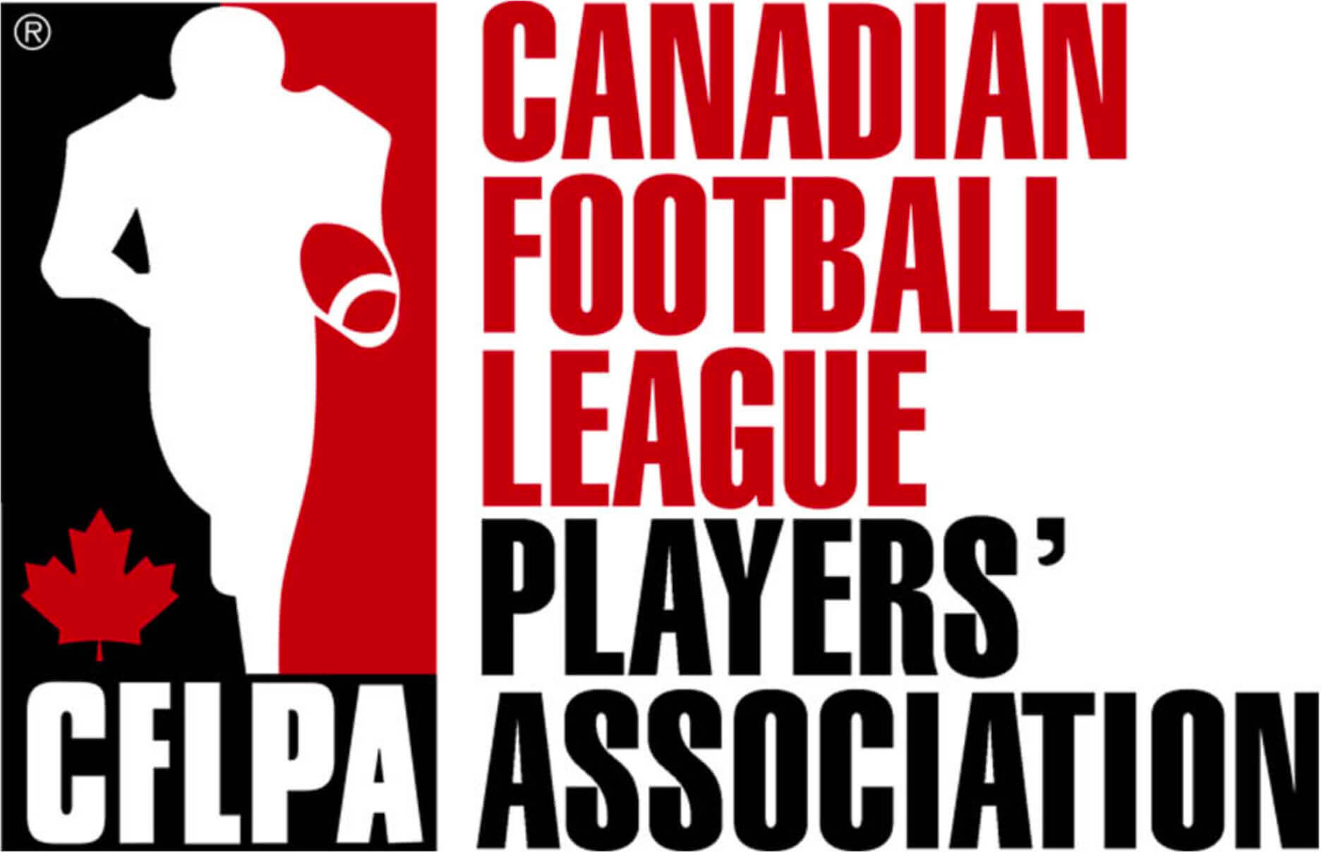
CFL Players’ Association: One of the few unions on this list whose official name includes an apostrophe after the word “Players.” The logo isn’t terrible, but the vertically oriented tri-color treatment with the white silhouette in the center feels very derivative of the NBA logo (which itself is derivative of the MLB logo). The football feels like it was slapped in as an afterthought — like, “Shit, the silhouette doesn’t look football-y enough, better put a ball in there” — and it’s weird that the white stripe appears on the front tip of the ball but not the back tip. Actually, maybe this is a terrible logo.
———
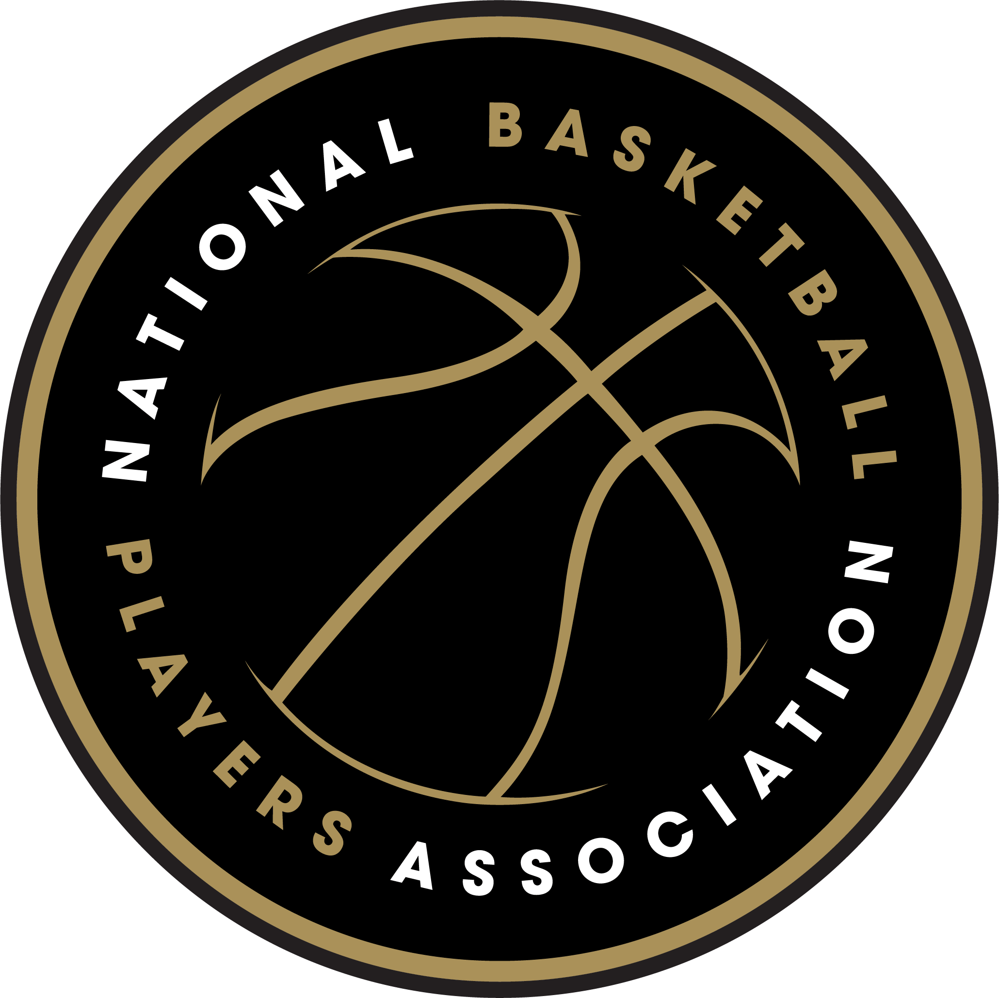
National Basketball Players Association: This is the oldest of the pro sports unions, dating back to 1954. Note that they’re not called the NBAPA — it’s just the NBPA (I guess because they didn’t want to double up on the word “Association”).
Anyway: We all know that NBA team logos tend to feature a basketball, so it’s funny that the logo for the players’ union is also ball-centric. I’m not nuts about that — a union is about people, so I think it would be better for the logo to show a player. It’s not a bad piece of design per se, but I don’t think it’s a good union design.
(Also, the color scheme reminds me of the Raptors’ first “Drake uniforms,” although I guess it’s inevitable that almost any color scheme is going to match some team’s colors.)
———
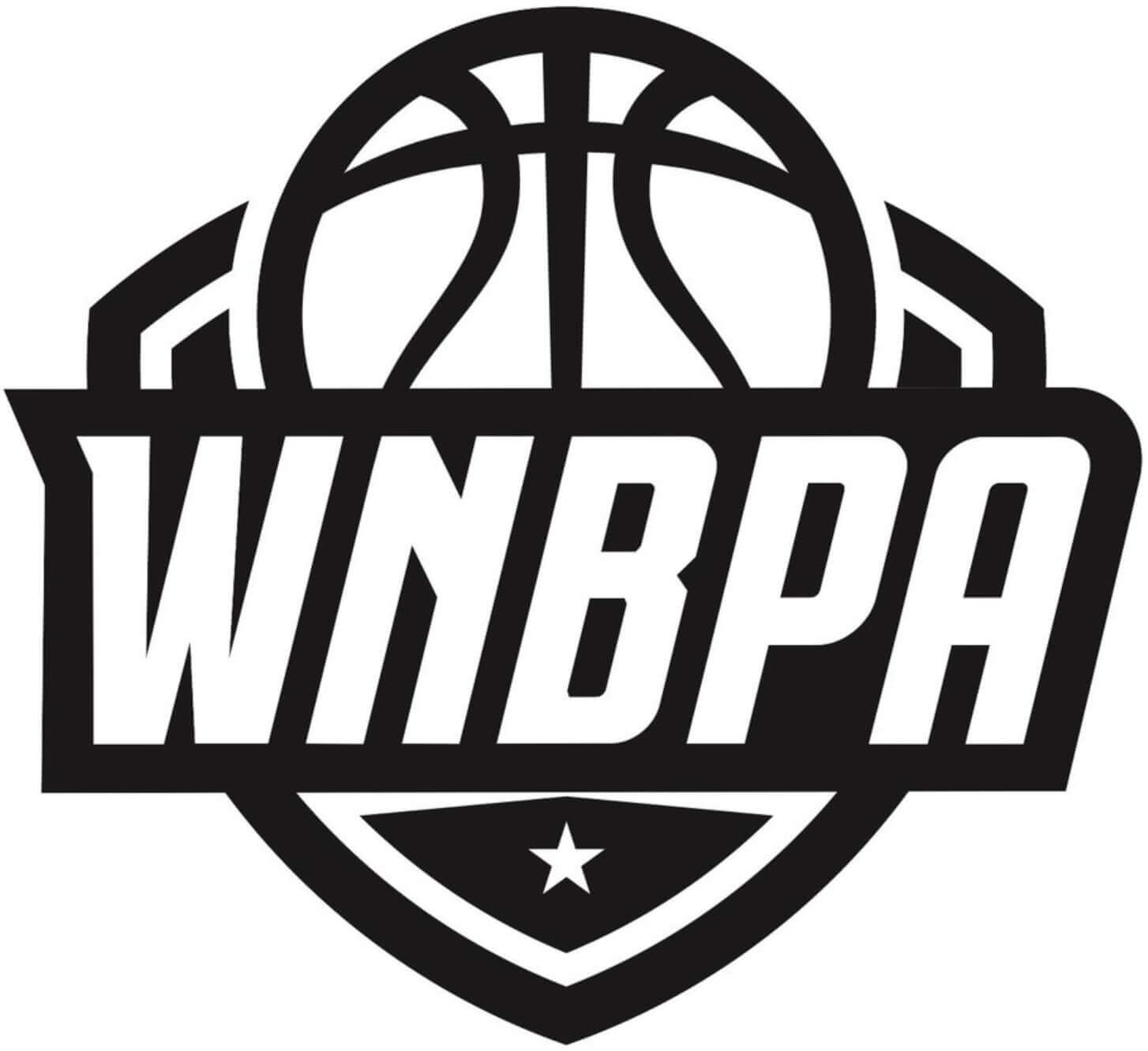
Women’s National Basketball Players Association: This design would be greatly improved by a few splashes of color. Seriously, why would anyone just stick to black and white in this day and age?
And just like the NBPA logo, I think this one would be better off featuring a player instead of just a basketball. Can’t say I’m loving the typography on this one, either. Not a great logo.
———
NHL Players’ Association: The only Big Four union whose official name includes the apostrophe after “Players.” Their logo isn’t bad, but something about it was bugging me and at first I couldn’t put my finger on what it was. Then it hit me: The logo’s triangular shape and stylized “A” remind me of the EA Sports logo. In fact, the union’s logo seems like it would be perfect for a video game, no?
This logo was introduced in 2014, replacing a red, white, and blue design that I liked a lot better. Once you see that one, the current black/white design looks really plain by comparison.
———
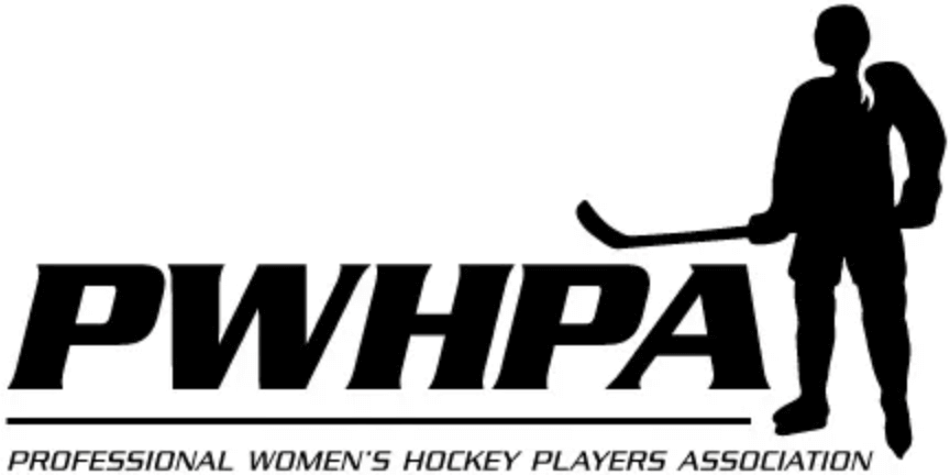
Professional Women’s Hockey Players Association: This union represents most of the top professional players in North America (but not the players in the Premier Hockey Federation [formerly the National Women’s Hockey League]). They get a lot of mileage out of that little reverse-field ponytail, right? The primary logo is adequate, or maybe adequate-plus, but they have a whole suite of secondary logos, and the player silhouette gains cumulative oomph with all those iterations. Not bad!
———
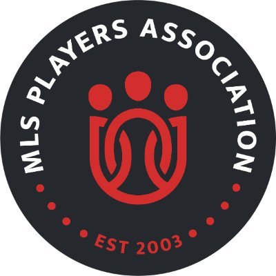
MLS Players Association: Originally known as the MLS Players Union, this group changed its name to the more common “Association” in 2017 (I think to avoid confusion because MLS has a team called the Philadelphia Union). The new logo they released as part of that rebranding is a very nice piece of work. The graphic in the center looks stylized and modern but is still clearly recognizable as players locking arms in solidarity, plus it also looks like a soccer crest.
Simple, communicative, effective — this is by far my favorite of the batch. Well done!
———
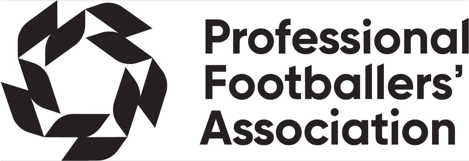
Professional Footballers’ Association: Founded in 1907 and representing English and Welsh soccer players, this is the oldest sports trade union in the world. Until recently they had an old-fashioned handshake-based logo (clearly based on the AFL-CIO logo), but last year they changed to the mark shown here. Once again, I’d prefer to see some color, but it’s still a handsome logo. Here’s an explainer from the company that designed it, along with a video explainer.
It’s worth noting that pro soccer players in lots of other countries have their own unions (almost all hewing to the “Professional Footballers Association” rubric). Here are the logos for the ones in Canada, Ghana, Australia, Italy, although there are many others.
———
NWSL Players Association: The silhouetted player is fine, but the icosahedral background pattern makes it look like she’s caught in a net or web. Even worse, it’s inexplicable that they chose to have the typography for the two phrases running vertically, which is hard to read and looks badly asymmetrical. If you scroll up to the MLS and NBA marks, you can see the right way to handle this.
———
All in all, an interesting bunch of marks, but not a particularly great portfolio of graphic design. Come on, sports unions — you can do better!
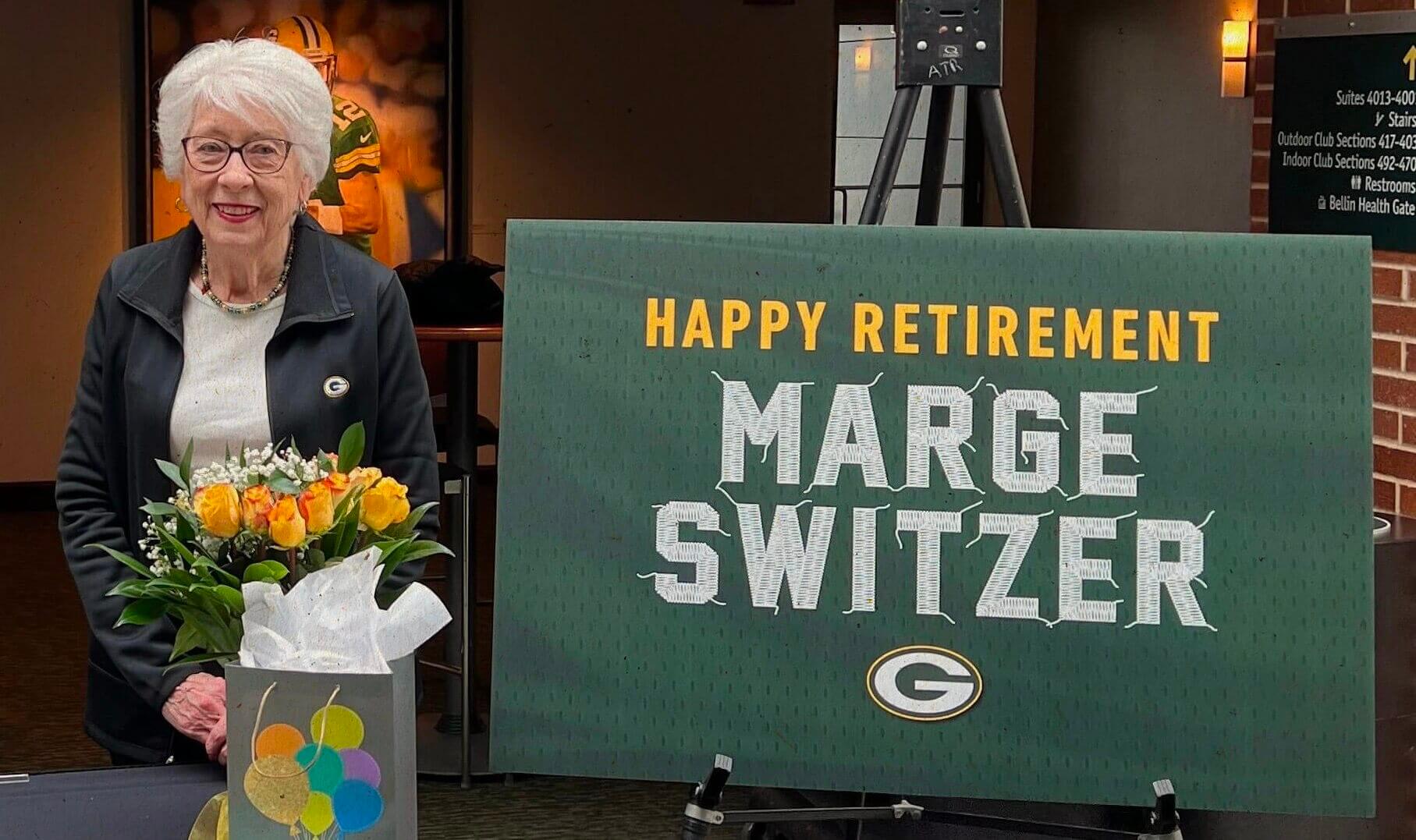
Photo by Joidon Jennings, packers.com; click to enlarge
End of an era: Longtime Green Bay Packers seamstress Marge Switzer retired yesterday after 27 years on the job. The team threw a nice party for her, complete with the sign you see above. But while I understand the thought behind the sewing-centric sign design, all those loose threads must have driven Marge nuts. She’d never send a player out on the field looking like that!
There’s a really good recap of Switzer’s career here. Recommended.
Collector’s Corner
By Brinke Guthrie
Follow @brinkeguthrie
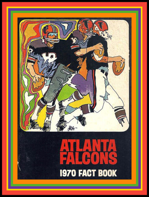
I’ll venture to say this is one of the grooviest media guide covers you’ll ever see. The Atlanta Falcons had that Age of Aquarius thing going with this 1970 Fact Book. Now, on the other side of the coin, the Chicago Bears went for a blander more conservative look that same year, one they would repeat in successive seasons.
Now for the rest of this week’s picks:
• The Falcons are also featured here in this big and bold belt buckle from Lee Jeans, an NFL Properties item from 1979.
• Thanks to reader Jacob Sherman for sending in this next item, undoubtedly the oldest item ever featured here — an 1890s photo of a baseball player from Pearsall, Texas. Interesting remarks from the seller: “He is standing next to a brick building in uniform, with ‘Pearsall’ across the front of his shirt. Pants appear to be padded, and he holds a bat across his shoulders and is wearing a Texas/western-style wide-brimmed hat.” He presumably didn’t wear that hat on the field, but you never know!
• The 1980 St. Louis Football Cardinals are featured on this Pizza Hut placemat.
• Gonna guess 1970-ish, judging by the team logos, for this NFL bath towel.
• We’ll stay in that same time frame for this 1971 Converse Basketball Yearbook with that impossibly excellent font. Look how the letters overlap each other!
• “Happy Birthday America — July 1976” is shown on the side of this Bicentennial Baltimore Orioles thermal promo cup ℅ The Coca-Cola Bottling Company of Baltimore.
• Let’s Talk Hockey is the title of this 1964 record album from the Toronto Maple Leafs.
• Frank Gifford’s NFL-AFL Football Guide 1968 promises a “insider’s analysis for the advanced viewer,” with “over 100 diagrams, photographs, rosters and schedules.”
• From 1969, Detroit Tigers catcher Bill Freehan is “Another Tiger Who’s Caught Dodge Fever,” at least according to the back of this postcard plugging the (New for ’69!!) Dodge Polara 500.
• Nice helmet representations on this set of 1970s NFL book covers.
• This 1970s floor rug or wall tapestry says “Football — No Place But GreenBay.”
The Ticker
By Alex Hider

Baseball News: This 2019 blog post from the National Postal Museum explores the various Roberto Clemente stamps the USPS has produced through the years. Here’s more on the Postal Museum’s baseball exhibit (from Max Weintraub). … Interesting find: A 1955 souvenir cap — with the tags still attached! — from the A’s inaugural season in Kansas City (from @mccallsgreatest). … The Rangers’ inability to choose between red and blue dates back to the team’s first spring training camp in 1972.

Football News: It’s well-noted that Washington QB Billy Kilmer often went chinstrap-less. But Brice Wallace found a couple of photos from 1977 and ’78 that show Kilmer wearing a chinstrap. … Former college football coach and current U.S. Senator Tommy Tuberville still refers to himself as “coach” on display boards he uses on the Senate floor (from Benjamin Engle).

Hockey News: Here’s a rarity: In last night’s Flames/Oilers game, neither team had a helmet ad (from Jim Borwick). … A Maple Leafs blog has ranked the team’s alternate uniforms over the years (from Kary Klismet). … The Canucks tweeted a behind-the-scenes video that shows the making of the pregame Pride sweaters the team will wear on March 11. In addition, here’s an explainer for the jersey’s crest design (from Wade Heidt and @wordseyeview, respectively). … Also from Wade: The Newfoundland Growlers of the ECHL will wear St. Patrick’s Day uniforms on Friday. … The PHF will hold its playoffs in Florida this season and recently unveiled a commemorative logo. Johnny Woods found a particularly ridiculous “storytelling” element in the league’s press release.

Basketball News: A Blazers blog reviewed and evaluated all of the uniforms they’ve worn in the Nike era (from Kary Klismet). … This YouTube video, published a few years ago, offers some great color views of Marquette’s men’s wild 1970 uniforms (from Brad Eenhuis). … The Charleston (West Virginia) Coliseum & Convention Center, home to the state’s boys’ and girls’ high school basketball tourneys, has a new floor design (from @joshuaexline).

Soccer News: There’s a trend among USMNT fans to get customized jerseys with a state NOB, where the number corresponds to the order of when that state entered the union. David Kendrick lives in Delaware, so he gets to wear No. 1. … The next four items are from Kary Klismet: Bayer Leverkusen of the Bundesliga will wear one-off “derby edition” jerseys against rival FC Köln. … Japanese club Vissel Kobe will wear new home kits for the Asian Champions League. … New alternate uniforms for LR Vicenza of Italy’s Serie B. … SCR Altach of the Austrian Bundesliga have new uniforms made out of recycled plastics. … This YouTube video offers a visual history of the soccer kit (from James C.). … OL Reign will unveil their new uniforms on Monday (from our own Jamie Rathjen). … AFC Richmond, the fictional club featured in the TV series Ted Lasso, may wear new uniforms in the upcoming third season of the series (from J.E.B. Castro). … New uniforms for Phoenix Rising FC of USL Championship (from @ThatRodneyGuy).

Grab Bag: This website allows users to type in a name and see what print ads that person was in (from Brinke). … Bay Area Curling Club has rinks that include houses honoring Indigenous people, the Black Lives Matter movement, LGBTQ rights, and other worthy causes (from Scott Rogers and Wade Heidt). … The downtown arena in Bridgeport, Conn., has a new advertised name (from John Muir). … Here’s a sensational article about an NYC woman who’s quietly amassed one of the largest collections of Black cultural history items, several of which are uni-related (from Tom Turner).
Ukraine News: Two English soccer clubs, Tottenham and Everton, honored the people of Ukraine with their warm-up shirts yesterday (from our own Jamie Rathjen). … Here’s an explainer about how the “Z” symbol has become a pro-Russia and pro-invasion symbol (from Steve Rausch).
For those interested, Paul also interviewed Packers seamstress Marge Switzer back in 2008. link
I can’t say the NFL players logo is a great or good one, but for some reason I’ve always liked that it and the QB club logo of the 1990s matched.
The second game in the iconic EA sports hockey series was actually NHLPA 93 as it was licensed by the union and not the league. So the logo is not only perfect for a video game, it has been the logo of a video game.
link
Didn’t know that — thanks!
NHLPA Hockey ’93 was my first Sega Genesis game (literally – my dad gave me the package containing the game before giving me the package containing the Genesis console that Christmas, much to my mom’s consternation). Notably, they handled the Rangers and Islanders by identifying them as “New York” and “Long Island”, respectively. NHL ’94 would be the first EA Sports game to have both the league and NHLPA licenses.
On a side note, I kind of like the old red-white-blue NHLPA logo a little better than the modern monochrome one.
I had that game for the SNES and there was bug where you could skate behind one of the nets (bottom net, right side) and the goalie would get stuck for a moment making for an easy wrap around goal.
Except it wasn’t that logo…? The video game style logo is from 2013.
Great rundown of the union logos.
FWIW, the last one, talking about the typography, is something that the (wrist)watch collecting community has been talking about for years, as it applied to watch dials. The term we use is “radial flip”, and refers to watches that flip the hour numbers 4-8 to maintain up-down, vs. staying radially symmetric.
Example without Radial Flip:
link
Example with Radial Flip:
link
link
The convention for radial numbers is that most of the time, Roman numeral watches do not flip, while Arabic numeral ones flip.
The other way to show numbers is to keep them vertical all the time:
link
Some watch collectors cannot stand the radial flip – complete dealbreaker.
Ed,
No joke, that is absolutely fascinating. Honestly, I’ve never noticed this before but I can promise you now that it’s something I will never stop noticing for the rest of my life.
Great info.
Thanks!
-C.
My favorite Swatch watch had Arabic numerals which were not radially flipped, so the “6” looked like a “9”. I found it witty.
Some anecdotal indigenous appropriation news. I was riding my bike around Dartmouth, MA this past weekend (a town debating the naming of their high school mascot and having a town-wide referendum soon). I only saw lawn signs wanting to keep the name, not a single piece supporting a name change. At least based on that (and what I think I know about the town) I can see where it’s headed
Appreciate the report! But FWIW, lawn signs are generally considered to be notoriously poor barometers of election results (link). For starters, people who live in apartments instead of houses don’t have lawns. Also, sometimes one side steals or vandalizes the other side’s signs, etc.
Unlike you, I know nothing about the town, so you’re definitely more informed on this specific case than I am. I’m just saying that lawn signs don’t necessarily mean anything.
Yeah I certainly did wonder whether the pro name change group just doesn’t have signage to begin with and what other factors come into play, I certainly have supported many causes without putting out lawn signs. Hopefully I’m wrong with my hunch!
I think this is a fairly common occurrence. Most people don’t like change, for whatever reason, so they feel the need to complain about it. It’s just human emotion at work, it’s not logical, there’s no critical thinking involved. They will find some way to rationalize it, usually by setting up a straw man or by attacking the other side. Yard signs and flags are the analog equivalent of comment sections.
Also fair to say that depending on the issue you might have a small group of passionate folks who are going to be more vocal, where the vast majority are less passionate about the issue but are on the opposing side or somewhere in the middle.
Given this issue, and based on other similar situations featured in the ticker, my guess is that is the case here. There is a loud group absolutely opposed to this, but when it comes times to vote they are small minority, with most people not really thinking it is a big deal and are willing to make a change just to move on from it all.
The MLBPA logo I always liked, the current version looks like it has been in use since around 1993. As before that it had red & blue behind the batter and had MLB all big under “Major League Baseball Players” as seen here. (RBI 93 is the first game to feature the current logo)
link
The main thing I’d change about the MLBPA logo is to switch the icon from a batter to a defensive player. Preferably one in motion that can be recognized as throwing for an out or turning a double play at 2B. In the immortal words of Al Capone in “The Untouchables,”
A man stands alone at the plate. This is the time for what? For individual achievement. There he stands alone. But in the field, what? Part of a team. Teamwork… Looks, throws, catches, hustles. Part of one big team. Bats himself the live-long day, Babe Ruth, Ty Cobb, and so on. If his team don’t field… what is he? You follow me? No one. Sunny day, the stands are full of fans. What does he have to say? I’m goin’ out there for myself. But… I get nowhere unless the team wins.
A labor union is about solidarity and teamwork, not individual performance, so the batter and the pitcher are the wrong icons for a players’ union logo.
Love this idea! It would also further differentiate the union logo from the MLB logo, which shows a batter.
RSR,
Or a pitcher, since guys like Scherzer seem to be the ones conducting the union’s train.
-C.
In the immortal words of Al Capone in “The Untouchables”…
So now I’ve got the conclusion of that scene running through my head. Thanks for that! ;^)
I’ve seen the NFLPA logo a lot because it’s on the covers of Madden football. And because of that, I’ve always thought the logo had something to do with video games. I never paid enough attention that the letters ‘NFLPA’ appear below the logo. The logo is so comic-like that I didn’t give it much thought and assumed it was a video game logo instead of a logo that’s supposed to represent a powerful professional organization.
I think anyone growing up playing football video games recognizes the NFLPA logo
This is true for all of these — for fans, video games and lockout/strikes are where you become familiar with union logos.
Check out @UnionLogos on twitter for all sorts of great logos, design examples, pins, etc.
The Bookcovers in Collector’s Corner are from the 1980s and maybe the 1990s. The Bengals have their striped helmet which was introduced in 1981. The Bills have their Red helmet which was introduced in 1984 and the Chargers have their dark blue helmet which was introduced in 1988.
I’ll give the ’72 Texas Rangers a pass on their original ‘indecisiveness’.
They had to wear recycled Washington Senators uniforms during spring training…because Short Stinks(?).
Paul,
Not sure if anyone’s mentioned this, but within the MLS players’ logo, the 3-player “crest” strongly hints at a “U” for union. It was the first thing I saw.
-C.
There’s a fine line between drawing what looks like a handshake (AFL-CIO) and drawing what looks like two people holding hands (PFA old logo).
No? Both hands are clearly the respective shaker’s right hand…
The NHLPA logo is actually Blue…I’m looking to see if I have it in vector, but here’s a rough idea:
link
Red on red with black pinstripes for Rutgers Baseball
link
Softball had red on red with white pinstripes when I watched them last week against Liberty.
The player in the NFLPA logo would have been perfect at Shea Stadium, if the Jets still played there when the neon ballplayers went up.
MLS PA logo looks like some weird paw print to me. No matter how long I stare at it I still really can’t see it’s players locking arms.
Billy Kilmer with Chinstrap
9/17/1967
link
9/15/1968
link
In College at UCLA
link
From the “Black Helmet” Saints Pre-Season Game
link
link
Finally from his rookie card (when he was a running back with the 49ers)
link
I wonder if Russ will wear #3 with denver & Lock #3 with Seattle
The MLBPA logo goes back to at least 1969, when a similar version was used to cover the Met logo on the scoreboard on this album cover, which I own.
link
Obviously the raptors don’t care that when they drake-ify themselves their alternate logo looks a whole lot like the NBPA logo. I much prefer the NFLPA, MLS, and PFA logos as they actually appear to have been designed. Most of the others seem to have been a burden on some lackey who was told that, as an organization they will need a standard image of the acronym for official use and “maybe throw in some clip art if you can find any”
Great story about the Packers seamstress. How do other teams manage to put on numbers, they must have teams of seamstresses as well. Do they have an union? Or other get togethers where they compare sewing techniques or fabric developments? Or are most shirts simply printed by the guys from the stadium/arena pro shop? Also fascinating but disturbing that the Packers seamstresses work from a basement without any daylight coming in. Like a sweatshop.
The NFLPA logo stands for reasonably priced replica jerseys from the 90s/00s for me. The logo was on the jocktag.
Marge and in charge. Congratulations!
The MLBPA logo’s font is noticeably similar to the font MLB used to use in its logo (link). If anything, it speaks to the fact the players and owners don’t see eye to eye that the league went away from that font in 2019 (link) and the players did not. The NHL, MLS and EPL logos also share commonalities with their league’s branding.
I don’t see an issue with the NFL player’s arm not extending. It’s just a cropped, line-art picture in a box. I don’t think it’s amateurish. It’s just of its time — very late 80s/early 90s. Dated, yes, but it replaced this (link) which displayed a ball with stripes, which was also dated.
If anything, I think the joke with the Switzer sign is that now she’s gone, there *will* be loose threads all over the place. If anything, it’s an endearing bit of humor.